Dries Van Noten’s Dichotomy Of Design
Review of Dries Van Noten Fall 2024 Men’s Fashion Show
By Angela Baidoo
THE COLLECTION
THE VIBE
THE THEME
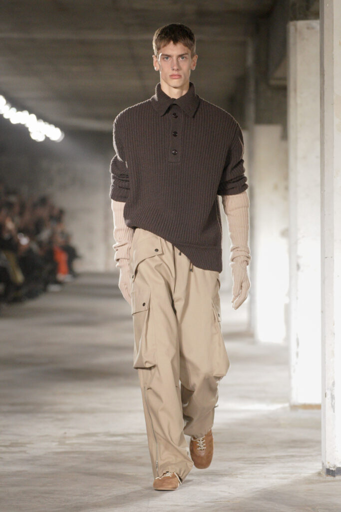
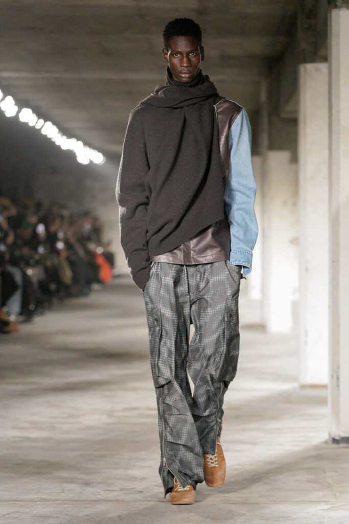
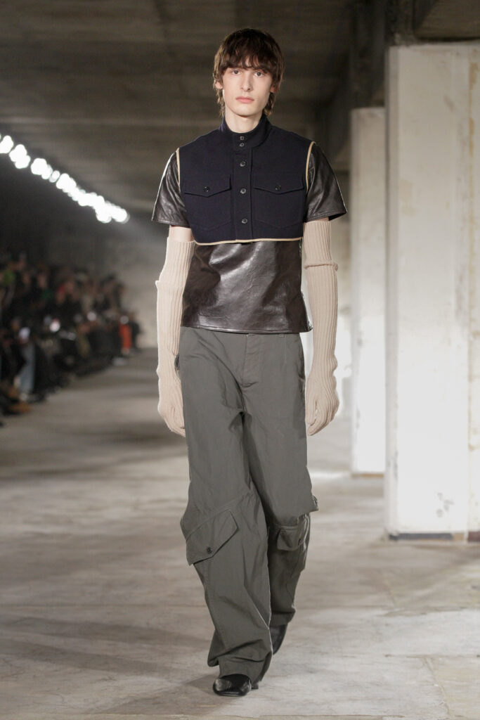
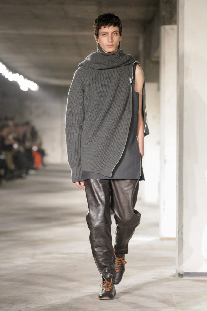
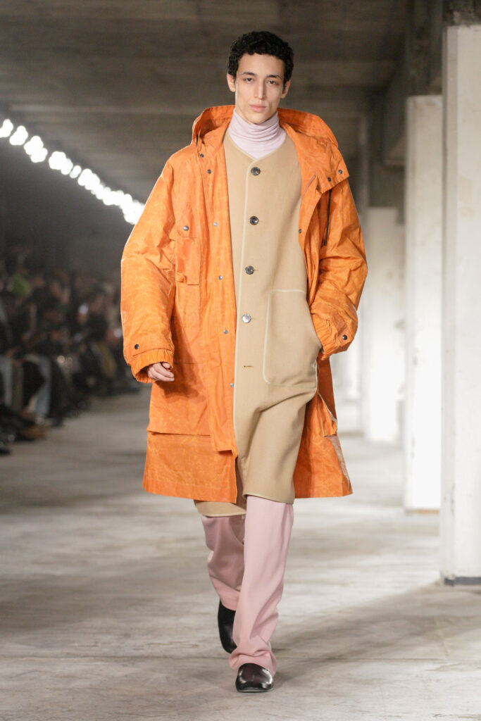
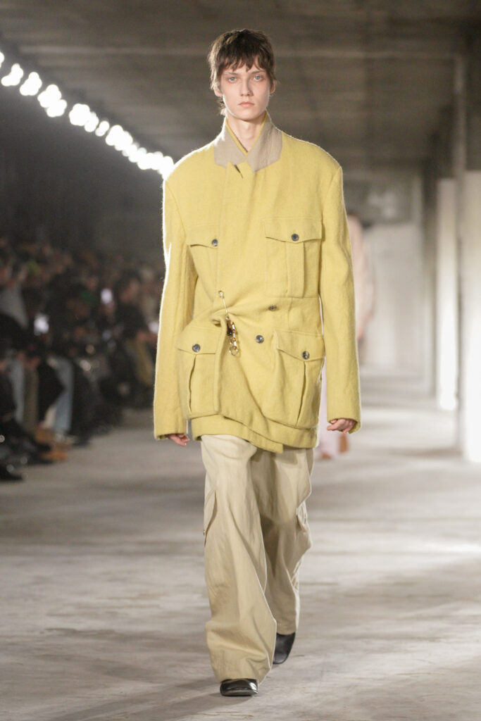
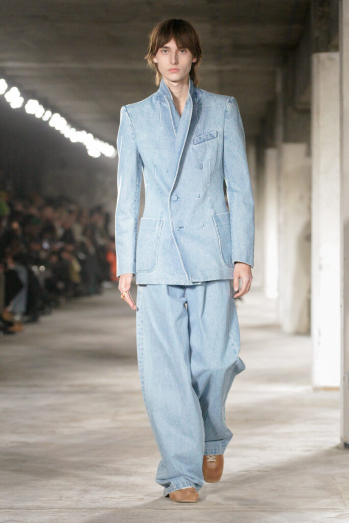
And so it began with a refined start, which gave way to a dichotomy of varying themes, as Dries Van Noten referenced “the tension of contrasts” and how bringing them together can create something new, even if it still finds a place within the brands universe. There are ways of looking at different gestures and rethinking how they might be transformed for the now, through fabric, cut, or construction, leading to the opening up of an ongoing dialogue with what has come before and what is yet to come. For fall 2024 there was a testing of the waters to stimulate in the viewer a sense of excitement, as during the initial opening looks, many in attendance were satisfied that they were getting Dries as they know it, so took their time taking in the sophisticated tailoring, lean outerwear silhouettes and vintage utility. But as the collection strayed further into that exploration of tension, there was a distinct perking up, and lifting of phones as more nuanced ideas started to come to the fore. As utility shirts were shorn in half to appear as bibs, layered over a simple T-shirt and navy suit, “Challenging perceived notions of how a garment is worn” according to the show notes. This pushed on into an oversized knitted sweater worn asymmetrically and unzipped, allowing for the untethered sleeve to now become an impromptu scarf, while a double-breasted blazer fastened in a skewed fashion was secured with safety pin jewellery. Denim was also given a sharp new outlook as a double-breasted blazer, relaxed volume trousers and trenchcoat.
Known to be a man of the cloth (the other cloth), those who invest know that the brand never disappoints when it comes to quality and richness, this time it was ‘solid’ heritage fabrics from British mills worked up with “delicate accents” according to the show notes, which could be seen in a graduated funnel-neck coat made using the needle punch technique and cargo parachute pants.
A designer who can be relied upon to create alchemy with the specificity of his palettes and prints, here menswear was given an initial grounding in earth tones, before breaking into “delicate corals, pinks and camels interspersed with organic moss tones, cocoa and inky blues” as read the notes. On their own they will commercially work at retail but viewing them together in contrasts and harmonies leads one to hope that buyers will stick to the script as has been laid out before them. Because very few places are you likely to find mustard matched back with dusty pink, or orange, camel, and that said pink.
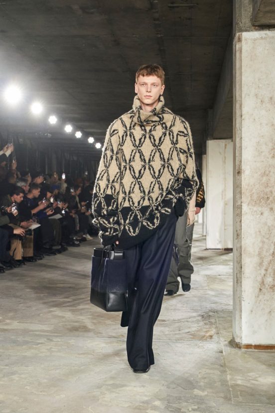
Prints appearing with a vintage feel as pixelated animal patterns and digital distortions worked cohesively due to the clever layering of contrasts – animal and abstract, comfy knitwear and casual cargo pants.
THE BUZZWORDS
Hushed palettes, dichotomy in design, skewed styling

THE SHOWSTOPPER
Look #33
Capturing the essence of the collection, this look takes to challenging how to style a simple sweater with a full-body zip to encourage the wearer to adapt and rethink their look with each wear.

THE DIRECTION
THE WRAP UP
The elegance of the unexpected was the driving force for today’s fall collection, taking what might be considered expected or classic, and through simply considering it through a contrasting lens, something new can be born. Throughout the collection colour was paired with its tonal opposite, fabrics were both refined and rustic, and the sleek was given depth with the addition of shaggy textures.
