Spring 2026: A Season of Colour Correction and Joyful Brights
By Angela Baidoo
The spring 2026 collections went from neutral territory to full Technicolour. Matching the optimism spurred on by the ushering in of over a dozen new creative directors, and the notion that luxury fashion was finally enacting the reset which many have voiced was past due.
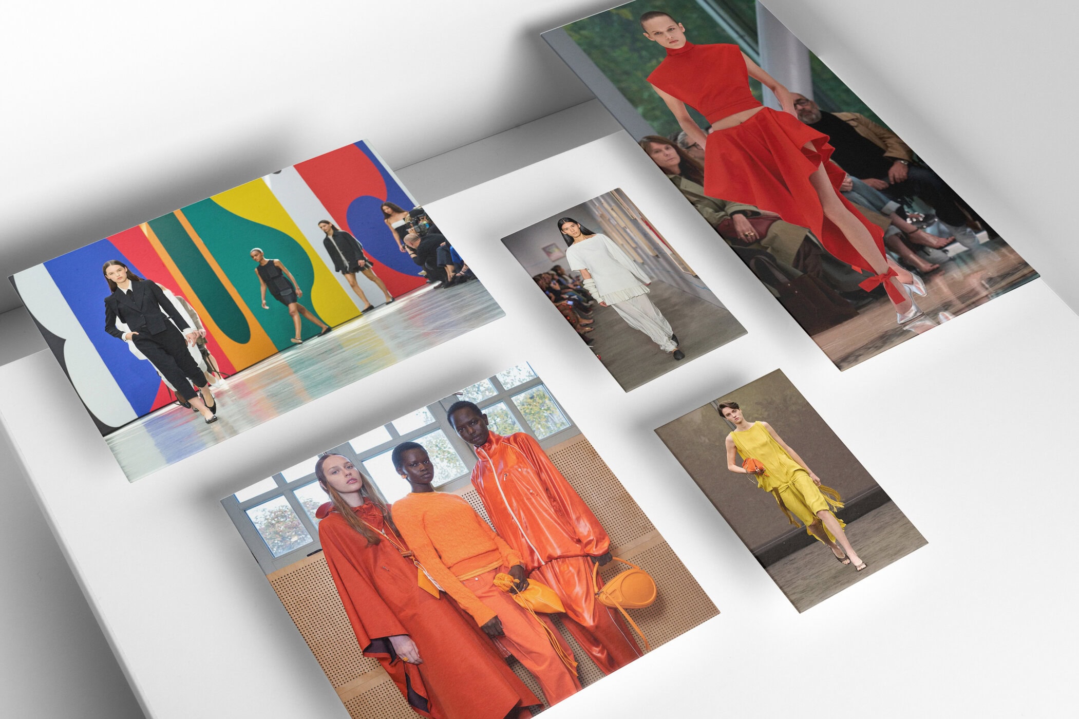
Dopamine and decadence set the tone with rich darks emerging as summers new alternative palette for ‘Quiet Luxury’. While brights revived the concept of revenge dressing, instilling a sense of fearless confidence in all those who choose to adopt the statement-making hues seen across the big four. Next season we will be compelled to stand out in our most vibrant ensembles. Whether that means reaching once again for pink and red or rethinking the layering of shades of cobalt.
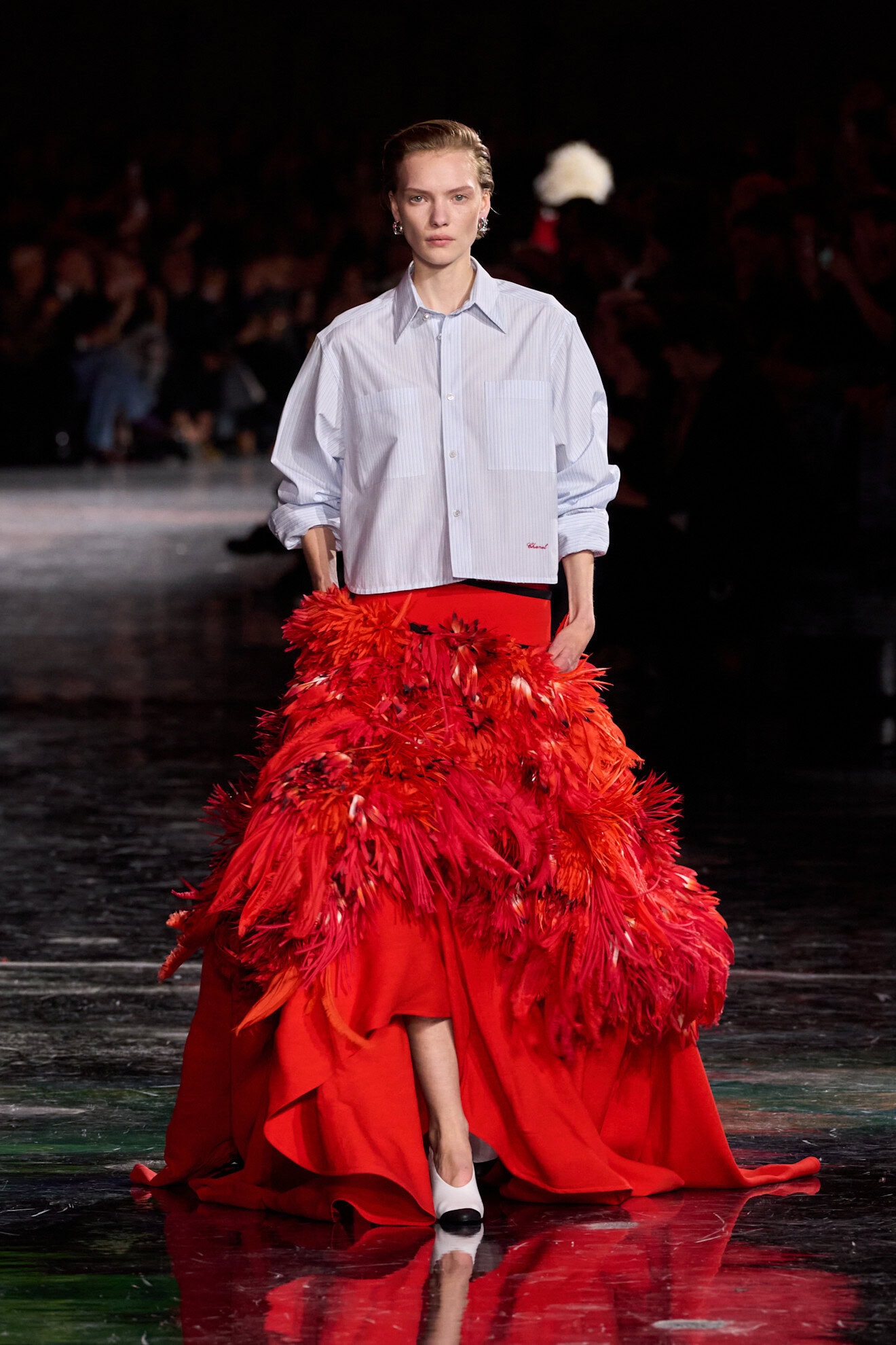
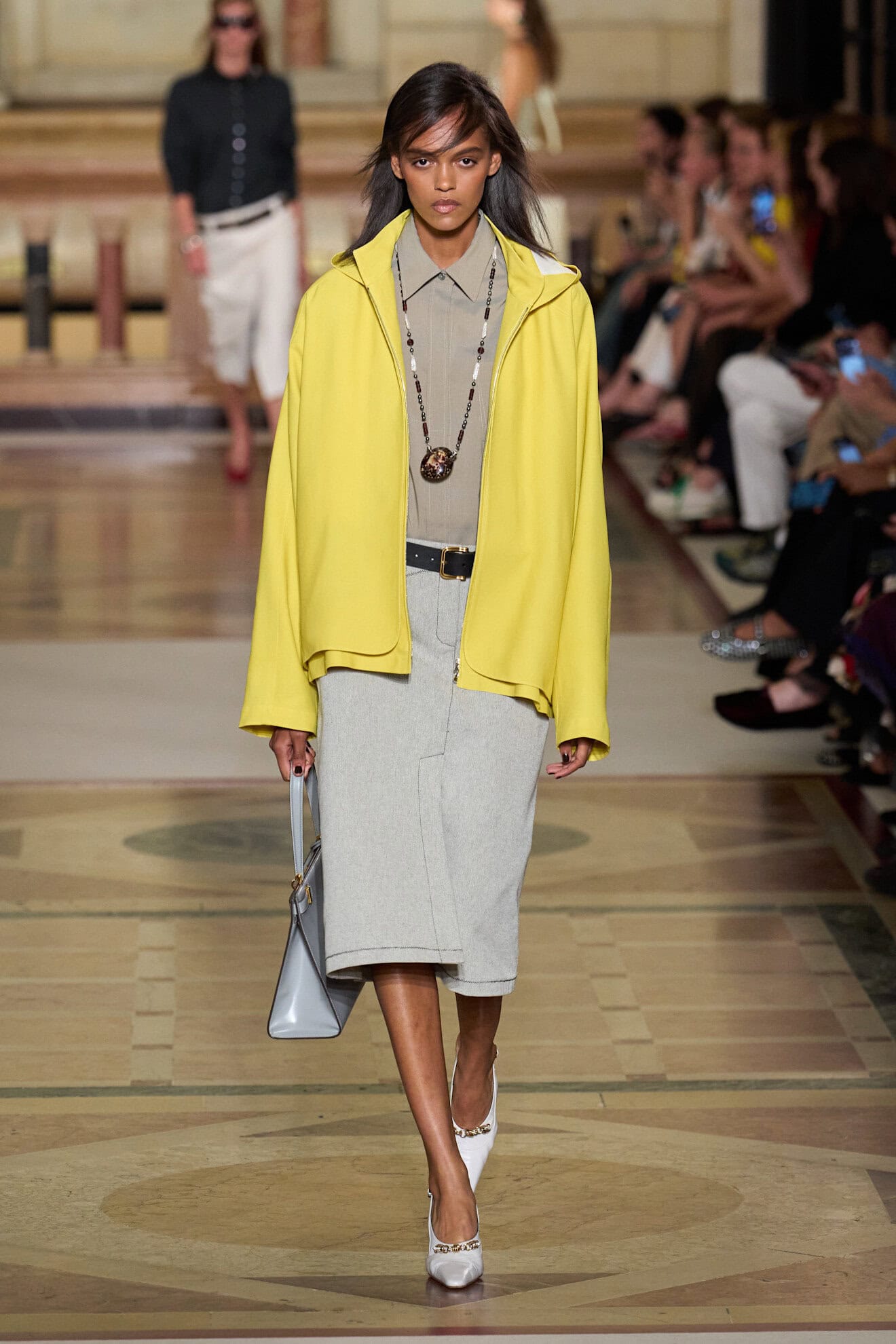
As designers hit the refresh button it was evident that they were having fun with fashion again. A sentiment much-needed after a period which appeared as if fashion was flattening. In 2026 there will be a full spectrum of colours to choose from which can be applied across chocolate-hued tailoring (Rachel Comey), oversized yellow trench coats (Alaïa), high-gloss orange pencil skirts (Ferragamo), baby pink boho blouses (Zimmermann), or lipstick red floral-embellished maxi skirts to take a walk among the stars (Chanel).
Here at The Impression, we have tracked and analysed the most important colours and combinations to bring you the hues that will matter most in spring 2026.
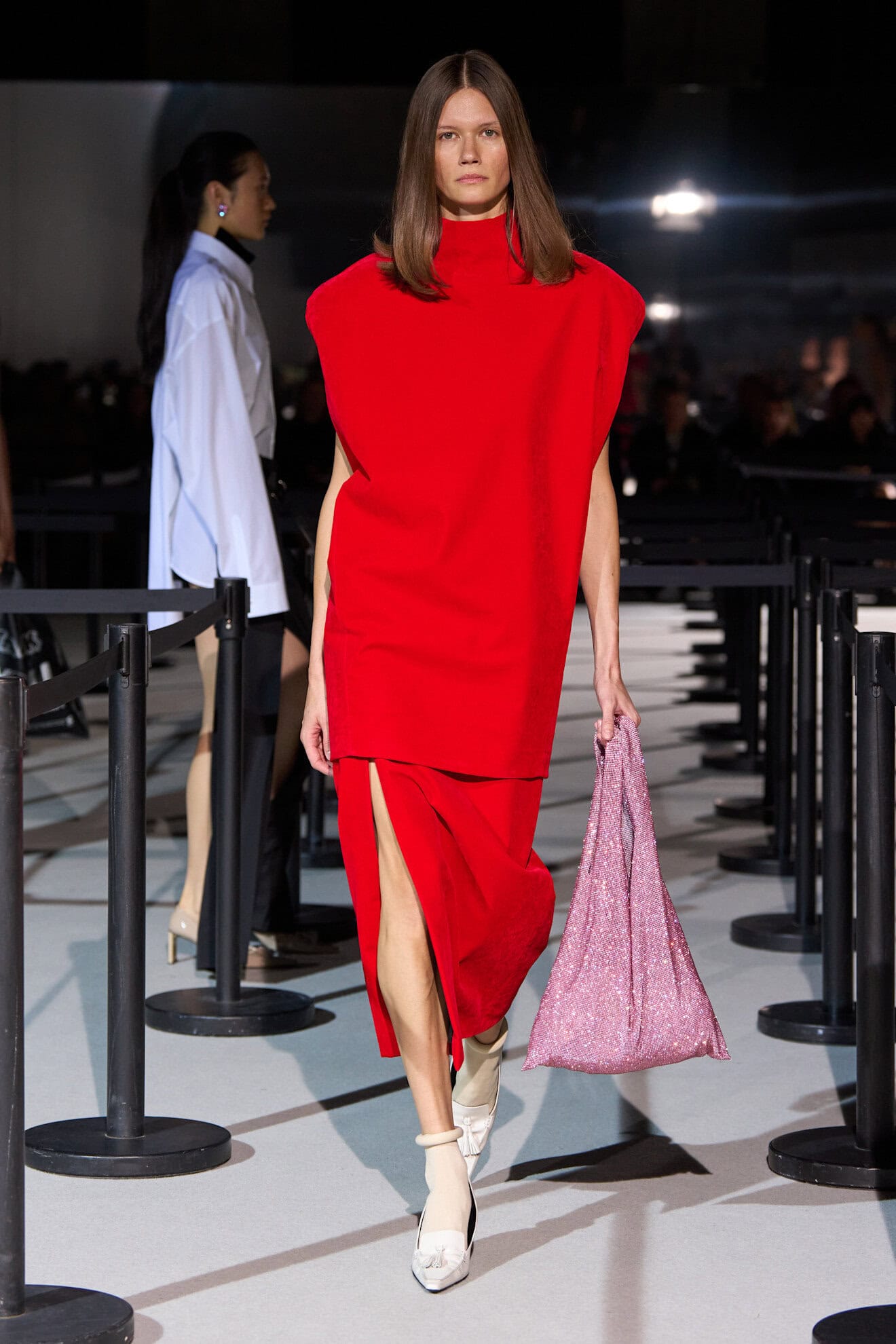
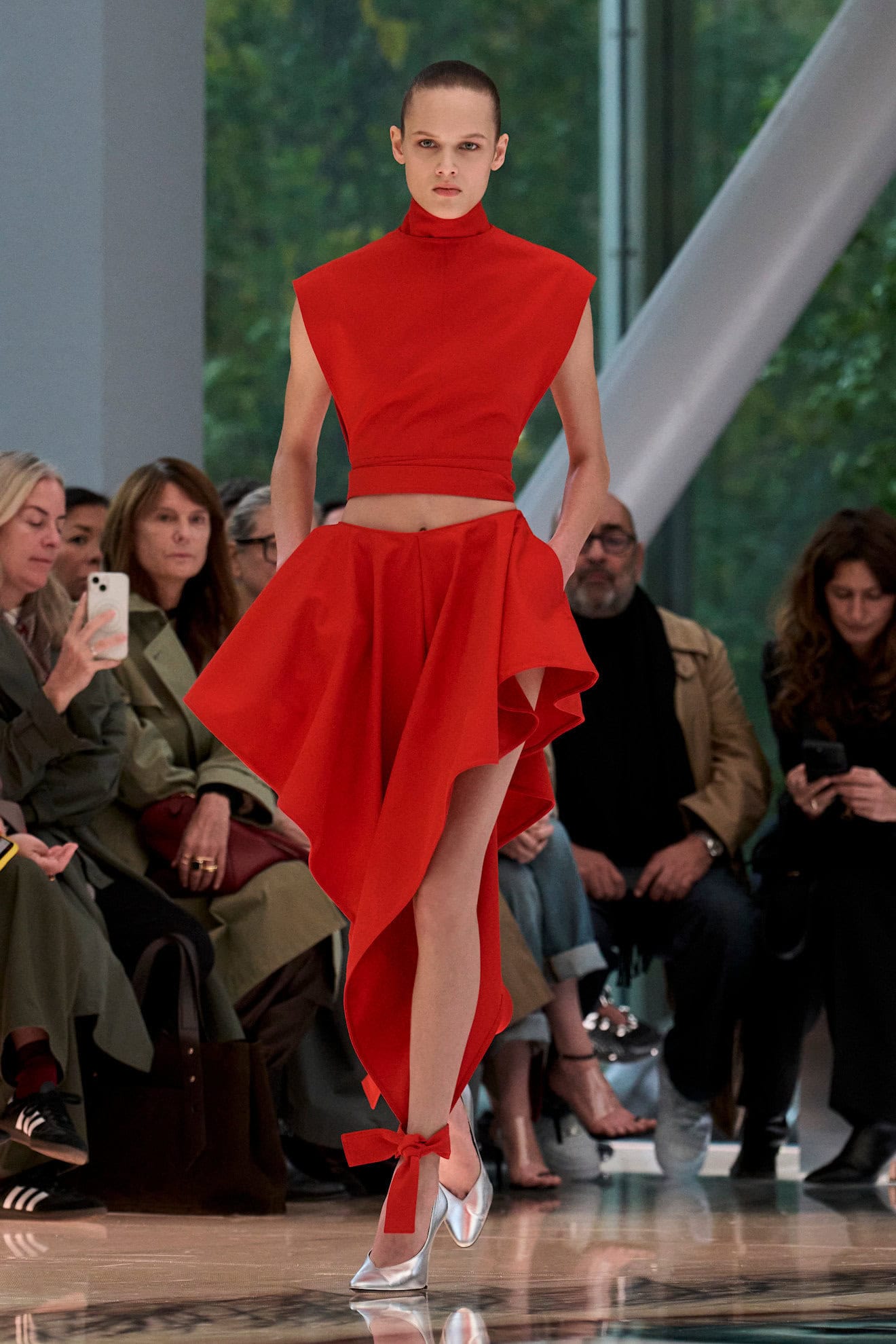
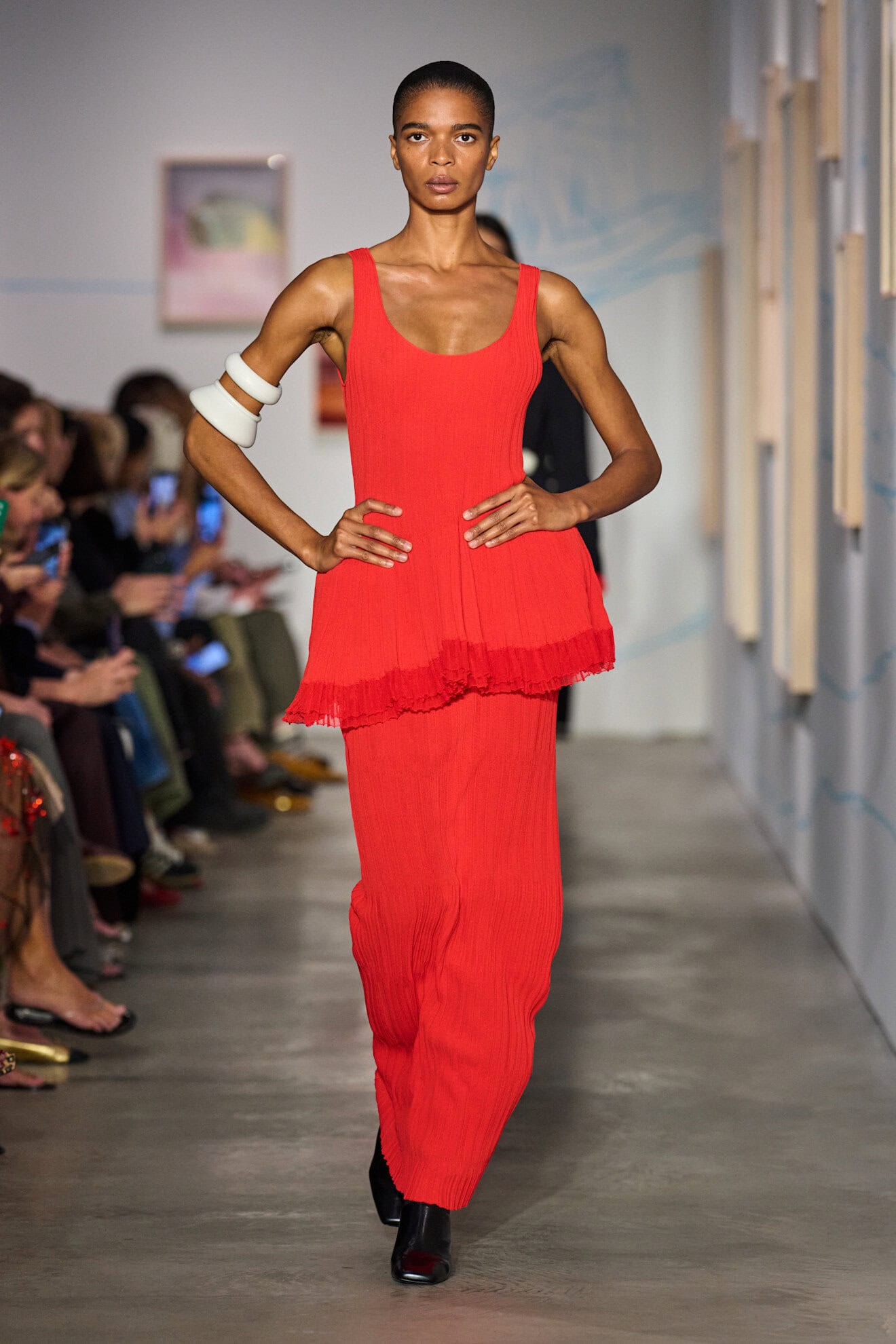
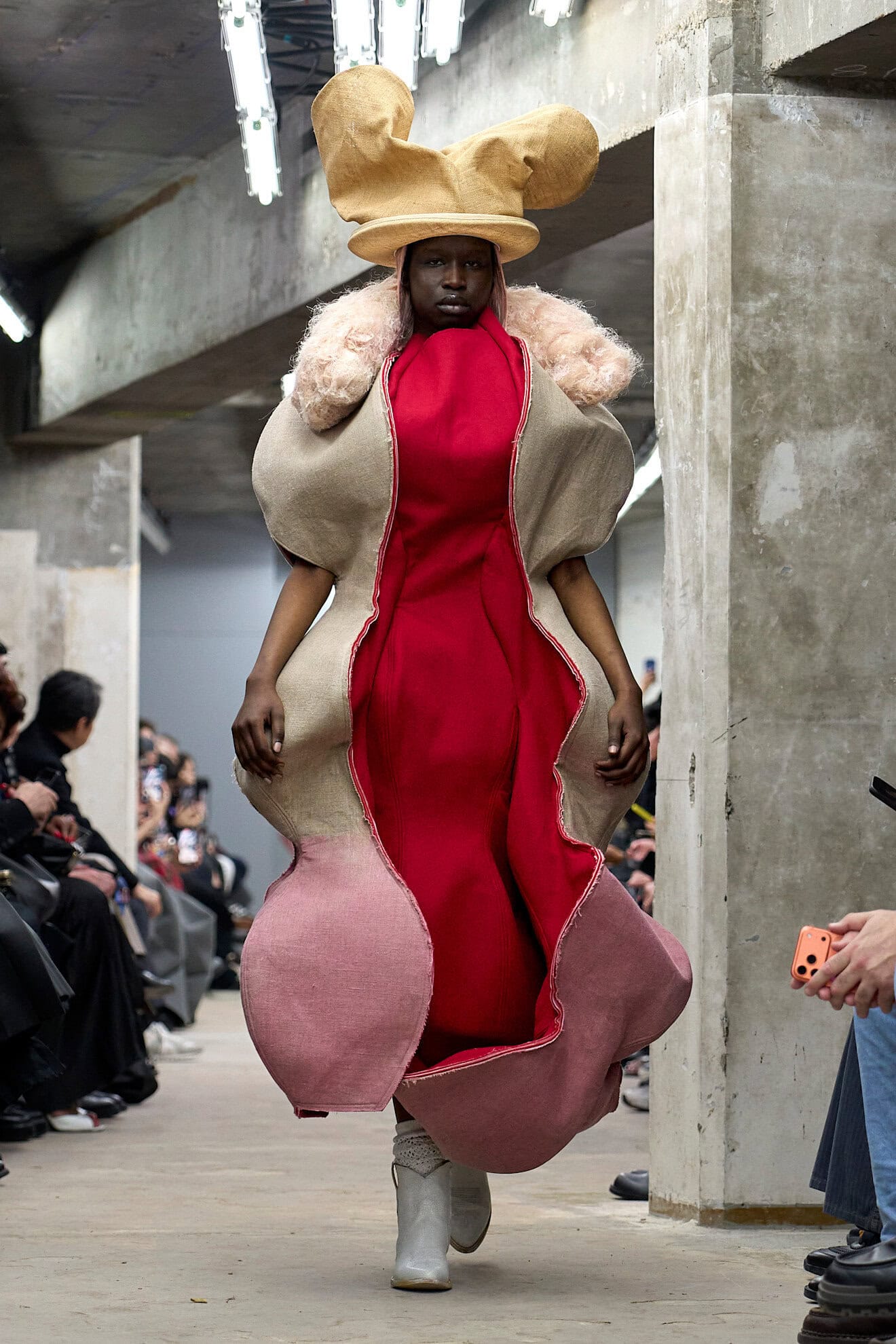
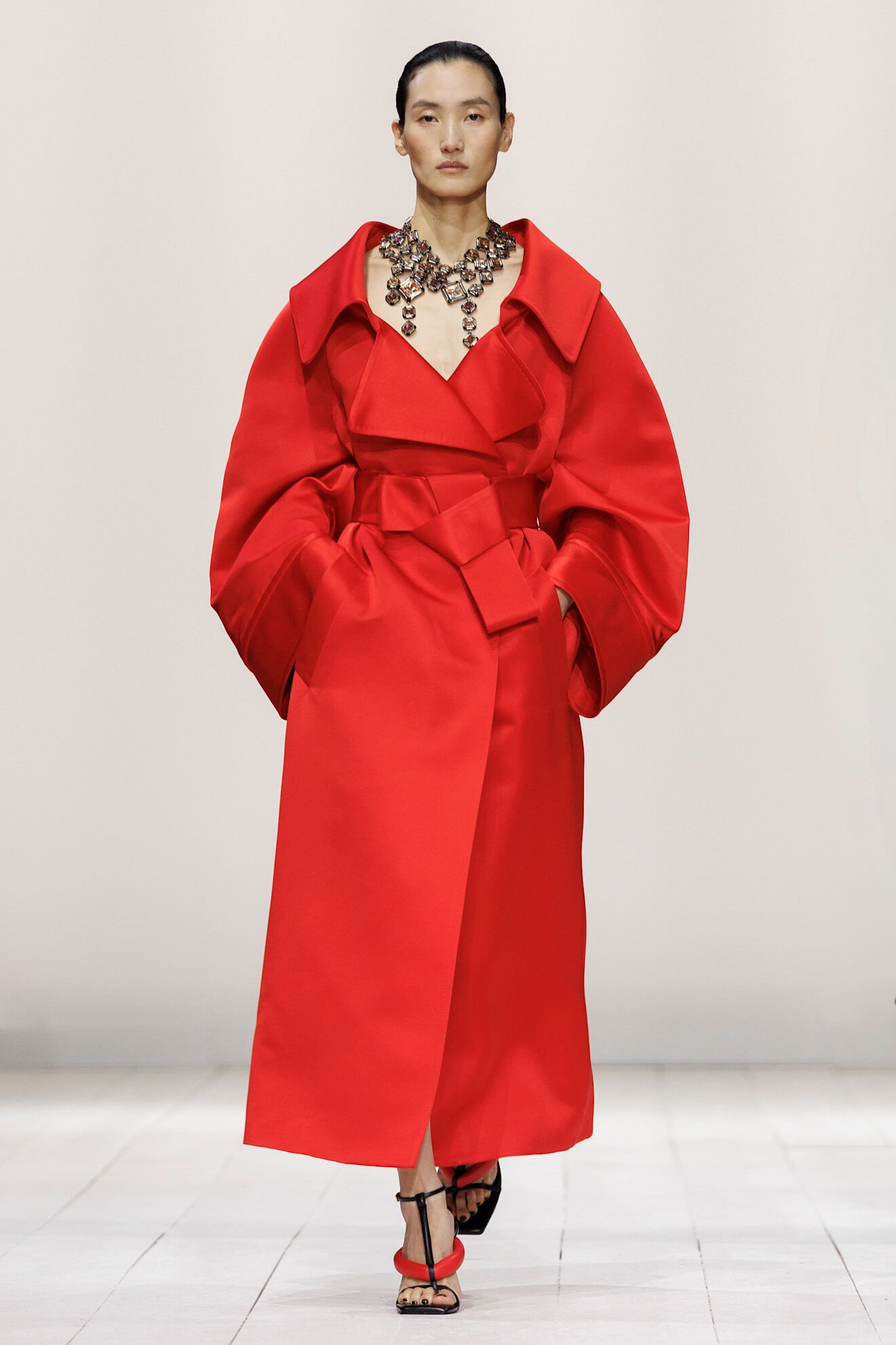
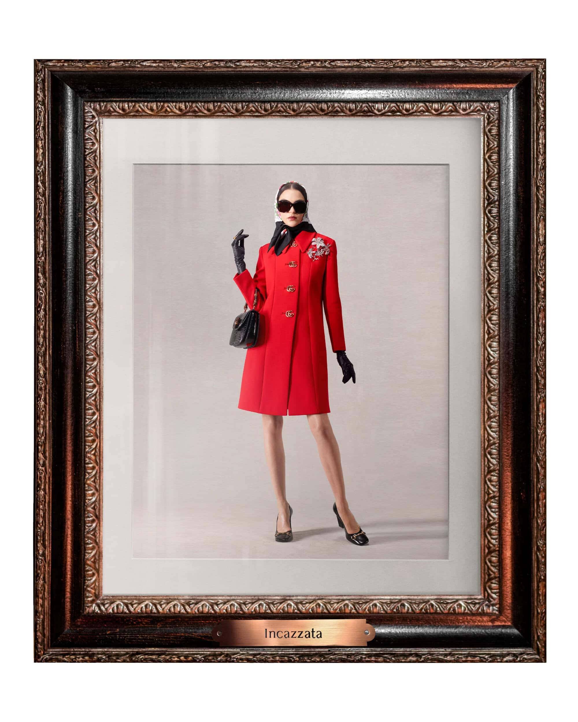
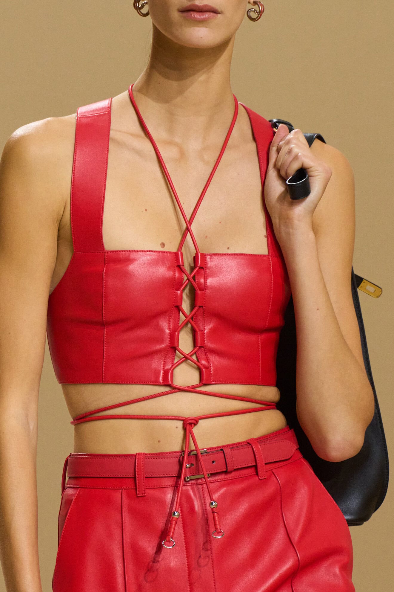
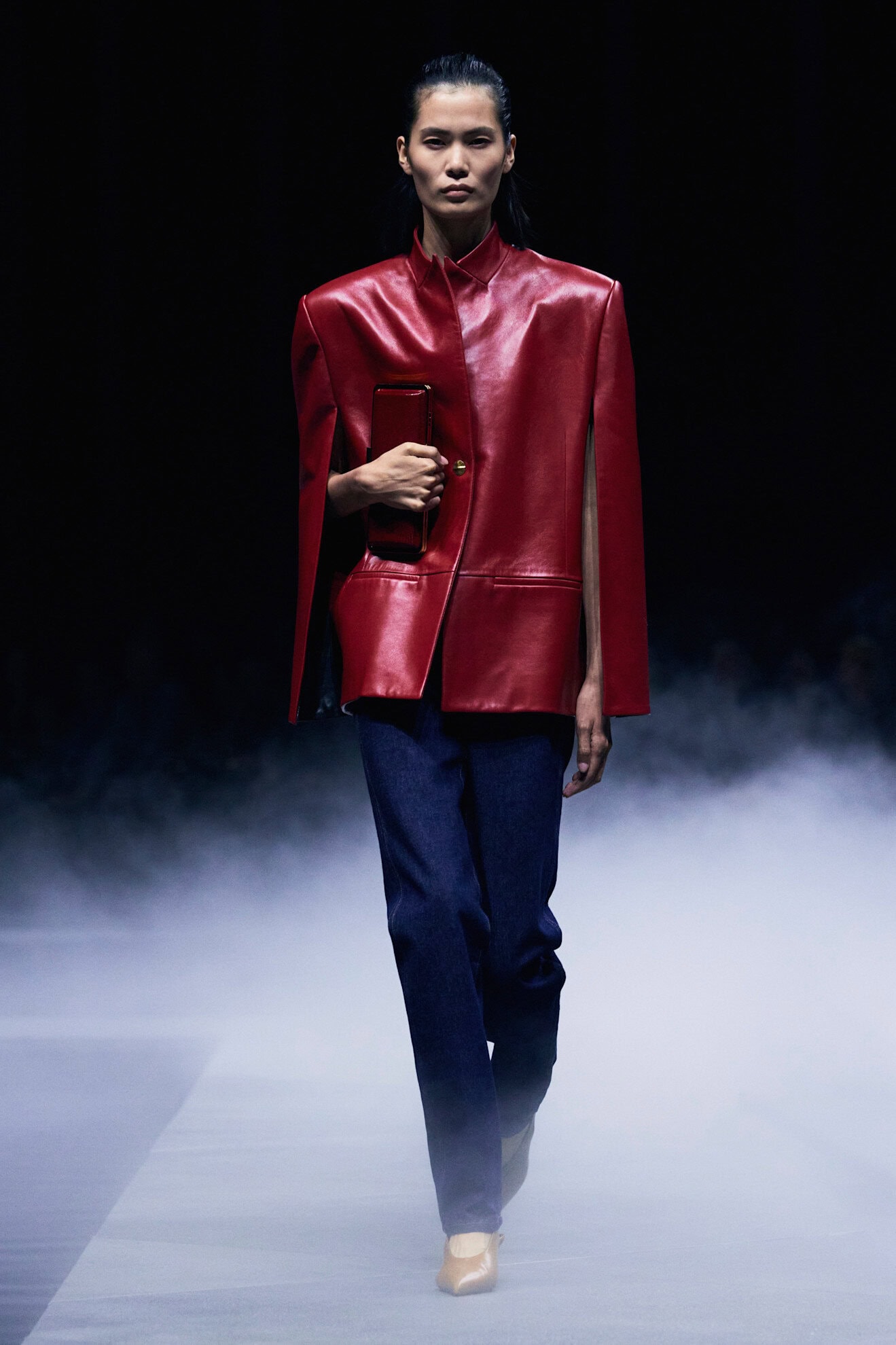
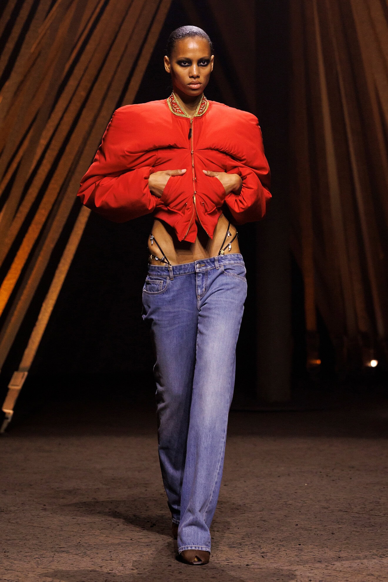
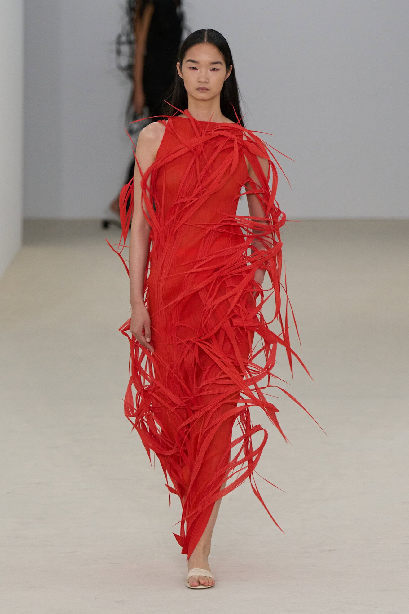
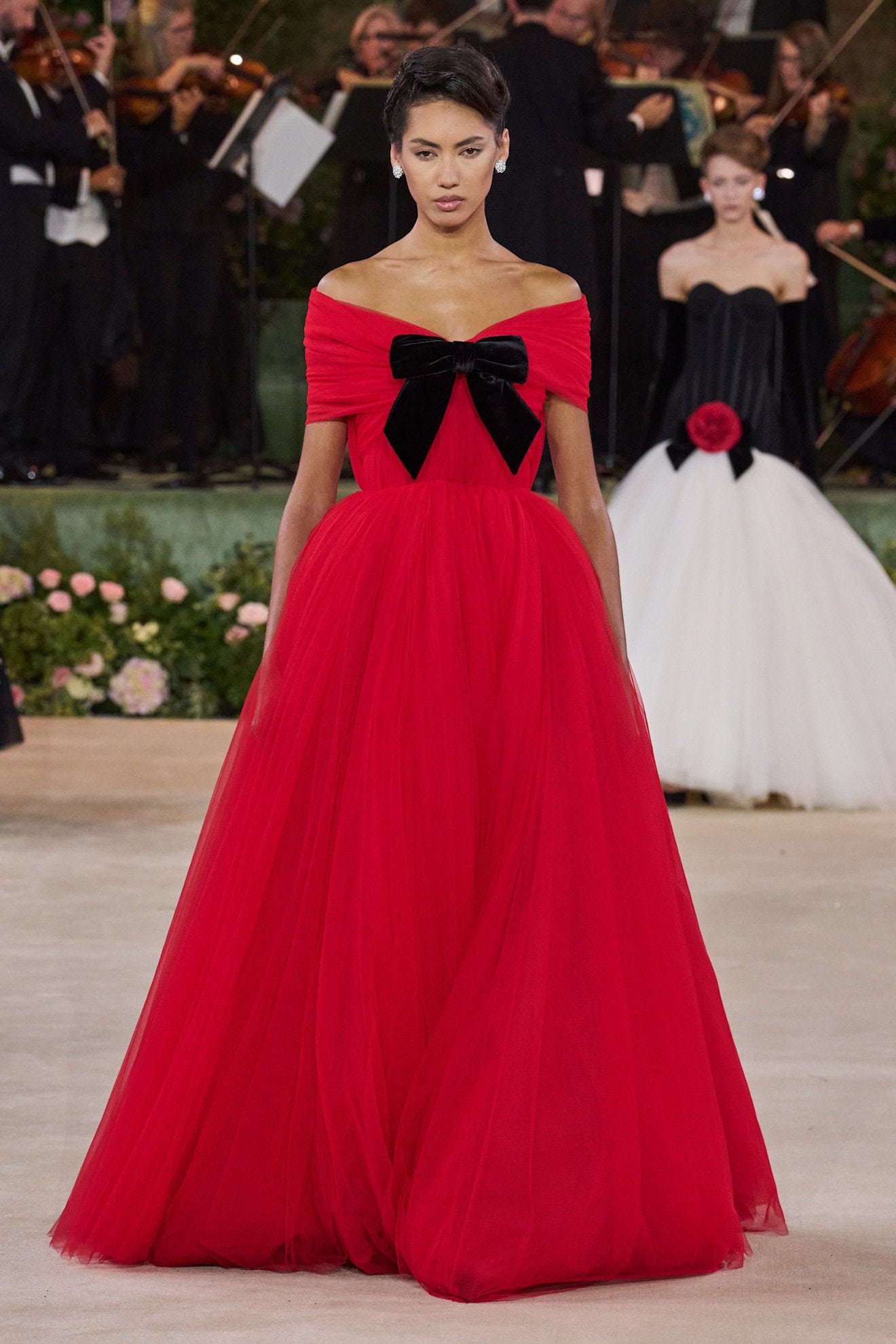
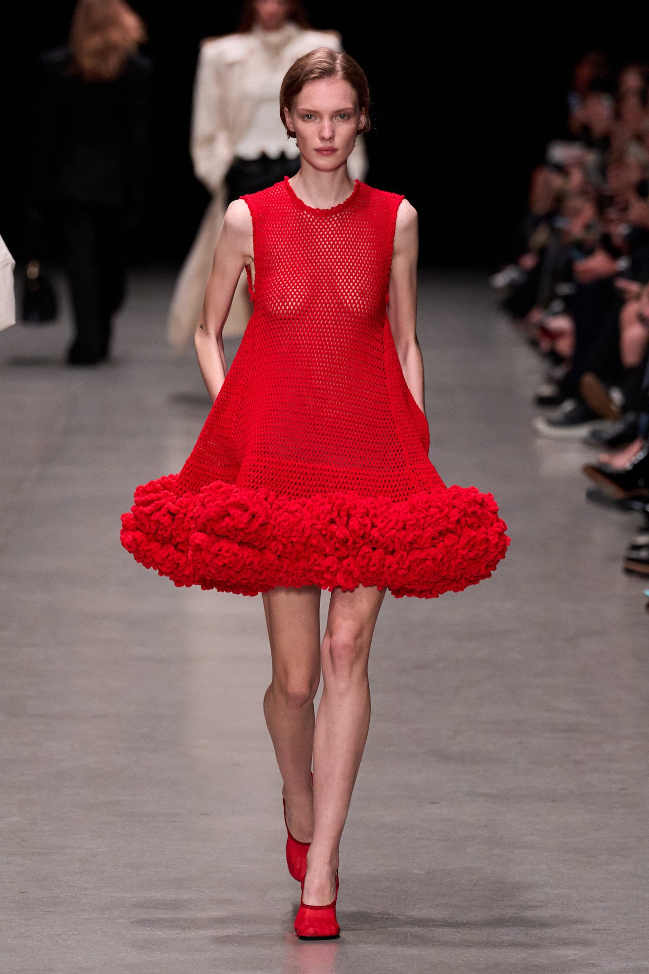
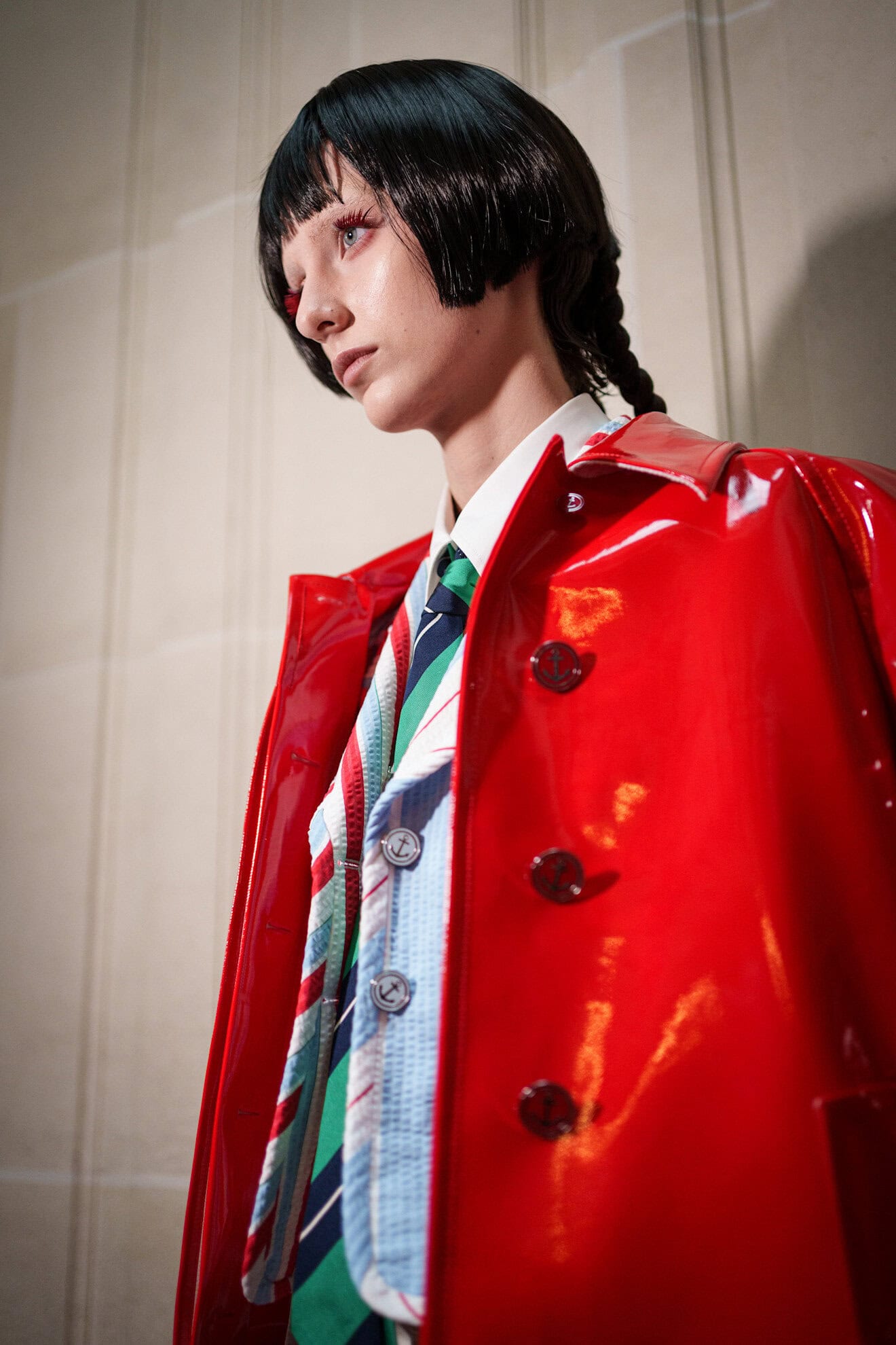
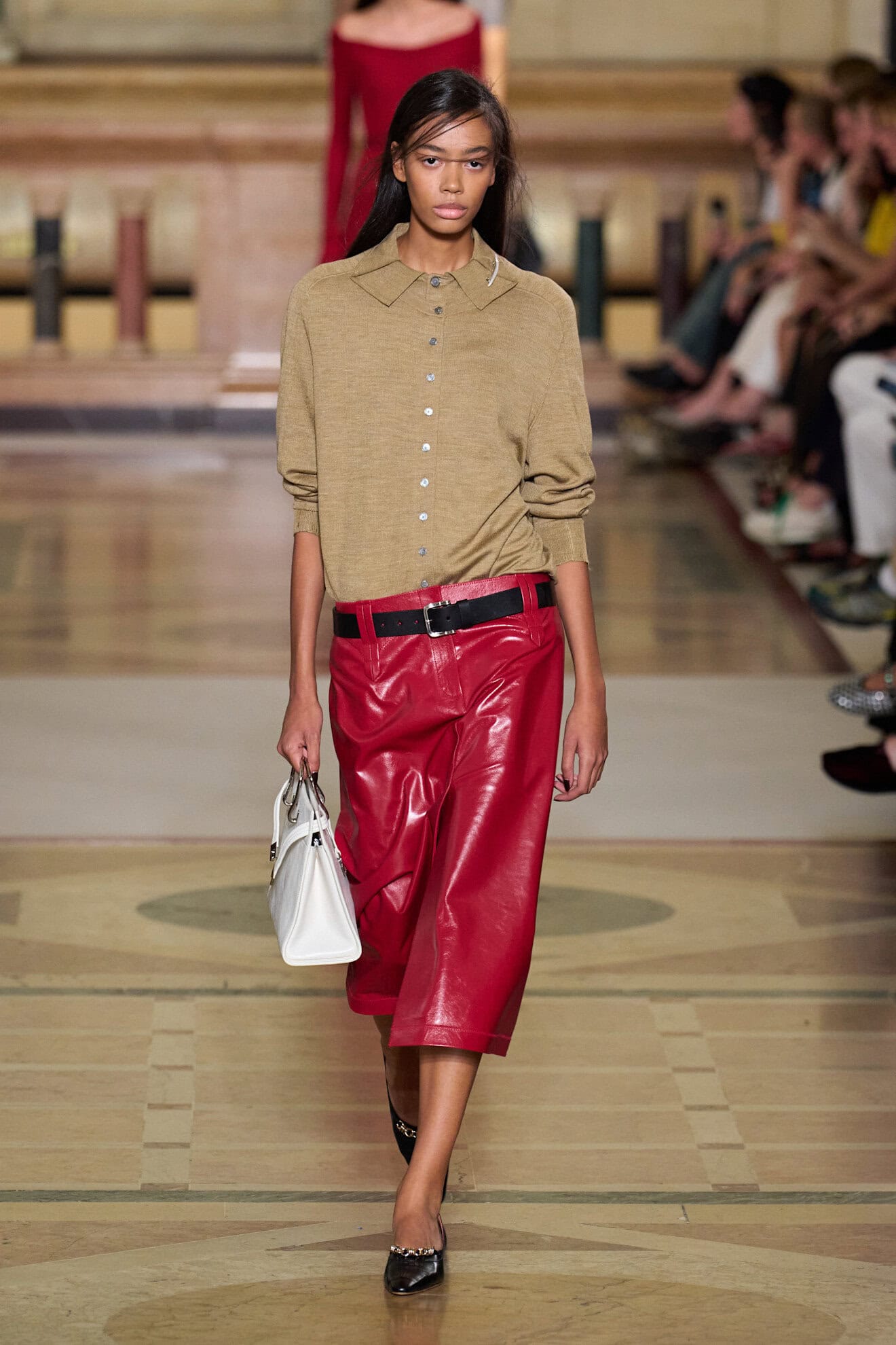
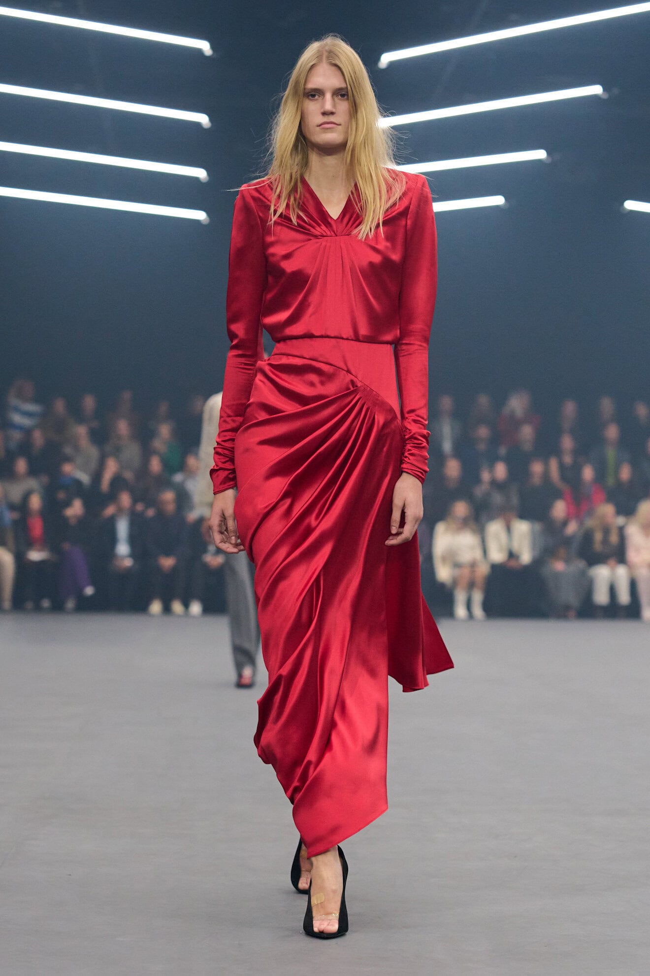
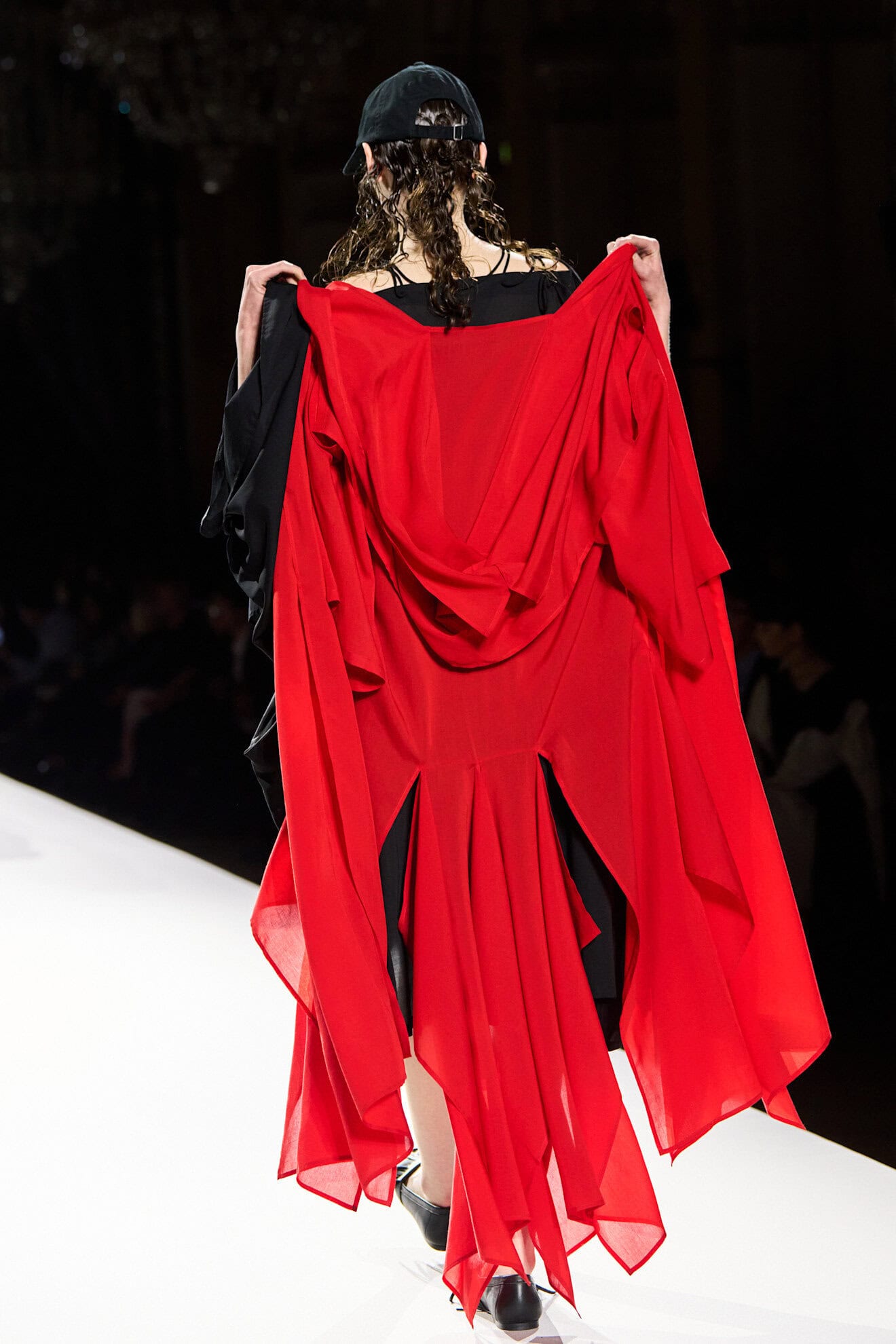
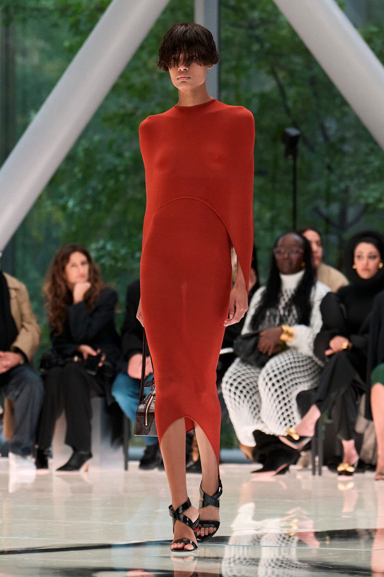
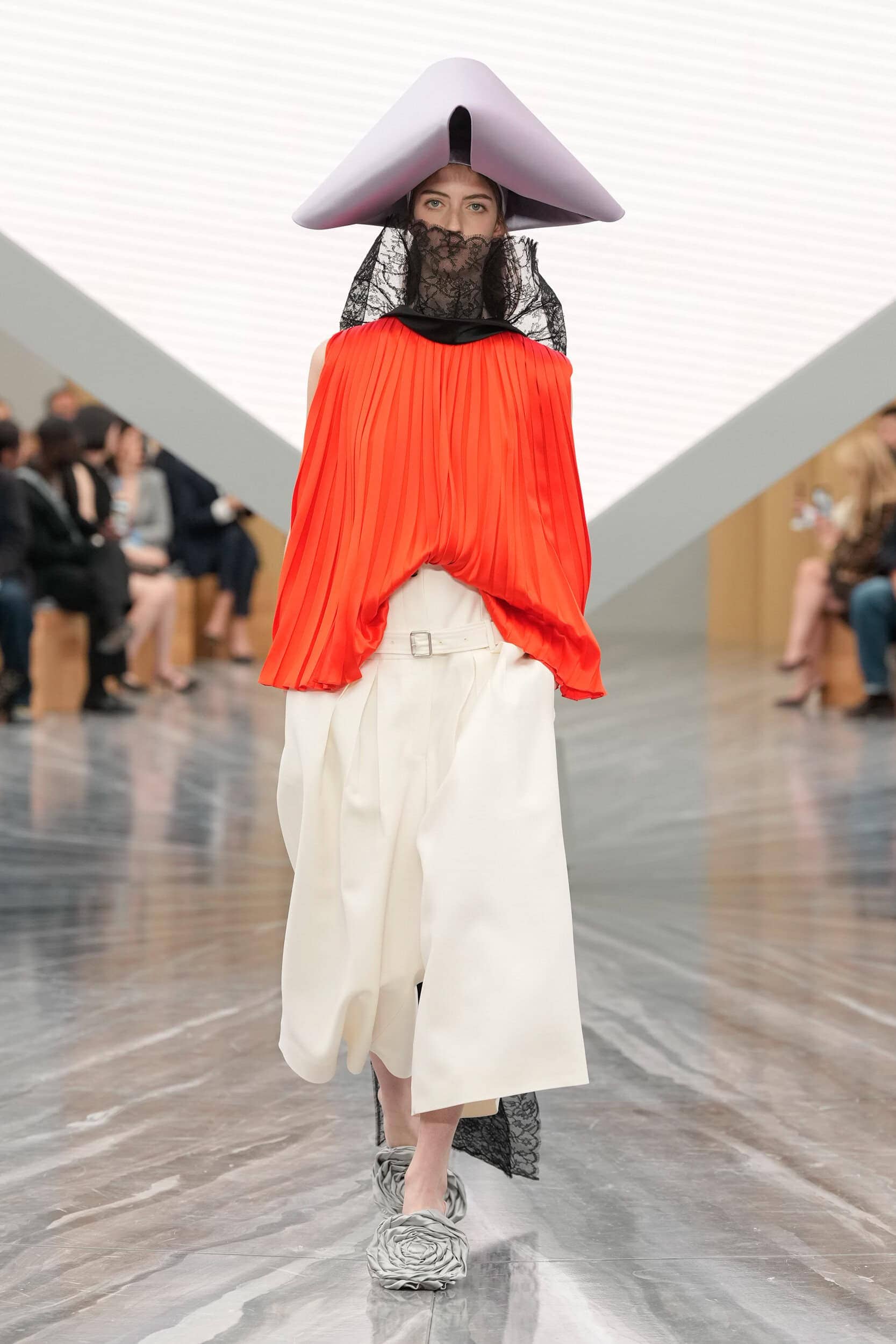
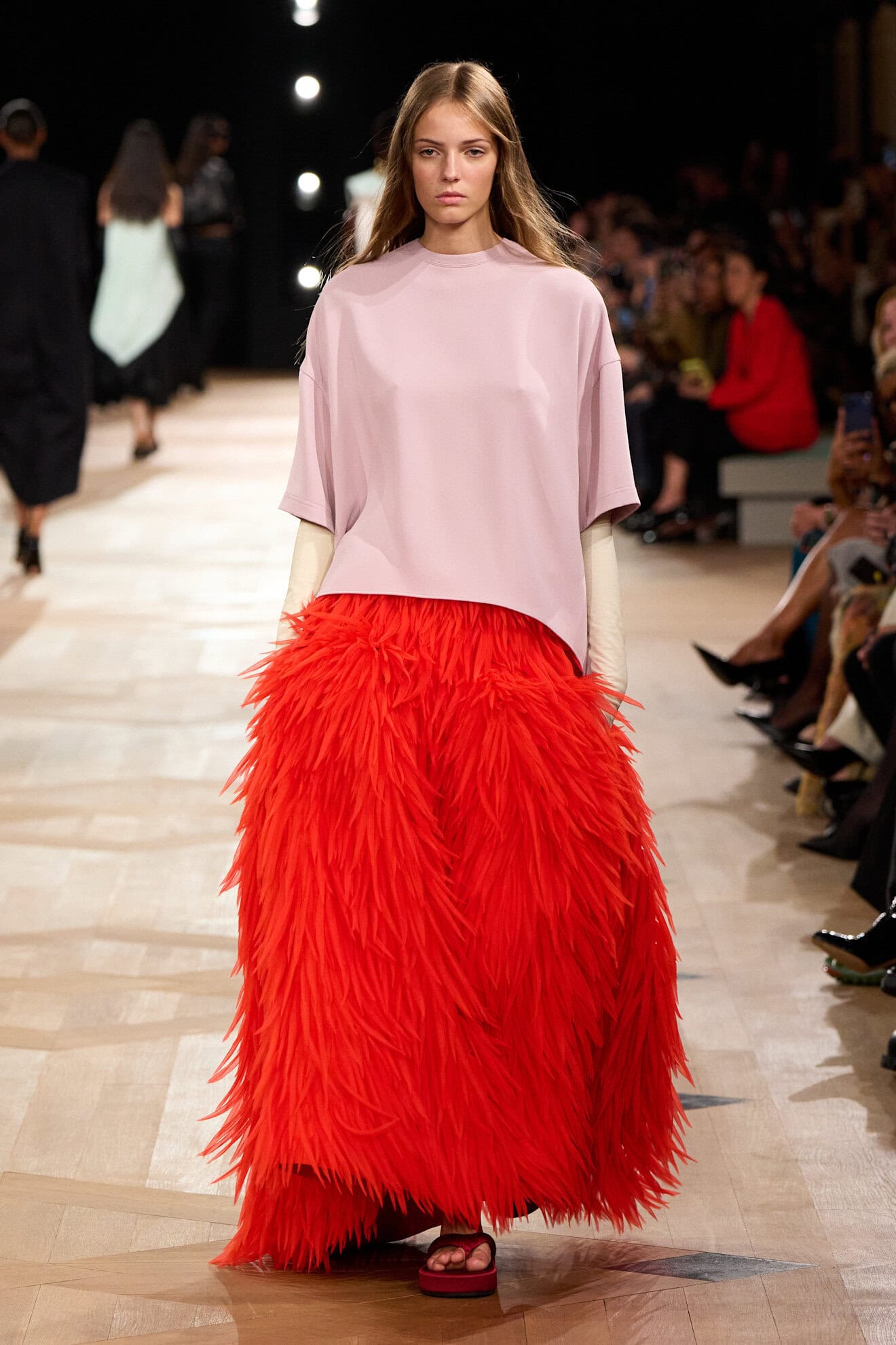
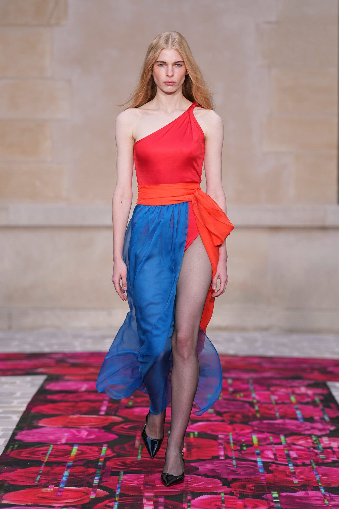
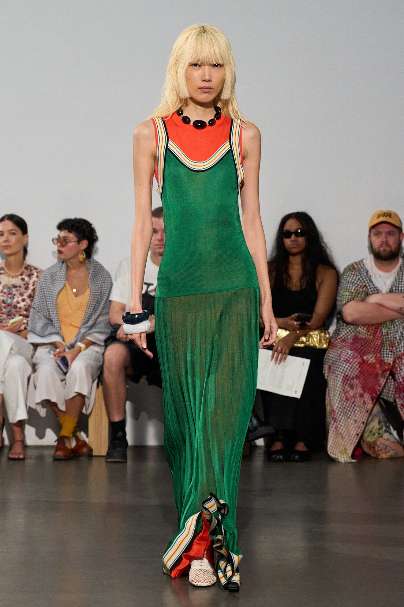
Richer In Red
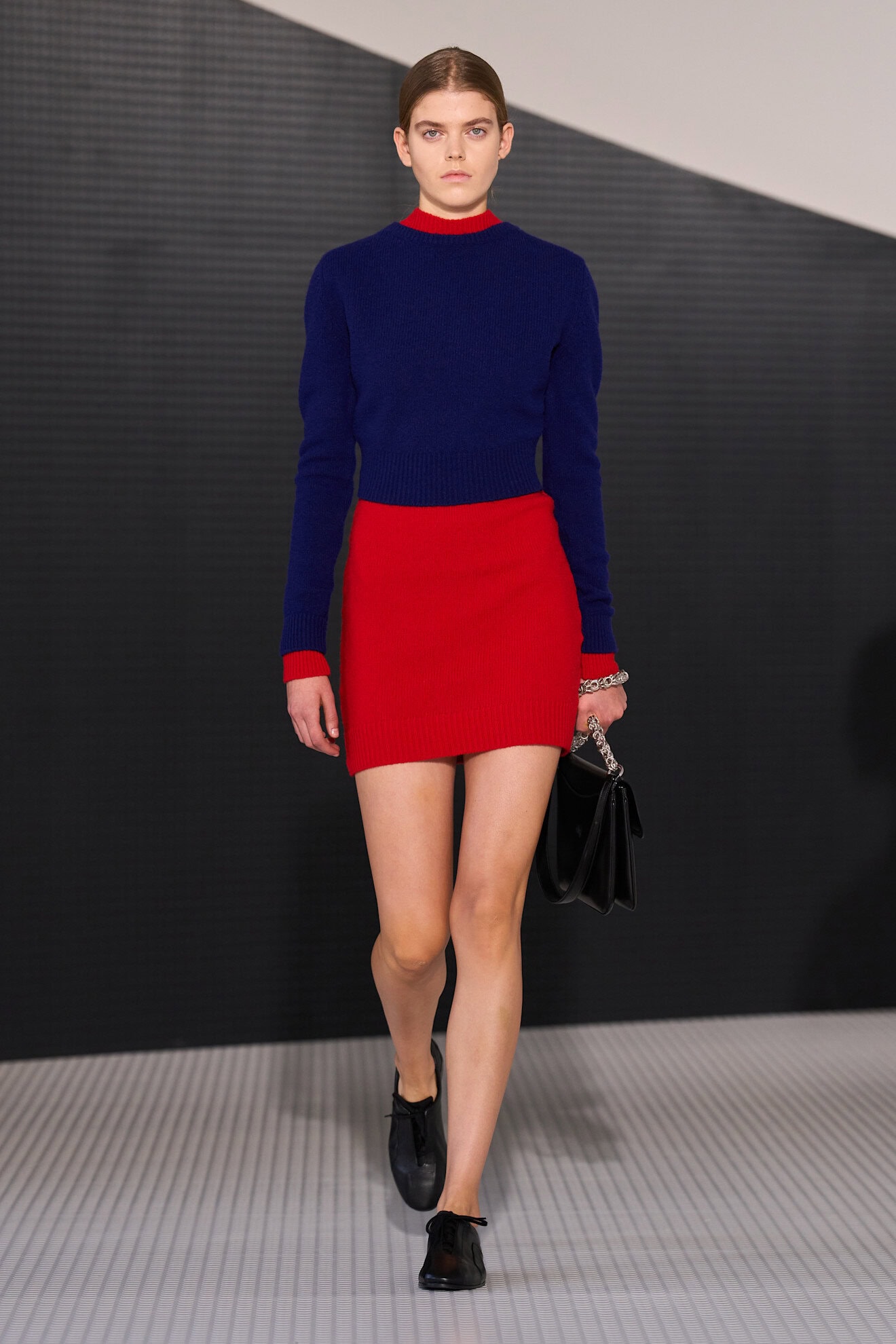
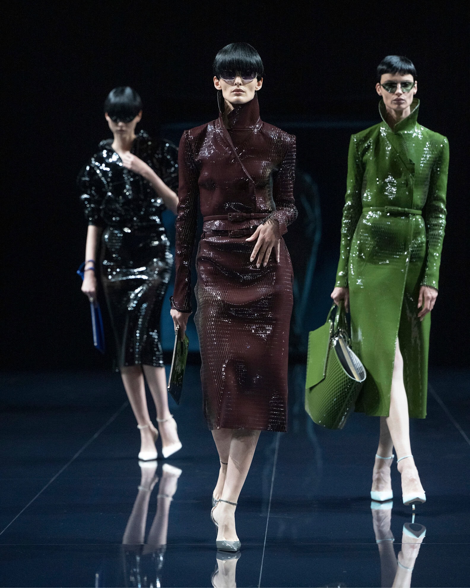
Red has morphed into an annual must-have, whatever the season, mainly for its bold and powerful connotations. From deep burgundy shades (revived in part by Sabato De Sarno’s Ancora Red underlining his time at Gucci) to lipstick red, this is the grown up side to softer pink tones. Styled head-to-toe designers didn’t shy away from encouraging women to take on the colour as a statement of their confidence in a world that is trying to dial down their influence.
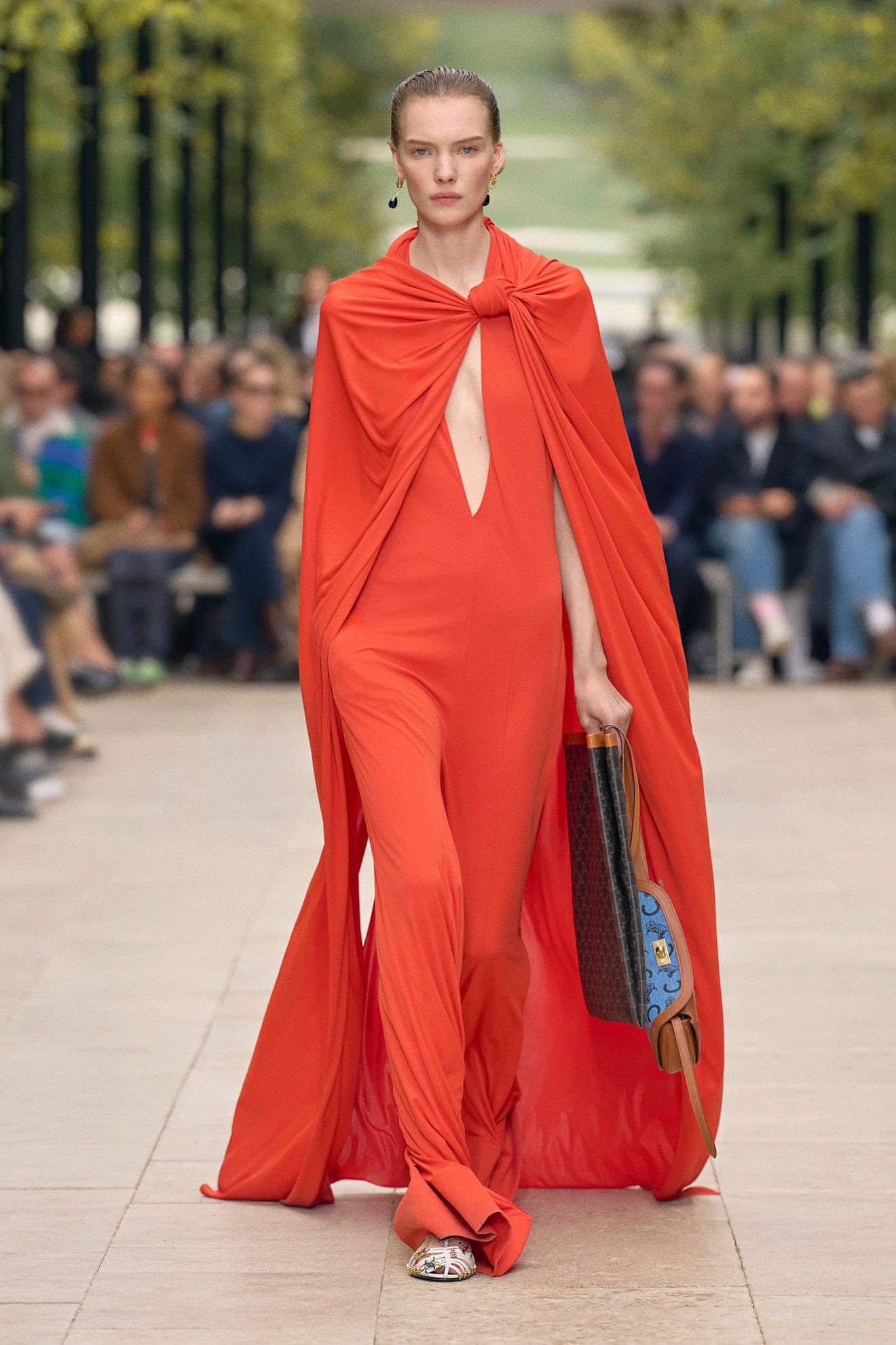

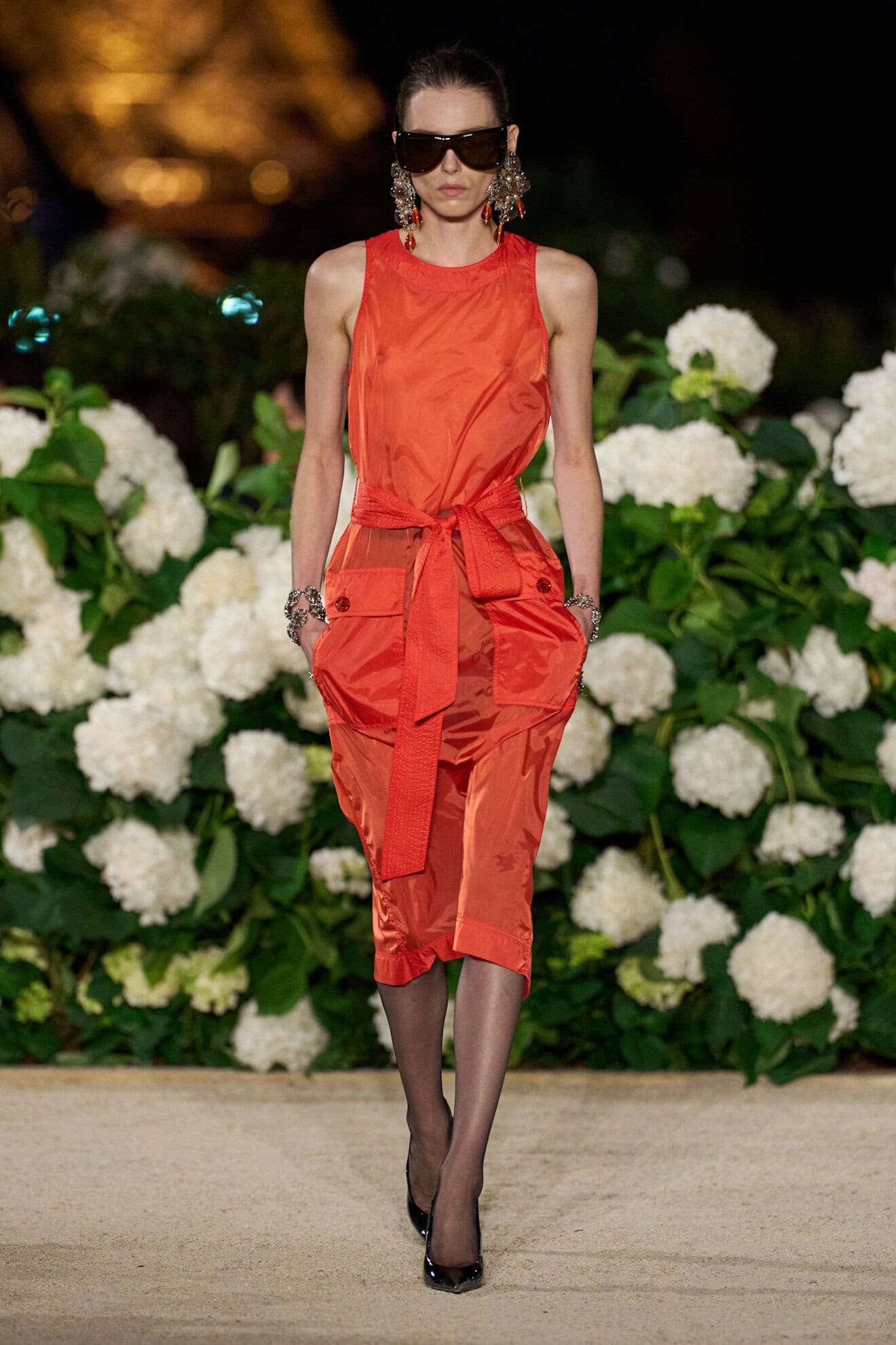
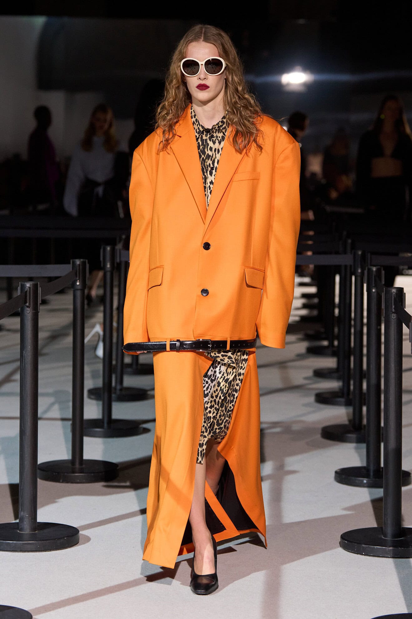
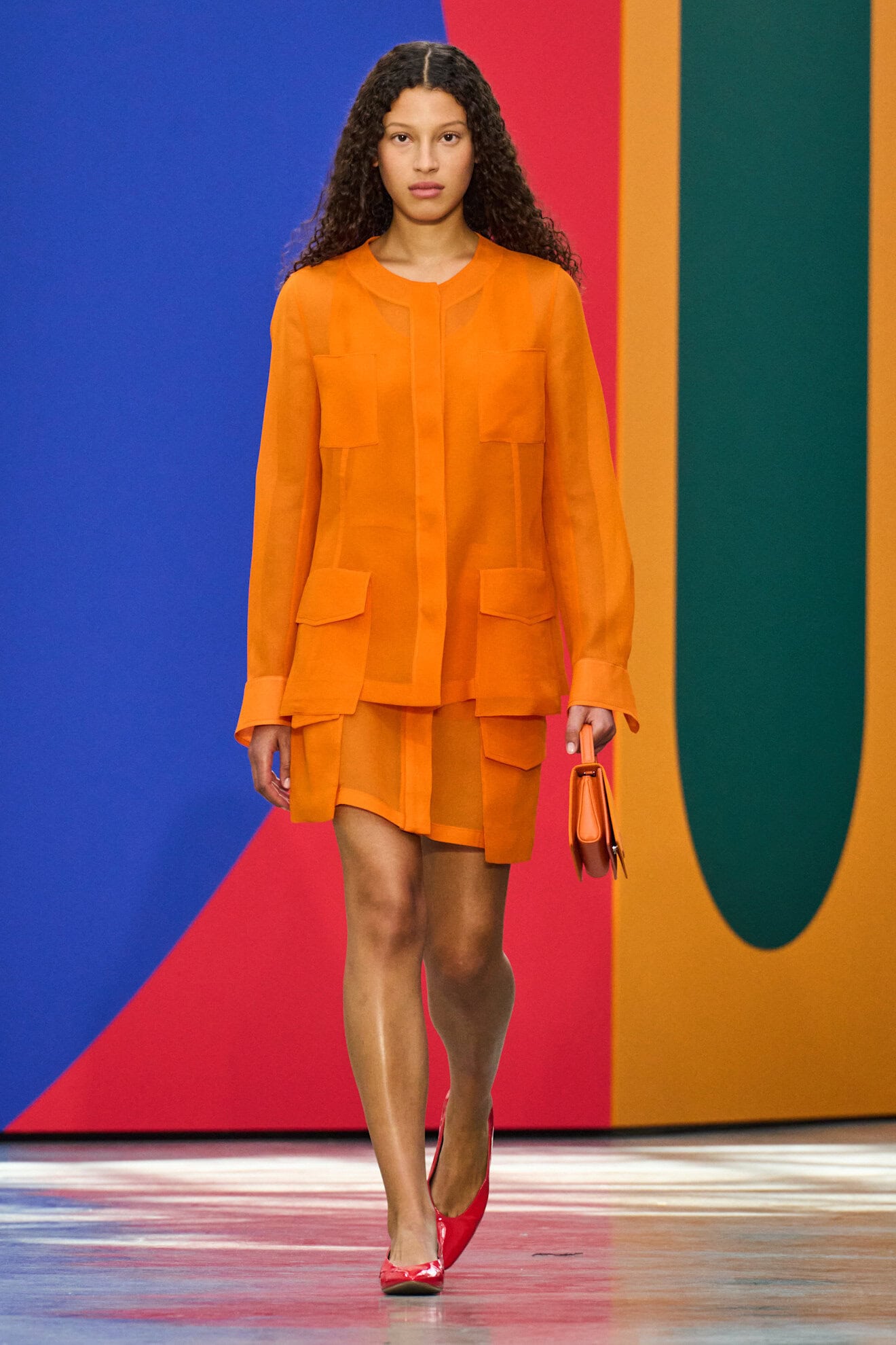
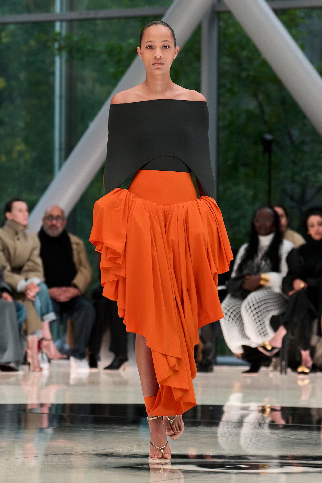
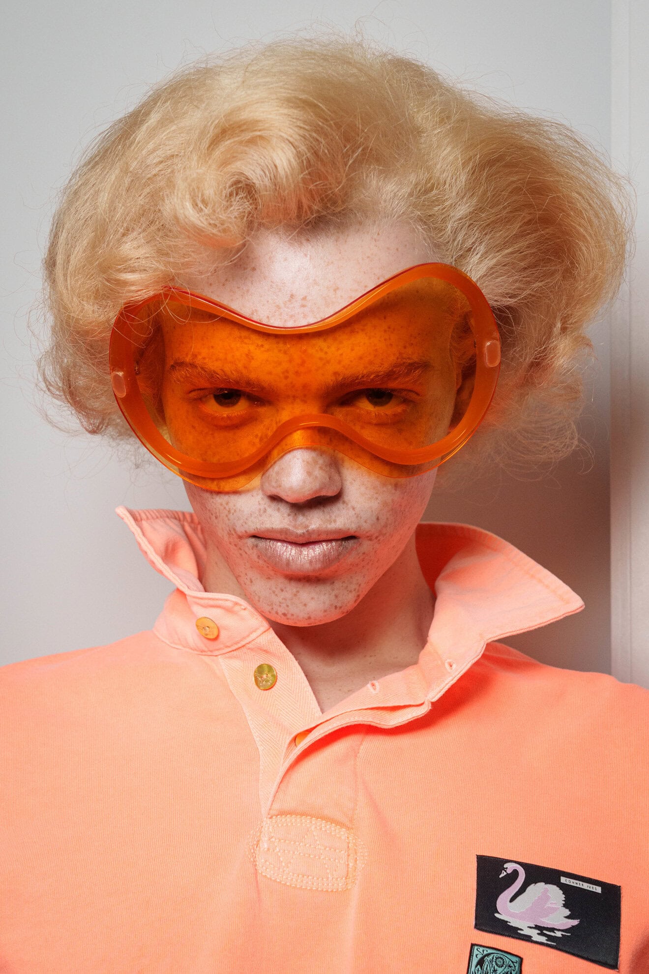
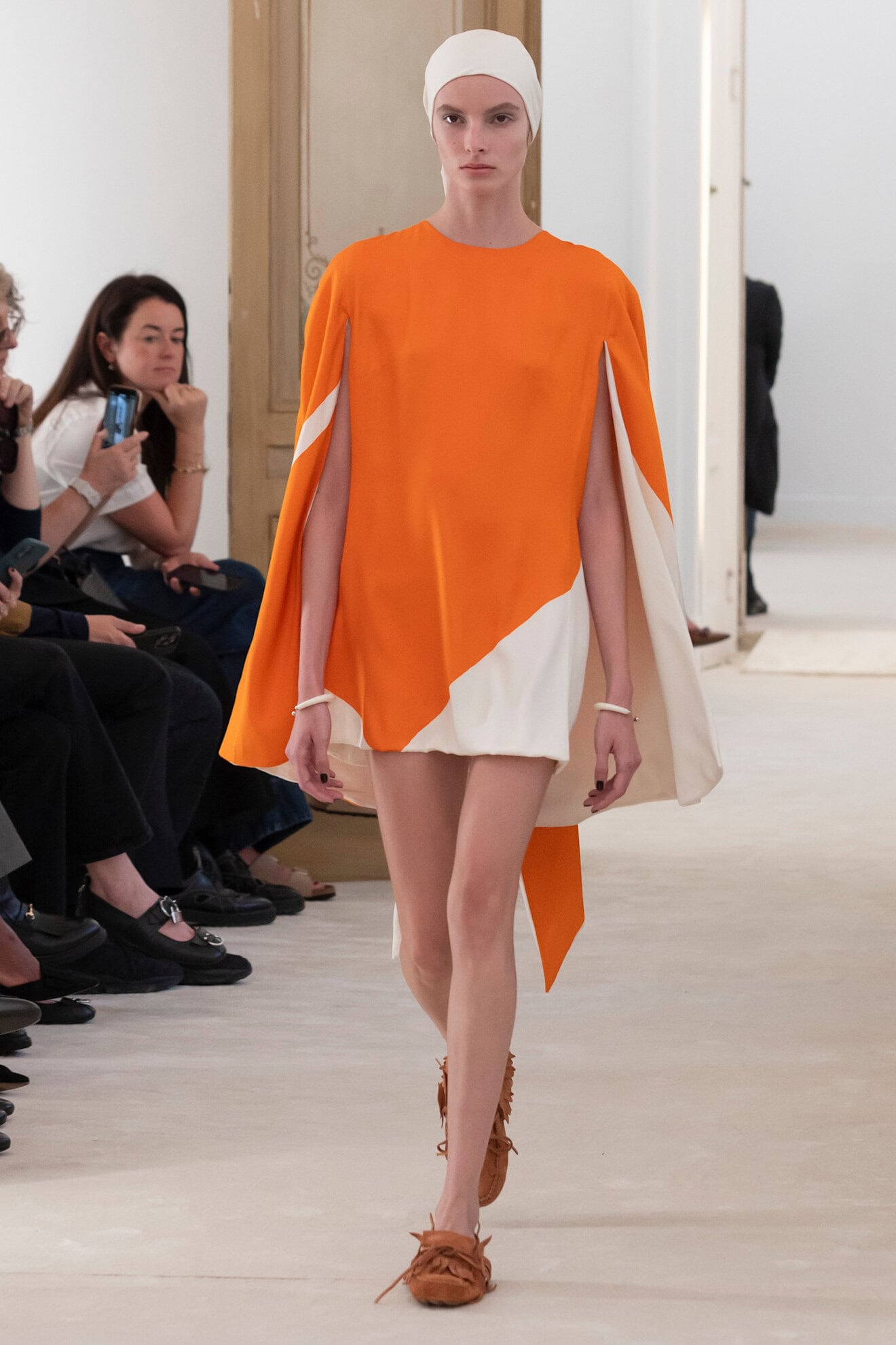
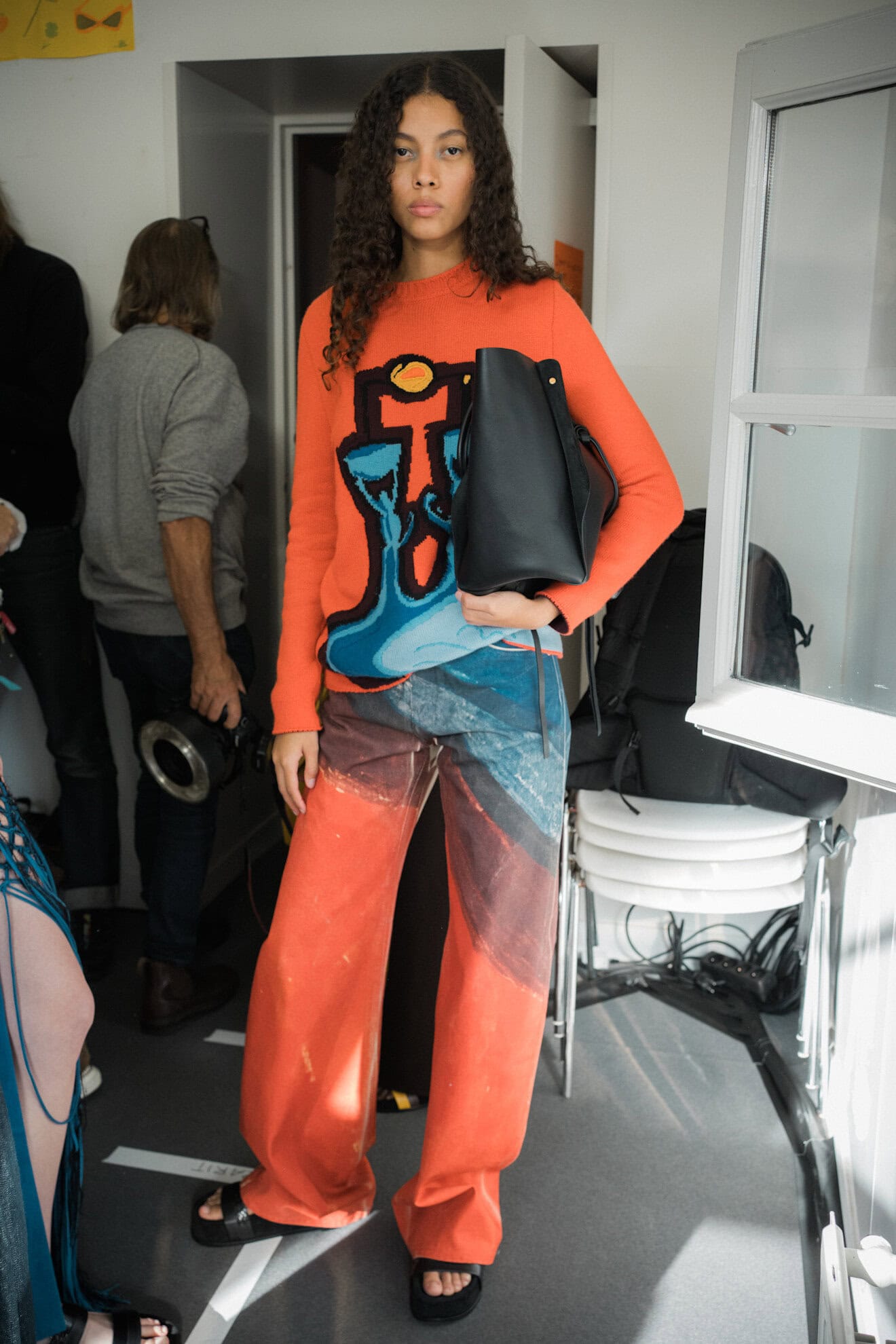
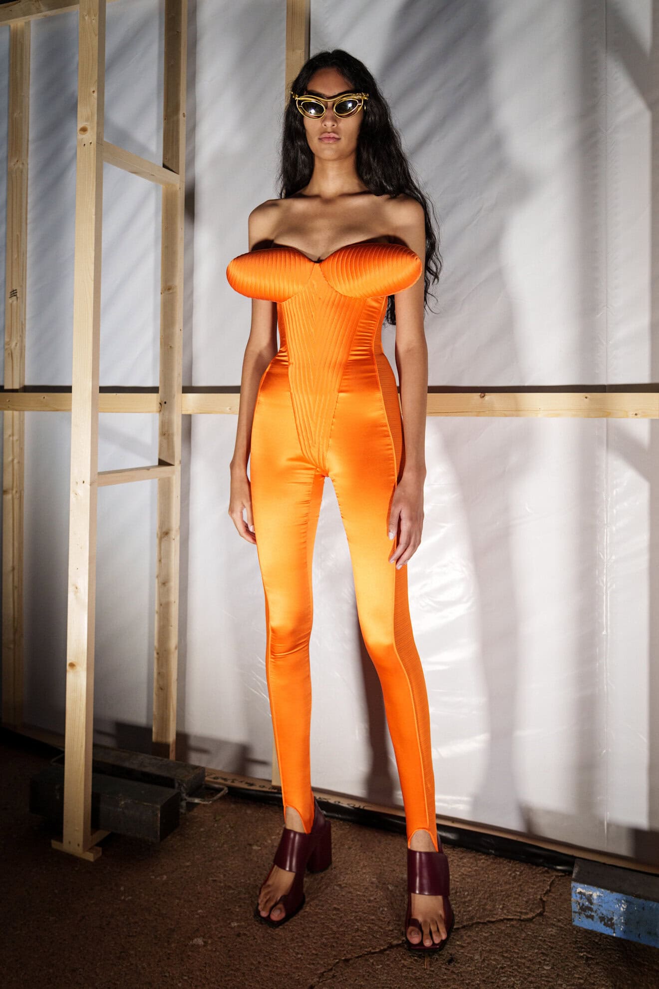
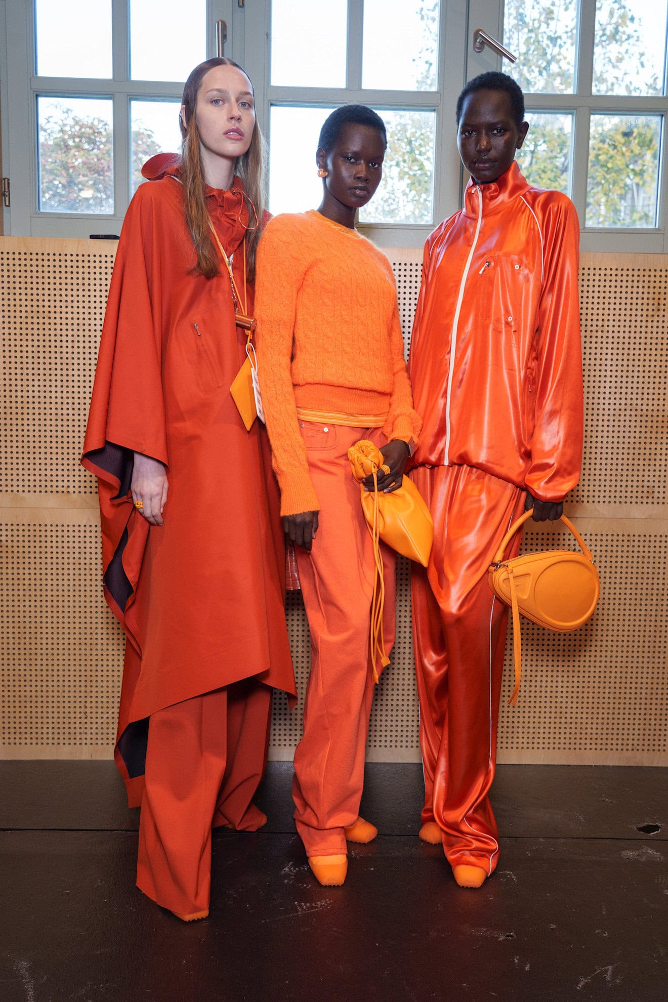
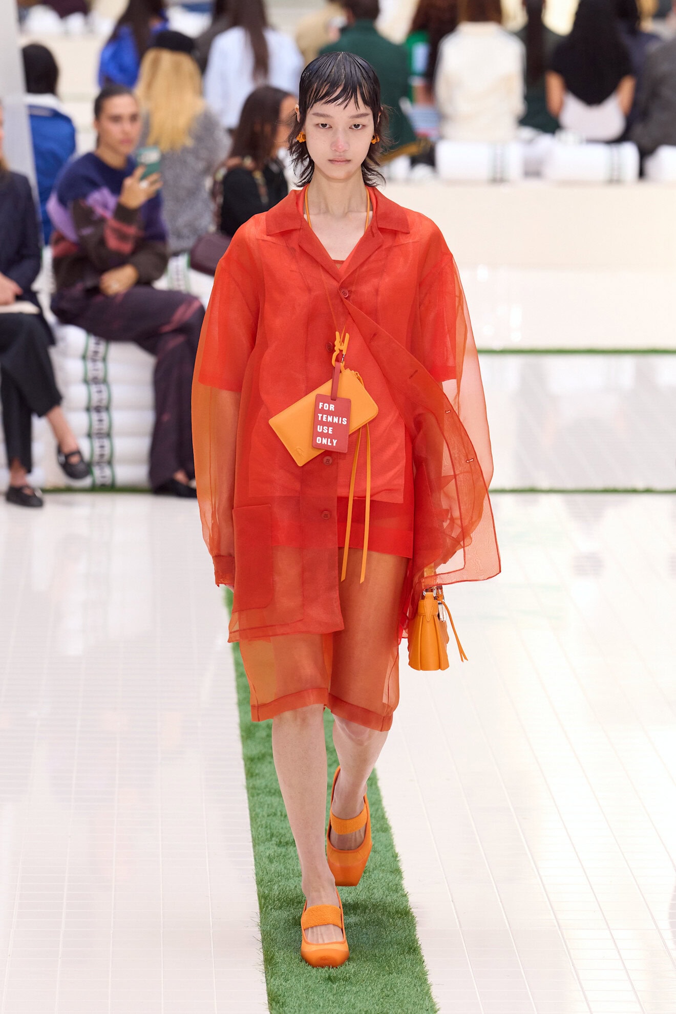
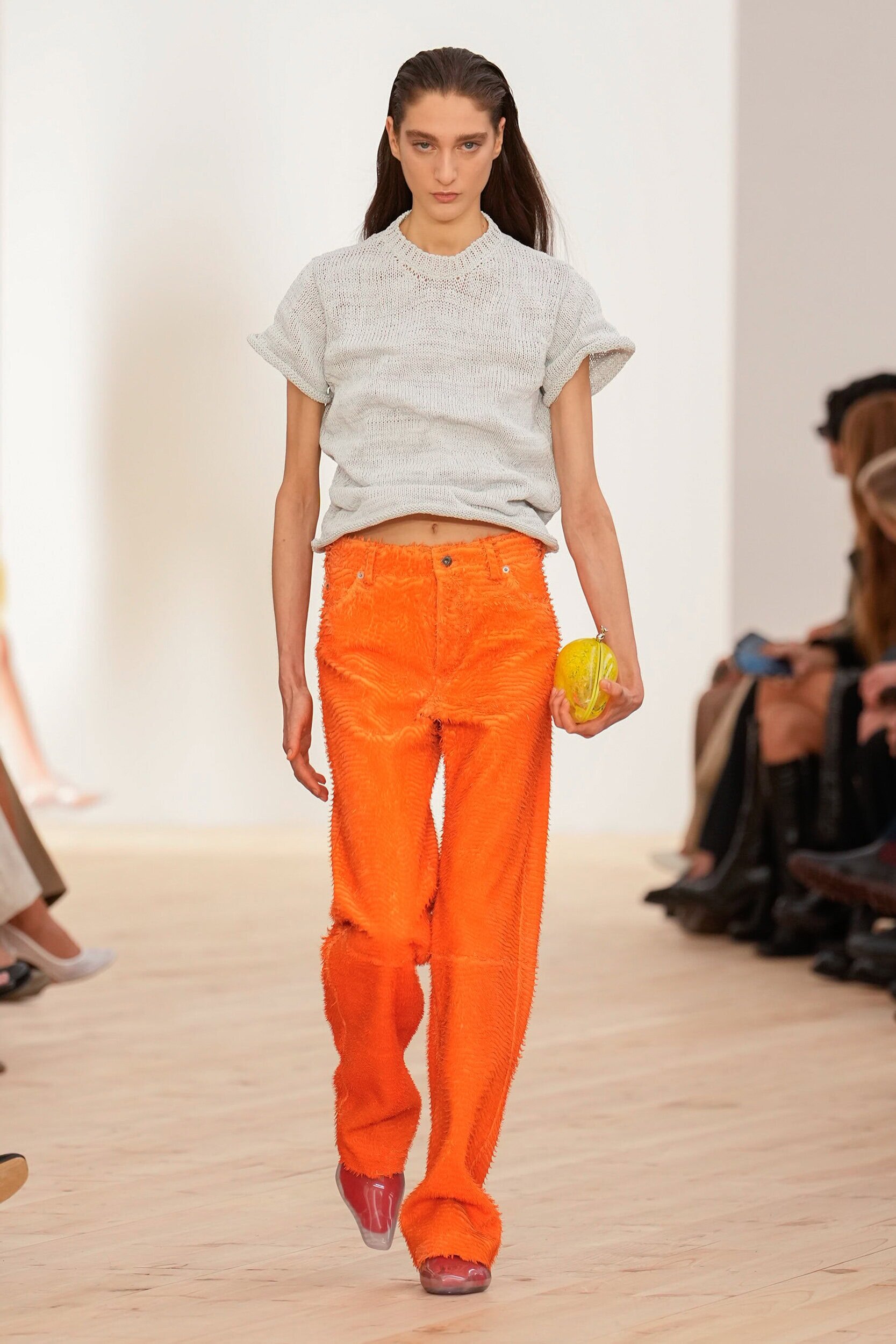
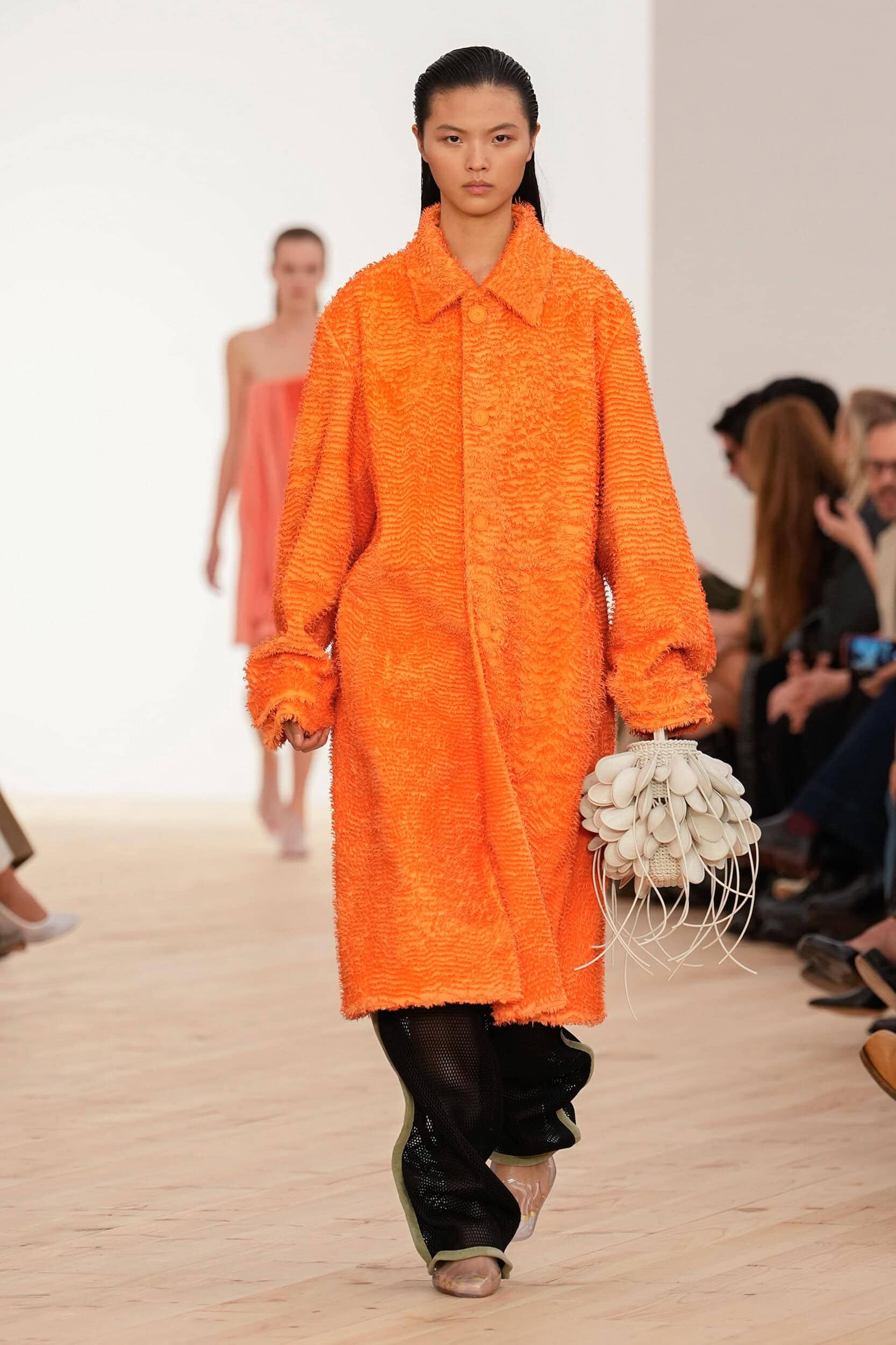
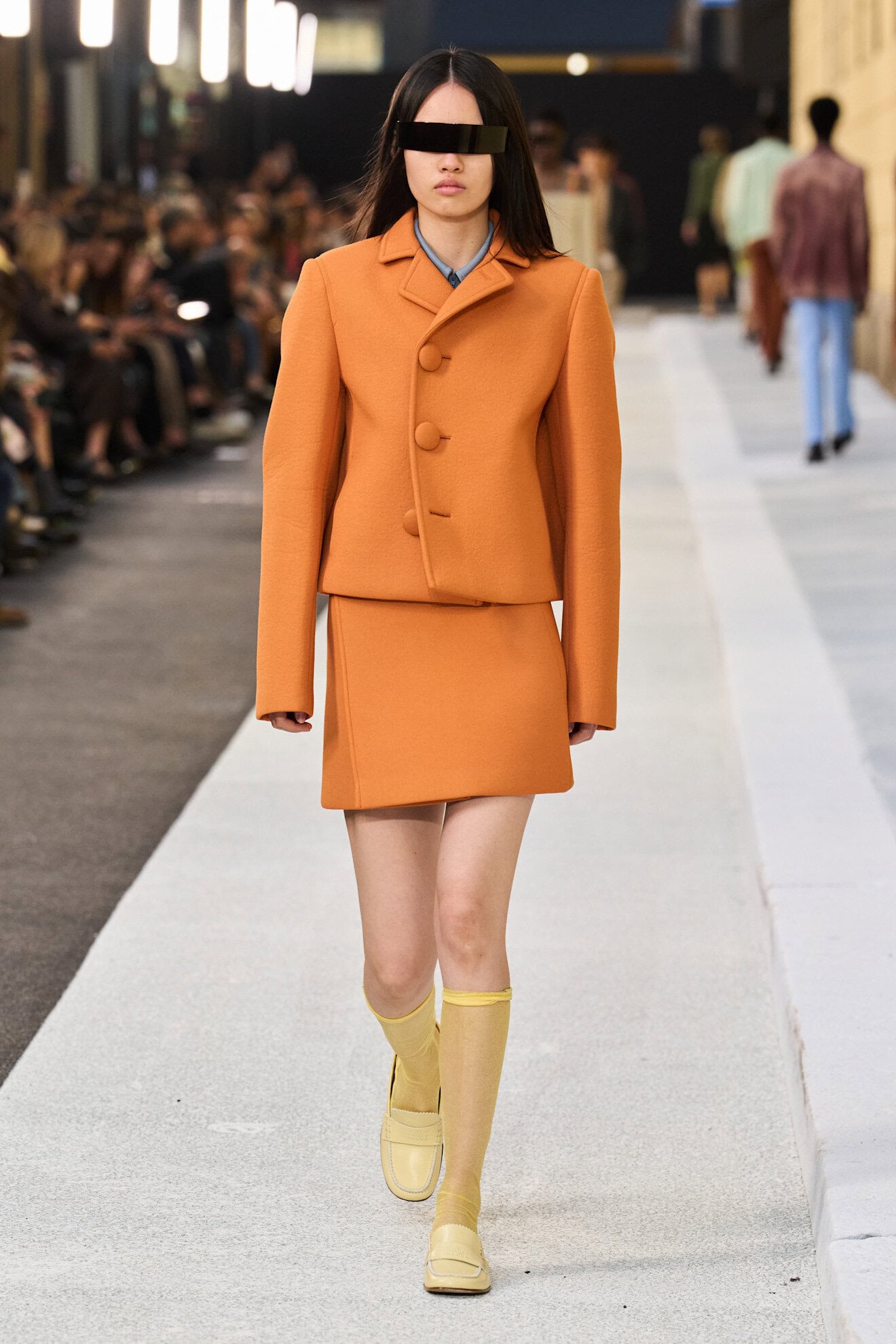
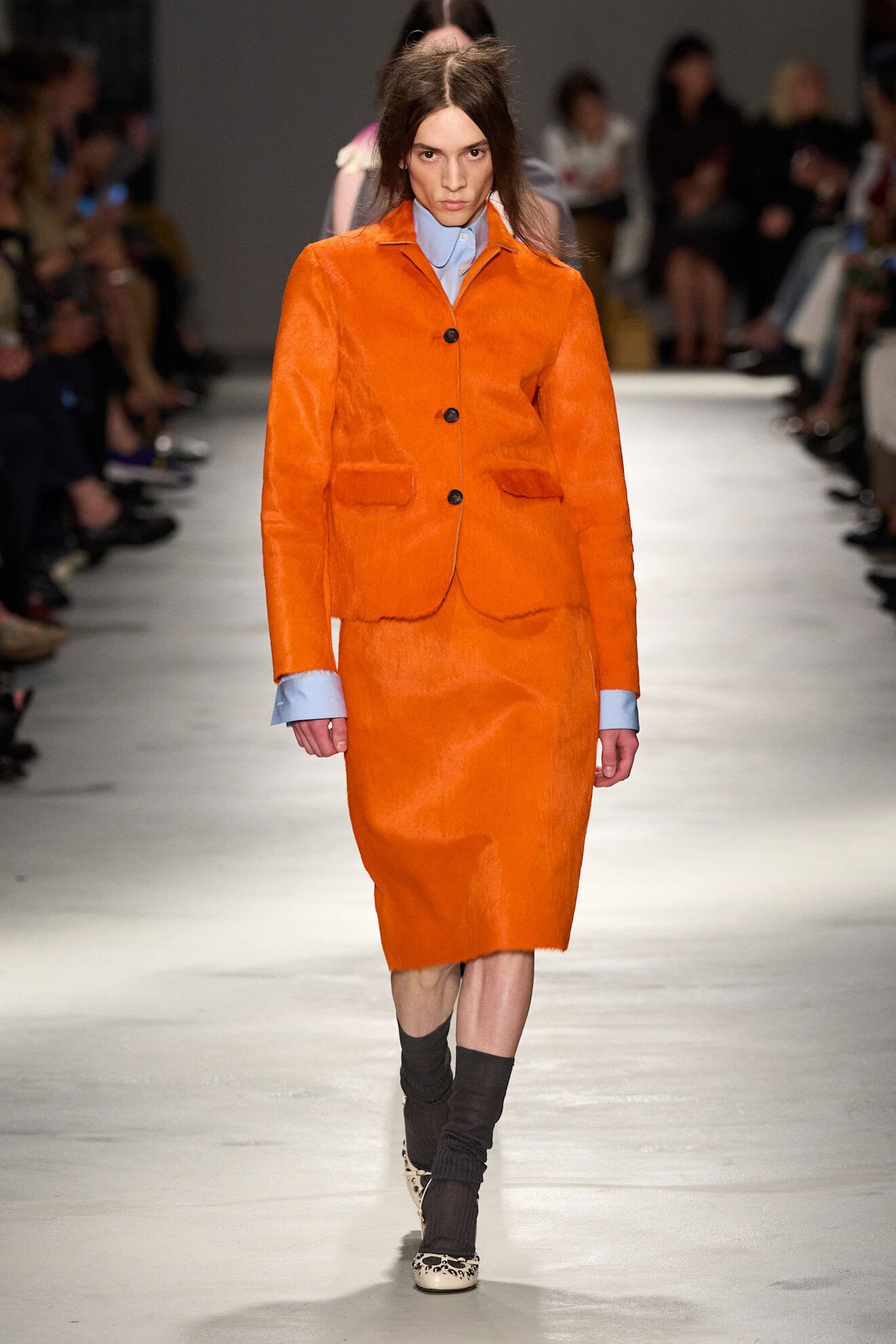
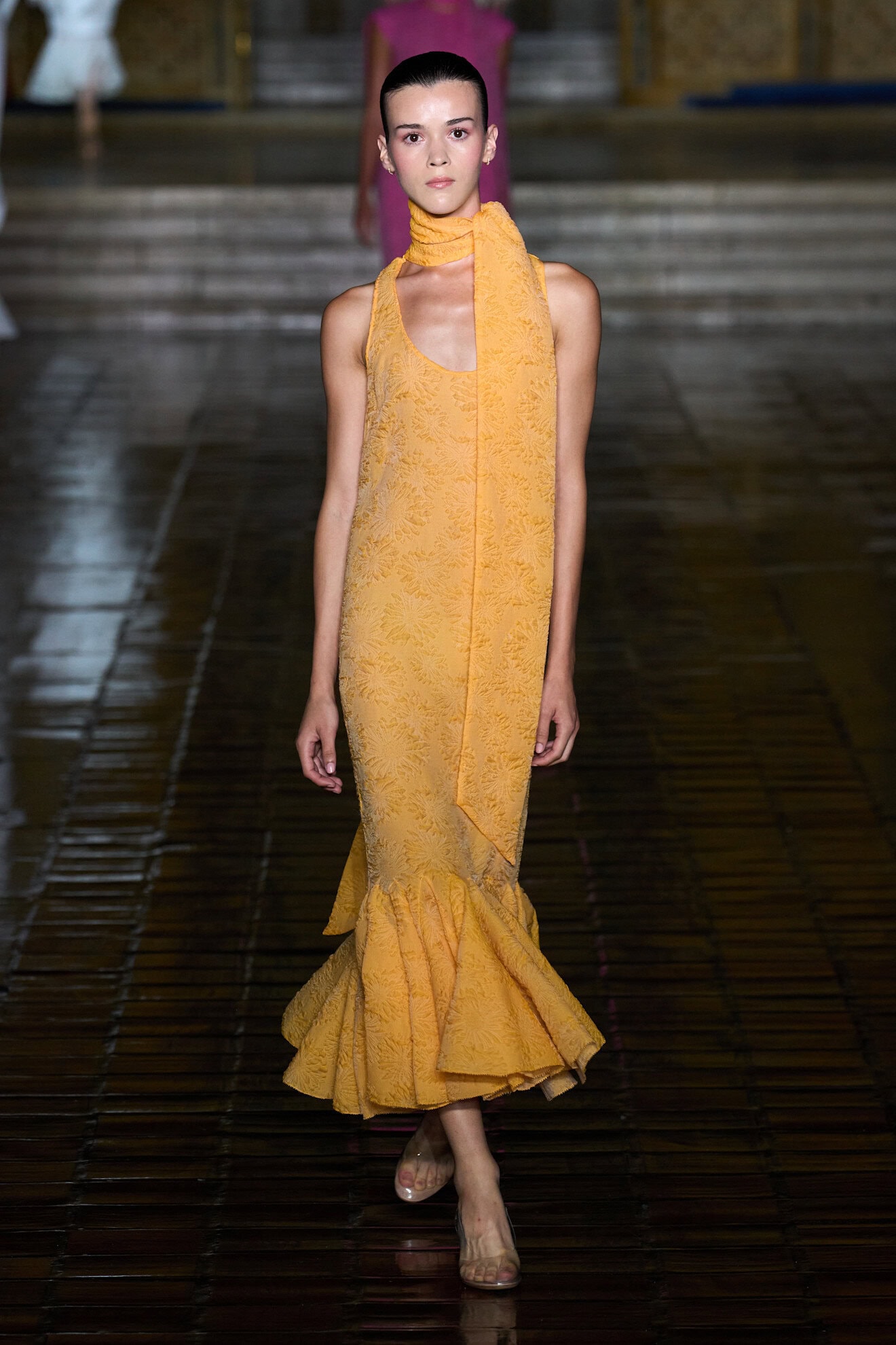
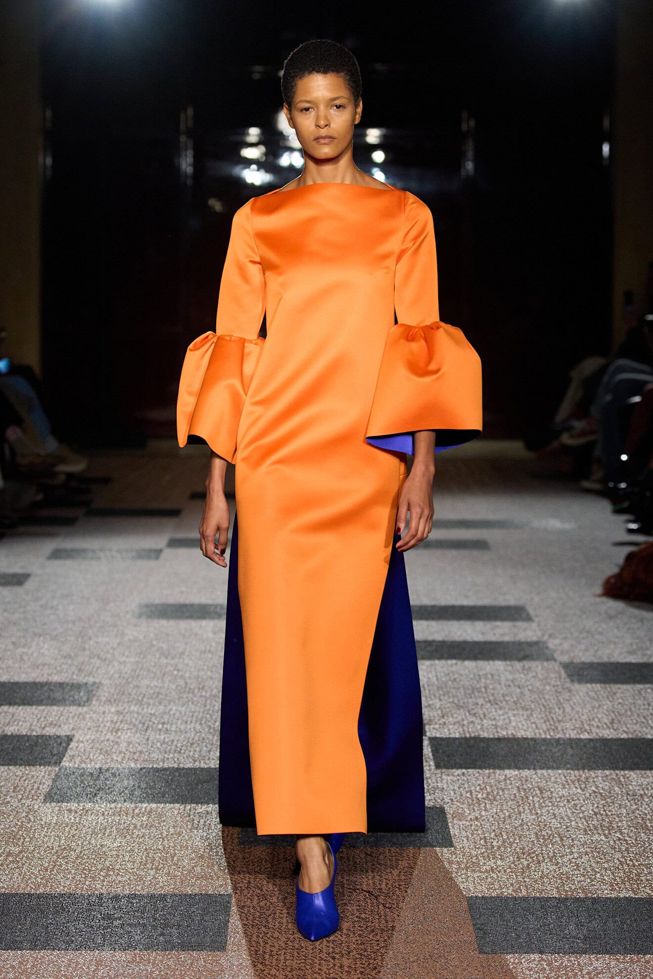
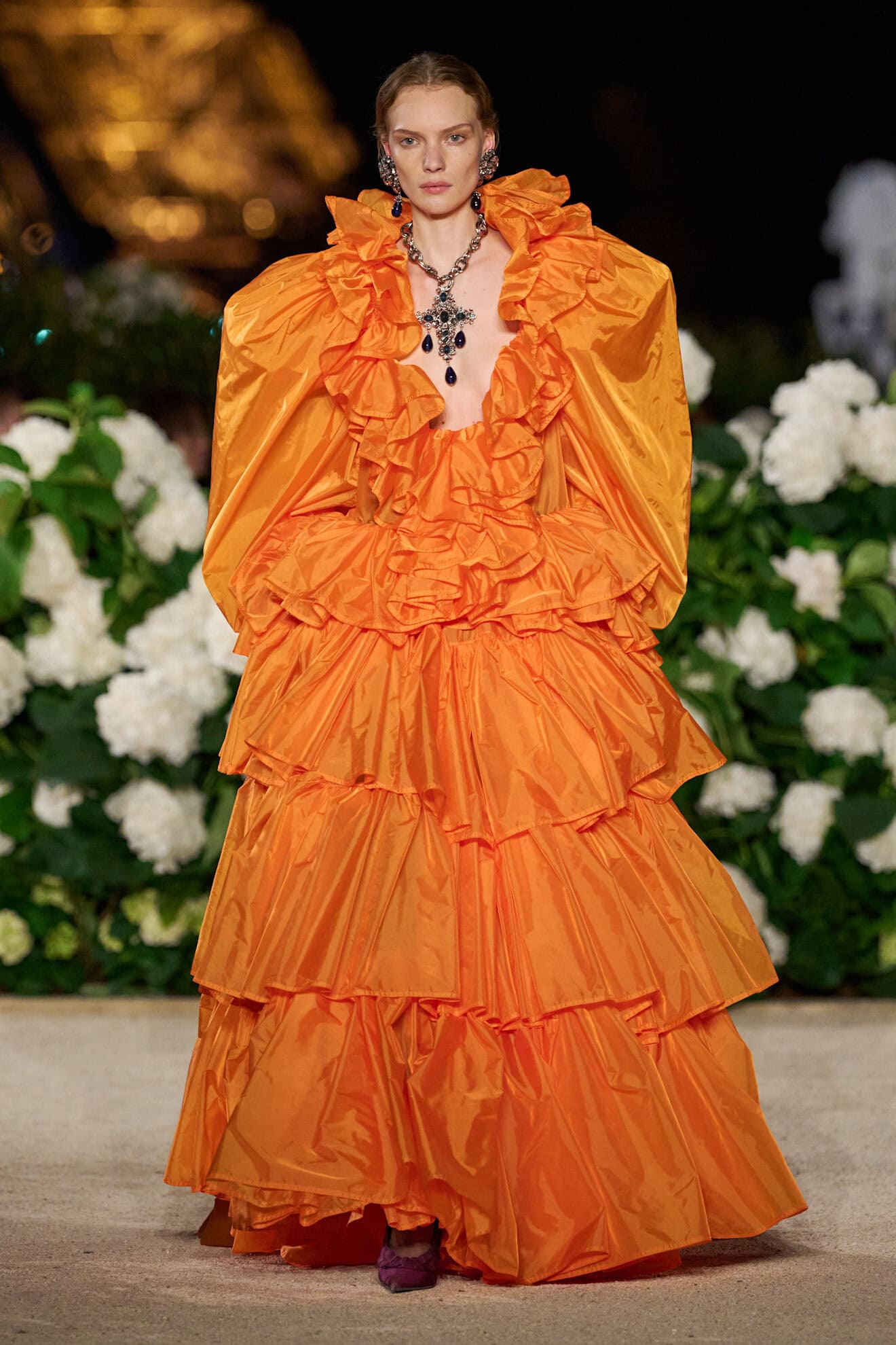
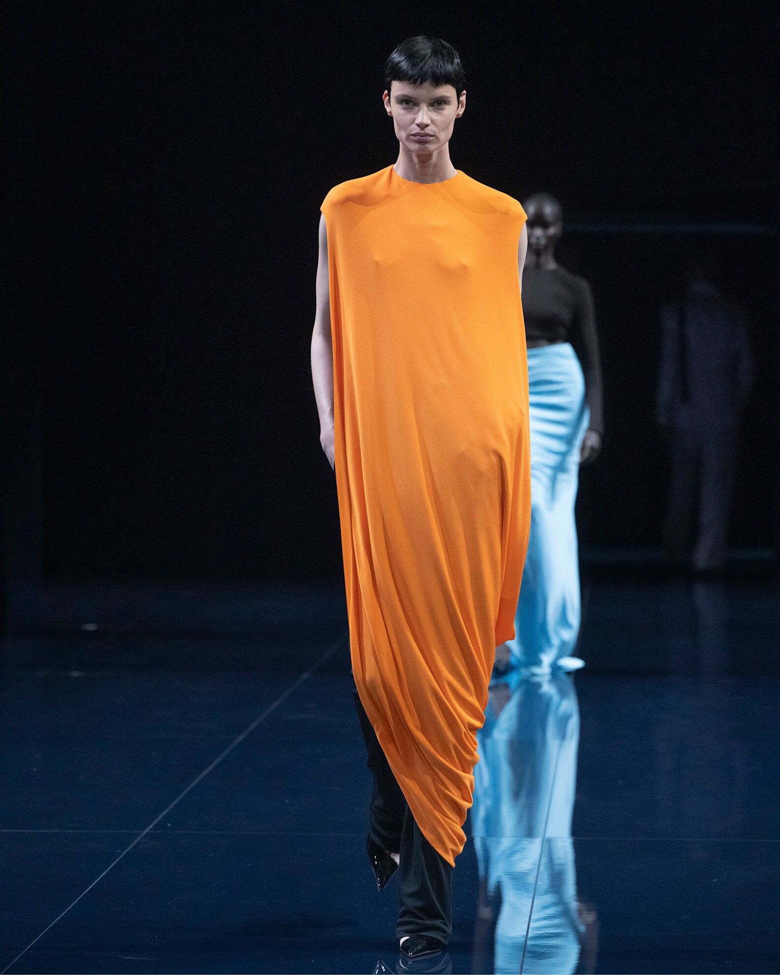
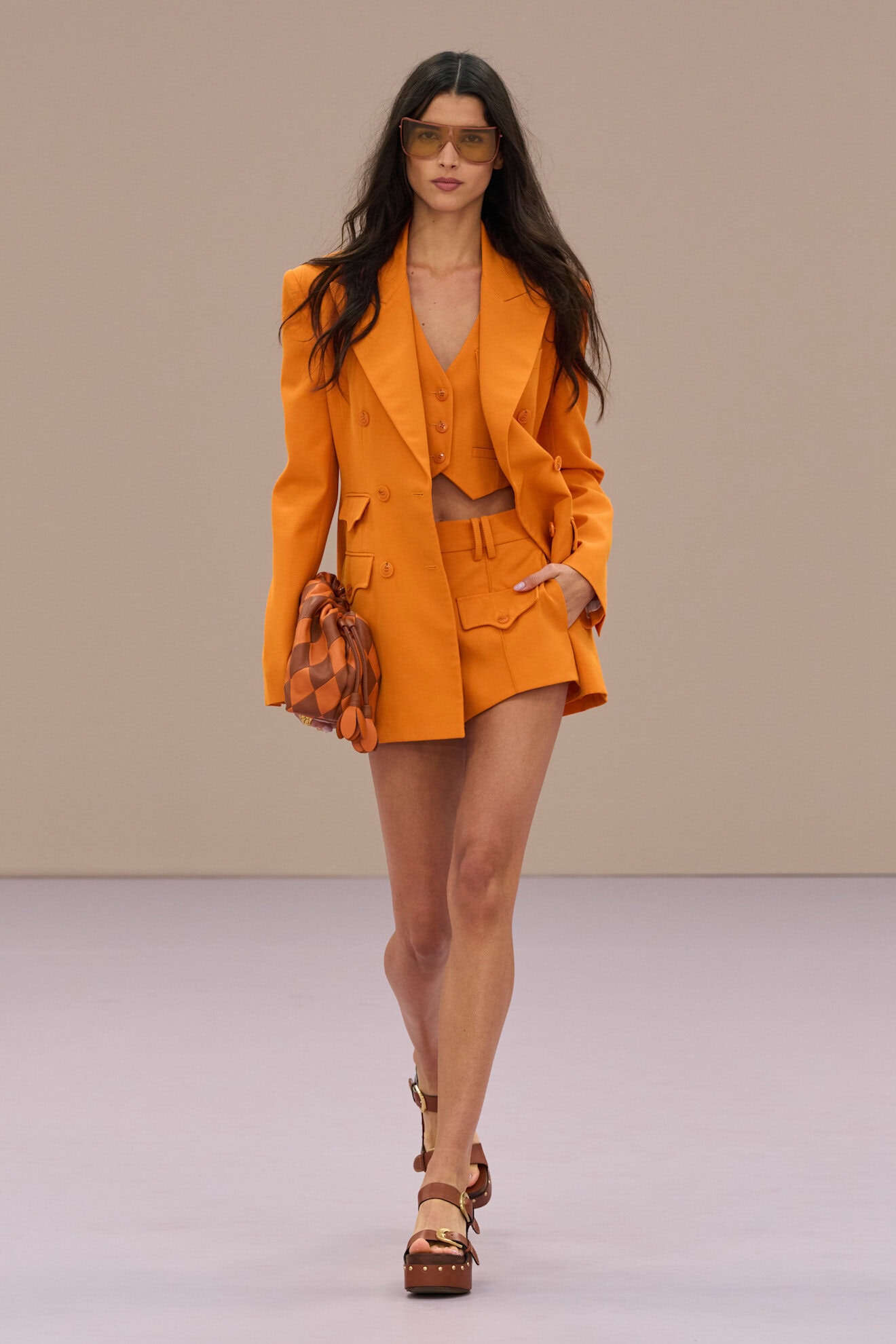
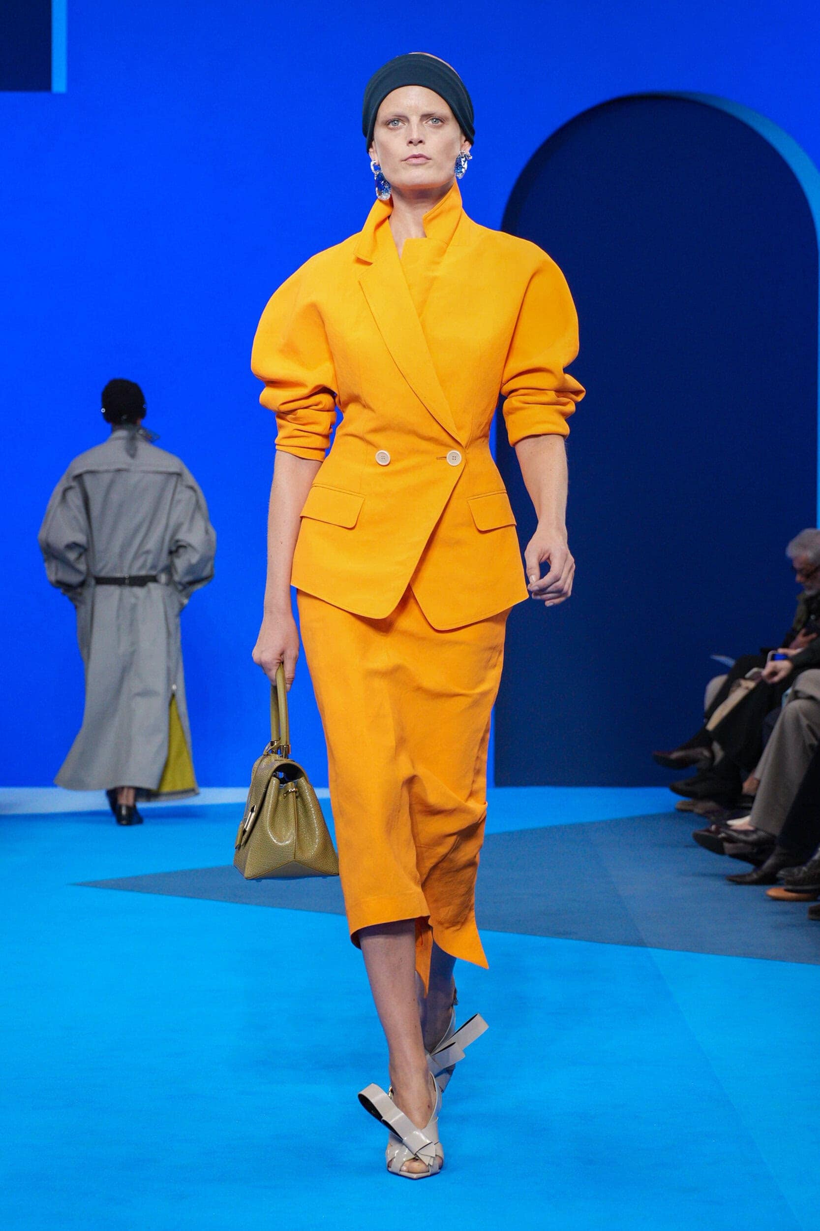
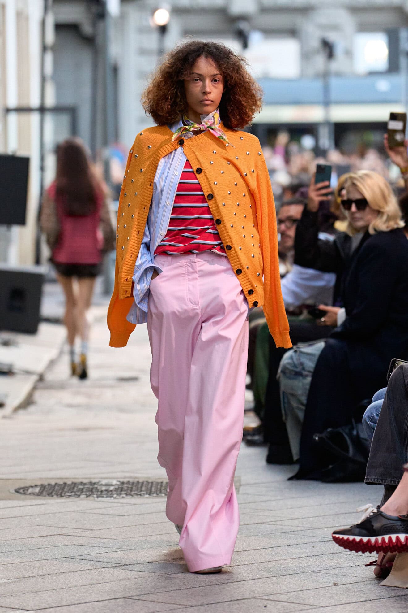
Orange Alert
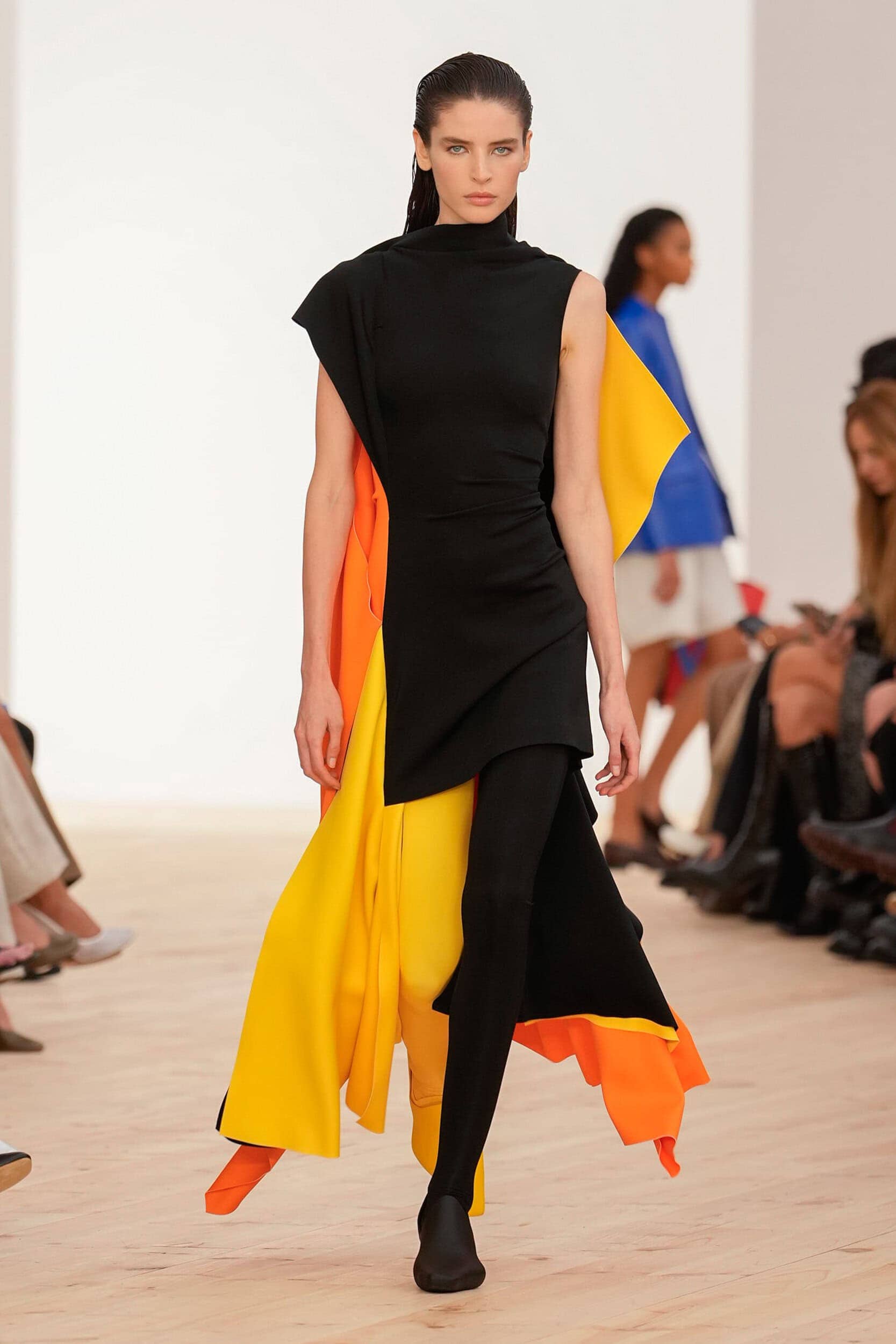
Nothing spells summer like citrus, and along with lemon yellow, tangerine will whet our appetites for zesty shades next year.
Call it the Taylor Swift effect, but coinciding with this season runways, her album launch ‘The life of a Showgirl’ also exalted all things orange with her glitter-infused album art. Chosen for the way in which it reflected the electric energy of her Eras tour, designers have simultaneously adopted the hue for these very same reasons. Floor-length occasion looks at Tom Ford, Saint Laurent and Roksanda dare wearers to be seen, skirt suits at Marie Adam-Leenaerdt, Akris, MM6 and No.21 embrace a reframing of the primness of the style, and sports fans will rejoice at the multiple ways the vibrant tone can be harnessed across technical capes, high-shine tracksuits, and sheer separates for time spent on and off the field.
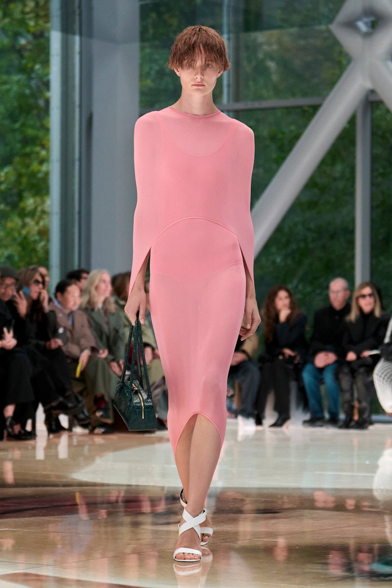
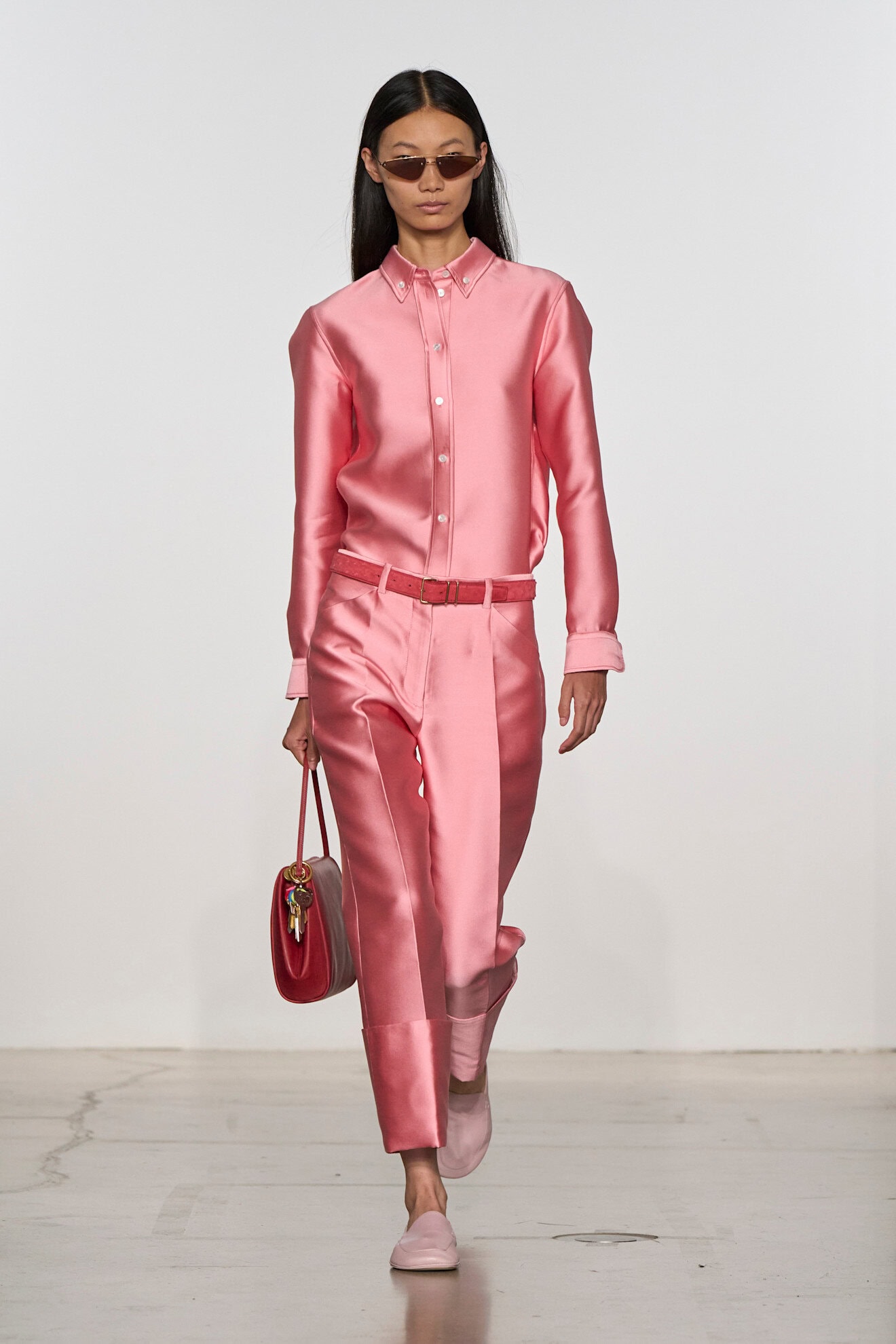
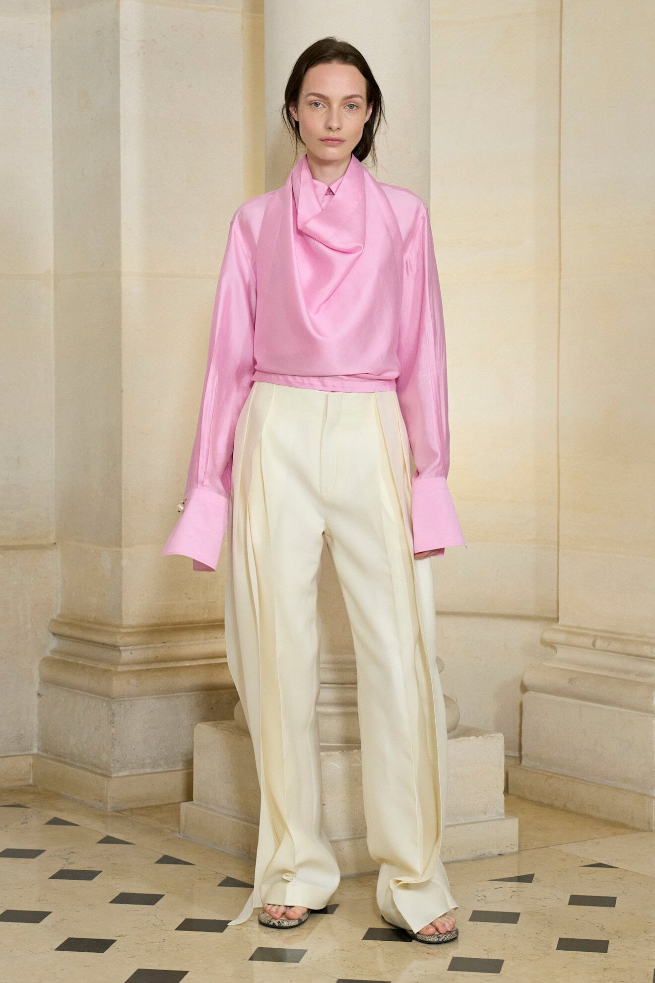
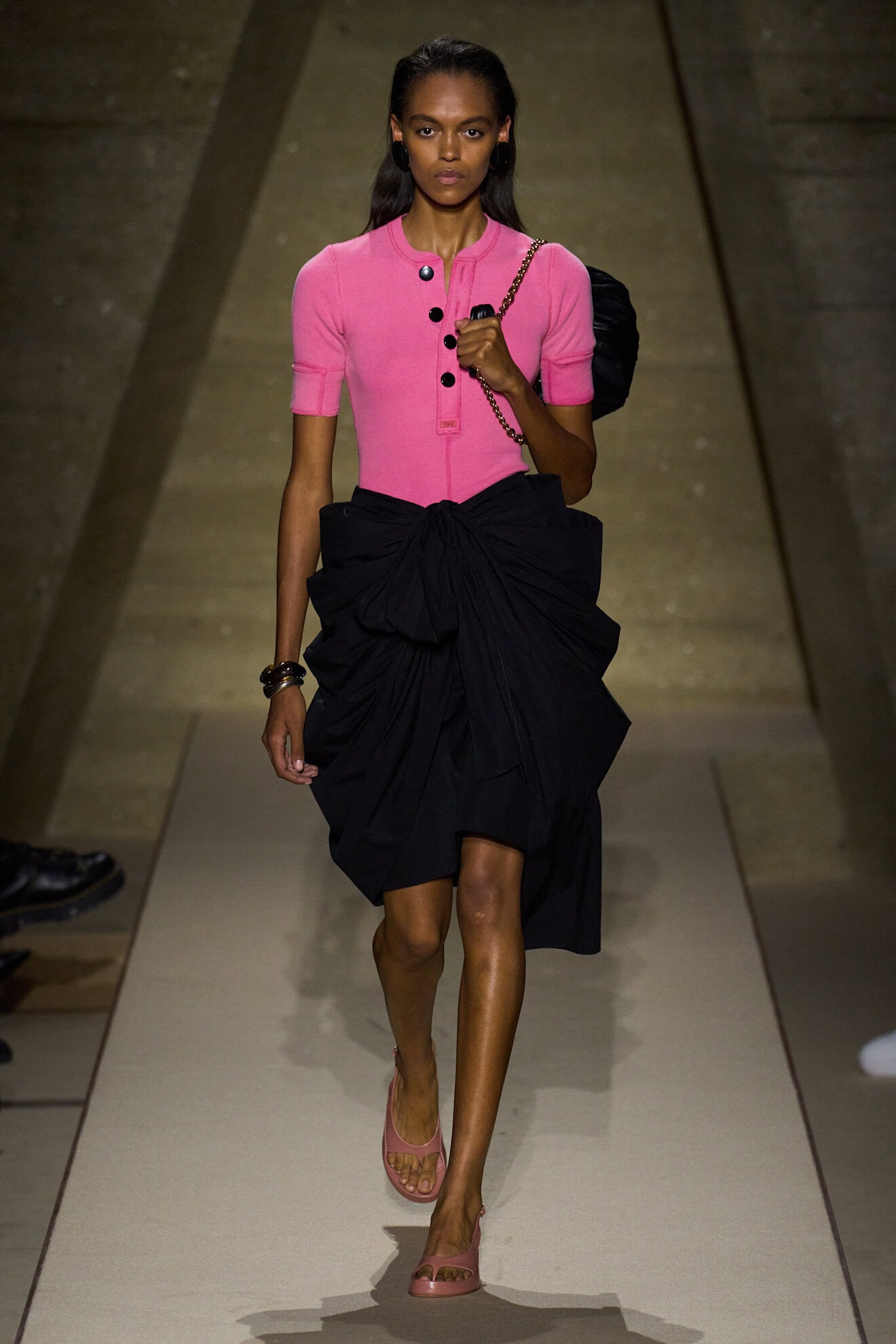
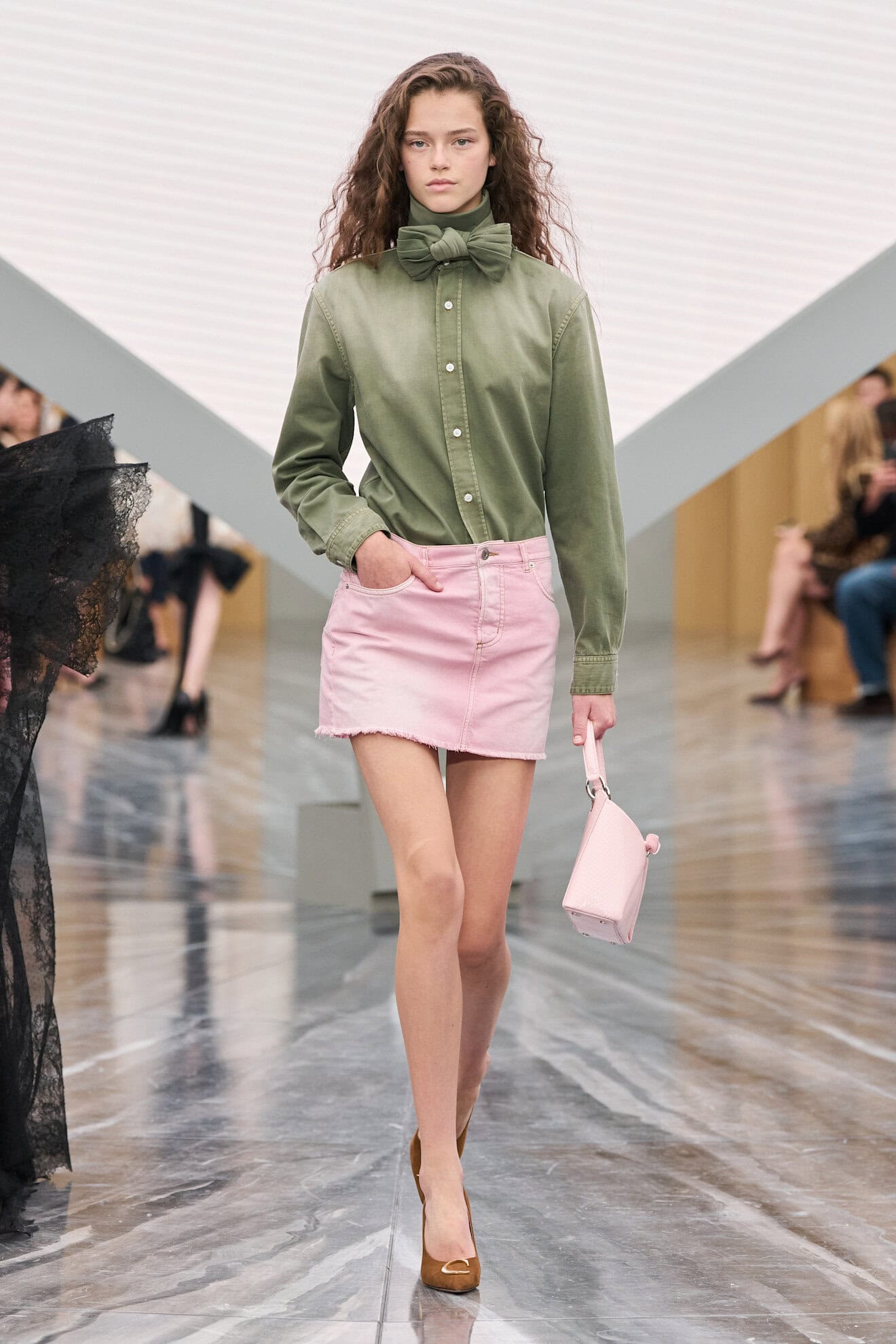
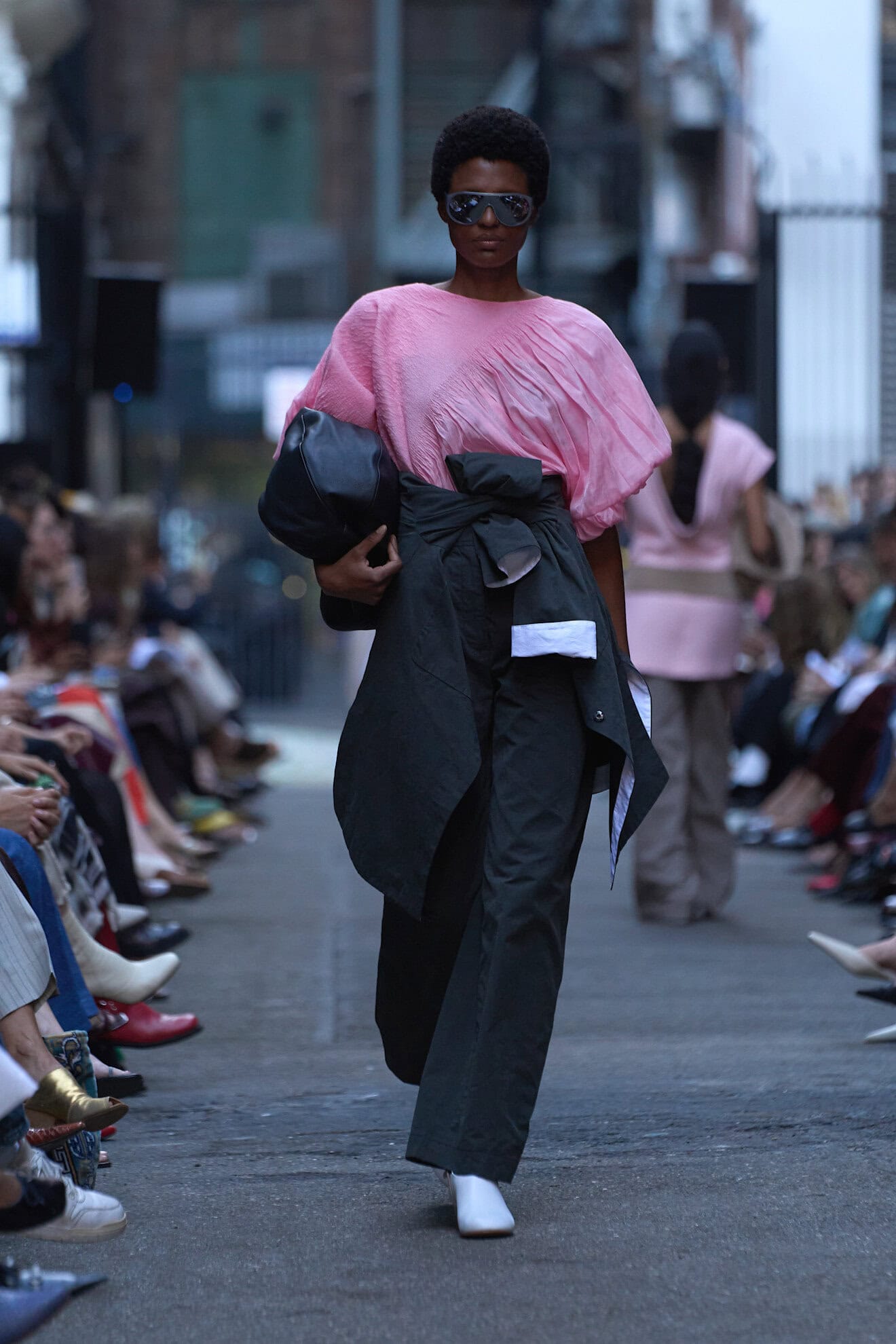
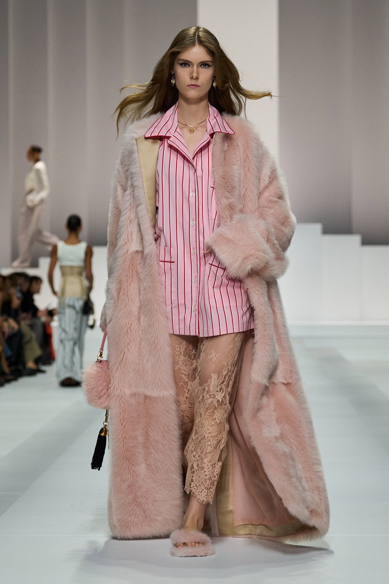
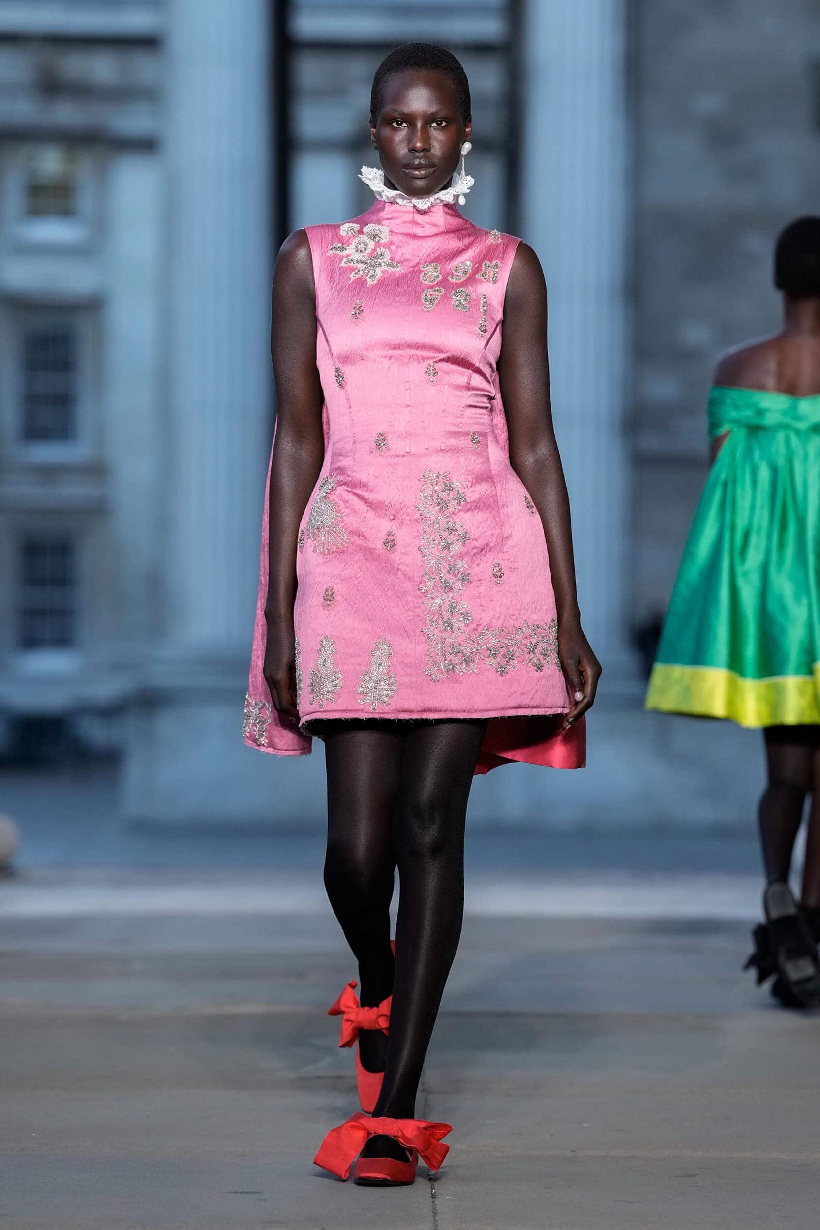
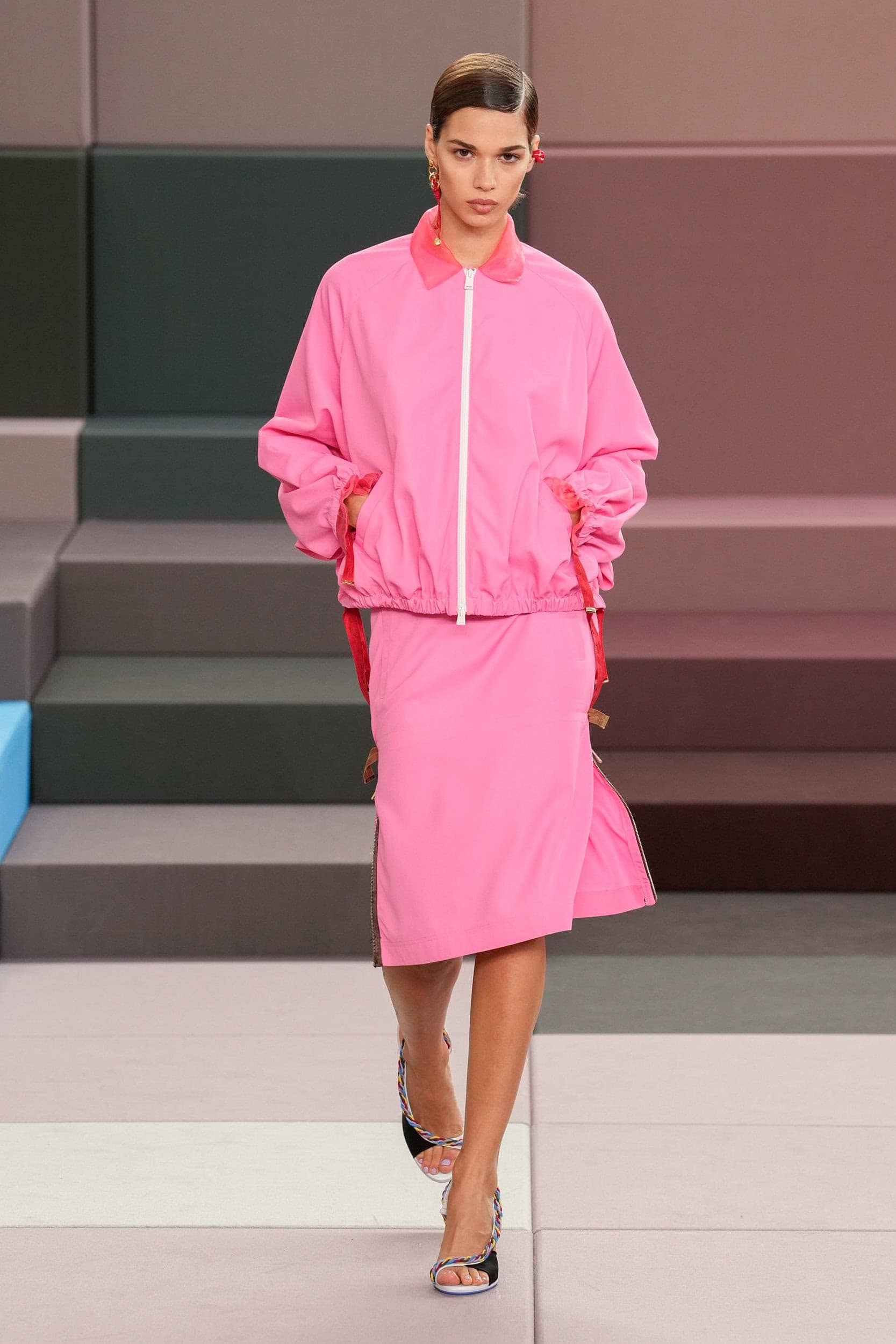
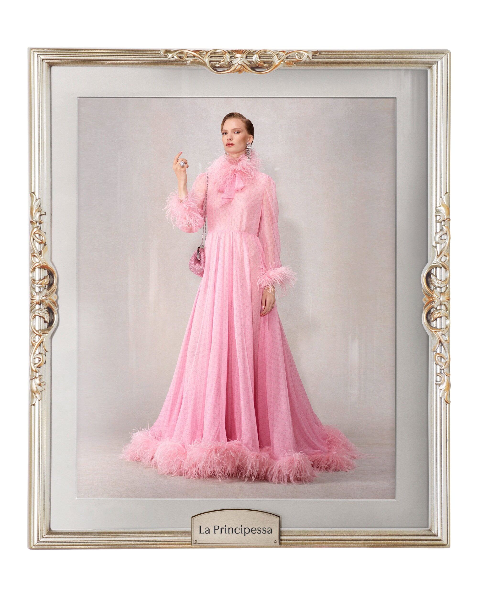
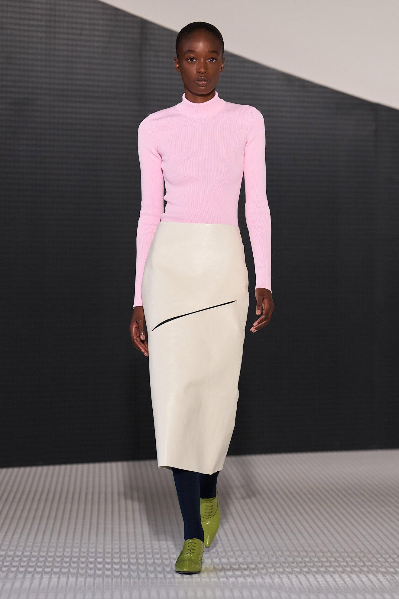
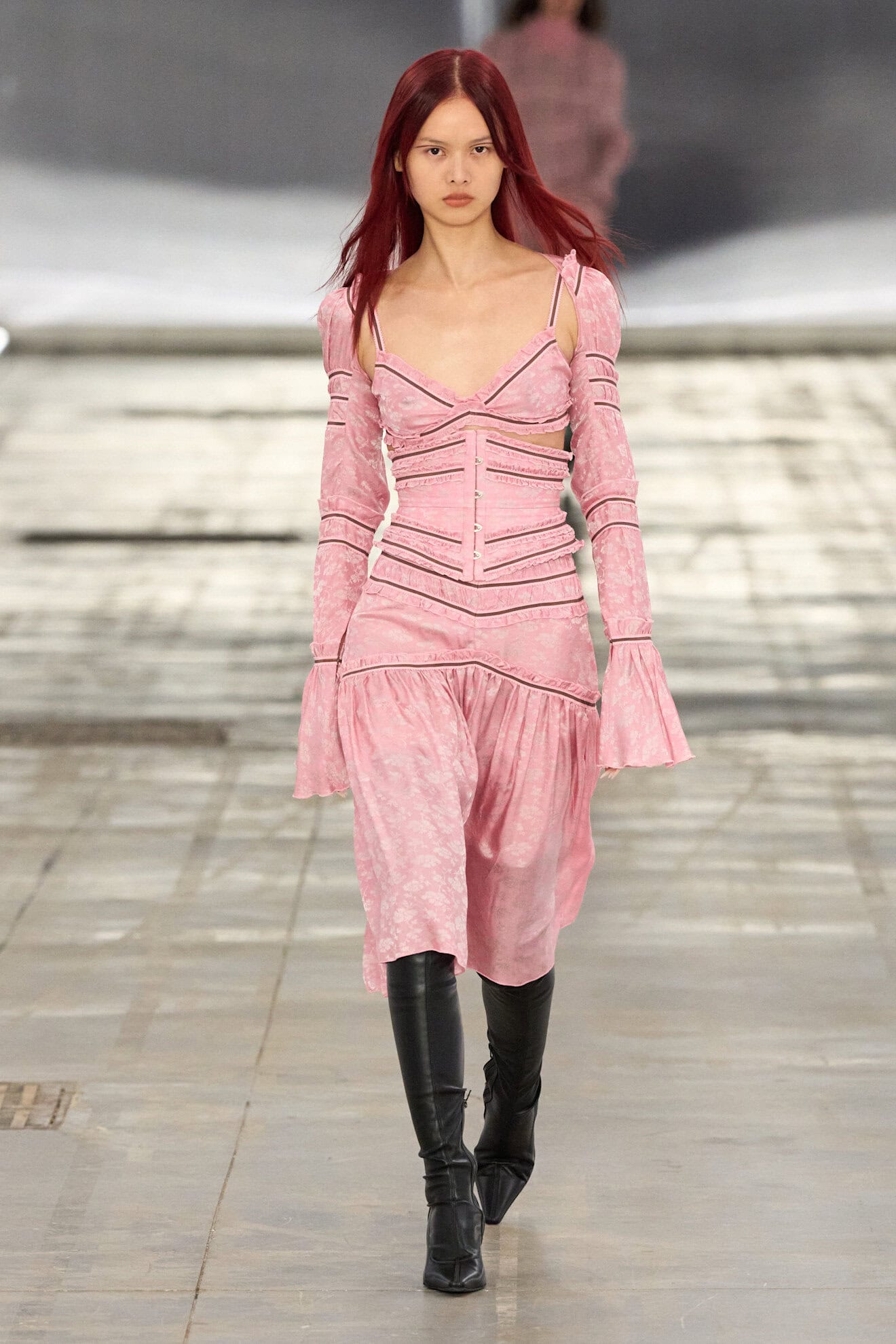
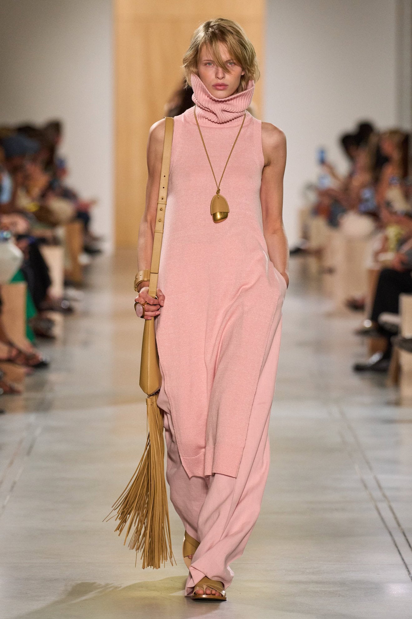
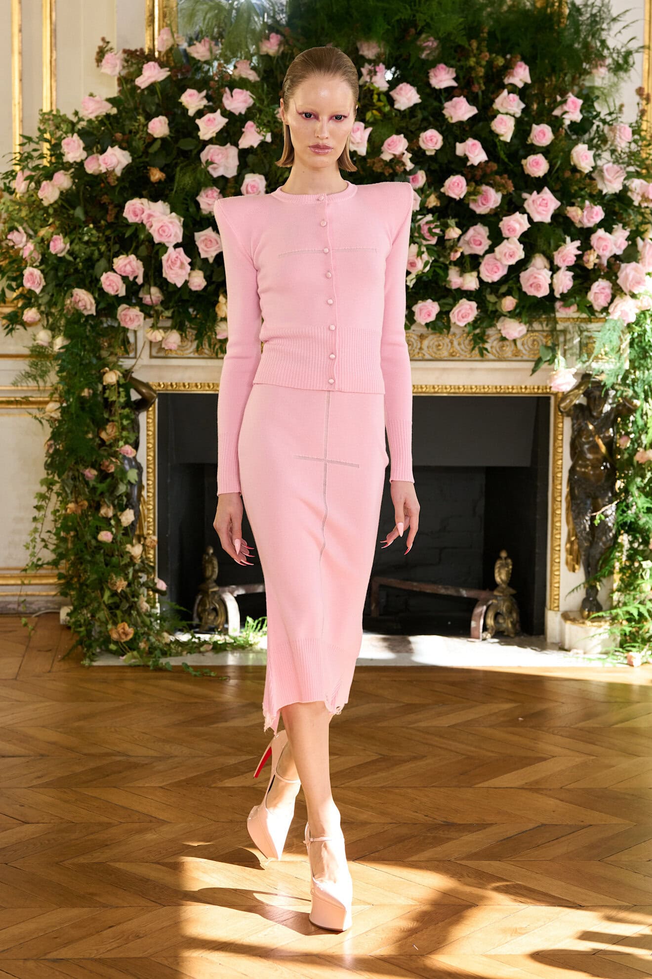
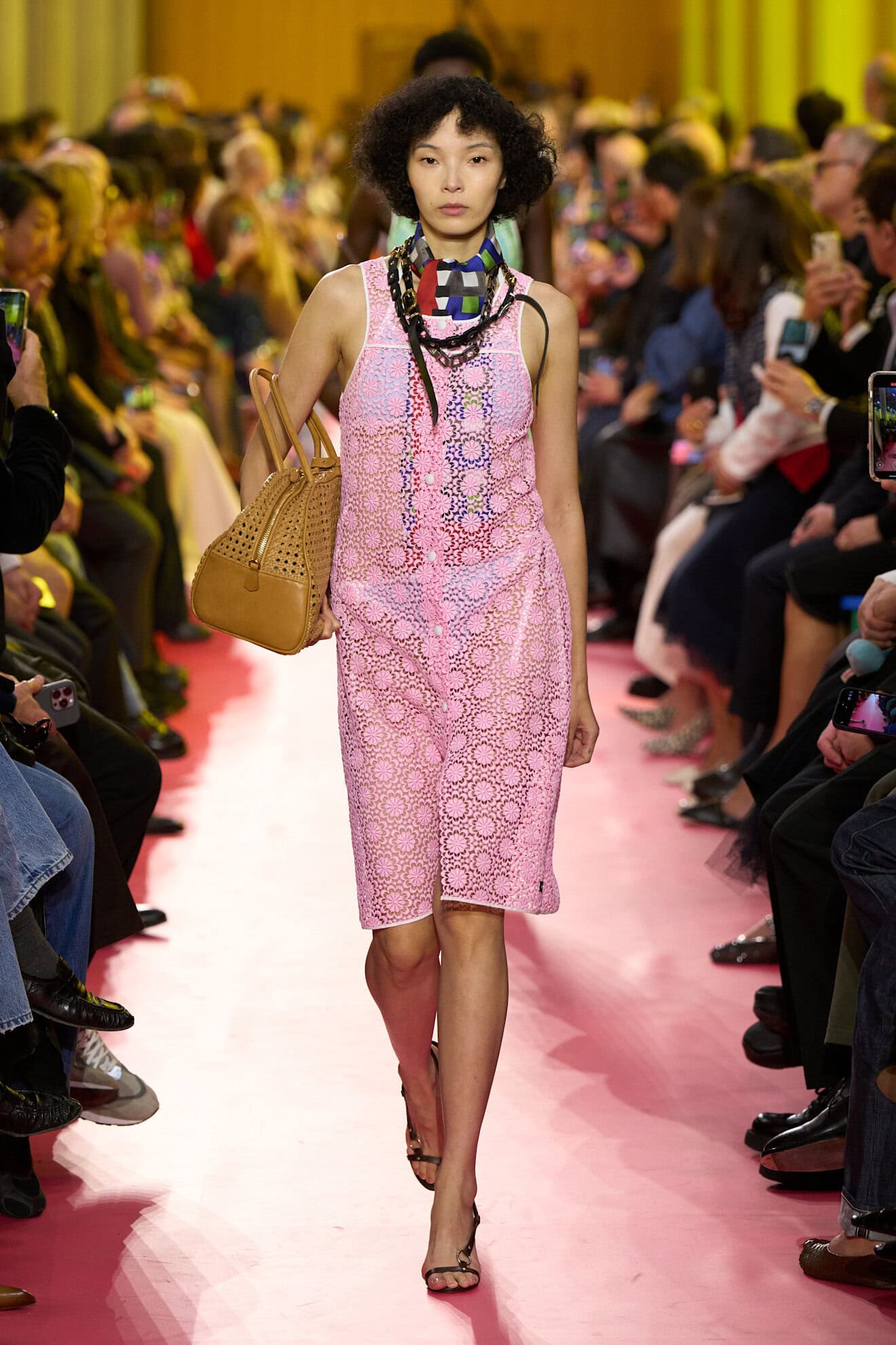
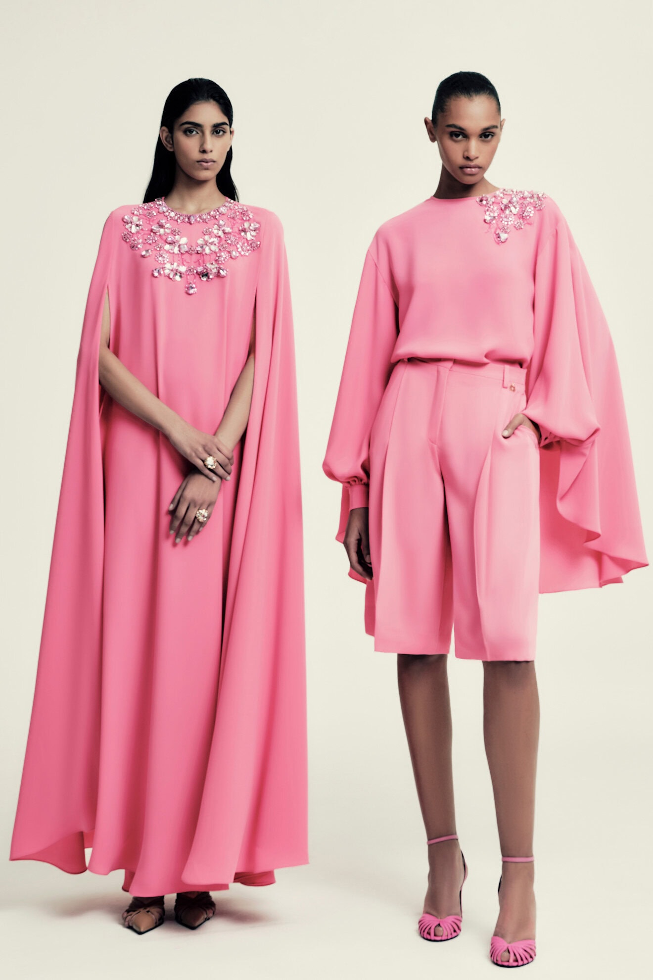
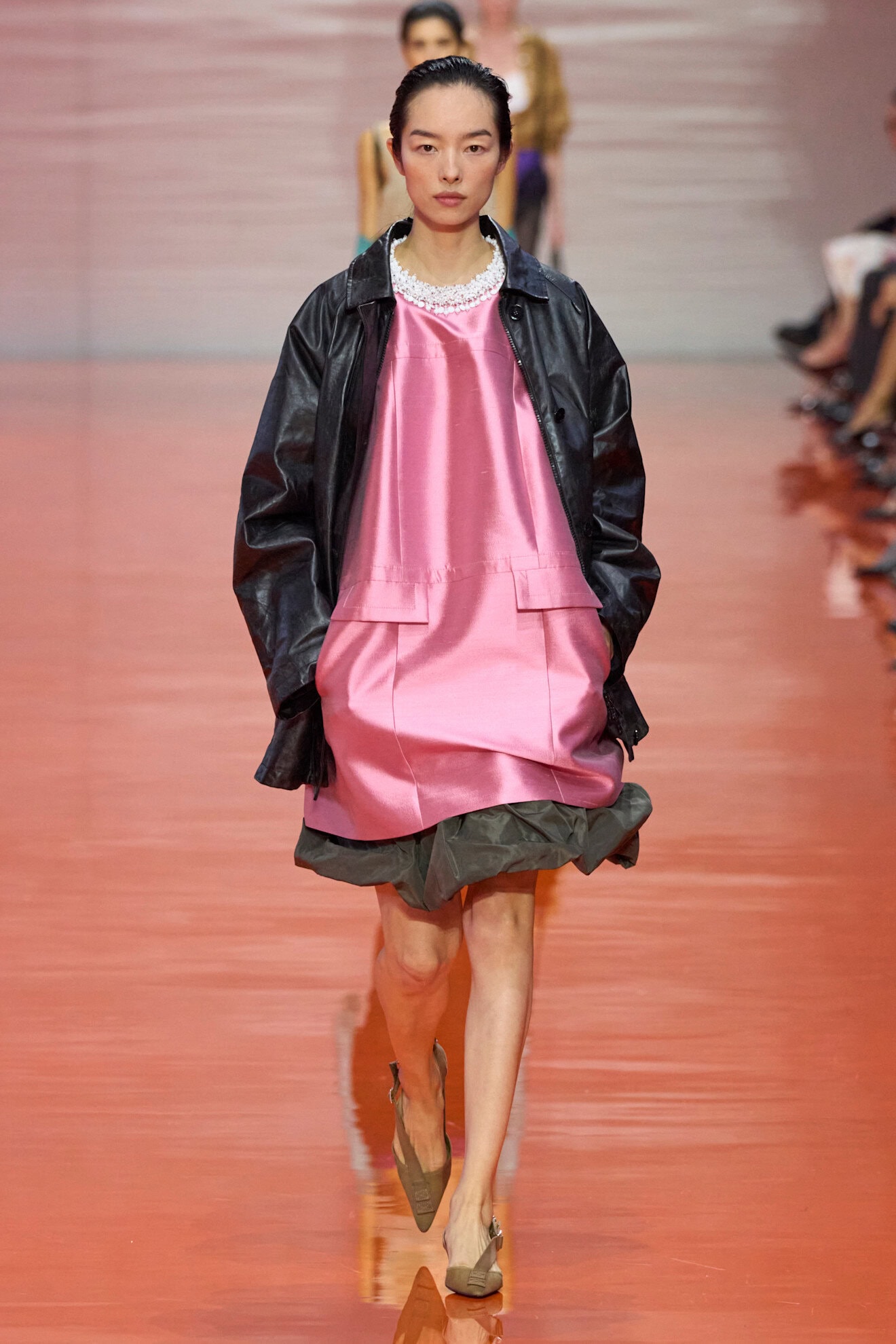
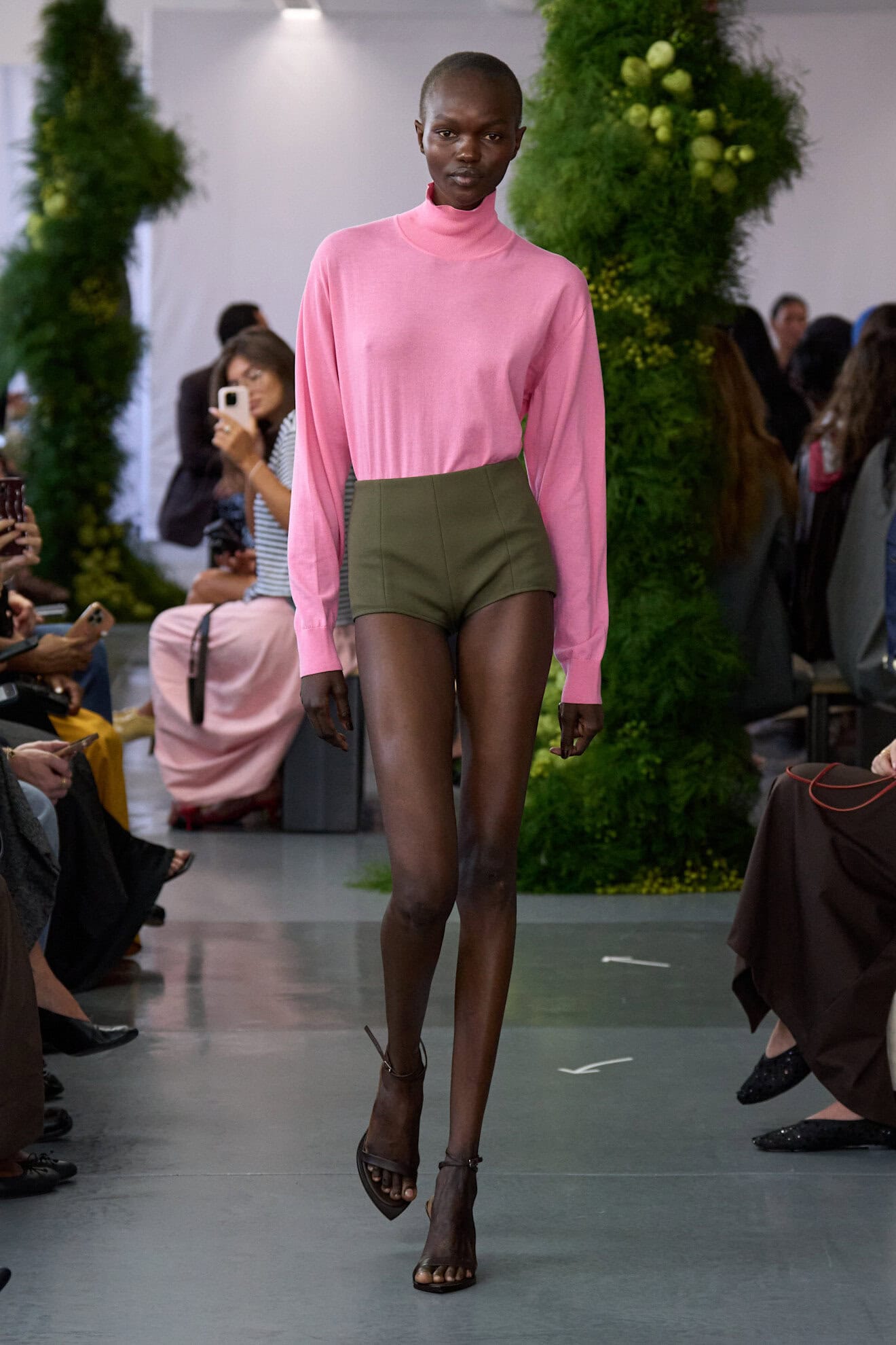
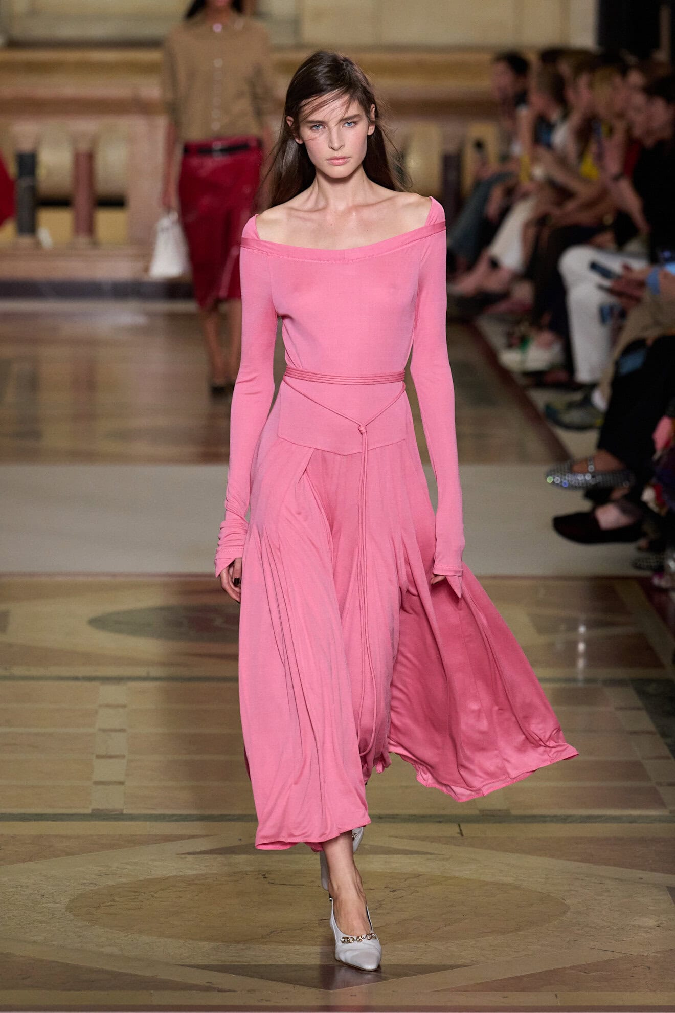
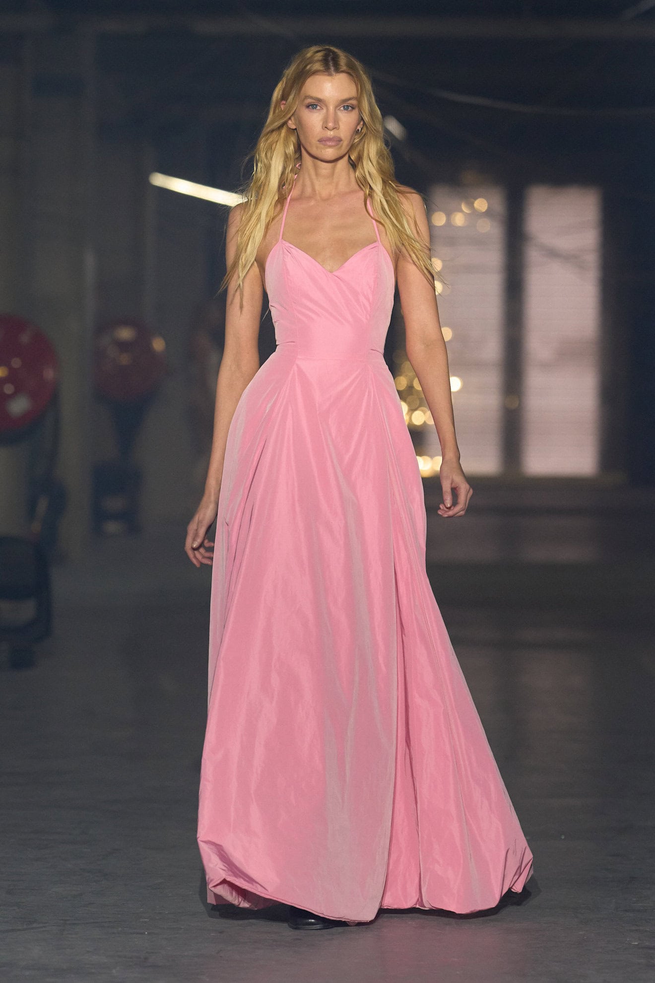
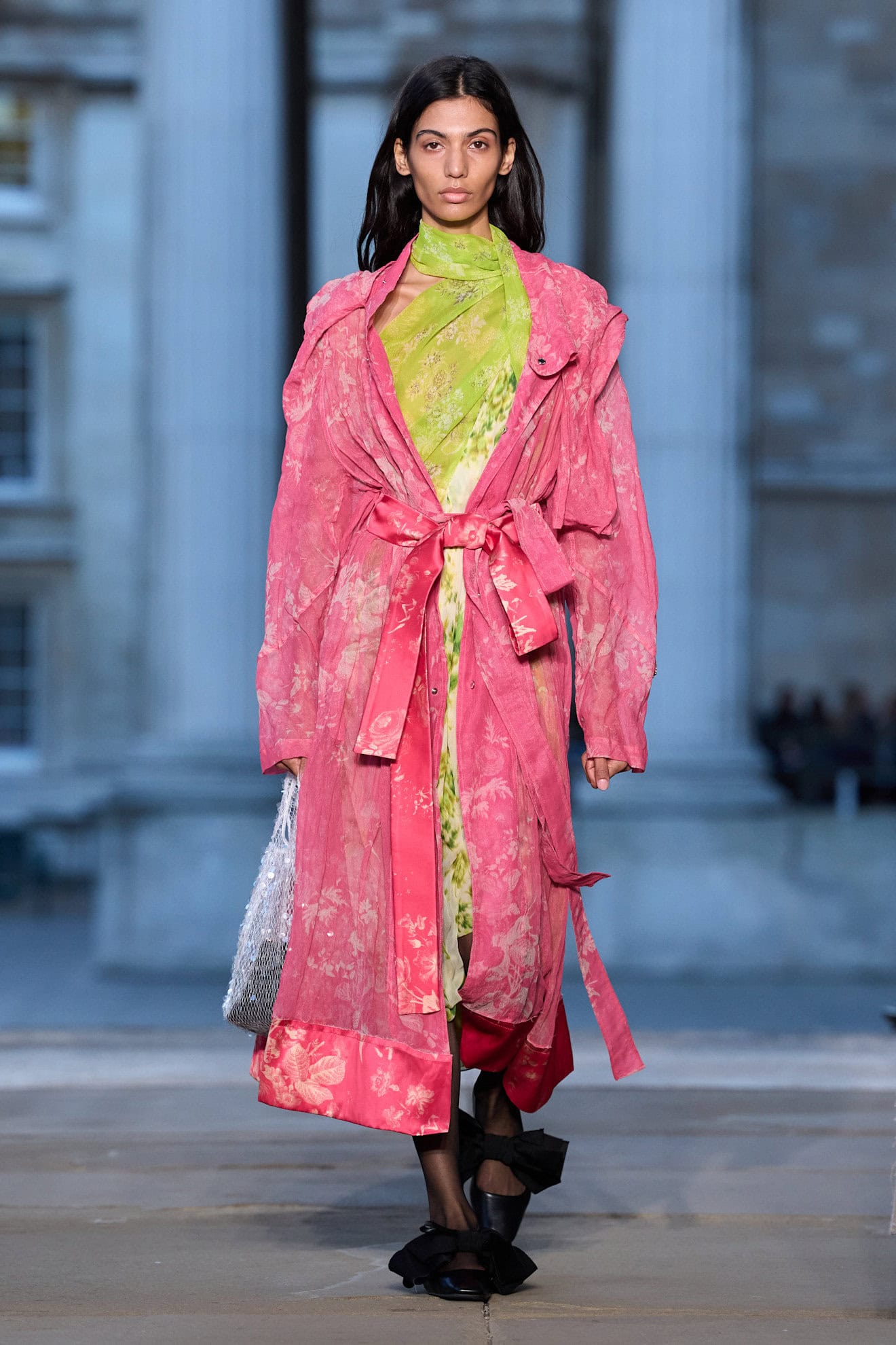
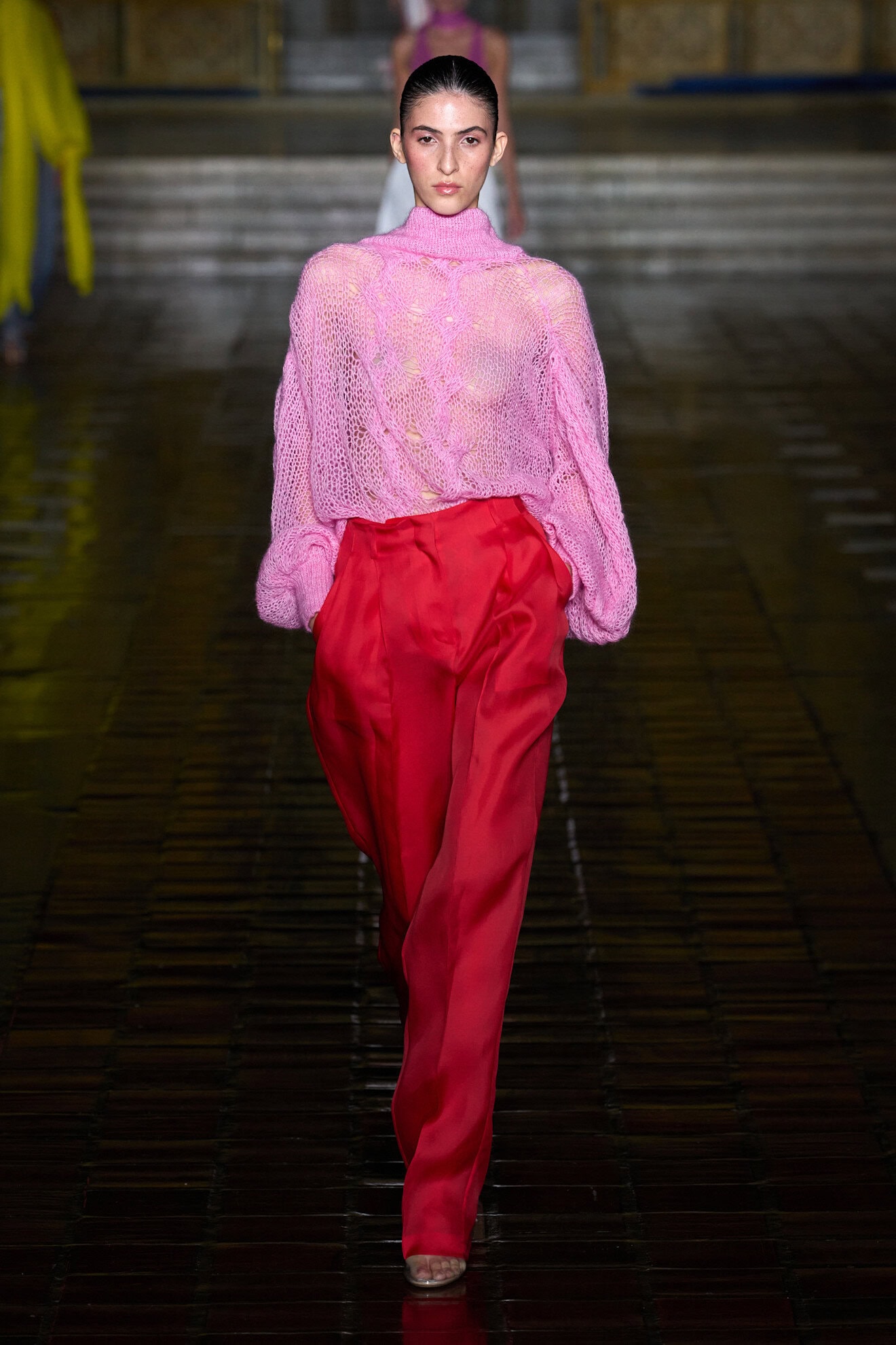
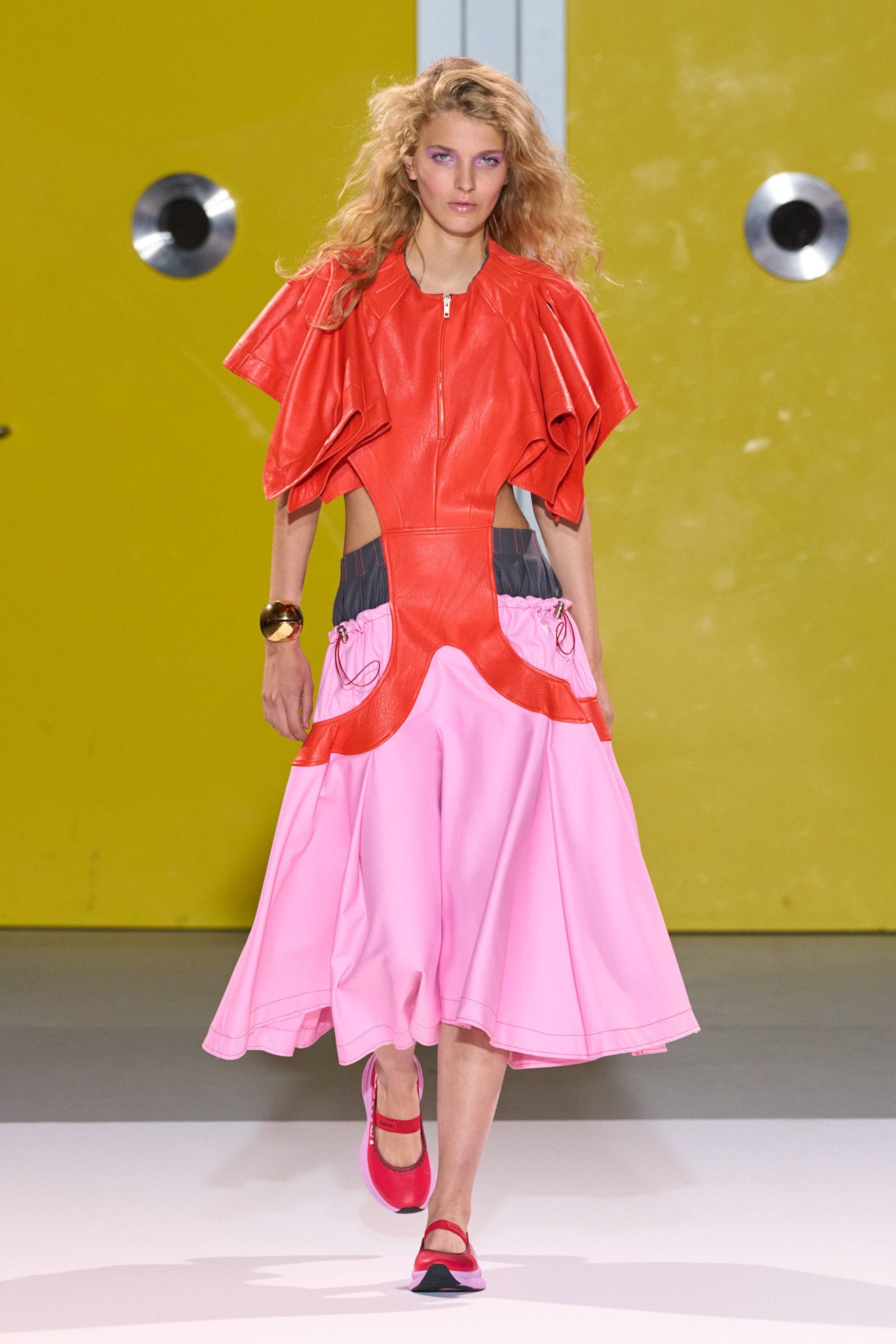
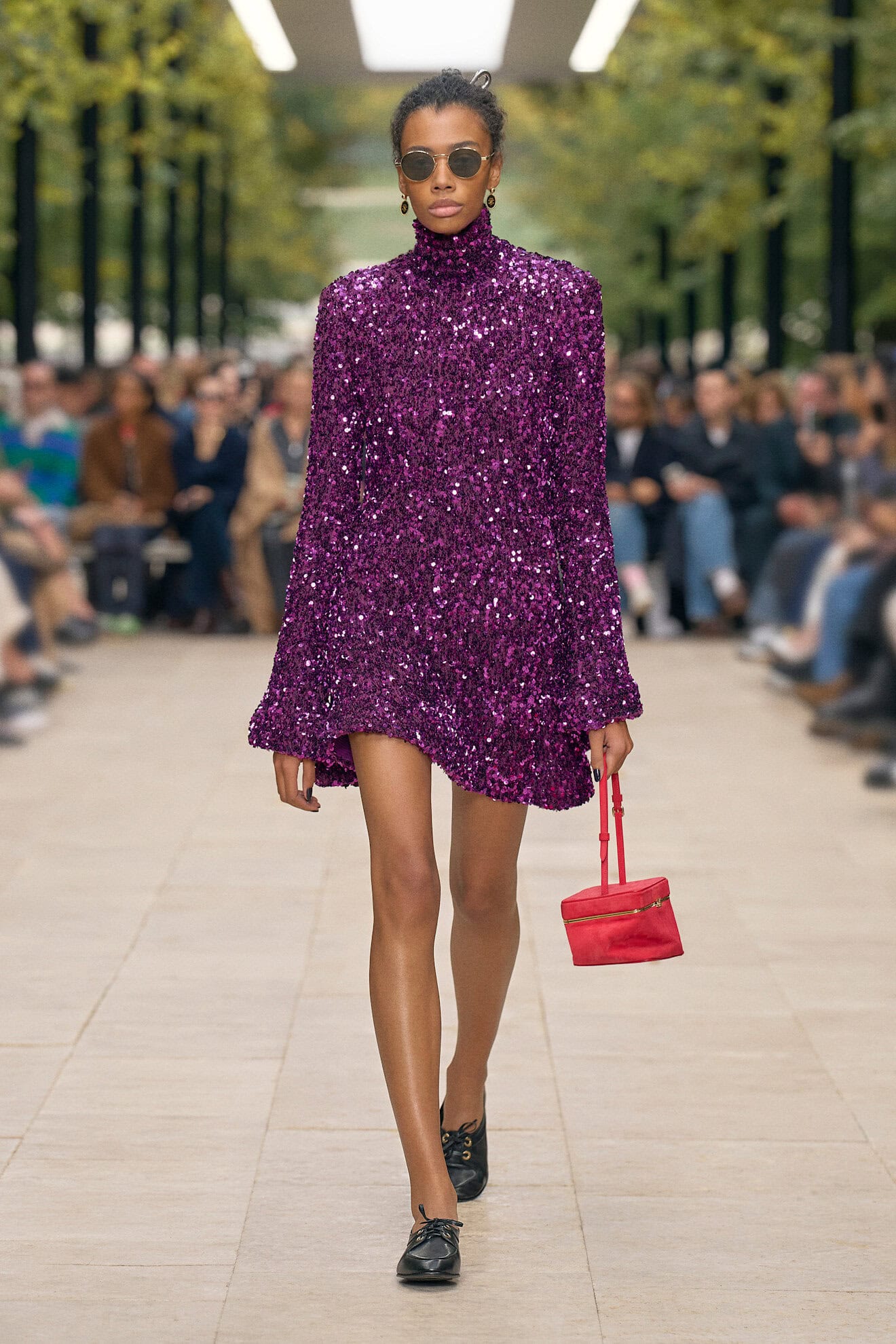
Bubblegum Pink
A pop-inspired iteration of the girlish hue, bubblegum pink is a call back to the positive vibes garnered during the season of Barbie pink, but this pink has power in its unapologetic feminine energy.
Bubblegum packs a punch and is for the rebellious bad girl who wears her pyjamas to the grocery store a la Dolce and Gabbana, rocks her Dior mini skirt with heels, and can attend a black tie event in a satin shantung tunic and her dads black leather jacket. And don’t underestimate the woman in the pink knitted twinset as at Matières Fécales her shoulders are sharp.
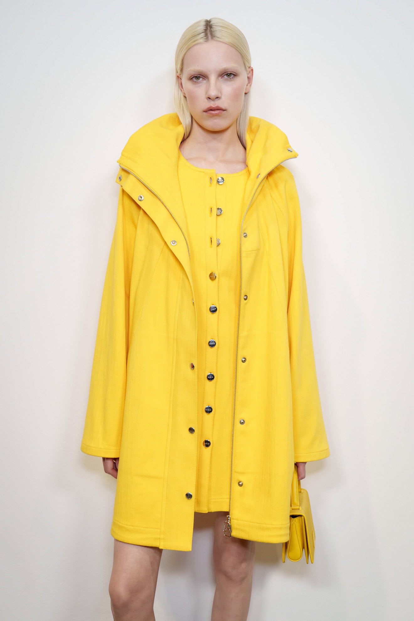
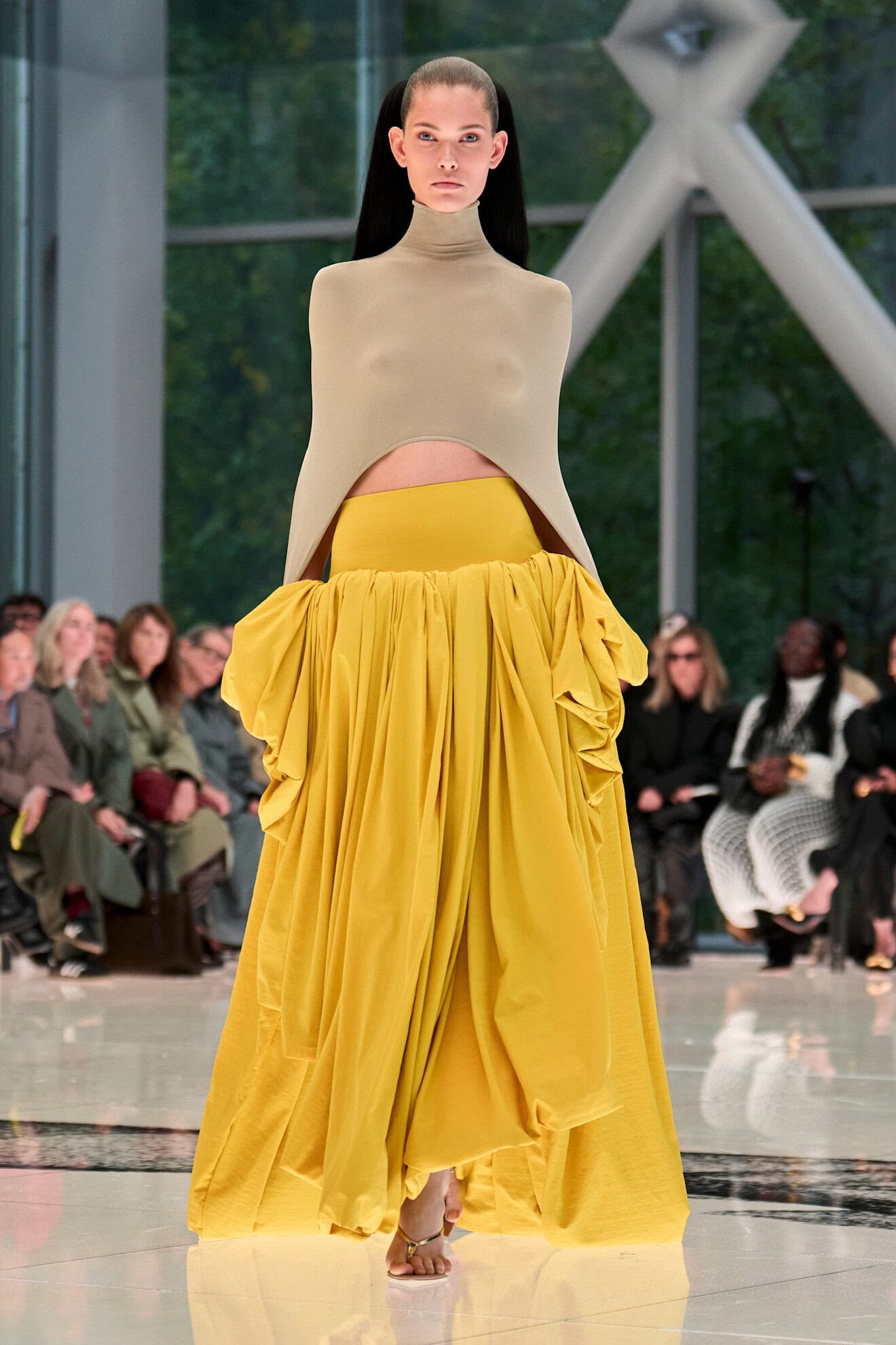
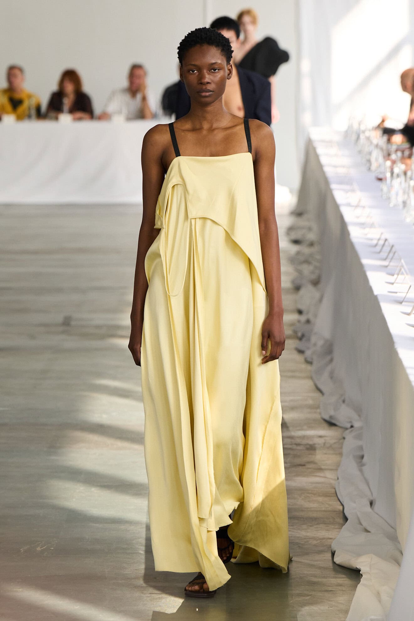
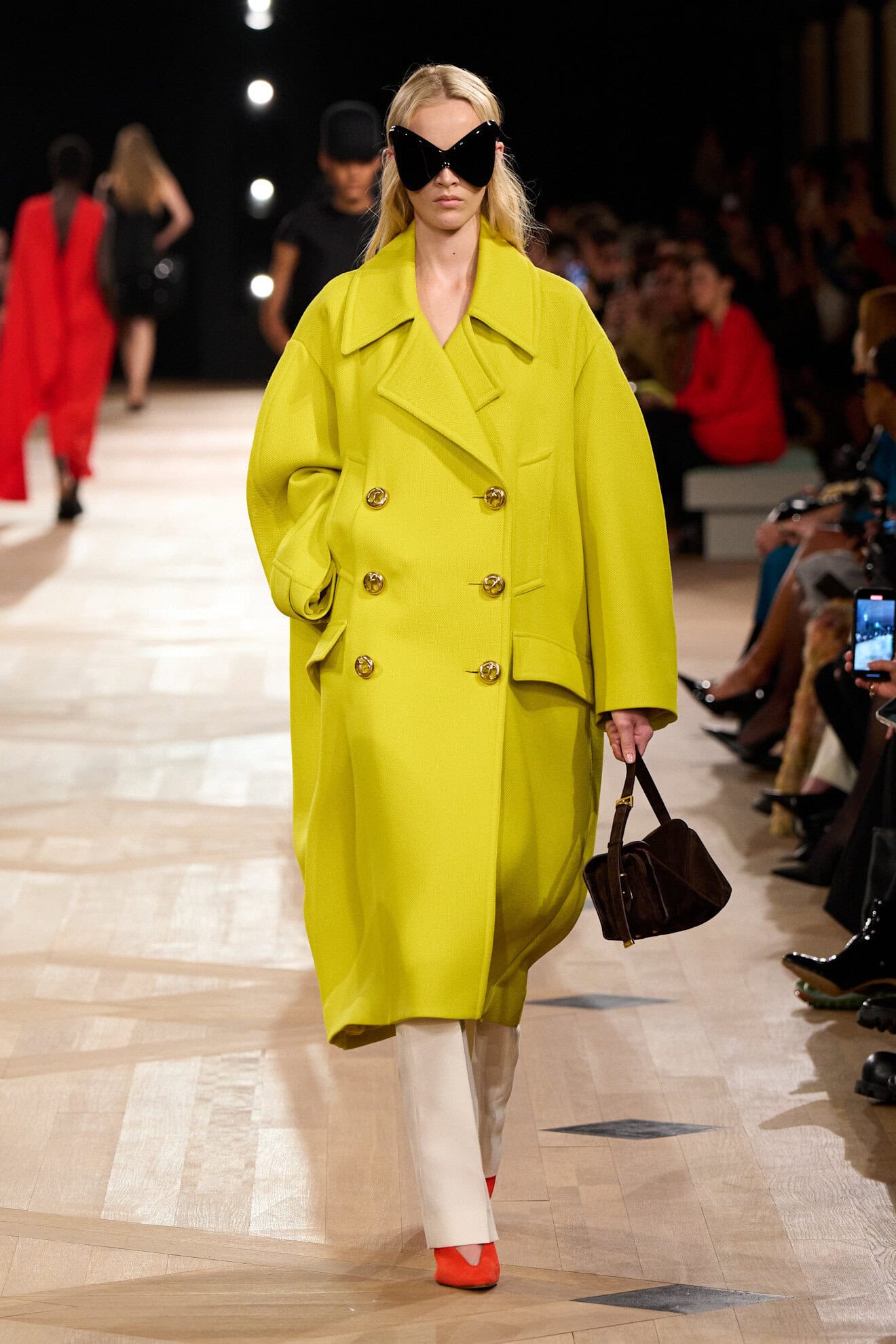
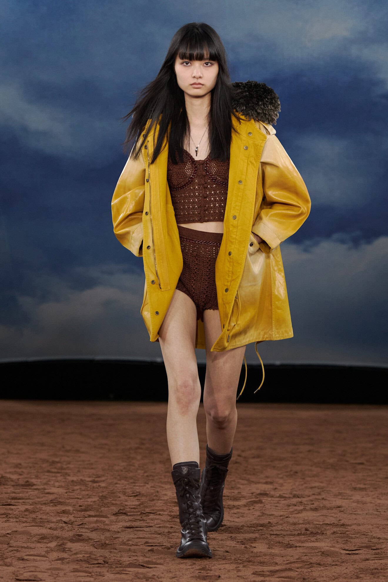
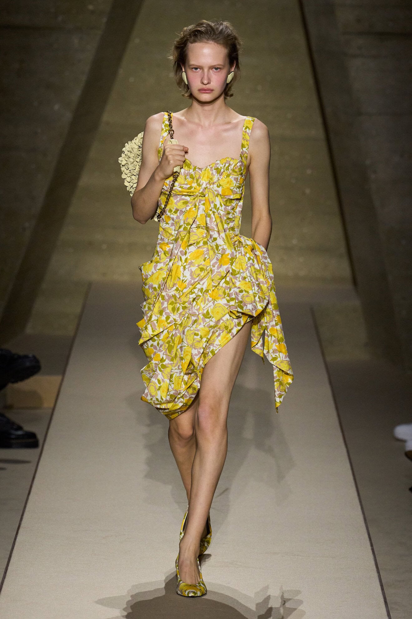
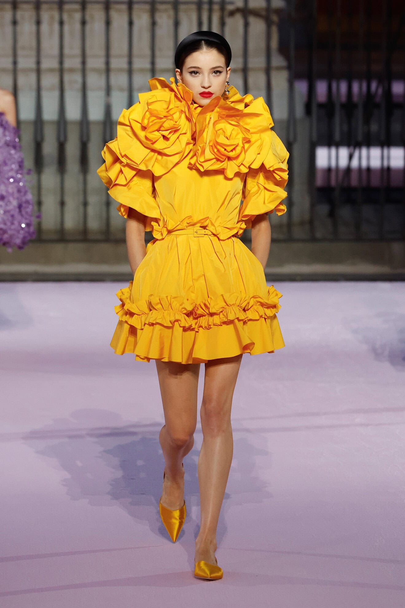
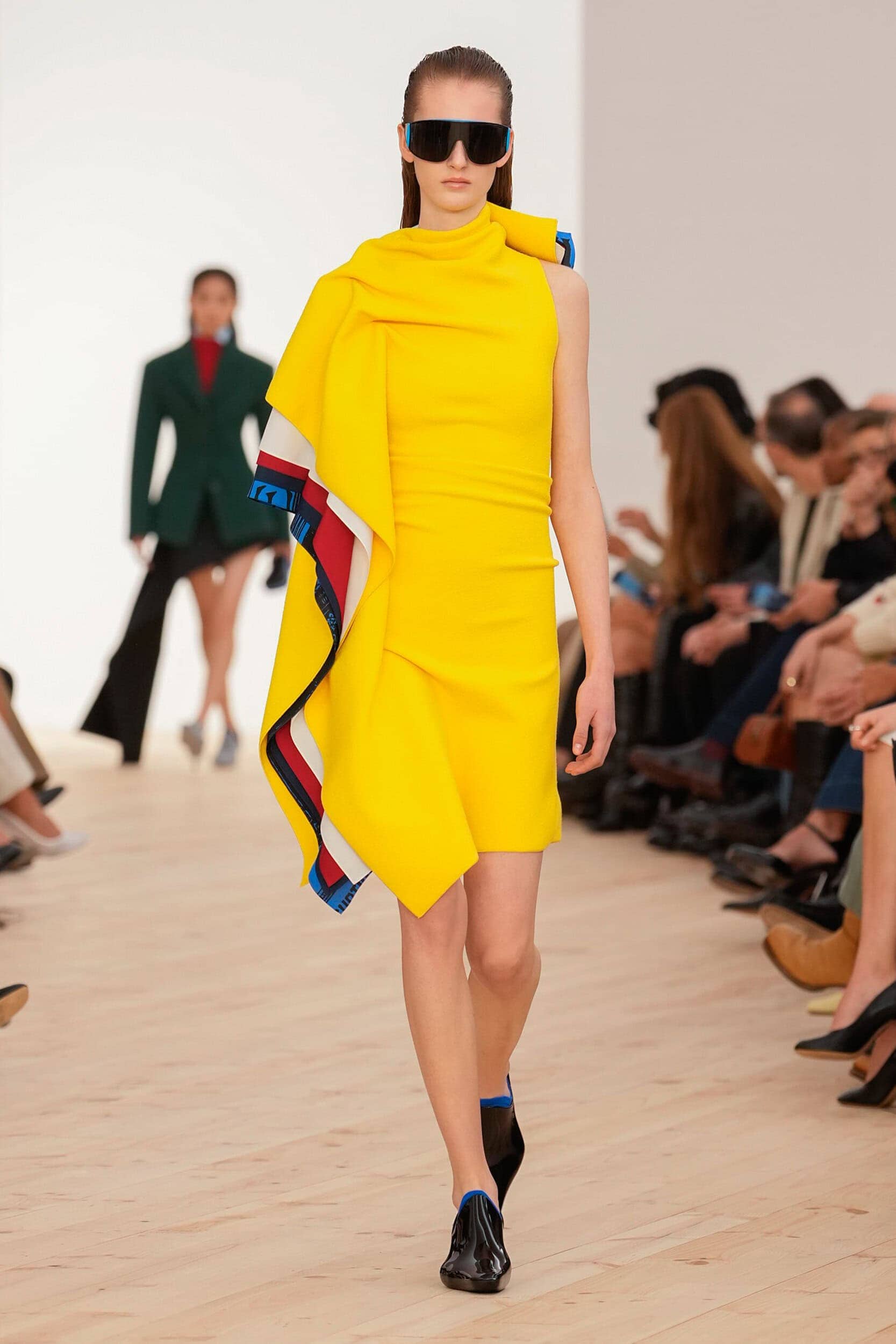
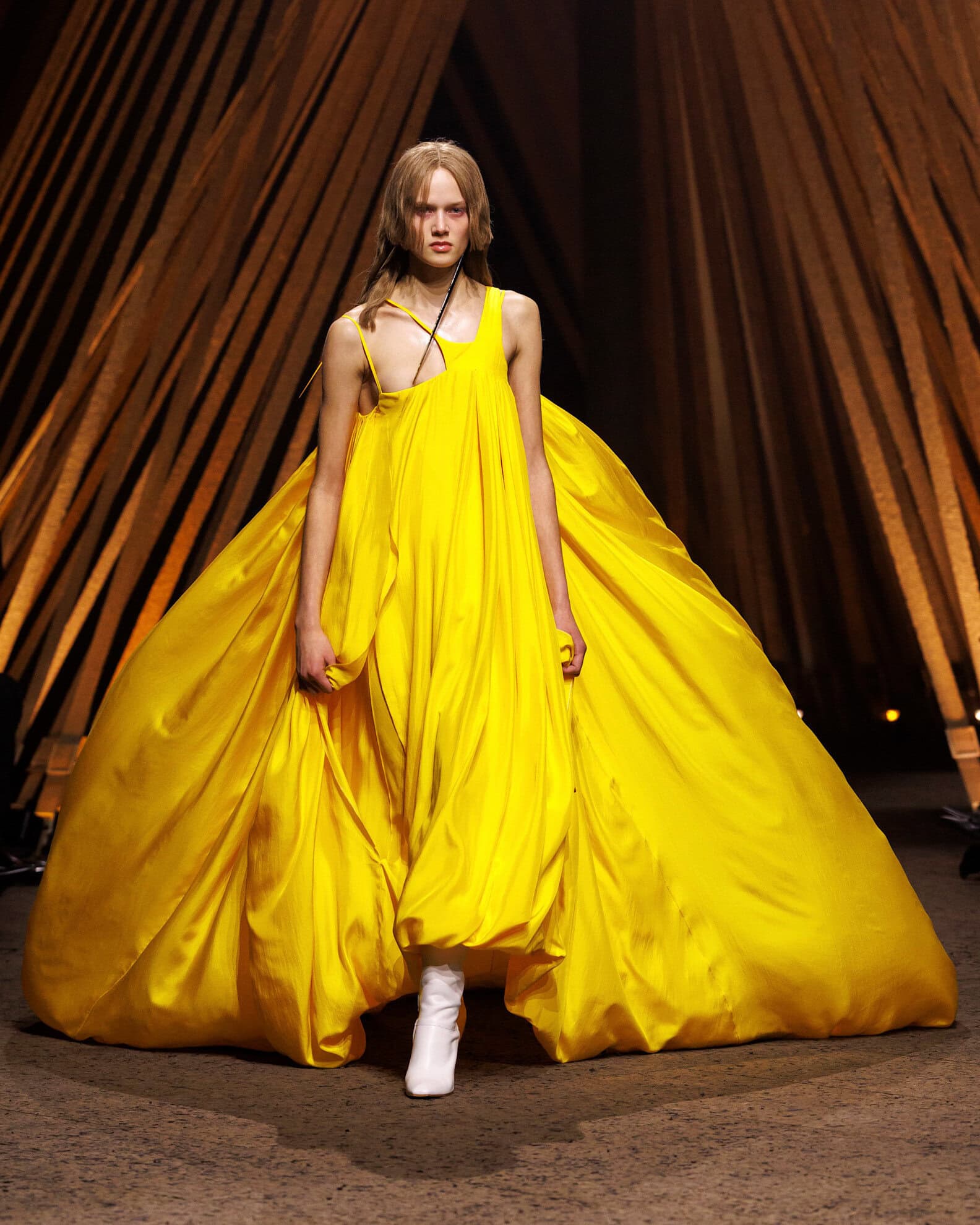
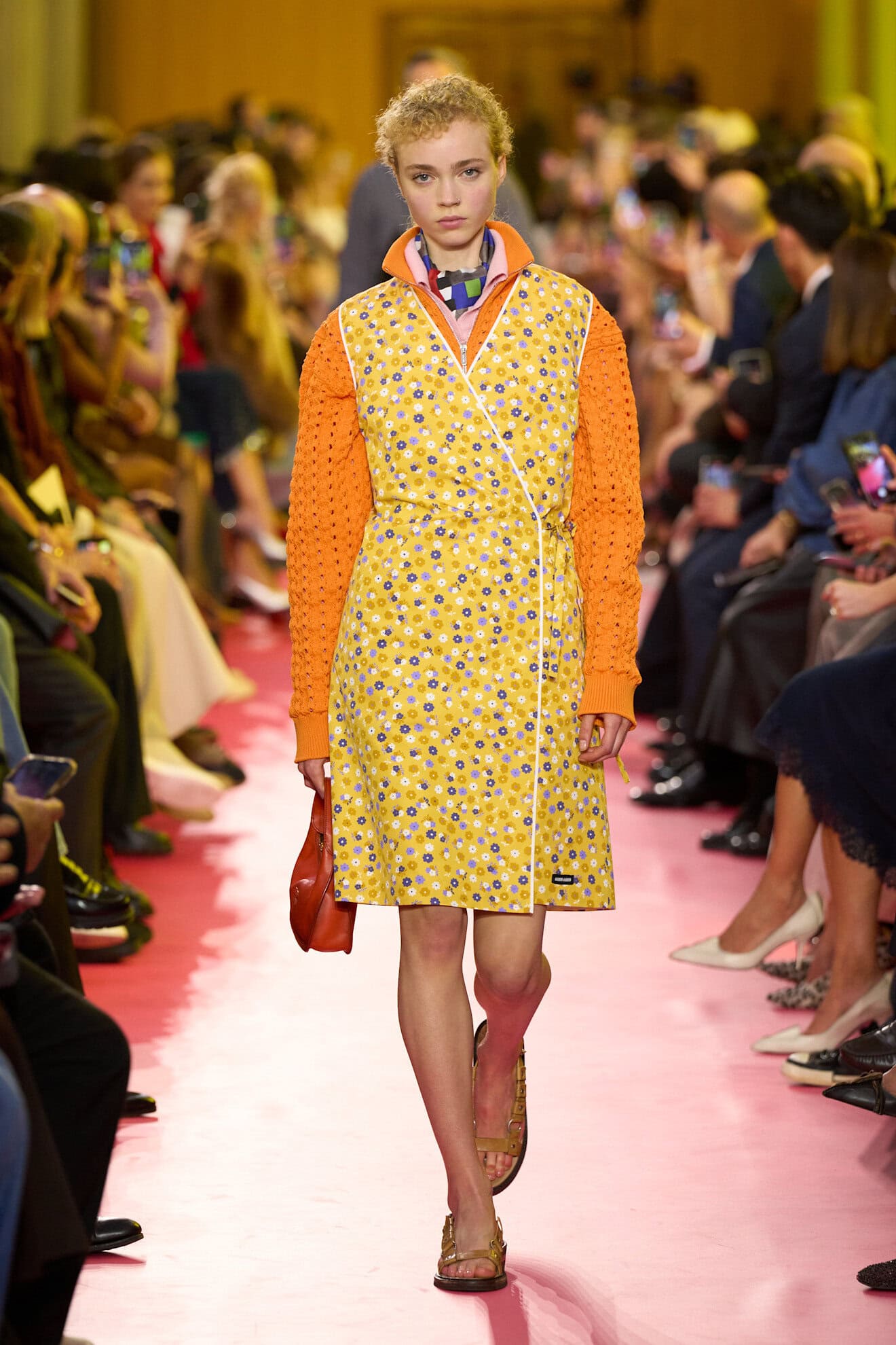
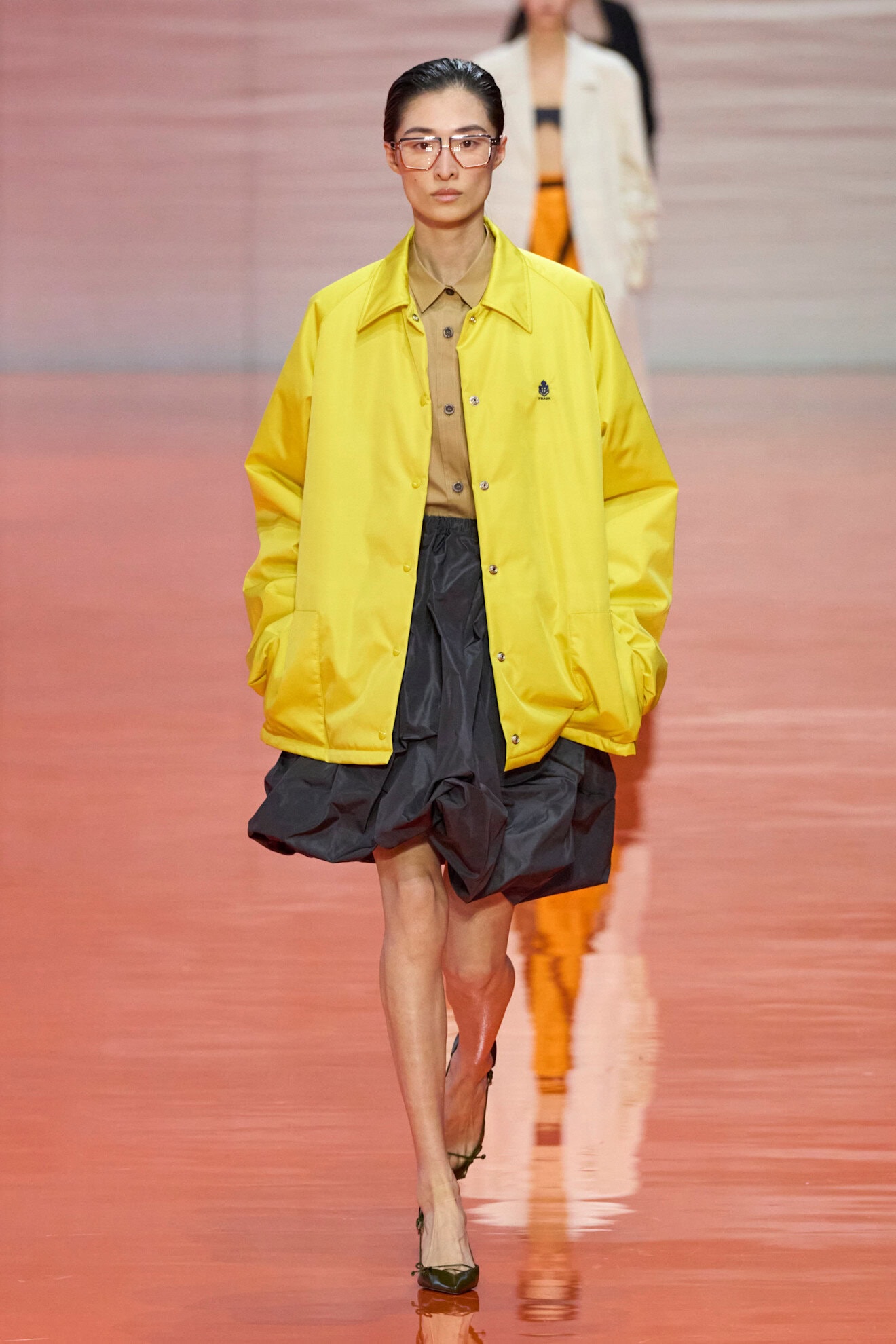
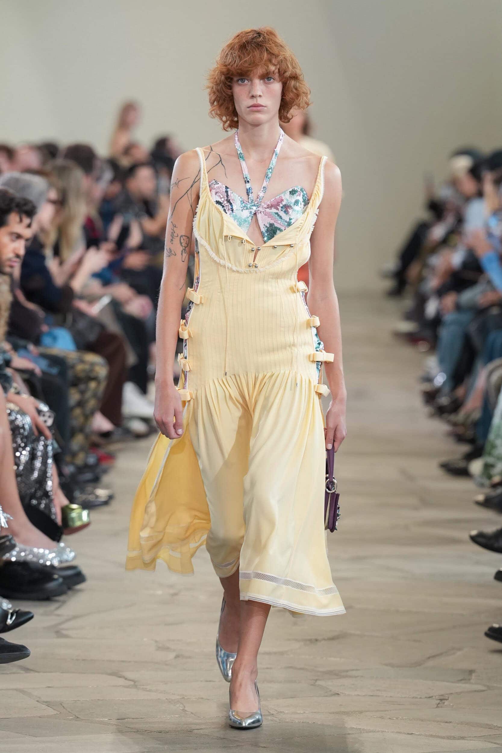
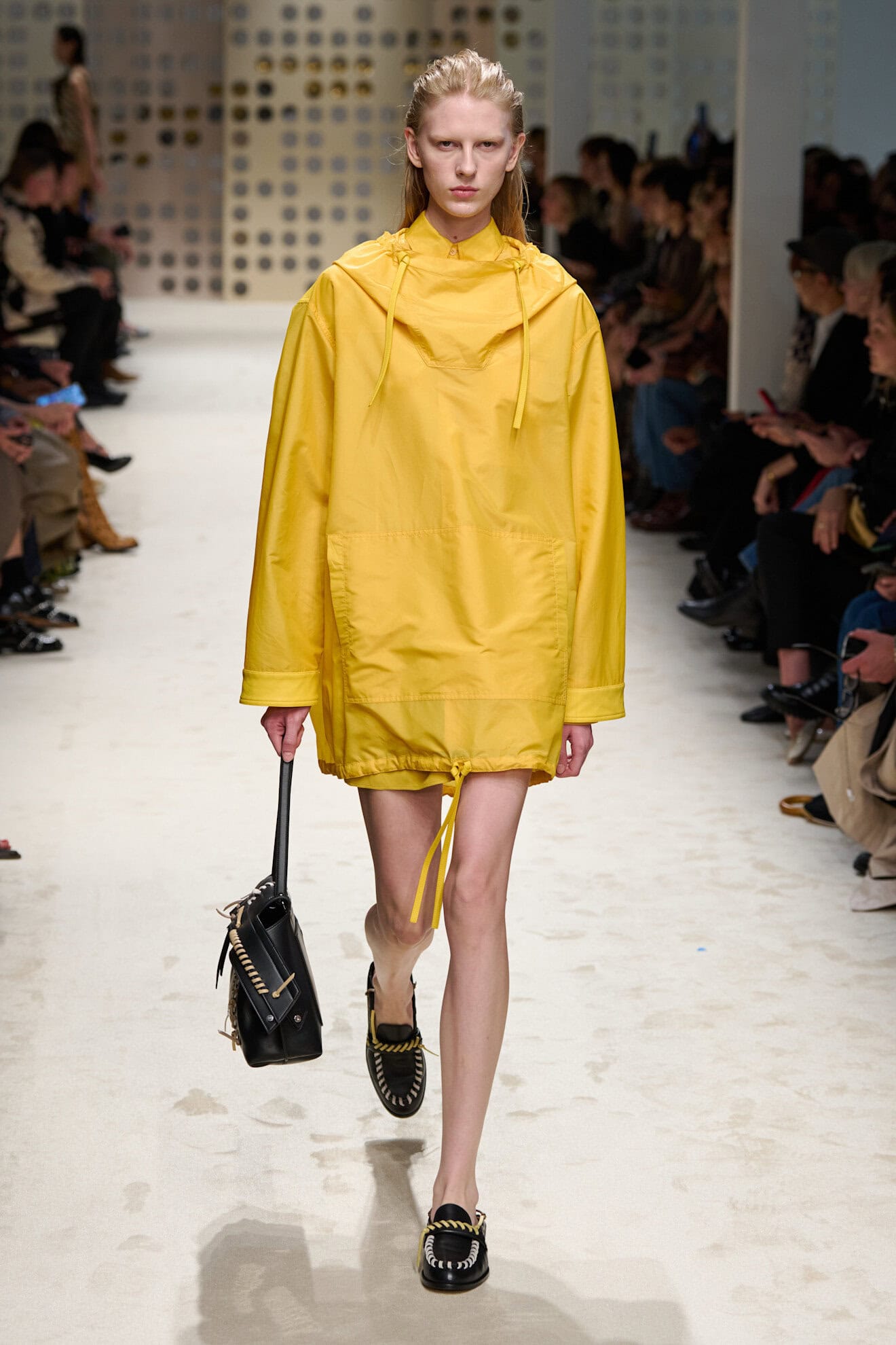
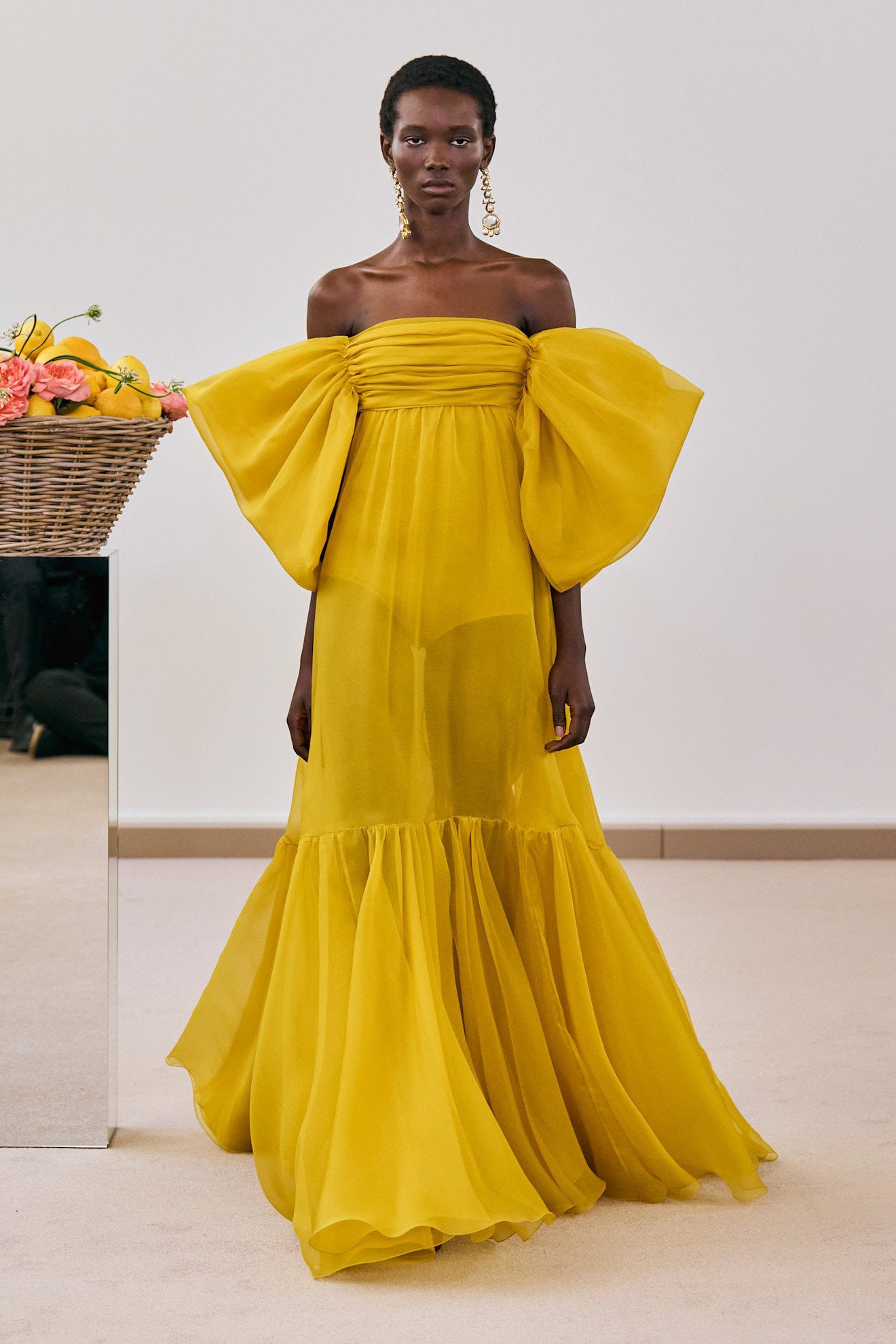
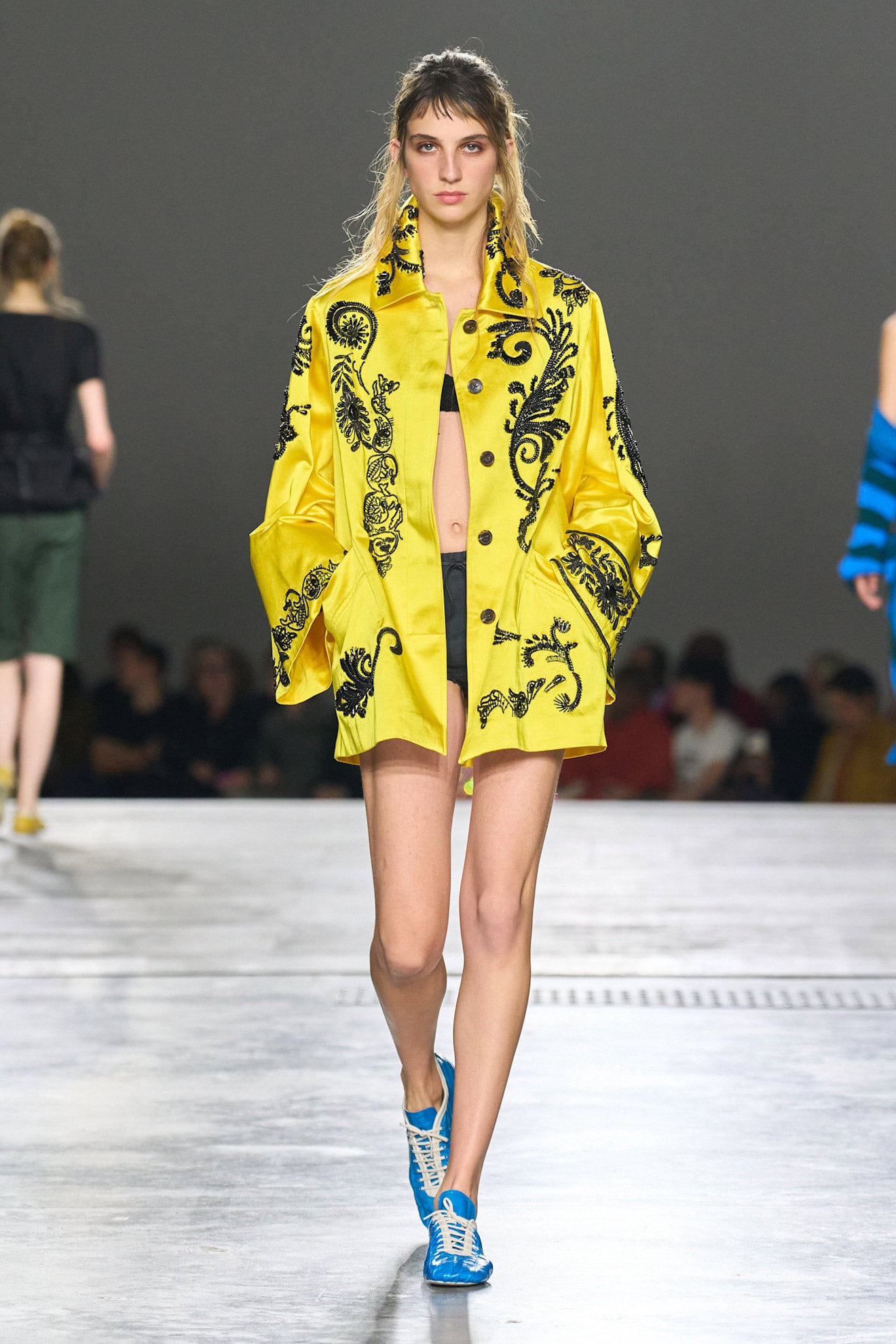
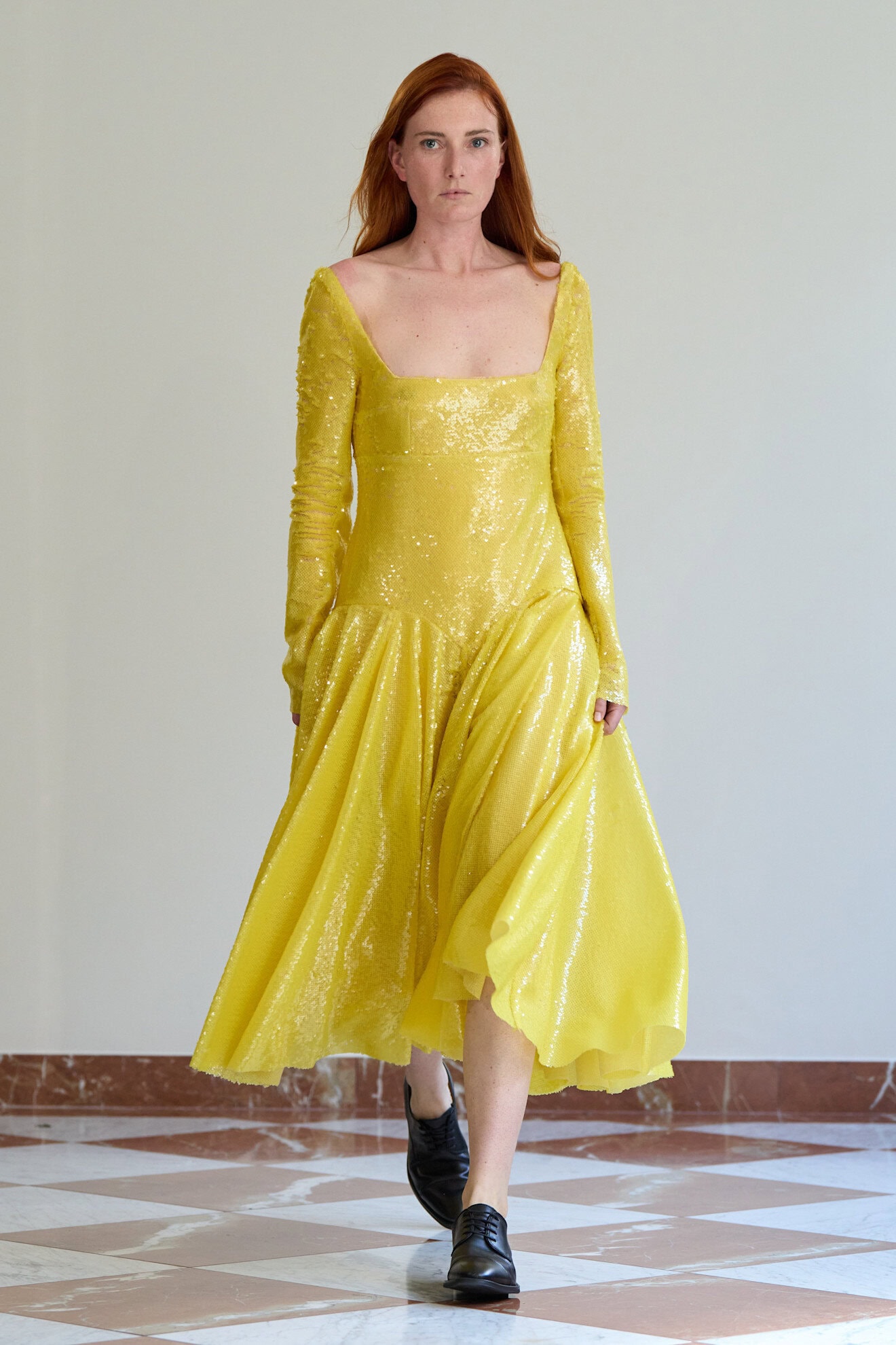
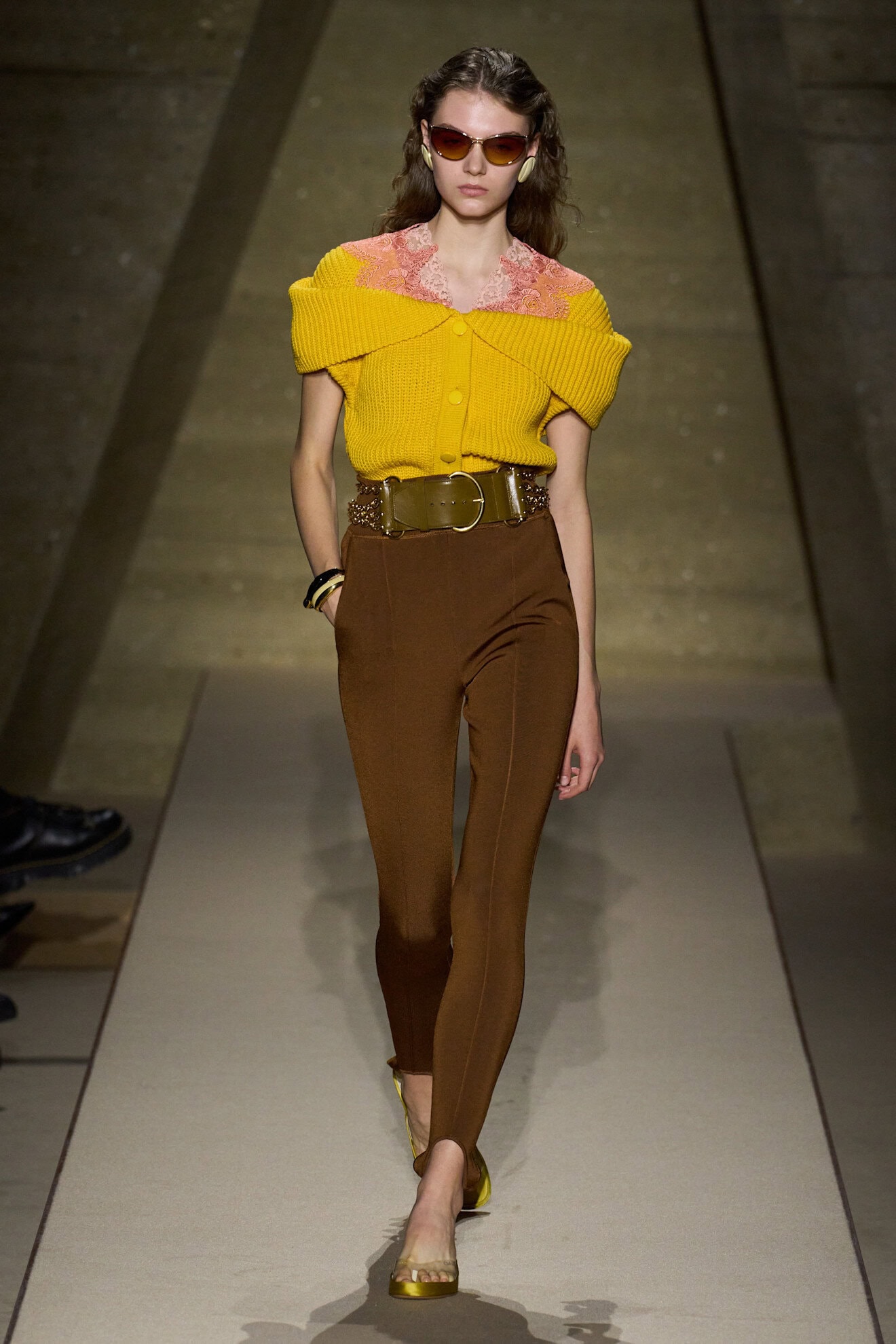
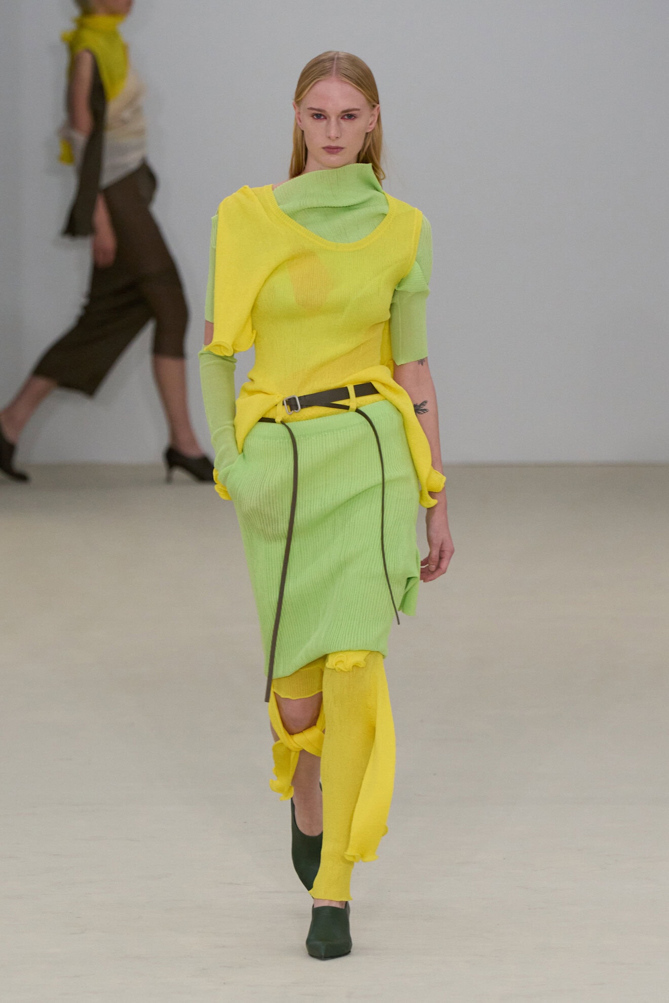
A Sunshine (Yellow) State of Mind
Conveying a perennial sense of optimism various shades of yellow have gained in prominence over the last decade. From designating it as an entire generations colour (Gen-Z yellow) to lemon yellow coinciding with the ‘European Summer’ trend on social media. It has also been picked up by the beauty industry with Prada launching a Banana-scented balm.
Yellow is part of a small group of colours that can be referred to as ‘The New Classics’ for the way they emerge every few years and transform the clothes we see on the runways, marketing visuals and even packaging trends. And as lemon makes way for banana designers are rendering it across sporty anoraks and voluminous occasion looks, think McQueens parachute bubble-hem gown or Giambattista Valli’s sheer summer dress.
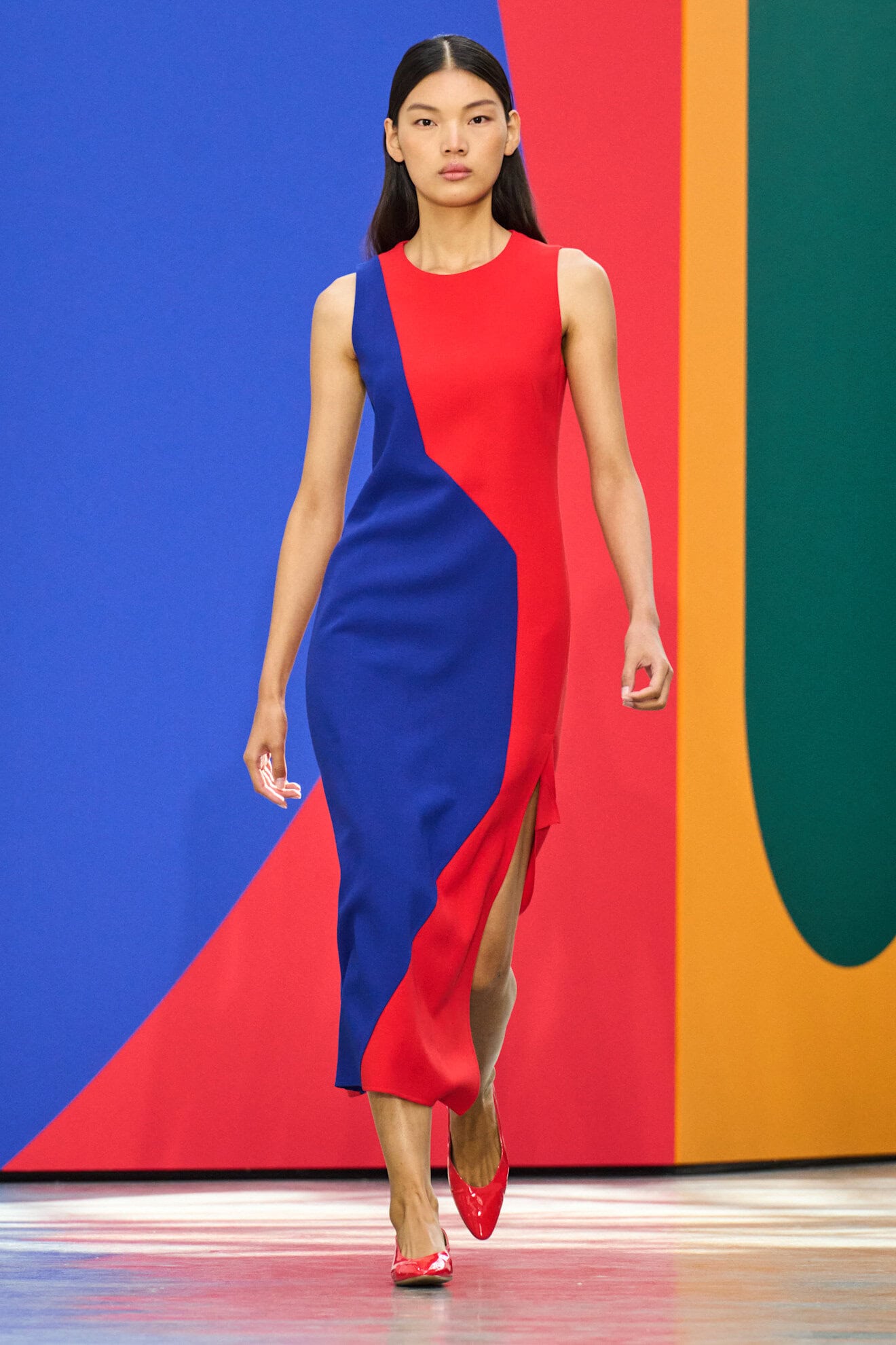
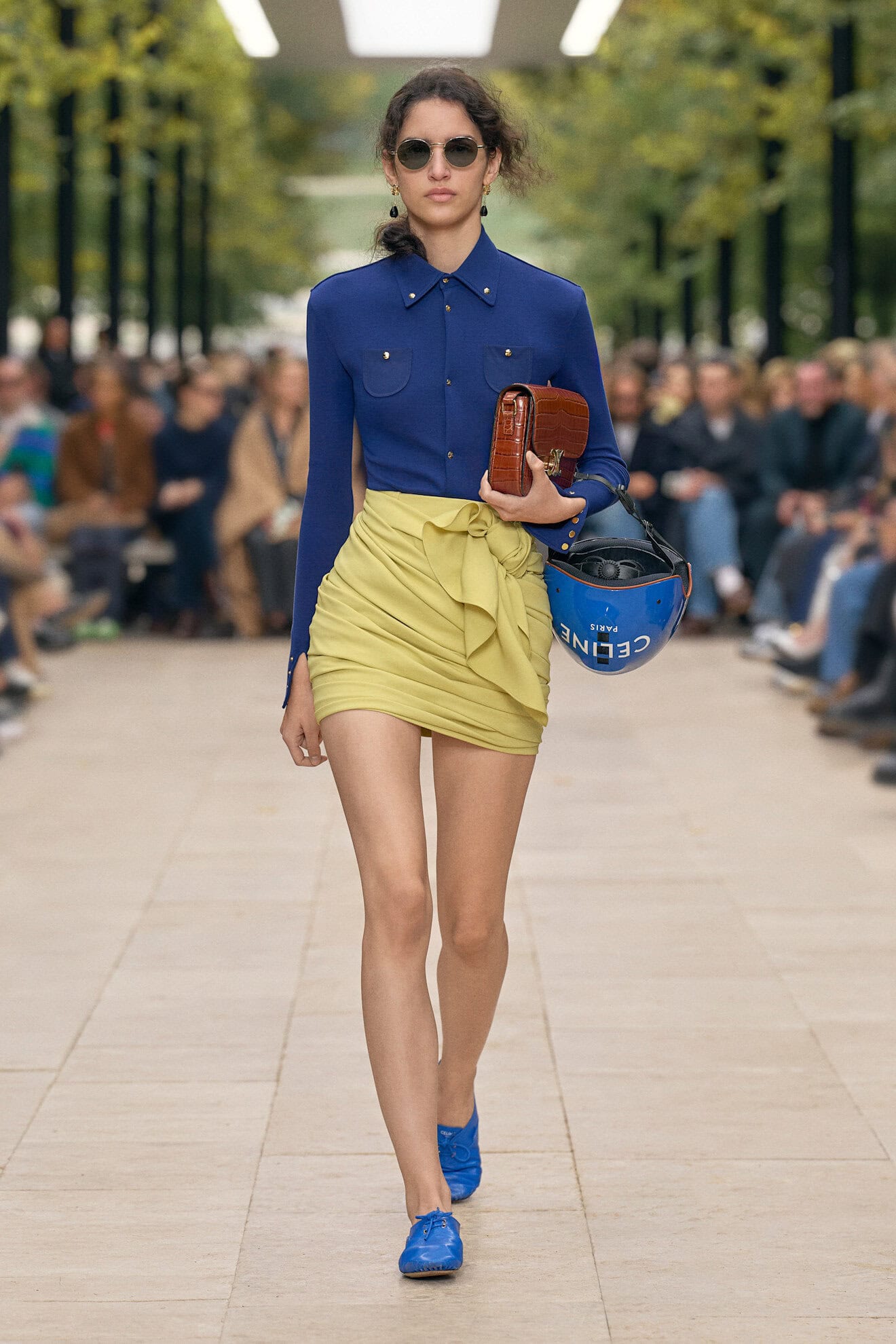
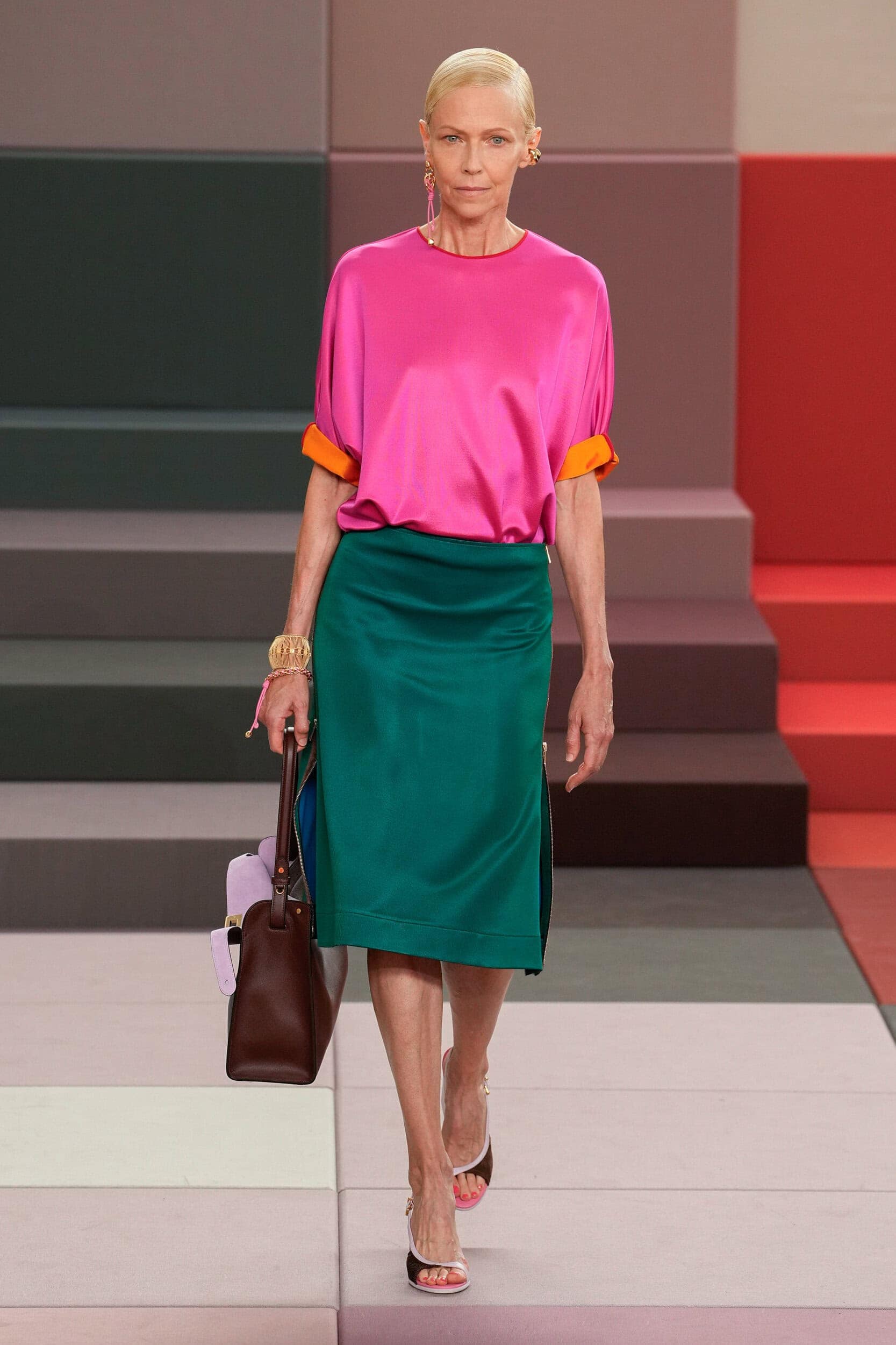
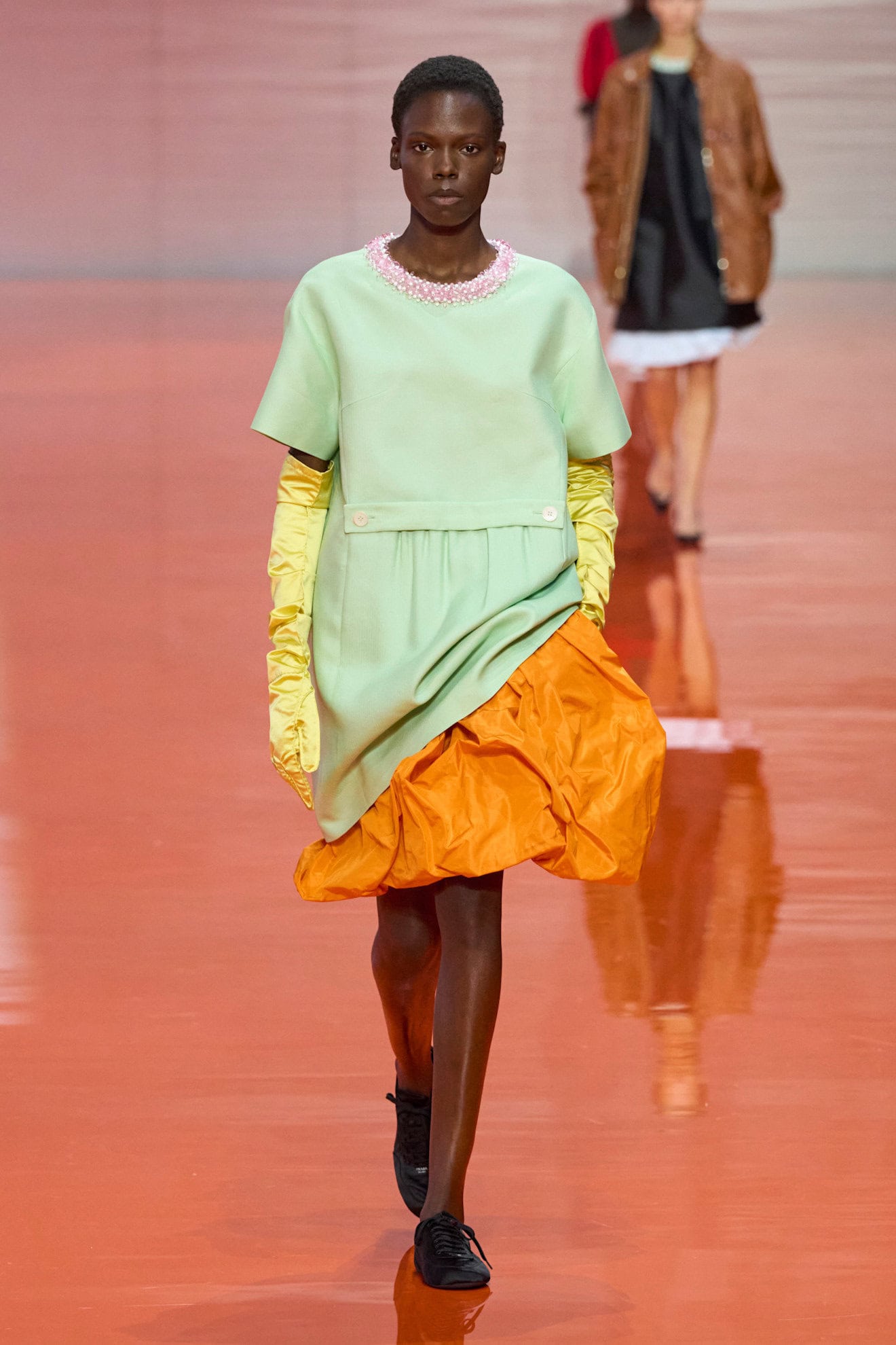
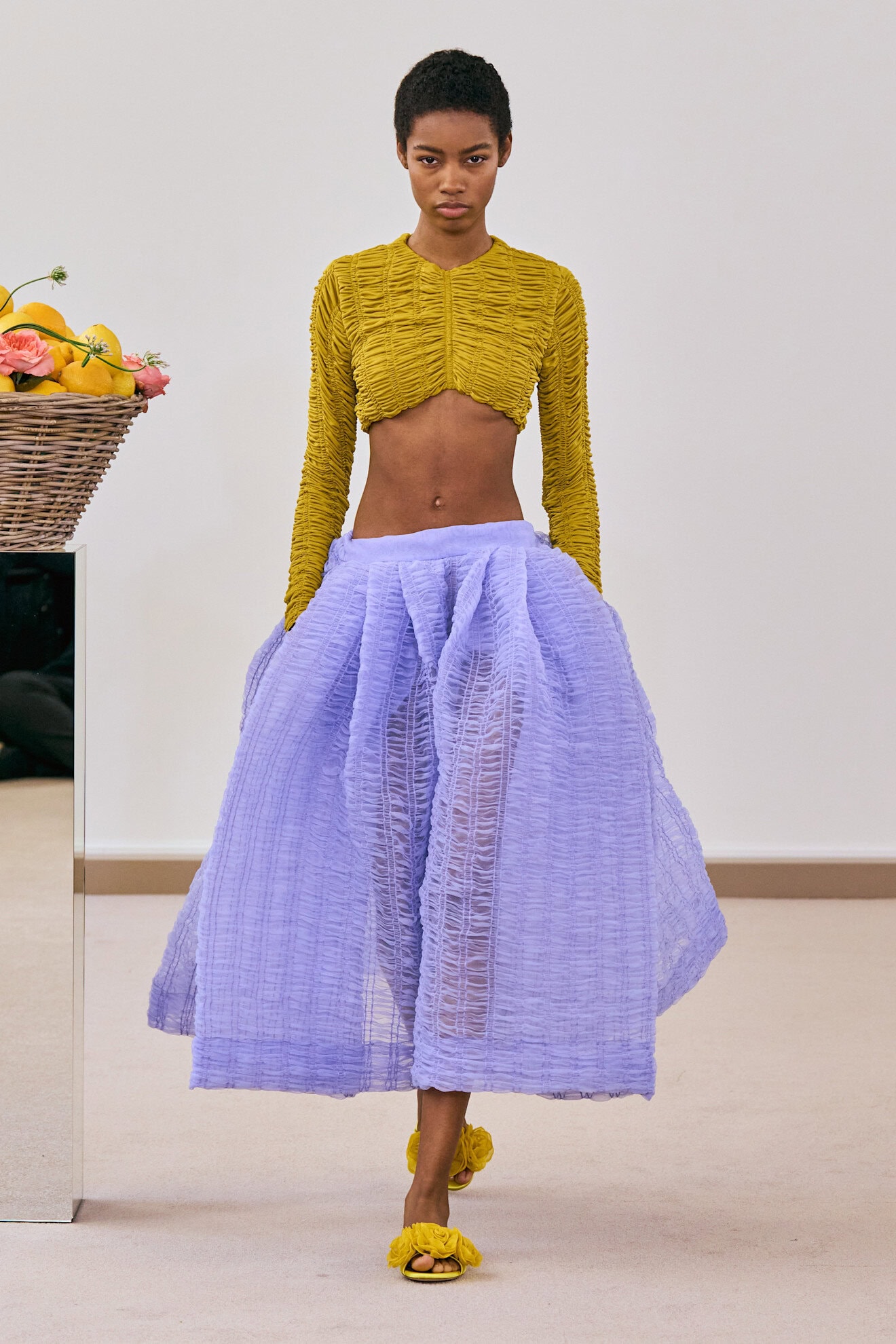
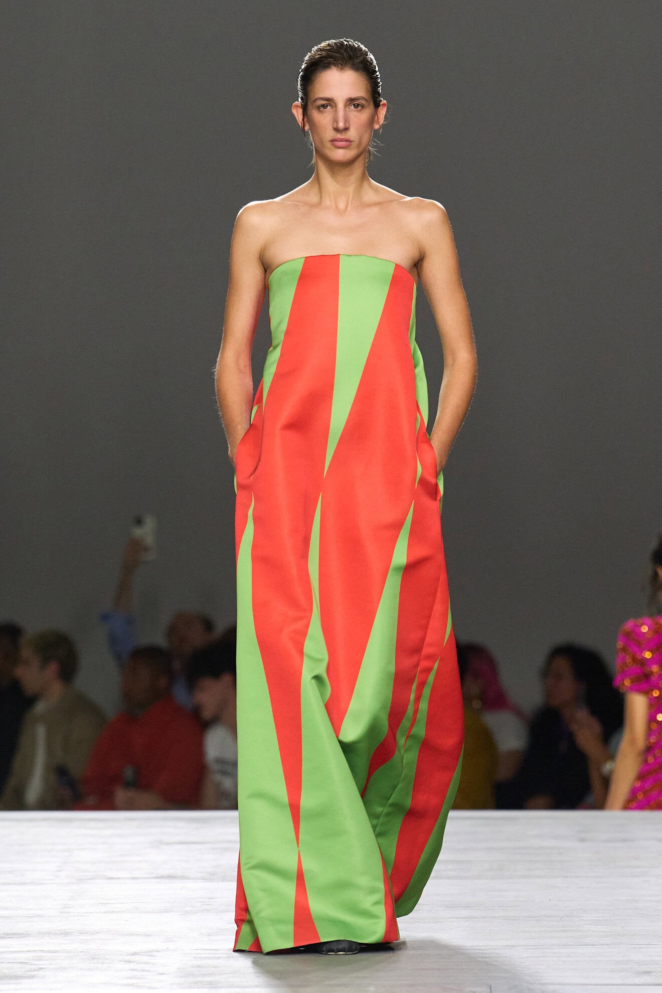
Block Your Brights
Colourful pairings of primary brights (Dries Van Noten, Diotima, Fendi) were the strongest signifier of a desire to create a collective uplift in energy next season. Not universally seen since ‘Dopamine Dressing’ emerged post-pandemic (and a time when uncertainty also saw a significant shift in consumer sentiment), vibrant palettes are once again being harnessed to illicit positive emotions.
Red and pink at Balenciaga, Pistachio, lemon, and orange at Prada, and mint and sea blue at Versace were worn both in harmony and as opposites across the spectrum which should not have worked, but ultimately did as designers combined clashing colours to make striking statements.
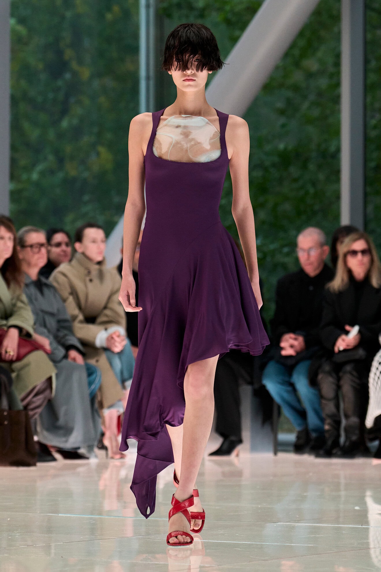
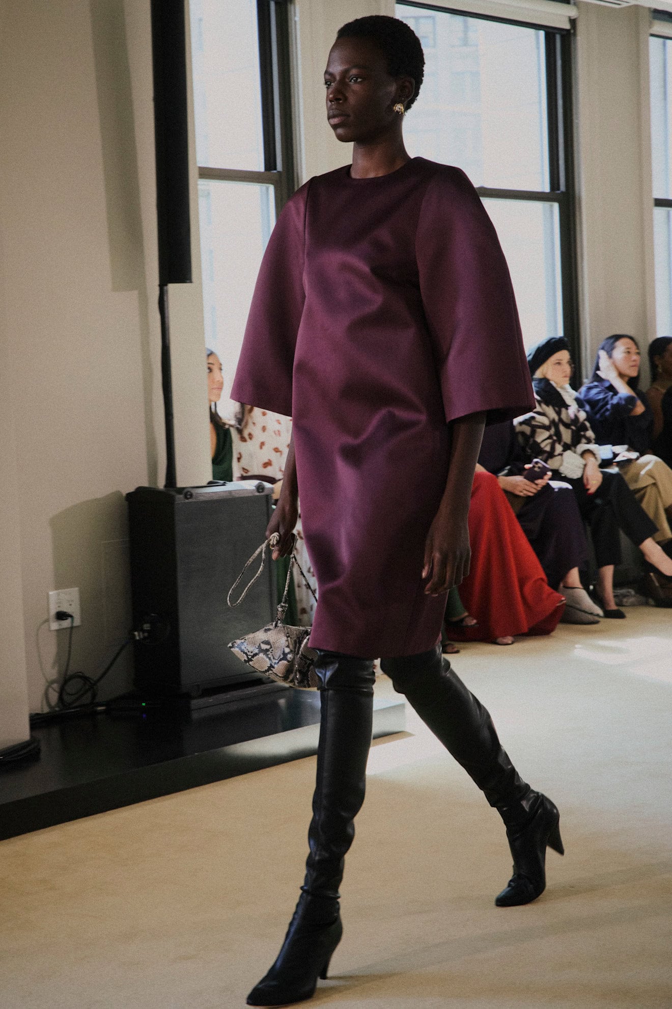
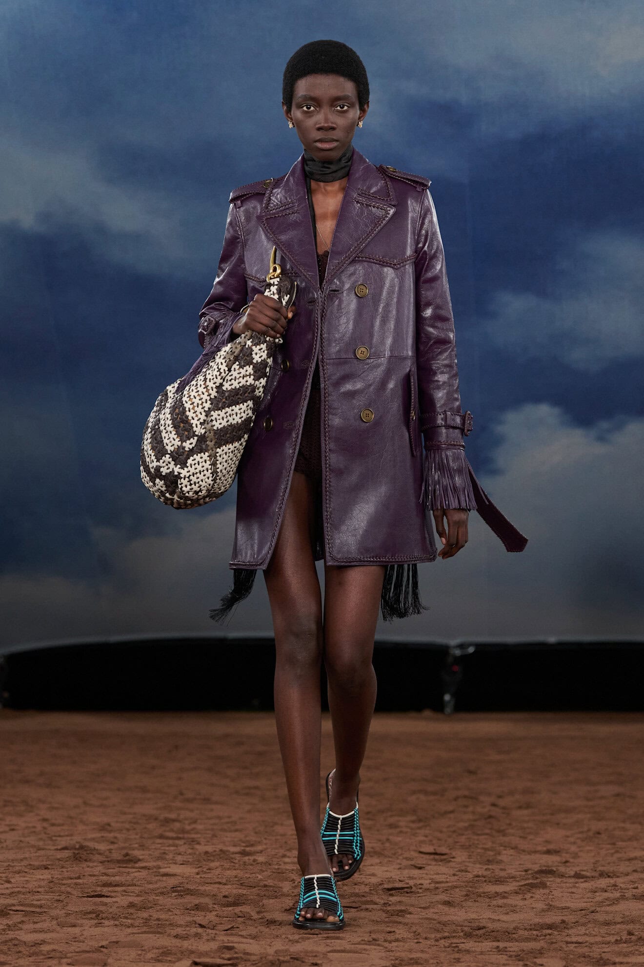
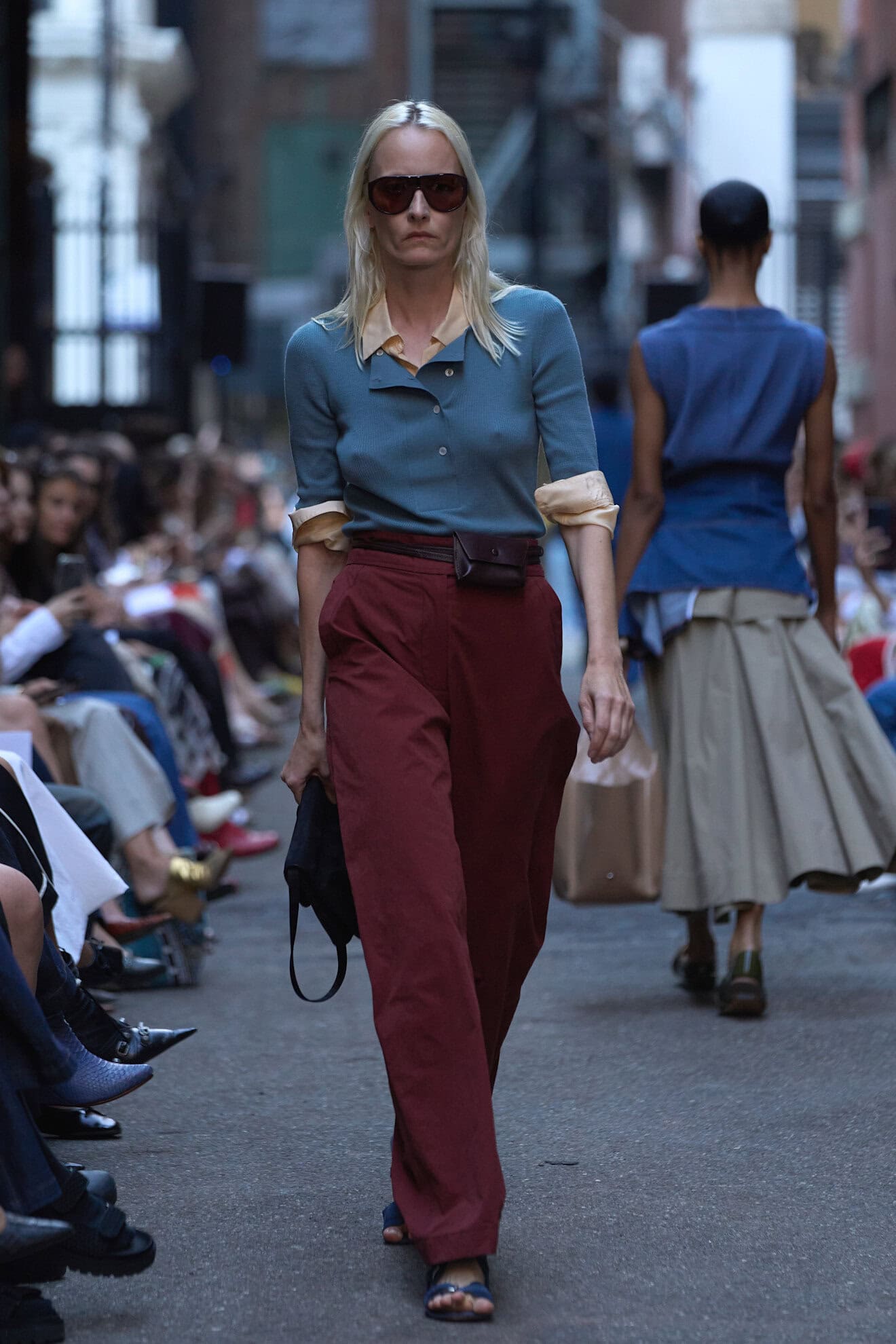
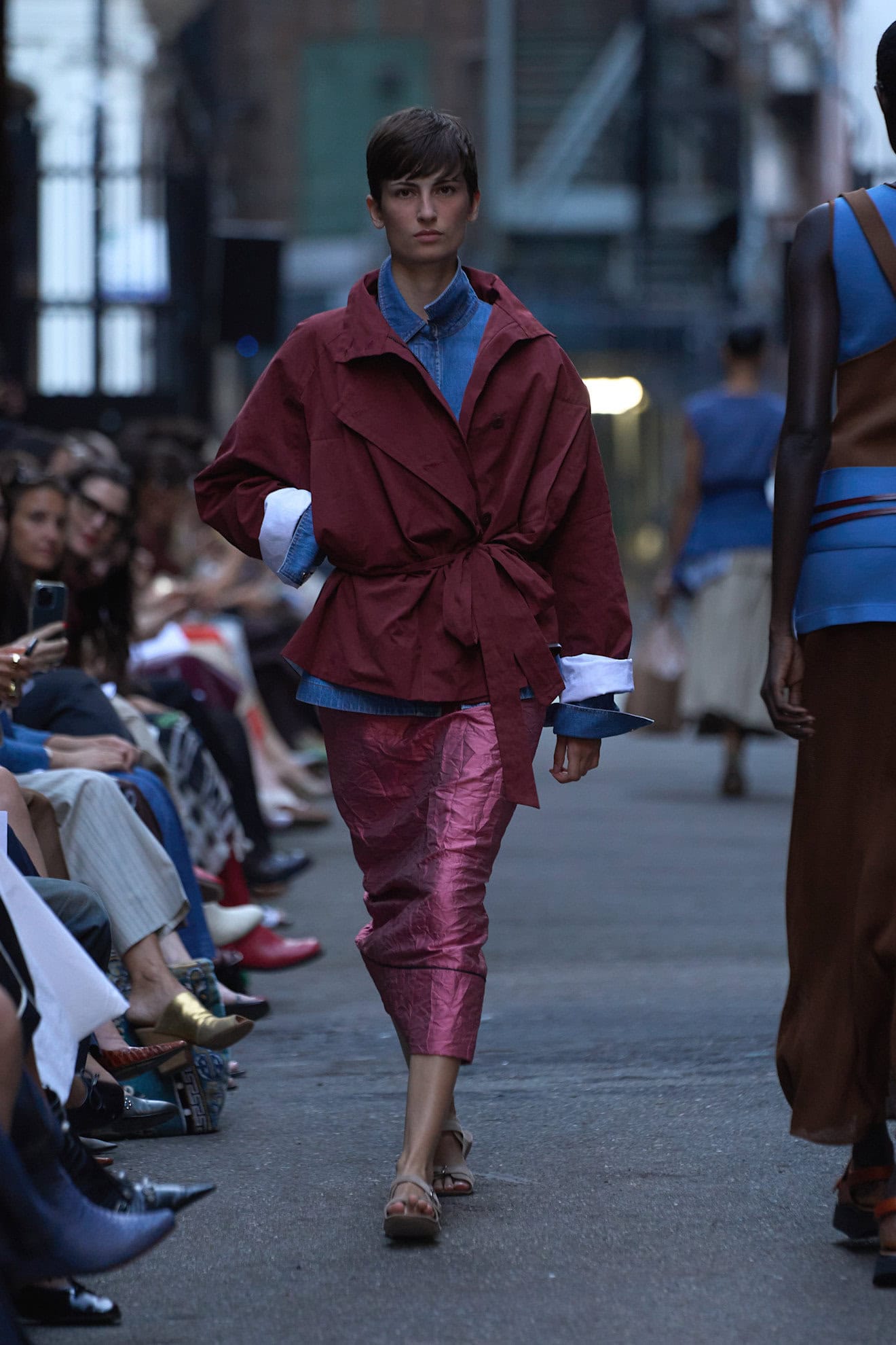
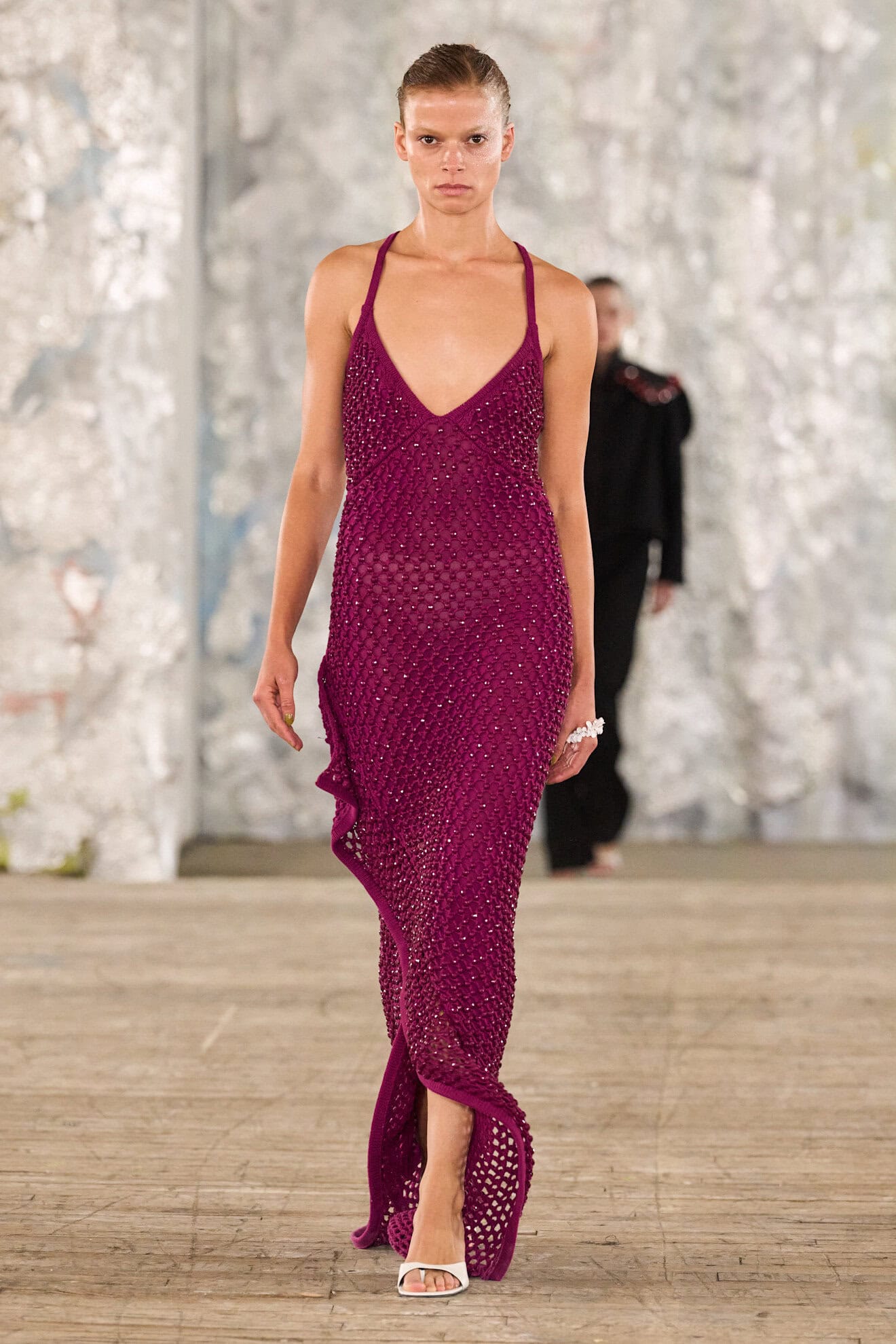
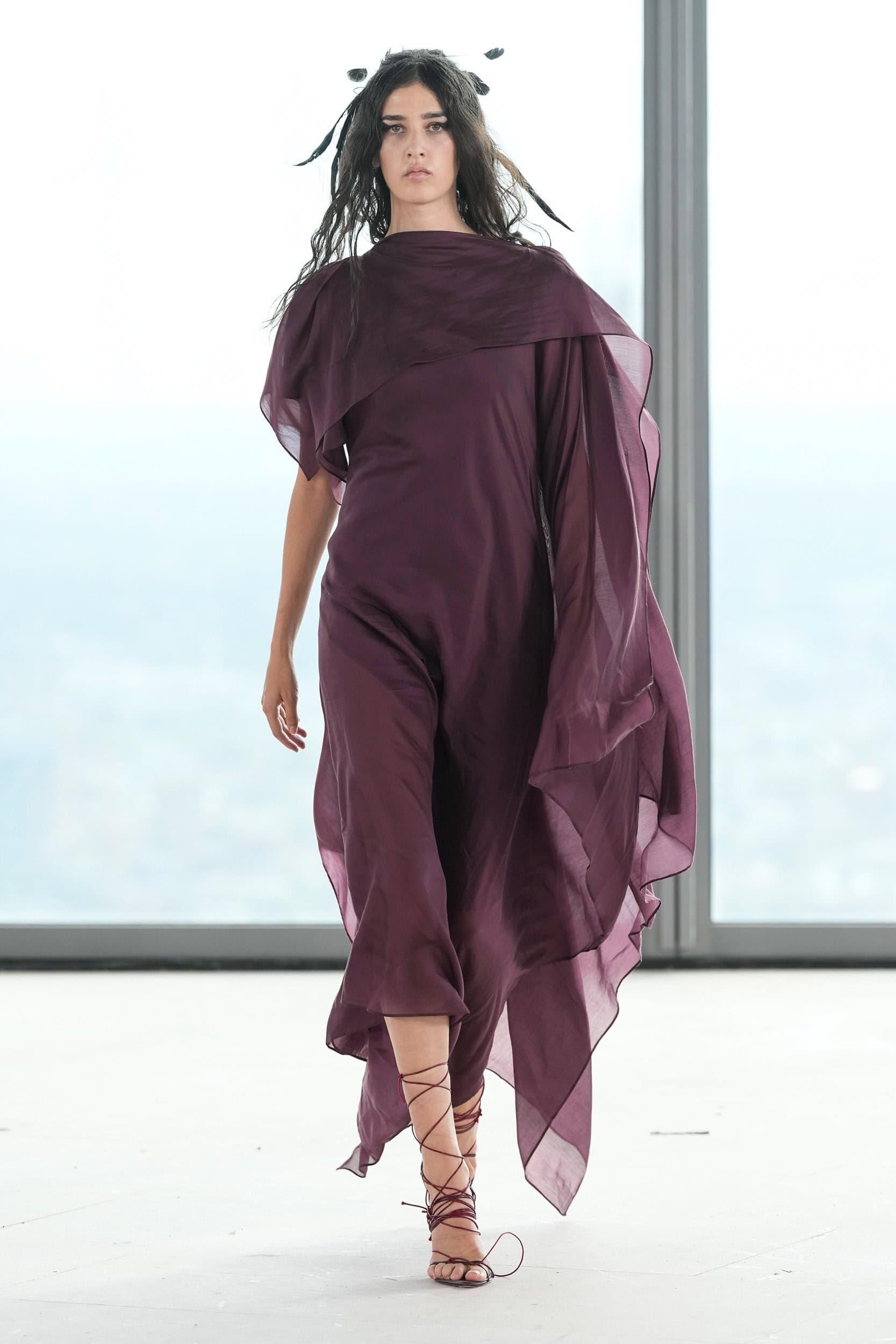
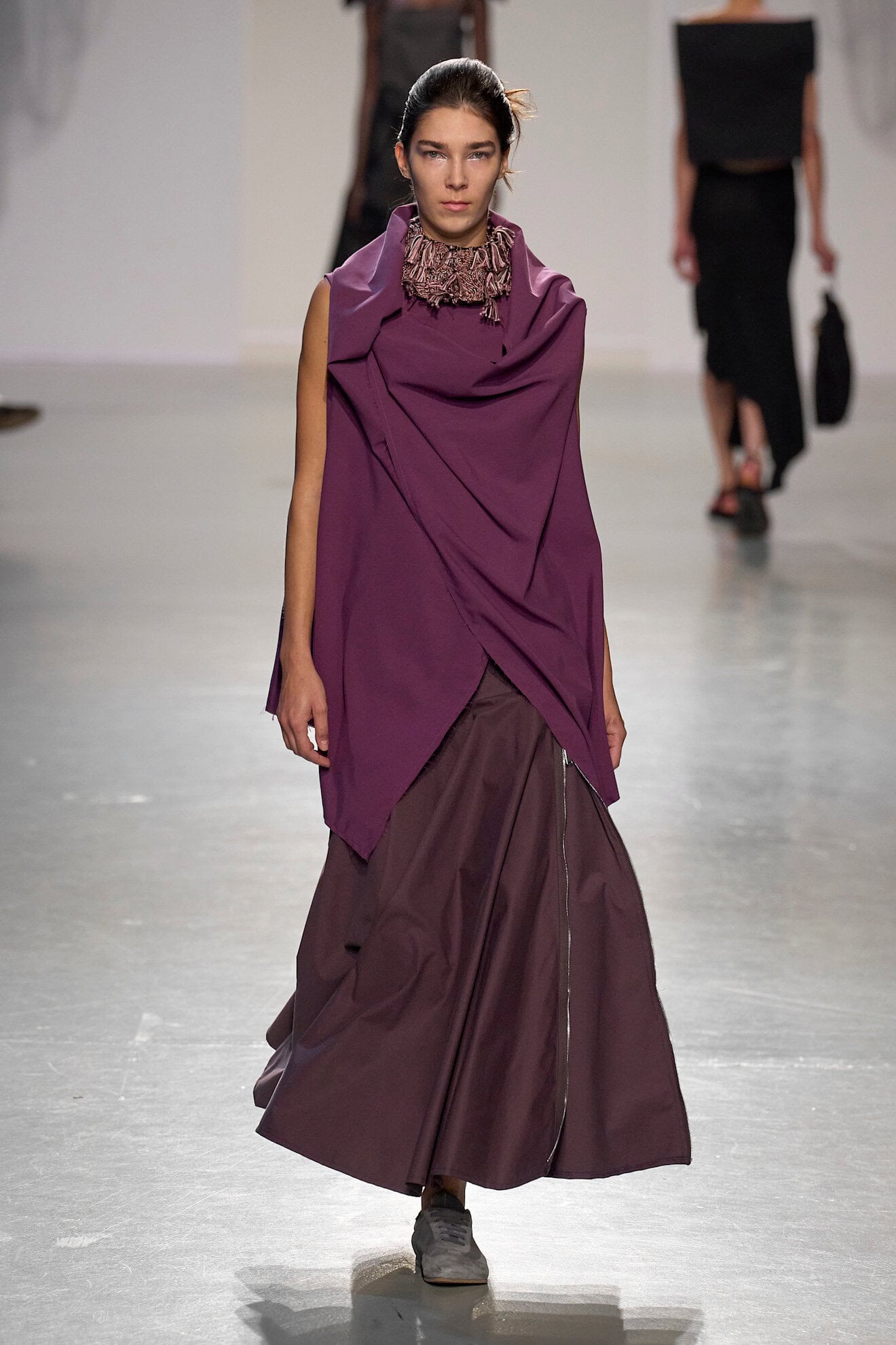
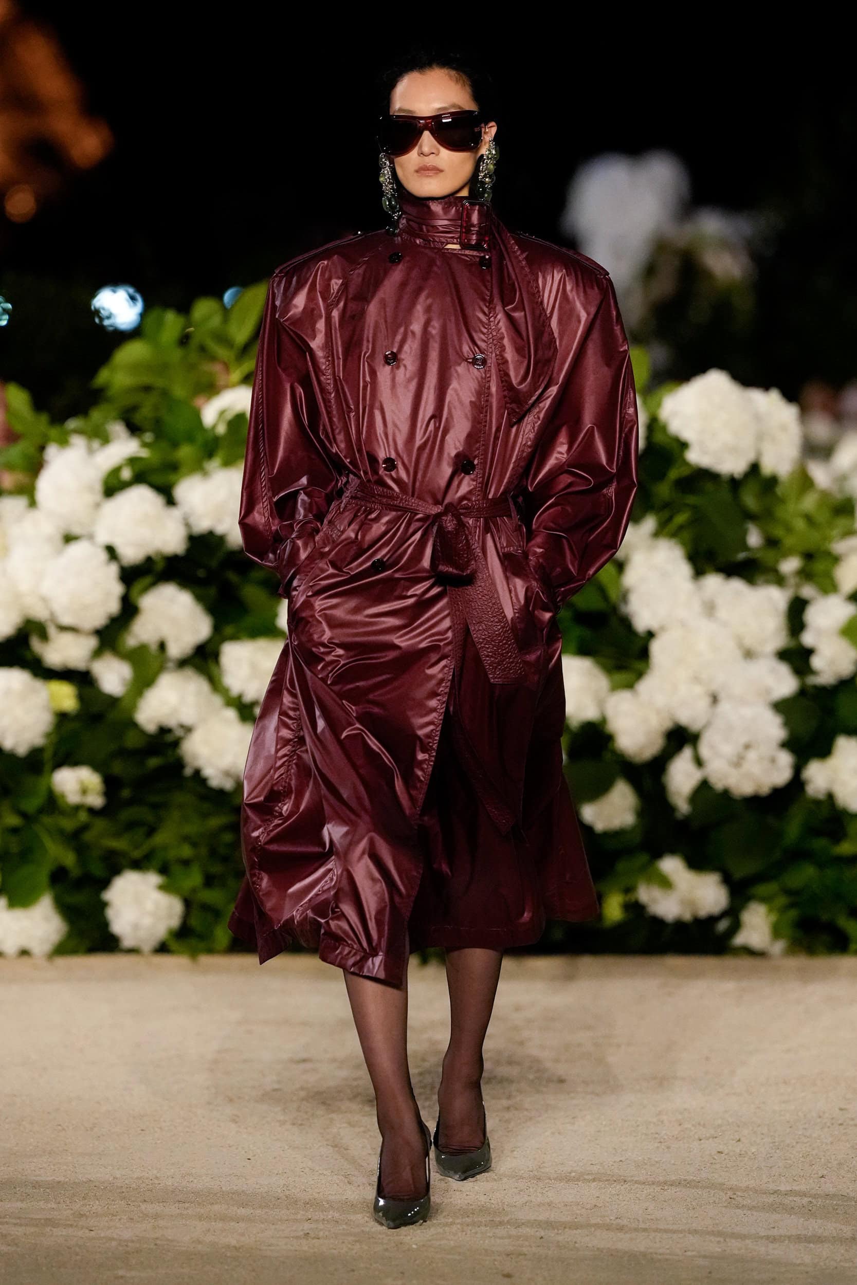
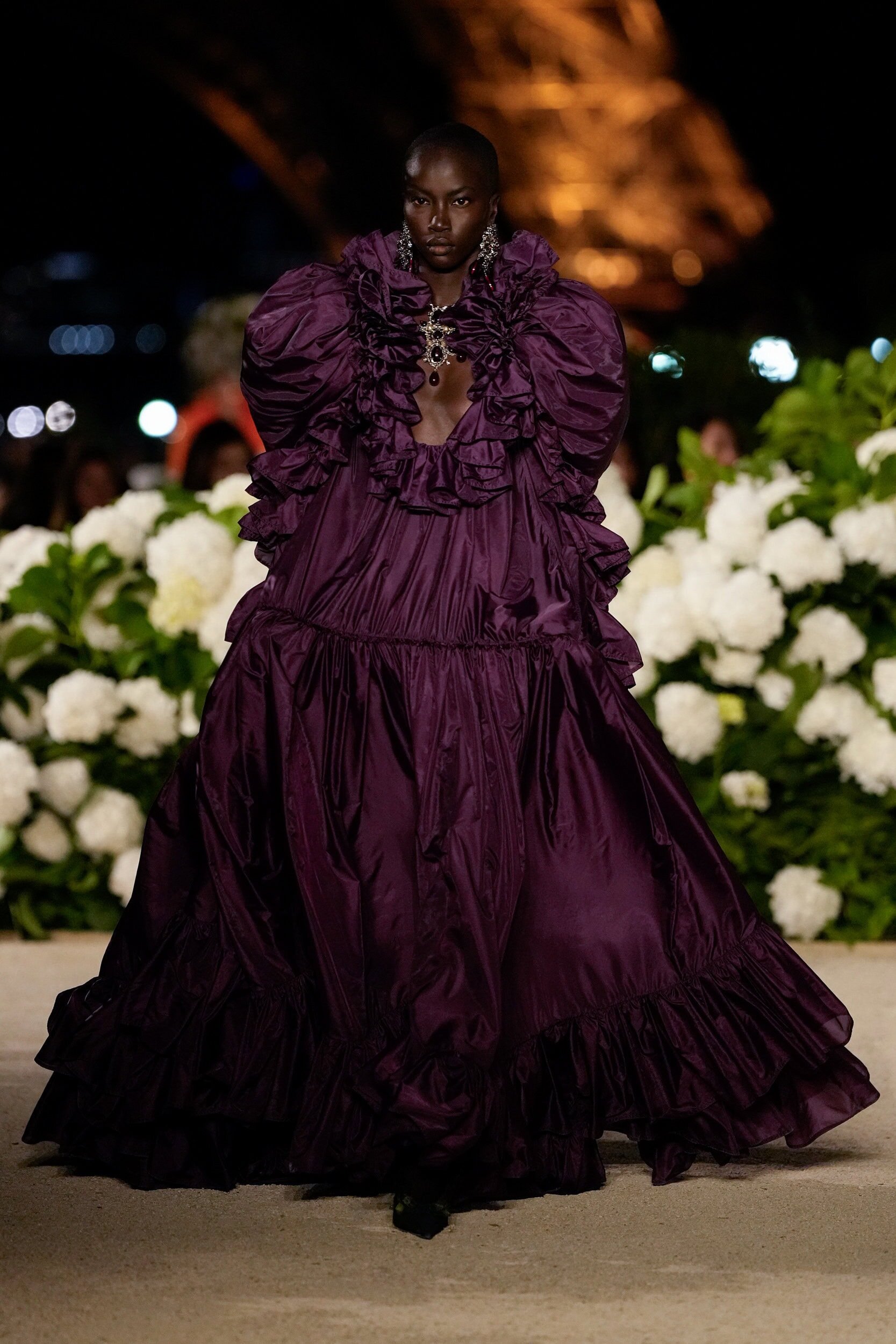
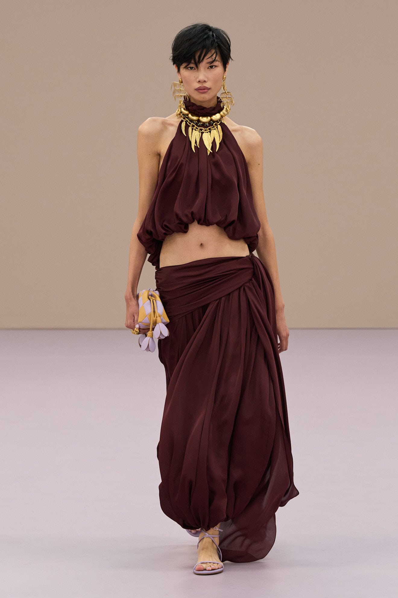
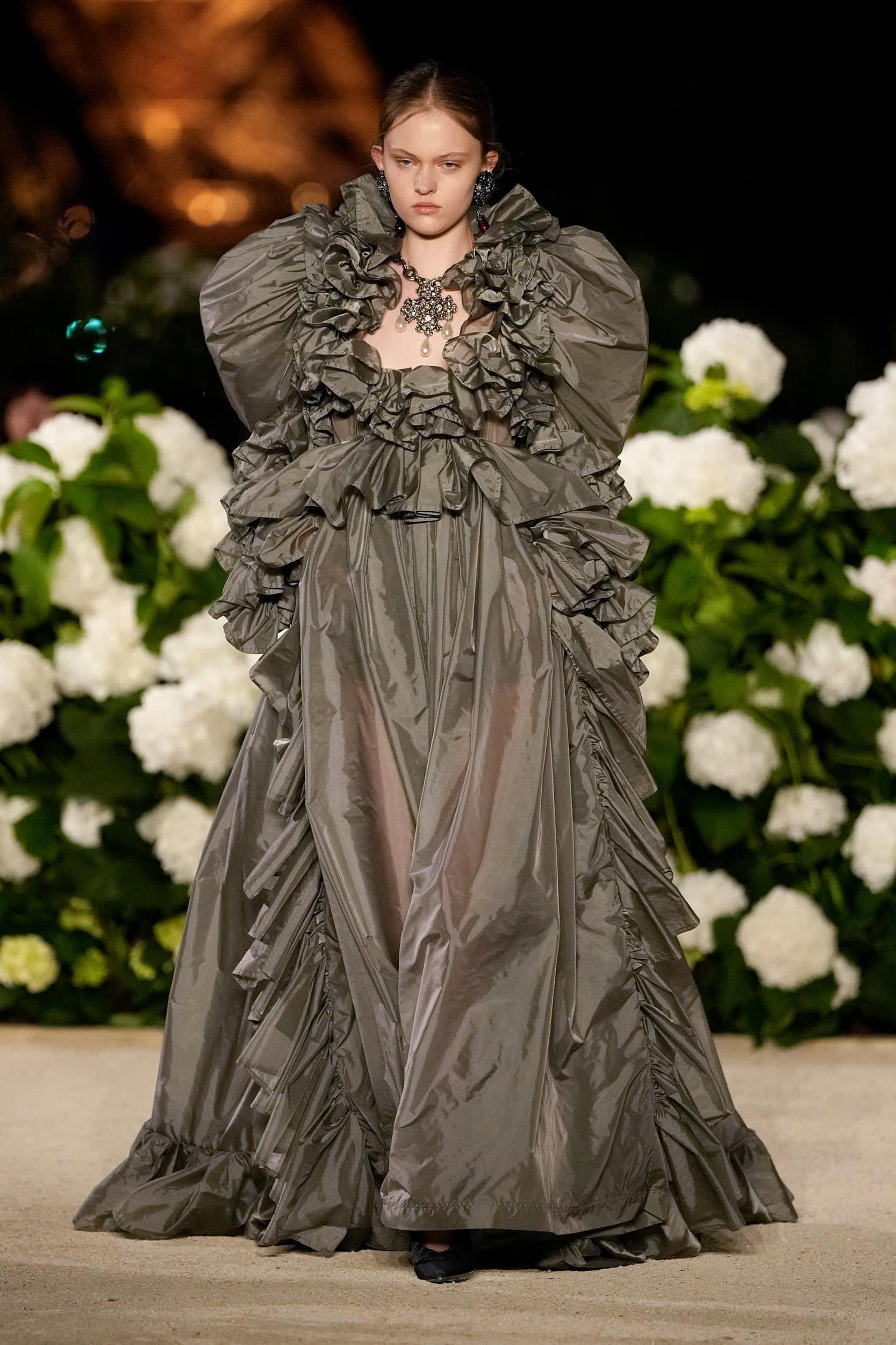
Almost Aubergine
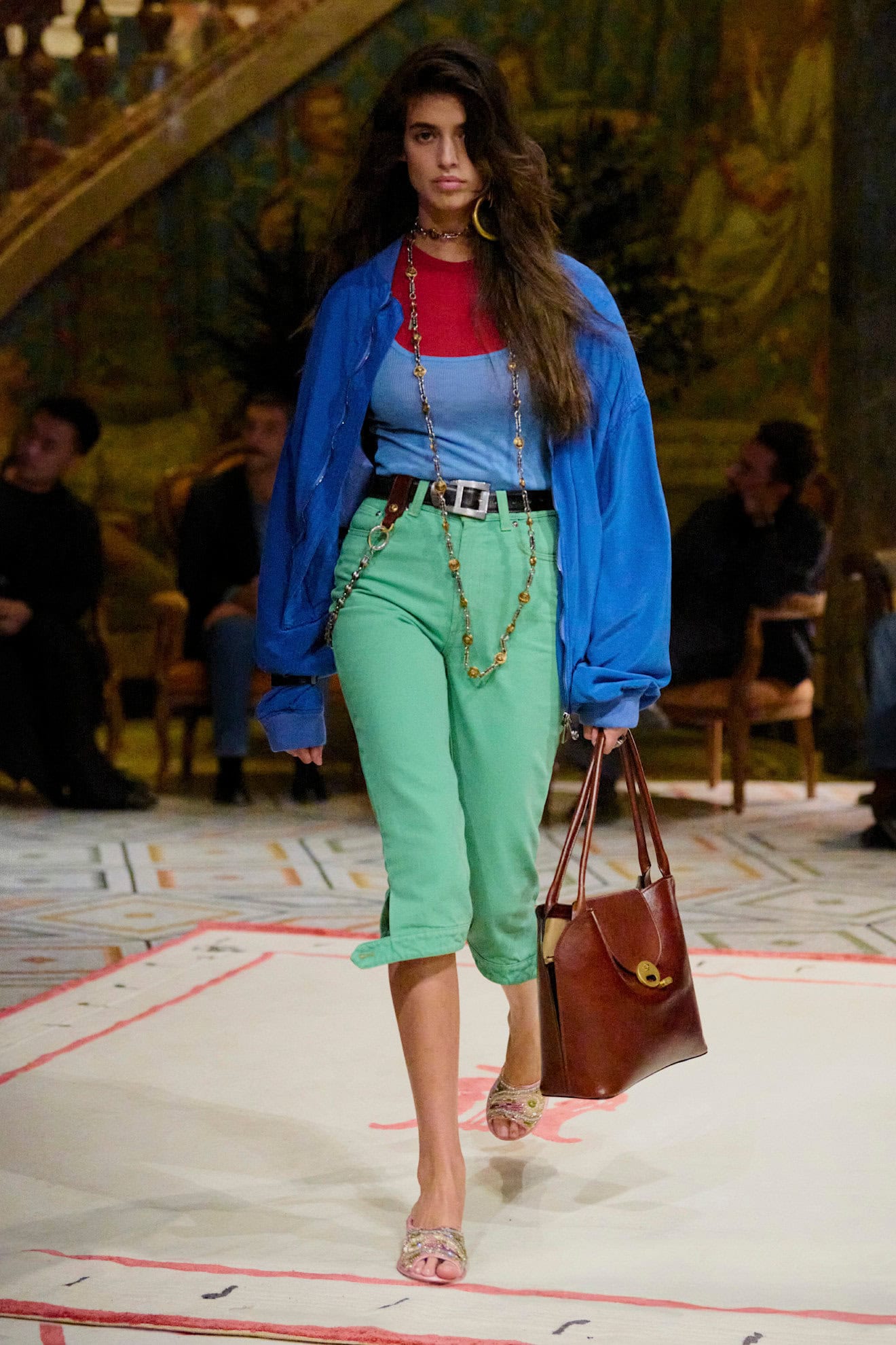
Sophisticated summer darks will offer light relief to those seeking an alternative to joyous brights but don’t wish to fall back on neutrals. Tracking across the season deep purple, teal, navy and cobalt reference the decadence and grown-up glamour of the 1980s whose power suits and broad shoulders were a key influence once again.
The richness of aubergine was made wearable through lightweight diaphanous fabrics and structured shapes – Haider Ackermann’s perforated leather skirt suit will be worth its RRP, while Rachel Comey’s down-to-earth New York fashion week show was an exercise in how to effortlessly pair these richer, deeper tones to update neutrals and pastels for everyday looks which can be as eclectic, as they are wearable.
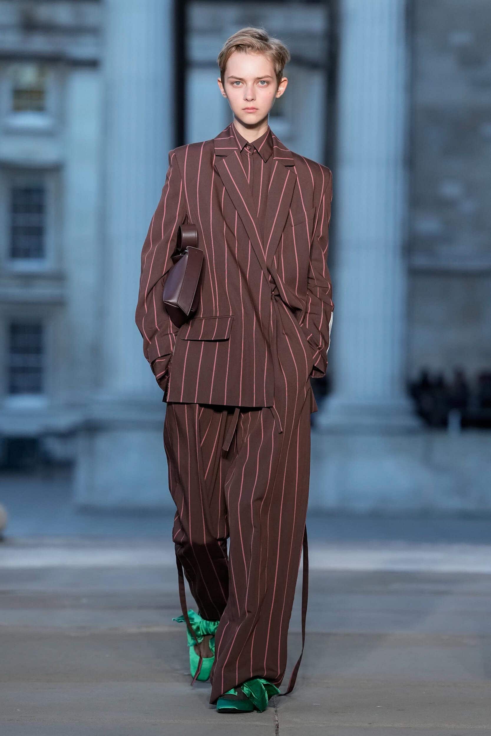
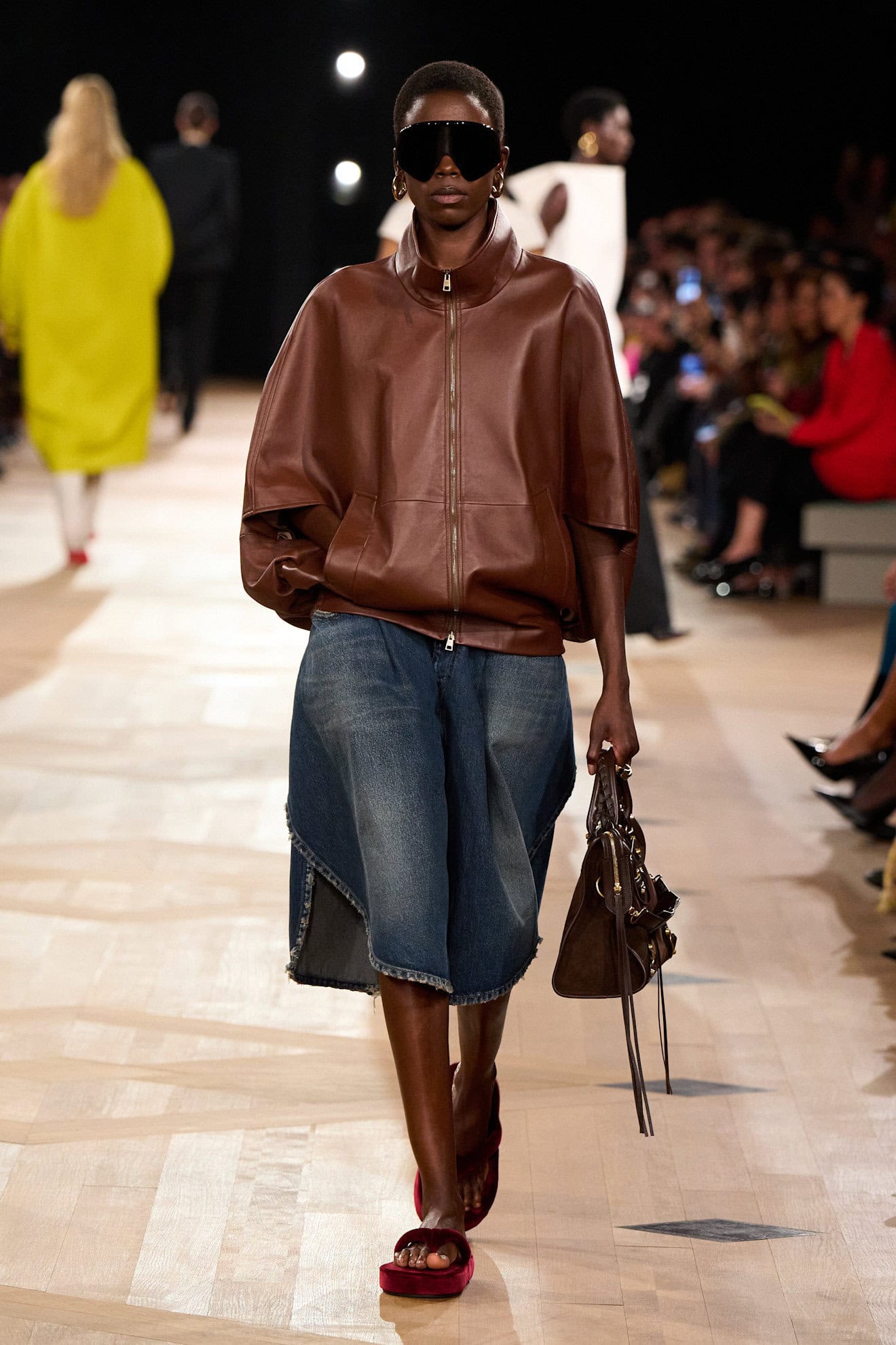
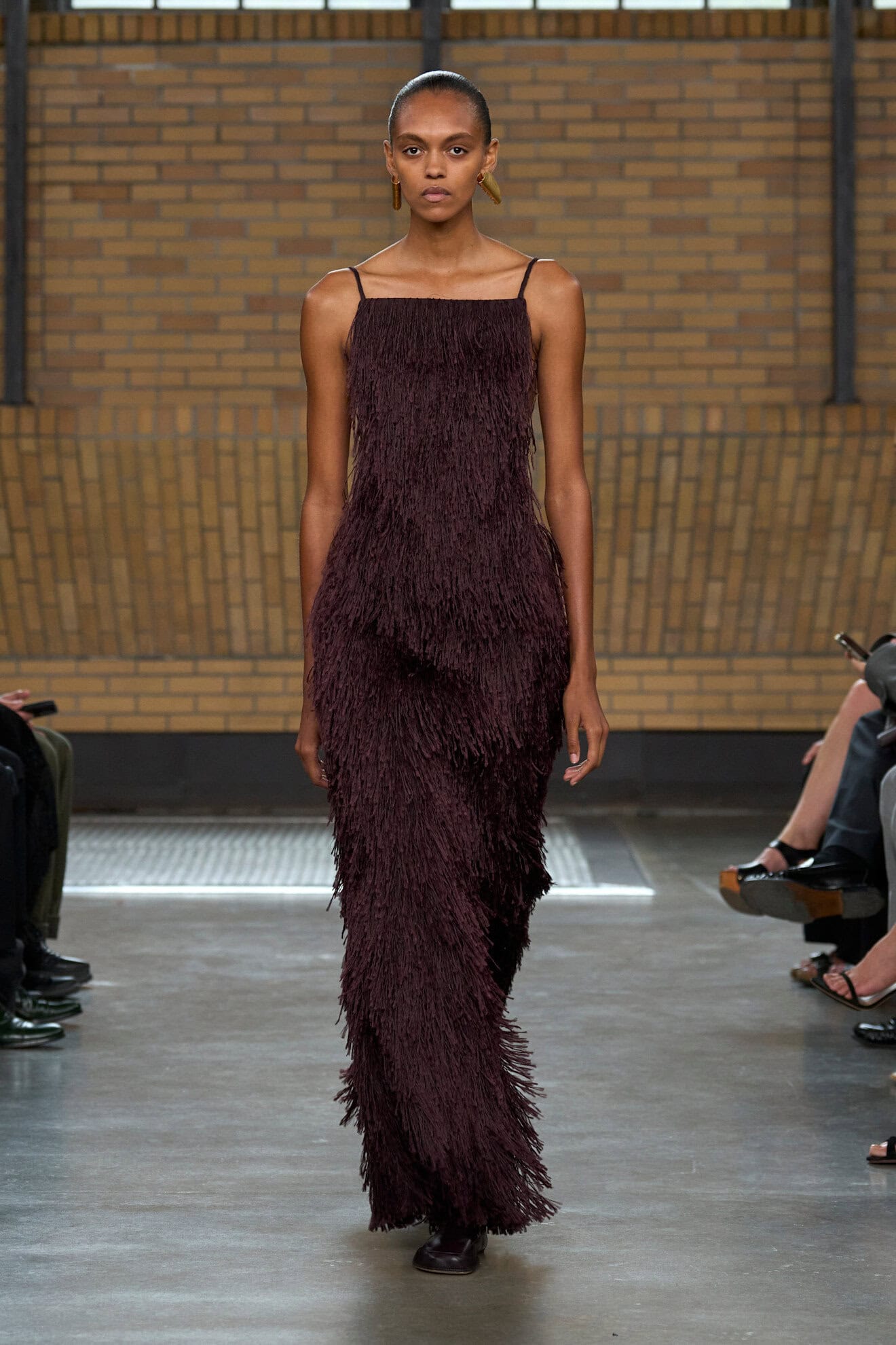
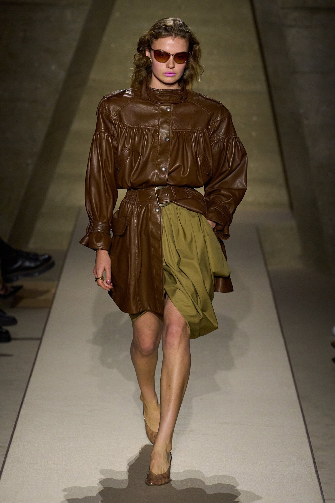
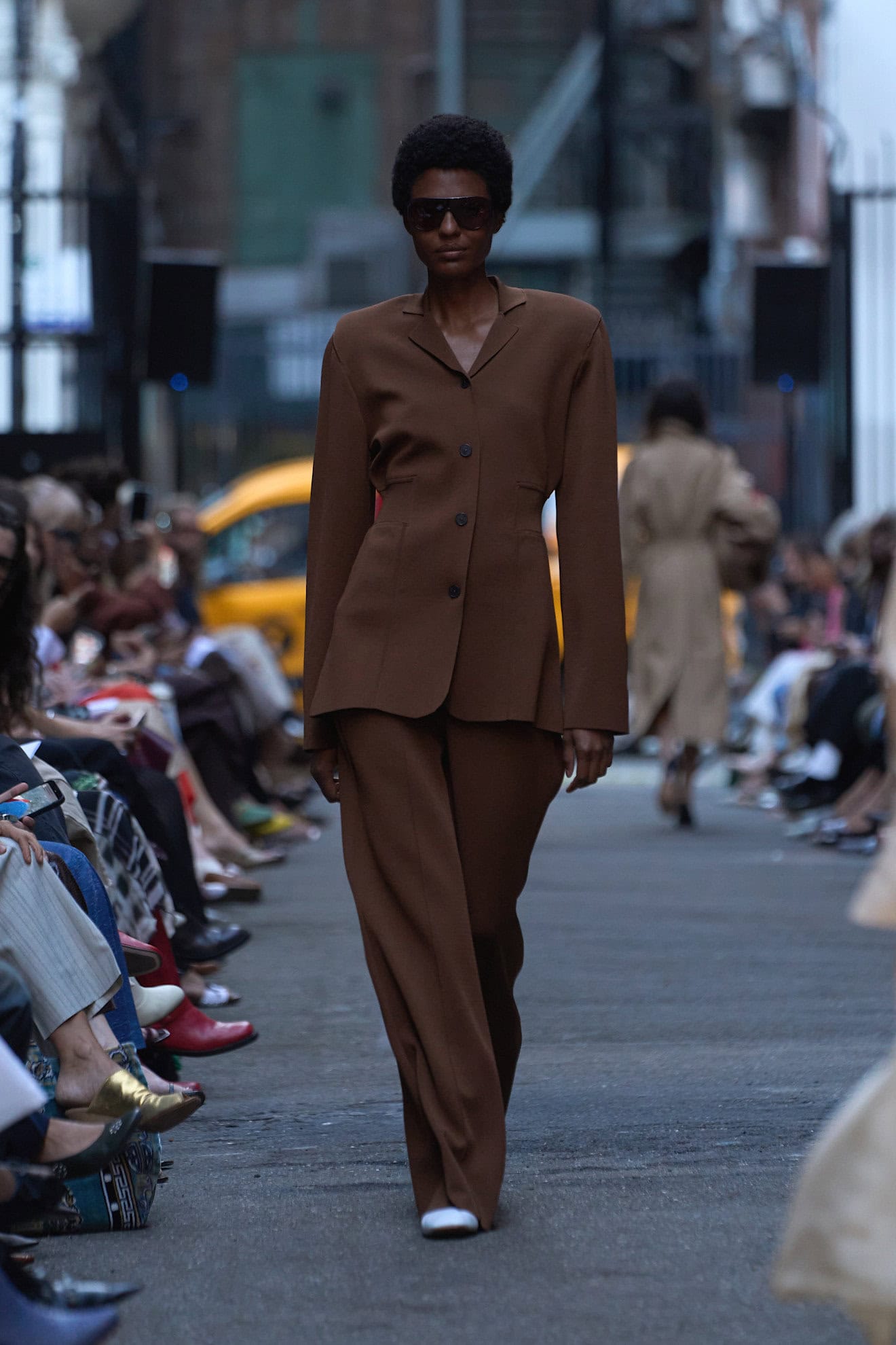
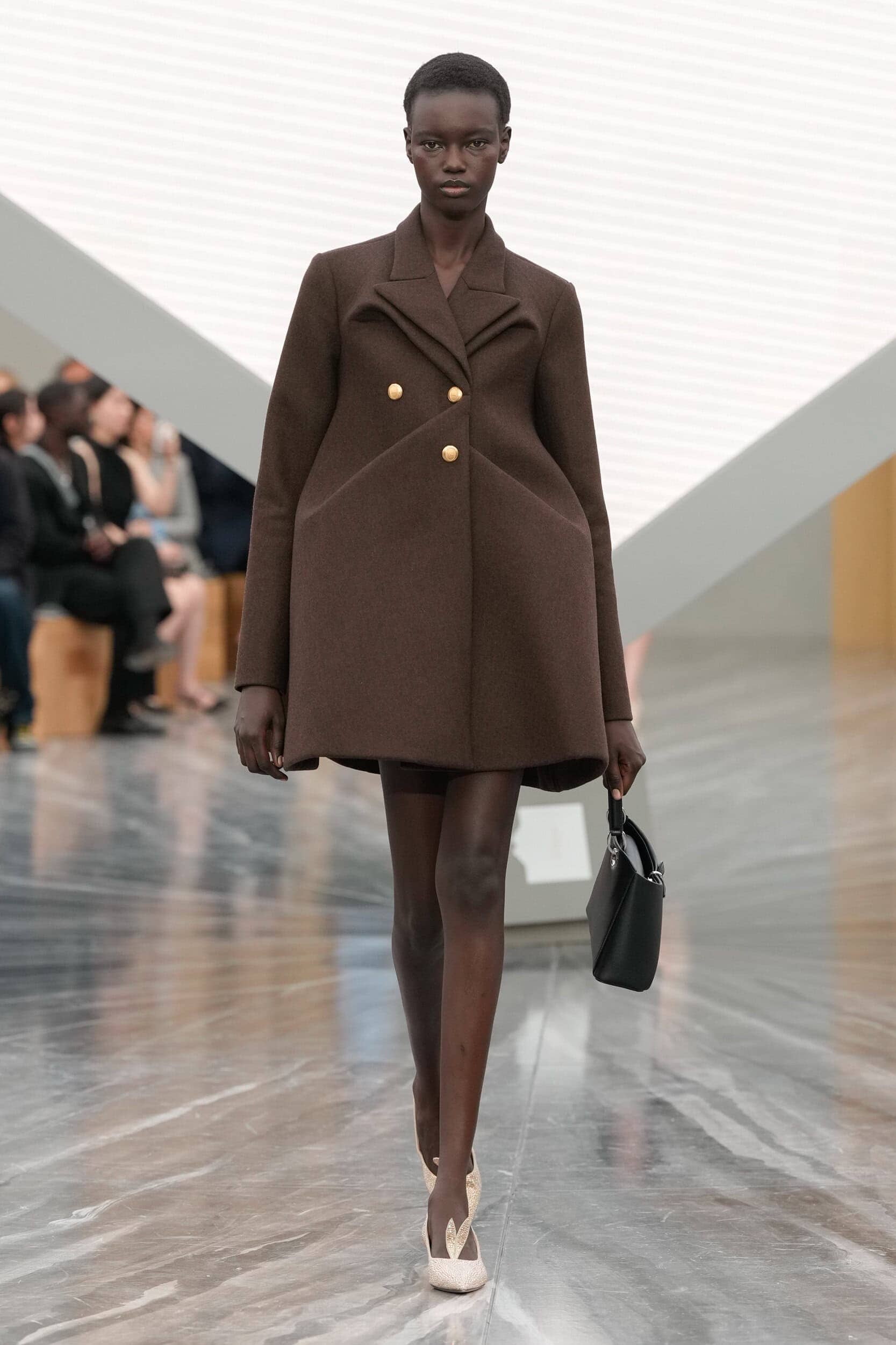
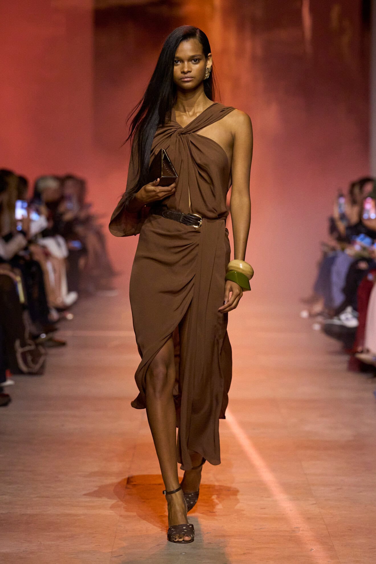
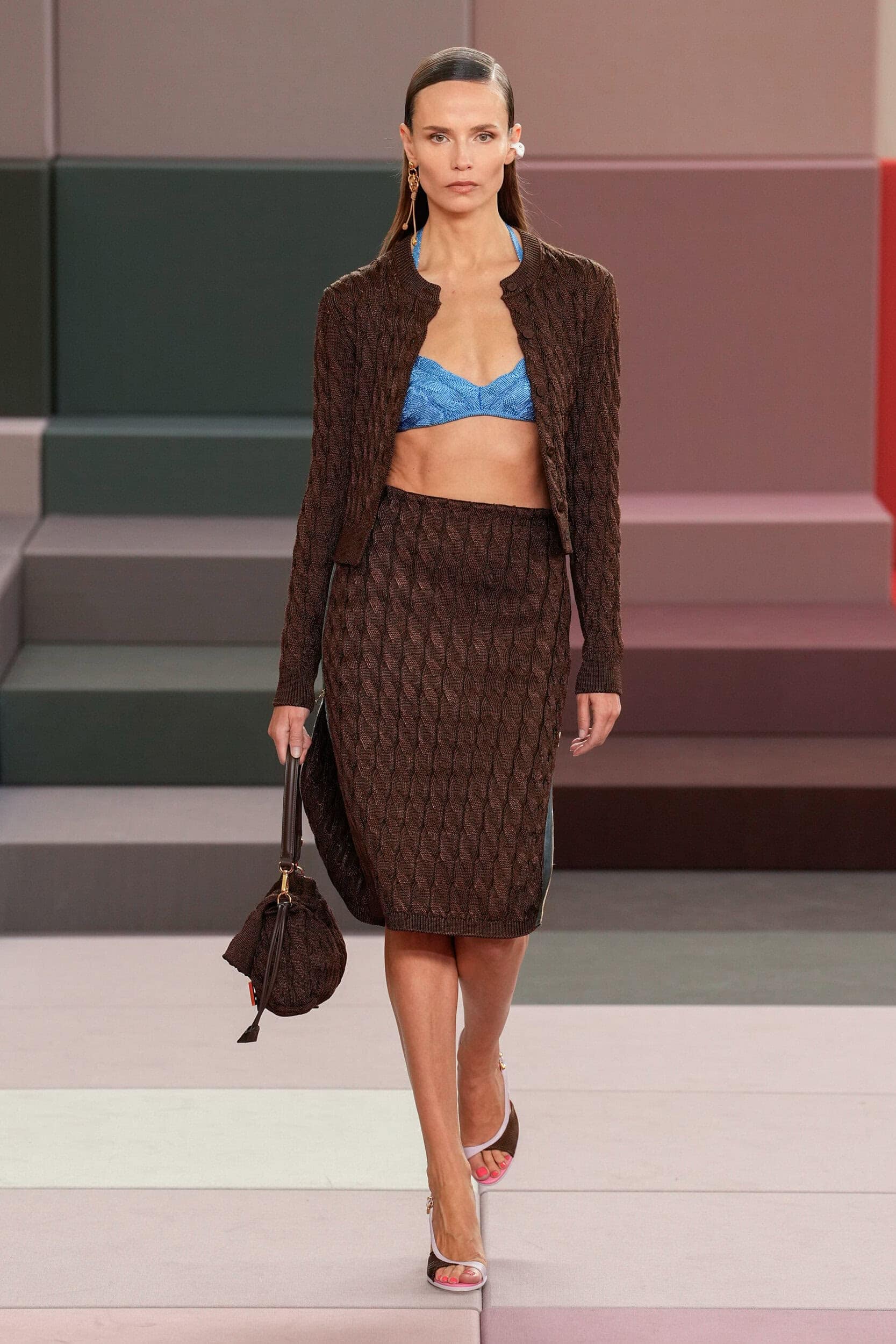
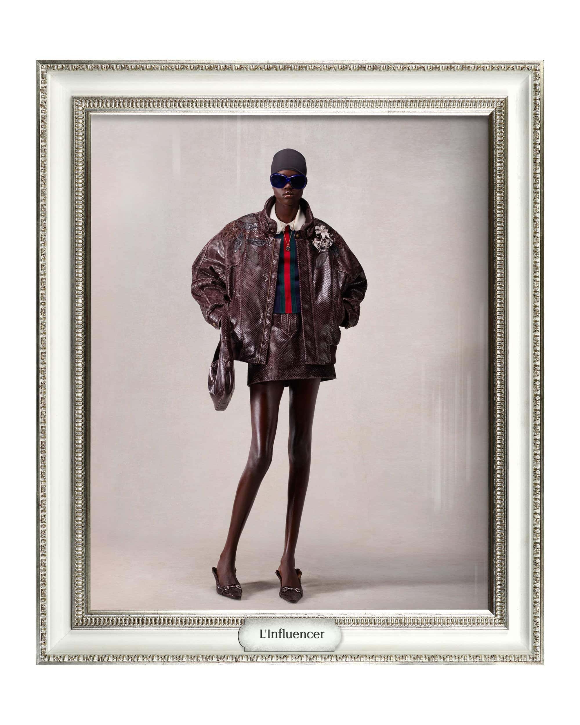
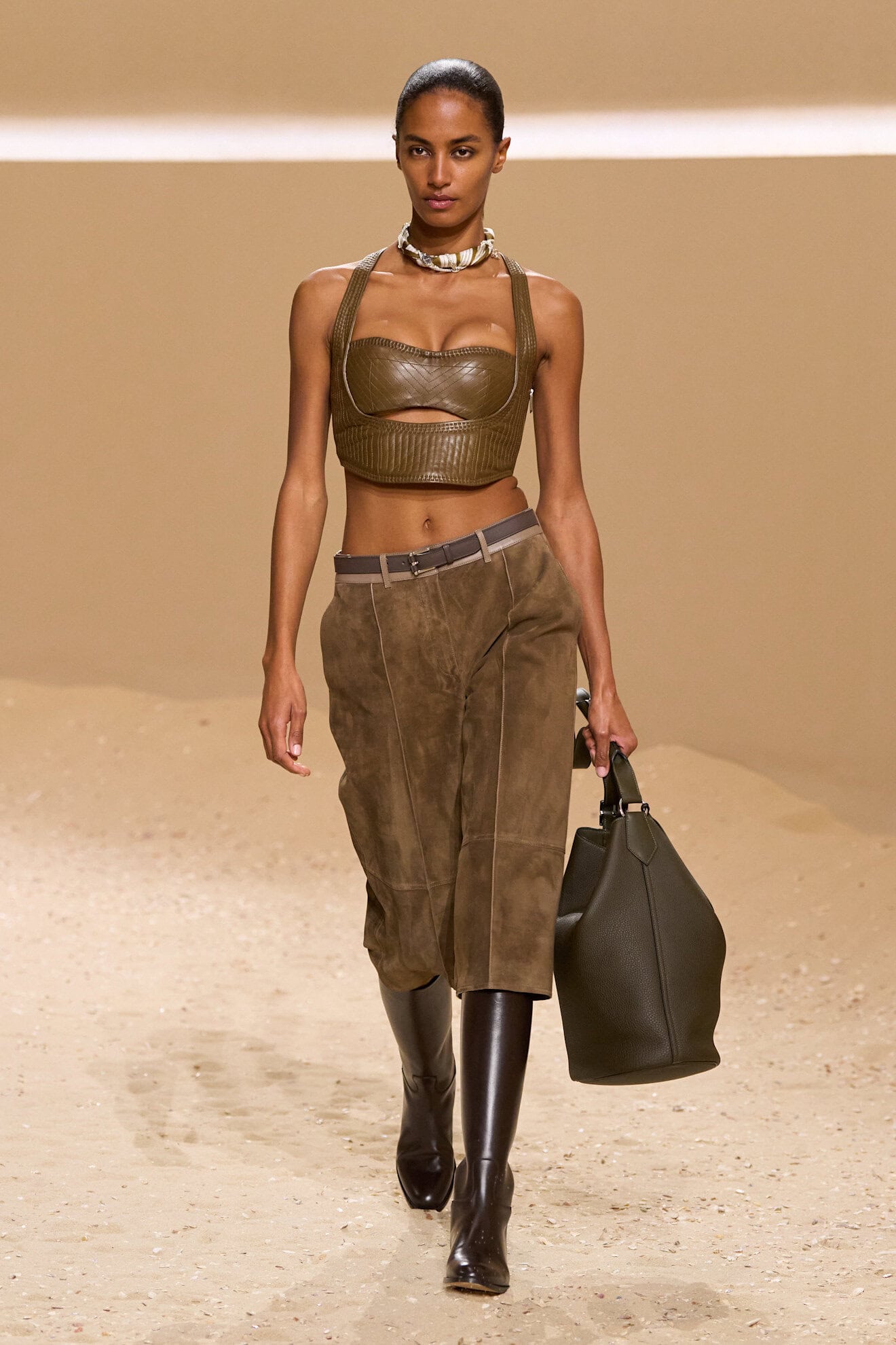
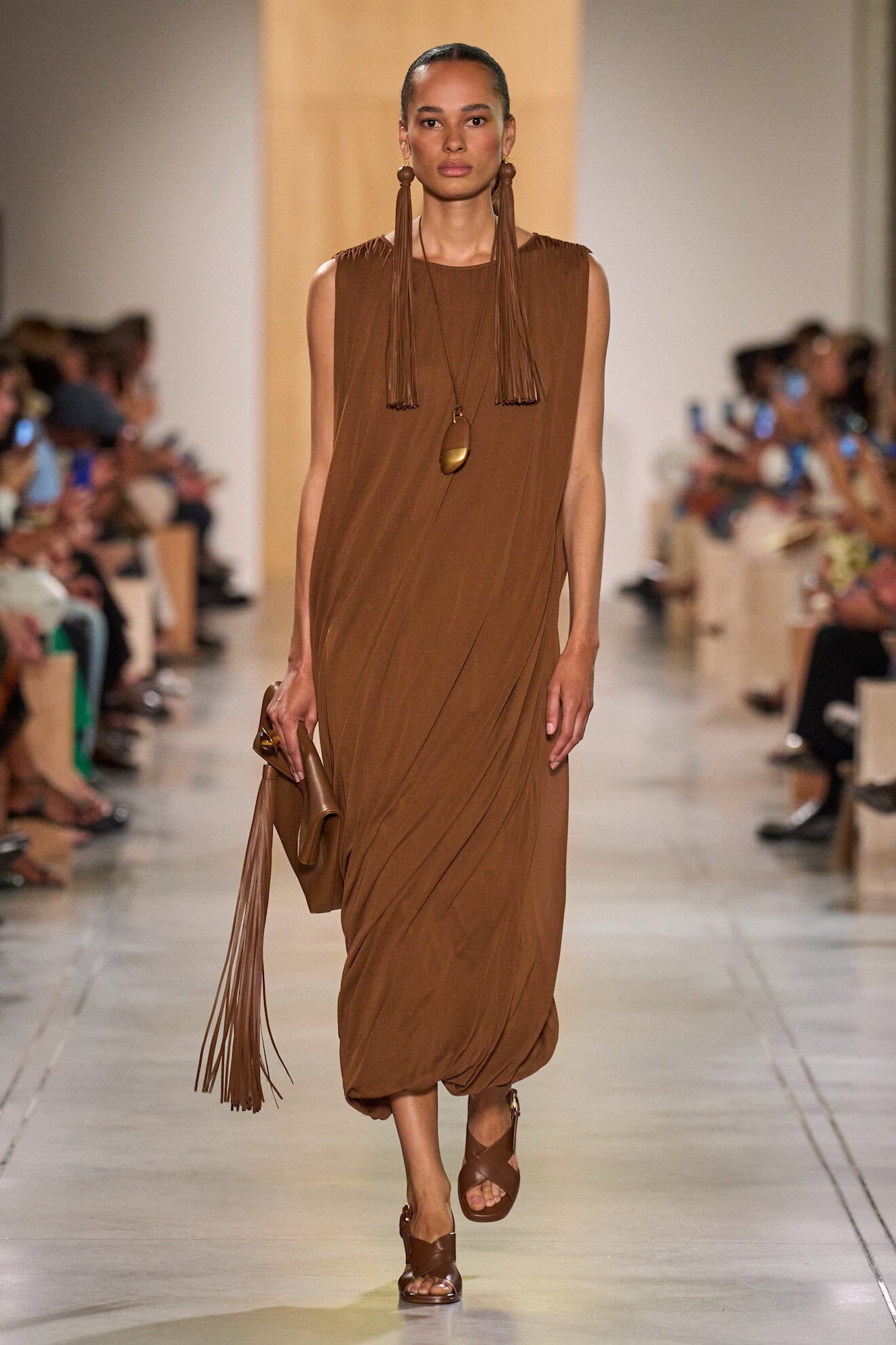
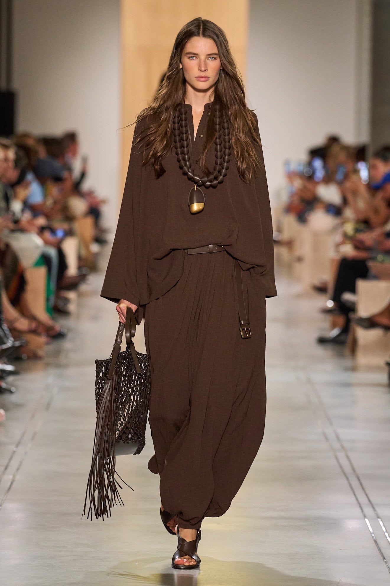
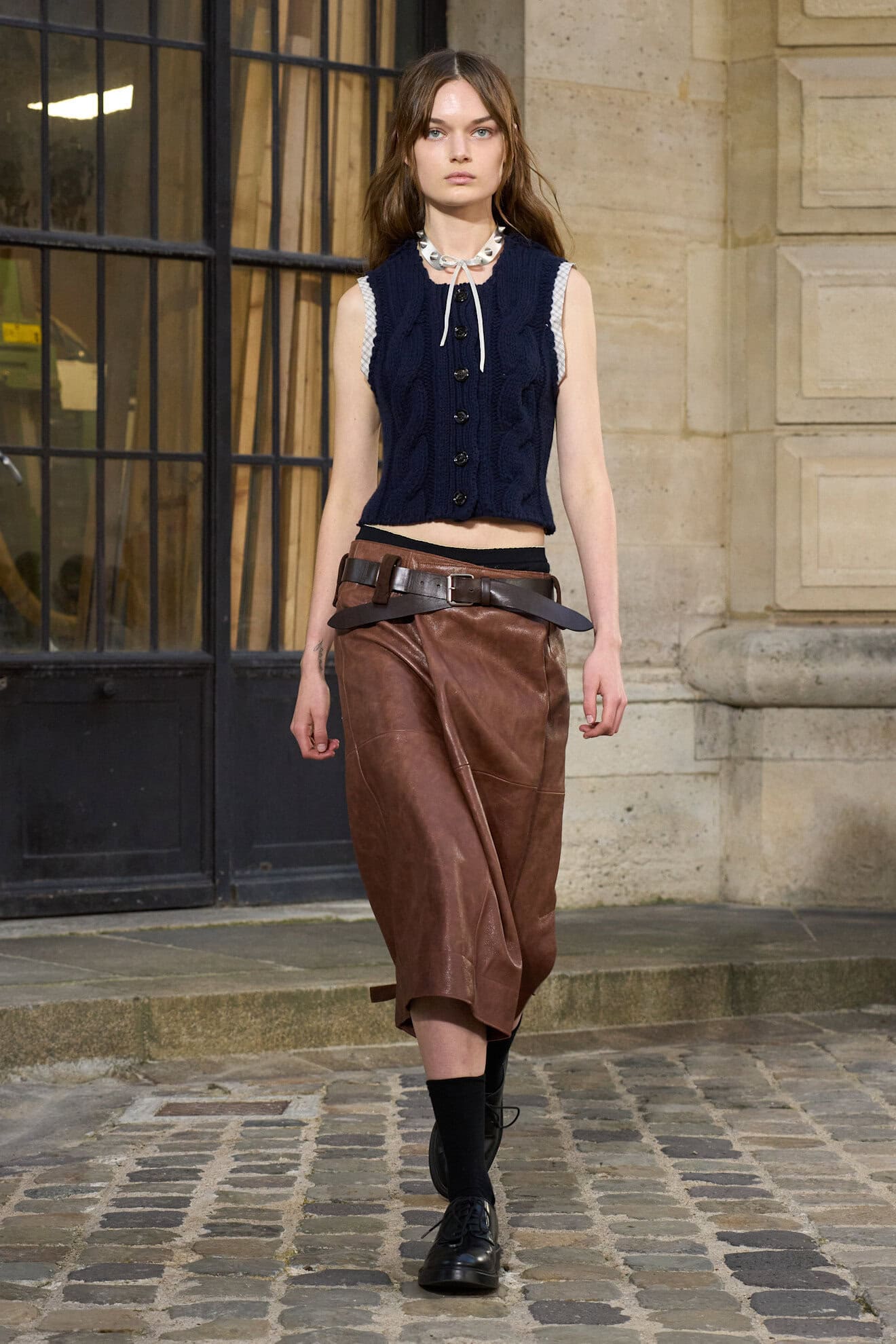
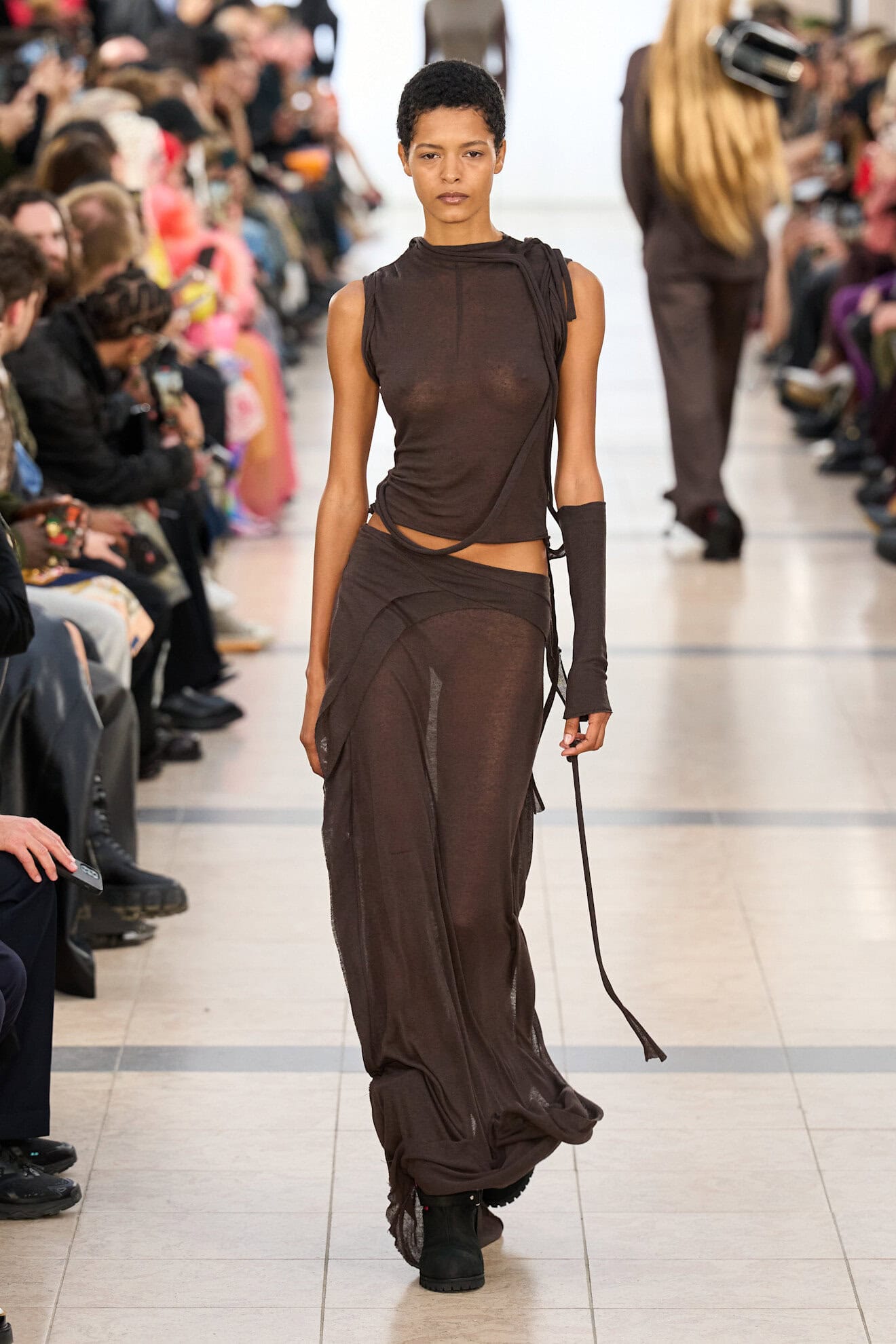
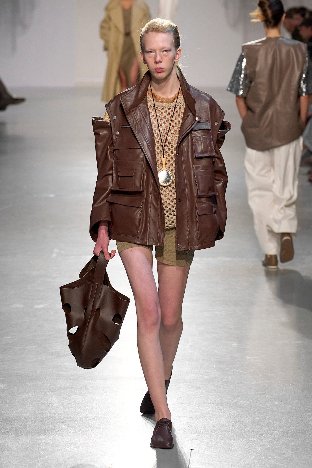
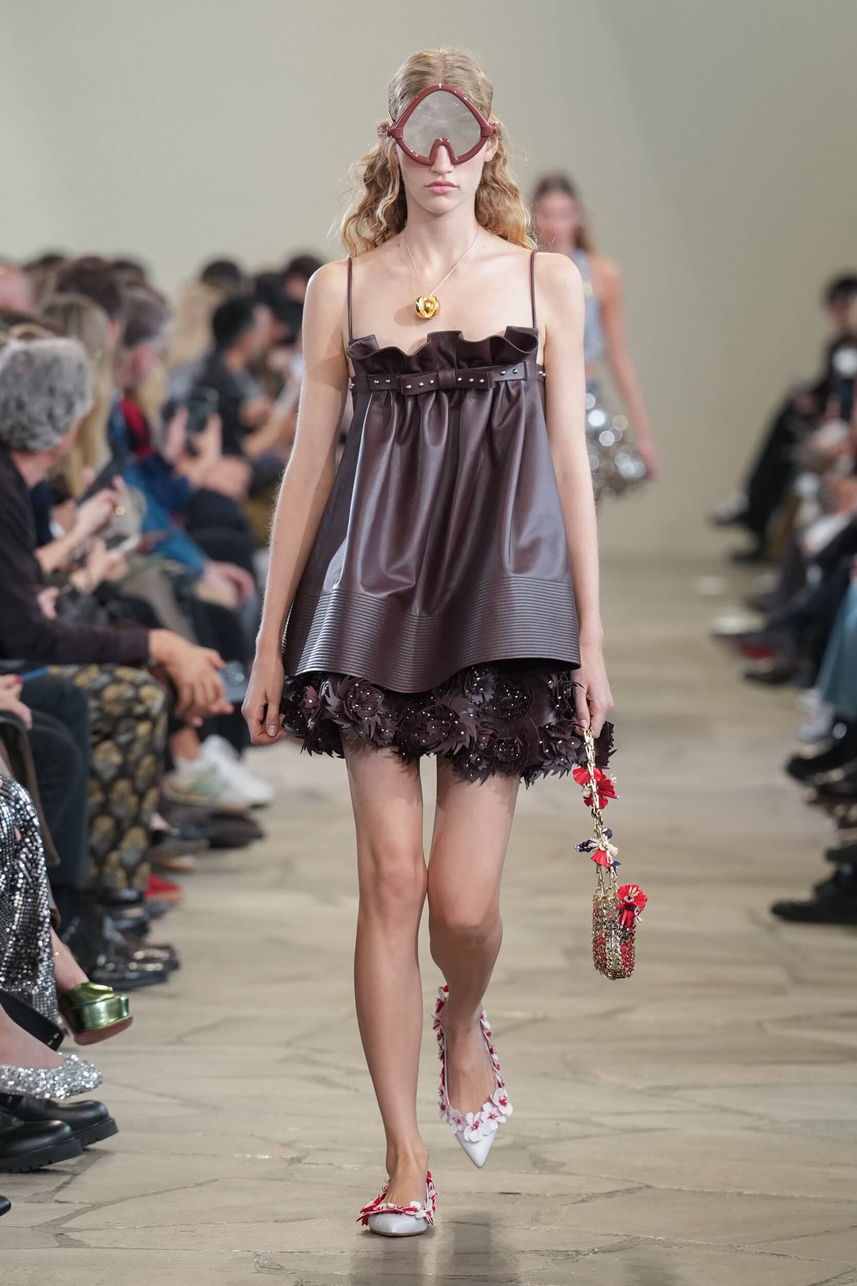
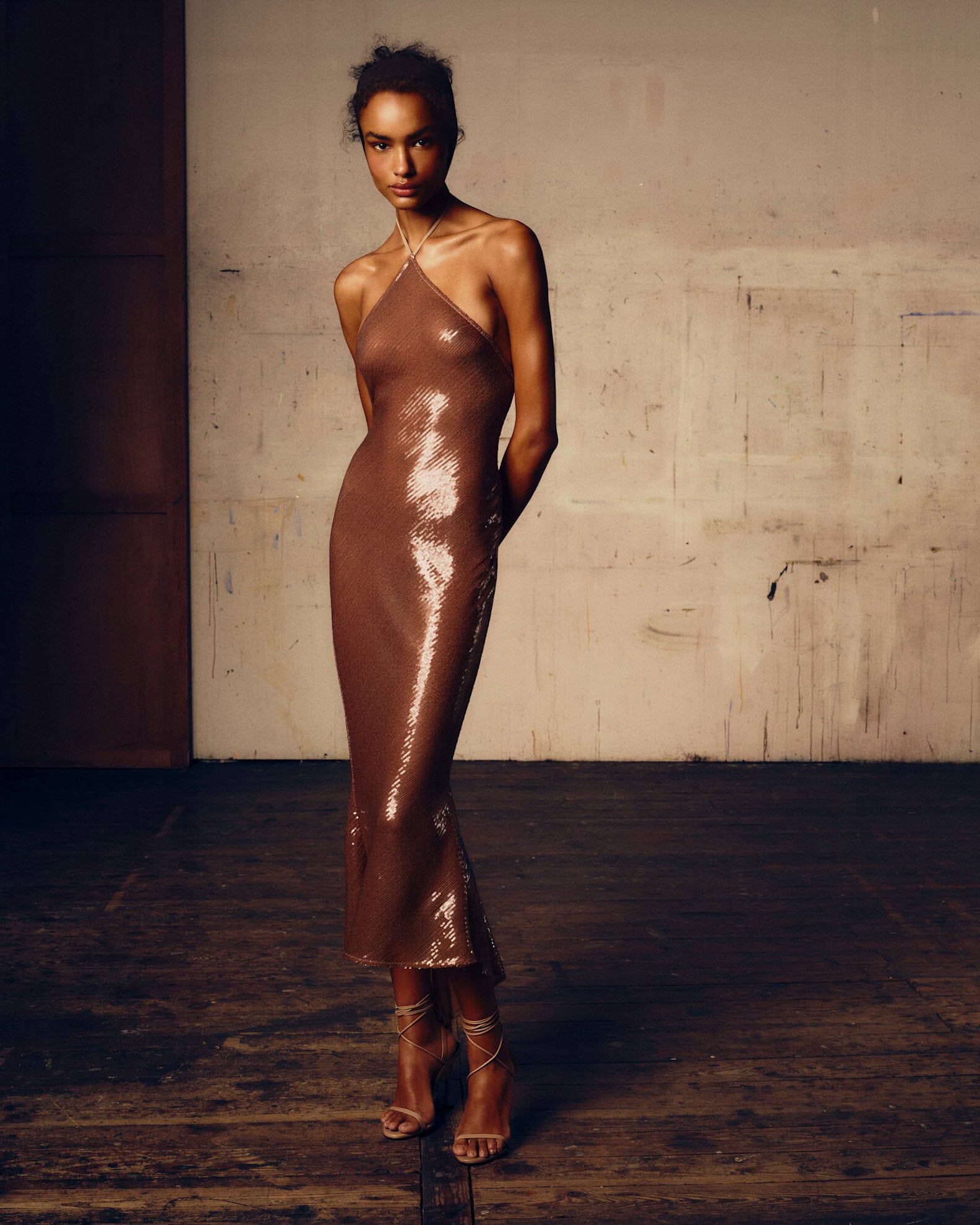
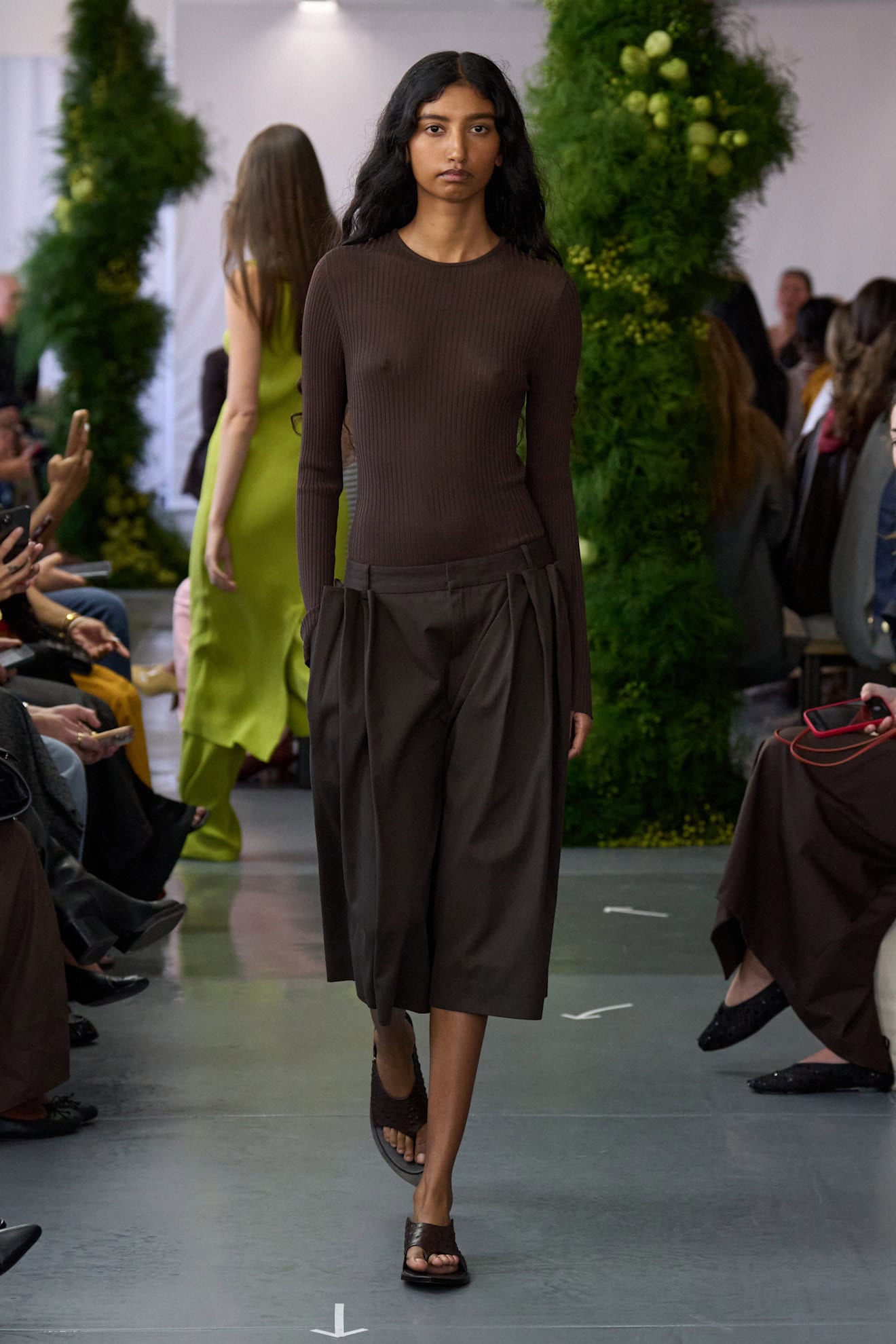
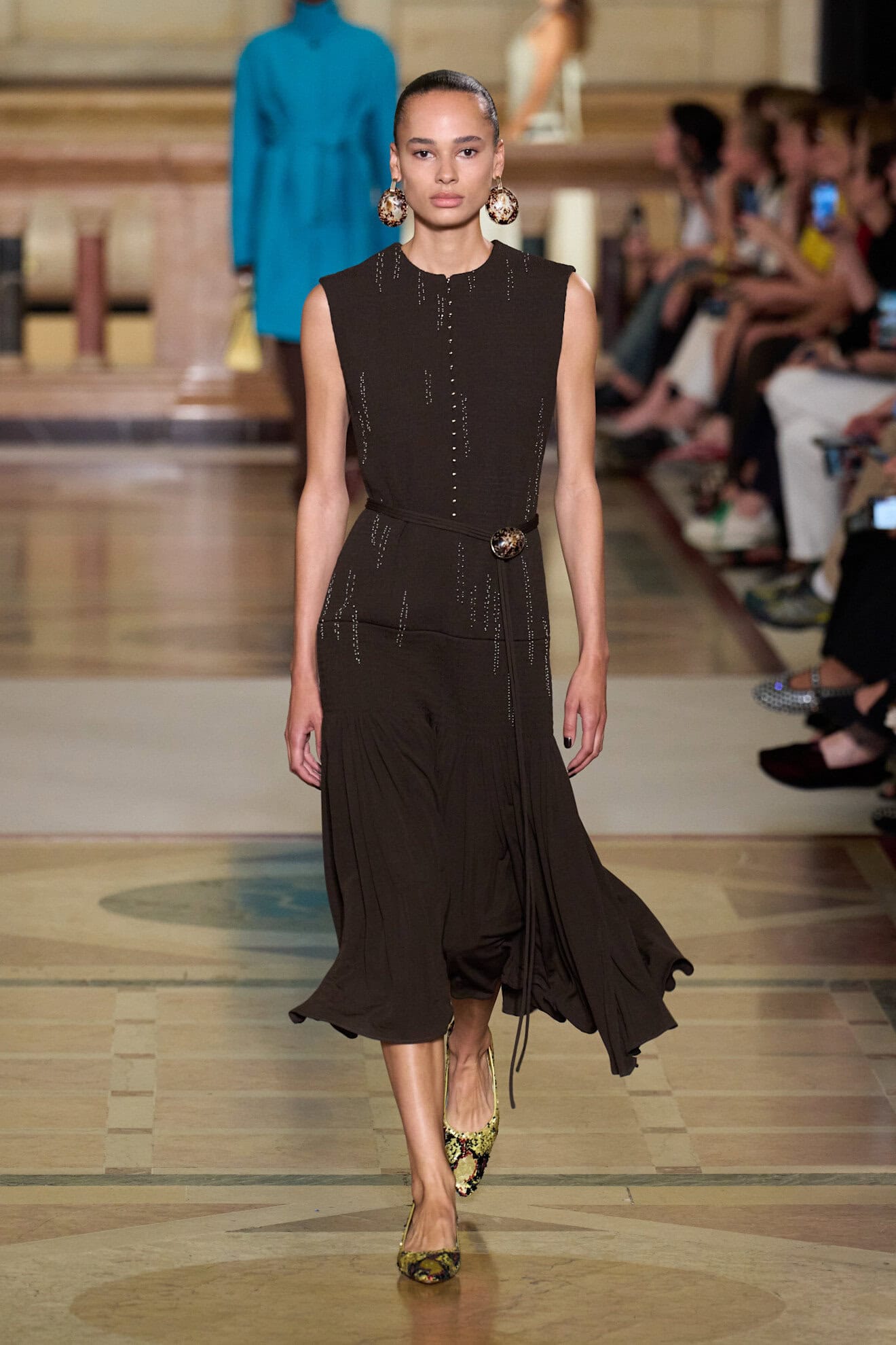
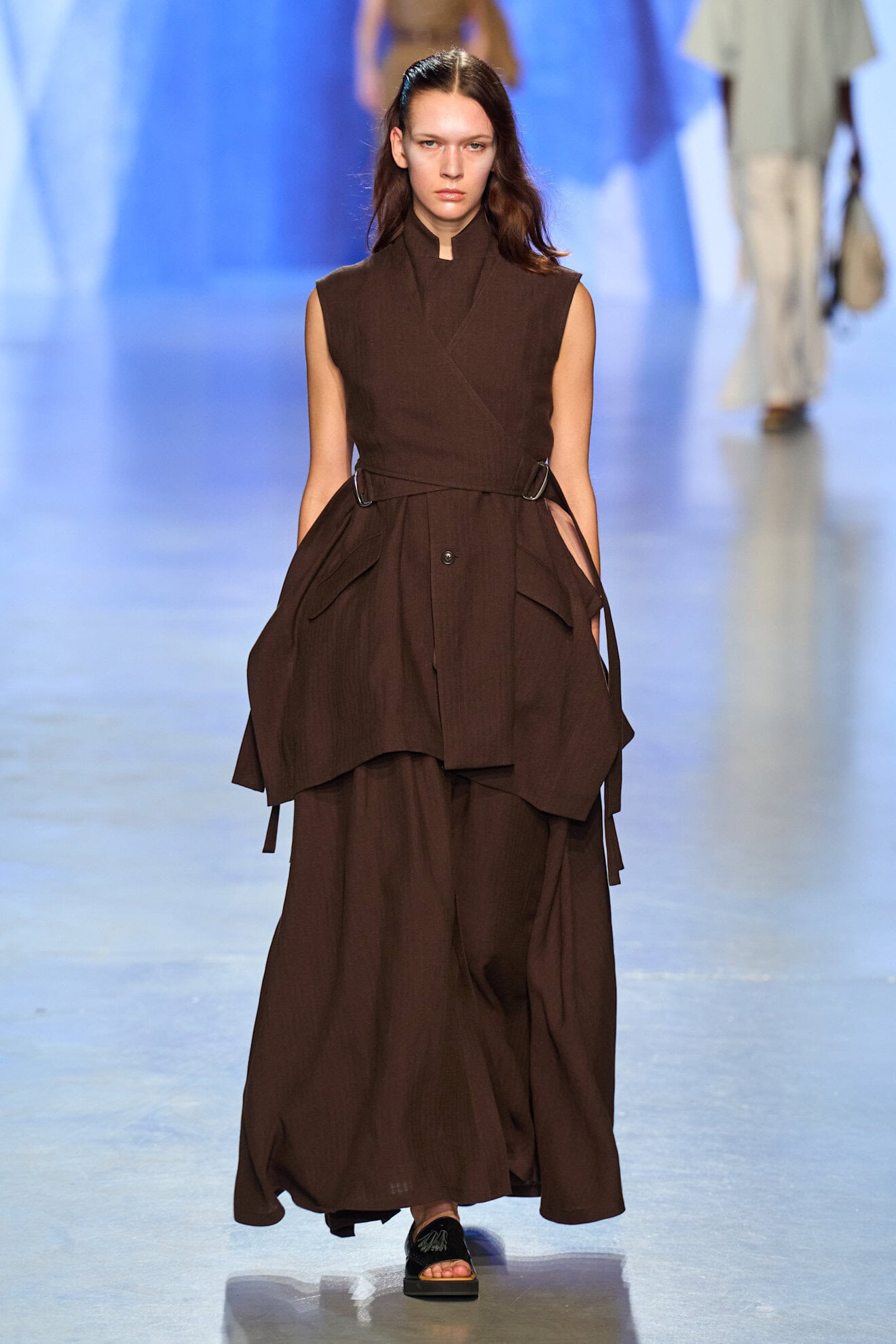
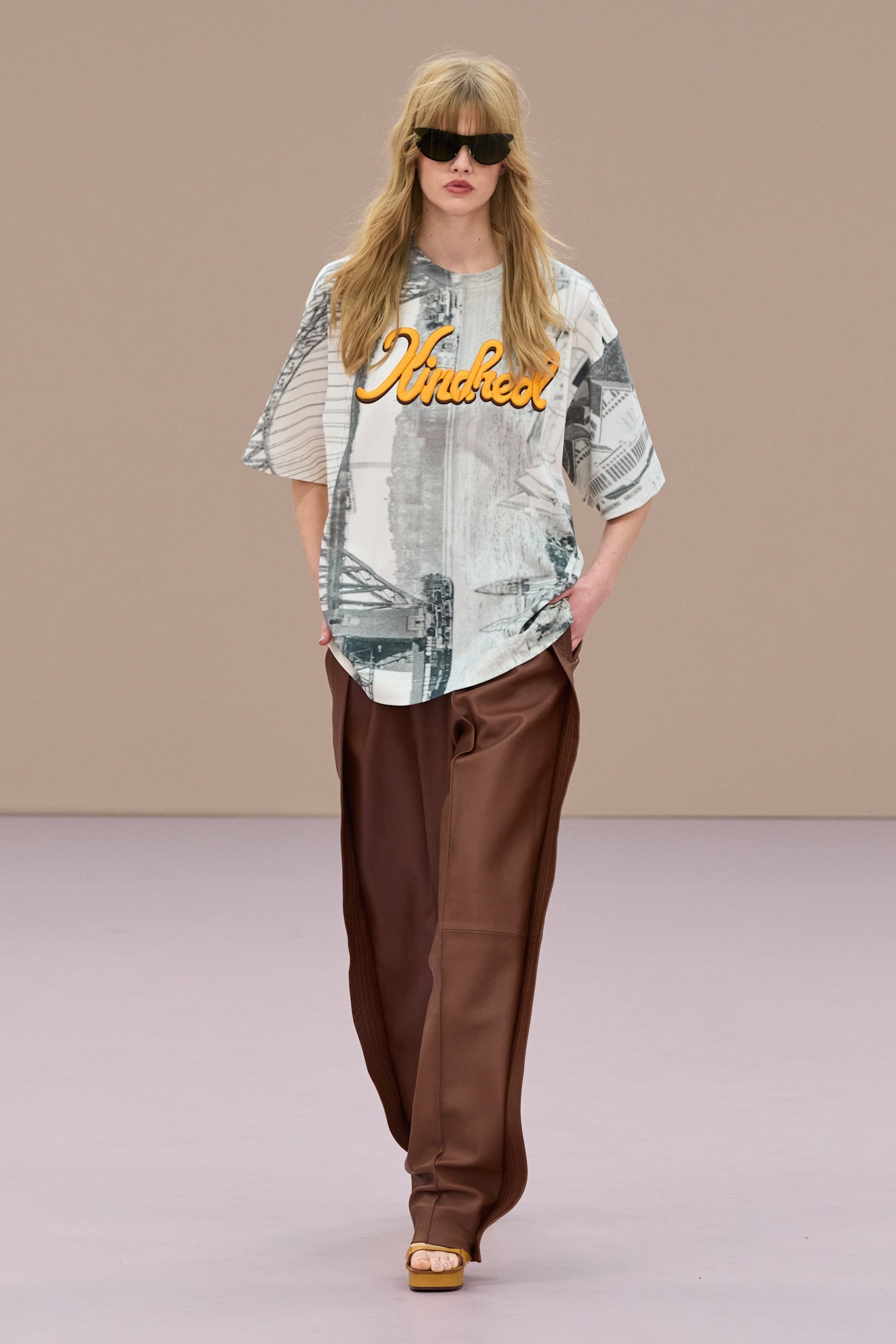
Chocolate Mousse
Pantones Colour of the Year, Mocha Mousse, was a reflection of the broad range of neutrals which arose in the ‘Quiet Luxury’ period, where subtle palettes of browns, beiges, and greys gestured towards a stealthier kind of wealth.
For summer, chocolate takes on an intensely chic persona in satin and leather, and will update suede sets for the transitional spring season. There was also a demonstration of its versatility via surface decoration in the form of tonal sequins at Ludovic Saint Sernin, quilted stitching at Hermès, geometric folds at Dior and tiered fringing at Calvin Klein Collection giving this new neutral its staying power.
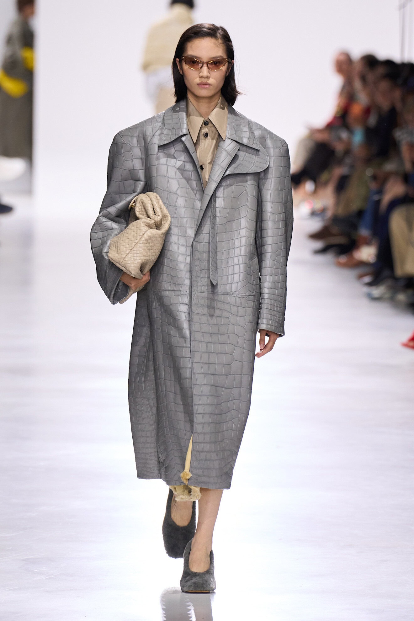
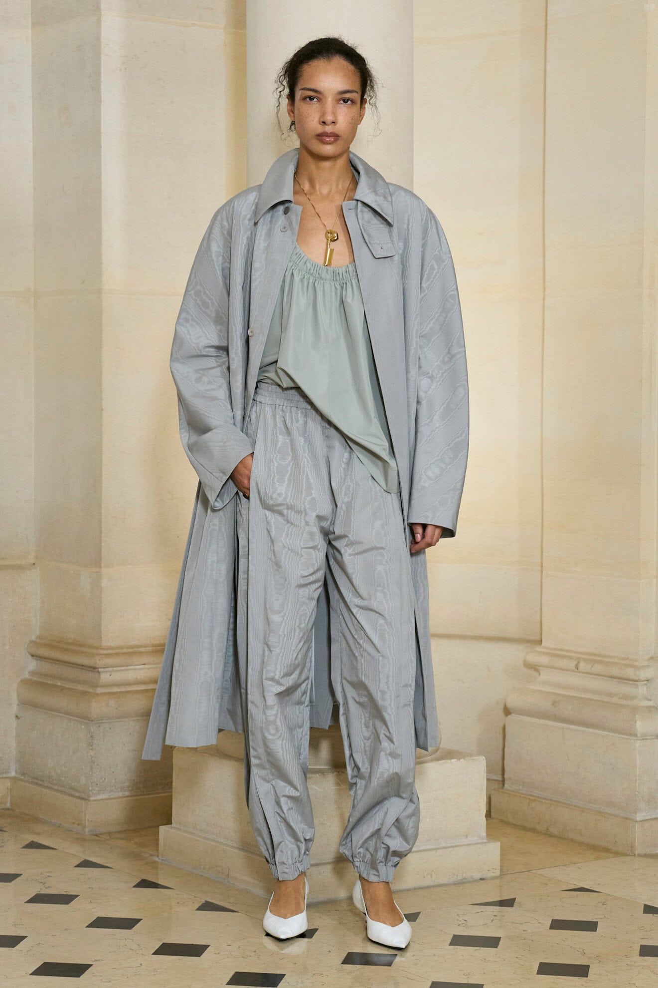
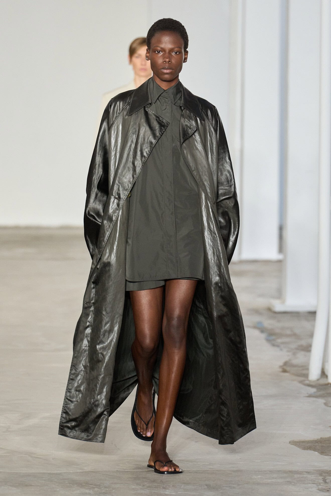
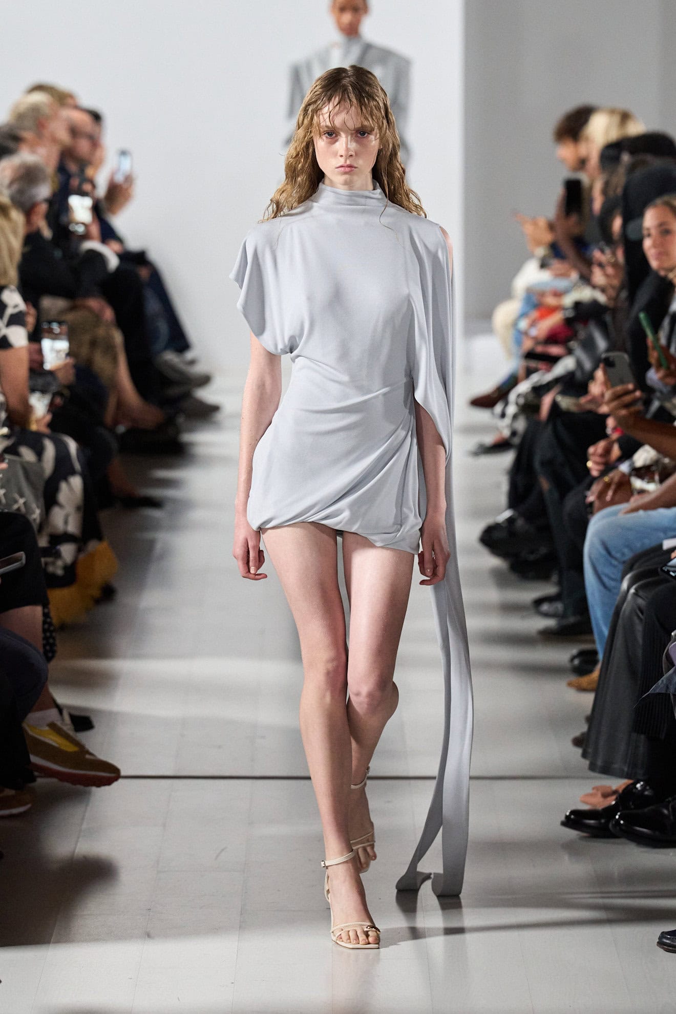
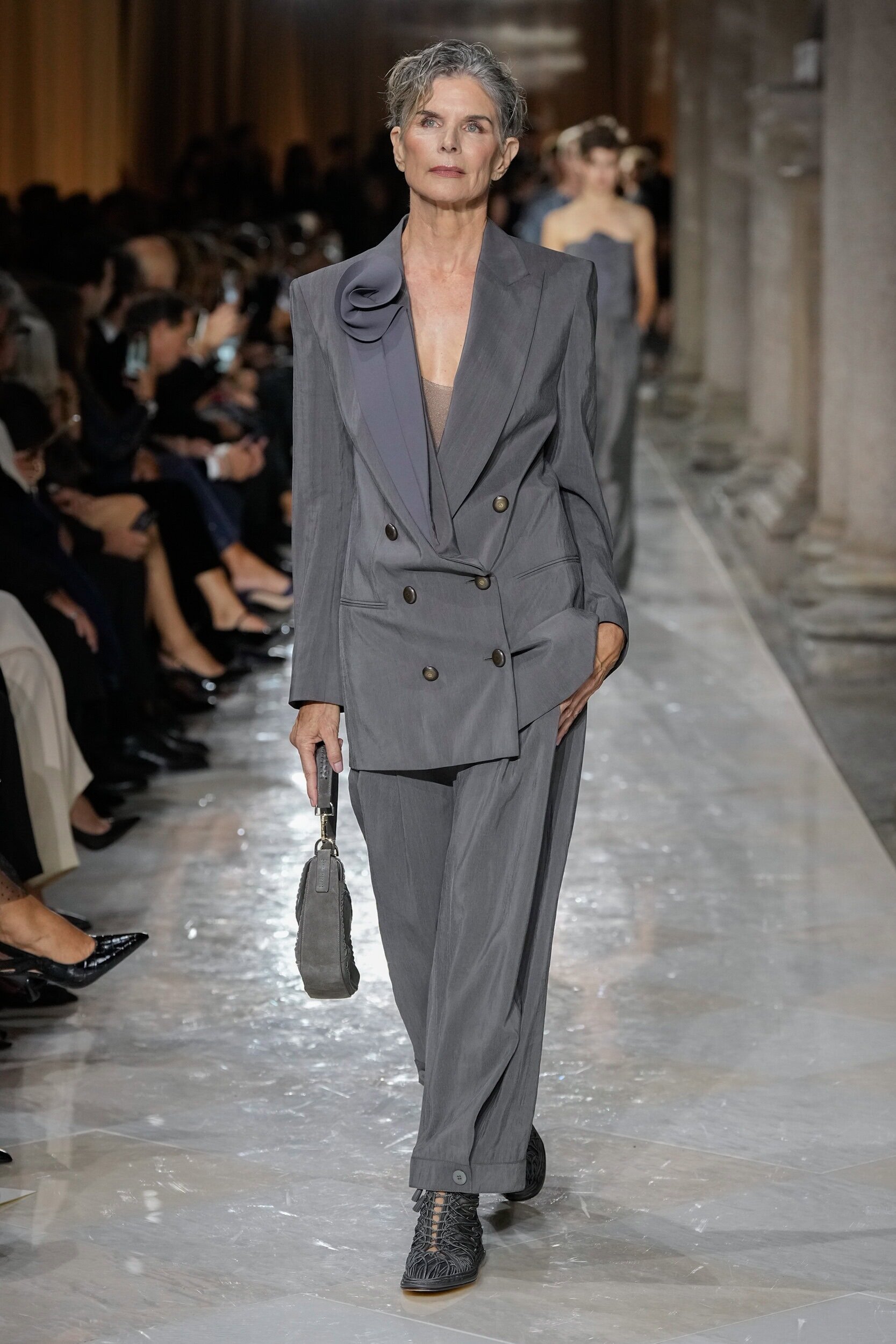
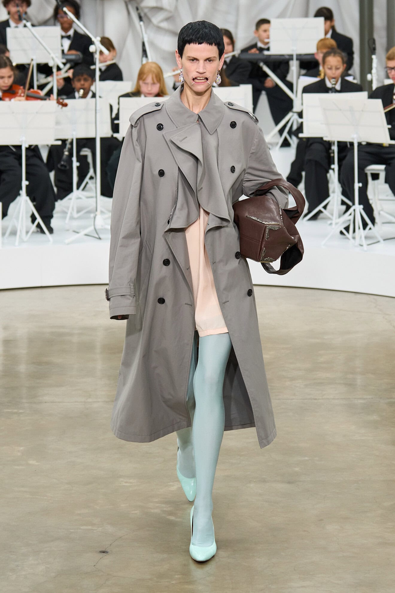
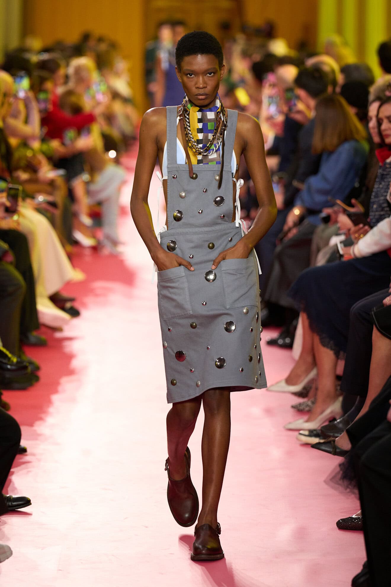
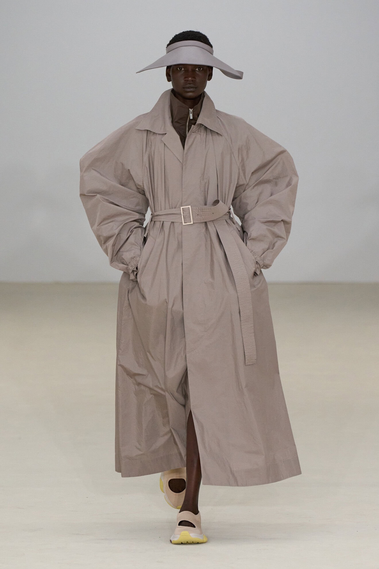
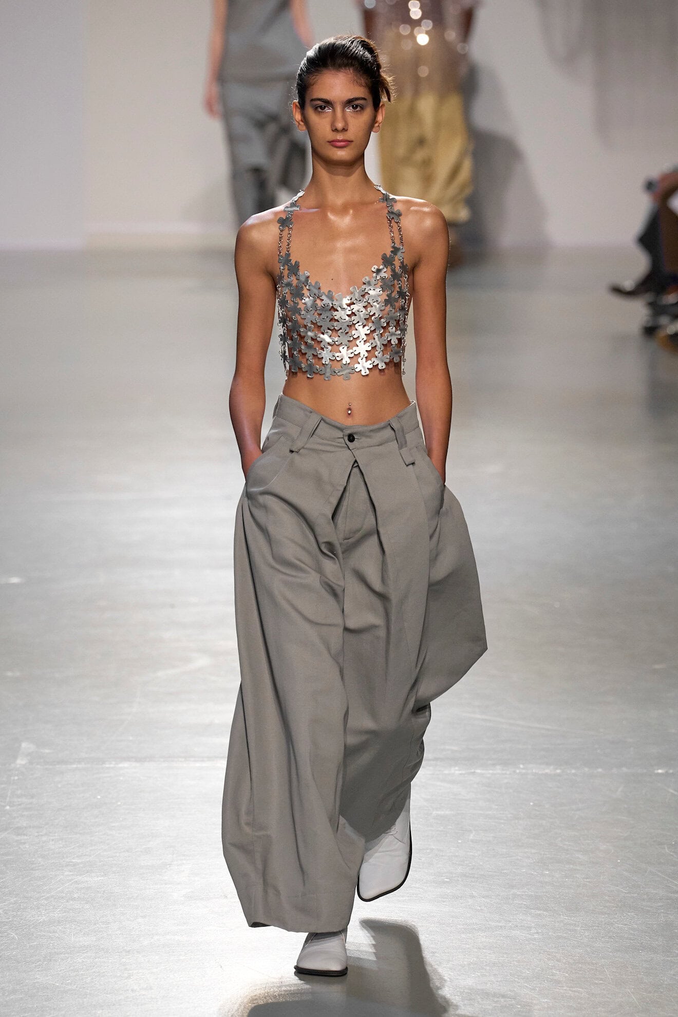
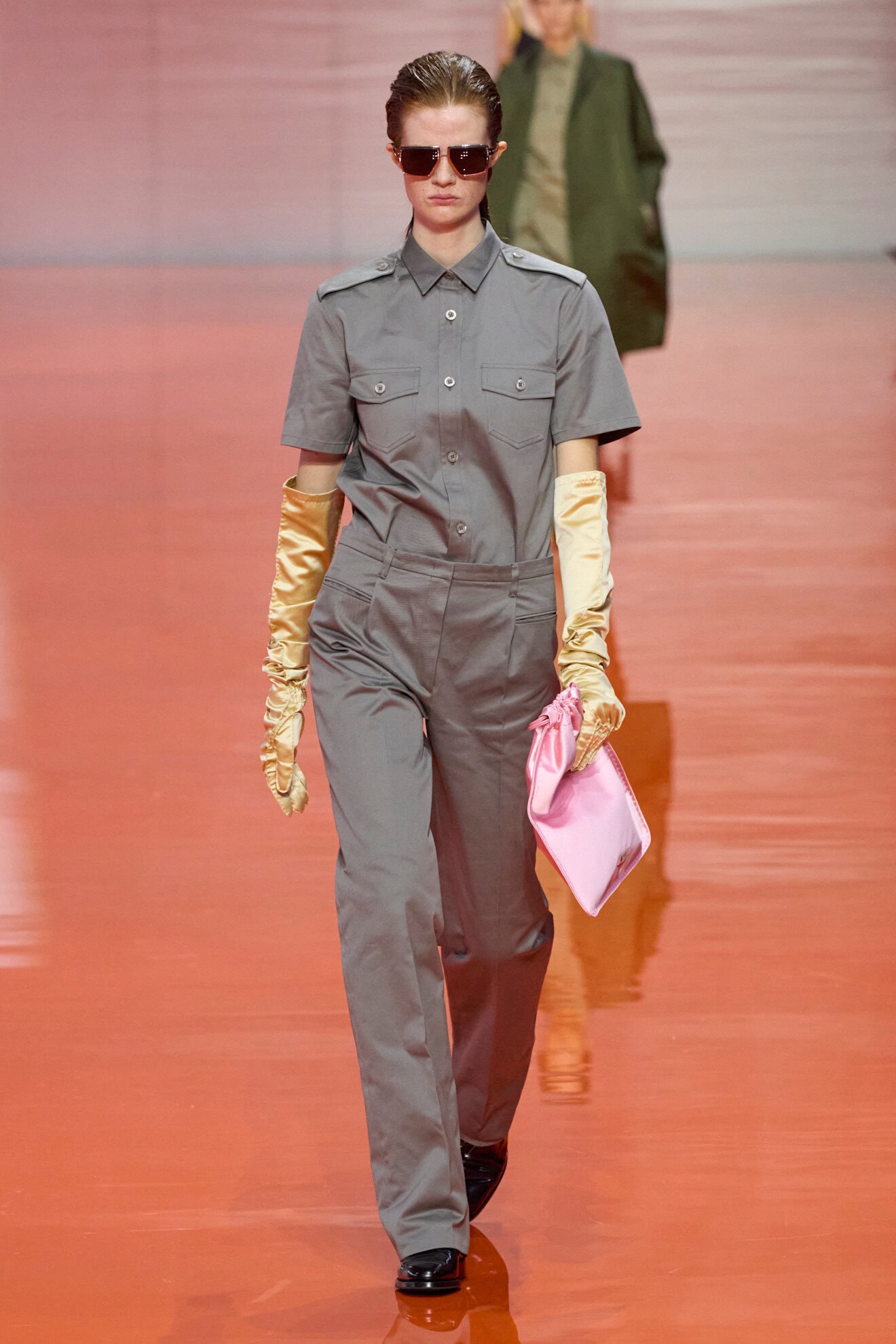
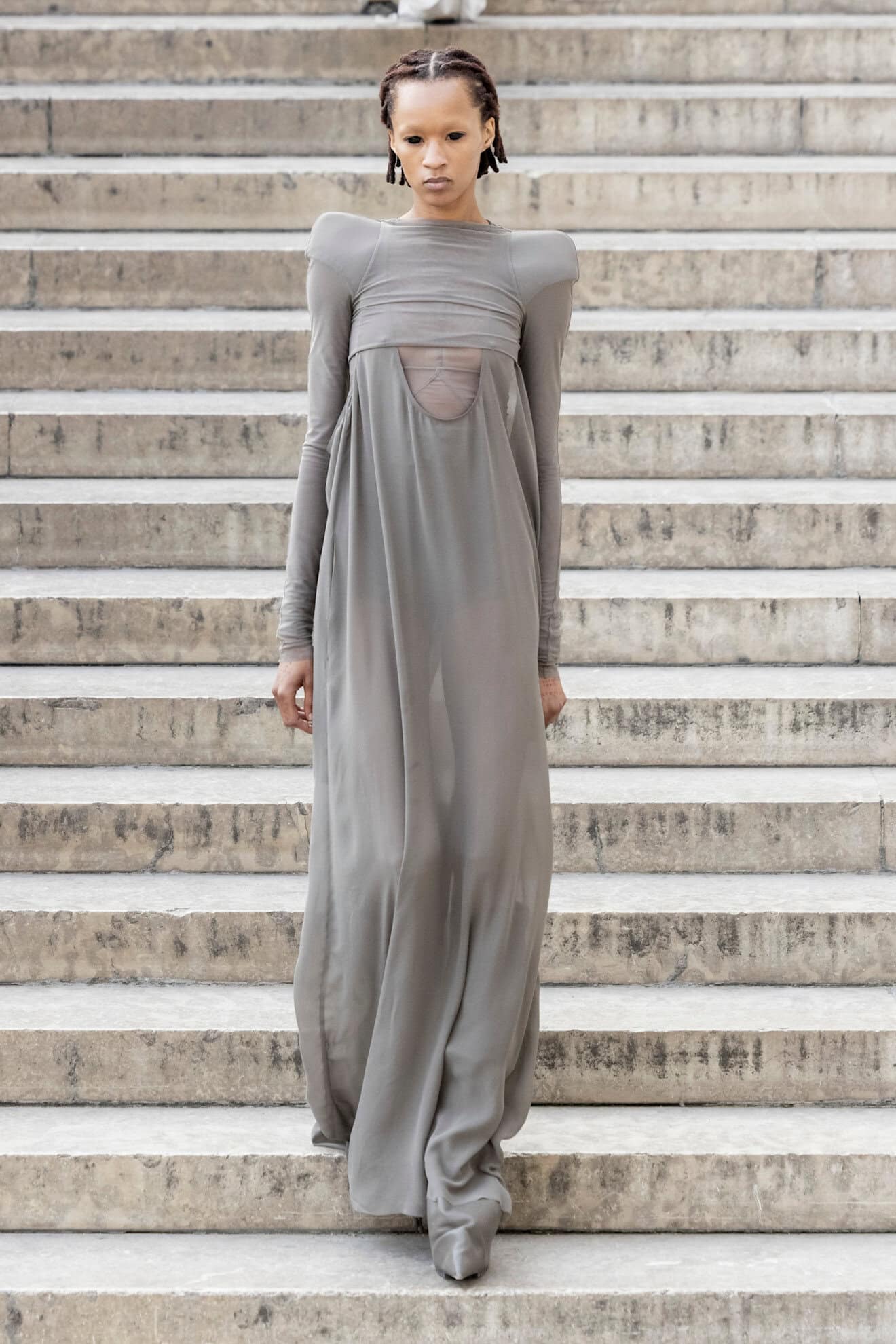
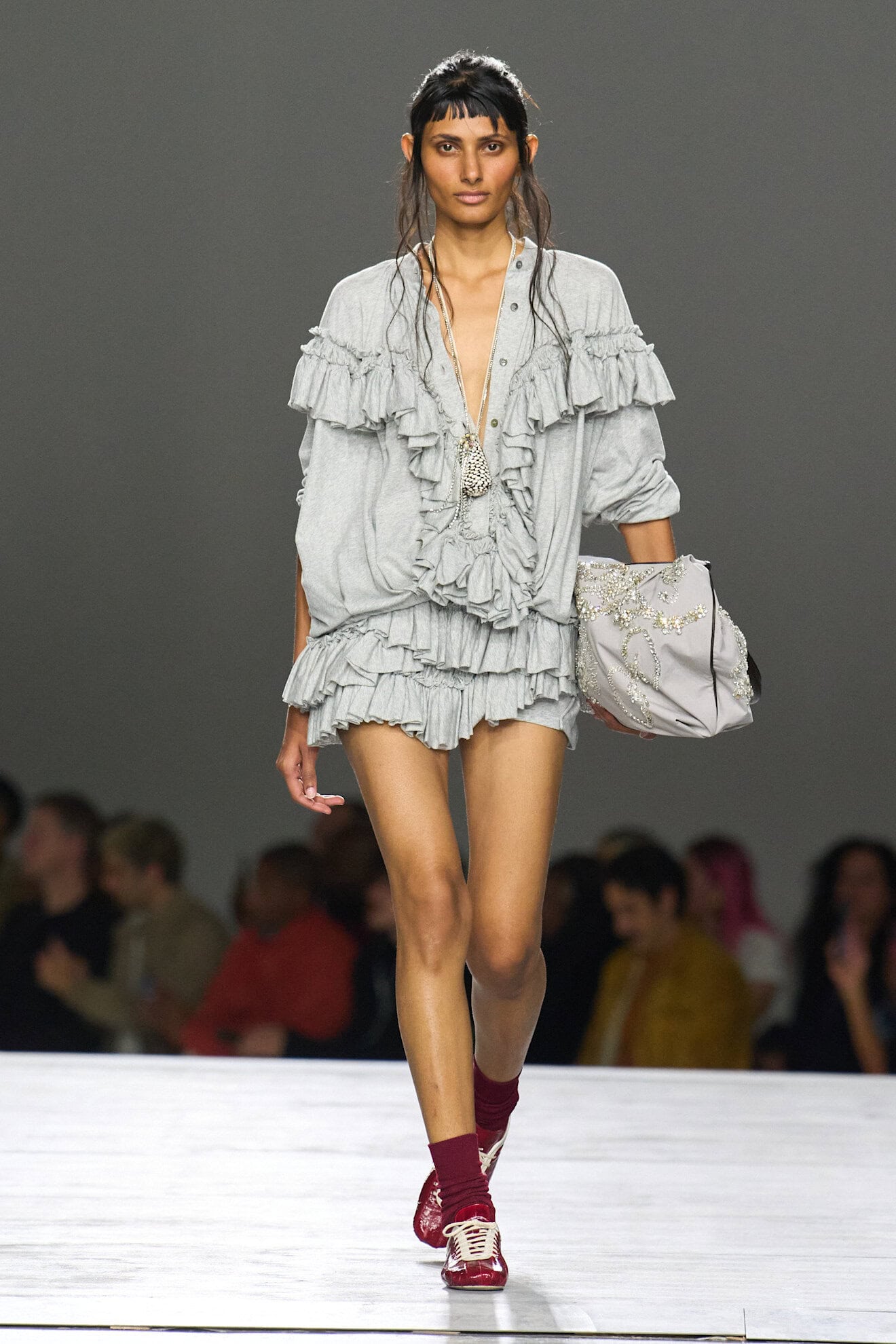
The Grey Area
Grey – a colour typically associated with formality – was widely seen across the start of the season in New York (Fforme, Calvin Klein Collection, Rachel Comey), reworked into everyday staples. Later in the season designers combined softer silks (Francesco Murano) and satins (Dior), as well as structured fabrics such as cotton canvas (Prada) and crocodile leather (Bottega Veneta) into unexpected pairings, ensuring the various shades sat outside of the world of tailoring.
These are not to be confused with your standard-issue uniform greys, the hues shown within the collections were foundational wardrobe builders and were upgraded with deeper tones of navy and aubergine to renew, or the shade was taken for a youthful spin when it was styled with a pop of pink.
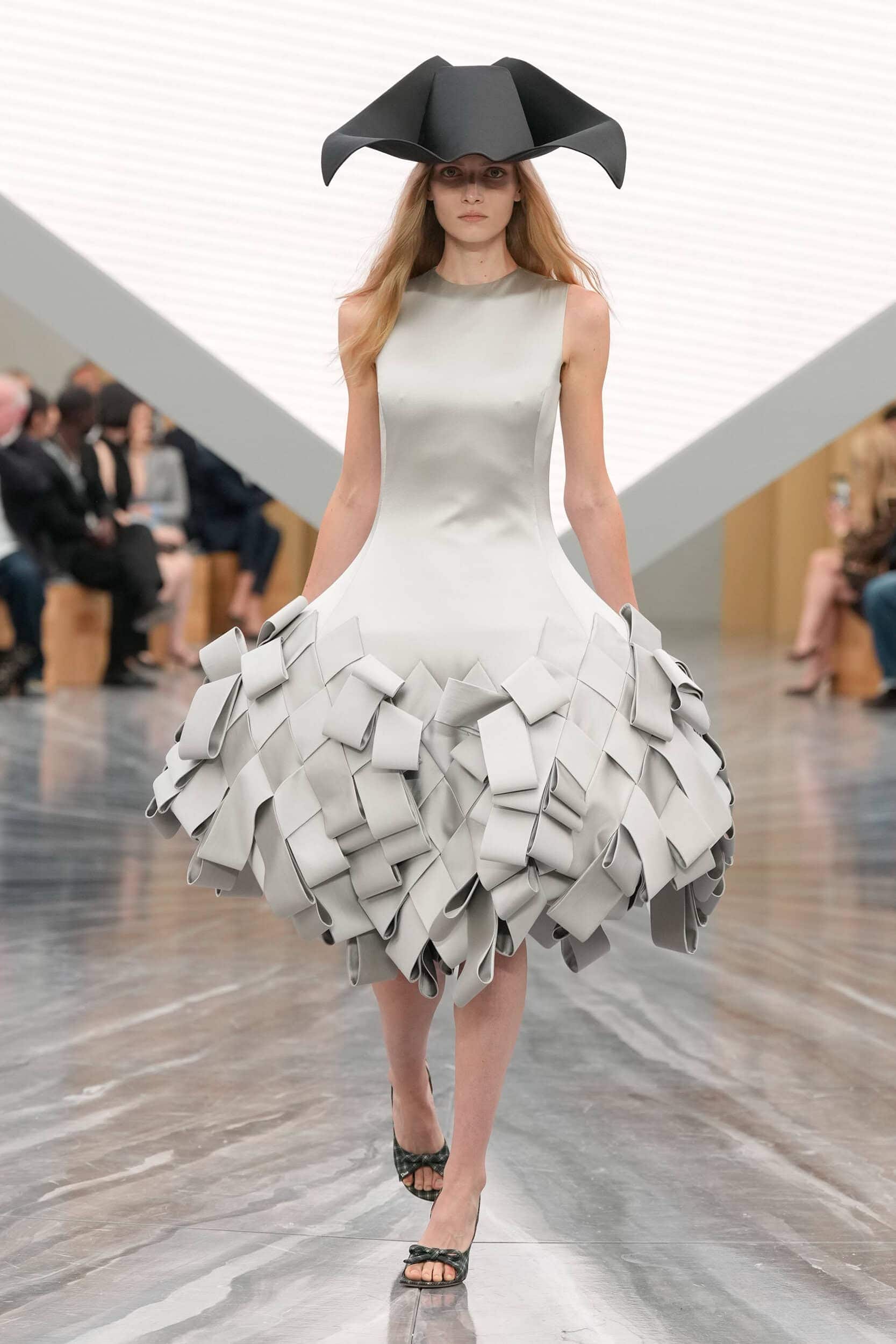
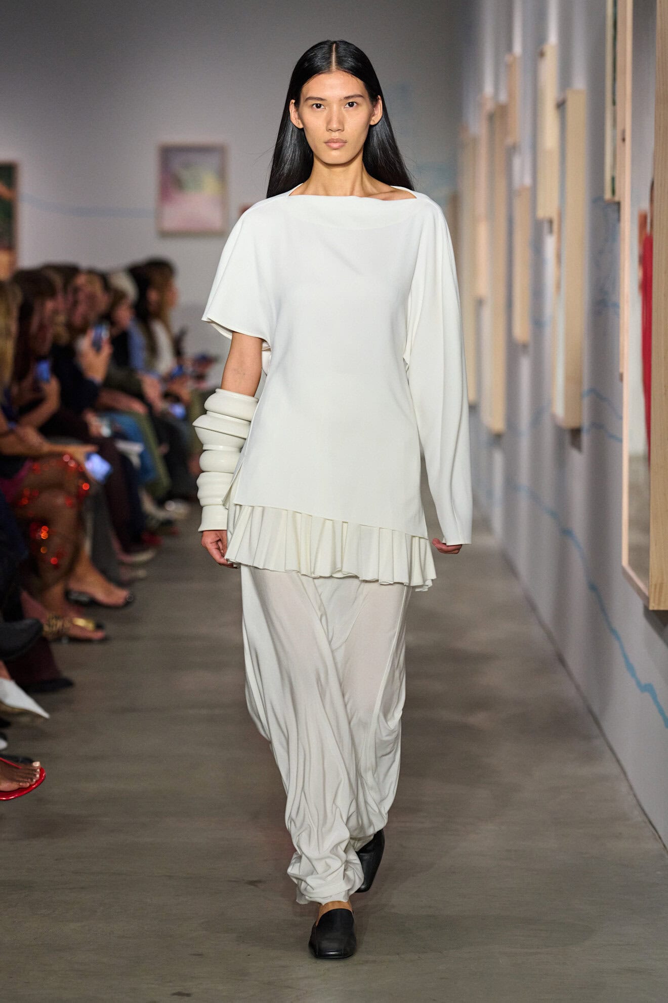
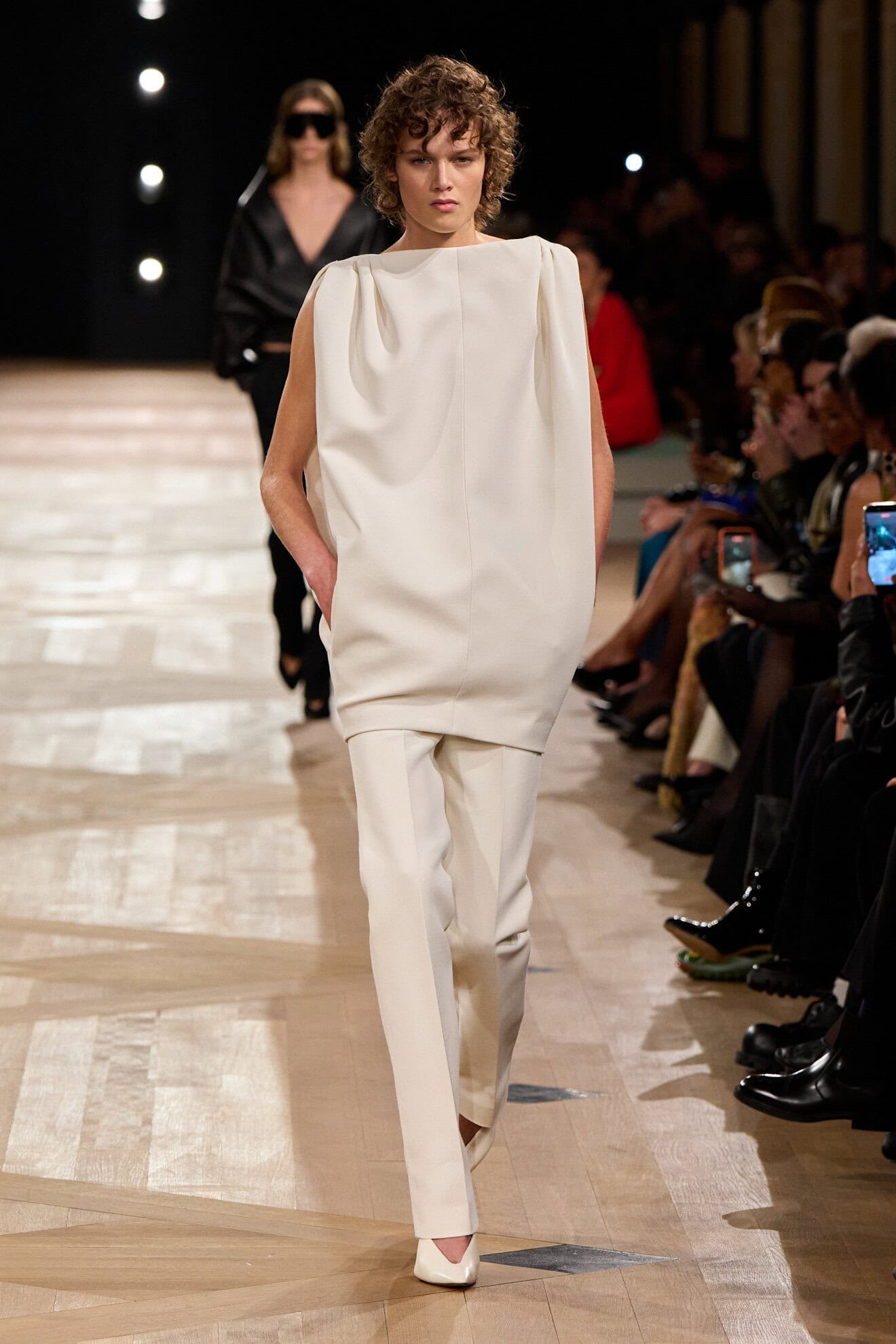
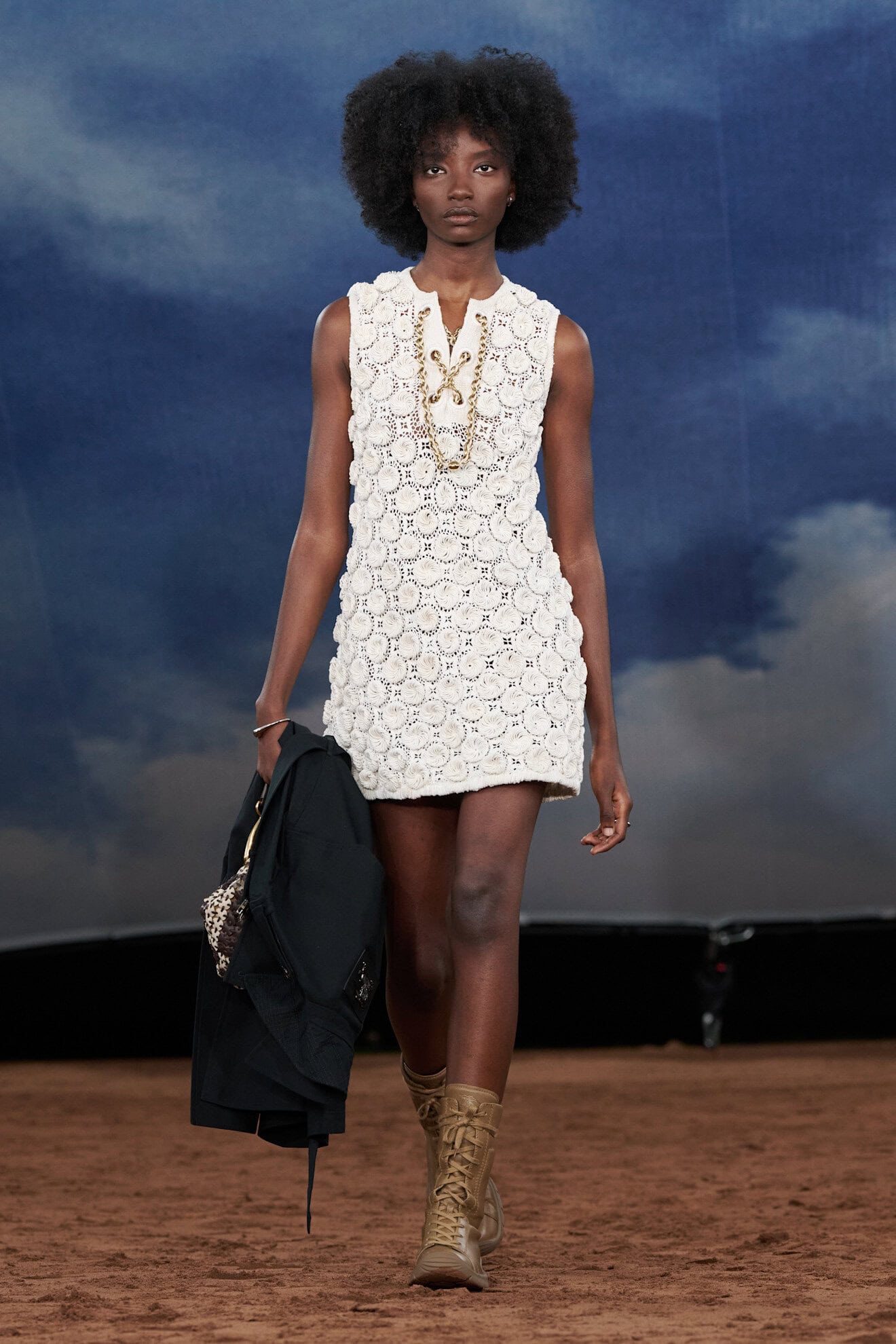
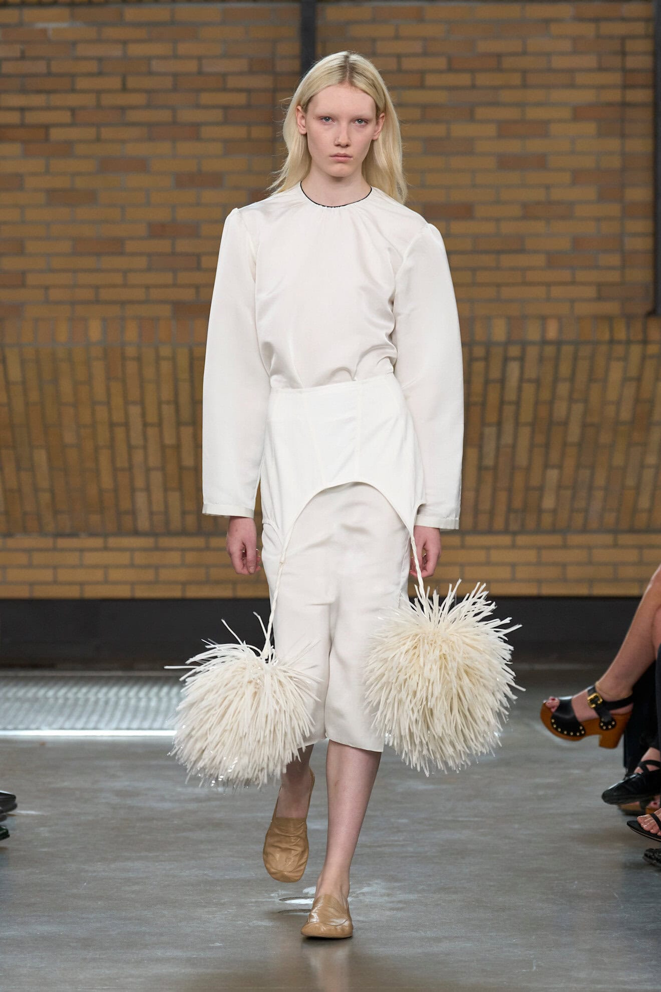
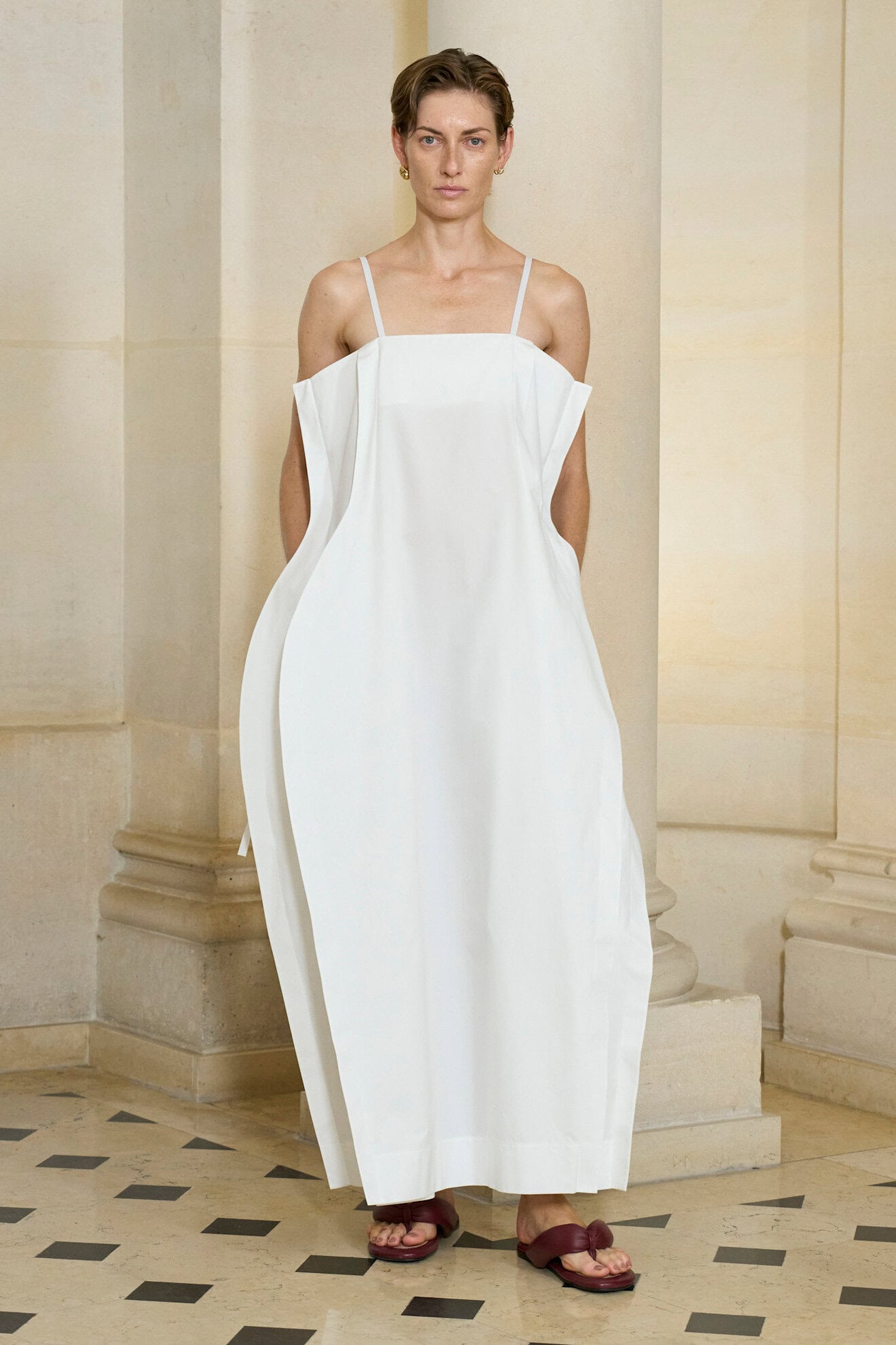
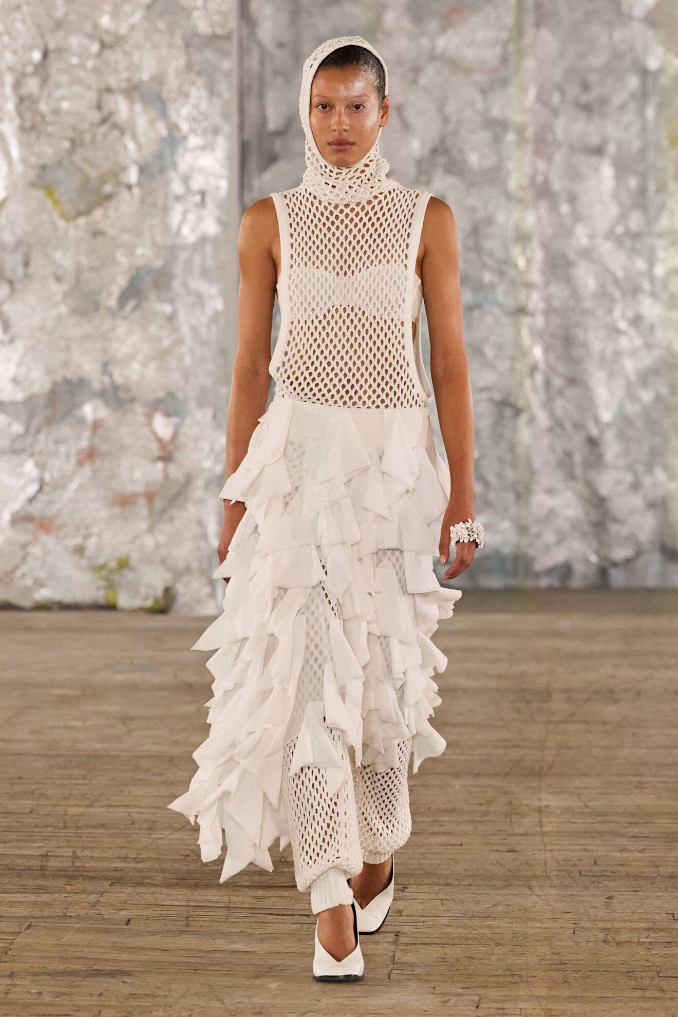
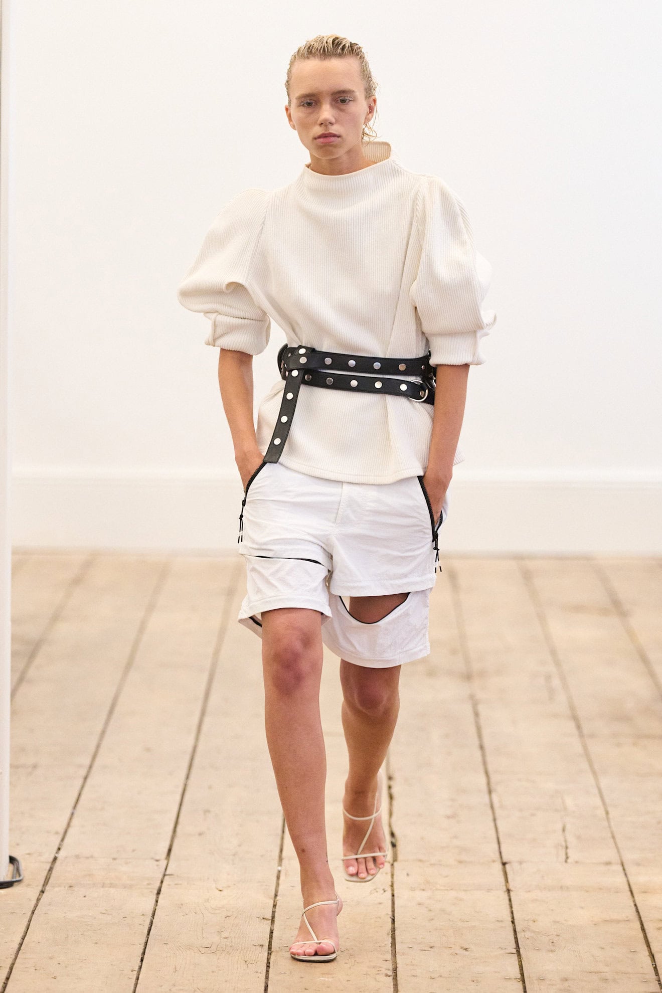
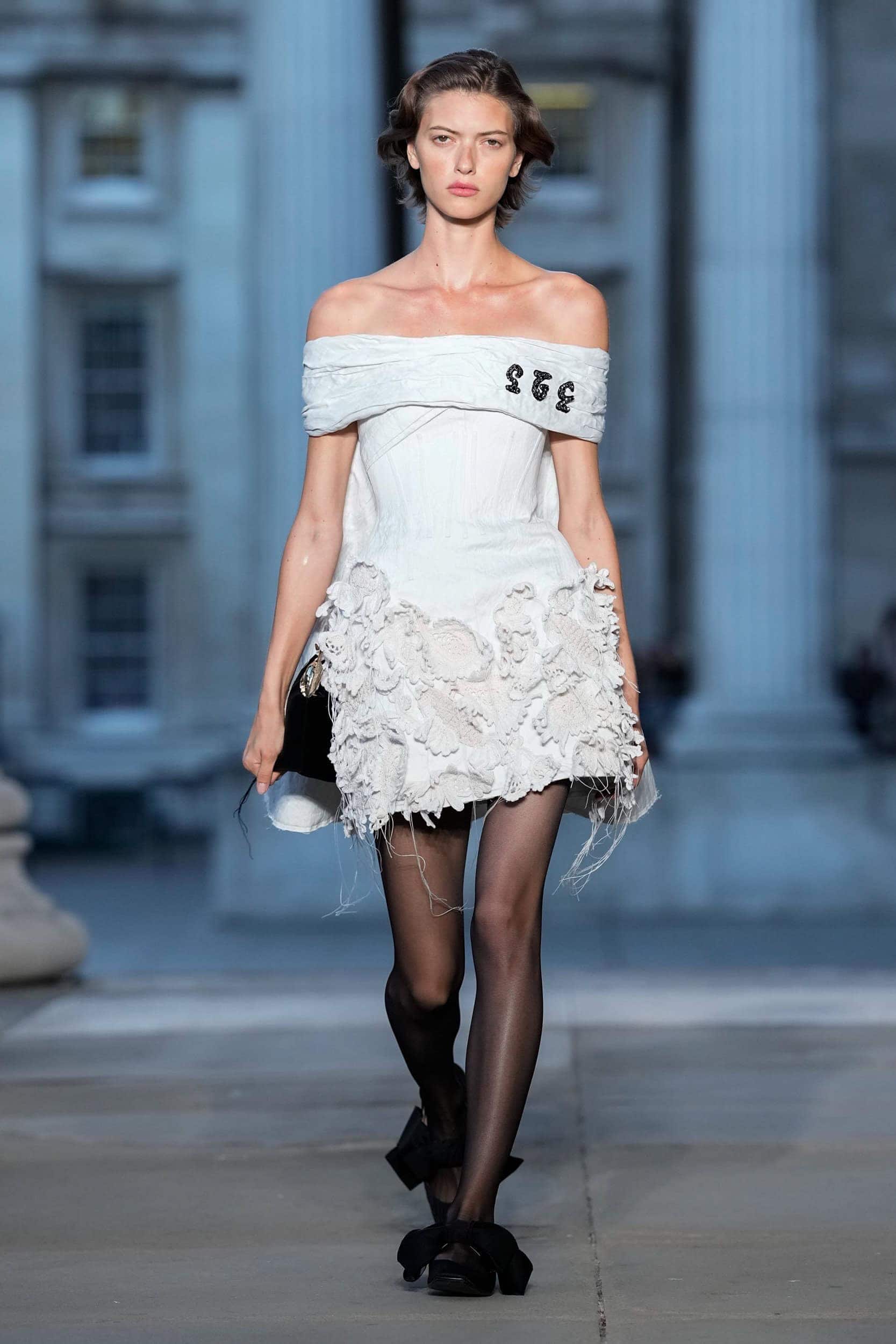
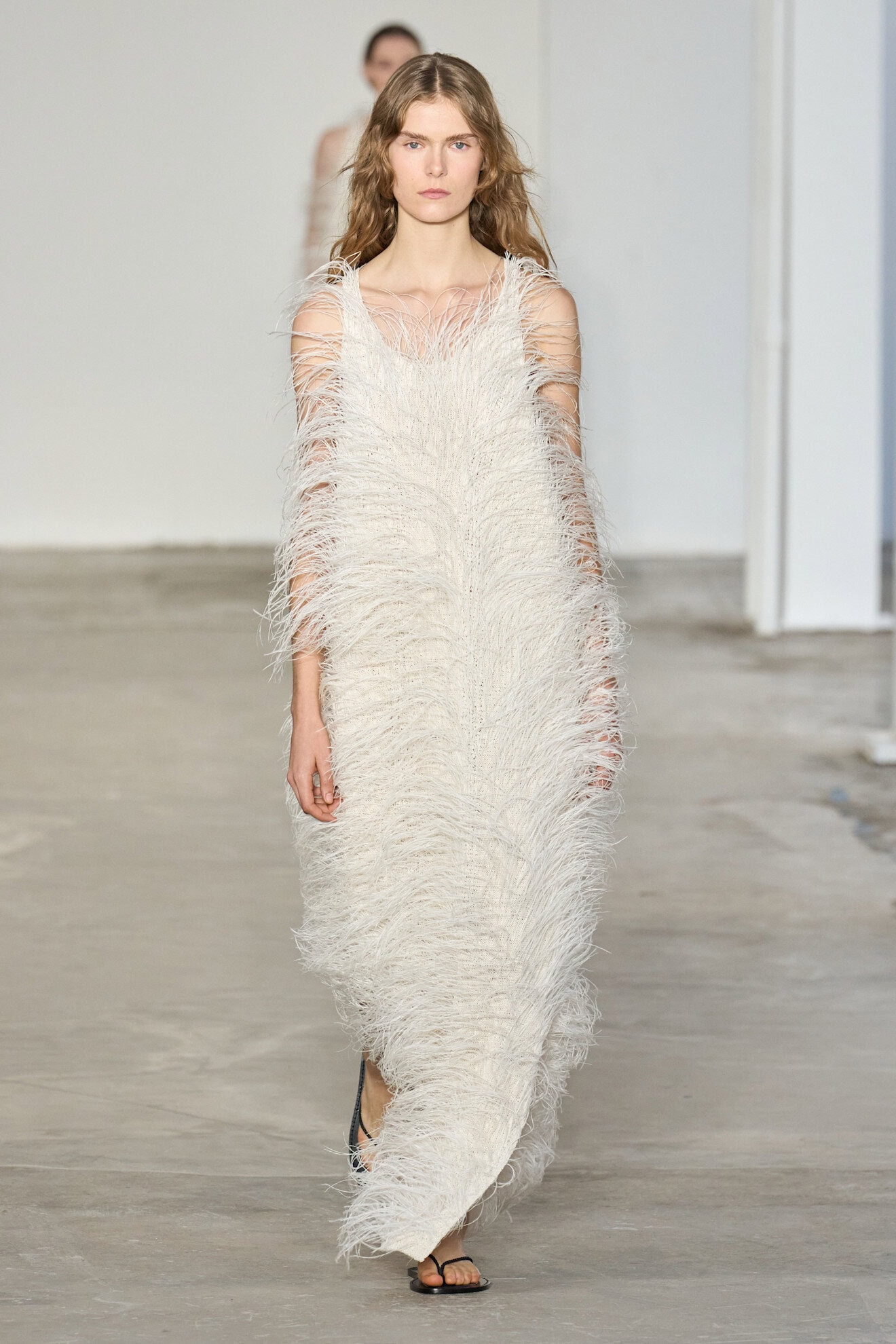
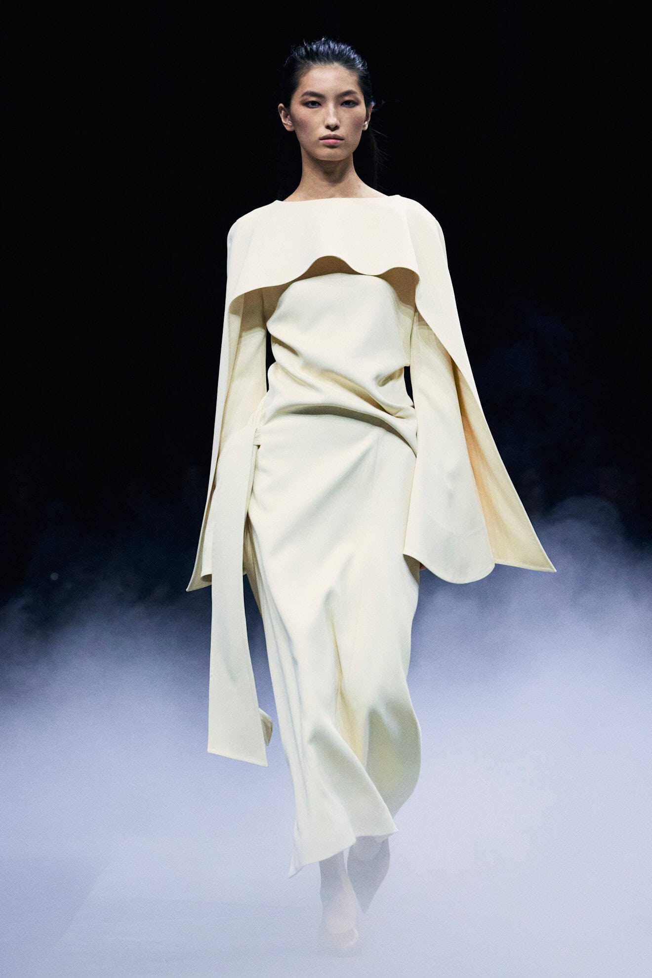
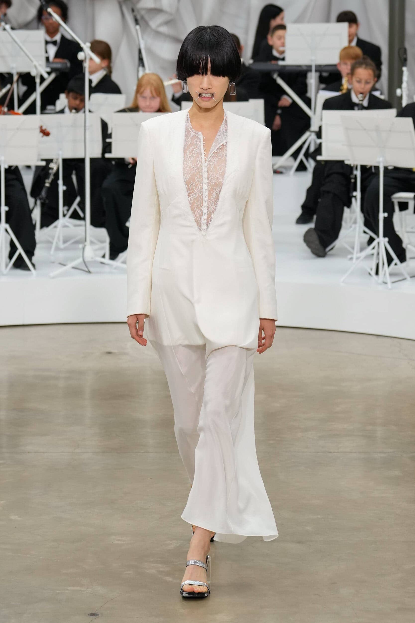
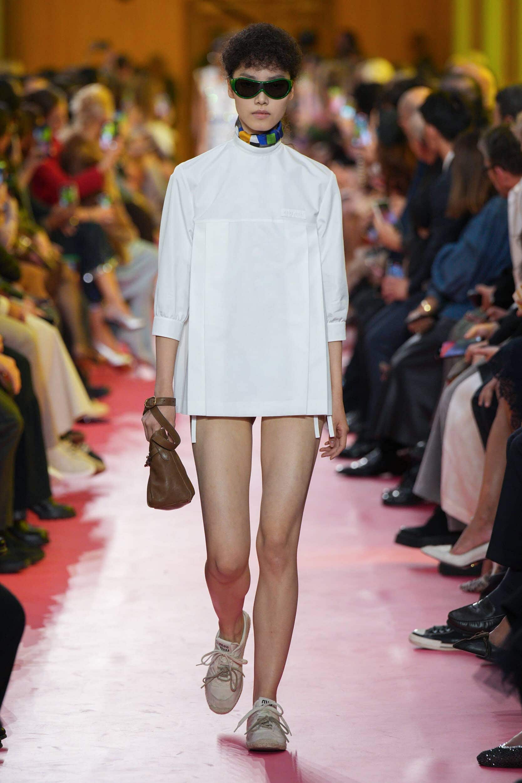
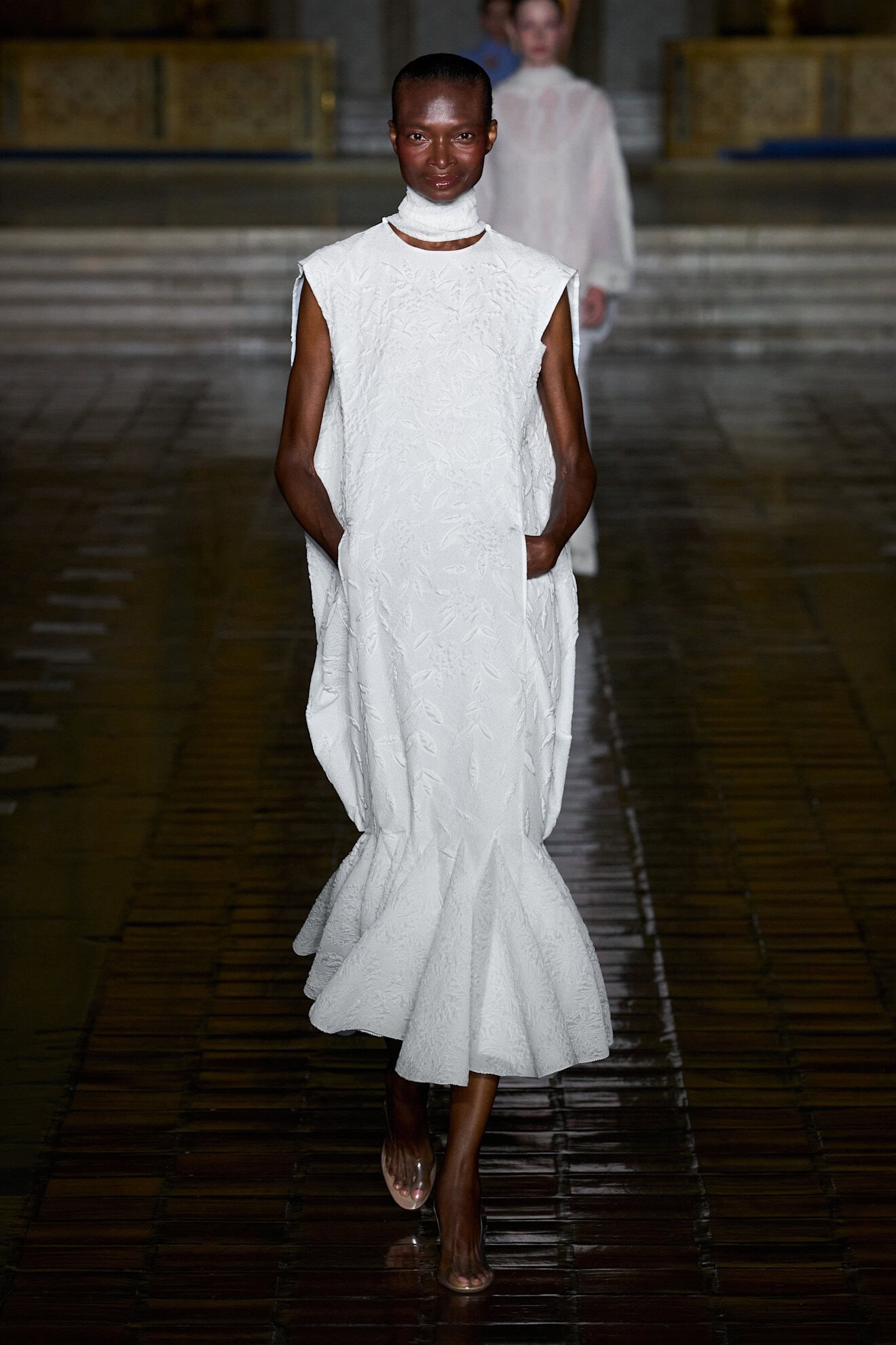
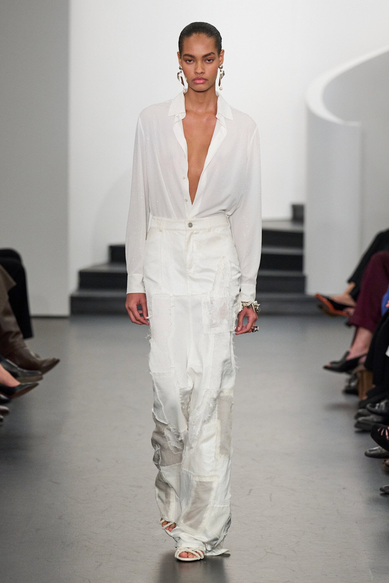
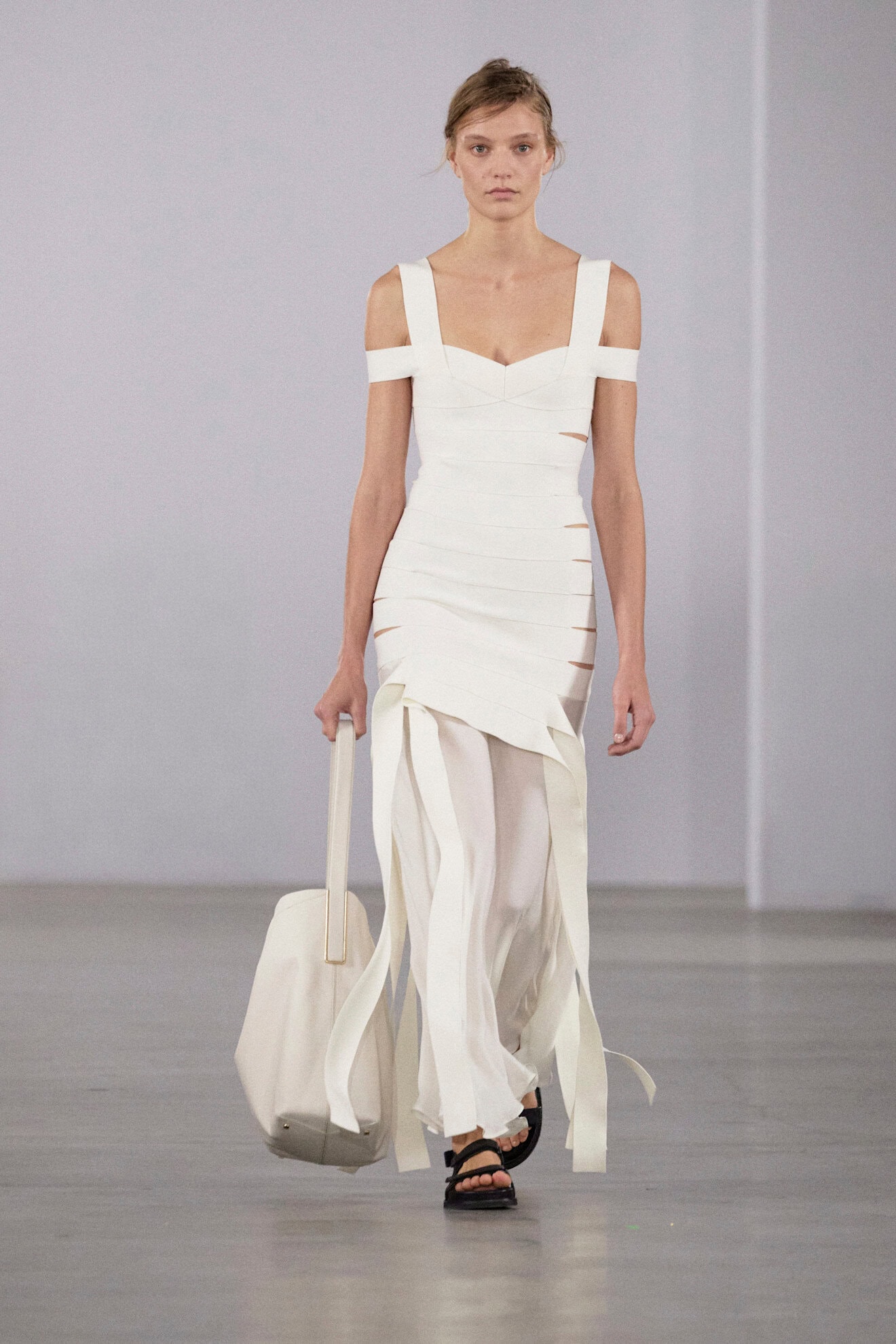
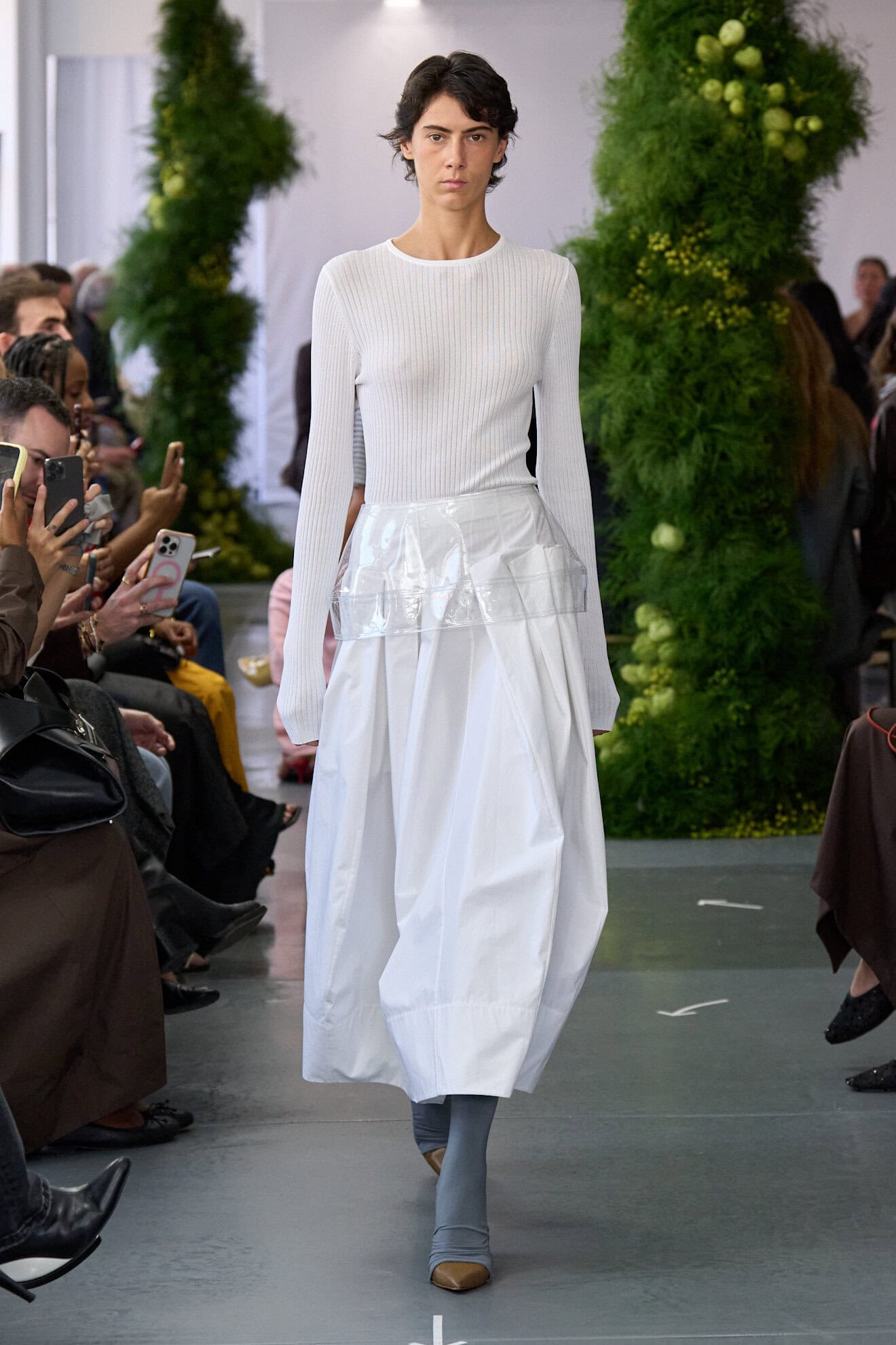
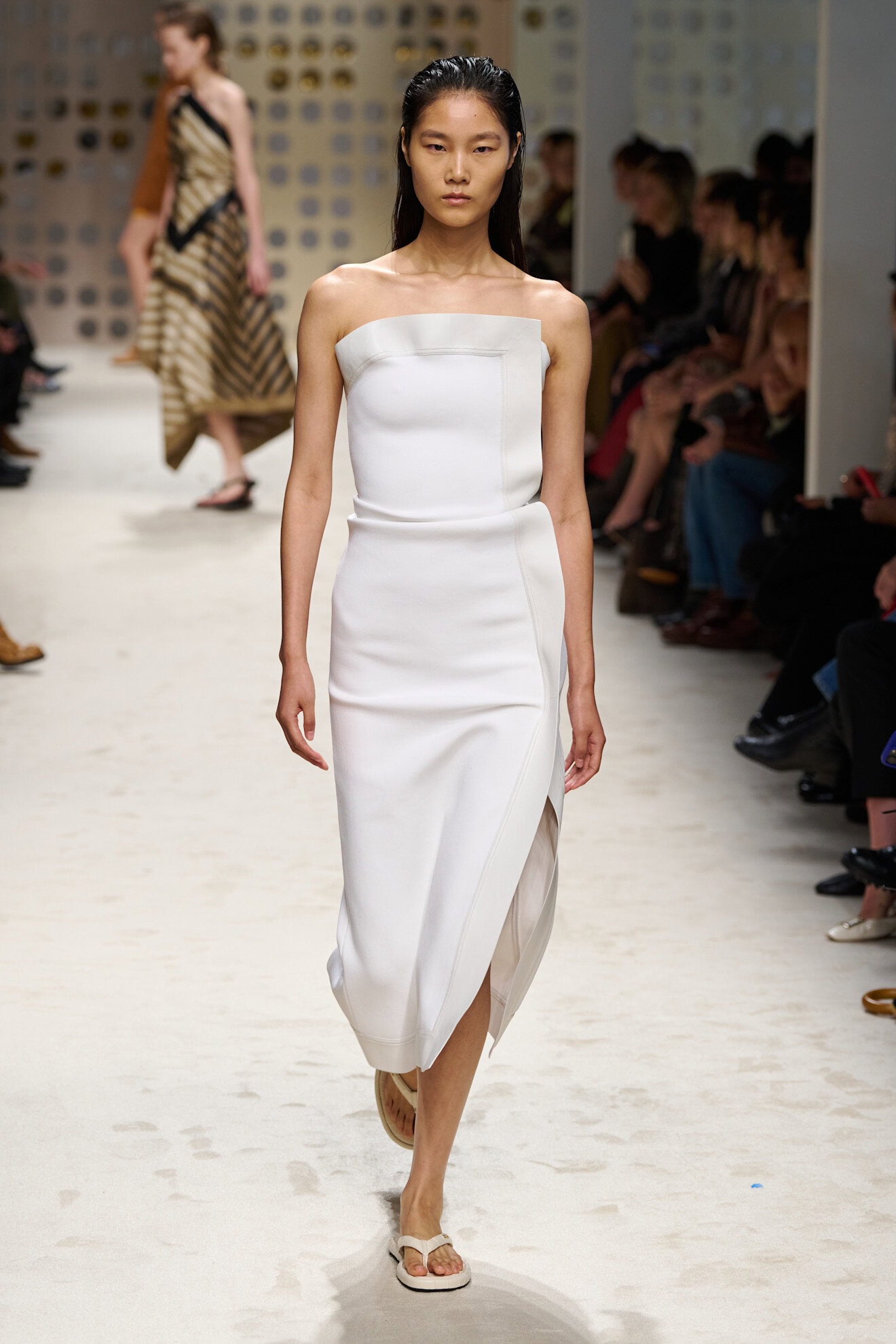
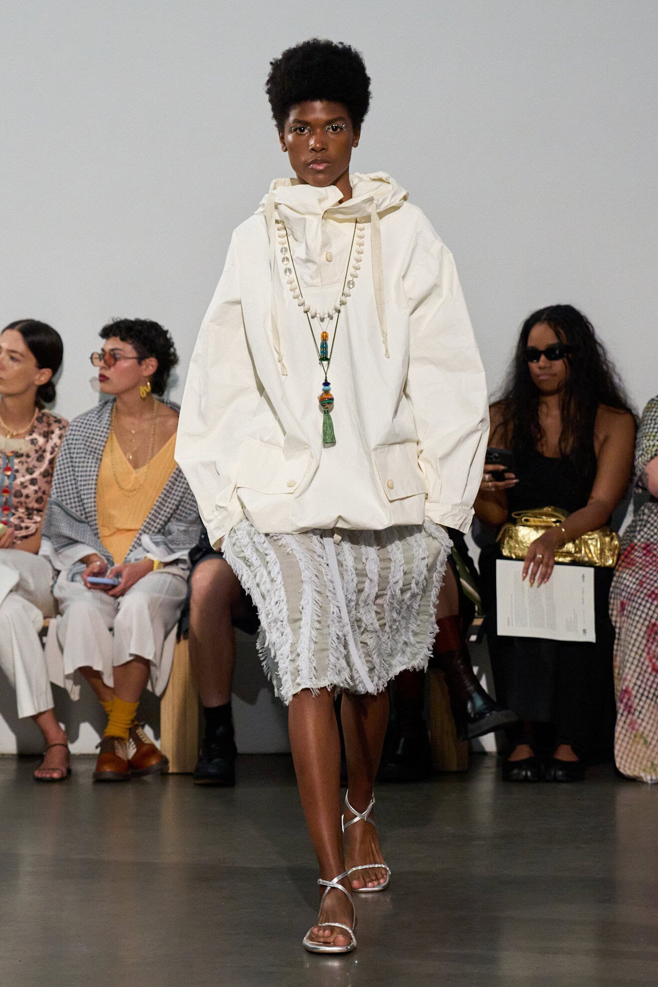
White About Now
Crisp or soft whites often mark the transition from winter into spring as summer dresses and deconstructed shirting introduce a new persona liberated from its heavier layers. 2026 is set to re-introduce the blank slate as the intellectual choice for women unafraid to wear white in the city. Designers elevated the non-colour by experimenting with origami-style folds, while the all-purpose midi seen at Bottega Veneta stood out for its simple brilliance, both in colour and construction.
White will also speak to freedom, empowerment, and solidarity – calling back to female empowerment movements of the past – and the rise of women designing for women i.e. Rachel Scott at Diotima, Catherine Holstein at Khaite, Amy Smilovic at Tibi, and Miuccia Prada at Miu Miu.
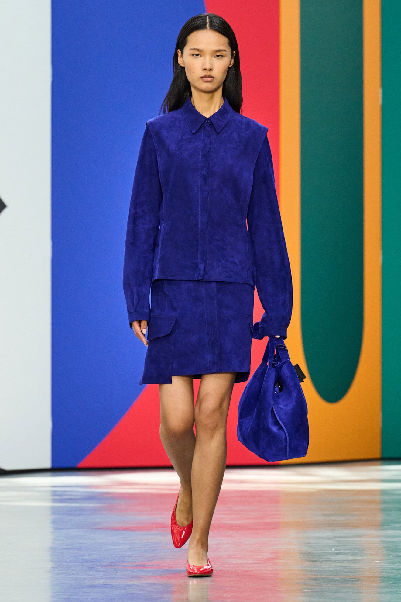
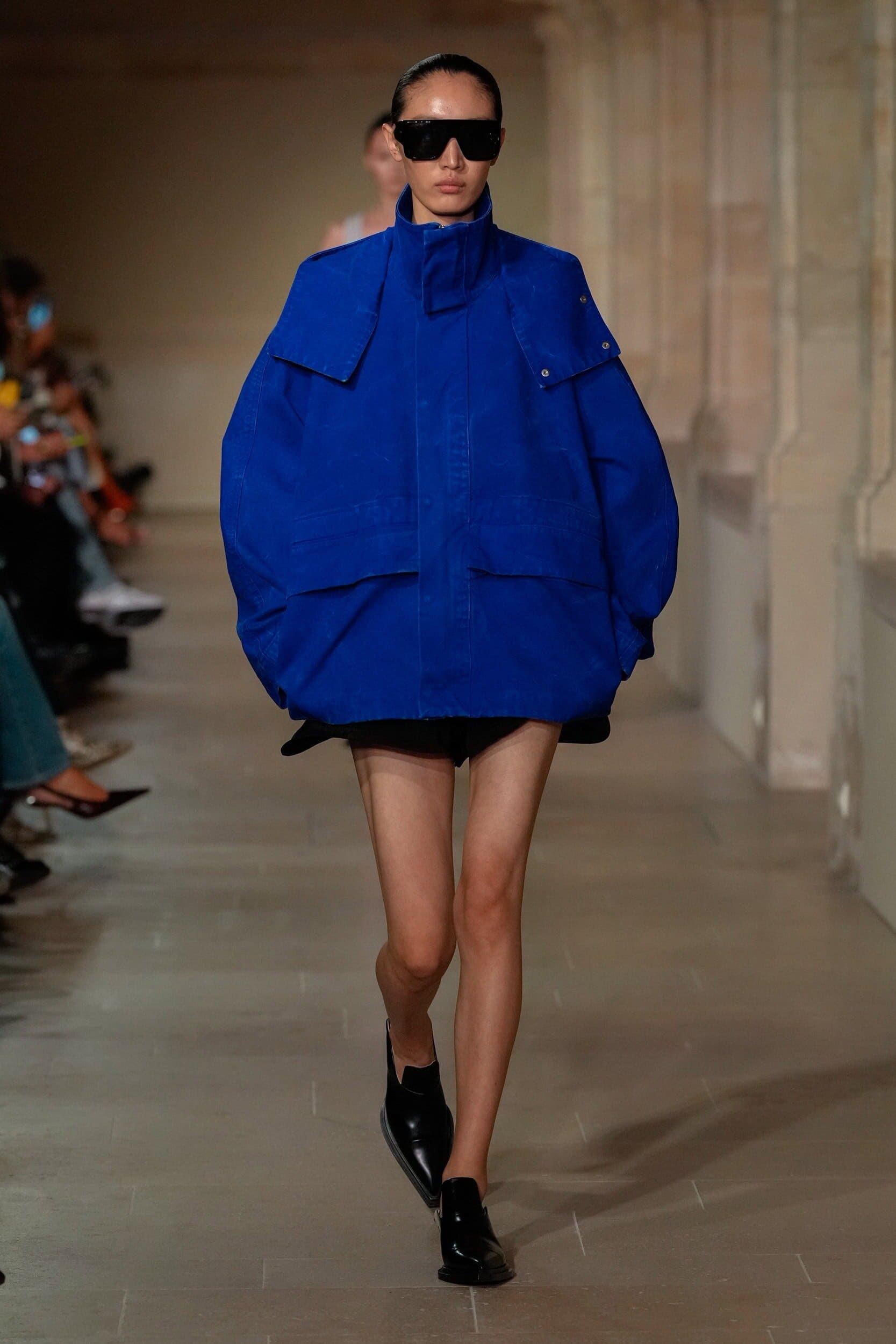
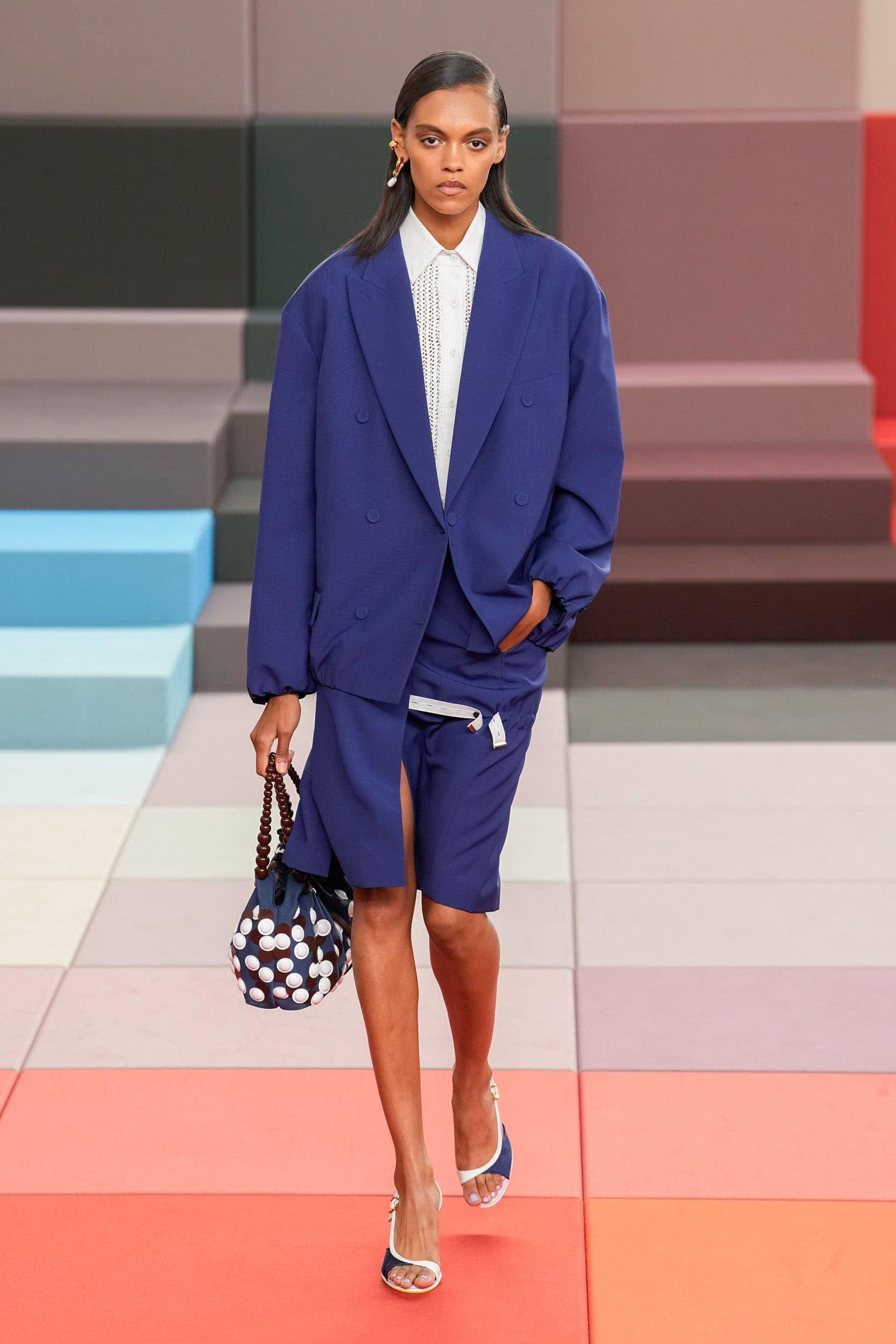
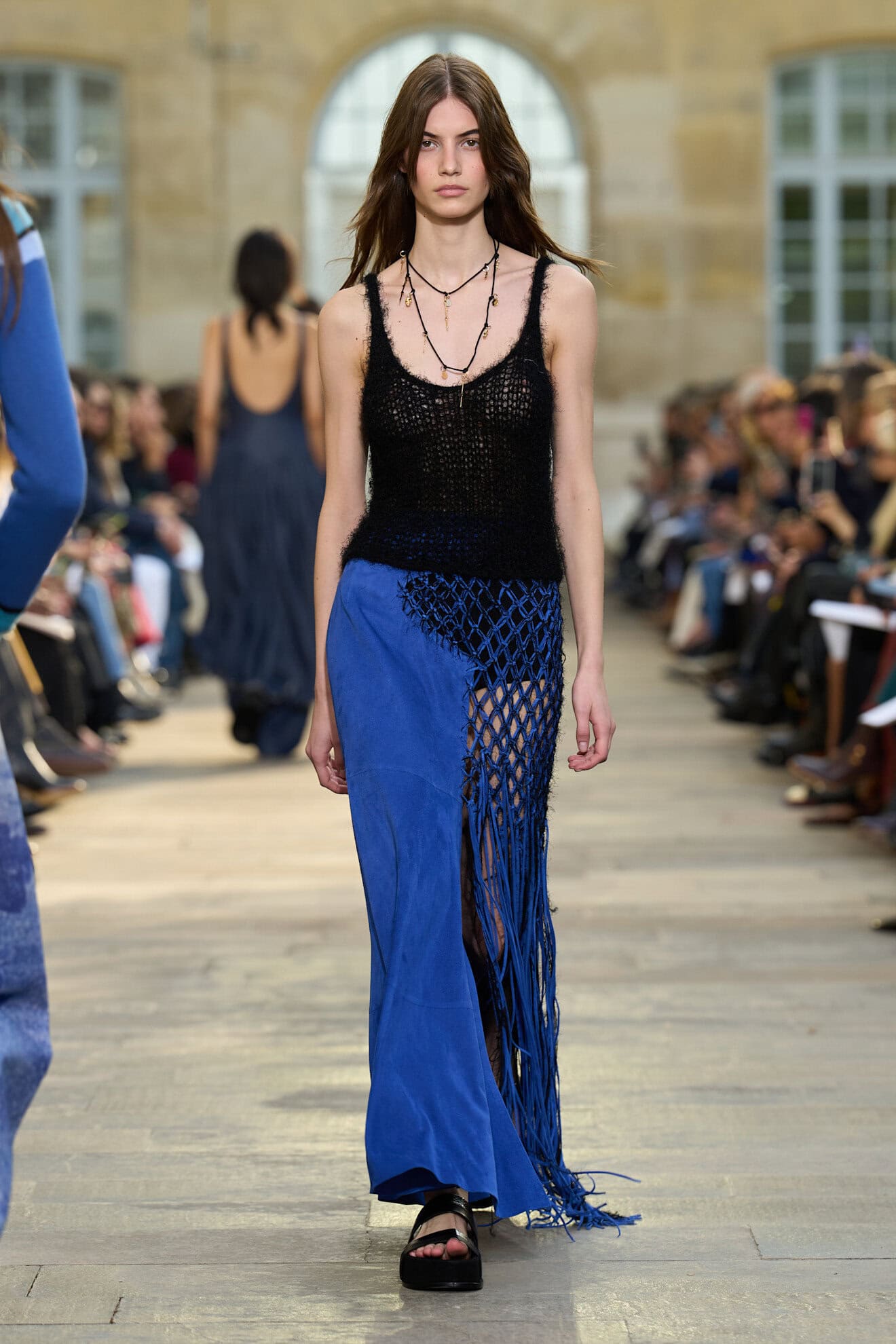
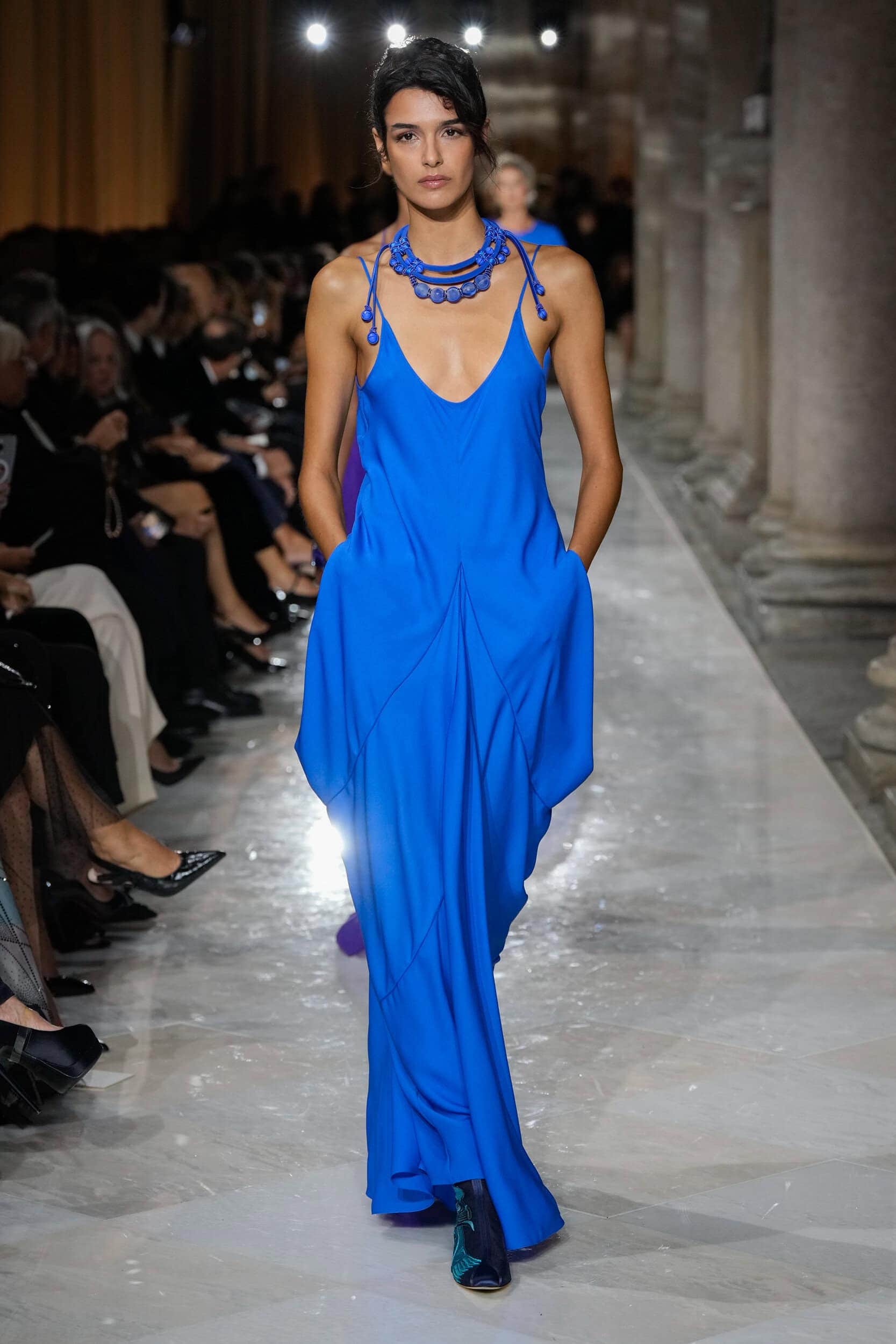
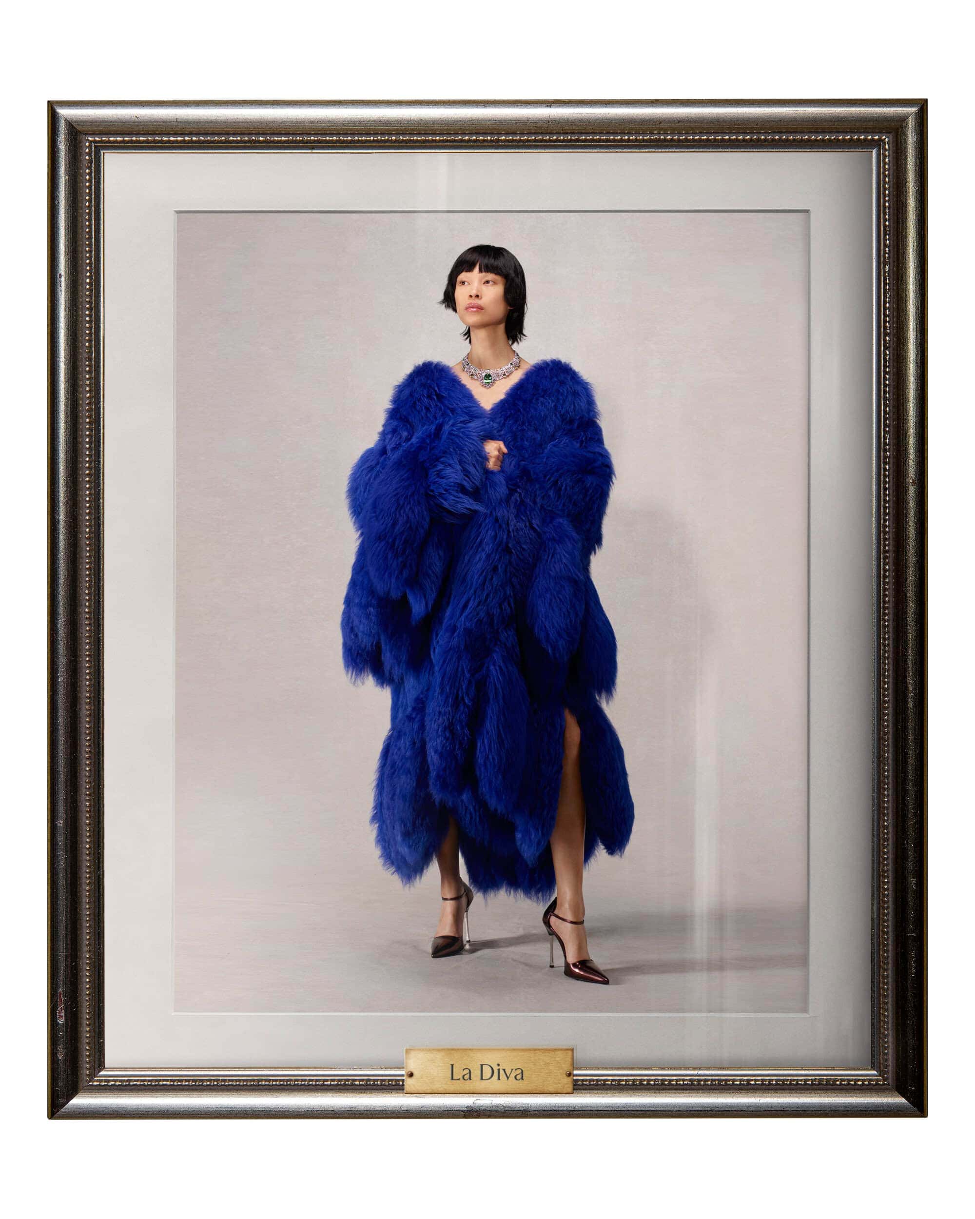
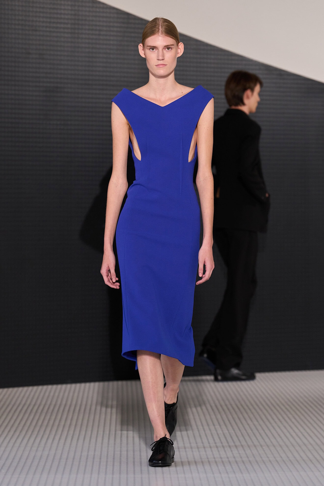
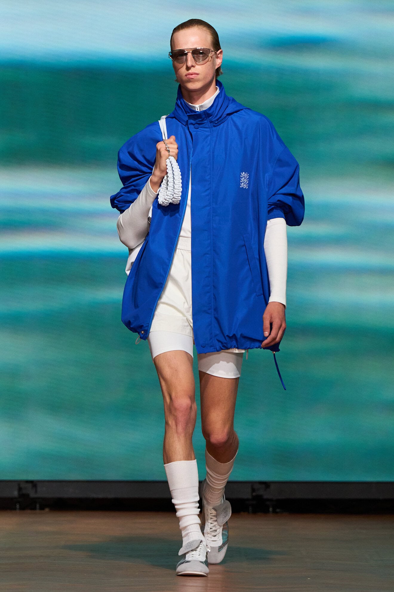
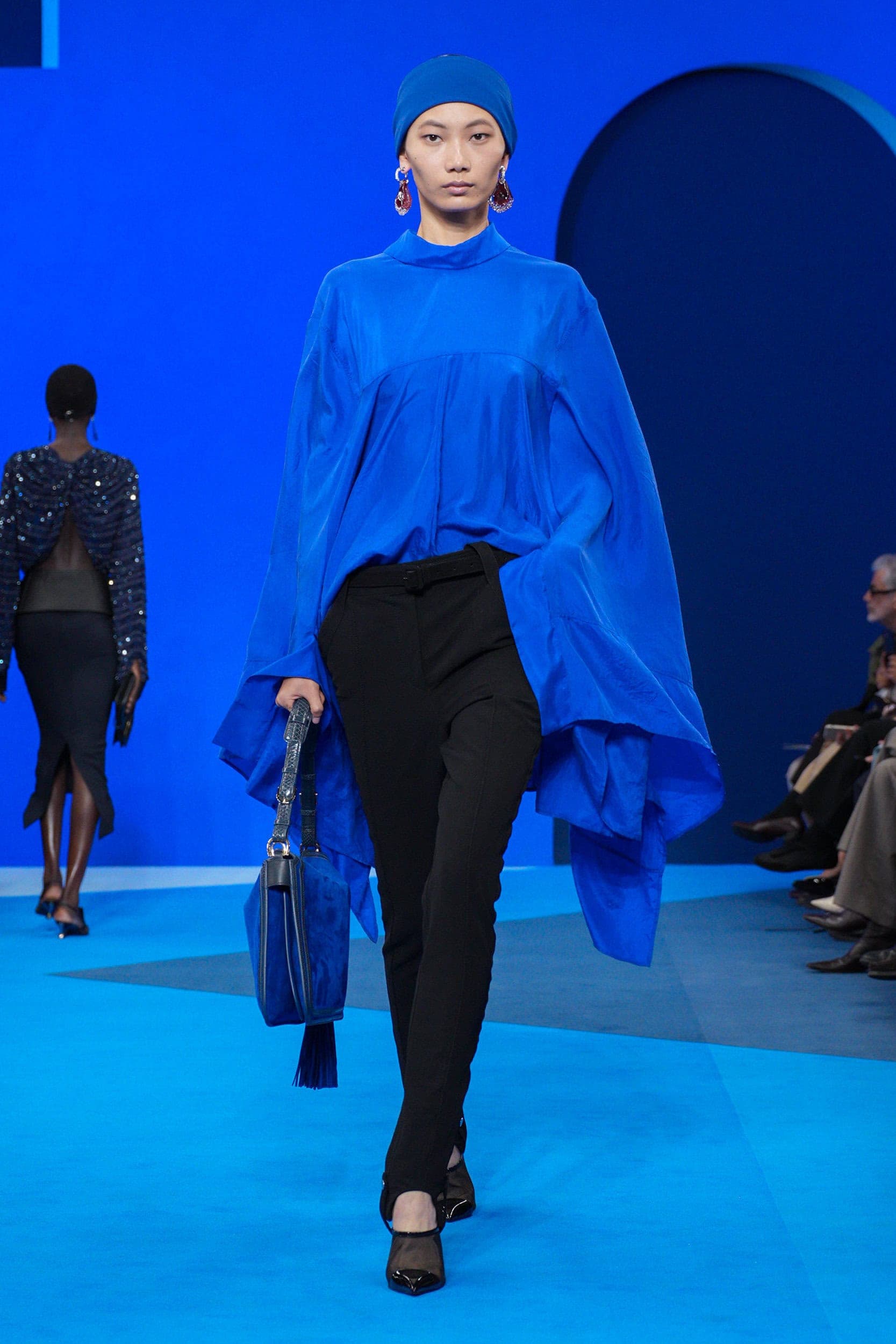
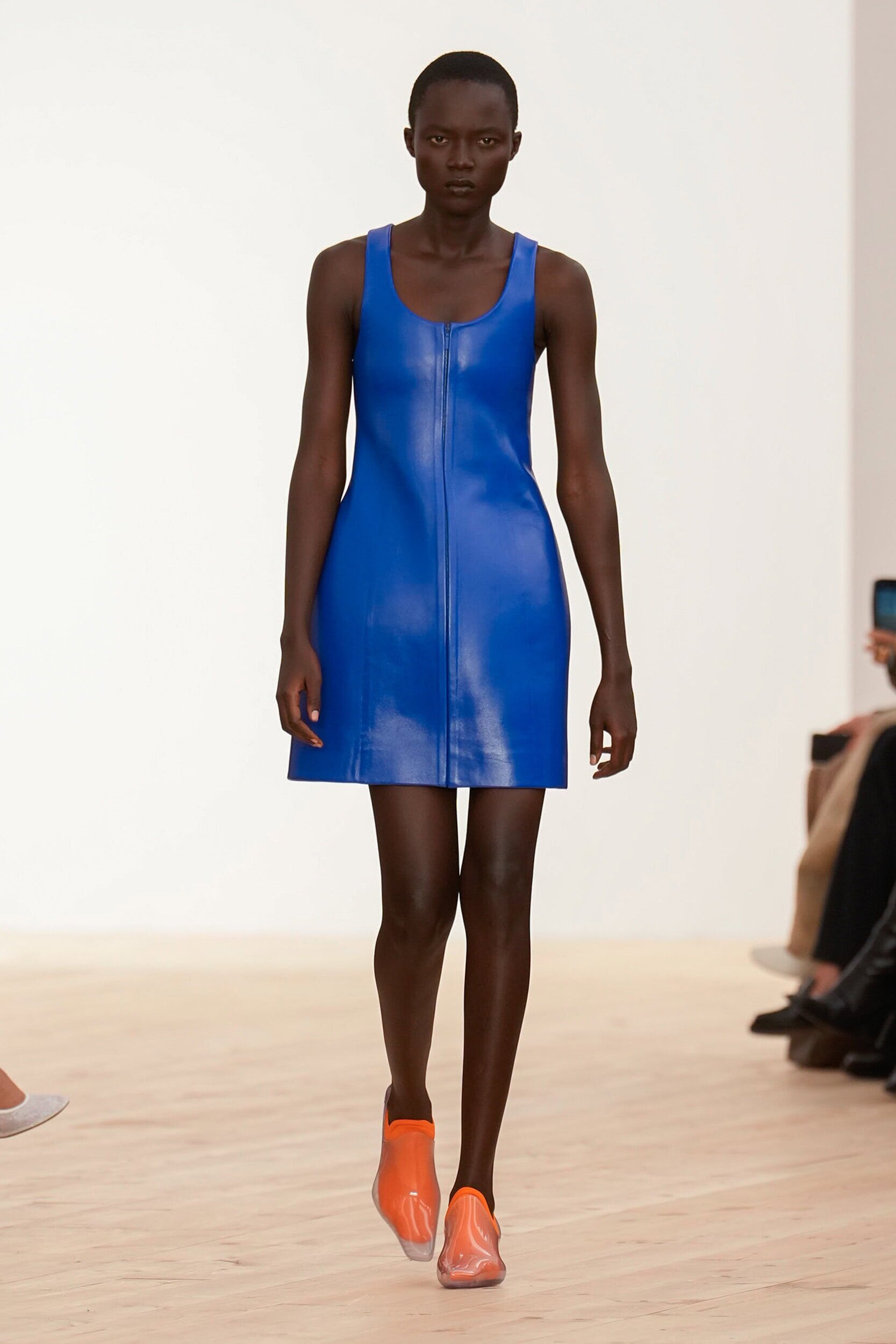
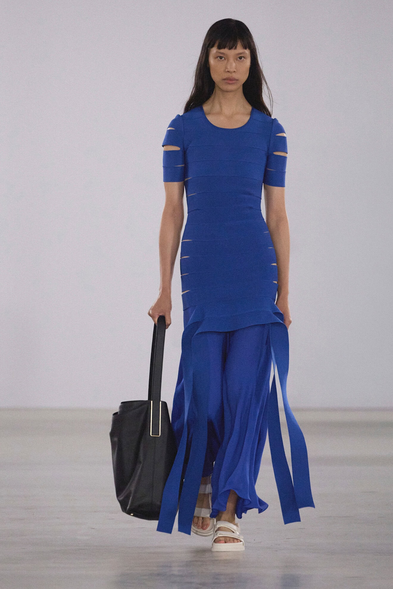
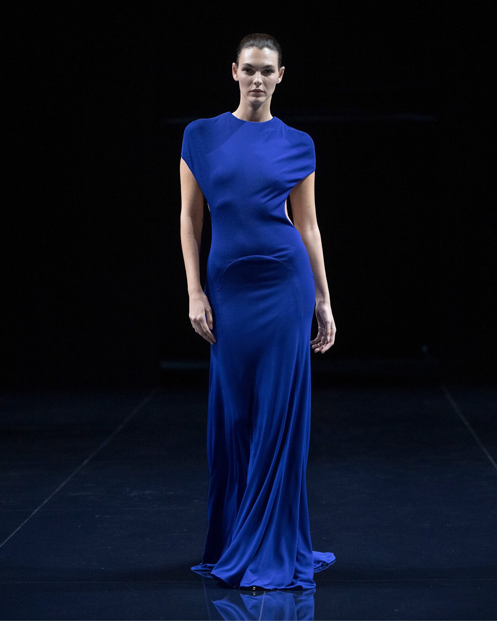
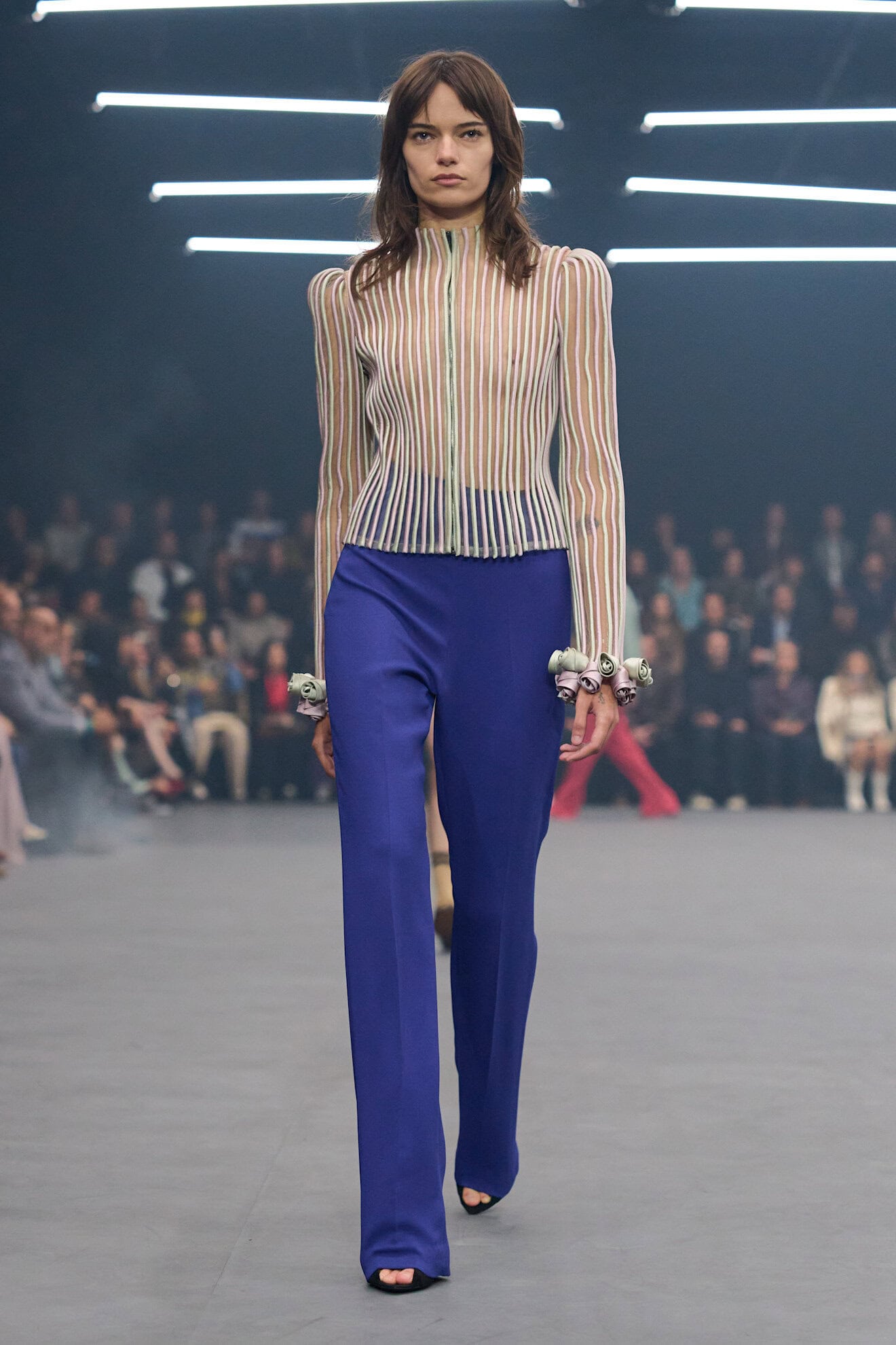
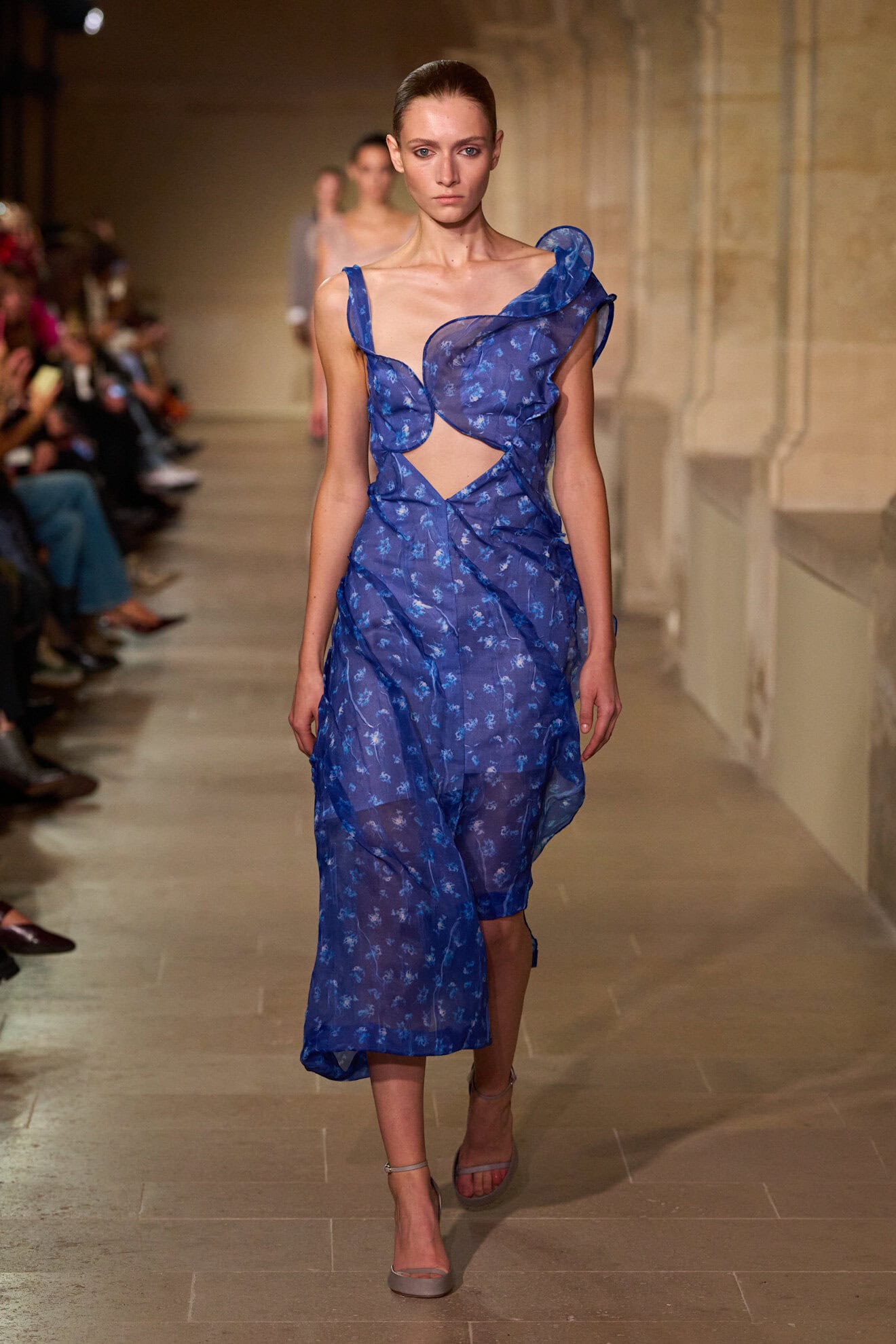
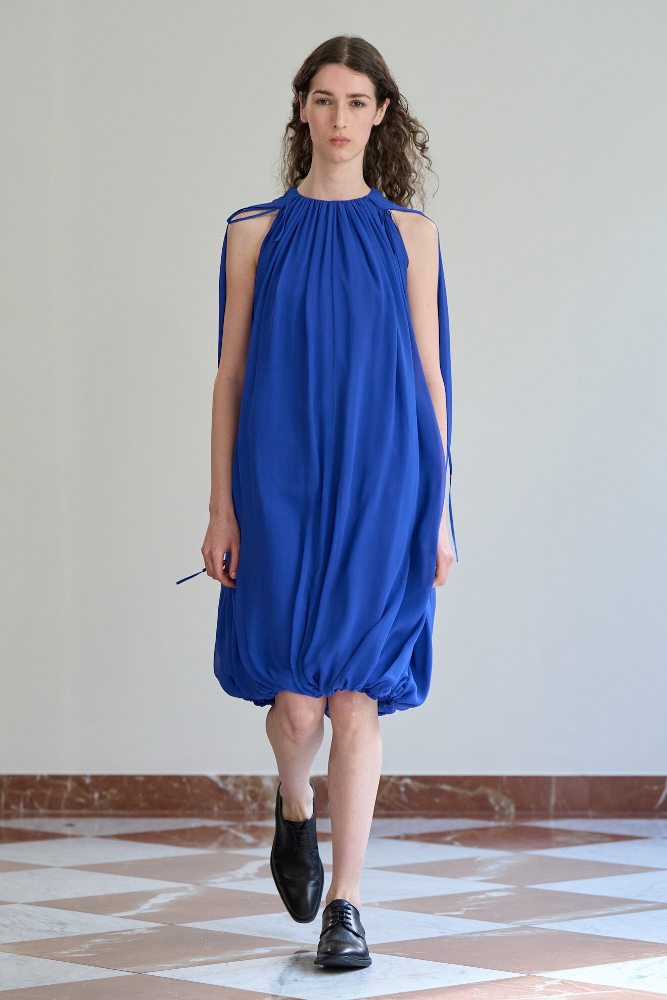
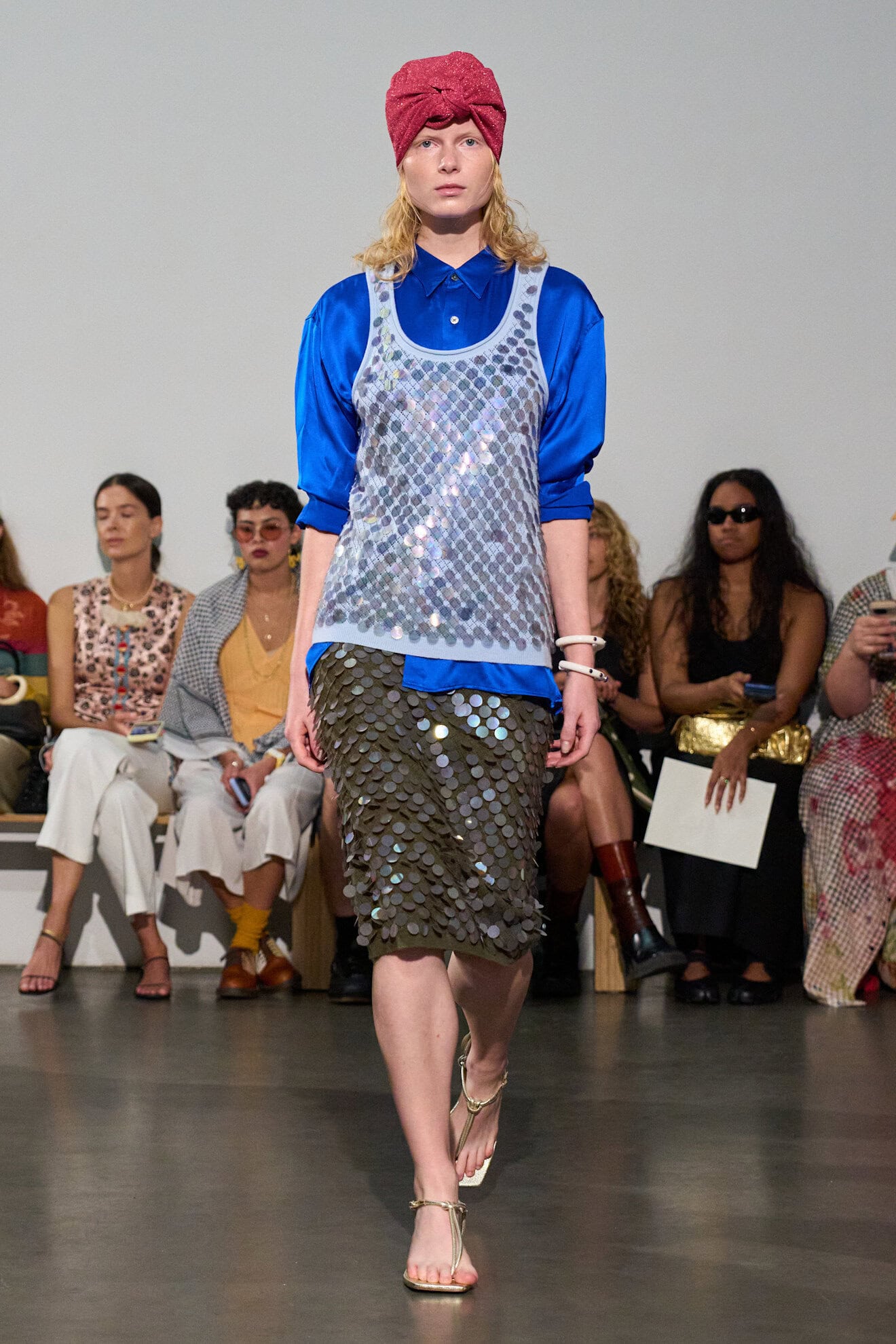
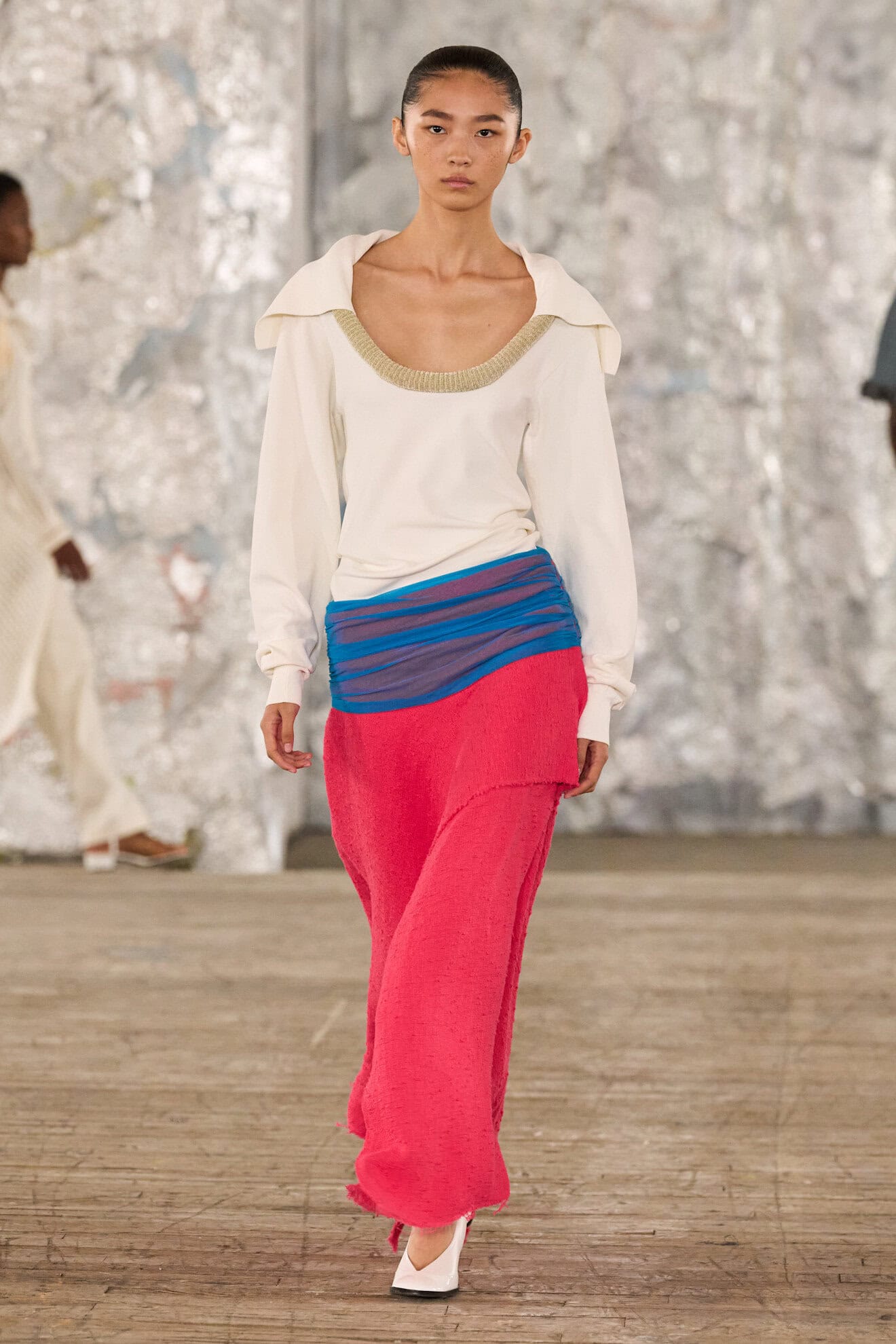
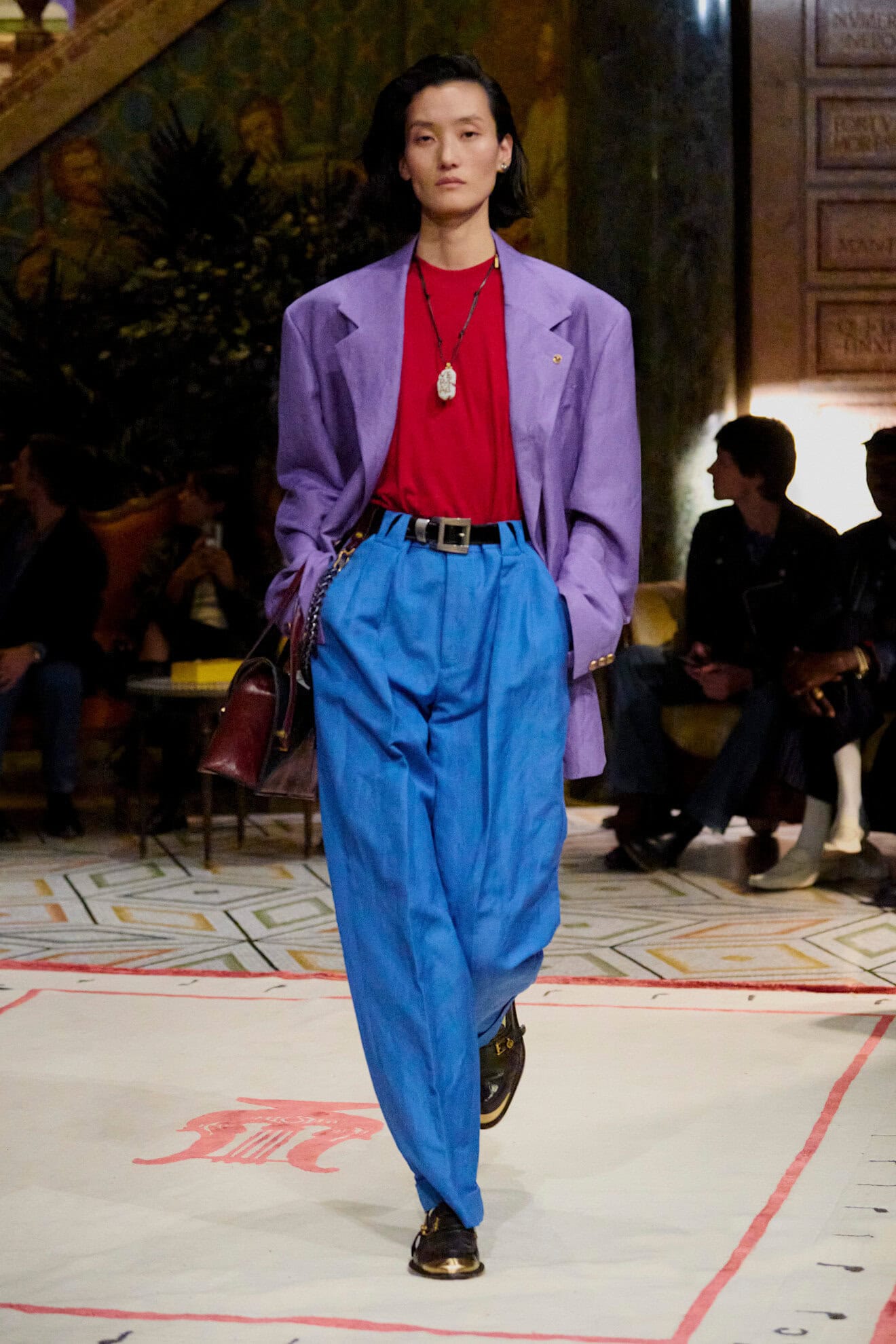
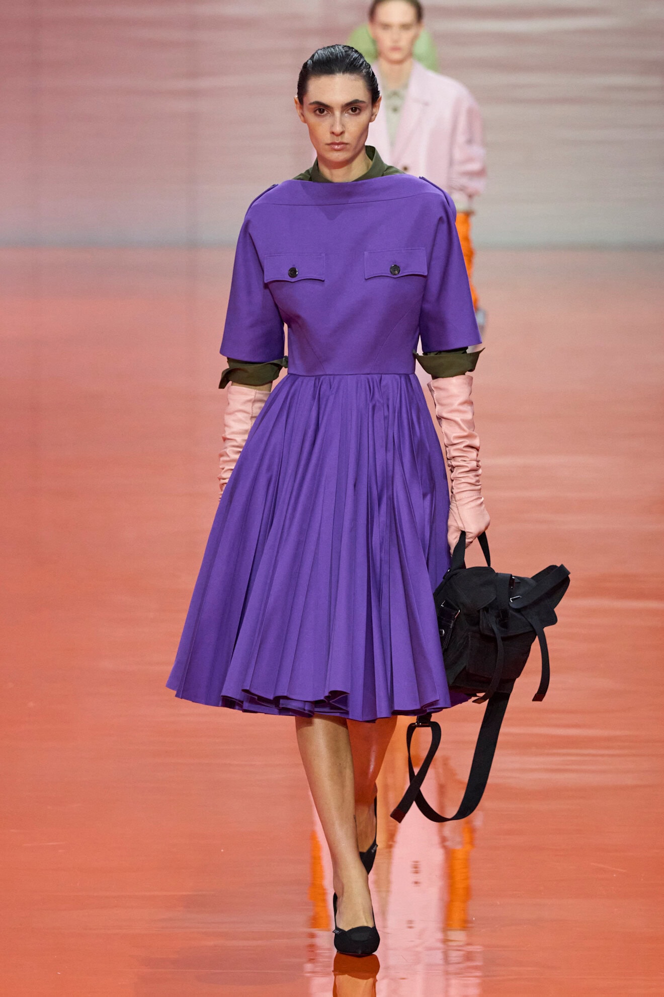
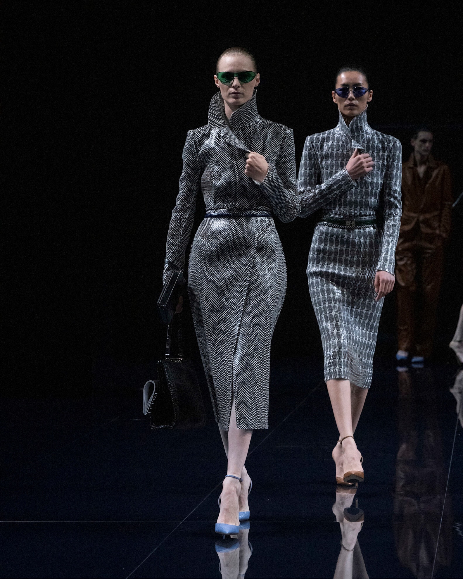
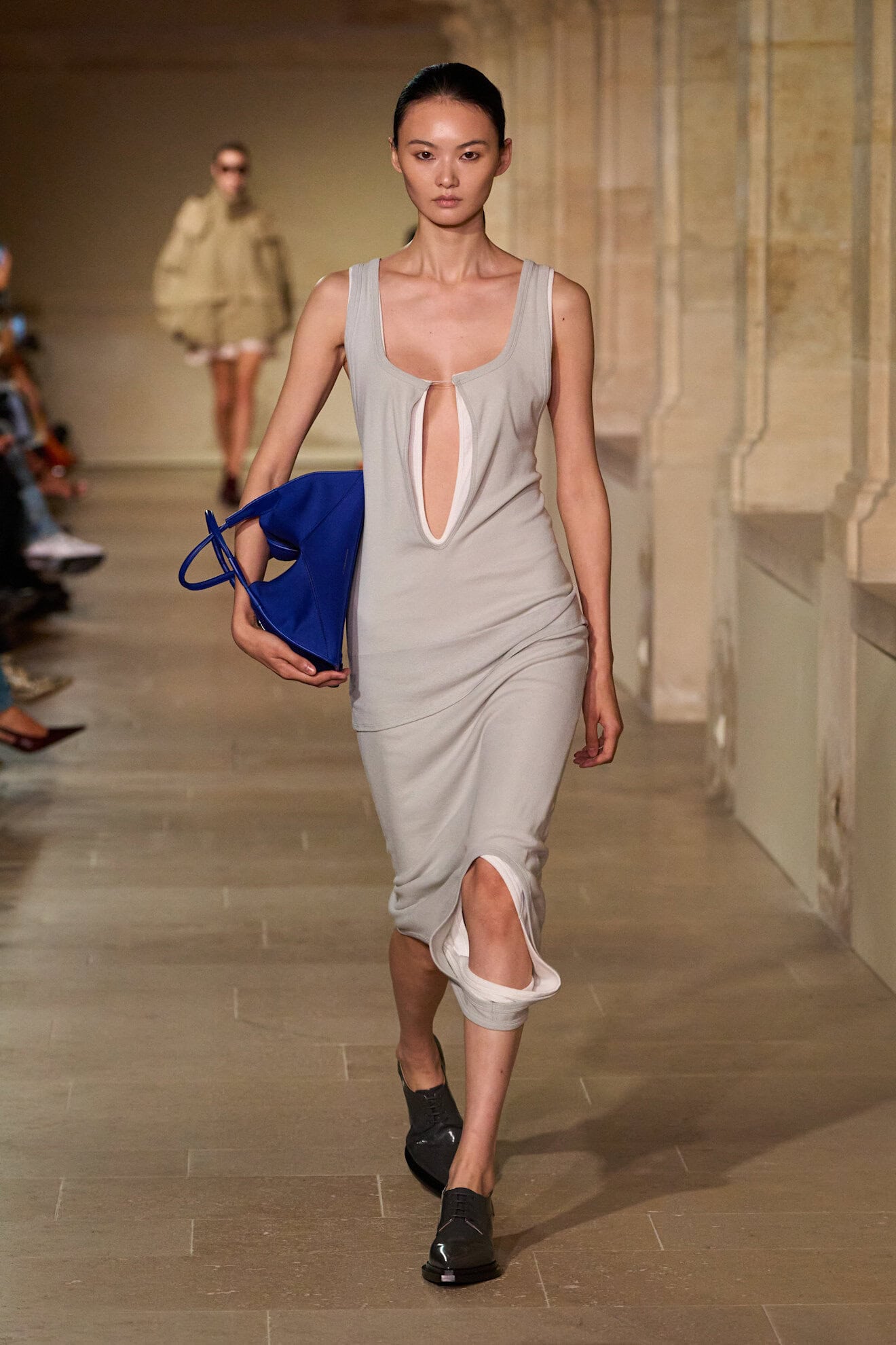
True to Blue
The 1980s have officially returned, and the resurgence of cobalt blue was further evidence of the era slowly makings its way back into the zeitgeist. Yet, far from taffeta gowns and leather suits, this time around the blue tone presented as distinctly minimal, creating an impact when worn monochromatically with a focus on simple textures – fur at Gucci or Crochet at Gabriela Hearst.
We are likely to see it taken up by the art crowd who attend the fashion weeks of that world, i.e. Frieze or Art Basel, as well as those fashion weeks which sit outside the big 4 – the shade is already a hit at Copenhagen. Its nautical and sports connotations will see it rendered across technical outerwear or sharp tailoring with a dynamic undertone, but cobalt or Yves Klein blues ability to reemerge every few years makes this an investment hue with long-term value.