Review of Balenciaga “It’s Different” Spring 2024 Ad Campaign by Creative Director Demna
Balenciaga continues its clever “It’s Different” campaign, introducing a new chapter that draws on an iconic advertising trope while highlighting some of the house’s signature pieces through its own cheeky perspective.
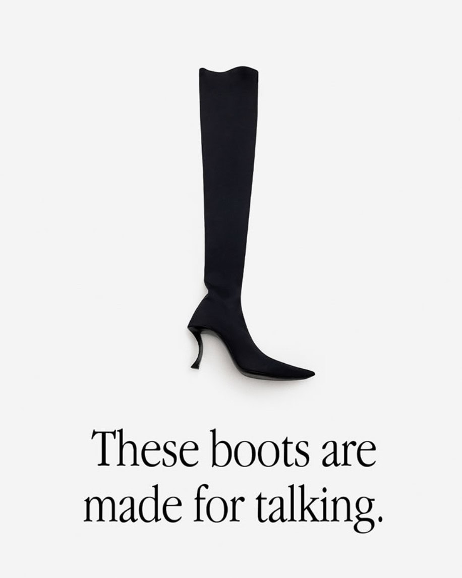
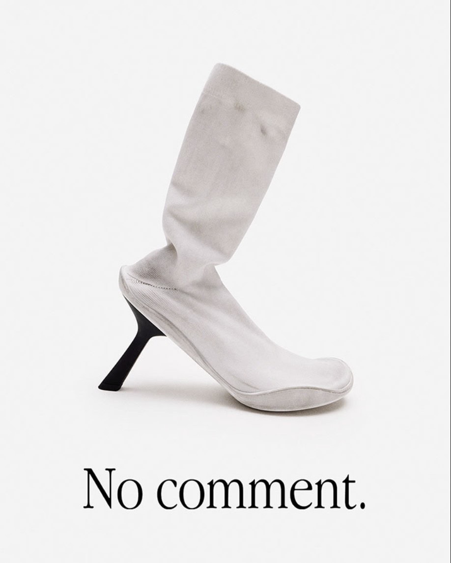
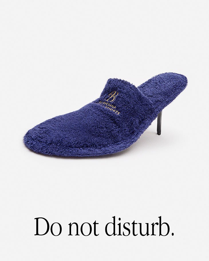
Launched at the end of last year, the first chapter of the campaign riffed on Apple’s famous “Think Different” ad campaign of the late 90s and early 2000s, even using the same recognizable typeface. But while Apple’s ads paired the slogan with faces of influential creators and innovators, Balenciaga here paired ironically detached anti-slogans with flat shots of some of its quirkier product offerings.
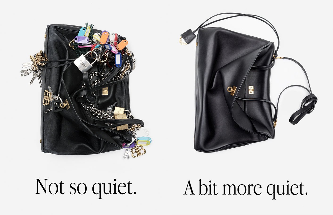
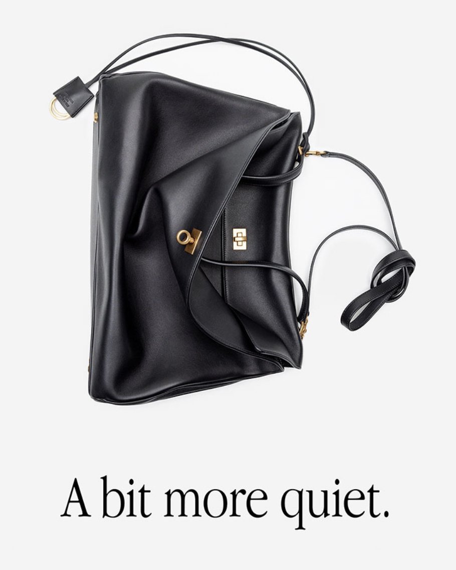
This new installment continues this practice while deepening the featured product assortment, and also makes a clever use of dual-page layout. One version of one of the brand’s signature bags is utterly laden with key chains, and gets the slogan “Not so quiet.” Meanwhile, the same bag in its pure form is “A bit more quiet.”
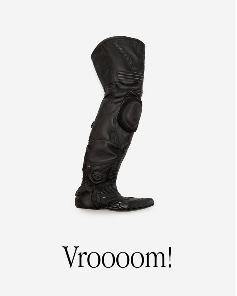
Other images include the brand’s futuristic wraparound glasses with the slogan “In your face,” while its moto boot simply gets the playful “Vroooom!”
The campaign wisely builds on the first chapter’s clever spin on an advertising classic. When flipping through the advertising pages of a glossy fashion magazine can be overstimulating, this direct and clear use of image and text is a powerful way to cut through the noise. The same goes for Instagram and billboards, and we wouldn’t be surprised to see some of the images overlooking the streets of Paris or New York – an impactful OOH approach that would also drive social media engagement.




Balenciaga Creative Director | Demna
