5 Key Insights from Fashion Colour Experts
By Lizzy Bowring
A/W 23/24 is a season that comes at the end of a year full of complexities, and if there is one thing that reflects global moods, it is Colour. To understand the significance of the meaning of Colour from Fashion Month, The Impression speaks to Pantone, WGSN, and Mintmoda to unpack the 5 key Insights.
Colour plays a vital role in the world in which we live, and it can influence not only our thought processes but stimulate emotions. Understanding the importance of color and how to apply its significance is a powerful tool for brands. Swiss psychologist Carl Jung says, “Colors are the mother tongue of the subconscious.” Being in tune and listening to the signals from our world allows brands to tell poignant and relevant stories of experiences and messages.
Synthesizing with global messages is highly relevant, more so now than ever. As we examine the changes in society, technology, and the environment, understanding human sentiment and its influence will assist in comprehending the direction of change. If one looks at the emotional roller coaster experienced over the last two years, consumers have sought to balance their anxiety with nurturing comfort and optimism. As a direct result, we have seen an acceleration in the popularity of soothing neutrals and clean, bright, chromatic colours.
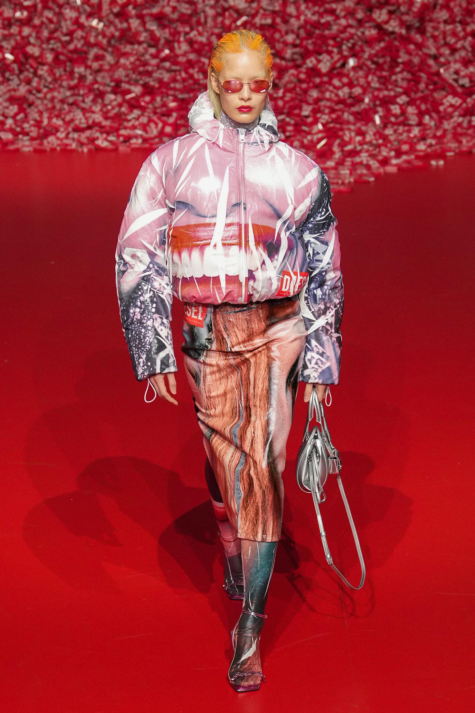
The initial ‘work from home’ aesthetic from 2020 to 2021 saw a rise in neutral color spectrums, offering a palette of calming hues for both apparel and home. However, as we emerge from the pandemic, consumers turn to an unleashed energetic optimism; this has given rise to a highly saturated color palette of Dopamine brights—shades of pink, including HyperPink, yellow, red, and bright blue. Black is ubiquitous due to its enduring and classic appeal, while Grey takes precedence in a sea of varying hues of ‘neutrals.’
Key Takeaways
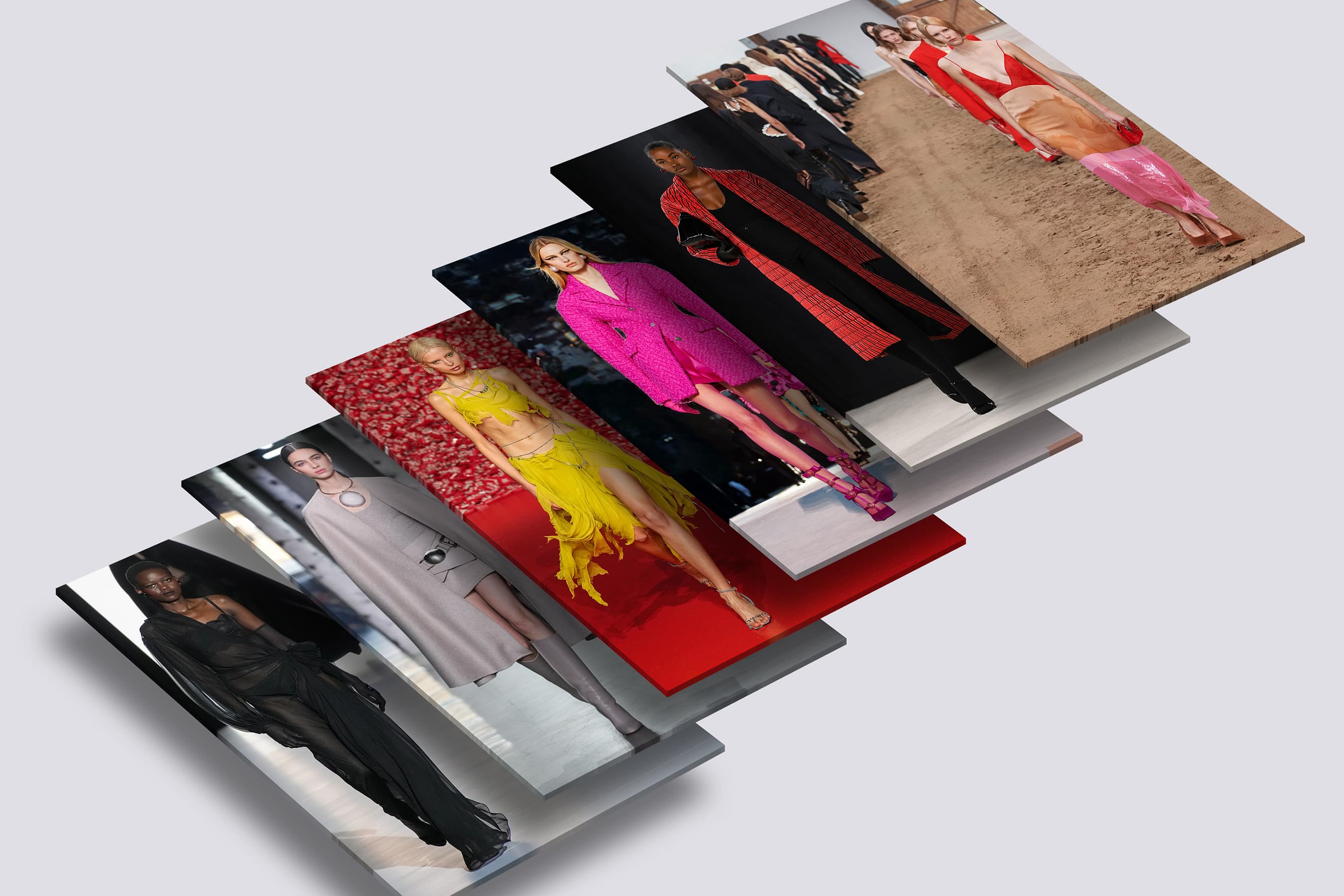
- The most prominent colours seen at Fashion month. A/W 23 reflects the overarching mood of the season in a display of sympathetic neutrals and effervescent brights
- The significance of the colour hues. Colour directly reflects the global antithesis we are experiencing, defining moods with a deeper meaning.
- To make a difference, be aware that consumers seek clothes that last. Consumer attitudes have shifted considerably since 2020, so they are savvier about where to spend their hard-earned money. Longevity is a key factor.
- Sustainability and circularity are integral to a brand’s ethics. Responsible Colour will become critically important, and it is up to brands to lead the conversation.
- The future of Colour is a larger conversation. Quality, not quantity. That’s the most environmentally friendly thing you can do.
1. The most prominent colours seen at Fashion month. A/W 23 reflects the overarching mood of the season in a display of sympathetic neutrals and effervescent brights
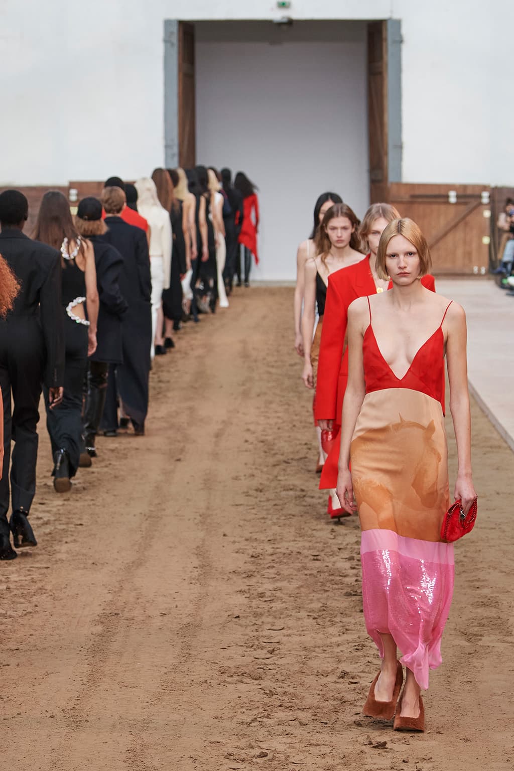
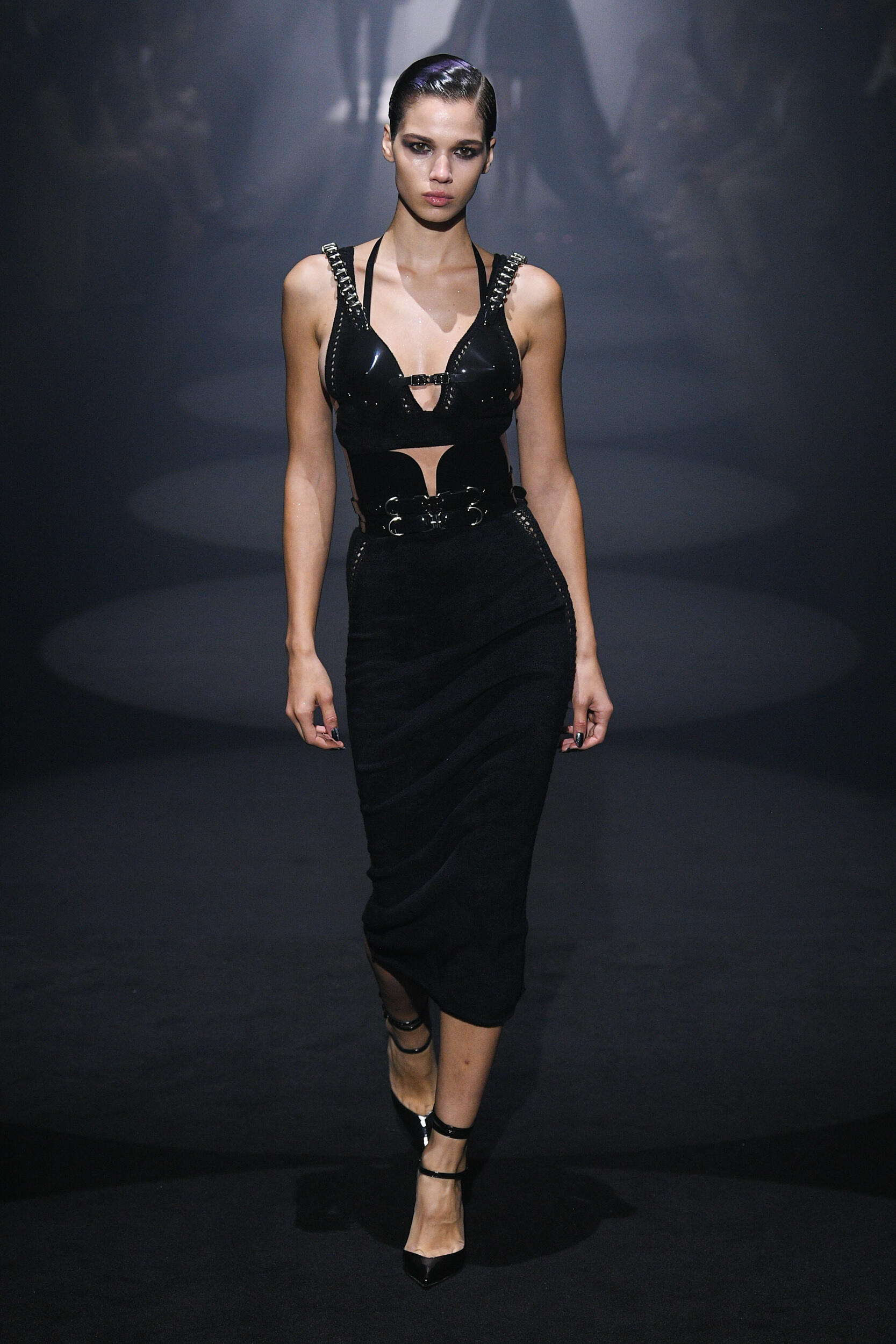
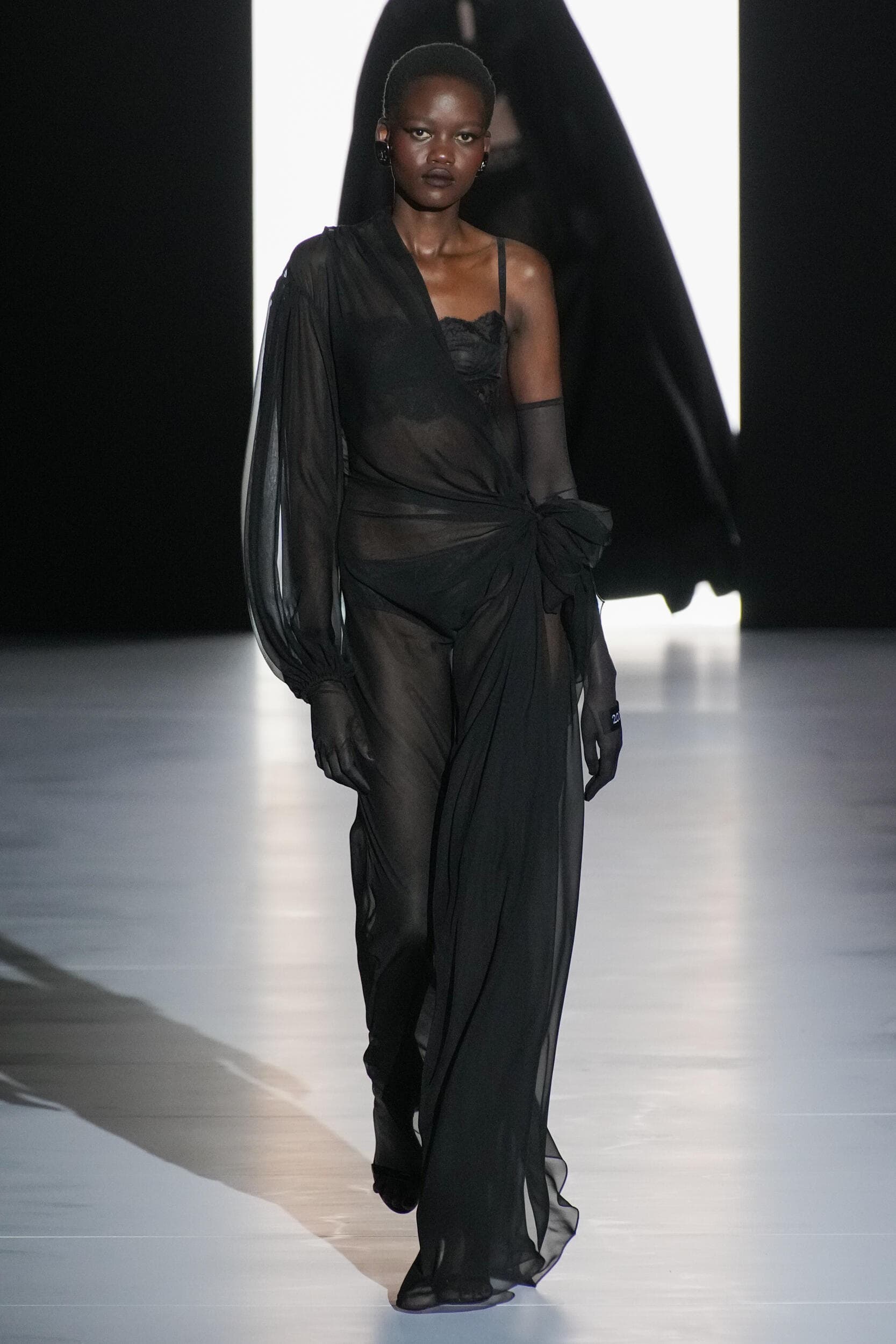
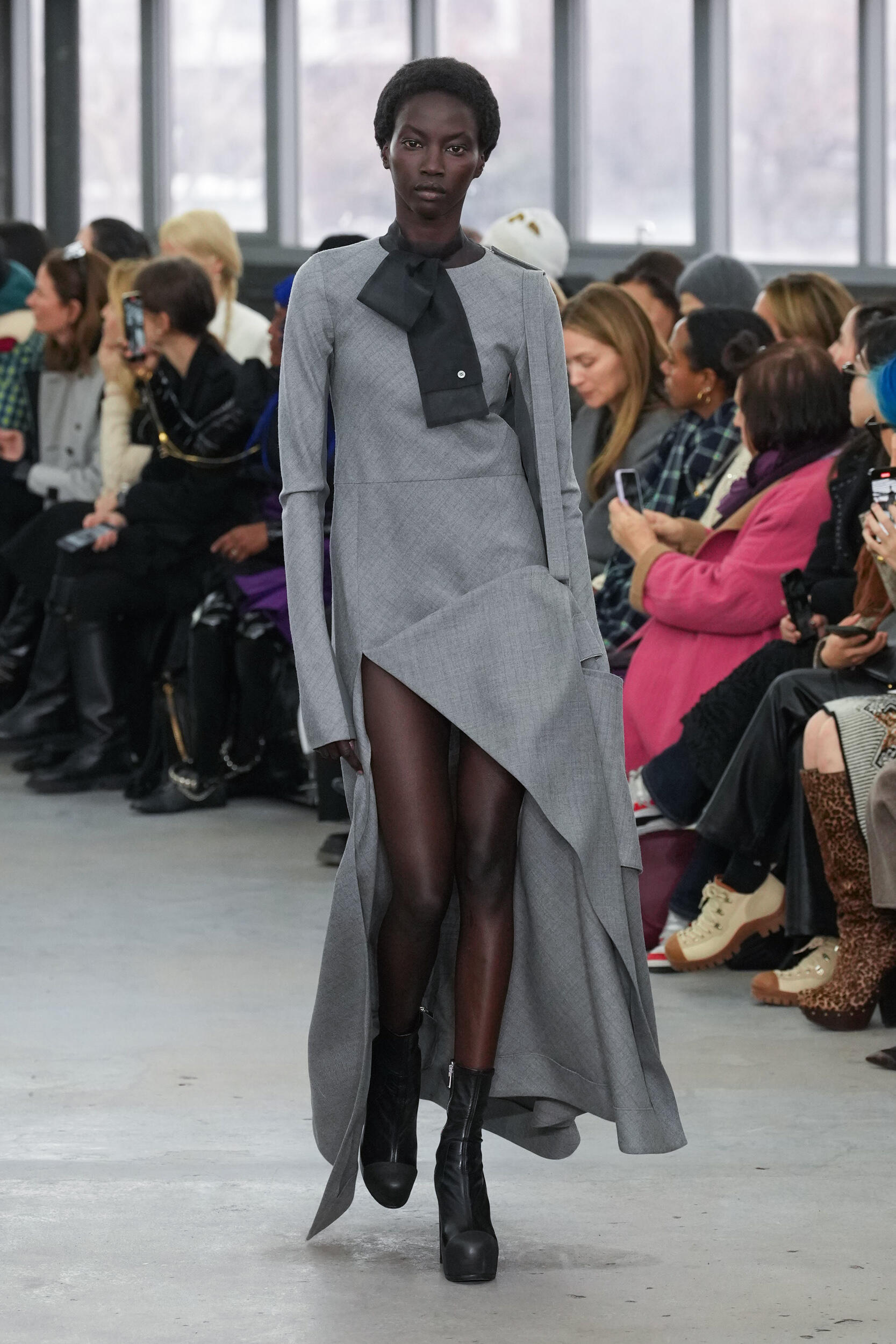
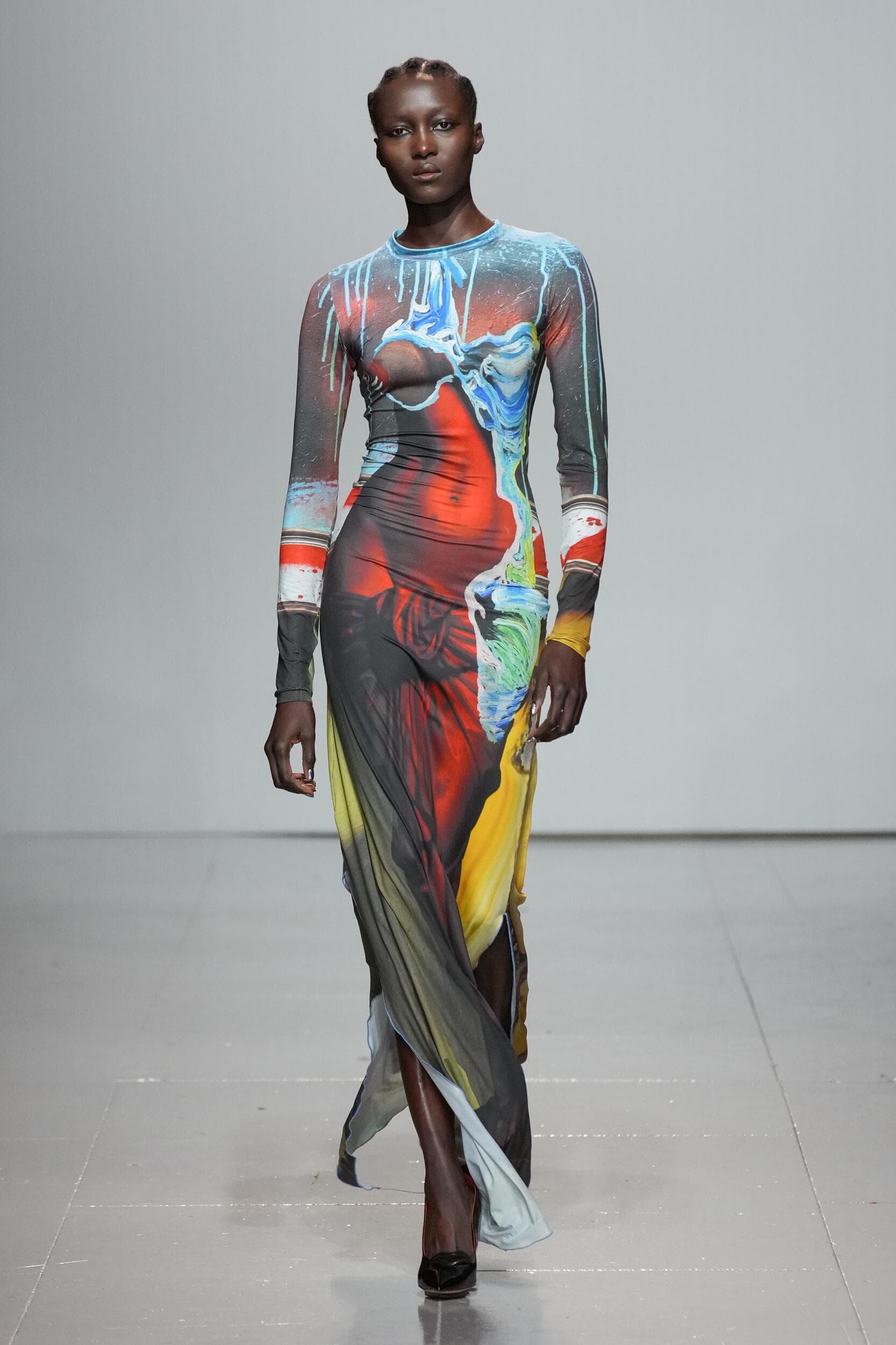
Fashion month is now complete, and after a bevy of collections, analyzing the key trends is a monumental task – ordinarily. But then, this season has been a little out of the ordinary. The changes in societal behaviors and the demand for a calming aesthetic have profoundly impacted how creatives and brands have approached the future. Given that the apparel trends have changed quite considerably to that of a more unified and realistic aesthetic, it stands to reason that the colours should follow suit. On the runways, brands approached the season with renewed confidence, the kaleidoscope of colors from the past seasons now fine-tuned. Dopamine brights still exist but in a reduced format to Yellow, Red, and Green, in some cases bright blue – the Colour representing freedom and adventure. However, the balance came with designers offering a palette of softened neutral colours offset against Black, White, and Grey. These colors are most significant for the A/W season and provide an important transeasonal appeal.

According to Clare Smith of WGSN: “You can’t ignore the prominence of black with all-black styling answering to the moodier trends of the season. This classic shade also aligns with indie and grunge-inspired stories. We’ve seen a dystopian, gloomy view of the near future pushing darker and subversive aesthetics forward, which black plays into perfectly. Another colour known for its classic appeal is the not-so-quiet return of grey, which sits perfectly alongside black. This Colour emerges due to a new interest in tailoring and formal as these trends slowly recover post-pandemic.”
These shades [black and grey] show strong transitional and trans-seasonal appeal, aligning with dopamine dressing, keeping silhouettes simple for commerciality, and perfectly balancing minimalism and maximalism.
– Clare Smith, Colour Strategist for WGSN


2. The significance of the colour hues. Colour directly reflects the global antithesis we are experiencing, defining moods with a deeper meaning.
A/W 23/24 accentuates the versatility of colours in their multiple nuances, particularly greys that are at once minimalistic and essential for much of the seasonal trends. The fascination with this chromatic restraint aligns with emotional responses to worldwide instability and underscores the general need for confidence and empathy. Grey is a colour that denotes composure, solidity, and stability and is a perfect complement to clothes that offer versatility. It also indicates understated glamour – a powerful complement to the return of ‘Real world’ clothes, where tailoring takes precedence, evoking a wearable, modern, and dignified aesthetic.
While the entire range of natural hues reflects the desire for stability and restoration for consumers who continue to be sensitive and cautious about the future, colours must do more. In contrast to these timeless and sustaining hues, colours associated with nature and wellness remain prominent, such restorative hues lending the season a sense of calm and tranquility. Including bright colours offers a sense of escapism while seamlessly transitioning from season to season. A/W 23 color emerges directly from the emotions we have been living with for the last two years.

The colors reflect the emotions we are experiencing, with two powerful trends appearing. Bright, joyful colors convey a message of enthusiasm and vitality. These uplifting colors empower us and give us the energy we need as we emerge from covid and write a new narrative for our lives. At the other end of the spectrum is the wide range of neutrals, these more traditional tones serve as building blocks.
– Laurie Pressman, Vice President of Pantone Color Institute


We see a direct reflection as we grapple with ongoing economic, political, and environmental crises. There is a strong focus on building for the future, and cautious optimism is coming to the forefront. The strong prominence of black, grey, and neutrals aligns with consumers looking for product longevity and the need for products to do more.
– Clare Smith
3. To make a difference, be aware that consumers seek clothes that last. Consumer attitudes have shifted considerably since 2020, so they are savvier about where to spend their hard-earned money. Longevity is a key factor.
Consumers are drawn to colours that are practical, versatile, and provide longevity. Although this reasoning outweighs most, the return to the office is beginning to become a significant factor, playing into a new mindset of careful investment. And not out of the equation, gender fluidity is a key component, so colours and apparel that can easily transition from one to the other are paramount. During the pandemic, consumers’ desire for neutral colours increased as they sought to feel safe and grounded. Yet compared to the following year, it was obvious that people’s preferences changed dramatically. Through 2022, consumers were ready to take risks and wear unapologetically upbeat colours that provided much-needed optimism and joy. In times of disaster, people have gravitated toward colours that reassure, lift, and provide some hope. Yet the product must also reflect these newborn attitudes while consumers seek longevity from the brands they purchase. While longevity points to reuse and recycling versus the throwaway culture, it is even more important that brands provide a sensible and responsible reason to buy. The upshot is that consumers’ increasing desire for colours directly links to wanting lasting products.

Black and grey are not about being depressed, they are there to last. It is a new way of thinking about clothes. Perfectly cut grey pieces that one can wear season after season. Dopamine colors are coming out of the pandemic and leaping into the street to have fun with clothes. It’s also about statement pieces that express your personality, so bright colors will lift your spirits and be your signature piece, and the neutrals are your longevity.
– Sharon Graubard, Founder and Creative Director of MintModa


Consumers are looking for more versatility in products. For A/W 23, it’s evident that brands and designers have focused on consumers’ need for longevity. Some brands feature minimal Colour in their collections, focusing on darks and neutrals to bring long-term appeal to consumers. We have also seen designers return to shades they first introduced in the summer season and show a longer lifespan in these hues by showing them again in A/W, highlighting the importance in trans-seasonal shades.
– Clare Smith
4. Sustainability and circularity are integral to a brand’s ethics. Responsible Colour will become critically important, and it is up to brands to lead the conversation.
Sustainability and Circularity are emerging as integral to a Brand’s ethics. Therefore, the impact of responsible Colour and/or naturally derived hues should be omnipresent. In many respects, there is no hue and cry about responsibly sourced colour that we heard almost two years ago or the trickle-down effect into 2020, and now all seems to be forgotten in the wave of Fashion Month. Clare cites there is still a long way to go with responsible and naturally derived Colour in fashion, and the key to responsible Colour starts even before you get to the dye choices. There is still much work to be done within the industry, and scaling solutions is crucial for responsible Colour to make the biggest impact. One great example of circularity and natural Colour being used for A/W 23 was by Coach. A few of their pieces were designed with fully sustainable materials, silk chiffon slip dresses were naturally dyed with logwood, safflower, and marigold using minimal waste pieces.


It may be time to push boundaries to make brands responsible. Although that will give rise to another topic, let’s look at another brand as an example of how to approach Colour with a sustainable mindset. Anrealage presented her collection with a digital concept, the designer’s experiments with Colour and pattern on the garments visible when exposed to UV light. At the same time, each garment’s color differences correspond to changes in the natural sunlight’s intensity. The designer says these products are “designed to develop through the days and seasons and are made to shift their tonal range continuously. They will revert to their original Colour when no longer exposed to UV rays – exemplifying how people change over time, interact with their surroundings, and how their environment can change them.


Sustainability and circularity are emerging as integral to the ethics of many brands. And many brands are turning to naturally derived hues to highlight this position. A lot is going on behind the scenes, with more and more dyestuff companies developing new methods to enable mass production using more sustainable dyestuffs.
– Laurie Pressman
Regarding colour and sustainability, Sharon Graubard of MintModa further elaborates: “When you buy consciously, that becomes your wardrobe, it’s not to throw away, and it’s not landfill material. Colors are the emotional impetus to buy, and it feeds the soul while also serving a duality of purpose – they are the workhorse of your wardrobe, and the other side is the colors that offer the expressive pieces. Neutrals are the root of tailoring and are not just about nurturing.”
It’s about the ‘fewer but better’ movement, clothes that last. It is a new way of thinking about clothes that one can wear season after season, isn’t that the point about ecology?
– Sharon Graubard
5. The future of Color is a larger conversation. Vivienne Westwood, “Buy less, choose well: that’s the maxim. Quality, not quantity. That’s the most environmentally friendly thing you can do.”
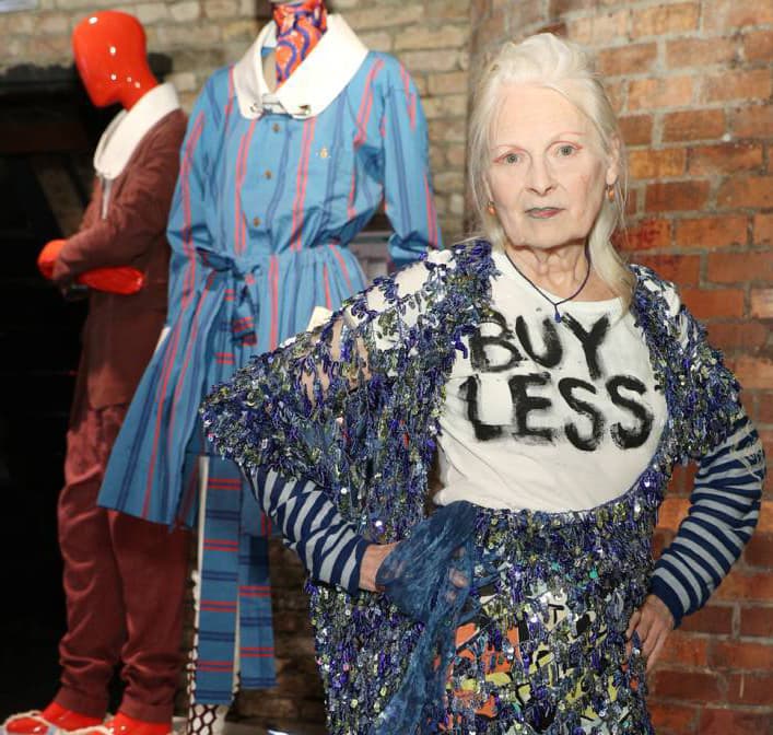
The future of Colour is always omnipresent and one that most people ask with regularity, “So what will be the colours for the next season”? Ideally, it goes beyond this thought, and as we have read, is as much about the future of colour has to do with the emotions of the creator and the consumer as it is about tapping into the world around us, to be open to the global forces and step away from the noise. We see this time as self-expression, where we are curators of our style and the keepers of the future. Be cognizant that consumers are no longer slavishly devoted to one look, they have a much greater comfort level with colour, so they are experimenting and reinventing, dipping into what they already have, using it in different ways making the old seem new again. As we have learned, there is a genuine move back to reclaim what we have lost, and by addressing the lessons with brands leading the conversation, Fashion may make an impact before 2030. As Vivienne Westwood says, it is the most environmentally friendly thing we can do.
I don’t think you can envisage the future of Colour without the discussion around responsible Colour – designers and brands need to do more to address the need for responsible Colour and more sustainable colour options, whether from water-efficient or zero-waste dyes, recycled Colour to natural and bio-based dyes. This will be a significant driver as consumers look for more sustainable opportunities. In contrast, we are also in a fascinating period where designers are experimenting and pushing the boundaries of what can be done with Colour.
– Clare Smith
And so, on reflection, the colors we have witnessed through Fashion month convey our increasing consciousness of and concern for our well-being in light of climate change. It is also about taking everything back to a state of normalcy. The colors of black, grey and neutrals plus the fabulous brights of red, green, yellow, and blue, directly result from all the nuances we have experienced over the last 2 years. And, importantly, through the new use of Colour seen at A/W 23 collections, we can change to feel good about ourselves and protect our future.