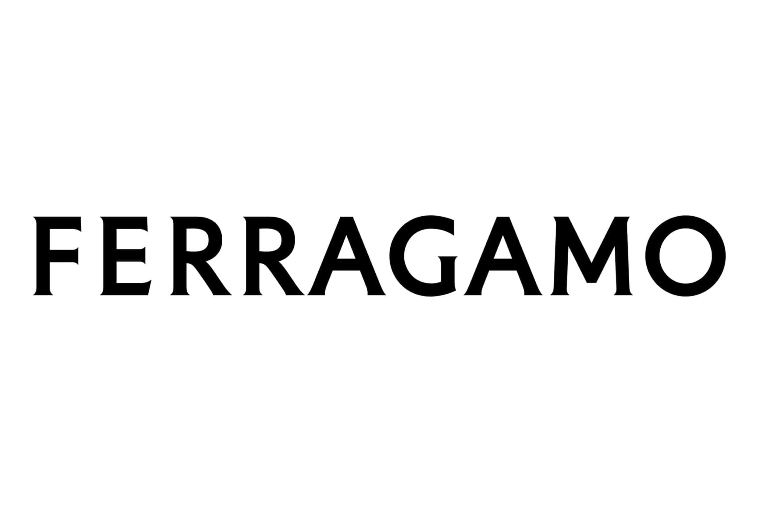
Ahead of Maximilian Davis’ Creative Directorial Debut, Ferragamo Drops “Salvatore” and Shares a Fresh Wordmark Designed by Peter Saville.
Ferragamo has debuted a new logo that drops the “Salvatore” from its name and swaps the founding designer’s scrawling signature for an all-caps serif font. The logotype was designed by famed British graphic designer and art director Peter Saville (who also was responsible for Burberry’s new monogram in 2018).

“The equity of Florence is in the culture of the company: that led me to the choice of a classic font. The vision is exacting and modern. Thereafter, the font is reduced and becomes modernist. Then there is the craft that is quintessentially Ferragamo, which is condensed in the idea of an inscription set in stone. Within this tension lies the new logotype and the complex balance it expresses” – Peter Saville
Shared via the brand’s Instagram account, the rebranding announcement comes just days ahead of Maximilian Davis’ debut collection as creative director for the storied Florentine fashion house. The post included teaser images of pieces and tags from the upcoming collection bearing the new logo.
While the brand is sure to face a bit of online backlash from dedicated fans – as was the case with Saint Laurent, Burberry, and more over the last decade – a logo represents a powerful tool to command brand identity and recognition, and the change thus feels set to usher in a new era for the house under Davis’ creative guidance. We look forward to seeing his new chapter unfold.
