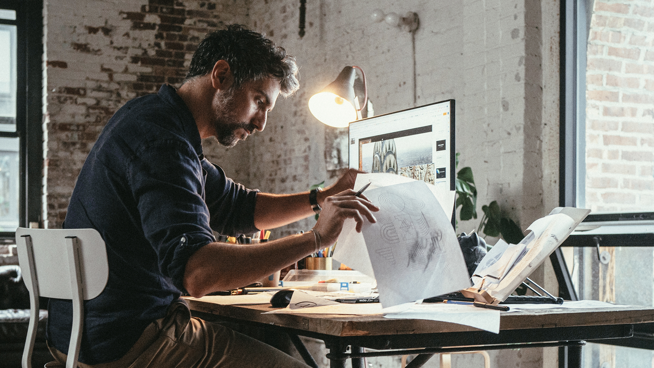
Continually expanding its creative and cultural universe, Jaeger-LeCoultre announces a new collaboration with the renowned lettering artist, Alex Trochut, as the latest instalment in its ‘Made of Makers’ programme.
Through ‘Made of Makers’ – a series of collaborations with artists, designers and craftsmen from disciplines outside watchmaking – Jaeger-LeCoultre is exploring and extending the dialogue that exists between horology and art. Honouring the core principles that define the Manufacture, La Grande Maison is choosing partnerships with leading creators who share its fundamental values of creativity, expertise and precision. The collaborations focus on world-class practitioners whose work explores new forms of expression through different and often unexpected materials and media.
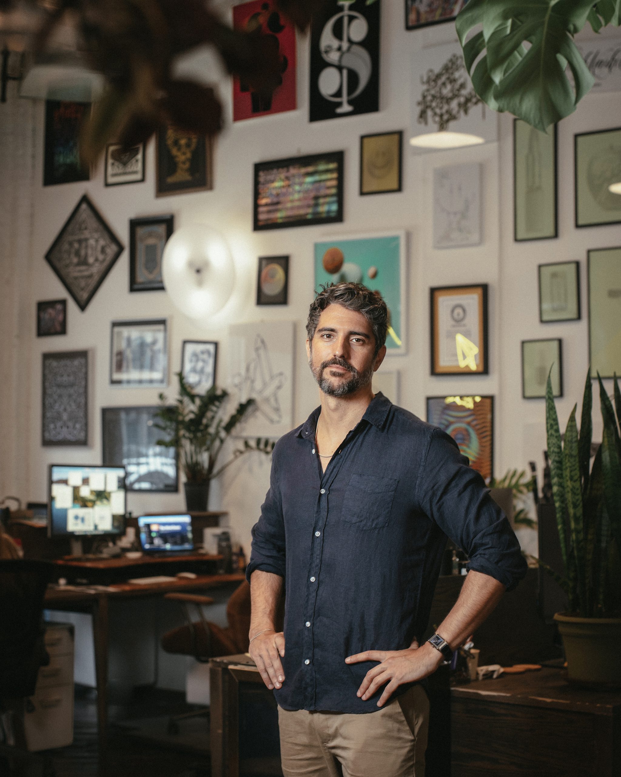
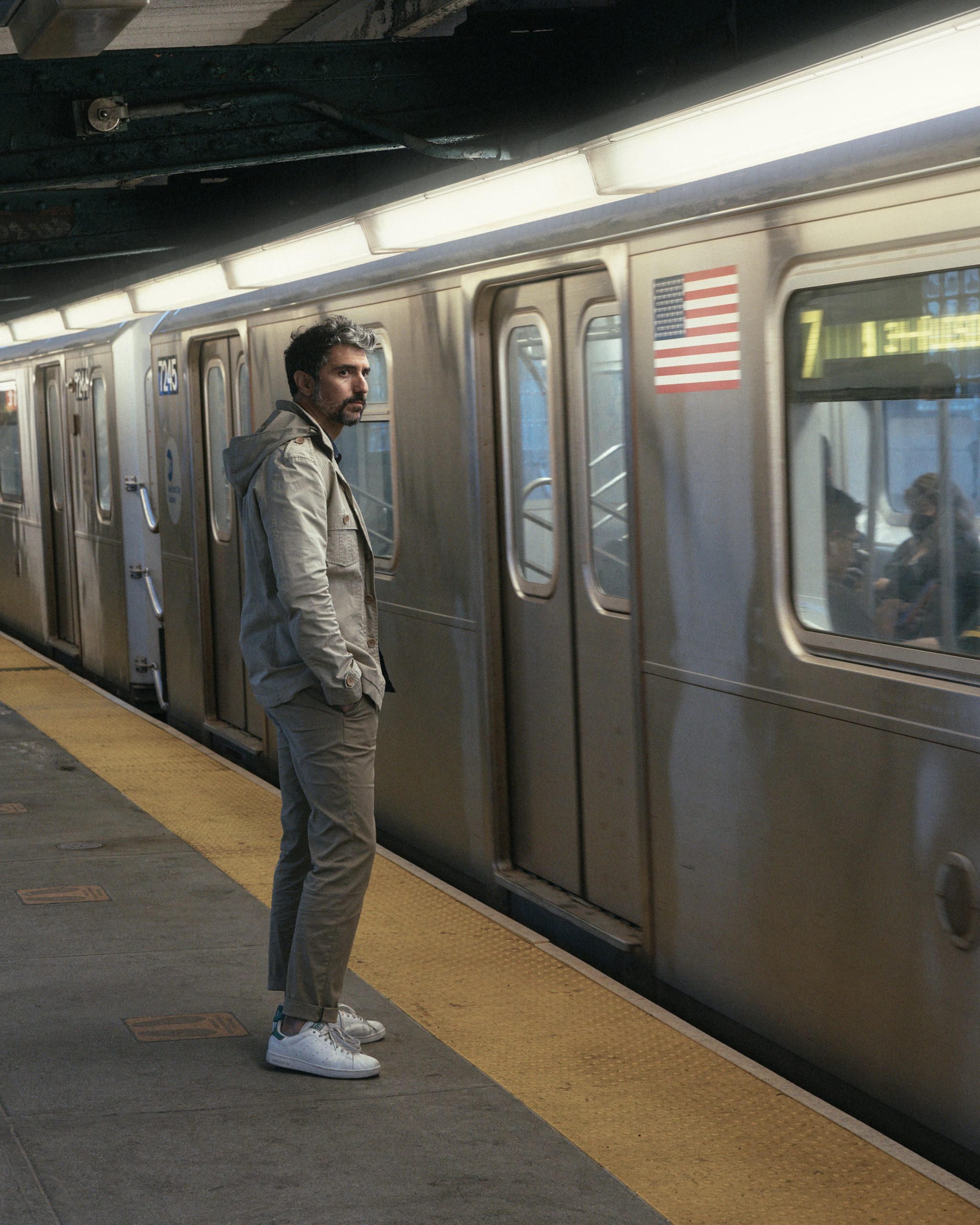
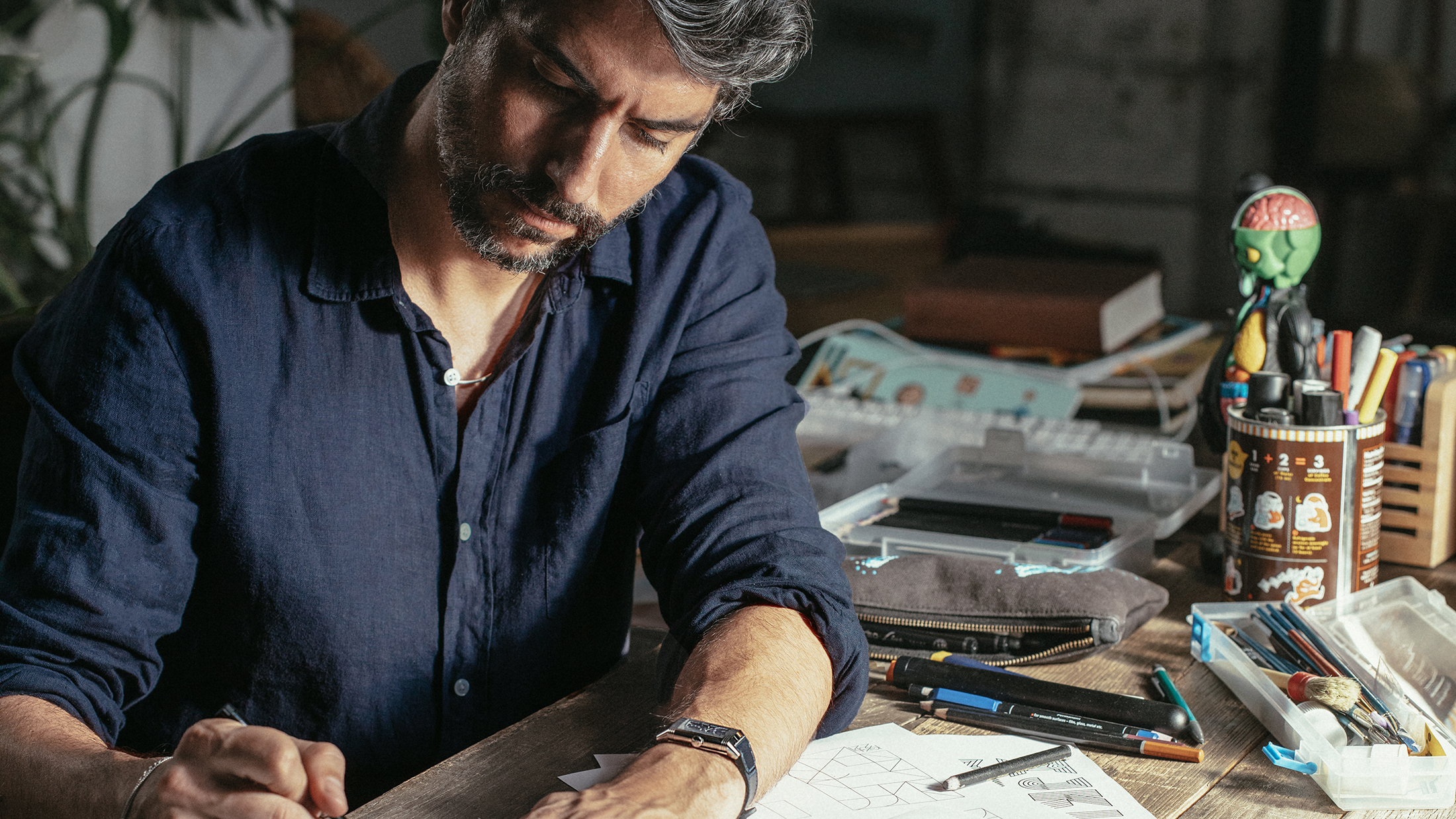
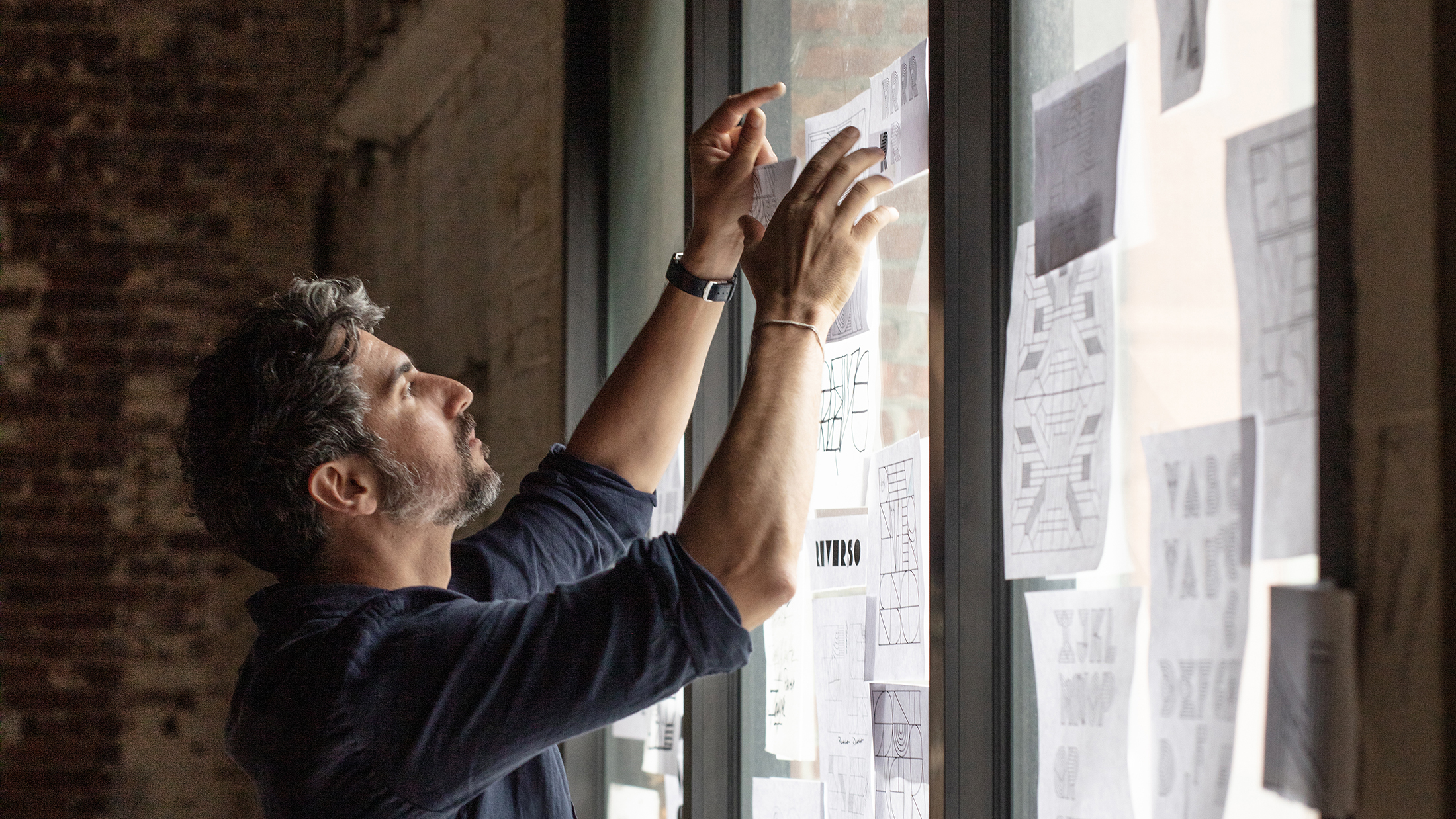
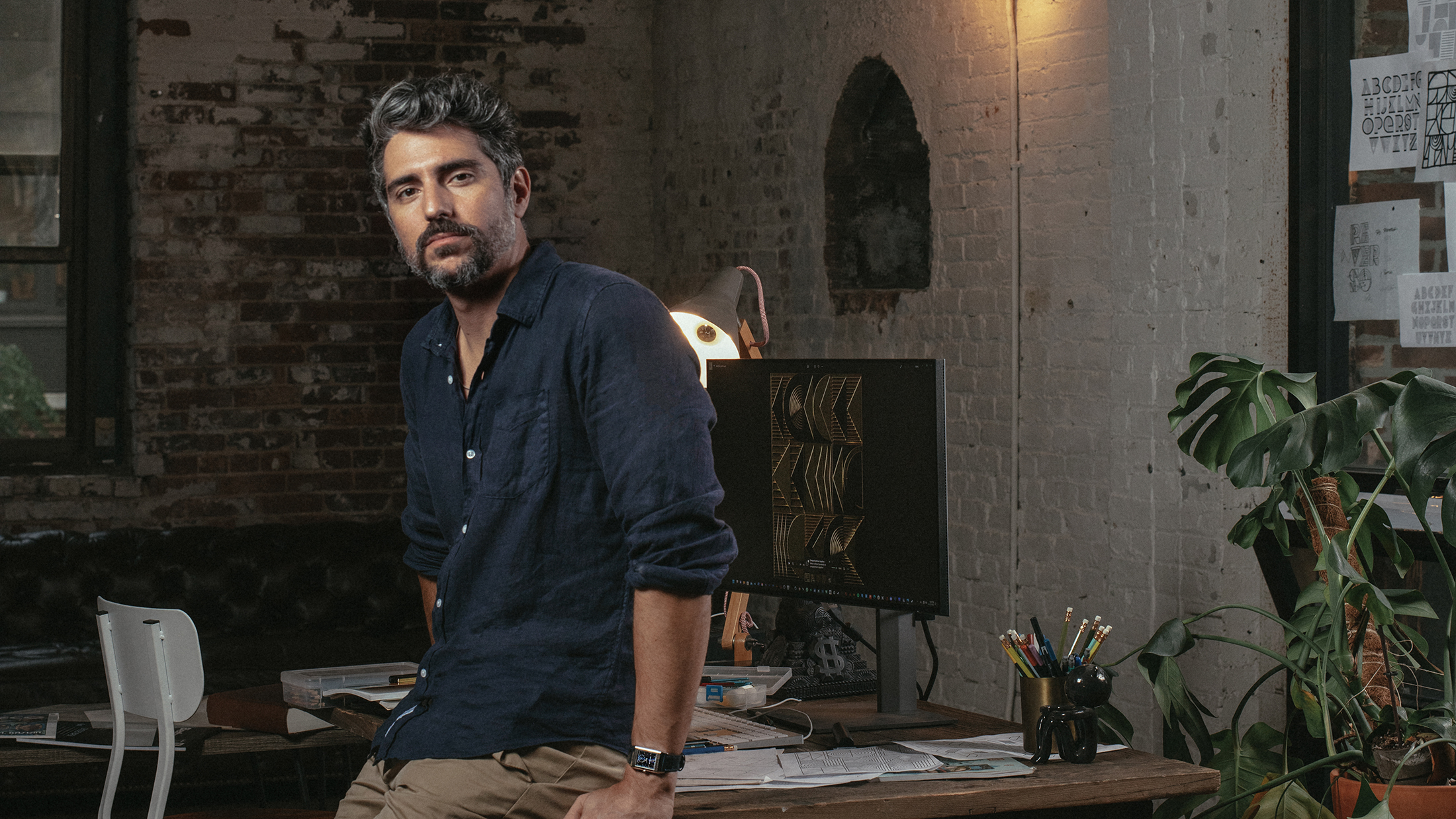
A native of Barcelona and based in New York for the past decade, Alex Trochut has become celebrated for his experimental approach to typography. Like the artisans who construct watch movements and those who decorate the dials and cases, Alex creates emotionally resonant work that combines deep complexity with apparent simplicity. He harnesses the visual potential of language, pushing letters and words to new limits so that seeing and reading become the same action; text and image become a single, unified expression.
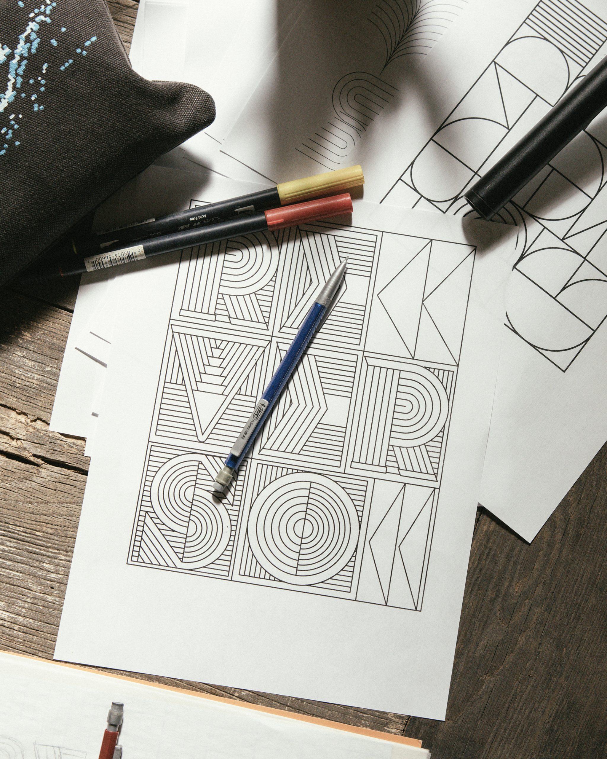
For Jaeger-LeCoultre, Alex has created a meaningful representation of La Grande Maison’s values through a new and boldly contemporary typeface. As a stylistic springboard, he turned to Art Deco – a style that remains very evident to this day in the visual landscape of his adopted home, New York, and one of great importance to Jaeger-LeCoultre as the origin of the Reverso. More than simply a style, Art Deco expressed the extraordinary spirit of modernity that swept the world in the 1920s and ’30s – progressive, optimistic and forward thinking, with a fascination for technology, and tremendous creative energy – values that will always remain relevant for the Manufacture.
We are delighted to work with Alex Trochut. His creative work is avant-garde and like our Maison, he uses his heritage as a foundation, harnessing that legacy in order to express the present and future in new creative ways.
– Catherine Rénier, Chief Executive Officer of Jaeger-LeCoultre
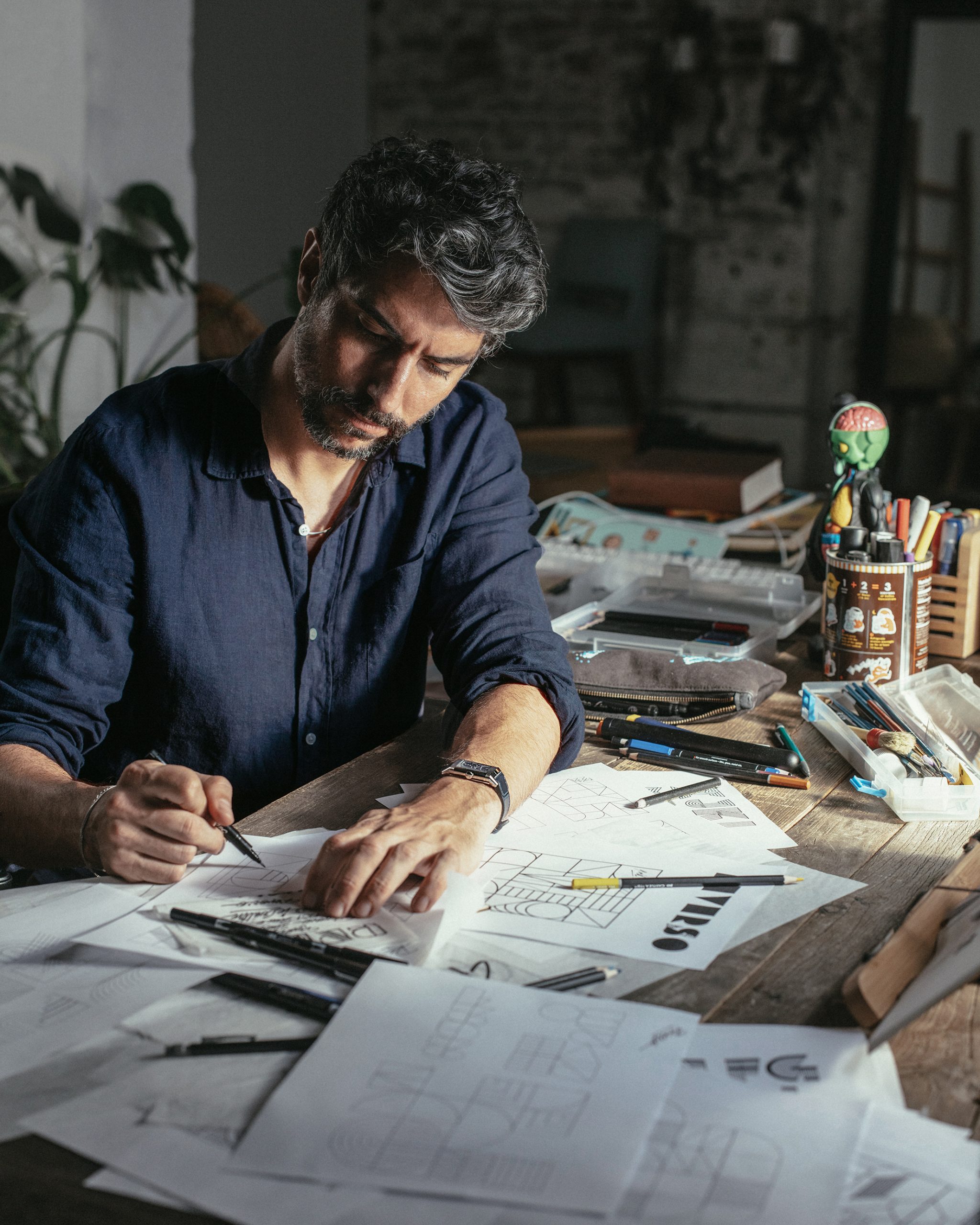
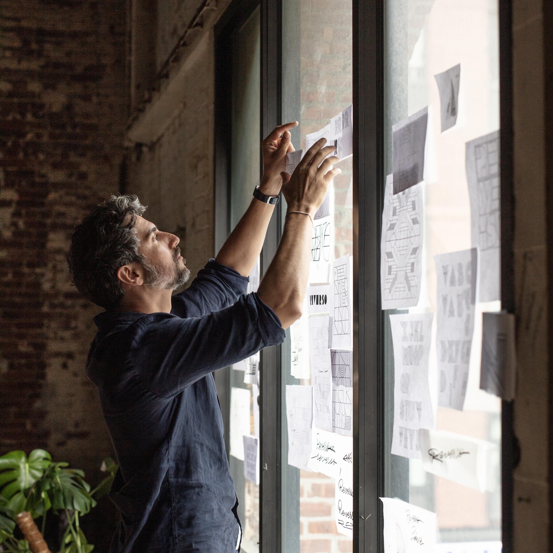
The new signature lettering that Alex has created for Jaeger-LeCoultre is a strongly modern addition to the Maison’s visual identity. In a sharp and contemporary take on Art Deco, each letter has a boldly sculptural quality and strong sense of visual depth, while also conveying a sense of dynamism and movement. It is equally expressive in both two-dimensional form and as three-dimensional objects.
As I started creating the designs, a concept emerged that would unify Art Deco and Jaeger-LeCoultre’s craft of watchmaking . The letters evoked some sort of mechanism, full of different modular parts that work together to create a whole. I wanted these letters to feel physical and expose their intricate parts equally as functional and decorative, giving the sense of a moving machine.
– Alex
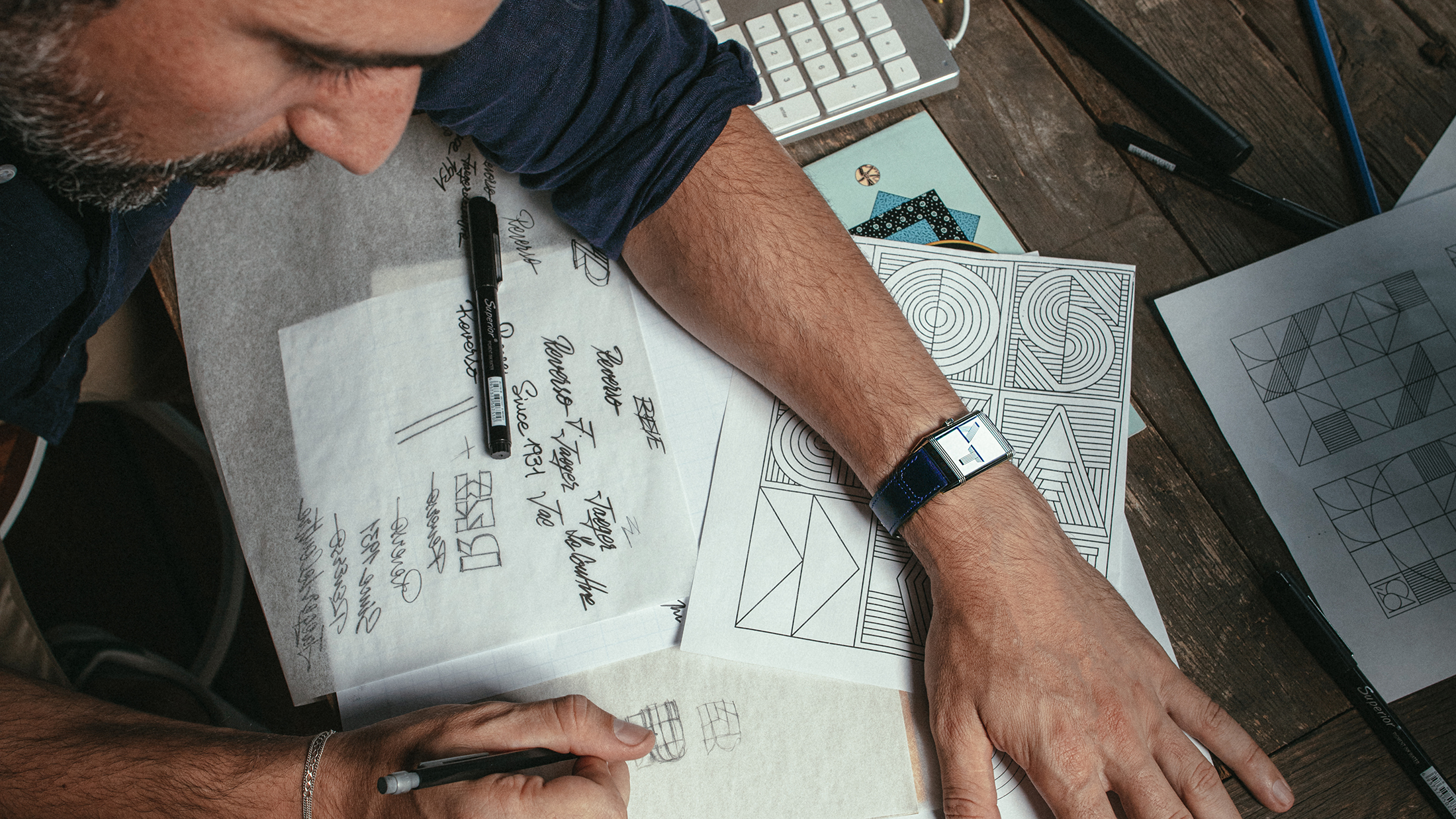
Alex sees a natural affinity between his work and that of Jaeger-LeCoultre’s watchmakers and artistic craftsmen: I think craft and technical skills are at the heart of both typography and watchmaking. Letters are a mix of emotional and rational decisions, with a big internal logic that ties all the decisions into one alphabet or lettering form, like a puzzle. While I consider watchmaking to be another level of complexity, both disciplines embody a devotion to the little things, which need to work in harmony inside a system.
Immediately engaging on both a visual and emotional level, Alex’s work has redefined traditional ideas of what typography can be. “Letter design is the non-verbal communication of the written medium,” he says. He attributes his special connection with typography to his grandfather Joan Trochut, who invented a revolutionary modular typographic and ornament system in the 1940s and is recognised as a major contributor to the history of typography.
Destined to become an additional signature of La Grande Maison, the lettering will be offered as a new style of personalisation for engraving on a Reverso case-back, and will be seen in a wide variety of other initiatives in the future.
