A Study in Rigour
Review of Jil Sander Spring 2026 Fashion Show
By Angela Baidoo
THE COLLECTION
THE VIBE
Structure, Formality, Lightness
A new beginning where it all began, the show venue for Simone Bellotti’s debut for Jil Sander was the very same in which the founder chose to 40 years ago. Speaking backstage when asked by The Impression’s Editor-in-Chief, Kenneth Richard, whether revealing the body is a different kind of modernism than Jil showed 40 years ago Bellotti said “ I think the way she was revealing was always very elegant and it’s not easy to do it. That’s why I’m learning. I’m trying to learn” but if the new designer was on a learning curve it wasn’t evident in this strong first showing. The first touchpoint for his vision for the brand was in the invitation which contained a single shot of what looked to be two scrapbooks housing a world of both developed and unrealised ideas, more than a means to house the flow of ideas Bellotti said these books also stood as a reminder for him to “study this brand”.
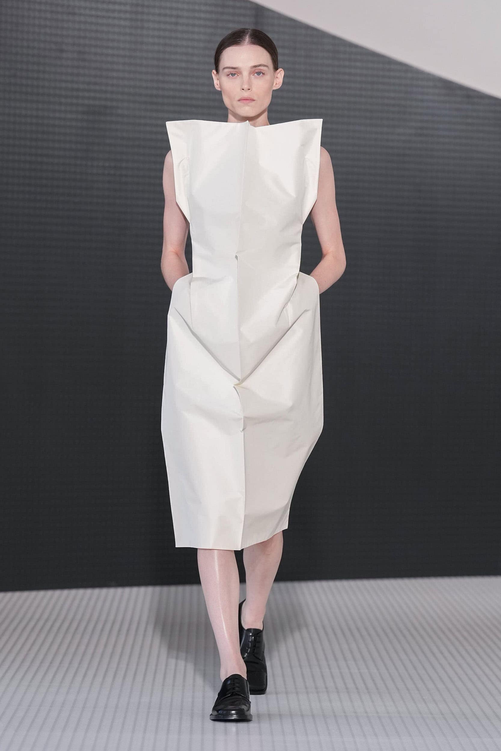
Pinned to a mood board backstage were just 6 images, 2 of which were the scrapbooks photographed for todays invite, an almost alabaster side profile of a nude female form by Irving Penn, a Richard Prince artwork (Point Courage, 1989) and among the others a suit of body armour. These stripped back visual aids aligned with the designers train of thought as he familiarised himself with the brands archives, saying “There is a part that is more about structure, formality, rigor, and at the same time, it’s about the search for modernity, lightness.” And in this his first collection he wanted to find a balance between the two.
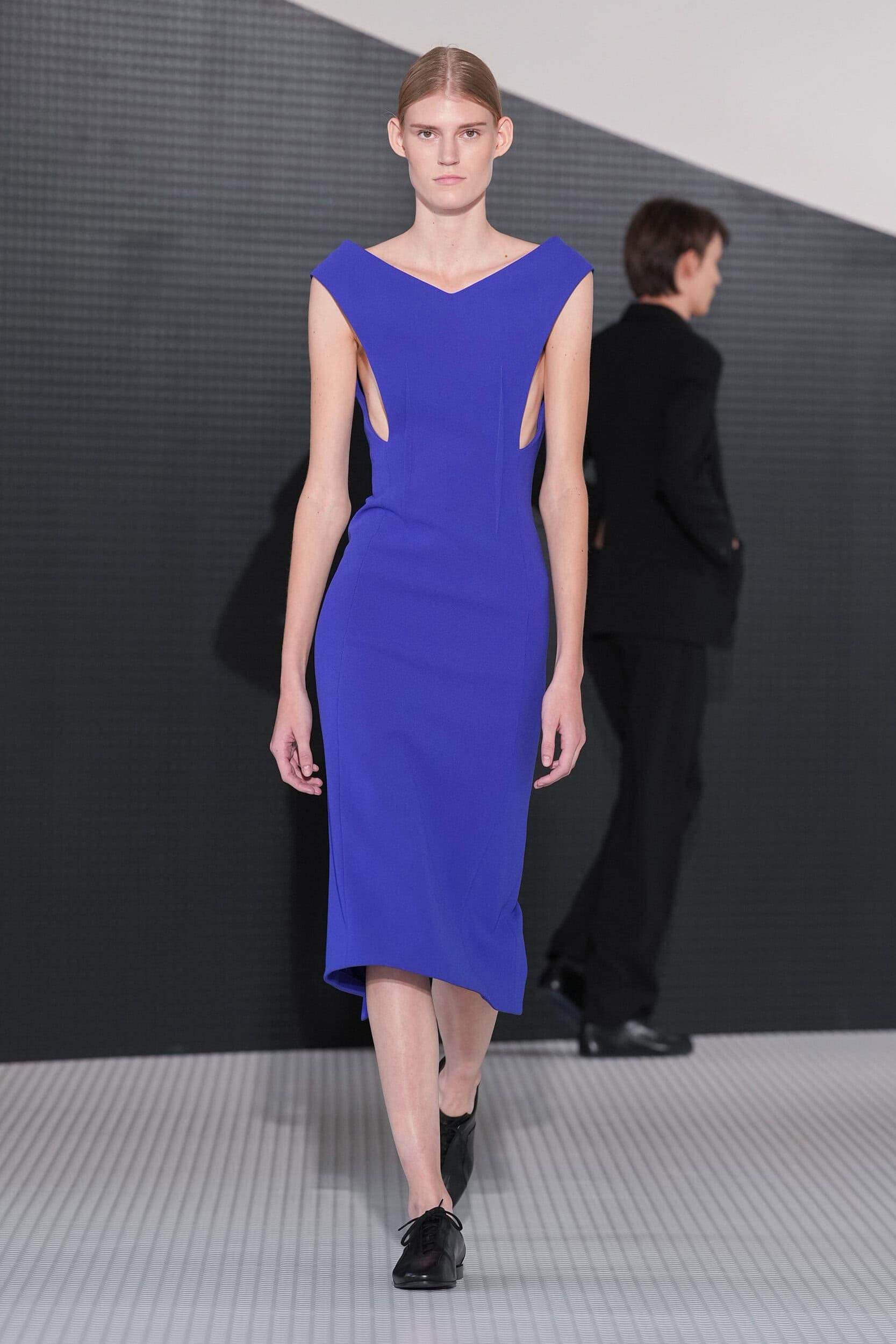
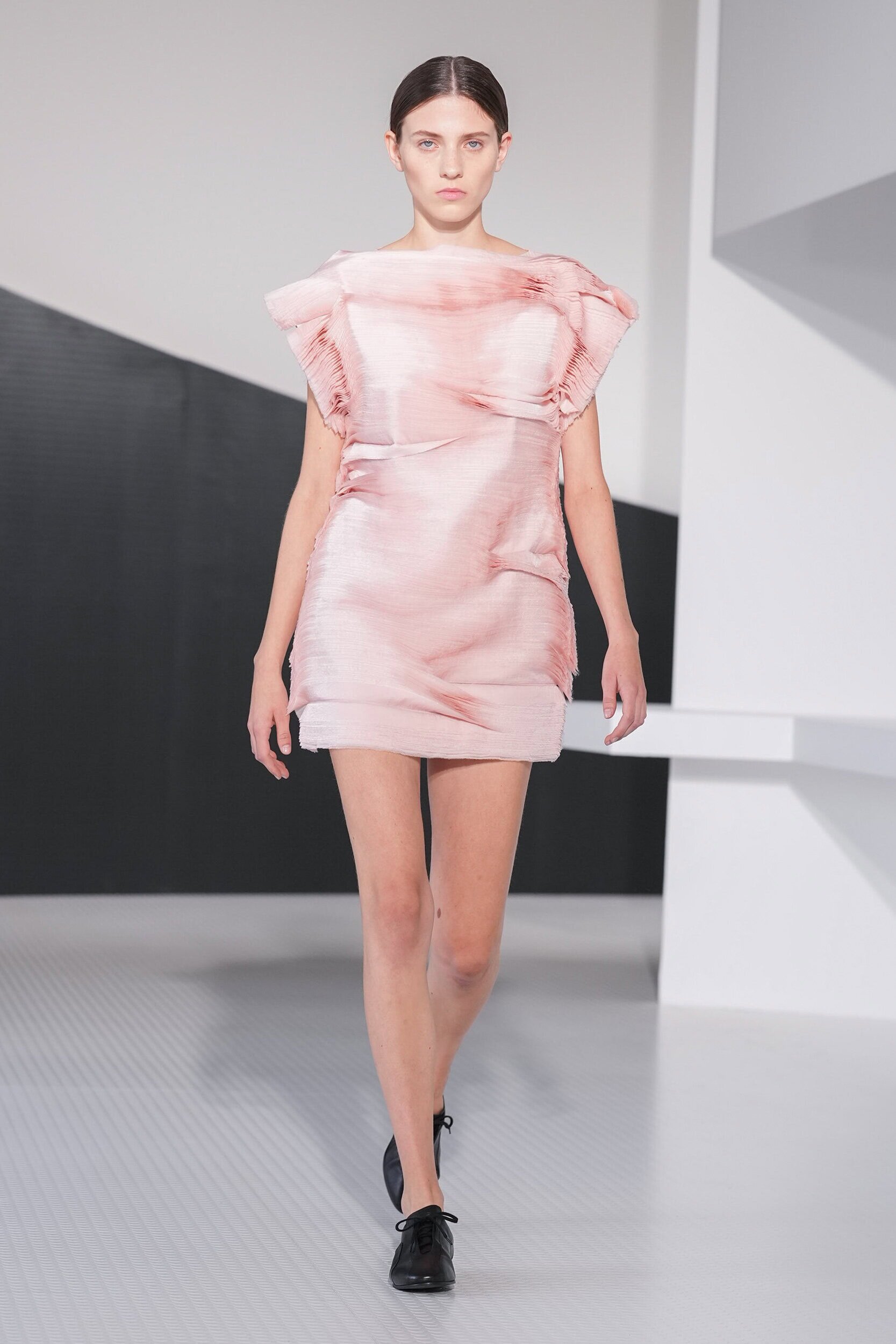
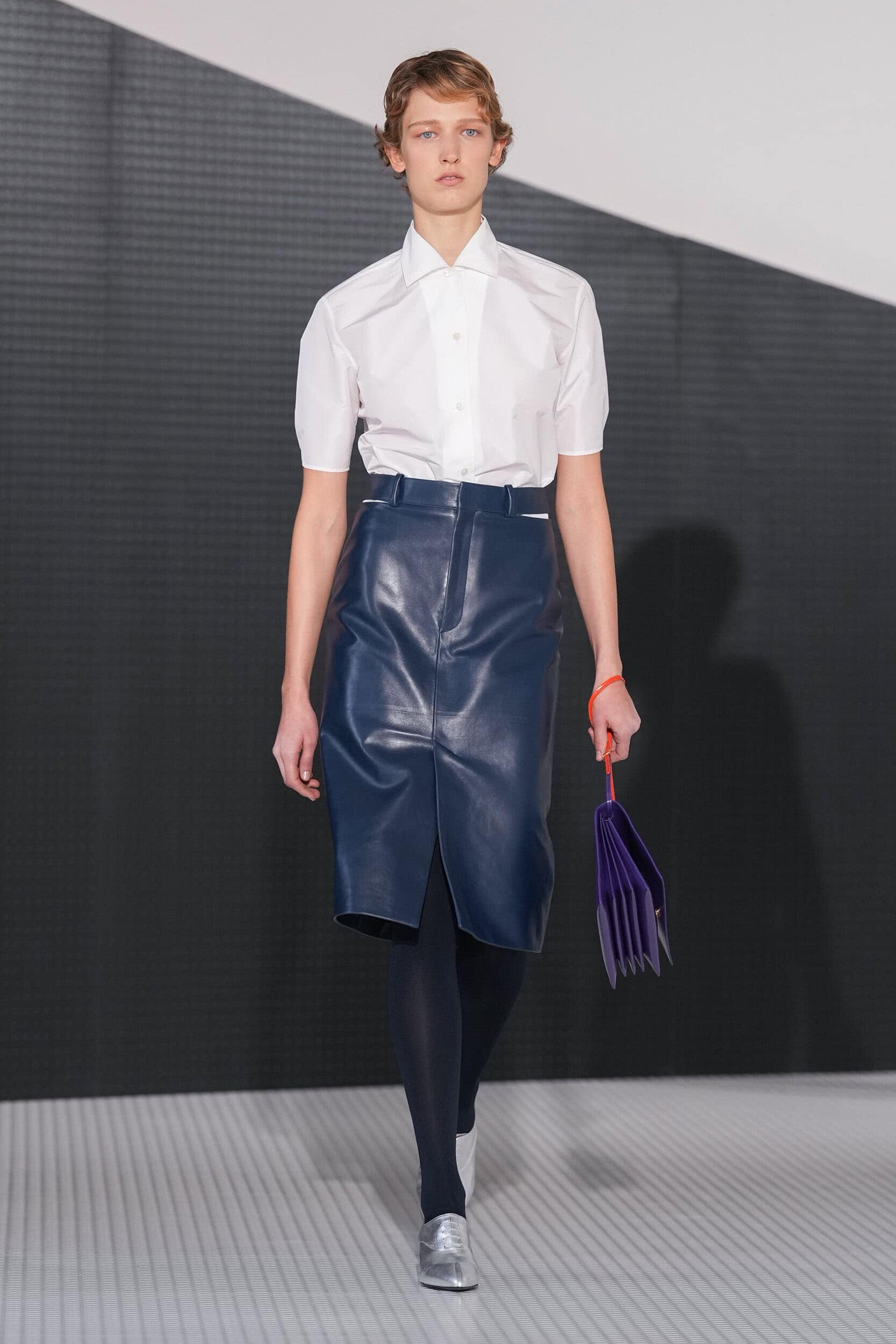
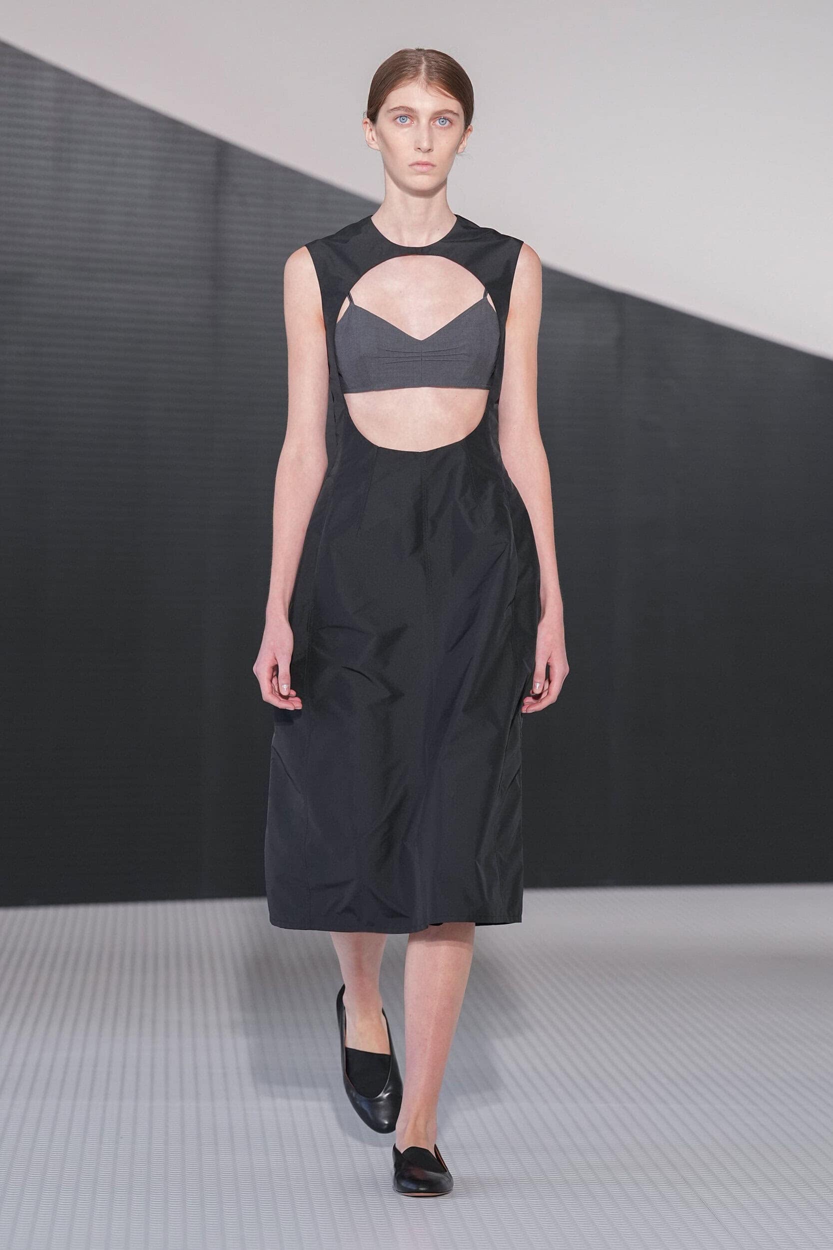
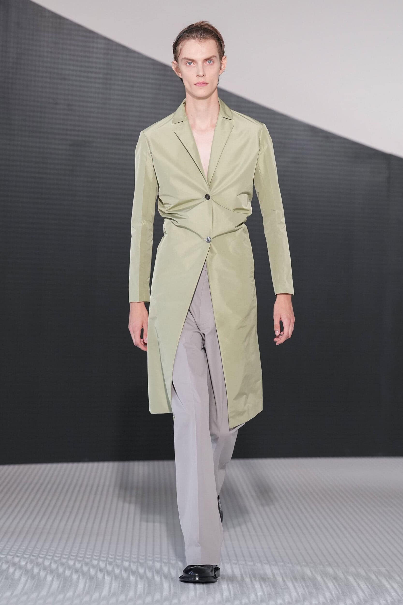
Jil Sander is a brand which has become a byword for chic minimalism, from the days of the founder herself whose era had a softer feminine edge woven into the stripped back styles, through to Raf Simons seven years at the helm which further broadened its appeal with his unabashed use of bold and sometimes jarring colour pairings which always seemed to work together. Then Luke and Lucie Meier, the most recent custodians, elevated the brands popularity to even headier heights with boxy oversized silhouettes (that have now become the norm) and a smart use of crafted textures meant to bring tactility to the fore. Bellotti is starting off with a focus on structure and how both a simple or complex application can rewire how you perceive a garment. Here, neat folds and precise gathers added an architecture to tailoring and shirting which emphasised the waist for both men and women and looked artfully crumpled. The body on today’s moodboard was a nod to how the designer had been considering the idea of how much to reveal for a brand not immediately associated with overt displays of sexiness. And he concluded to play with the concept of conceal-and-reveal through layered transparency, geometric cut-outs and slashes, but not the thigh-high kind, these cuts were spliced across the body at the thigh and rib cage, not areas immediately associated with your typical erogenous zones but attuned to what the designer was feeling at the time, as he said “It was like a feeling for me, protecting the body, but at the same time revealing [it].”
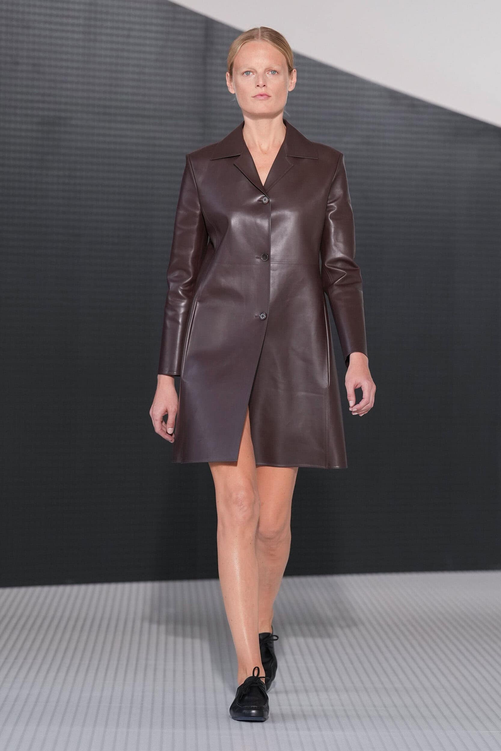
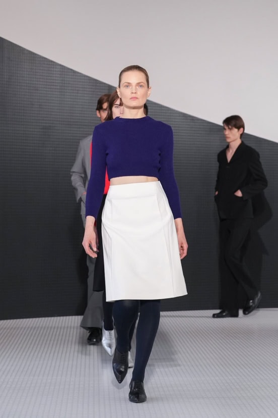
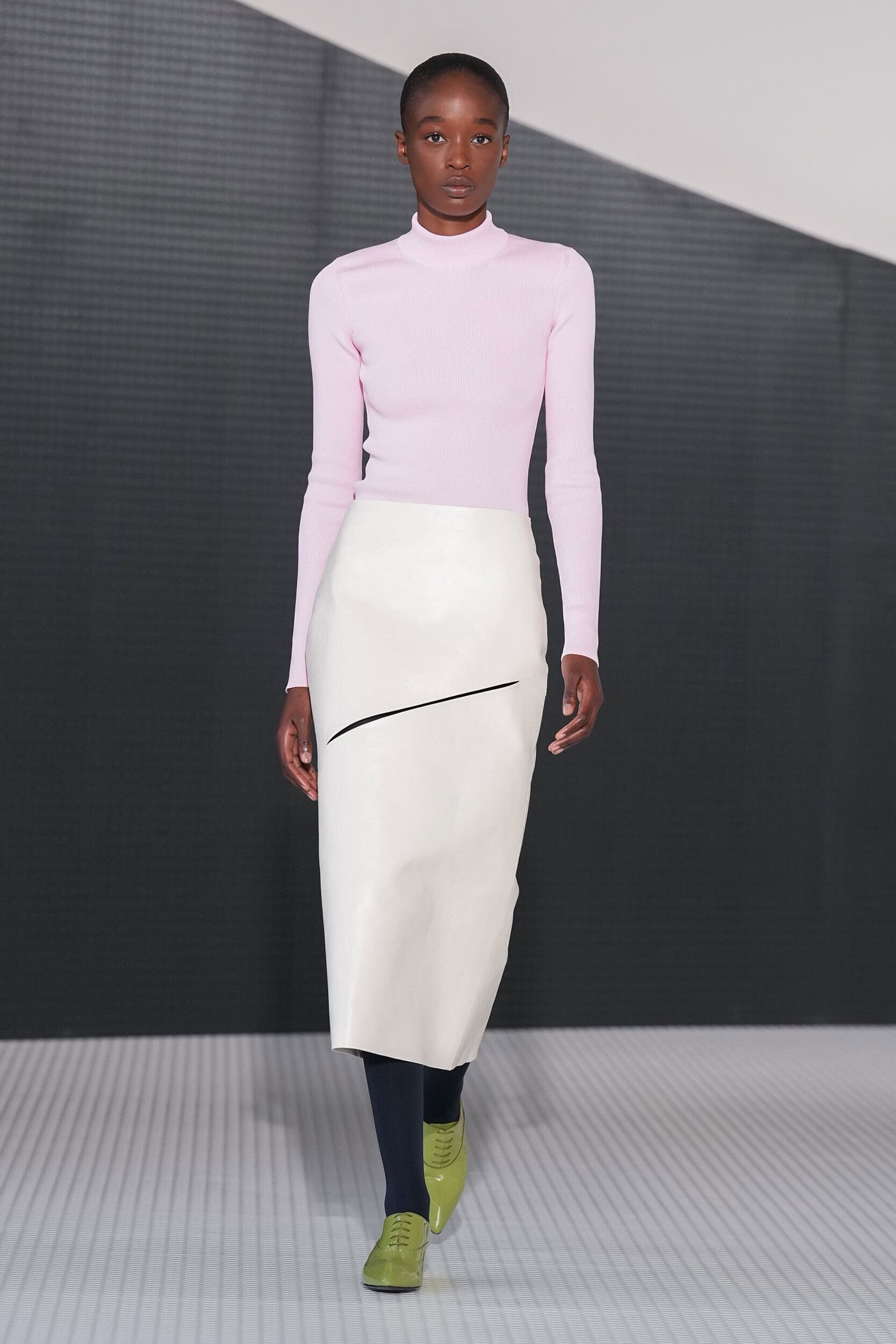
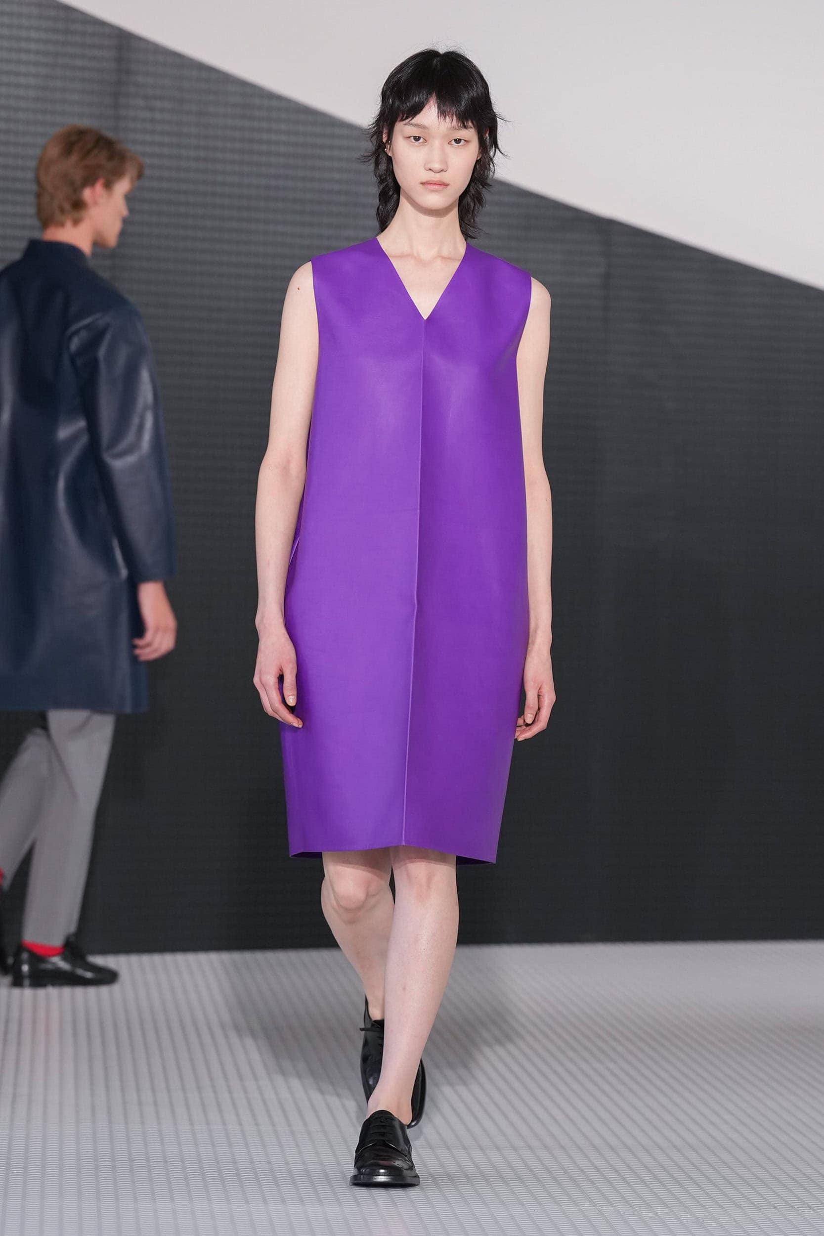
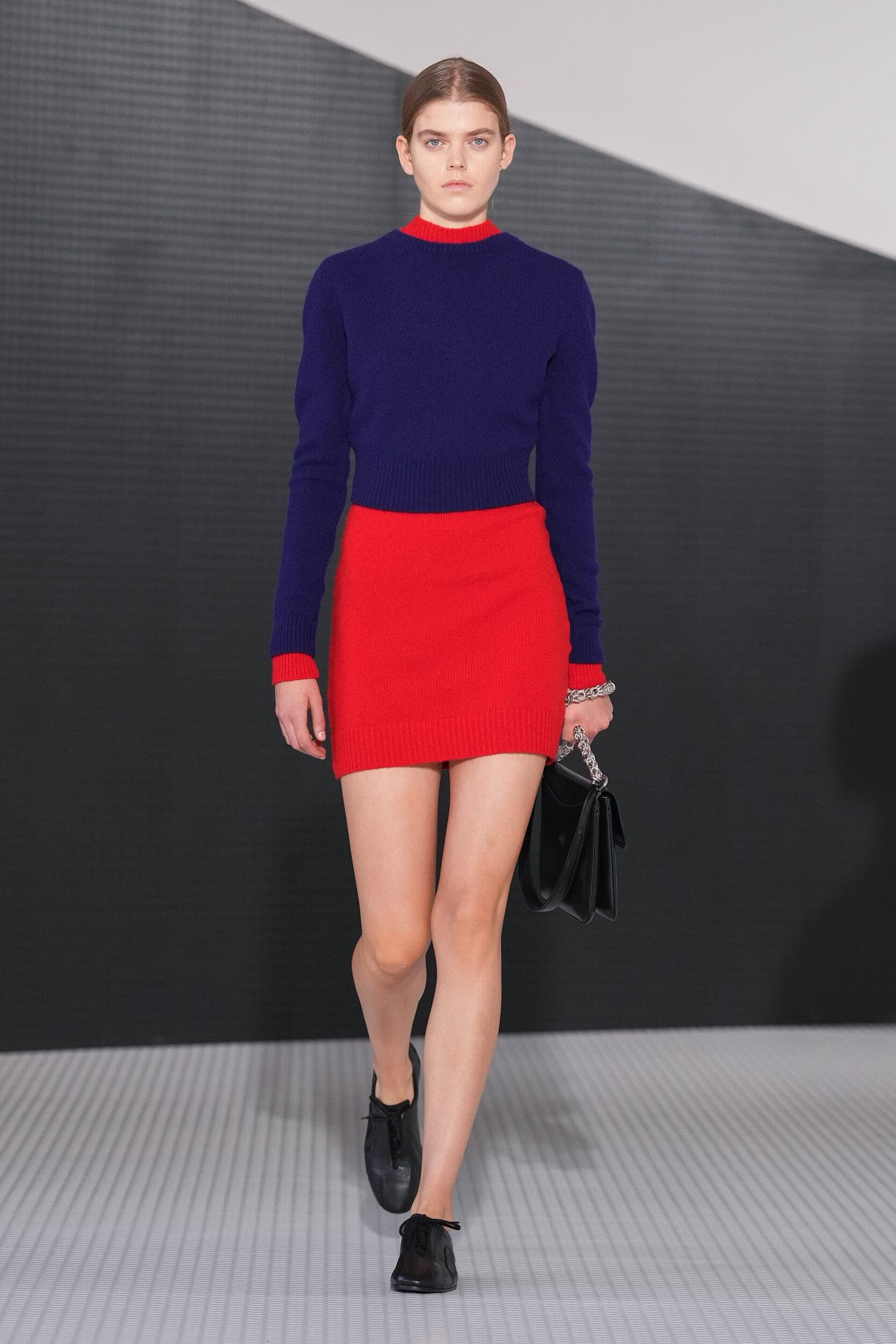
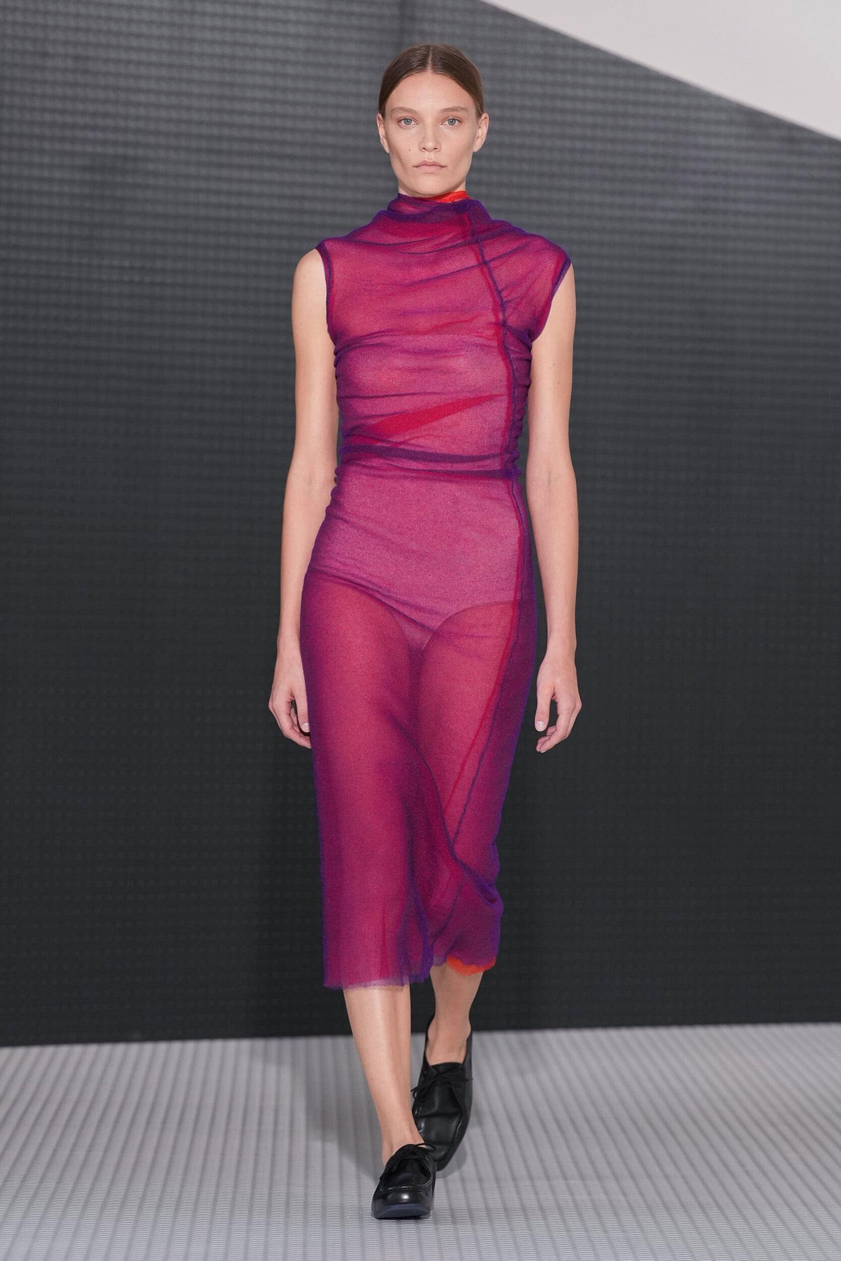
What was on-brand was the use of colour, a recognizable Sanderism, red and blue were laid over one another, a striking purple dress featured a crisp fold down the centre and would perfectly pair with the chocolate brown overcoat. The sheer-on-sheer red and purple dress cleverly created an animated glitch and even in his neutral section towards the end of the collection, Bellotti provided a updated view on the modern work uniform with soft sage, a pinkish beige, and a surprisingly wearable knocked-back cobalt.
THE DIRECTION
THE QUOTE
I started trying to study this brand and I felt that this brand represented two apparently opposites feelings and elements. There is a part that is more about class, structure, formality, rigour, at the same time, it’s about a search for modernity, lightness. So, for me, it was just trying to find the key to balance these elements.
Simone Bellotti, Creative Director, Jil Sander
THE WRAP UP
Simone Bellotti’s made a confident debut for a designer who considered themselves still in the process of ‘learning’. But it was on his reductive approach and studied use of colour that gave his collection cohesion. Fans of the brands previous creative directors will be content with this new era that is once again proposing a new uniform for modern men and women.