An Obsession with the Good, the Basics, and the Barely There
Review of JW Anderson Spring 2025 Fashion Show
By Angela Baidoo
THE COLLECTION
THE VIBE
Twisted trompe l’oeil, mini-sodes, sculptural distancing
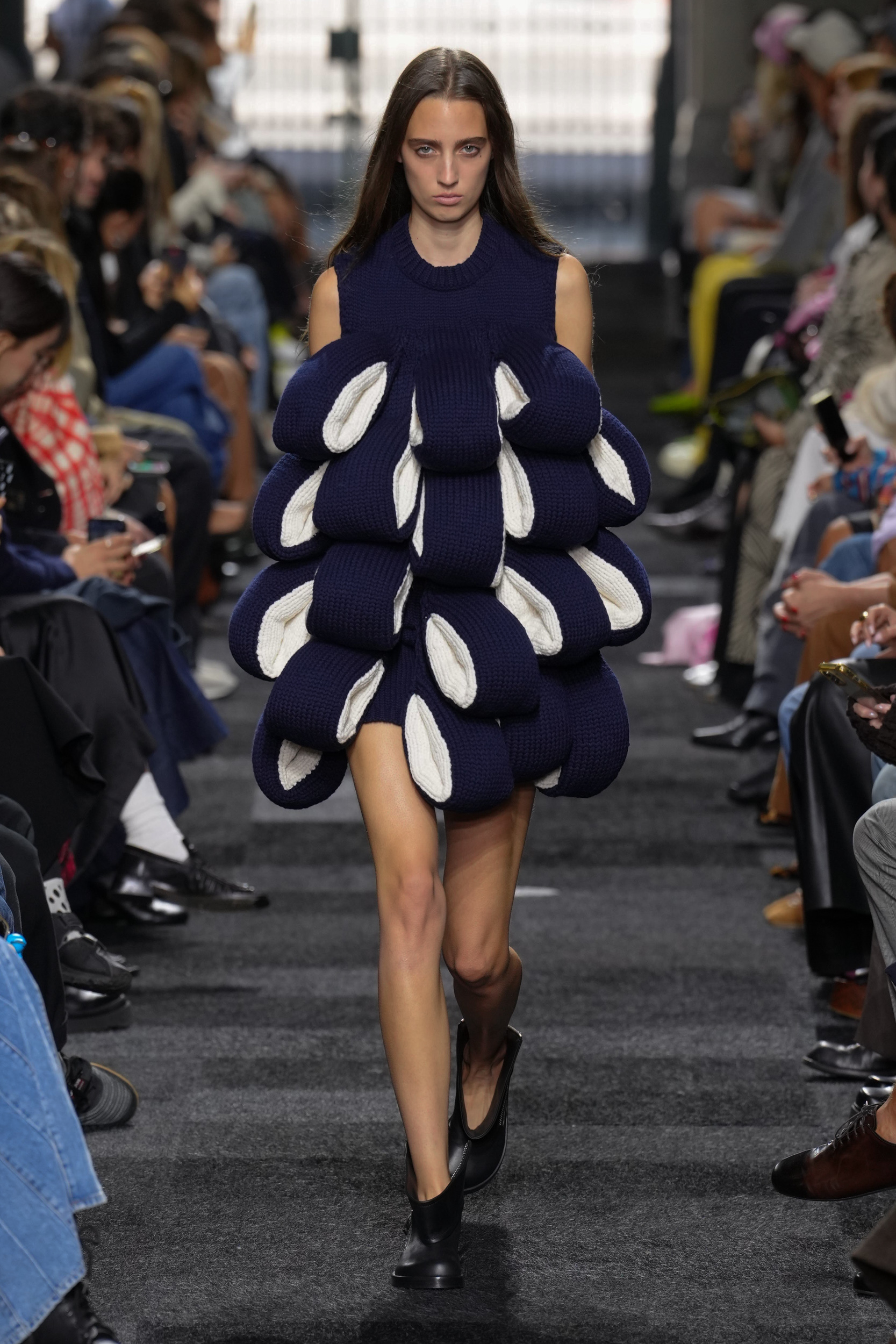
Jonathan Anderson is a busy man. Never one to rest on his laurels we have seen how the British designer has juggled numerous creative endeavours outside of, but still adjacent to, the world of fashion. In 2024 alone he debuted his costume designs for the Zendaya-led Challengers film, which is soon to be followed up by the much-anticipated Daniel Craig vehicle ‘Queer’. And there was also an exhibition of artist Patrick Carroll’s work at Salone Del Mobile. This practice of ‘seeking’ across different creative mediums is what adds to the designers pull.
He has also never dropped the ball on the two fashion houses he helms, as both his namesake label and Loewe inspire generous column inches every season, as we try to dissect the colloquial or left-field meaning behind his designs.
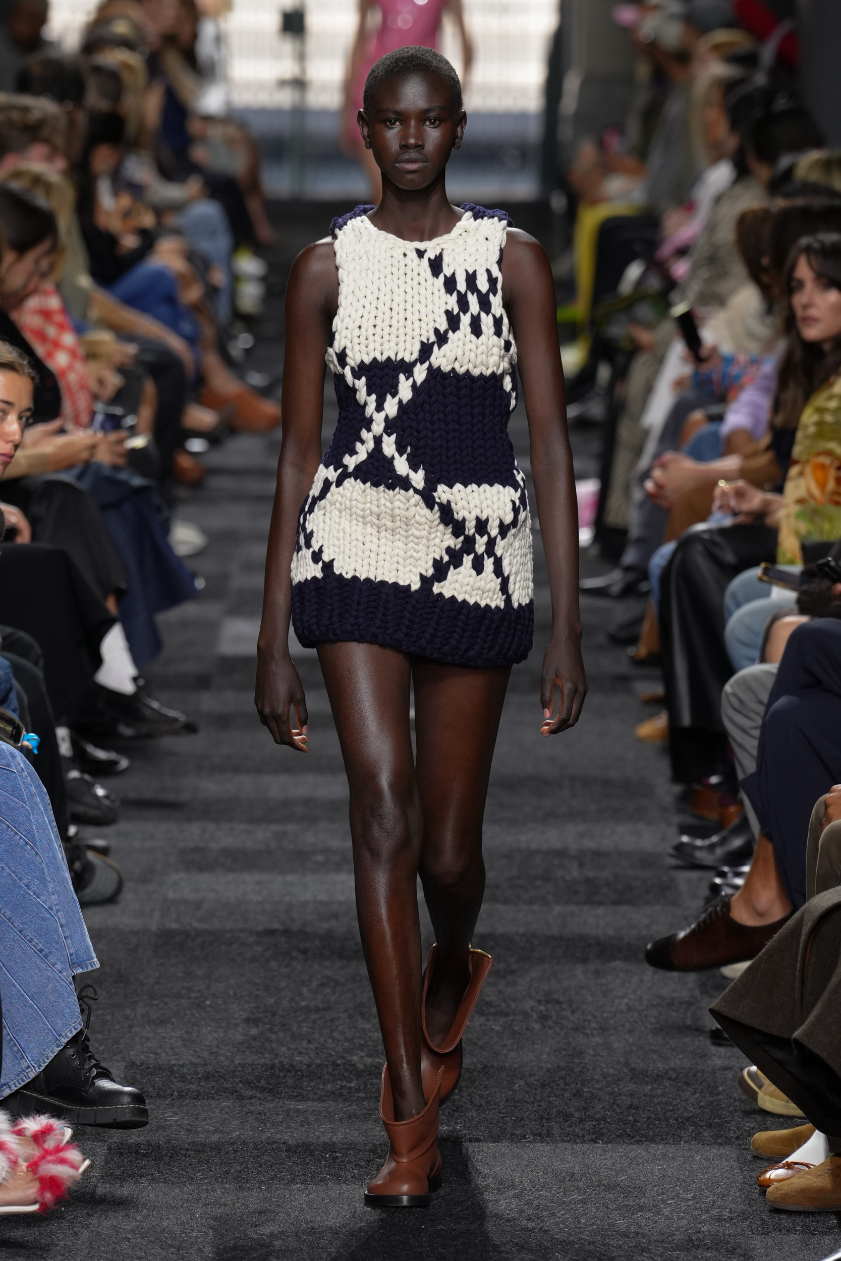
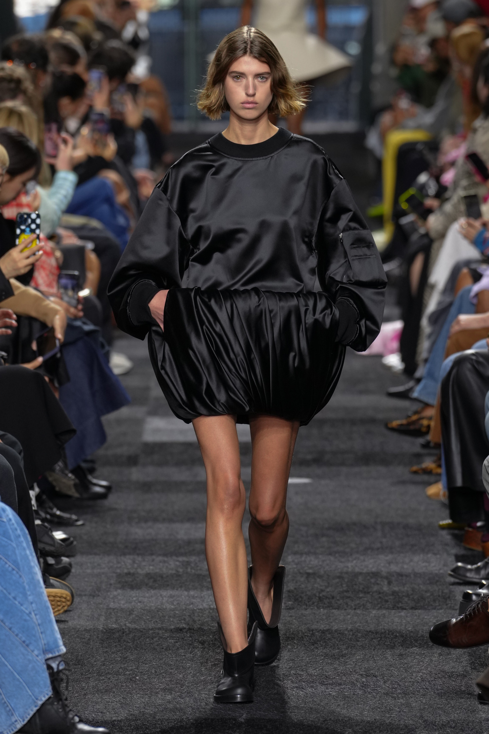
Anderson’s use of fashion as a medium of communication is what gives us the kind of collection we saw today. It was less about ‘Was that a knitted mini shift dress?’ and more an exercise in dissecting what garment detail had been superimposed and “zoomed in” to distort its scale to give us a new take on trompe l’oeil. By stripping back and liberating himself by “setting strict boundaries” according to todays show notes, the designer considered “What clothing is made for?” with a focus more on the why, than the what.
As one of the few designers who can reference and remix his own work and have it still feel fresh – such as the looped fringing on the knitted dresses which were a call back to earlier seasons work – it also can’t hurt the brands bottom-line, as his fans are sure to never miss an opportunity to secure one of his iconic designs.
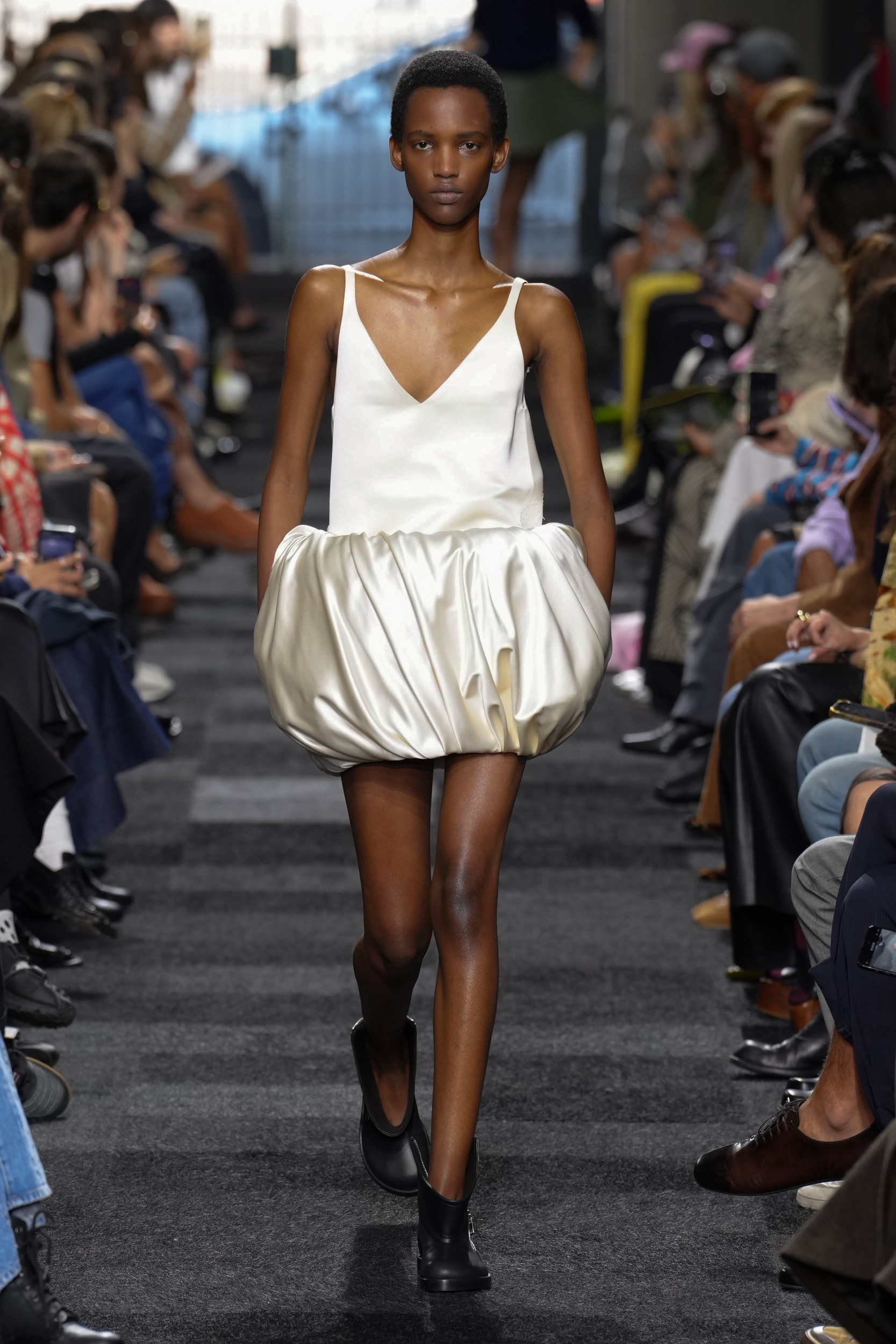
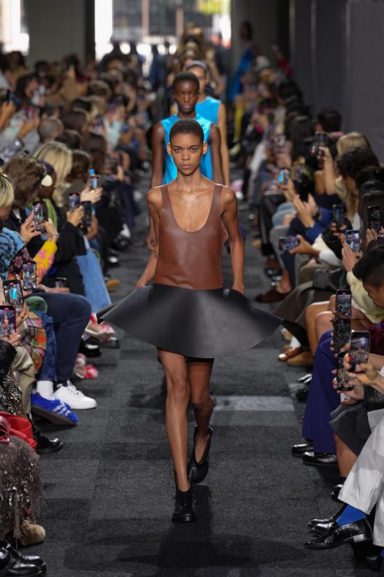
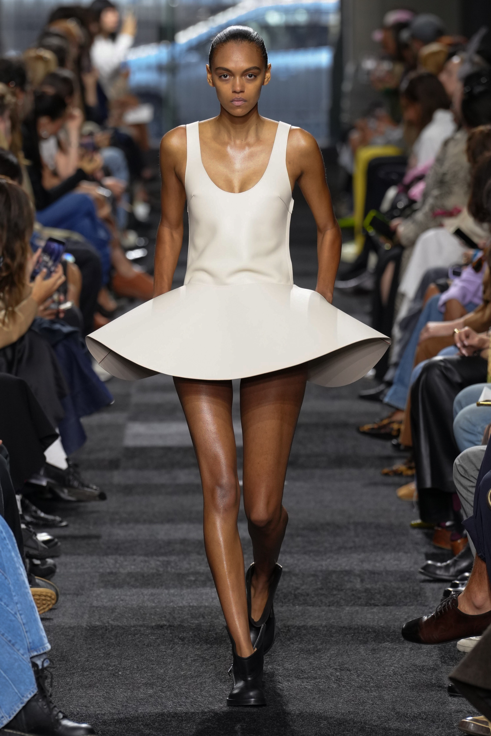
The oversized silhouettes were balanced out with mini-lengths, but in the case of the saucer-like skirts (which in hindsight would have made perfect social distancing aids) there was a cheeky glimpse of what lay beneath, which would take the bravest of customers to attempt to wear on its own. However, even though not shown today it was evident that each look would easily lend itself to layering.



THE DIRECTION
THE WRAP UP
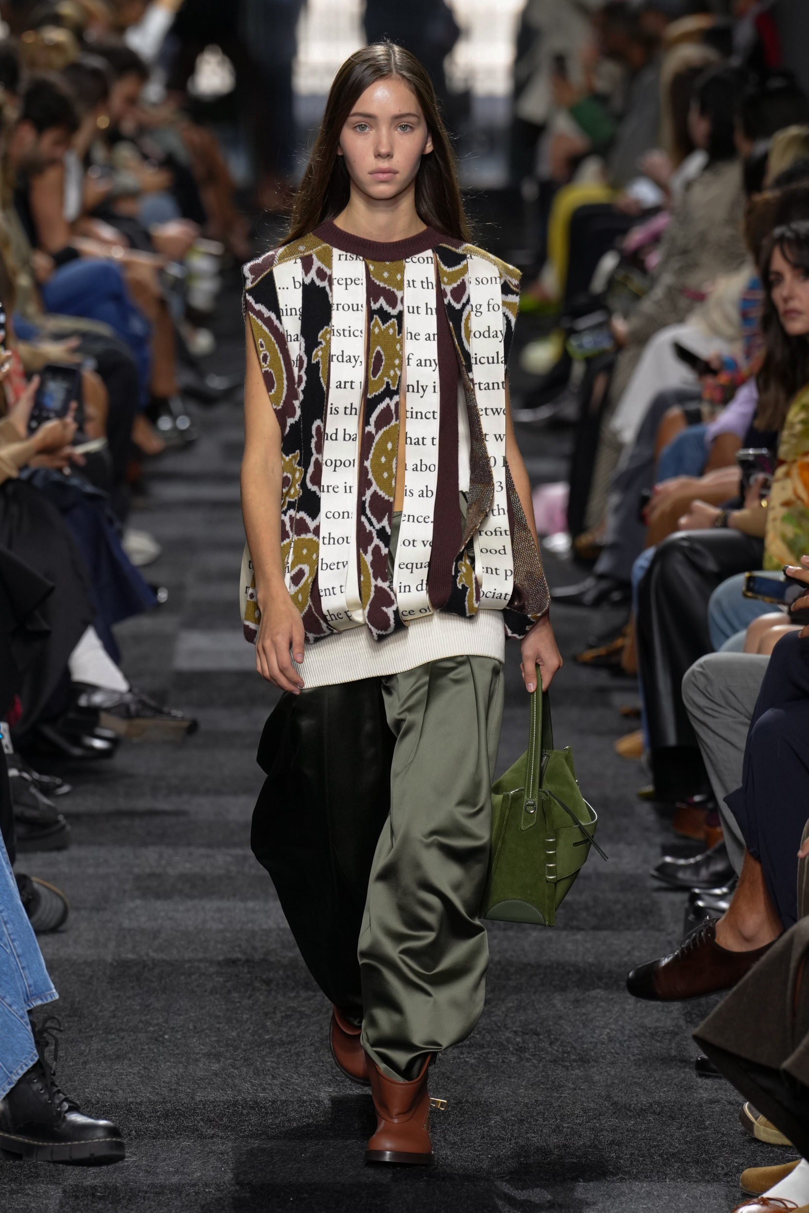
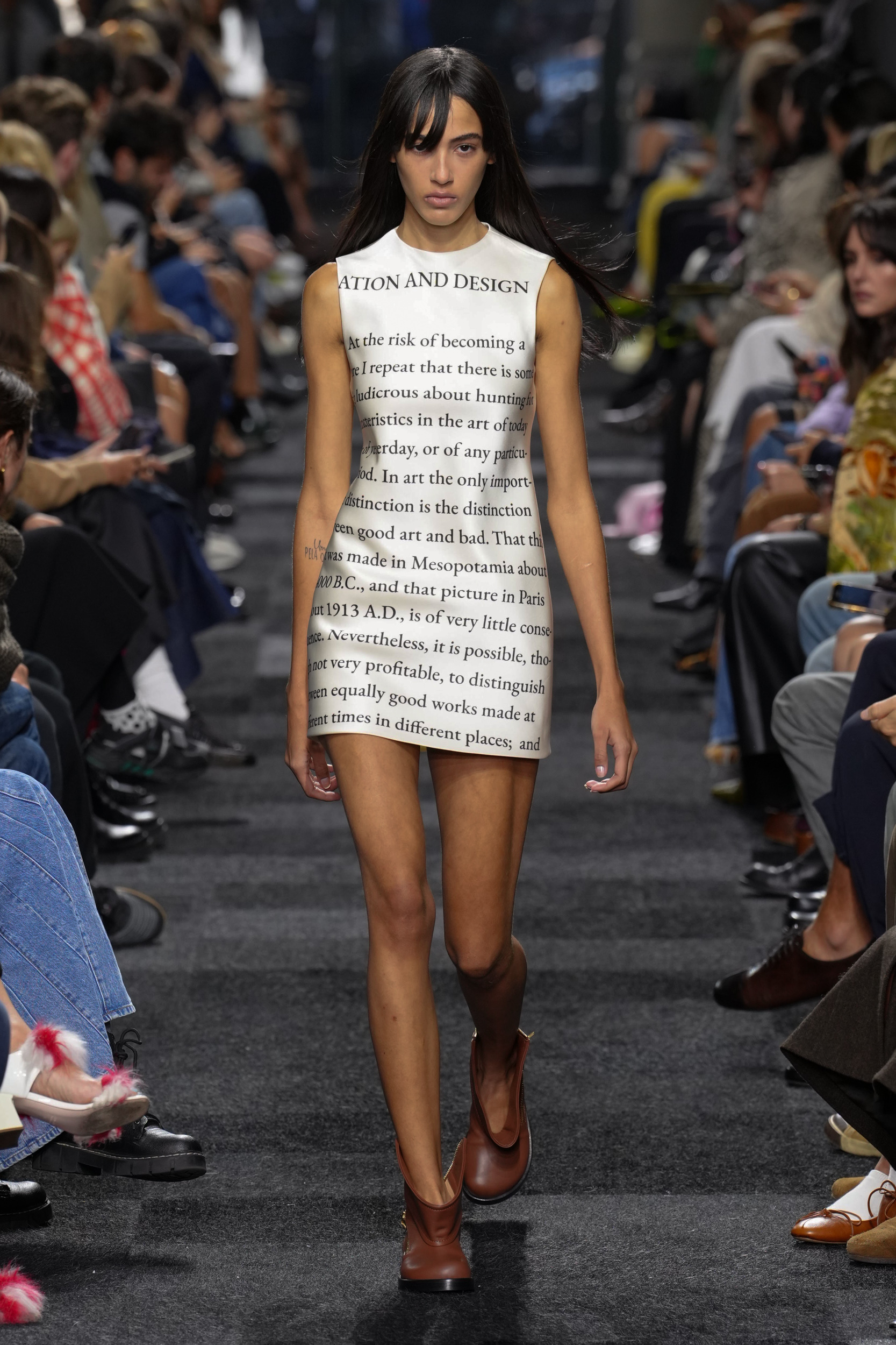
An excerpt from Clive Bells book “Art”, specifically a section on ‘Simplification and Design’ was replicated by the designer as a print. And Bell’s observation “At the risk of becoming a bore I repeat that there is something ludicrous about hunting for characteristics in the art of today…In art the only important distinction is the distinction between good art and bad.” But looking at the text at a time when culture has fallen into the grey area, where everything is given a space to be considered good, and if your opinion defers then you simply don’t “Get it”, Jonathan Anderson’s art is such that it would also fall into that grey area for many outside of fashion and his fandom, as his work performs on an almost intellectual level. So in immortalising Bell’s text as part of his brand canon there may have been a slight tongue-in-cheek reason for doing so.
