Spanish Beauty and Fashion Giant Prepares for IPO with a Fresh Corporate Identity
Puig, the century-old Spanish beauty and fashion conglomerate, is set to debut on Spain’s stock exchanges, heralding this new chapter with a redesigned corporate logo. Marc Puig, the chairman and chief executive officer, unveiled the evolved visual identity in a video announcement, signaling significant changes as the company transitions to public ownership.
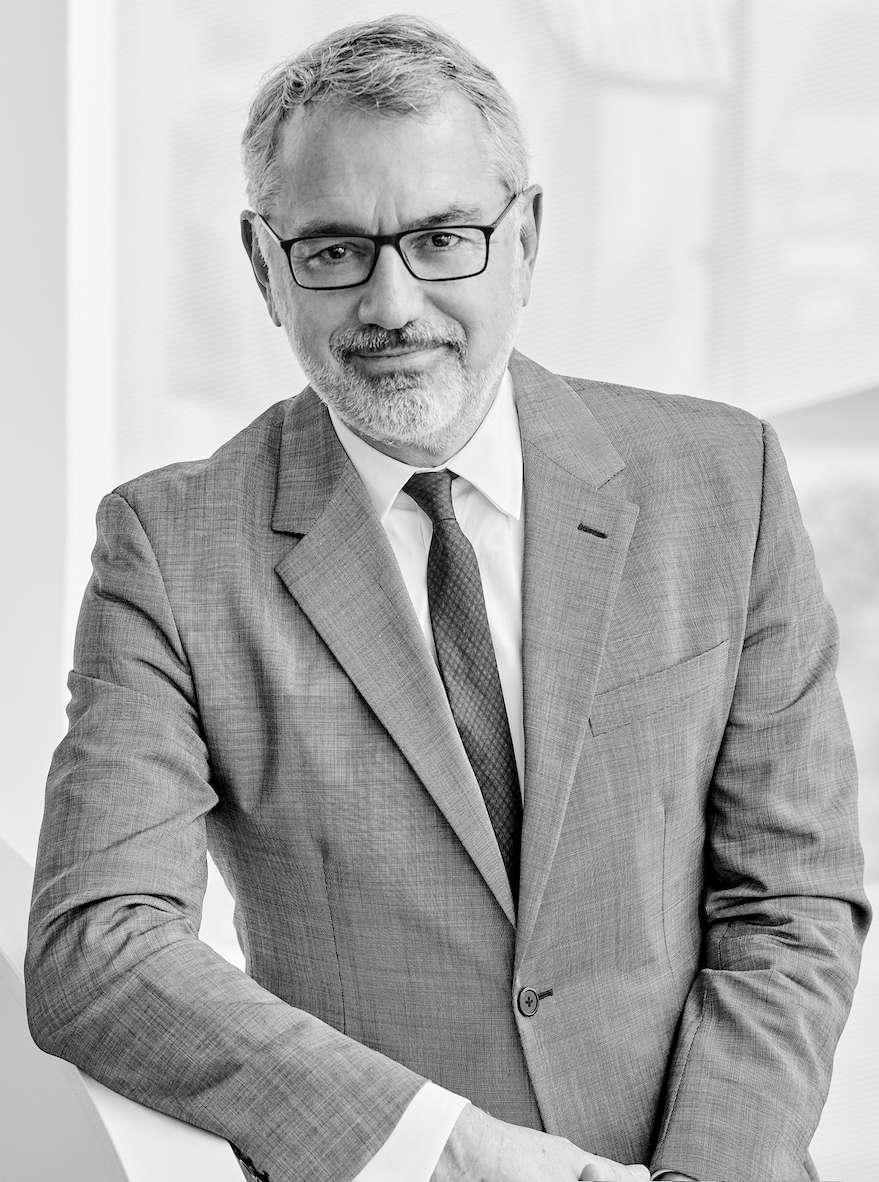
“For more than 20 years, we have run this private company as if we were a public company,” Marc Puig stated. “Now, our intention is to run this public company as if we were a private one. We will focus on the long term, on the health of our brands, and on maintaining our culture. We will try to make this transition as smooth as we can, but some things will change.”
The new logo, designed in collaboration with Paris-based art and design agency M/M, represents a significant departure from the existing logo, which features four stacked half-moons. The updated logo adopts a vertical, curvilinear shape, reminiscent of a fingerprint or a blossoming form, suggesting movement and growth, rendered in shades of gray and white. This redesign, according to Puig, is meant to “dig deeply into our roots” while projecting the company’s commitment to creativity and innovation.
Puig also highlighted that the company would increase its focus on communicating its own story alongside promoting its brands, which include well-known names like Rabanne, Carolina Herrera, and Jean Paul Gaultier. “Going forward, we are also going to be more outspoken about Puig,” he added. “In the future, we will talk more about our company: Who we are, what do we do, what do we stand for. We will talk about Puig as a home of creativity, a place where brands can shine and where people can go.”
The logo change coincides with Puig’s 110th anniversary and comes at a time when the company is increasing its visibility through sponsorship of major events like the Puig America’s Cup and the women’s event in Barcelona, where the company is headquartered.
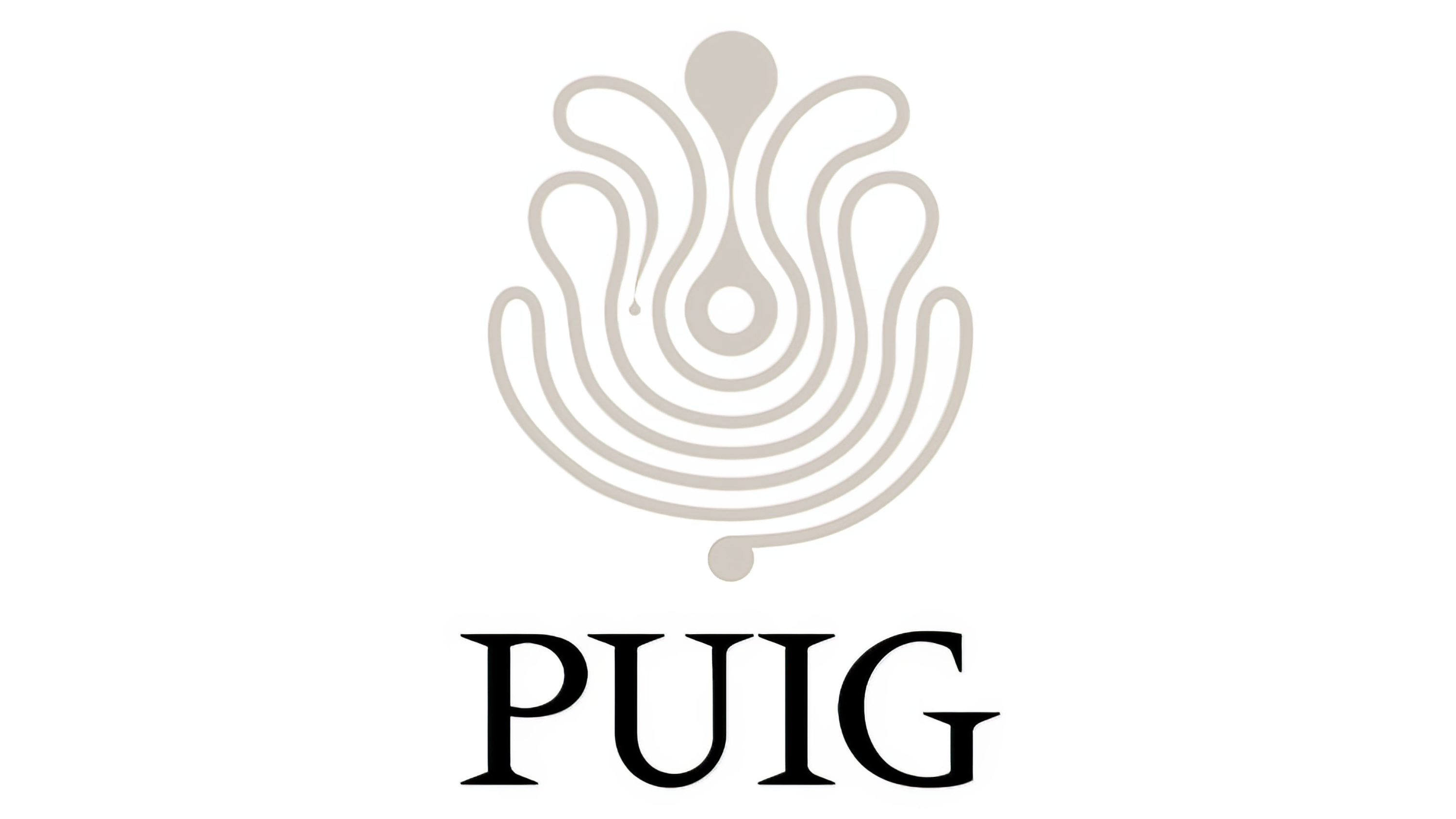
The new logo will officially be used for the first time during the bell-ringing ceremony at the Barcelona Stock Exchange. It incorporates elements inspired by the Méridien typeface created by Adrian Frutiger in 1955, reinterpreted in the bespoke typeface Paralelo, which features a mix of asymmetry, angles, and curves.
The creative process involved deep dives into Puig’s heritage, with M/M founders Mathias Augustyniak and Michaël Amzalag exploring the Puig Tower headquarters, the group’s perfumery laboratory, and the Disseny Hub Barcelona, which holds archives of Yves Zimmermann, who had overseen Puig’s graphic identity for over 40 years.
In concluding his announcement, Marc Puig expressed hope that the new logo would reflect the company’s ethos. “I hope you think it reflects who we have become: Puig home of creativity,” he said.