How Typography in Brand Identity Has Changed and Where To Take It Next
By Mark Wittmer
A logo or wordmark contains mysterious power. It’s often the first image that pops into a consumer’s head when they think of a brand – and yet, despite this visual immediacy, it can often be quite difficult to grasp why this symbol means what it does, connected as it is to the brand’s history, the history of fashion and marketing more generally, and contemporary trends. The last decade in particular has seen something like a revolution in logo typography that has arrived in step with the digitalization of content consumption, a revival of logomania, and the rapidly changing pace of fashion trends. Among all this change in perception and symbolism, how can a brand cut through and maintain relevancy while staying loyal to the history and image that made them successful in the first place? What does the typography of your logo say about your brand? When is it the right time to make a change?
Key Takeaways
The Digital Age: Following the rise of pocket-sized screens and the digital world over the course of this century, many long-established wordmarks that made sense in print or on a sign have been dropped in favor of sans-serif simplicity that is easier to read on an iPhone.
A Delicate Balance: The decision to rework an established wordmark is always a risk. For heritage brands, there is a fine line between historic and dated – but, conversely, updating a logo can mean modern minimalism gets mistaken for soullessness.
Time Will Tell: All change can be uncomfortable and confusing, but if the decision to change such a core element as a brand wordmark was made correctly, consumers will recognize and appreciate the fresh direction before too long.
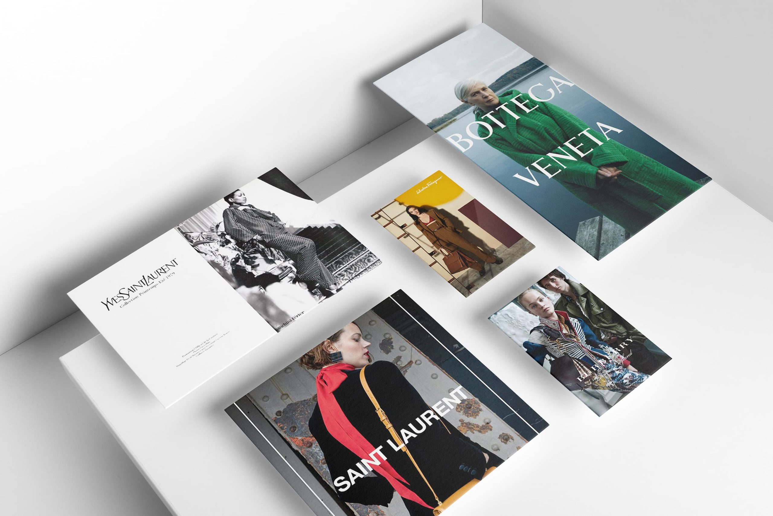
Swelling in tandem with social and technological progress, the last decade has seen a wave of change with heritage brands shifting core brand assets in typography, text, and logo – Saint Laurent, Dior, Celine, and Burberry, to name a few key examples – away from the historic and toward the minimal and futuristic lines of sans-serif fonts. In addition to reflecting changes in technology and the way we receive and interact with content – a simpler logo is easier and quicker to read and understand on a phone screen – these changes reflect broader cultural shifts as well. Old-school text can seem antiquated, stuffy, fussy. More minimal fonts reflect at once a sense of the technological, the youthful, and the inclusive, appealing in one fell swoop to the technologically savvy and socially aware millennials and zoomers that represent an ever-increasing share of the luxury sphere.
Karla Otto’s Anna Ross offers an insider perspective on these changes, and how they represent anticipatory plays to welcome a growing and shifting consumer base.

“Fashion is a constant evolution, so it makes sense that brand logos move with the times. A lot of this is synonymous with trends. If you review many of the logos of brands pre-serif-shift, they do feel a little dated. That sort of swirly, over decorative typography has largely fallen out of fashion across many consumer categories, with a shift towards clear, bold typeface that reaches a wider, more global audience. That global audience is key; as brands reach wider audiences, their message must be universally identifiable and translatable.”
– Anna Ross, Head of Creative Insight and Trend at Karla Otto
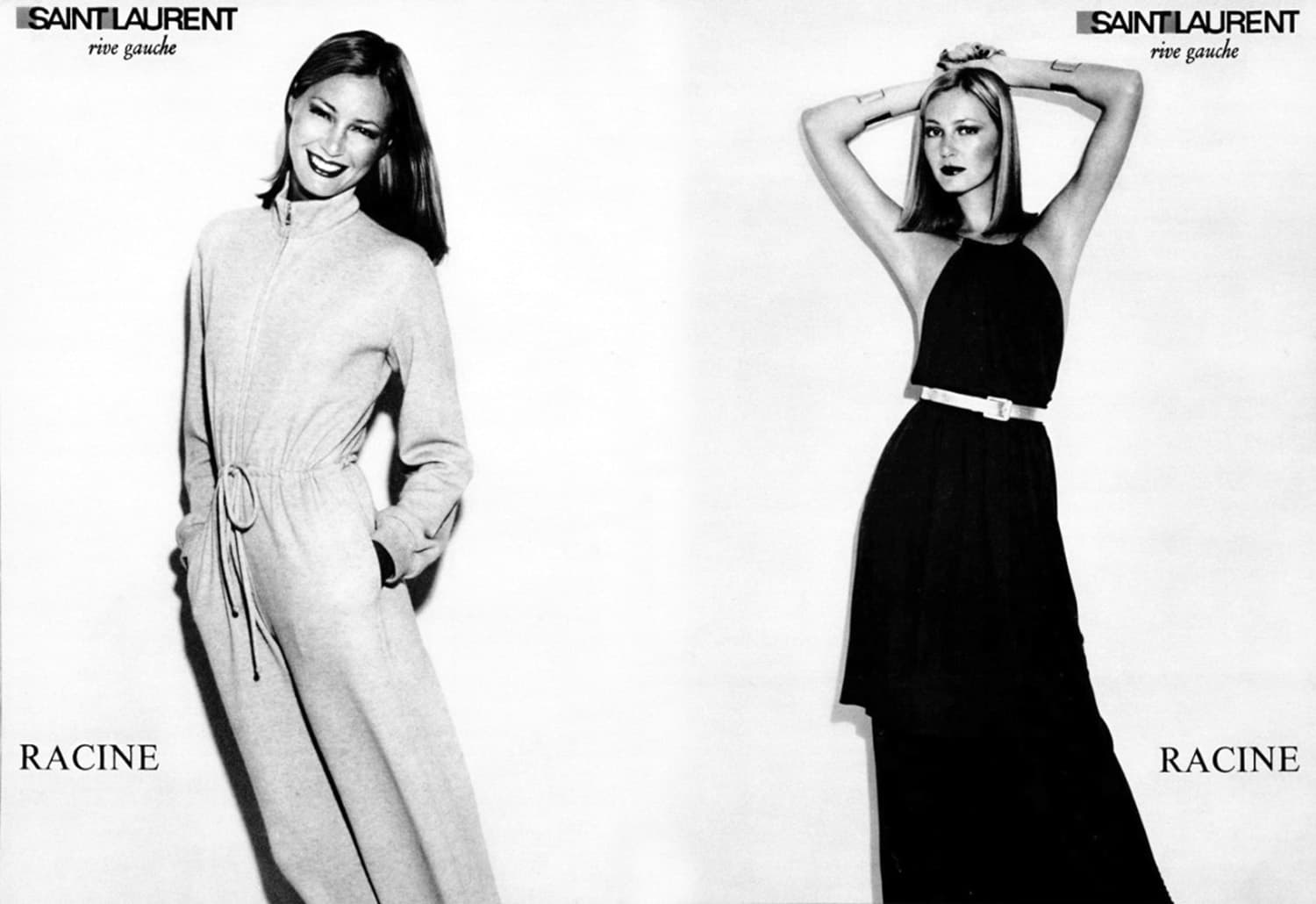
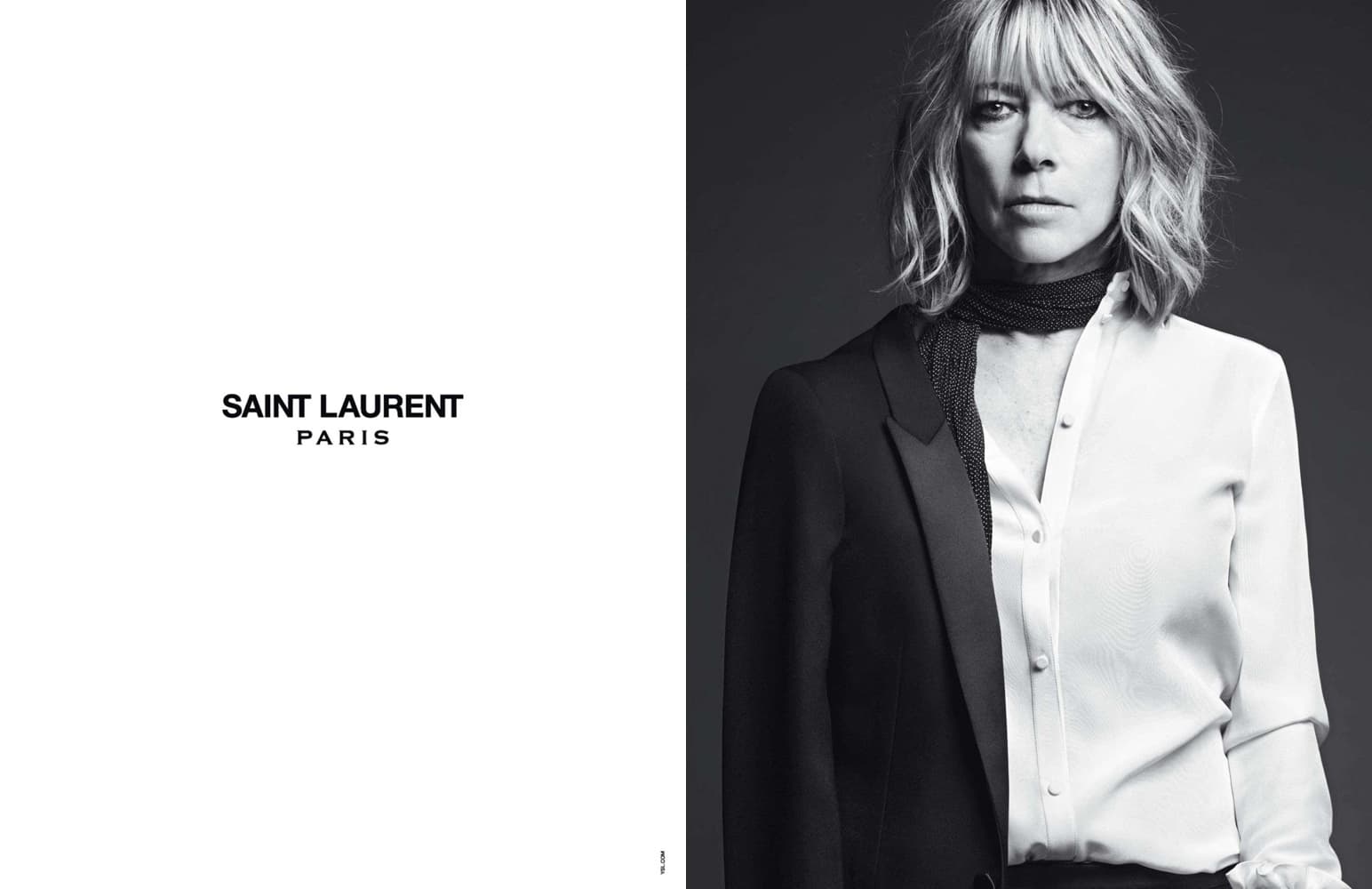
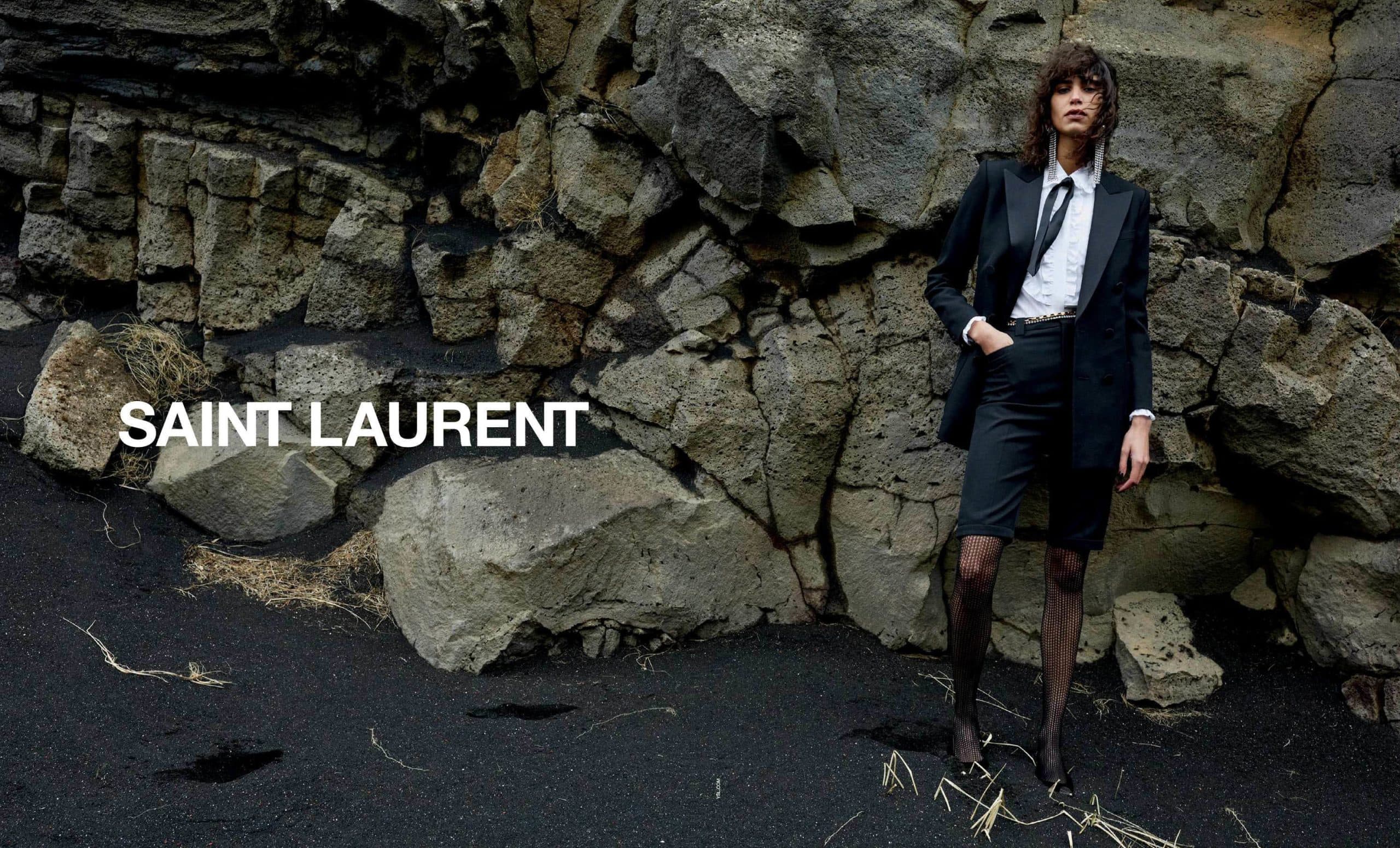
That being said, any such change to a historic symbol never comes without backlash – particularly in the case of beloved heritage brands with an iconic role in the history of modern fashion. Following the appointment of Hedi Slimane as creative director, Saint Laurent kicked off the trend for the decade when it changed its logo in 2012, swapping the fine script that had been with the house since its inception for a bold and simple sans-serif as well as dropping the “Yves” from its name on ready-to-wear tags and in ad campaigns. The move had immediate repercussions, with enraged fans taking to social media to express their disappointment, with many seeing the move as disrespectful to the founder’s legacy and even threatening to boycott the brand.
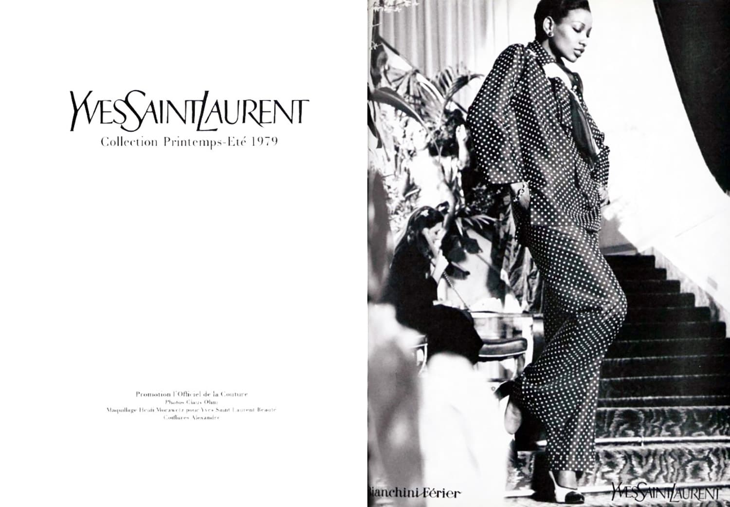
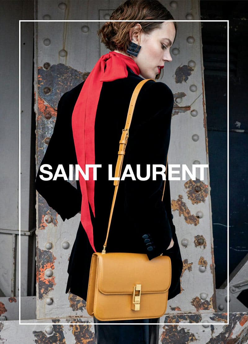
An often overlooked historical point in this change, however, is that the new logo actually hearkens back to that of Saint Laurent Rive Droit, the label used for the brand’s ready-to-wear line during Yves’ tenure. This new wordmark also formed an important element in Slimane’s vision for guiding the brand forward, arriving in tandem with his glam-rock-chic design work and his frequent choice to cast idiosyncratic musicians and artists in his campaigns – an approach that still defines the brand today. Current creative director Anthony Vaccarello picked up where Slimane left off, and it feels now as if the current logo goes hand in hand with the house’s designs and campaigns – and it’s hard to imagine it any other way.
As Ross wisely points out, Hedi Slimane made a similar change after taking over the reins at Celine, which, though it may have initially alienated fans of beloved previous creative director Phoebe Philo, signaled a promising – and lucrative – new ear for the brand. “In other cases,” she says, “it’s a useful tool to carve out an entirely new identity altogether.
Look at Céline versus Slimane’s version of Celine. That’s a whole different customer and design vision, by the simple removal of an accent. For some, a great loss; but it presents an opportunity to renew their image and reach a new consumer. It’s obviously working for Celine; according to data in partnership with Lefty, Celine’s Menswear S/S23 show generated the highest estimated media value at $43M EMV.”
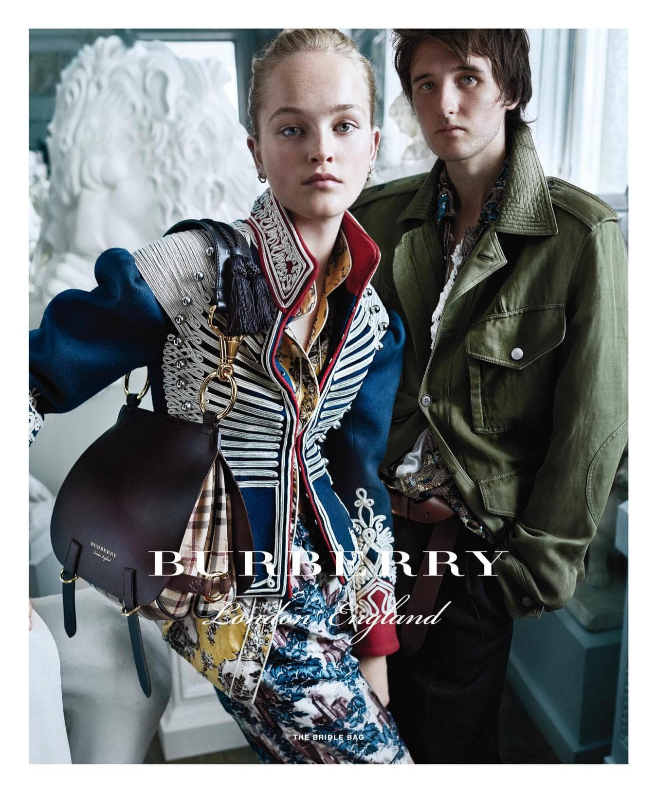
More recently, Burberry underwent a similar change, and we’re just now seeing its transitional phase draw to a close as it steps more firmly into its new identity. Following the appointment of creative director Riccardo Tisci in 2018, the brand swapped its classic logo – which had been practically unchanged since its founding in 1901 – for a crisp and minimal bolded sans-serif font. The change arrived in tandem with a new TB monogram designed by iconic English graphic designer Peter Saville, which Tisci splashed across every surface imaginable, but particularly bags and shoes, in a push to compete with the leather-goods sales of LVMH and Kering-backed competitors. While the monogram hasn’t reached the same level of recognition and saturation as those of Louis Vuitton or Gucci, the brand’s identity across design and marketing communications does feel unified under the new logo and image – even if many of us still miss the old one.


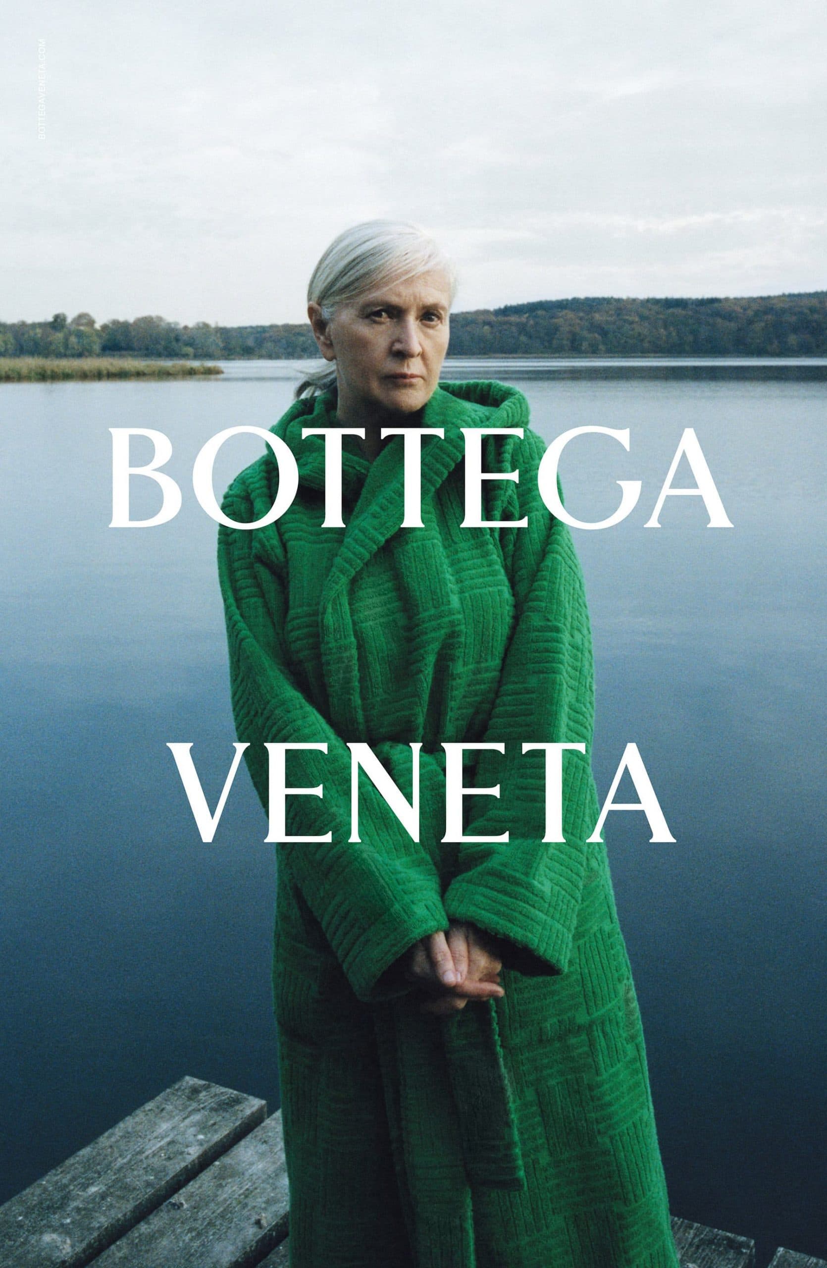
In a world of speed, change, and newness, staying consistent can also cut through to make a powerful statement, embodying the luxury of remaining true to one’s origins. A brand like Bottega Veneta that doesn’t put its logo on its craft-focused products, yet has made consistently bold yet minimal and elegant use of its timeless wordmark in its ad campaigns, doesn’t seem to have reason to change its logo – probably ever.
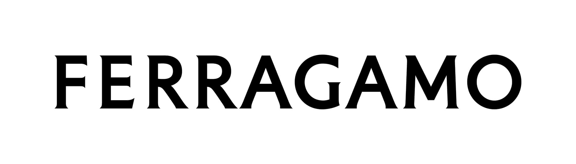
The very recently rebranded Salvatore Ferragamo represents a fresh case study to keep an eye on in this connection. The brand’s identity, as embodied in its previous logo, which had been in use since at least 1948, was deeply connected to the life and work of its founder, as well as that of his wife Wanda, who grew the business massively after his death. In many ways, it felt like this logo was very essential to the brand, and to change it would be a mistake. But the brand has had a lot of internal shakeups recently, and now is beginning to step confidently forward under the guidance of new creative director Maximilian Davis. The change in the logo could come to represent a great new era for the brand – only time will tell.

So what’s the future of fashion logotypes? There’s no one path forward for all brands; each one is distinct, and must look to its place in its own lifecycle. But a conservative approach is probably best – don’t change your wordmark until you know it’s the right time, and when you do, make sure it marks an important new chapter for the brand. And when you do decide it’s time to change, stick with your decision – it will prove itself to be the right one.