Logo More or Logo-Less, how two brands steeped in tradition are playing to their audience
AKRIS
Anyone following Akris thoughout the years has the added benefit of getting a little art education. Albert Kriemler has taken inspiration from art and architecture since 2004, including collaborating with artists such as Thomas Ruff, Carmen Herrera, Sou Fujimoto, Geta Bratescu, Ian Hamilton Finlay.
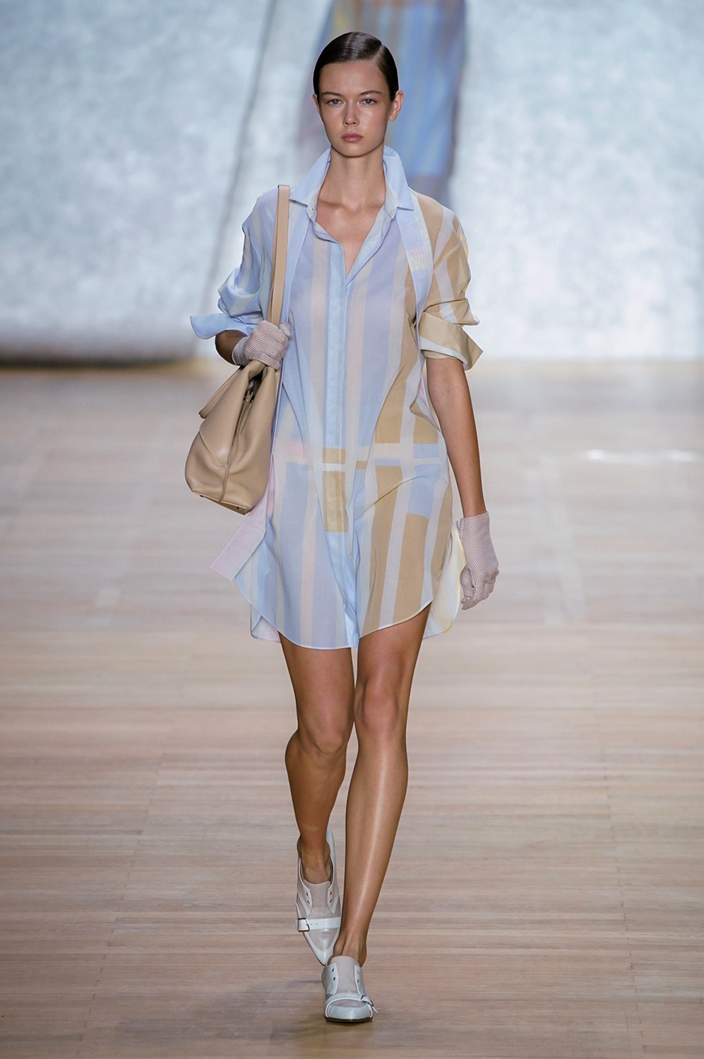
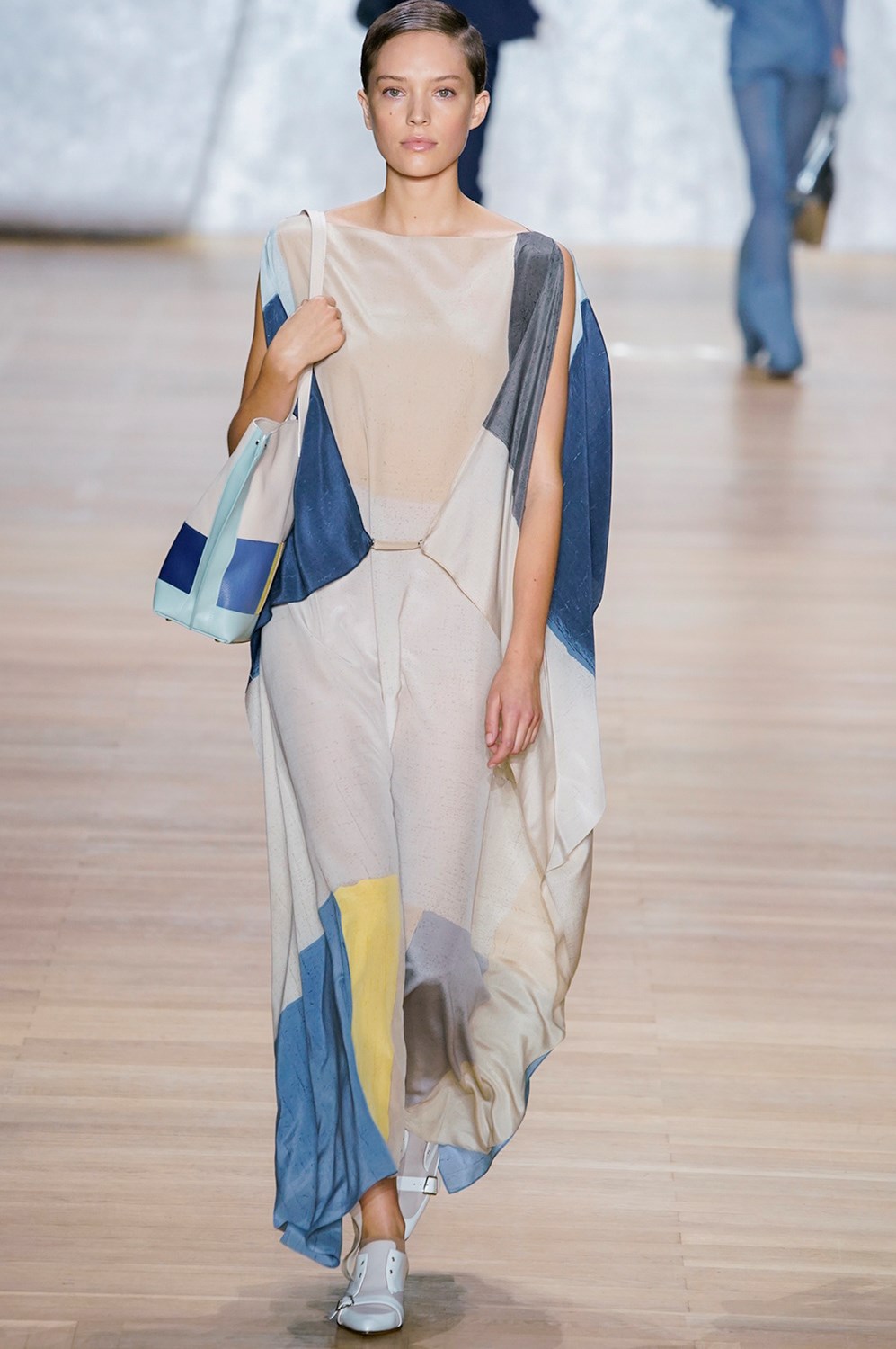
For SS20, he was inspired by Antonio Calderara’s geometric abstract paintings and “opalizing, luminous and shimmering pastels,” which set the tonal palette for the collection, highlighting silver as it channels the magical play of sunlight on water. The silver lurex jersey looks he sent down the runway were just that, liquid and glistening like the path of sunlight reflected on a body of water. The color blocking, grid embroidery, and square stone embellishments are visual elements from Calderara’s oeuvre, not to mention the combination of yellow gloves with a black outfit.
The other basis for the collection is the 10-year anniversary of Ai, the iconic trapezoidal bag that is representative of the brand. The trapezoid, which is shaped like an A, has become a signature and key visual of the brand, a “logo-less logo” that repeats from bag shape to hardware to garment silhouettes in a way that “stays true to the inconspicuous and simple allure of the house.” The Akris woman is a discreet, discerning client who appreciates high quality and subtle luxe, and has a real life where she can wear these real clothes, not just for Instagram or street style photographers. Akris knows its clientele and has been serving it well over the years.


LACOSTE
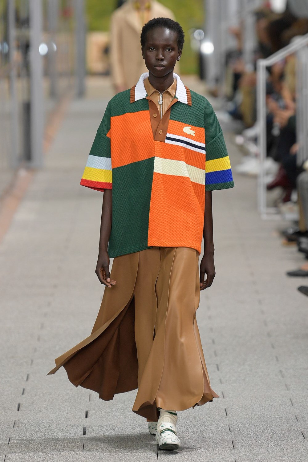
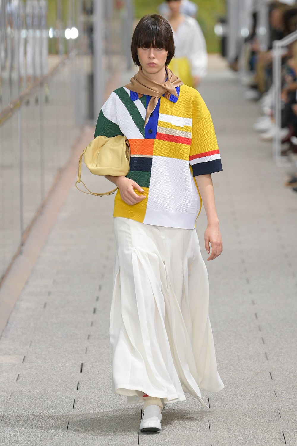
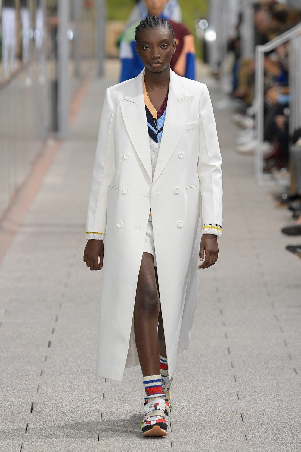
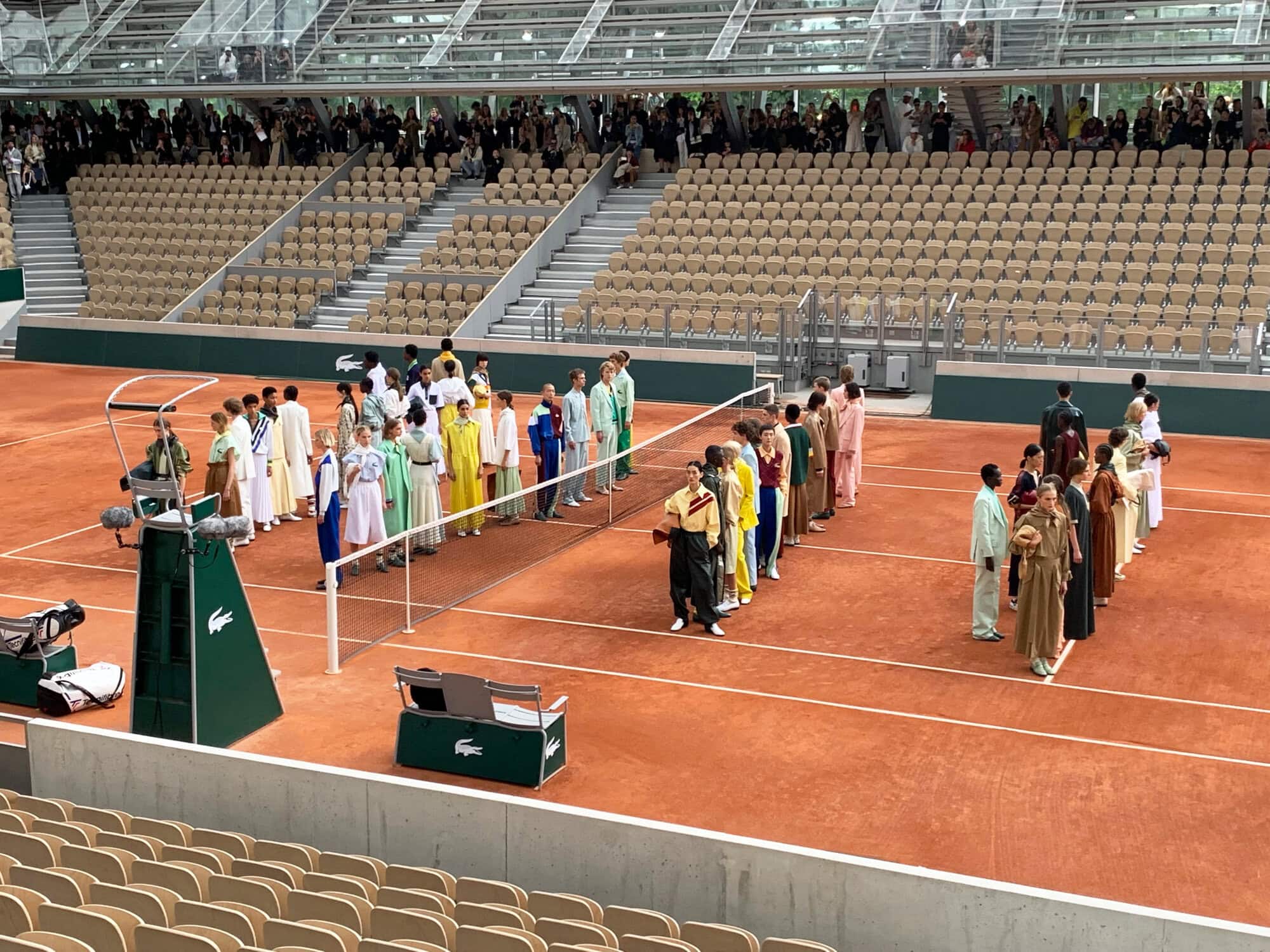
Set at Stade Roland Garros, home of the French Open, the Lacoste SS20 show was befittingly ushered by young people in Lacoste tennis outfits and there was a show tennis match while the audience found their seats. Befitting because René Lacoste, the company’s founder, was nicknamed “the Crocodile” for his tennis prowess. Hence the iconic polo and the logo, which is purportedly the first example of branding on clothes. Louise Trotter’s second collection for the house subscribes to the current logomania, continuing with the supersized crocodile, making a pattern out of it, for example, on their loafers, and even jewelry.
The color palette was the standout thing about the collection, with a hue of nostalgia and an interesting combination of what would traditionally be strange colors but actually works really well together. For example, 50 shades of green ranging from mint, lime, army, khaki, grass… you get the picture. The silhouettes are relaxed, injecting a bit of streetwear into what used to be the exclusive provenance of preppy country club to perhaps court the contemporary market. The sneakers are a play to that, too.
We’re curious where the brand goes from here, and what demographic it manages to speak to.