Review of Bianca Saunders Fall 2021 Fashion Show
A Sculpture, A Photograph, and a Movie Serve to Deconstruct a Shoulder
By Long Nguyen
“I like to take a multidisciplinary approach to my work, with art and filmmaking as part of my practice. This collection started from sculptures I exhibited in Paris last autumn and has drawn inspiration from the multidisciplinary artist Jean Cocteau,” the British designer Bianca Saunders said on her Instagram. She provided her followers with clues to dissecting her fall clothes in the film Superimposed, directed by Daniel Sannwald.
Less than a minute long, the concise black and white art film is full of surrealism gestures that recalled the movie that Saunders said was her inspiration – Jean Cocteau’s Le sang d’un poète (The Blood of a Poet). Cocteau made the 1930 avant-garde film in four sections with a mixture of baroque styling and surrealism elements like presenting the dissolution of personal identity. When cinema entered a new era of narrative sound films, Cocteau still deployed handwritten cards at the beginning of certain scenes.
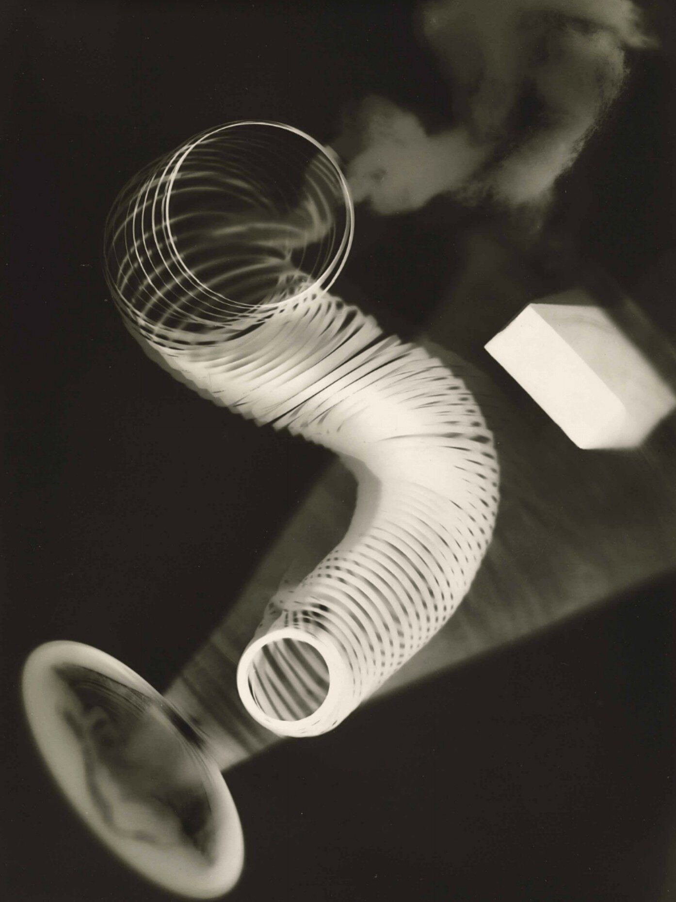
While designing this men’s fall collection, Saunders said that she was looking at art and surrealist art and the 1930 Jean Cocteau film that served as a springboard for the LFW presentation film. Besides, Man Ray’s photographs, especially during his Dada and Surrealist post World Was I era, and the stretch fabric sculptures of the Austrian artist Erwin Wurm were other significant influences on her fashion thinking this season.
Both Man Ray and Jean Cocteau’s aesthetics aimed at deconstructing the realms of art that they were working in with experimentations that served to transcend their art medium’s immediacy. Ray invented techniques like photograms – a photographic image made by placing objects onto the surface of light-sensitive papers without the actual camera – and the process of solarization.
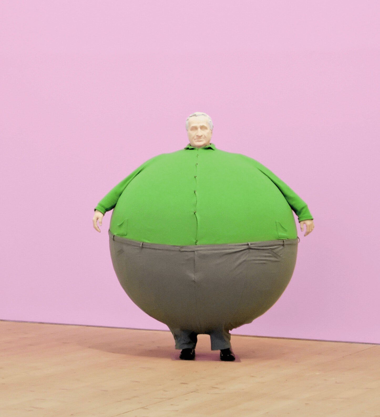
In Erwin Wurm sculptures for the artist 2006 series titled The artist who swallowed the world, Wurm made blow-up balloon-like sculpture figures with stretched-out clothes. Wurm sculptures offer Saunders a stark reminder at least in part of the extremes looks at proportions in clothes.
Art aside, Bianca Saunders is a menswear designer focused on the meticulous technicality of cuts, making patterns, and draping the chosen fabrics that morph into different shapes each season. Men’s fashion changes at a turtle’s pace. The real innovations come from experimenting with different ways to alter a familiar silhouette’s forms – may be tightening a bit here and loosening a bit there – to create a different proportion.
The secrets to menswear lie beneath in the details of constructions that can result in different garments that can induce a different temperament. Even that can alter the ways to look at the gender roles of clothes. That Saunders looked at Man Ray, and Jean Cocteau isn’t much of a surprise.
In her fashion work, the designer played with the men’s clothes constructions and how she can alter these constructions to change men’s clothes’ perception. In a way, she is examining how the works of these artists changed their respective mediums.
Perhaps this is a way to look at Saunders’ work since her Royal College of Arts MA Fashion graduation in 2017, as a way to break some of the rigid ways that men dress.
In layman’s terms, what that means is a reexamination of the way garments are cuts and rearranged in different ways to alter the proportions, not just the actual garments but also significantly how we see the clothes on a body.
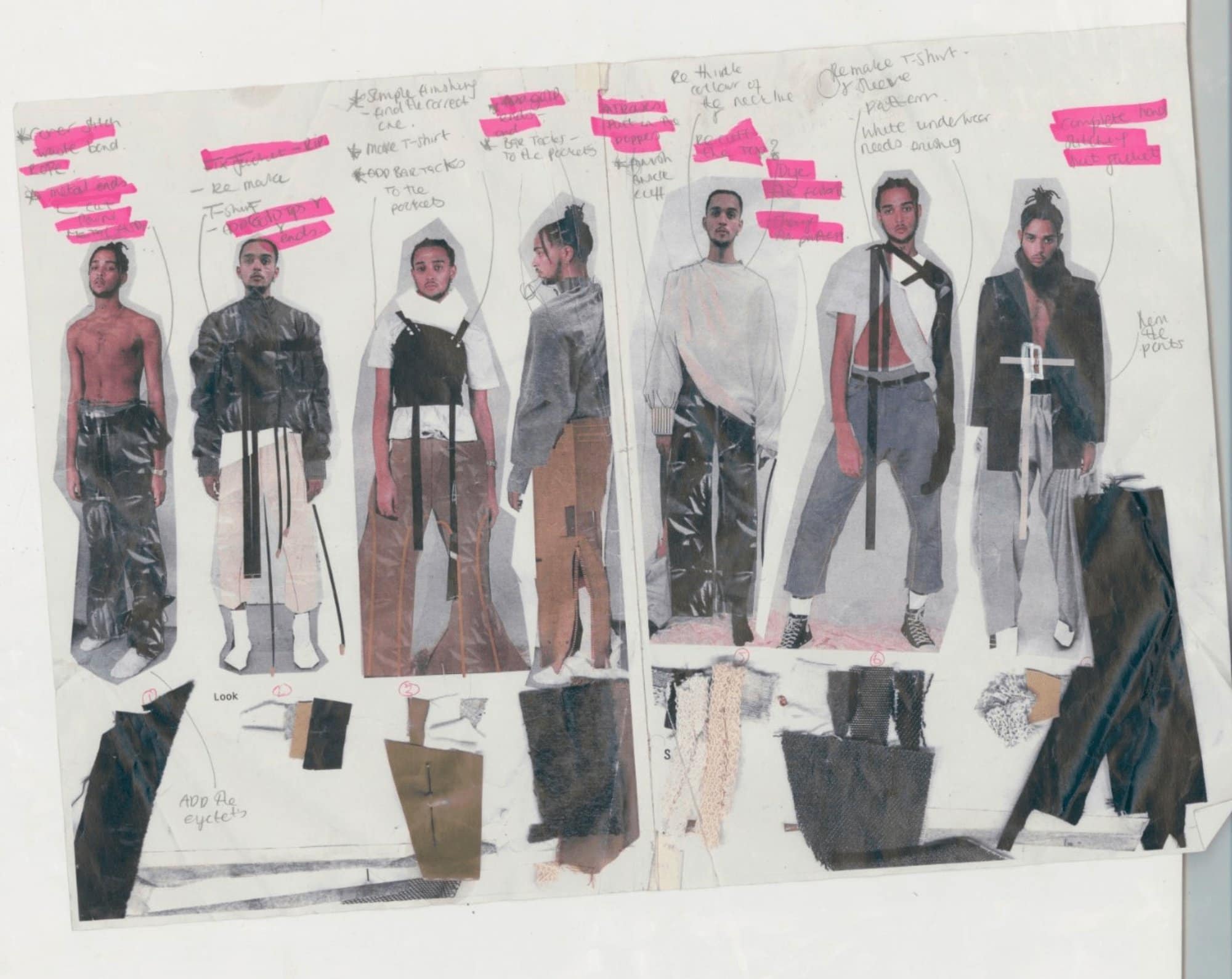
“I always feel that a stronger shoulder point is the center to masculine clothing. Tucking in and adjusting the shapes to show a softer side underneath,” Saunders said via Instagram. The shoulder is the point of departure for her sharp and focused collection of garments, each crafted with the concise methodology the designer deployed in her signature alteration of standardized shapes. This preoccupation with the shoulder is a design subject that has been a favorite topic since her graduation thesis at RCA and in her first presentation in early 2018 titled London is a Place for Me exhibition of Caribbean life in Britain.
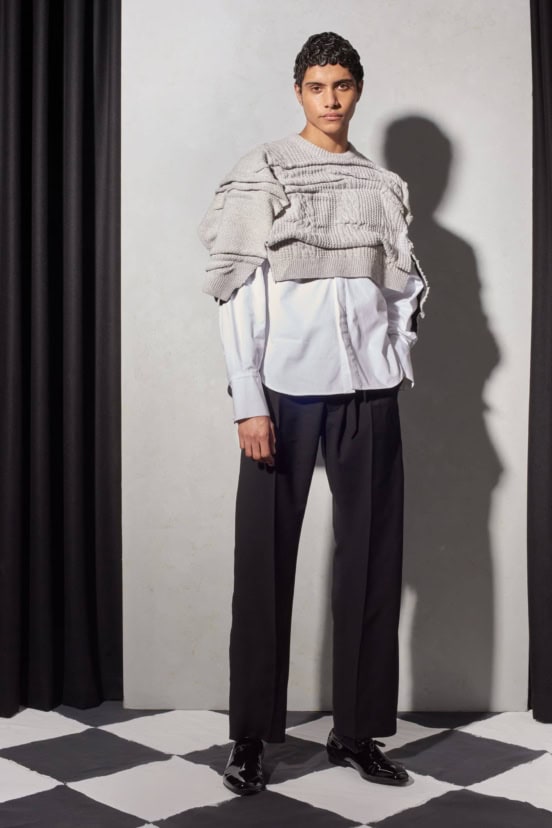
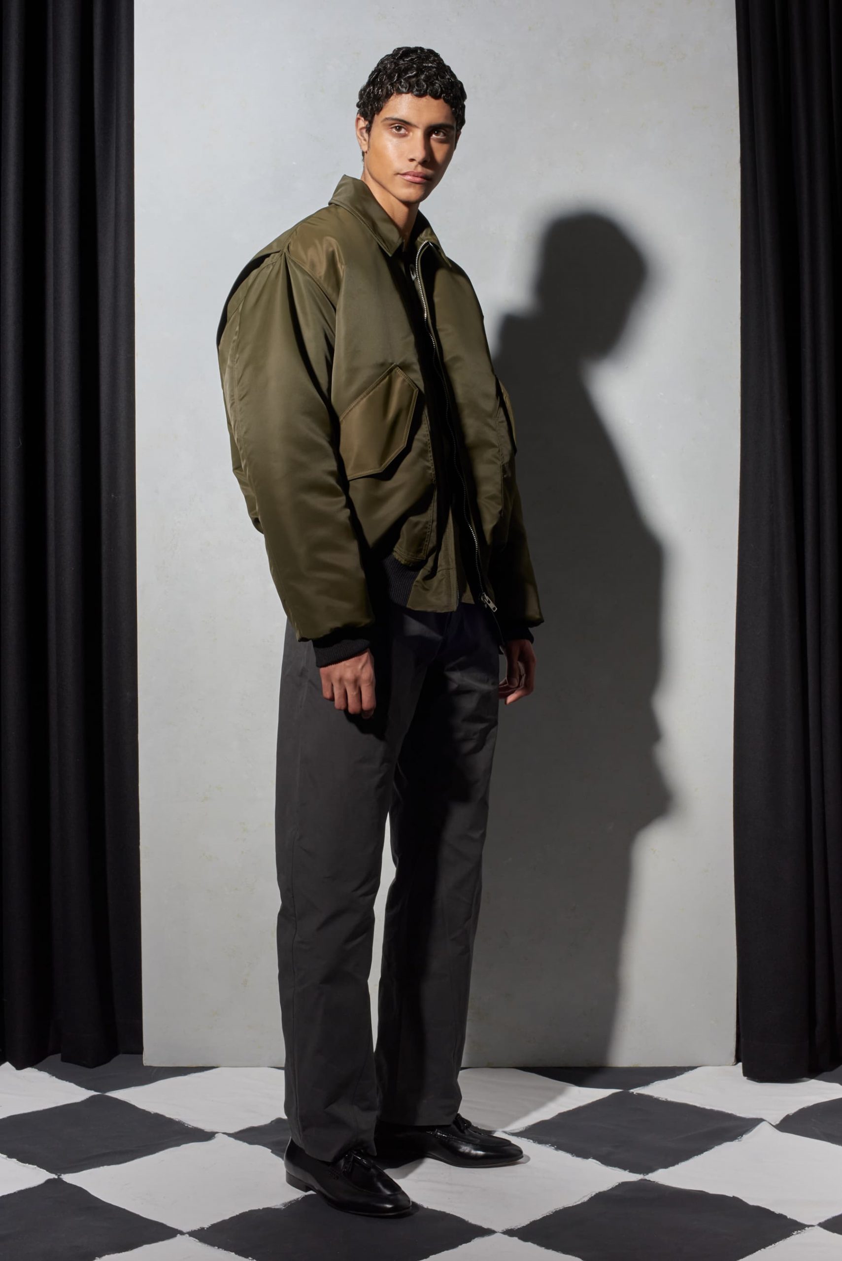
The simple single breast black wool tuxedo jacket has a sunken-in shoulder with an out side fold layer to raise the shoulder level. The sleeves fall above the wrist bone, with patch pockets at a higher placement below the ribcage, purposely showing the waistline. A black cotton work shirt has a flare shape falling forward with the volume in the front. A nylon olive MA1 bomber blouson has asymmetrical cutting where the front is oversize, and the back is shorter due to the back vent moving close to the shoulder blade.
The shifting of the proportion to the front of the jacket, whether in a single breast jacket, a shirt, or a nylon bomber, surrendered these garments’ bold appearance. In lieu, the A-line silhouette allows for a broader separation of space between the person who wears the jacket and the outside world, a sartorial line of protection. But do tough guys need this barrier of protection?
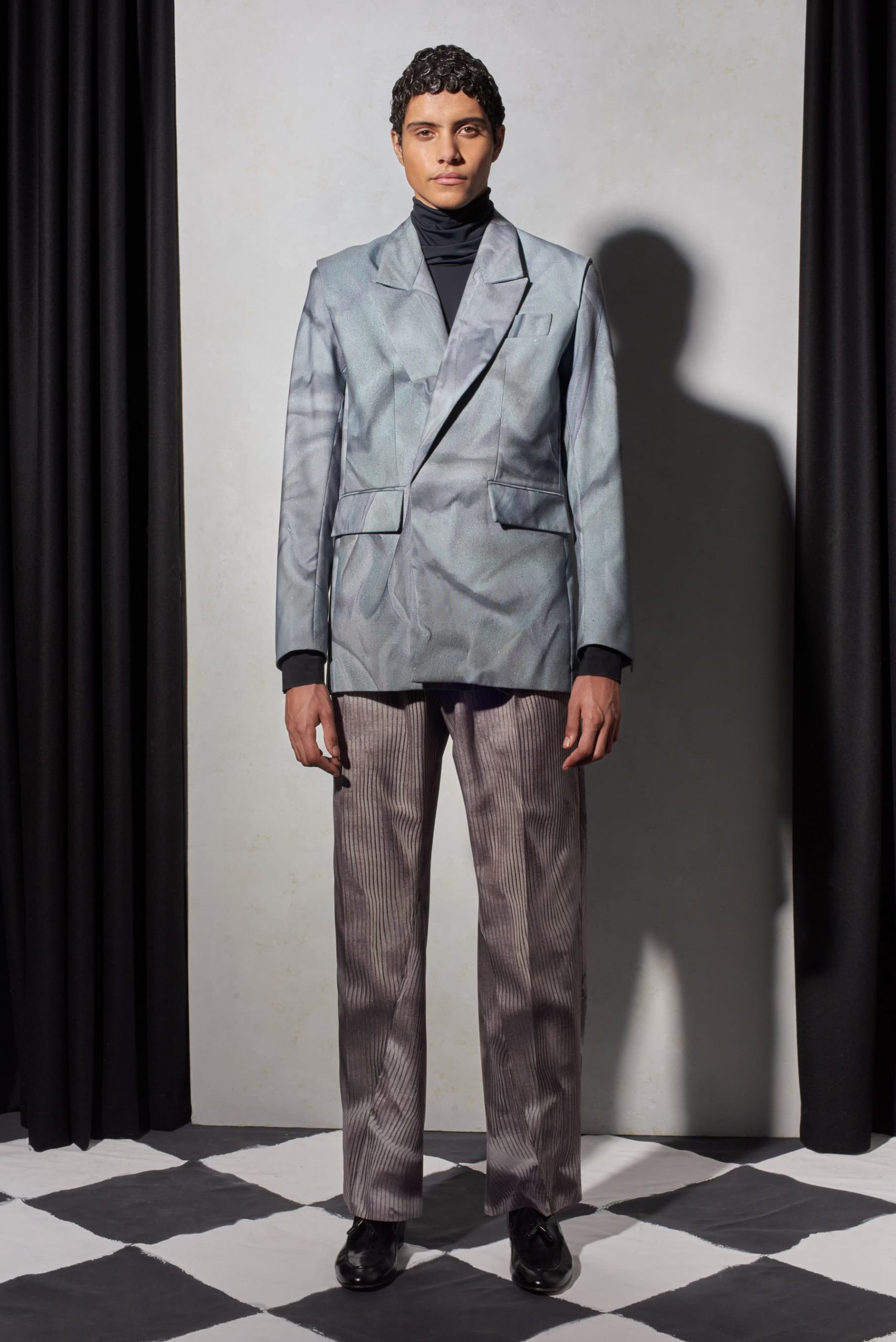
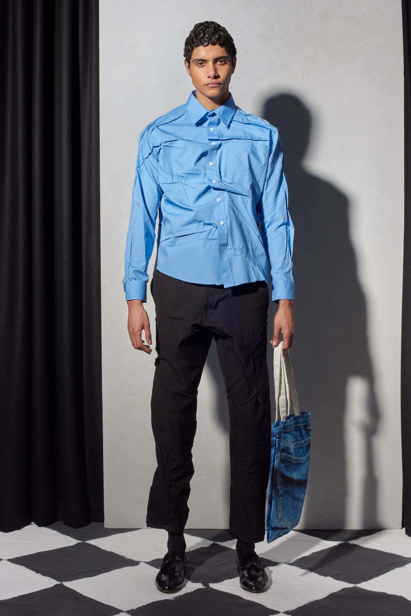
The blue-grey cloud-ish print on a shirt-jacket and matching pants came from an idea following the September 2020 exhibition Drawing a Blank, organized by the young curator Ben Broome. In the show, Saunders’ sculpture is a light brown cotton jacket and a cotton khaki pant, all crinkle up. That wrinkle effect produced the optical print and the crumble impact on a bright blue cotton shirt or an ecru cropped knit jumper.
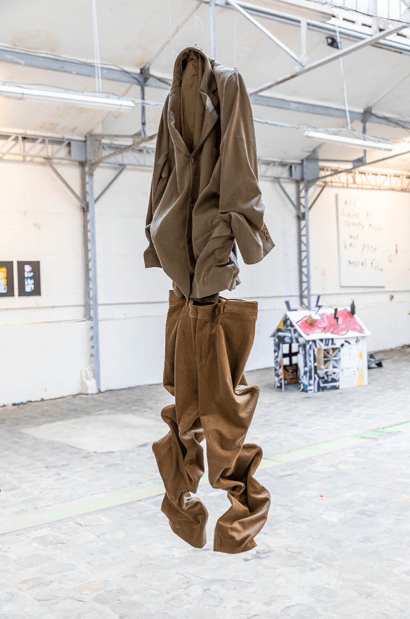
Working with basic Wrangler jeans, Saunders twisted the seams’ cuts around the legs so that the inside seams end up out in front. A Wrangler corduroy jacket became a new suit when paired with a similarly twisted pant cut.
Cultural stereotyping can rest or fall on top of a shoulder blade.
In Saunder’s case, her sunken shoulder gives the typically rigid clothes from the traditional men’s jacket or even to a work shirt the softer shapes. Suddenly, the bold tailored men’s jacket no longer looks or feels so conventional and perhaps so stiff as well.
