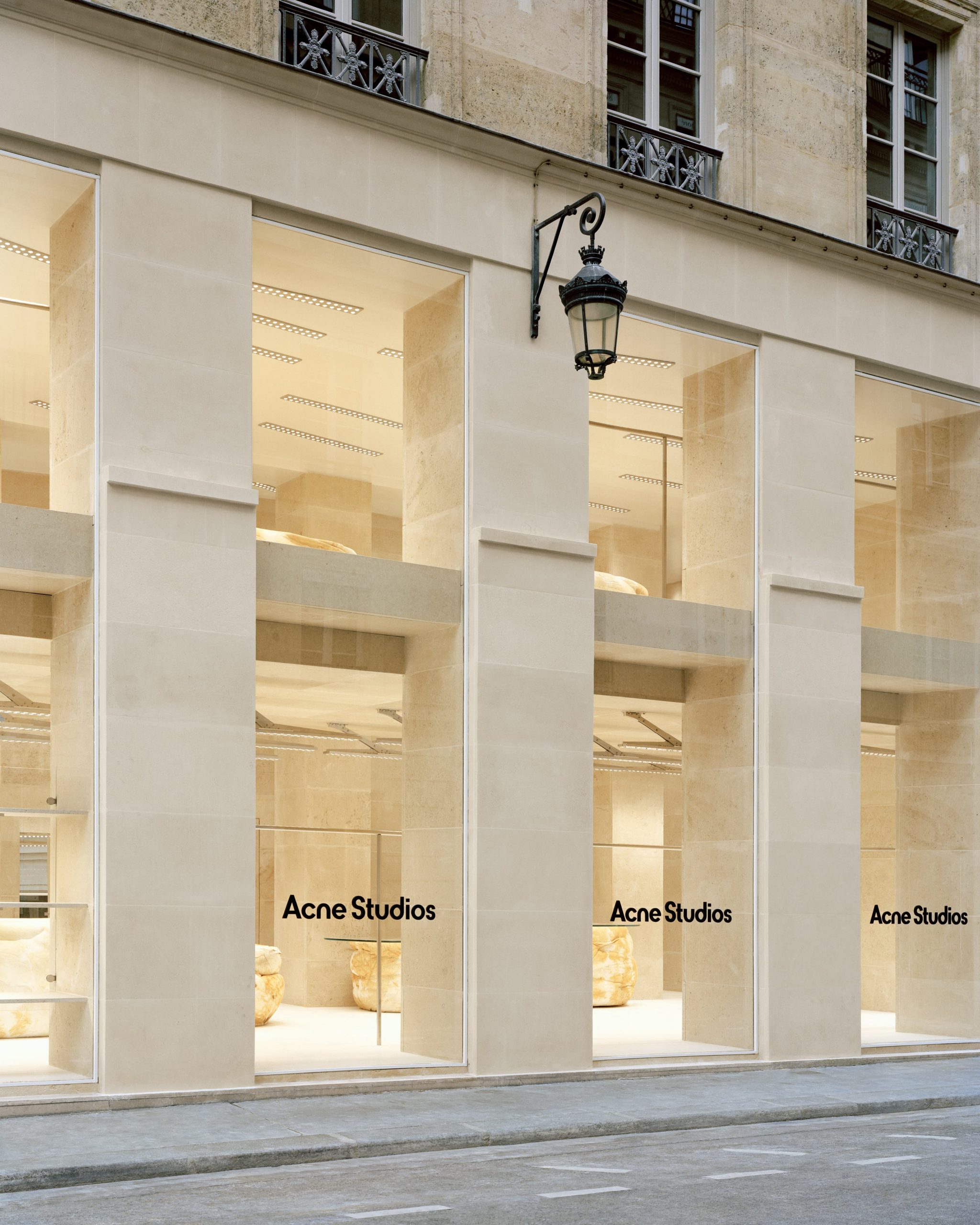
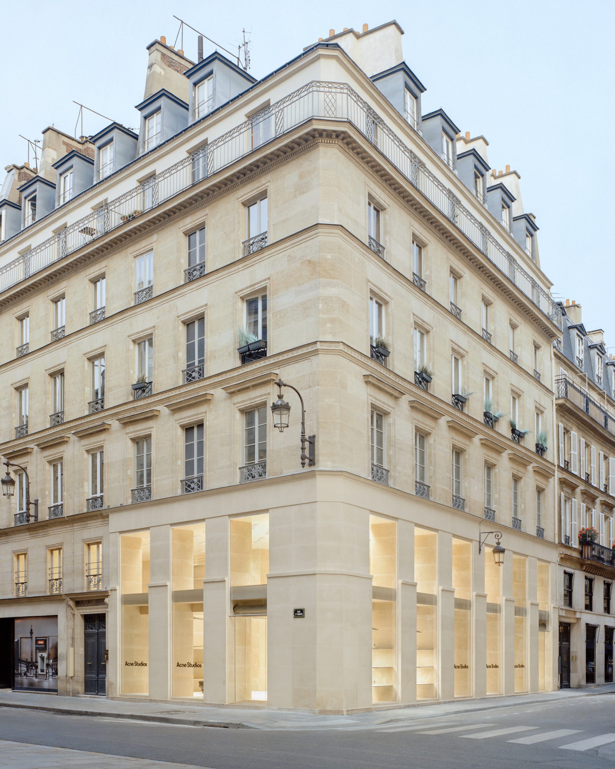
After a comprehensive renovation, the 219 rue Saint-Honoré store in Paris opened on 23 June 2022. Occupying a corner position on one of Paris’s most storied streets, the new space adheres to the brand’s global store ethos, where each location interprets the Acne Studios design language in an individual way. In this case, it channels both the classic elegance of Paris and the counter-cultural currents that infuse the Stockholm-based brand.
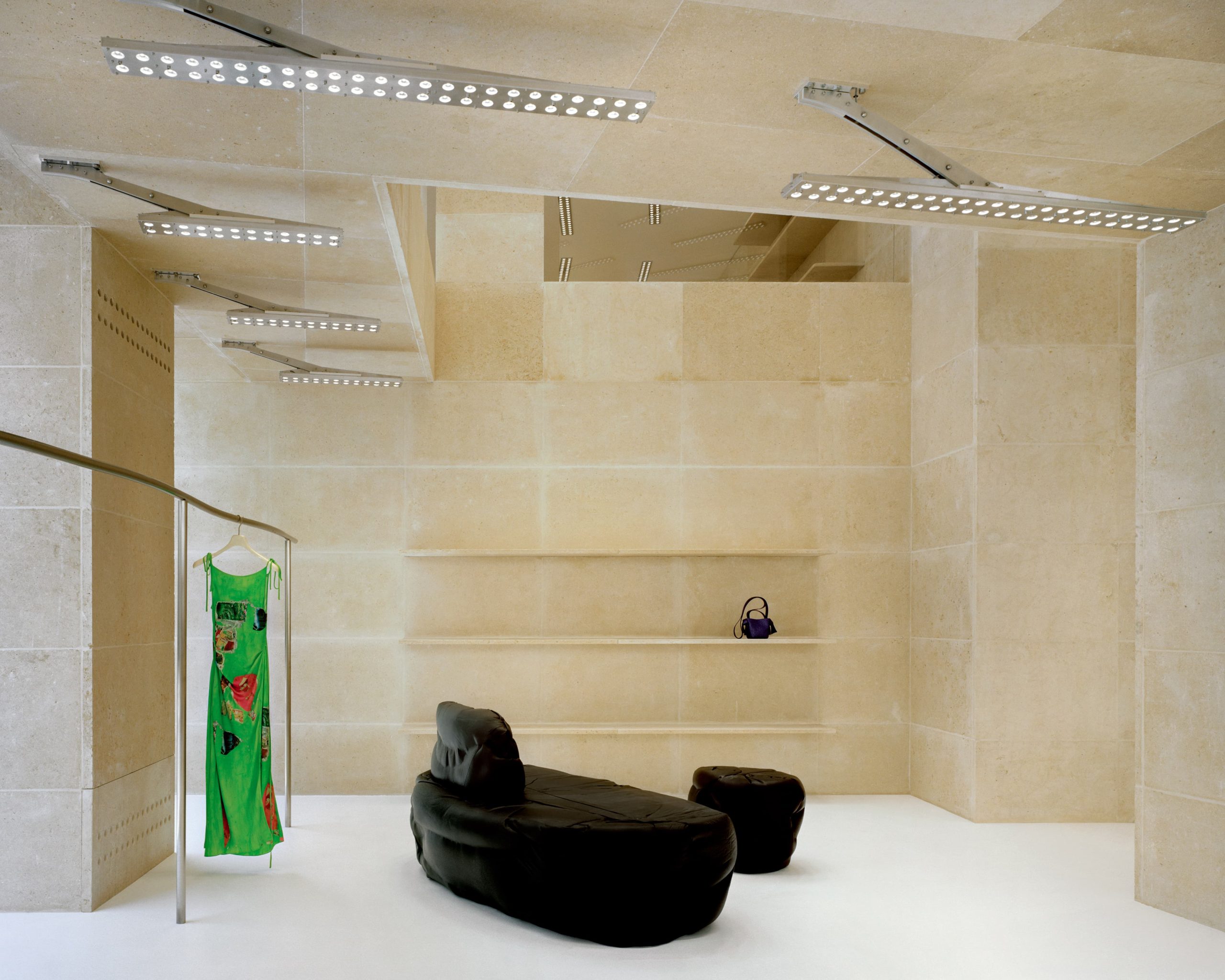
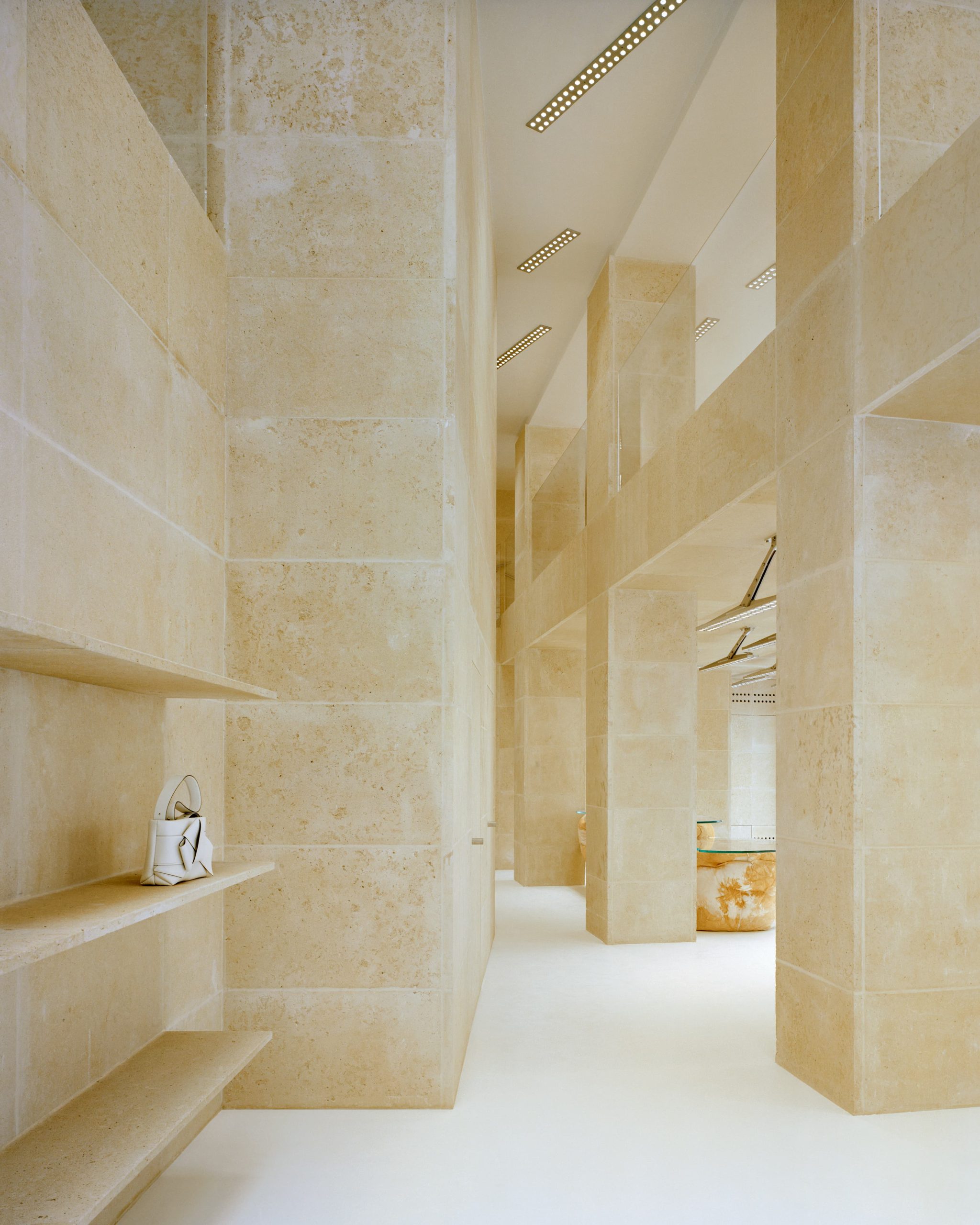
Designed by the Barcelona-based architecture studio Arquitectura-G, the 385m2 space is composed in Saint Maximin stone, extending the exterior façade to the interior of the store. A pale, golden-beige limestone sourced from a nearby French quarry, Saint Maximin is synonymous with Paris, having been used extensively in the construction of the city. The stone has been used to clad the walls, floors, and columns, to impressive infrastructure-like effect.
“Lately, I’ve been hanging out at the Rålis skate park in Stockholm, which was built under a bridge to prevent the concrete skate bowls from getting wet and slippery. I find it a poetic spot, and it reminds me a little of Paris because there are so many bridges in the city. I wanted the store to feel like you were sitting under a bridge. I like the idea of a secret society, a sub-culture, existing under the arches – and I thought it was a good way to think of Acne Studios as a brand on the big fashion street,” says Jonny Johansson, Creative Director of Acne Studios.
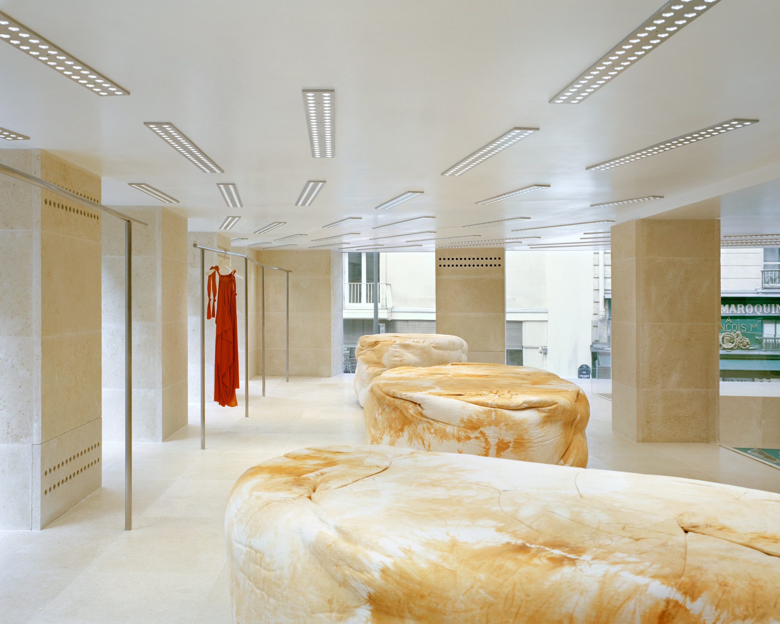
Paris’s exceptional light is given true prominence. Original floor-to-ceiling windows have been stripped back to allow more light to enter the store, and enhance an airy double-height space connecting both floors. Elsewhere, the fixtures are a study in contrasts. Swooping hand-made bespoke metal rails designed by Arquitectura-G flank the angular stairs that lead to the spacious upper level. The French artist and long-standing Acne Studios collaborator Benoit Lalloz designed the internal lights which are arranged in wave-like formations to create a sensation of fluidity, in contrast to the rigid discipline of the stone-clad columns. In the same vein, the British designer Max Lamb created soft furniture – a mix of black leather seating and hand-dyed fabric display units and tills – in globular, organic shapes to offset the sharp doorways, stairs and shelves.
For the unveiling, the store showcased FW22 looks from its men’s and women’s collections alongside shoes and accessories, including the brand’s emblematic Musubi bag.
Acne Studios Questions & Answers:
Some of the reference images include a picture of the concrete skate park in Rålambshovsparken in Stockholm and the Pont Neuf in Paris – how did these images influence the store design?
I spent a lot of time in that skatepark in Stockholm, sitting waiting for one of my friends, he is obsessed with skateboarders! He even goes to skateboarding school. So I’ve been spending time under the bridge lately at the skate park, and because it’s under the bridge, it doesn’t rain there and it’s not wet and slippery. It’s finding these poetic spots – under a bridge, where you have sort of like a beautiful concrete wave motion, and this whole idea of being under a bridge where nobody wants to be, where it’s beautiful, I thought was quite a beautiful idea. But Paris, there are all these bridges, all the time. I wanted to have some sort of local references for me, myself, relating to us in Stockholm, and then some references to Paris.
So we had two floors, I was like, can we do a bridge? I want it to feel like you’re sitting under the bridge. So that’s when the whole idea – because I like that sort of like secret society sort of like – I thought it was good for us as brand on the big fashion street.
When it comes to the interior of the store, you often work with Benoit Lalloz the French artist who designed the lighting – what do you like about his work?
I saw him the first time, he did something for Balenciaga, way, way back – Nicolas Ghesquière time or whatever. He did this poetic light that felt like a futuristic forest almost, so I always wanted to work with him. I contacted him many years ago and he was very busy, and then finally we got to work together, and I just use him for every light for what we do. We do these daylight situations that I like. I like daylight, I’m not really a night person.
Maybe not surprising given you are from Sweden where there’s no daylight in the winter!
Well, yeah, I’m a surfer.
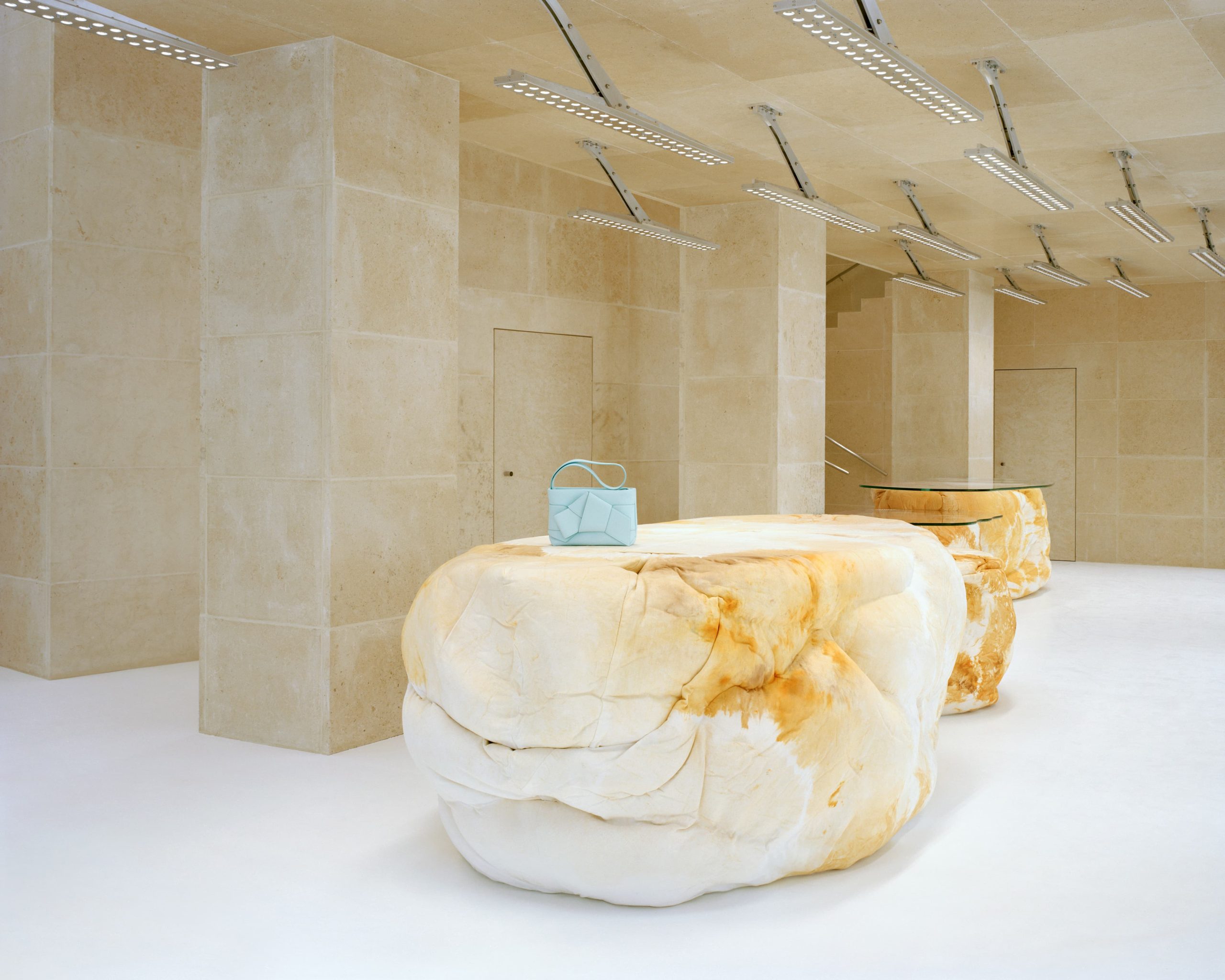
Another artist involved in the store is Max Lamb who designed some furniture – what appeals to you about his work? These designs look almost like Henry Moore sculptures made of rock.
Max Lamb – he feels very modern in his process, how he almost makes everything himself by hand, he feels very futuristic to me. We wanted to make a contrast with the stone.
So it’s Saint Maximin stone, which is the colour of Paris?
Yeah, the whole thing is like referring to Paris for me – it’s not like, that stone has that colour of – if you look at the city as a whole, it’s beige. If you squint you see this stone, this pale colour. Then you have for me these dots of black which is like cars. And they’re moving fast, and sort of like shiny and black, quite scary in one way. That’s Max’s work.
Last question, what is your favourite thing about the new store? Any favourite detail or element?
Telling my Mom about it. She’s like 75.
Does she wear your designs?
She does wear Acne if she can. If it’s black.