Review of Chanel Spring 2022 Couture Fashion Show
Modernist Staging, Traditionalist Design
By Mark Wittmer
Chanel’s Spring 2022 couture show from Paris marked the first time that creative director Virginie Viard collaborated on an artist to create her set, instead of opting for her usual rife-with-historical-charm, iconic Parisian locations. Belying the newness of this artistic venture, however, the collection itself felt a step behind the artistic staging.
Viard called on artist Xavier Veilhan to design the show’s set. It’s great to see the house move forward and bring in another strong creative vision, and the move also hearkens back to Karl Lagerfeld’s bold and forward-thinking showmanship during his time at the house. Mixing materials and aesthetic influences, the artist developed a space that combined the simplified geometrical abstractions and industrialism of early 20th-century constructivist and Bauhaus movements with the modernist architecture of a mid-century home in which you might find a conversation pit.
Despite the sense of social progressivism and farseeing abstraction suggested by these aesthetic references (all of which, in addition to their groundbreaking visual identities, were connected with progressive social and political movements), the collection itself for the most part felt like a rote rehashing of Viard’s typical rephrasing of Coco Chanel codes, though of course with a couture-appropriate emphasis on craftsmanship.
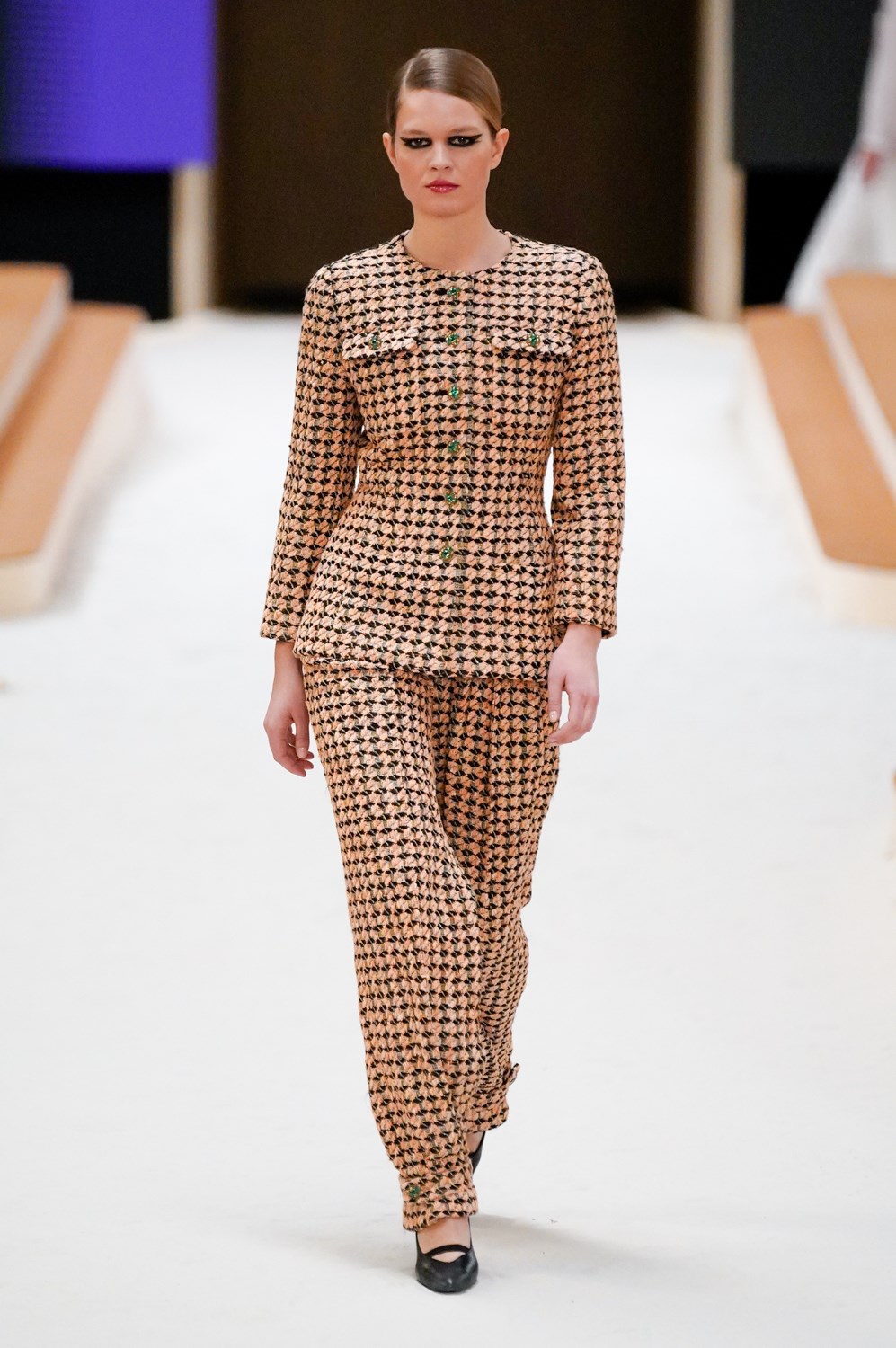
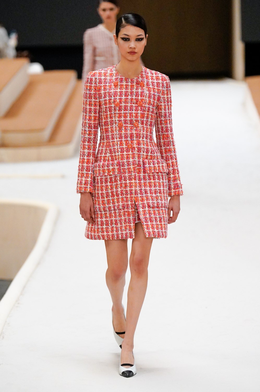
The designer’s signature tweed jackets dominated the first half of the collection, the familiar silhouette of pinched waist and expanding hips being applied across a range of materials and colors, as well as to dresses.
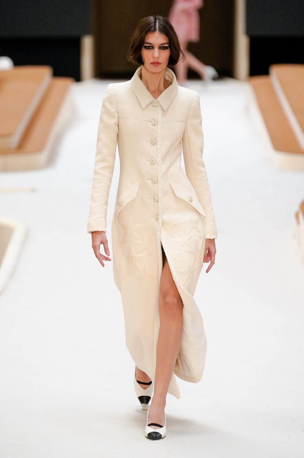
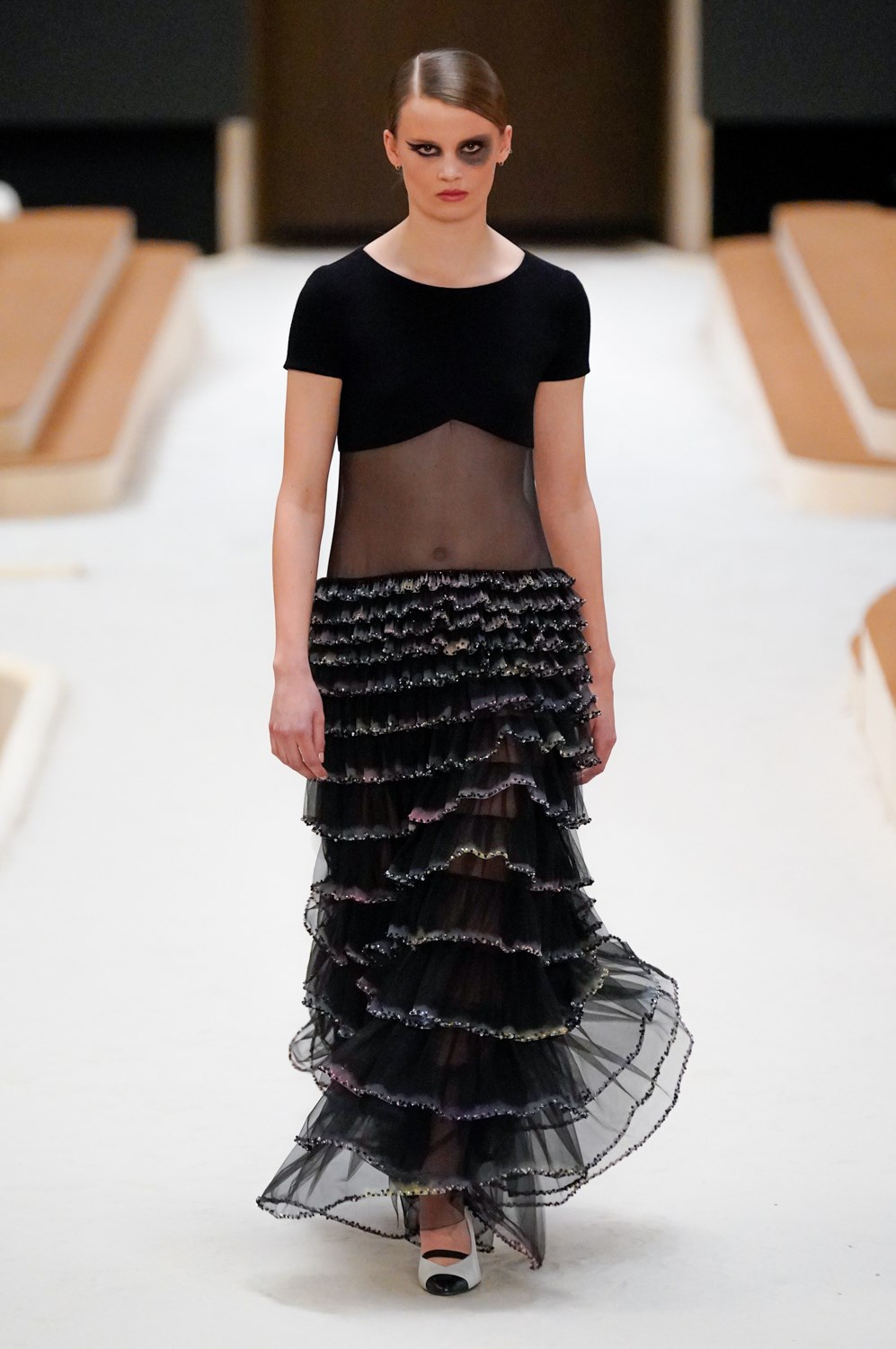
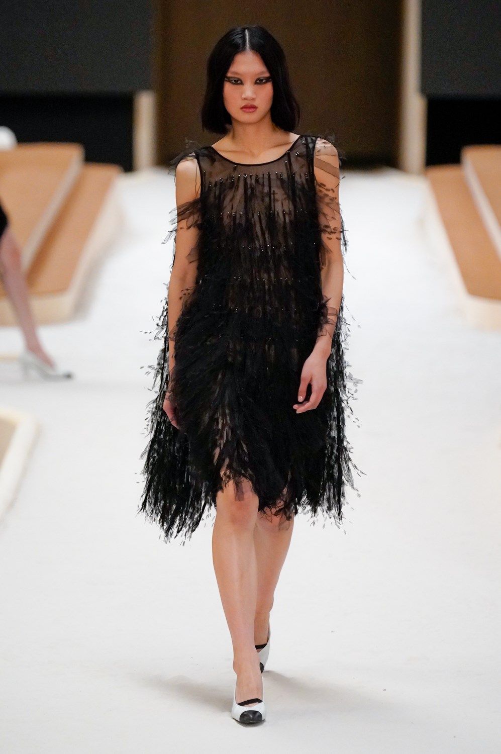
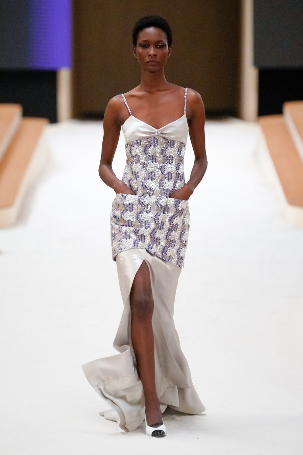
The second half of the show saw Viard elongate the silhouette and render it more fluid, focusing on different possibilities of construction with each dress and combining solid fabrics with sheer. She works with tiers and layers, creating spatial interplays that allow for many opportunities for the mètiers d’art to show off their skill.
Chanel has a richer design alphabet than any other house in fashion: everything from the iconic “CC” logo and typeface to the shape of perfume bottles and the number 5. Viard seems to be missing out on an opportunity to push this lush visual history into realms that are far more playful and new than the prim 40’s charm that still pervades her collections. This show saw her begin to flirt with new aesthetic codes, but they could have been pushed so much farther, as well as more thoughtfully incorporated in the brand’s history.
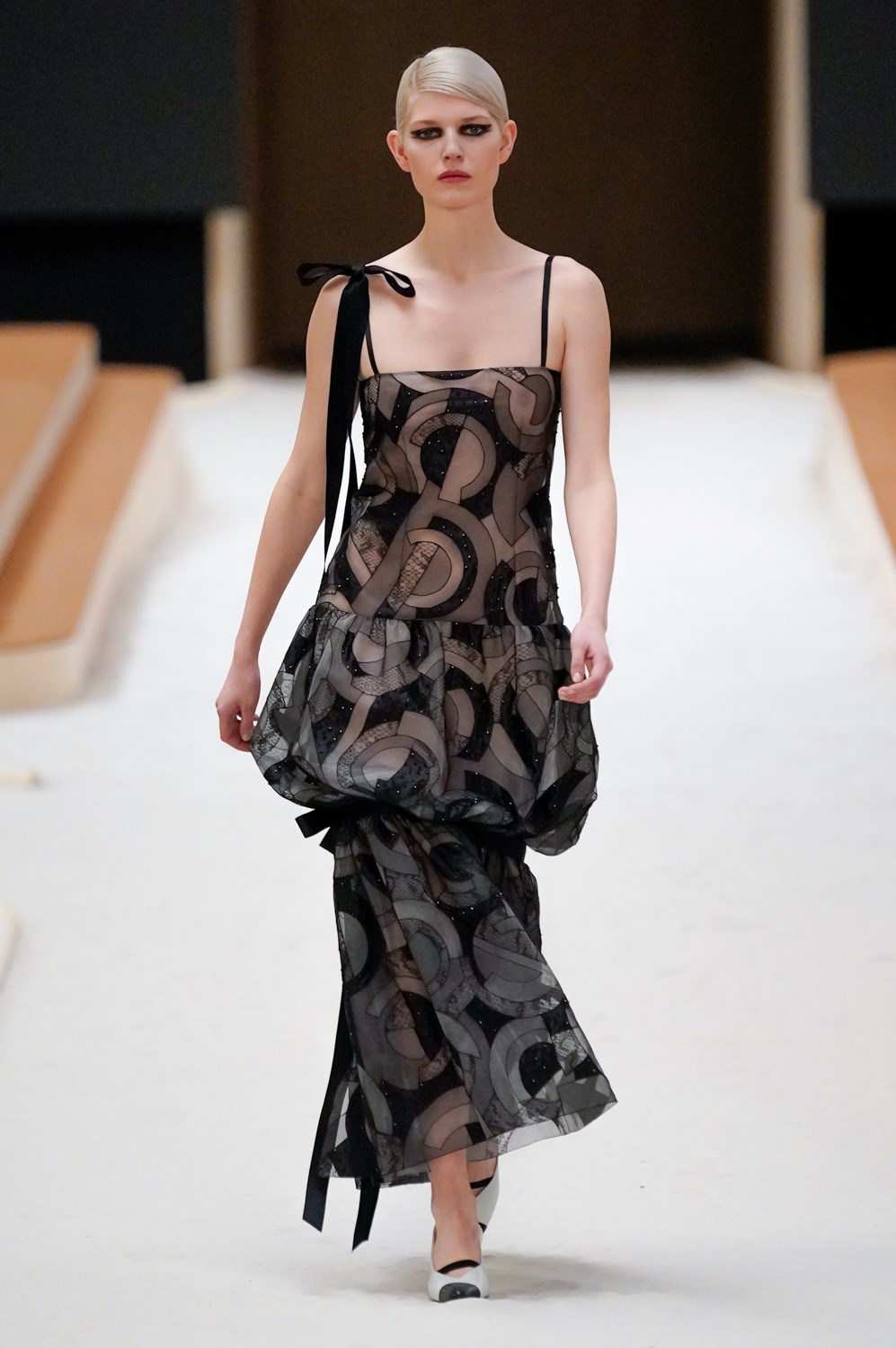
The only hint of the designer’s interest in constructivism and Bauhaus peeks out in an interlocking circle motif that appears explicitly on just one piece. “
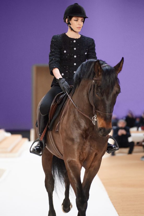
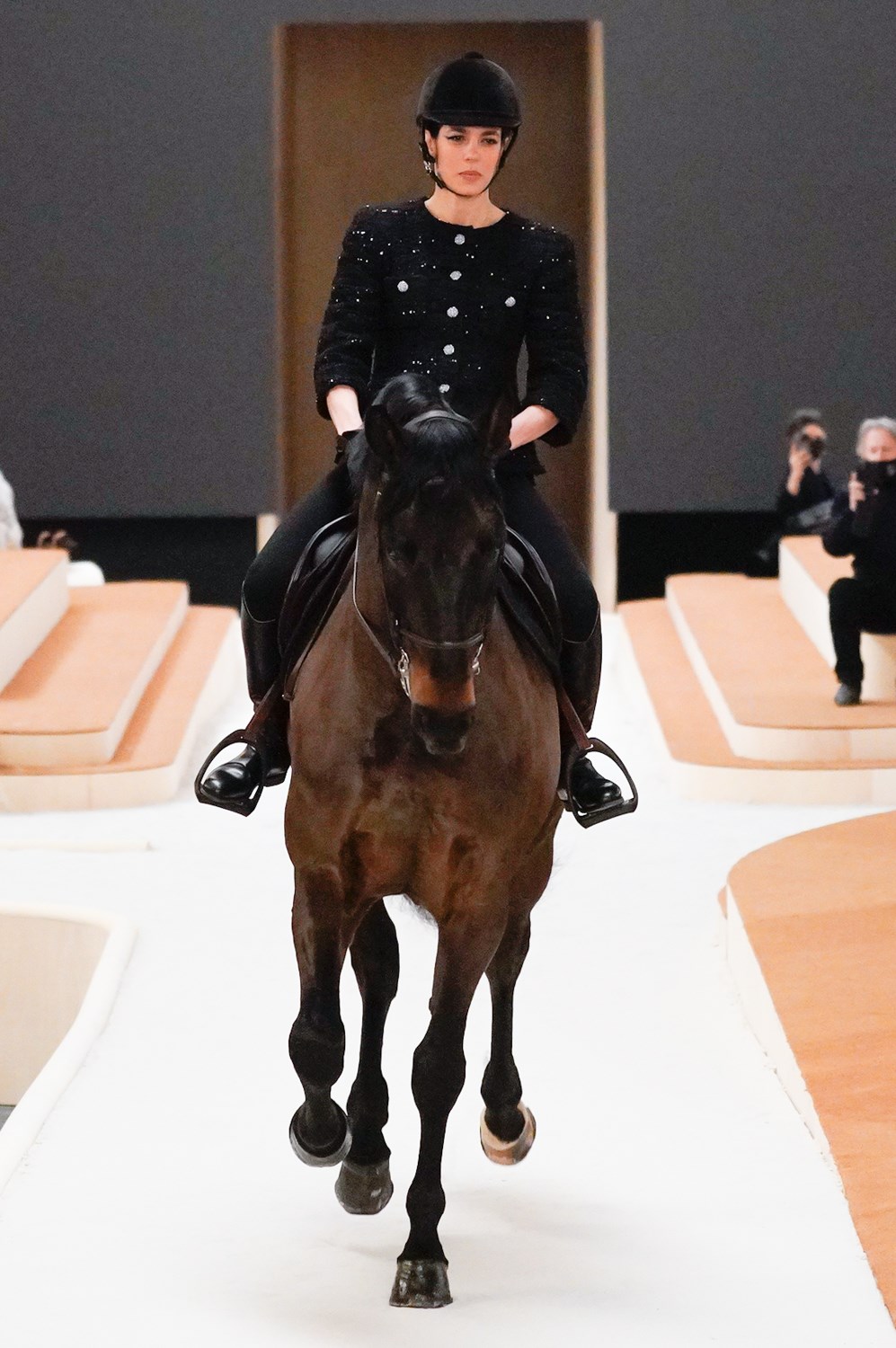
It’s a strong design, which makes it feel all the more disappointing that Viard doesn’t seem interested in pushing her work forward conceptually. She briefly borrows the design language of artistic movements that came at crucial inflection points in social history, but seems uninterested in saying anything with them. Referencing Karl Lagerfeld’s ahead-of-its-time thinking for the house, she creates an artful and interesting set design, then in a retrograde – albeit interesting – show of elitism sends a horse through it (the first look rode in on horseback) and stops there.
Not only has she been pushing out the same vision for the house for many seasons, but also, despite their apparent target audience, most of the pieces don’t feel youthful. That young models are wearing them feels more like a juxtaposition, in extreme cases pointing out that these jackets feel quite a bit older than they ought or need to. Not that the elderly or their clothes are at all bad things (some more mature models would have actually made a stronger statement), but it feels cynical and unimaginative to push bygone design codes again on a younger generation who doesn’t have that sort of nostalgia.
There is undeniably excellent craftsmanship to this clothing, but we’re still waiting to see the reason why it should exist today.
