In an era of revolutions within society and technology, how important is the messaging of color and its application to Brand Identity?
By Lizzy Bowring
Color plays a vital role in the world in which we live, and it can influence not only our thought processes but stimulate emotions. The challenge for brands is to understand the importance of color and how to apply its significance and when to select the most appropriate time.
First, it is necessary to understand the psychology of color. According to Swiss psychologist Carl Jung, “Colors are the mother tongue of the subconscious.” A staple element of design, colors evoke emotions and states of mind and are a powerful marketing tool to frame the viewer’s mood.
The psychology of color is associated with the emotional component of human experience; they are not at the level of culture and tradition but are at the automatic and biological levels. Color affects the nervous system depending on the different wavelengths that compose them. The warmer colors, such as reds and yellows, have longer wavelengths. Once transmitted from the eyes to the brain, the energy required to process them is more significant—the corresponding increase in energy level and metabolic rate results in a state of excitement.
On the contrary, the shorter wavelengths of colder colors, such as blue, green, and purple, require a lower amount of energy for processing, resulting in a slowing of the metabolic rate and, therefore, a calming and relaxing effect. There is no denying that this psychology underscores the vital link between color and our emotions.
Colors have different meanings when considered within various cultures; make sure to consider the context. For example, in every culture, different colors mean different things. Red is a lucky color in China, and Yellow is the color of Royalty. In West Africa, Purple is a Royal color, and in Japan, White is associated with Death yet in Western culture, it is associated with Purity, freshness, and goodness.
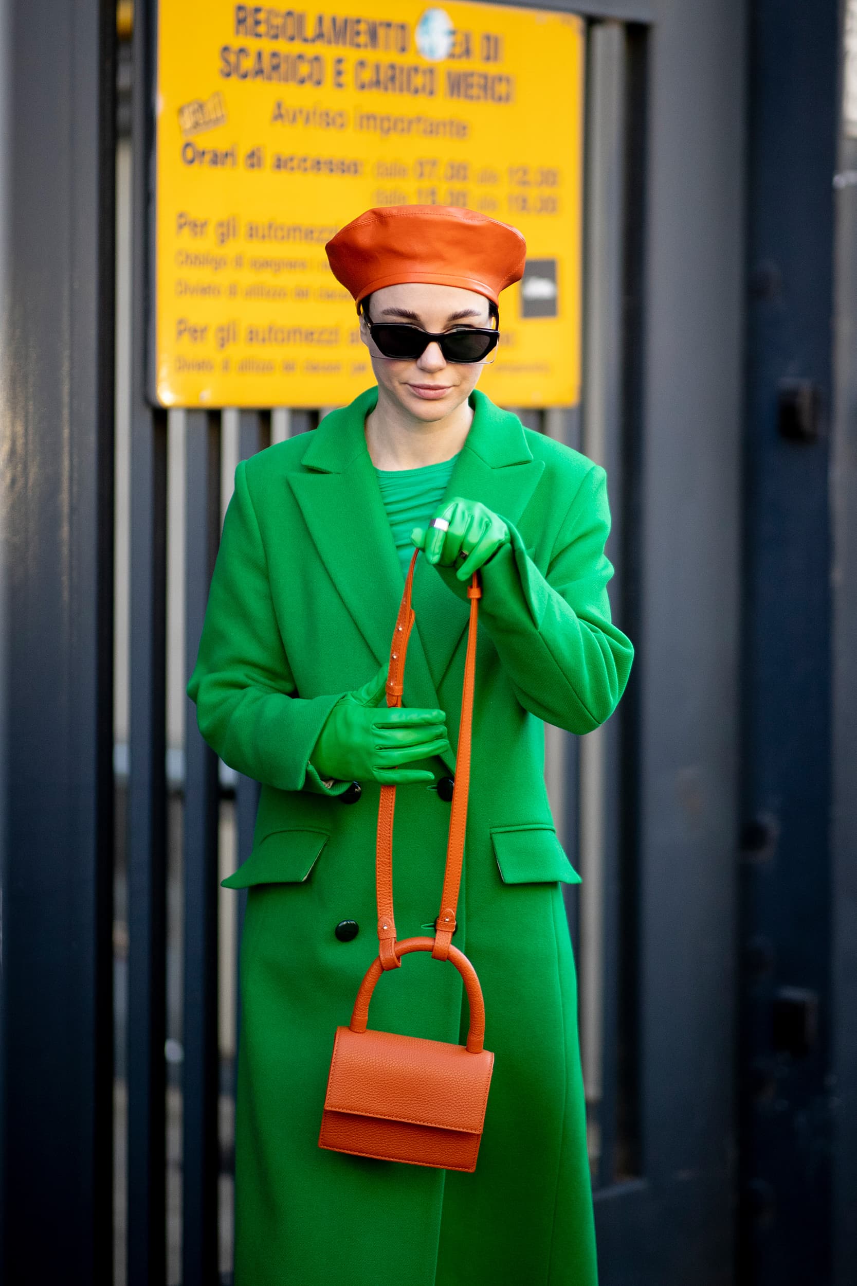
Trend cycles and changes are constantly accelerating, so how can we understand and analyze these changes that are brand-appropriate and, at the same time, meet consumers’ expectations and aspirations? Color proposes a brand’s credibility. It is incredibly overwhelming to be presented with a plethora of colour in one season. It is essential to understand how to select the most appropriate and engaging colours that will appeal to not only your audience but also will capture the brands identity.
Action points
Synthesize with global messages
Anticipating the most appropriate colors for a business is to understand critical global aesthetics; this will assist in synthesizing creative concepts with essential signals to make the most suitable choices for a brand.
Select colors that are Brand-specific
A brand must visually and chromatically express the universe of reality it represents, both in terms of emotions and value, crystallizing its distinctive traits and constituting imagery that excites and ignites consumers’ expectations.
Create an enduring color strategy
Longevity is fundamental to the future of any business! The choice of color that stands the test of time is a conduit for the lifecycle of a brand.

Colour is a key tool for communication, you just have to look at the basics of colour psychology and you will see how certain hues connect human emotion”
– Jane Boddy, Creative Contributor, Pantone
Synthesize with Global messages
This subject is highly relevant and particularly more so now than ever before. As we examine the changes in society, technology and the environment, understanding human sentiment will assist in comprehending the direction of change. If one looks at the emotional roller coaster experienced over the last two years, consumers have sought to balance their anxiety with nurturing comfort and optimism. As a direct result, we have seen an acceleration in the popularity of soothing neutrals and clean, bright, chromatic colors.
The initial ‘work from home’ aesthetic from 2020 to 2021 saw the rise in these neutral color spectrums, offering a palette of calming hues for both apparel and home. However, as we emerge from the pandemic, consumers turn to an unleashed energetic optimism; this has given rise to a highly saturated color palette of Dopamine brights—shades of pink, including HyperPink, yellow, and bright blue have increased YOY. And while we say that these color palettes take precedence,
Black is not removed from the equation due to its enduring and classic appeal, it is always there”.
–Jane Boddy
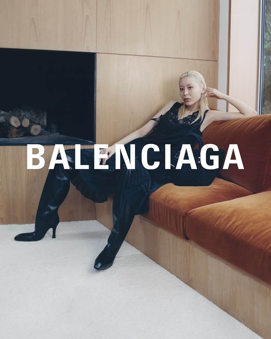
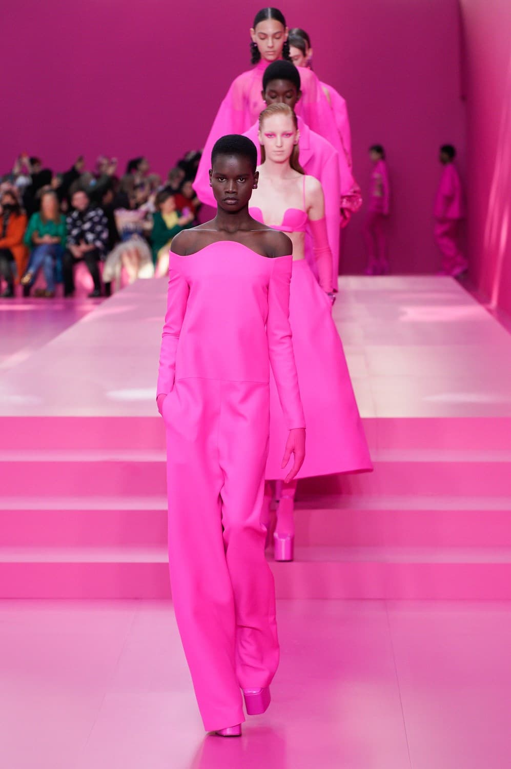
This last season, several luxury brands focused on color to make a statement with head-to-toe usage. At Balenciaga, we witnessed silhouettes explicitly offered in apocalyptic black. The original message was to convey the state of climate change, but it turned into something a little more restrained—Black, grey and brown. Valentino, nevertheless, went PINK. Everything is drenched in pink – the designer promoting love. “Our thoughts go to those suffering. We see you, we feel you, and we love you. Because love is the answer, always.” Pierpaolo Piccioli. But the shade also represents passion and confidence. The hue, dubbed “Valentino Pink PP,” was developed by Piccioli, in conjunction with Pantone; this is very different to the original use of red used by Valentino Garavani. These two brands contextualised how specific colors are used to communicate and reflect current pressing cultural events.
Being in tune and listening to the signals from our world, allows brands to tell poignant and relevant stories of experiences and messages”.
Select Colours that are brand-specific
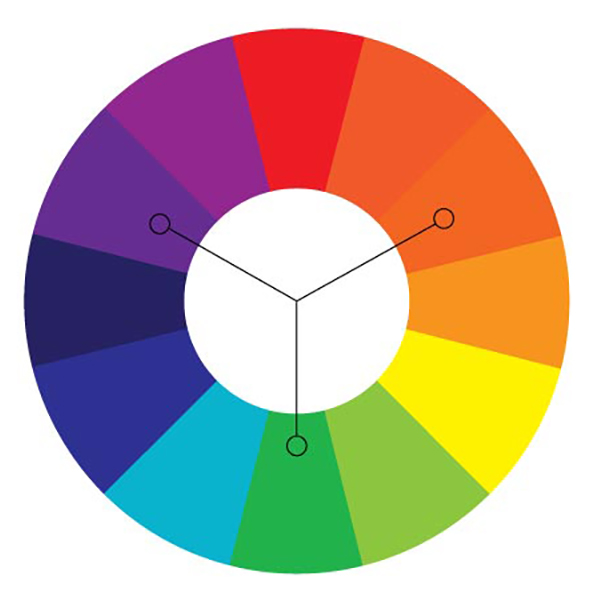
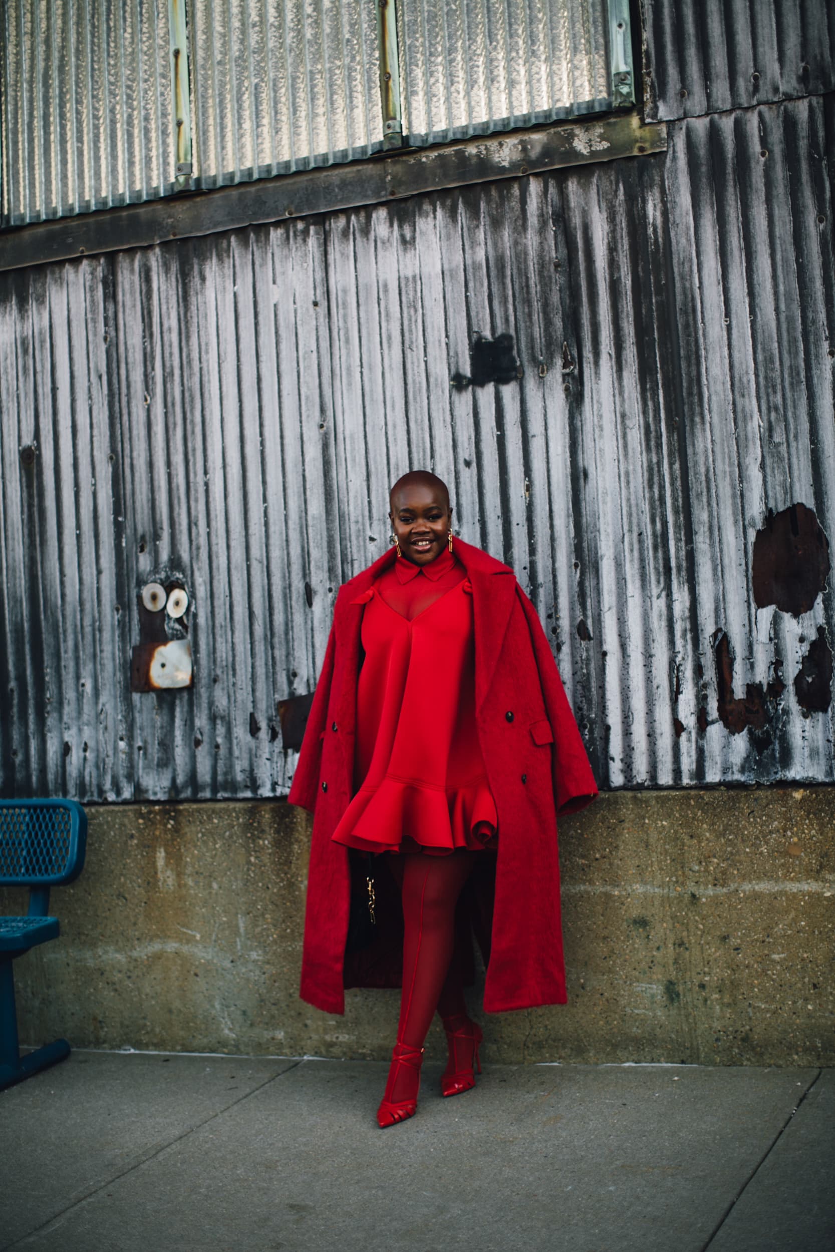
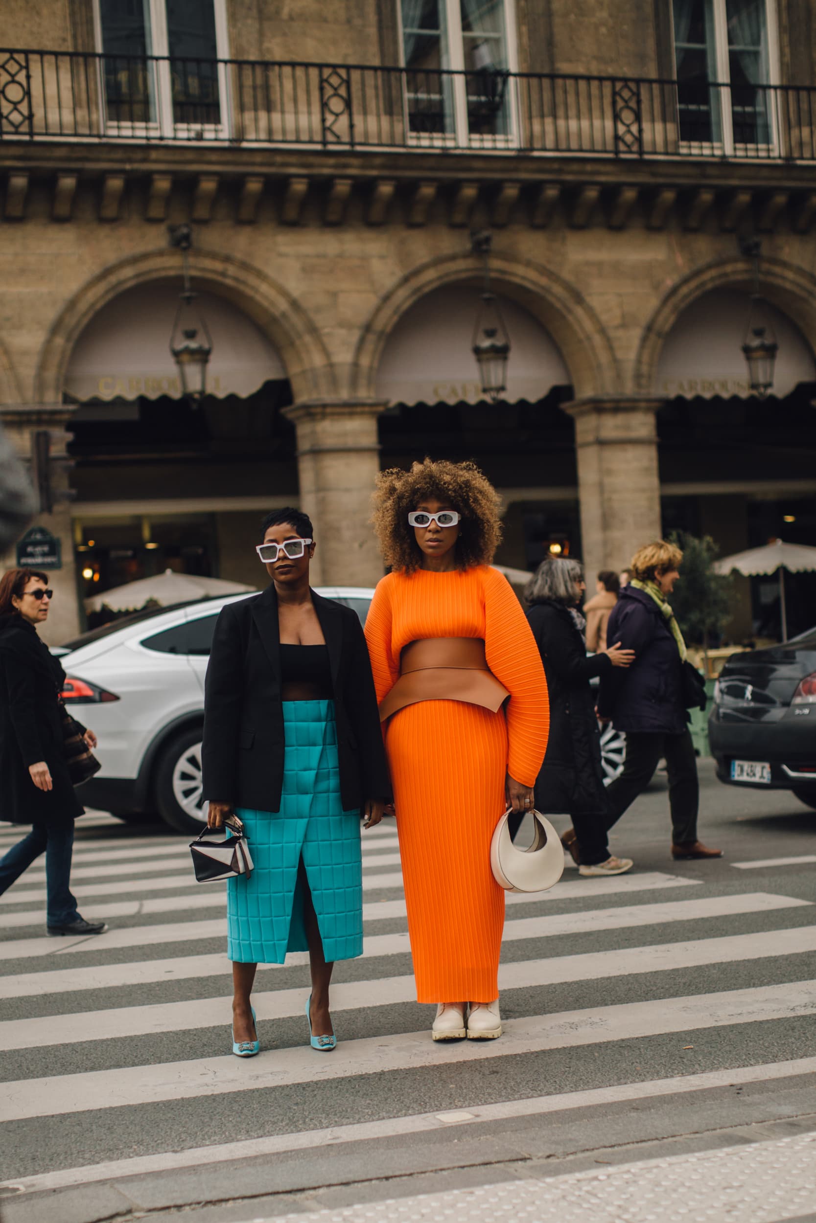
Creating something memorable and that one can immediately identify with the brand is crucial for business success. A vast majority of the top brands have only one or two core brand colors. Research in branding suggests that consumers prefer color schemes with very similar colors. So another way to go is to riff on your core brand color by adding a few related colors. These analogous color schemes also become a breeze for designers to work with, and from there, adding contrasting accent colors will complement the use of a primary one. More often than not, choosing similar color schemes is often harmonious. Monochromatic color schemes can be a strong way forward with the uptick of enhancing the core color. On the other hand, contrasting color schemes will cause your core colors to pop, providing a fun and modern appeal.
So these are usually the steps to follow in selecting color for branding:
— Identify your brand personality
— Pick a core brand color based on your brand personality traits
— formula: 1 core brand color plus a few neutral shades
— formula: 1 core brand color plus 1-2 analogous colors
— formula: 1 core brand color plus a contrasting accent color
— formula: 1 core brand color plus 3-5 equally bright colors
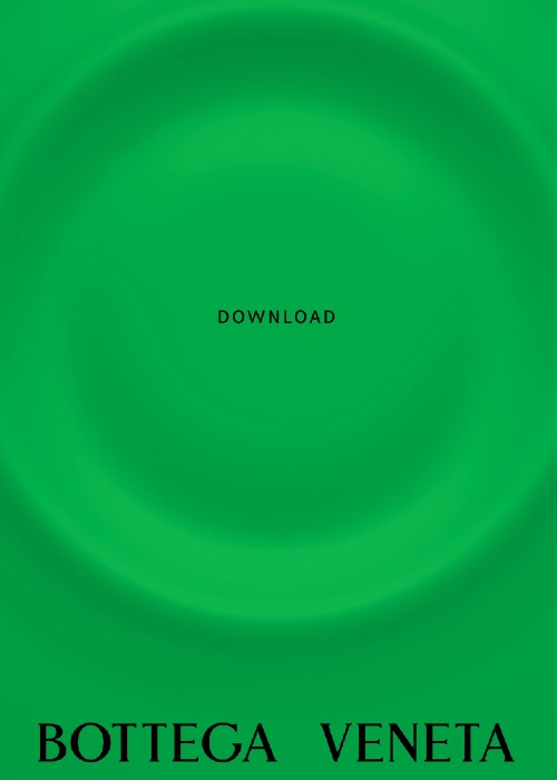
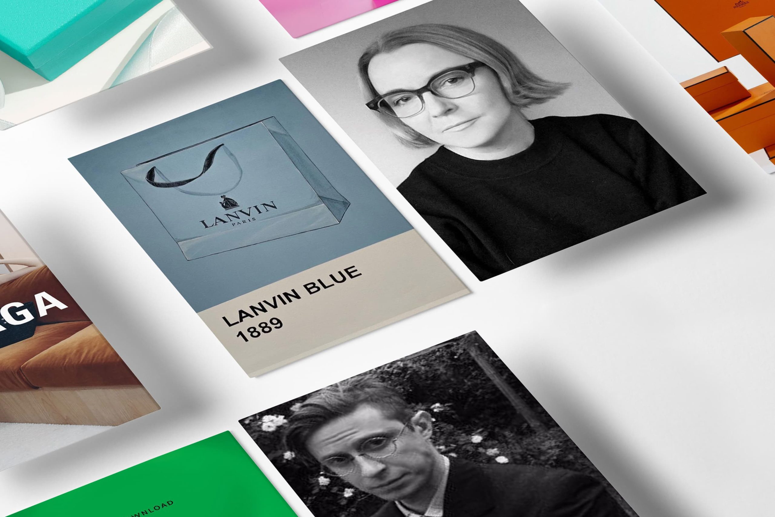
Specific colors for a brand can act as instant recognition to consumers, particularly on social media platforms. They can increase brand awareness, replace logos, and prove to be valuable tools as fashion moves toward the Metaverse. Heritage brands that make the most out of their colors and are instantly recognizable find that the original choice of color stands the test of time. A/W 2022 saw Bottega Veneta‘s logo appear as merely a square of green, seen on marketing boards and covering the windows of the Palazzo san Fedele, a late 19th-century building in the heart of Milan. This green had been used for some time but came alive in Spring 2021 when it became known as Bottega Green. The green billboards were interactive with the Bottega Veneta app allowing viewers to see images from the latest campaign – a great marketing ploy!
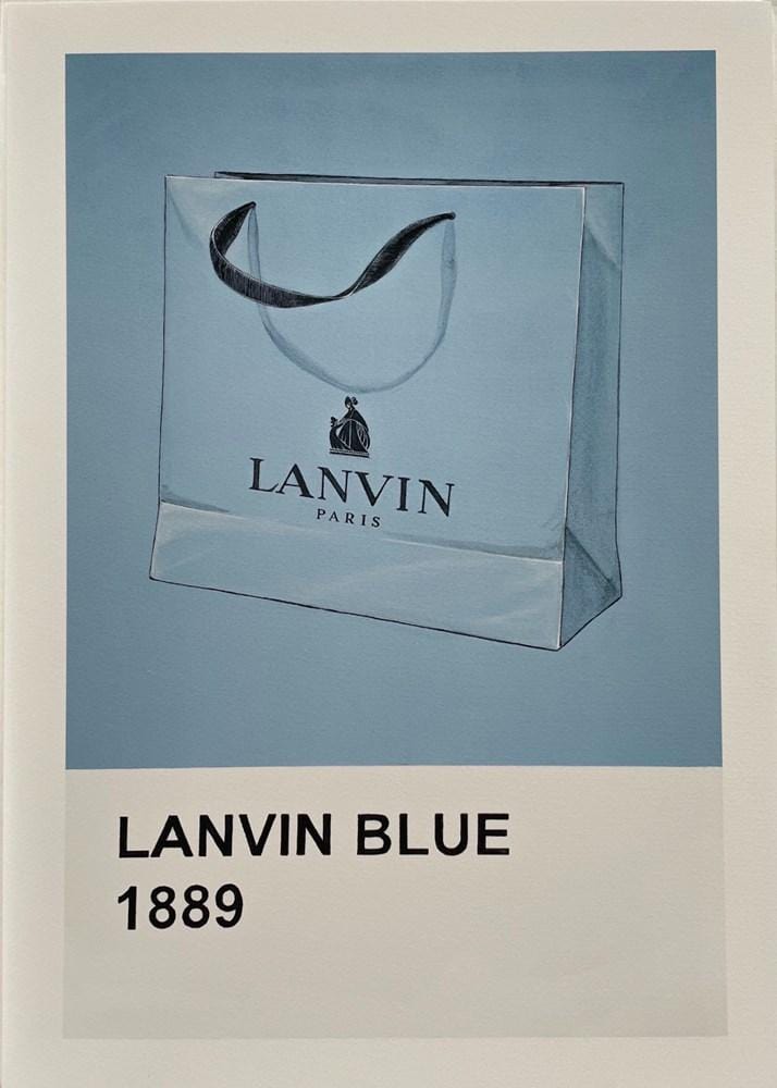
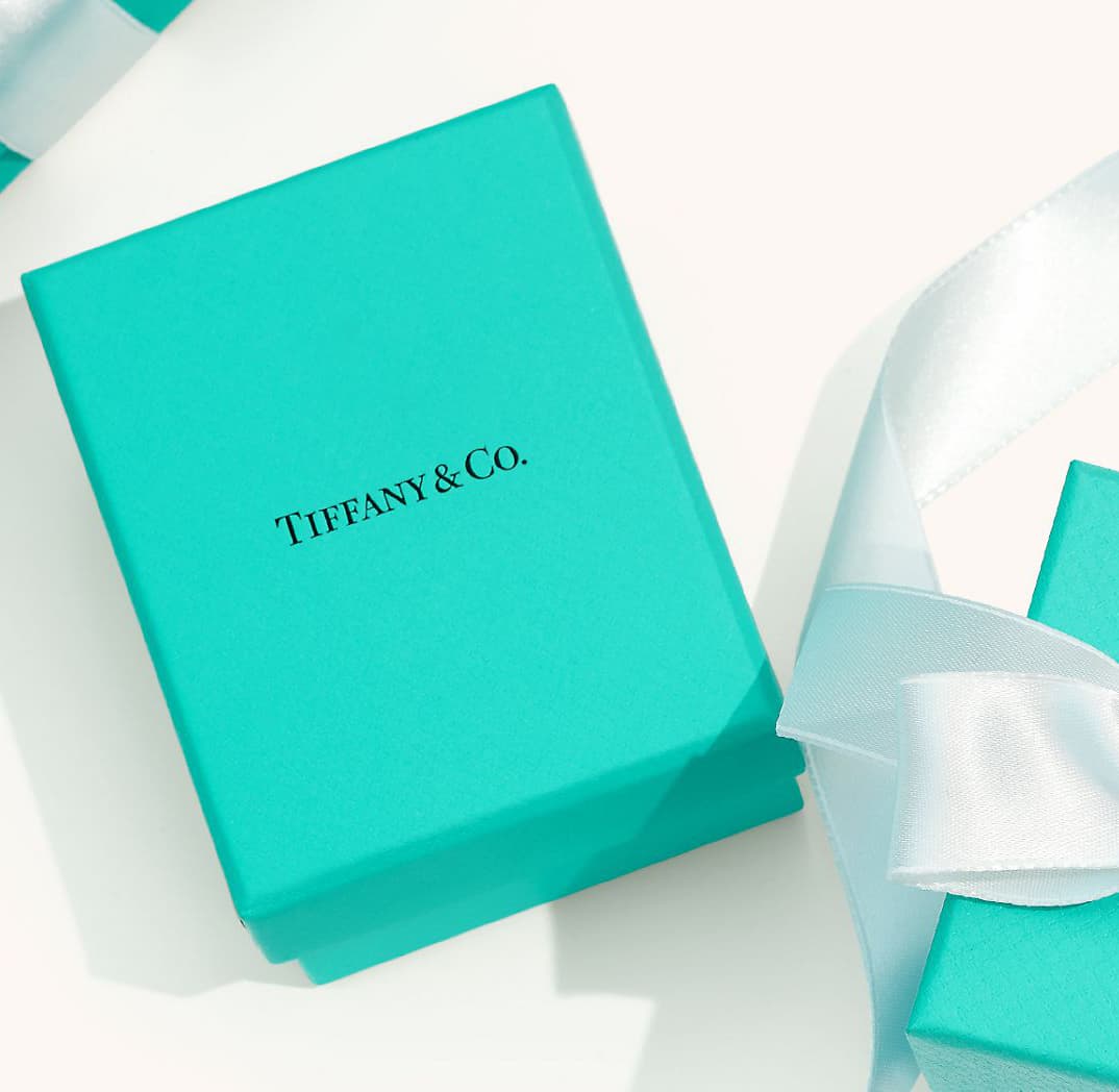
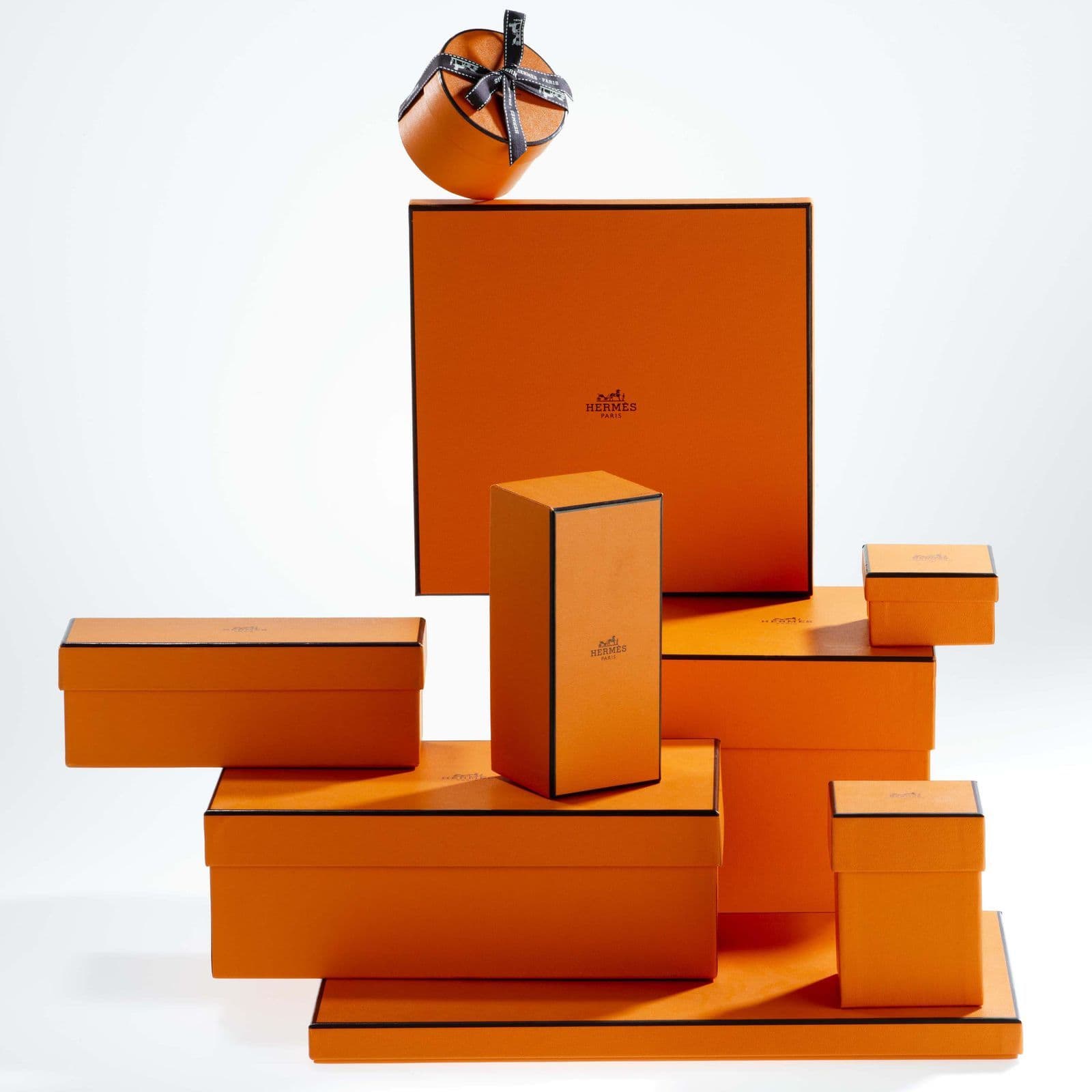
As every Lanvin shoe lover will know, boxes are drenched in a particular shade of blue; this is known as “Lanvin blue.” The color could not be reproduced and therefore was never subjected to reproduction. And then there is Hermes with its warm orange box, first born out of necessity in the Nazi-occupied Paris of the 1940s as the cardboard maker only had orange paper left: thus what was once a standby became Hermès’s signature. At the same time, at Tiffany’s, the Tiffany Blue is the name for the light-medium robin egg blue color associated with Tiffany & Co. created in 1837. The hue of Christian Dior‘s identity, (which was derived from Dior’s childhood home) Trianon gray, sometimes known as Montaigne gray, is an important part of the brand’s identity. The meteoric rise and use of Digital media allows brands to advertise quickly, their colors and brand persona.
On the flip side, the question arises what if a new creative director insists on altering the established brand color? Of course, there will be push back, but as at Burberry with Tisci’s rif on the signature pattern, eventually, both brand and consumer will embrace the house’s evolving identity.
Create an enduring color strategy
Considering a timeless aesthetic as a critical component will be a crucial driver. Make your colour choices fit for future seasons.
Color is intimately connected to making the most desirable aesthetic choices. But in today’s formidable context, we are increasingly being put to the task of finding solutions that will endure the test of time. Notwithstanding, color currently is characterized by two ideas, the idea of nurturing nature and the idea of energetic optimism. Now, how can we benefit from both of these nuances within a timeless framework?
Let’s look at nature, where sustainability and wellness are key trend drivers. The choice of appropriate neutral or bright colors will be determined by how resourceful, regenerative and responsible the brand might be or if your customer is adventurous or cautious. Long-lasting natural hues, including white and black, will remain essential. These natural hues directly connect to and reflect the need for soothing hues. The most pressing issue of sustainability will see the rise of natural plant-based dyes in warm natural hues – this will also affect the use of bright white as raw and non-bleached whites will become the basis of most seasonal palettes.


On the other hand, brights, or Dopamine colours, have been popular for some time and will continue on an upward trajectory due to the continuing mood of optimism! If we continue on this positive trajectory, these colours will go beyond transeasonal and, for the most part, have a duality of purpose; the interaction with the digital world will also underscore a color spectrum of intense, saturated or digital acidic shades. One has to visit the recent exhibition Future Shock, which “transforms 180 Studios’ subterranean spaces through mesmerising and immersive digital technology, to absorb the wonder of these digital colours.

“Fashion has a great communication power, but this power is strongly linked to contemporaneity. To be relevant, you should be aware of and witness the world around you. Evolution is a fundamental part of what I like about fashion so to re-signify is a natural attitude to the future. Re-signify means to look at what you know through a new lens. Inspiration needs to be directed and worked with a different approach. Re-signification is my own personal work process by which the signs of today create the foundation of what can become the signs of tomorrow.” said Pierpaolo Piccioli.

Colour represents one of the most powerful tools we can use to hit our target on an emotional and aspirational level.”
– Gabriele Moschin, Creative Director at SIGNOR Studio
Color is transformative. Used in the right way, it is the essential tool for not only representing Brand persona but is integral in connecting to human emotions and experiences.