JW Anderson Prescribes Real Sleep As His Remedy for Life in 2024
Review of JW Anderson Spring 2025 Fashion Show
By Angela Baidoo
THE COLLECTION
THE VIBE
THE THEME
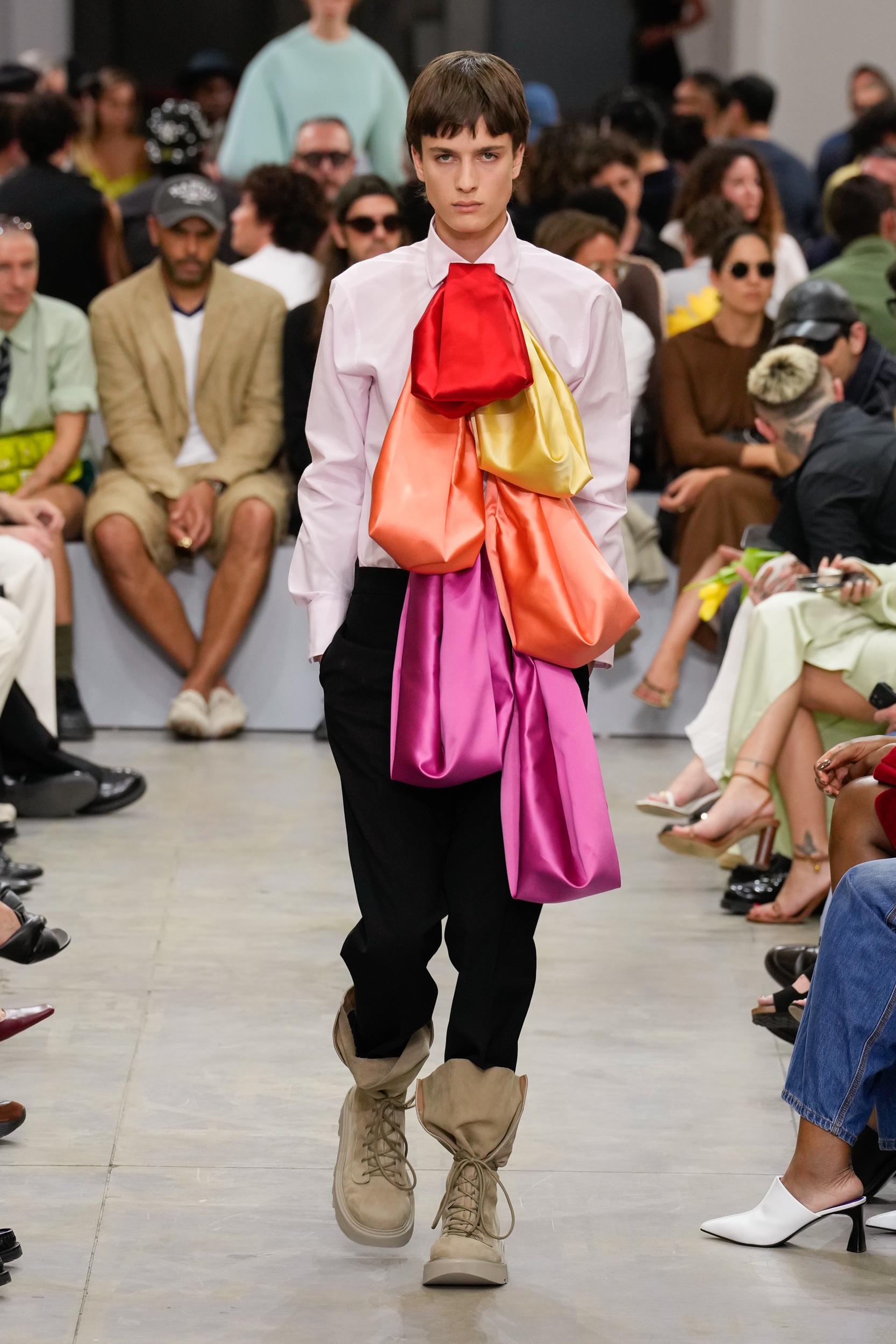
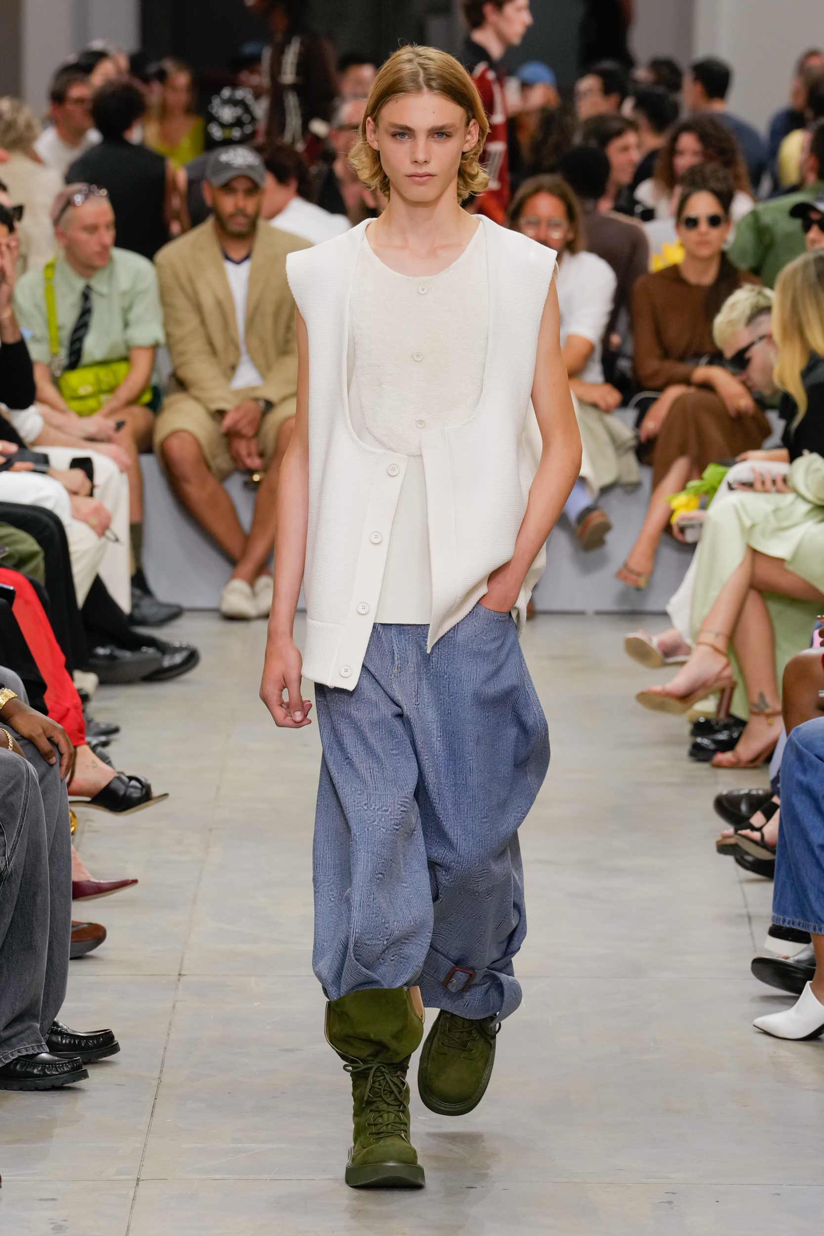
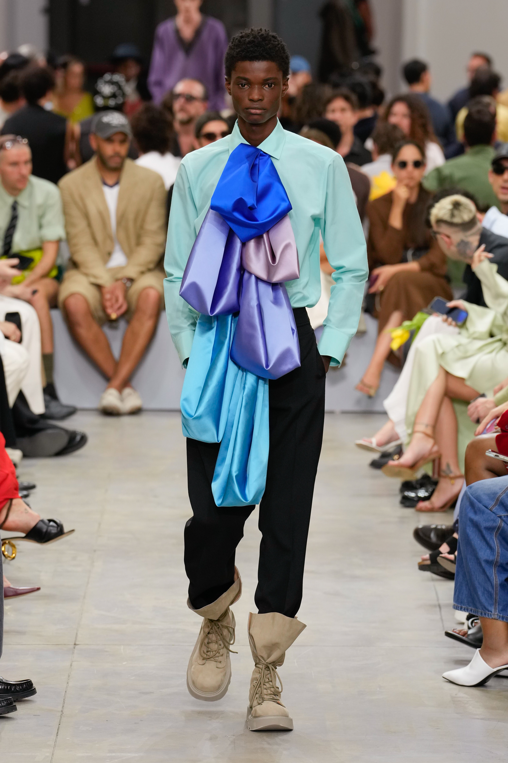
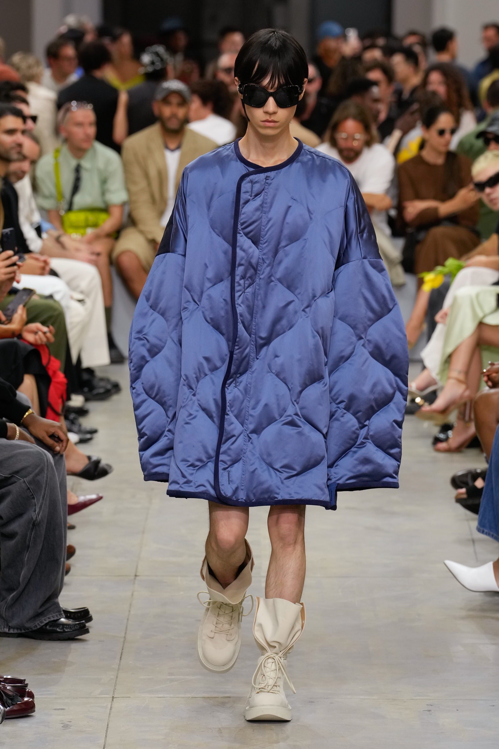
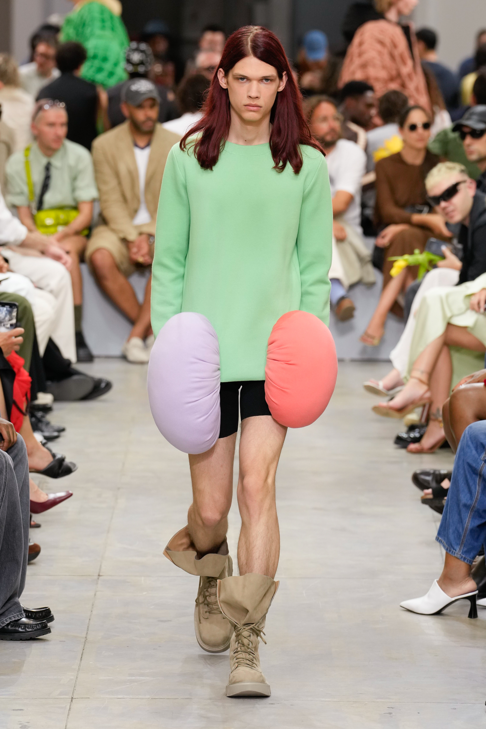
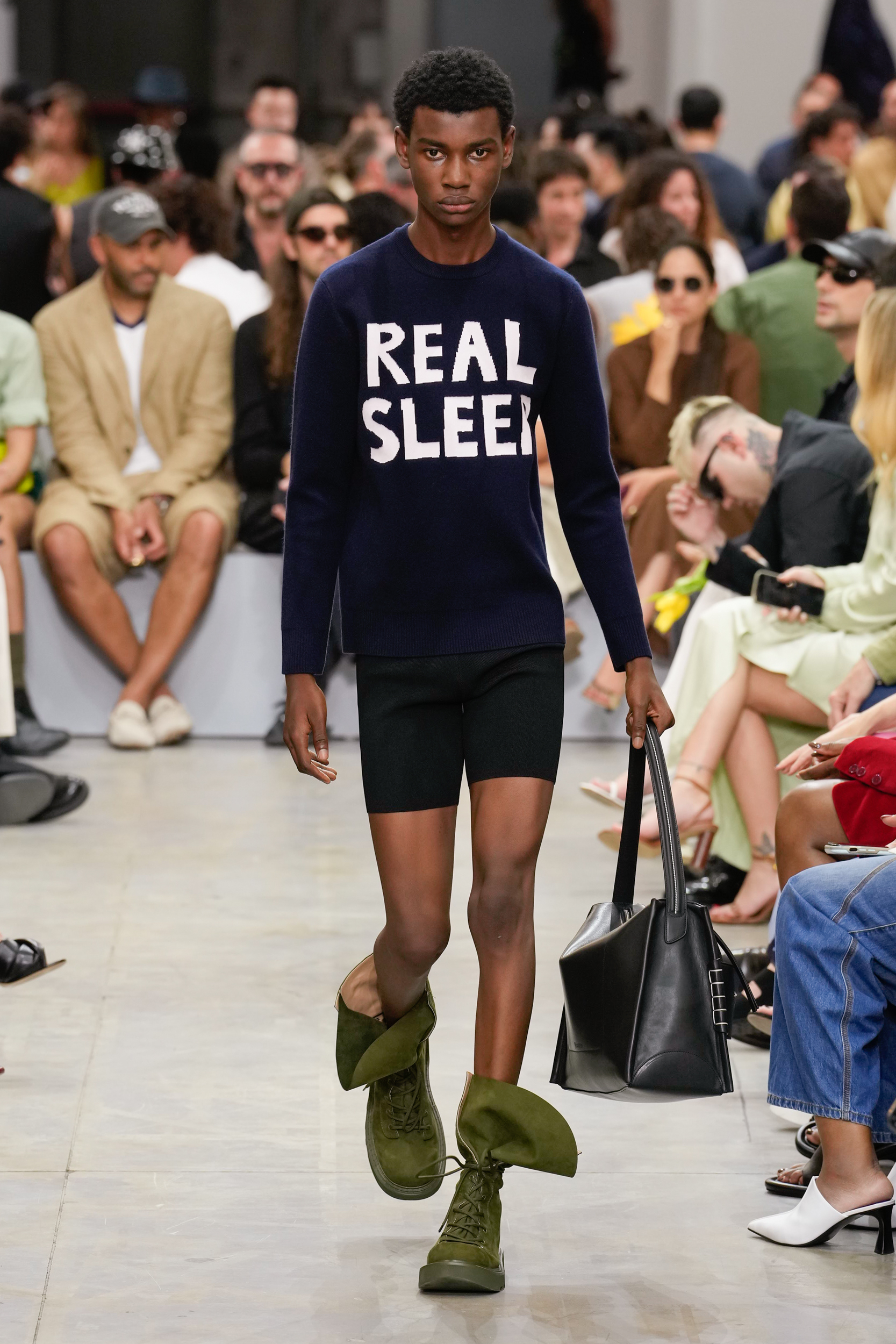
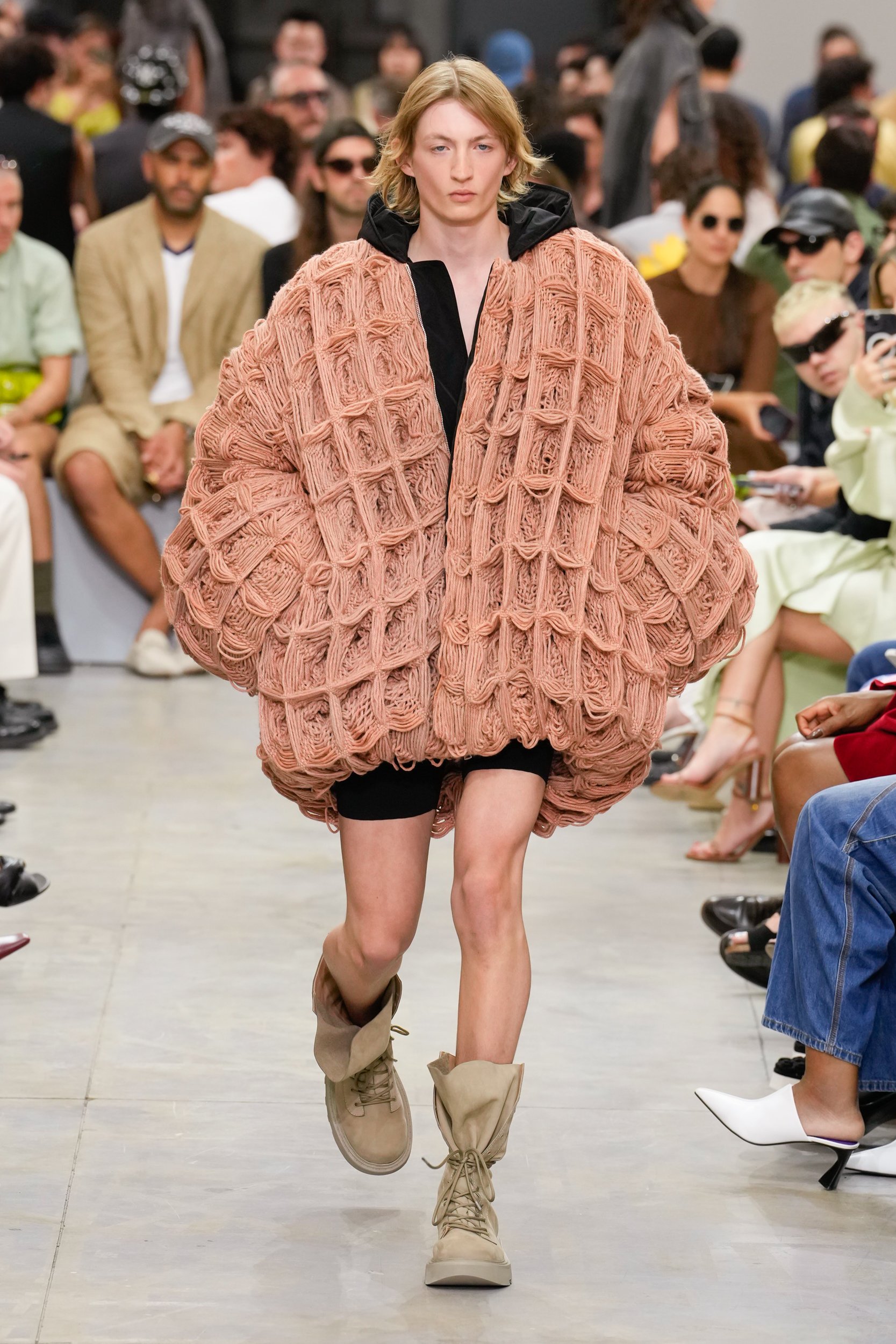
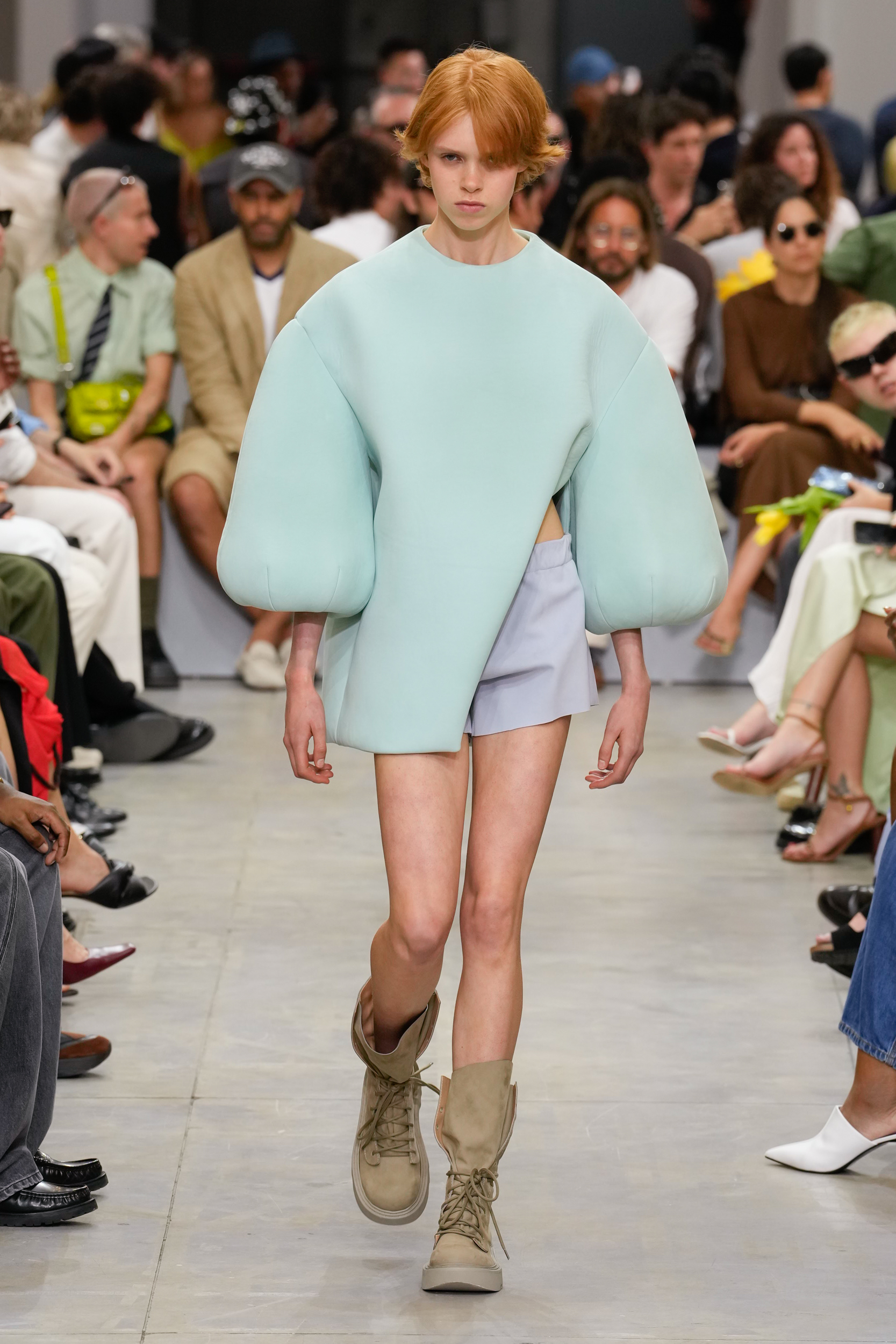
Jonathan Anderson’s answer to life right now is that we all need more ‘Real Sleep’, and never a truer sentiment was said. For spring 2025 the designer is tackling a very real-world problem of insomnia, doom-scrolling, and anxiety-induced sleepless nights caused by simply try to live in the world in 2024. His full manifesto said “Close your eyes. Inhale. Exhale. Accomplish a state of sleep. Real sleep.” And it’s in this state where we can imagine wearing the bulbous forms and squashy shapes-cum-silhouettes that had been dreamed up for todays collection. Opening with a duvet-style jacket which beckoned you to lie down and wrap yourself in, the collection followed in the same vein. Pillow-like forms in pop brights were affixed to longline tops ready to transform and be on-hand for nap-time, and spongey sweatshirts with sleeves that mushroomed from the shoulder mimicked a modern-day cocoon that the wearer could escape inside when life gets too much, which the designer elaborated on to The Impression backstage “I like this idea that these shapes are somehow like armour, as something protective” he said.
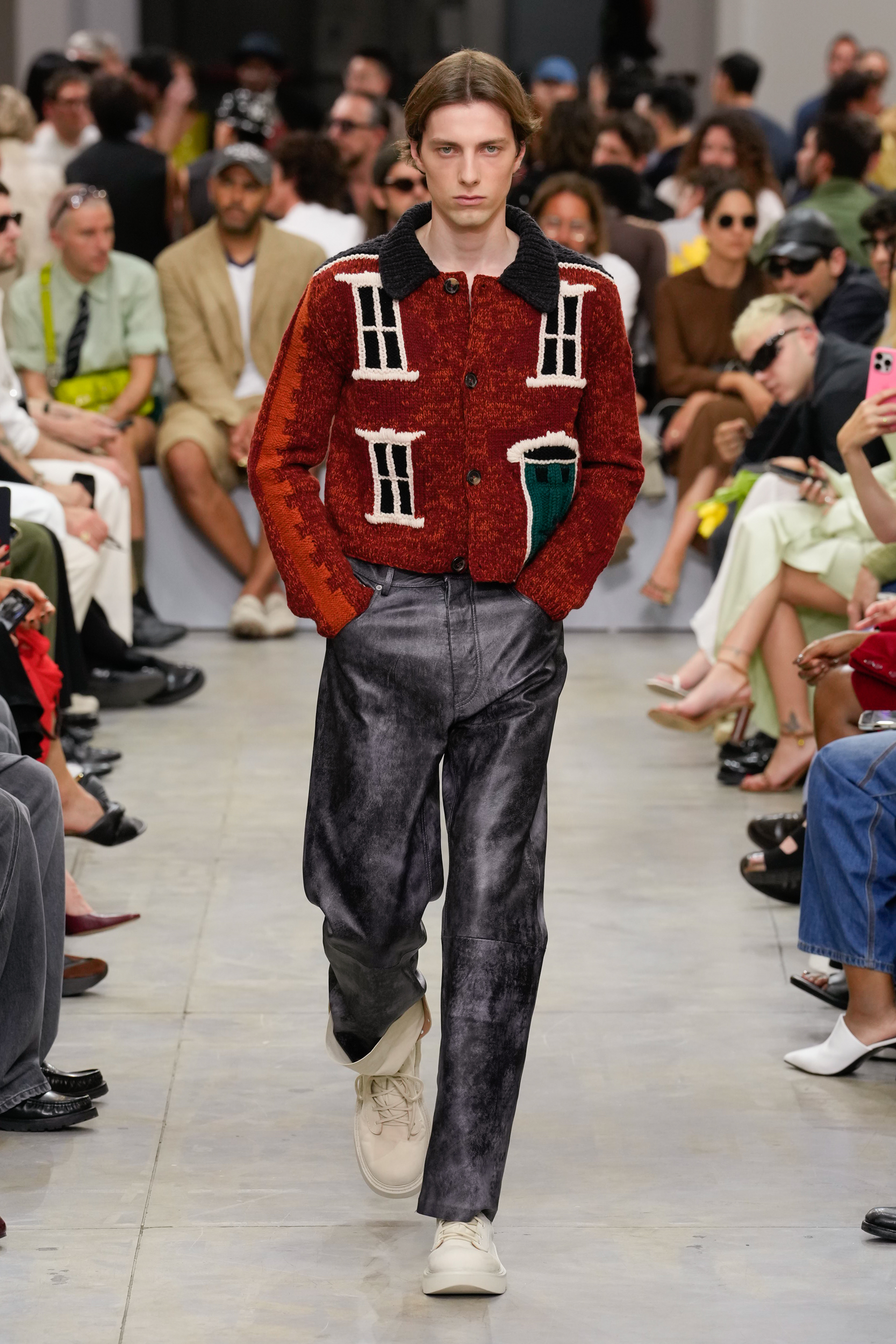
Womanhood, in all its forms, was a key theme of last seasons women’s shows, and in contrast the men’s season is looking back to boyhood, possibly as a way to make sense of the world and to return to a time before masculinity, and all its modern complications, came into play. The designer – like many others in Milan – picked up on this with a series of hand-crafted knitted sweaters and cardigans with classic British country-house motifs harking back to a time when the designer may very-well have inhabited, and worn a version of one, in his own childhood in the 1980s.
Each season we always get a quirky pop culture reference inserted into the collection. Last season it was a set of wig-style hats which took their inspiration from a classic British series set in the north called ‘Last of the Summer Wine’ for spring it was a more universal reference as Anderson revealed that his persistence had paid off as he had finally been grated permission to use the iconic Guinness brands graphics, of which he had been a fan of for years for their statement advertising from the 1920s to the 2000s, one of which featured a face in the foam of a perfectly pulled pint which was used for a knitted sweatshirt.
It was an ironic choice to select the infamous Irish stout, as it has been known in the past to be given to patients as ‘medicine’ to help with low iron levels – a side effect of which is sleepiness – so the very anti-thesis of the shows theme. But in saying get some “Real Sleep” in an industry where the very idea of getting 8 hours in, is more of a myth than reality, the designer has also thoughtfully given the world his antidote, and that’s to have a pint of Guinness. And if you required reminding you only have to wear one of his Intarsia knits which are sure to become brand collectibles, even outside the sphere of fashion.
THE BUZZWORDS
Real Sleep, Cocooning, Childhood

THE SHOWSTOPPER
Look #8
Taking the idea of blowing things up to the ultimate extreme, Anderson created a 3D knitted sphere which enveloped the model, and looked as if it was something fantastical that AI had created, but as this is a JW Anderson show, where craft is at the heart of the brand, it is more likely to be a handcrafted feat of his imagination.
THE DIRECTION
THE QUOTE
I liked the idea that the shapes were depicting being in-and-out of dream-like states, where there is also repetition, so we created looks in threes, and it falls into the idea of surrealism once again.
– Jonathan Anderson, creative director, JW Anderson
THE WRAP UP
Although a fun collection there was a serious undertone to how the designer came to develop his key themes, as he revealed backstage that he had been exploring the idea of therapy (something the industry should consider offering as part of its creative director package should it not want to see any more cases of burn-out) and sleeping tapes, and while he didn’t divulge as to whether he had resolved to utilise more of either, he channeled those thoughts into actions and gave us a solution in physical-form. Clothes which you could, at any point, lay down in and get the much-needed rest that we all know we are lacking.