How The Spring 2027 Season Found Comfort in Colour: From Soft-Serve Pastels and Retro-induced Tones to Digital Blues and Life-Affirming Greens
By Angela Baidoo
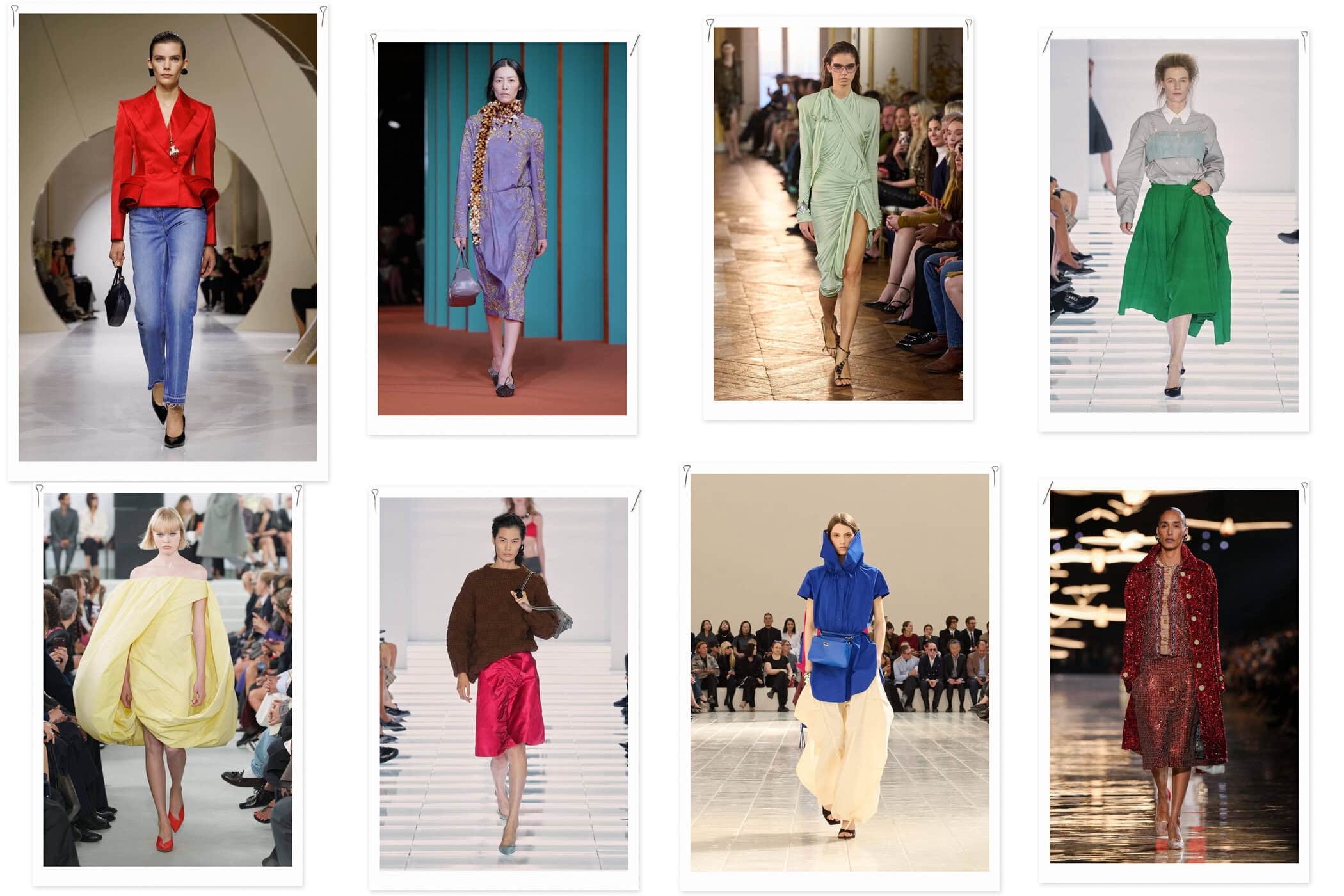
The Spring 2027 womenswear collections approached colour as both a source of comfort and a means of escape, balancing soft, sentimental shades with the kind of vibrant brights that could cut through an increasingly hard-edged world.
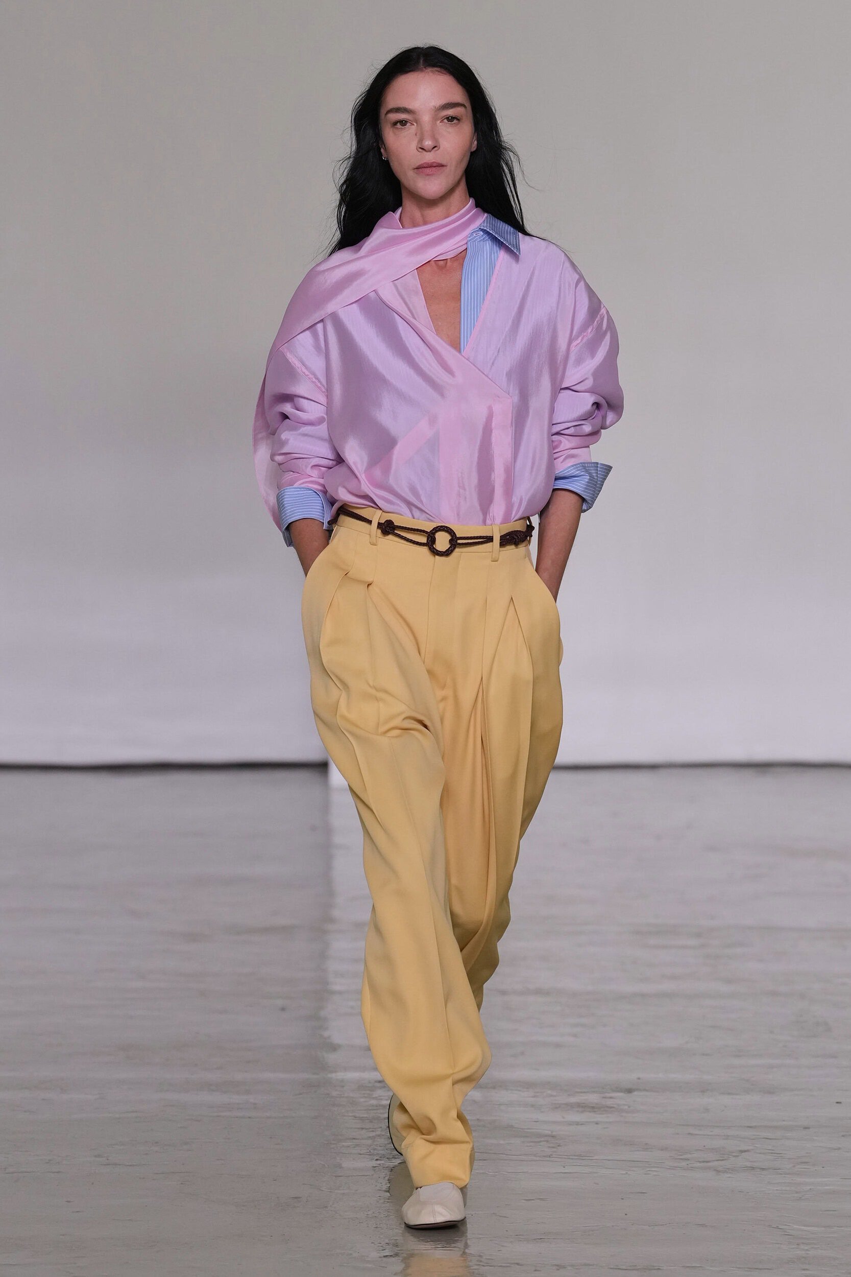
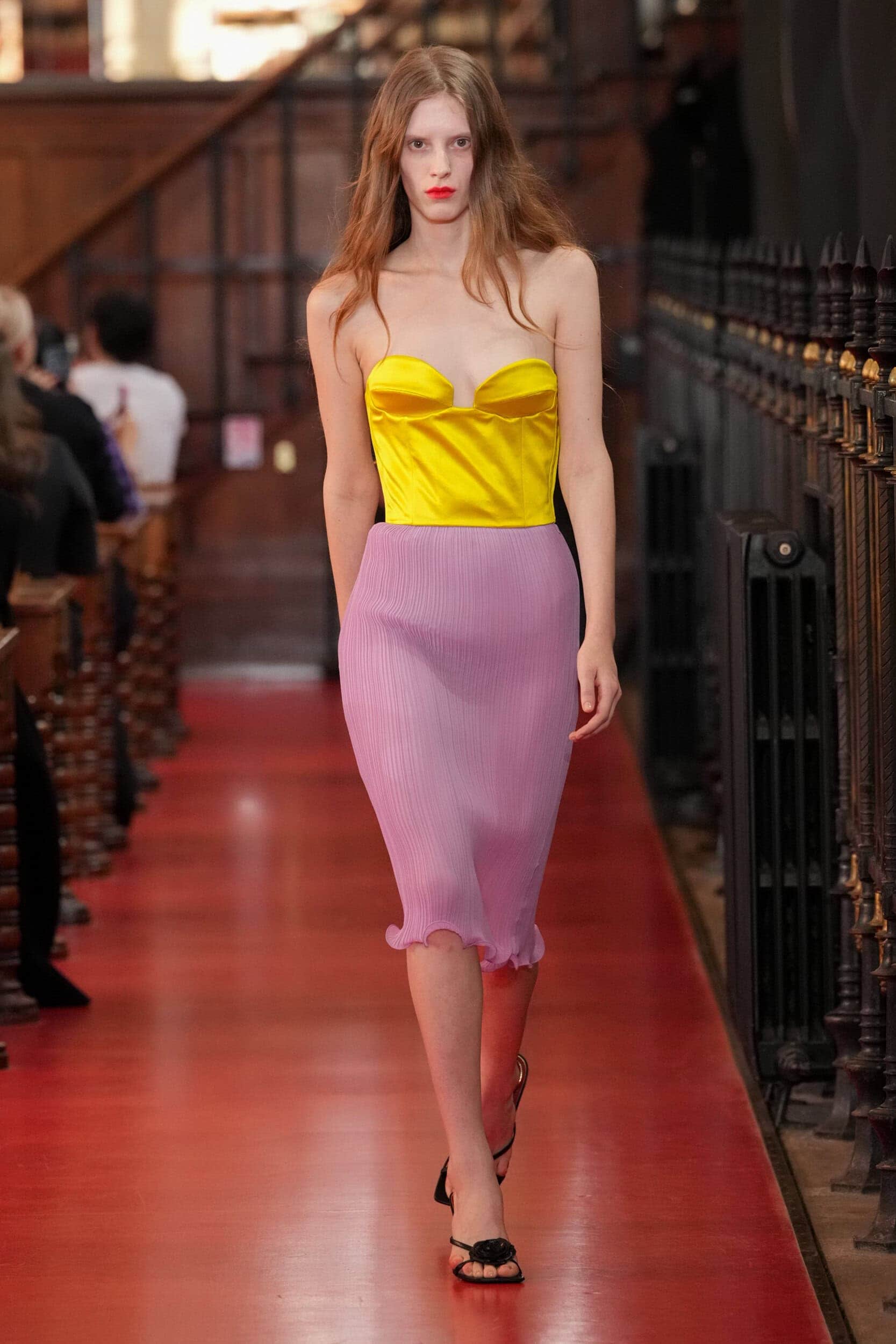
Across all four cities, designers used colour to alter the emotional resonance of their collections: lilac, butter yellow, baby blue and pink offered a soft landing, while cobalt, grassy green and electric rainbow shades injected a more energising sense of optimism onto the runway. At Bottega Veneta, Louise Trotter proposed lilac and butter as an unexpected new summer pairing for relaxed workwear, while McQueen and Jil Sander introduced lemon yellow to the drama of occasionwear. Elsewhere, cobalt – already identified by WGSN as a key colour for 2027 – moved between strength and femininity at Givenchy and Issey Miyake and something sportier at Miu Miu.
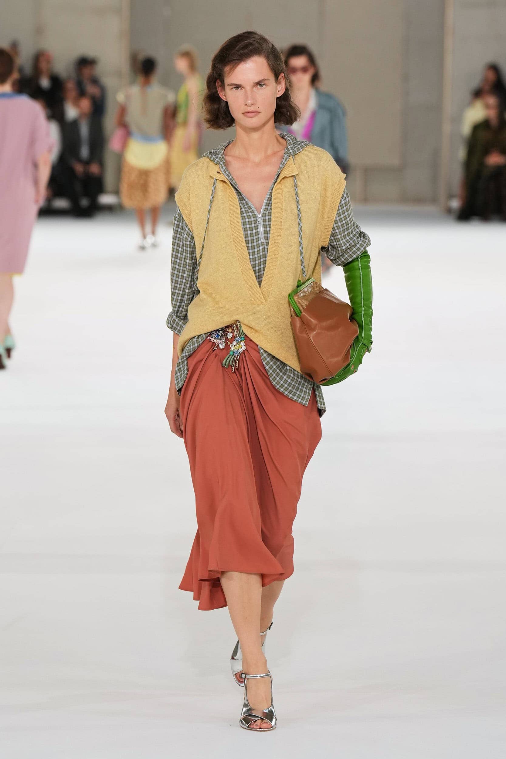
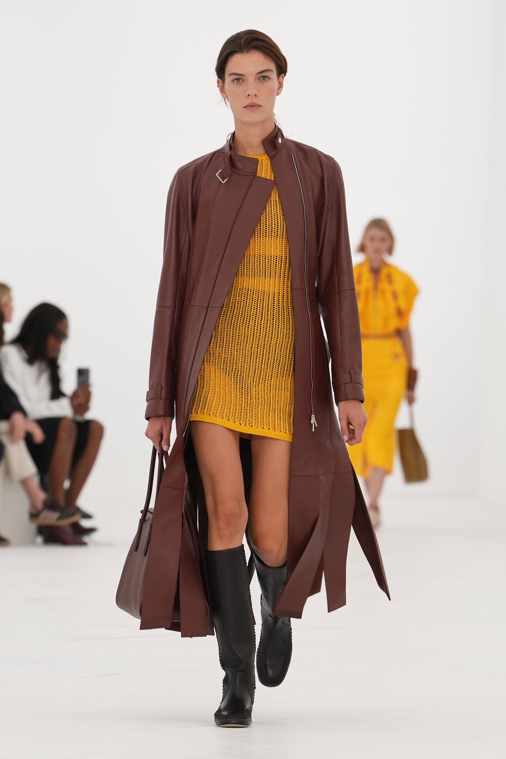
But Spring 2027 was equally focussed on colours that looked back with rose-tinted glasses or deliberately upended the conventions of the season. Mustard, chocolate brown and russet were a callback to the golden cast of seventies Kodak moments at Tory Burch, and Ulla Johnson, while Ferragamo and Proenza Schouler continued fashion’s move towards darker, trans-seasonal palettes of deep teal, burnished gold and berry.
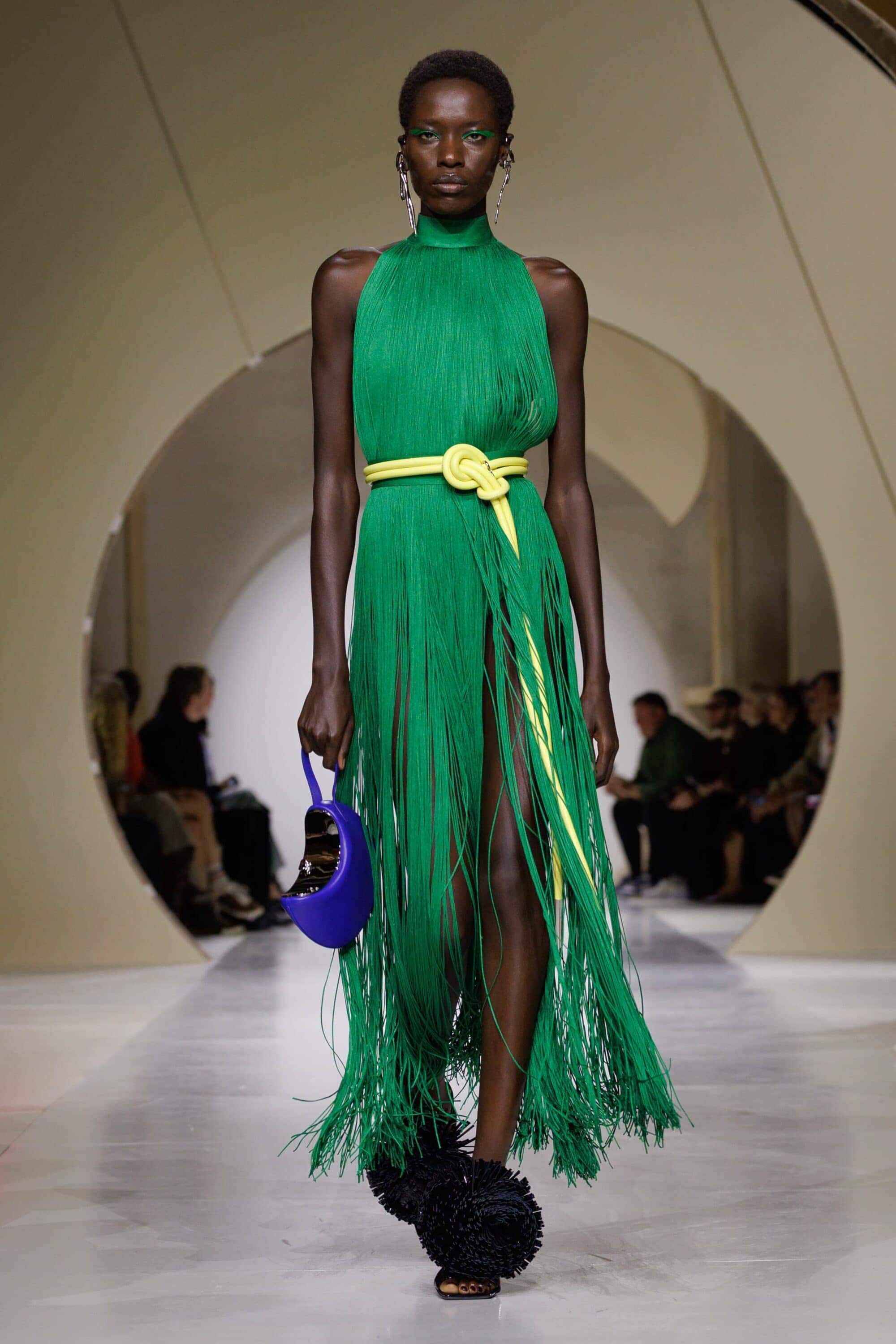
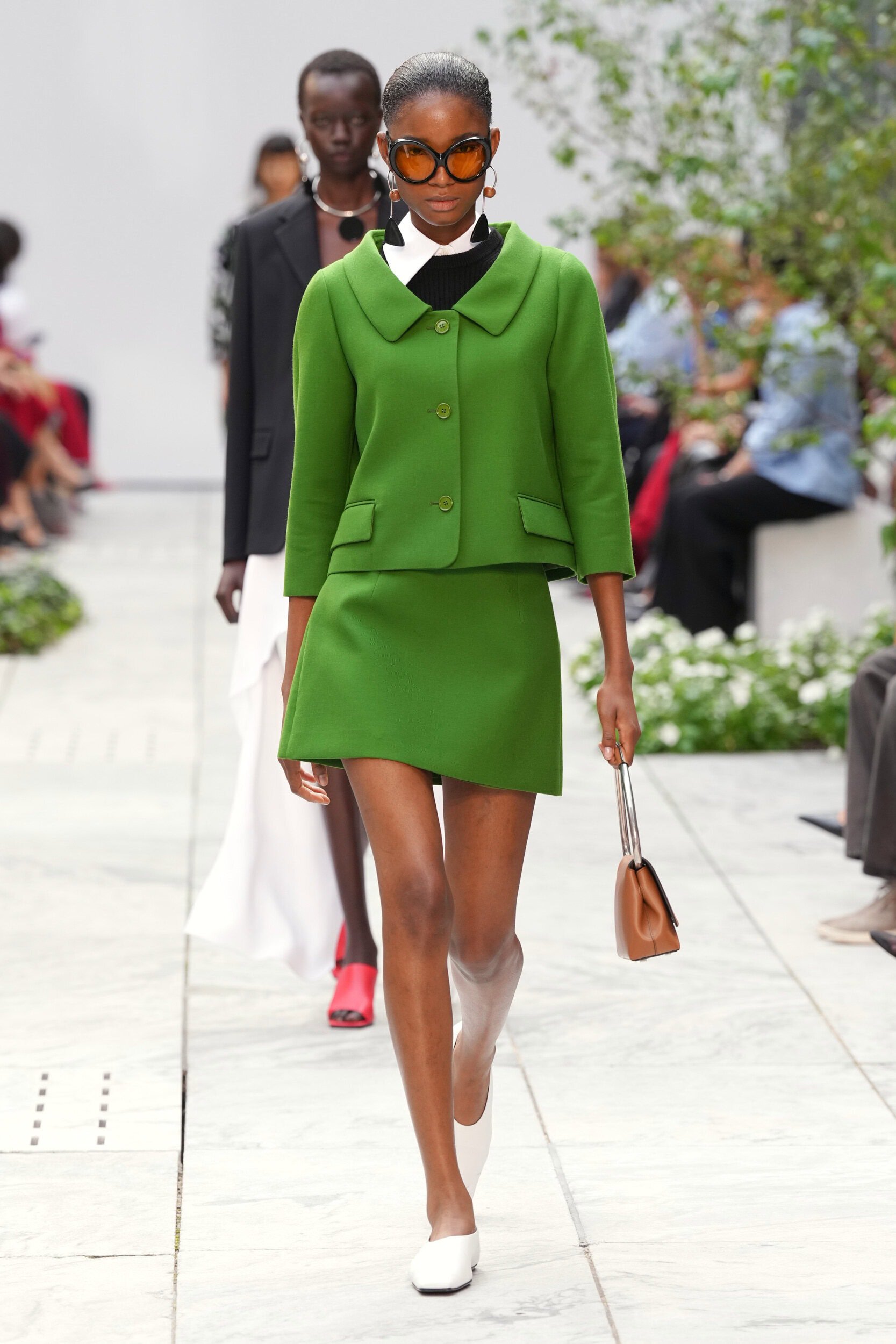
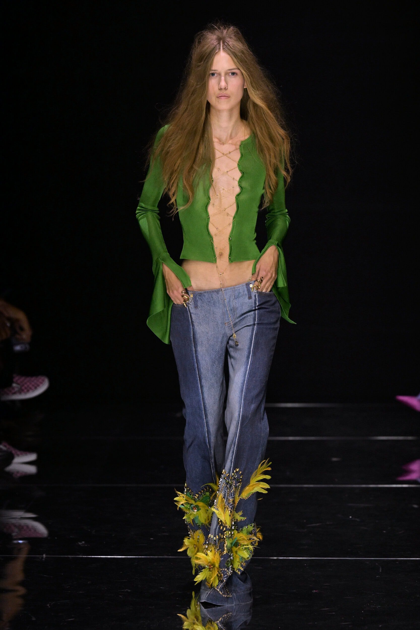
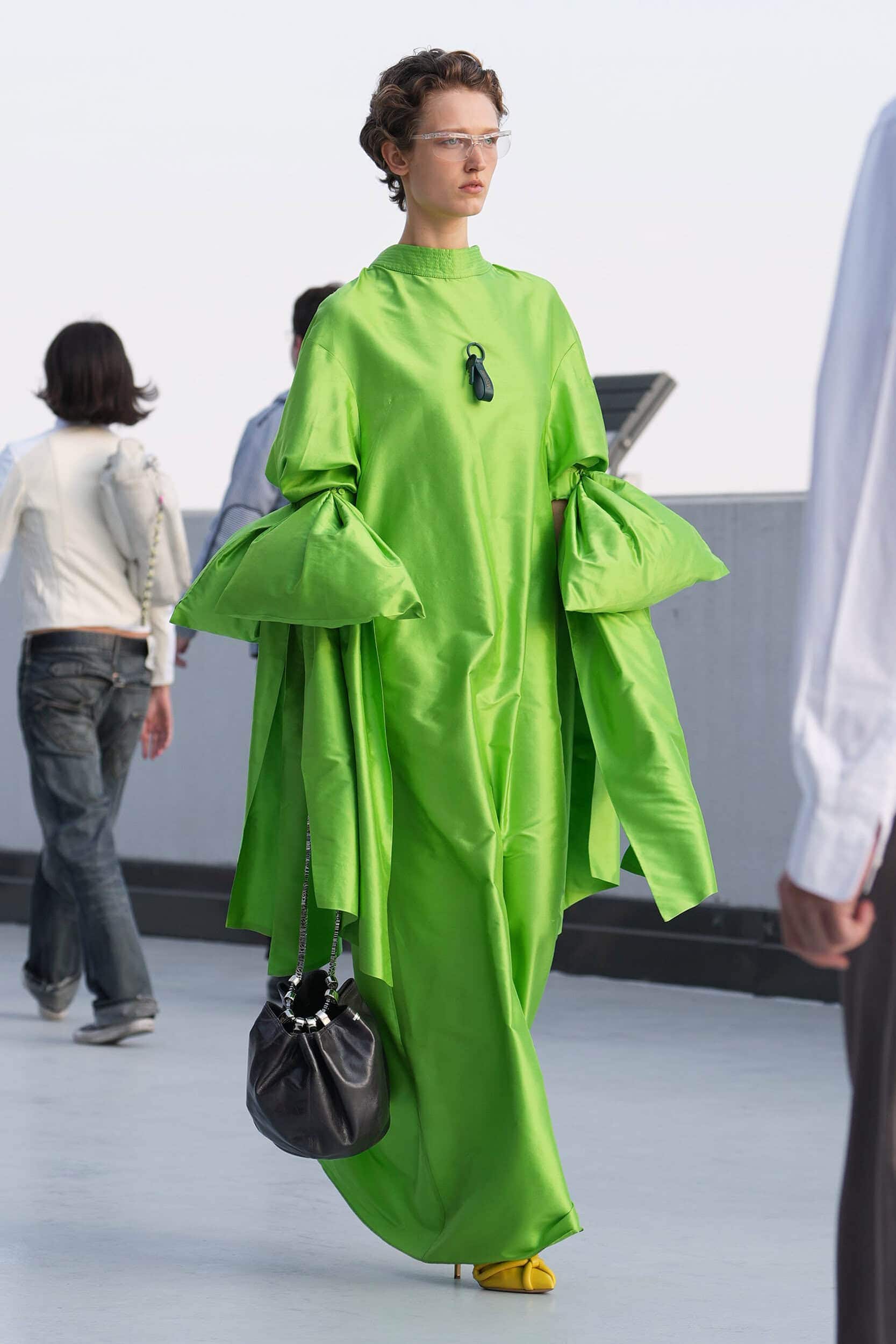
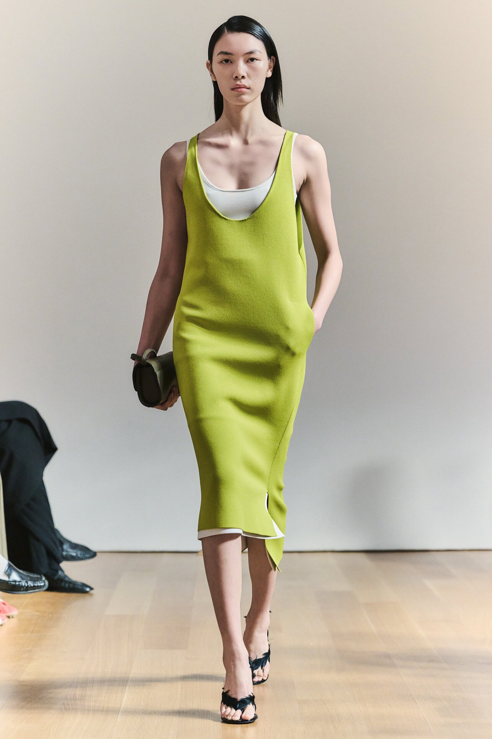
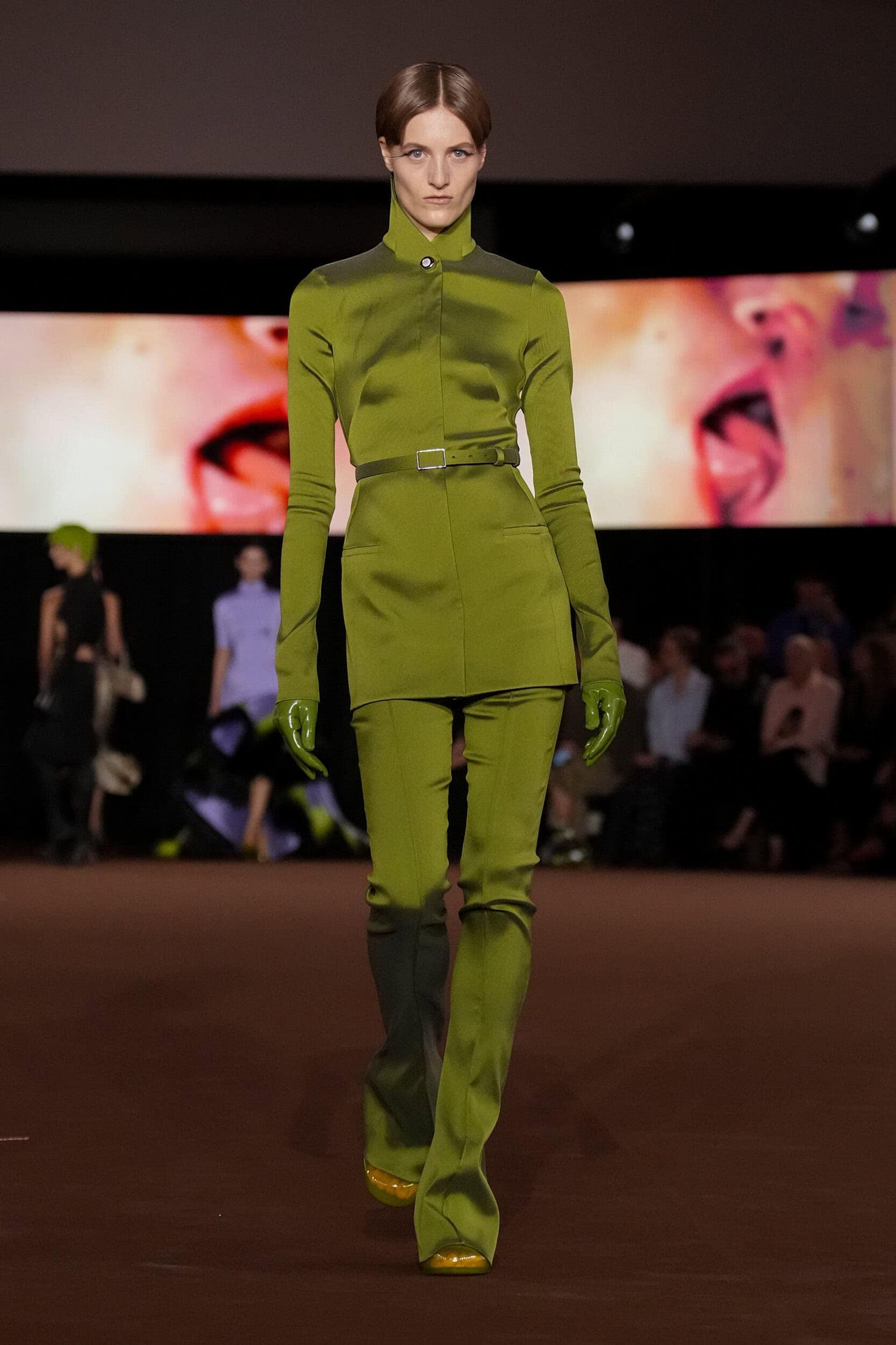
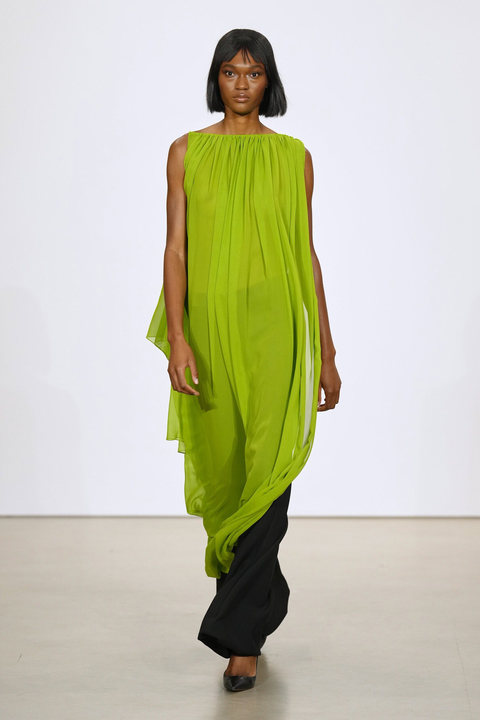
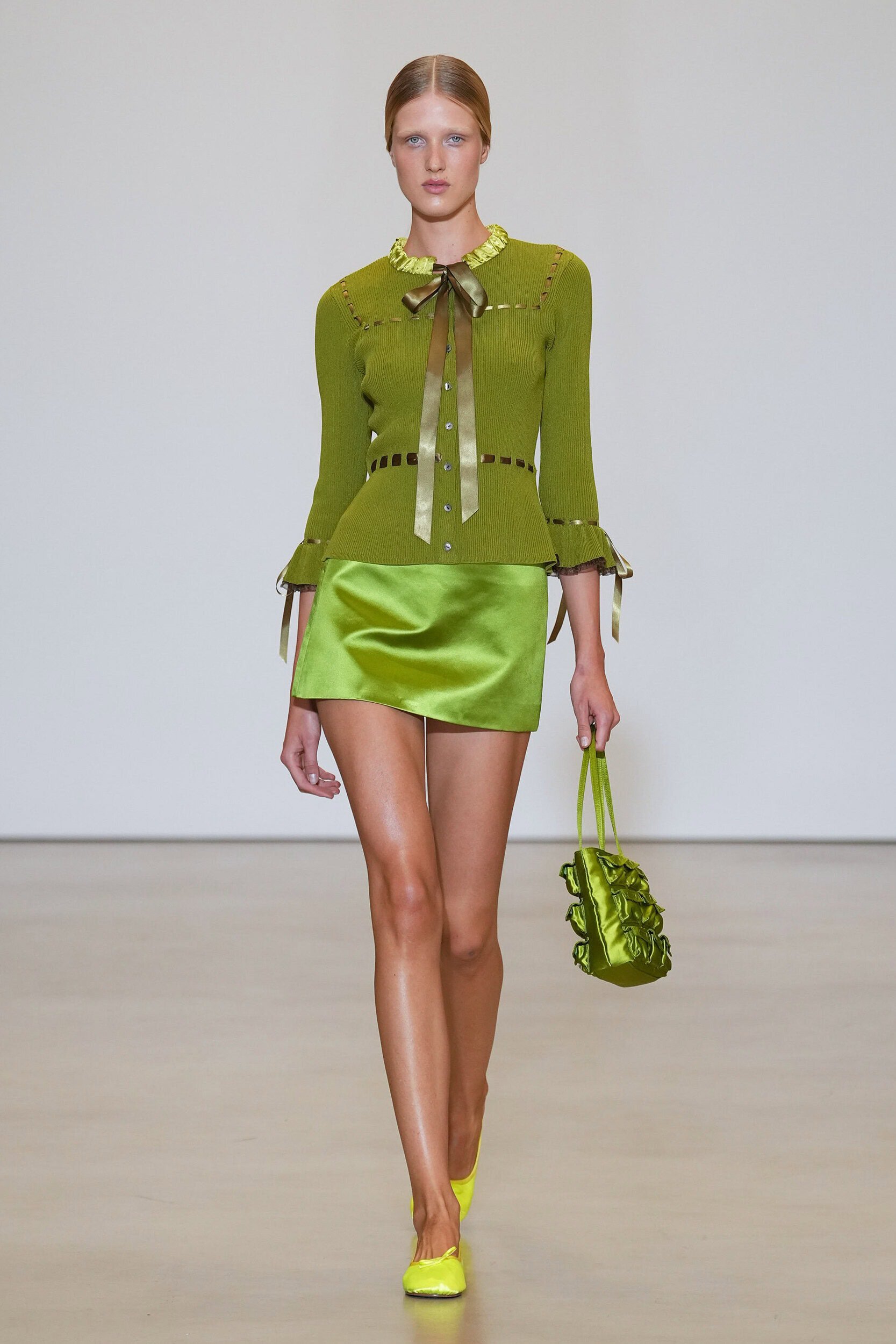
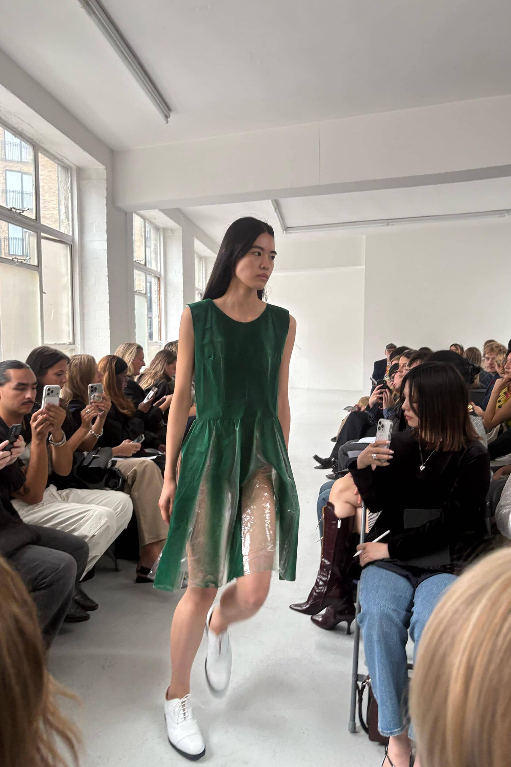
Nature provided another point of reference, from khakis that mimicked the forest-floor at Altuzarra and Schiaparelli to Prada’s vibrant grass green and the acidic tones seen at Courrèges and Brandon Maxwell. Between these extremes emerged peach as a softer everyday option, alongside purple, rainbow brights and the season’s continuous use of red.
Rather than settling on a single shade to define Spring 2027 the season presented colour as a tool of emotional expression. Designers chose to use colour as a way to both look back to the comfort of nostalgia and forward towards a hopeful future grounded in reality.
1. Soft Serve
Why it’s Trending?
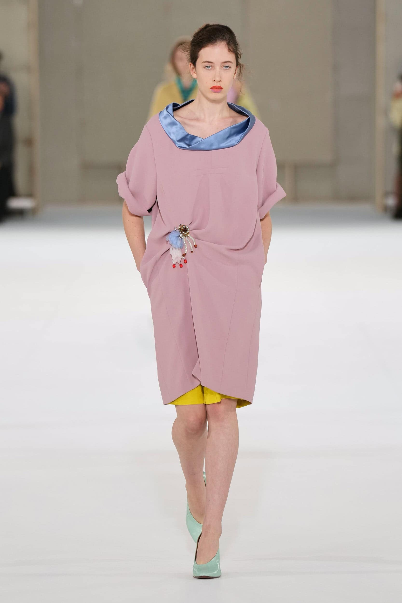
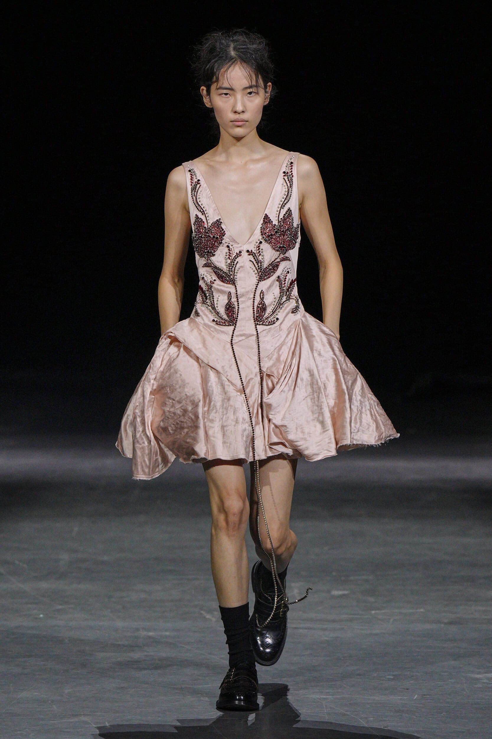
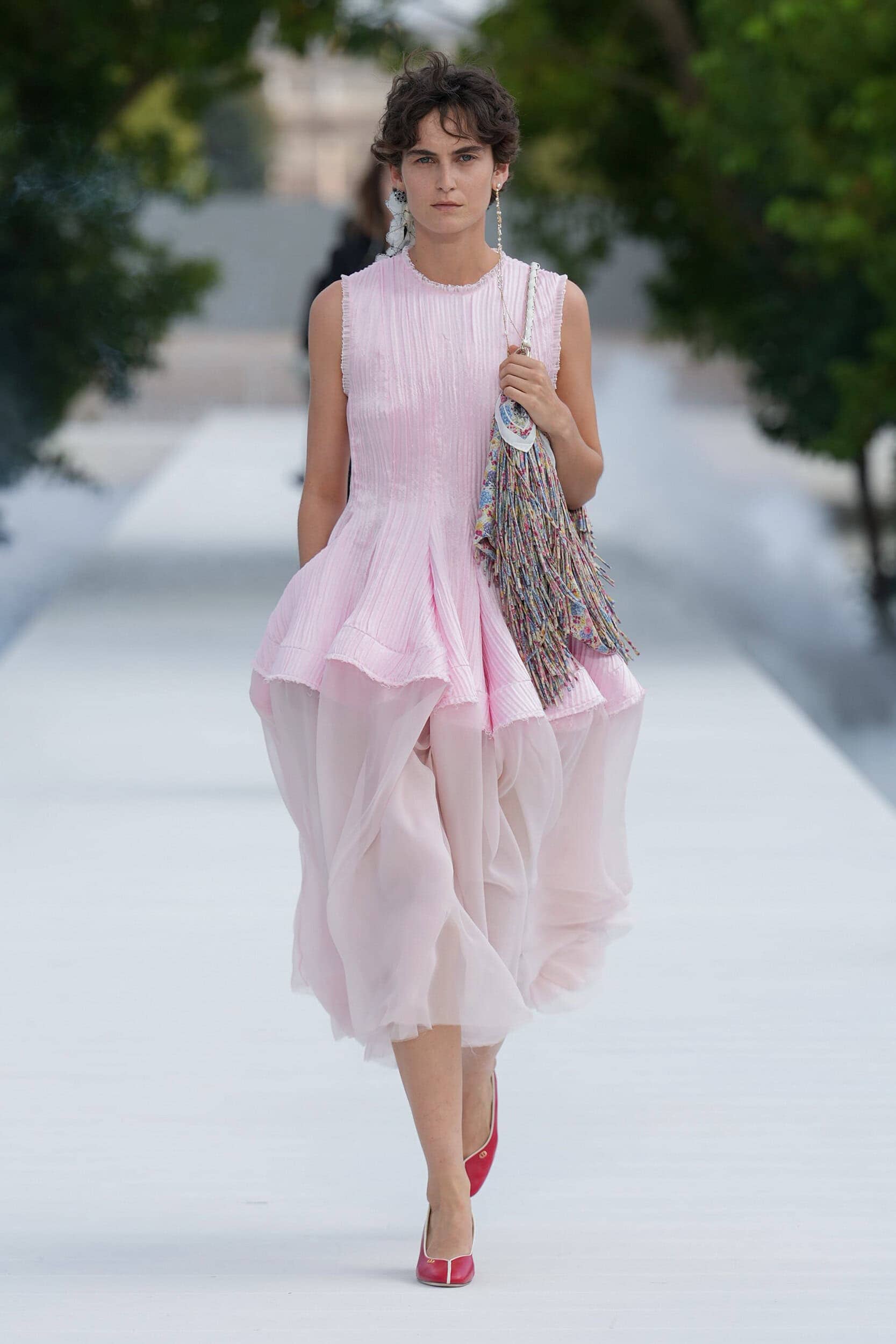
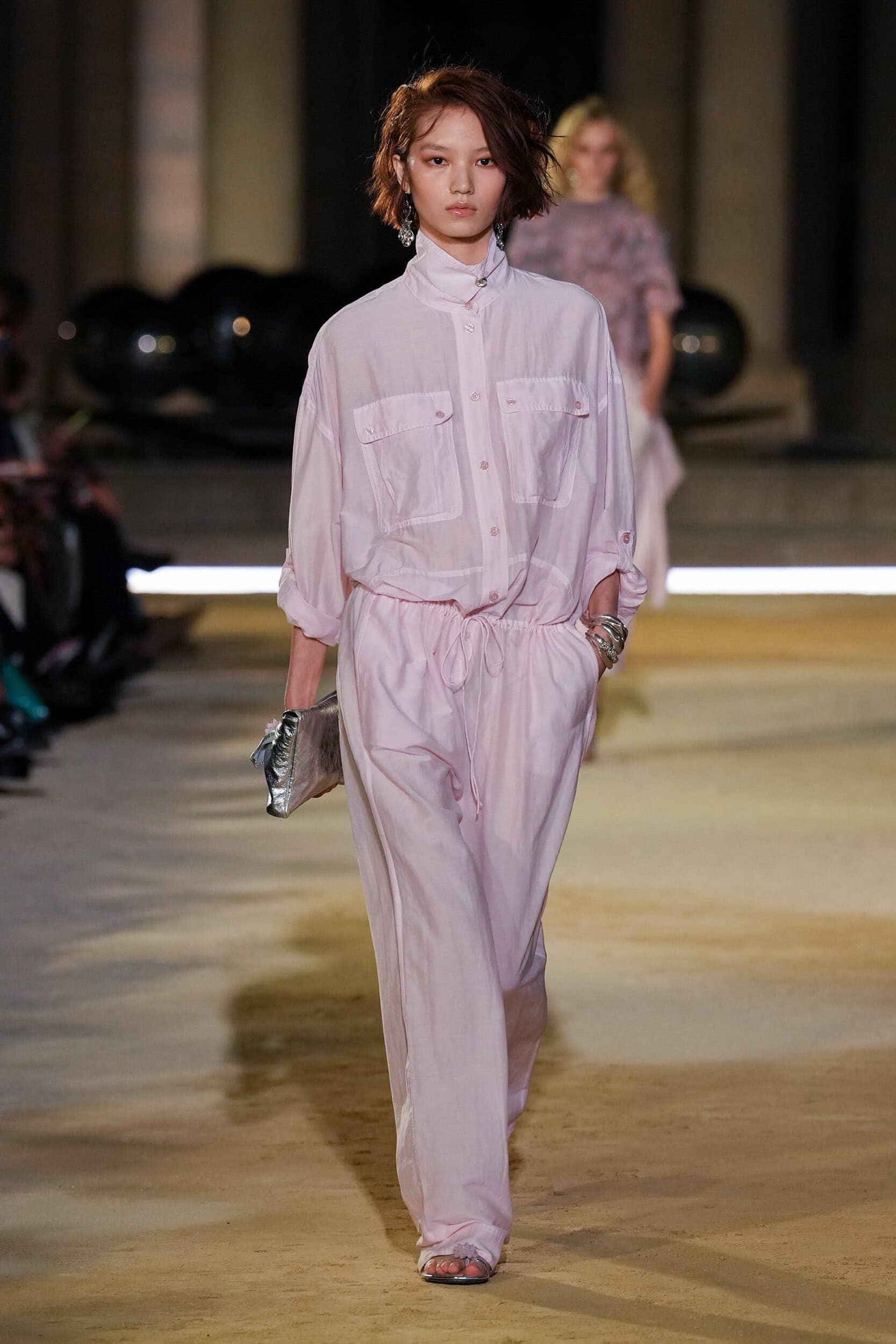
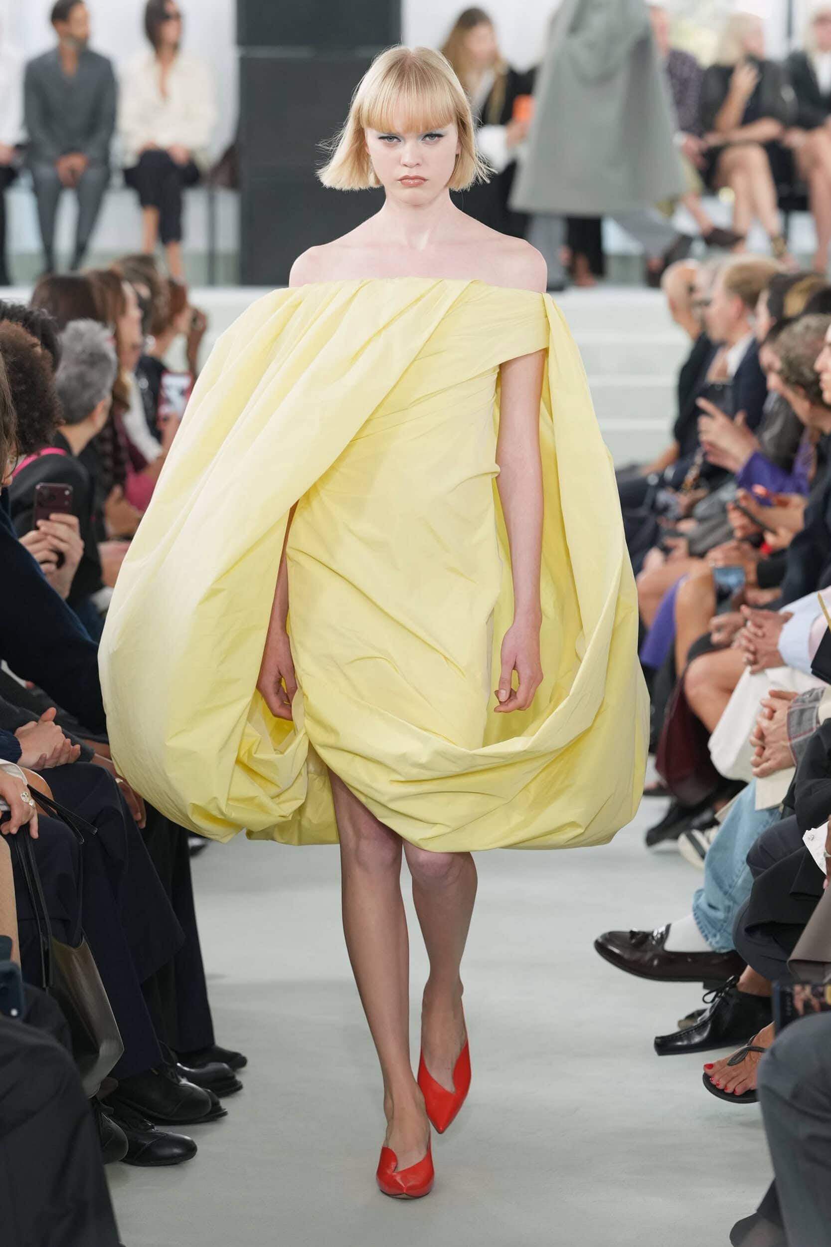
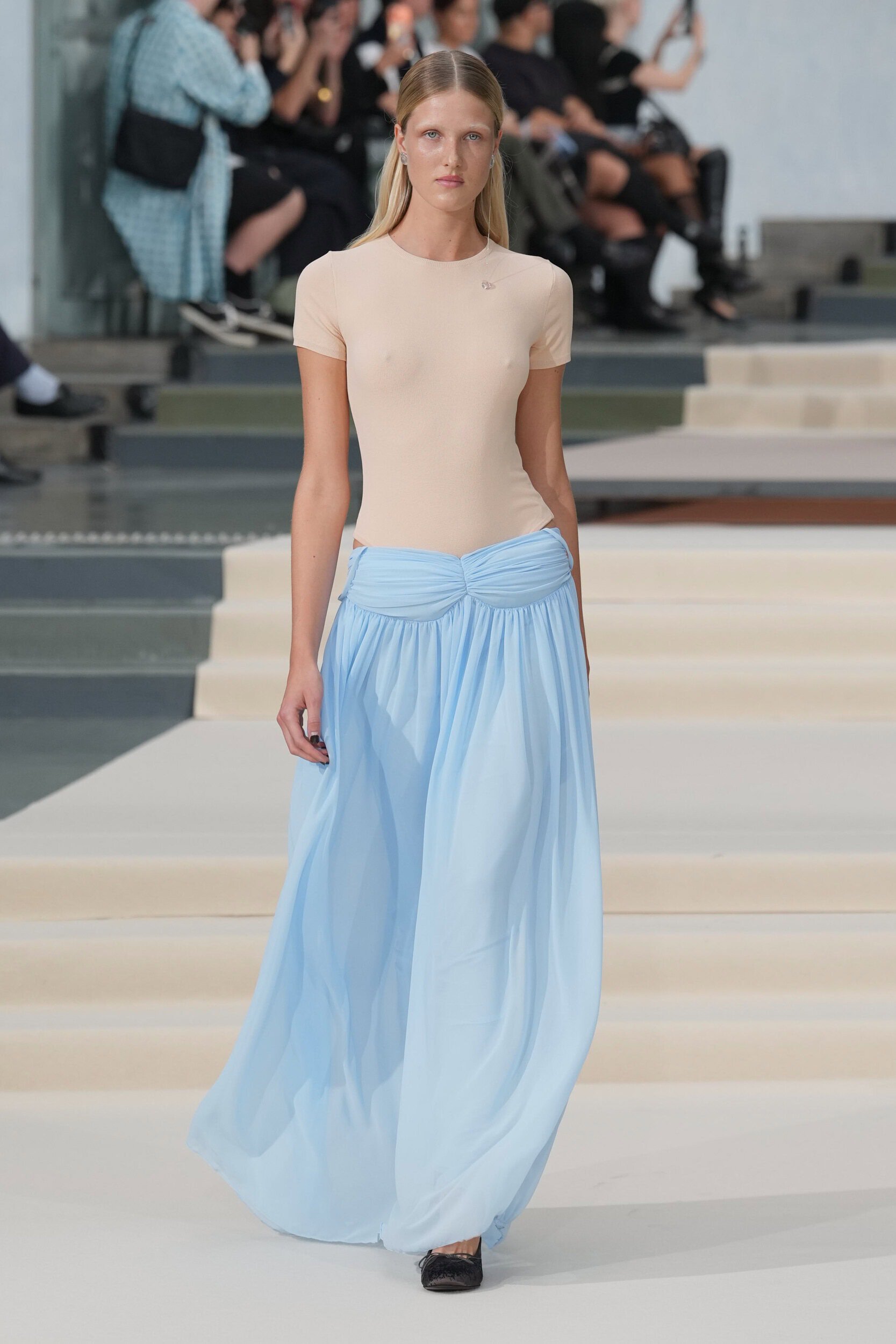
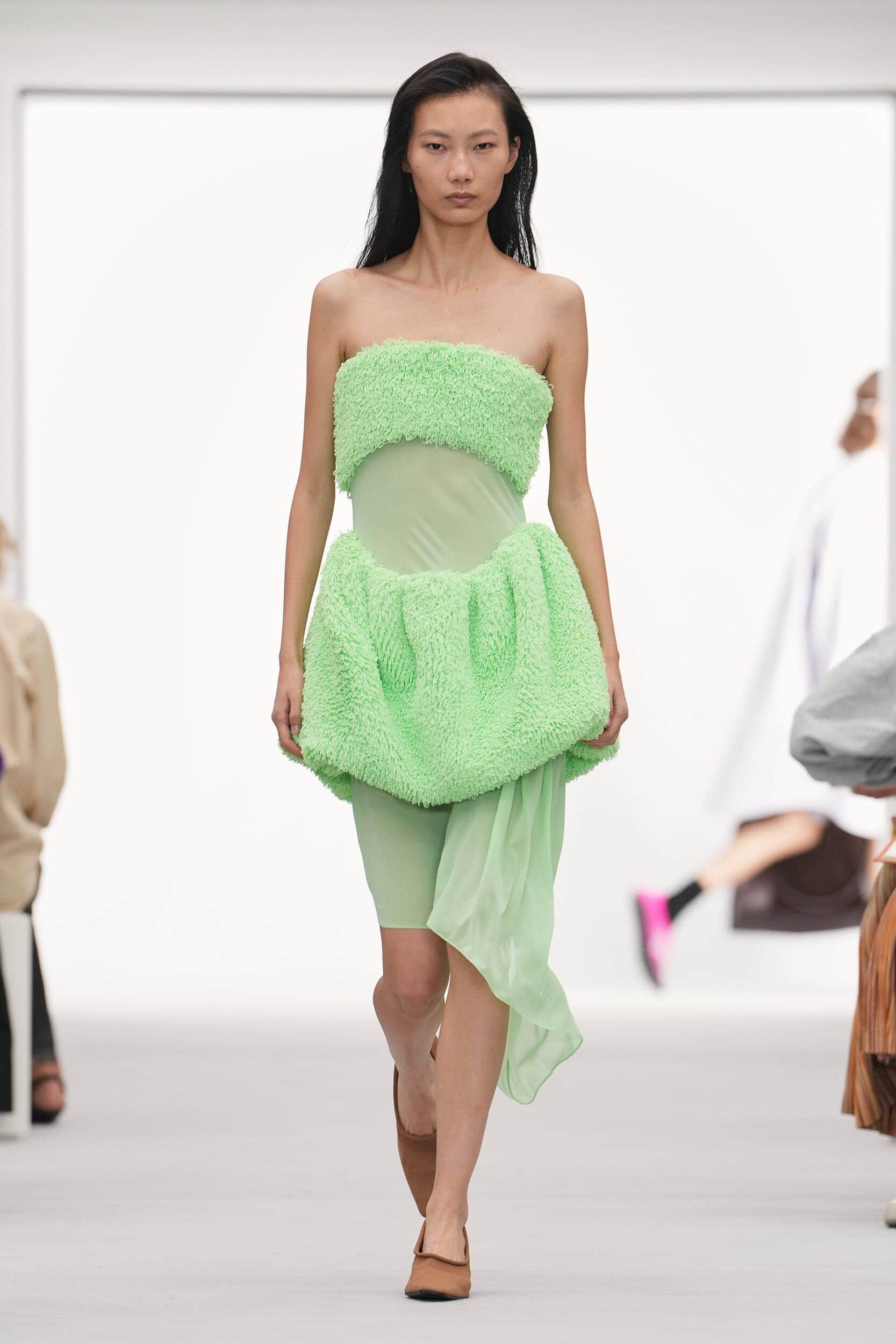
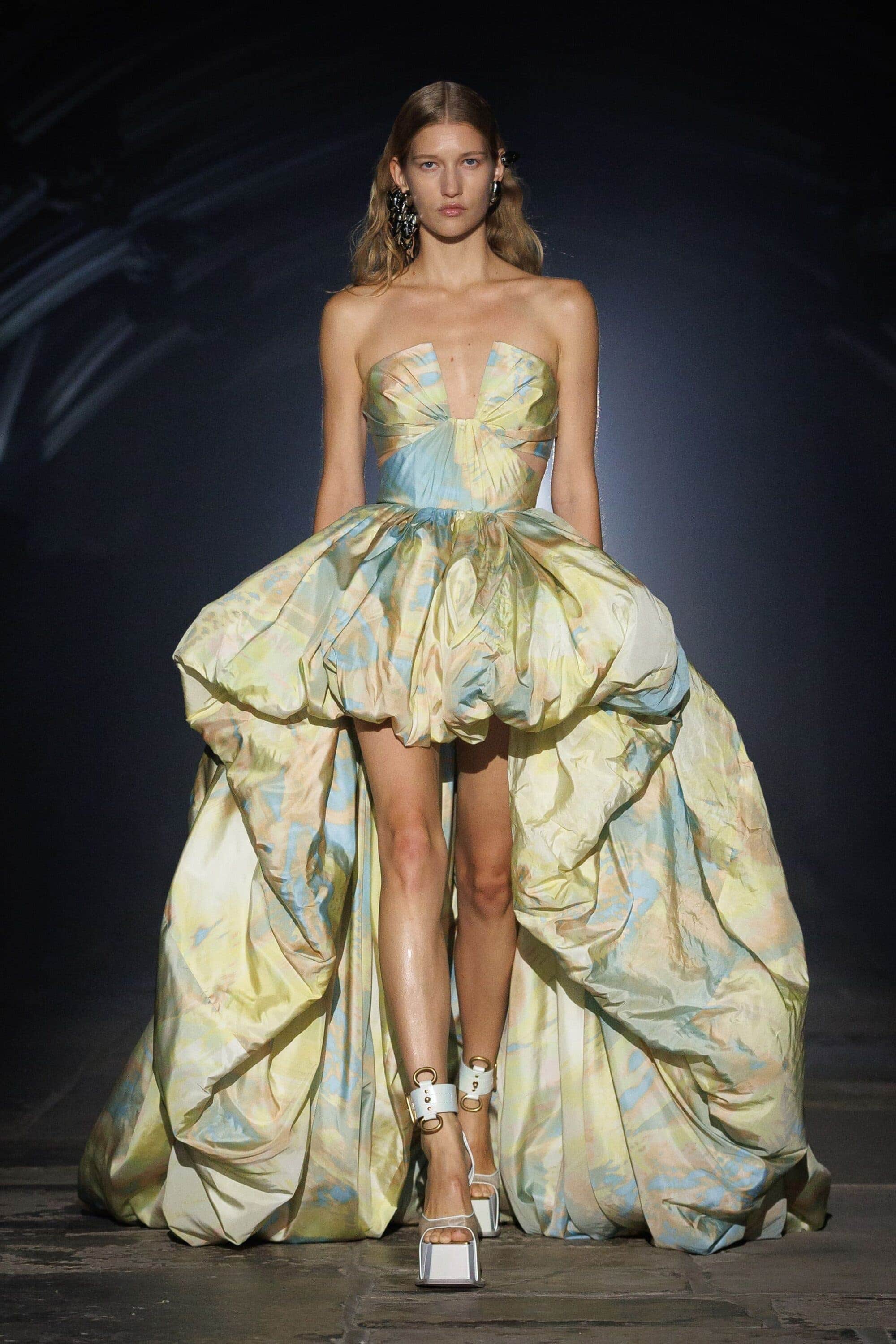
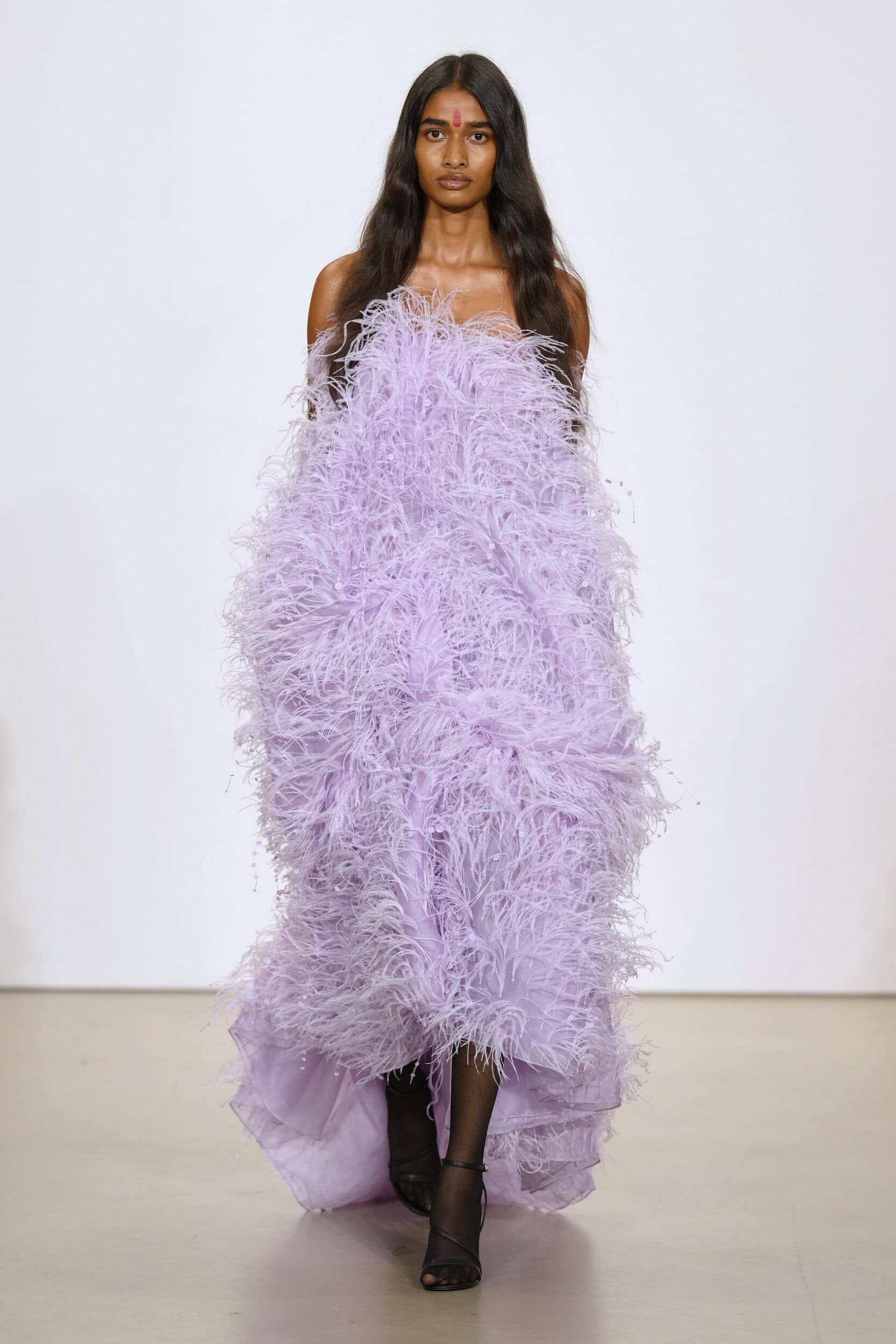
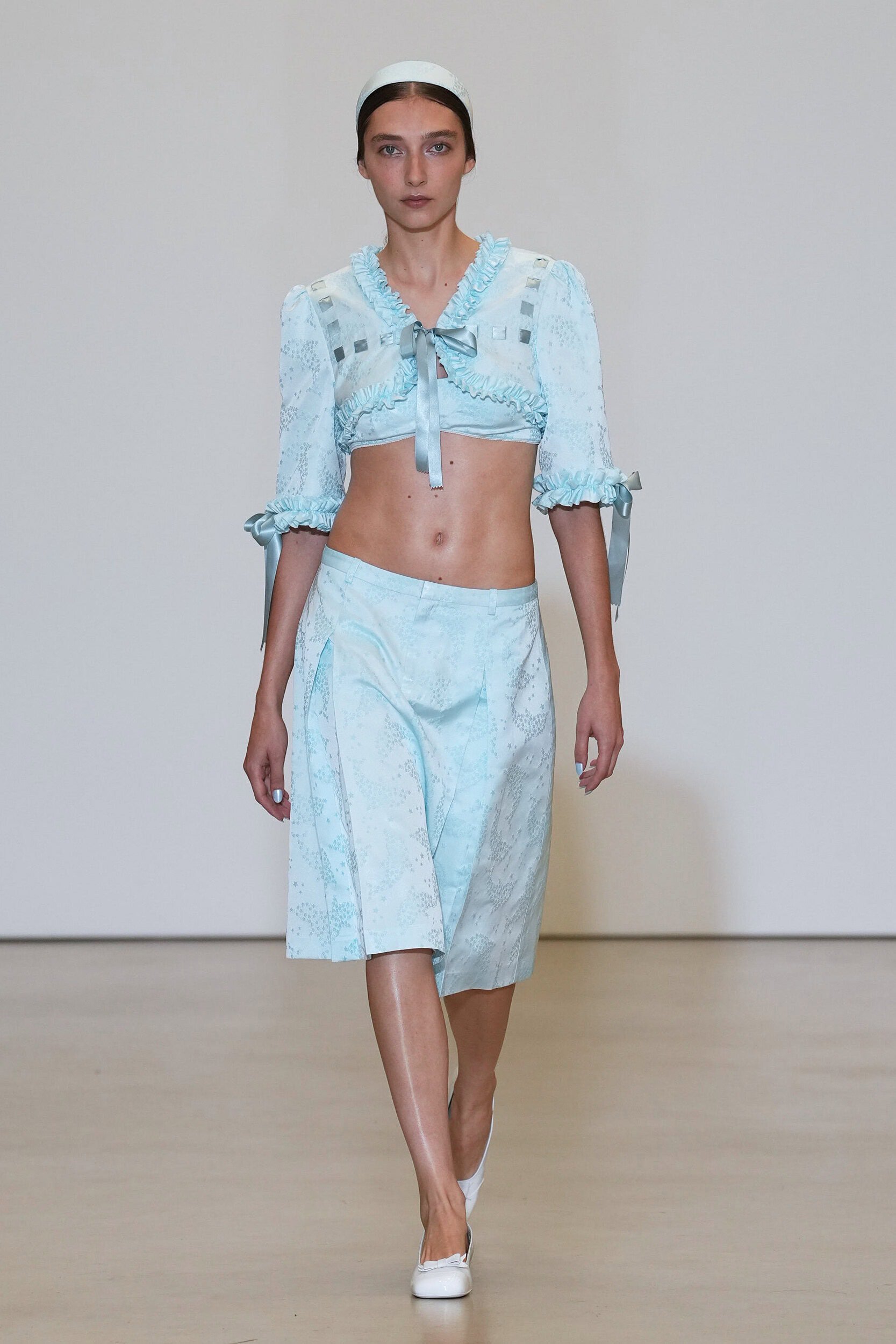
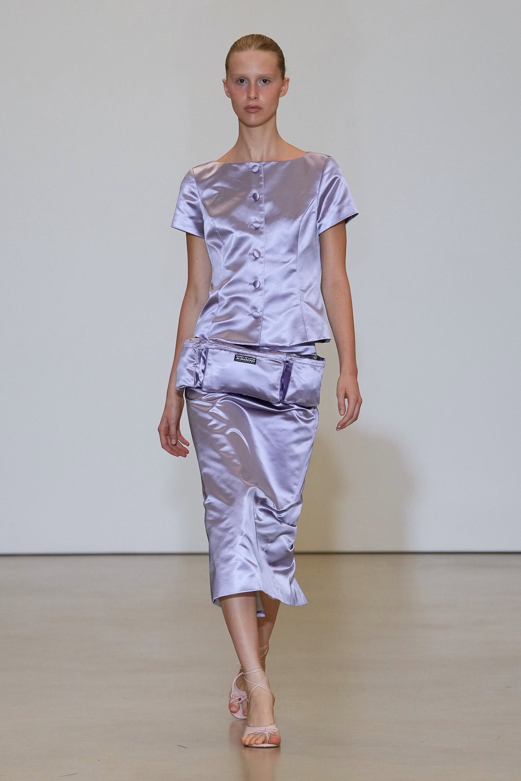
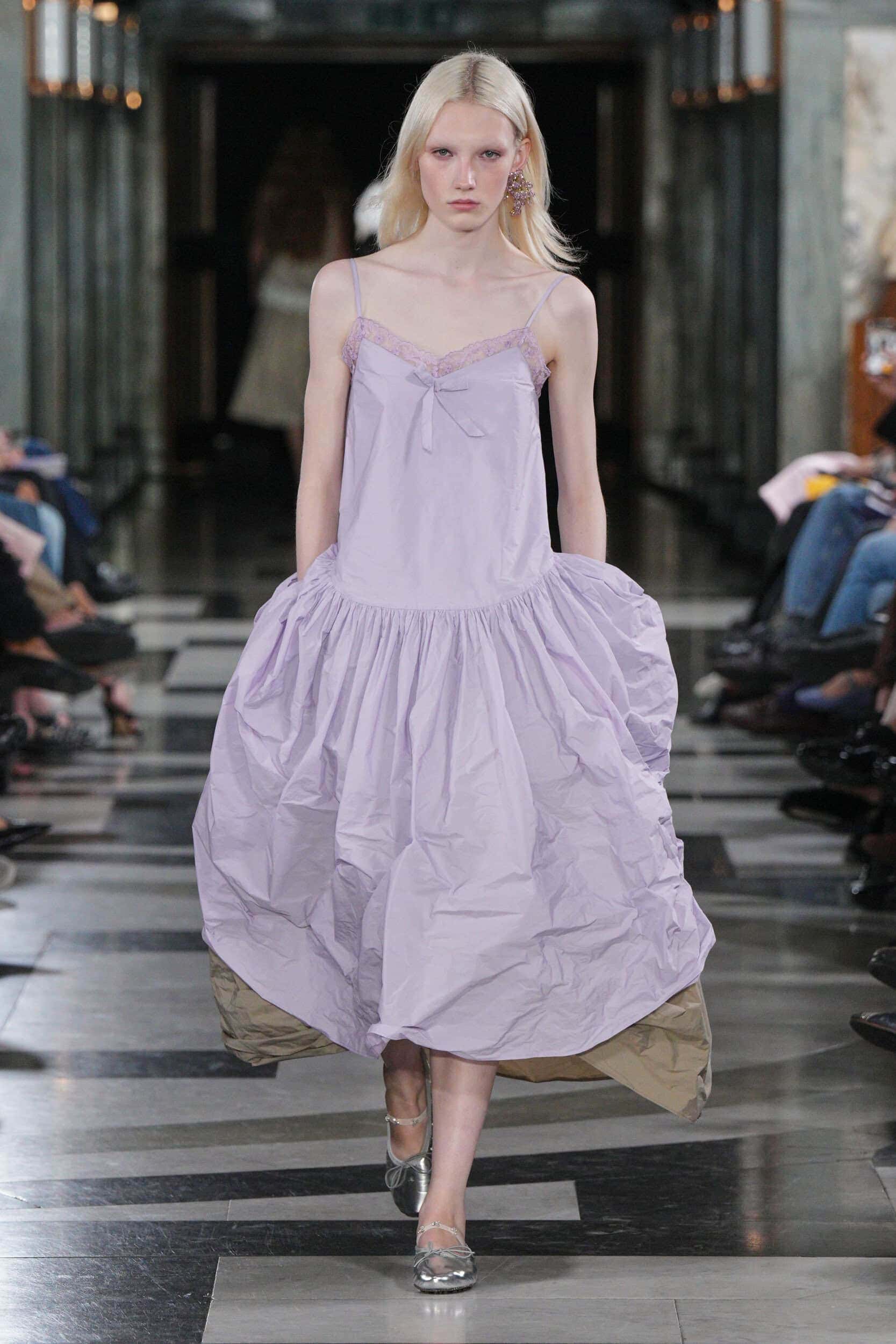
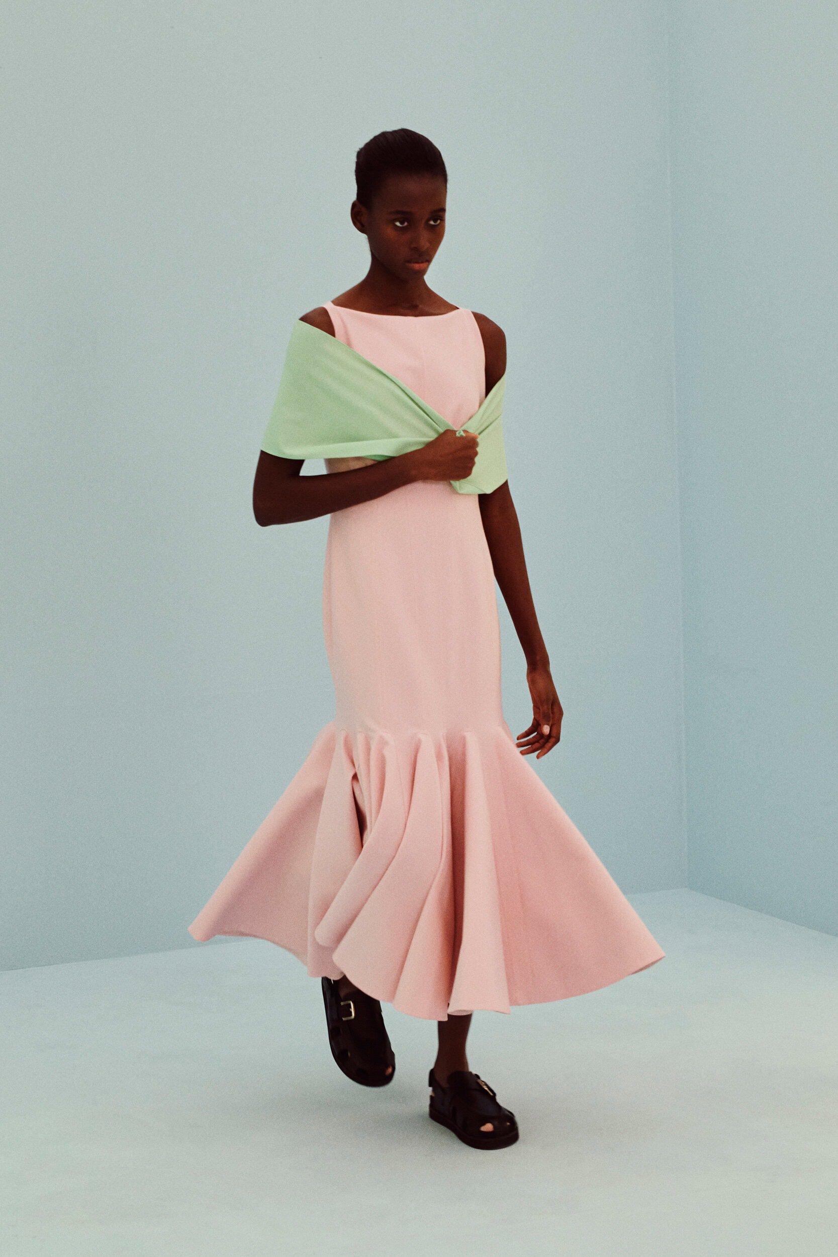
Providing the comfort and soft-landing needed in an increasingly hard world designers played into the infinite possibilities of warm pastel tones.
Why it Matters?
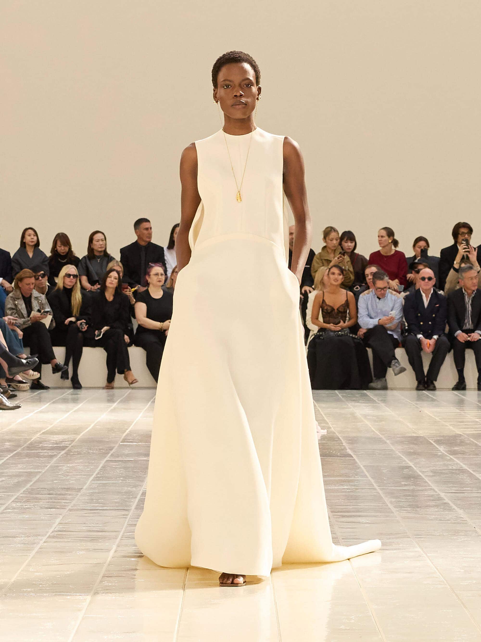
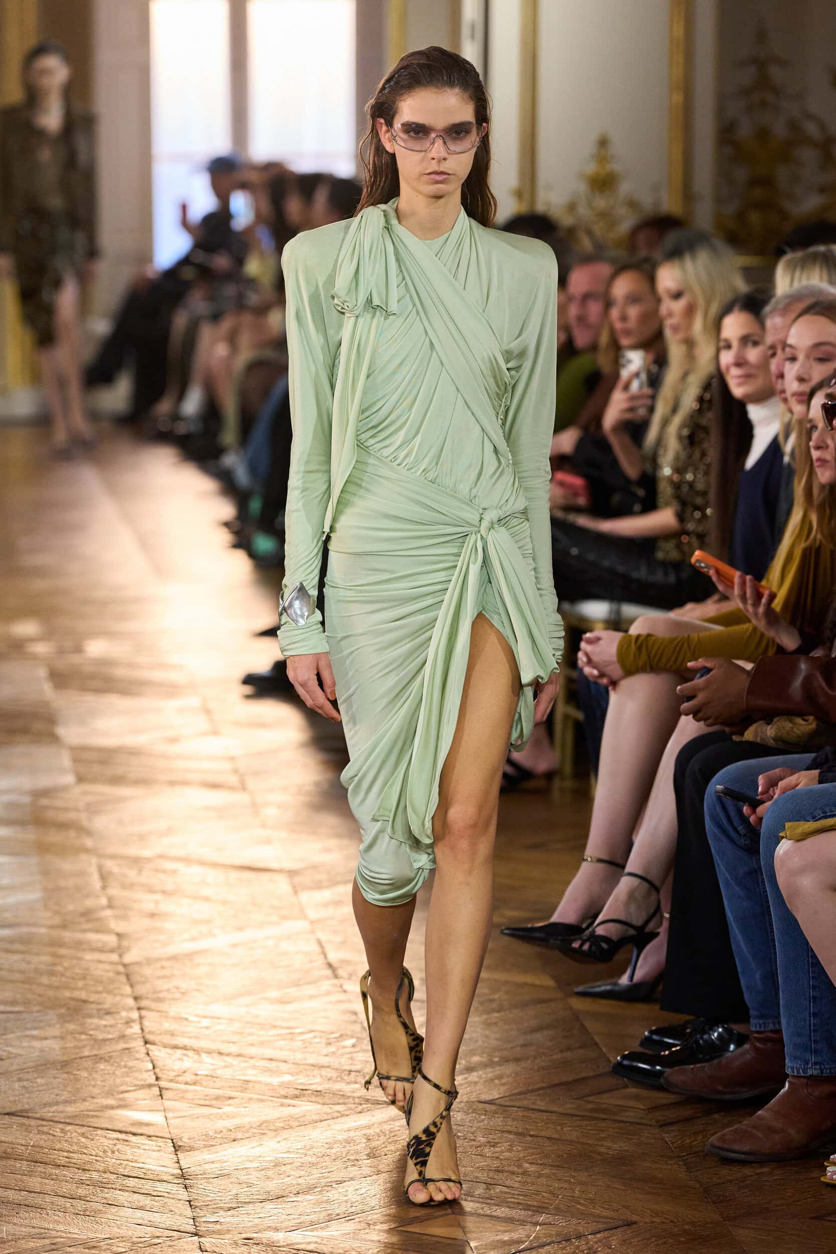
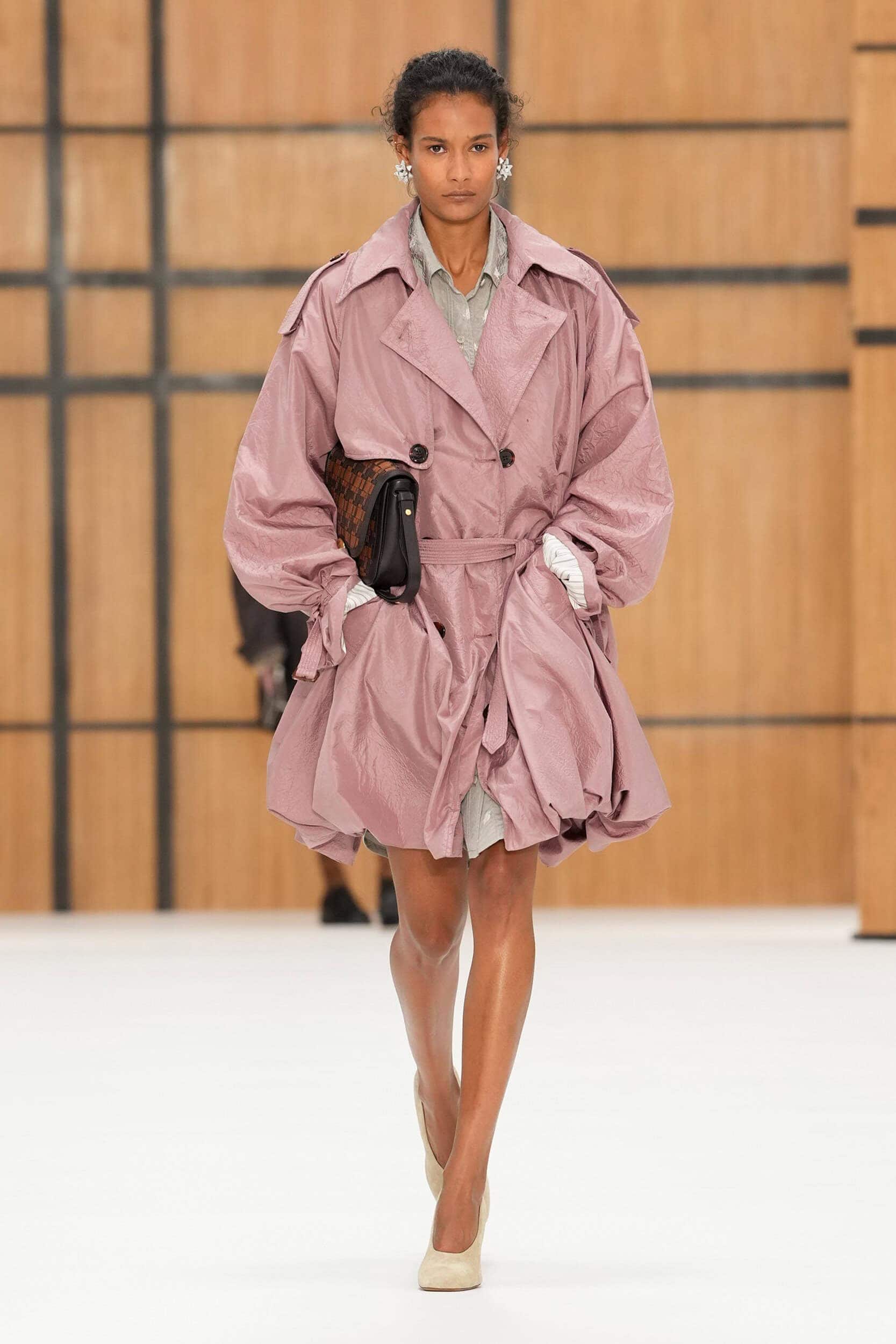
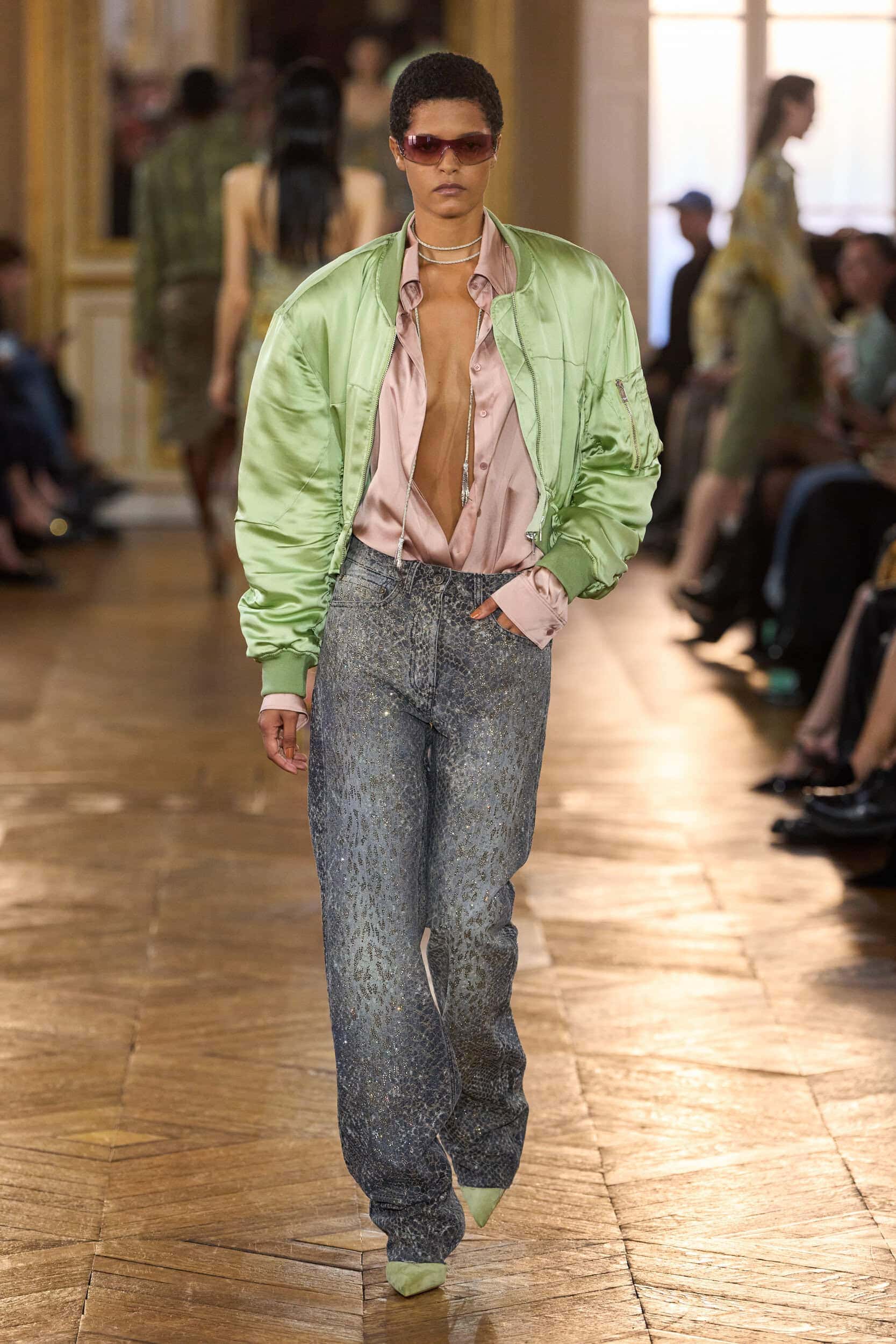
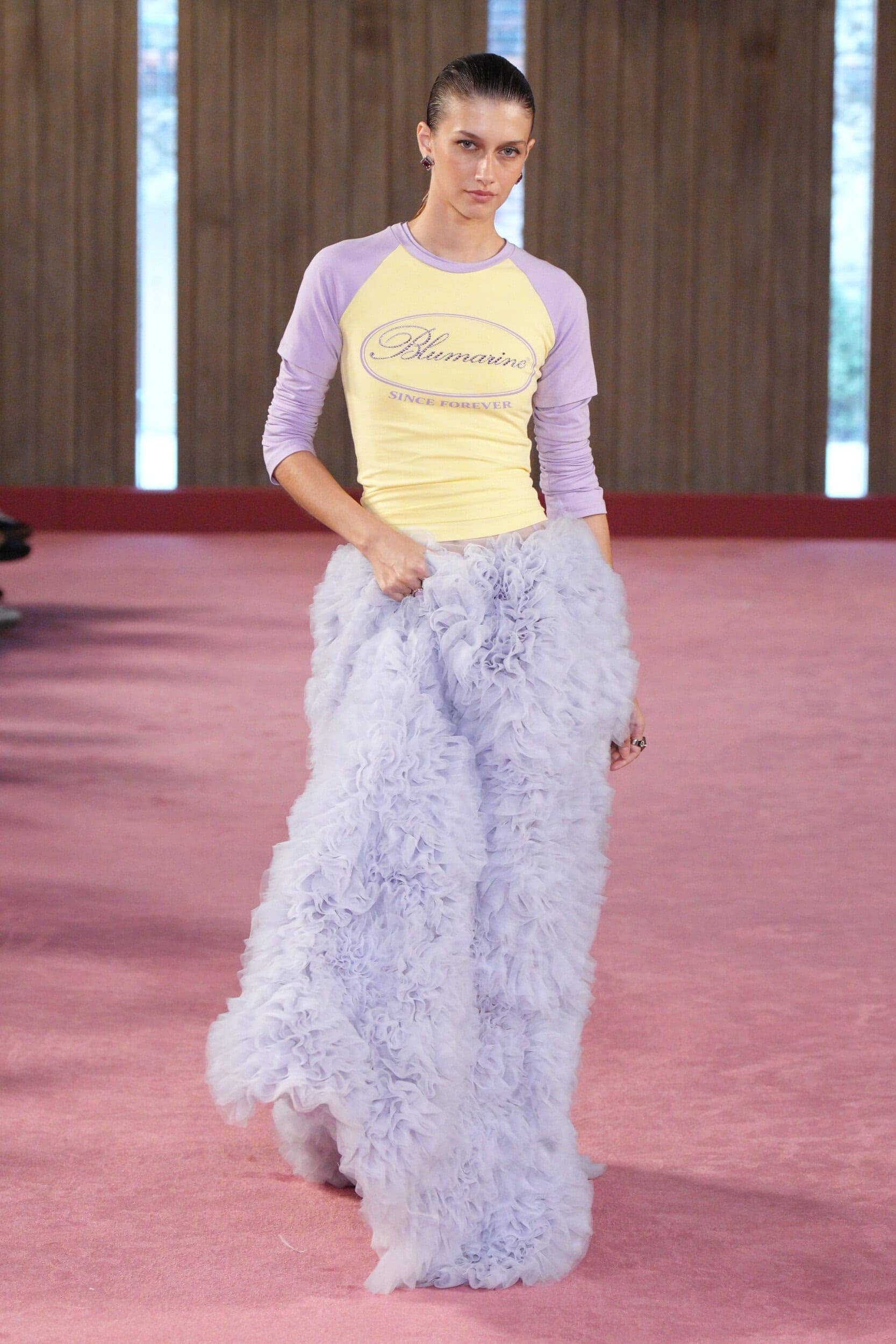
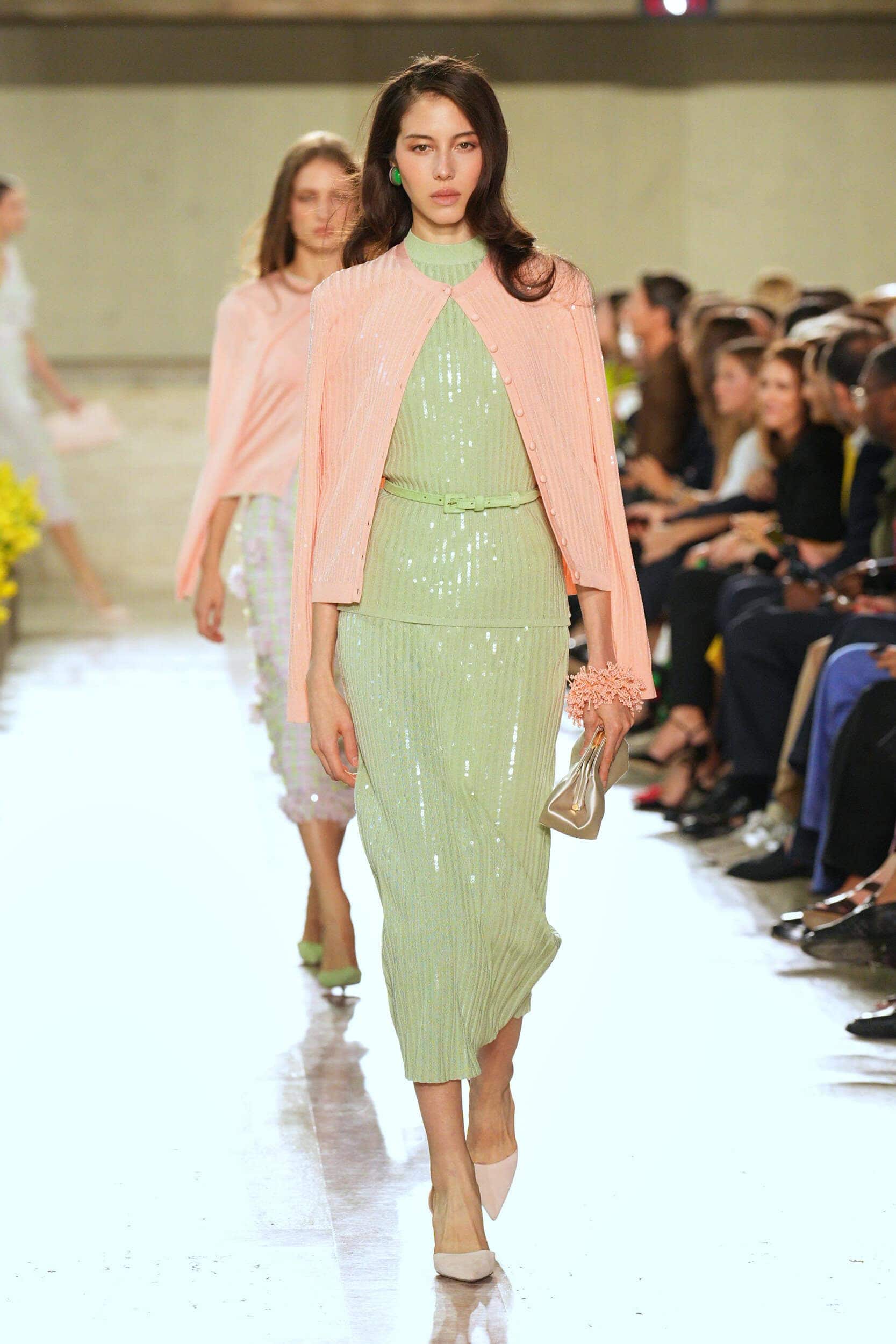
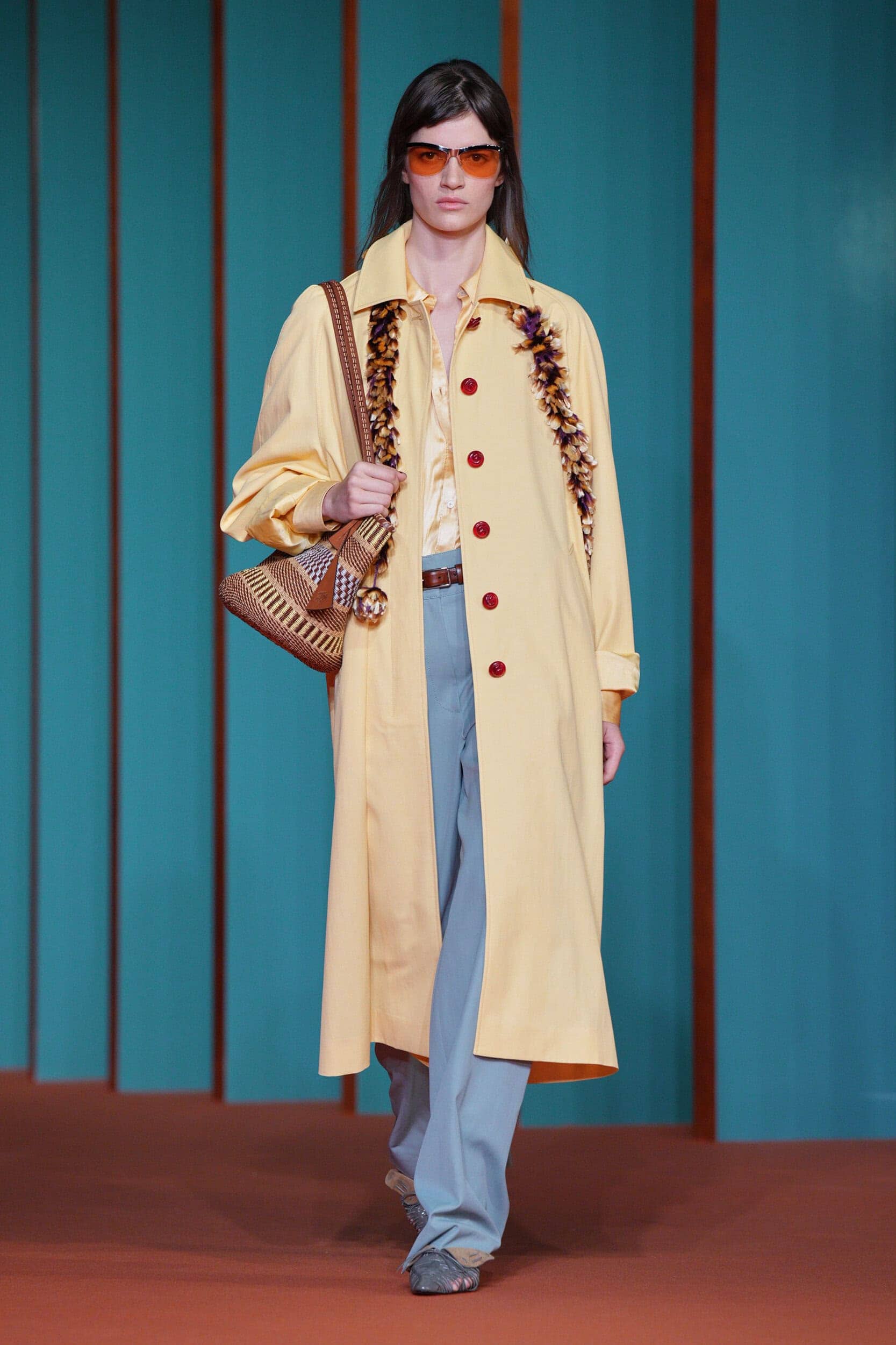
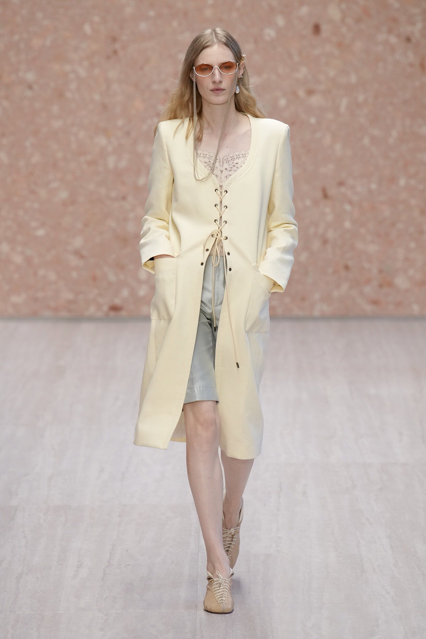
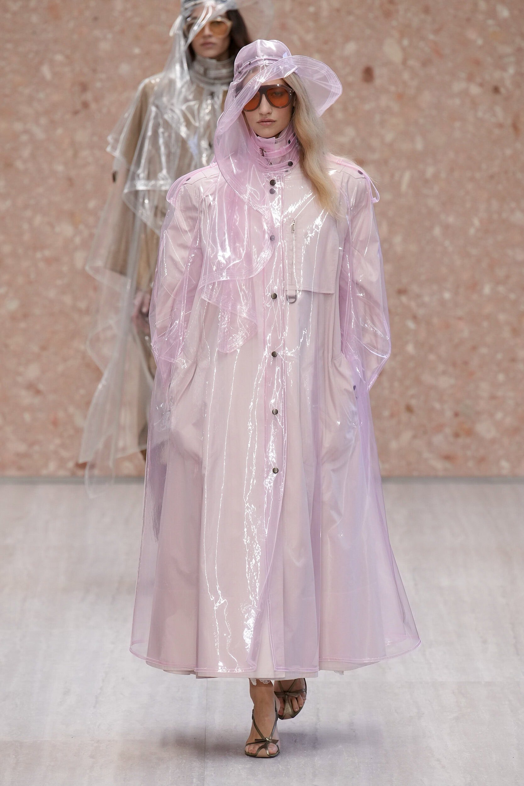
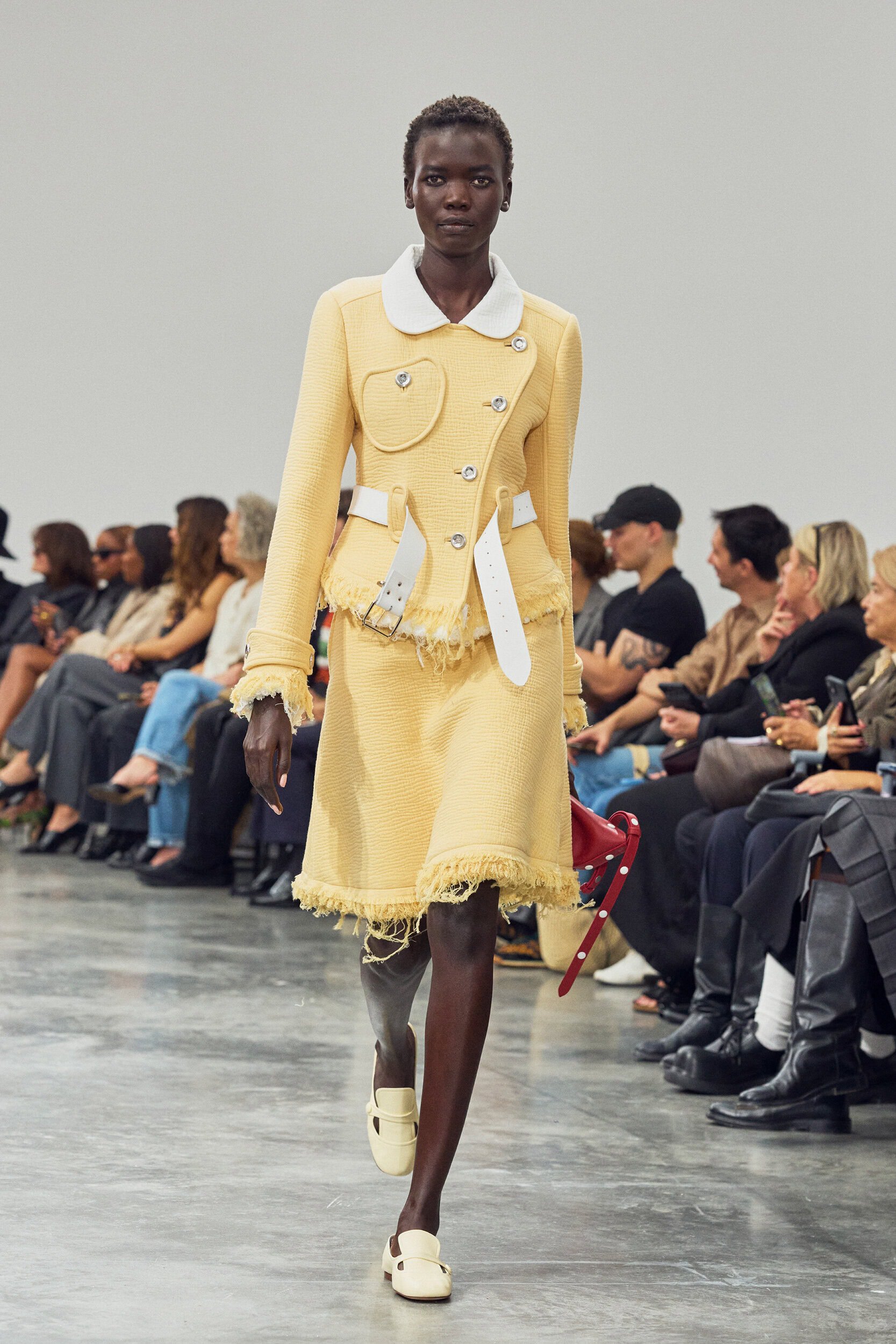
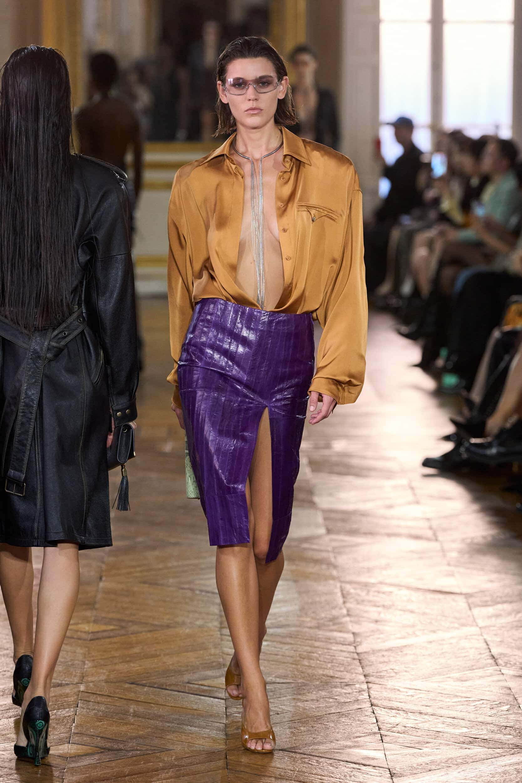
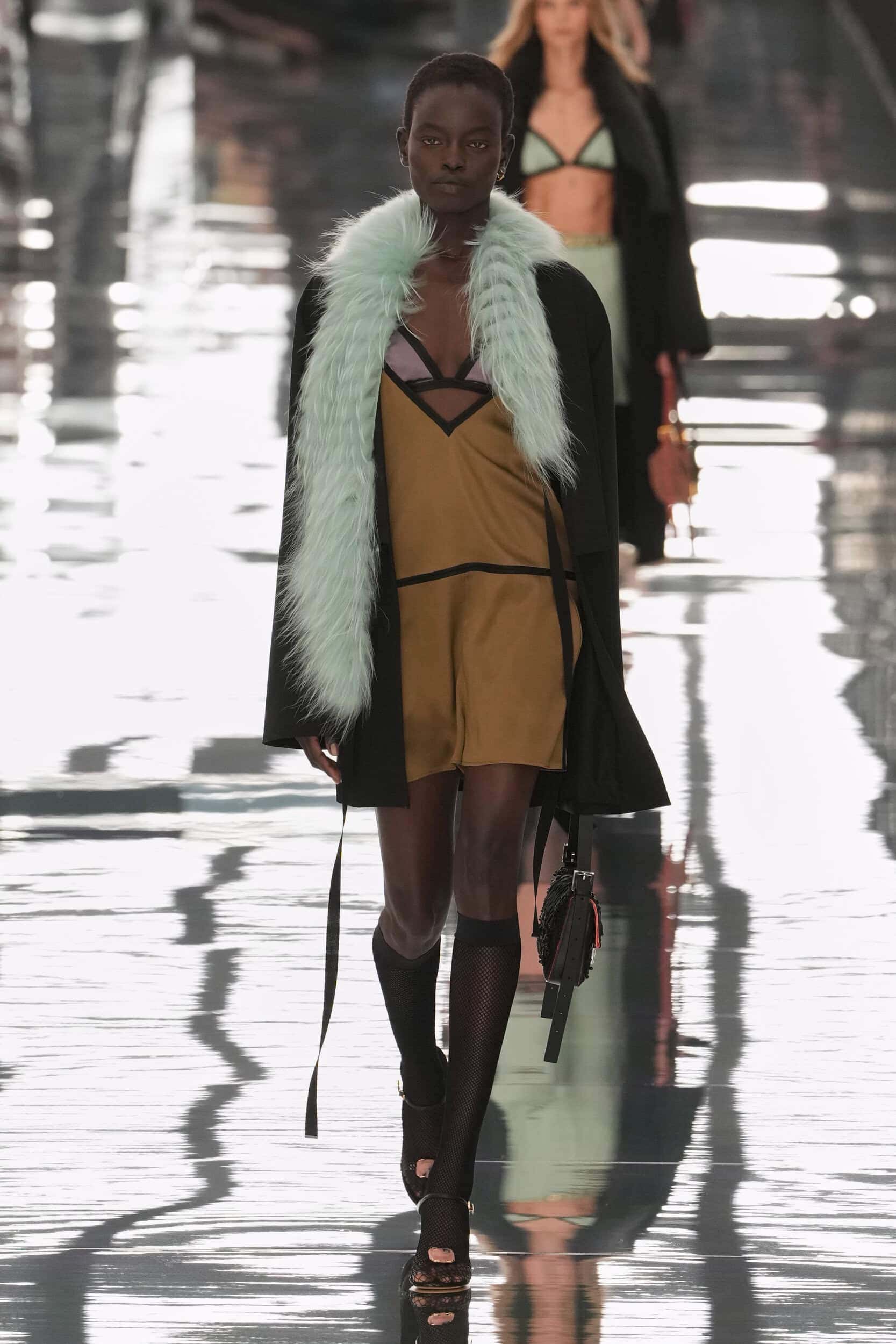
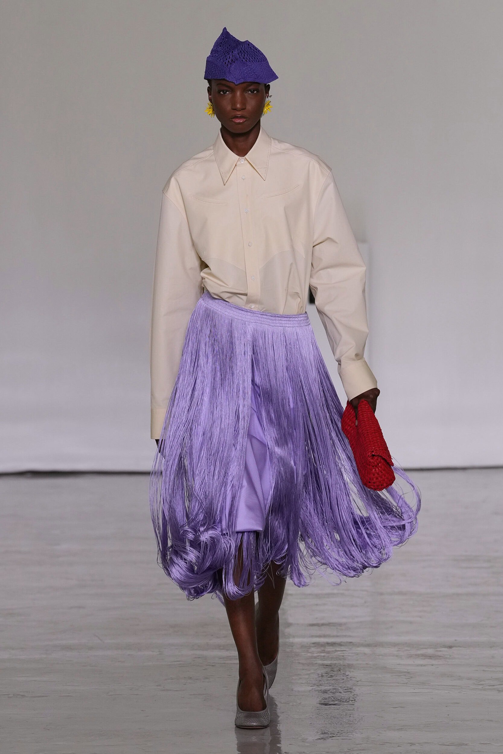
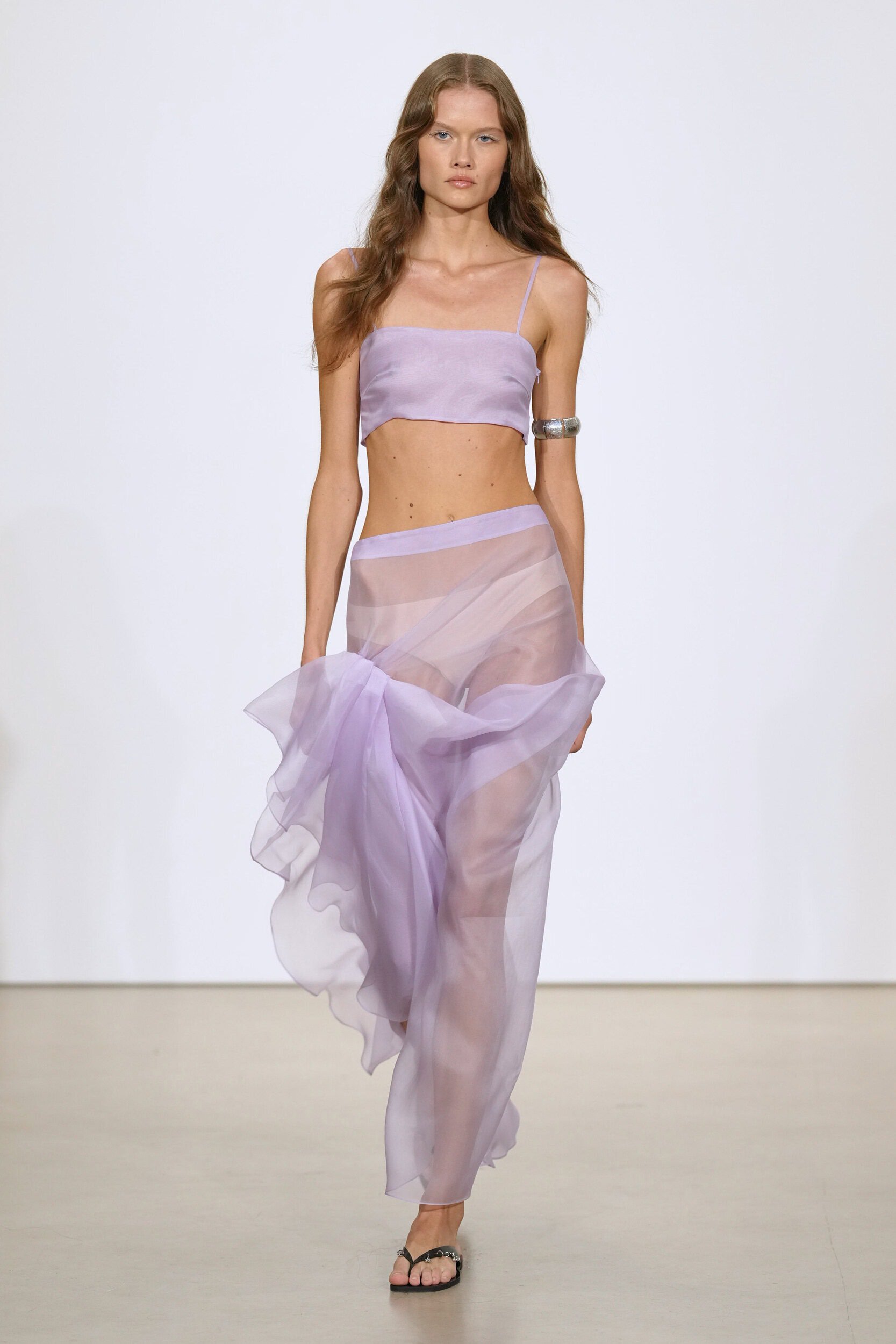
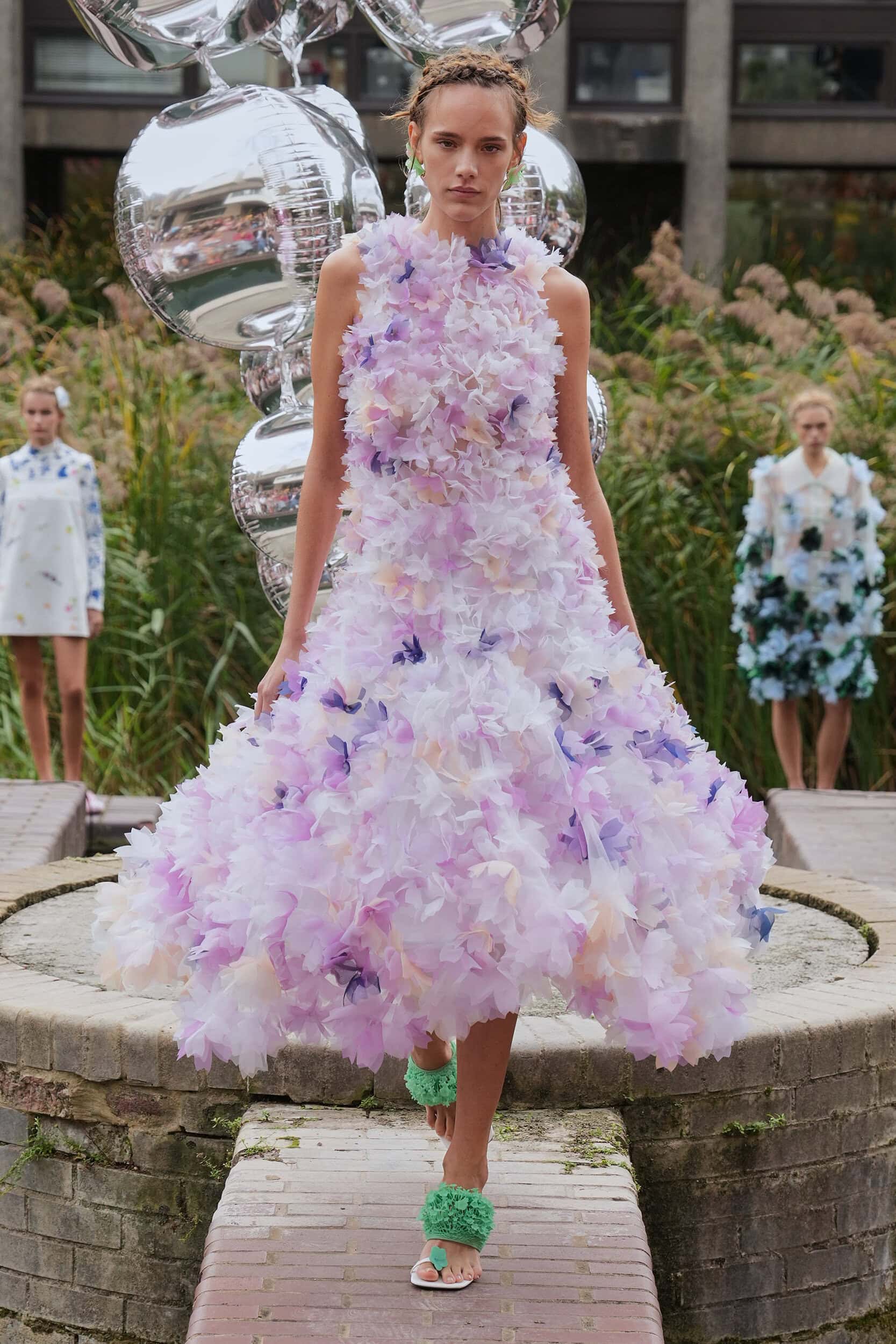
One of the leading palettes of the season, sweet and sentimental shades of lilac, baby blue, butter yellow and baby pink featured across all four cities. No category was left untouched as designers leaned into the harmony these hues can create. At Bottega Veneta Louise Trotter suggested a new summer uniform of contrasting lilac and butter that is sure to tie-in with the promotion of the Miami Vice ’85 reboot, McQueen and Jil Sander presented red-carpet worthy voluminous dresses in lemon, and lilac was a fan favourite in sheers and shiny satins at Sandy Liang, Simone Rocha, Isabel Marant, and Chloé.
Where Was it Seen?
McQueen, Chloé, Balenciaga, Dries Van Noten, Jil Sander
2. Retro-coded Colour
Why it’s Trending?
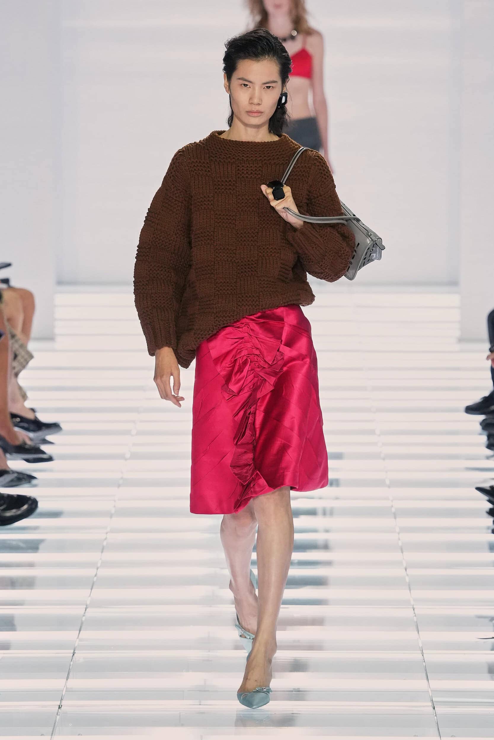
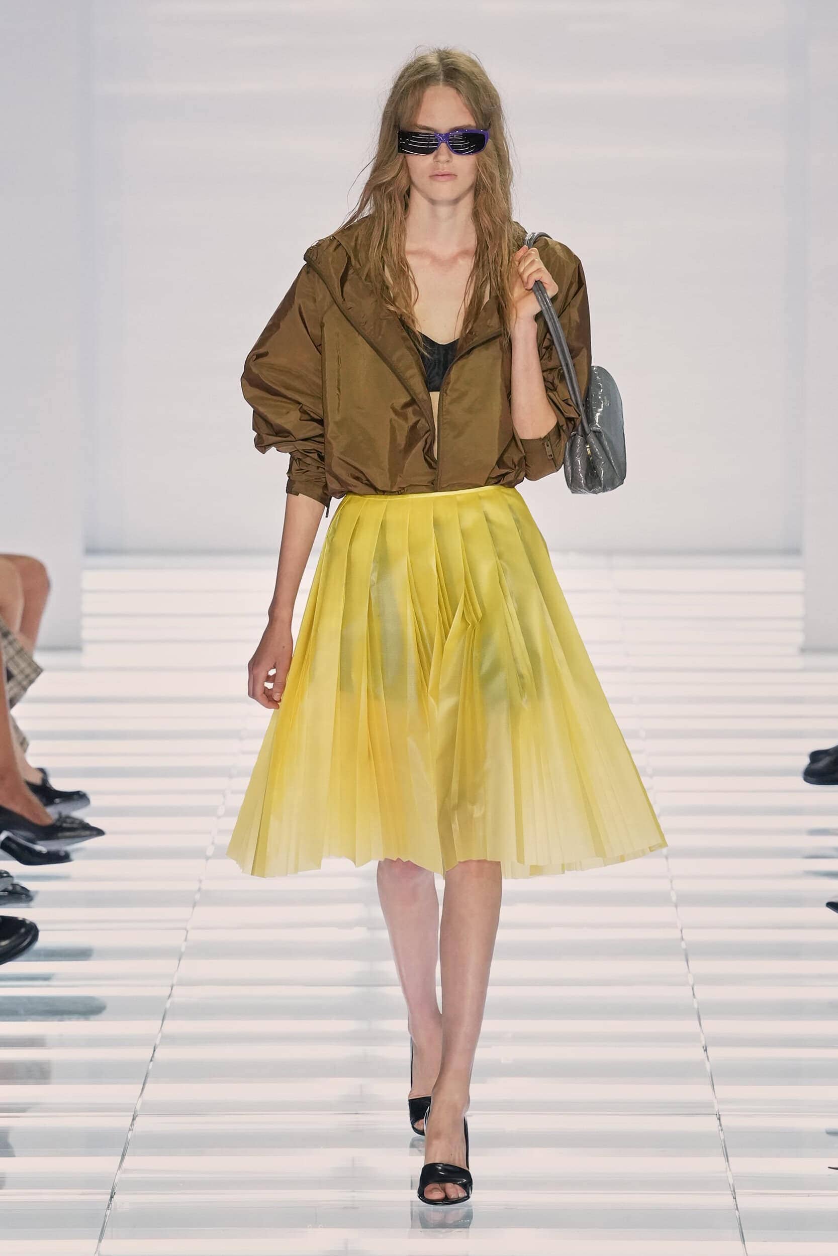
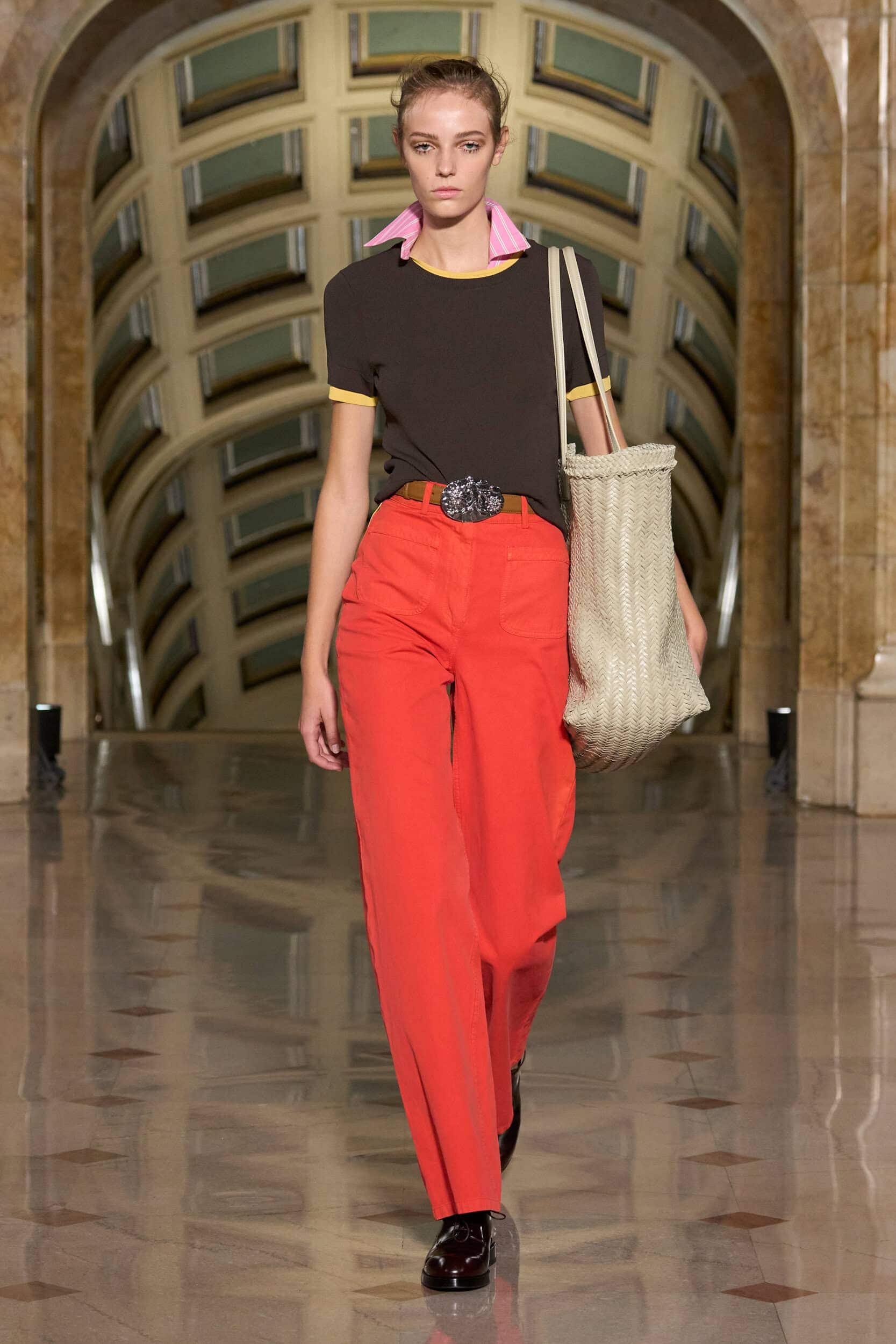
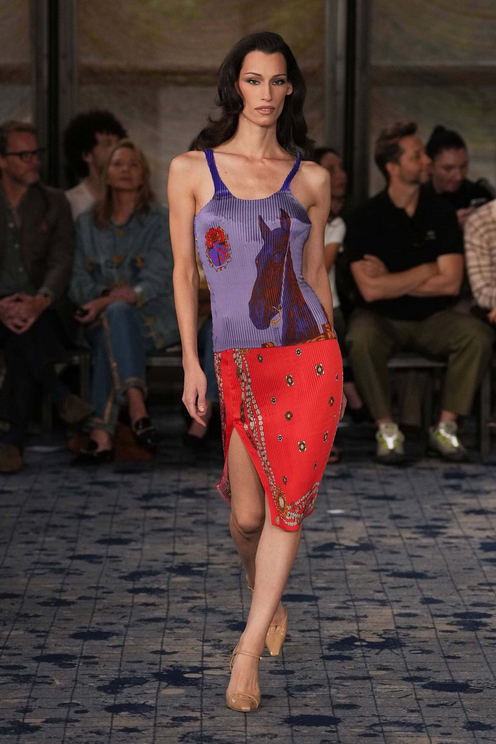
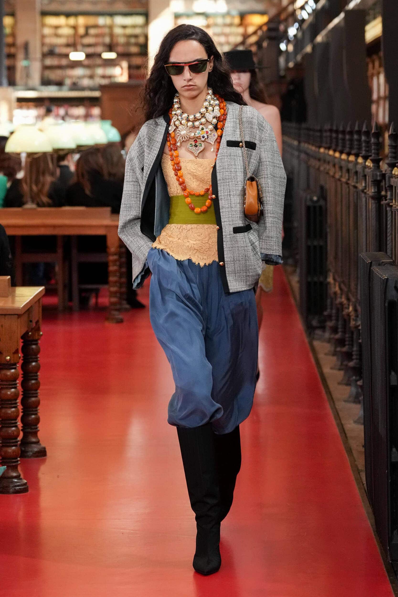
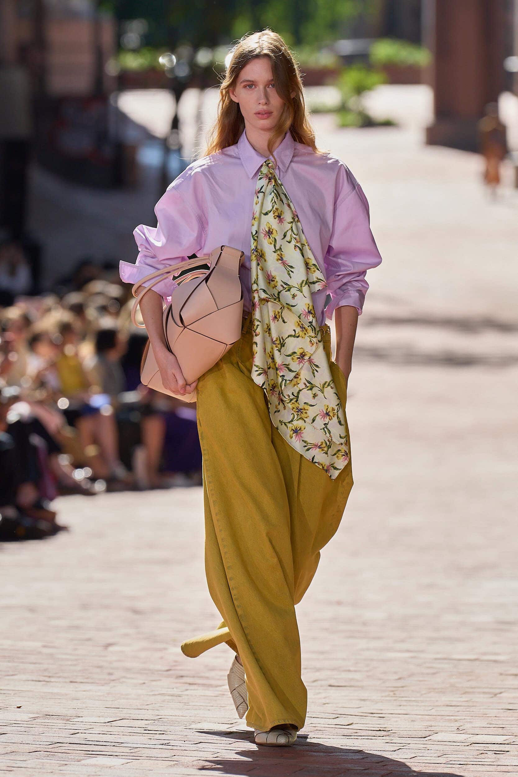
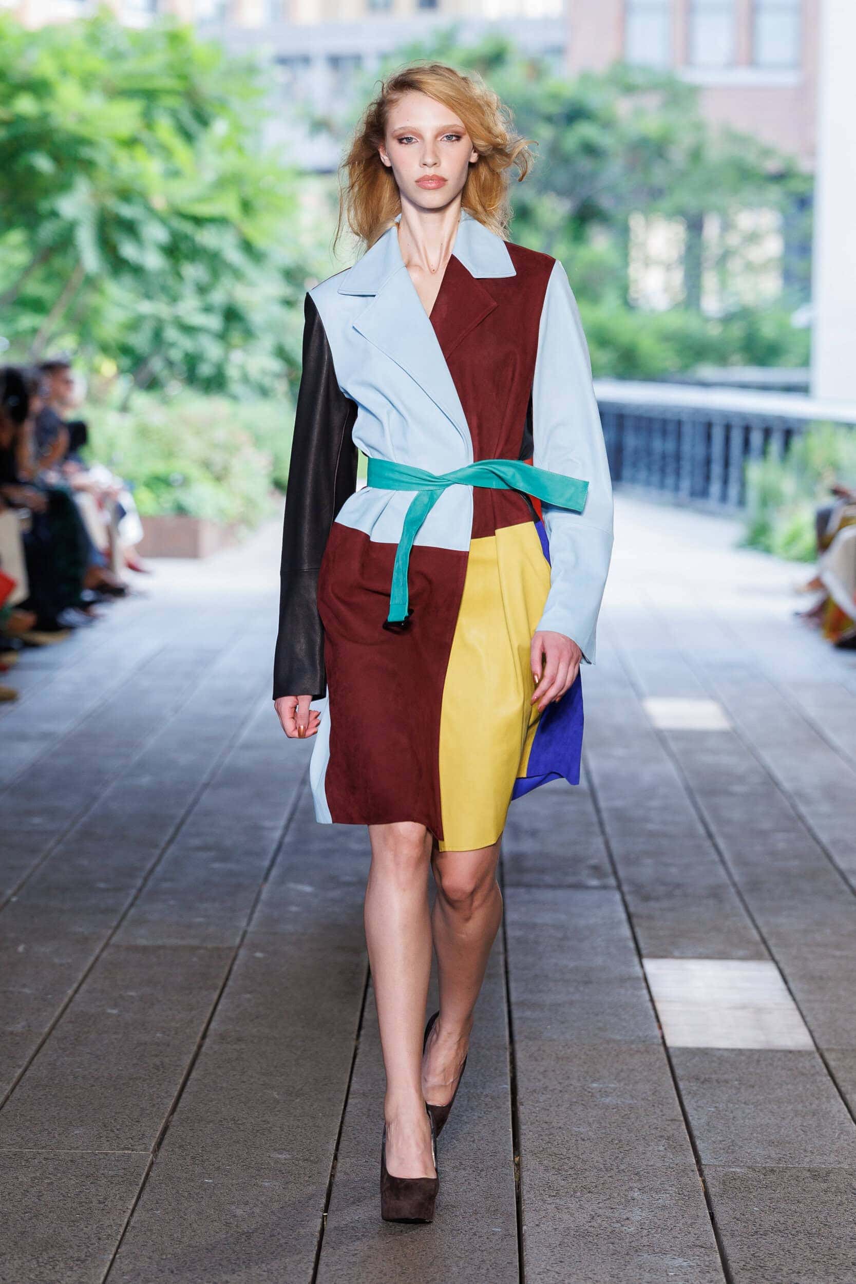
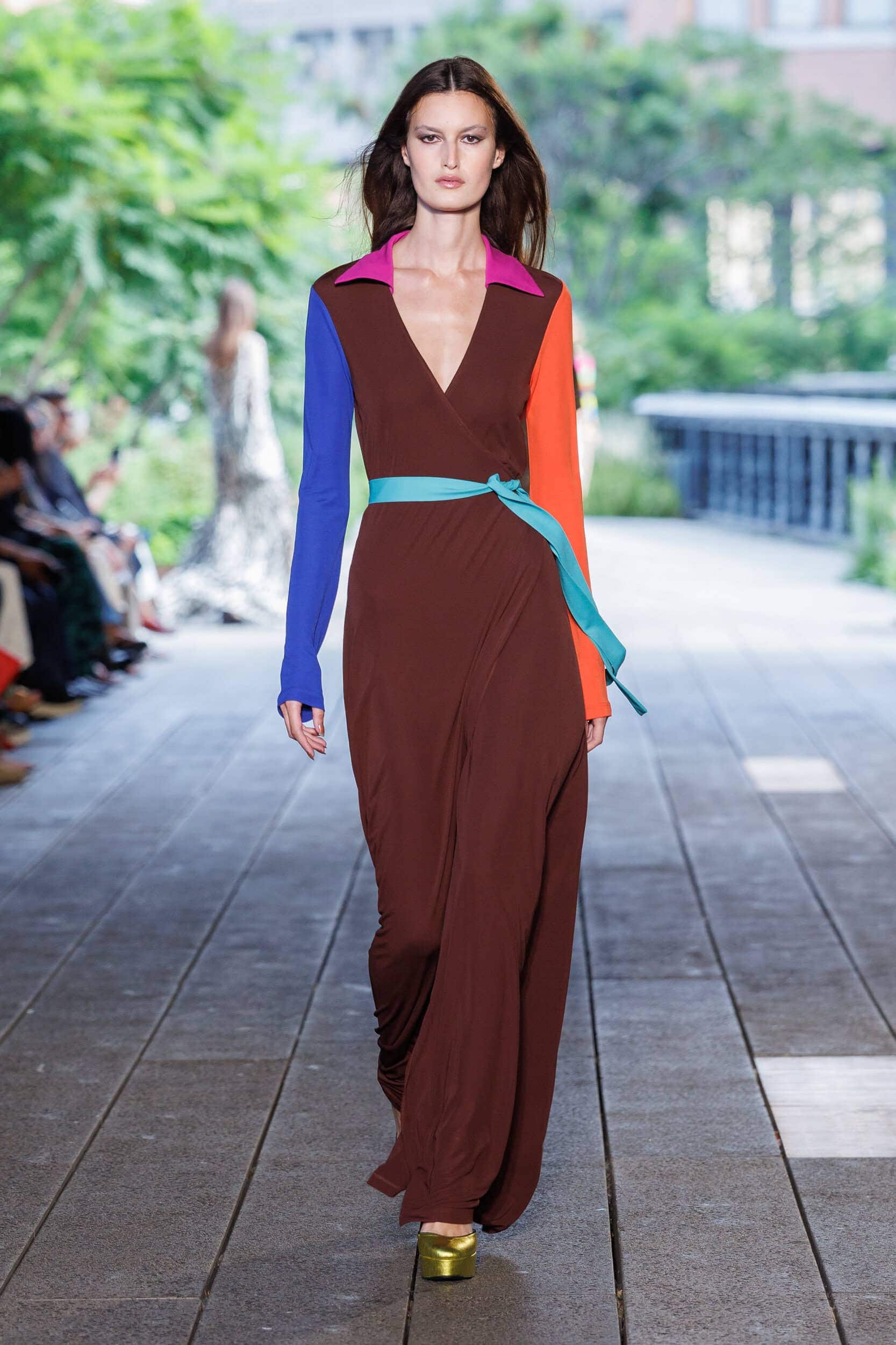
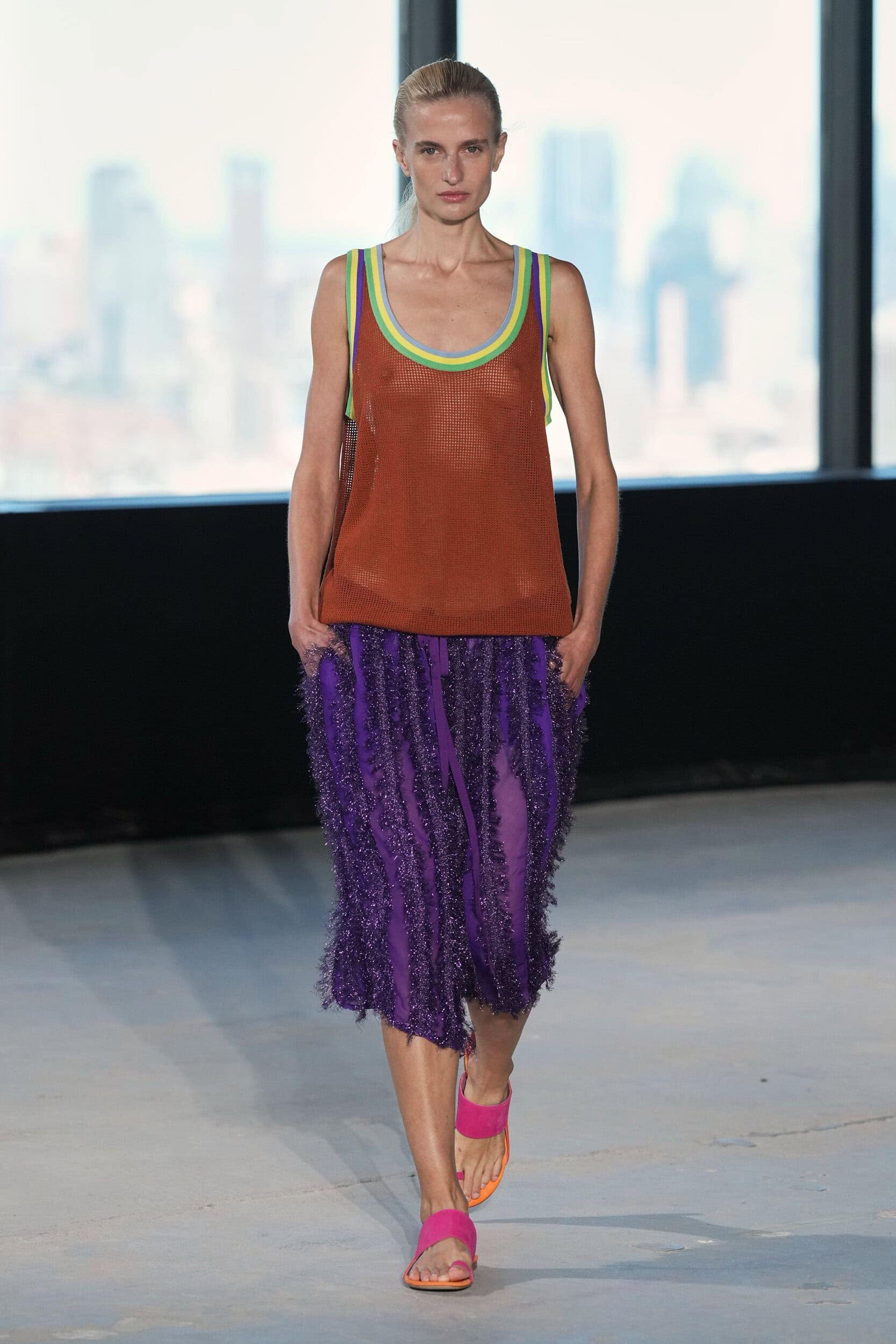
Existing within the same eco-system as the men’s spring collections that were shown in June, colour pairings are inspired by retro interiors and the golden-hued seventies that were captured on film as Kodak moments. Taking it back to a lost time of childhood freedom and analogue experiences.
Why it Matters?
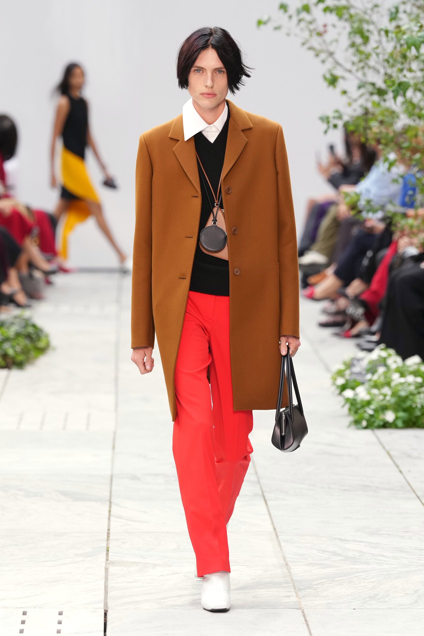
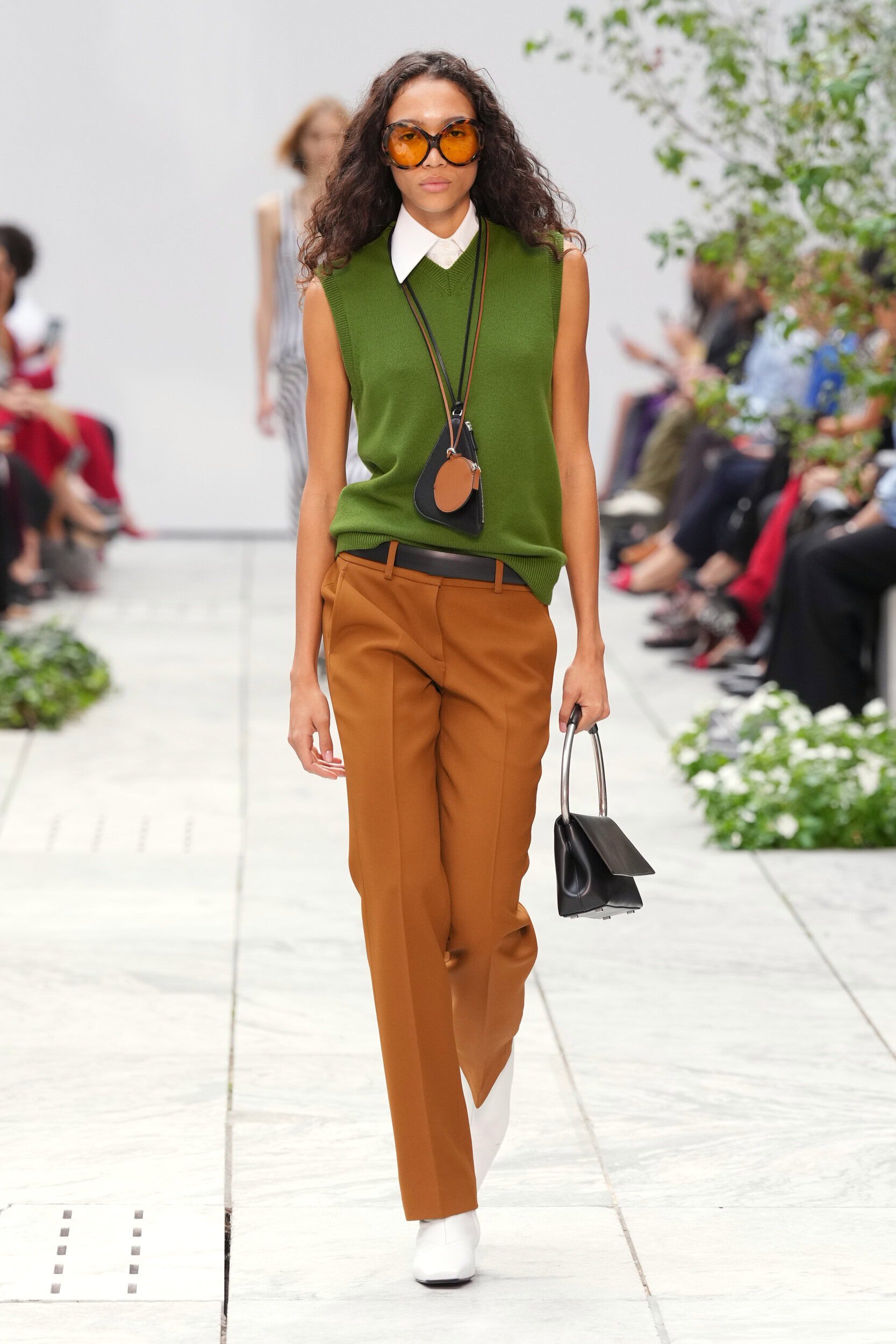
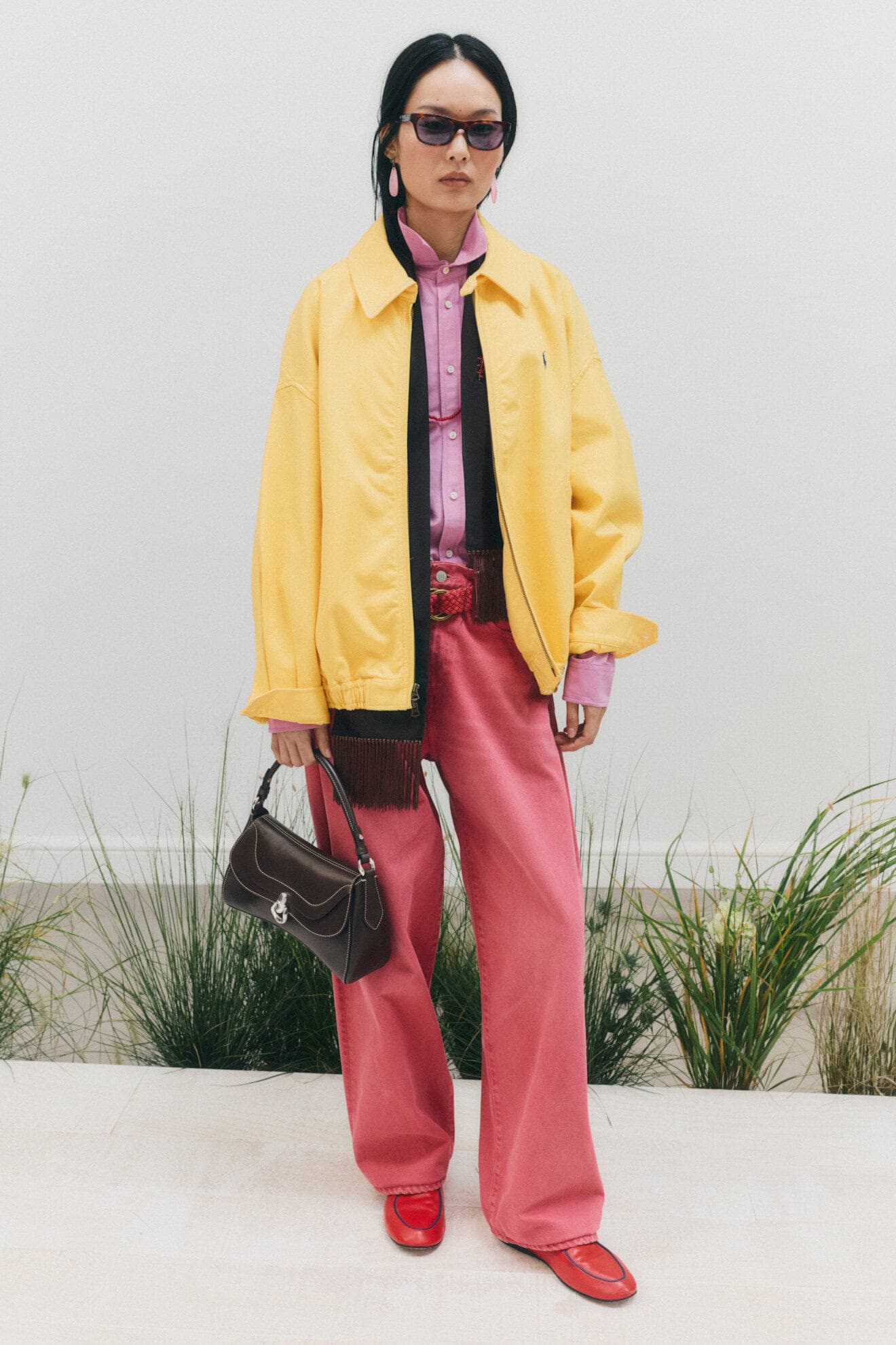
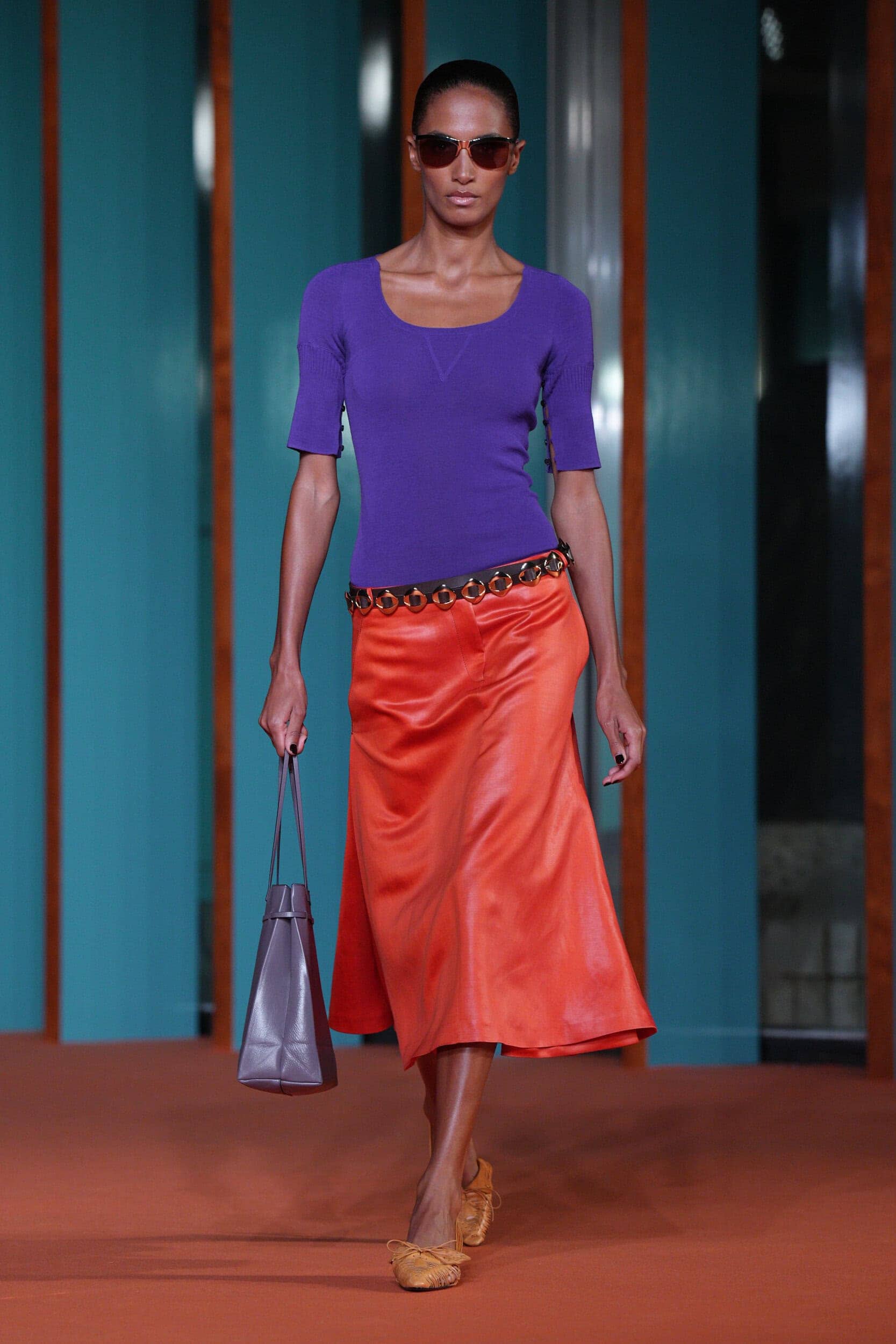
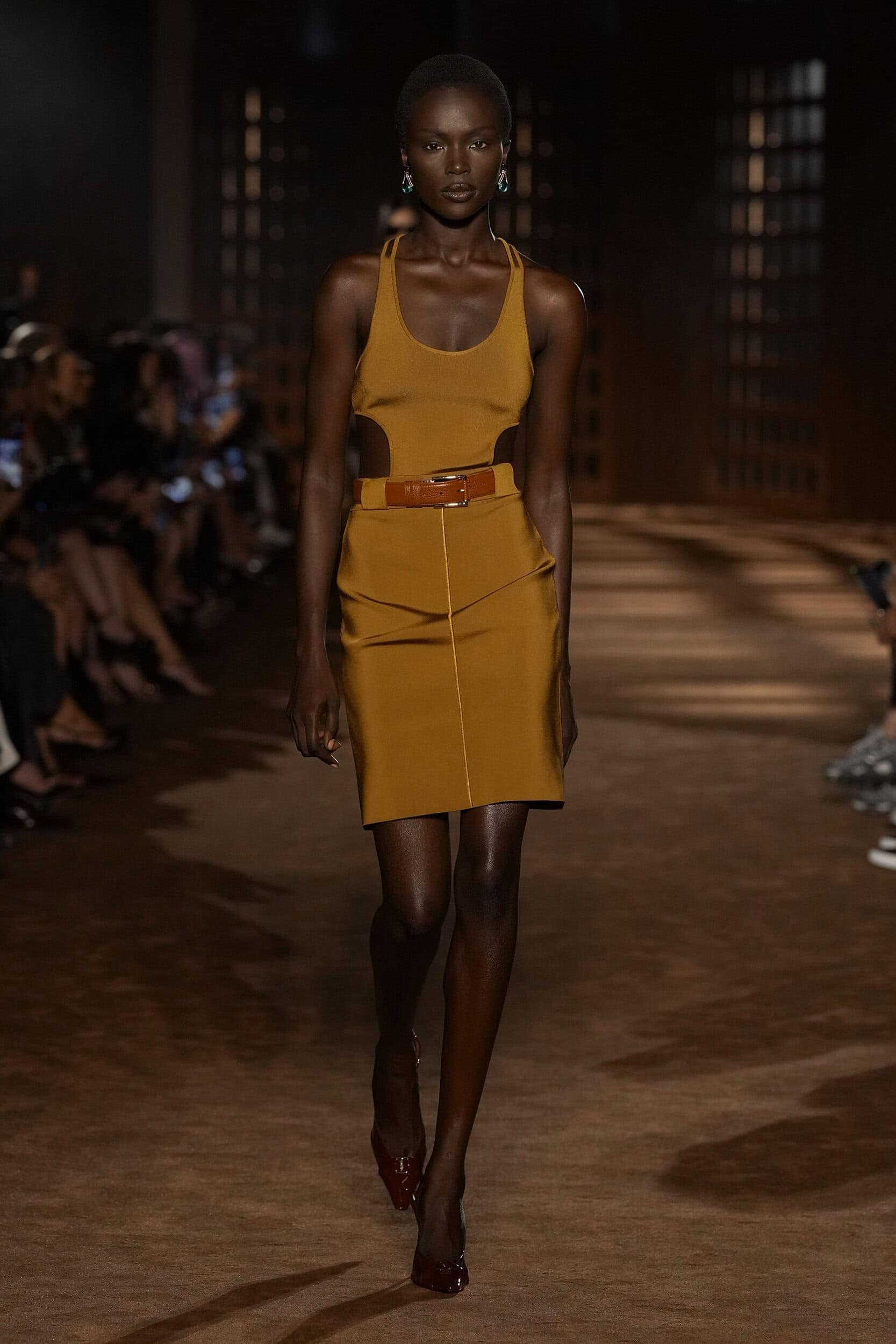
Muted tones of mustard, chocolate brown and russet red were layered with unconventional brights to create collections that appeared to have a lived-in filter applied to them. This sentiment spoke to bringing back the authenticity of dressing for personal satisfaction with designers such as Tory Burch, Ulla Johnson, Ashlynn and the originator of eccentric colour play Miuccia Prada.
Where Was it Seen?
Tory Burch, Anteprima, Dries Van Noten, Prada, Polo Ralph Lauren
3. Staying Alert
Why it’s Trending?
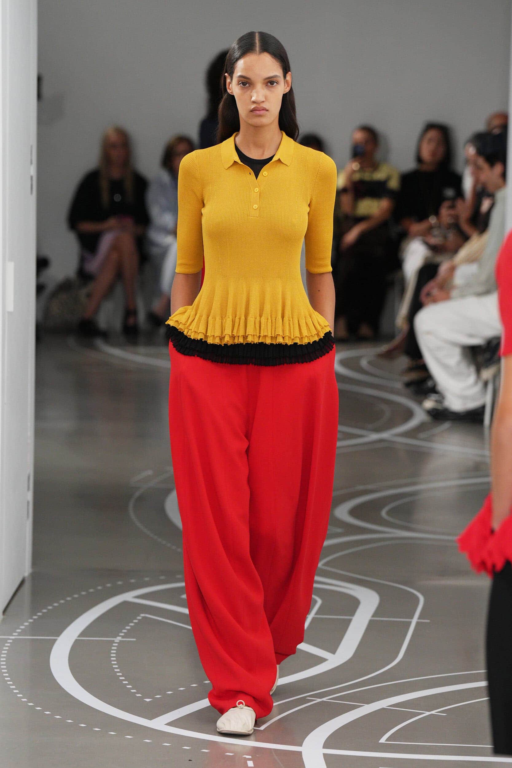
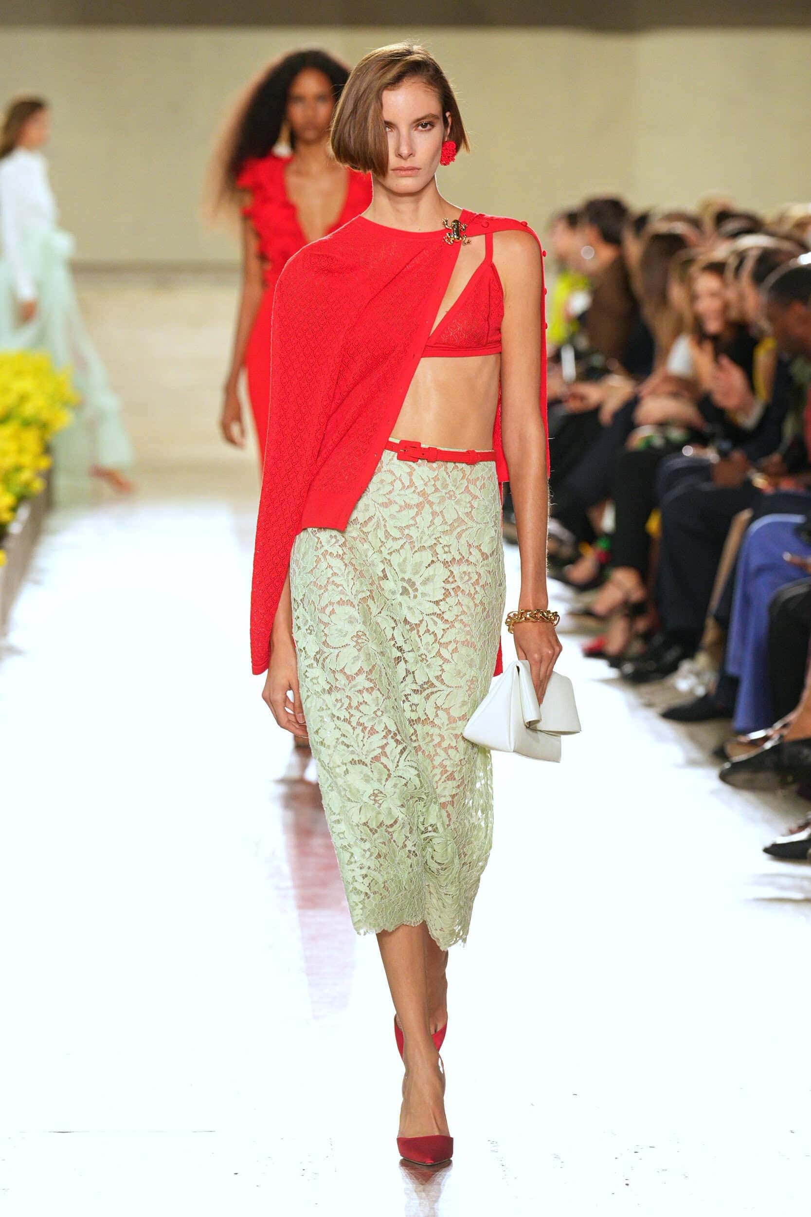
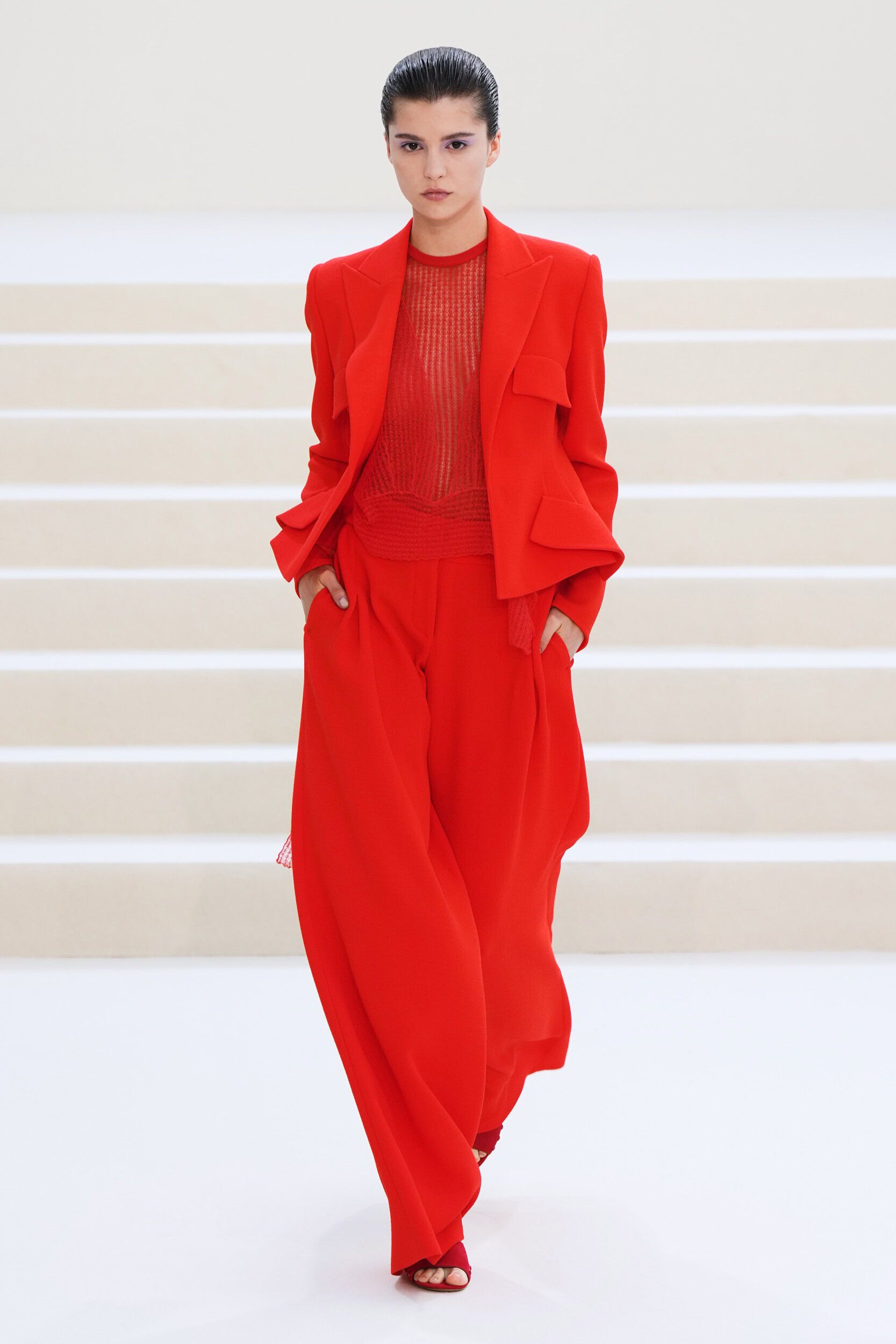
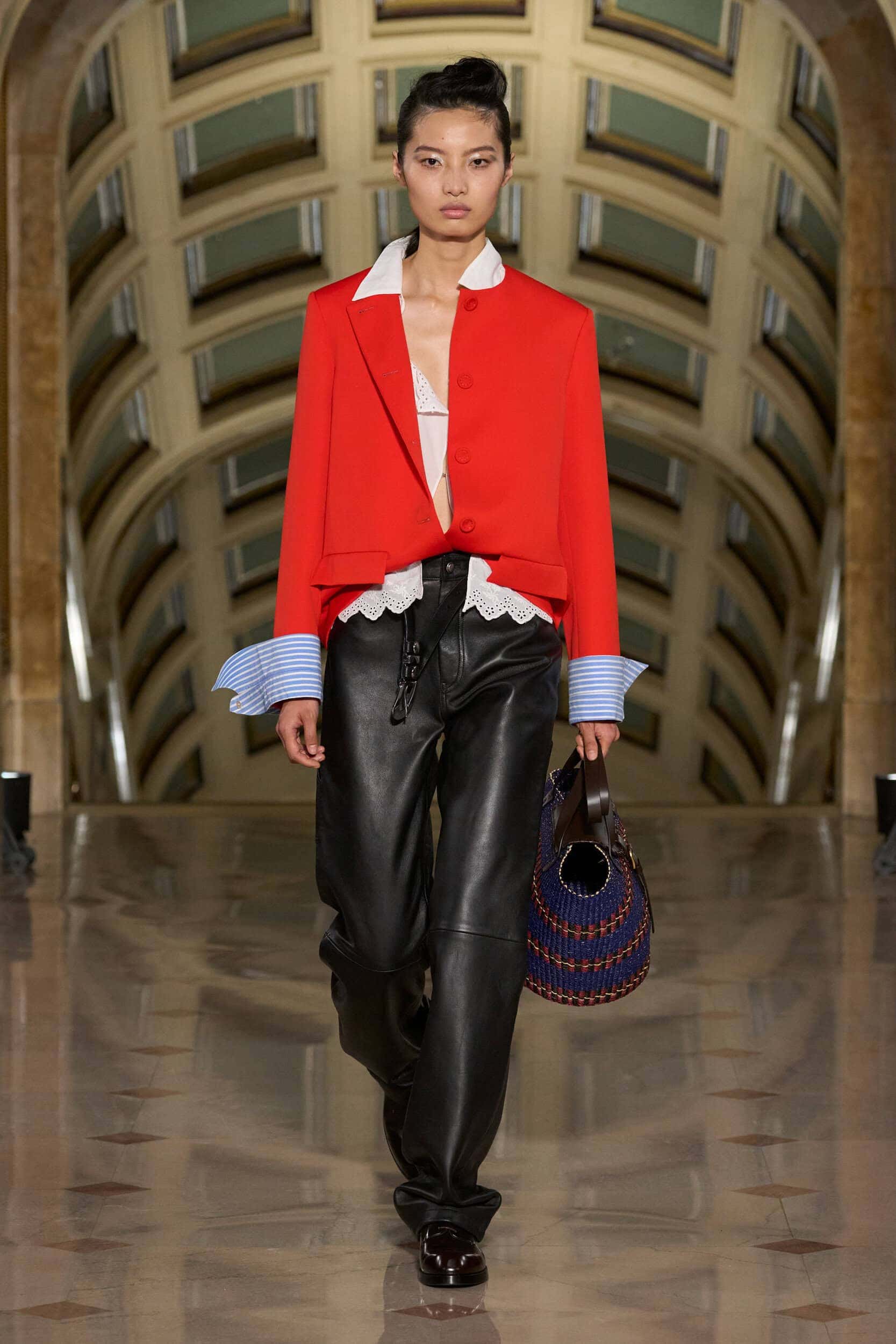
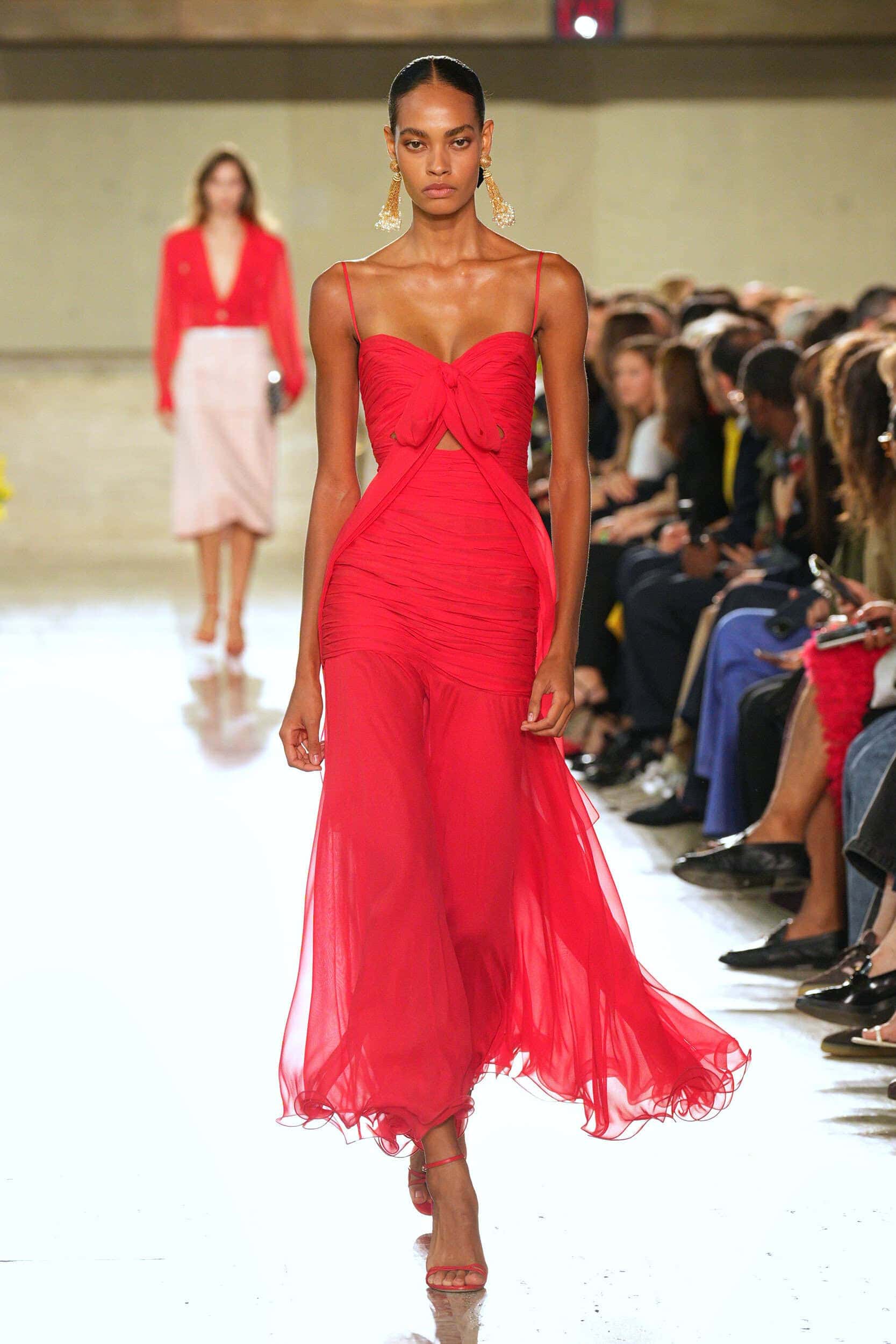
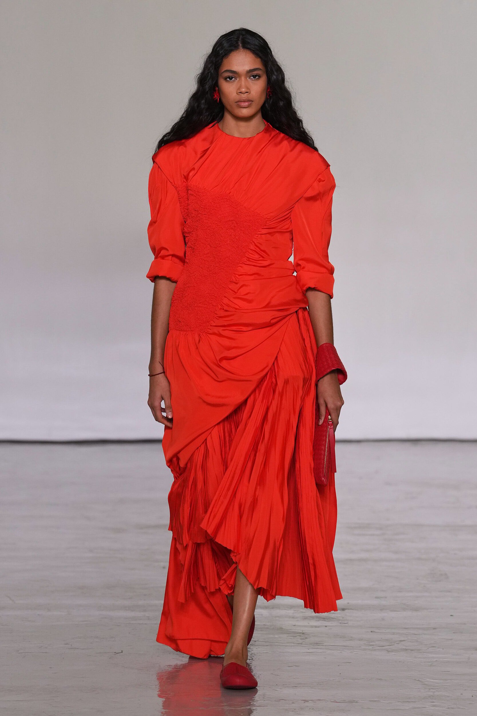
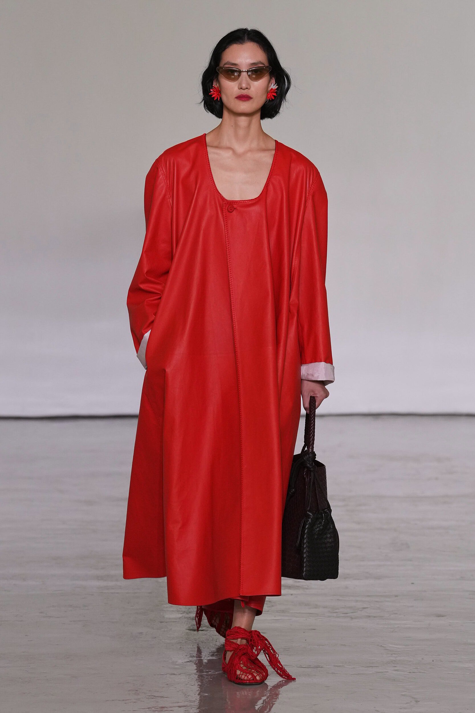
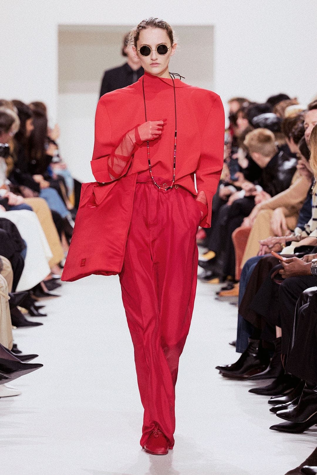
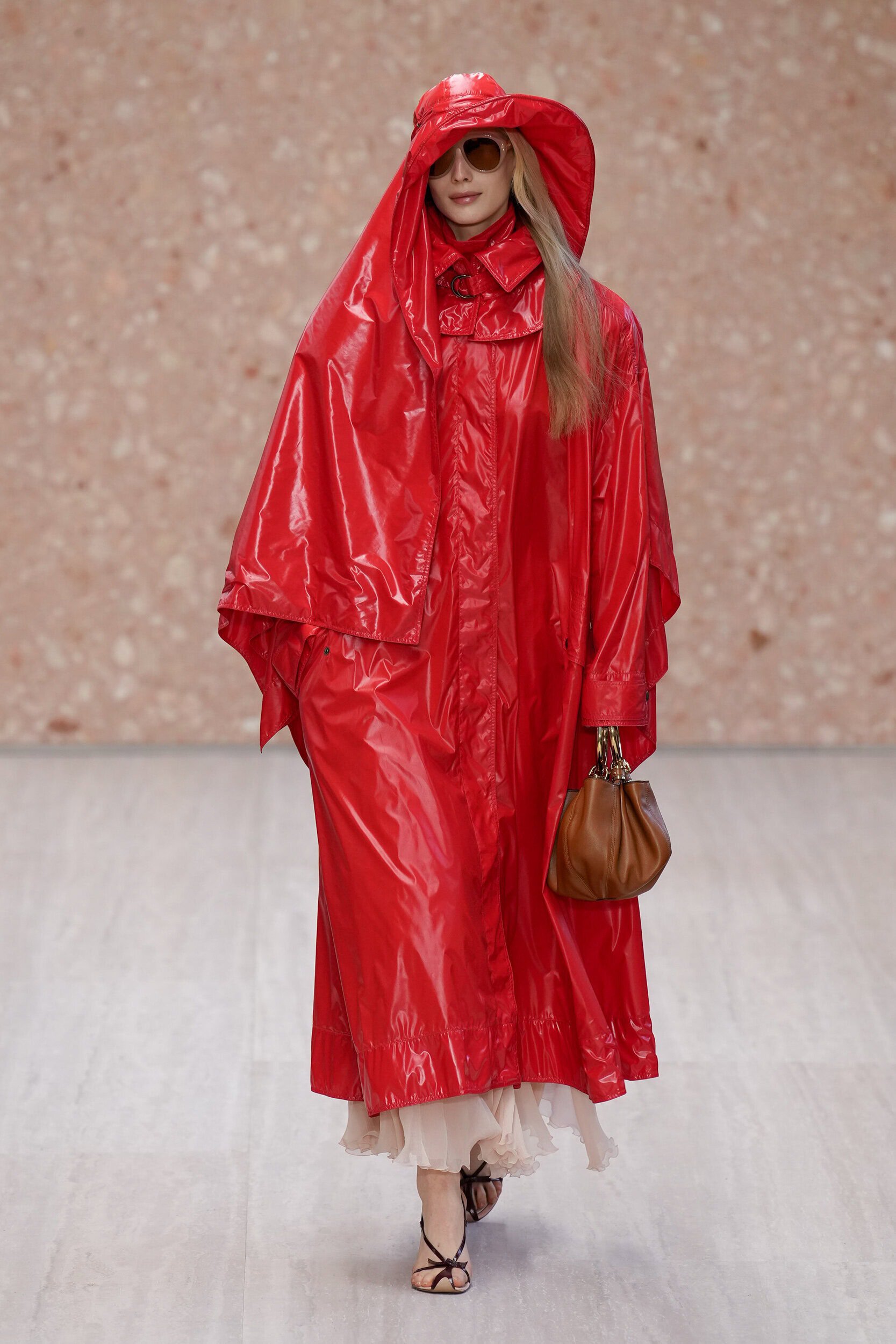
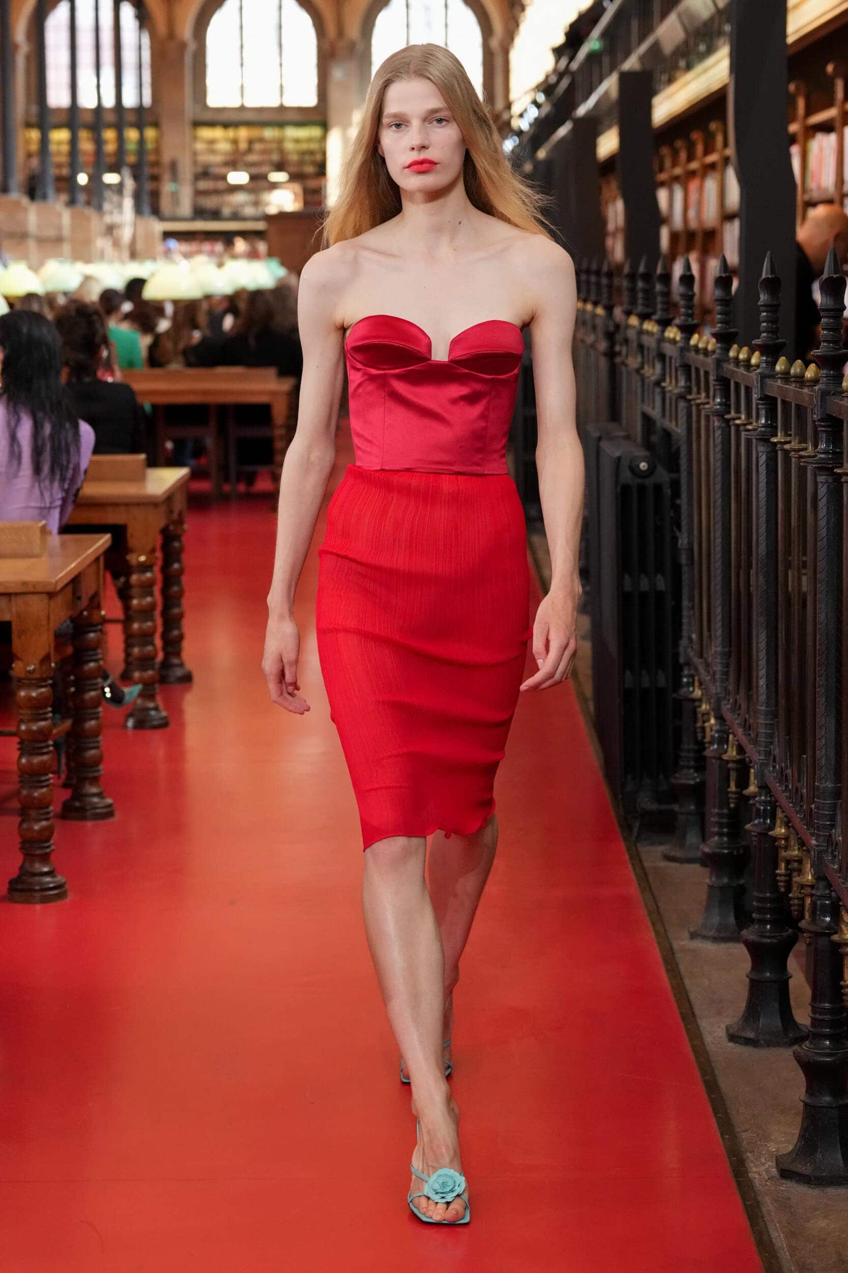
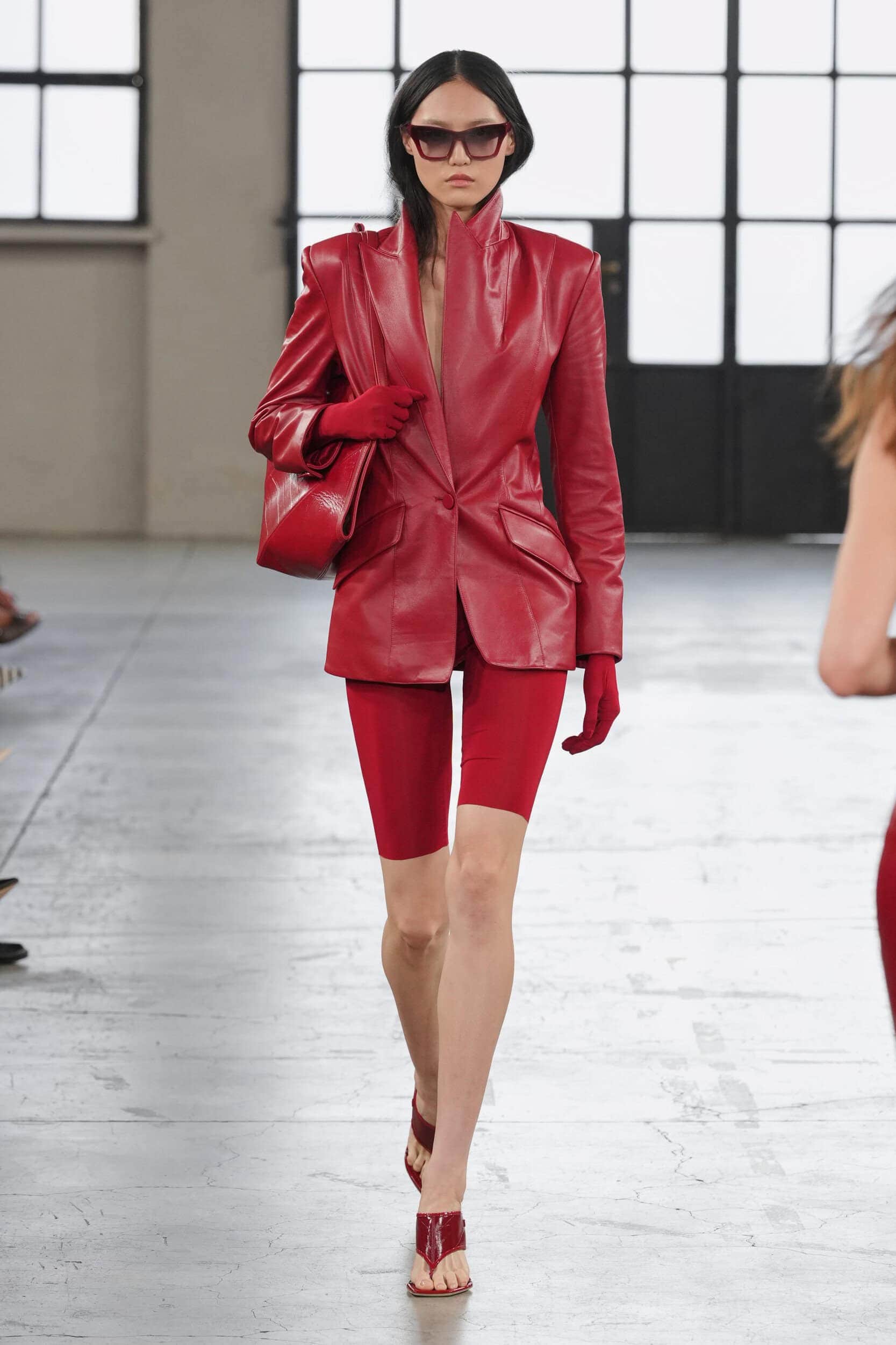
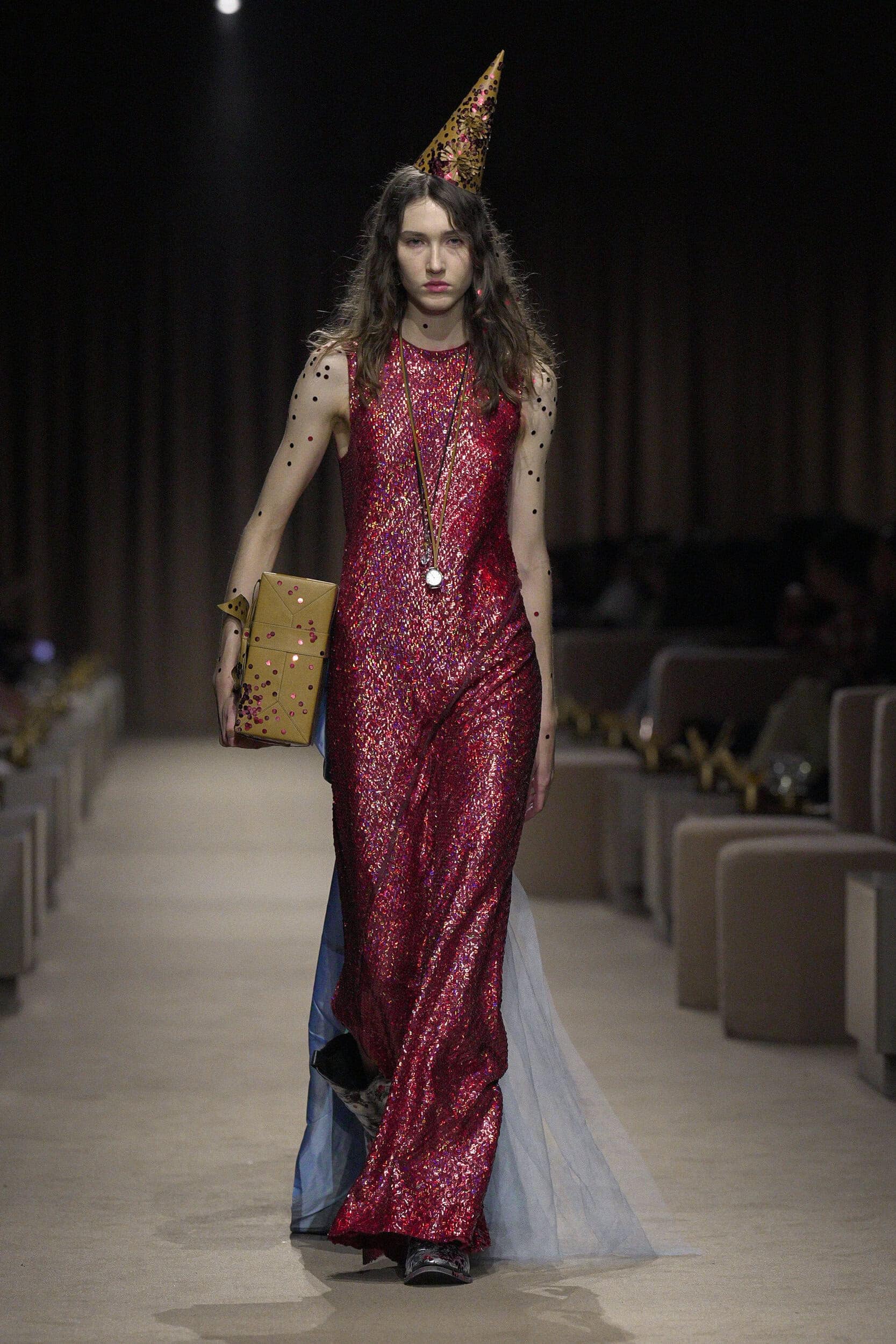
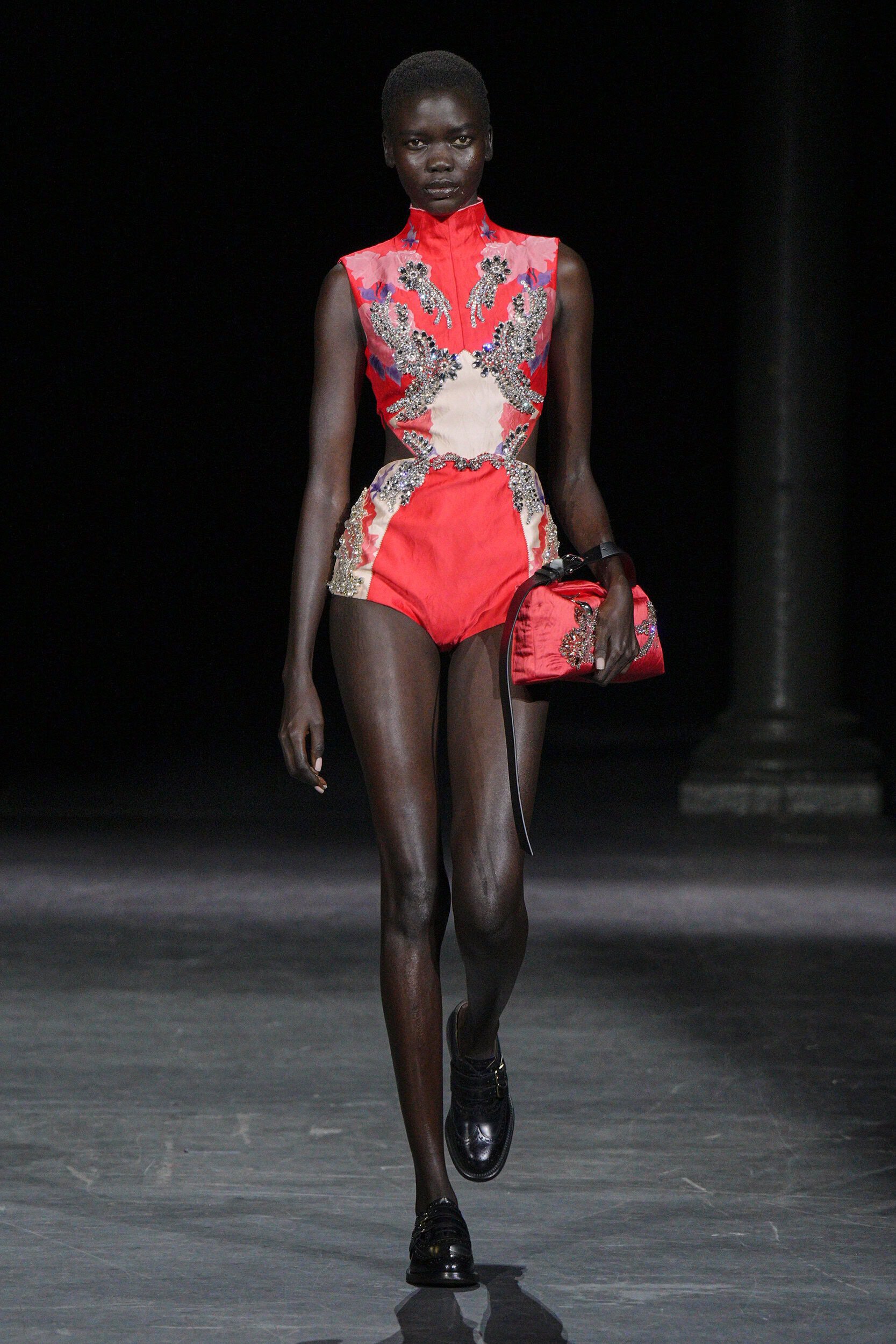
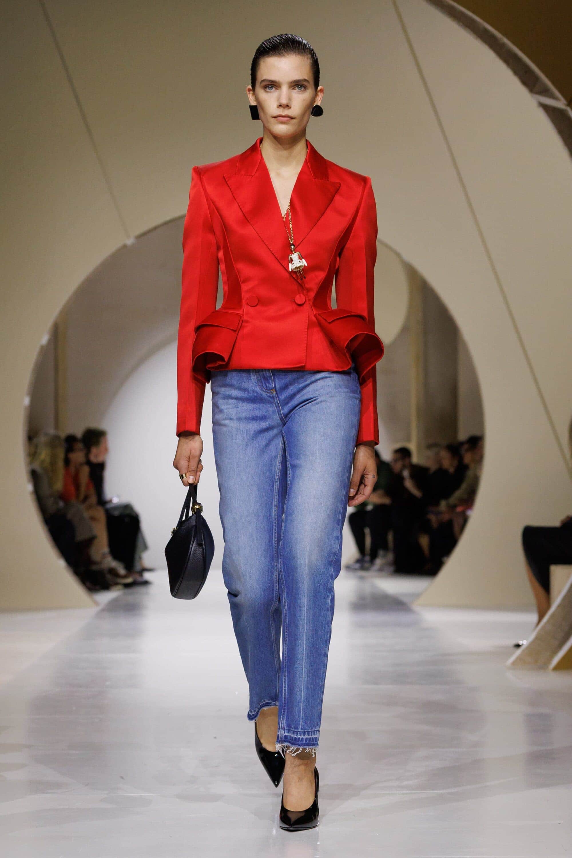
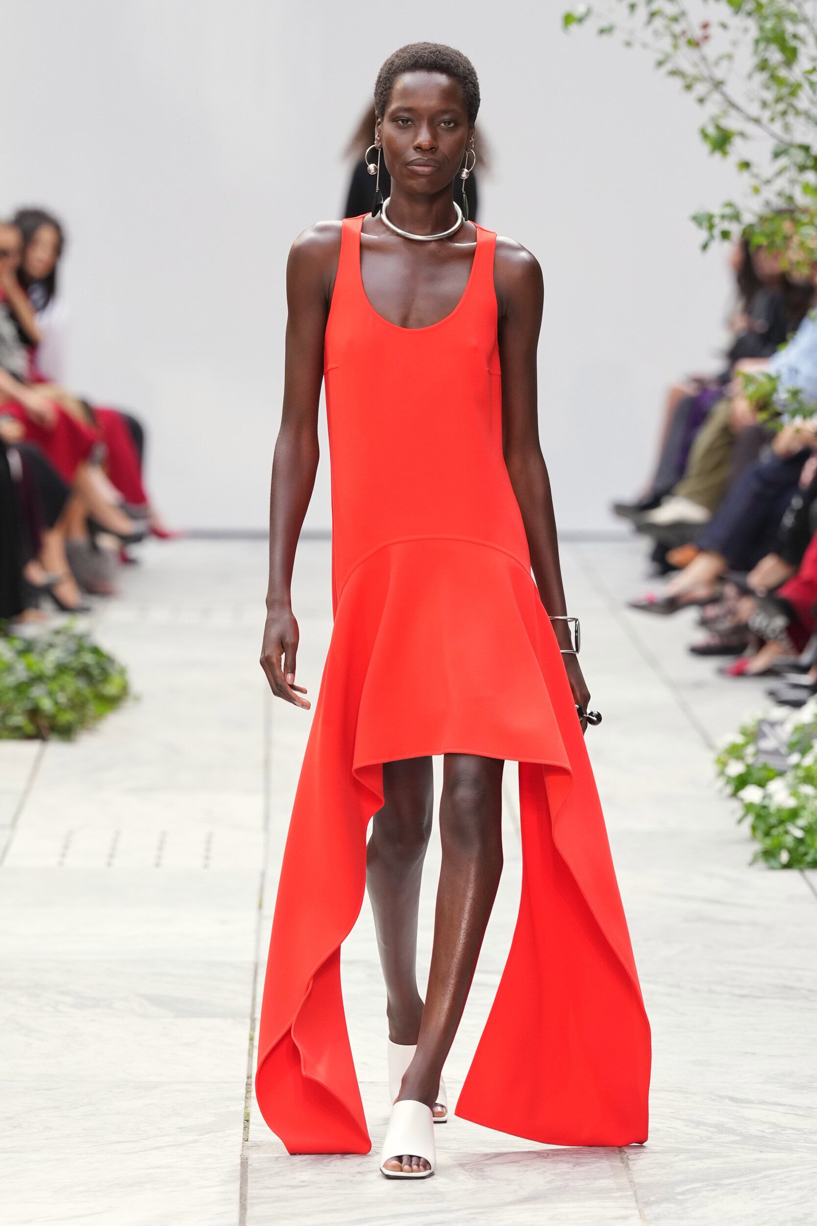
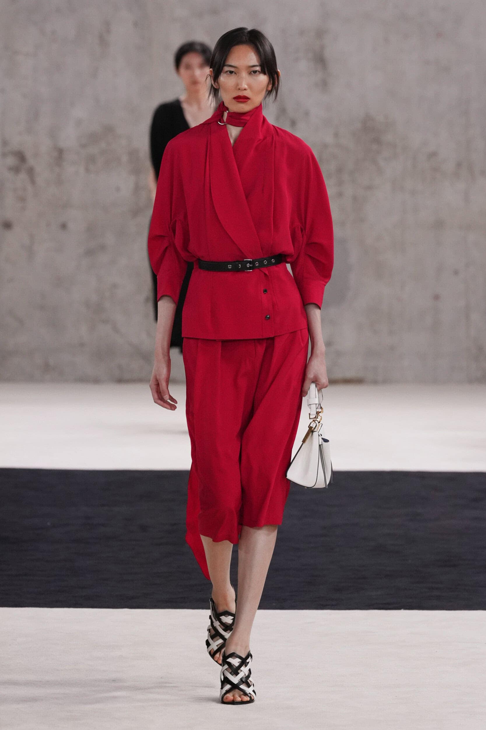
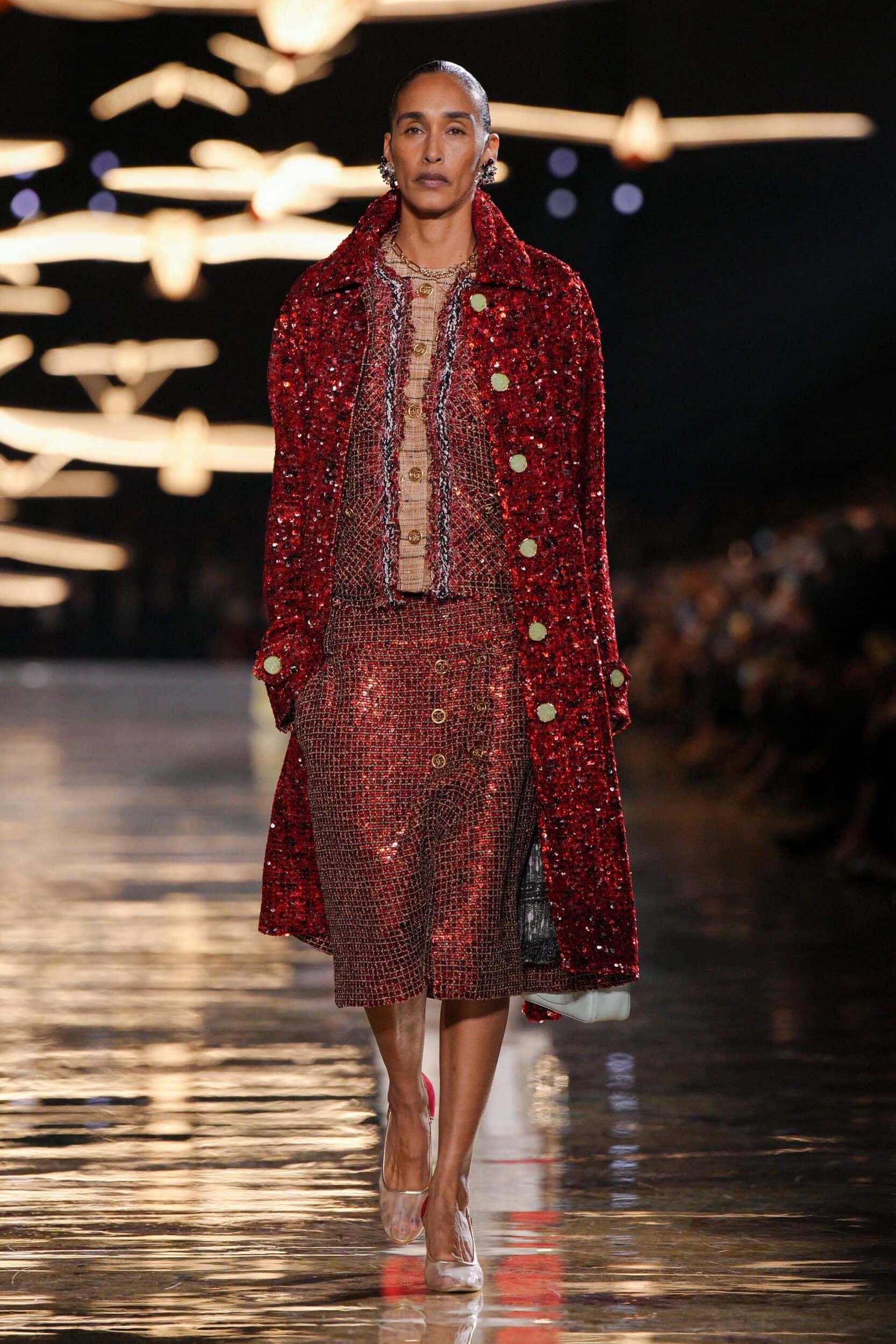
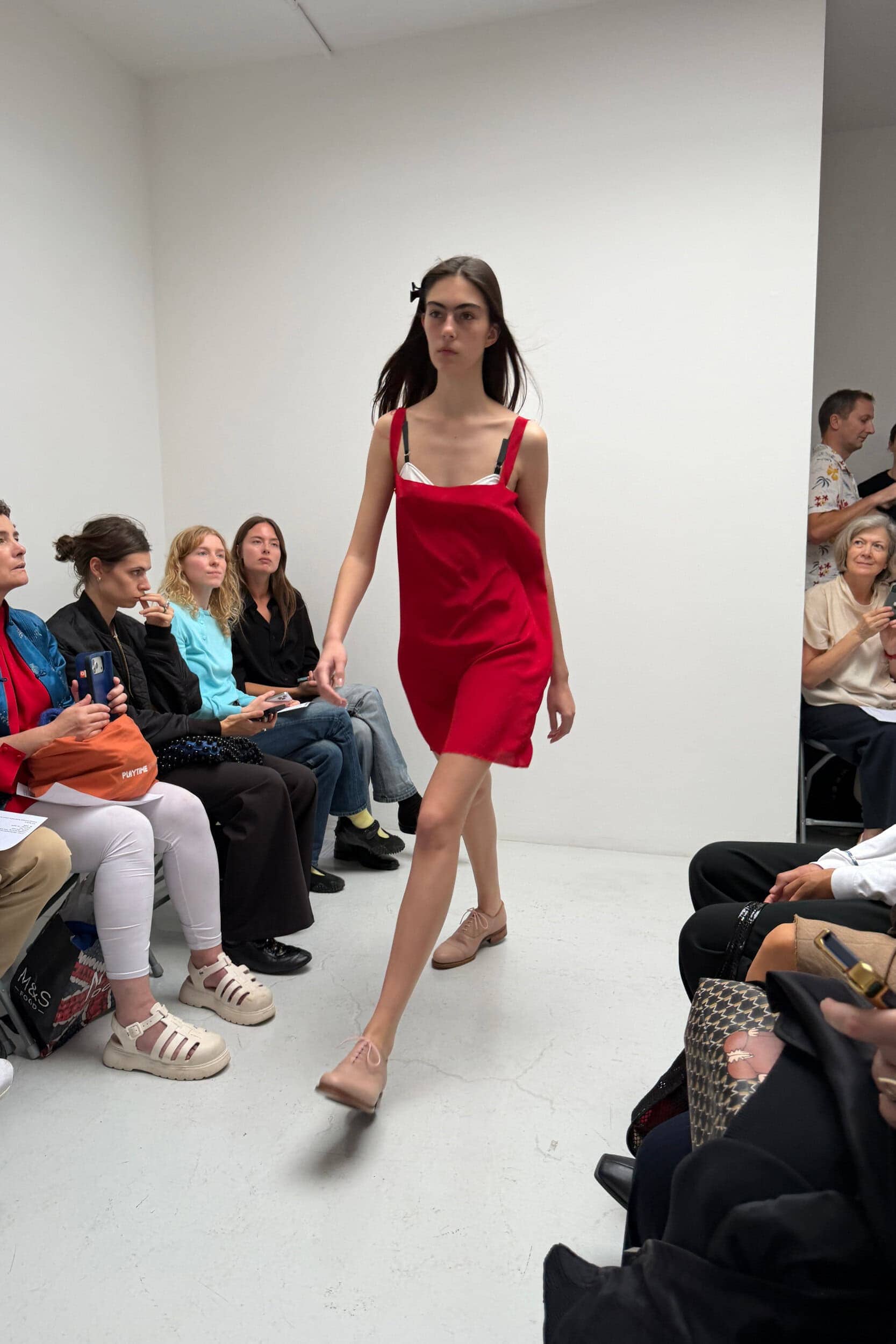
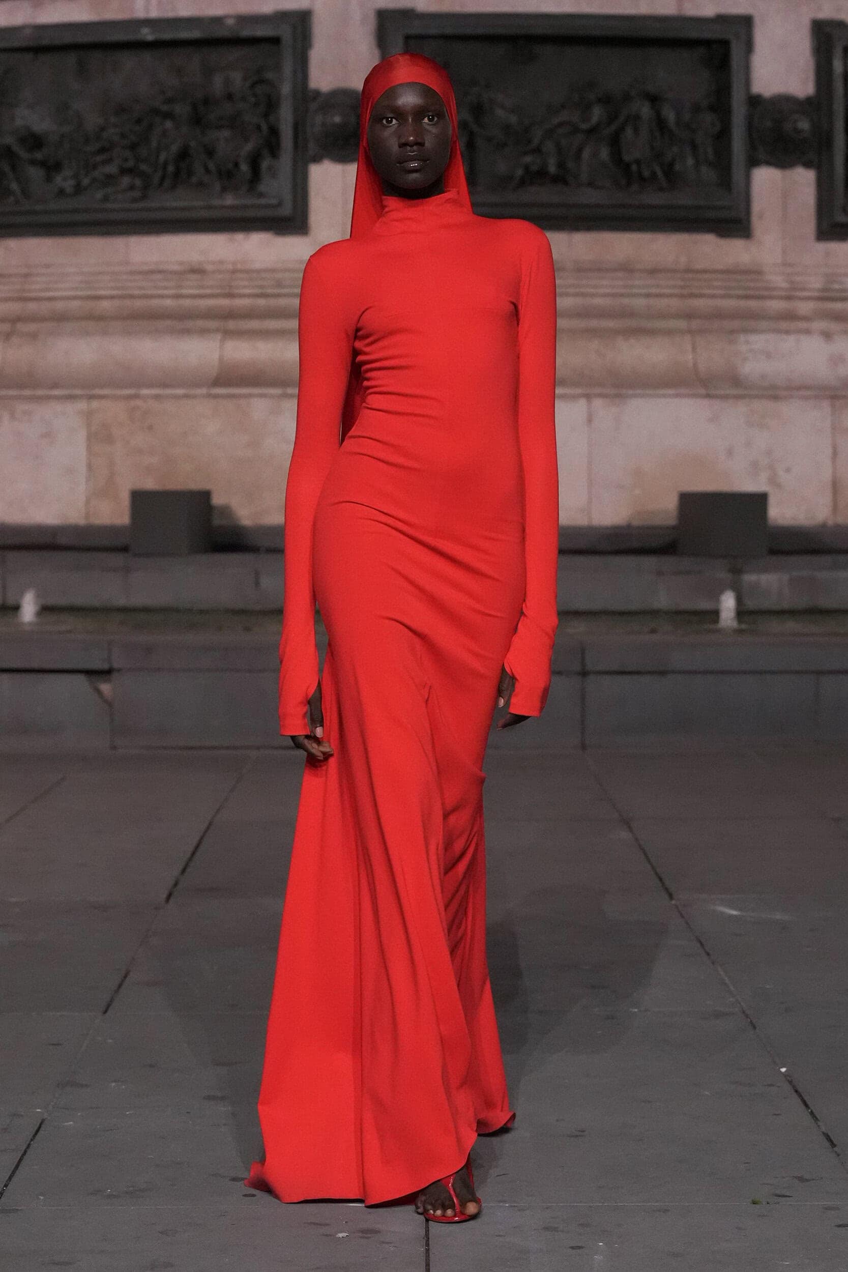
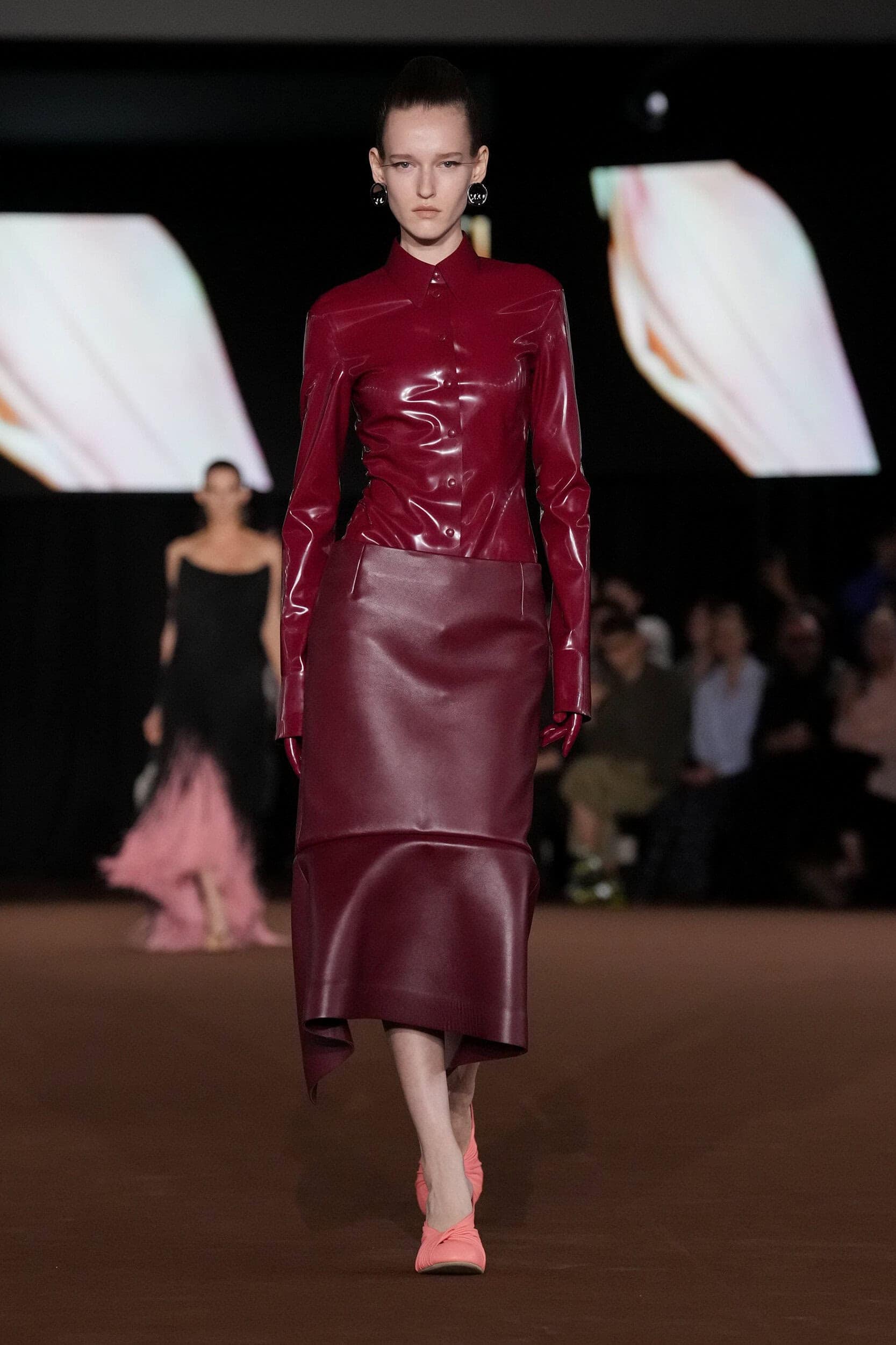
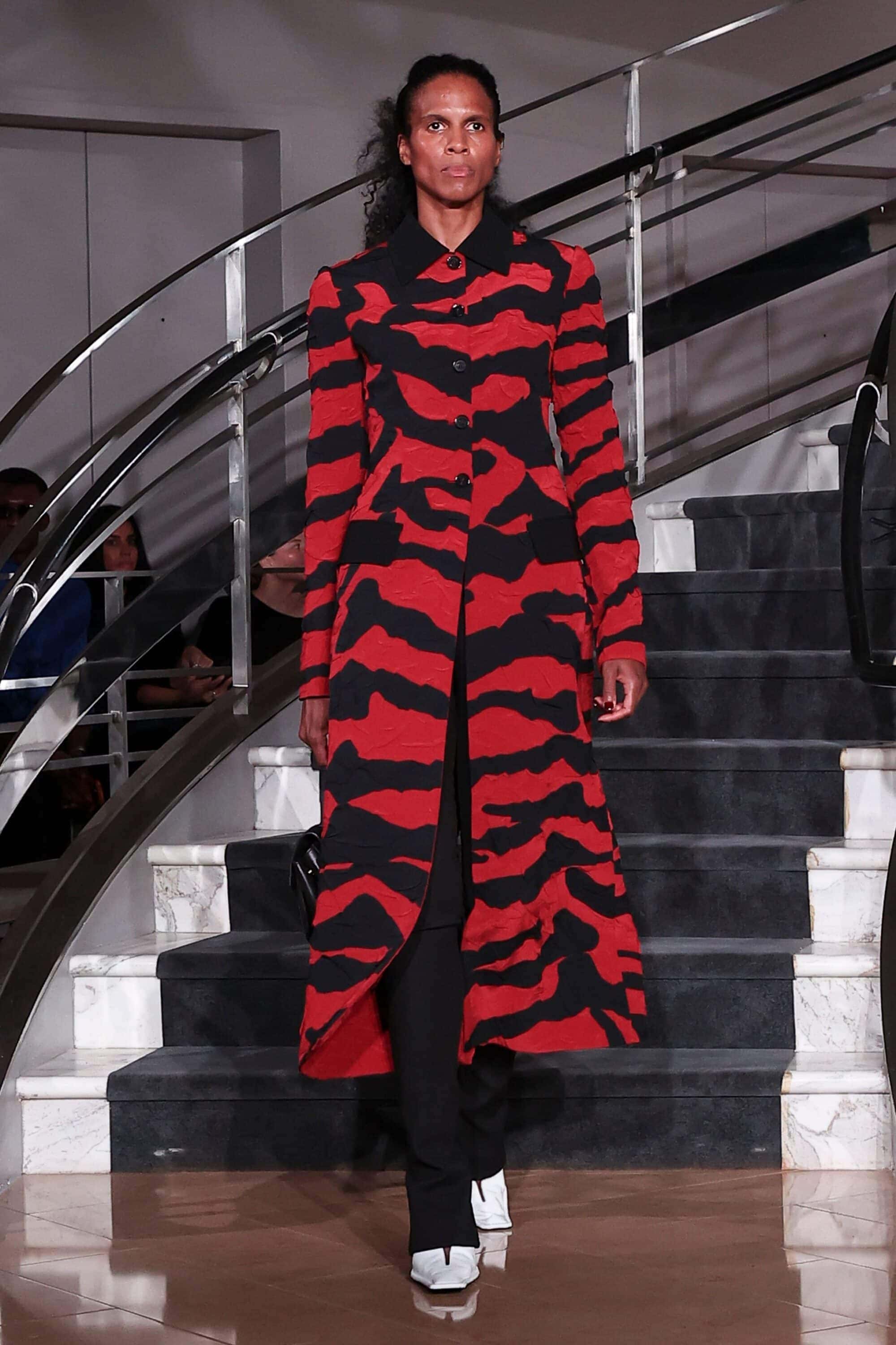
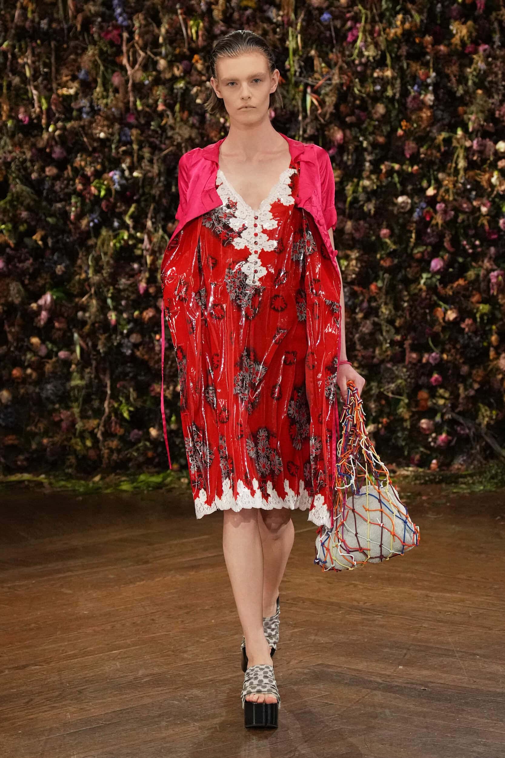
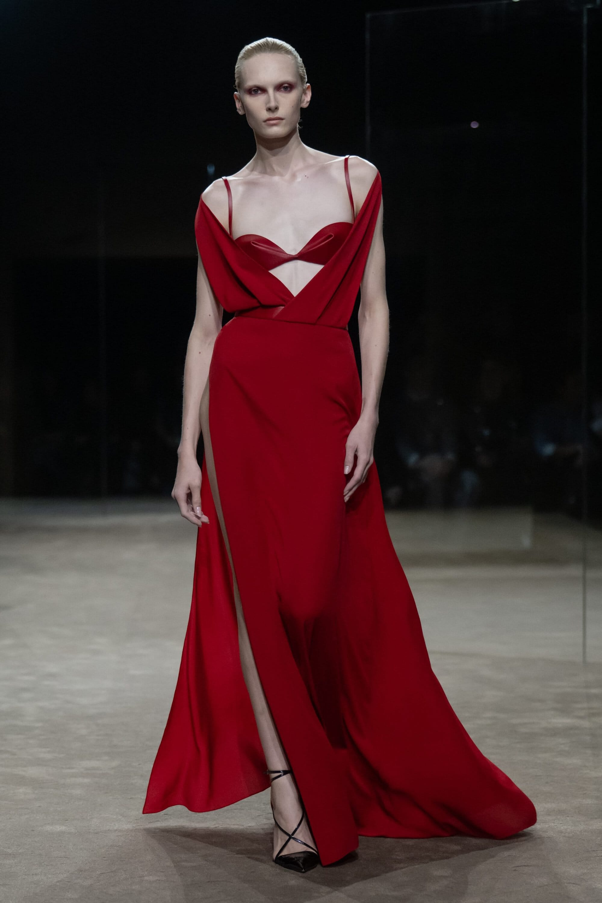
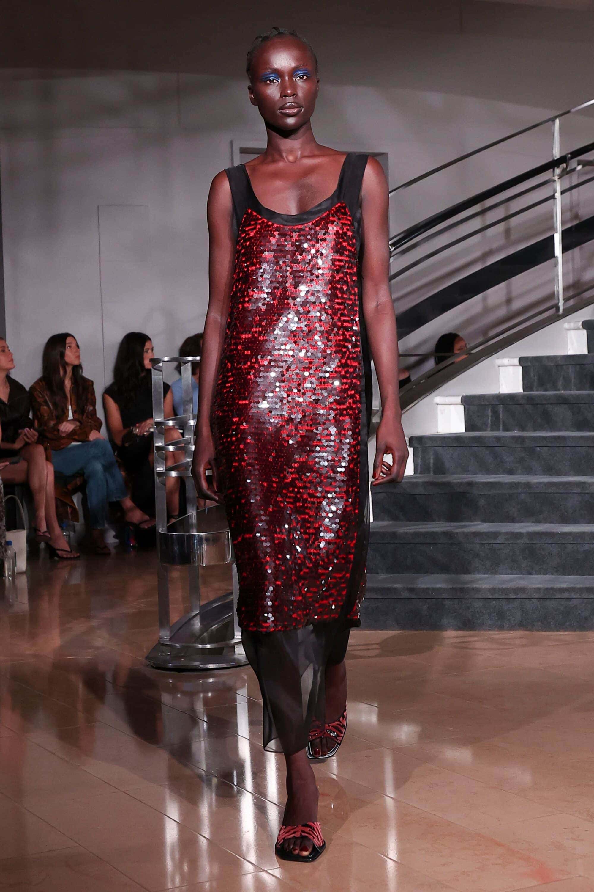
In a season that has positively encouraged the pursuit of emotional connection red became the unspoken language of a renewed assertiveness. Alongside singular statements in clothing designers simultaneously painted the runway scarlet with swathes of head-to-toe chiffon, structured satin, and glistening sequins carrying the legacy of the powerful hue’s impact.
Why it Matters?
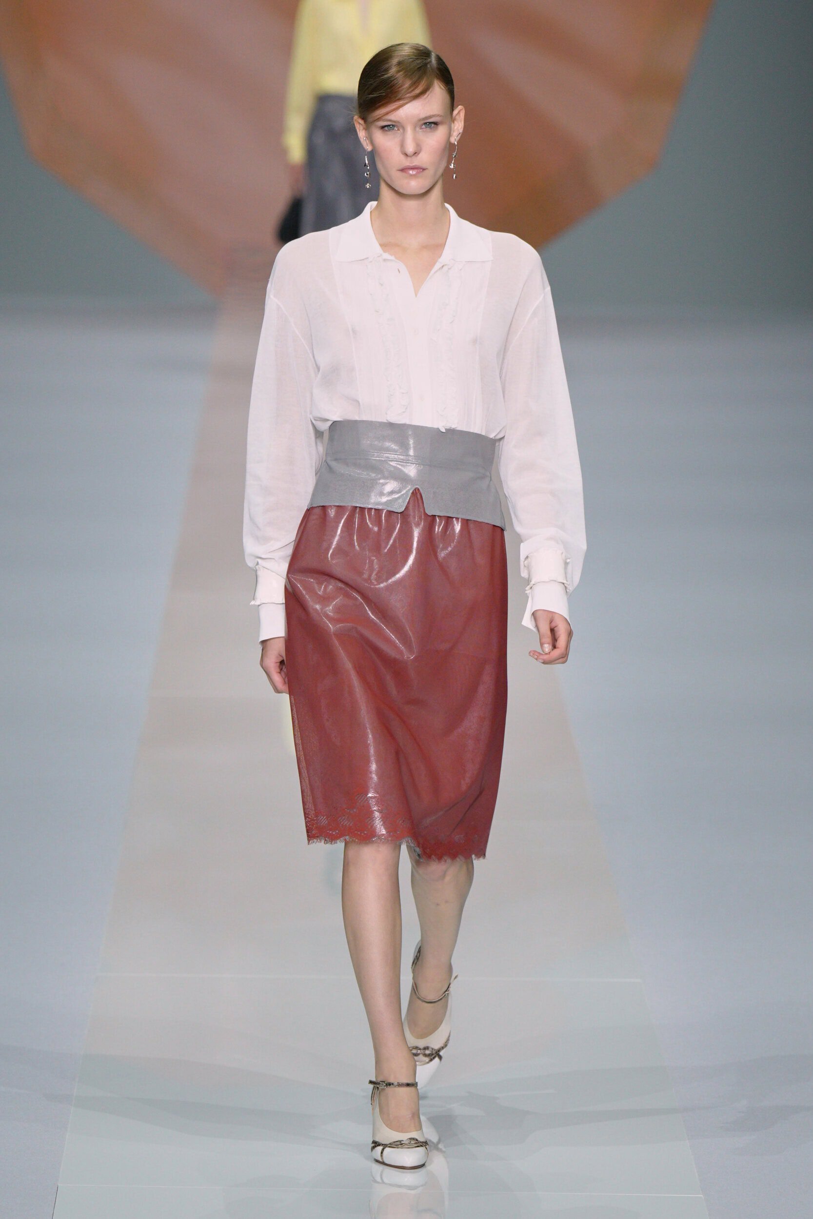
Radiating longevity, the intensity of red defies fleeting trends as its stability endures. It’s ease at translating for multiple occasions was demonstrated at Bottega Veneta where Louise Trotter applied the colour to both a leather swing coat and a smocked summer dress. The power of the red dress was channelled at Carolina Herrera and Coach, and at Valentino Alessandro Michele called on the legacy of the colour that has become the house’s signature. Soft tailoring from Celine and Akris was juxtaposed with strong peplum blazers at Givenchy marking a shift towards tailoring that emits a radical expression of feminine resilience.
Where Was it Seen?
Bottega Veneta, Tom Ford, Chanel, Michael Kors, Gucci
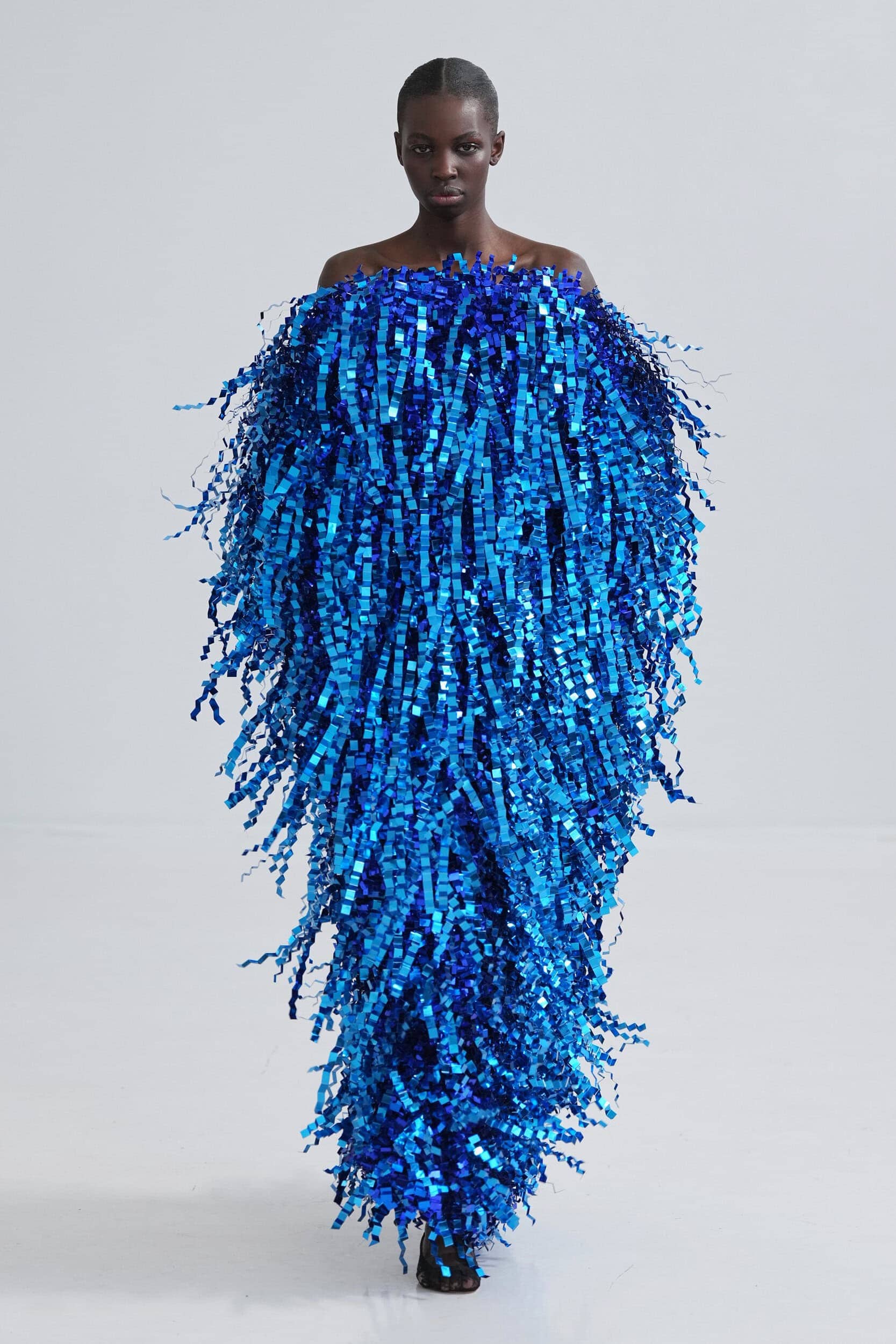
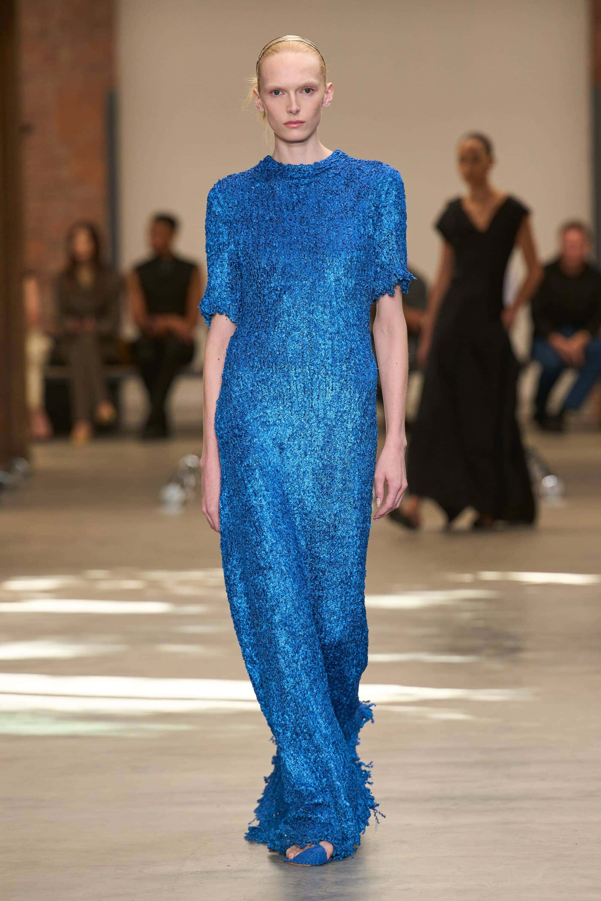
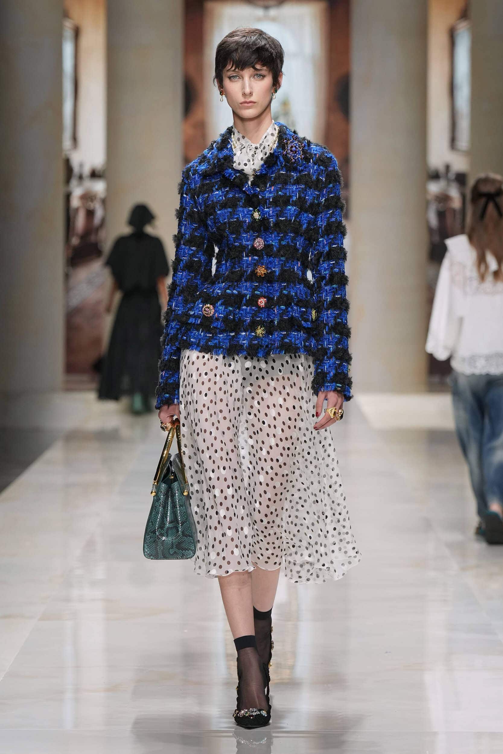
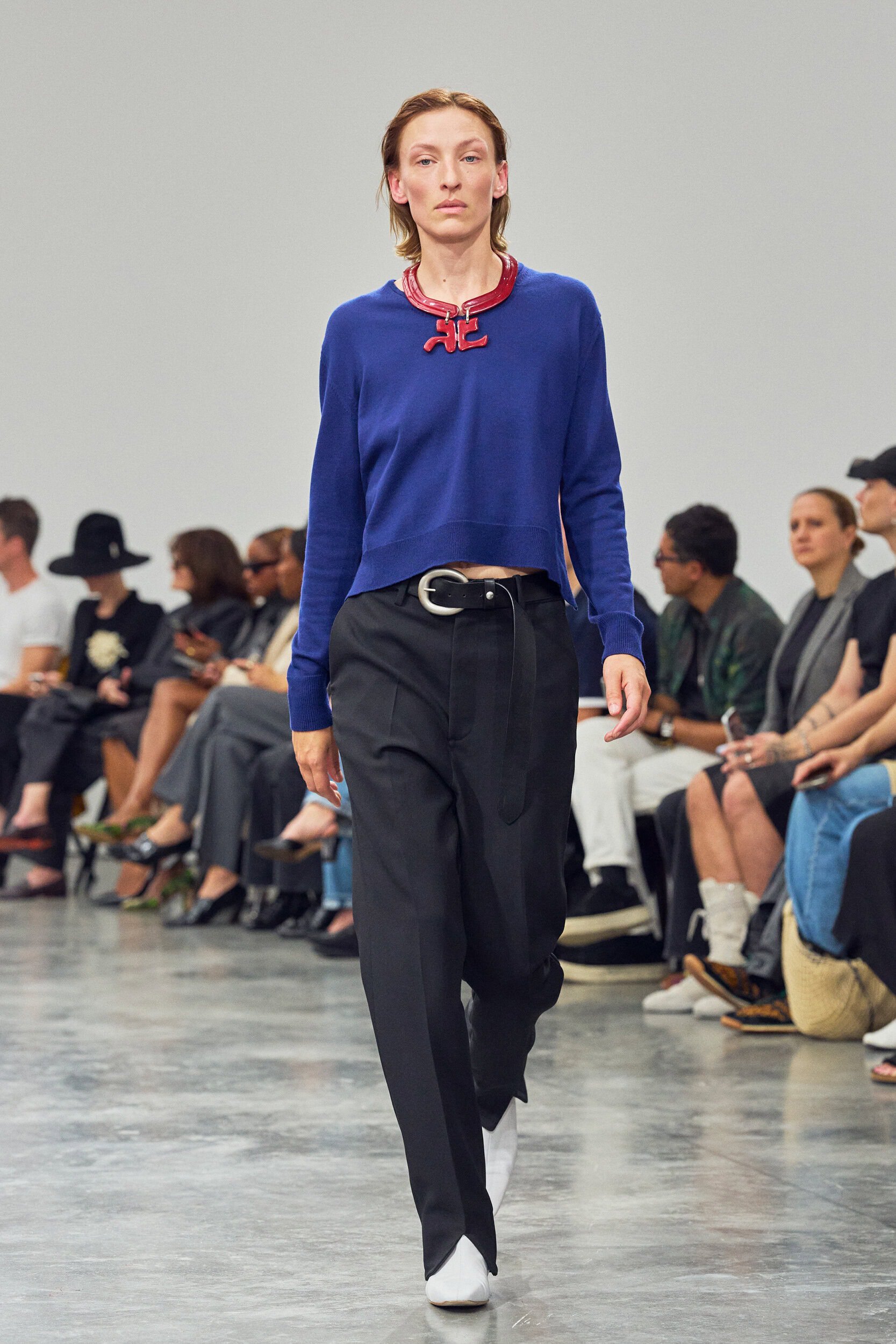
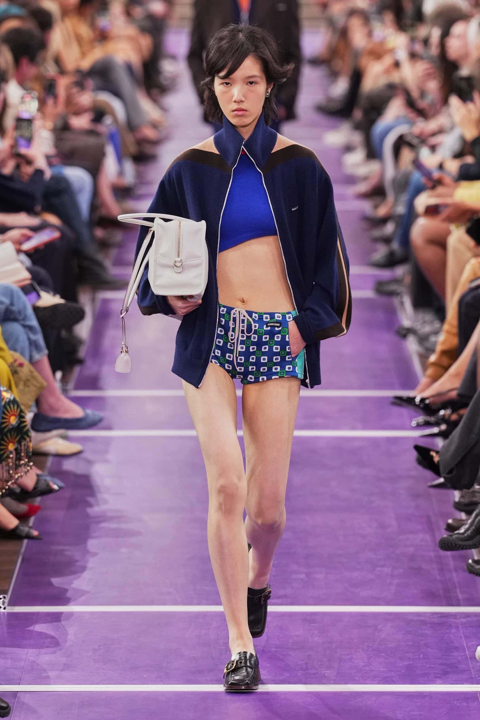
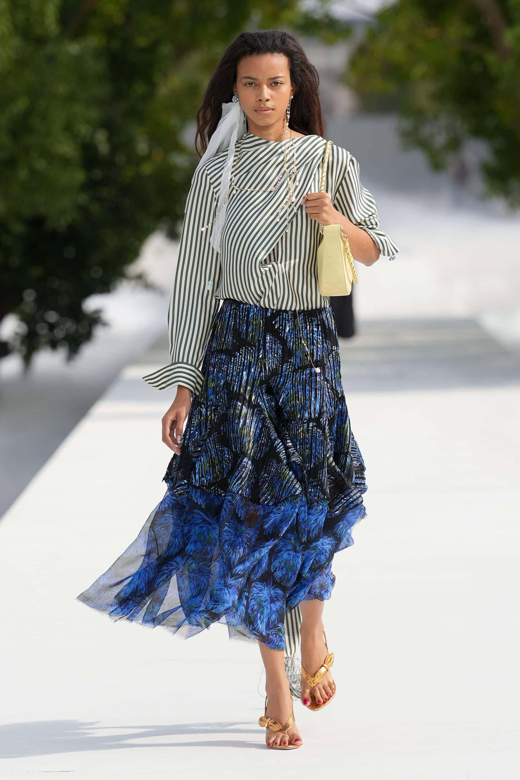
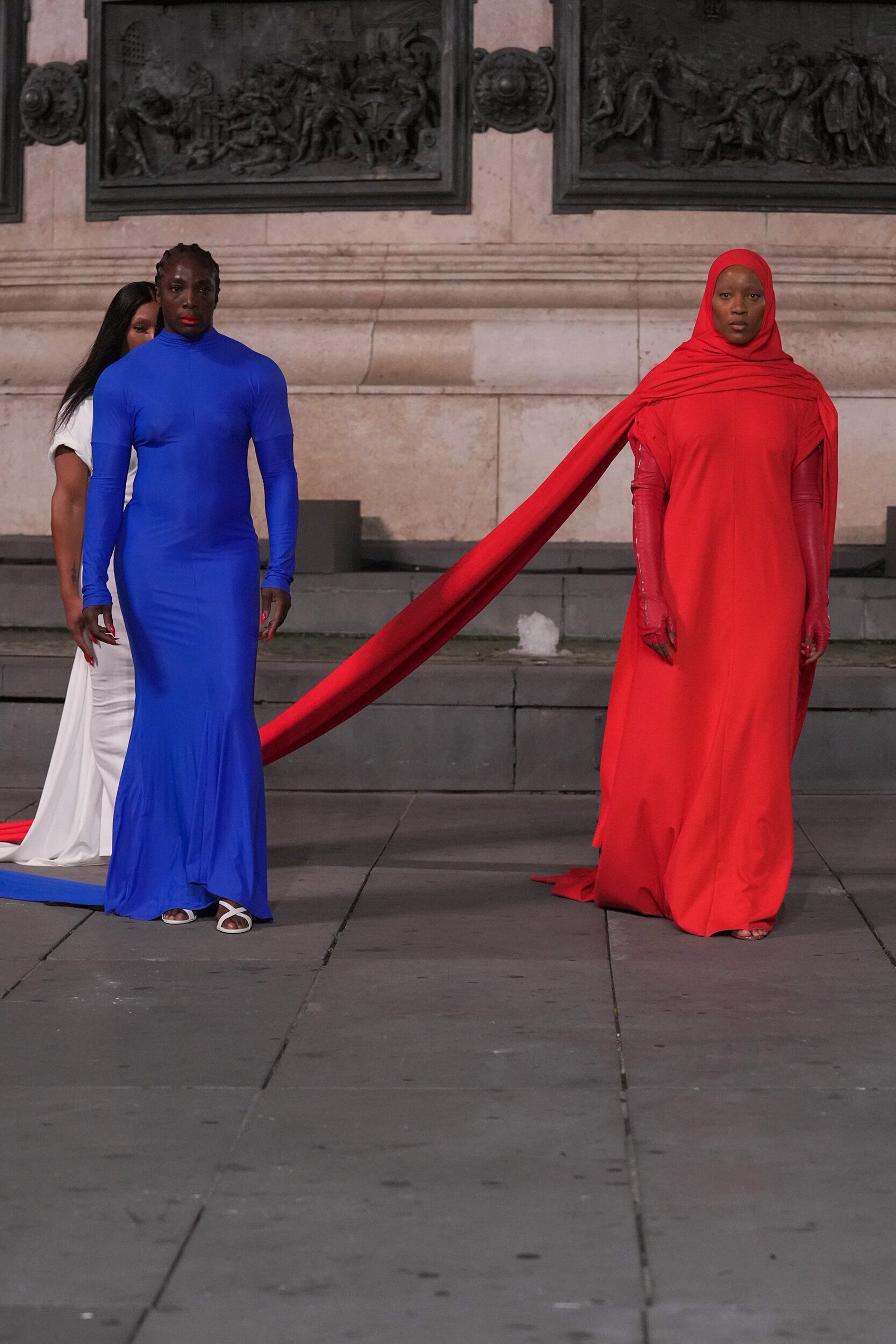
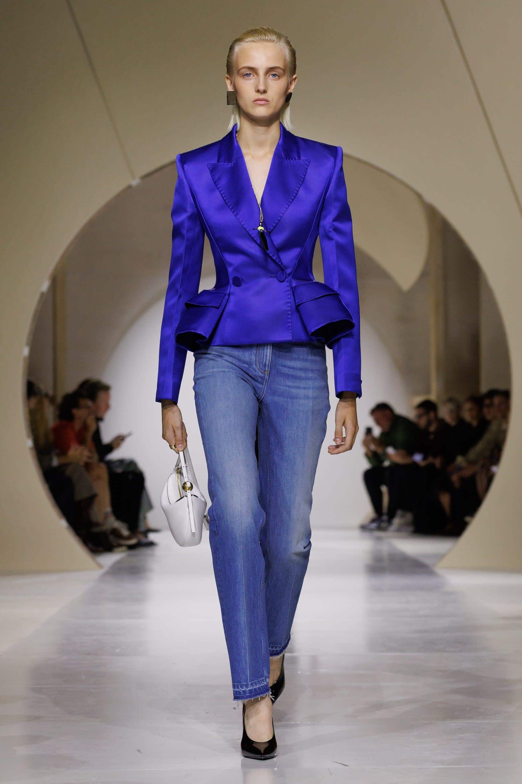
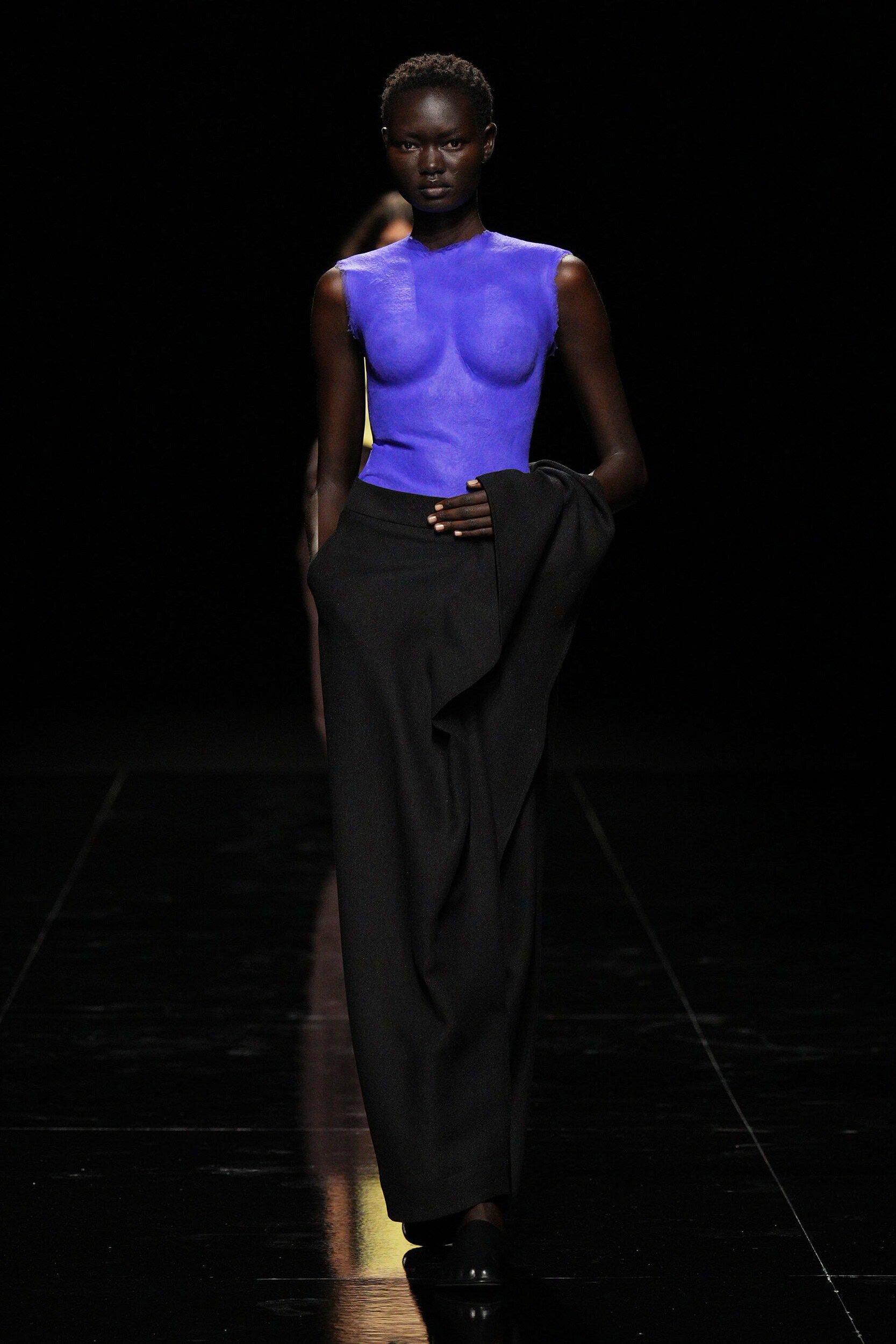
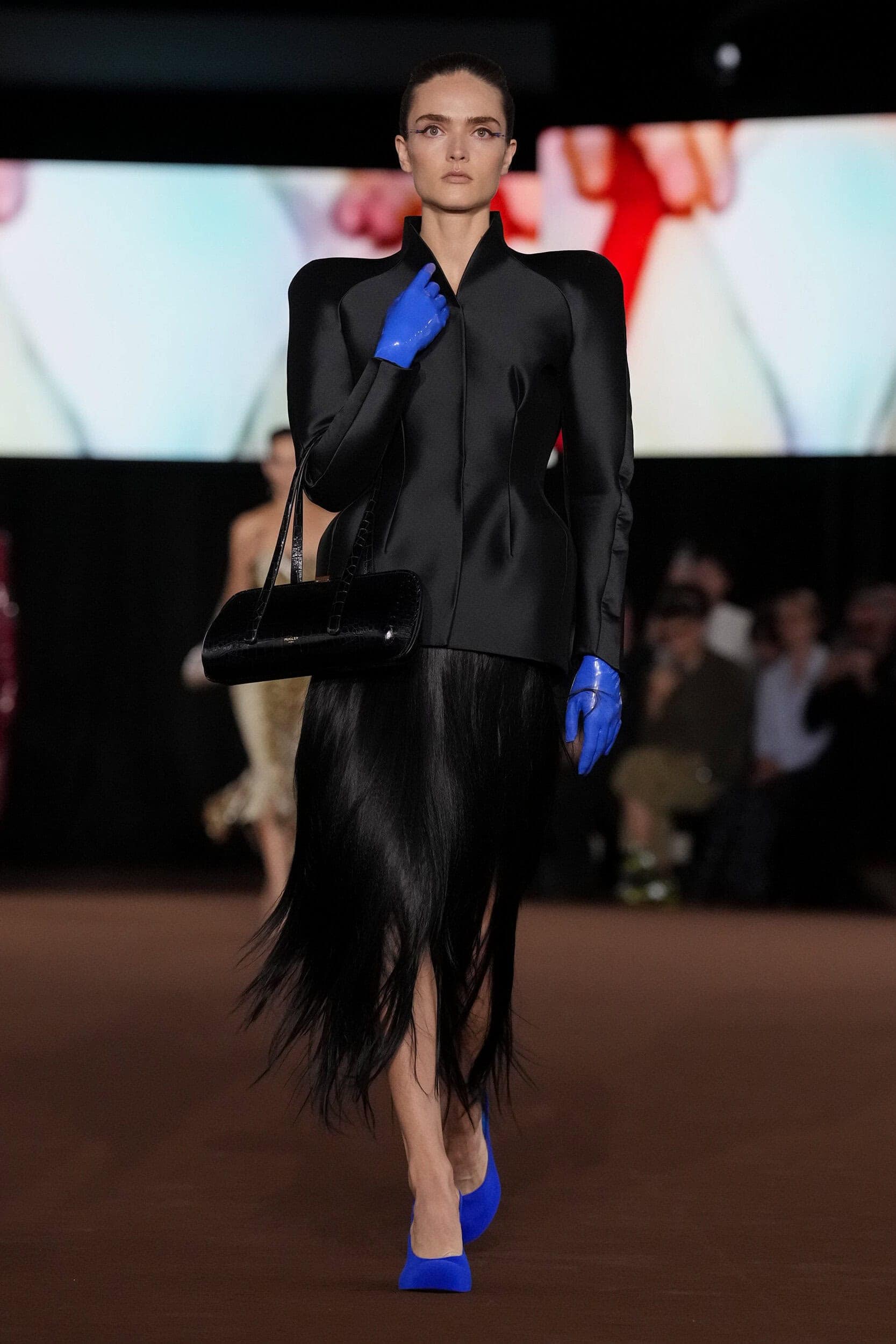
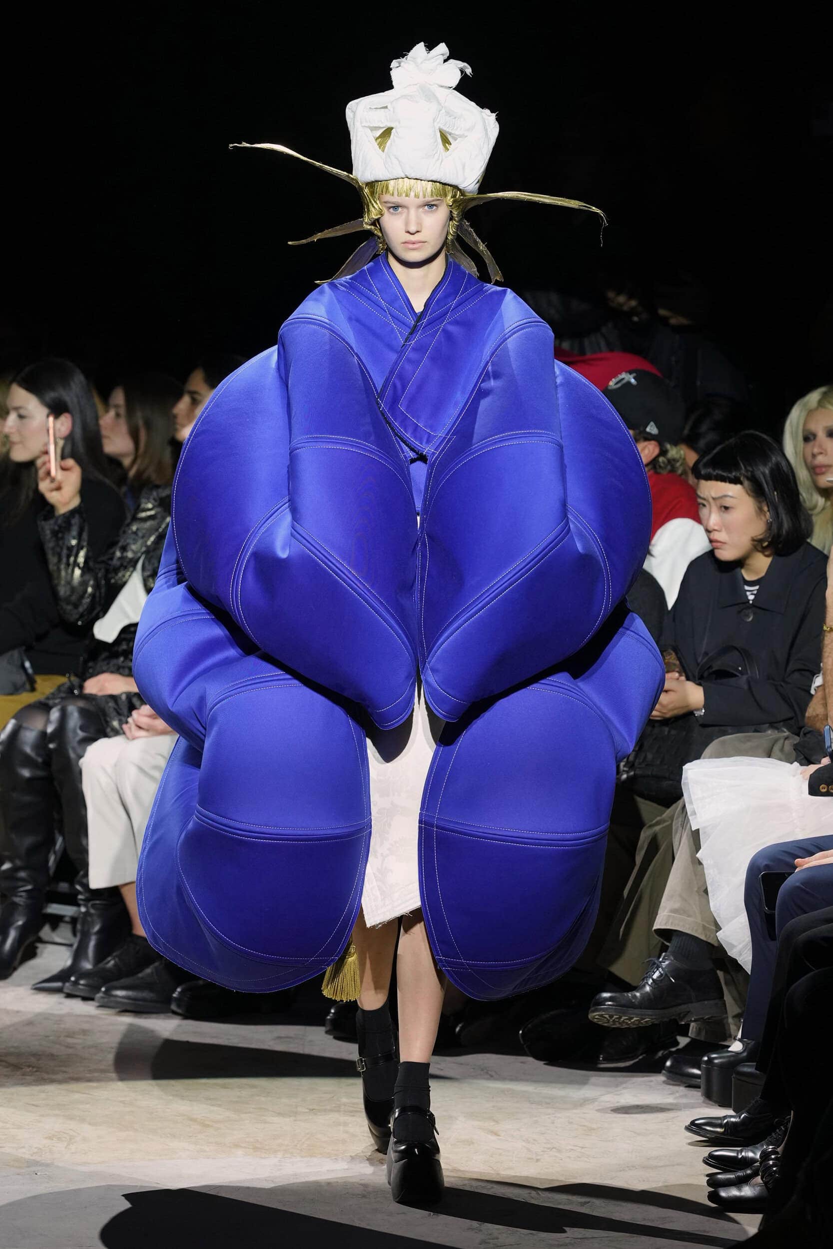
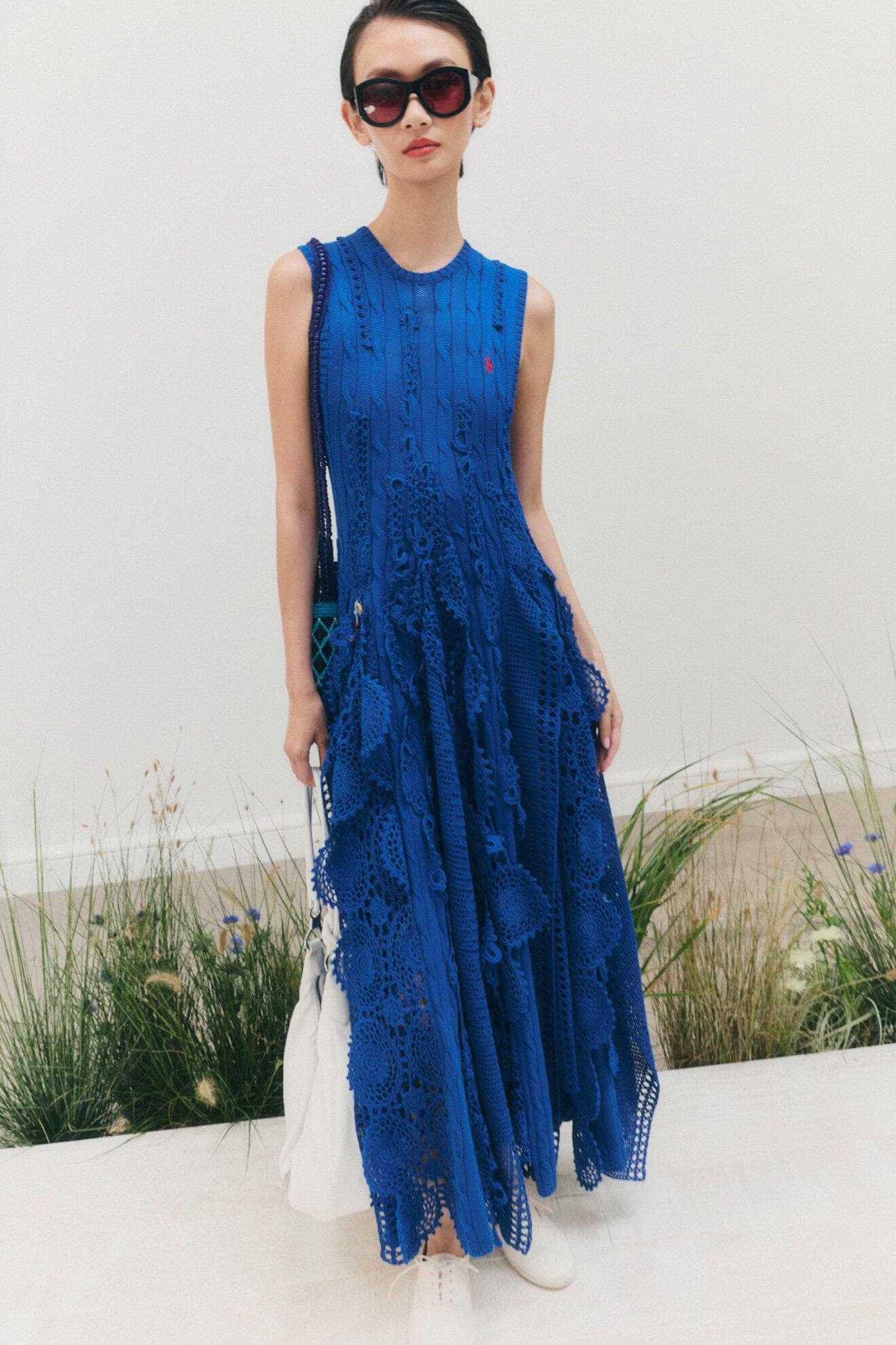
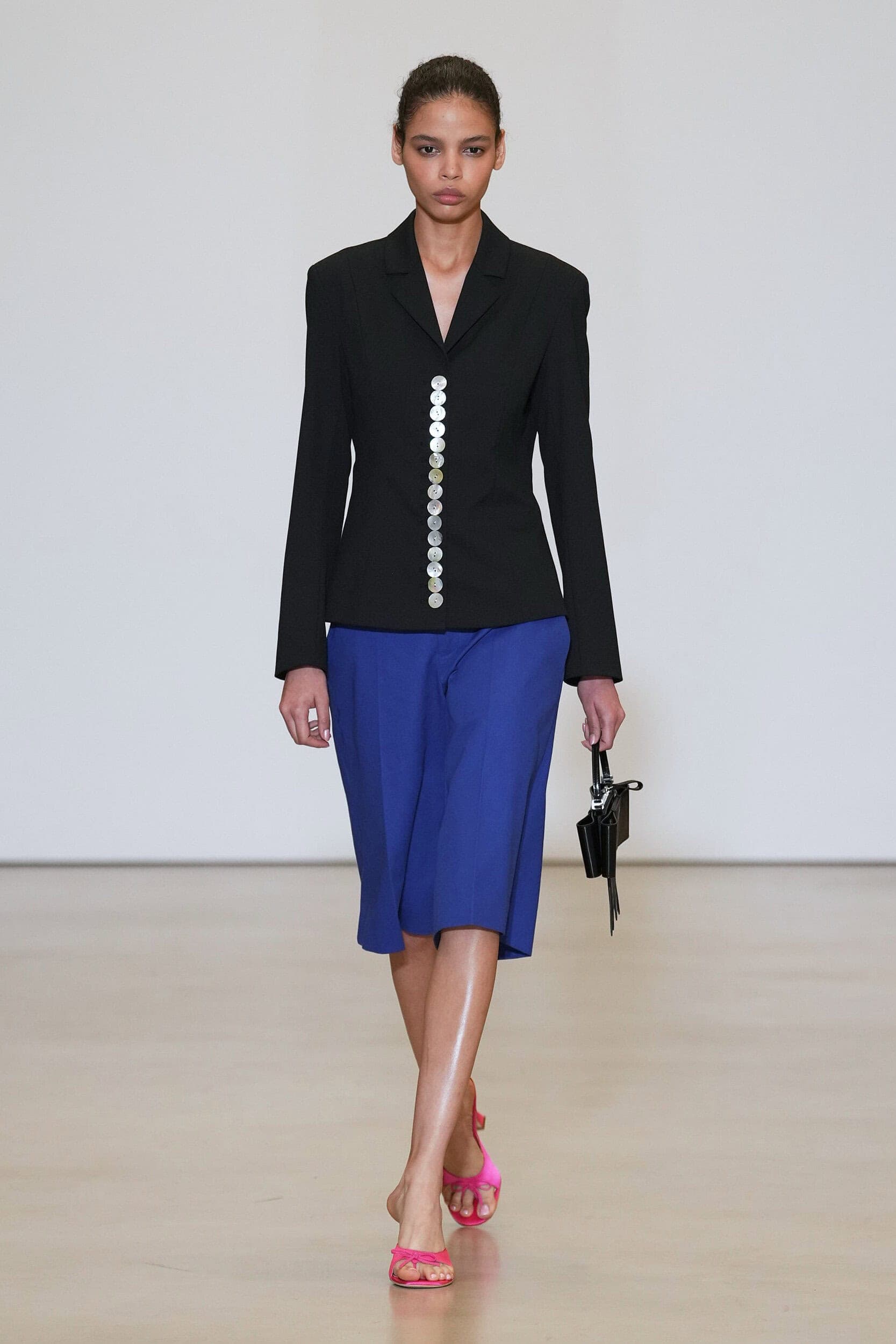
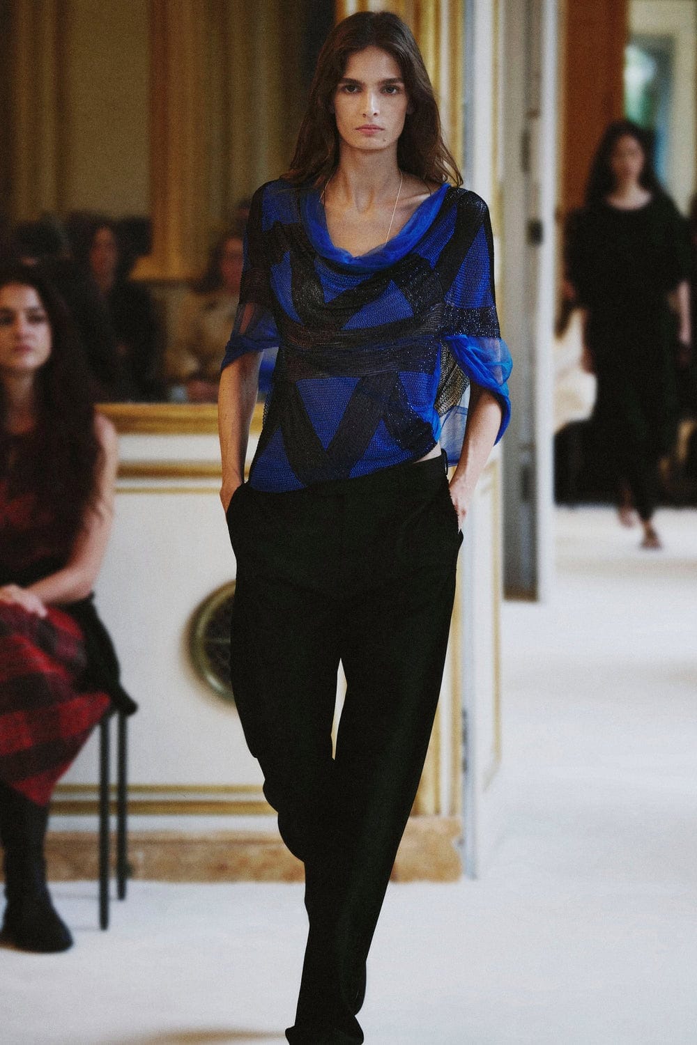
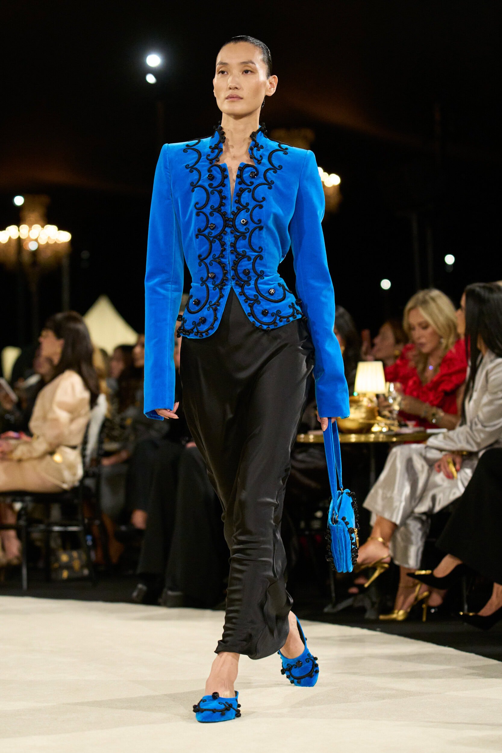
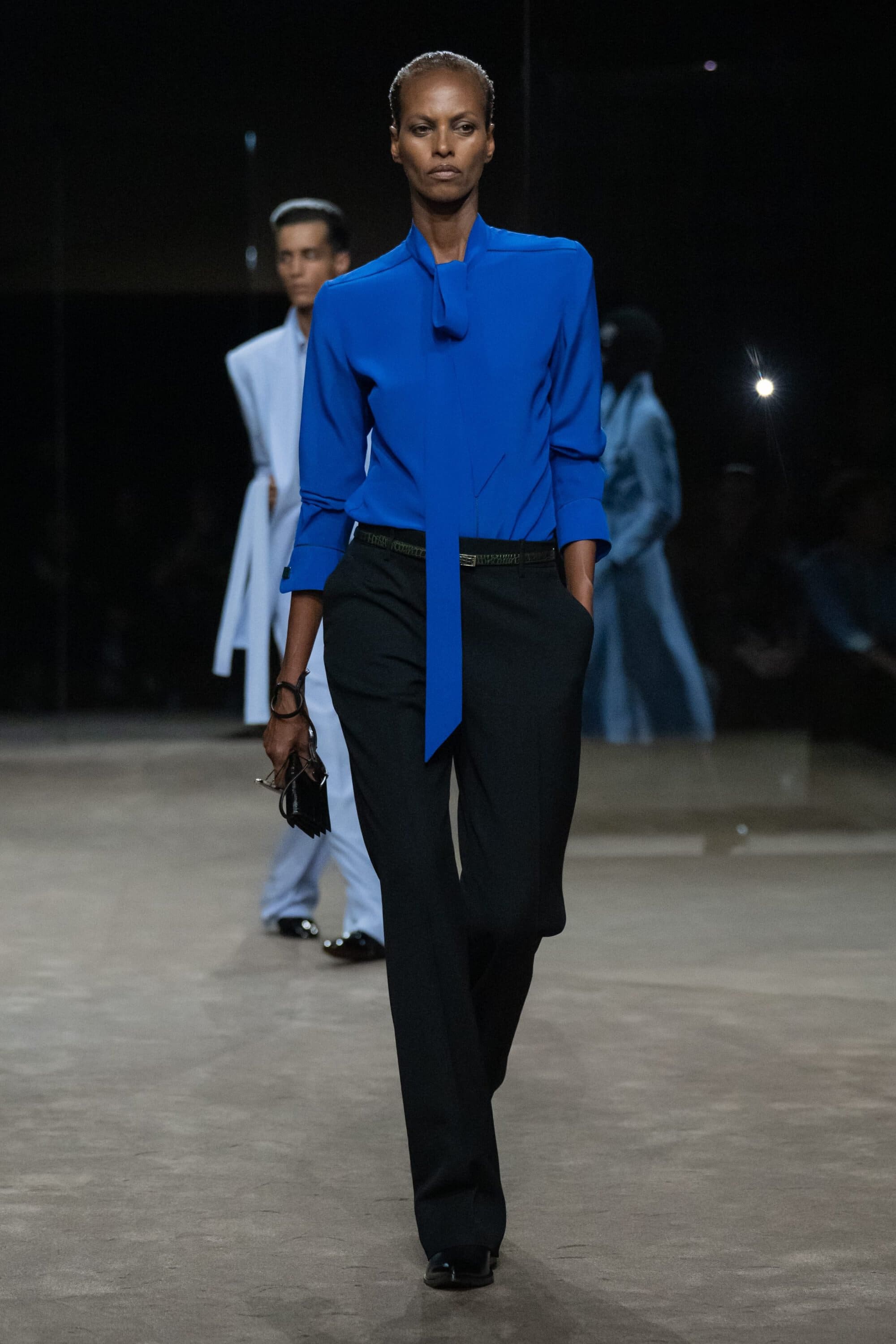
4. Staying True to Blue
Why it’s Trending?
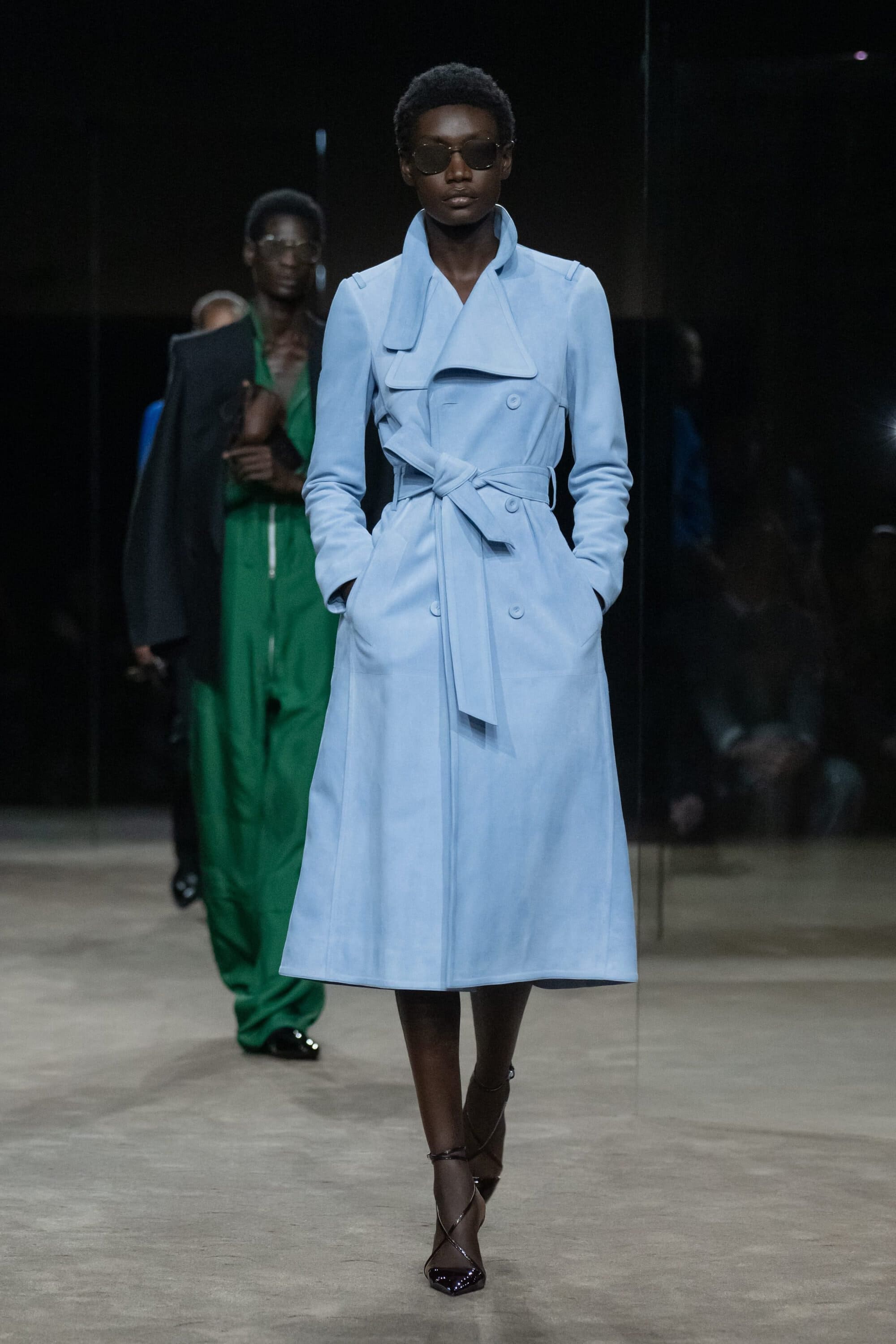
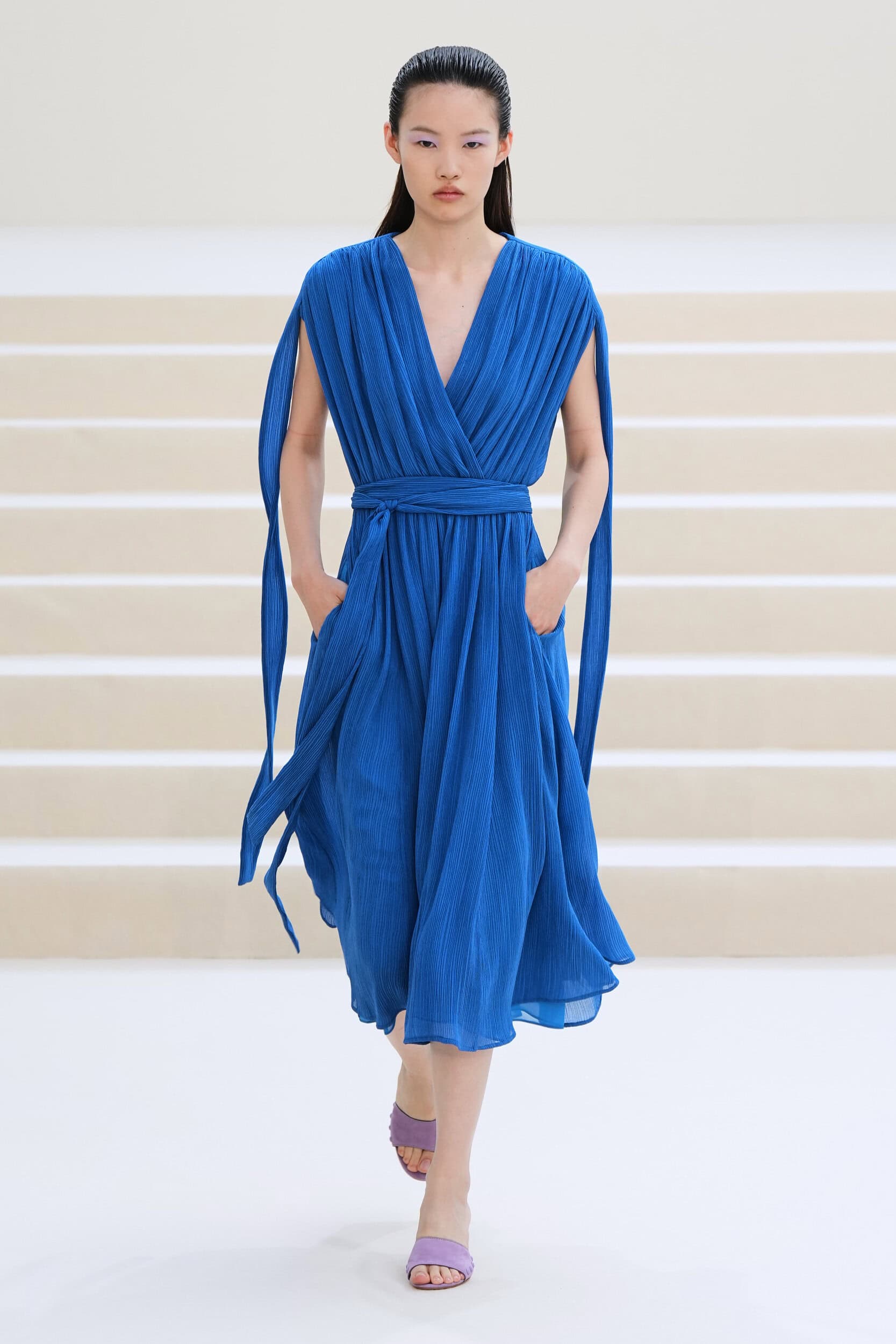
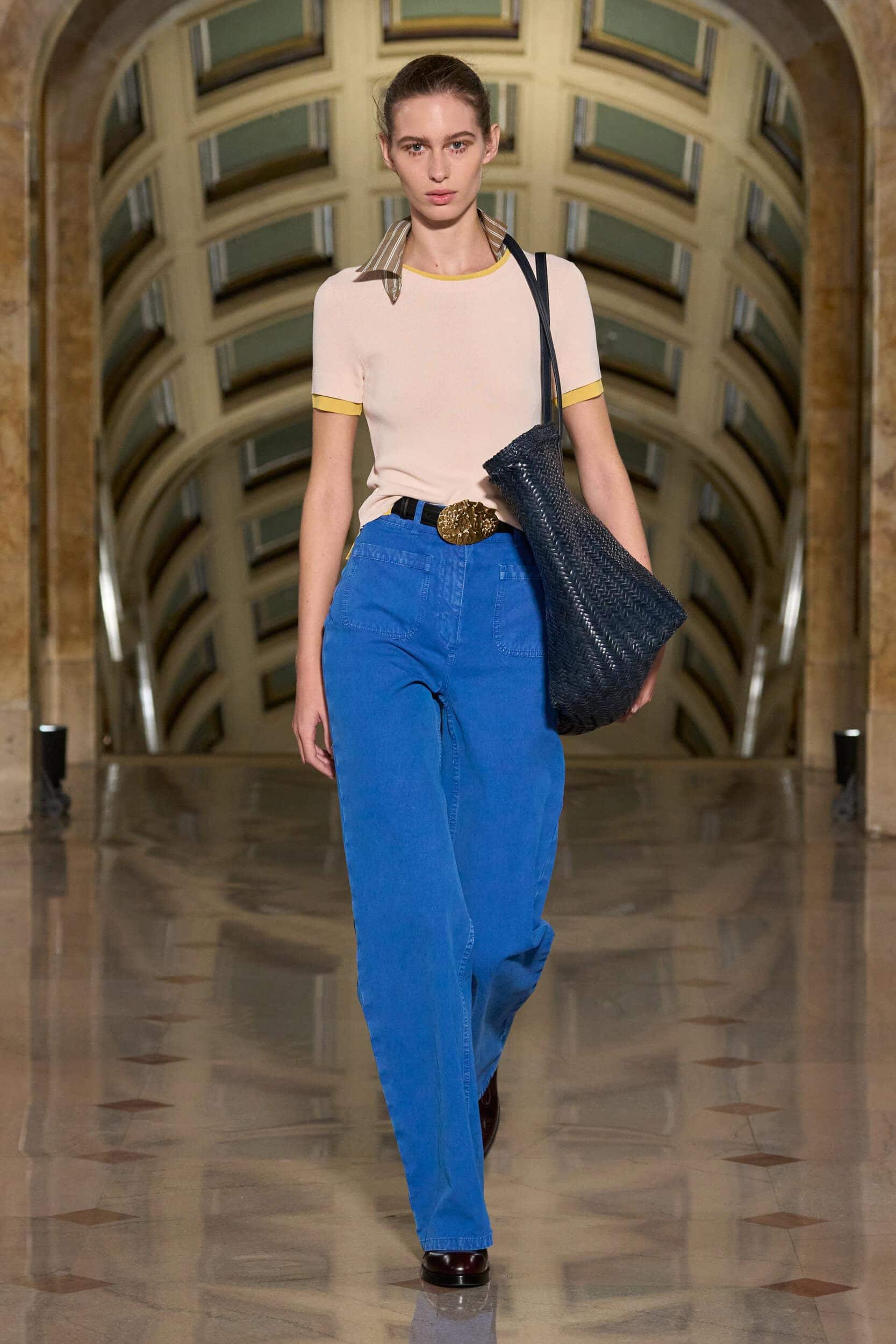
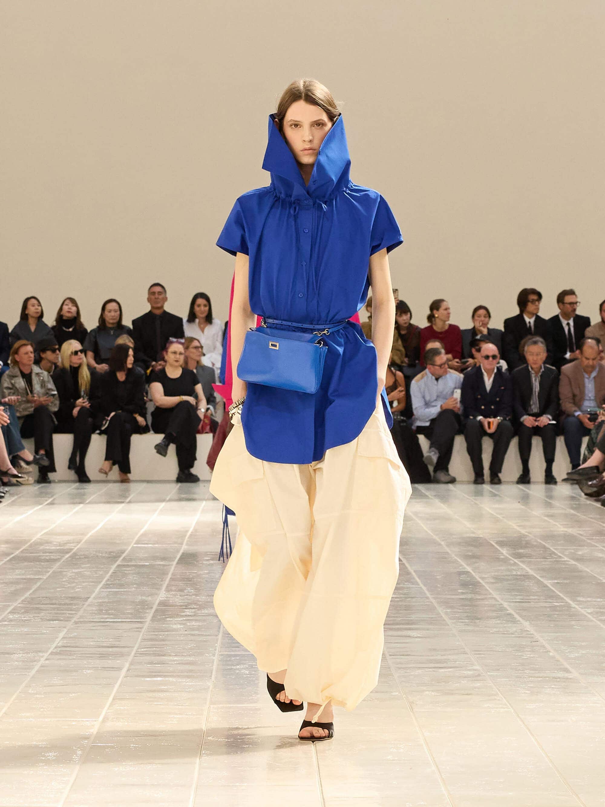
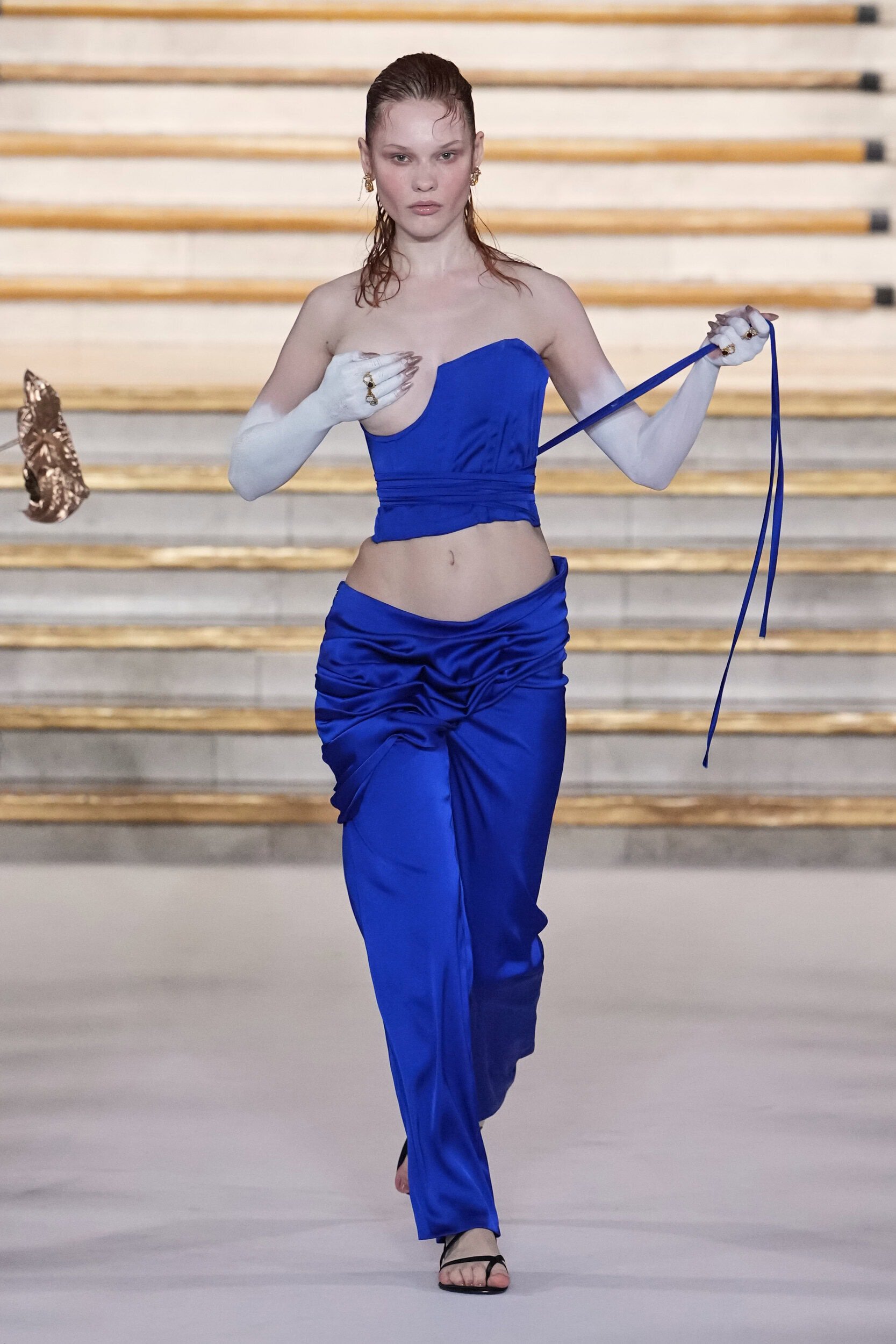
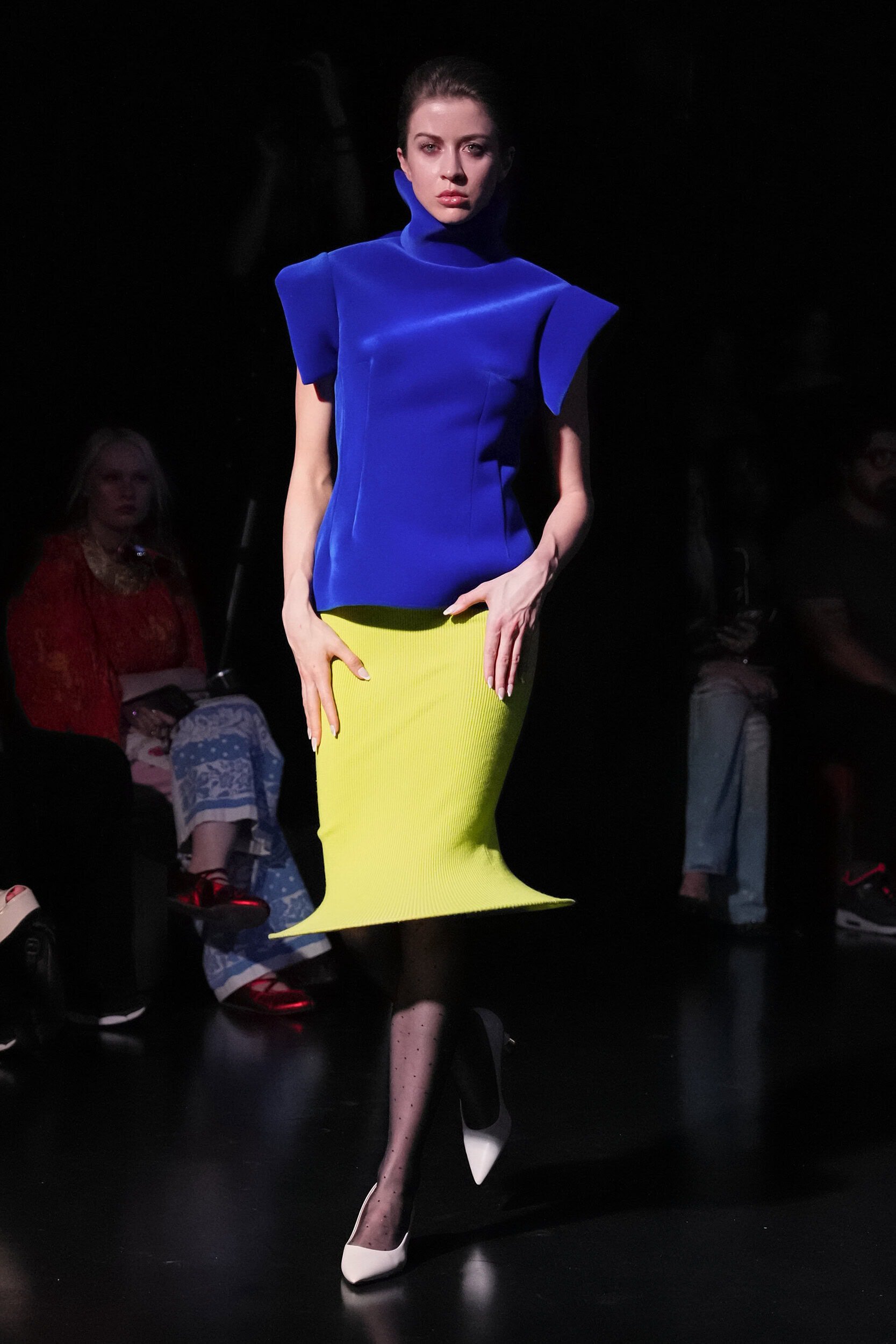
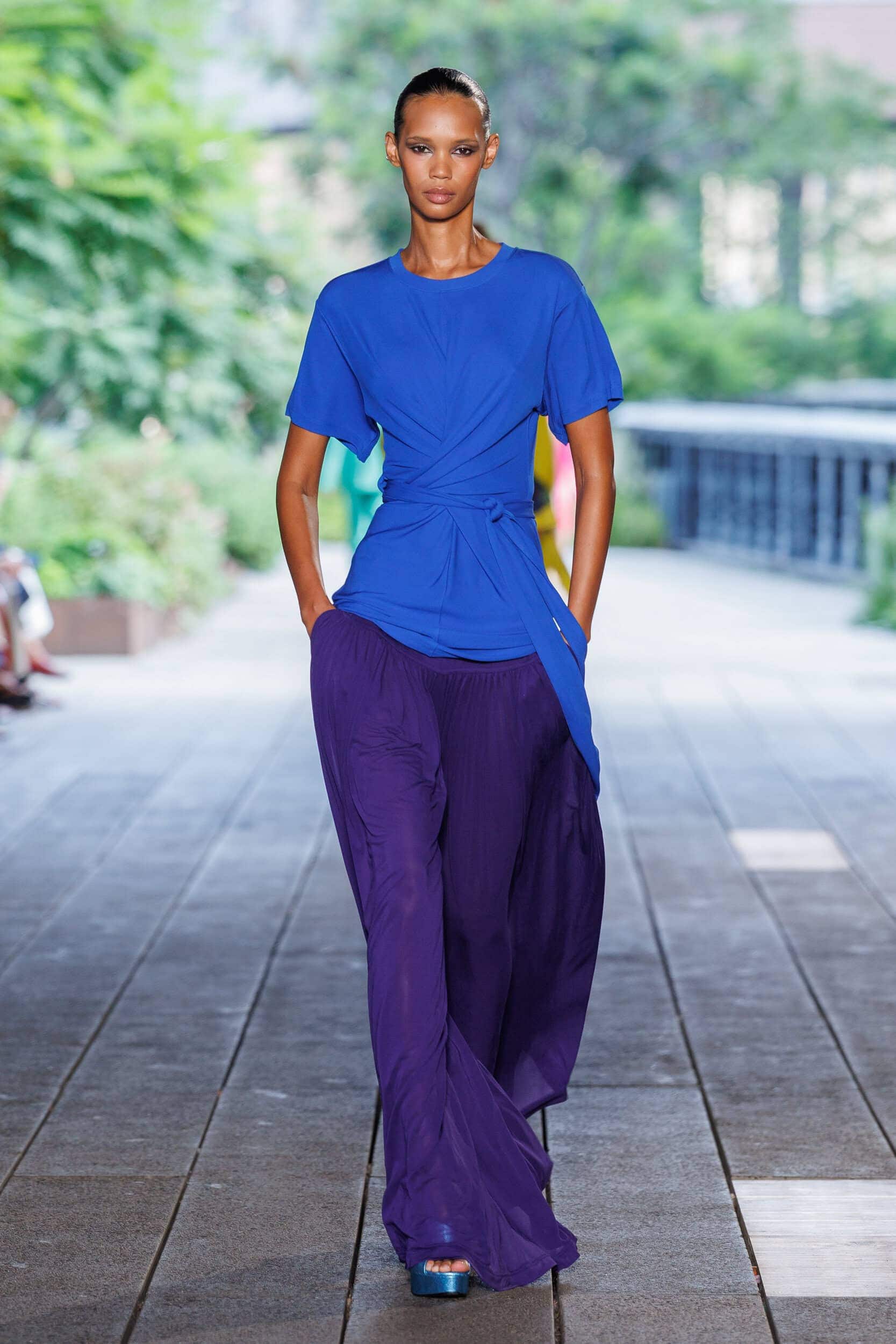
Leading trend forecasting agency WGSN declared Luminous Blue as their 2027 Colour of the Year, explaining that the cobalt hue had a “dopamine-boosting appeal” that would transition across the seasons. The vibrancy of cobalt and its cooler undertones make it an accessible option across the genders with designers utilising it to also highlight accessories and footwear.
Why it Matters?
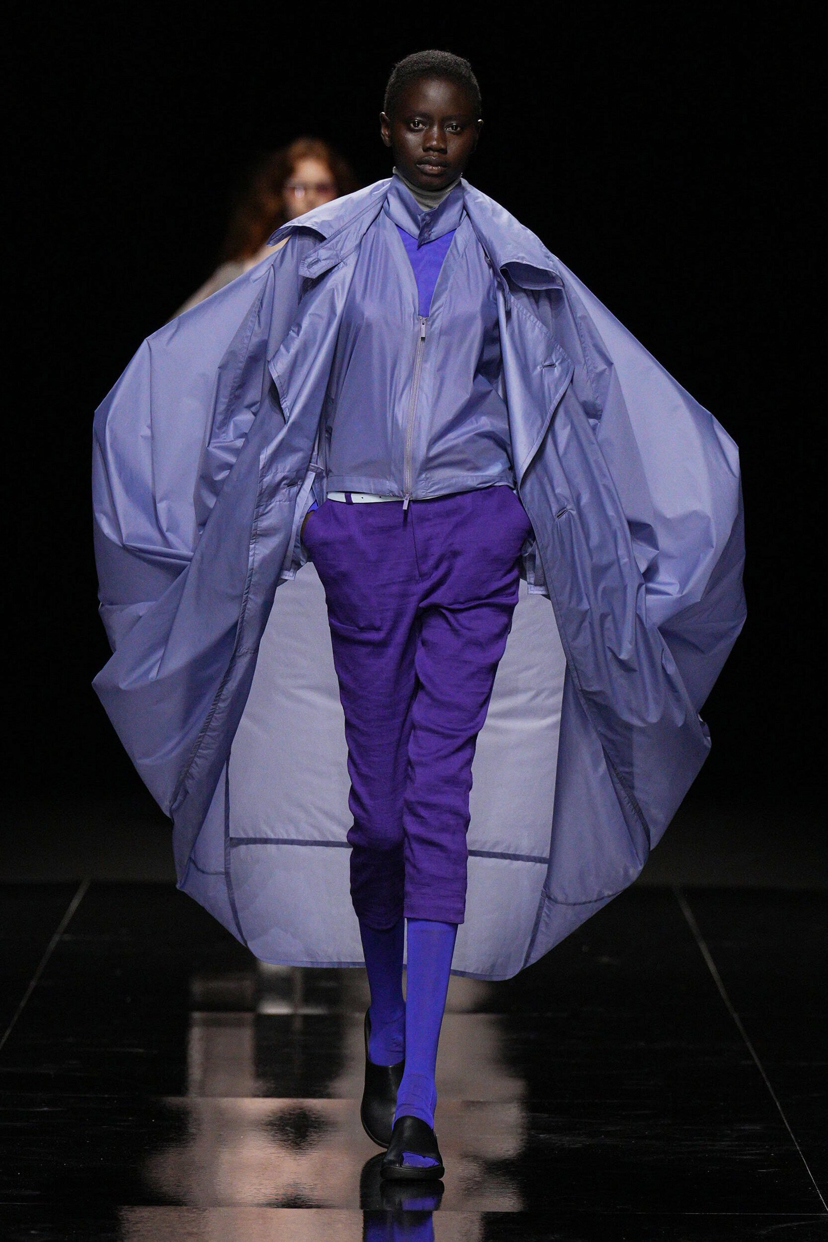
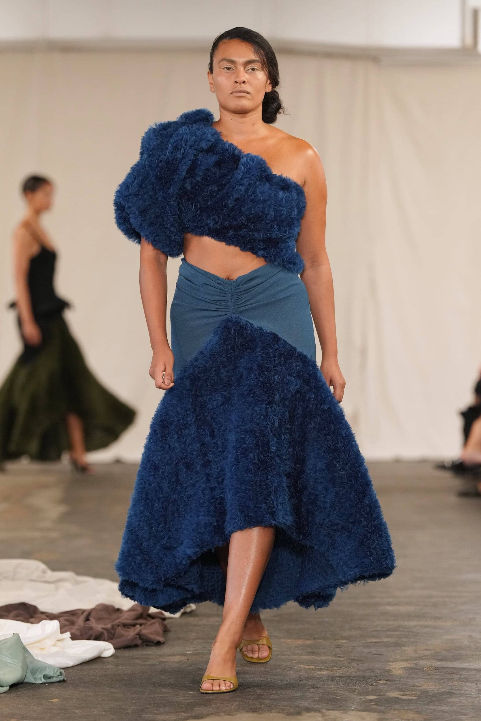
Hard-working colours are an essential component of trans-seasonal wardrobes, and this deep blue also represents the balance between technology (blue light) and nature (it is a natural metal). Across the collections is was used to represent strength and femininity at Matières Fécales, Issey Miyake and Givenchy, the adventurous at Miu Miu, and the ethereal at Calvin Klein Collection and Area.
Where Was it Seen?
Givenchy, Area, Tom Ford, Akris, Altuzarra, and Polo Ralph Lauren
5. Going Natural
Why it’s Trending?
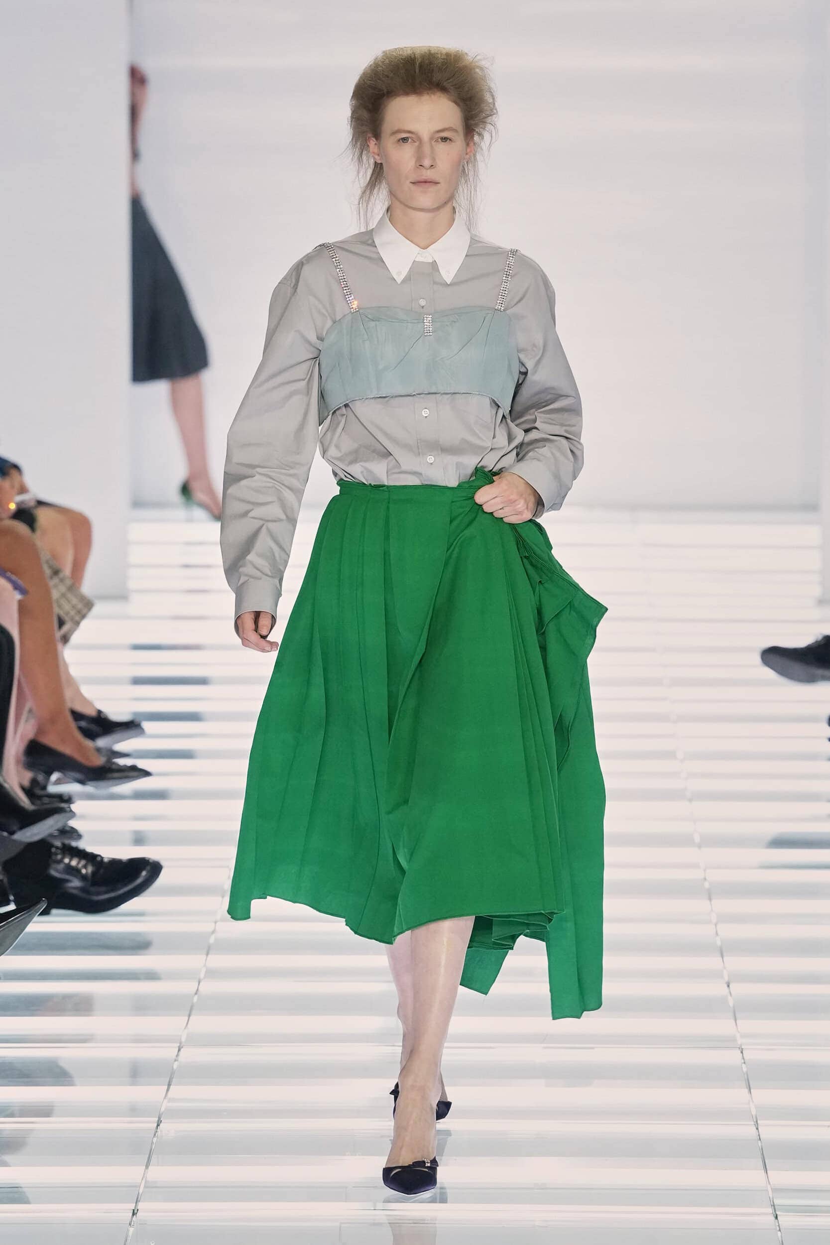
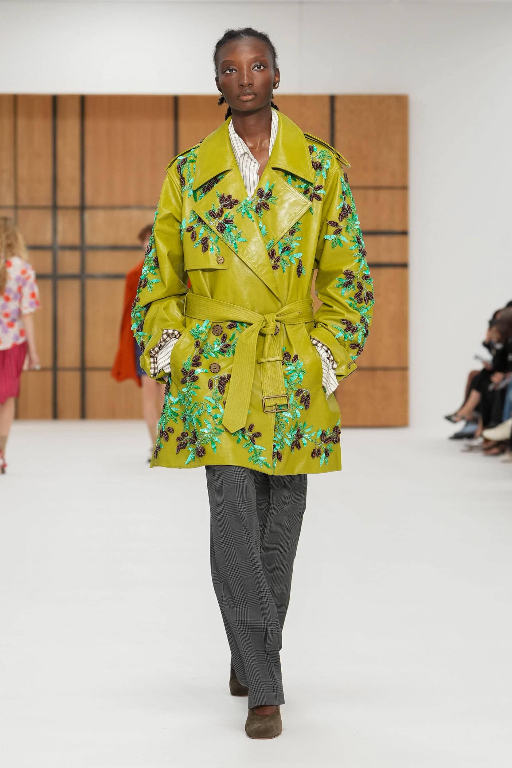
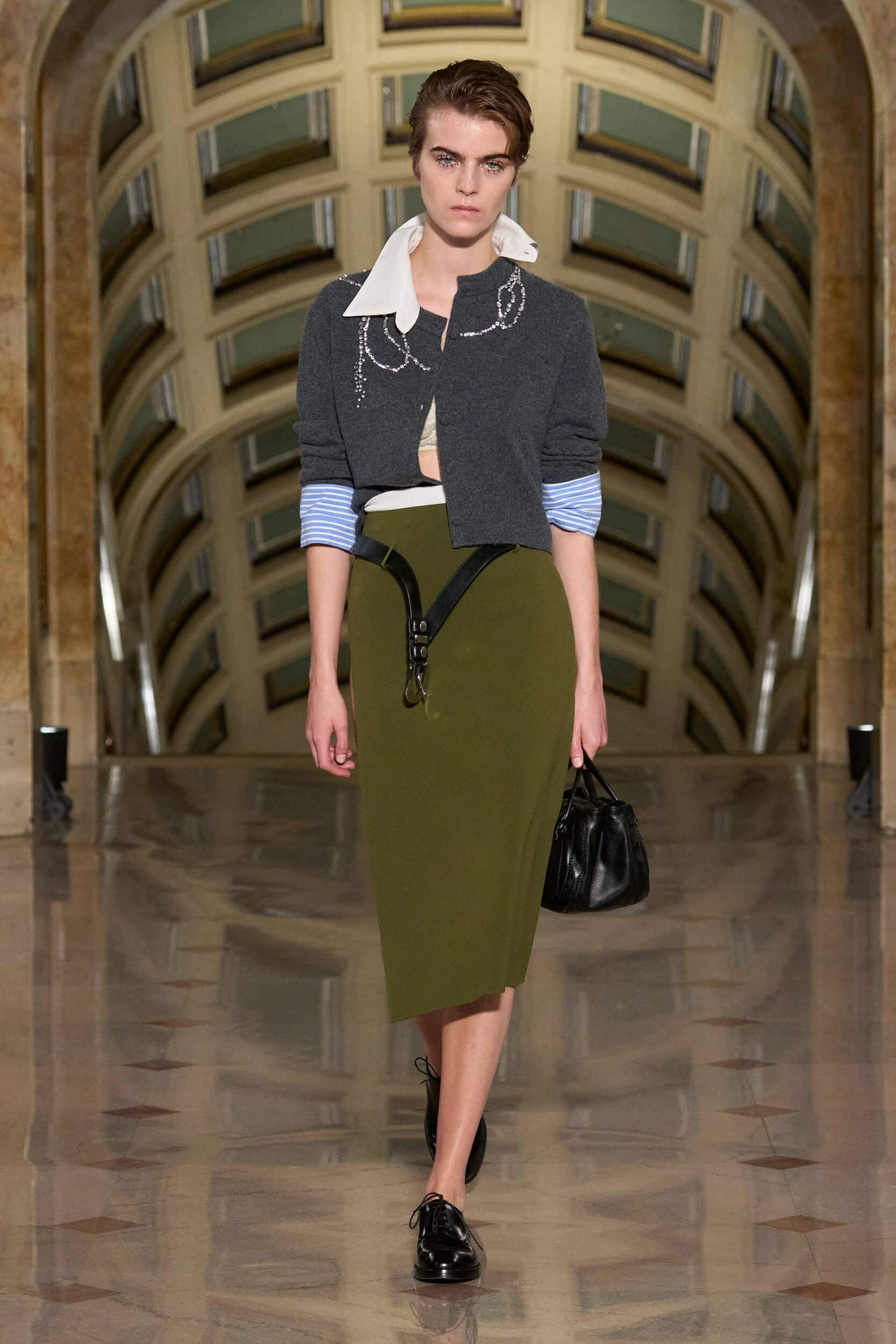
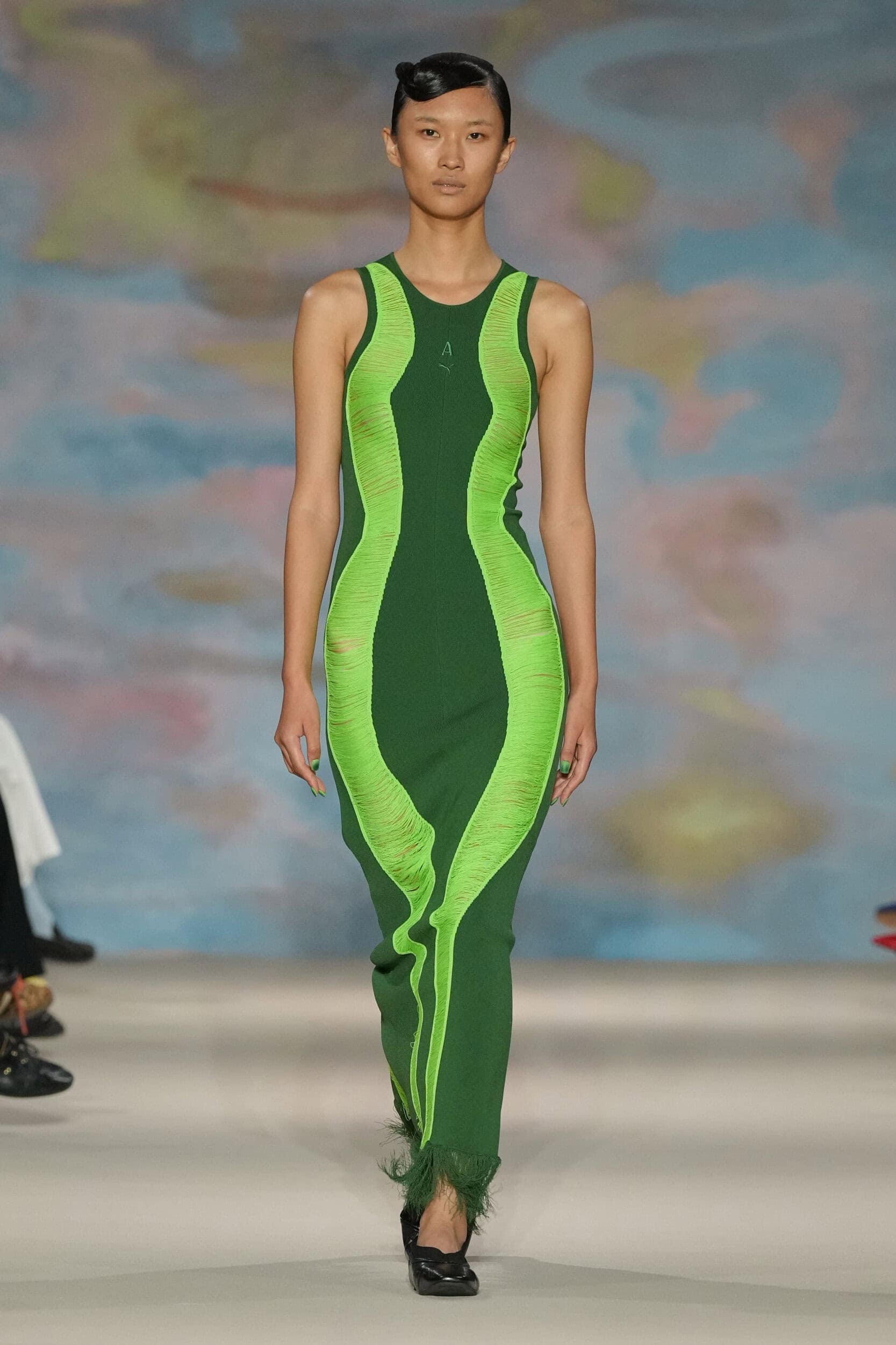
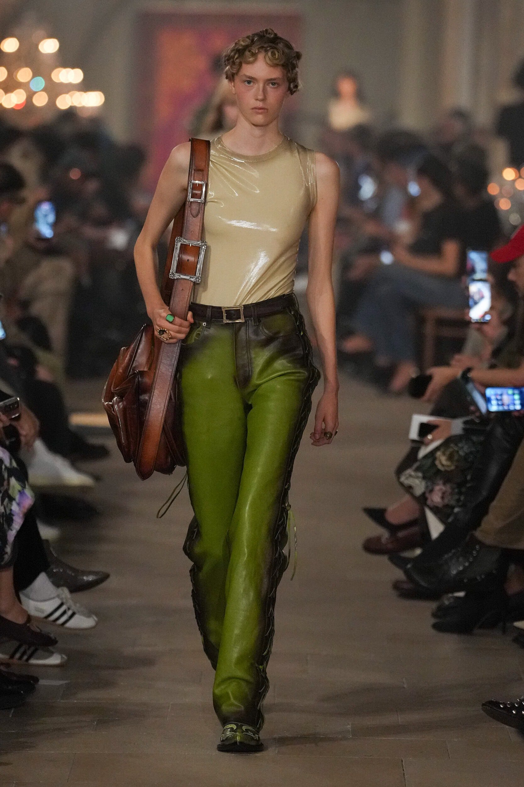
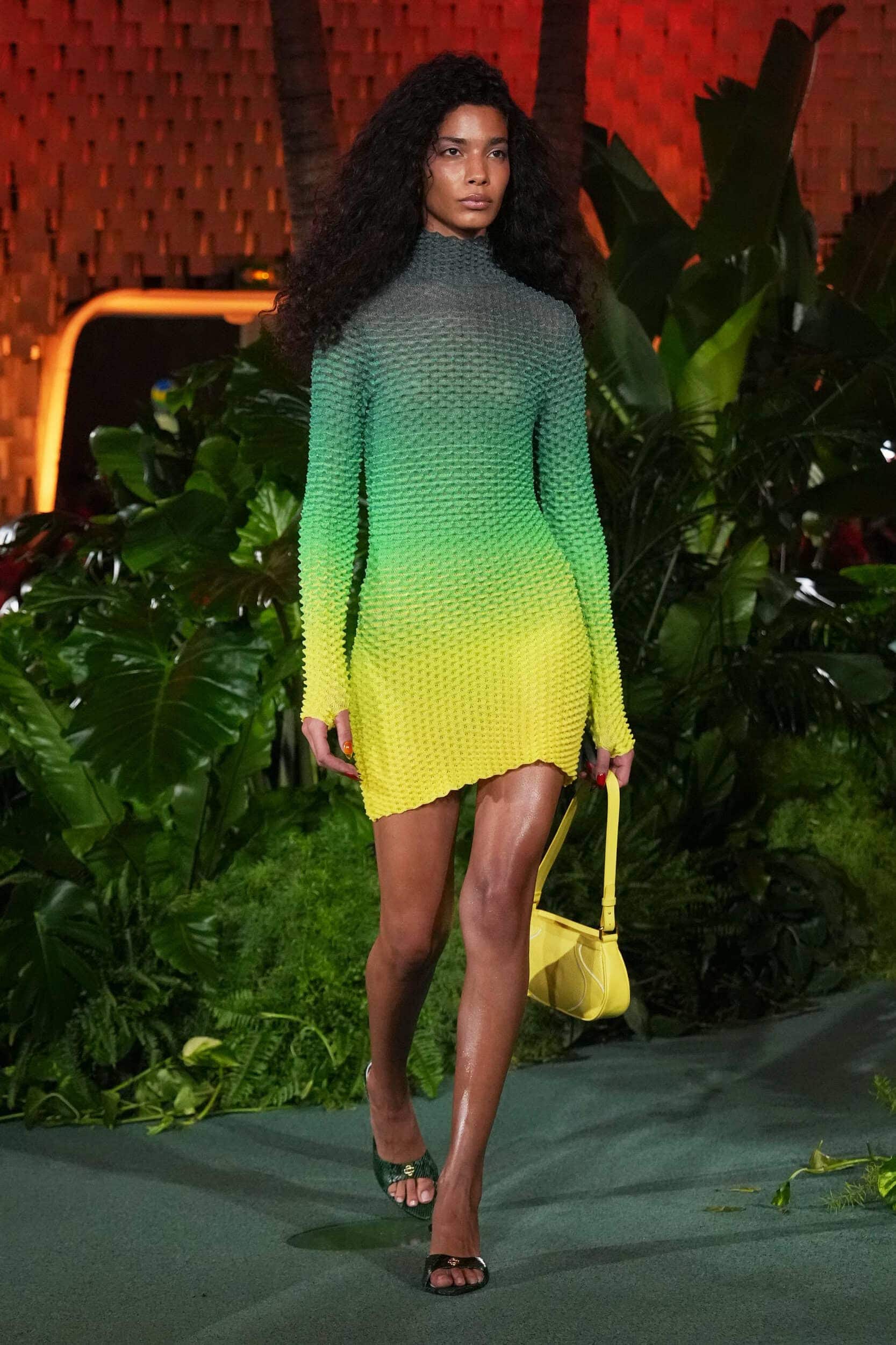
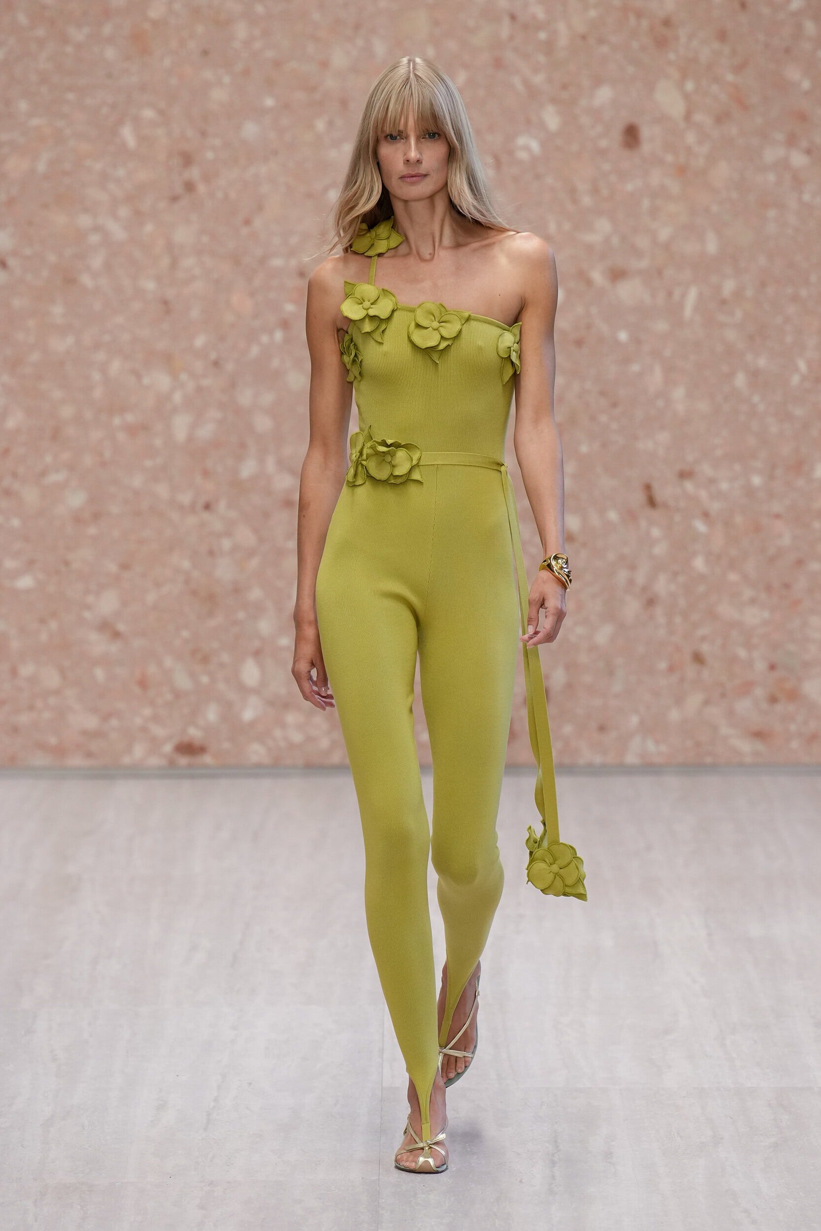
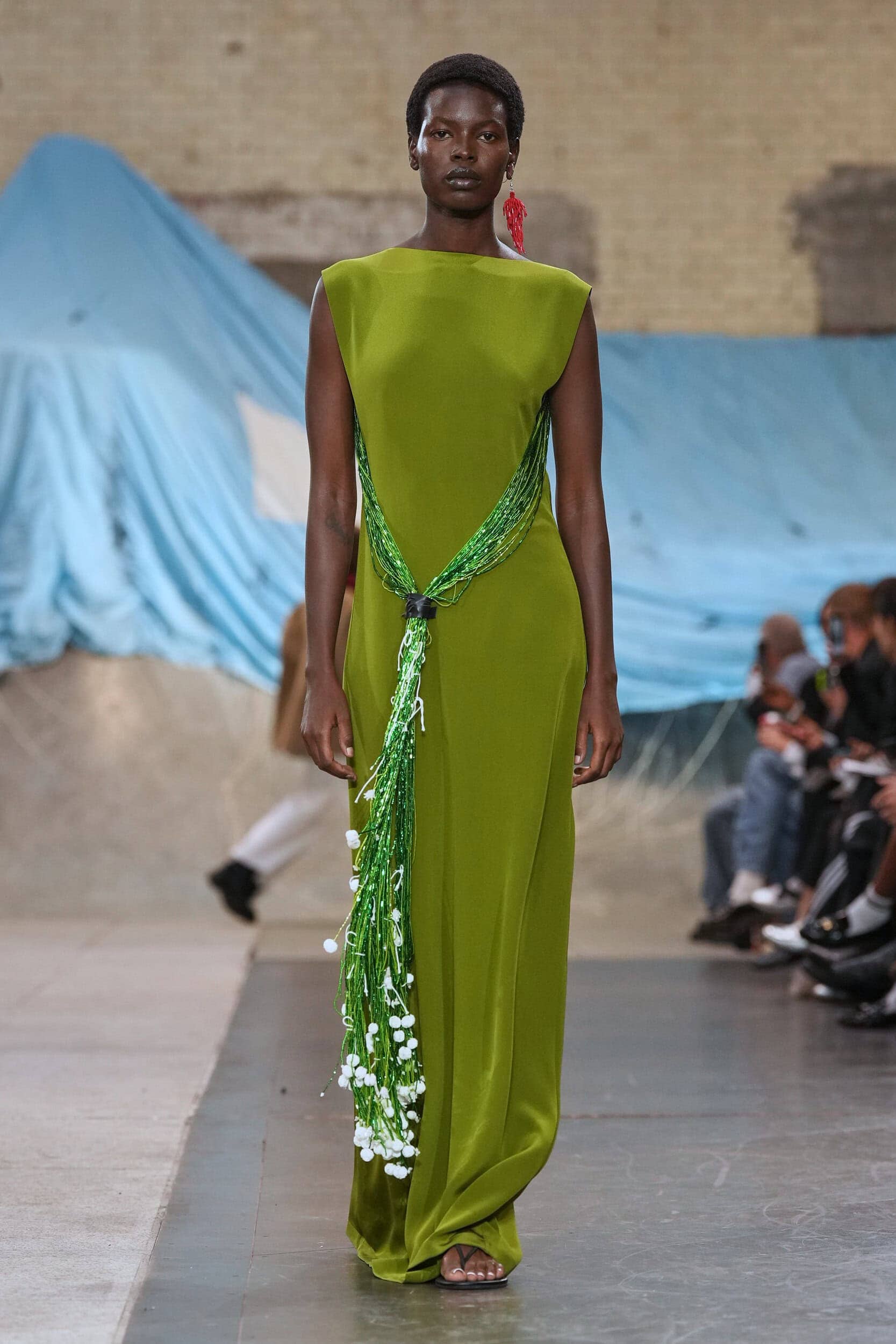
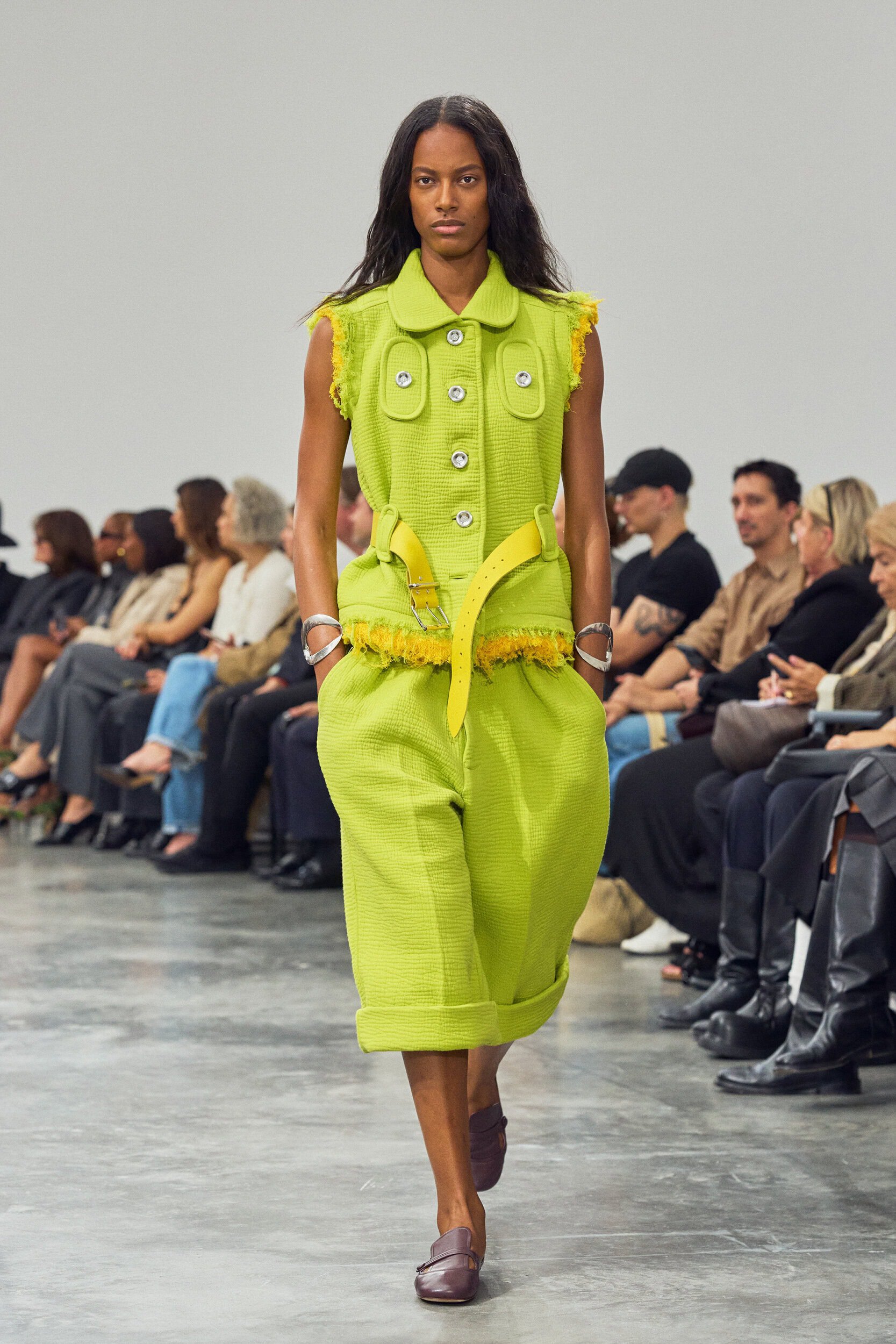
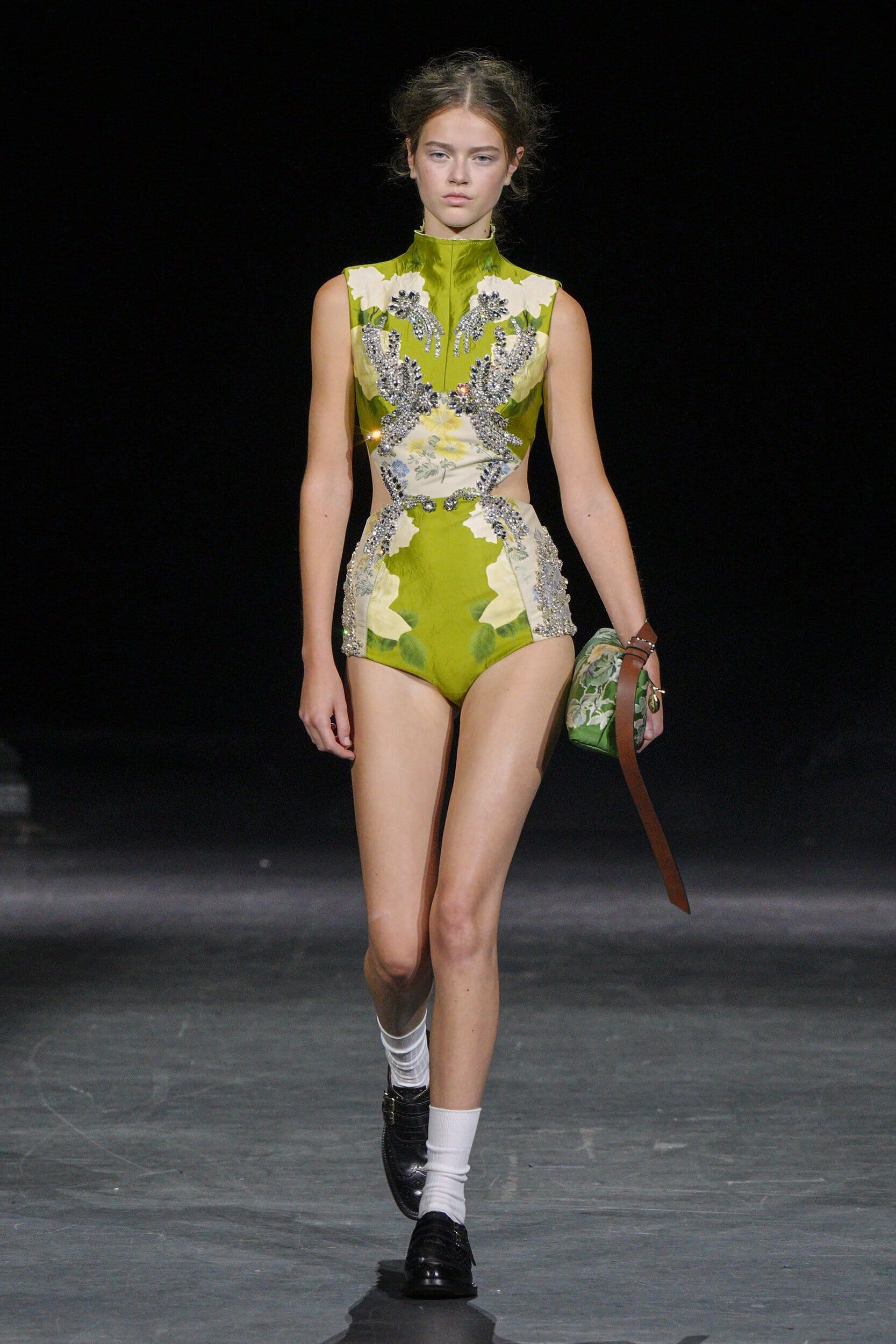
Life-affirming and life-giving, greens positive connotations and intrinsic links with nature have made it a calming expression of spring for designers.
Why it Matters?
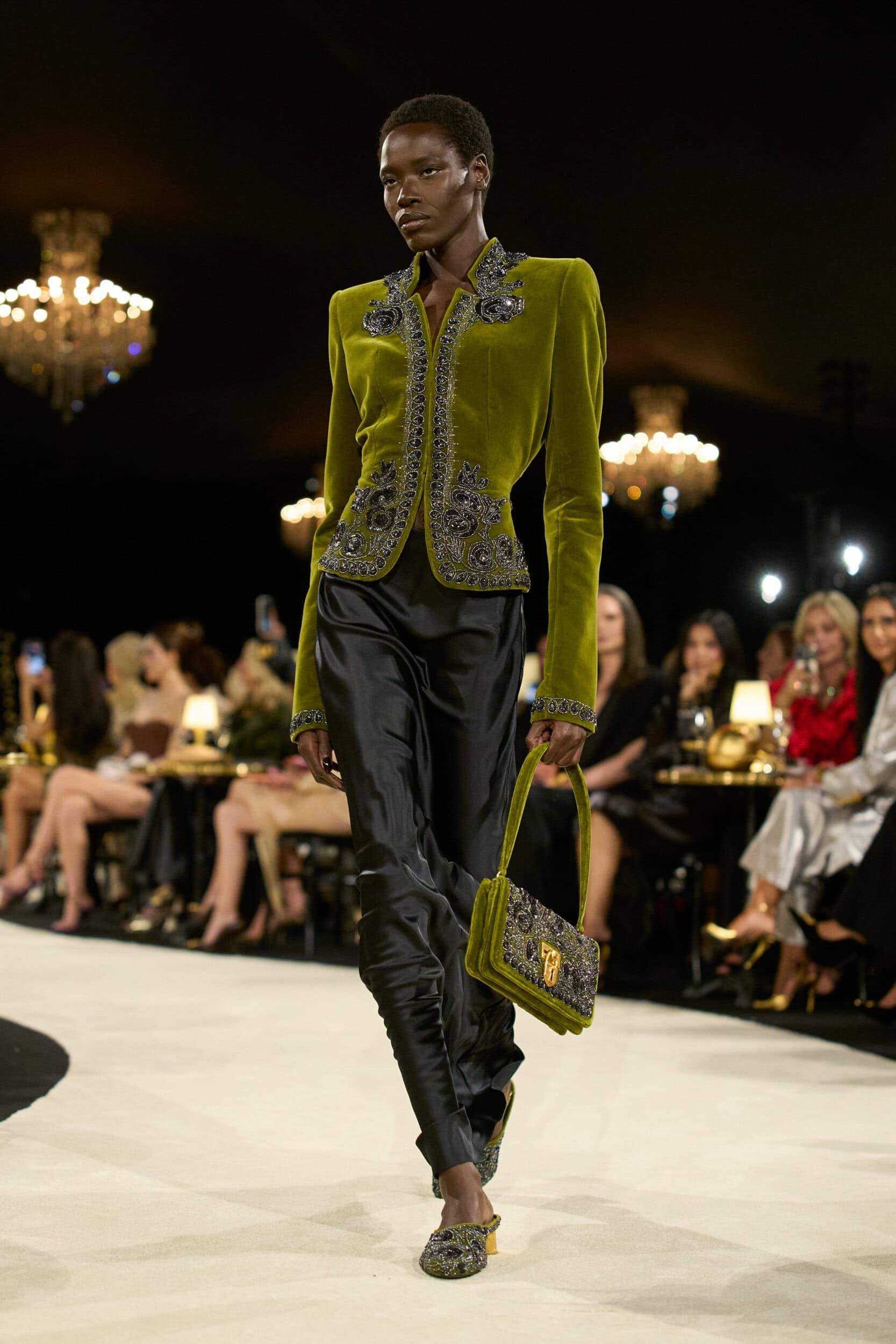
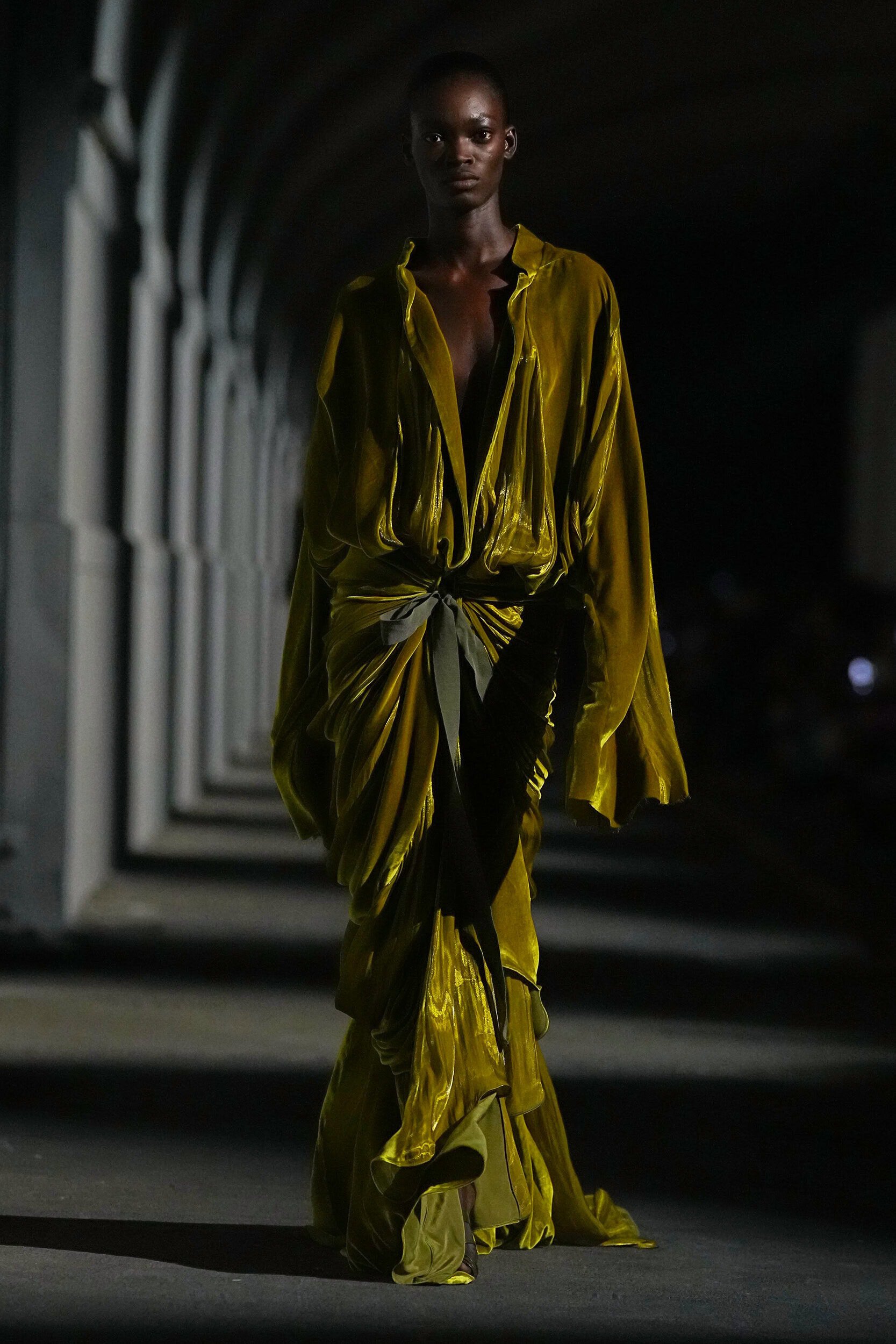
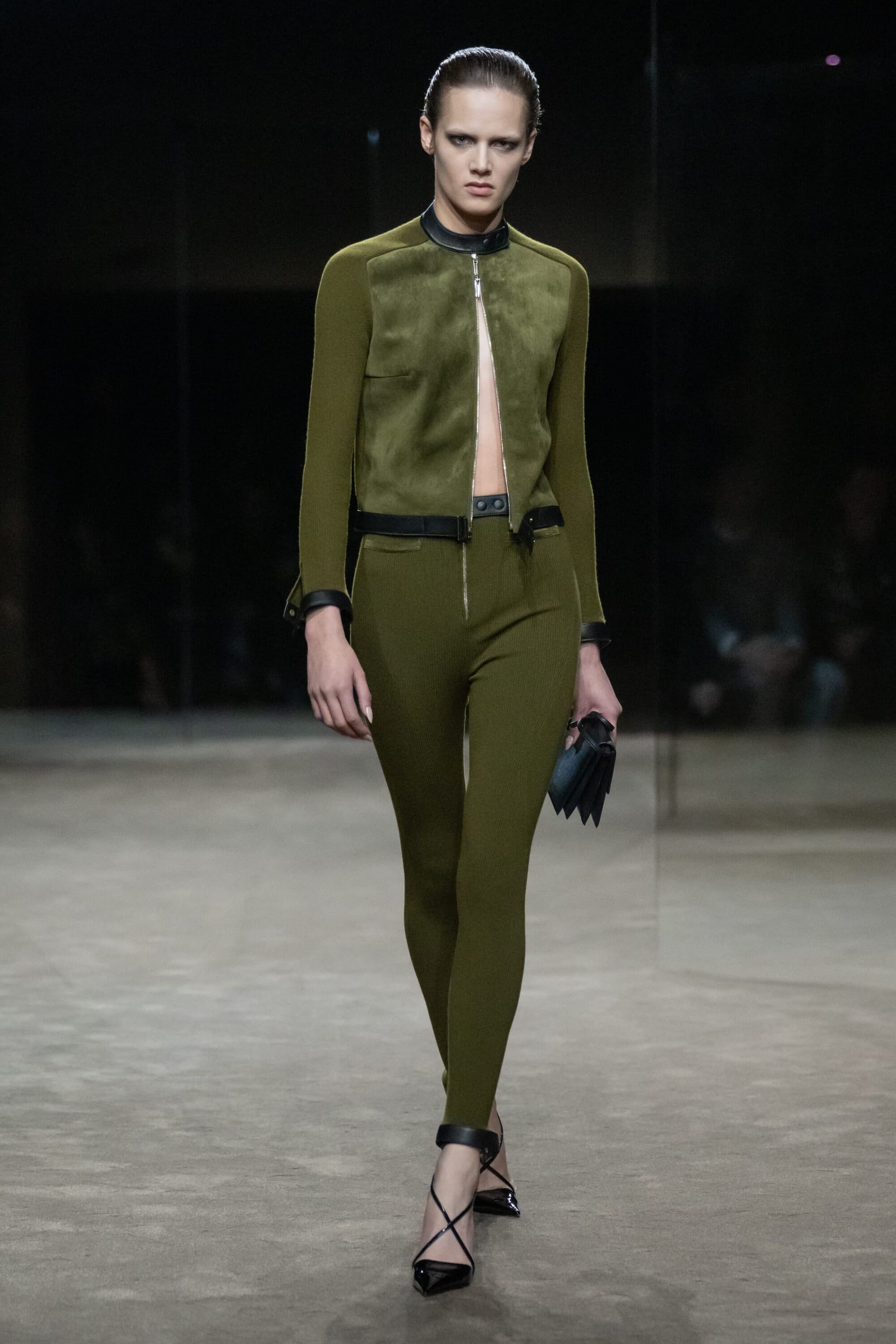
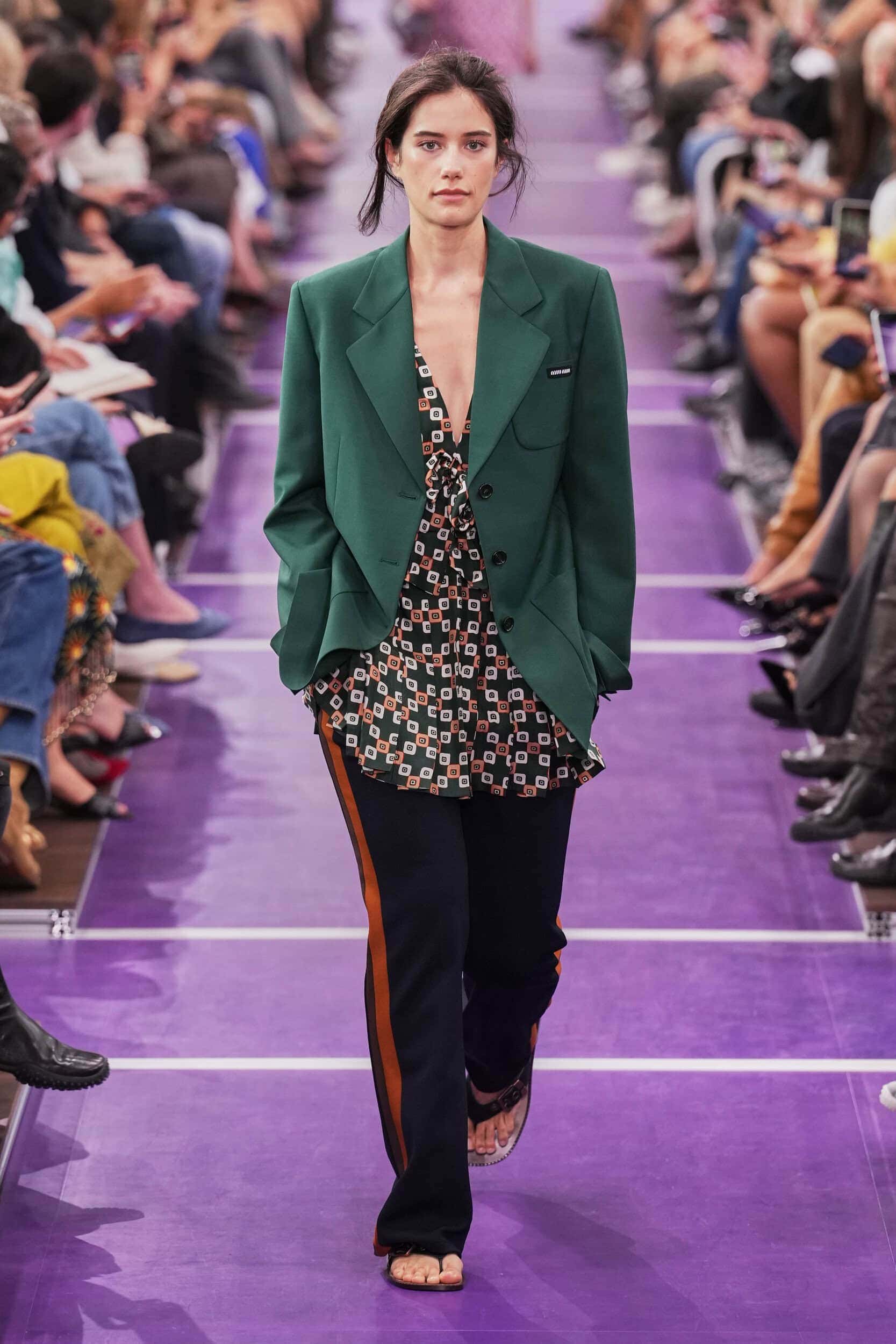
The move away from nature has made the rallying call to ‘Go outside and touch grass’ grow louder. The absorption into a digital world requires a more organic approach to life and this was reflected in deep khakis that mimicked forest floors at Altuzarra and Schiaparelli, vibrant grassy shades from Prada and Michael Kors, and acidic bursts reminiscent of algae at Courrèges, Brandon Maxwell and Casablanca.
Where Was it Seen?
Prada, Burberry, Ahluwalia, Givenchy, Tom Ford
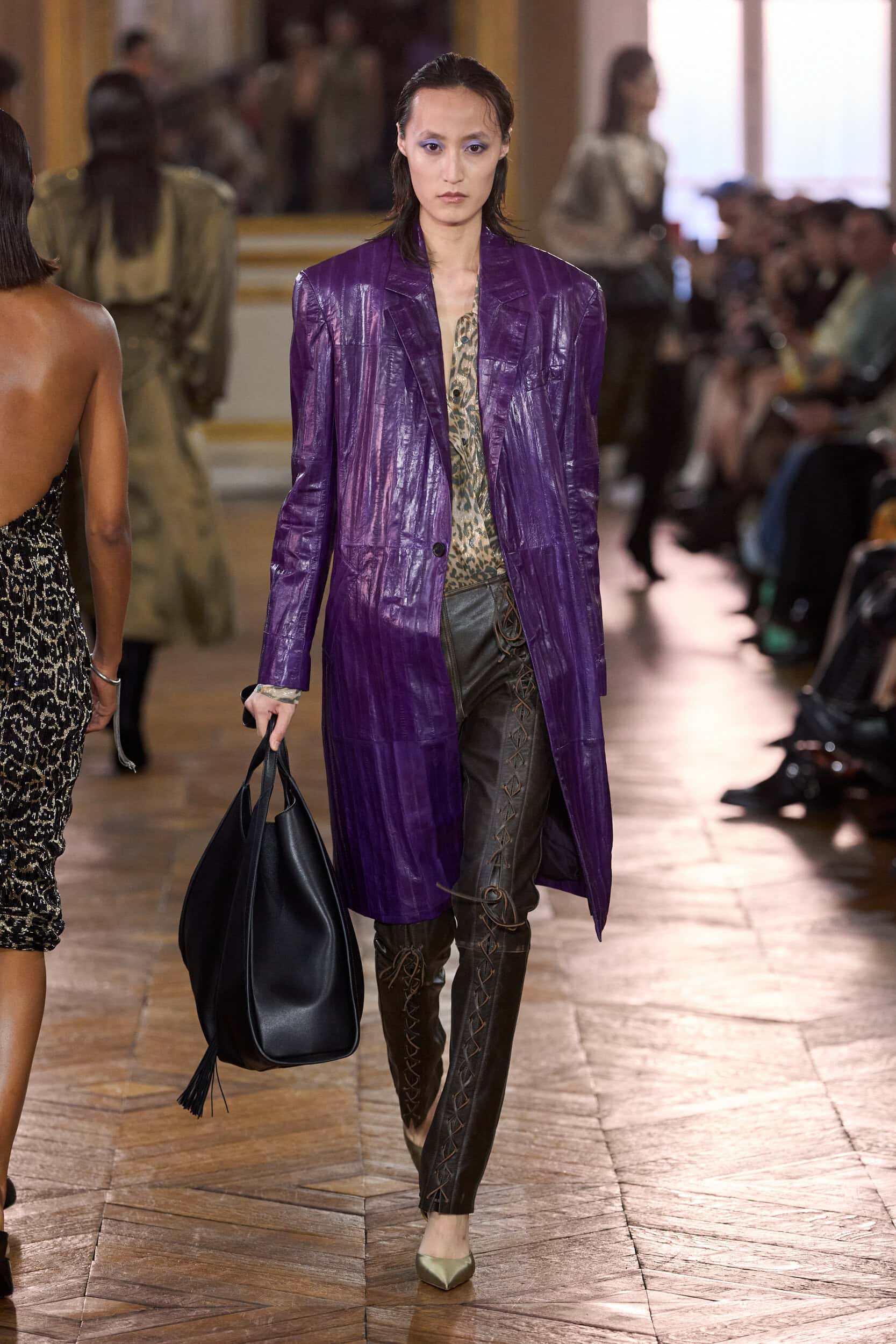
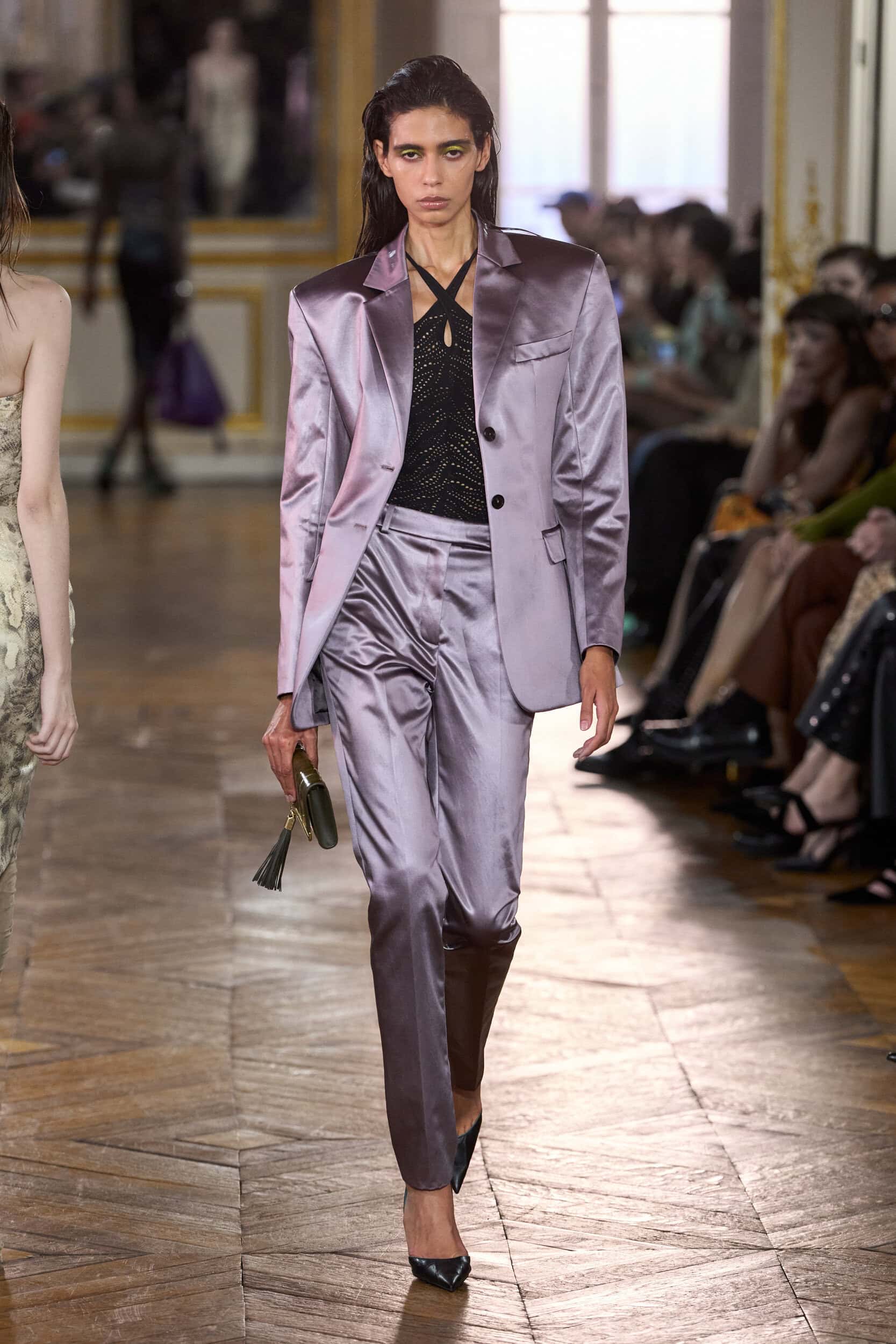
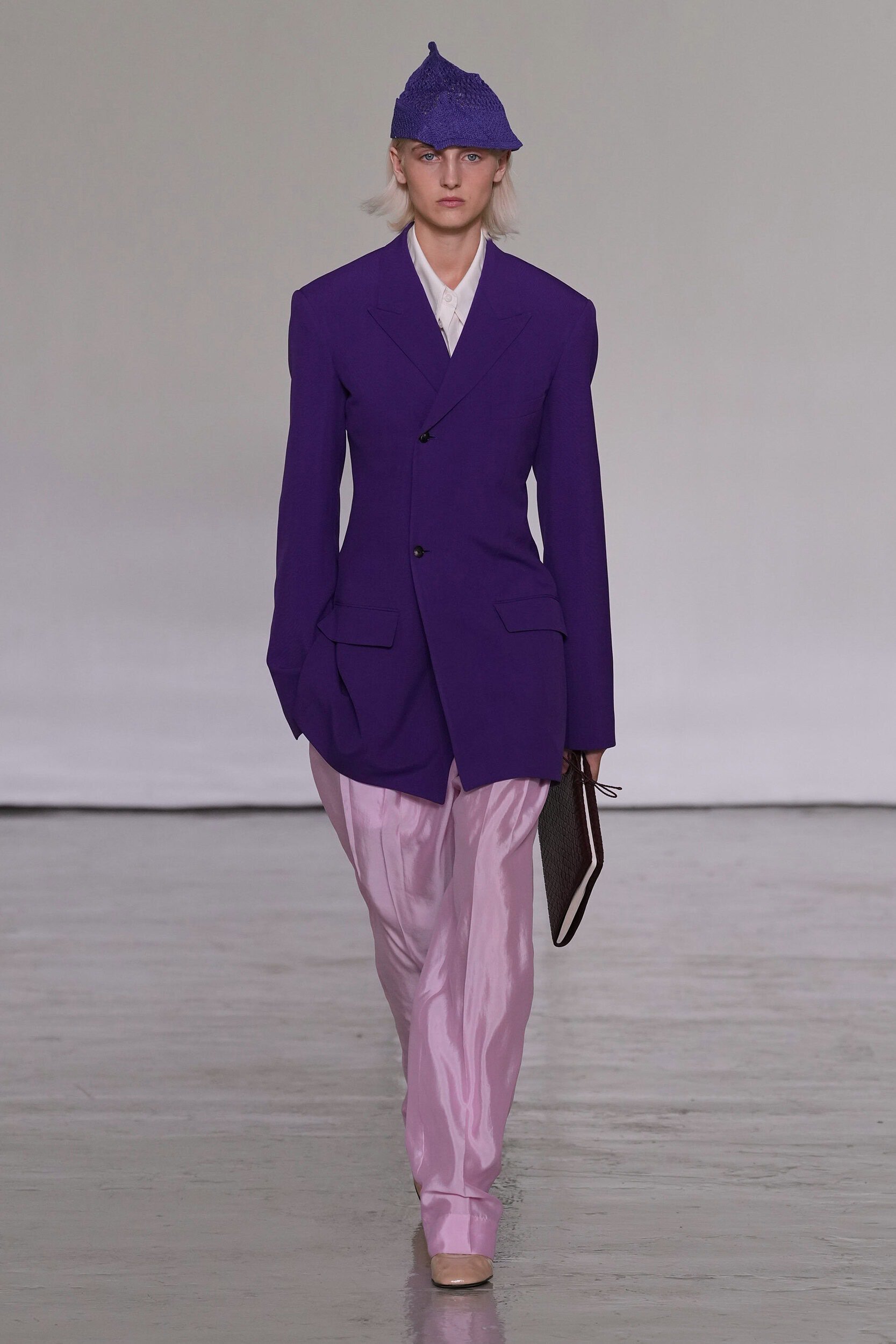
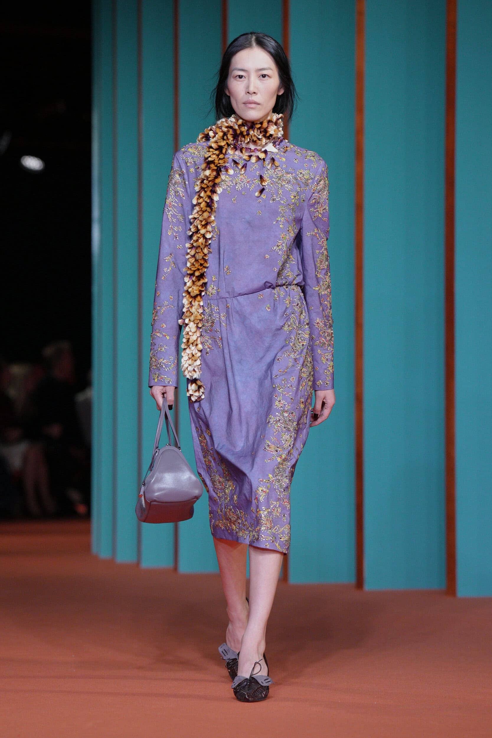
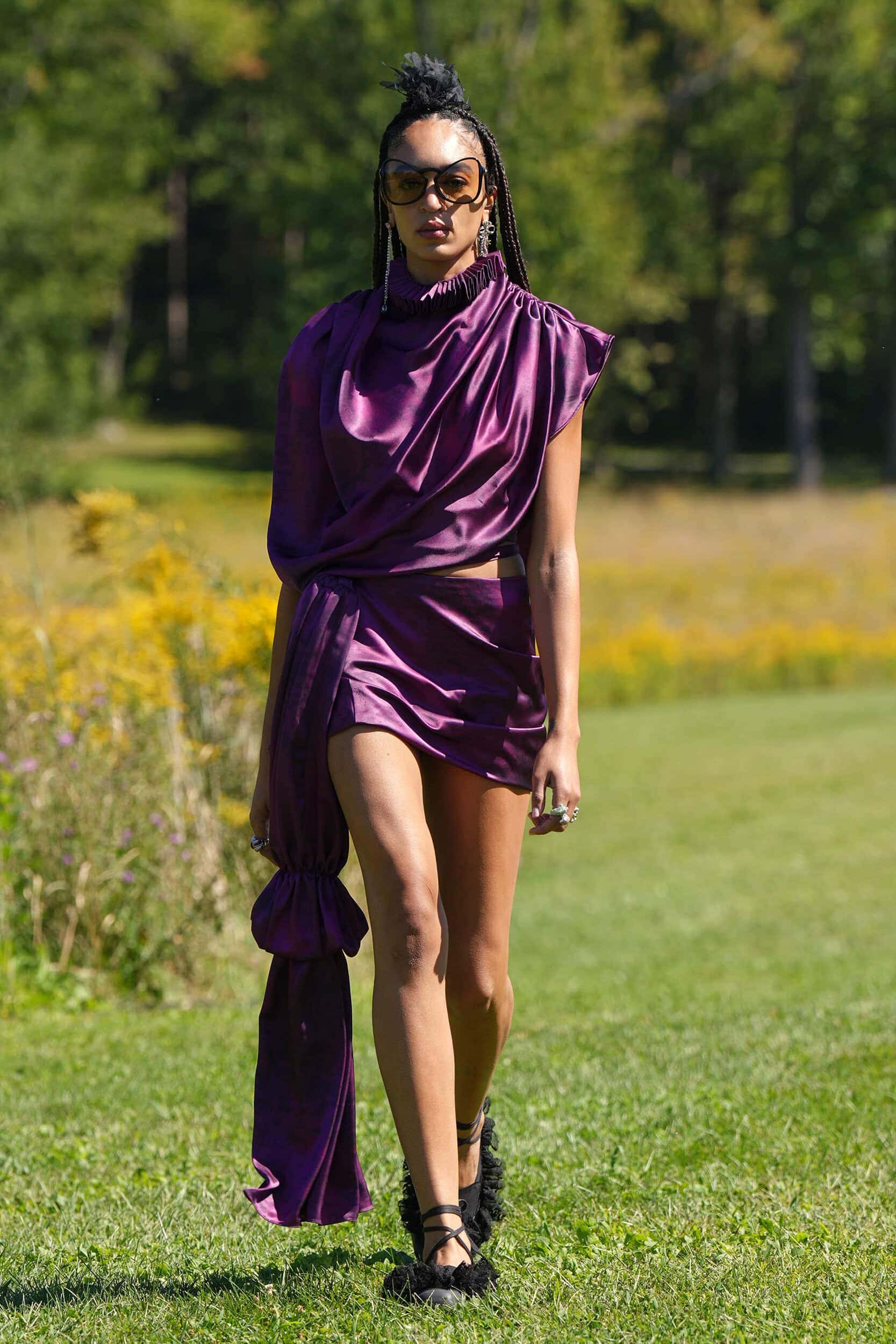
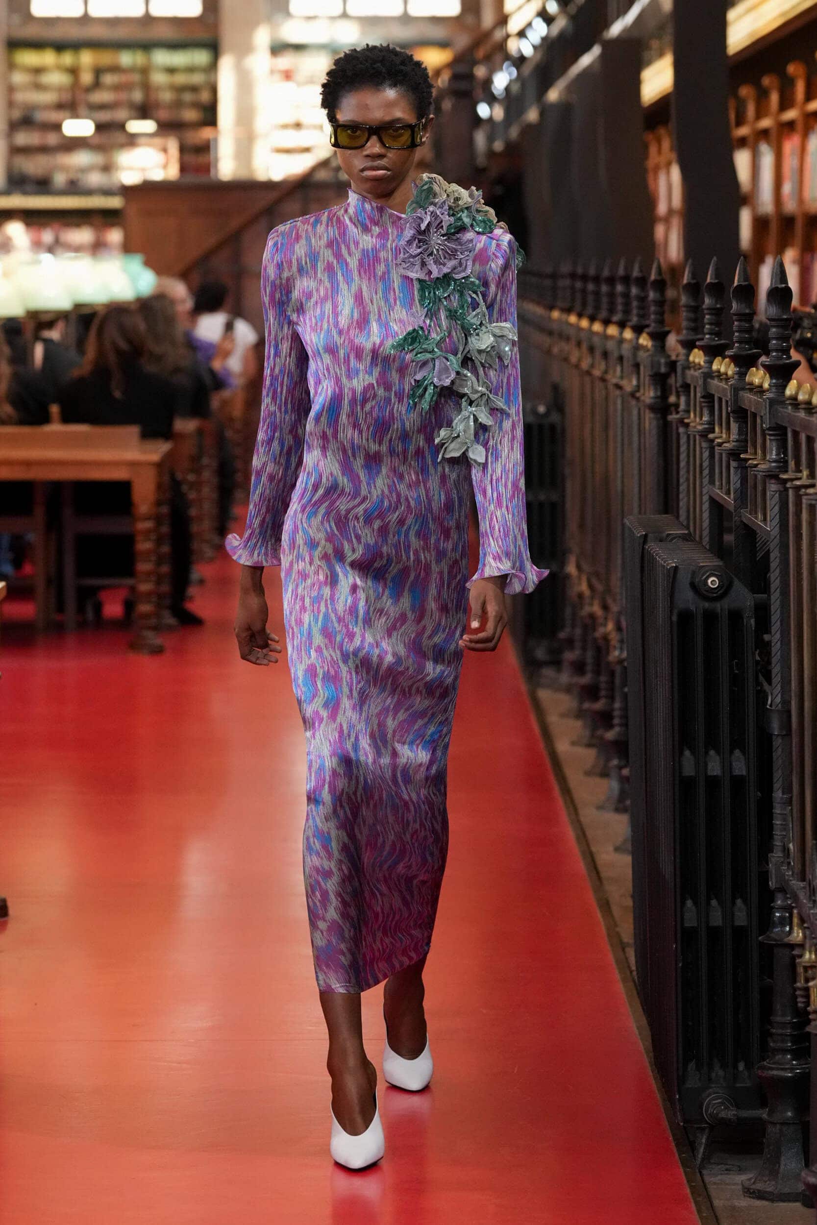
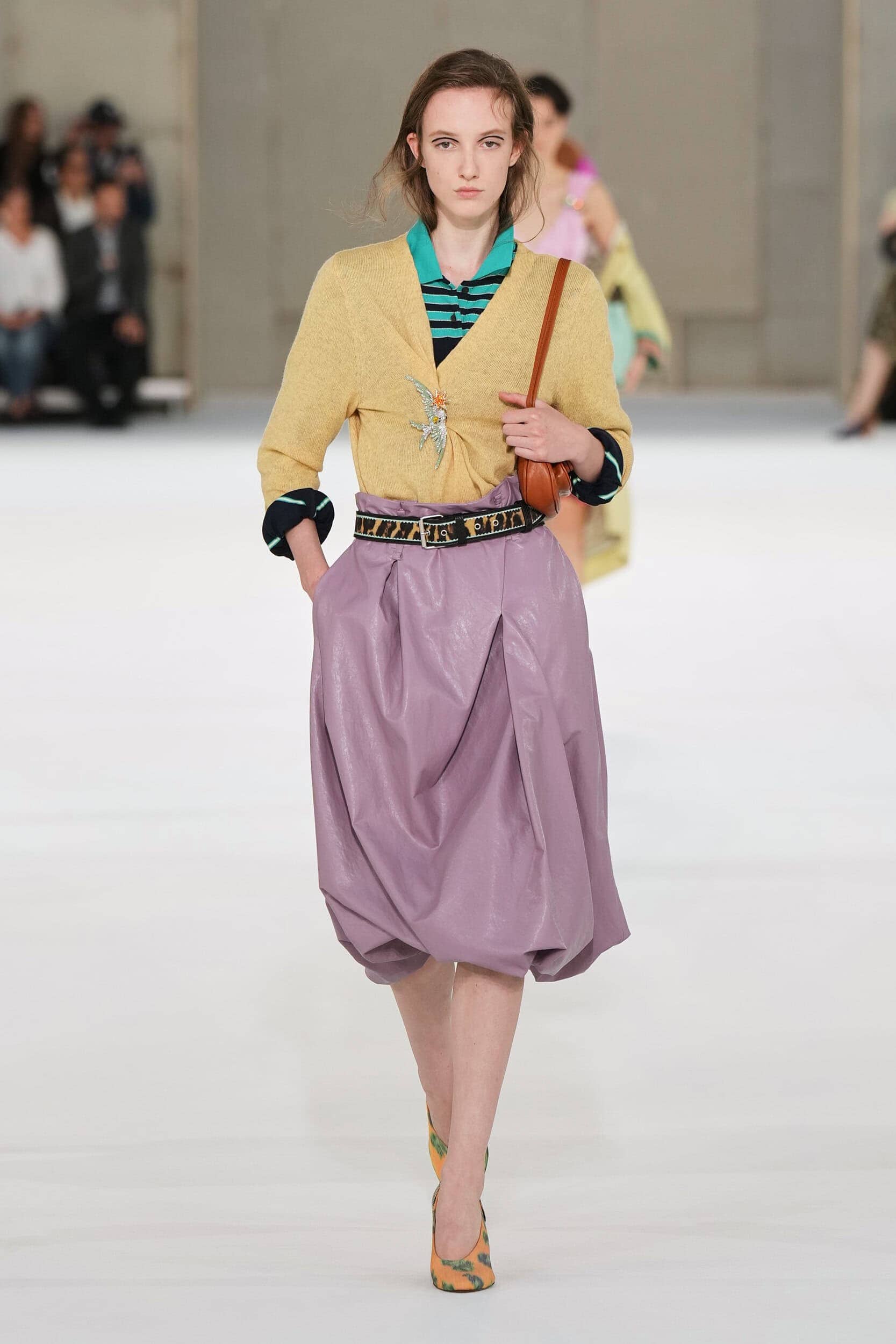
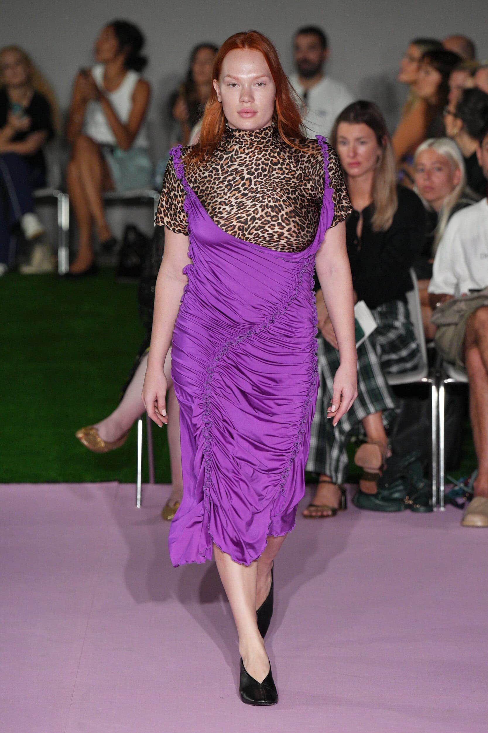
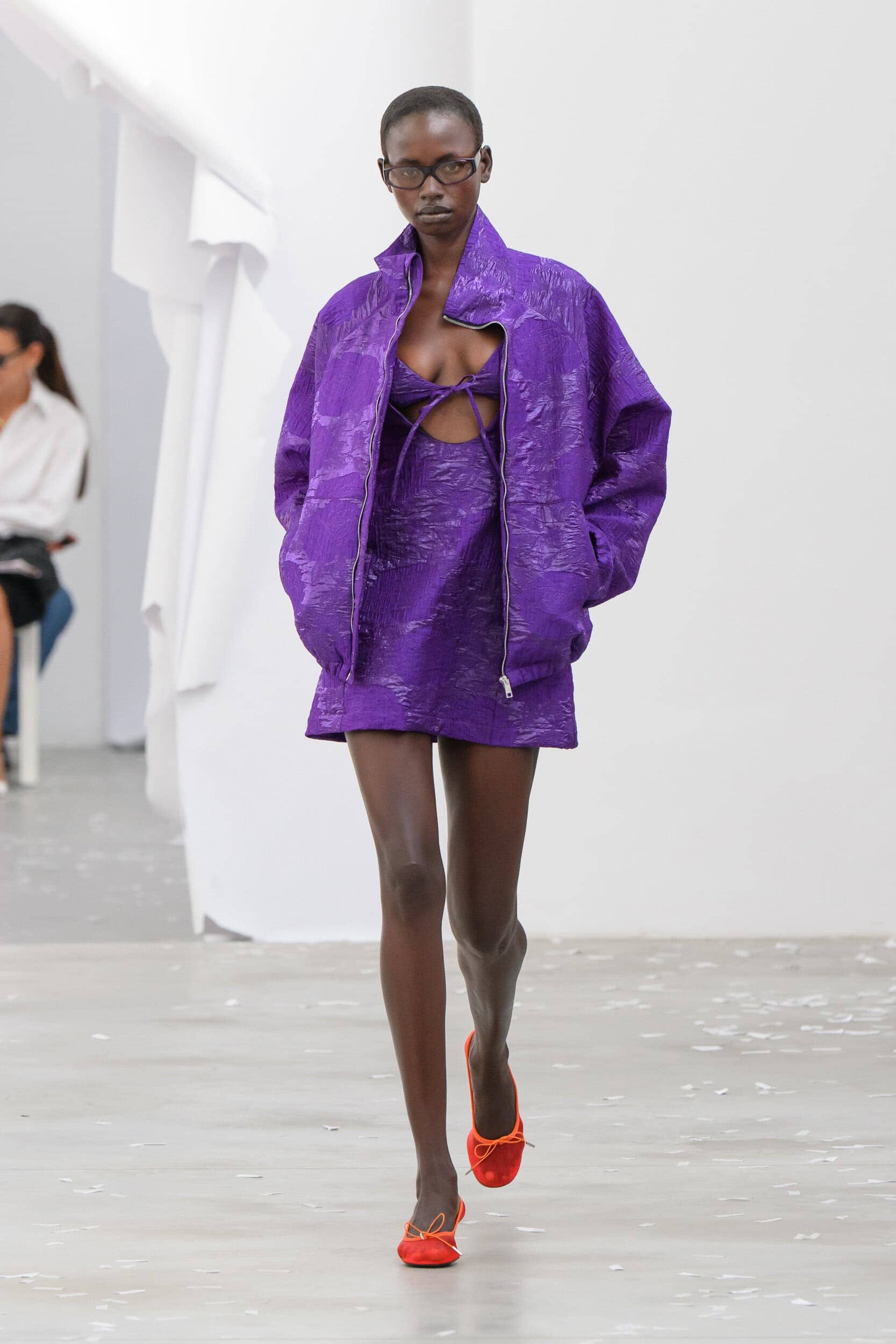
6. Put it All On Purple
Why it’s Trending?
In a season that was defined by both light and dark palettes, with each given an equal measure of importance, experimenting with colour, especially when it lives outside of its typically assigned season offers more ways for the consumer to play with unexpected combinations.
Why it Matters?
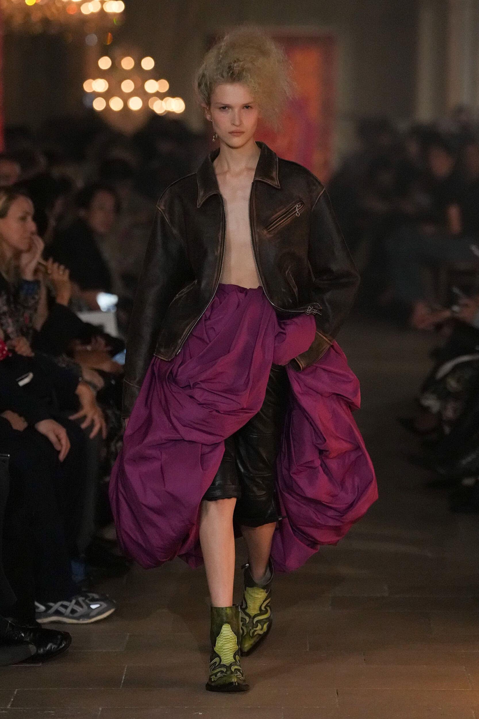
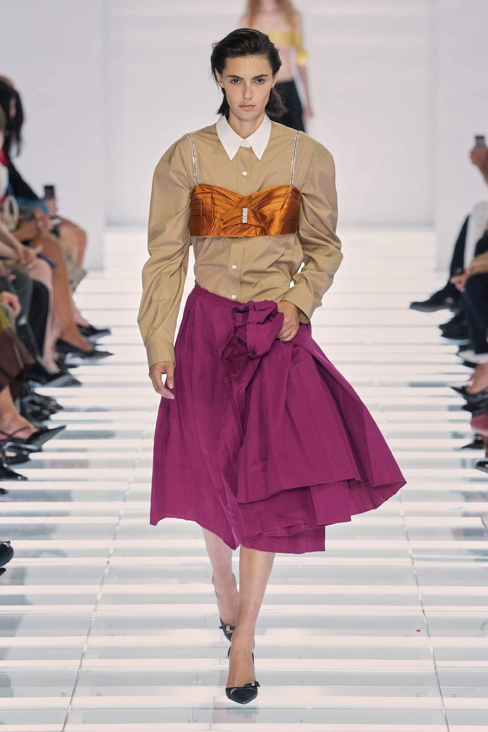
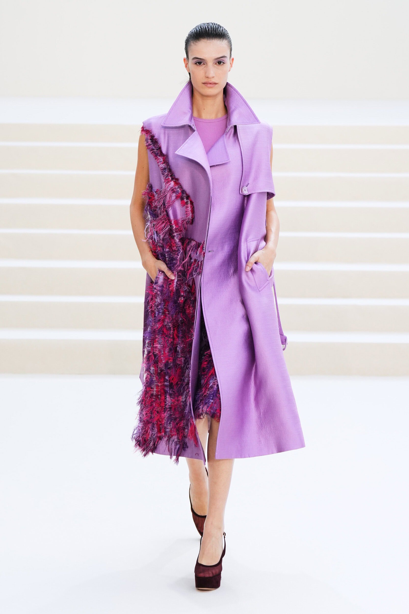
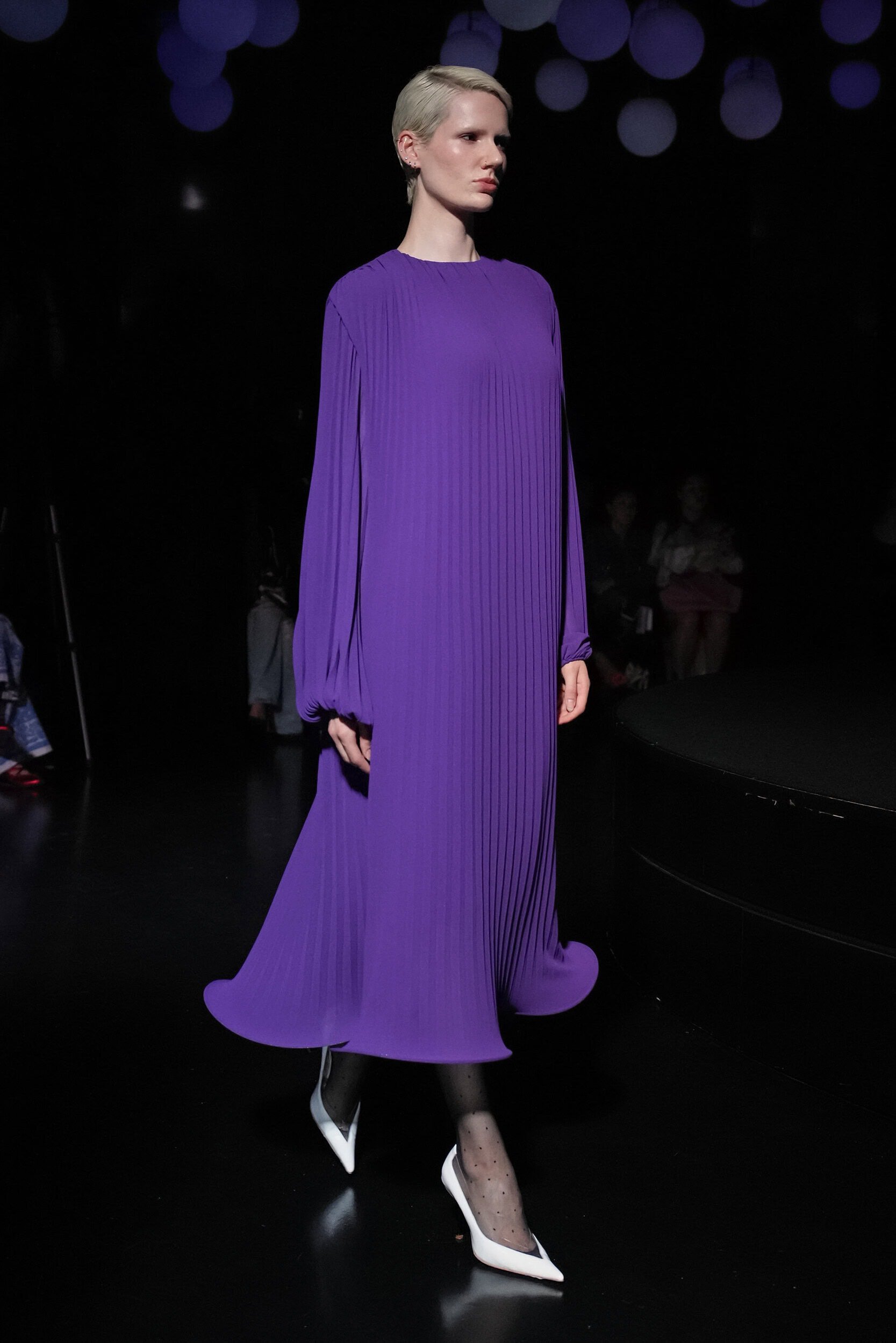
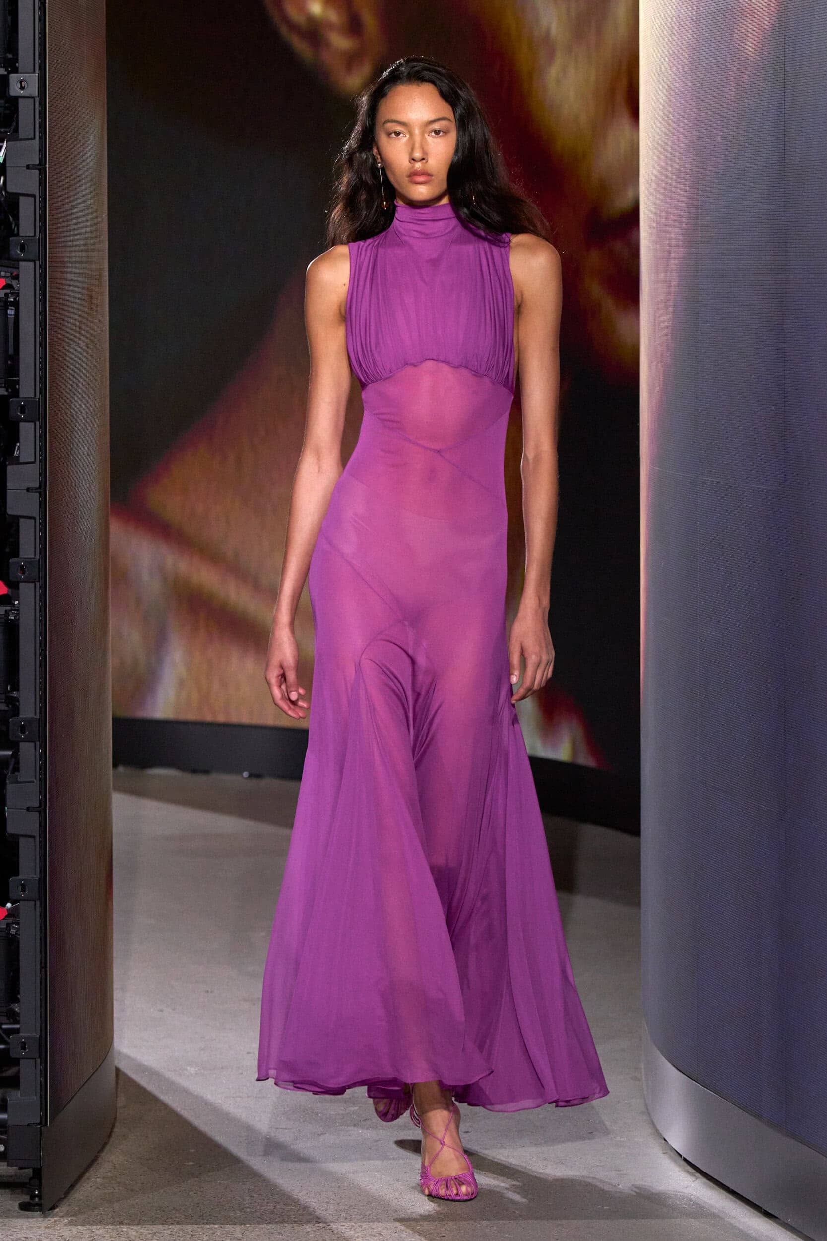
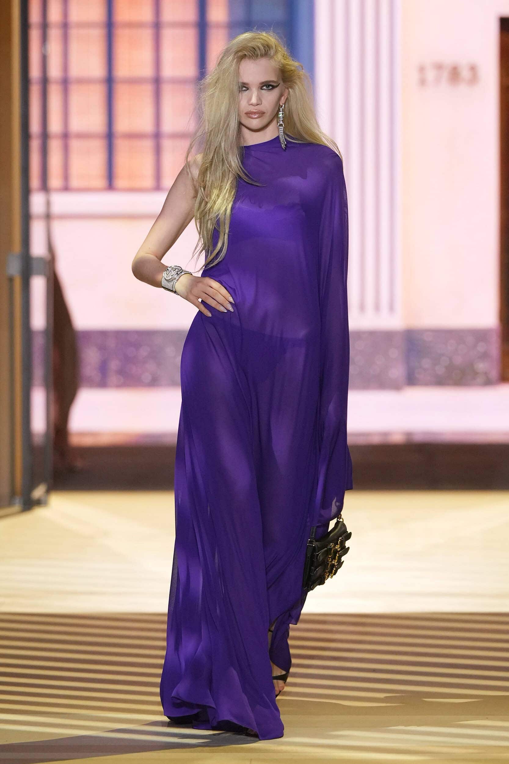
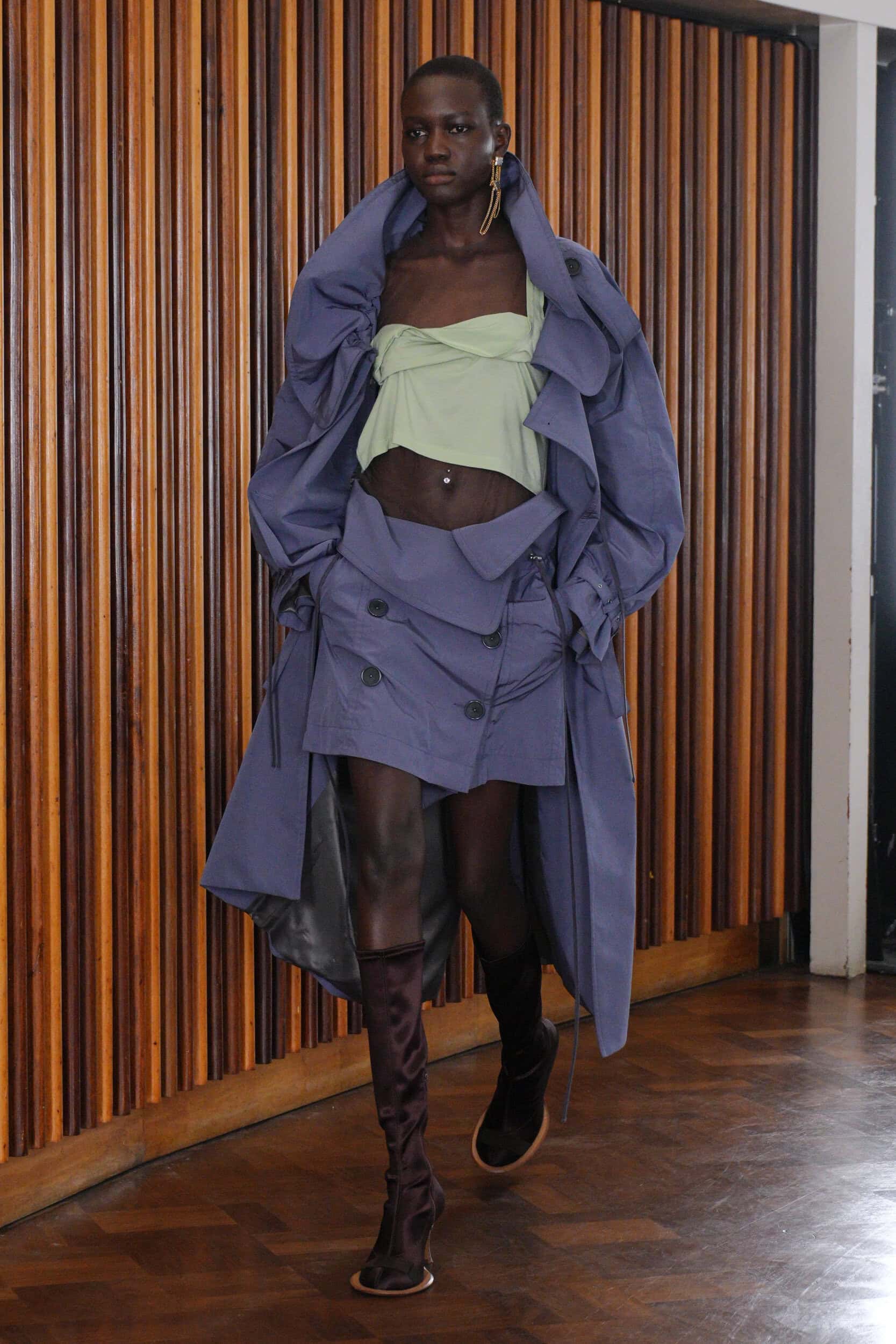
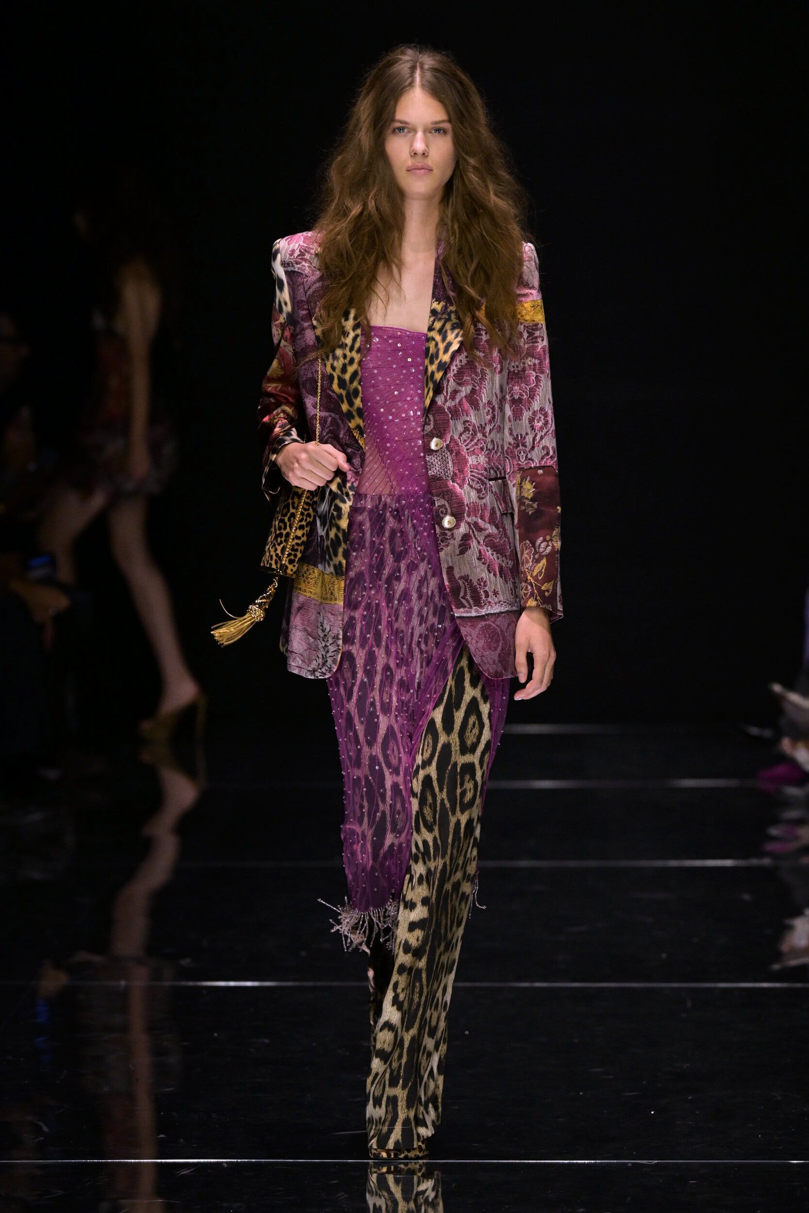
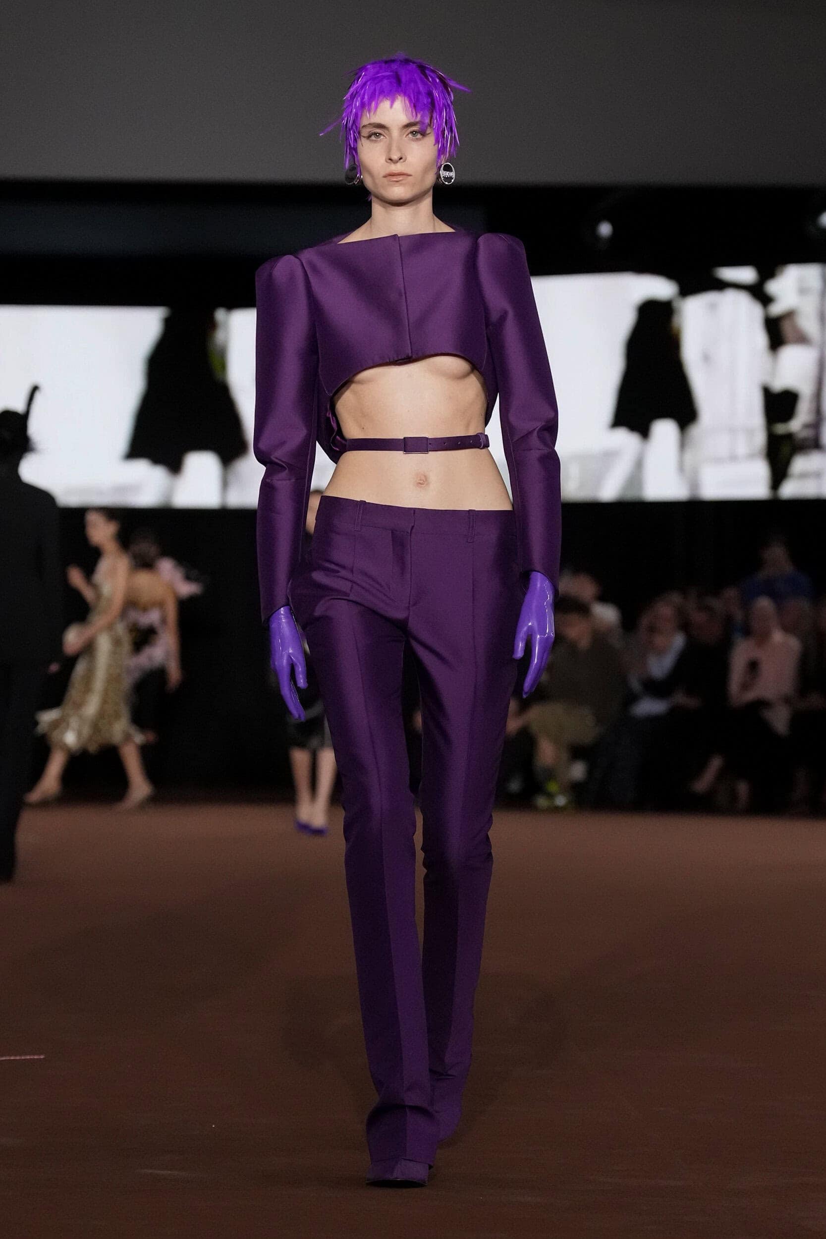
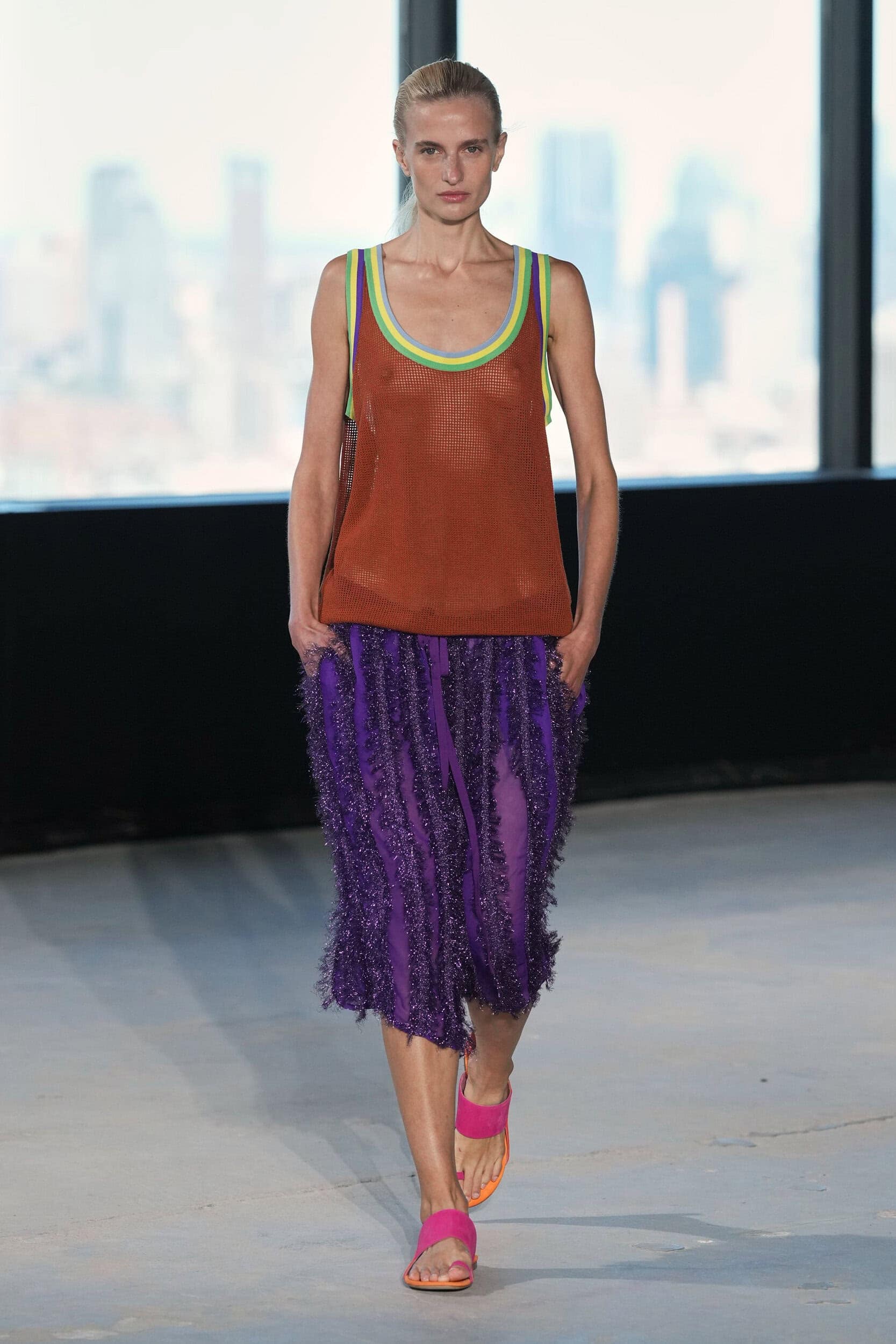
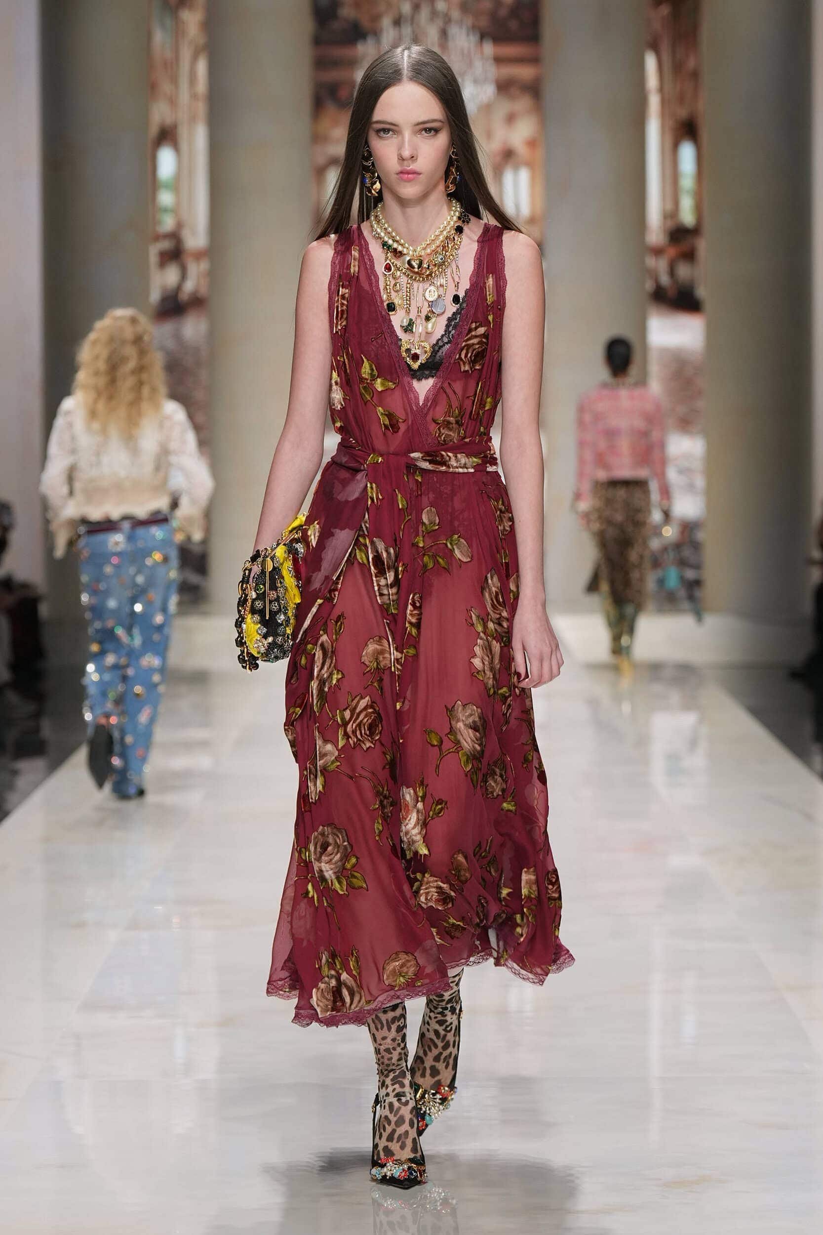
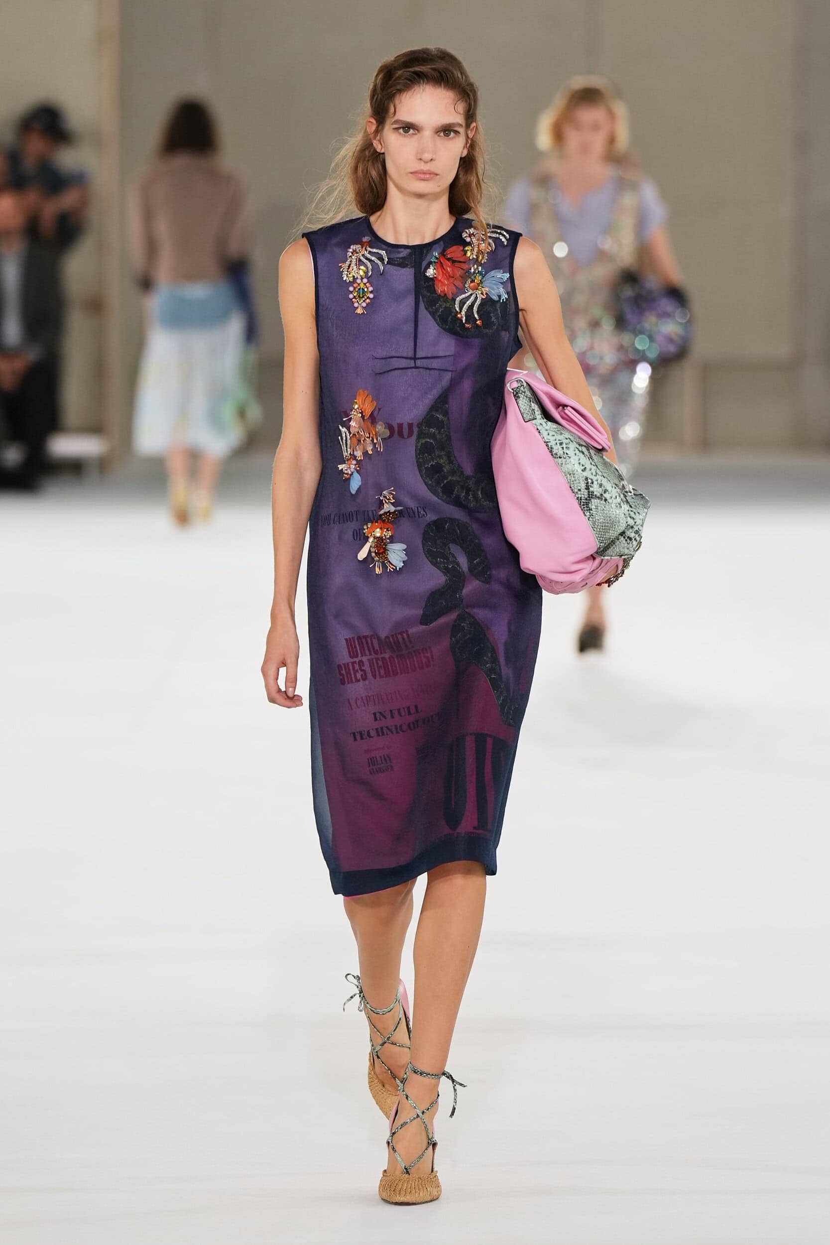
A shade known to stimulate creativity – due to the combination of stabilising blue and energetic red – purple took on an ethereal quality when used on sheers at Prabal Gurung and Issey Miyake, transcended into a magical realm when metallic and high-shine effects were harnessed at Zankov and Valentino, and pushed the idea of non-conformity when paired with equally bold colours at Tory Burch, Diane Von Furstenburg and Prada.
Where Was it Seen?
Valentino, Alaïa, Akris, Mugler, Gucci, Zankov
7. Dark Matter
Why it’s Trending?
A trend that The Impression has been tracking for a number of seasons, the use of darker-toned palettes that go against the grain of what is expected of the summer collections are evidence of the need for trans-seasonal clothing that work all year round.
Why it Matters?
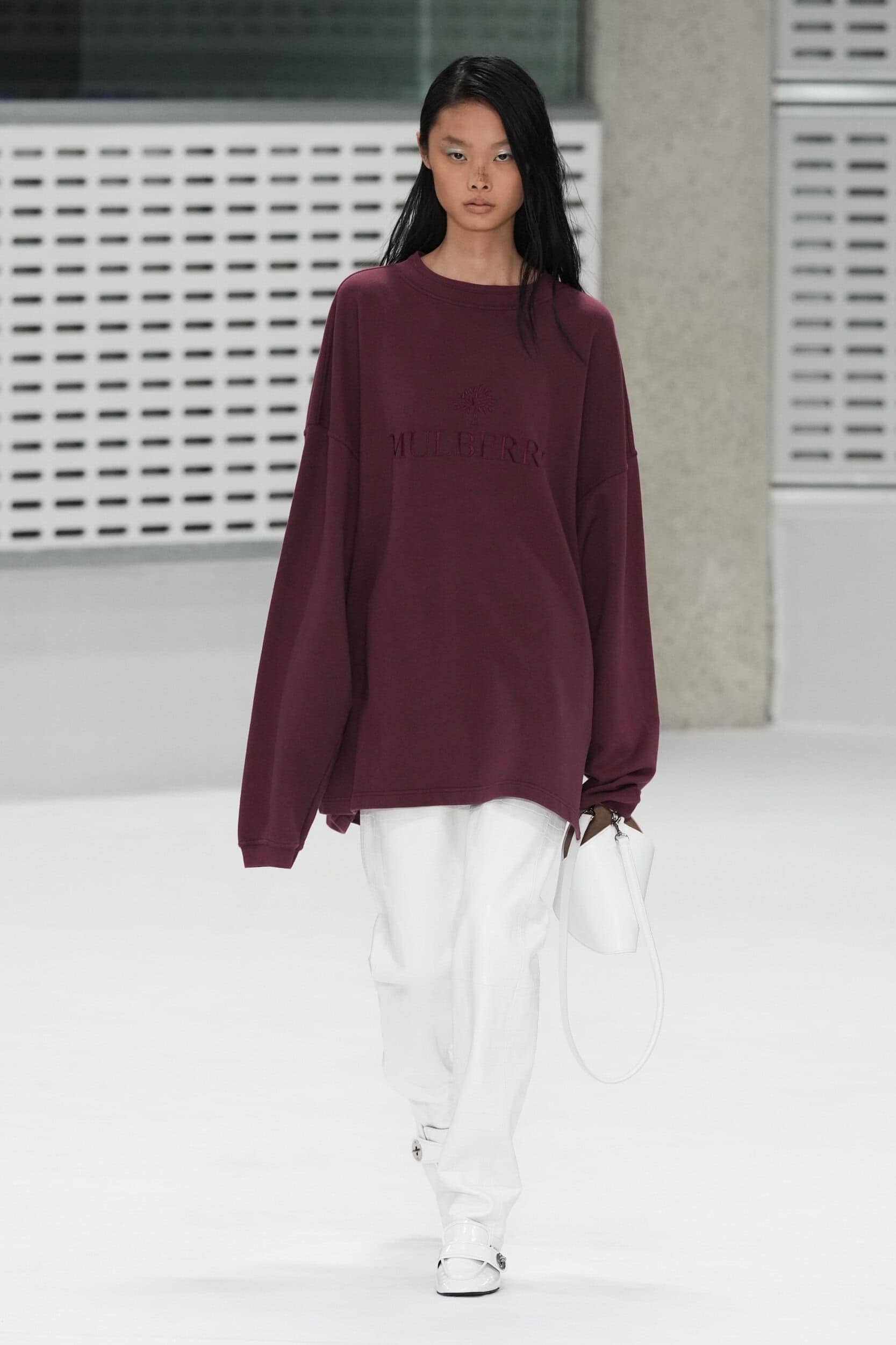
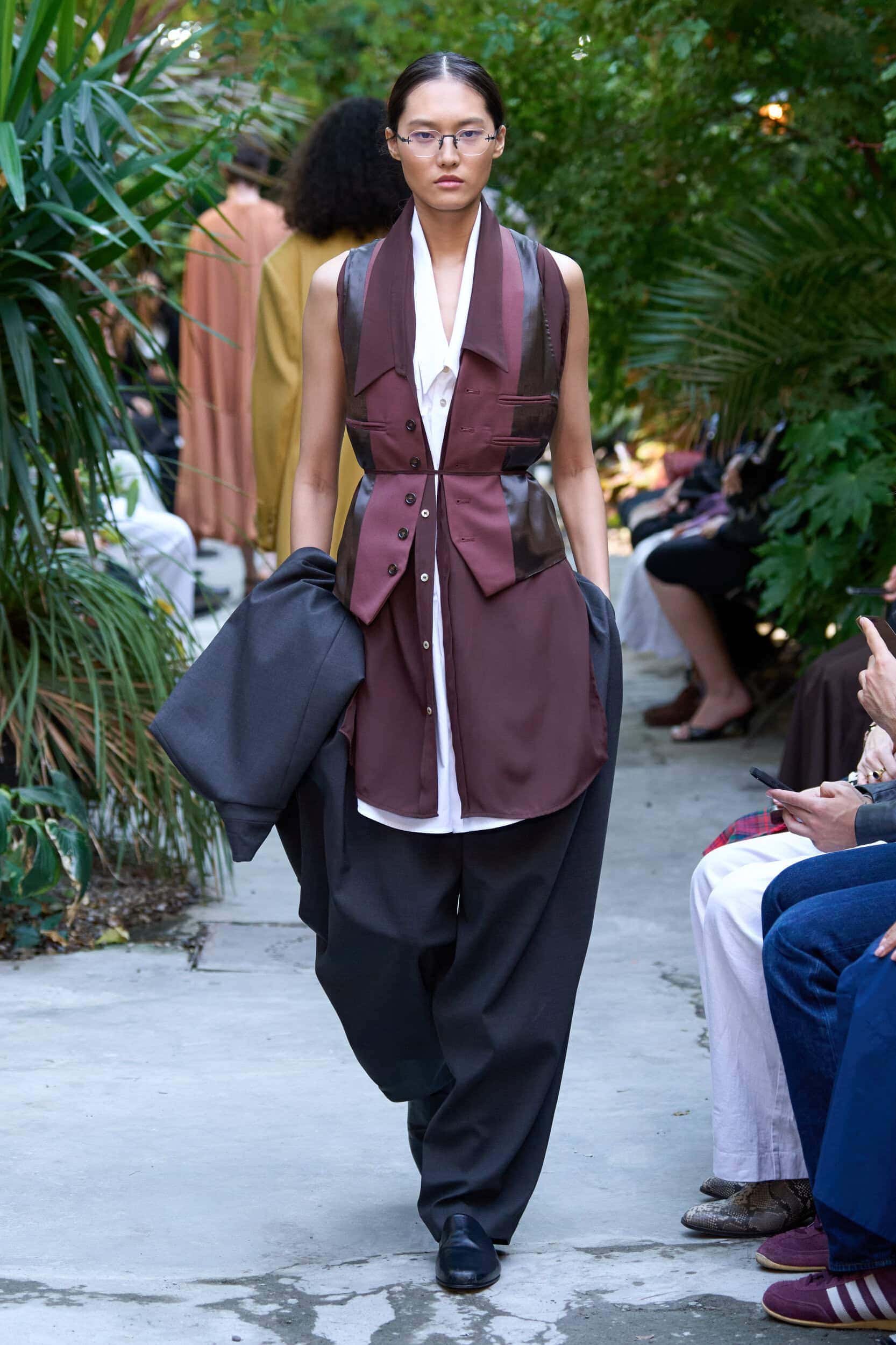
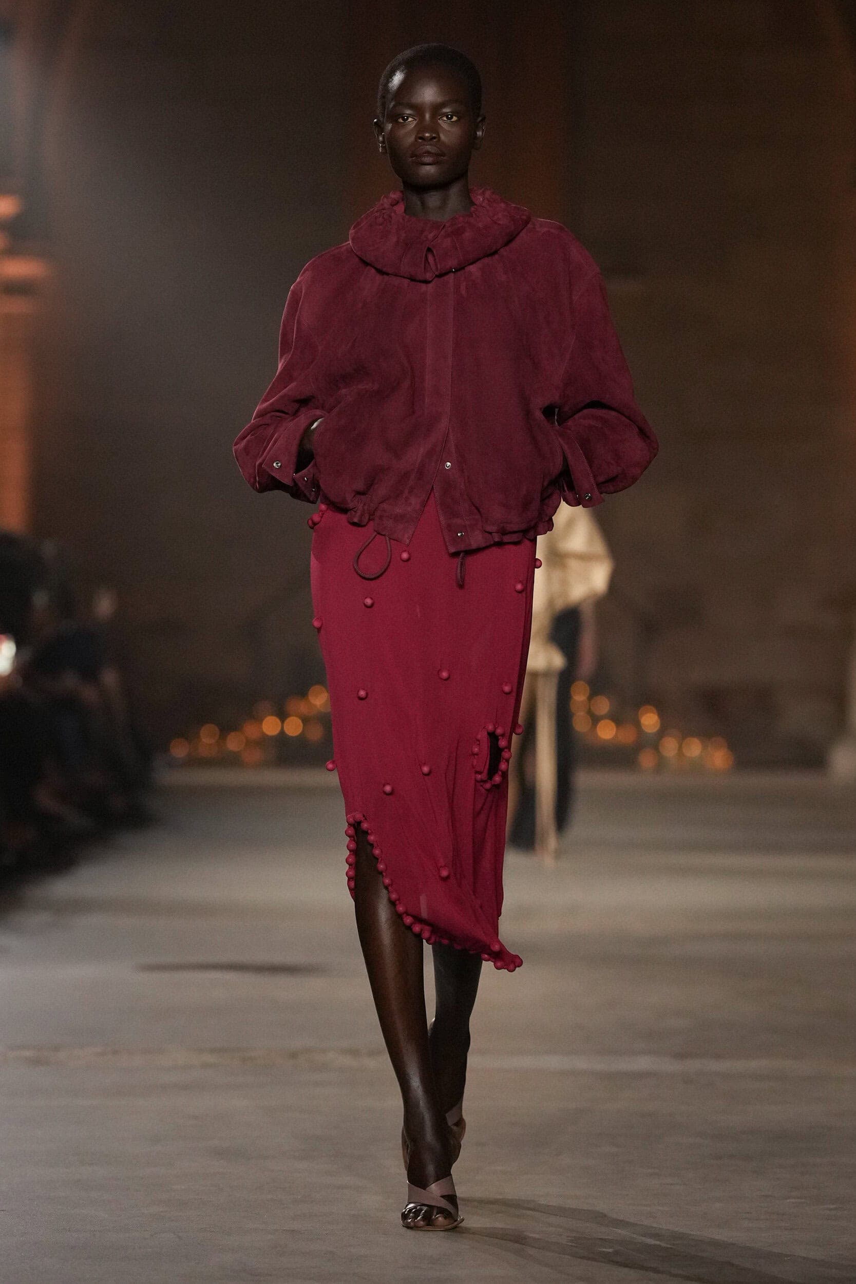
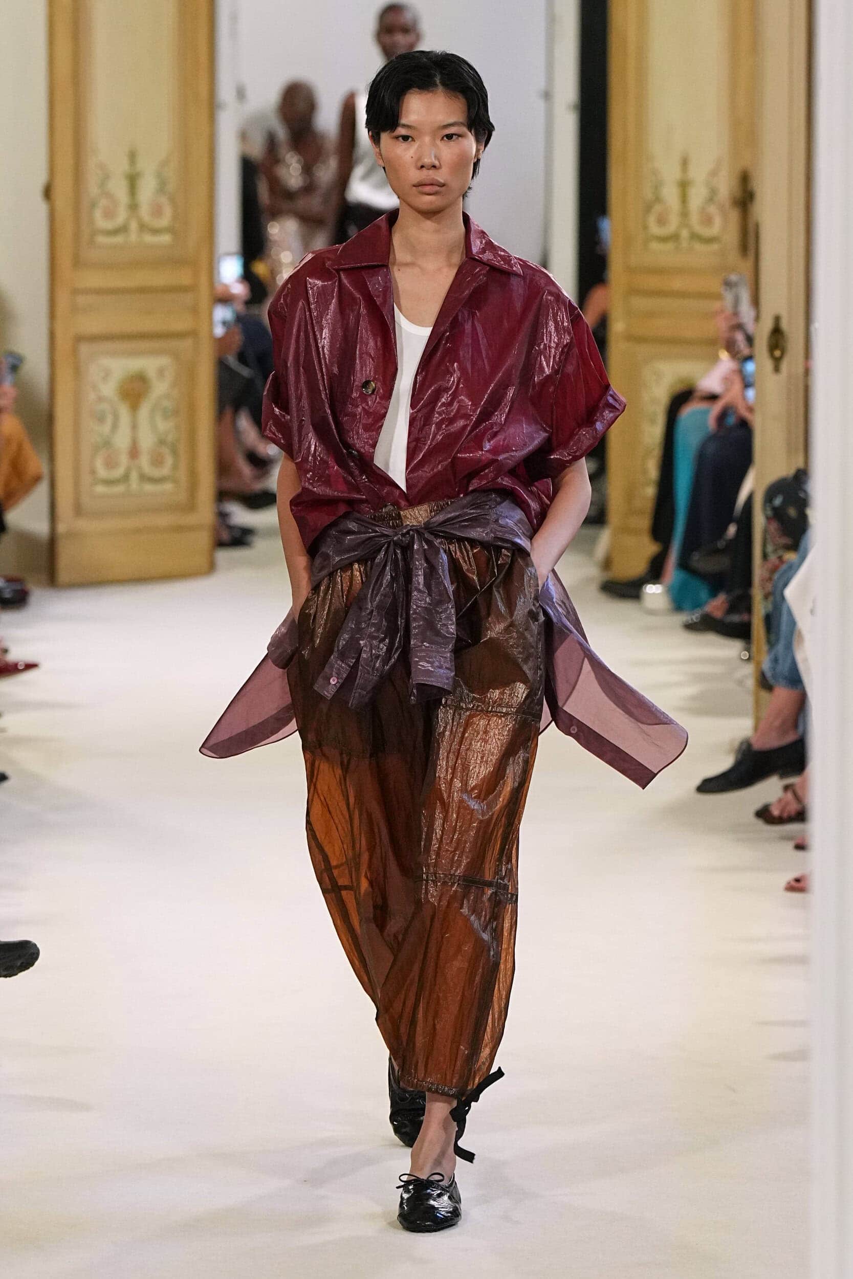
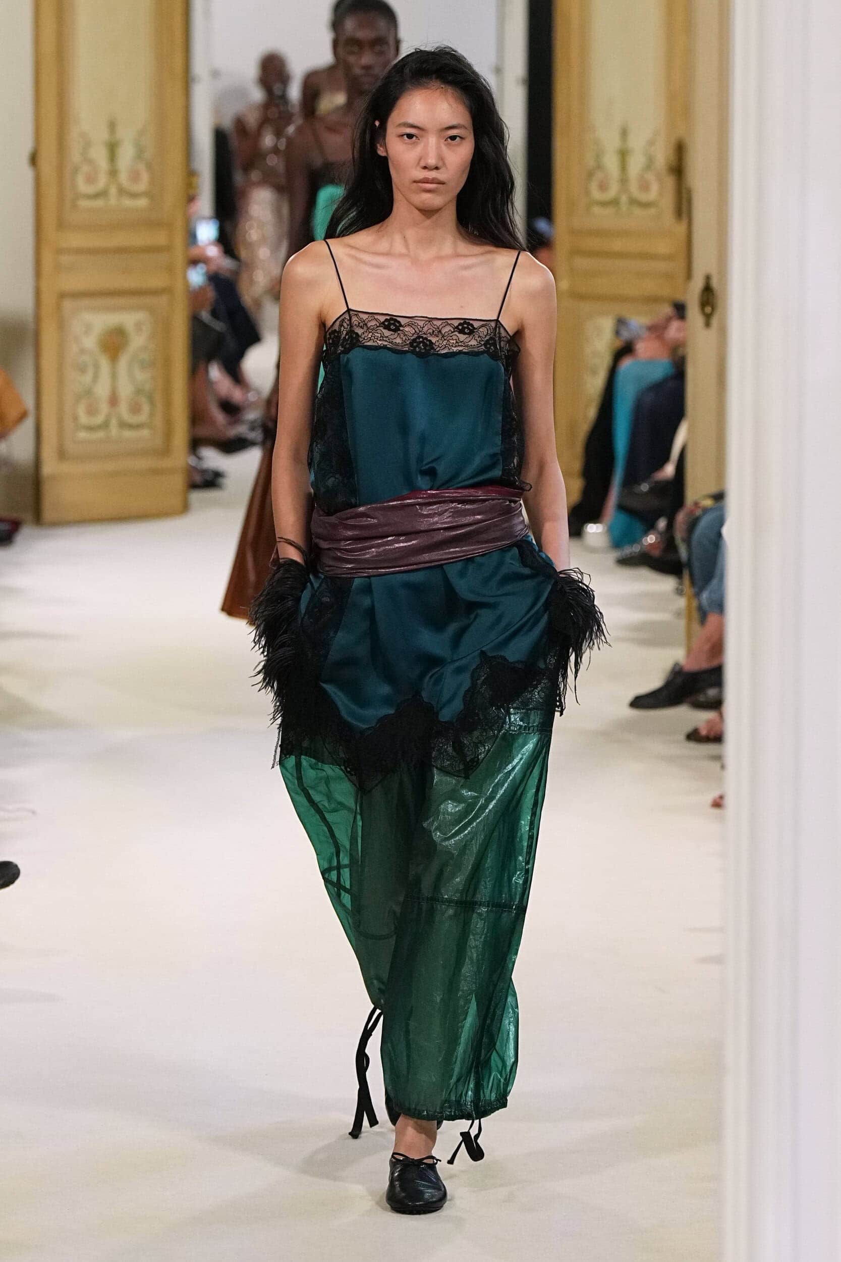
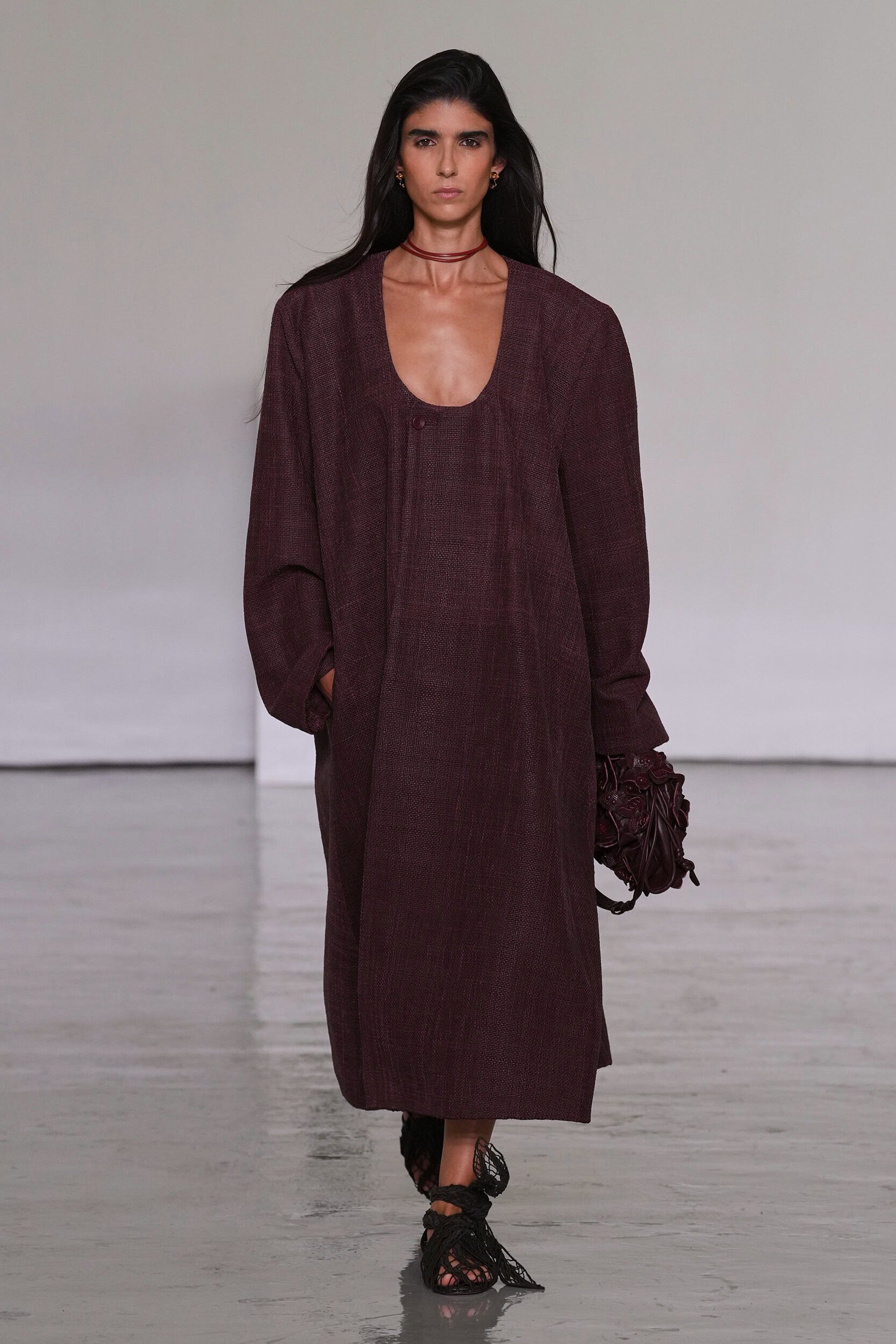
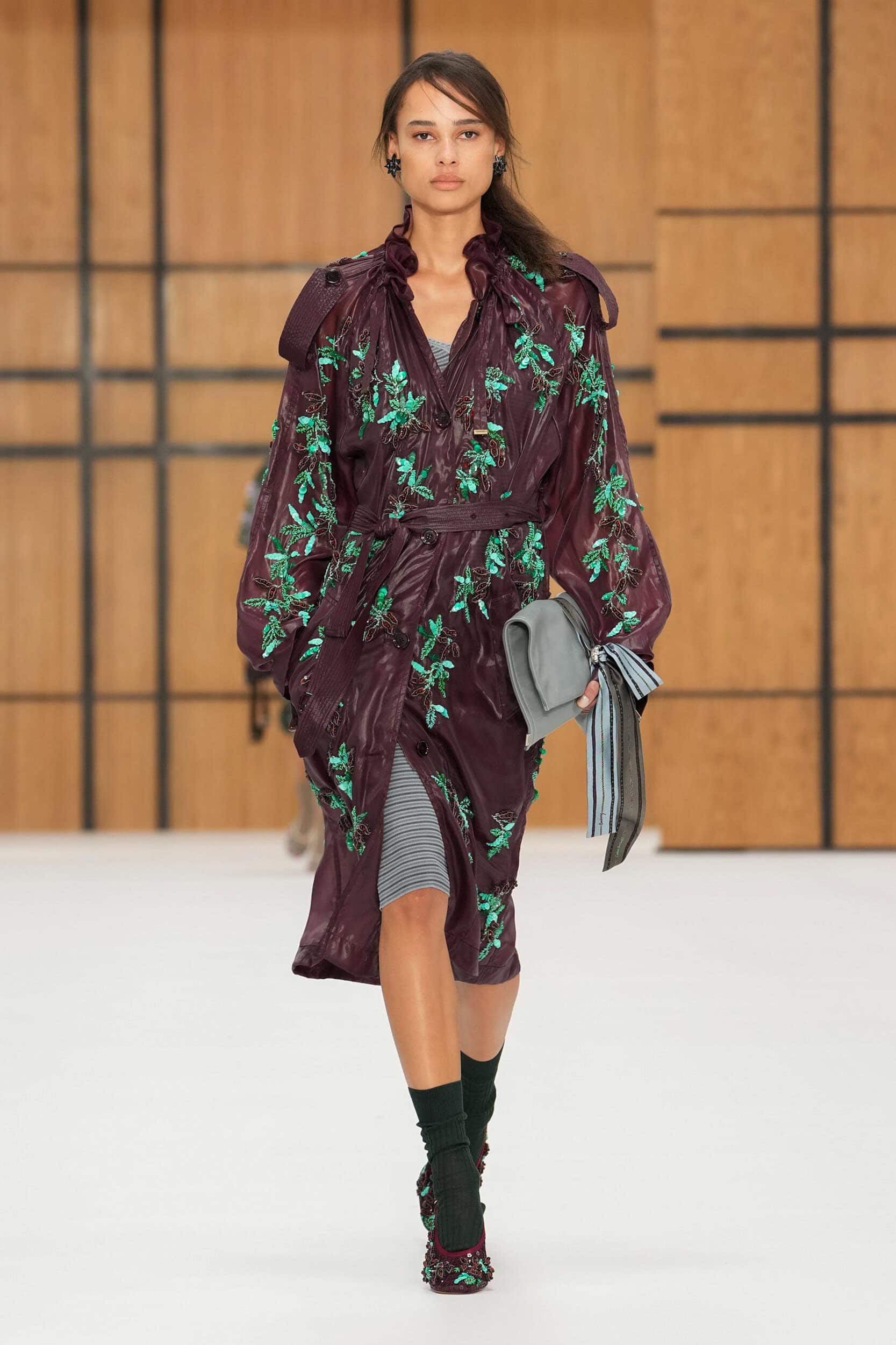
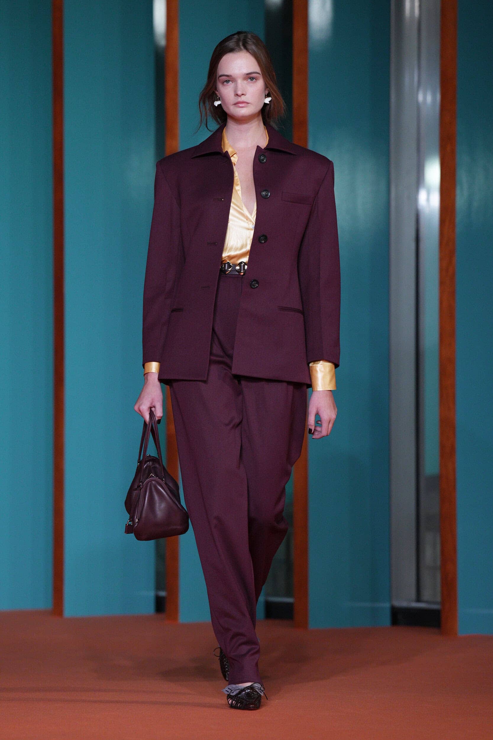
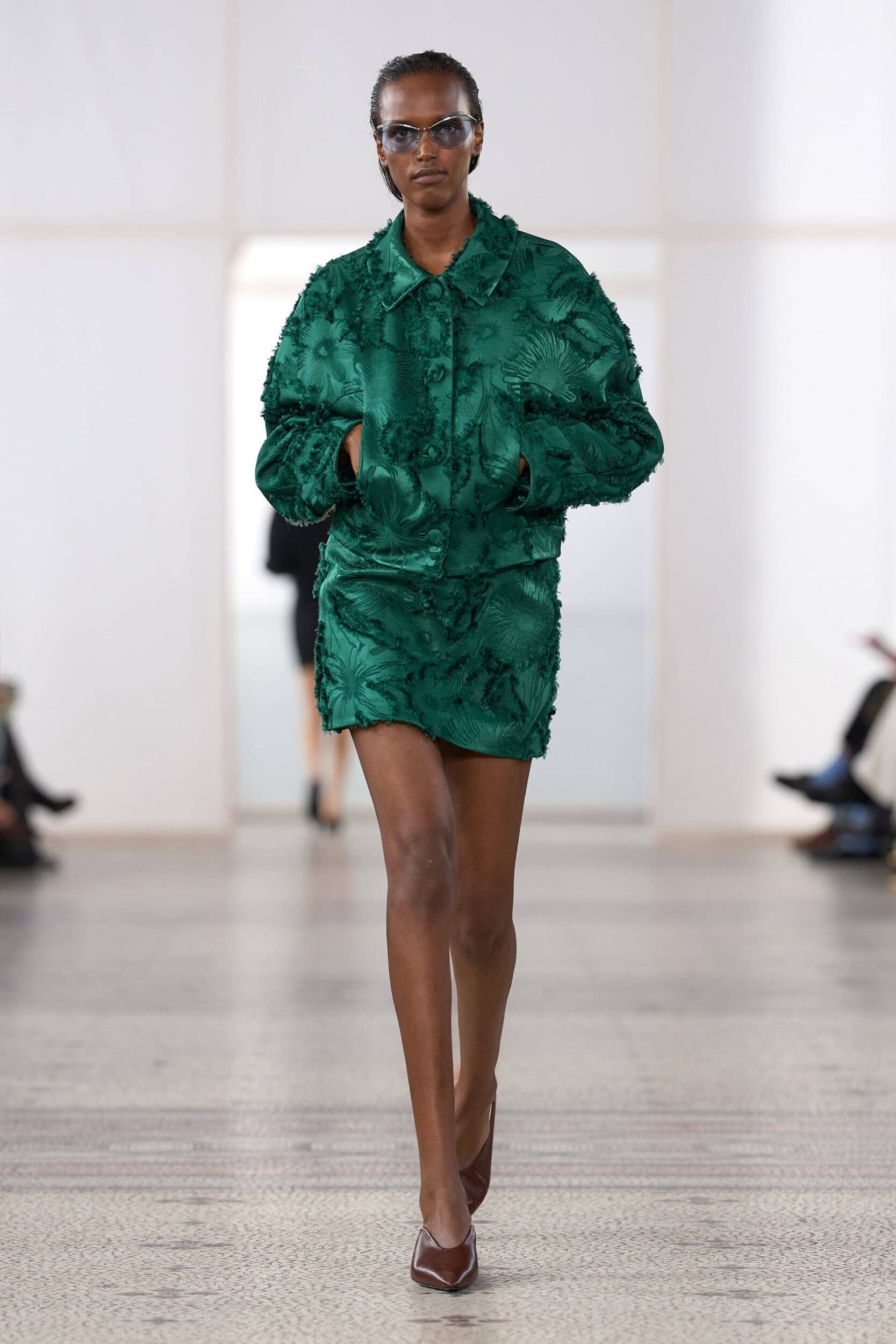
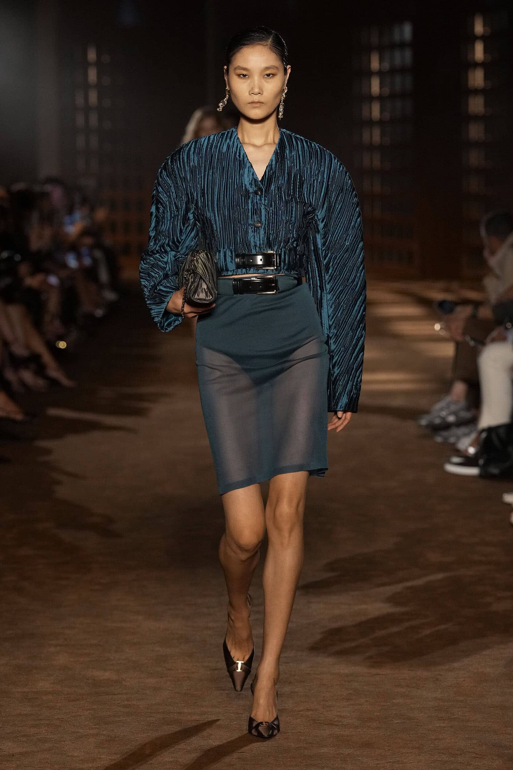
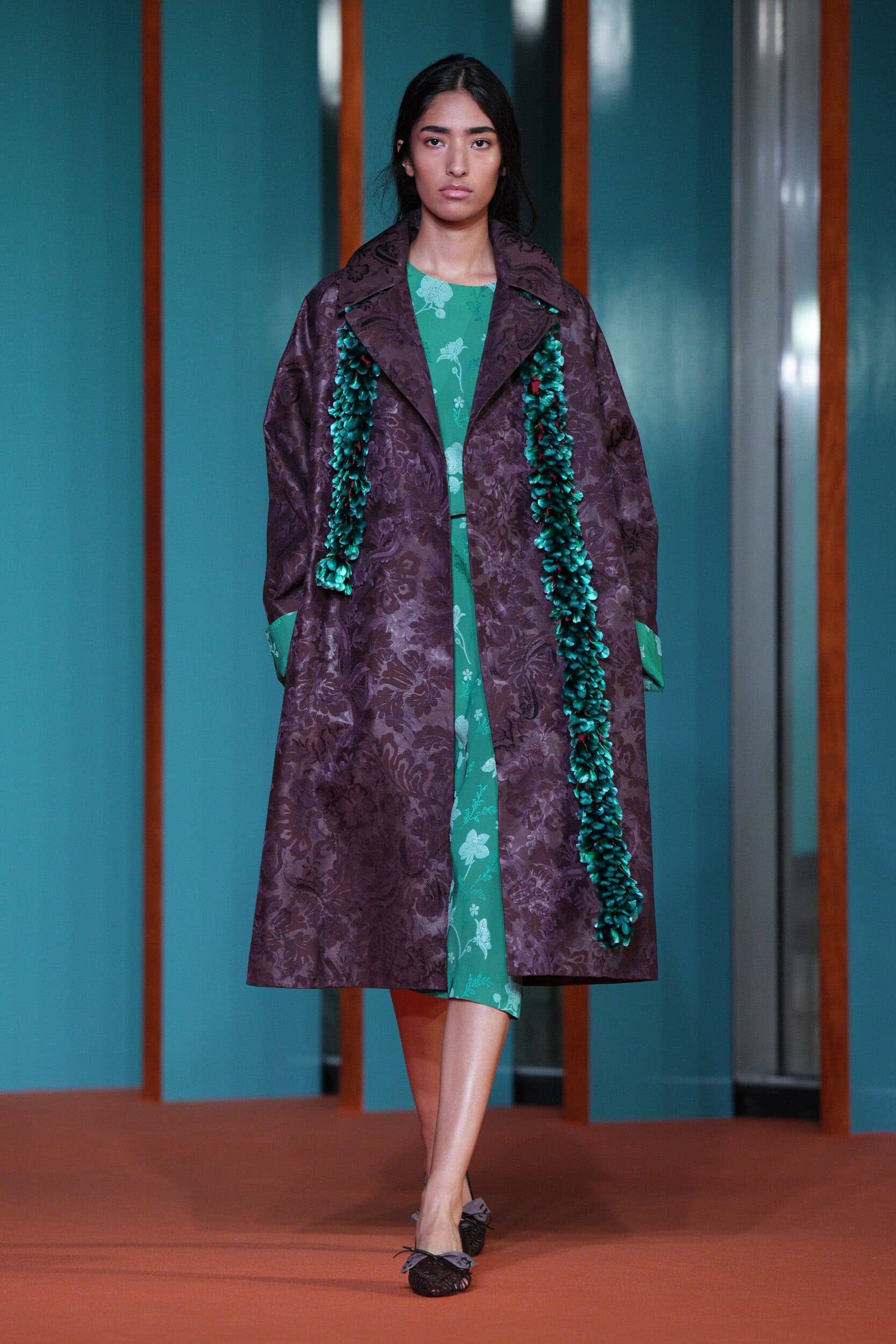
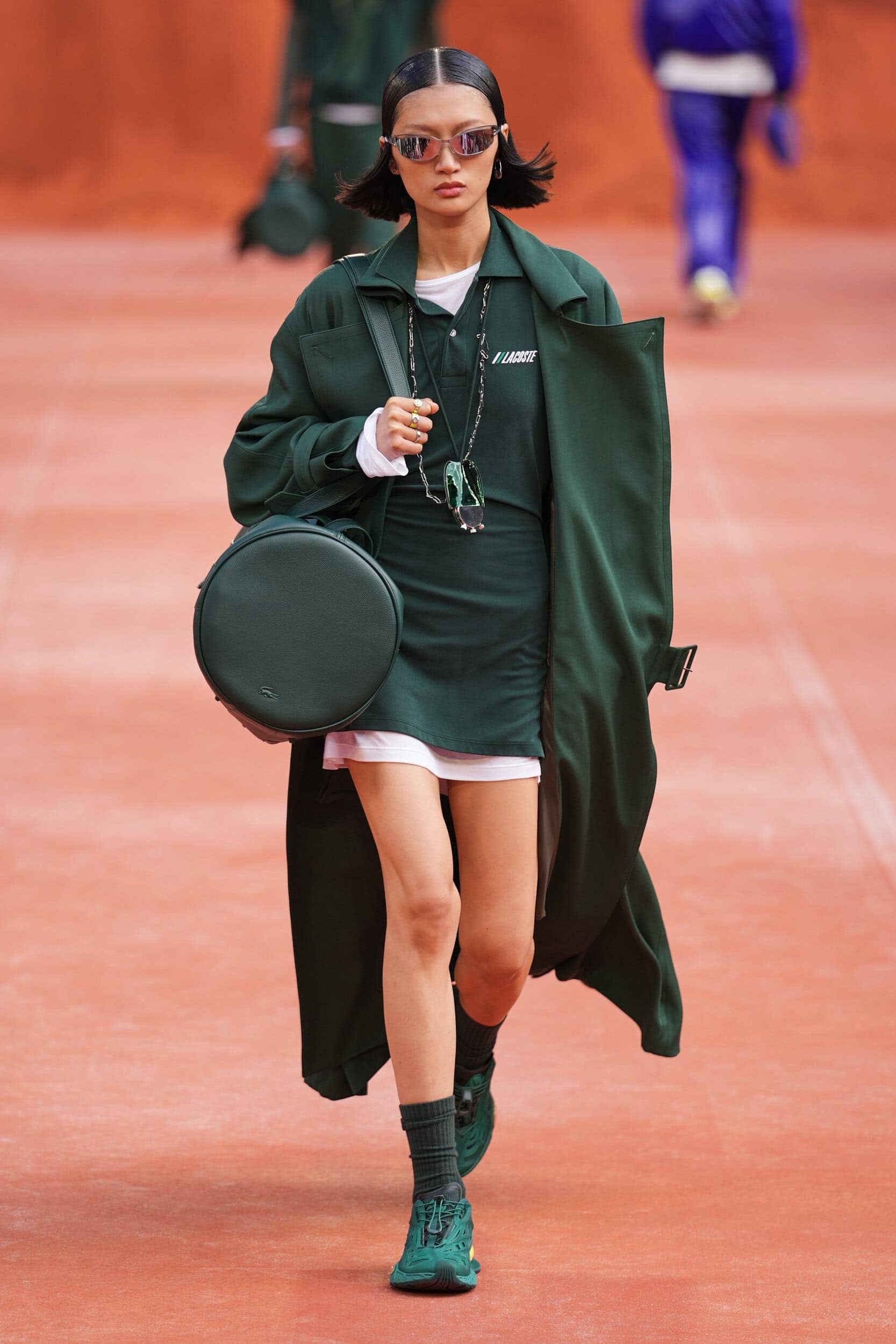
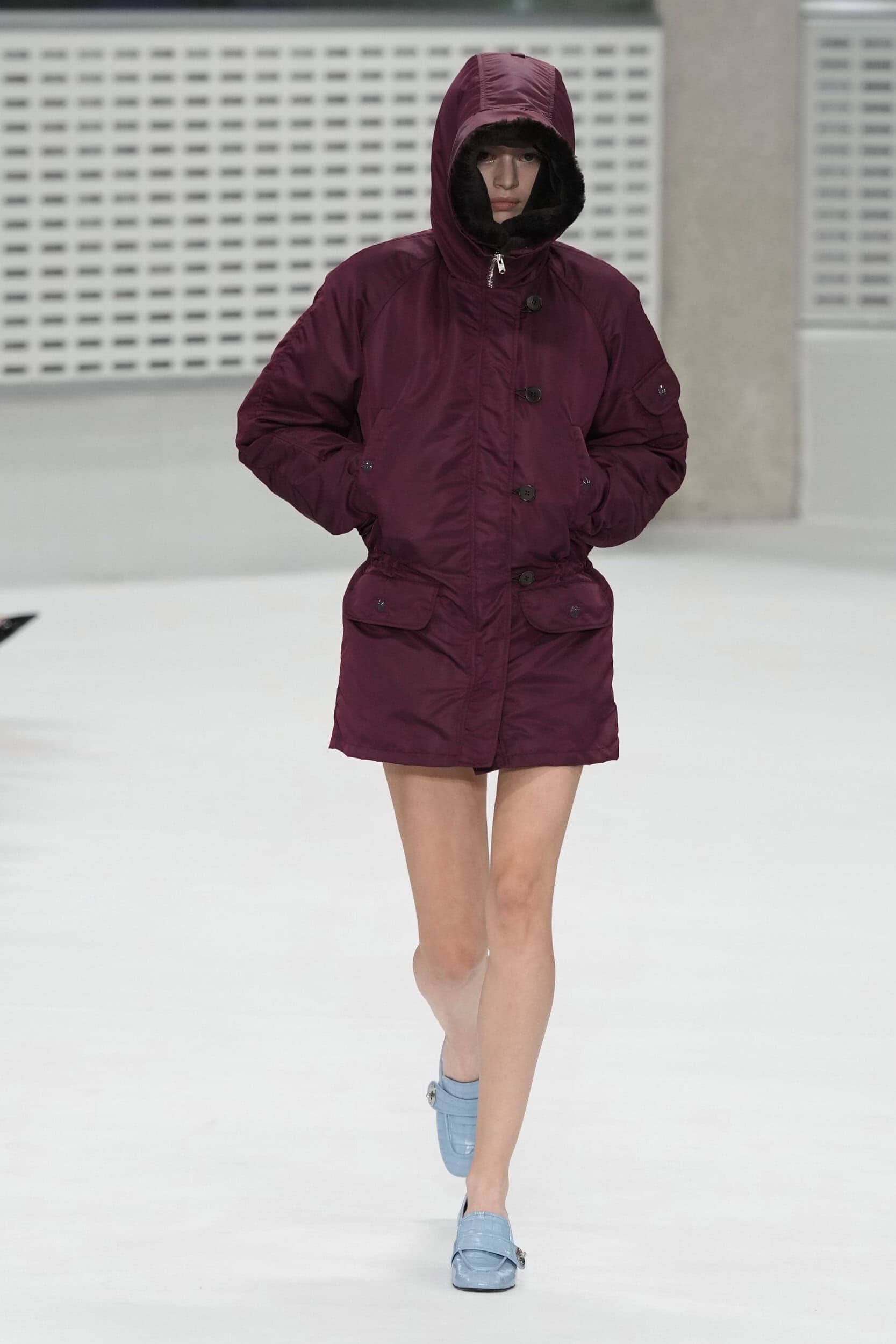
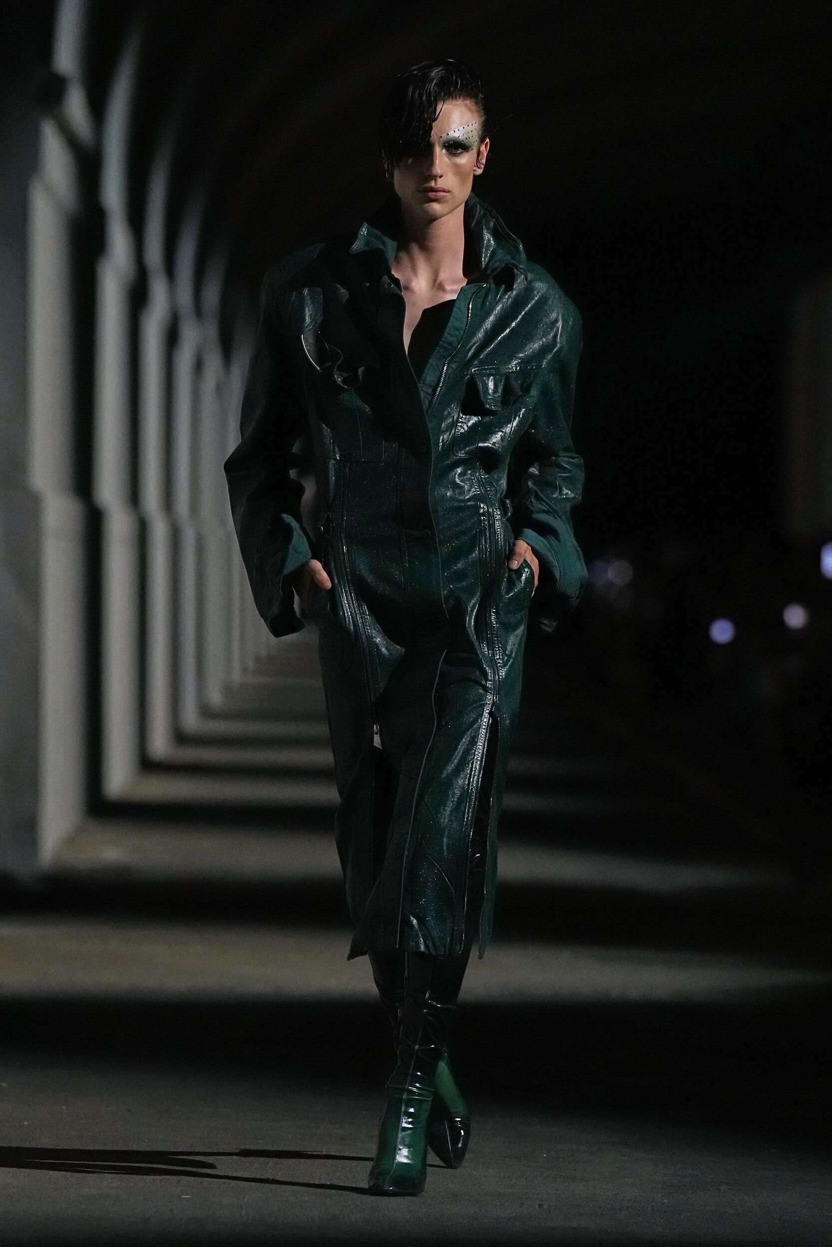
As the consumer breaks out of traditional ways of working, vacationing, and spending their leisure time deeper tones that carry a more thoughtful message will resonate. Rustic earthy shades, deep teal, burnished gold, and intense berry hues convey a sophistication that can be applied to all categories, from a simple T-shirt rendered in silk to a bomber jacket in a textured jacquard.
Where Was it Seen?
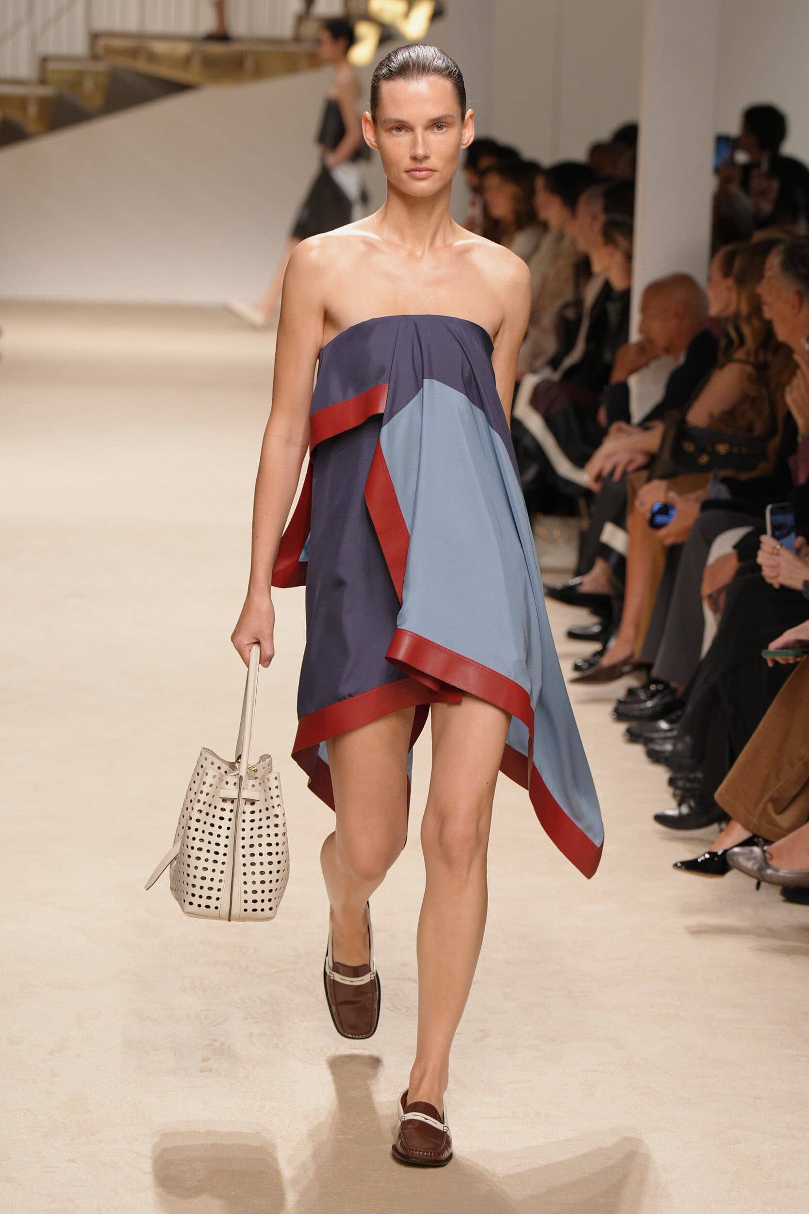
Ferragamo, Lacoste, Dries Van Noten, Tory Burch, Proenza Schouler
8. Joy-inducing Brights
Why it’s Trending?
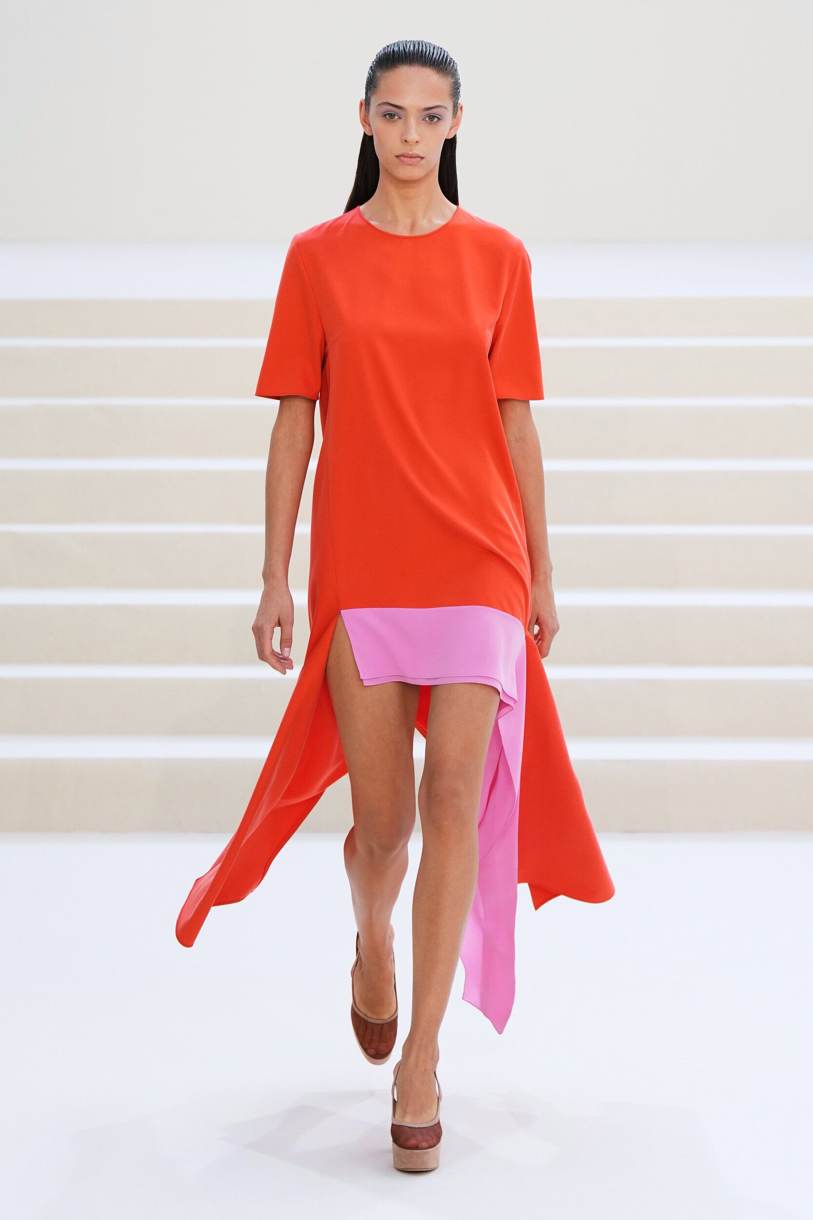
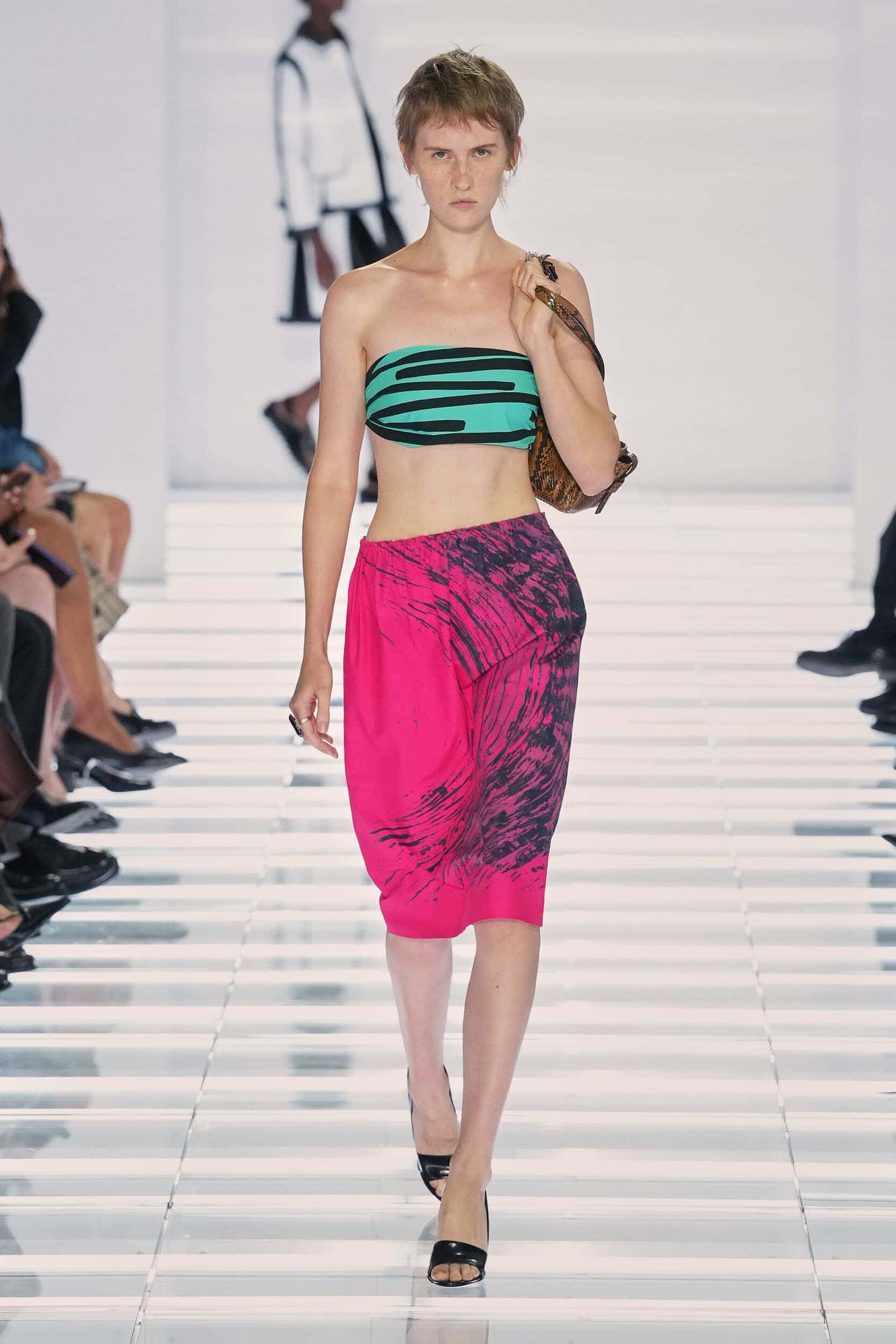
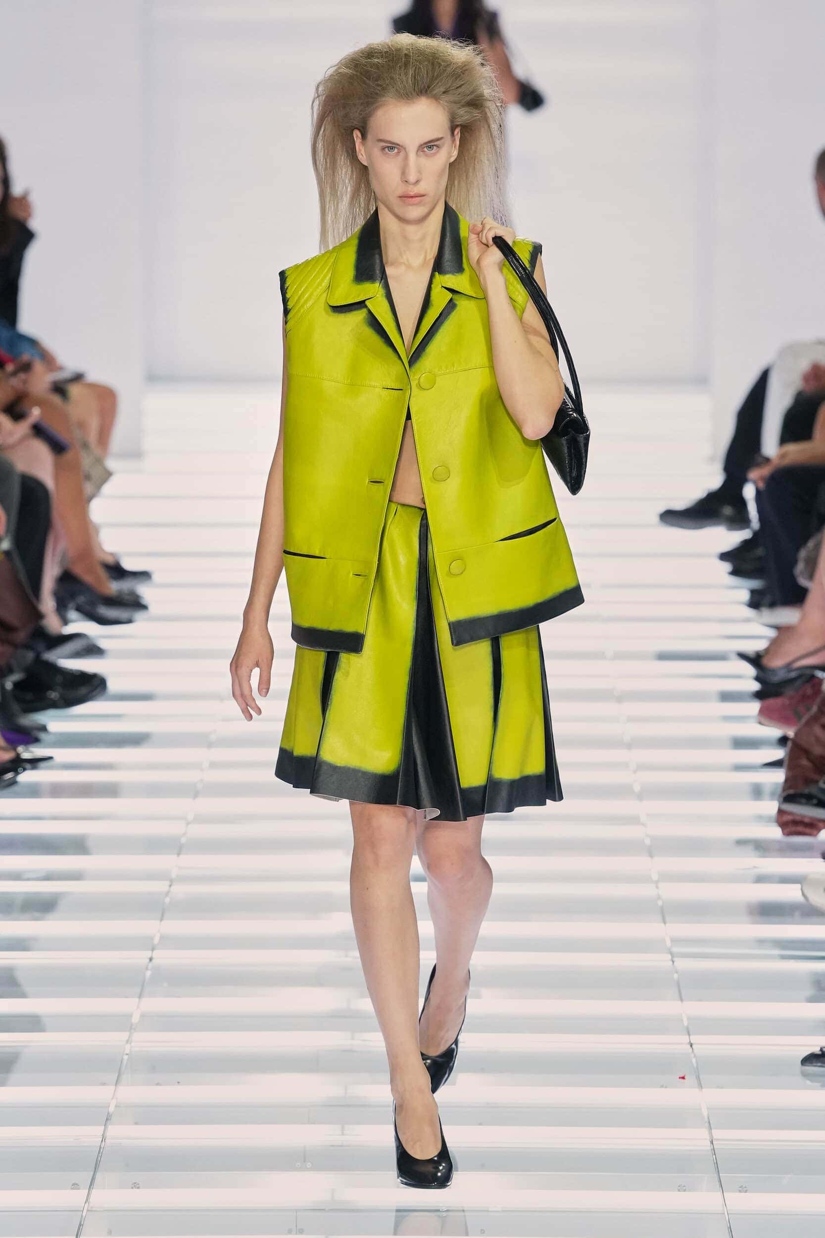
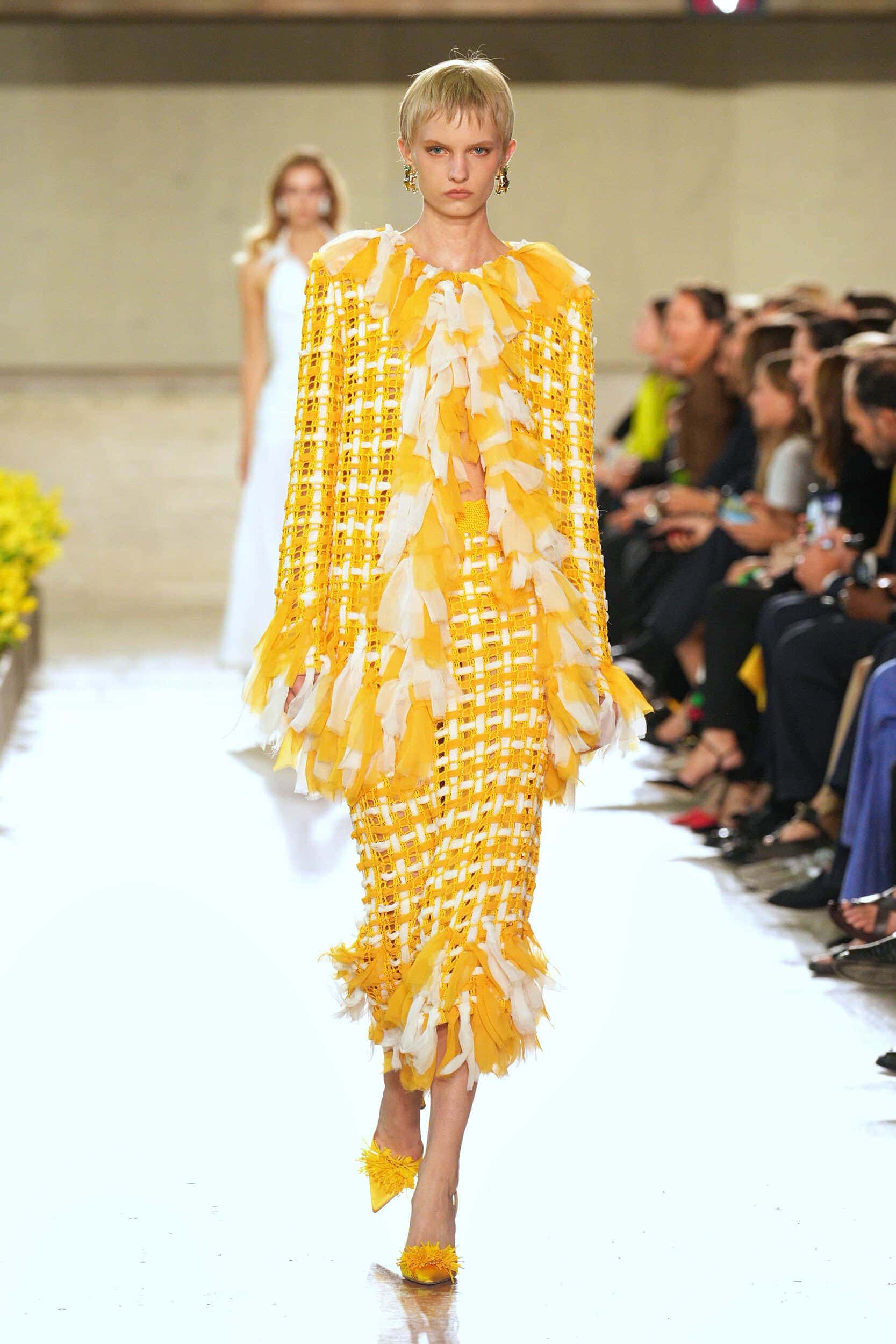
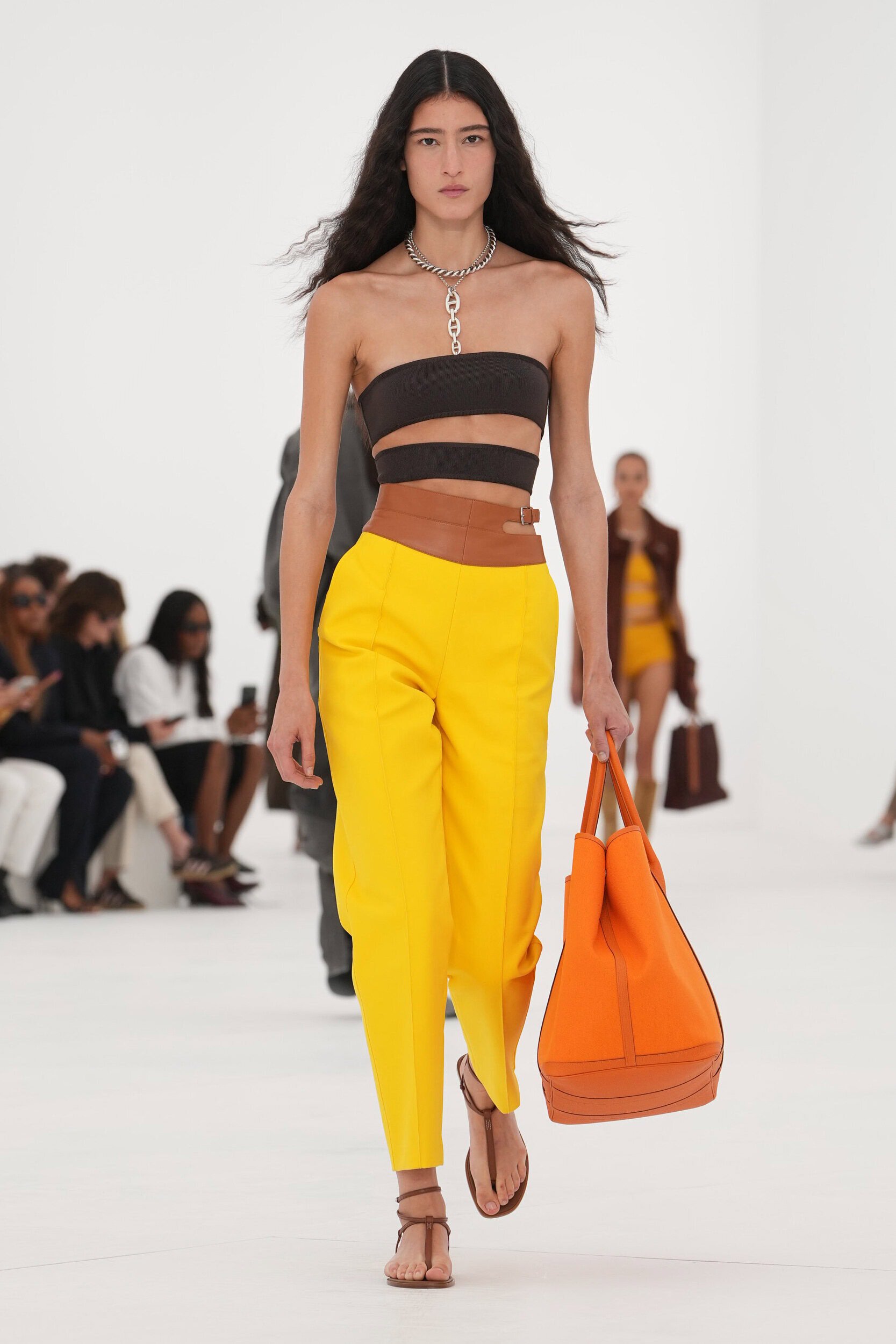
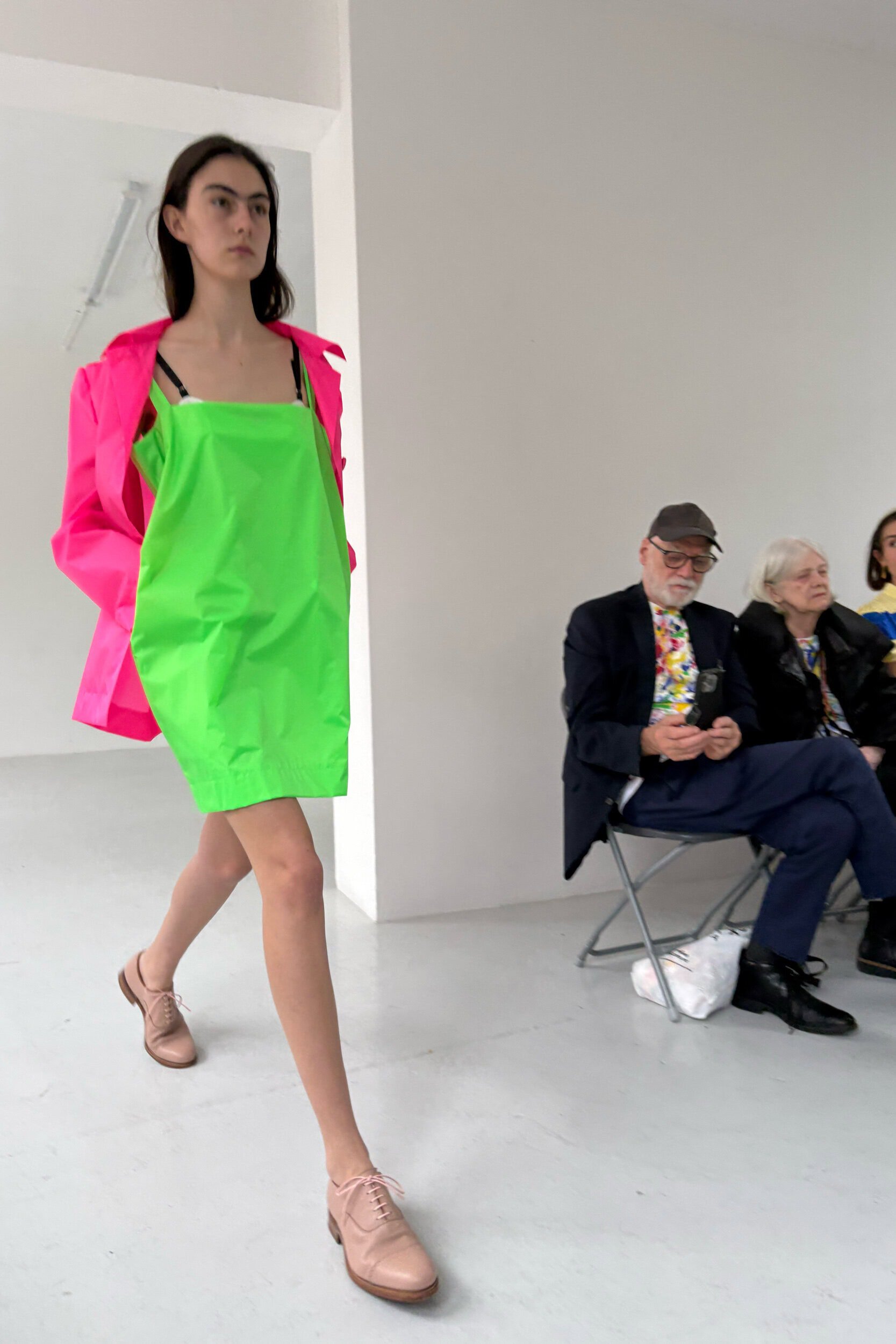
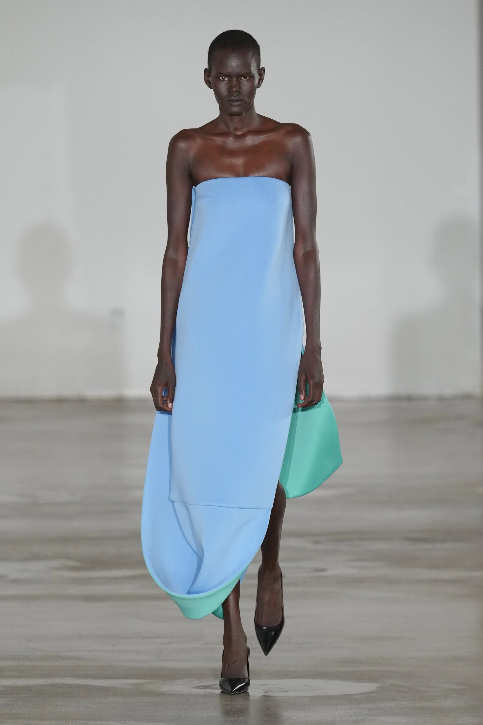
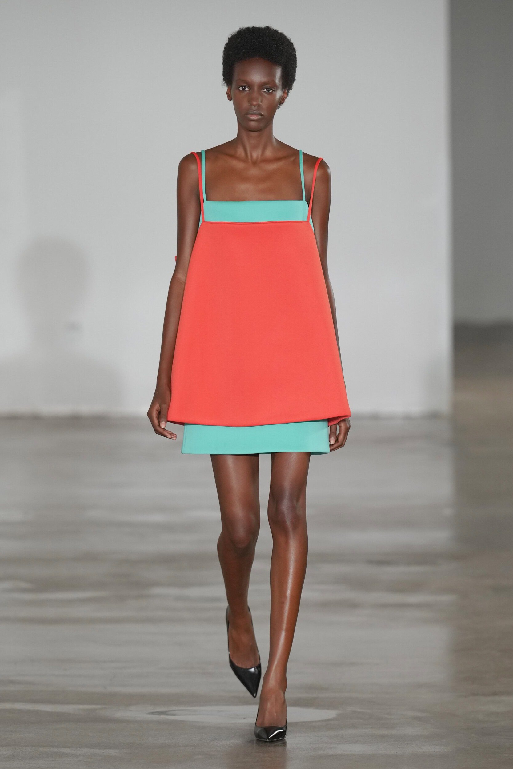
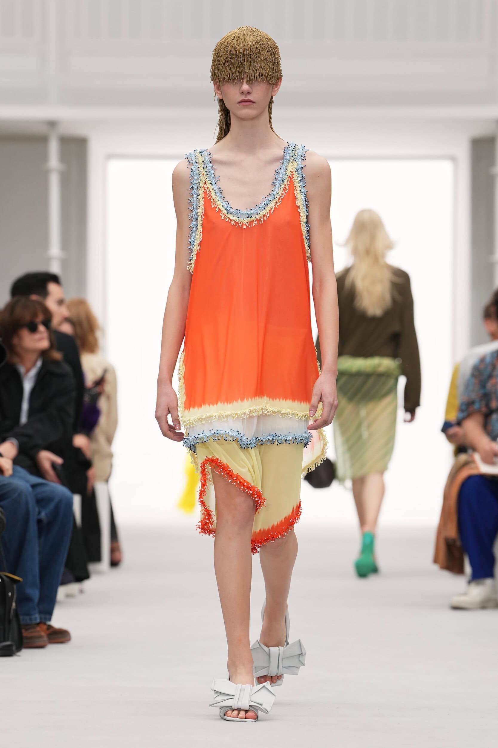
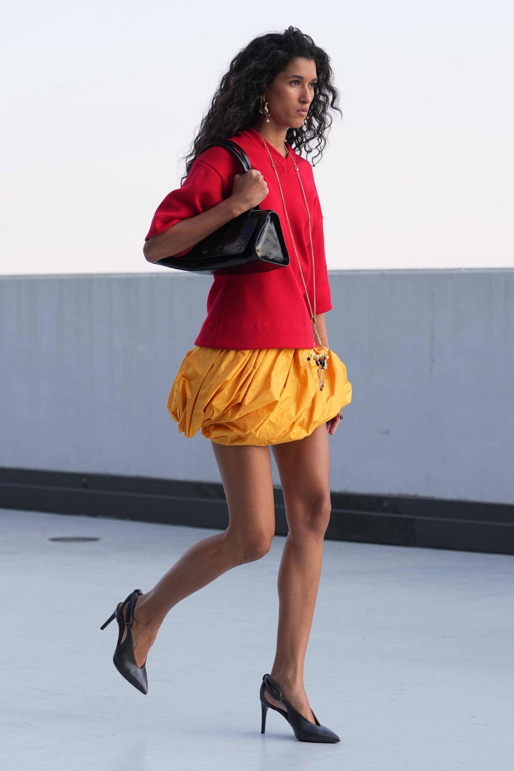
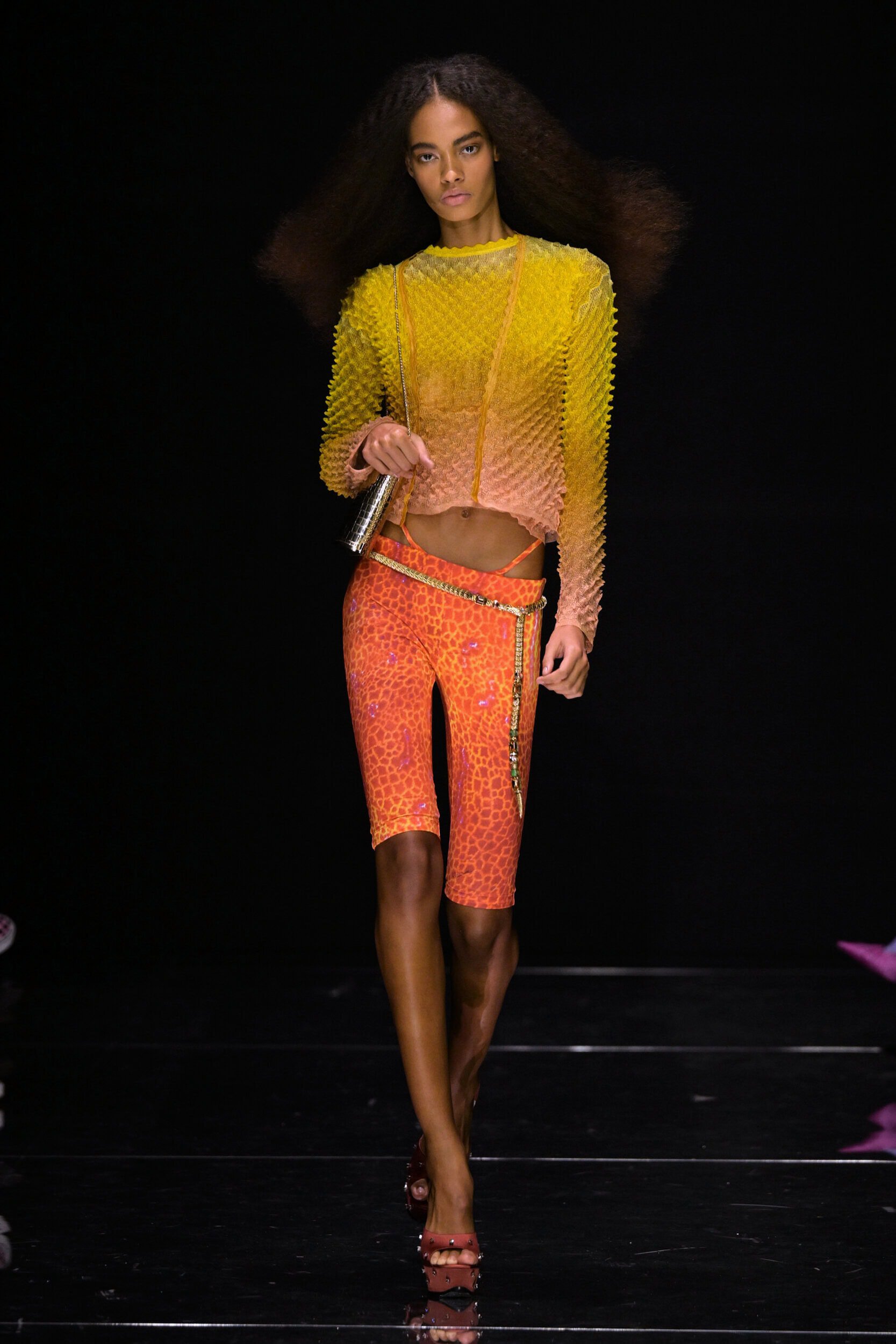
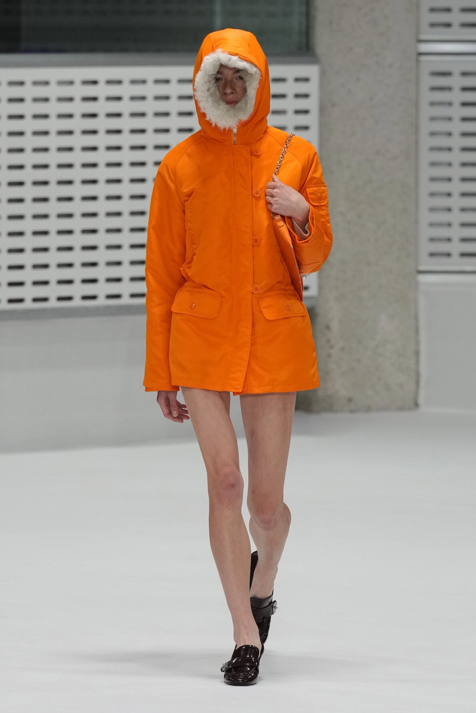
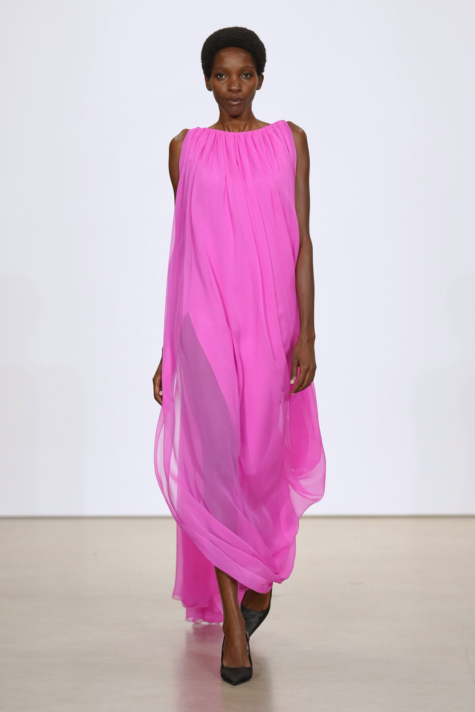
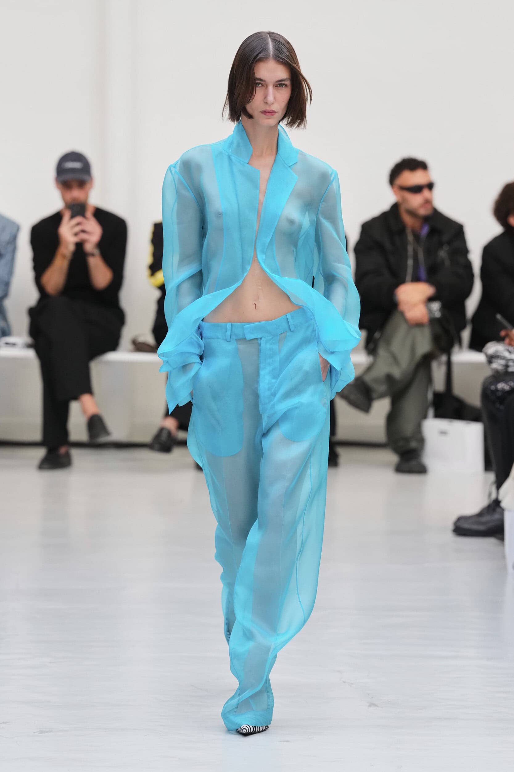
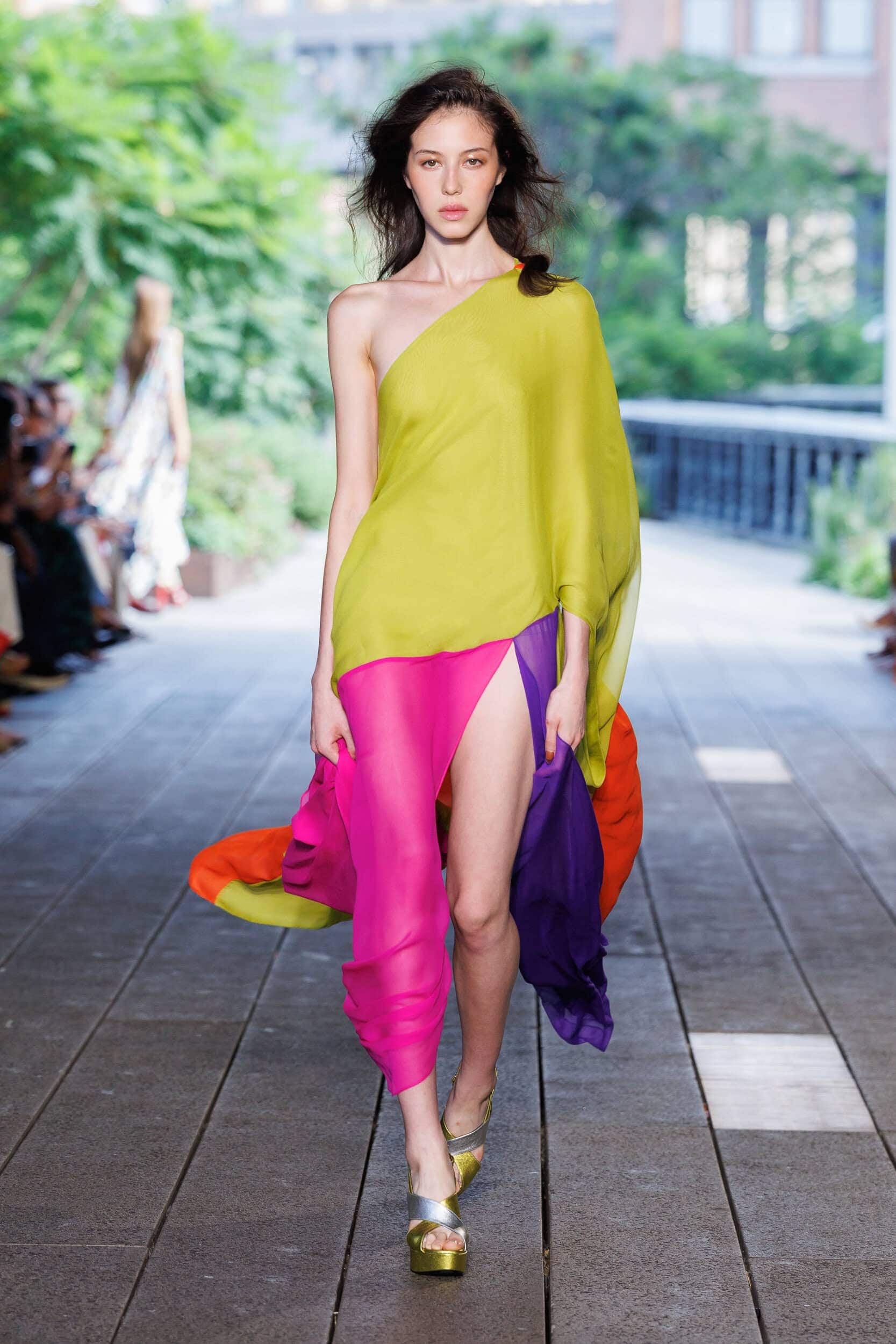
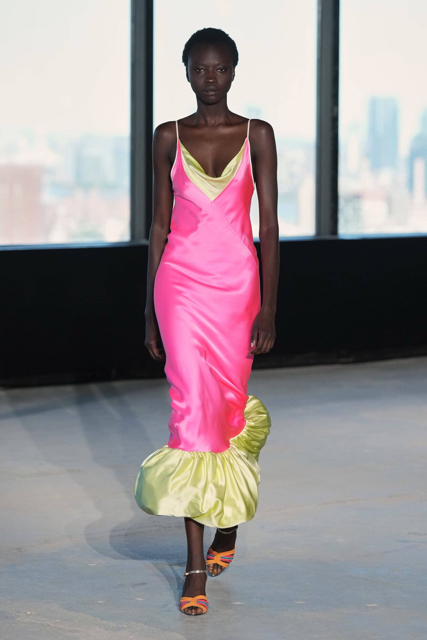
If spring opens with pastel hues summer will descend into a riot of colour. Staying within the nostalgic timeframe these bright clashes of colour hope to exude an optimistic outlook that is reminiscent of a time when black and white turned to technicolour.
Why it Matters?
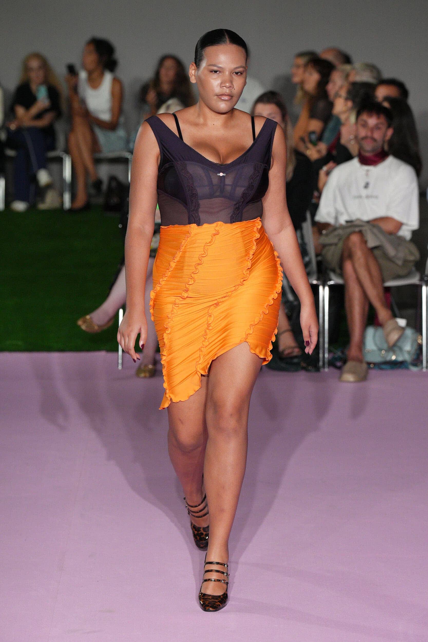
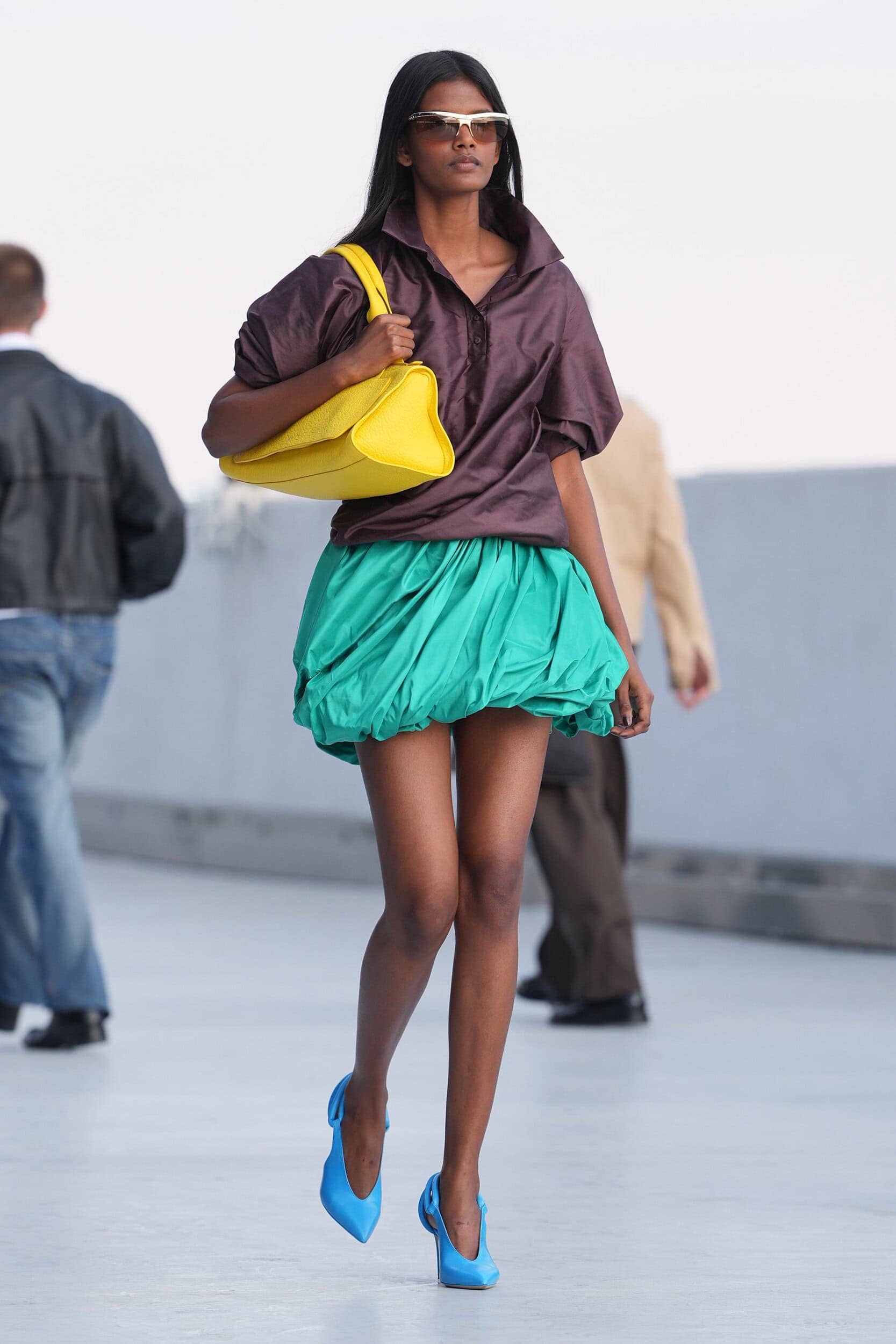
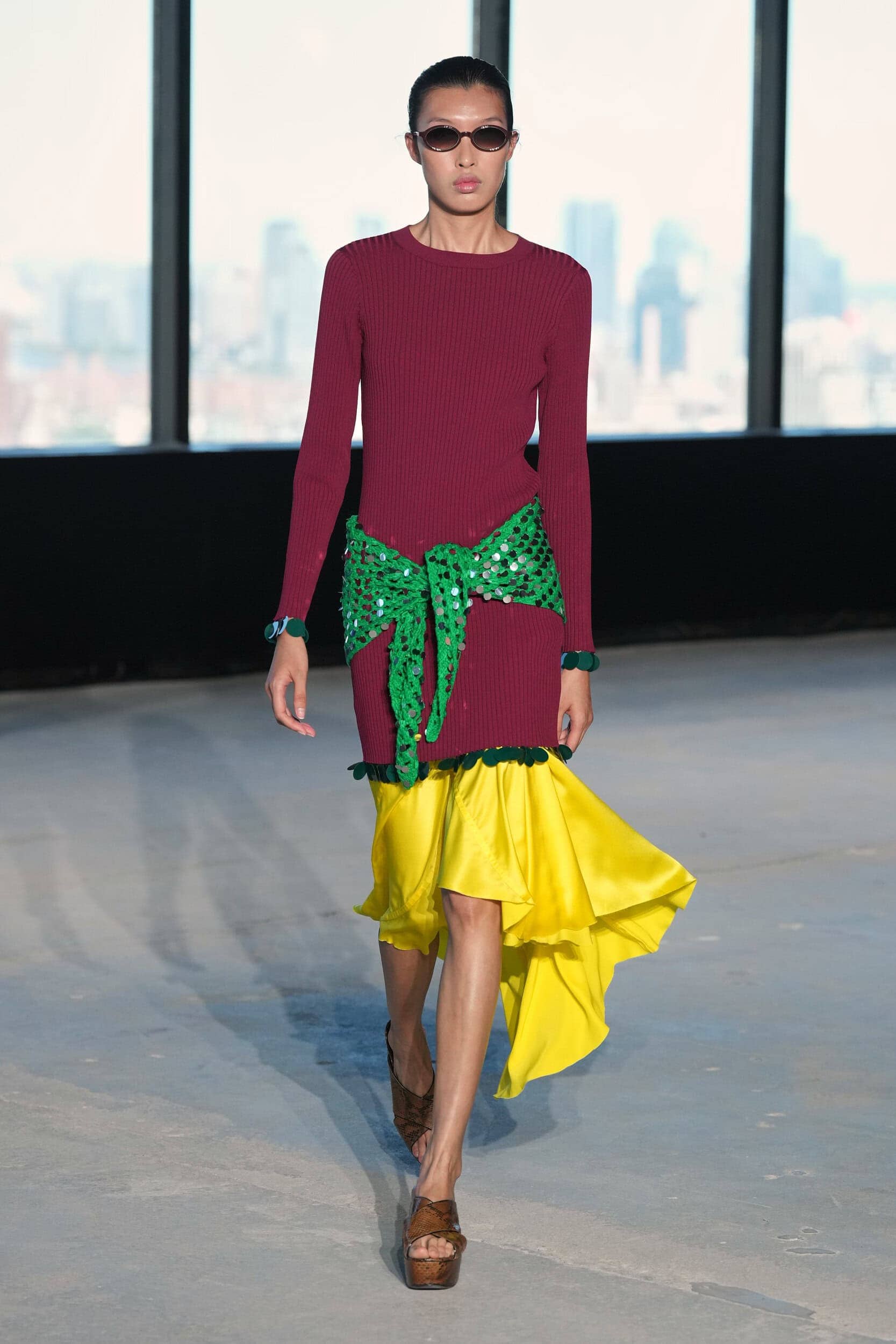
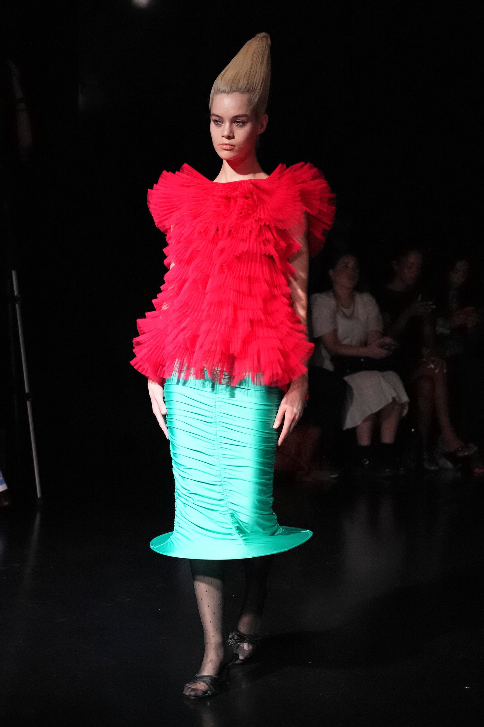
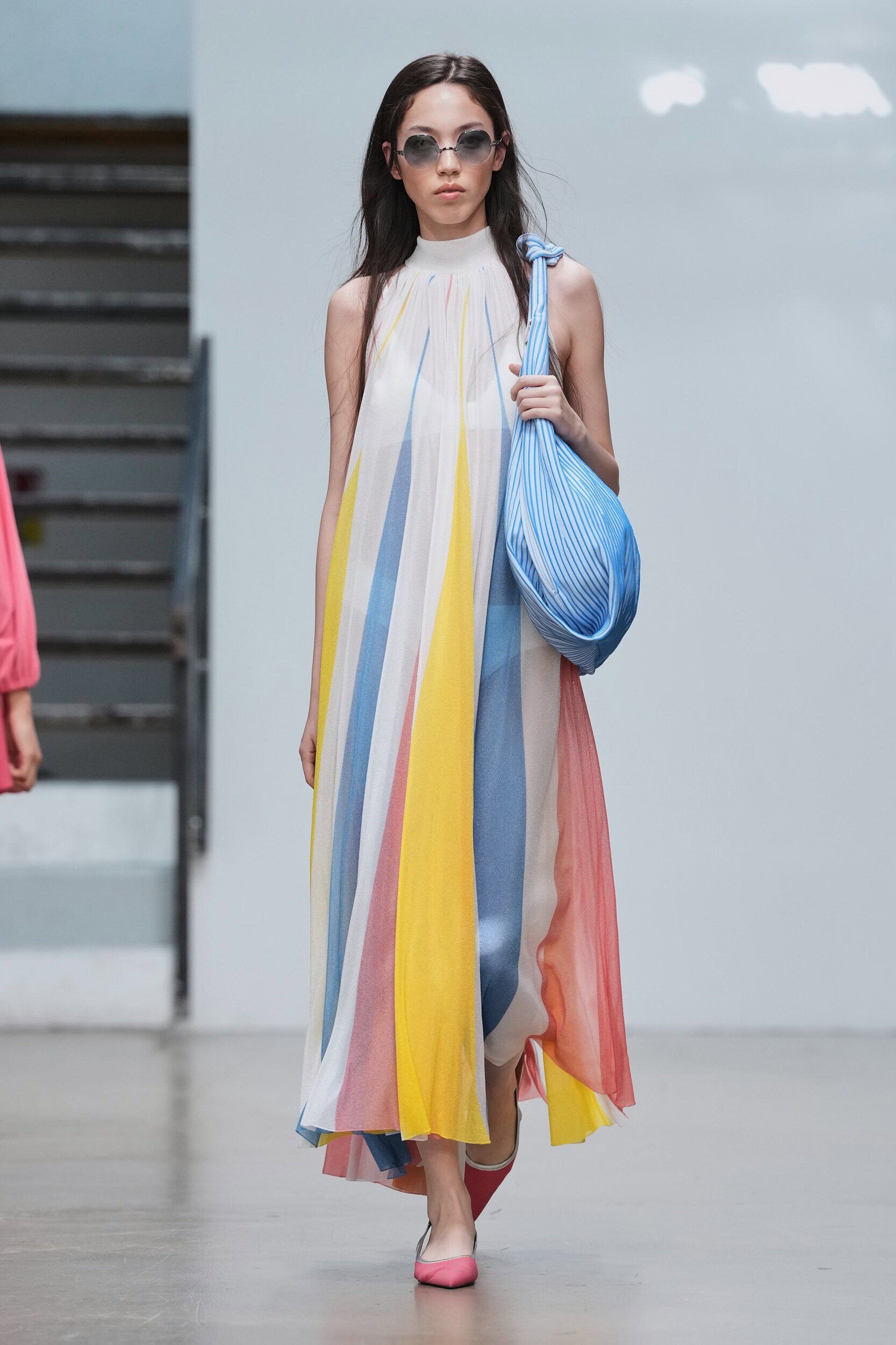
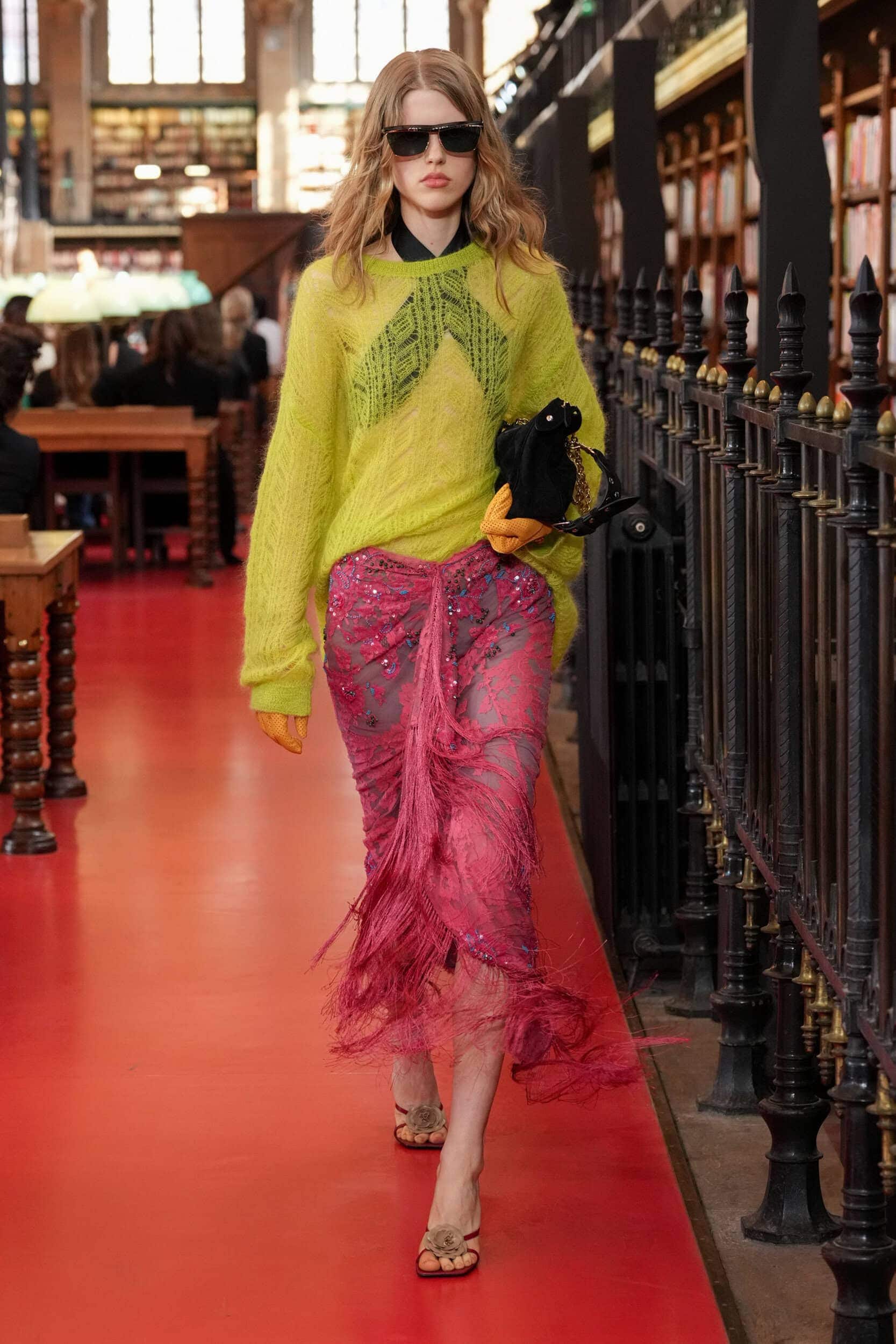
A childlike spirit of joy infused shades of orange, yellow, pink, and blue and called to mind a rainbow and its hopeful associations with new beginnings. Tones were kept upbeat and even strayed into the electric at A Letter and Bad Binch Tongtong. Lii mastered the art of complimentary contrasts and Henry Zankov’s debut at Diane Von Furstenburg was a confident first outing that brought back the brands infamous glamourous spirit.
Where Was it Seen?
Lii, Prabal Gurung, Valentino, Prada, Moschino
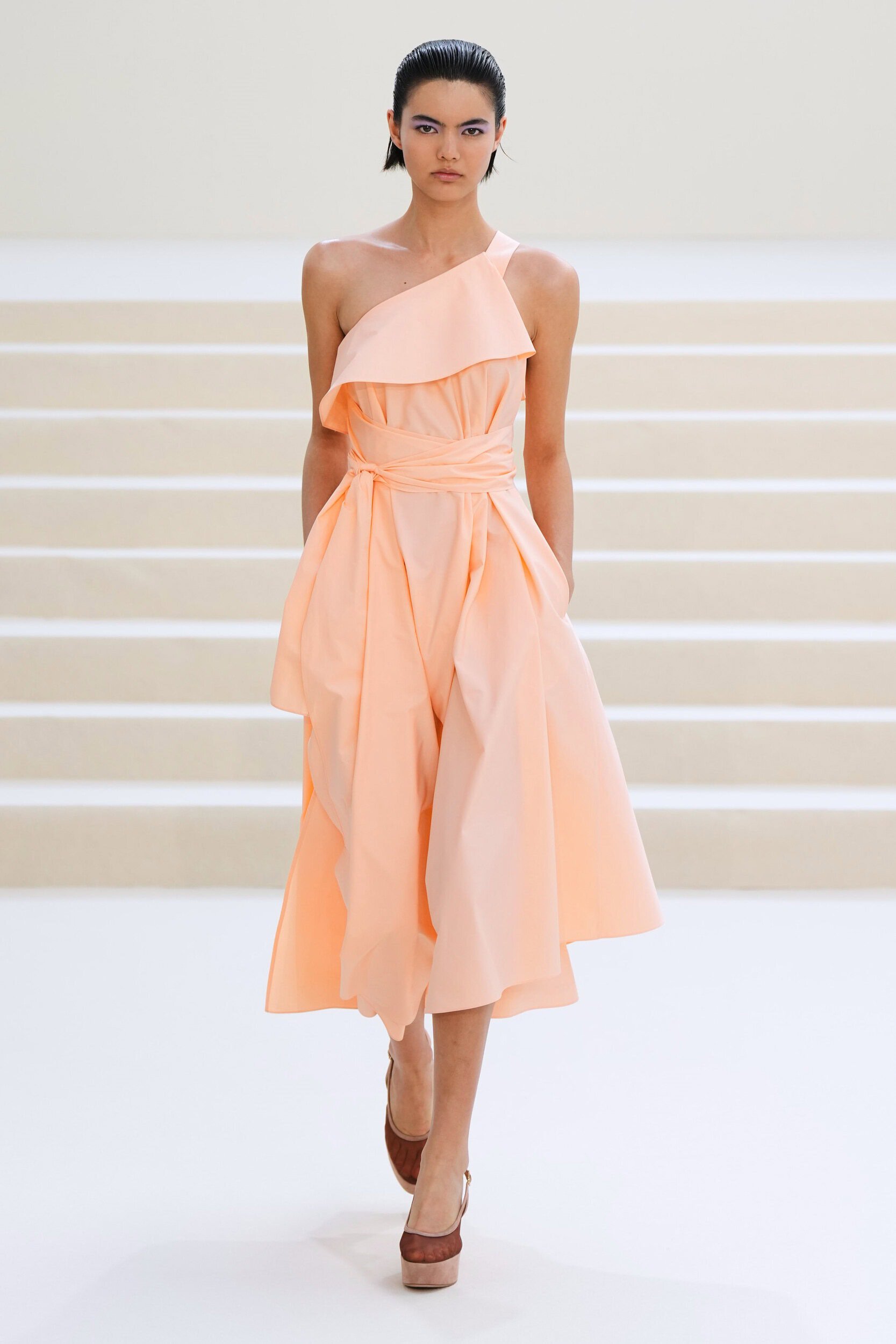
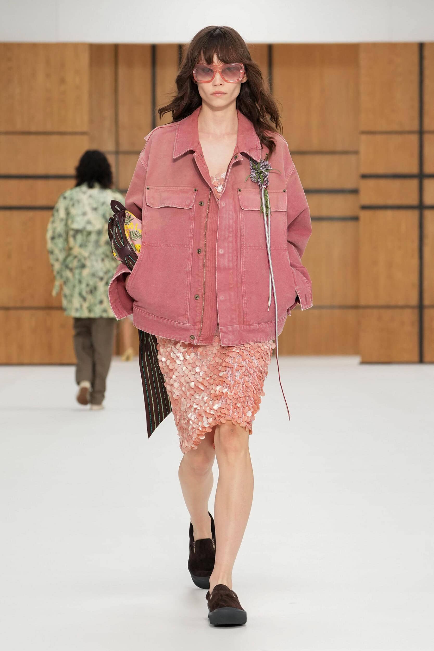
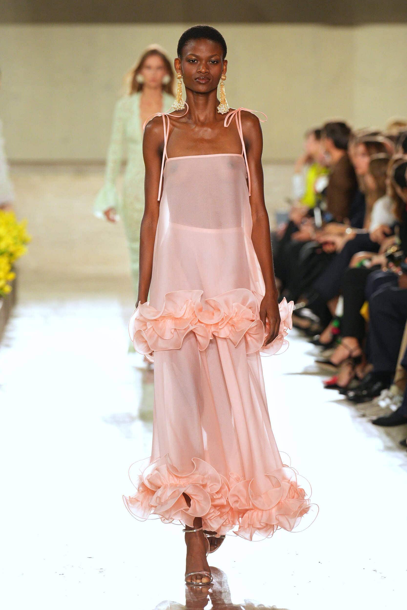
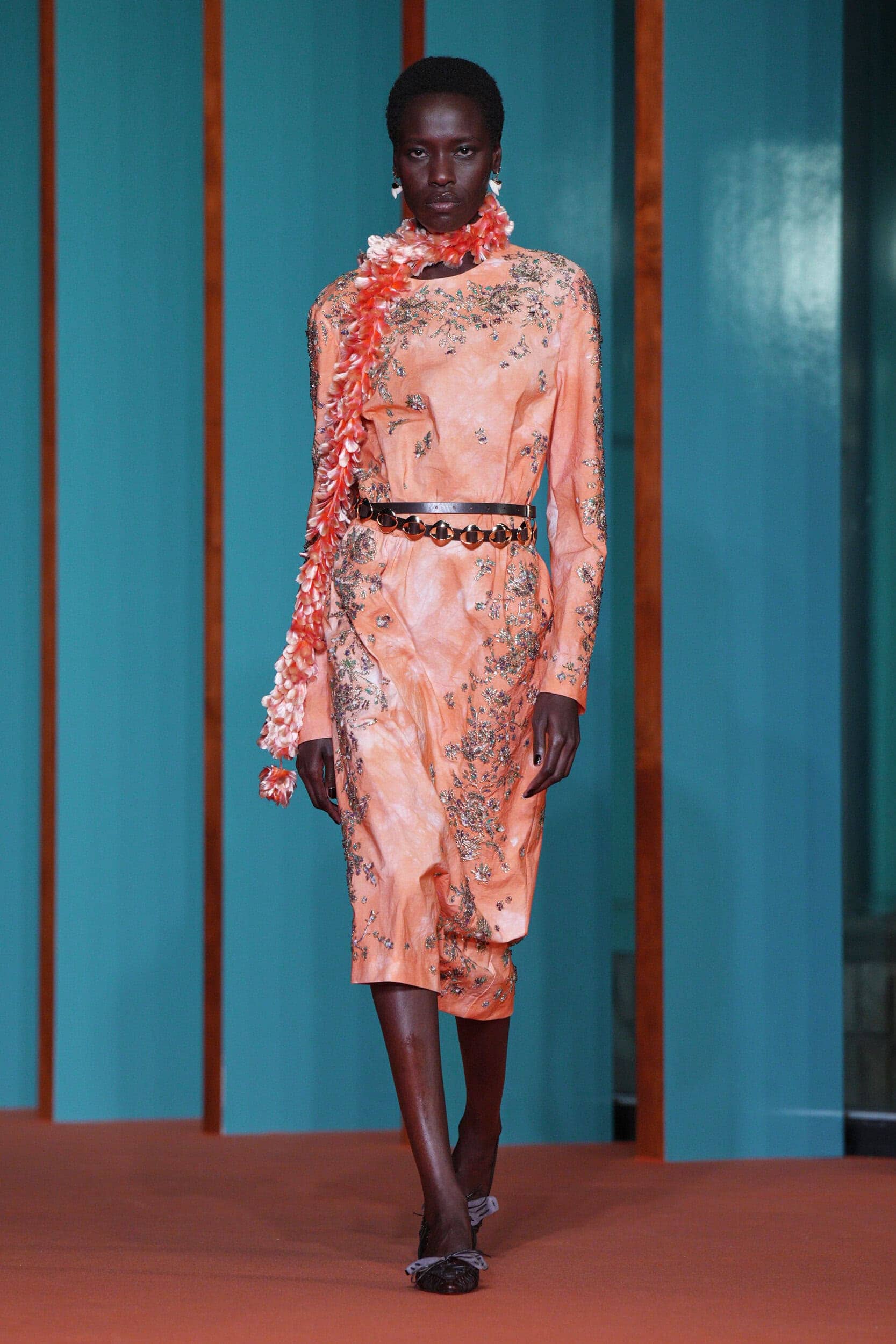
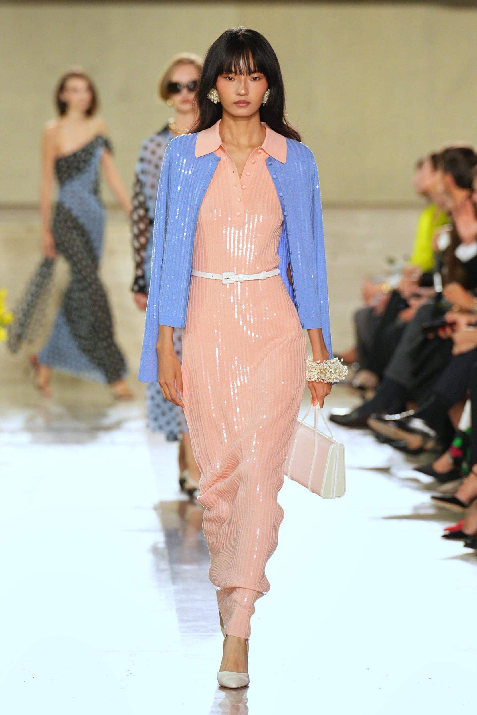
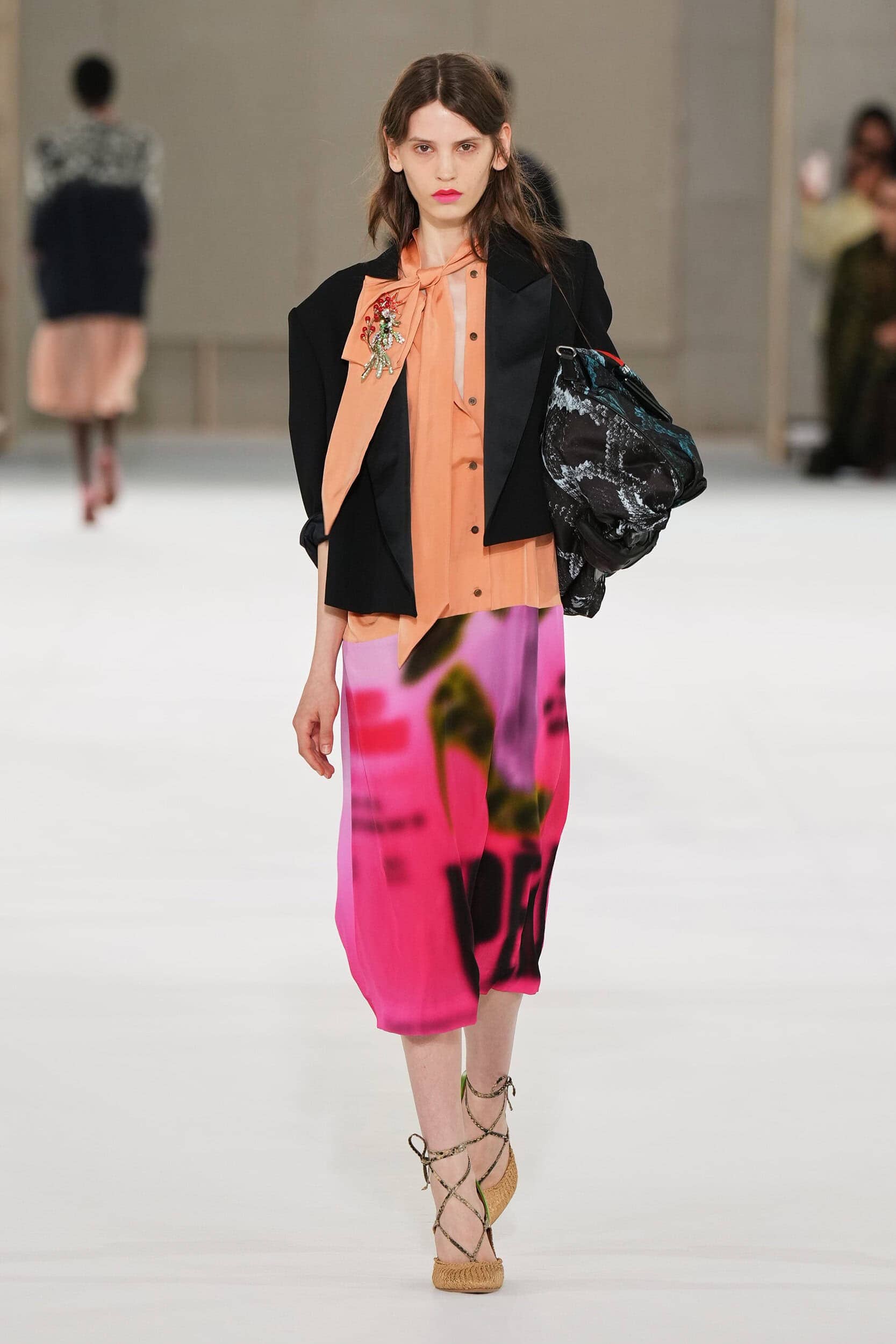
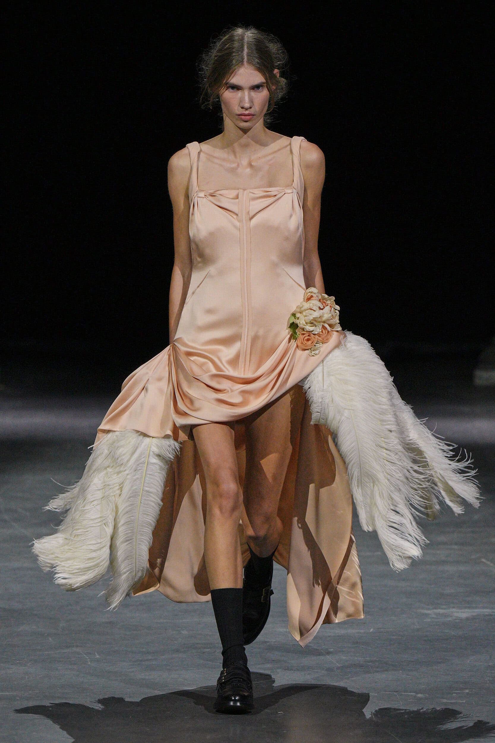
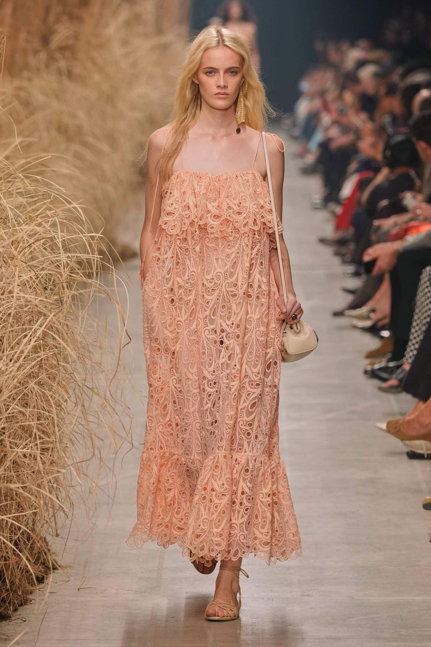
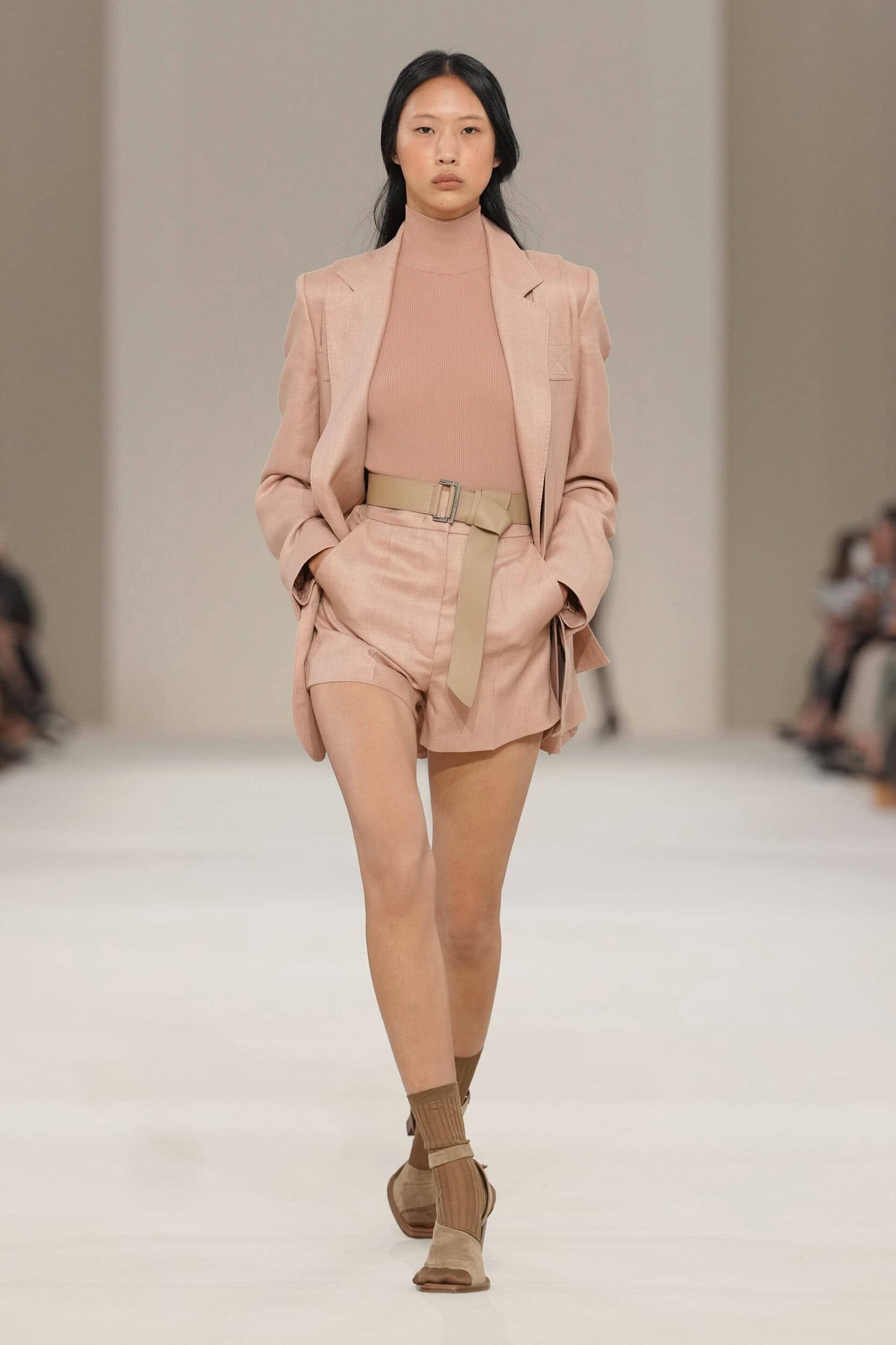
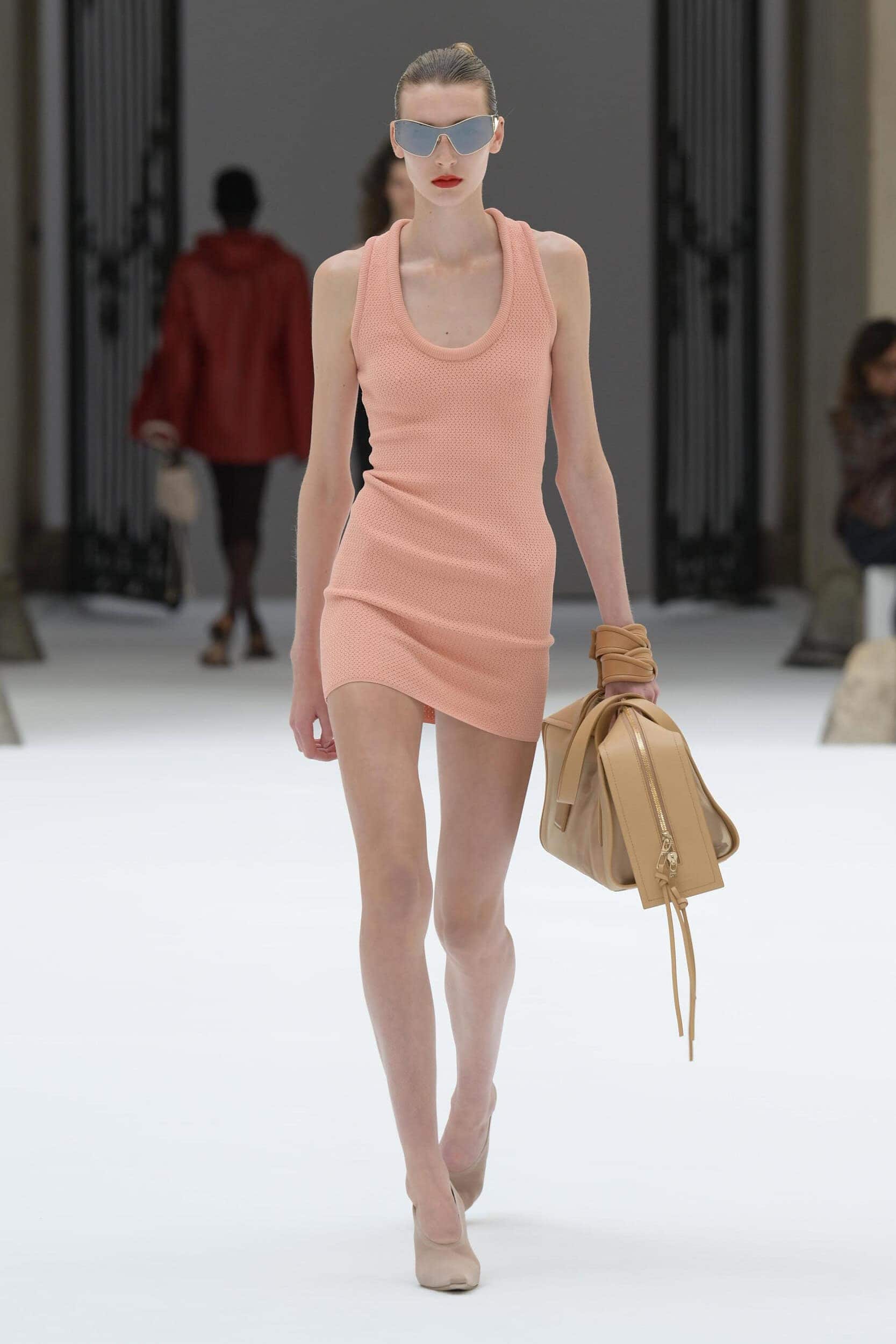
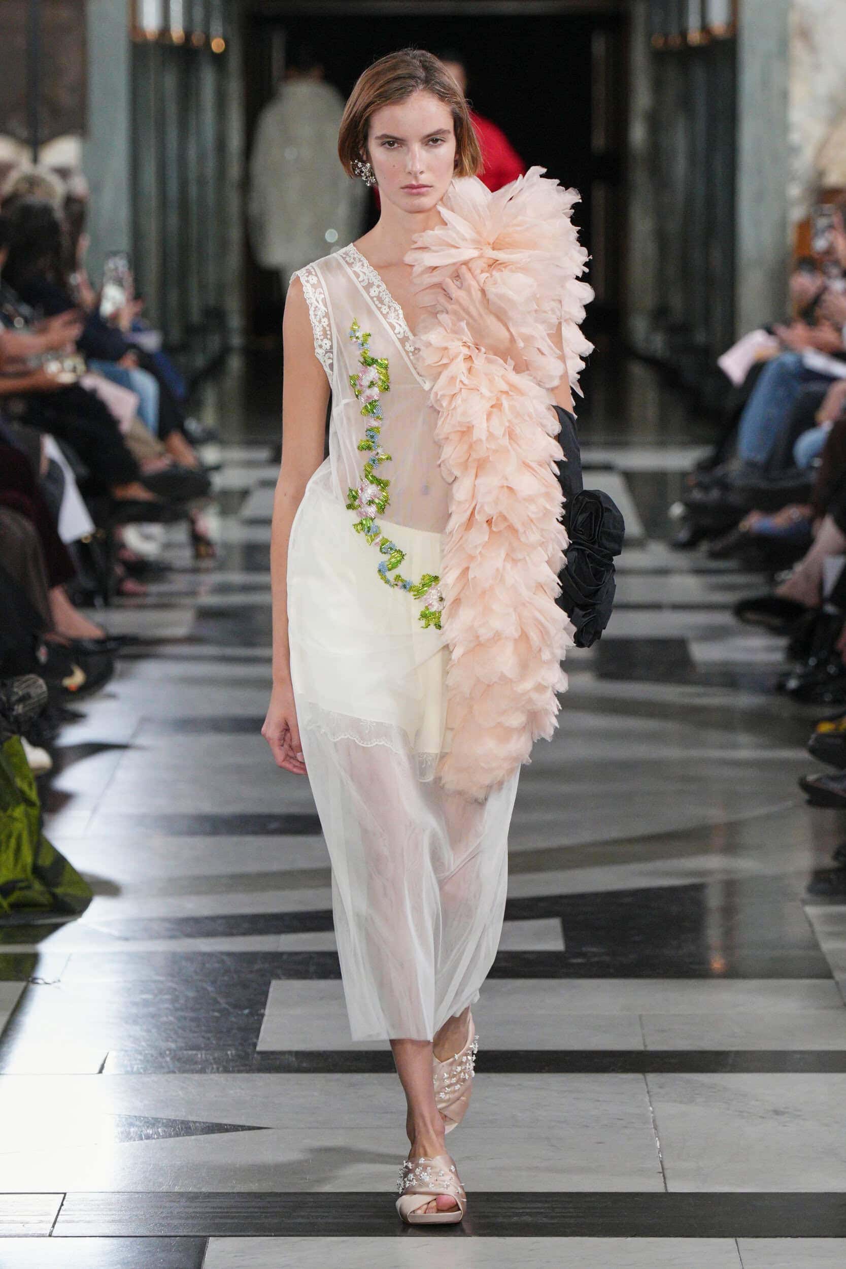
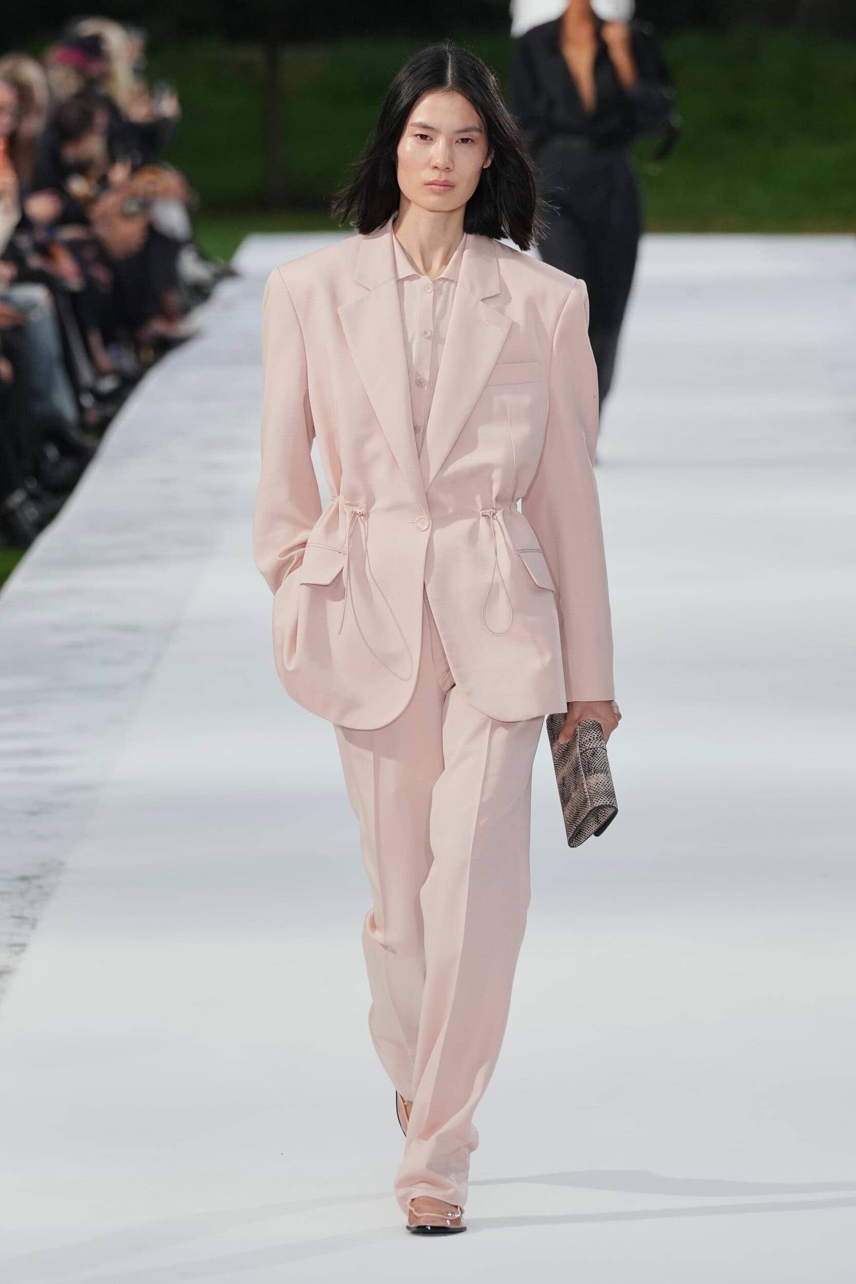
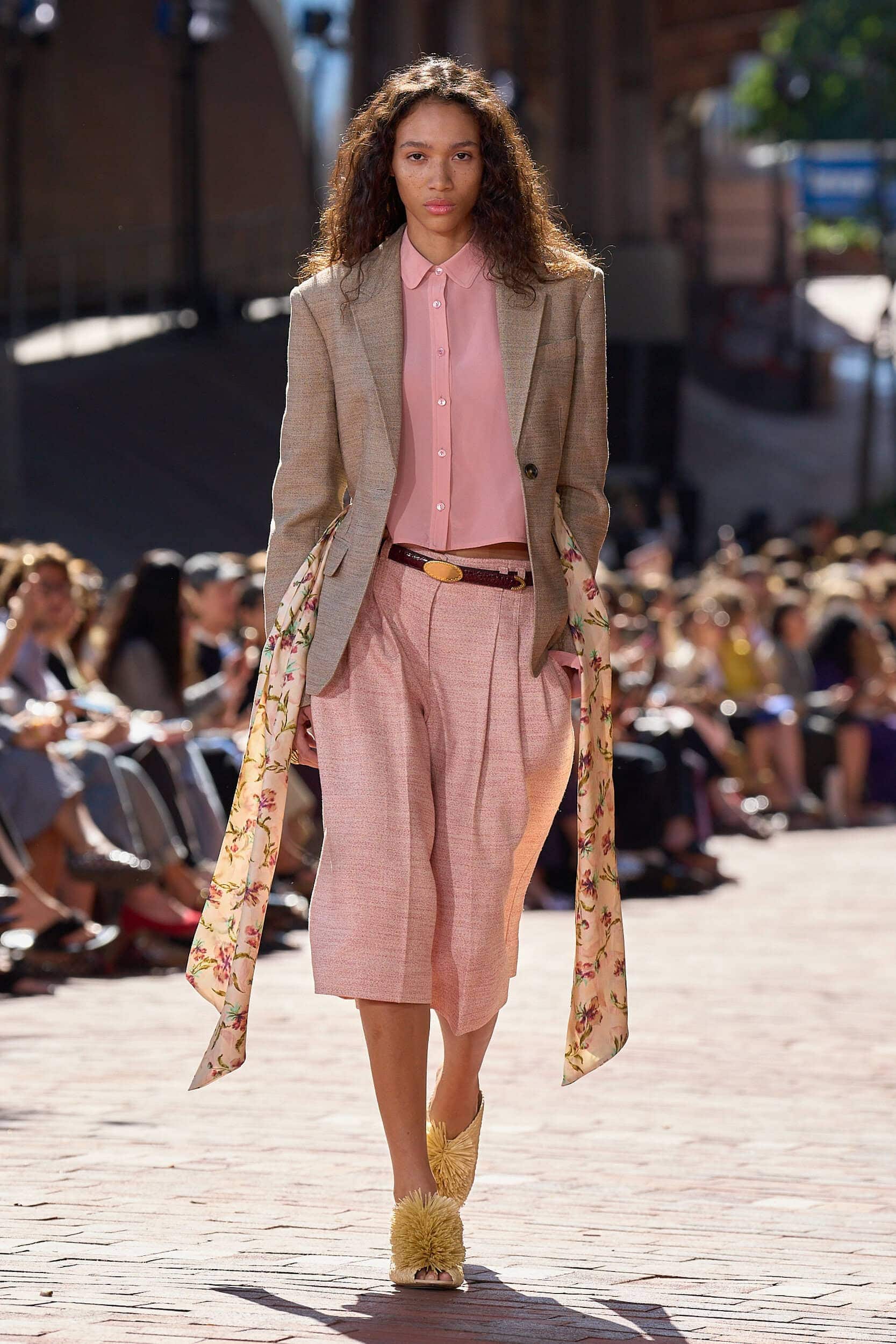
9. Emerging – Just Peachy
Why it’s Trending?
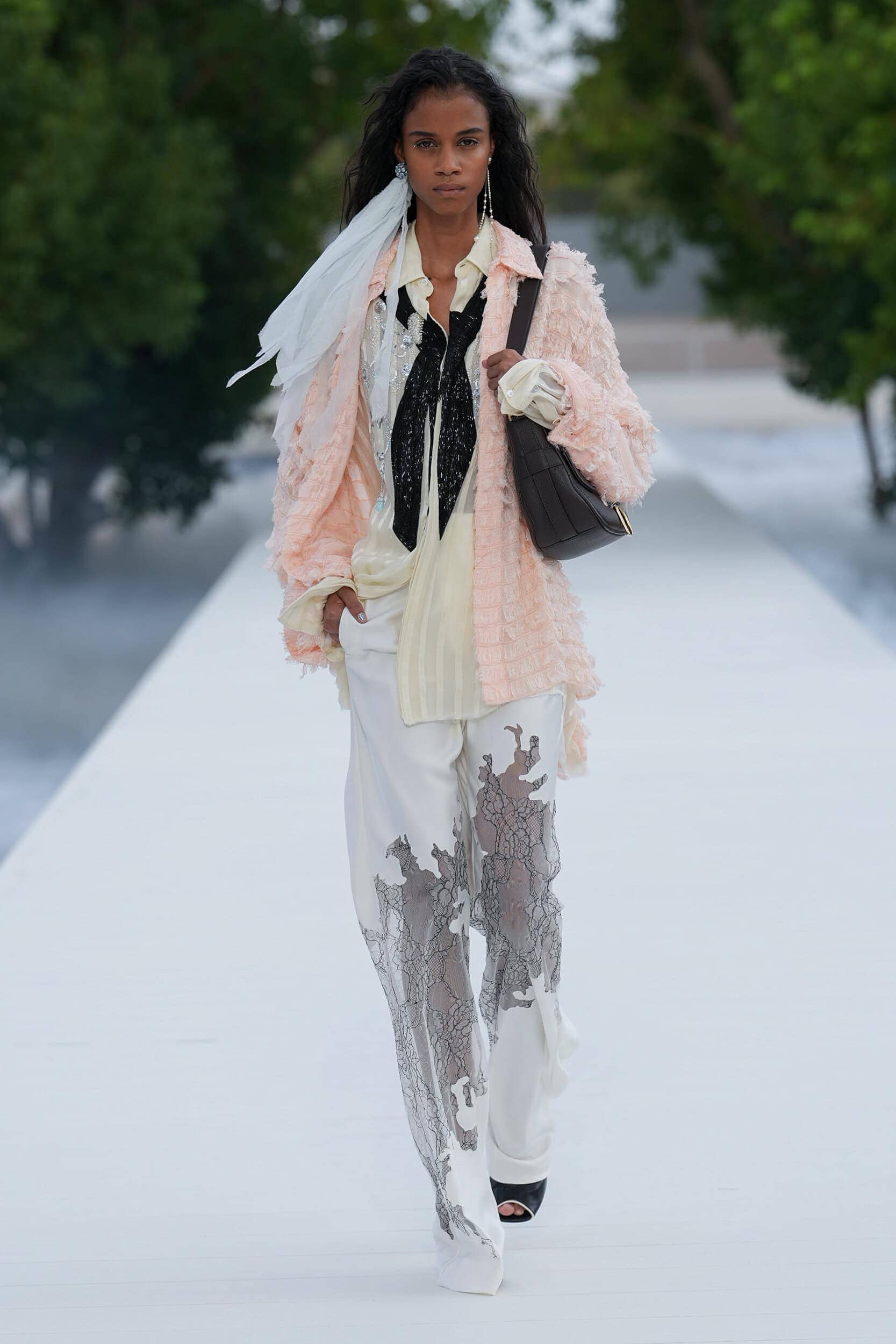
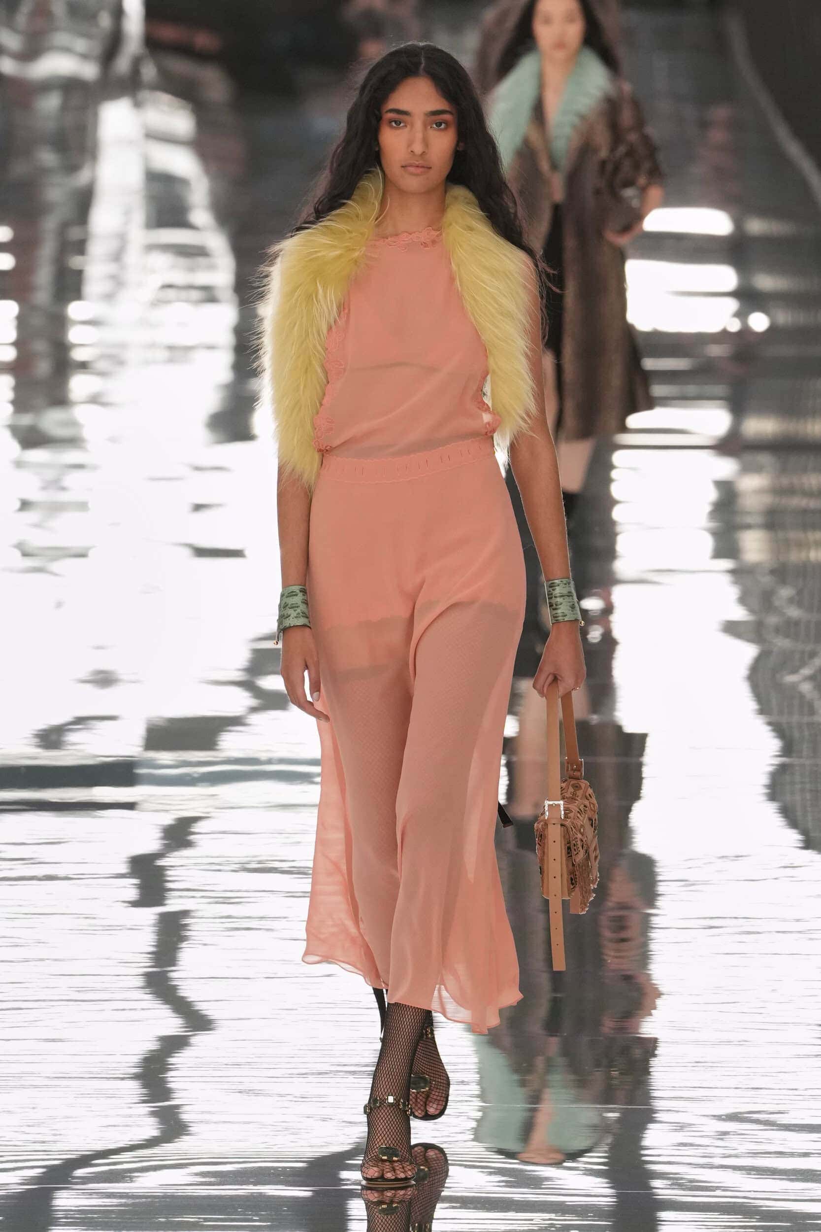
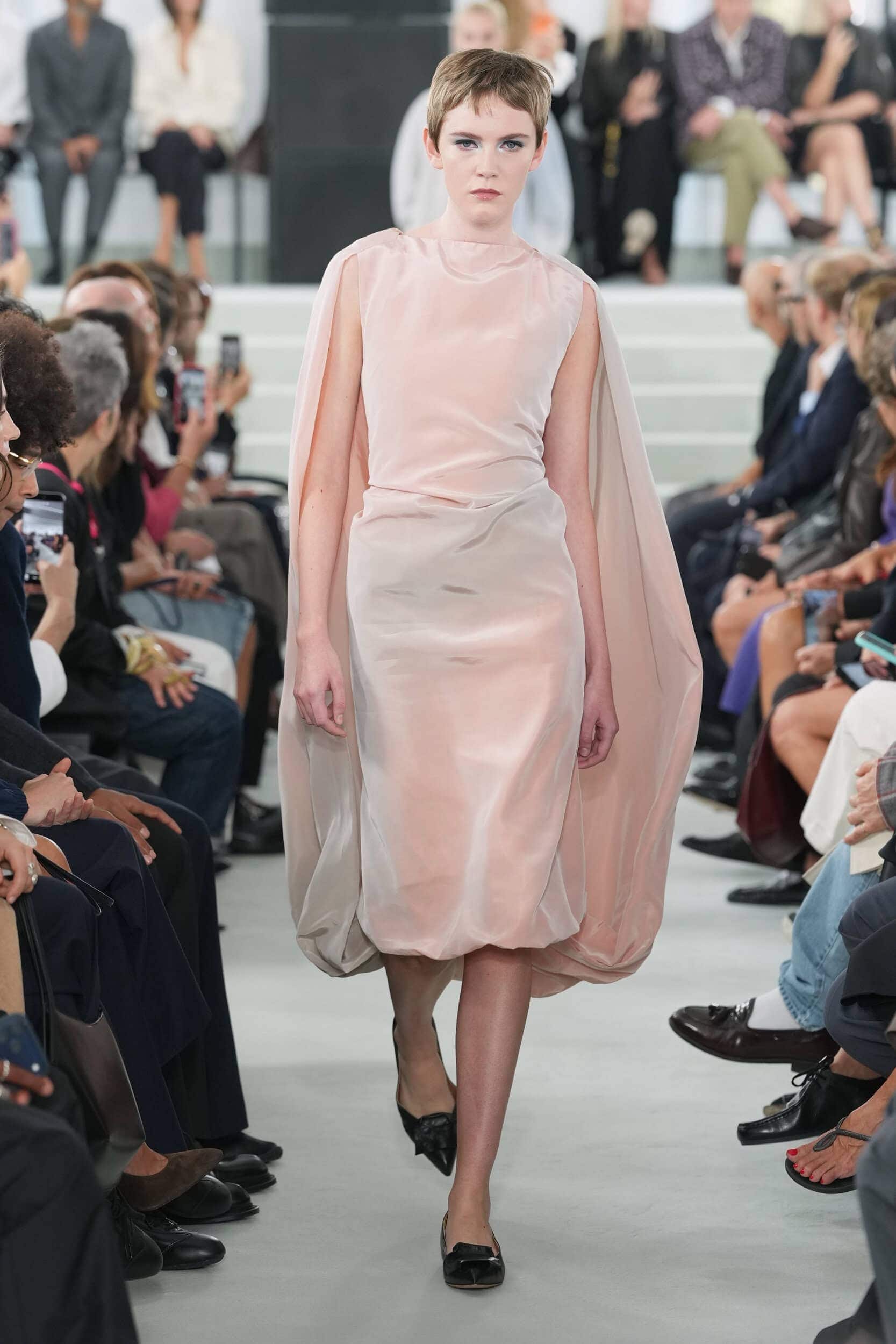
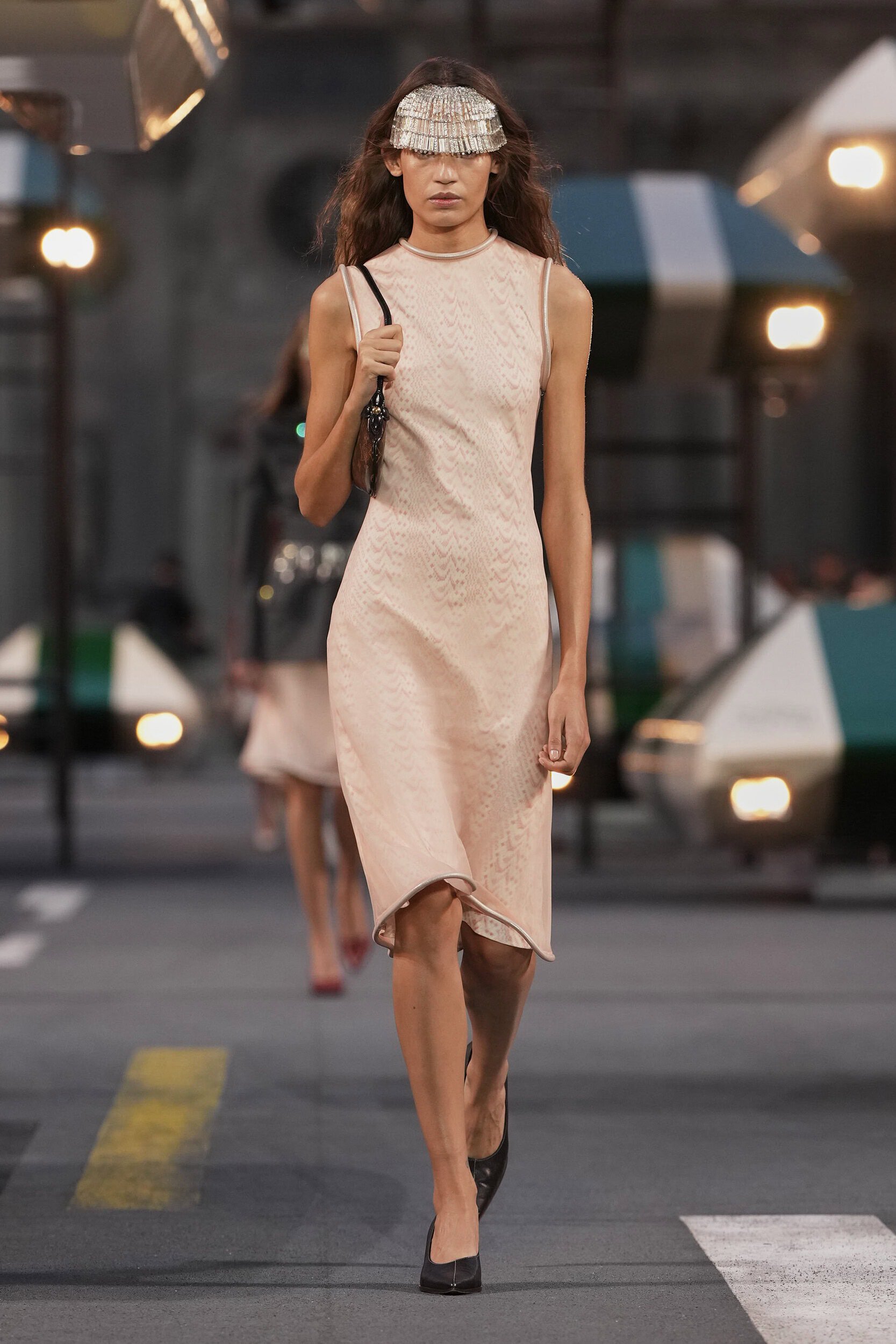
A natural warmth that almost strays into the neutral space and is a welcome addition to everyday tones, peach is an emerging colour that offers a natural balance to the zesty orange shades that are also trending.
Why it Matters?
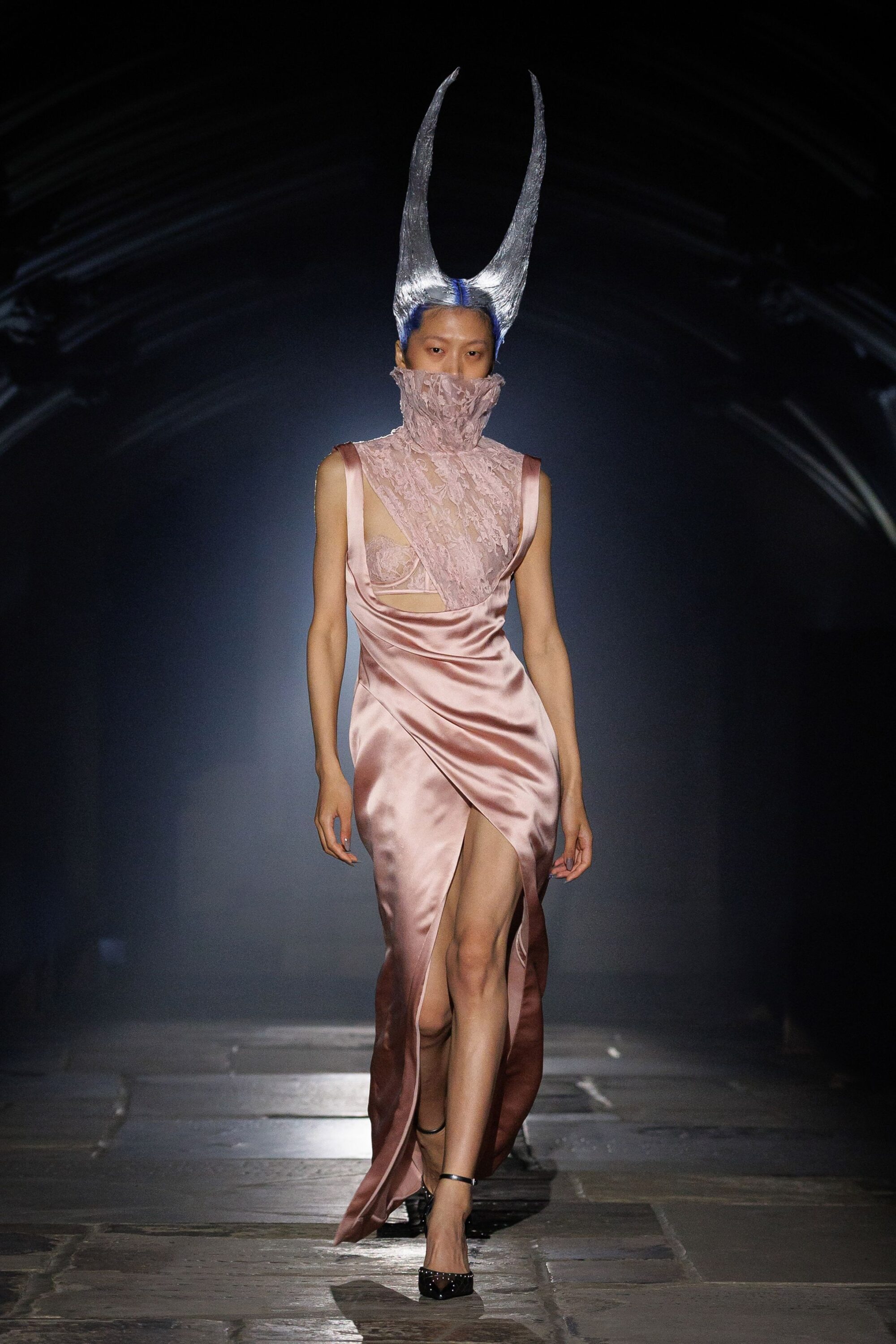
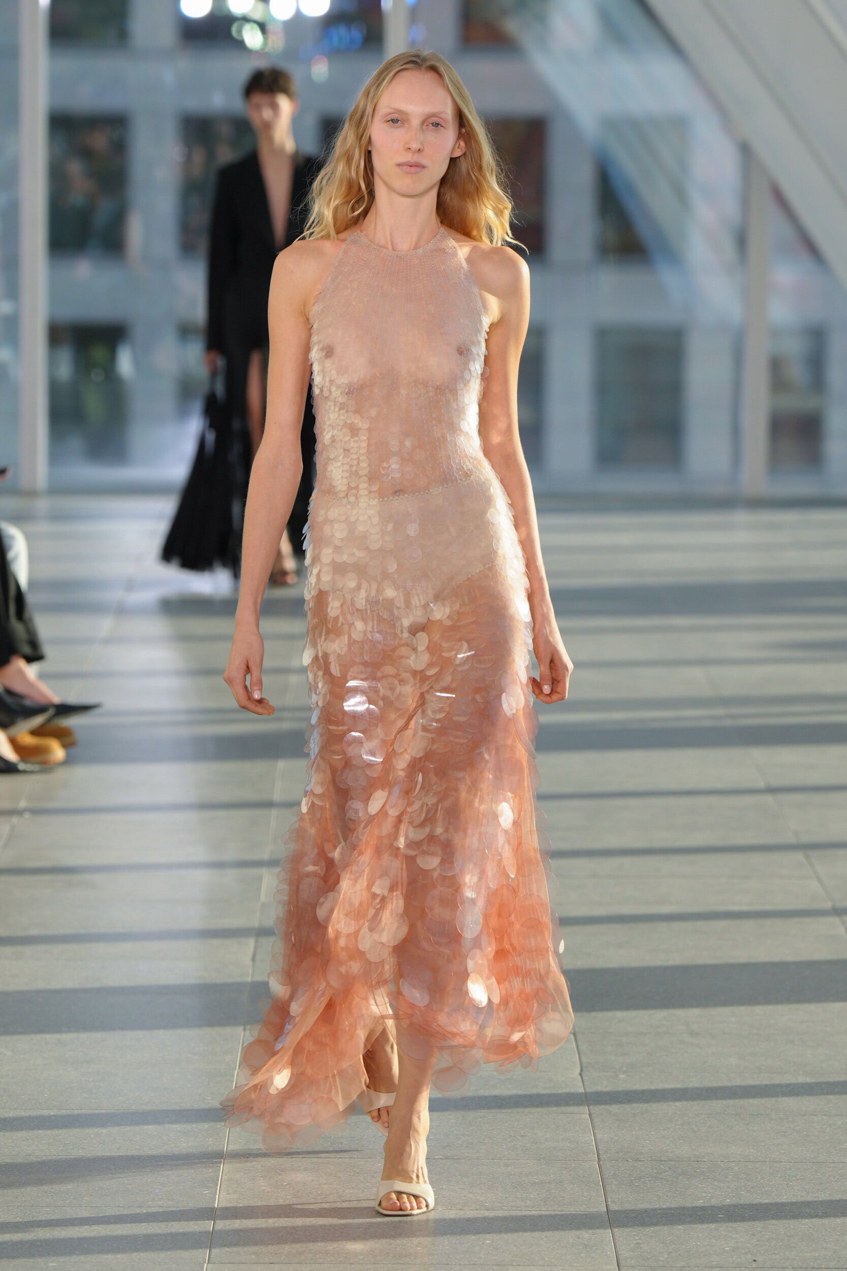
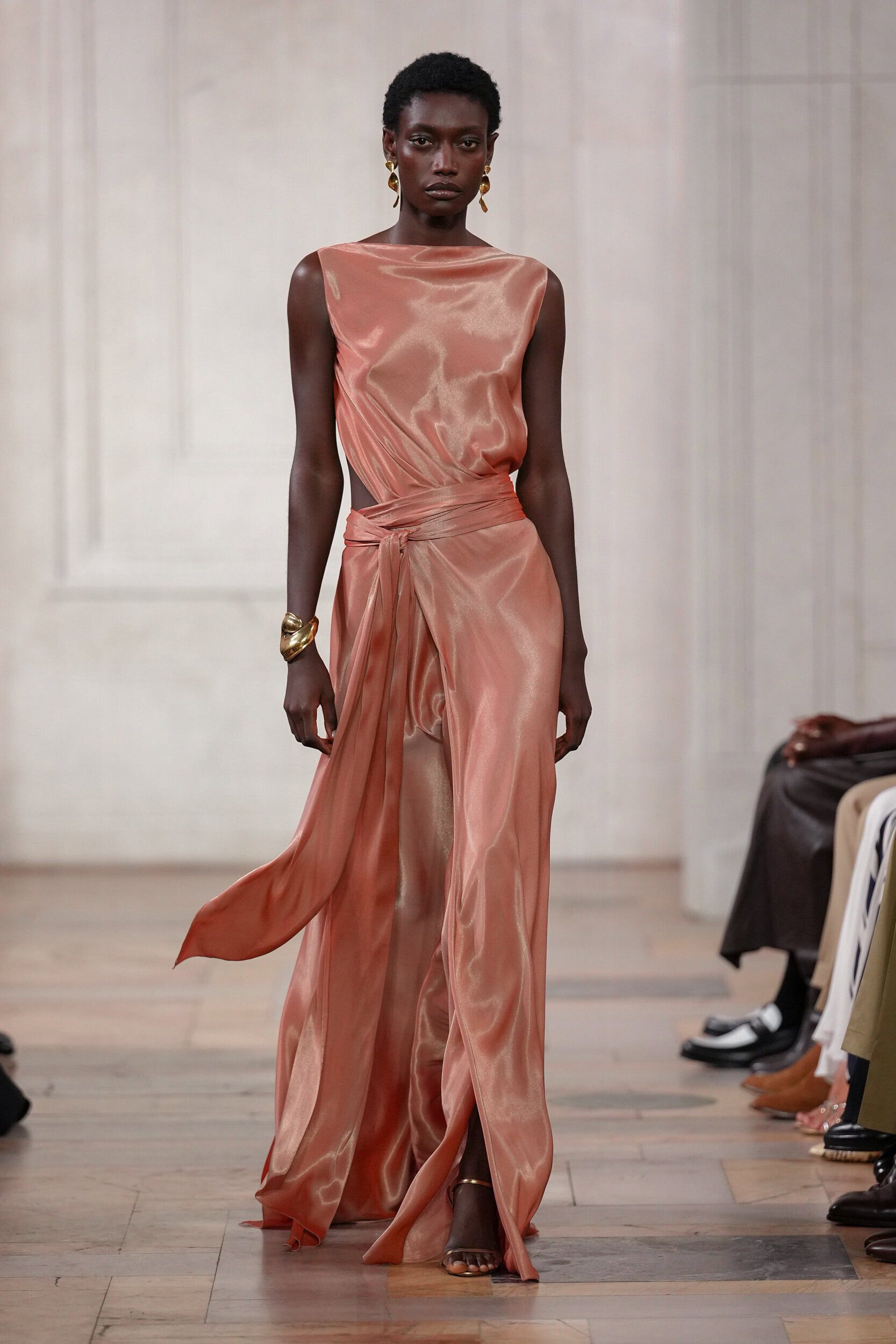
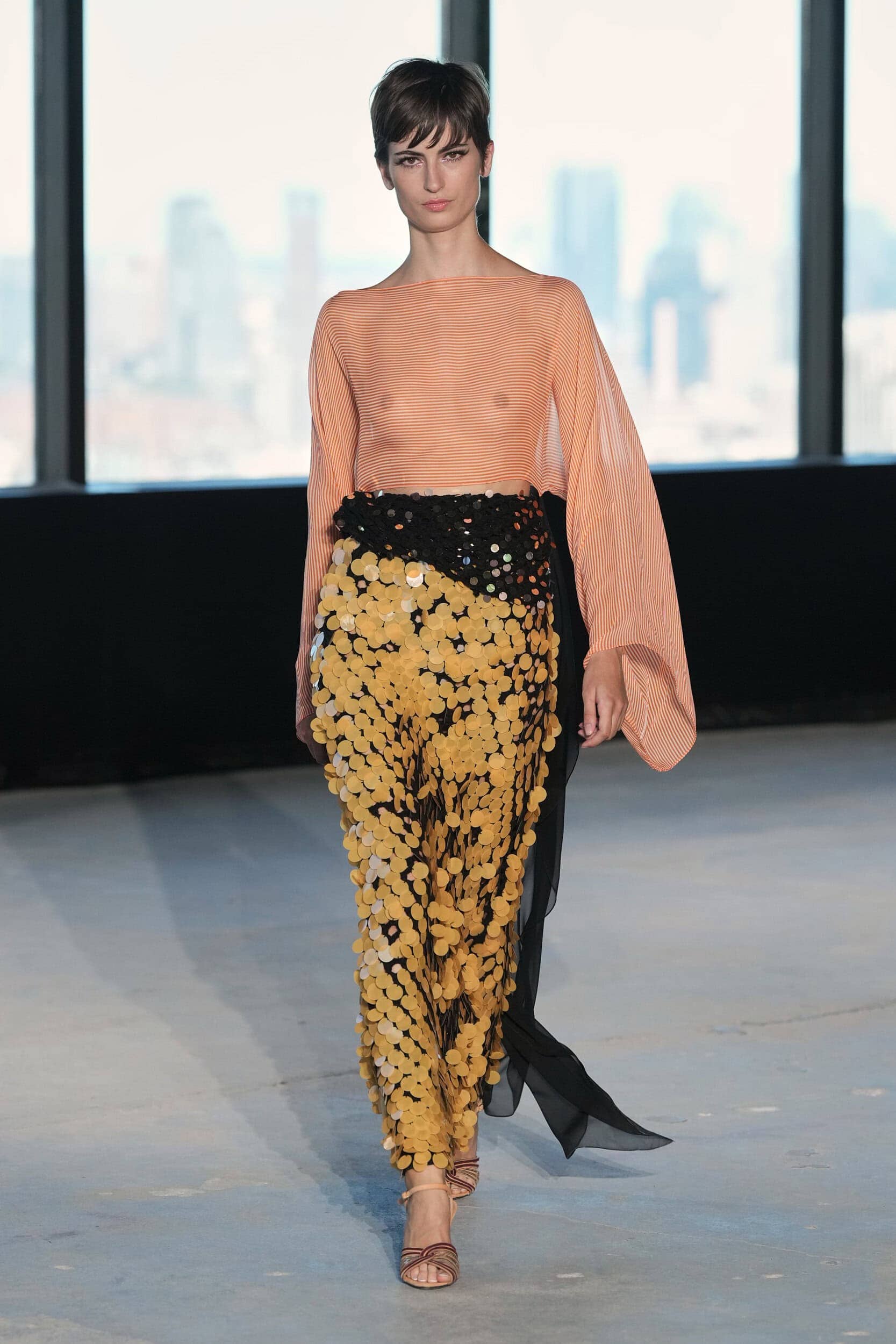
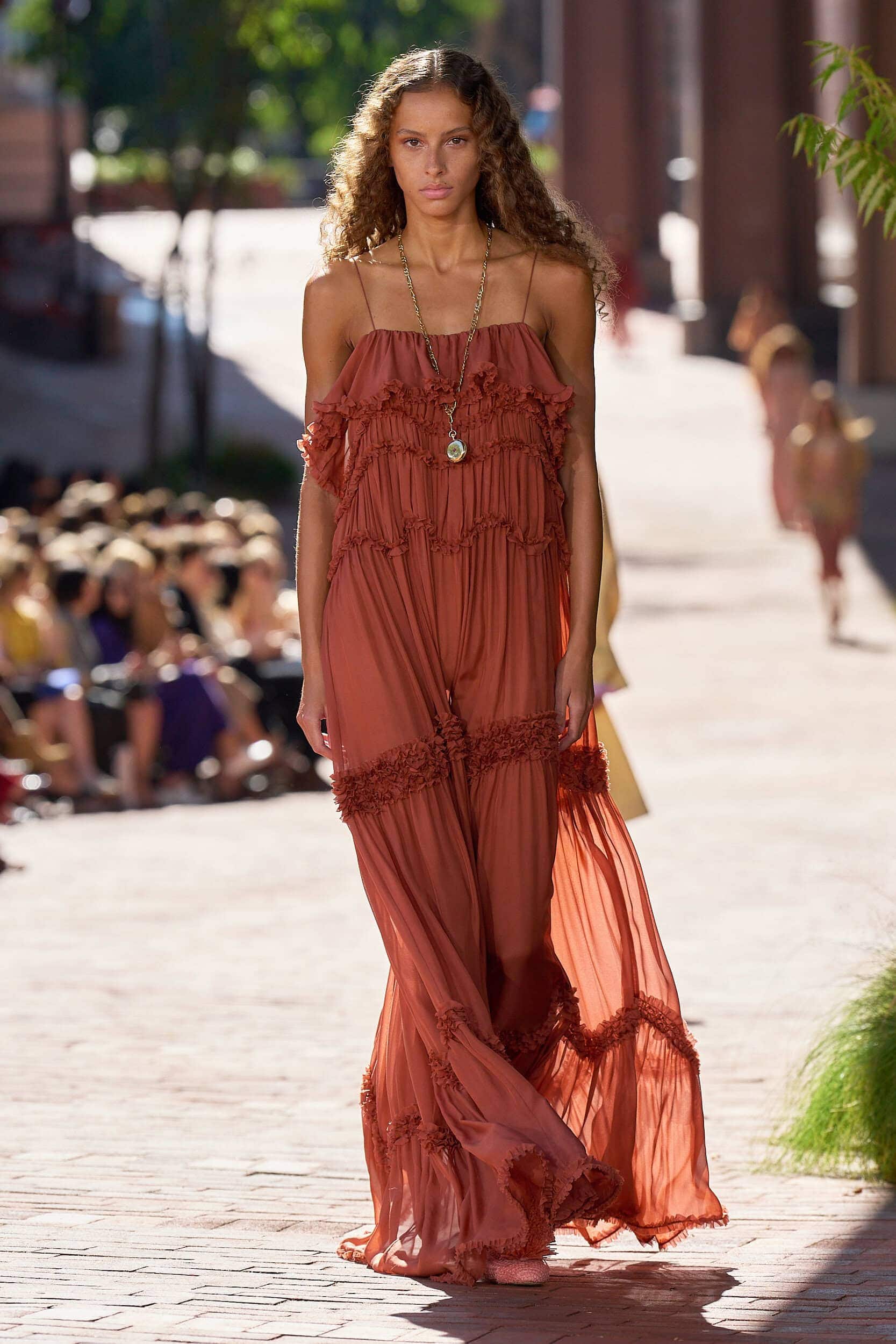
Effortless shades that can be dialled up or down were a key feature on the runway and peach showed how versatile it can be. Minimalist tailoring at Max Mara demonstrated how it could work as a modern update for a corporate wardrobe. Chloé, Etro, Akris, and Carolina Herrera infused the colour with a precious romanticism, and Tory Burch, McQueen, and Jil Sander severed the hues ties with bridesmaid gowns and reworked it for the modern occasion market.
Where Was it Seen?
Dries Van Noten, Erdem, Fendi, Tory Burch, Akris