Review of Palm Angels ‘Island Speed’ Spring 2026 Ad Campaign by Creative Director Francesco Ragazzi
Palm Angels’ Spring 2026 campaign, Island Speed, arrives like a heatwave with a pulse—equal parts stillness and velocity, tension and release. Under the direction of Francesco Ragazzi and captured through a stark, sun-bleached lens, the campaign proposes a deceptively simple question: what happens when speed is frozen, and attitude is left to speak for itself? It’s a compelling hook, one that aligns neatly with the brand’s ongoing fascination with youth culture at its most unfiltered.
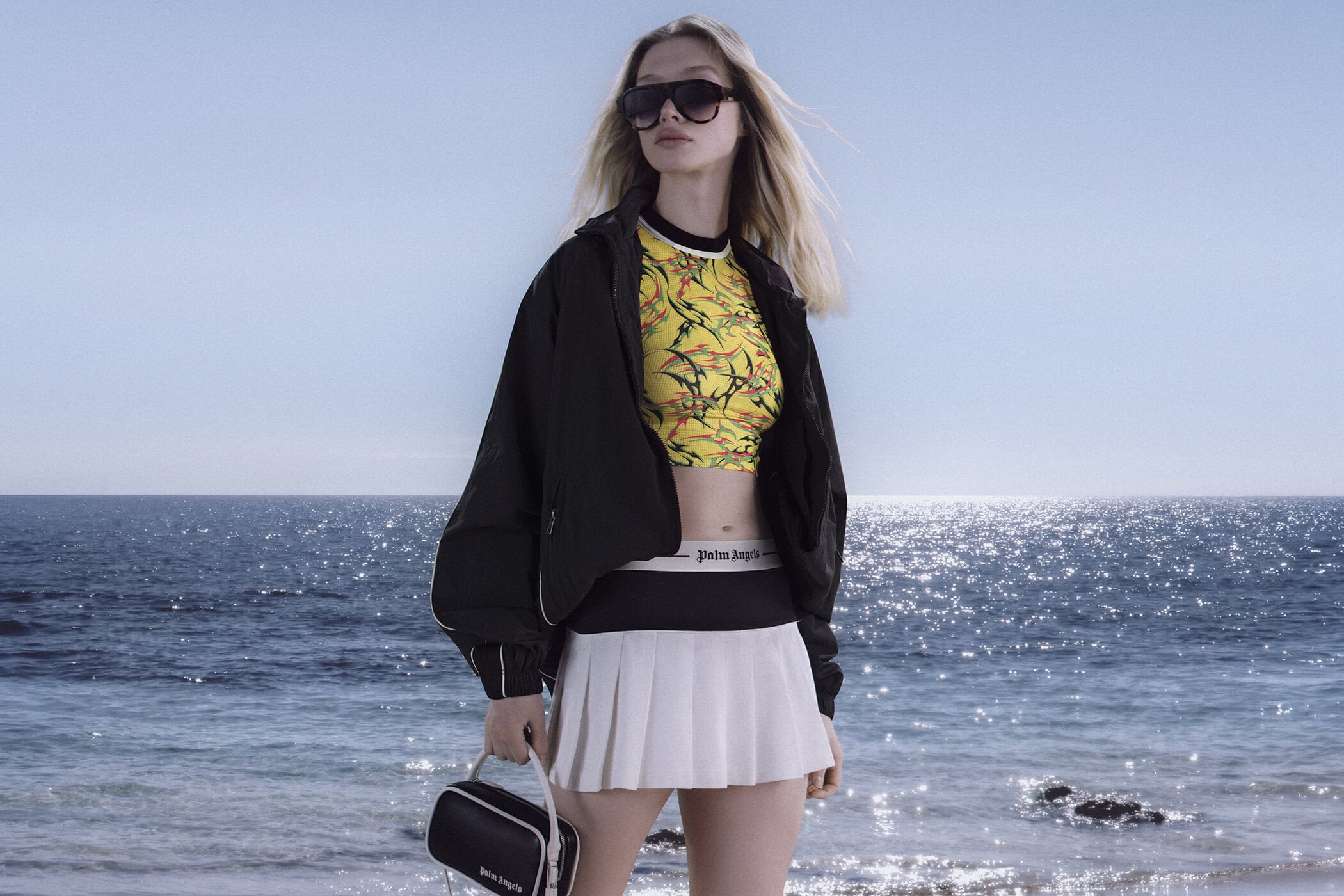
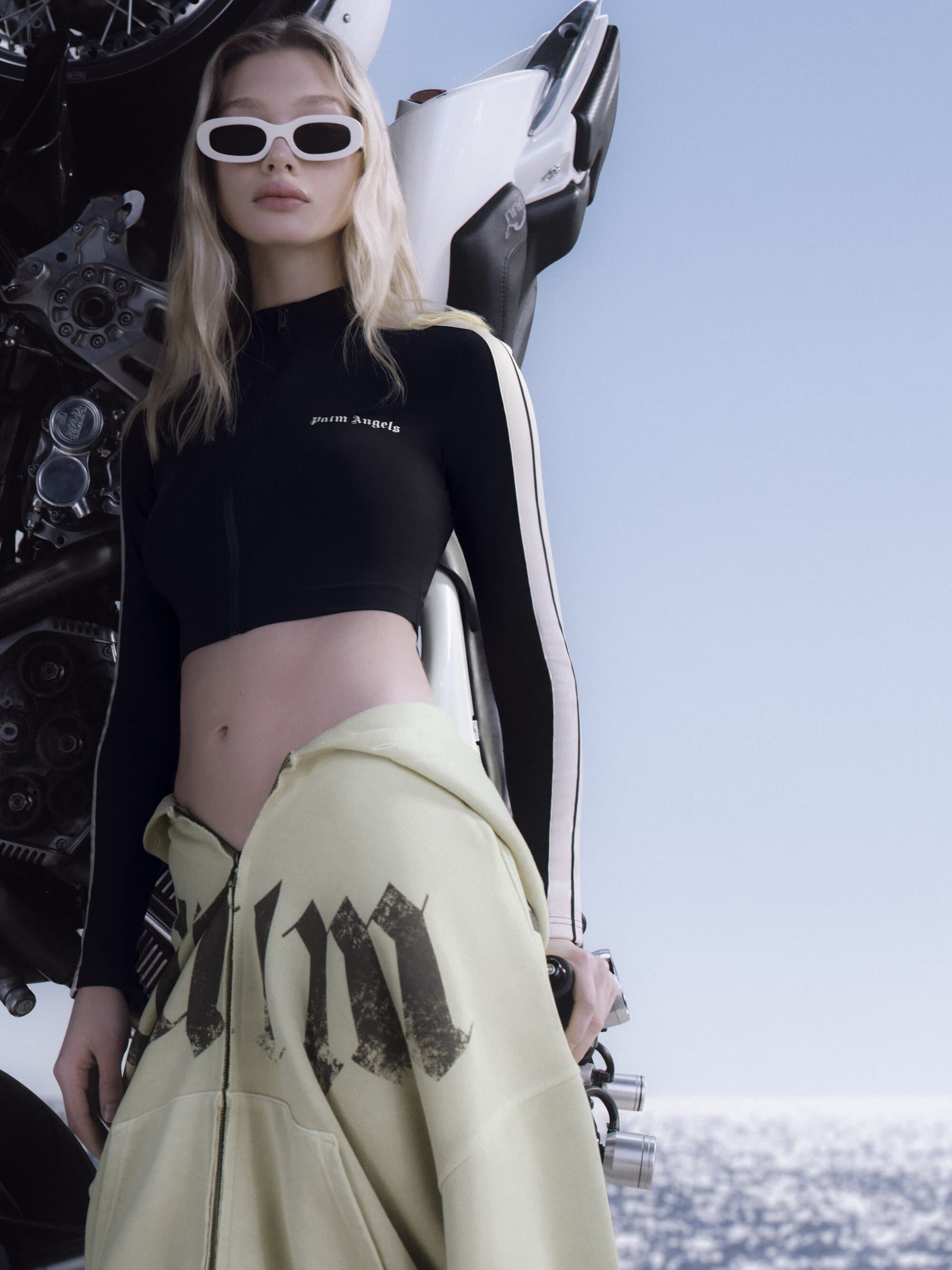
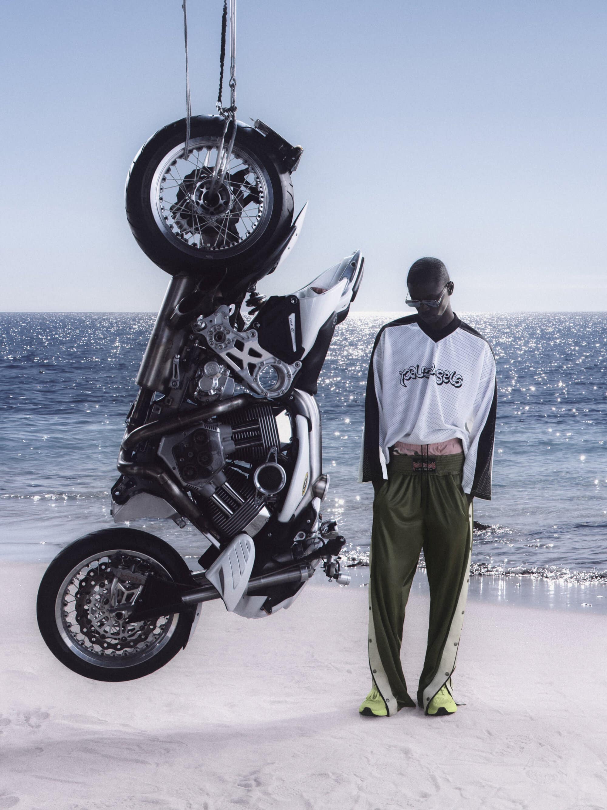
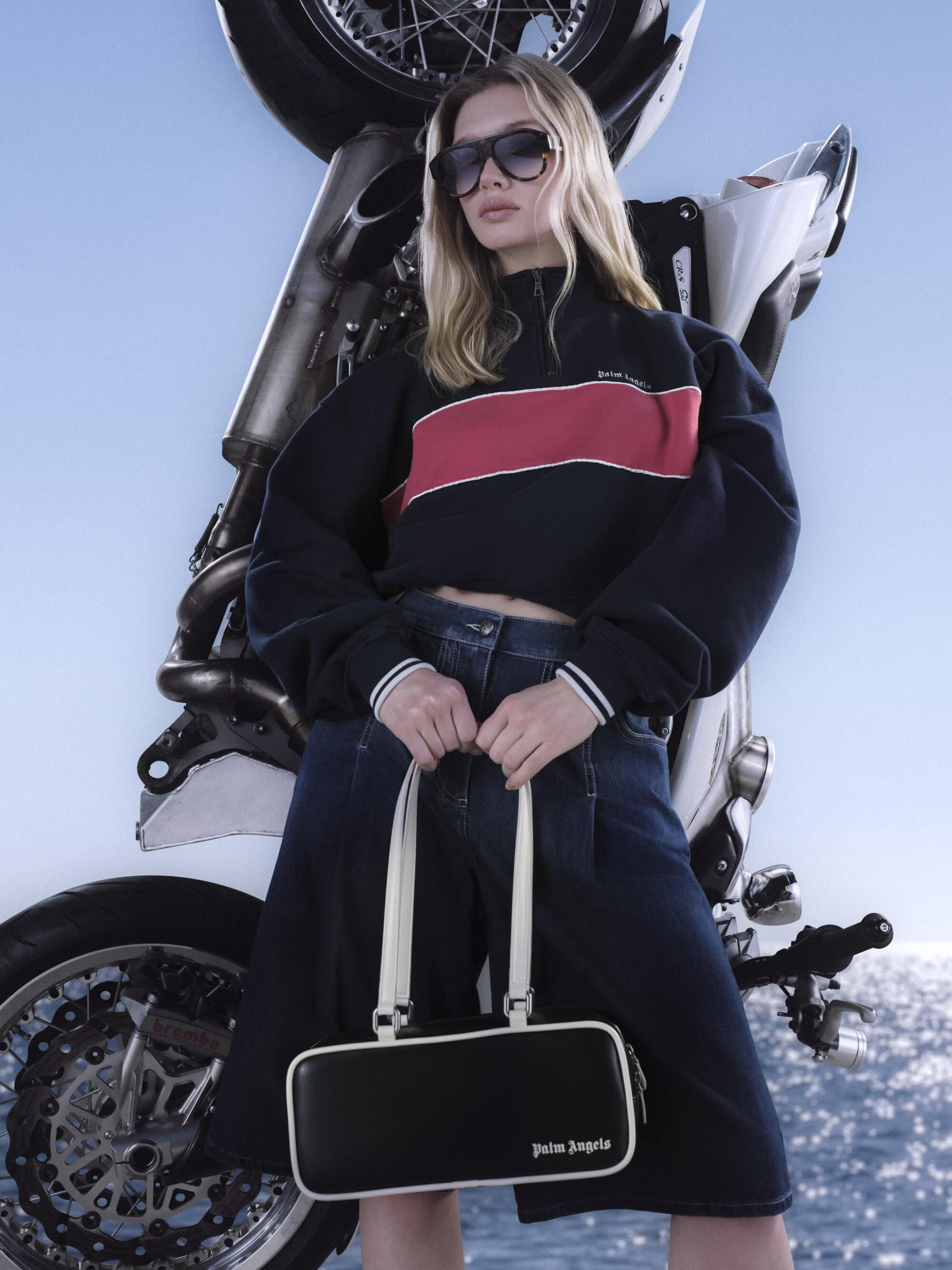
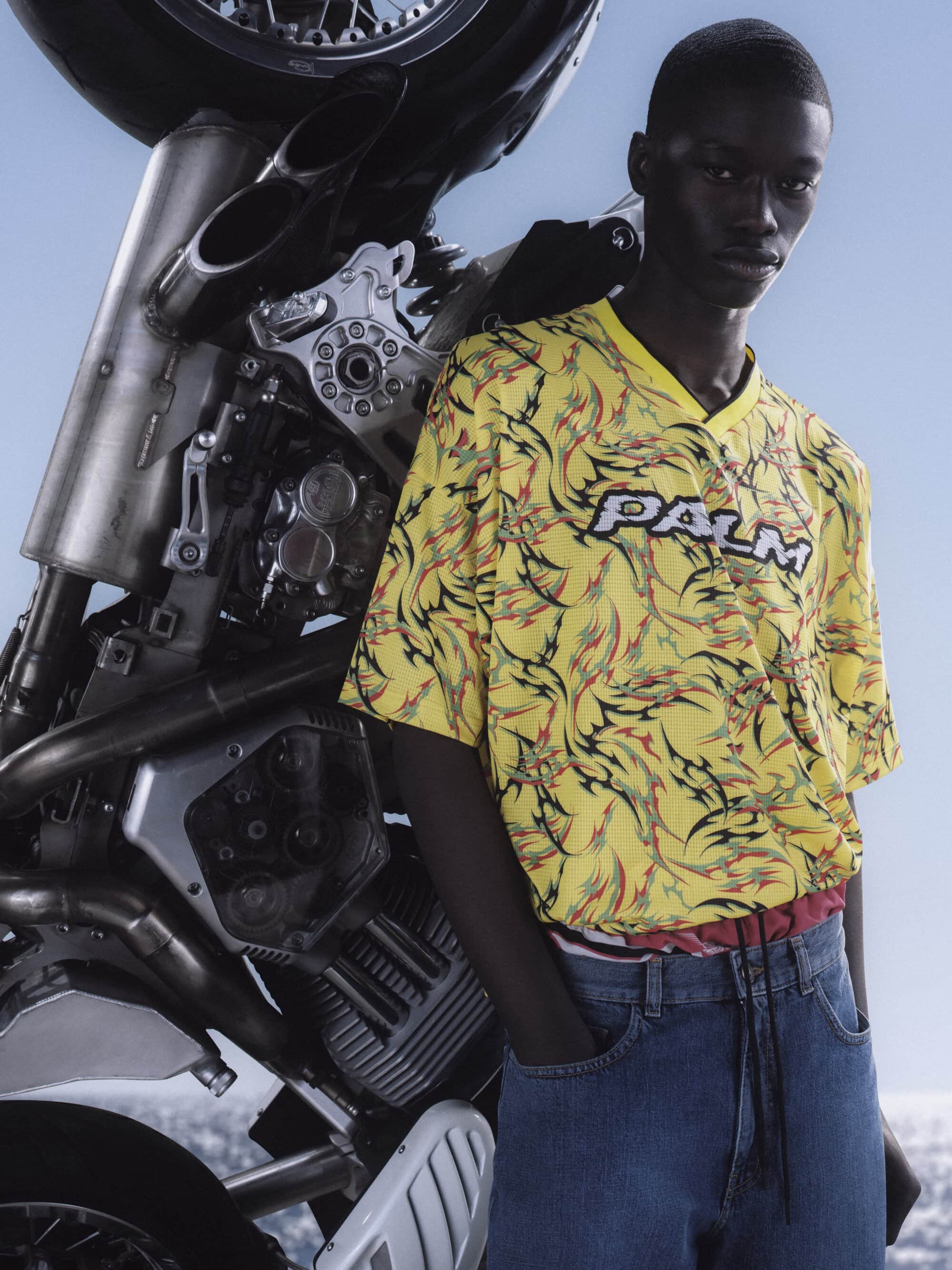
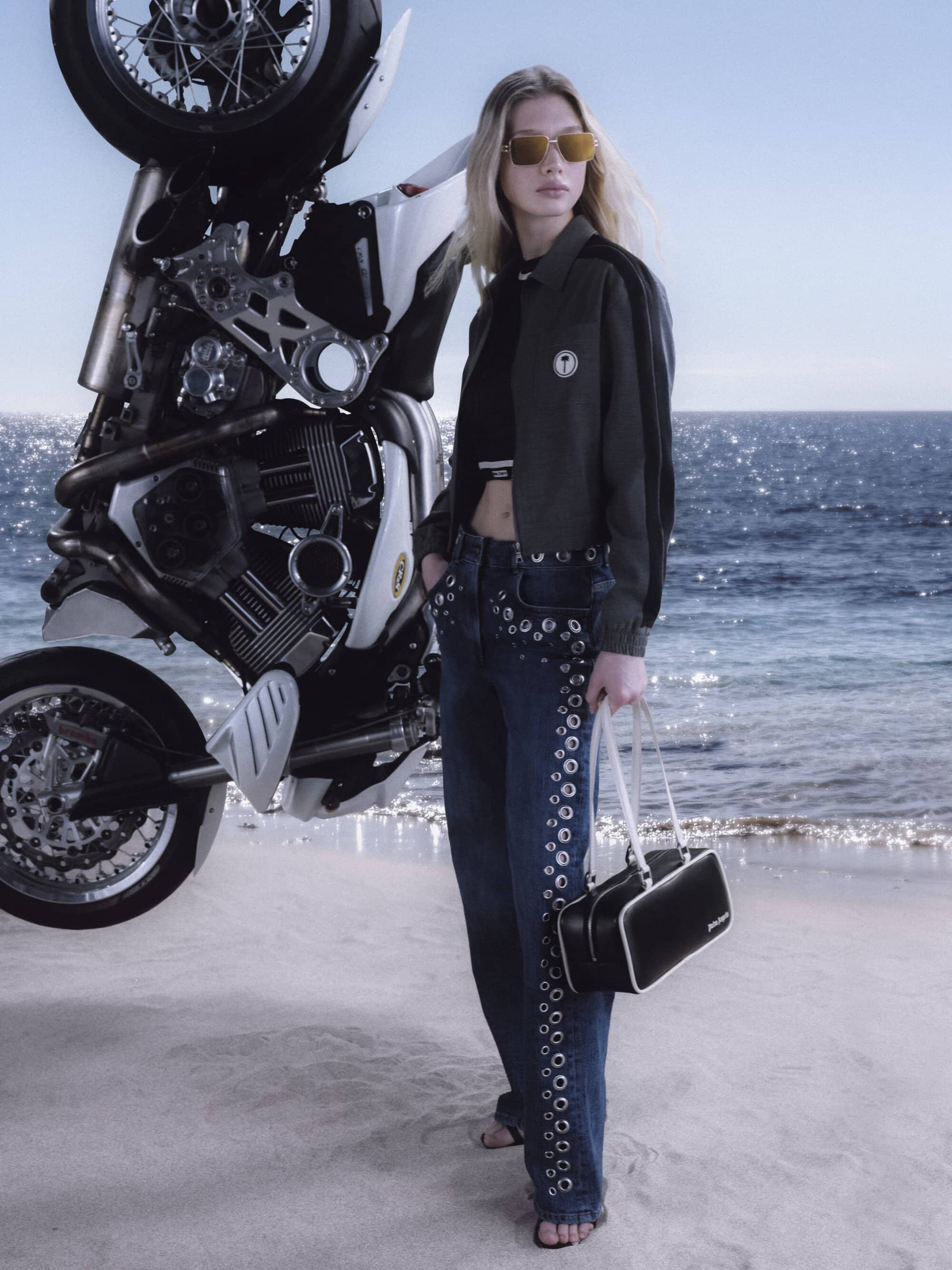
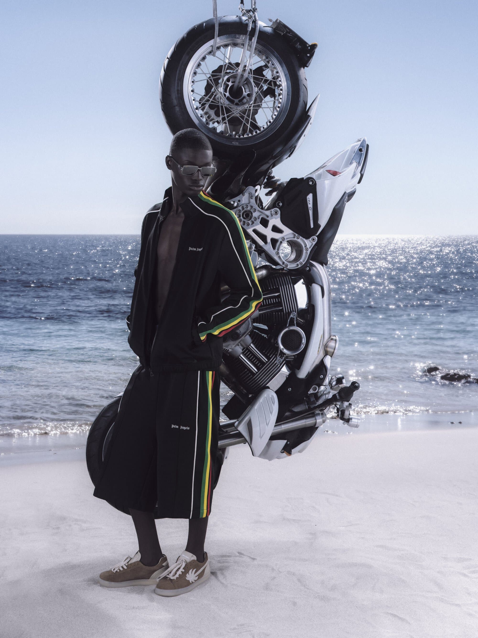
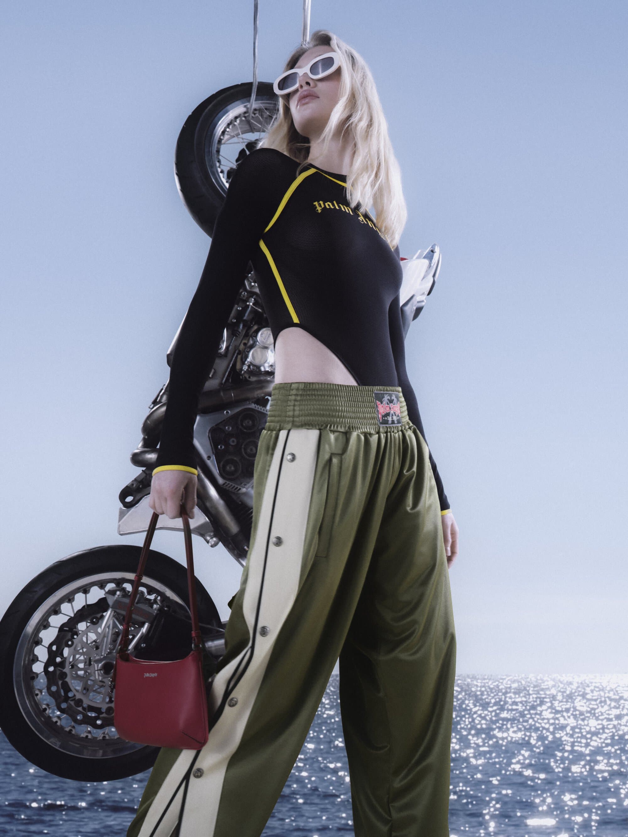
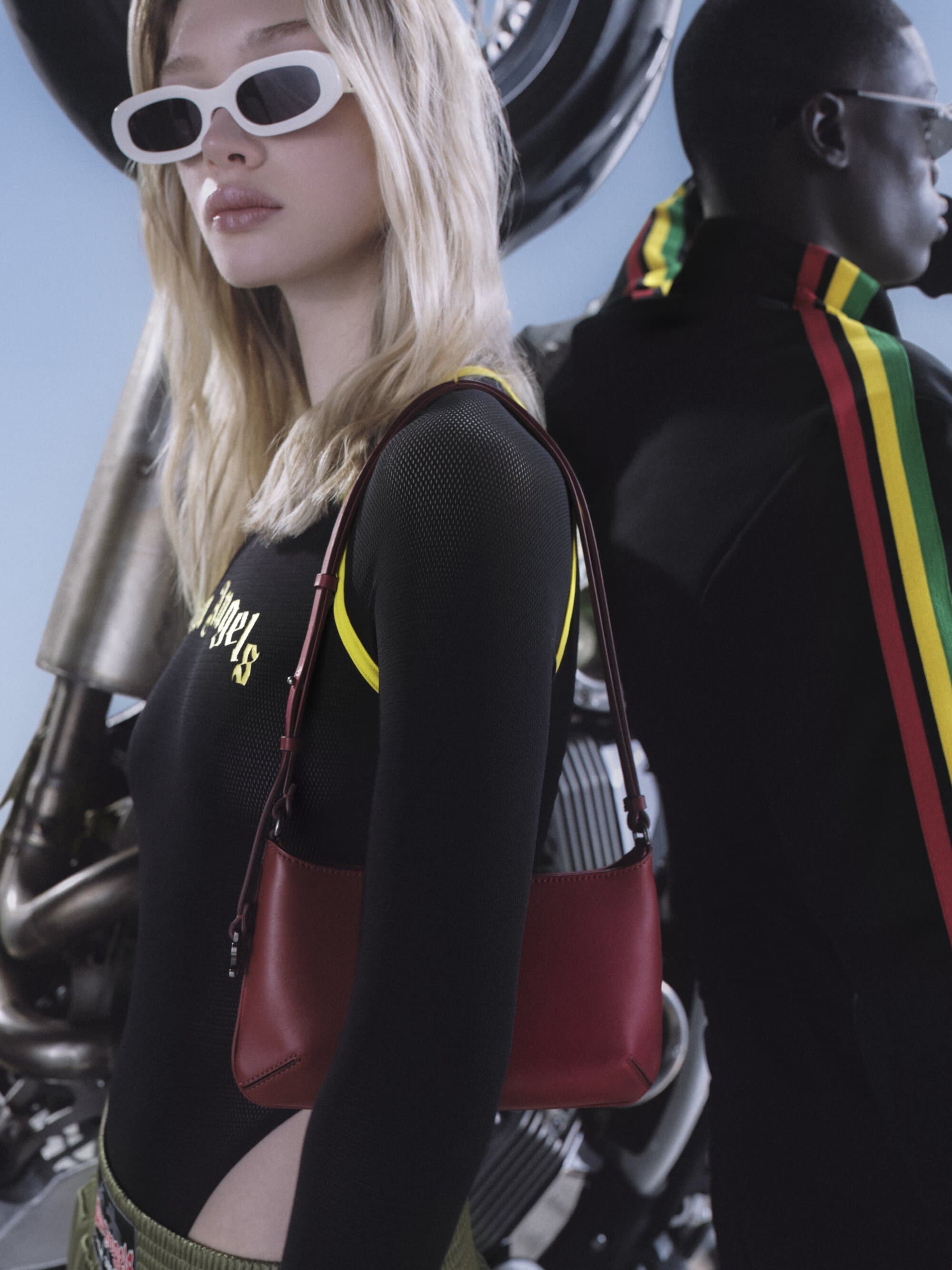
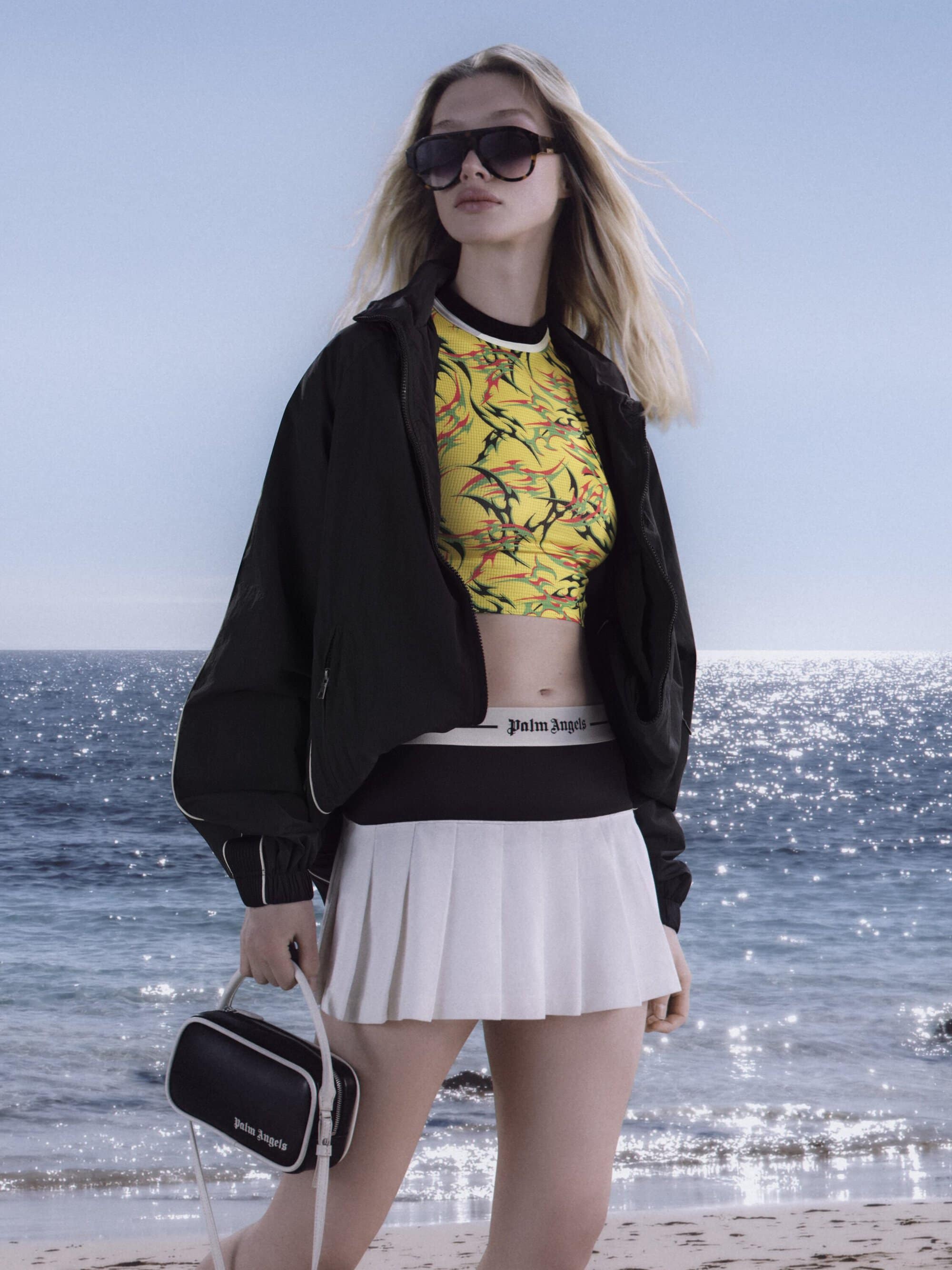
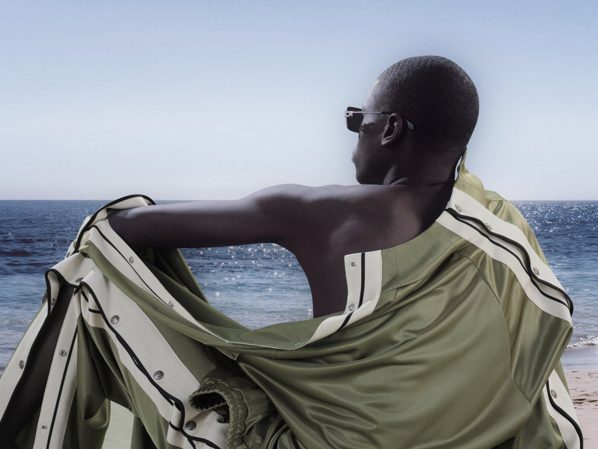
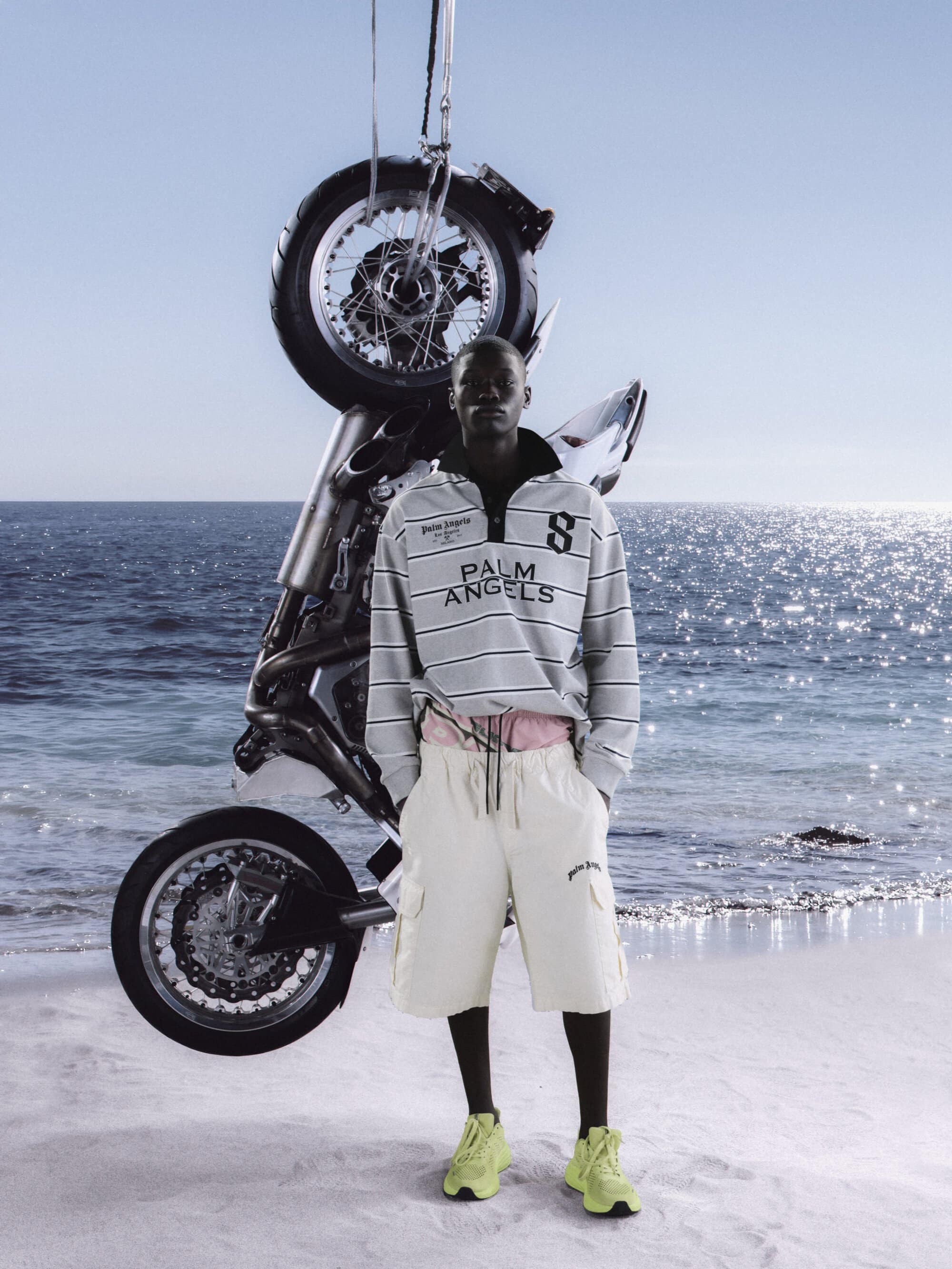
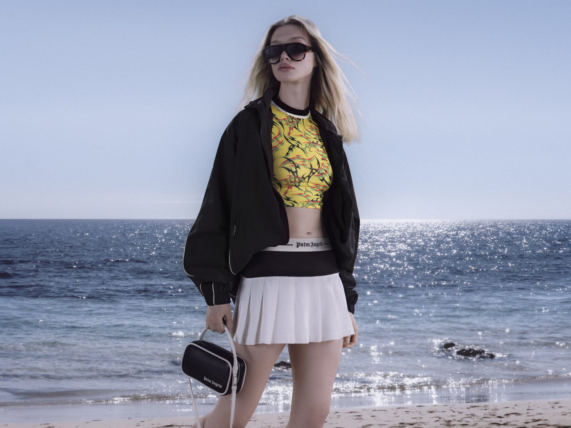
The imagery is anchored by a striking, almost surreal visual—a motorbike suspended mid-air against an expanse of sea and sky. It’s a moment that feels both impossible and entirely believable within Palm Angels’ universe, where rebellion often takes on a poetic edge. Around this central motif, bodies move—or rather, hold themselves—as if caught between action and aftermath. The light is unforgiving, casting sharp contrasts that heighten the sense of exposure. There is no soft focus here, no romantic haze; instead, the campaign leans into a kind of visual honesty that borders on confrontation.
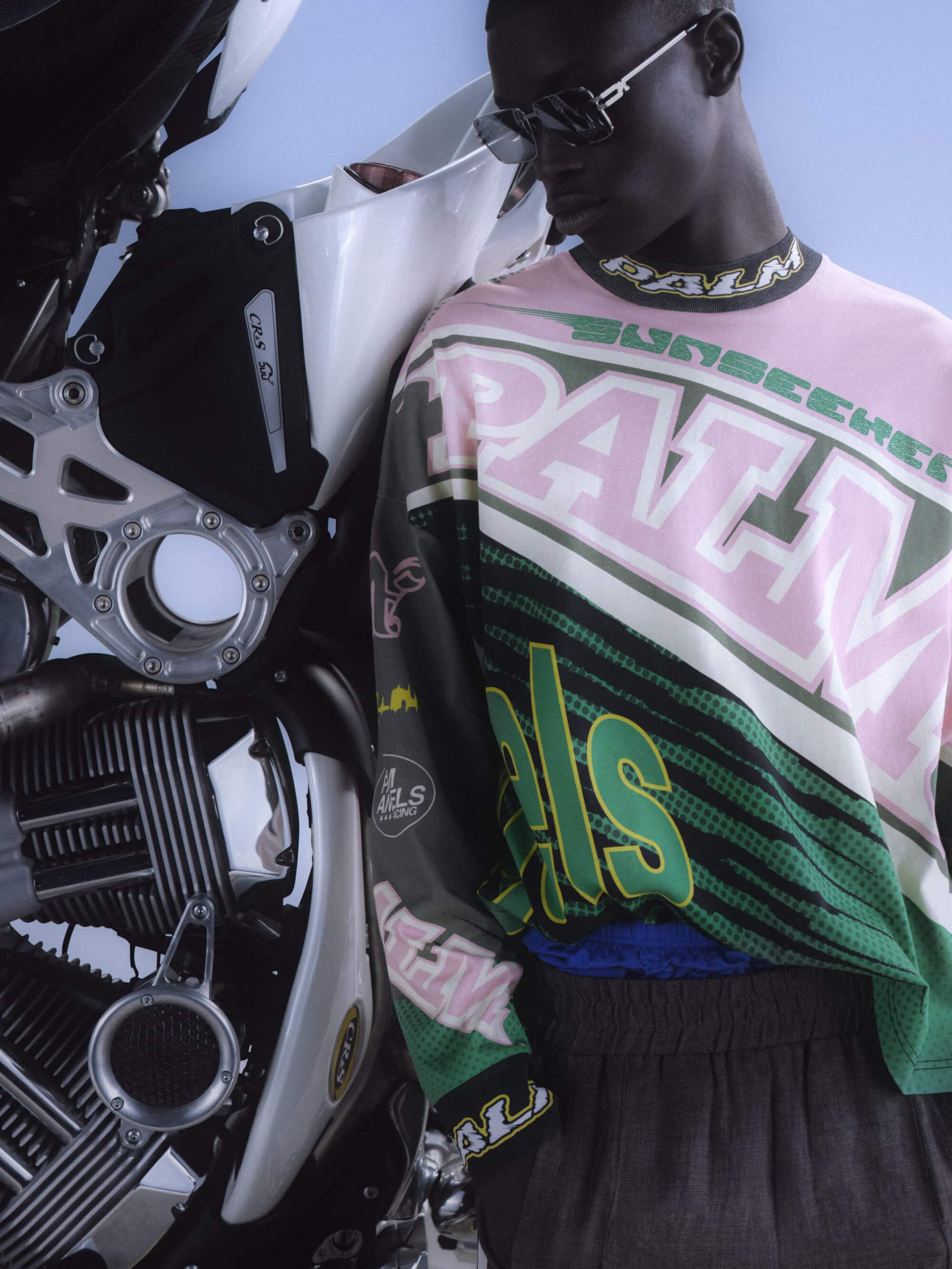
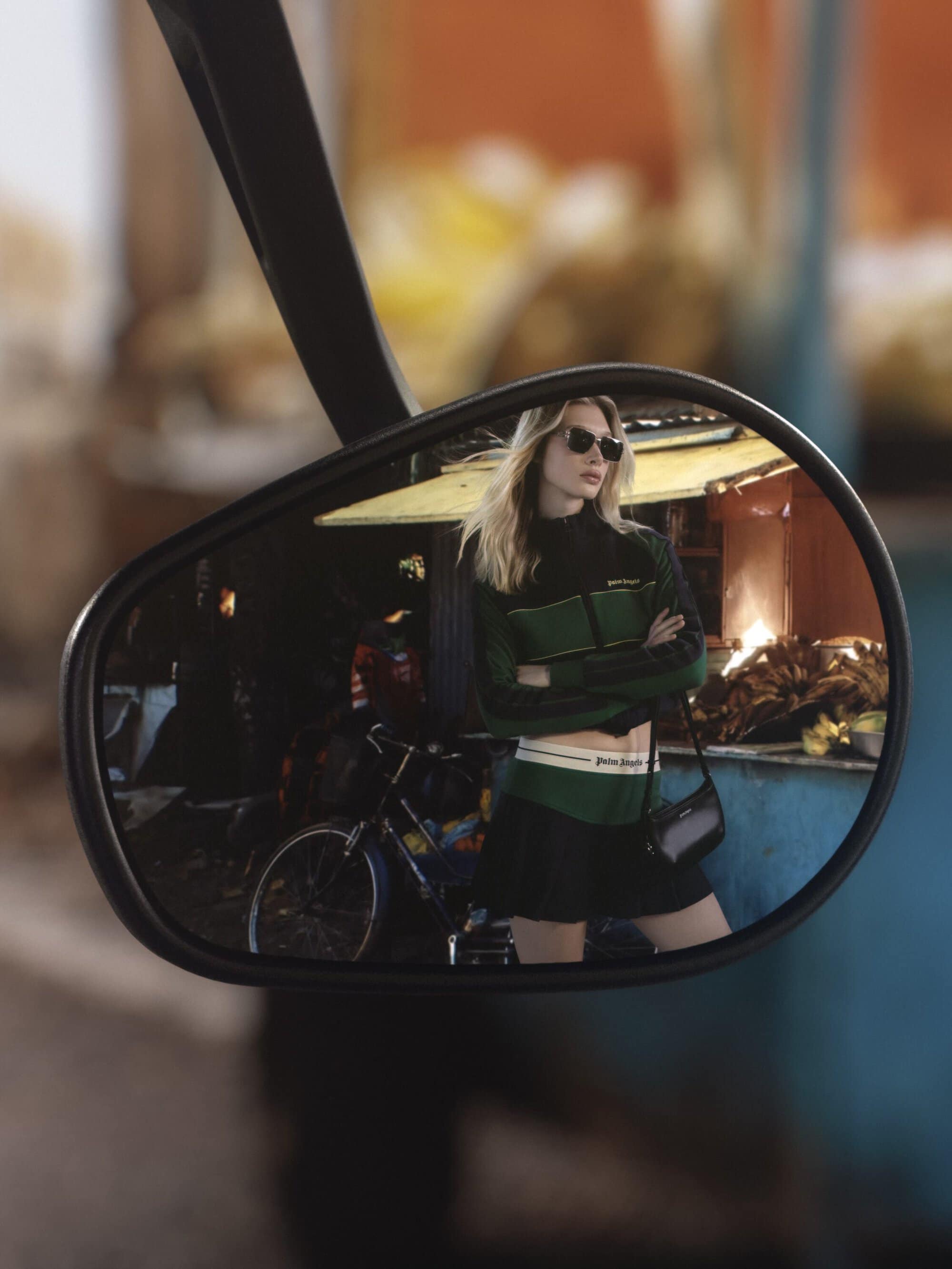
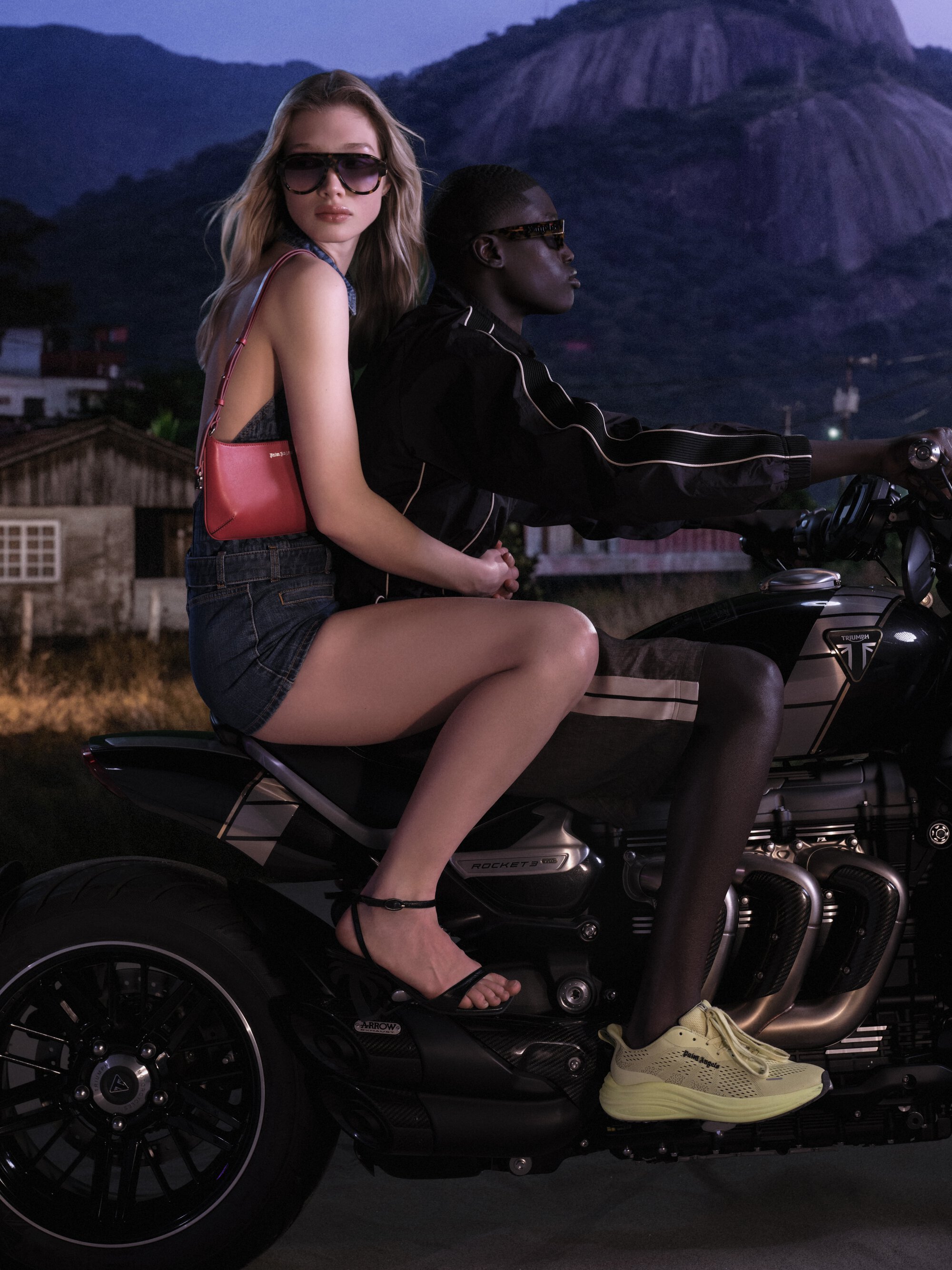
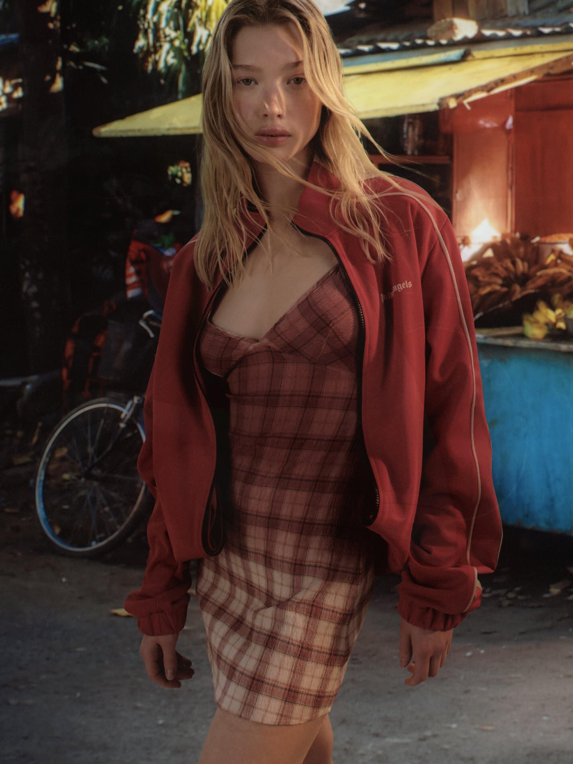
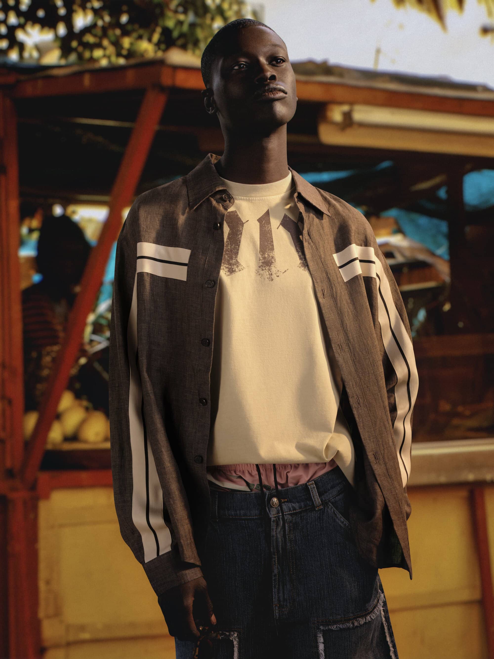
Set against the cultural backdrop of Jamaica, the narrative draws from the island’s evolving bike culture, where motion becomes identity and roads double as runways. This influence is handled with a degree of sensitivity, framing the environment not as spectacle but as context. Rhythm is implied rather than literal, carried in posture, stance, and the quiet choreography of presence. The casting reinforces this sense of lived-in authenticity—figures who feel part of the landscape rather than placed within it.
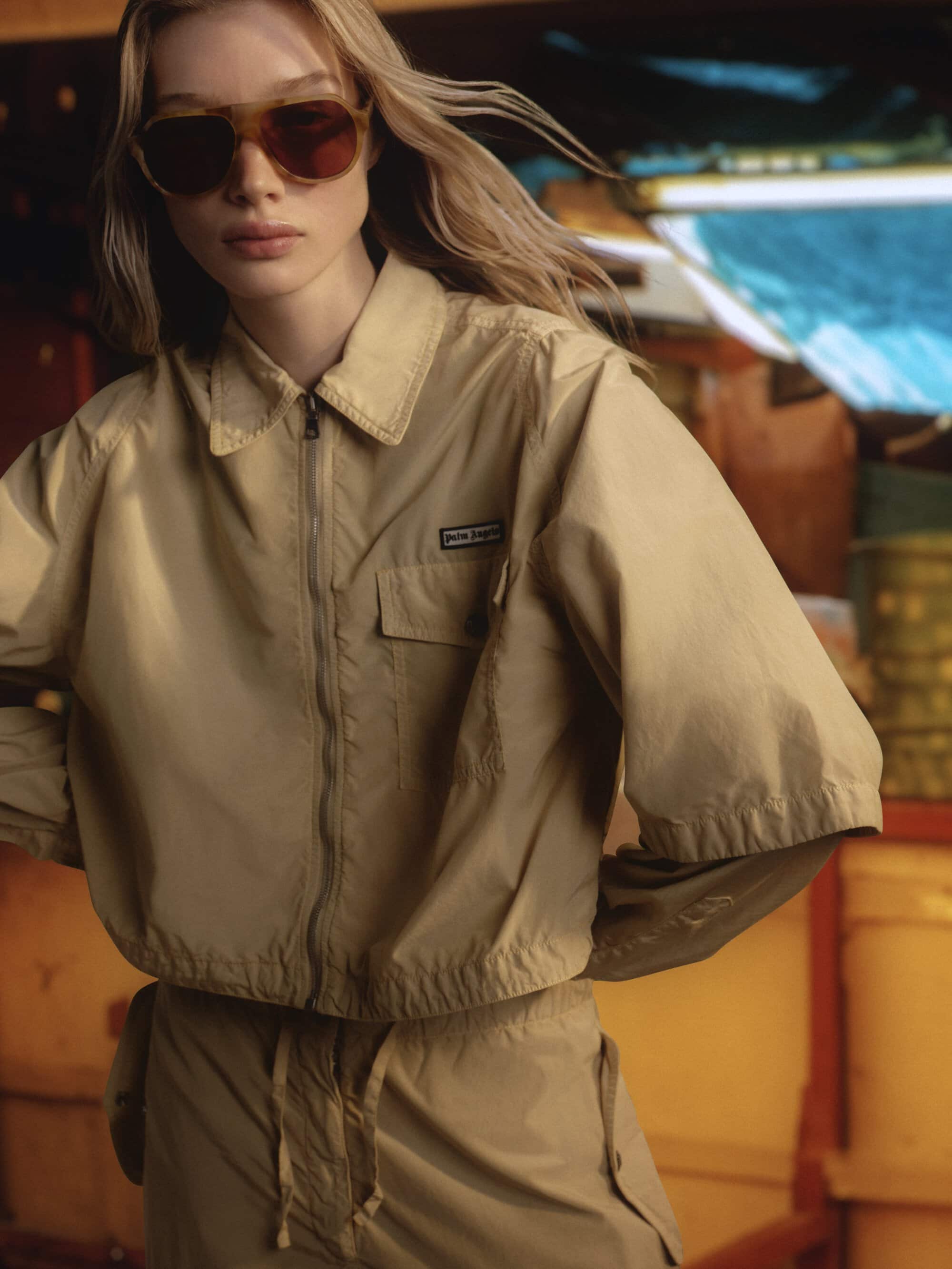
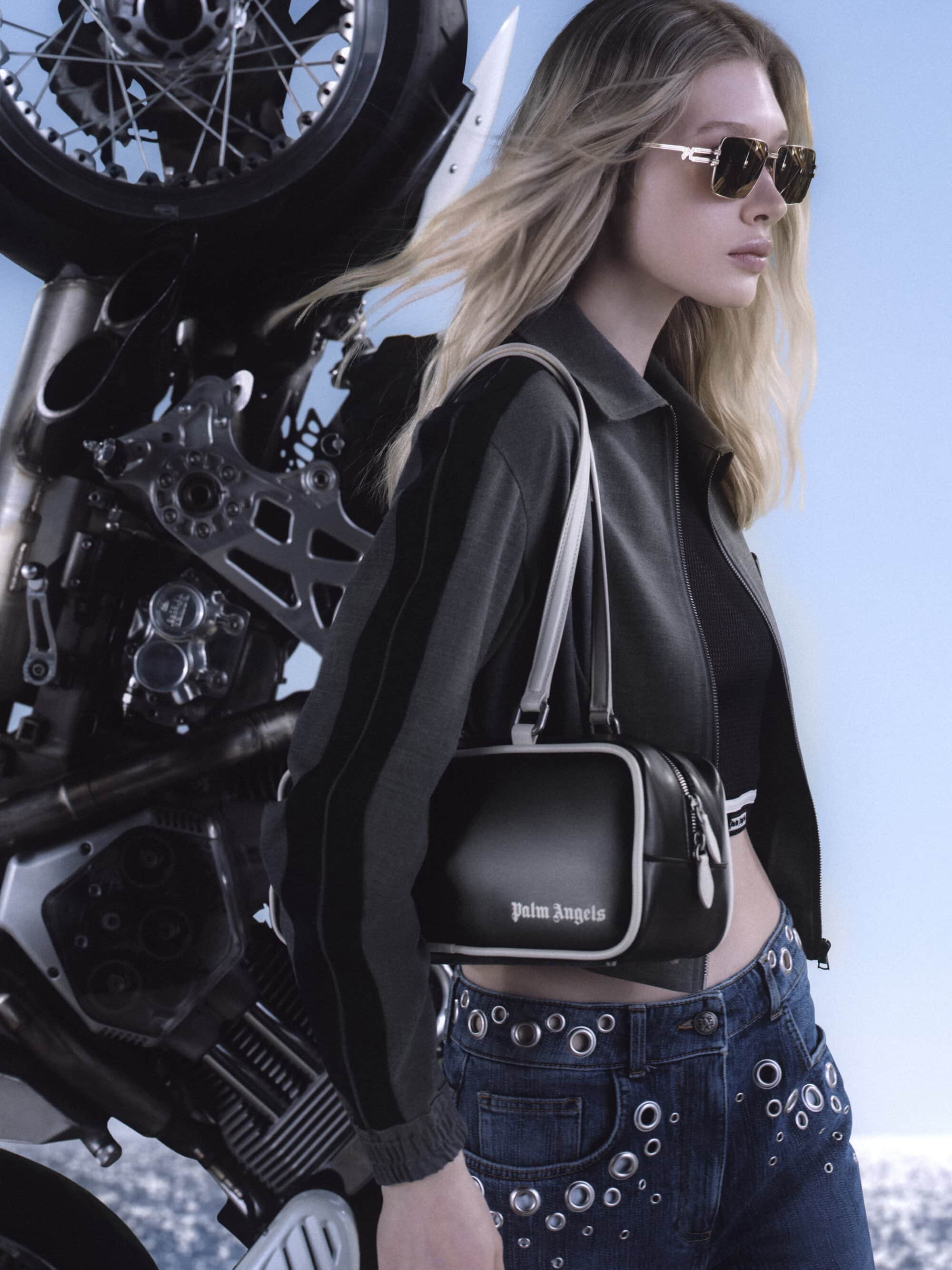
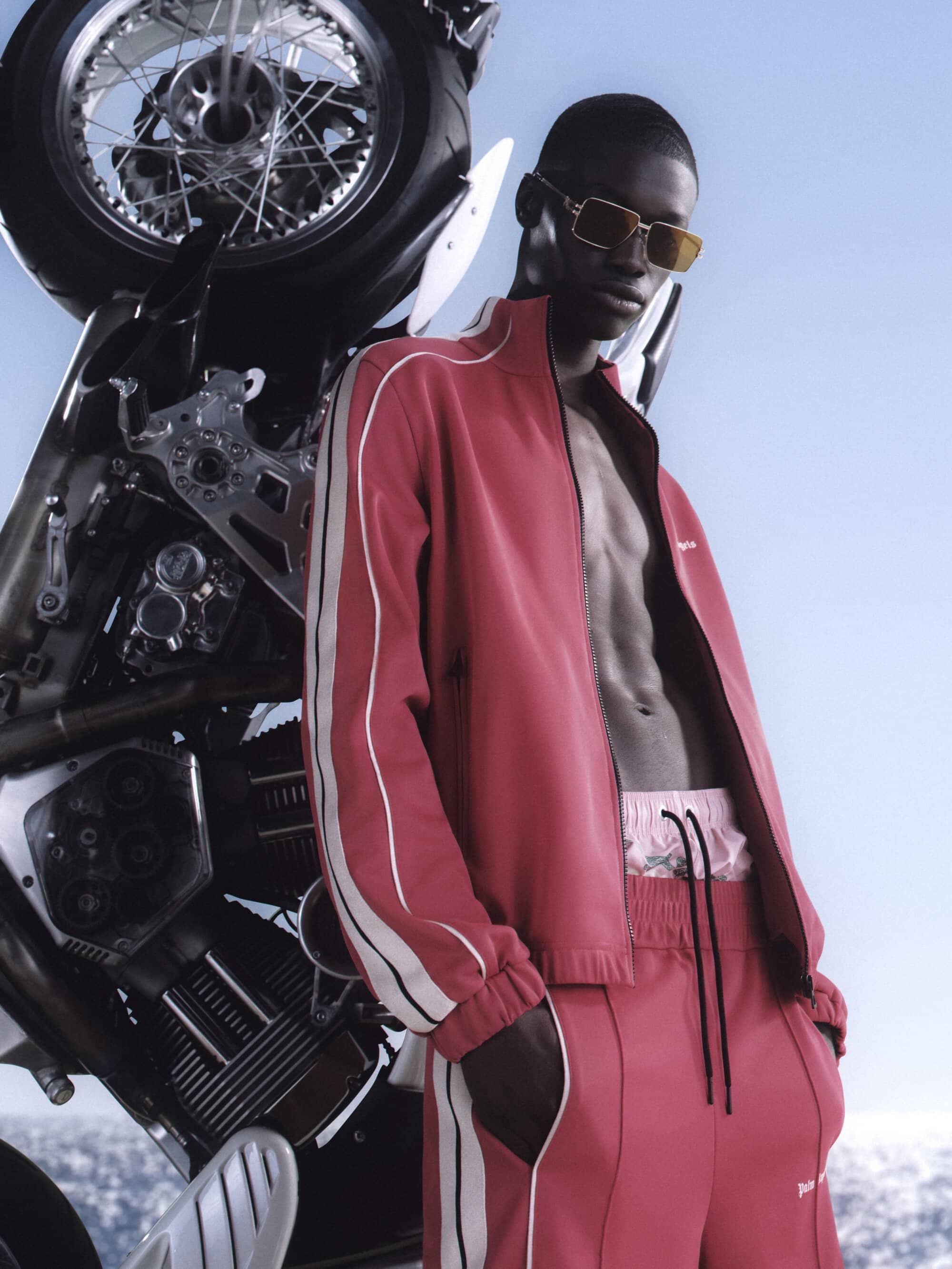
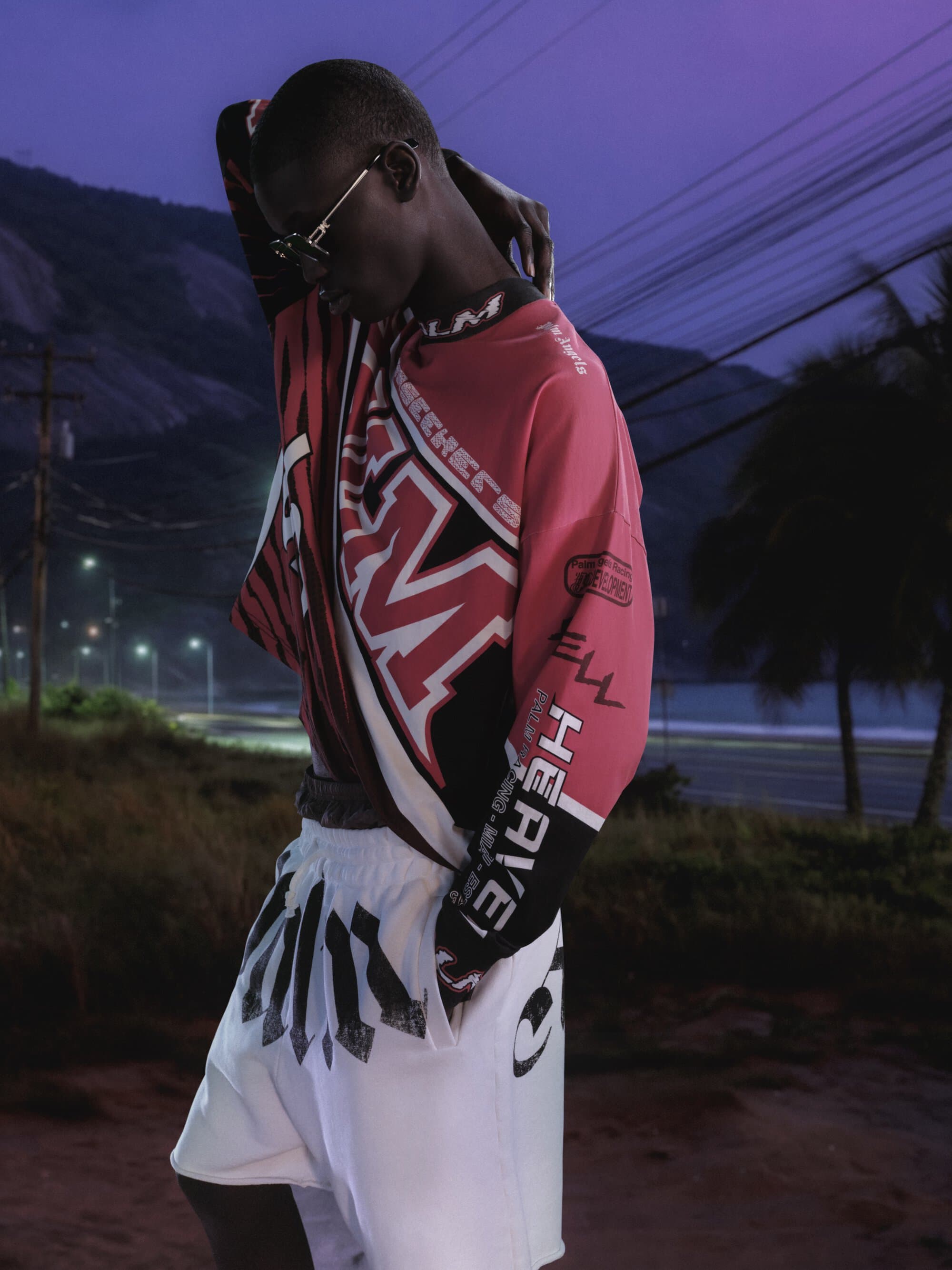
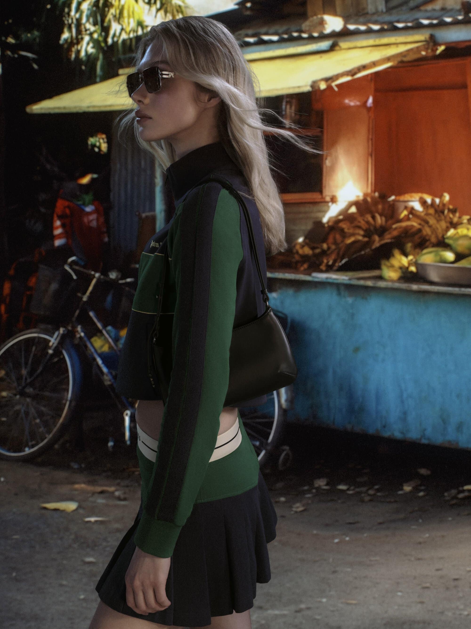
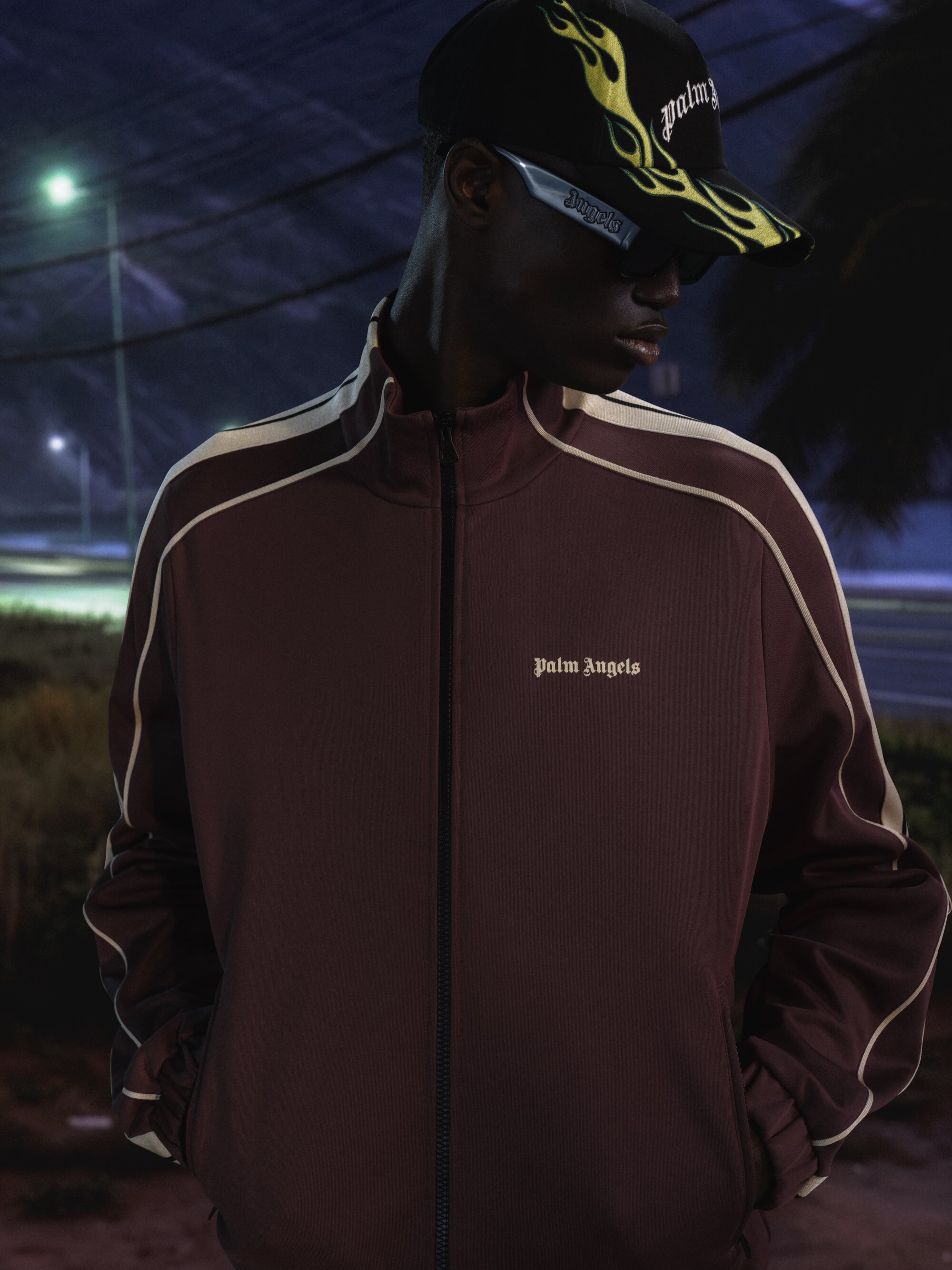
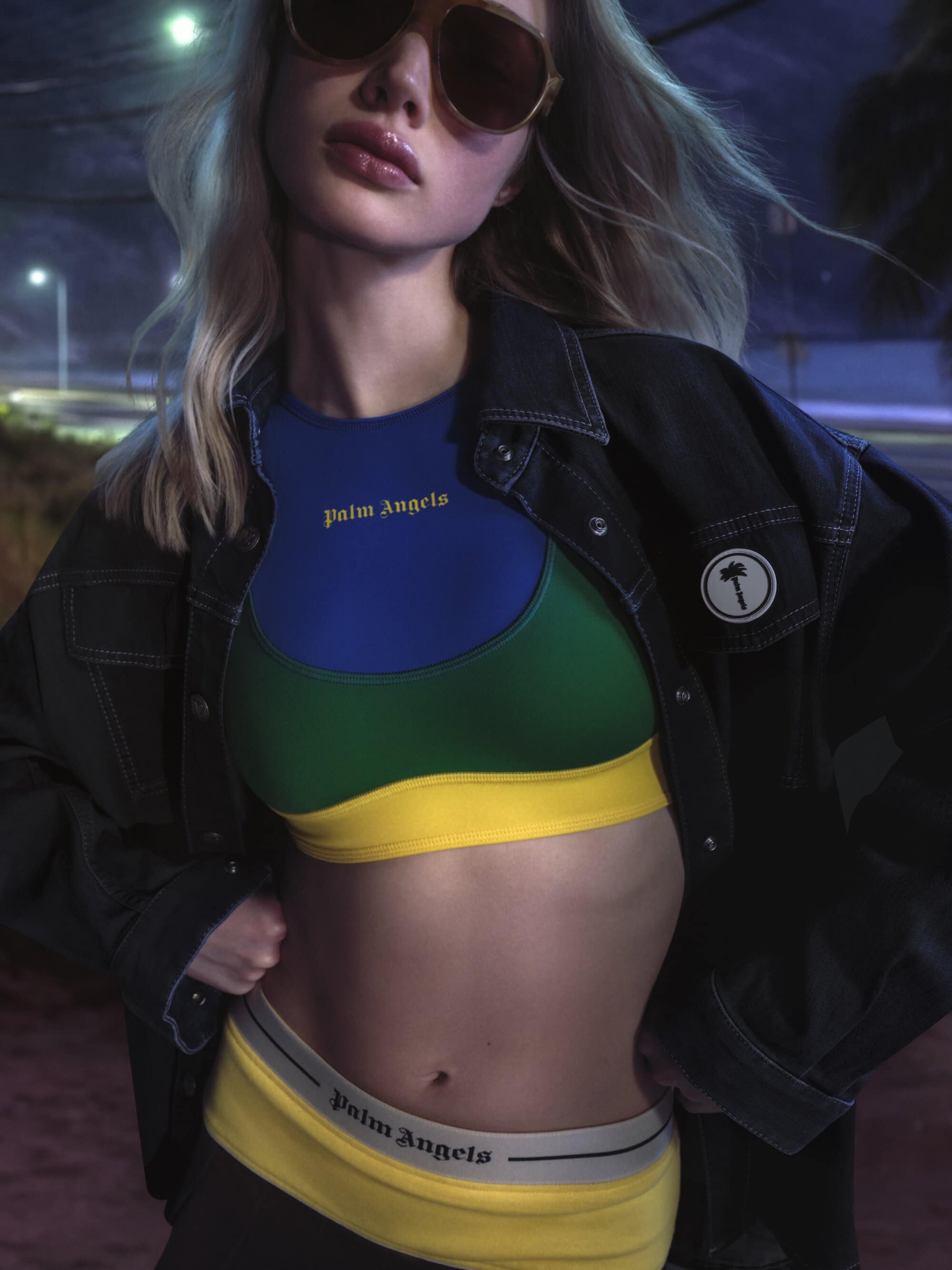
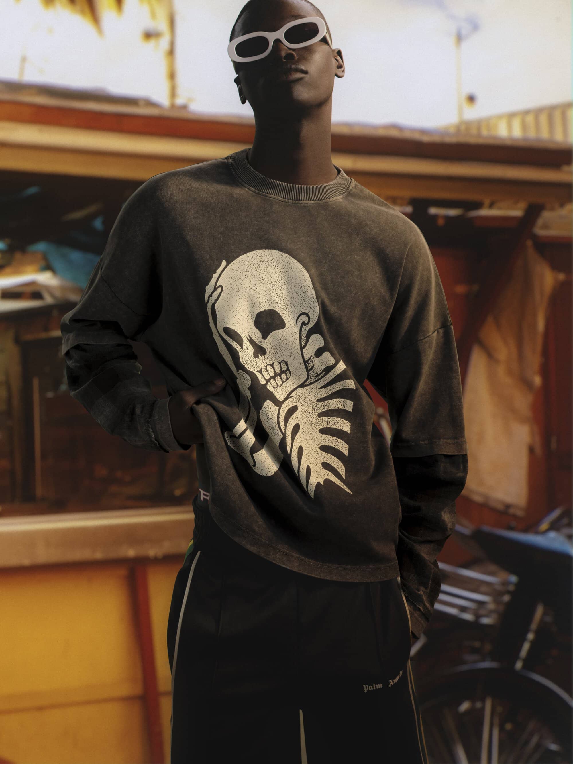
The collection itself remains firmly rooted in Palm Angels’ established codes. Oversized silhouettes, deconstructed layers, and a mix of technical and weathered fabrics suggest garments shaped as much by environment as by design. There’s an ease to the pieces, but also a sense of abrasion—as if they’ve been worn through heat, speed, and repetition. The introduction of a new logo, rendered as a patch, is a subtle yet strategic gesture. It signals evolution without abandoning recognition, a recalibration rather than a reinvention.
What the campaign does particularly well is sustain a mood. It understands the power of a singular idea and commits to it fully. That said, its visual language—while striking—occasionally risks becoming too consistent. The interplay between motion and stillness is conceptually rich, but one can’t help but wonder if a broader range of perspectives might have deepened the narrative’s emotional texture. A shift in scale, a break in rhythm, or a moment of unexpected intimacy could have added further dimension to an already compelling story.
Still, Island Speed succeeds in translating Palm Angels’ ethos into a setting that feels both specific and expansive. It captures a culture in motion while holding onto a sense of introspection—a delicate balance that not all campaigns manage to strike. There’s confidence in its restraint, and a clarity in its visual thesis that resonates beyond the immediate frame.
In the end, Palm Angels reminds us that speed isn’t always about movement—it’s about energy, tension, and the anticipation of what comes next. And here, suspended between sky and sea, that anticipation lingers just long enough to leave an impression.
Creative Director | Francesco Ragazzi