The Seduction of the Screen Siren
Review of Dries Van Noten Spring 2027 Fashion Show
By Angela Baidoo
THE IMPRESSION TAKE
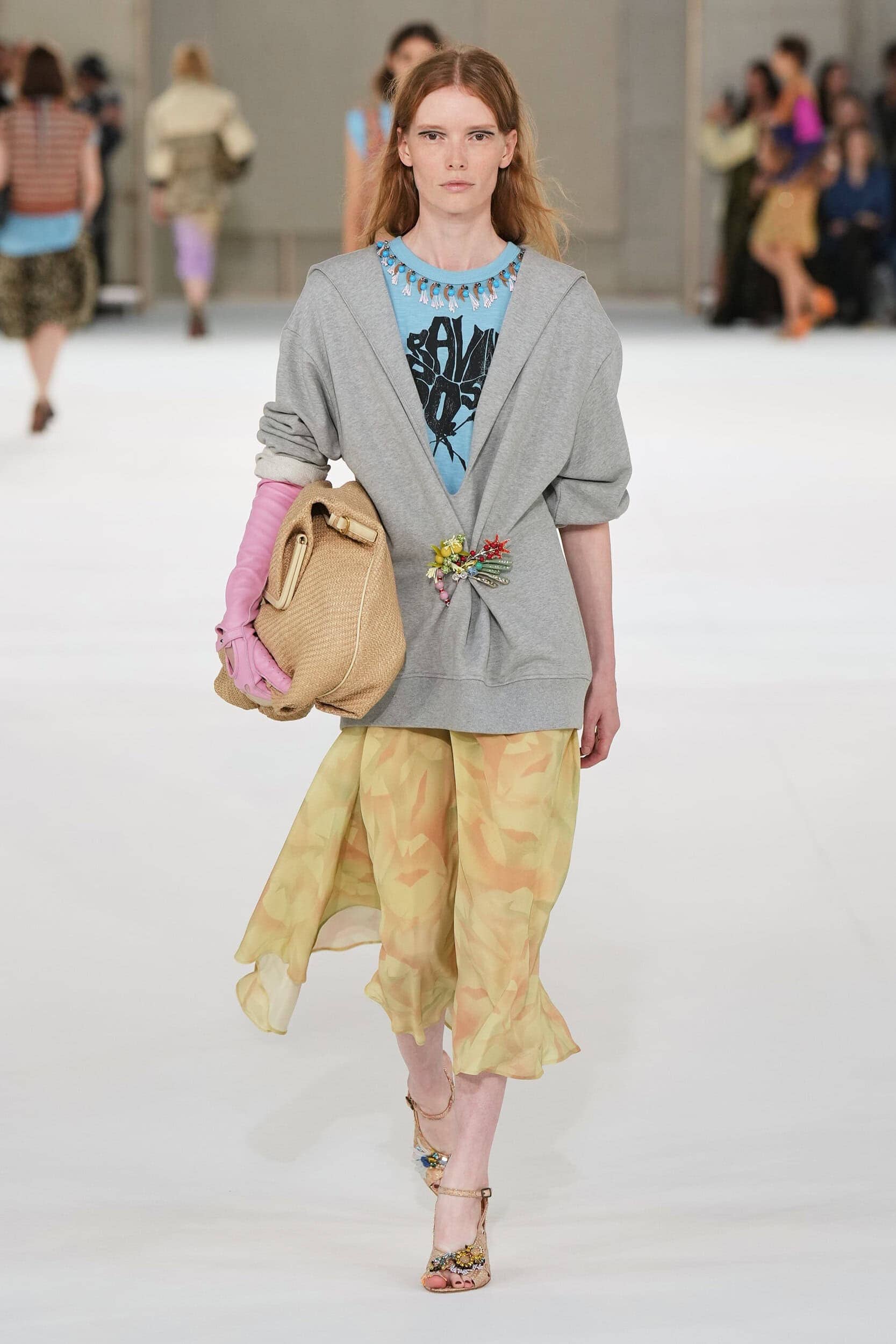
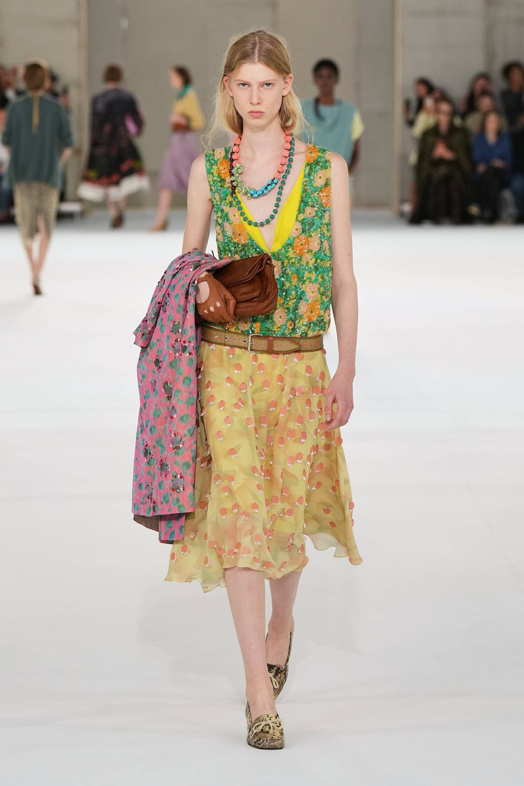
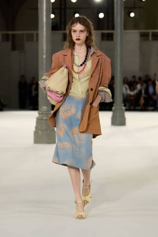
For Spring 2027, Julian Klausner pushed Dries Van Noten toward a lighter, more playful vision of glamour, drawing on 1950s screen sirens, vintage movie posters, saturated color, and the simple pleasure of dressing up. The result was one of his most confident collections for the house yet, balancing nostalgia with an appealing sense of everyday ease.
Creative Director: Julian Klausner
House: Dries Van Noten
Collection: Spring/Summer 2027
Presented: Paris Fashion Week
Reviewed by: Angela Baidoo
The Impression Review Score by Kenneth Richard: 9.3
View the Collection
In all his collections before today, where there was no argument that Julian Klausner was a worthy successor to the Dries Van Noten name, not one has come close to eliciting such a unanimous wave of positivity as spring 2027.
As show goers left the venue there were several joyful exchanges on how good the show had been, offering as it did an alternative point-of-view on everyday dressing. That view being from the 1950s, where a diet of daily dresses and sophisticated separates were given a shot of the Van Noten treatment to make a day-in-the-life of a Hollywood actress instantly desirable.
THE COLLECTION
THE VIBE
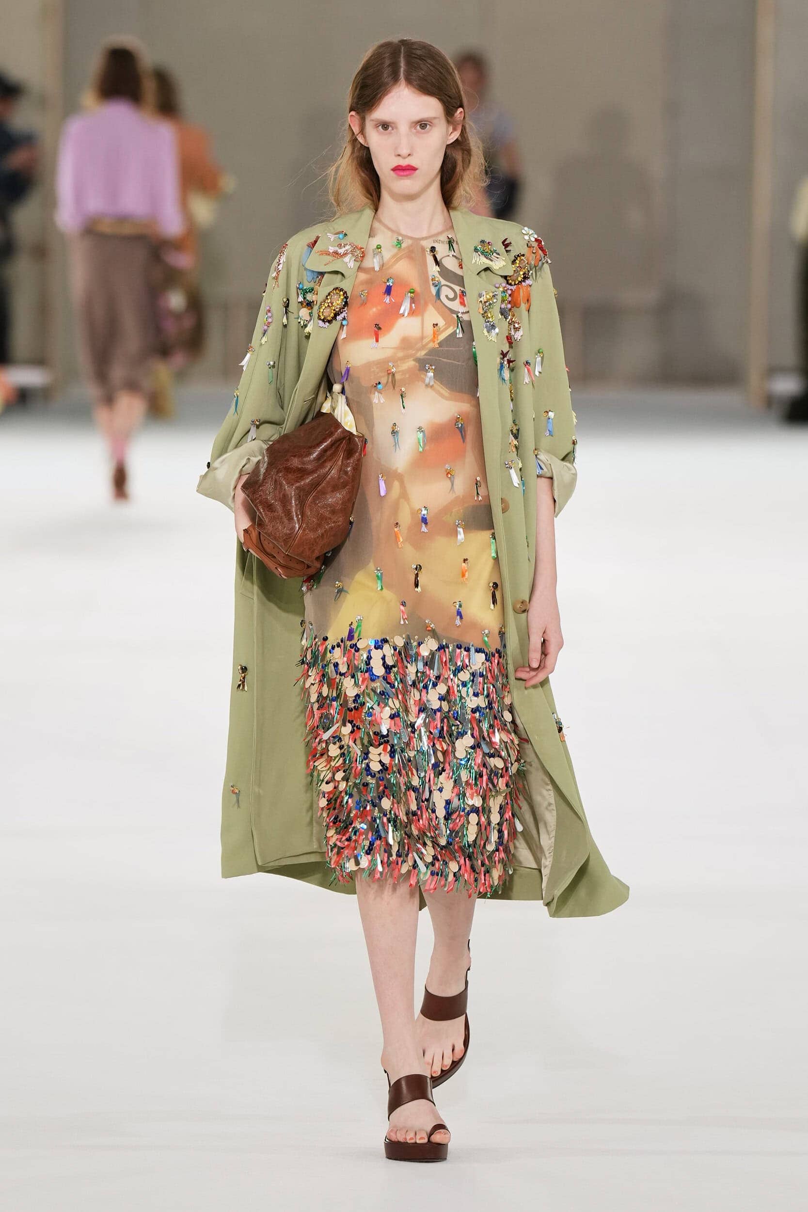
Unrolling the show invitation that arrived in a poster-sized tube did in fact reveal a movie poster advertising the upcoming film noir ‘Lacquera and Lace.’ It was of course a tongue-in-cheek faux film directed by Julian Klausner, styled by Robbie Spencer and releasing on, when else, but today’s show date. It was a well thought-through keepsake to accompany a show that won’t easily be forgotten.
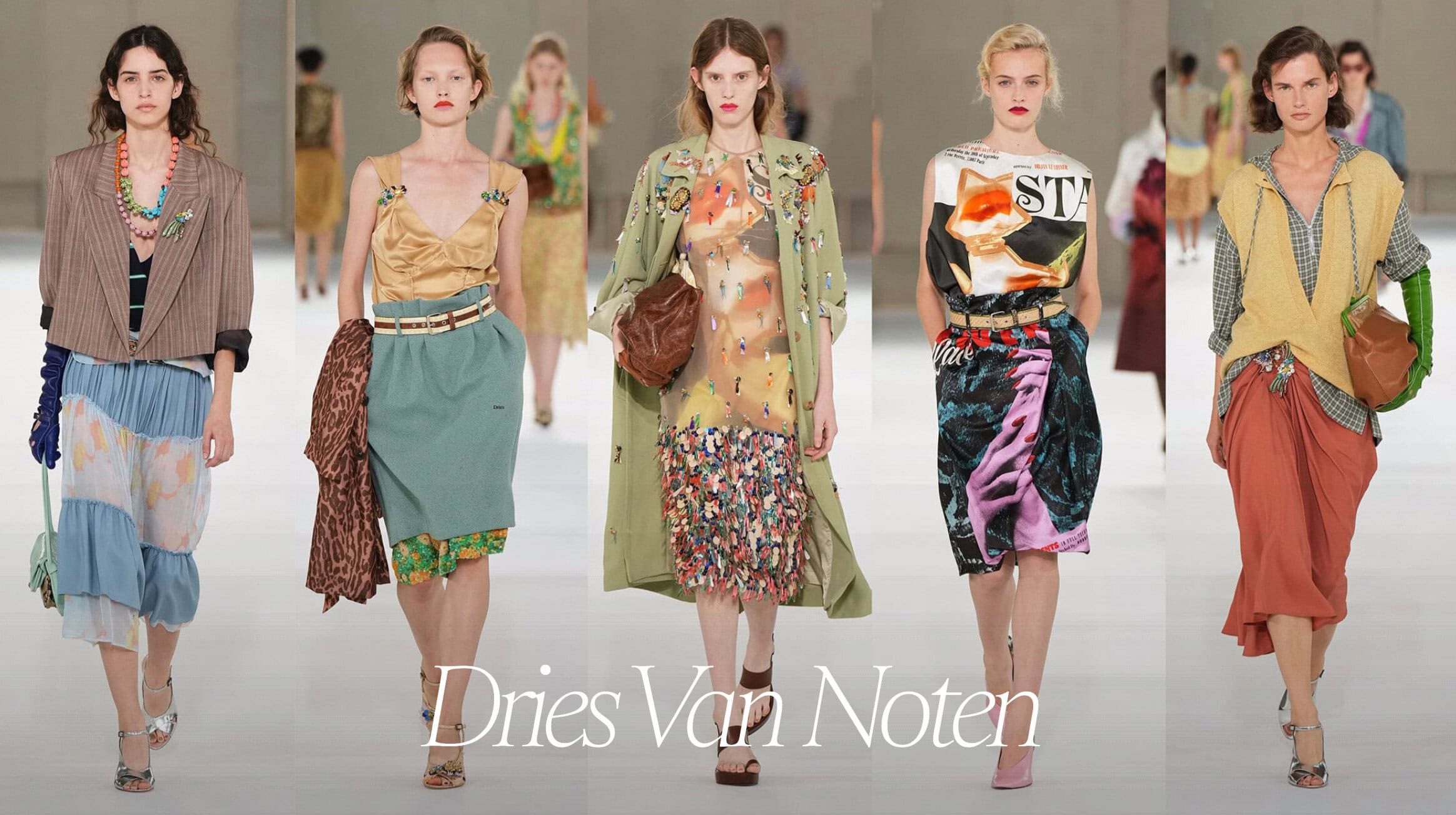
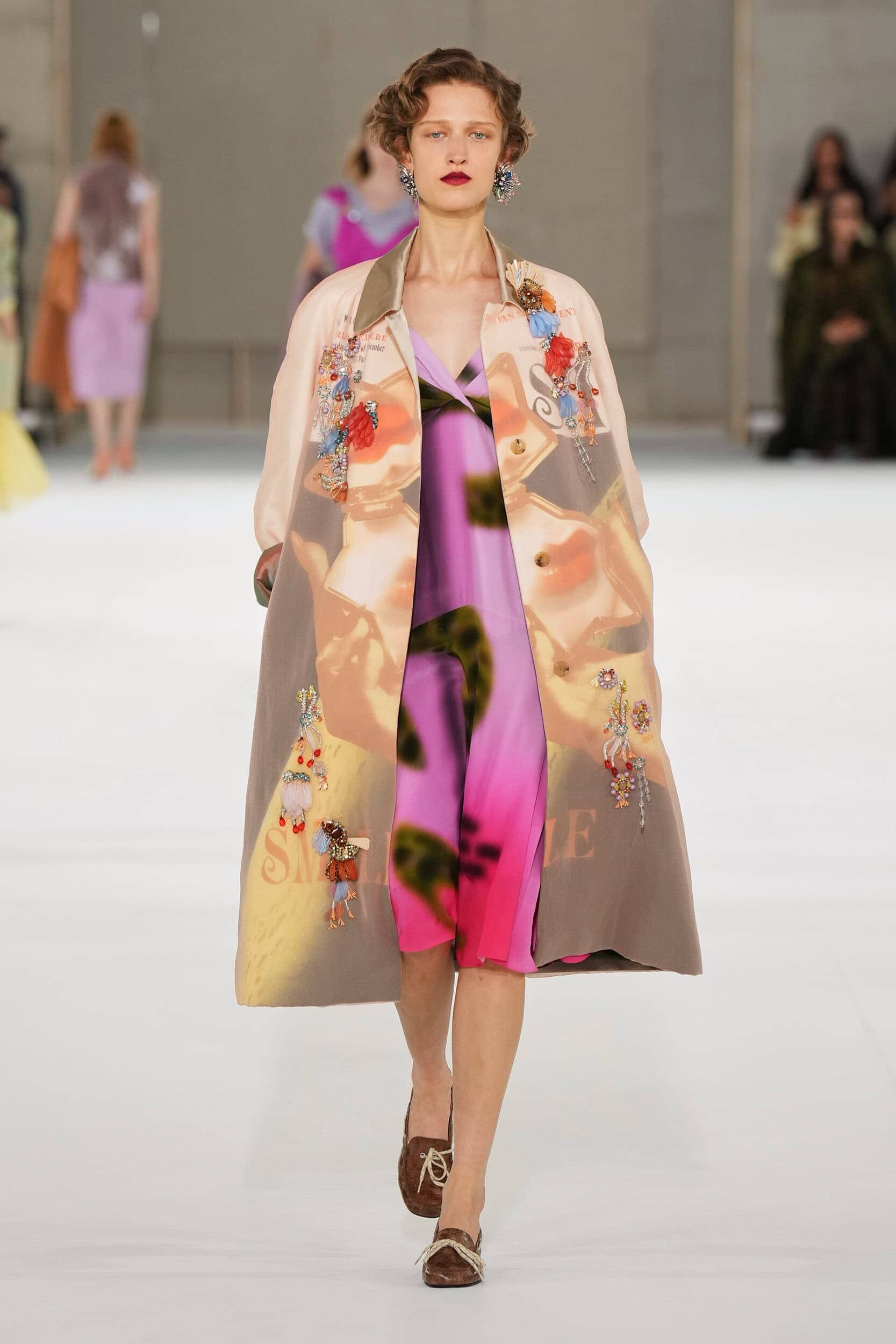
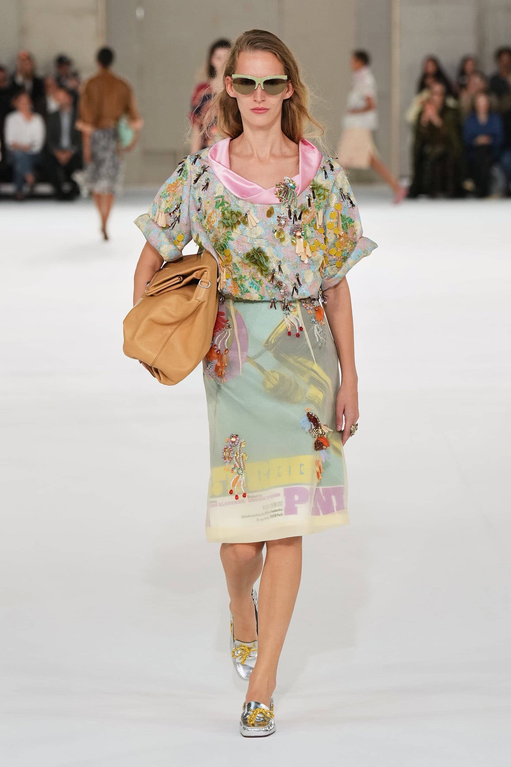
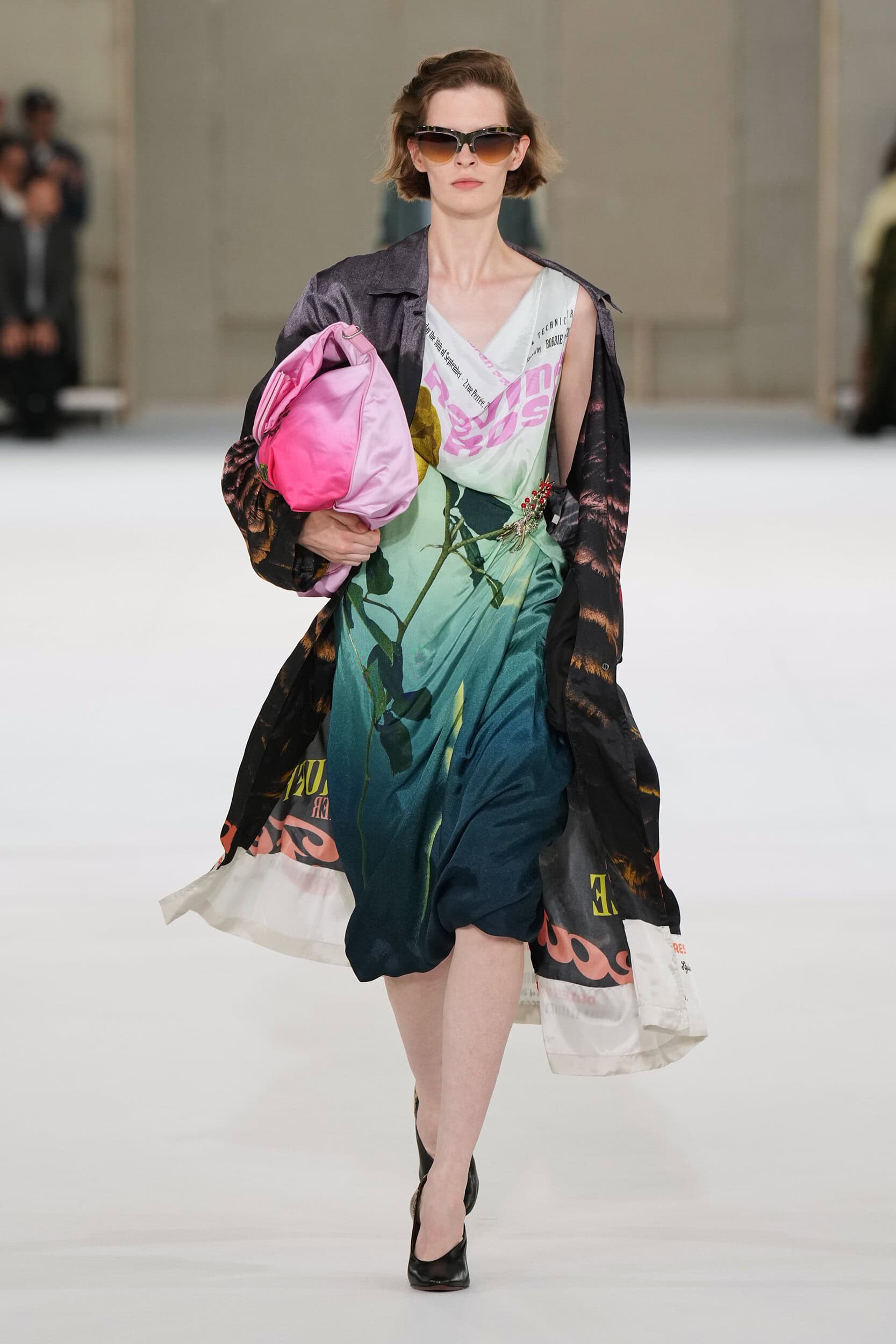
There will be those who may have been secretly disappointed that we won’t have the pleasure of watching a Dries Van Noten production anytime soon, but what the designer did provide were several versions of film posters, eight in total, used as the graphic print for satin-draped dresses and sheer overlaid pencil skirts. Movie memorabilia for the modern age.
‘The Joy of Dressing’ – that long forgotten emotion designers are encouraging us to reignite – was top of mind for Klausner. Who was thinking on the innocence of pure unadulterated glamour, when a string of pearls and opera gloves were never too much for the school run. Or at least they wouldn’t have been for the 1950s A-list actress the designer was channeling.
This collection was about remembering what it felt like to get dressed up just for yourself, and he made that task all to easy as one-after-the-other the deliciously Dries outfits paraded across the vast runway soundtracked to the hum of daily city life. Not the clinking of cocktail glasses or the flashing of (camera) lightbulbs on the red carpet. The casual approach was deliberate he said, a way to ease women back into glamour “In winter, we had something very linear and it was much more severe. This time it was much more casual. I wanted it to be glamorous and feminine and light, and not too serious.”
Sack dresses and shirts were almost folded around the body, graphic T-shirts were influenced by vintage band iterations and worn under floral dresses, and rugby tops were layered with striped button down shirts. The palette looked back to the fifties with their sugary pastels and garishly good brights that referenced the Las Vegas strip “We looked at the colors of the ’50s and ’60s: lemons, a kind of jade green, and then a lot of Las Vegas colours, but it was about playing with new color combinations and seeing mixes that felt satisfying.”
In his pursuit of glamour, all roads were always going to lead to the movies and its main medium of advertising – the poster – which Klausner admired for its ability to distil a 90-minute feature into a single image “I like to look at movie posters as a kind of art form. It’s a very specific graphic language. Especially in the ’50s, it’s the whole story in one image. You get the climax of the movie in one picture.” And in his own mini-movie the cast of characters were a charming mix of how you might wish to get dressed everyday of the week, with a dose of skewed imperfection, a cluster of jewels, and a channeling of your favourite movie star.

THE WRAP UP
This collection wasn’t about achieving the polished perfection of a Grace Kelly or Doris Day, this was about glamour that felt slightly undone. As was the case in the fifties – which many of the silhouettes referenced – the messiness of the reality behind the white picket fence was always more intriguing than the polished veneer.
Here is where Klausner had fun playing in that metaphorical dressing up box “A tight belt, a tight glove, putting on something sparkly. I love a brooch because you can glamorize anything else that’s in your wardrobe, as well as wearing a flashy color.” And in messing with the magic, he could very well ignite a movement for collections that celebrate the joy of dressing.