Review of Golden Goose Spring 2026 Ad Campaign
Golden Goose introduces its Marathon Speed sneaker for Spring 2026, marking its global rollout after an initial release in Asia. The campaign positions the silhouette within a narrative of movement and endurance, drawing on references to 1970s American track culture while reinforcing the brand’s established codes of wearability and distress.
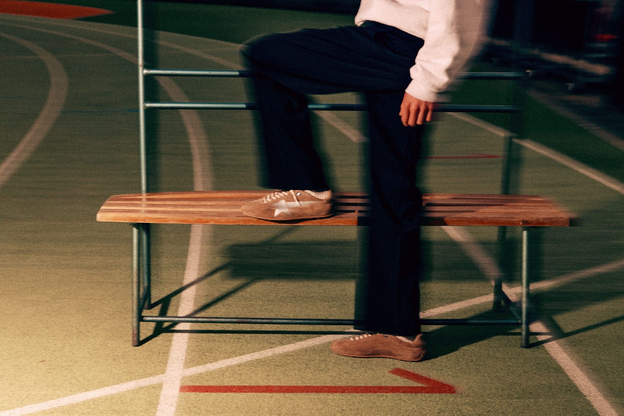
Visually, the campaign departs from Golden Goose’s typical sun-faded, lifestyle-oriented imagery, instead situating the models on a running track under low, artificial lighting. The atmosphere is deliberately unsettled—motion blur, grain, and off-kilter framing create a sense of instability that mirrors the idea of constant forward movement. This shift toward a more cinematic, almost nocturnal energy introduces a tension that feels more aligned with performance than leisure, though it occasionally borders on stylization for its own sake.
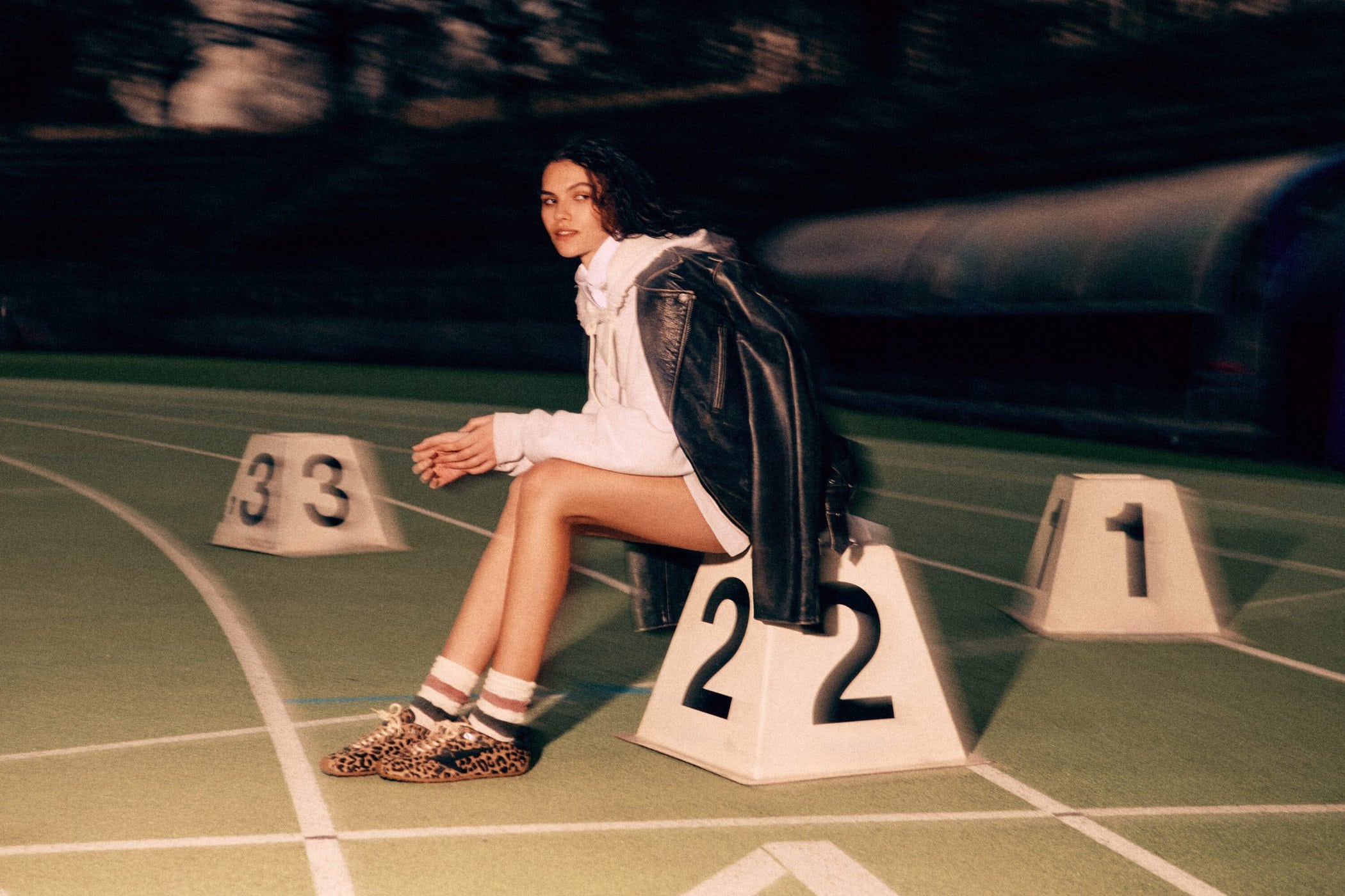
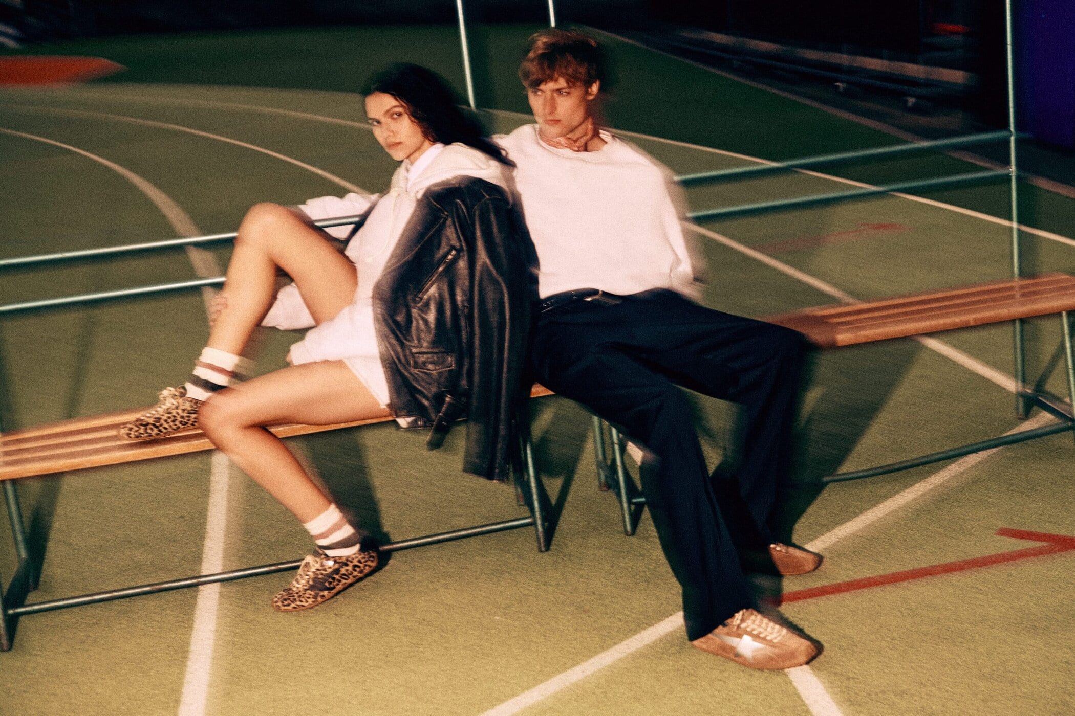
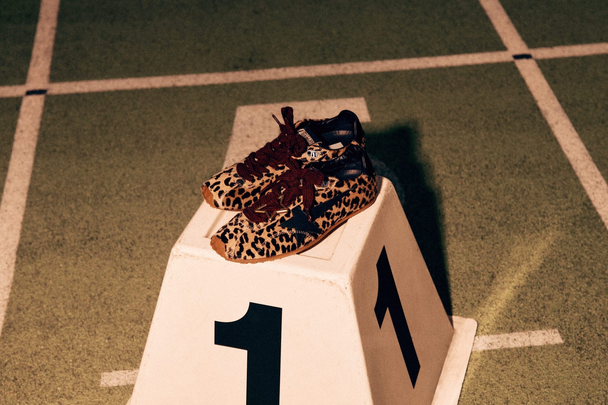
The sneakers themselves remain the focal point, with the campaign emphasizing material contrasts and surface treatments. The leopard-print ponyhair version stands out as the most visually assertive, its pattern amplified by the saturated tones of the track. In contrast, the tobacco suede iteration offers a quieter alternative, while the black nappa leather version leans into the brand’s signature distressed finish. Across all variations, the trekking-style laces and star motifs reinforce Golden Goose’s hybrid approach—part athletic reference, part pre-worn luxury signifier.
Styling leans into a pared-back, almost transitional wardrobe: oversized sweatshirts, leather outerwear, and minimal layering. This restraint allows the footwear to dominate, but also contributes to a certain uniformity across the images. The casting reflects a gender-neutral approach, aligning with the product’s positioning, though the interactions between models feel secondary to the visual treatment of motion and texture.

Conceptually, the campaign’s framing of the sneaker as a metaphor for life’s “marathon” is clear but familiar. The language of perseverance and individuality has long been central to Golden Goose’s branding, and while the Marathon Speed introduces a new silhouette, the underlying narrative remains largely unchanged. The Co-Creation element—offering customization through charms, laces, and embellishments—adds a layer of personalization, though it is not strongly integrated into the campaign imagery itself.
Overall, the campaign presents a cohesive extension of Golden Goose’s identity, translating its distressed aesthetic into a more kinetic visual environment. While the track setting and motion-driven imagery introduce a degree of freshness, the concept remains within the brand’s established framework. The result is a campaign that is visually distinct in tone, yet conceptually consistent to the point of predictability.