The Art of Disturbing the Familiar
Review of Michael Kors Collection Spring 2027 Fashion Show
By Mackenzie Richard Zuckerman
There is a peculiar difficulty in assessing Michael Kors at this point in his career. Few designers working today possess a vocabulary quite so immediately legible: the immaculate coat, the languid trouser, the precise blazer, the sliver of skin against black jersey, the ease of American sportswear elevated through cashmere, glamour, and the suggestion of somewhere better to be. Kors has spent more than four decades refining that language, and its consistency is both an extraordinary achievement and, increasingly, the source of its most obvious critical vulnerability.
The question, then, is no longer whether a Michael Kors collection looks like Michael Kors. Of course it does. Nor should relevance require a designer to abandon the codes that made his work distinctive in the first place. The more compelling question is whether those codes are still capable of generating surprise.
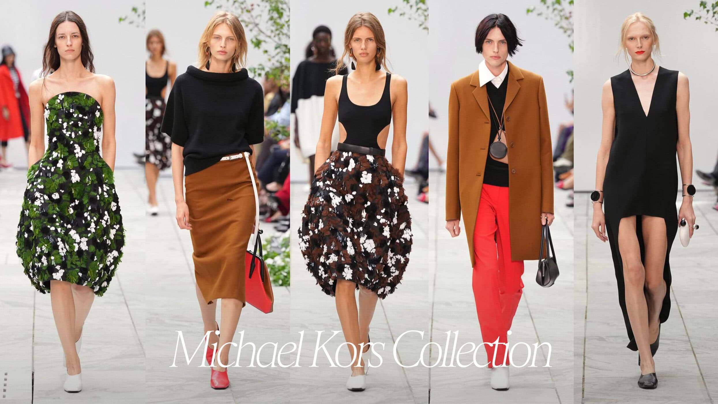
For Spring 2027, Kors seemed unusually conscious of that challenge. Staged at New York’s Museum of Modern Art, within MoMA’s sculpture garden, the collection drew on the work of Carmen Herrera, Alexander Calder, and Ellsworth Kelly, taking many of Kors’s most familiar components and subjecting them to a subtle but meaningful disturbance. This was not reinvention so much as recomposition: a Kors collection in which polish was repeatedly interrupted by asymmetry, graphic color, suspended planes, swollen volumes, and an eccentricity that felt less resort-bound than art-world adjacent.
Spring 2027 was a strong Kors collection: confident, elegant, sharply composed, and full of clothes that understood their woman with typical precision.
THE COLLECTION
THE VIBE
Modernist Polish, Art-World Sportswear, & Controlled Disruption
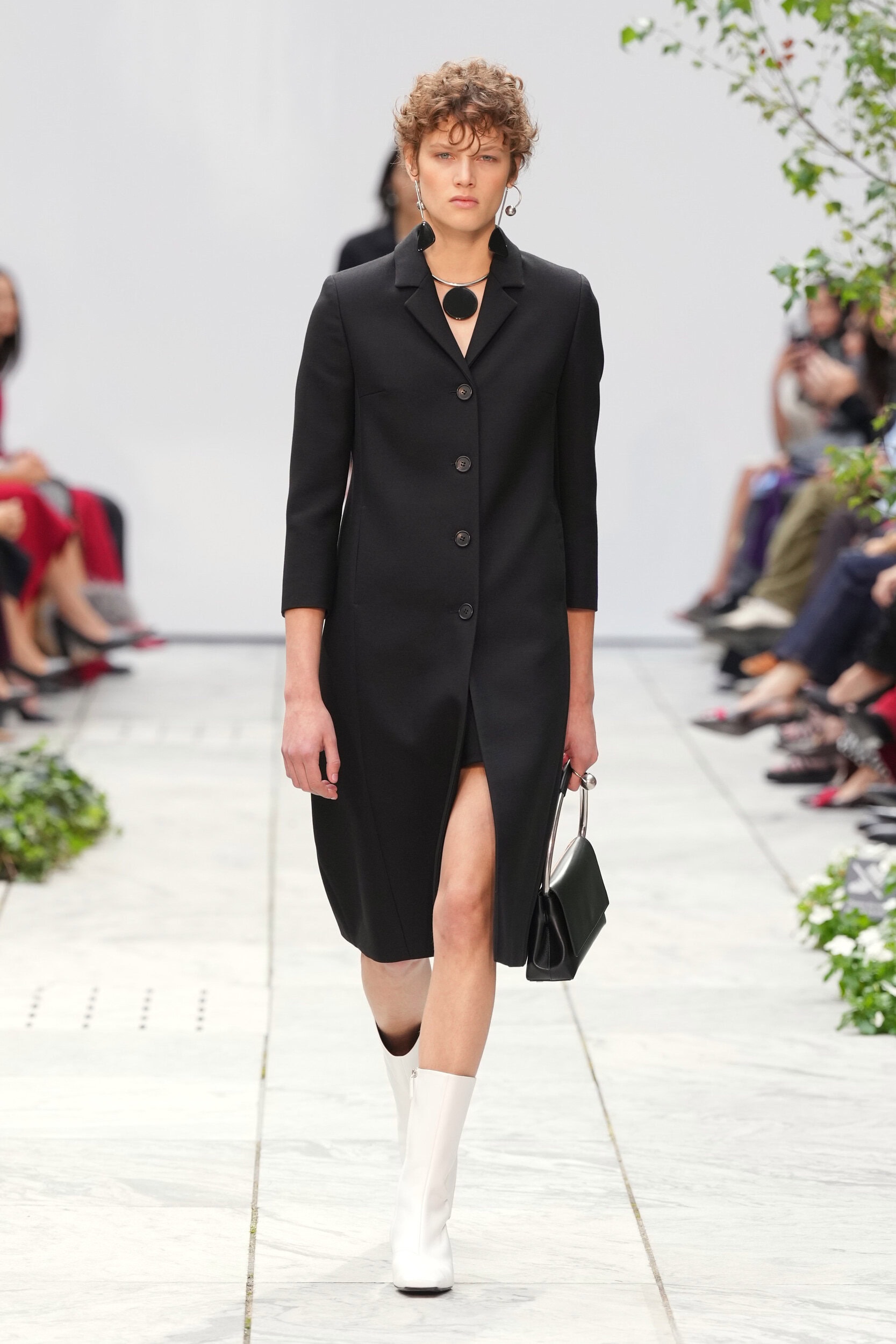
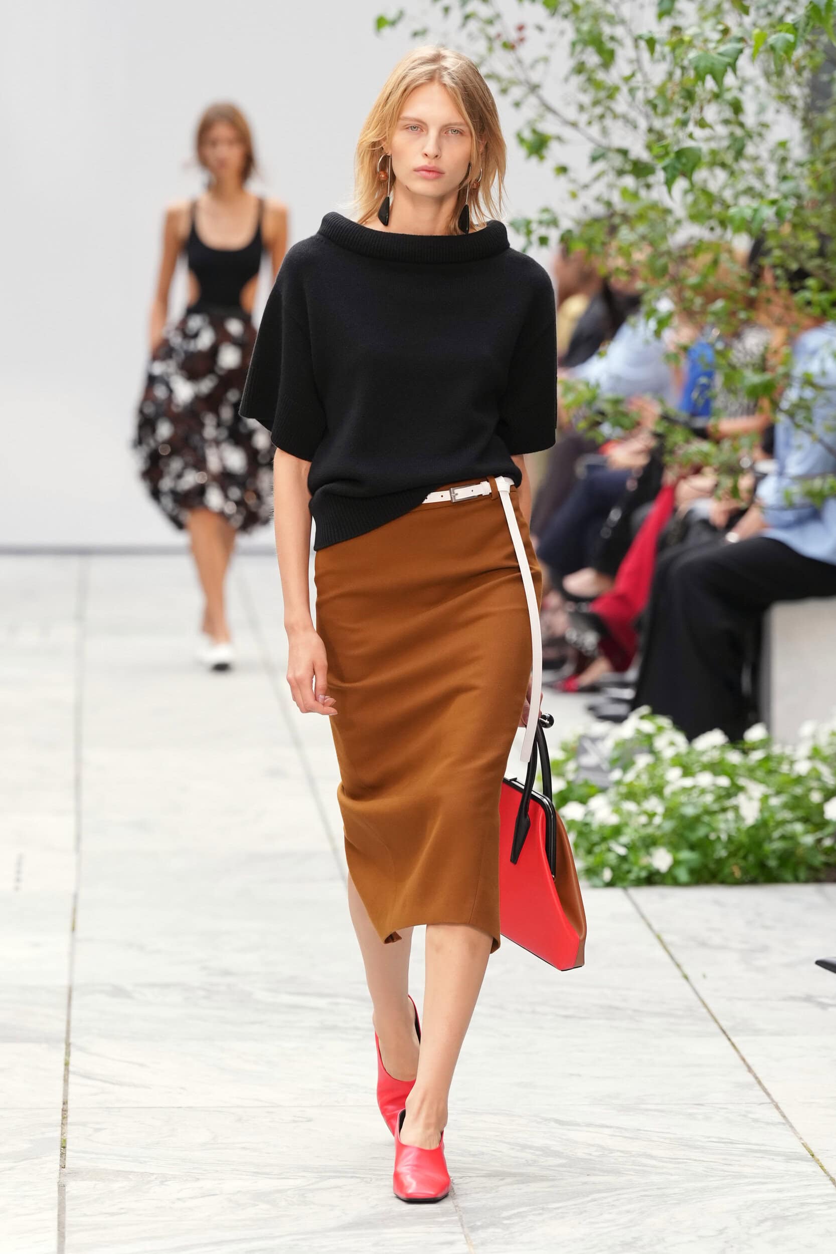
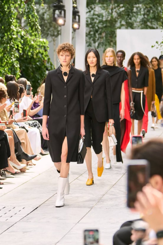
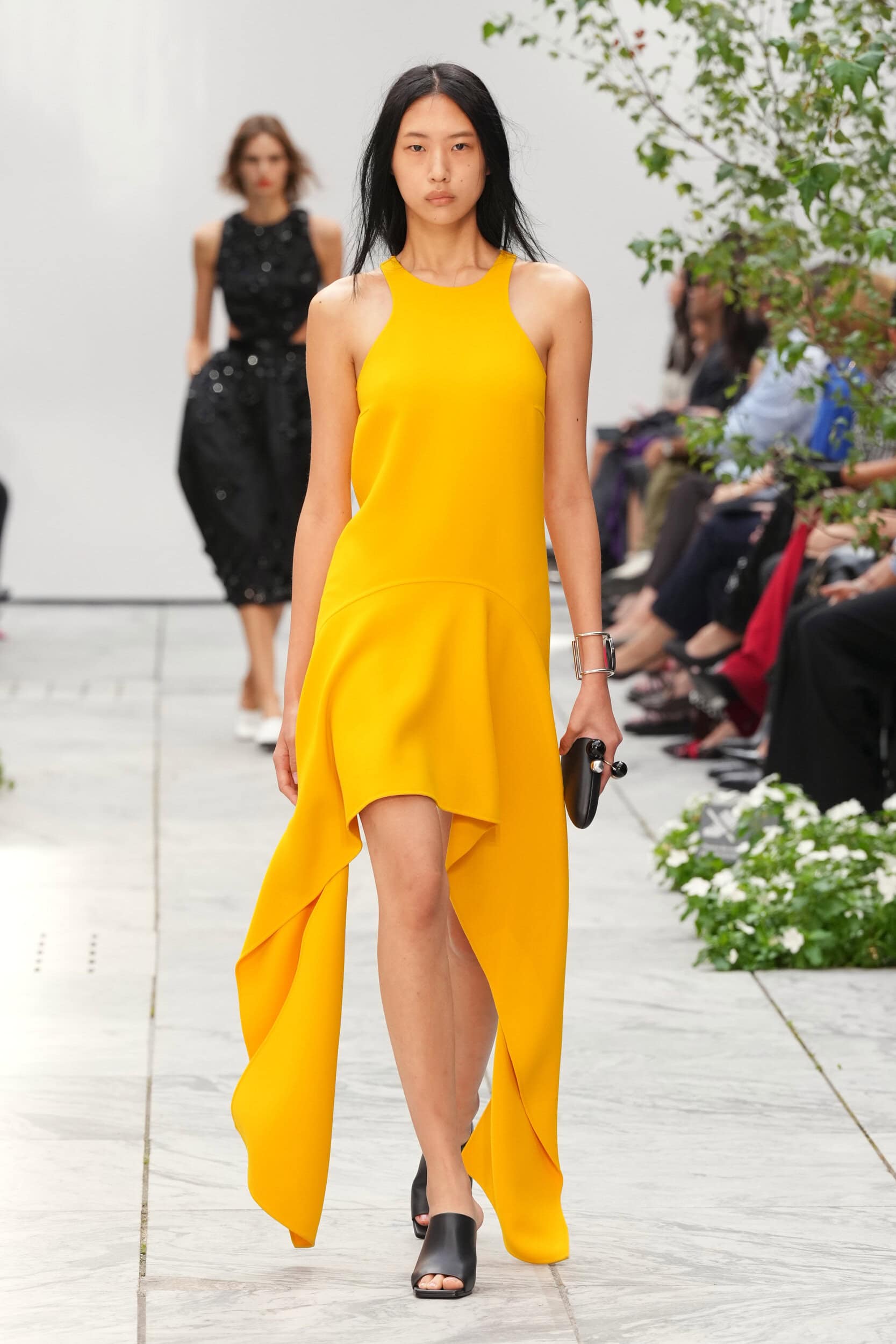
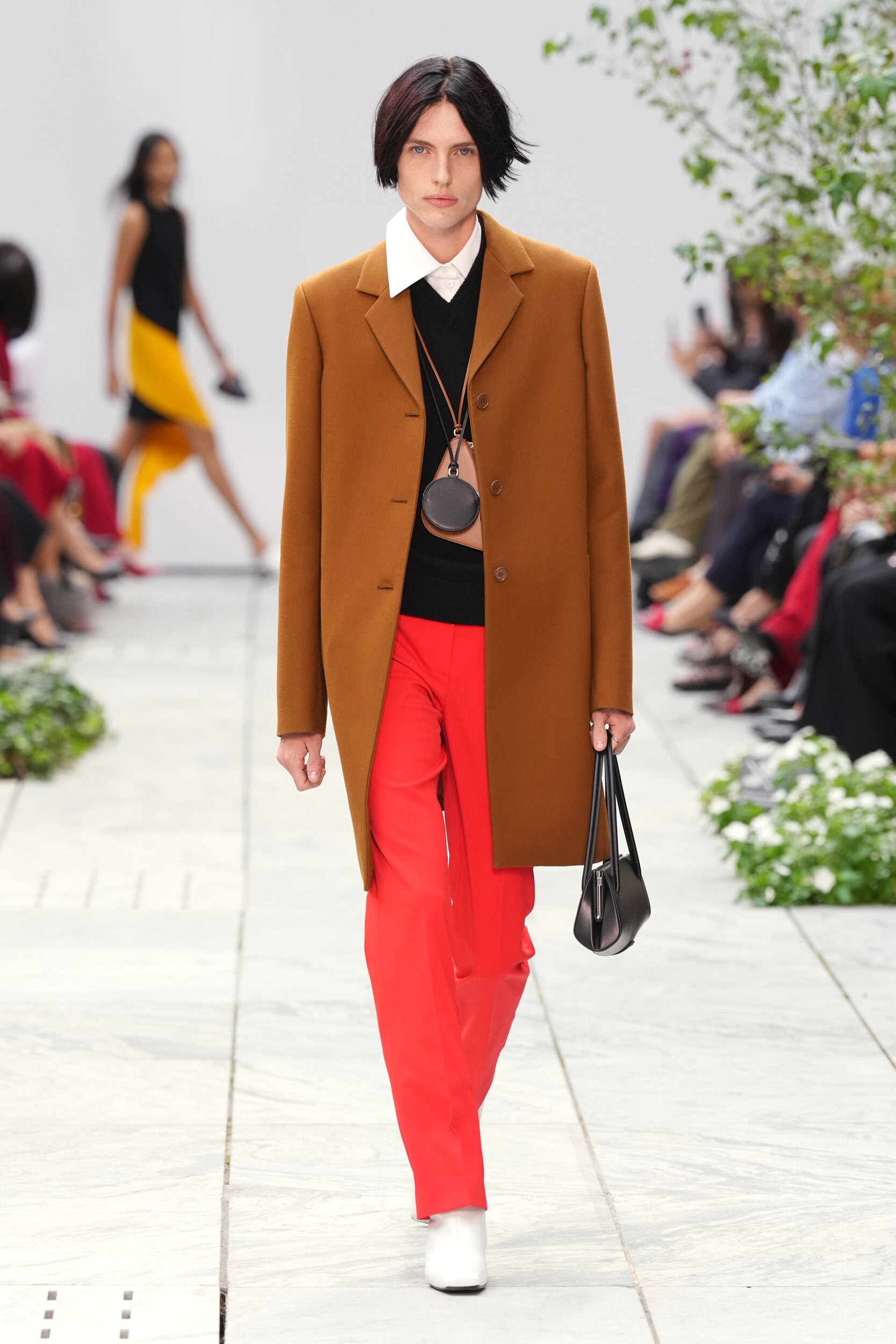
Kors has often built collections around destinations: Capri, Palm Beach, Aspen, New York. His jet-set ideal depends on movement, but also on a recognizable fantasy of affluence. Here, place receded somewhat in favor of composition. Black and white established a severe ground onto which Kors placed red, green, yellow, cobalt, and tobacco brown with painterly deliberateness. Color rarely dissolved gently into the clothes. Instead, it arrived as an object: a yellow shoe beneath a black suit, red trousers against a brown blazer, a sharp green skirt suit, a sudden plane of red interrupting black.
The artists Kors referenced offered more than a library of recognizable motifs. Each provided a different way of reconsidering form. Herrera’s hard-edged reductions found an echo in garments divided into sharply articulated planes; Kelly’s interest in figure, ground, and the visual weight of pure color appeared in those isolated fields of red, green, yellow, black, and white; Calder’s experiments with balance and motion could be felt in trailing panels, asymmetric hems, and volumes that appeared to pull away from the body.
Taken together, their influence was most convincing not when Kors made clothes that looked like modern art, but when modernist thinking changed how the clothes occupied space. That distinction is important.
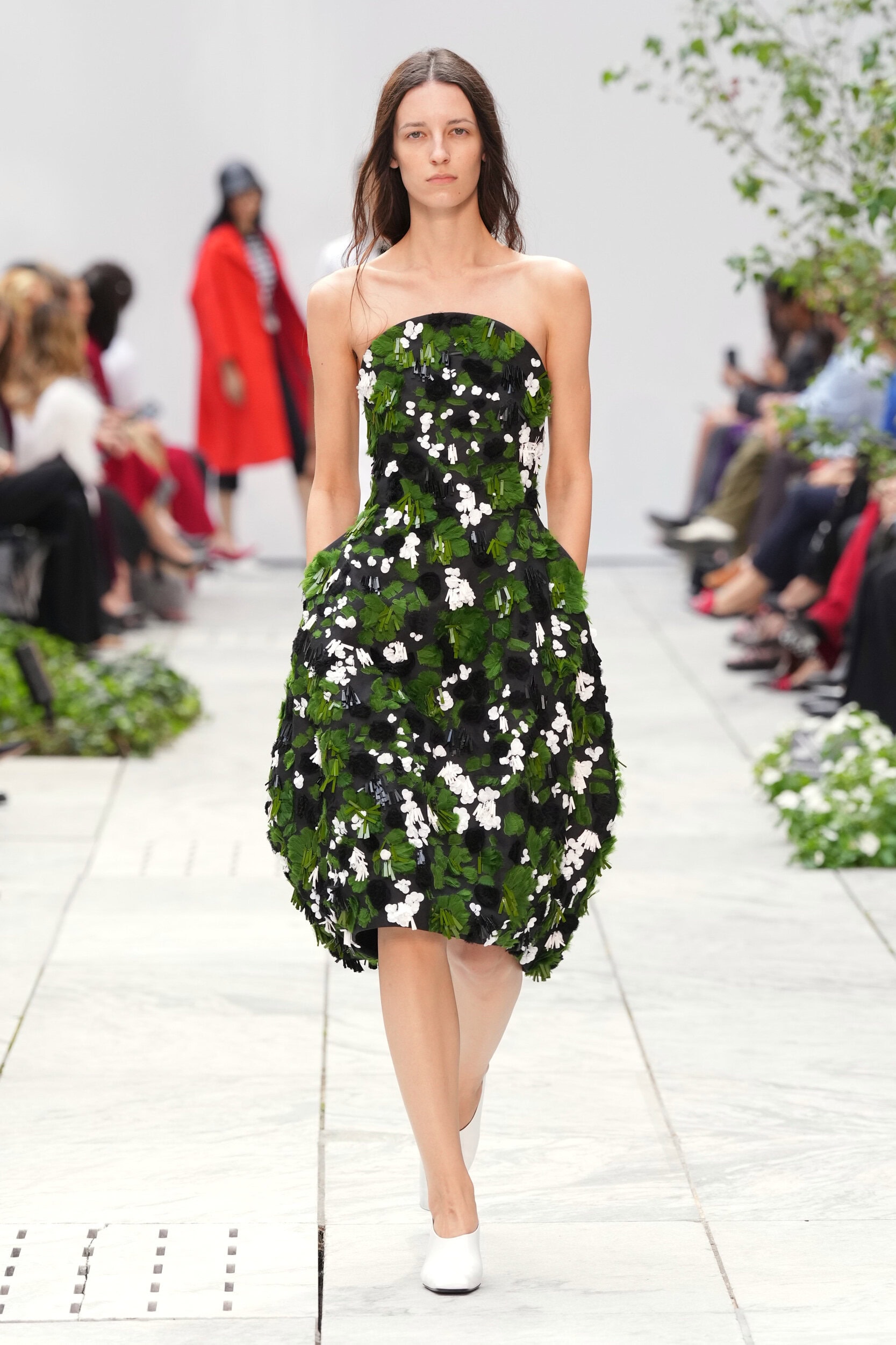
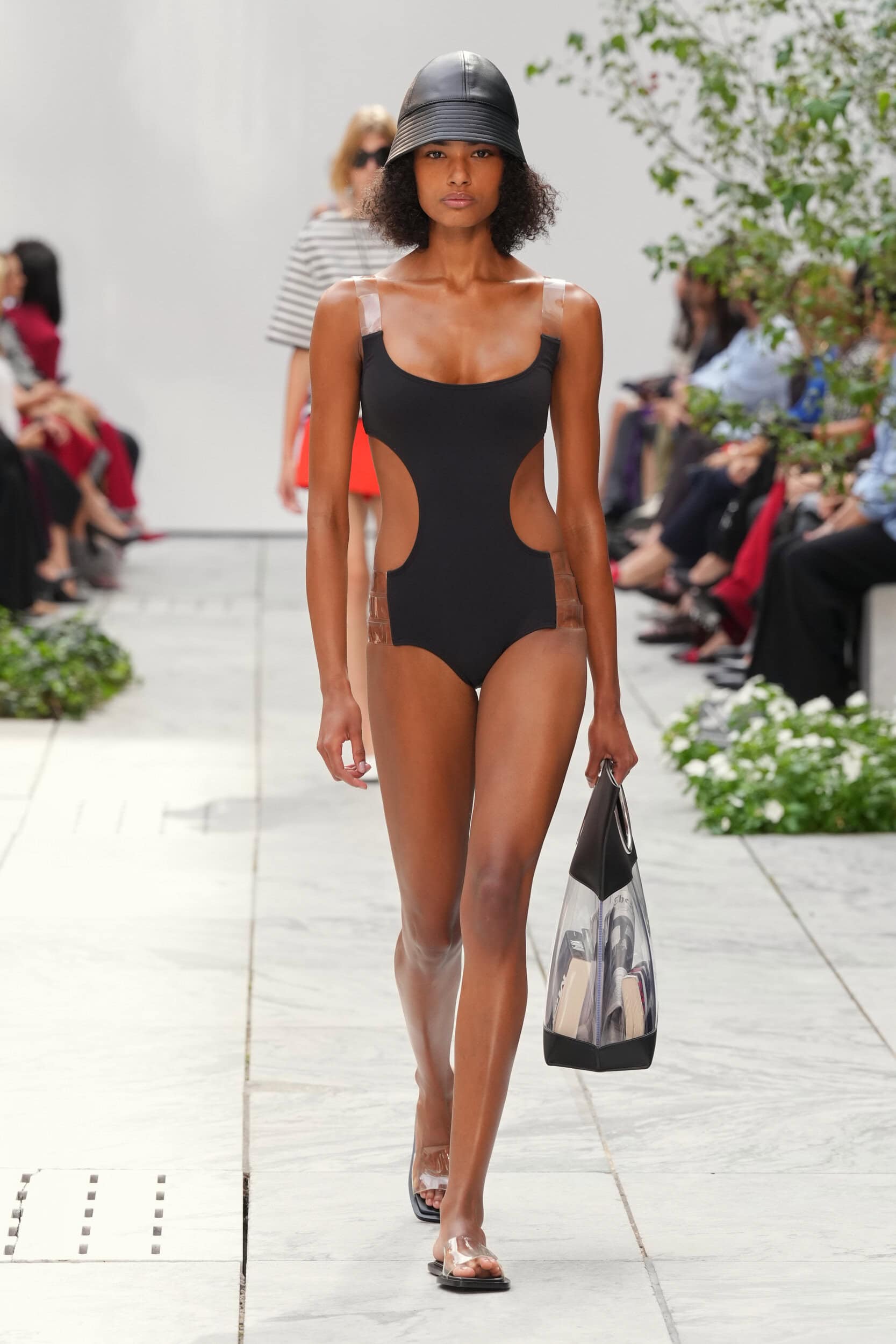
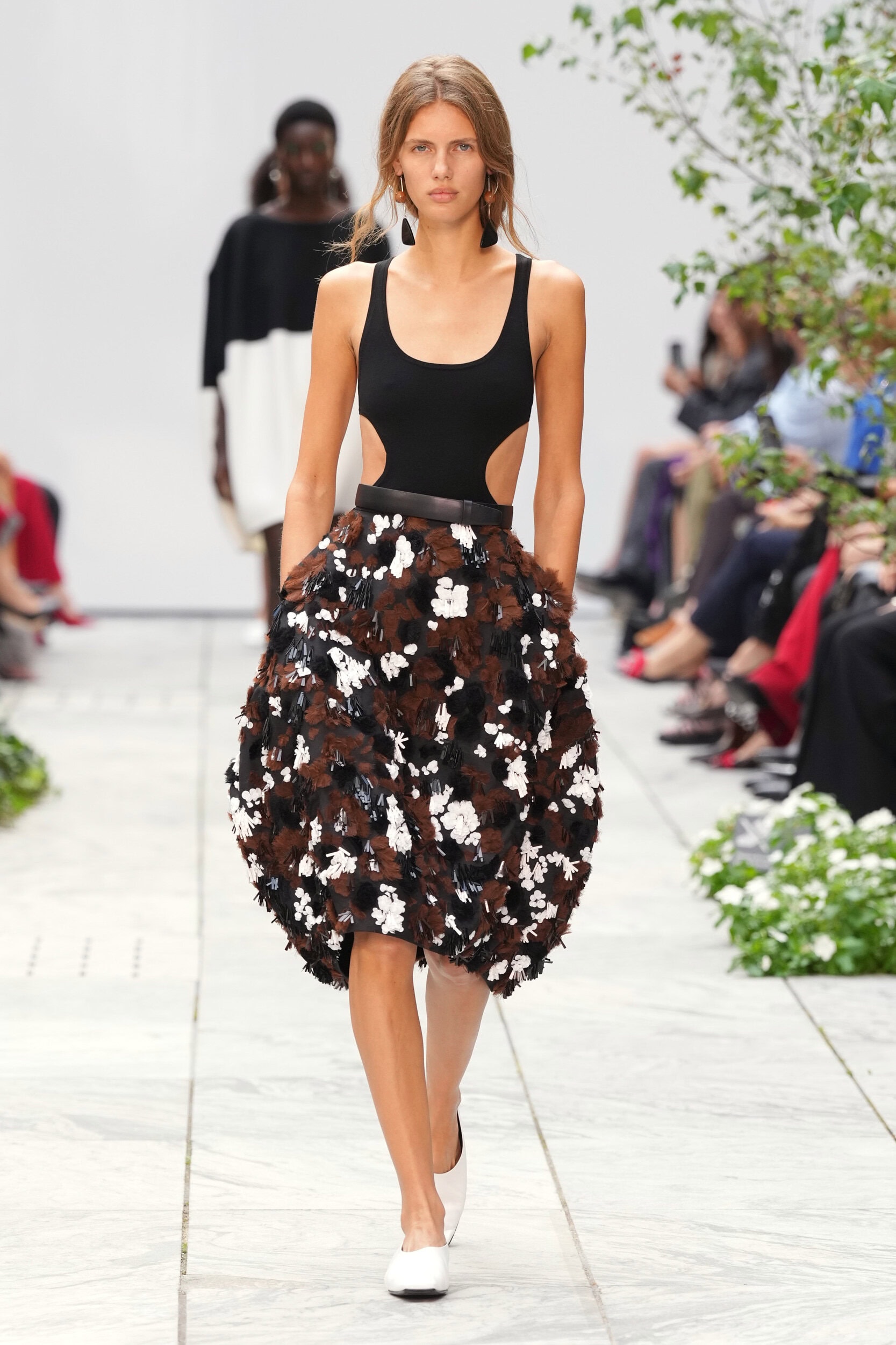
A clean black dress extended unexpectedly into a long trailing panel. Skirts were interrupted by wedges of contrasting fabric or pulled off balance through uneven hems. Familiar day dresses swelled outward into rounded, almost lantern-like forms. Scarves and asymmetric overlays appeared to hover away from the body rather than simply decorate it, while cutouts carved negative space from otherwise straightforward evening columns.
There was something particularly Herrera-like in the way the collection treated the meeting point between one plane and another. In several looks, the division of the garment became the design itself: black meeting white at a hard angle, a red section breaking the line of a dark dress, a contrast panel reshaping the outline of a skirt. Rather than decorating a familiar silhouette, Kors allowed the seam, edge, and cut to become active parts of the composition.
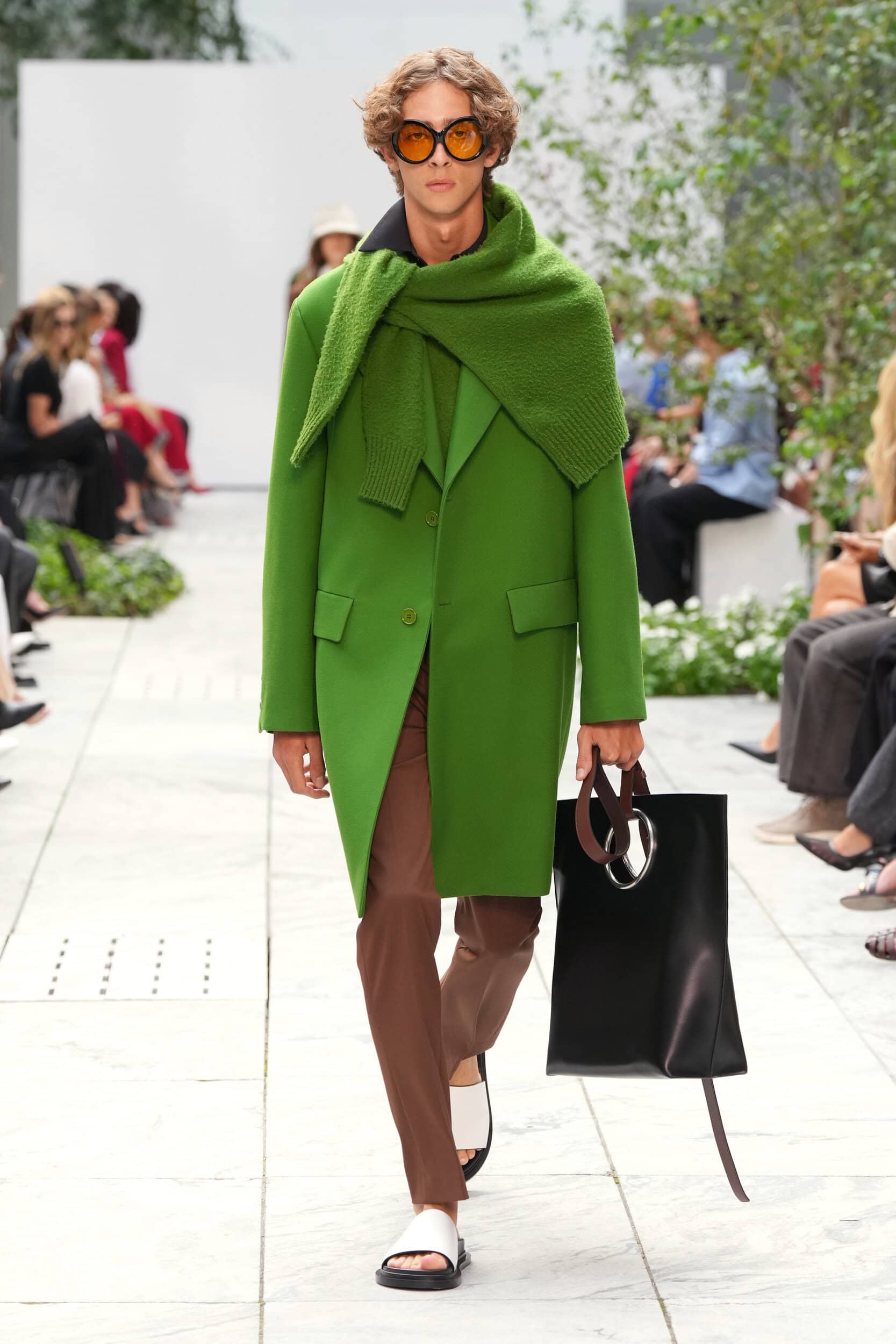
Kelly’s influence could be read similarly through the collection’s handling of color. The red trouser did not need to symbolize anything; its force came from the way that amount of red sat beneath a brown jacket. The green suit functioned almost as a single chromatic shape. A bright shoe beneath an otherwise controlled black look could redirect the entire composition. Color was not simply seasonal embellishment. It carried visual weight.
Calder, meanwhile, seemed to provide the collection with its sense of movement. Kors repeatedly set something anchored against something trying to escape it: a fitted bodice against an expanded skirt, a clean column against a trailing panel, severe tailoring against fabric that floated or projected away from the body. There was an idea of counterweight running through the strongest looks, as though the garment were being considered not simply as something worn on the body, but as something negotiating the space around it.
None of these gestures amounted to radical experimentation, but they were significant precisely because Kors has always been a designer drawn toward resolution. His clothes tend to settle beautifully into themselves. They know where the waist belongs, where the hem should stop, and exactly how much glamour is enough. Spring 2027 allowed a few things to remain deliberately unresolved.
That may be the most meaningful thematic connection to the artists themselves. Herrera, Kelly, and Calder all reduced art, in different ways, toward elemental relationships: color against color, shape against ground, mass against space, stability against movement. Kors, too, seemed to strip away some of his habitual storytelling here. Rather than asking where the Kors woman was traveling this season, he appeared more interested in what might happen to the familiar blazer, trouser, skirt, or column dress when its symmetry, proportion, or balance was disturbed.
For a designer whose collections can sometimes change the scenery around an essentially stable wardrobe, that shift matters.
There were, of course, moments when the art references remained more literal. Painterly patterns and textured surfaces occasionally read as art translated into motif rather than art translated into design. They were attractive, but less persuasive. Placing an abstract print onto a recognizable Kors sheath does not fundamentally alter the Kors vocabulary. Changing the relationship between body, fabric, proportion, and movement does.
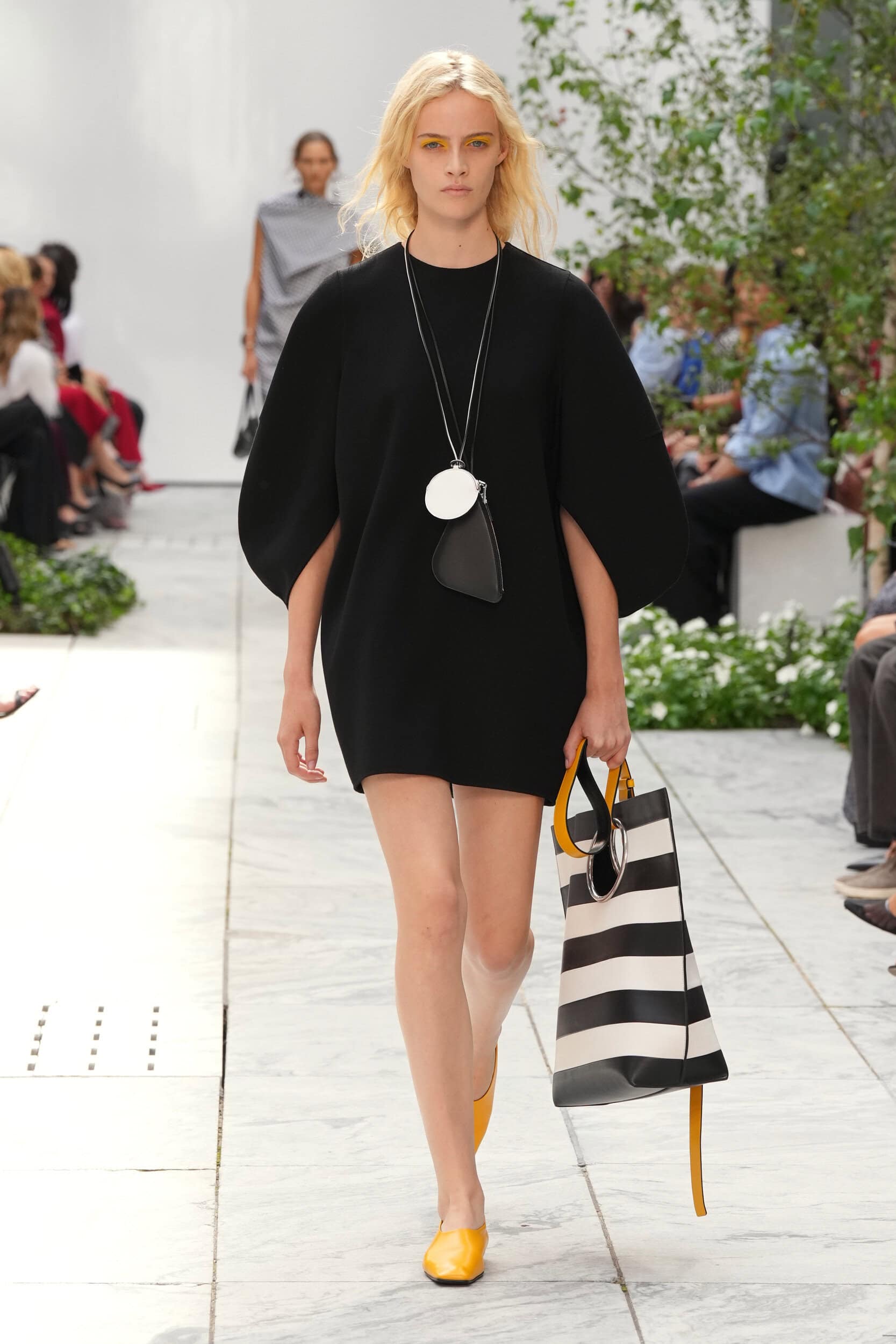
There was also a subtle shift in the woman inhabiting these clothes. She remained recognizably Kors: polished, affluent, practical, assured. But she seemed slightly more eccentric than usual. Bucket hats, oversized circular pendants, tinted eyewear, striped rugby knits, brightly colored shoes, and deliberately unexpected combinations introduced an almost intellectual-preppy character. She felt less immediately bound for a yacht than for an exhibition opening.
That strand worked particularly well because it grew from another tradition already native to Kors: American collegiate sportswear. Collared shirts, Bermuda shorts, blazers, pleated skirts, polos, and straightforward separates appeared throughout, but they were repeatedly knocked slightly out of alignment. A conservative brown jacket was sharpened by primary color. A striped knit met a dimensional formal skirt. A prim white collar surfaced beneath something graphic and severe.
It was polish acquiring personality.
And perhaps that is where the collection’s most productive tension lies. Kors has never had difficulty making desirable clothes. What he has occasionally struggled to provide is friction. His instinct is to reconcile opposing ideas beautifully: masculine and feminine, glamour and practicality, sportswear and evening, extravagance and ease. But when every contradiction is resolved too completely, the clothes can become frictionless.
Spring 2027 allowed some of that contradiction to remain visible.
Not everywhere. There were still stretches of familiar territory: straightforward tailoring, clean sheaths, slim black evening dresses, and highly wearable separates that could plausibly belong to several recent Kors seasons. But the collection worked because Kors knew exactly how far to take the disturbance while still preserving the assurance of his world. Even its awkwardness remained tasteful; even its eccentricity came carefully edited. The remaining question is whether future seasons might allow that tension to go further still.
There is an interesting tension there. The designer’s greatest strength has always been his ability to recognize the precise point at which fantasy becomes wearable, eccentricity becomes elegance, and glamour becomes effortless. But that instinct for editing can also stop an idea just as it begins to become truly strange. Here, the rounded silhouettes could have grown stranger, the asymmetries more insistent, the collisions of color less polite. Kors opened the door to disruption, but rarely allowed it to threaten the assured desirability of the clothes.
And yet that restraint is inseparable from what makes his work his own. It also made the collection not only intelligent, but genuinely pleasurable to watch.
THE WRAP UP
Asking Michael Kors to become deliberately ugly, obscure, or confrontational would misunderstand the point of his work. His great strength has always been an ability to make luxury appear uncomplicated. The challenge now is not to abandon that fluency, but to prevent fluency from becoming predictability.
Spring 2027 suggested that the solution may be remarkably close at hand. Kors does not need to stop being Michael Kors, nor does he need to dismantle more than four decades of accumulated identity in pursuit of novelty for novelty’s sake. This was a strong collection precisely because it understood the value of that identity: the ease, polish, glamour, and commercial clarity that have long made his work so persuasive.
Its most compelling moments came when the vocabulary he already owns began behaving unexpectedly. A hem pulled off-center, a volume allowed to swell, a plane of color interrupting the body’s line, a piece of fabric escaping the discipline of an otherwise immaculate garment. These were not radical disruptions, but they gave the collection energy, intelligence, and a welcome sense of play.
For a designer whose authority has long rested on knowing precisely when enough is enough, Spring 2027 showed the continued strength of that instinct. The collection was elegant, desirable, and assured. The next opportunity may lie in resisting that instinct just a little longer, allowing the formula he has perfected to slip, however slightly, further out of balance.