How The Spring 2027 Season Learned to Love Colour: From Optimistic Escapism to Light-Filled Joy and Grounded Neutrality.
By Angela Baidoo
The Spring 2027 menswear collections embraced colour with a renewed sense of emotion, balancing the desire for joyful self-expression with an increasing need for comfort, familiarity and optimism during these turbulent times.
Designers looked to nostalgic references, sun-faded palettes and nature-derived tones to create wardrobes that felt both uplifting and effortlessly accessible. Rather than relying on a single dominant shade, colour was used to build the mood, whether that was through retro-inspired brights, dreamy pastels, rich berry tones more akin to the fall season or the quiet confidence of crisp white and classic black.
Across the season, the strongest colour stories reflected a growing appetite for individuality expressed through either joyful or easeful dressing. Washed finishes softened saturated hues, earthy neutrals brought warmth to technical fabrics, and fresh greens and citrus-infused yellows reinforced fashion’s ongoing dialogue with the natural world. Together, these palettes signalled a shift towards wardrobes that offered a spectrum of colour that can move effortlessly between escapism and everyday versatility.
1. Retro-infused Brights
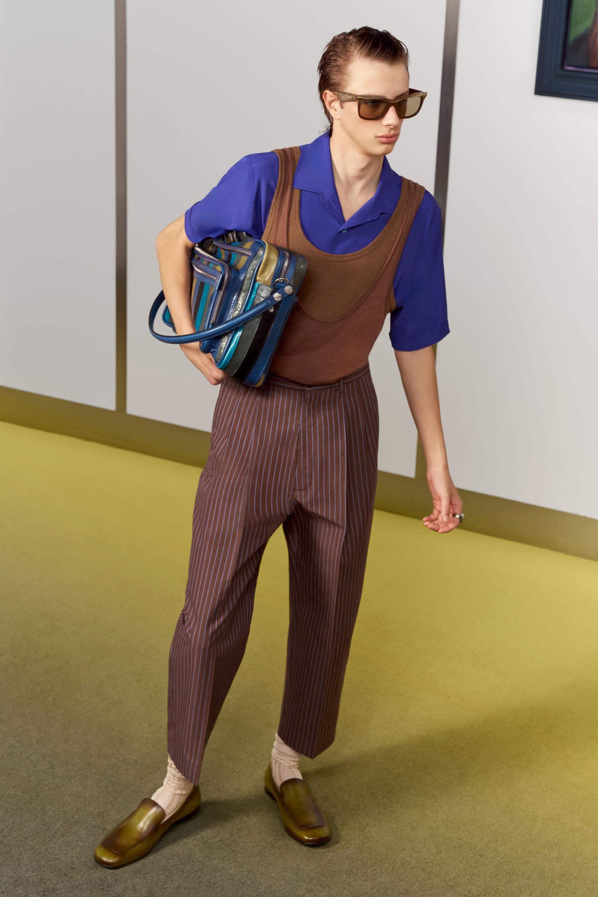
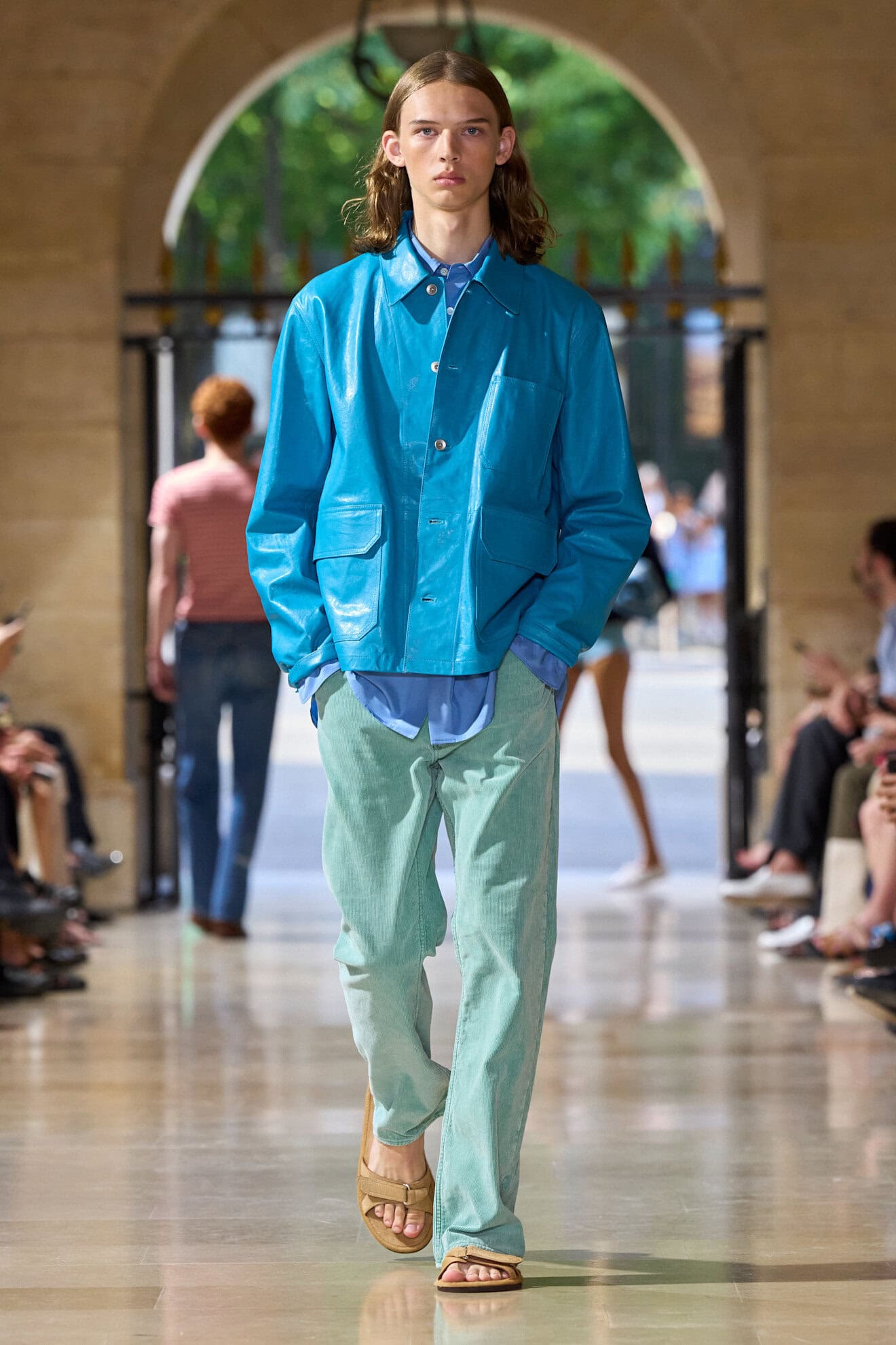
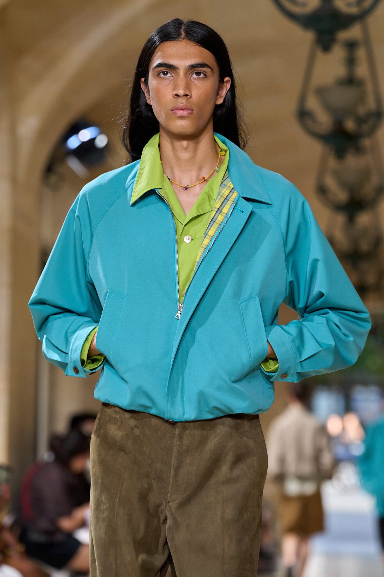
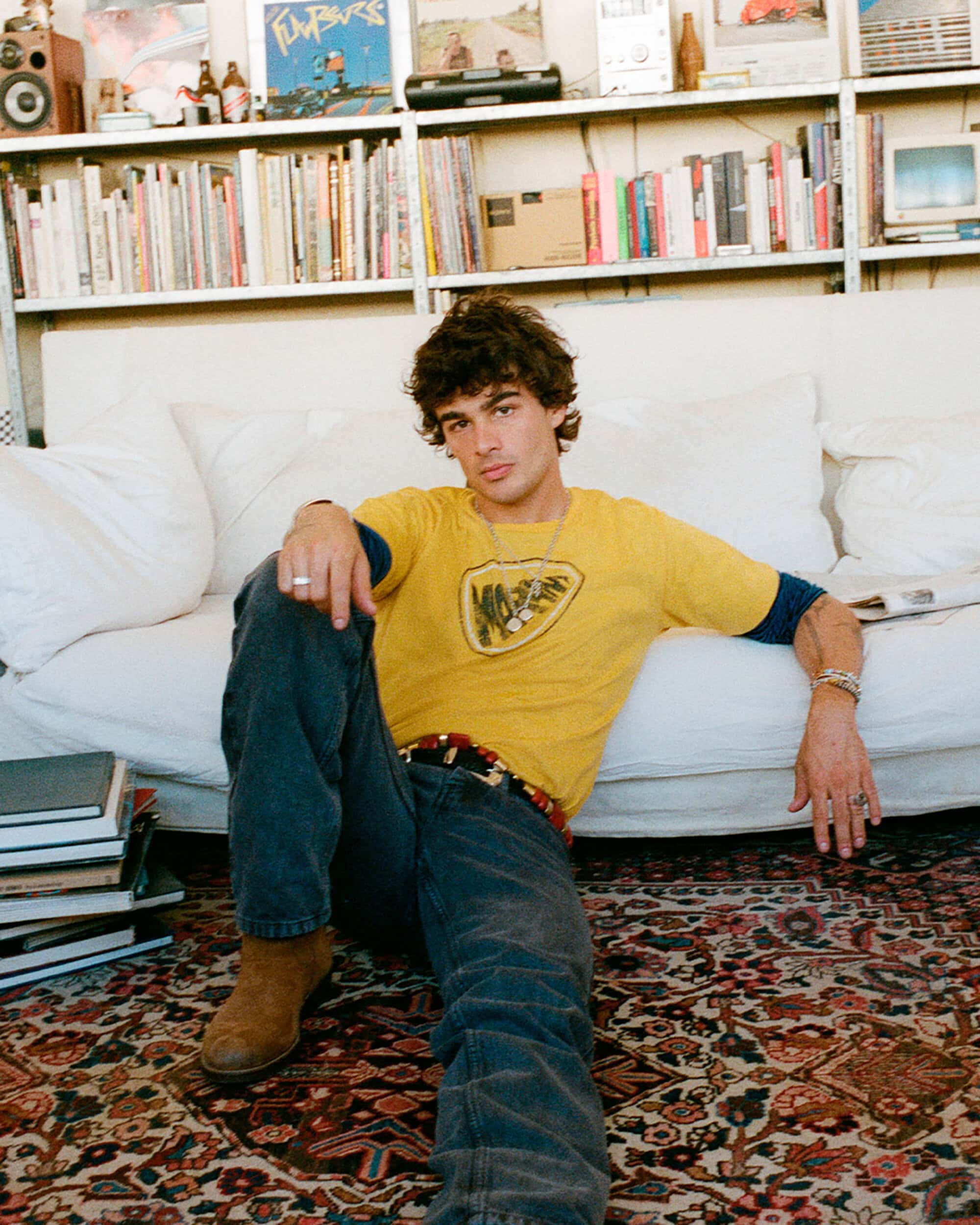
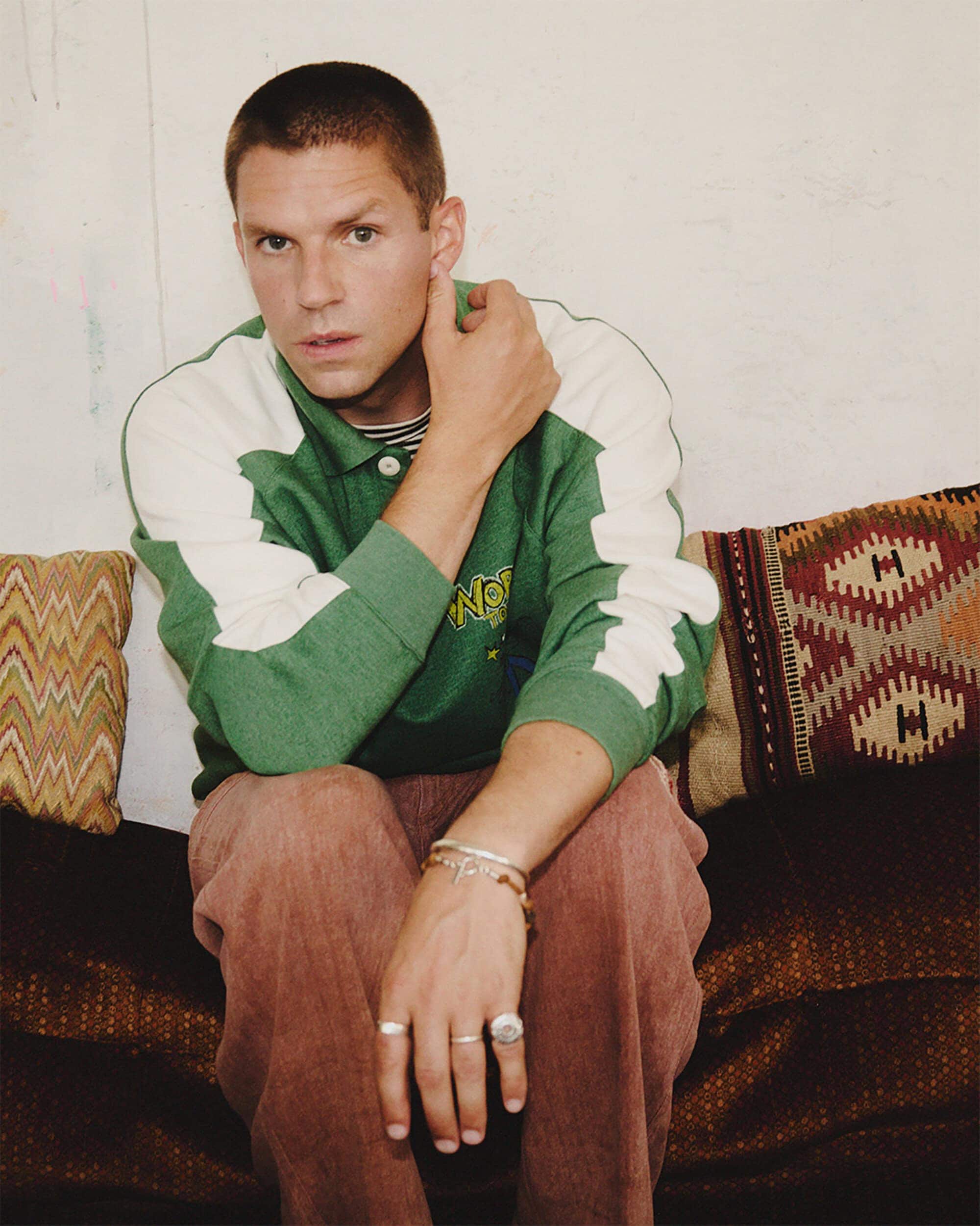
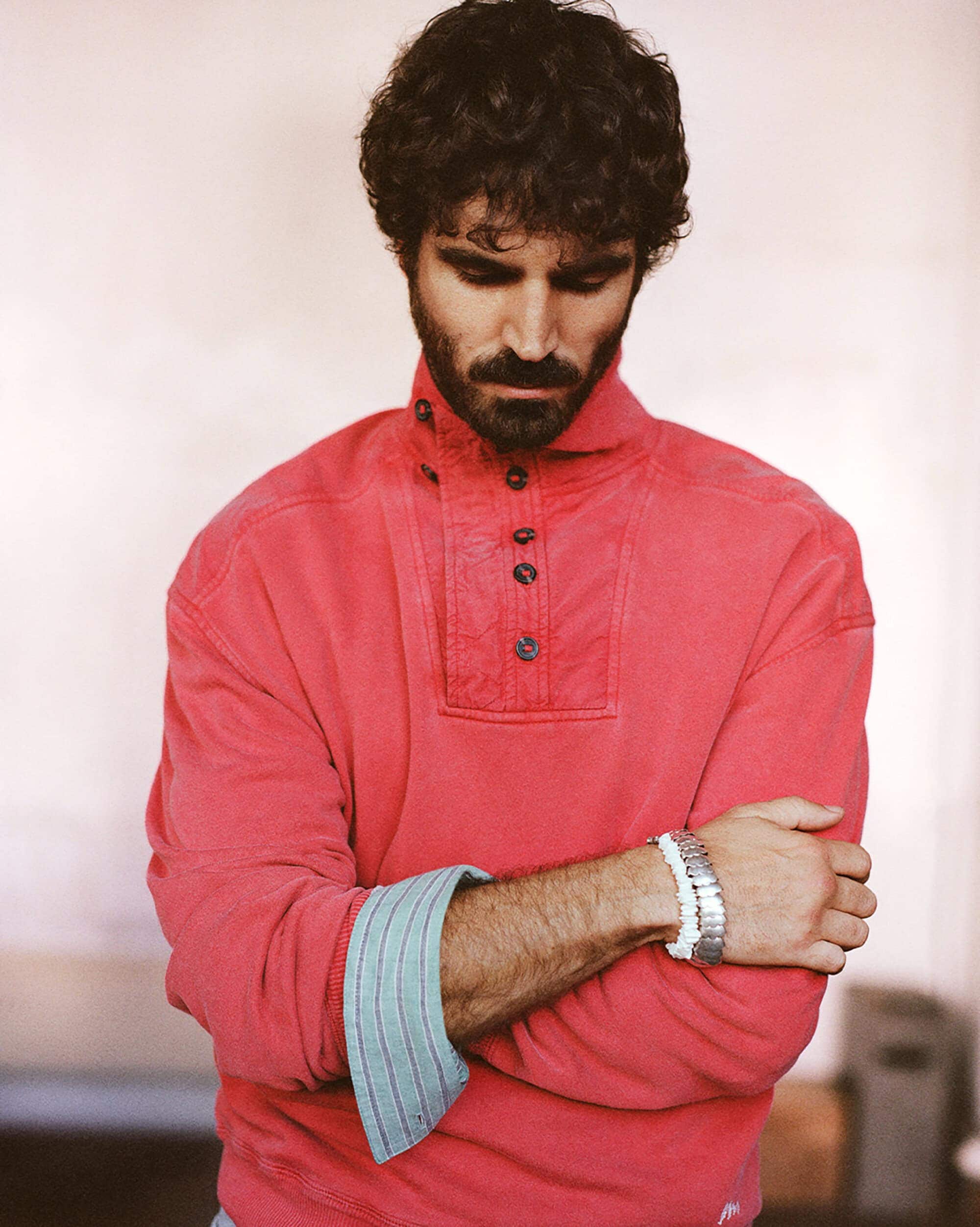
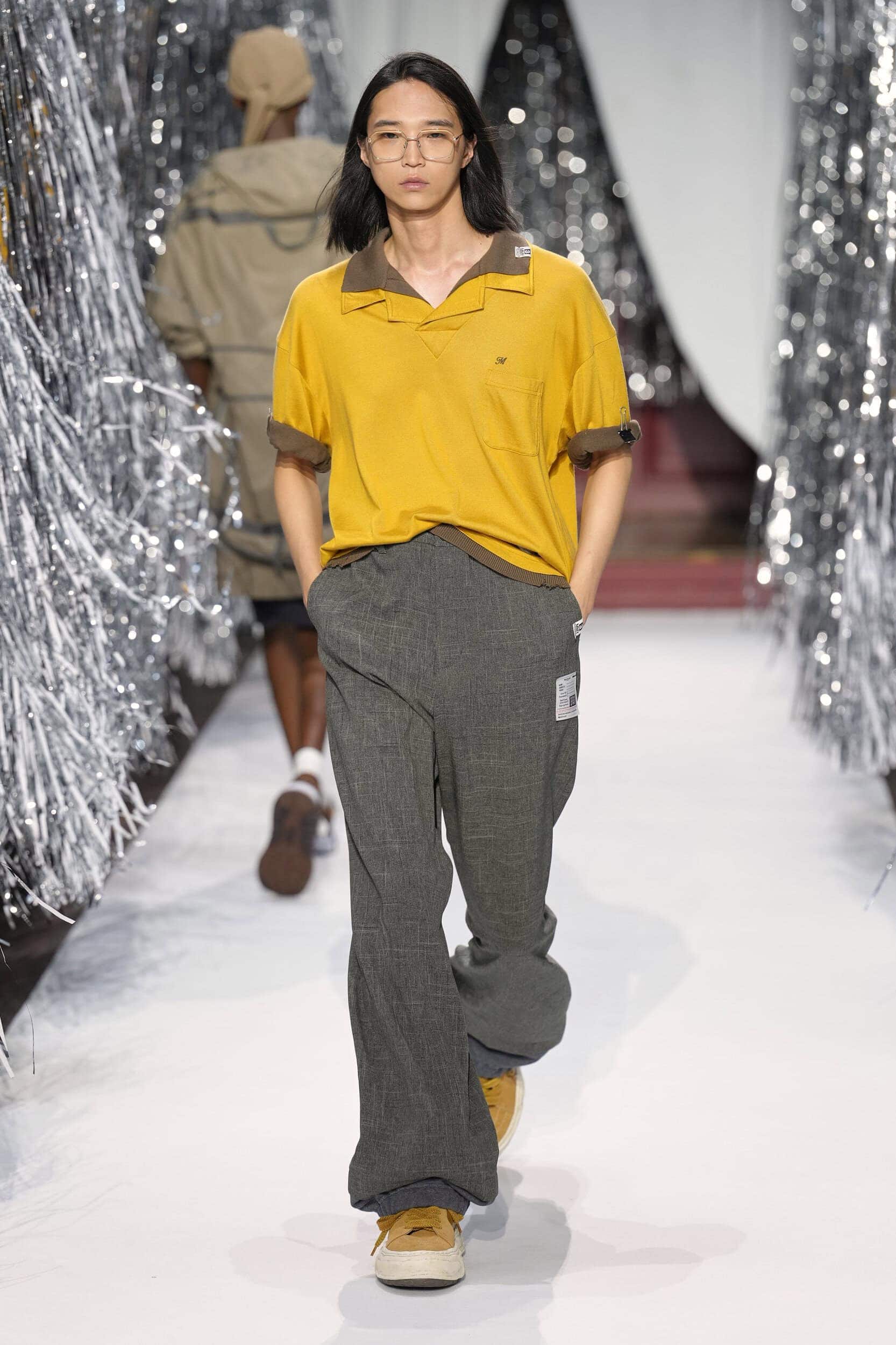
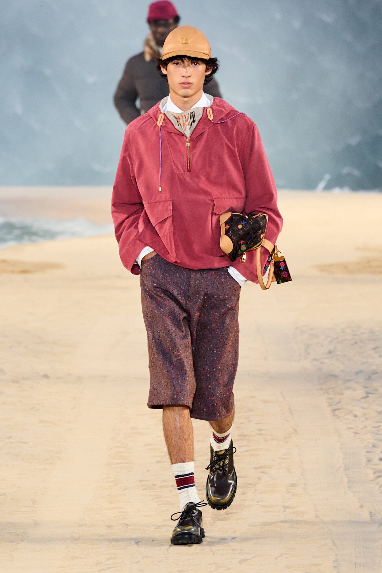
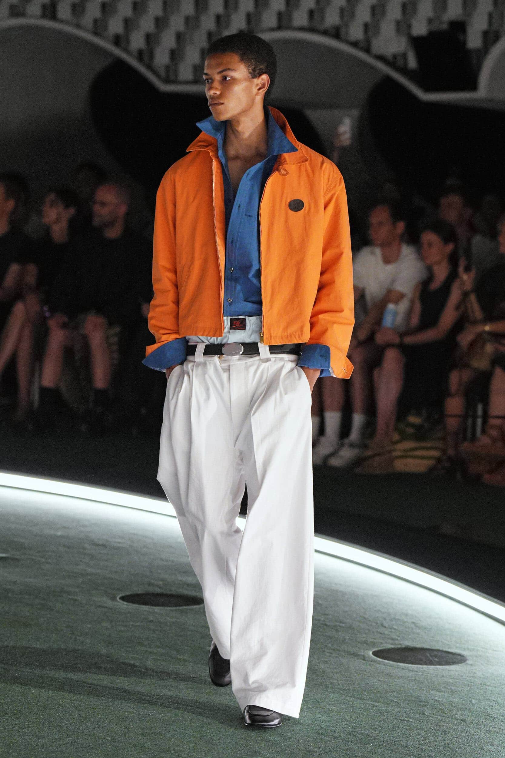
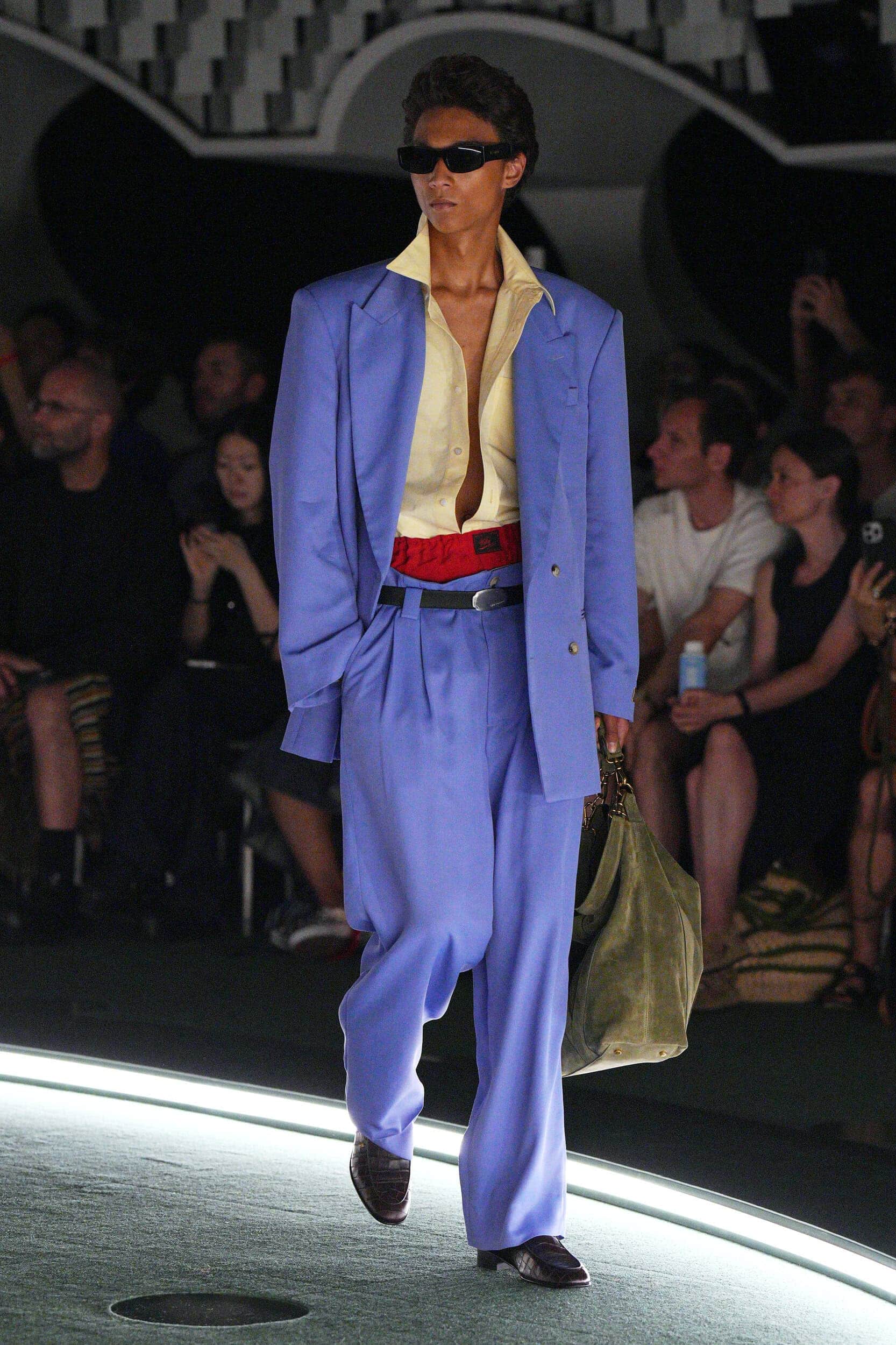
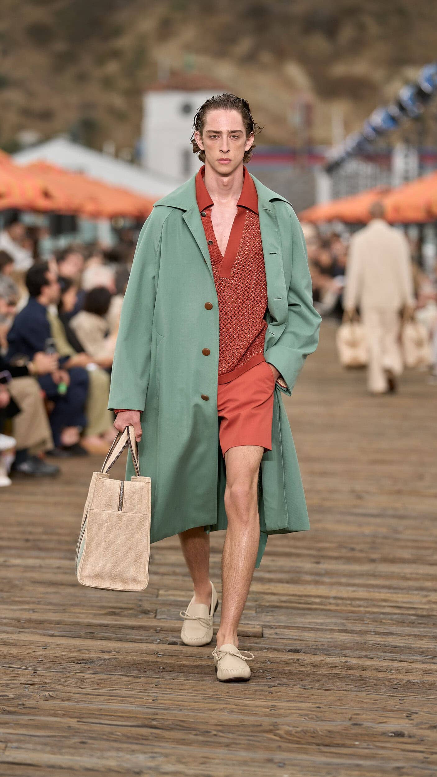
Next spring a retro-infused Kodak moment will colour the collections, with washed out colour-combinations that feel lived-in and personable. Reminiscent of the golden-hued filters of the 1970s and 1980s the joy of bright colour-blocking will be amplified for summer.
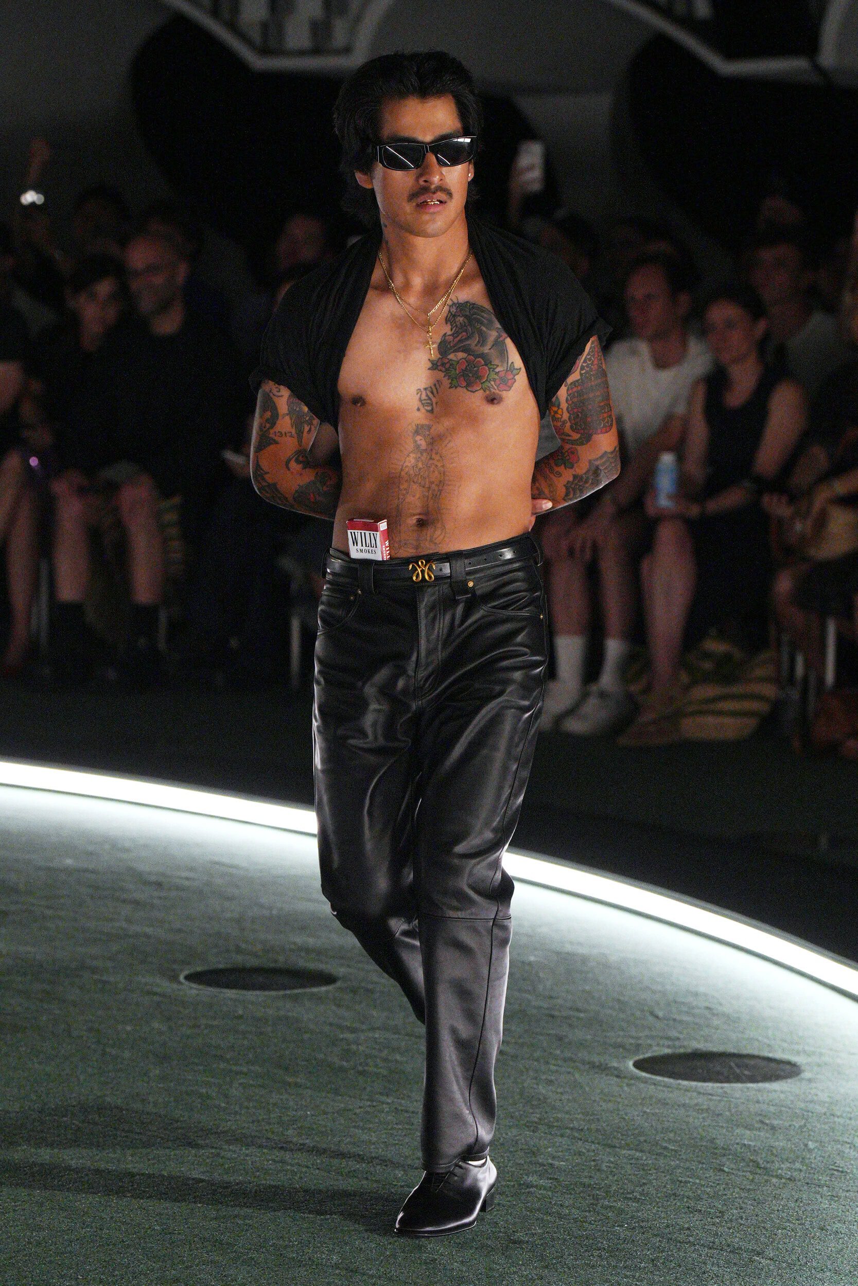
It was the call for authenticity that many answered, from Auralee’s perfectly harmonious take on the beachside palette to Willy Chavarria’s dialled-up, yet softened layers of colour. Pigmented brights added personality to the proliferation of jersey wardrobe basics as the hero item that was adopted throughout the season. From Isabel Marant to Acne Studios brands dived into this sentiment that simplified methods of dressing for individuality – via colour – that is still sought after as a form of bold self-expression..
2. Ice Cream Dreams
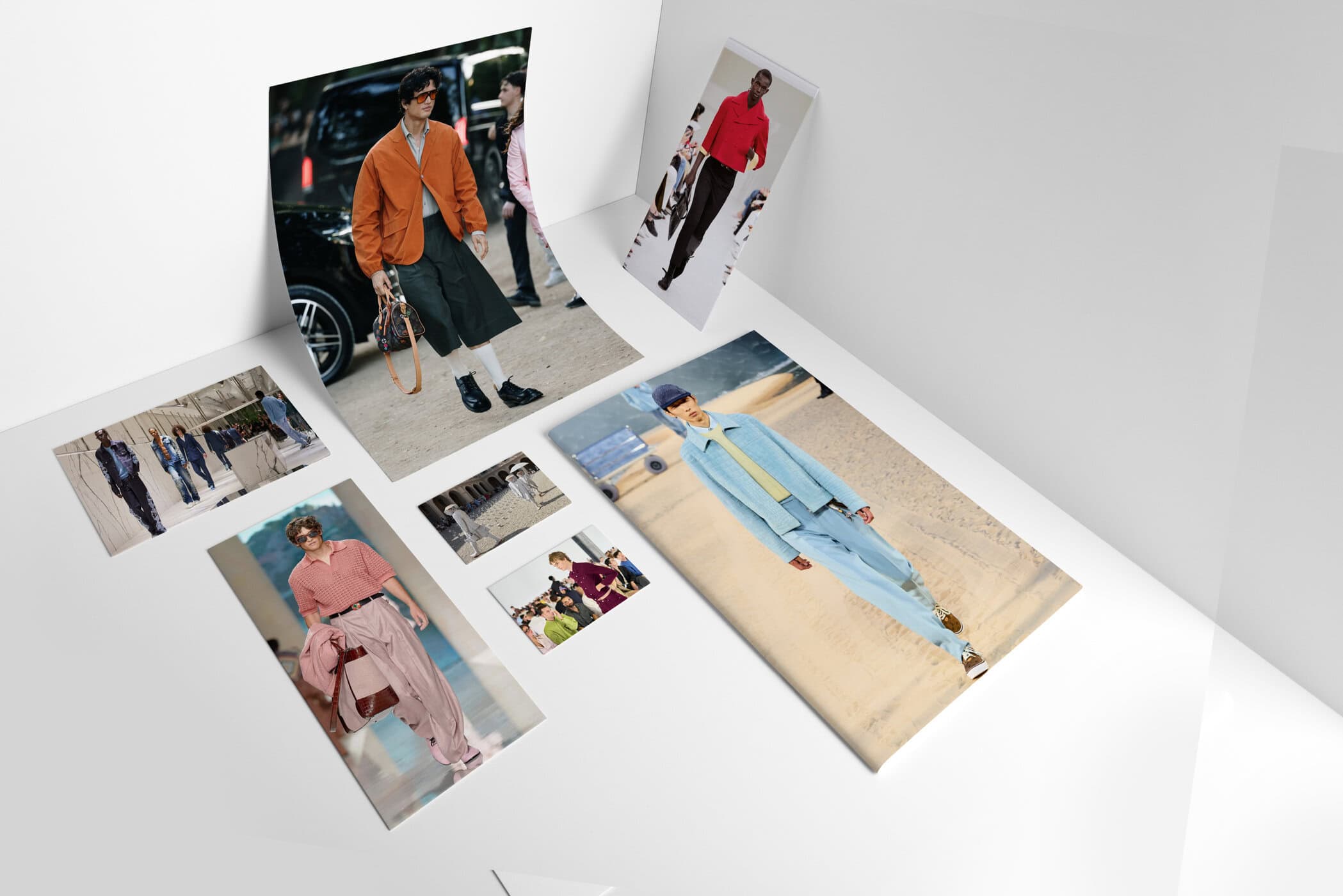
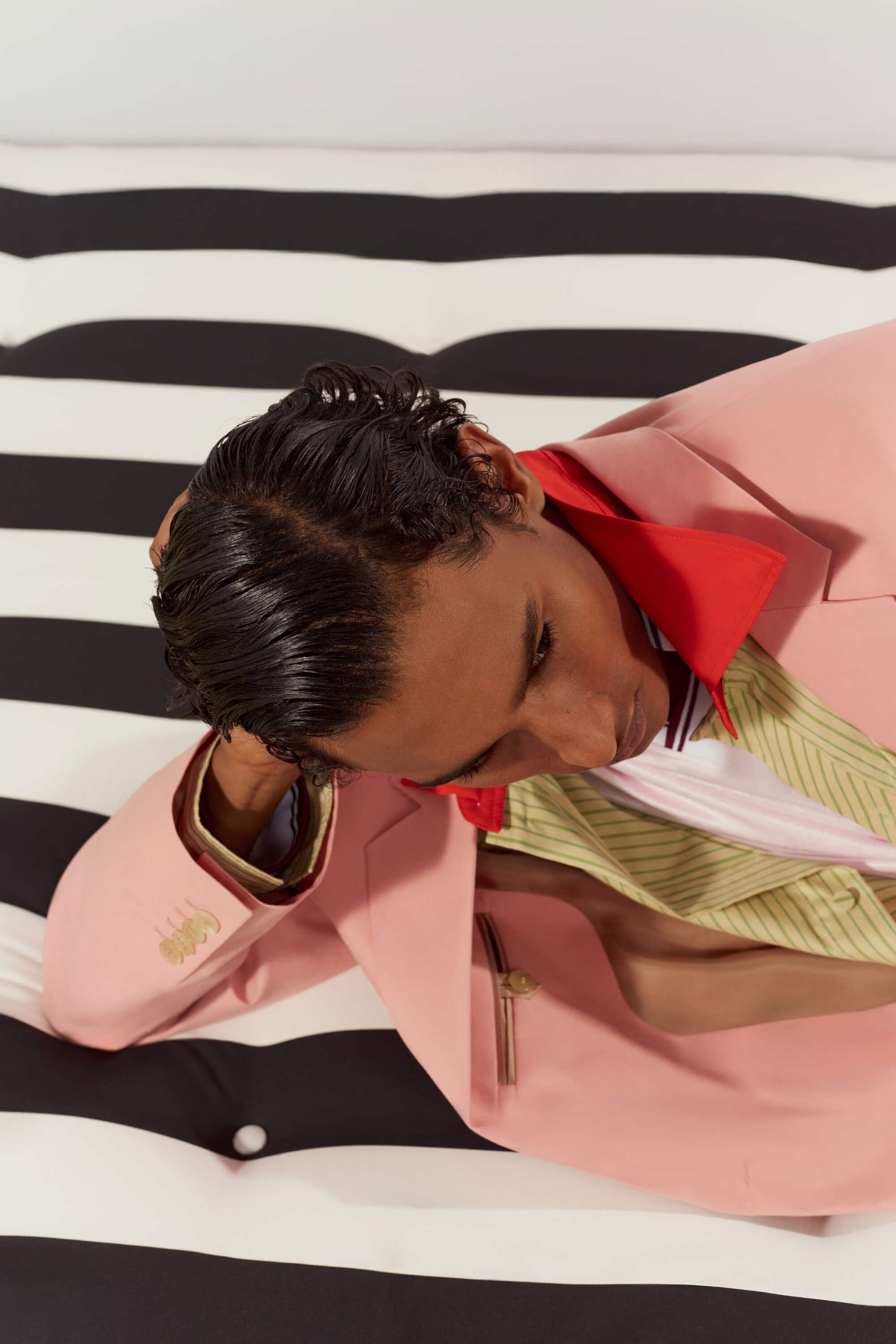
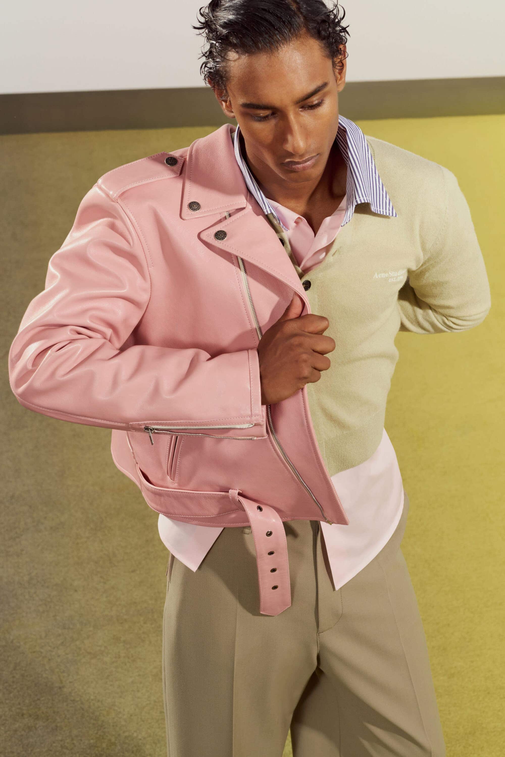
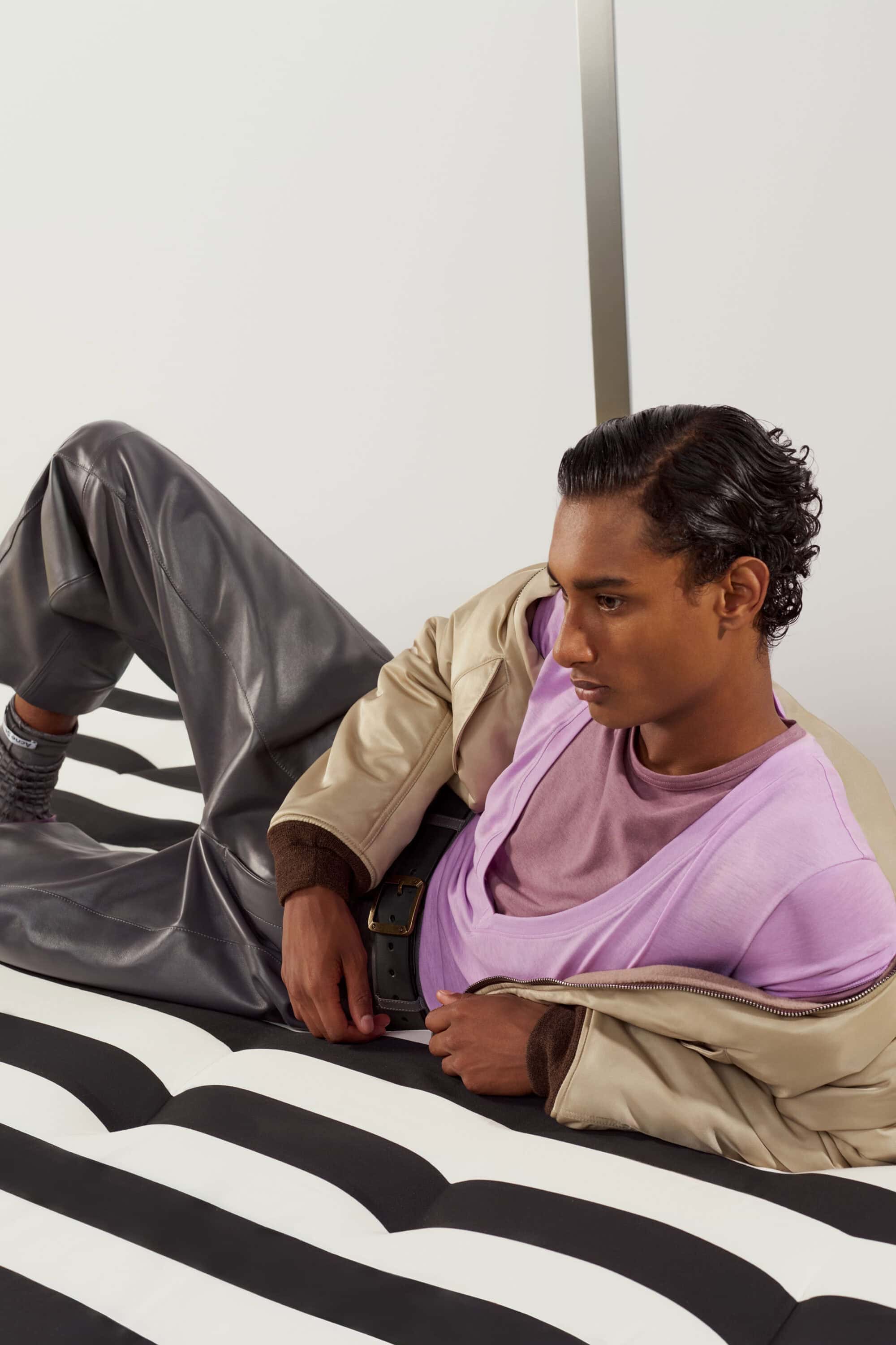
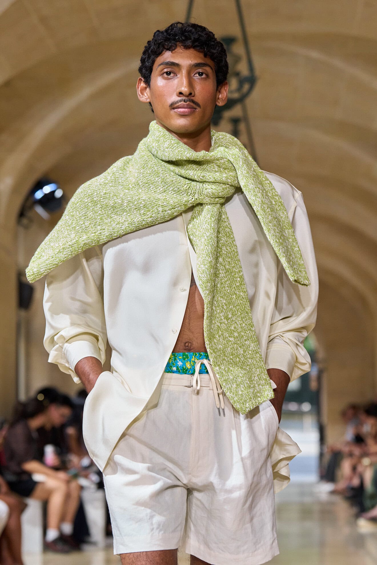
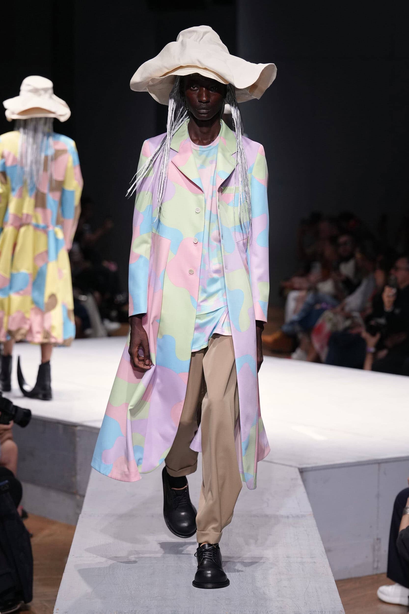
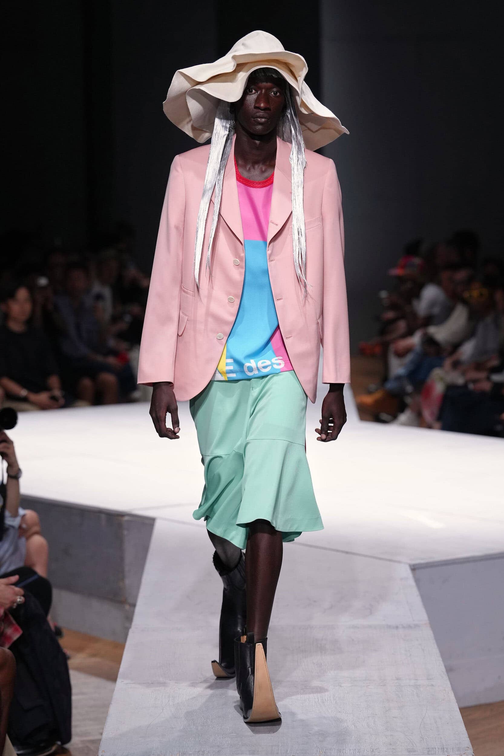
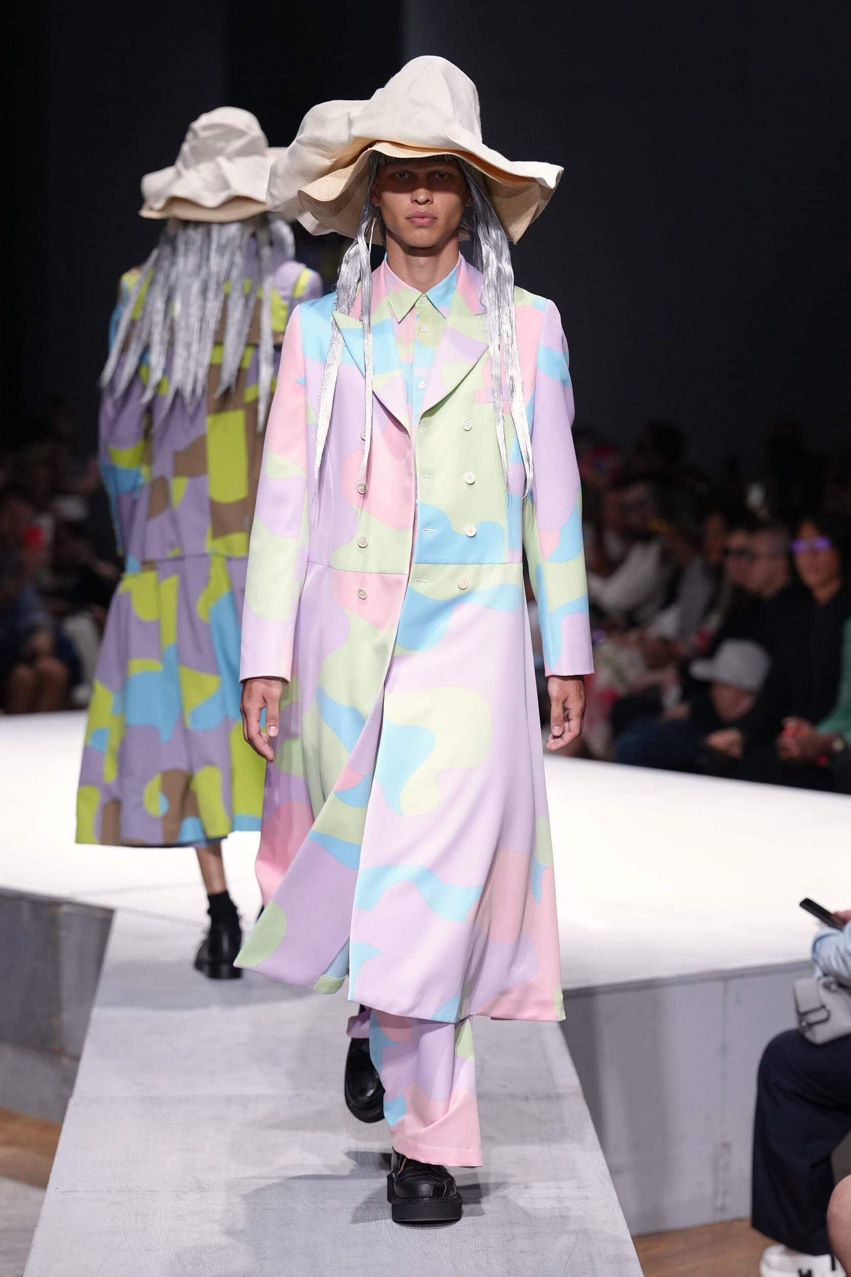
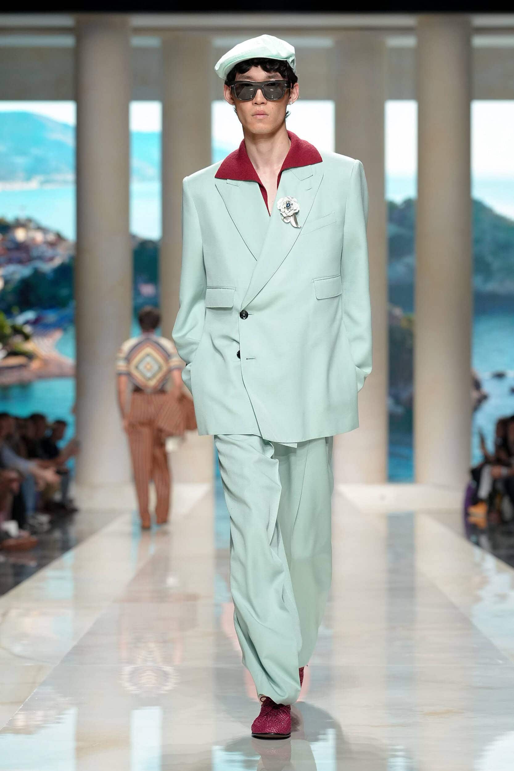
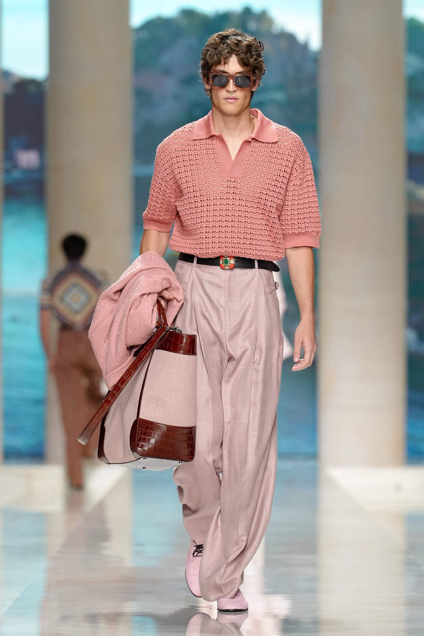
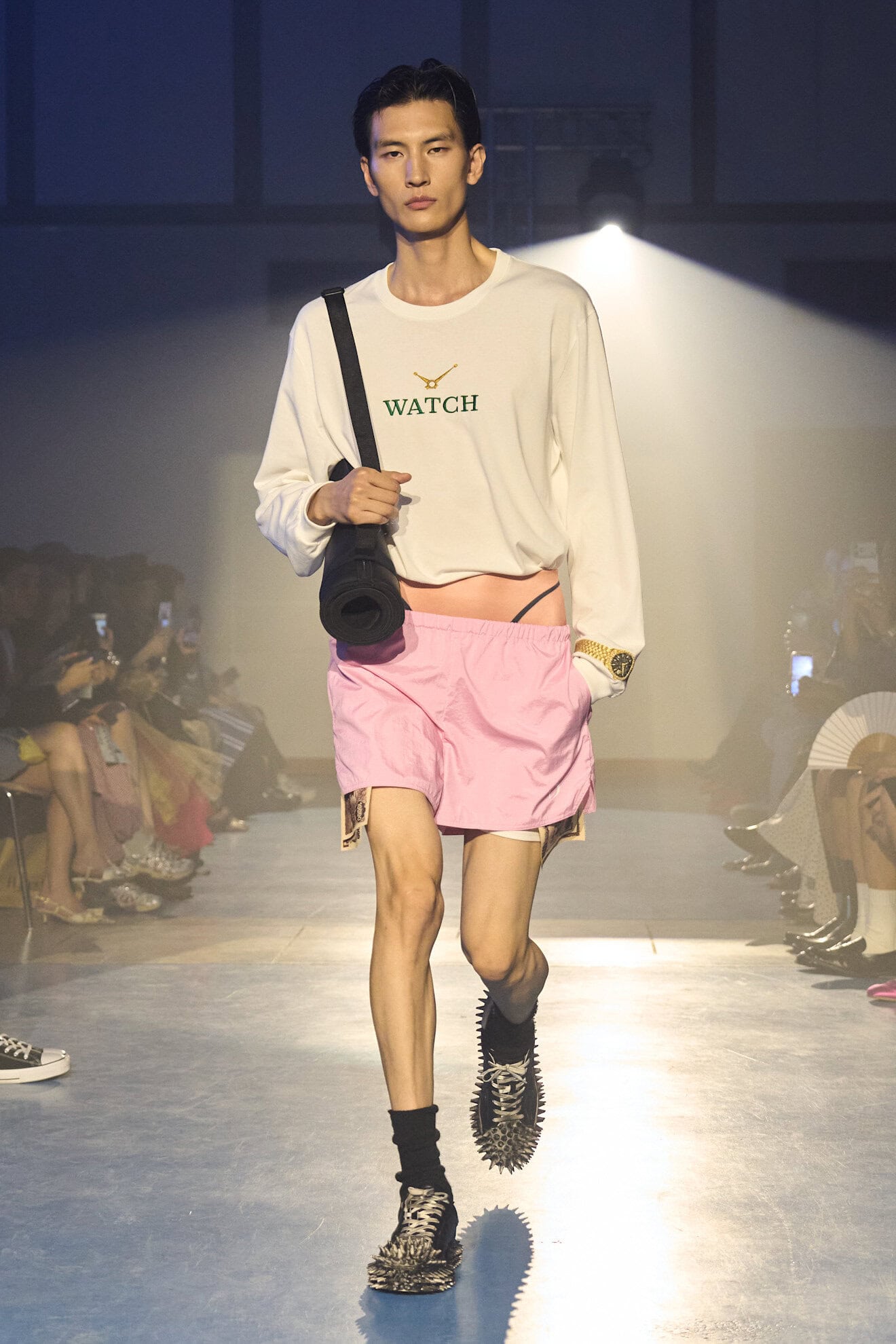
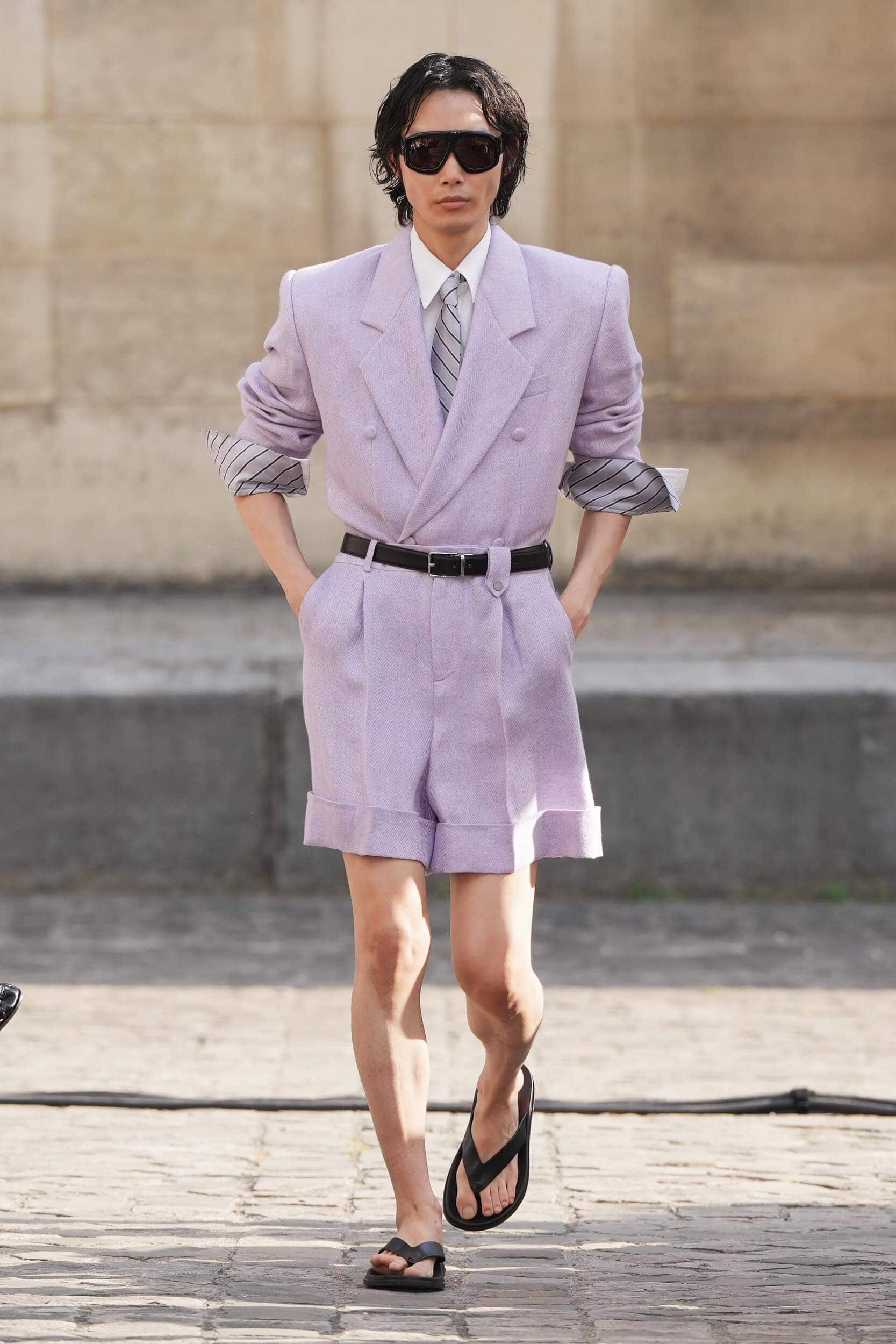
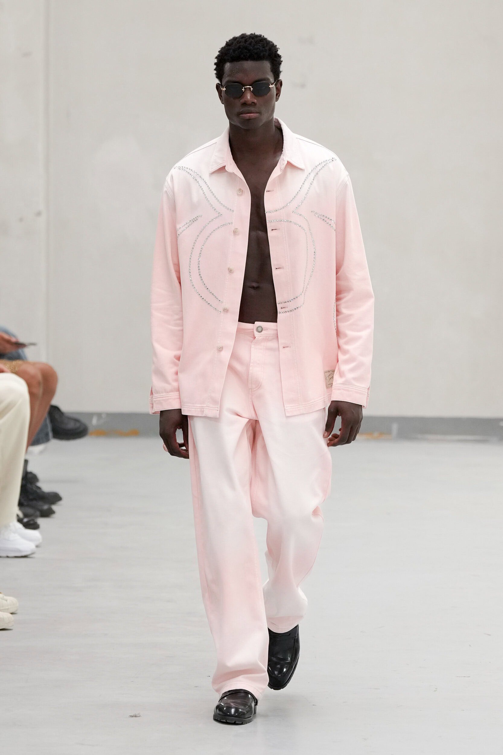
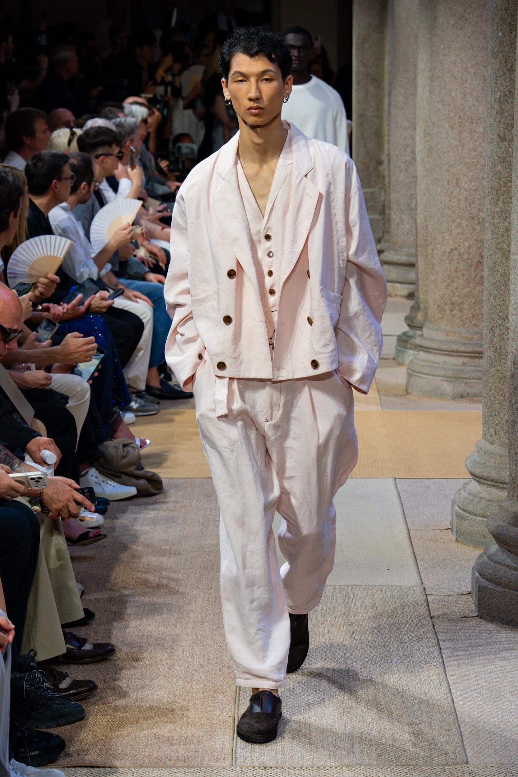
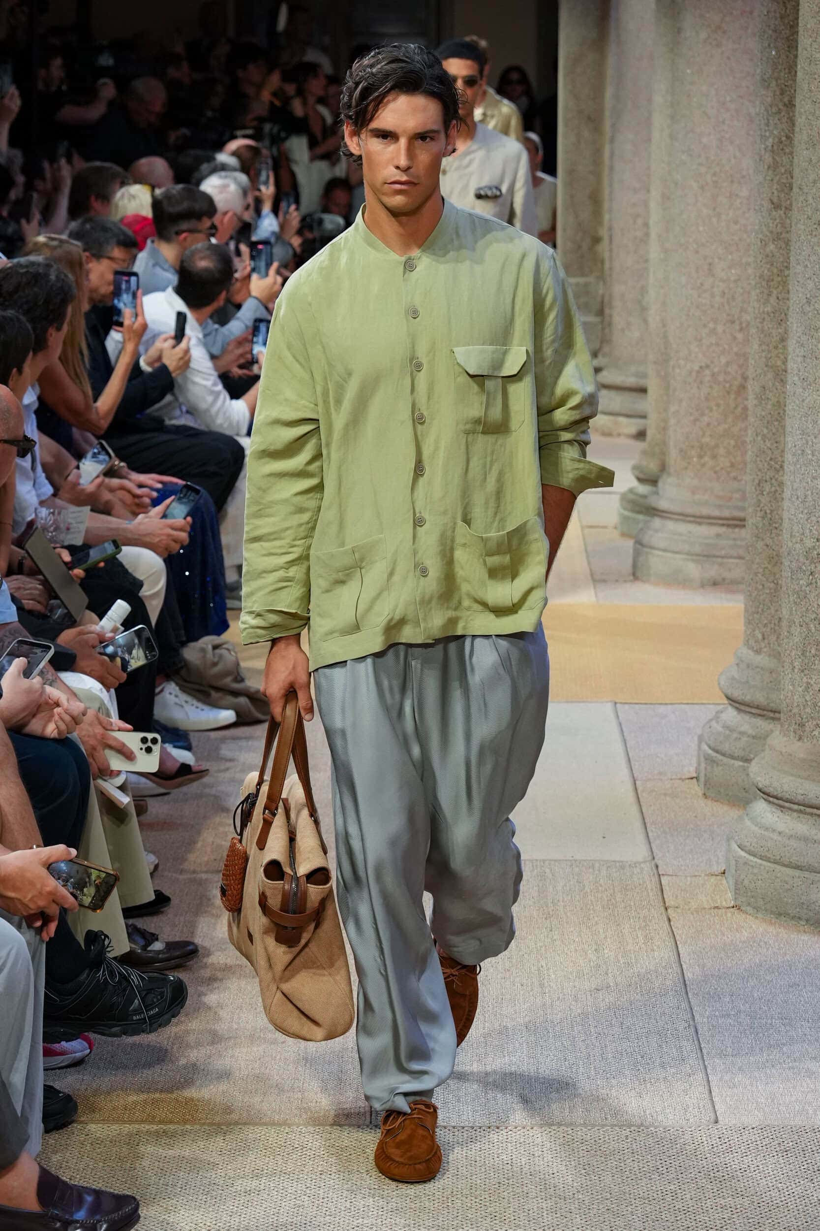
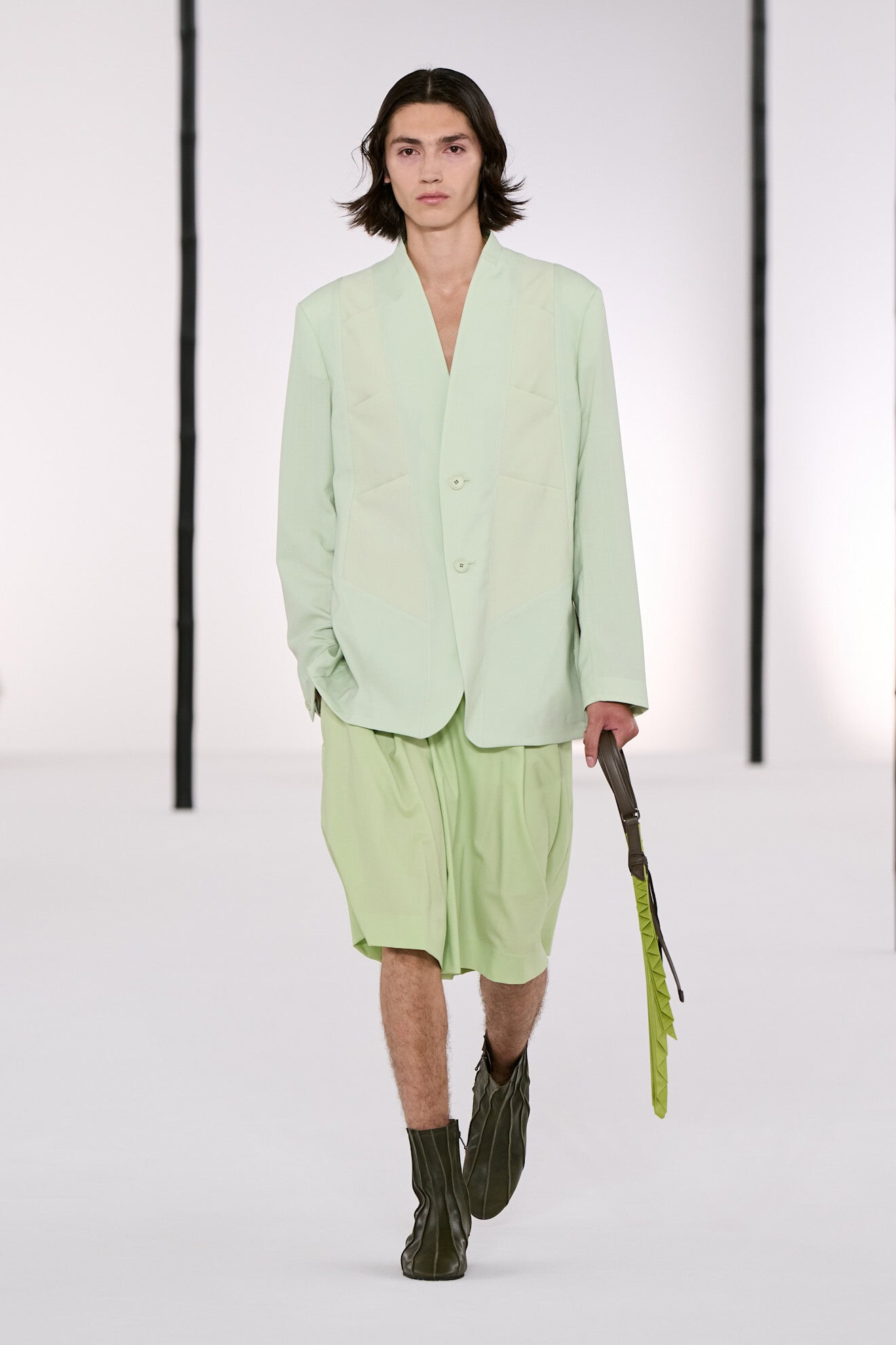
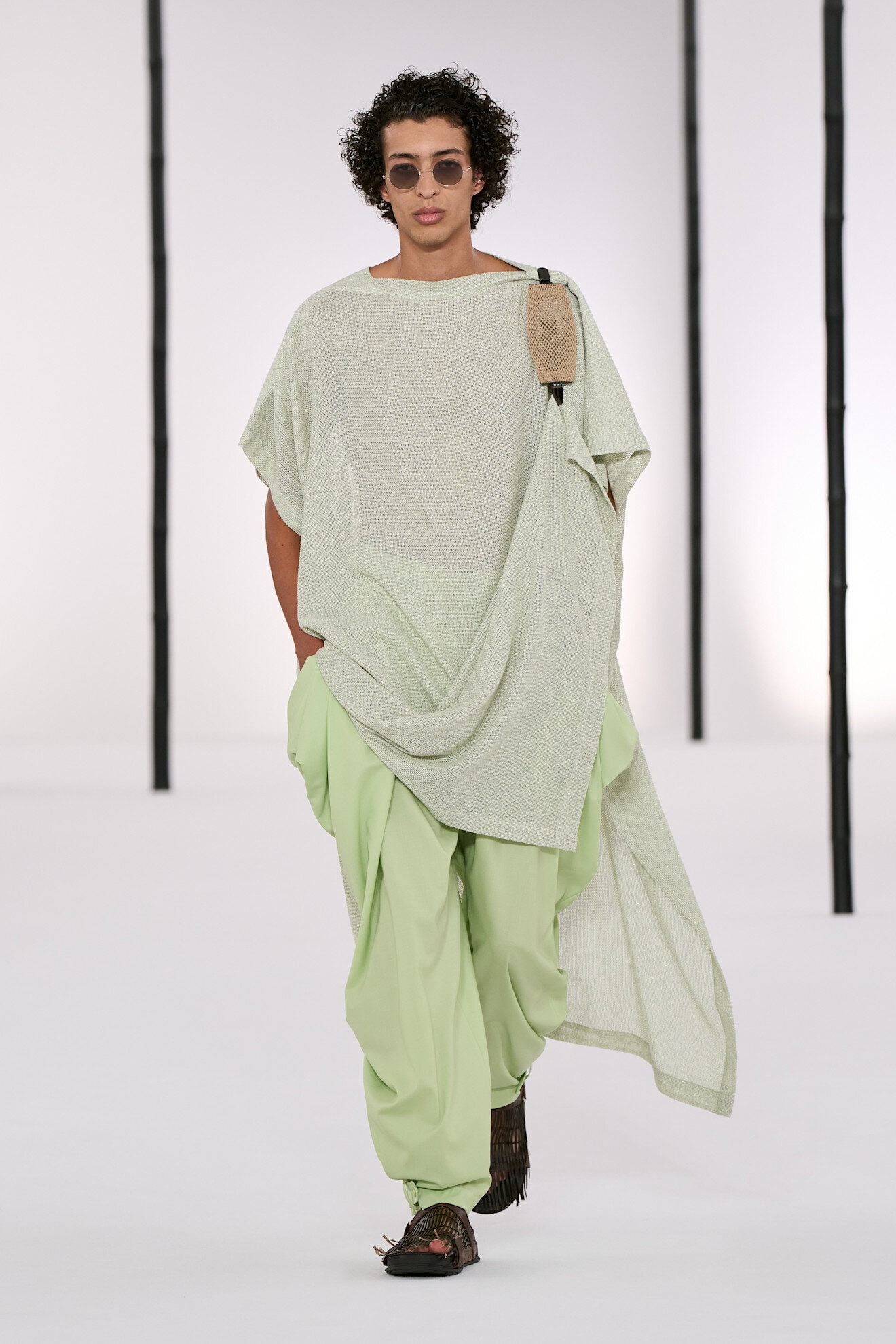
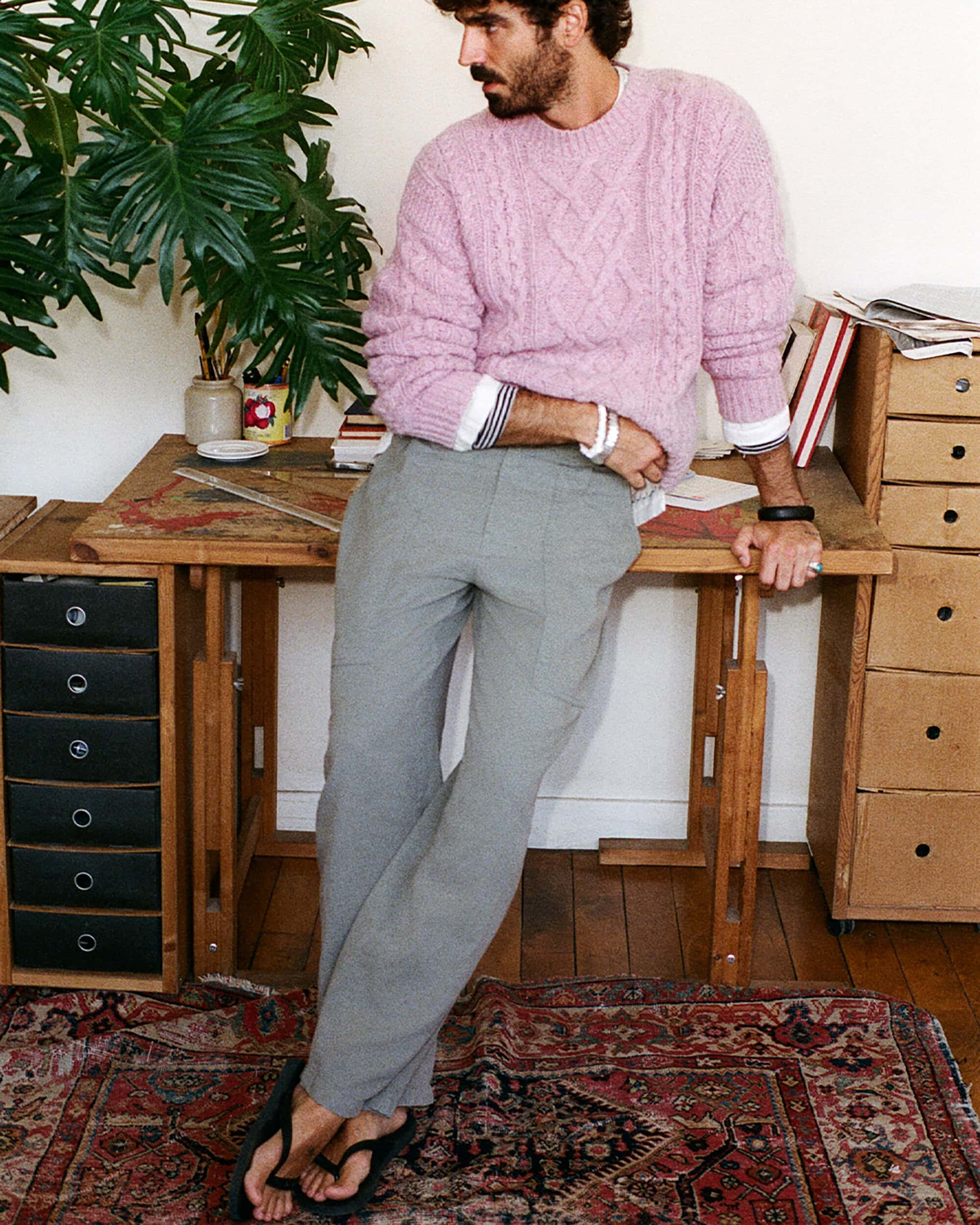
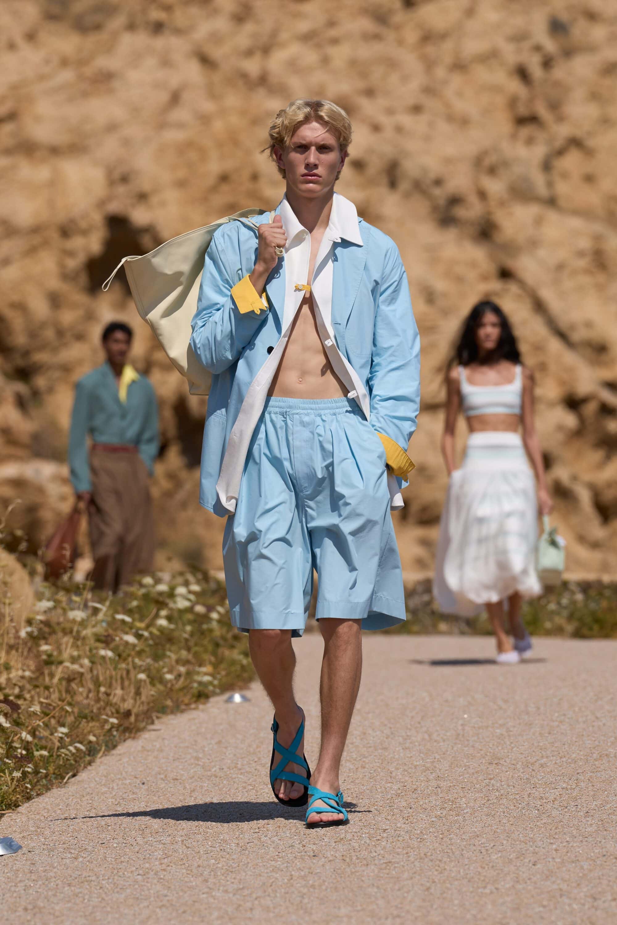
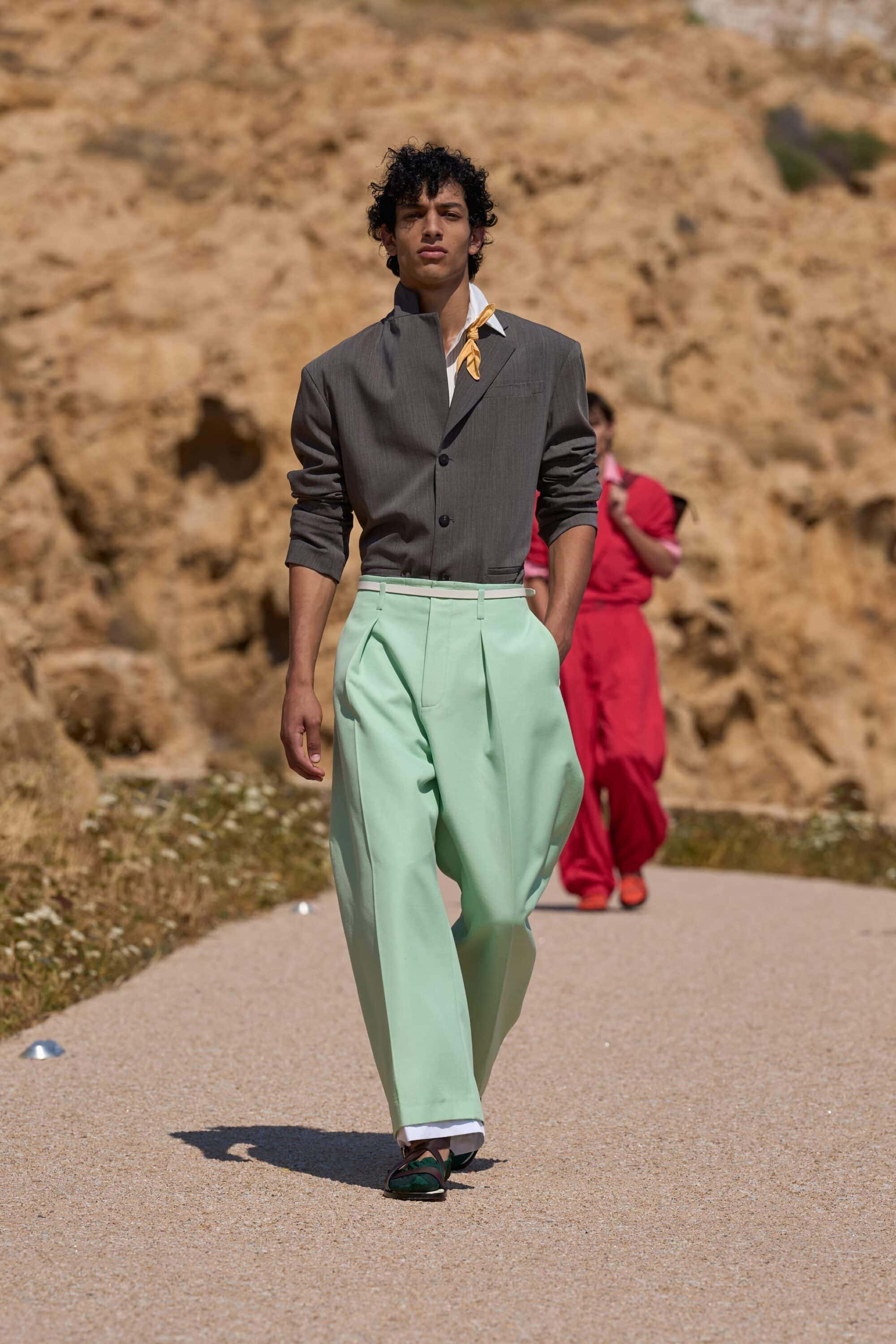
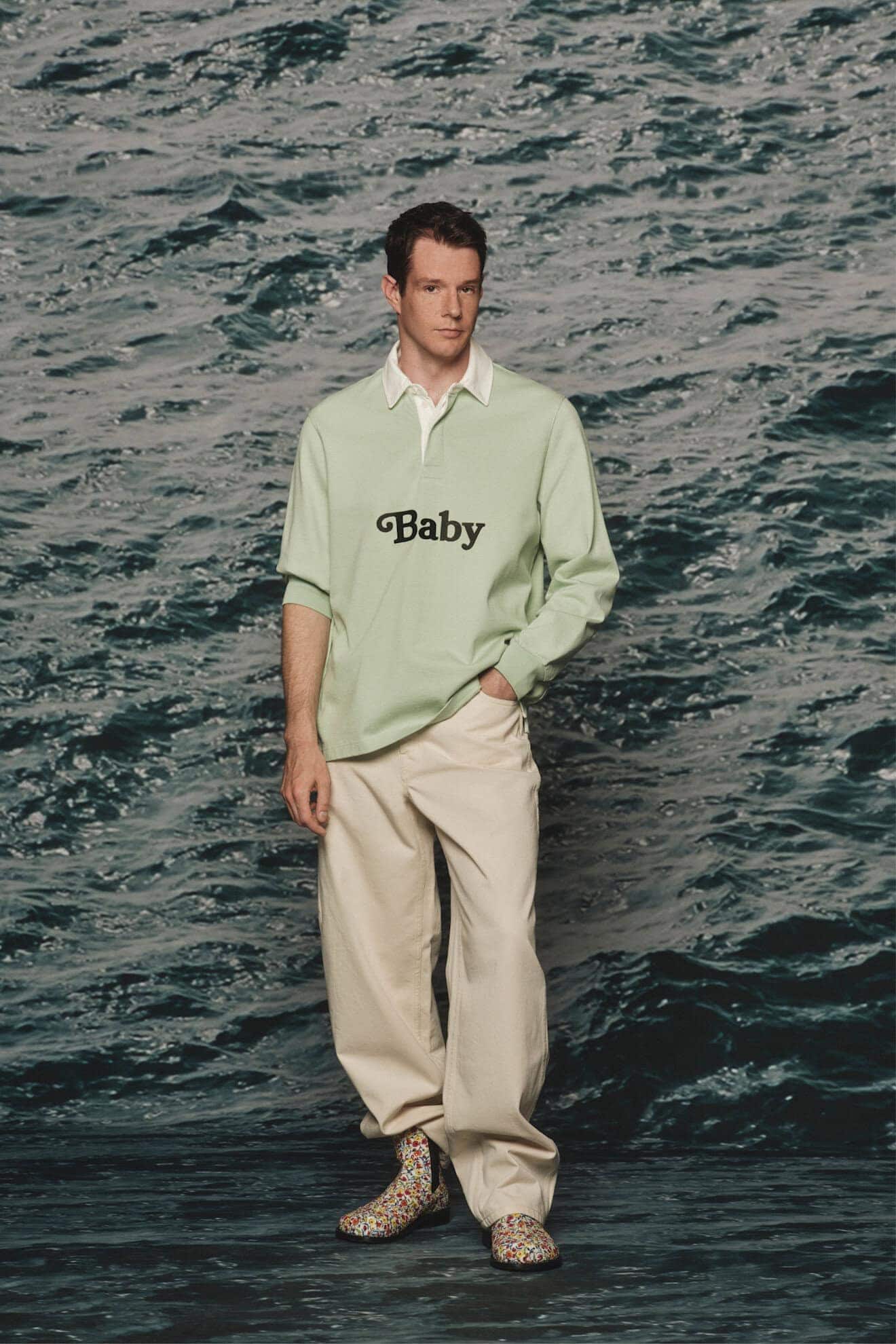
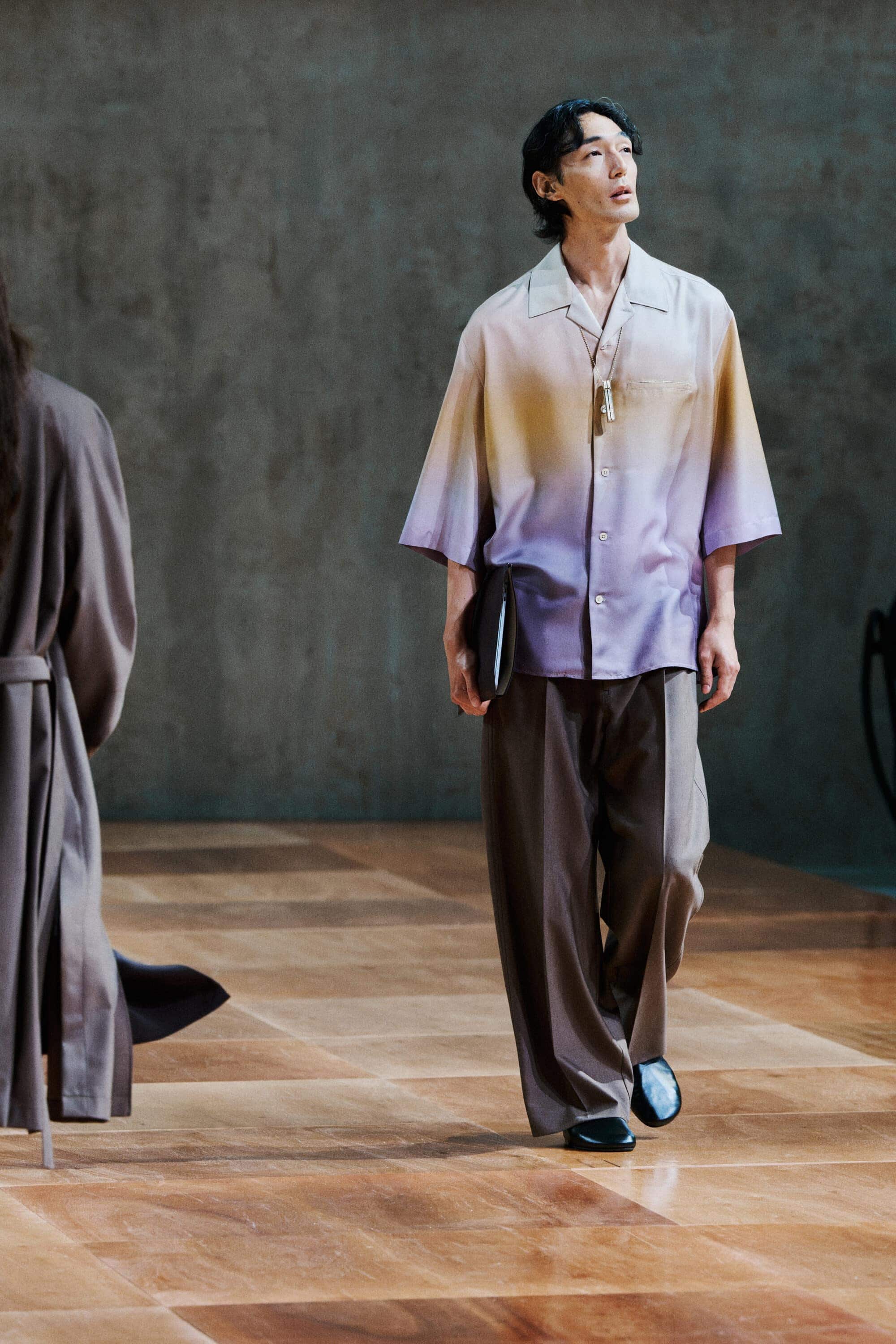
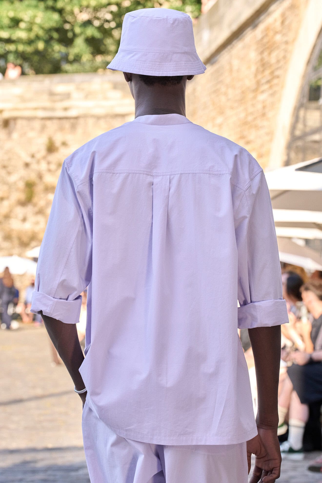
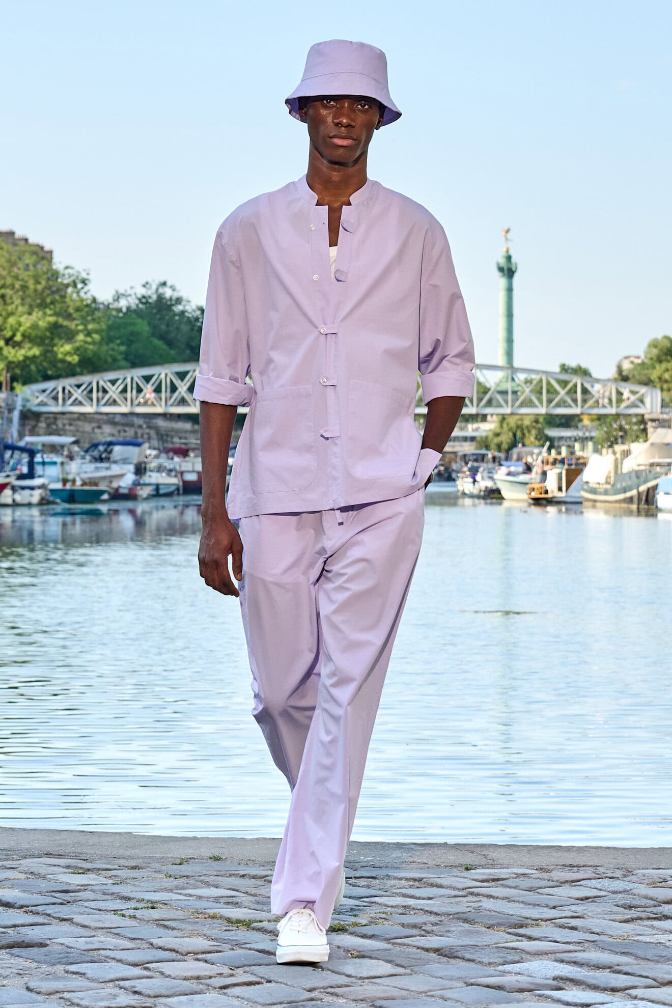
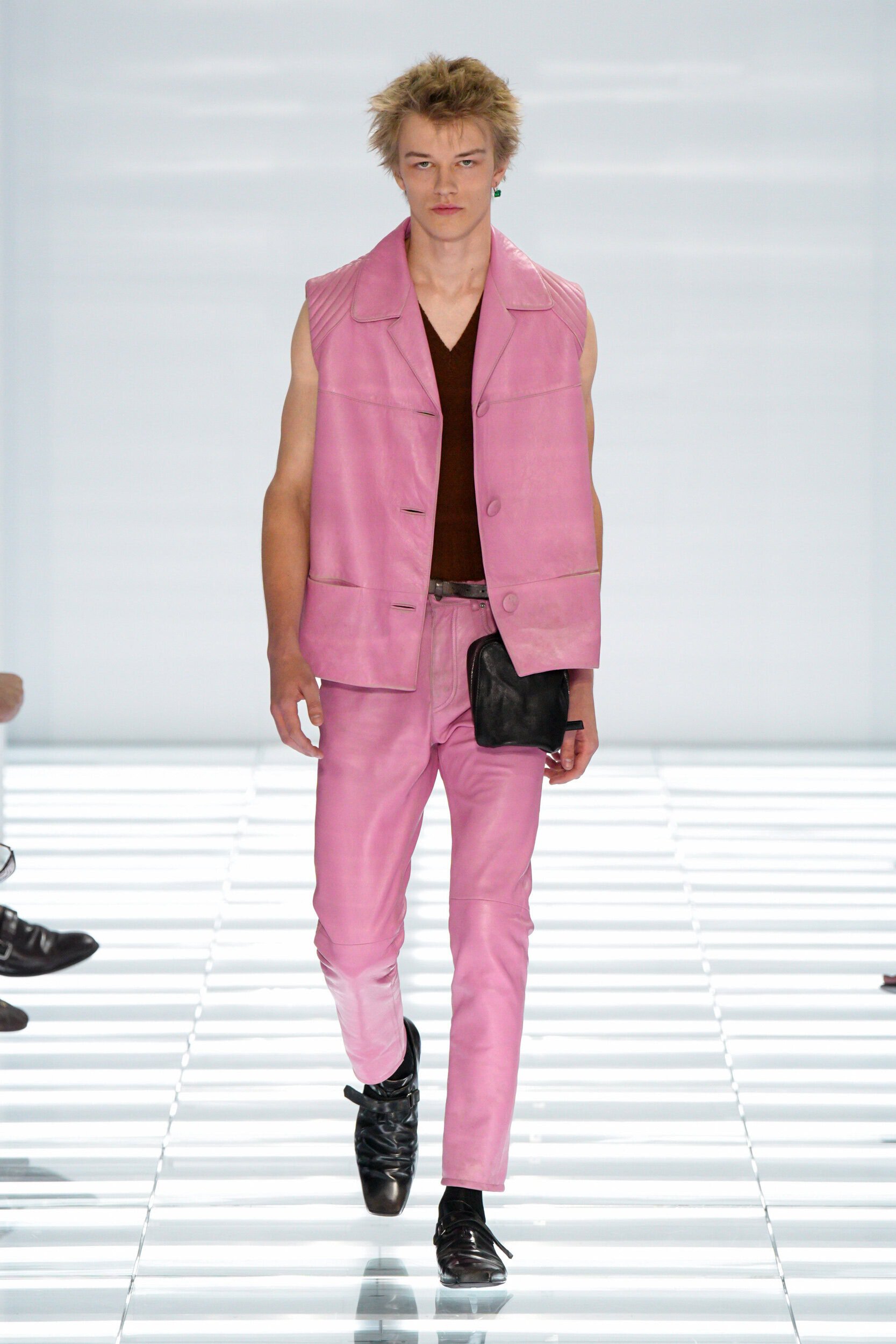
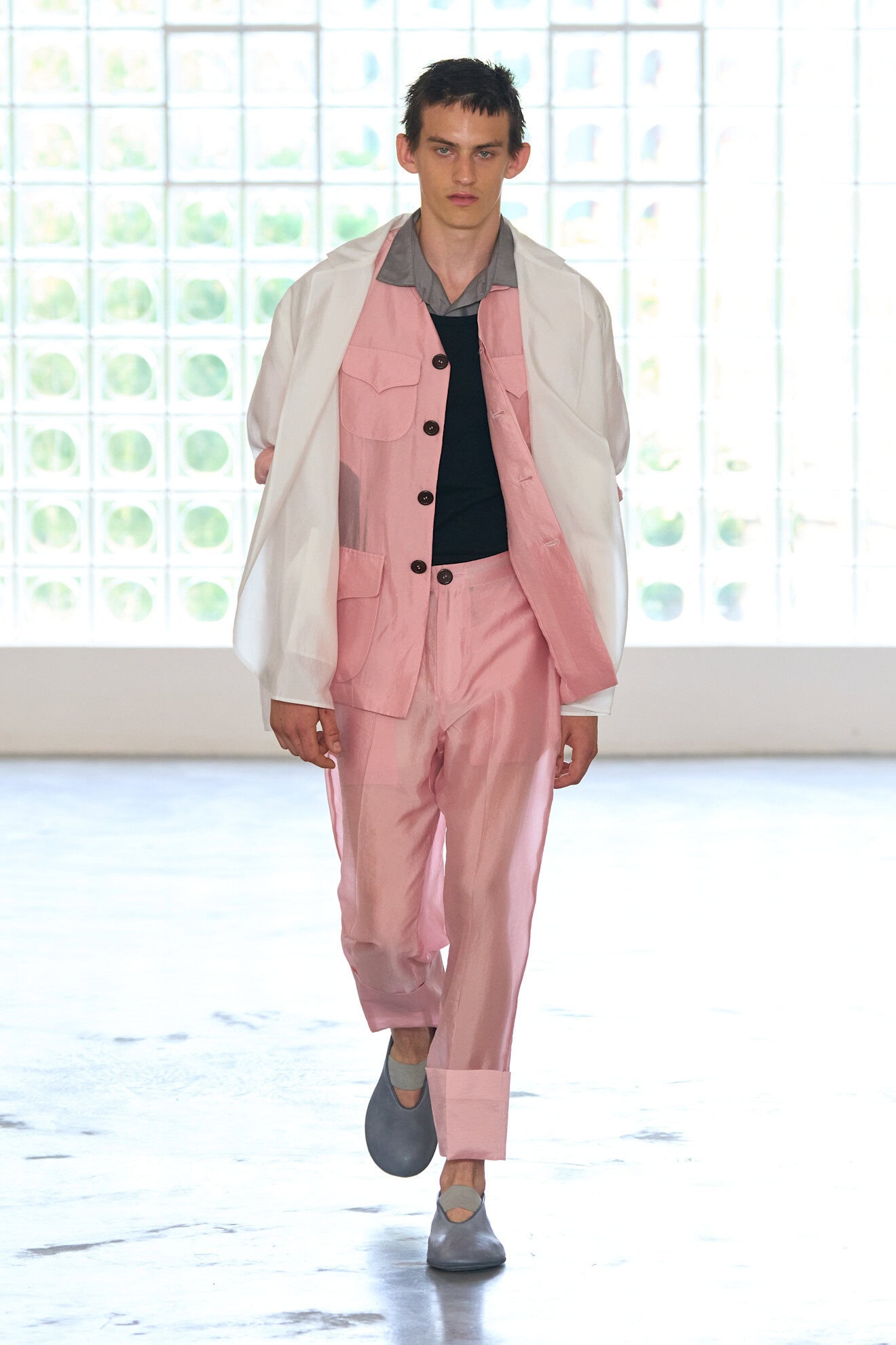
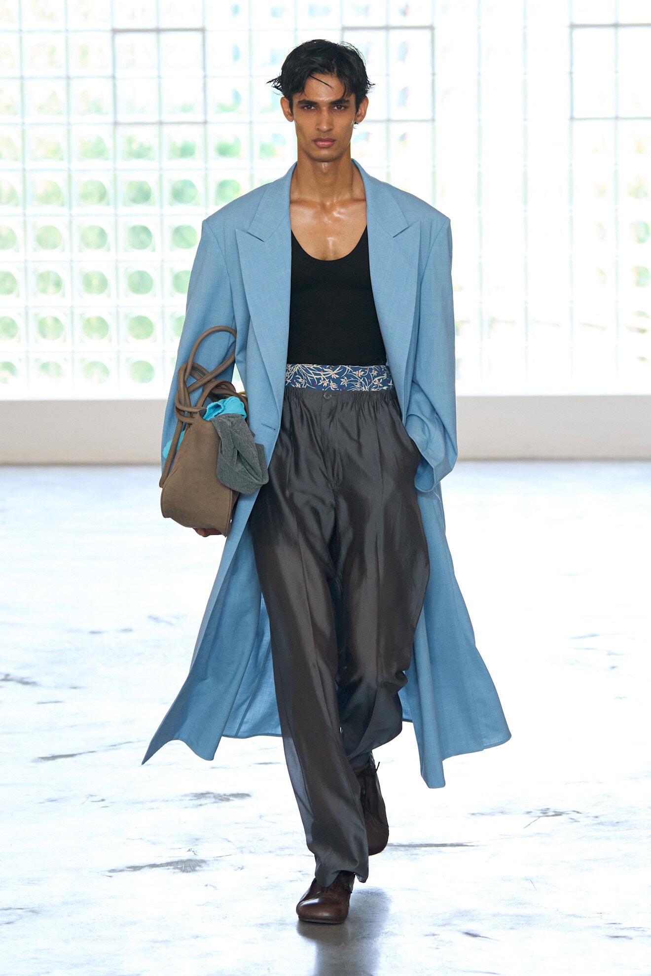
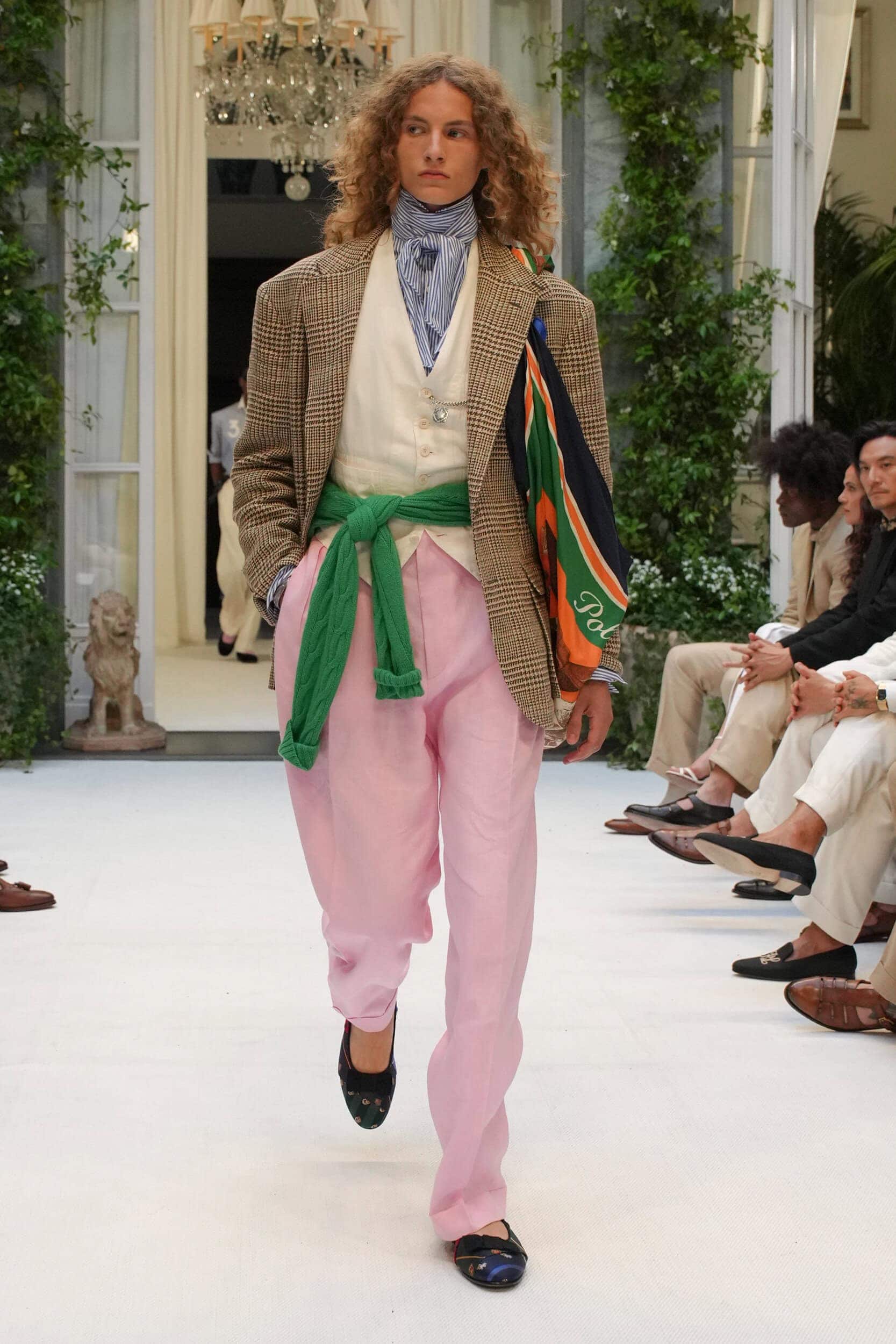
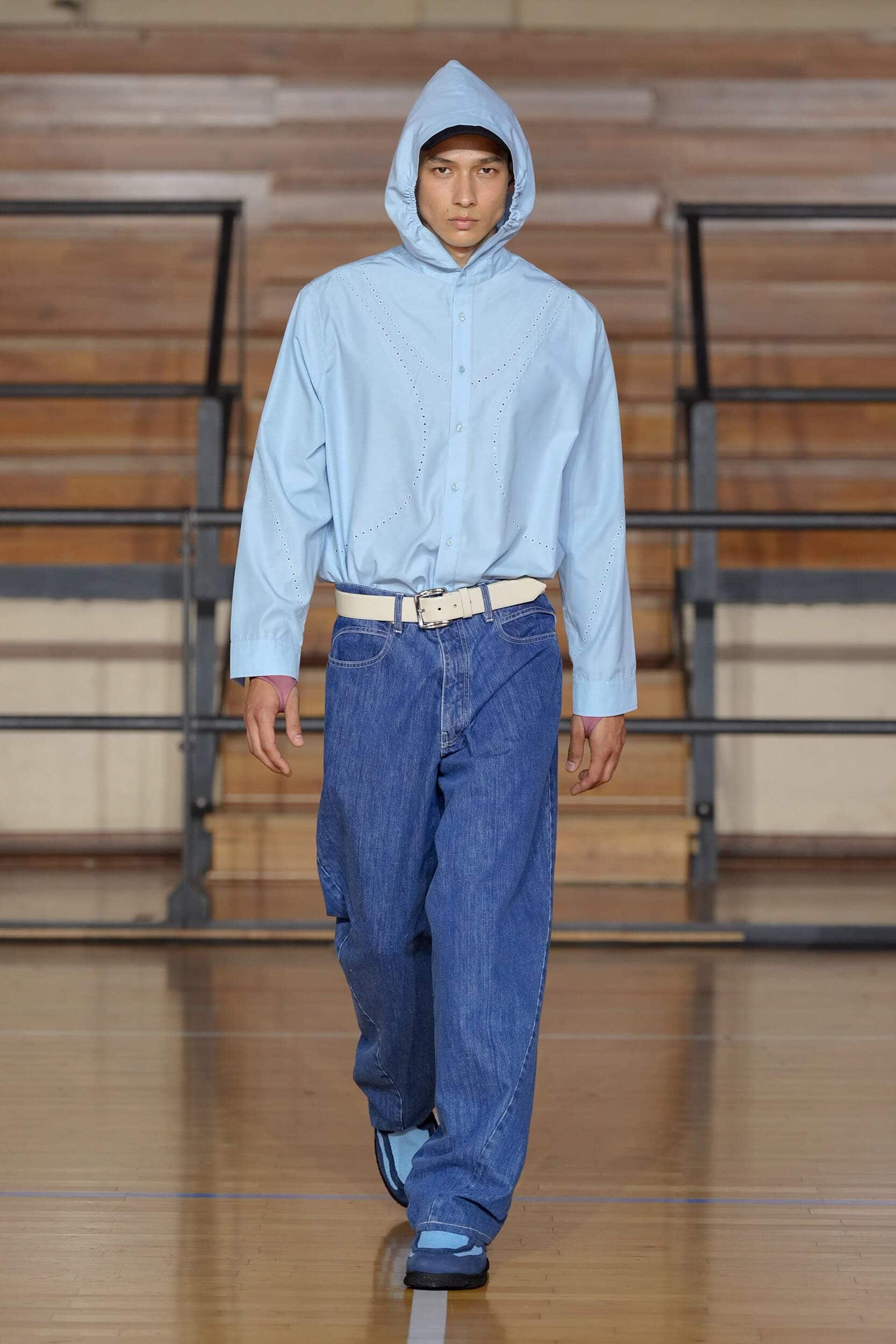
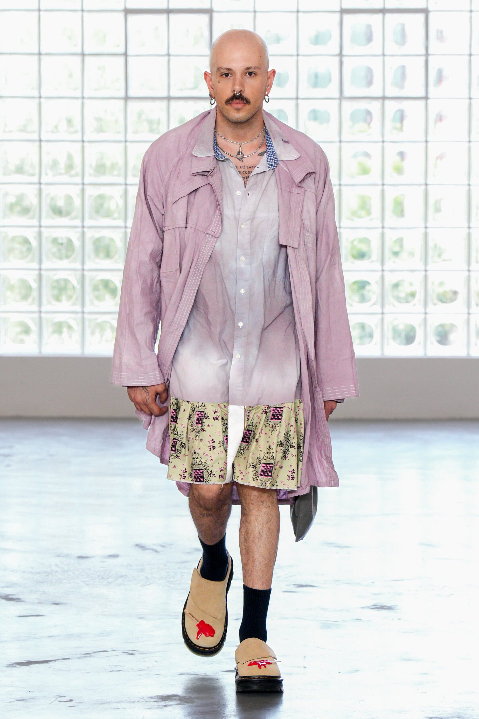
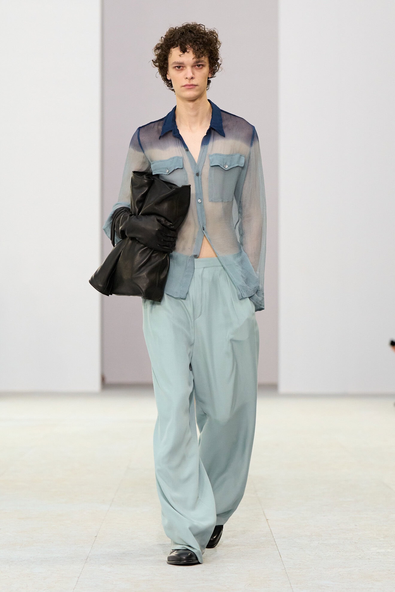
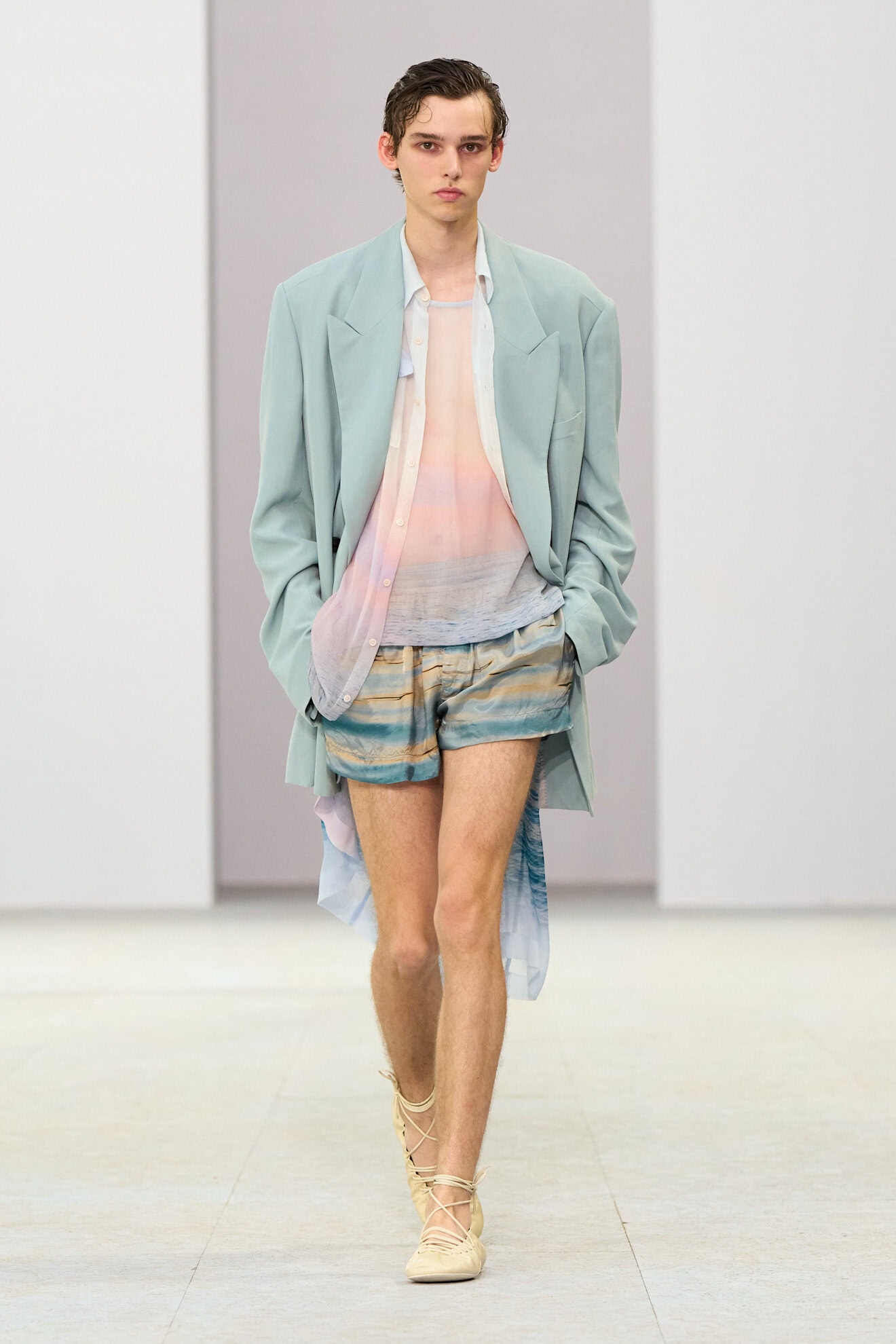
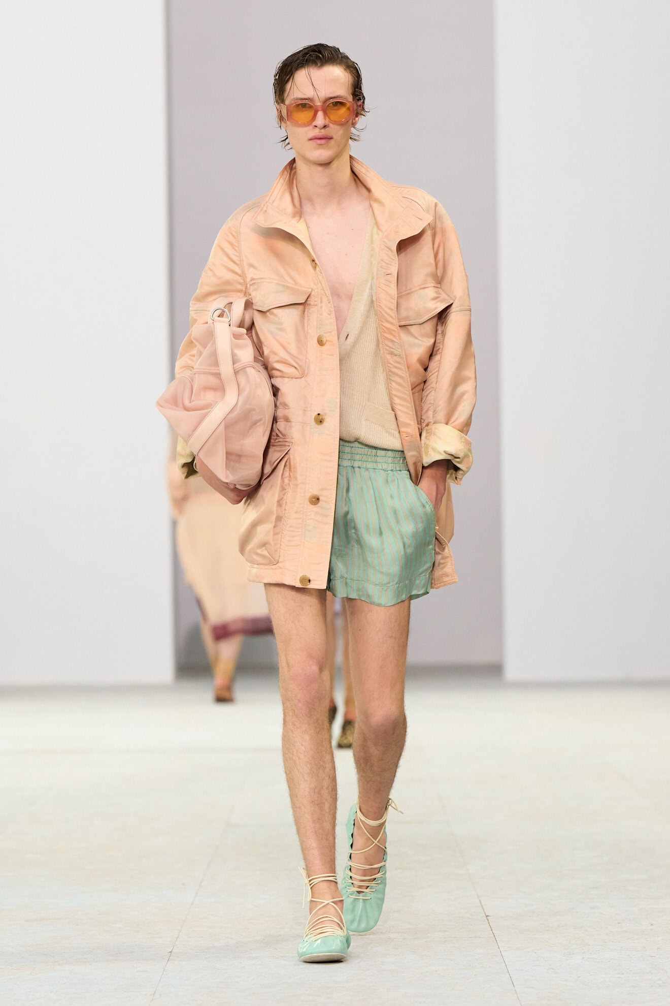
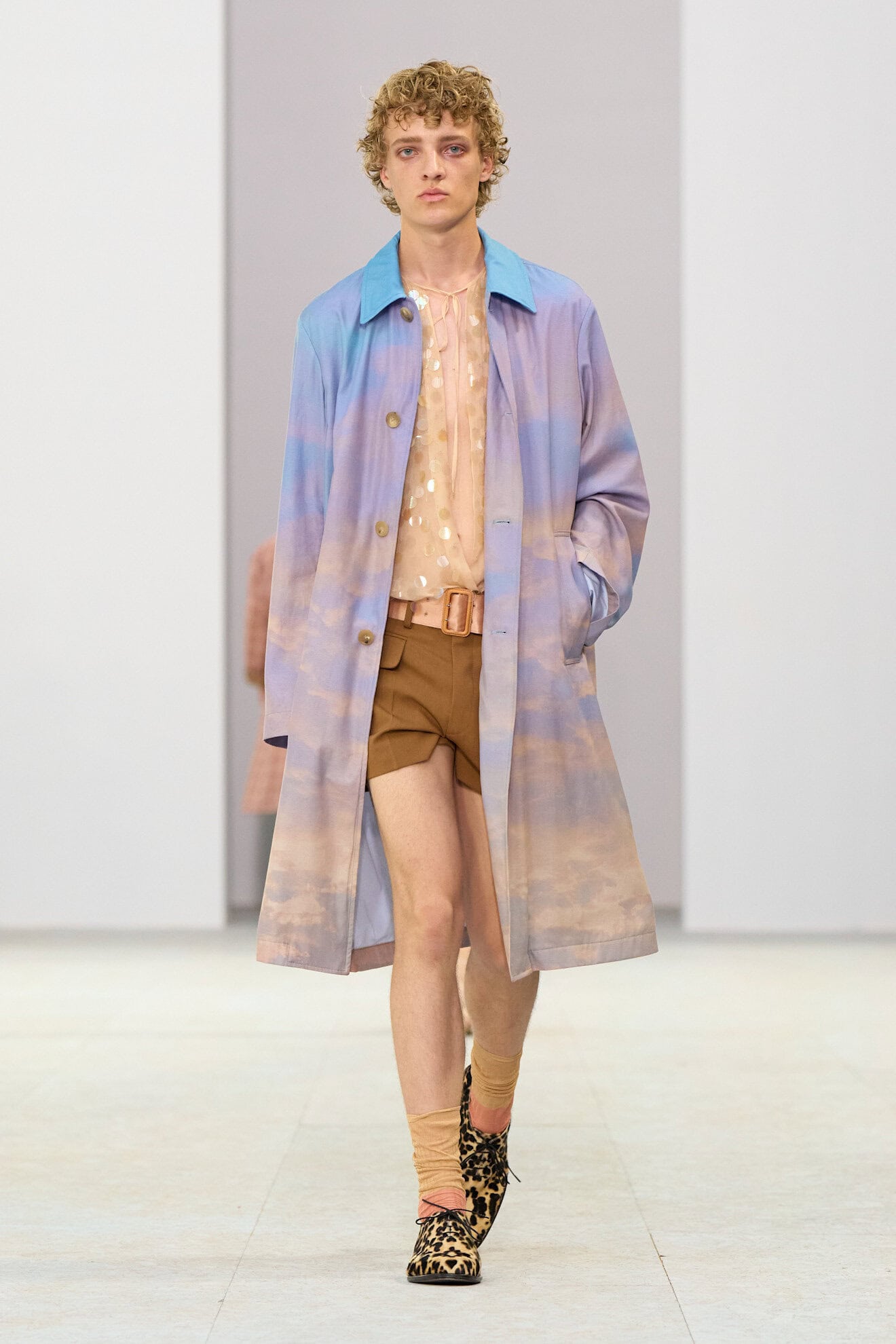
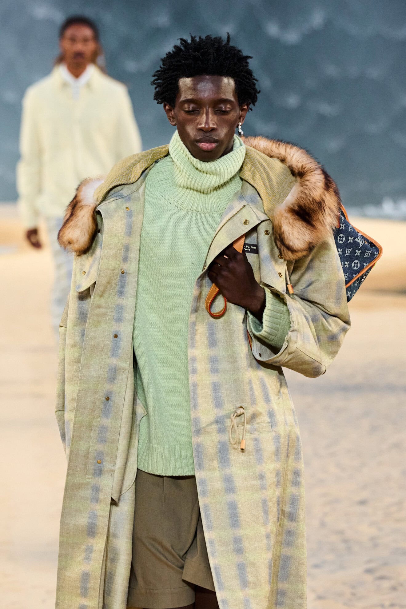
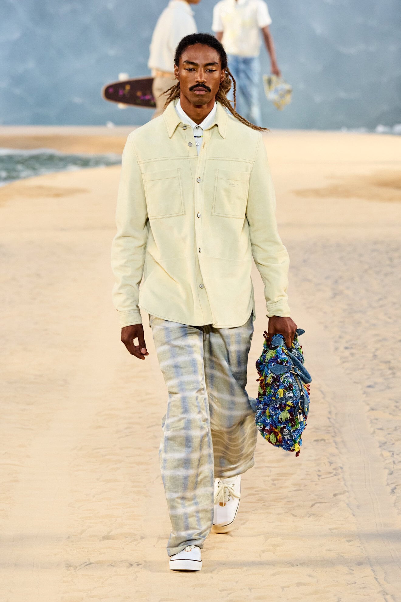
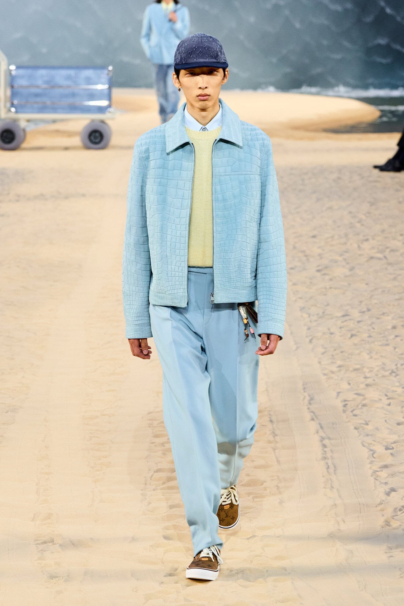
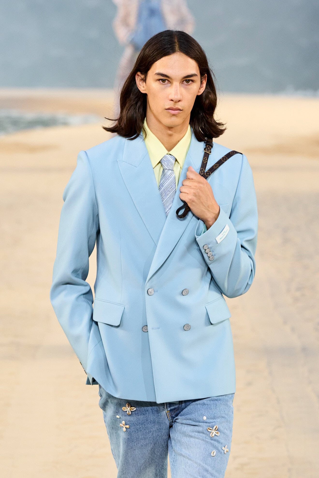
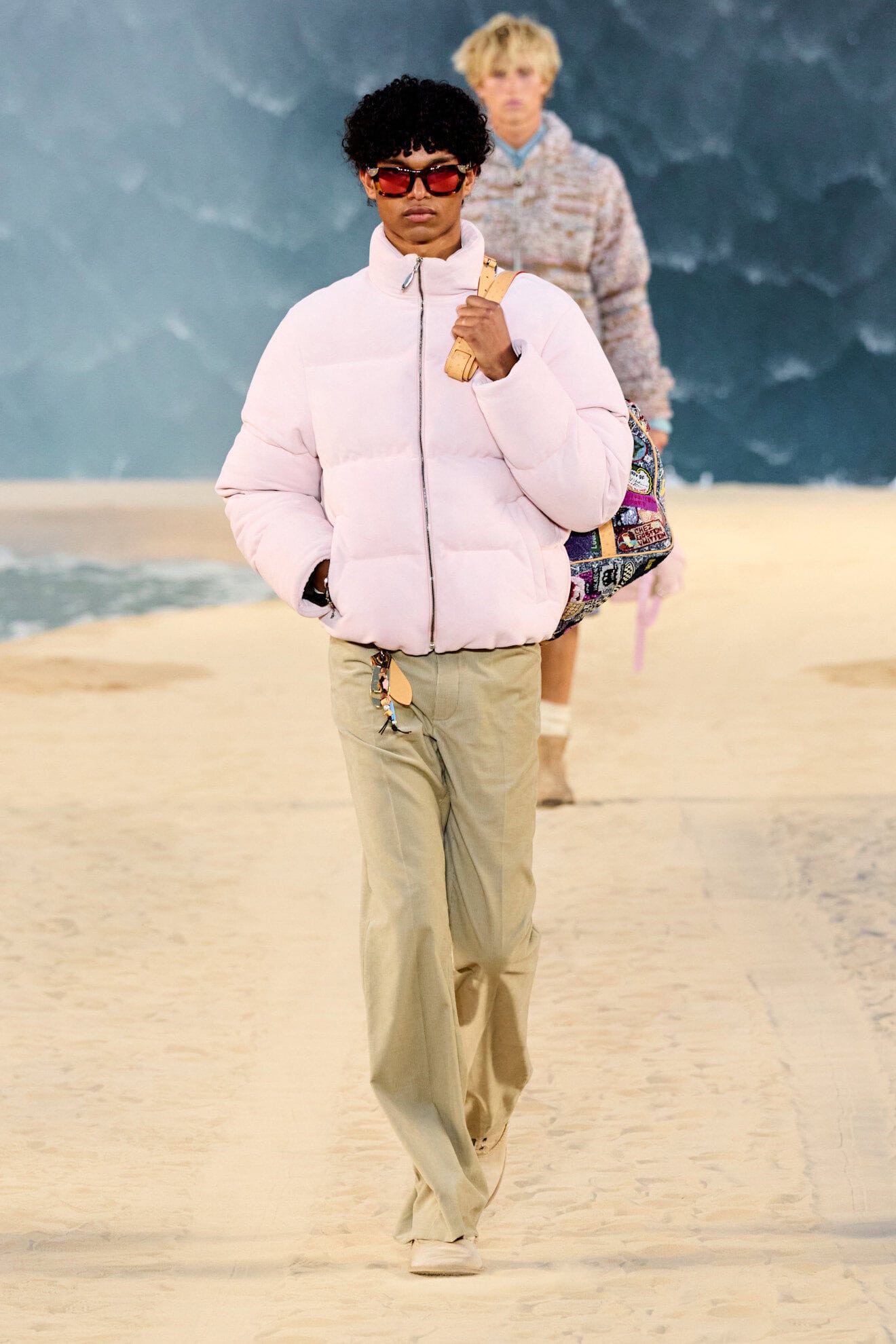
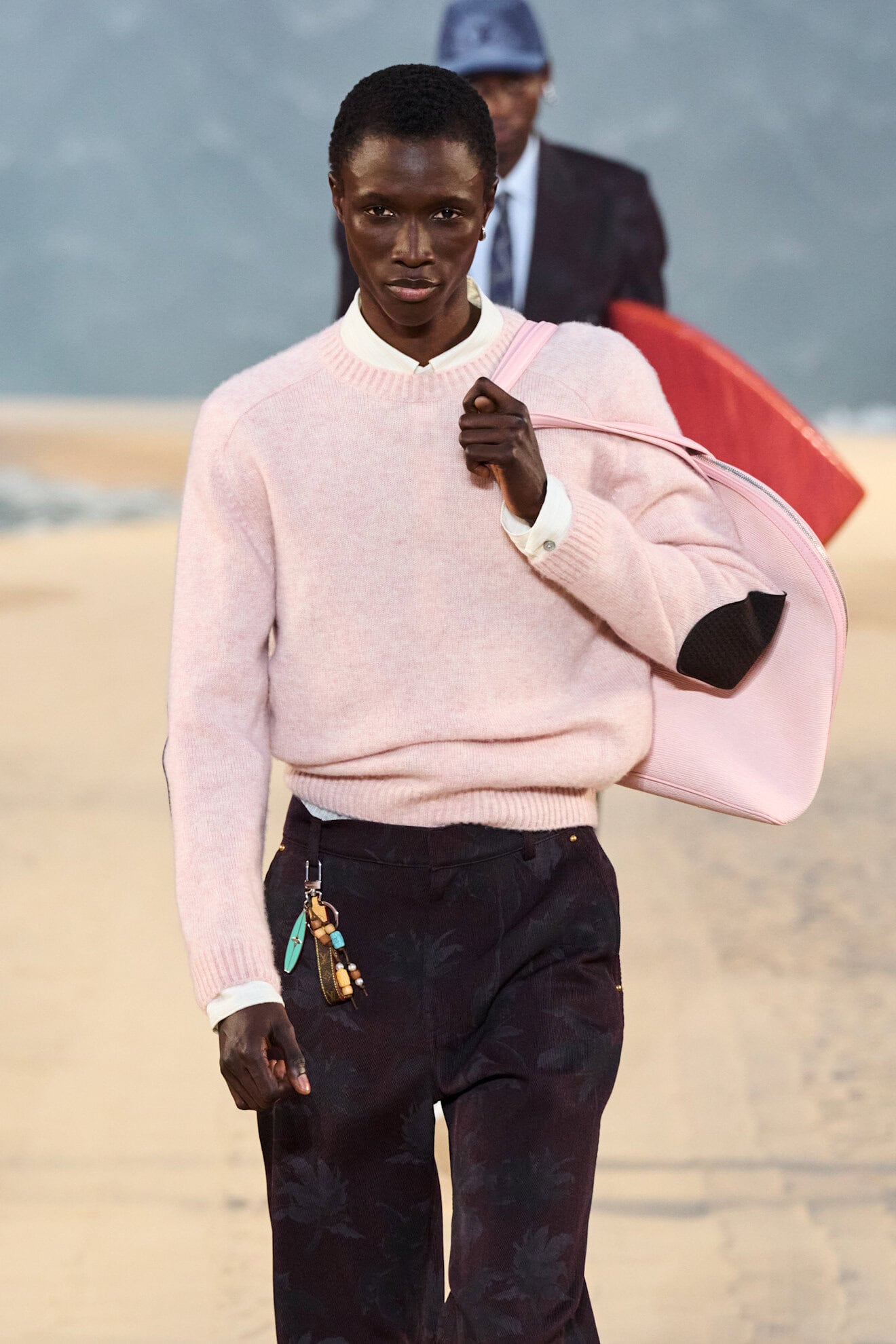
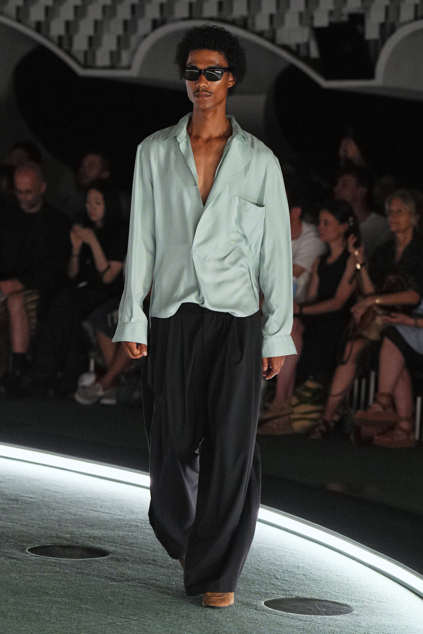
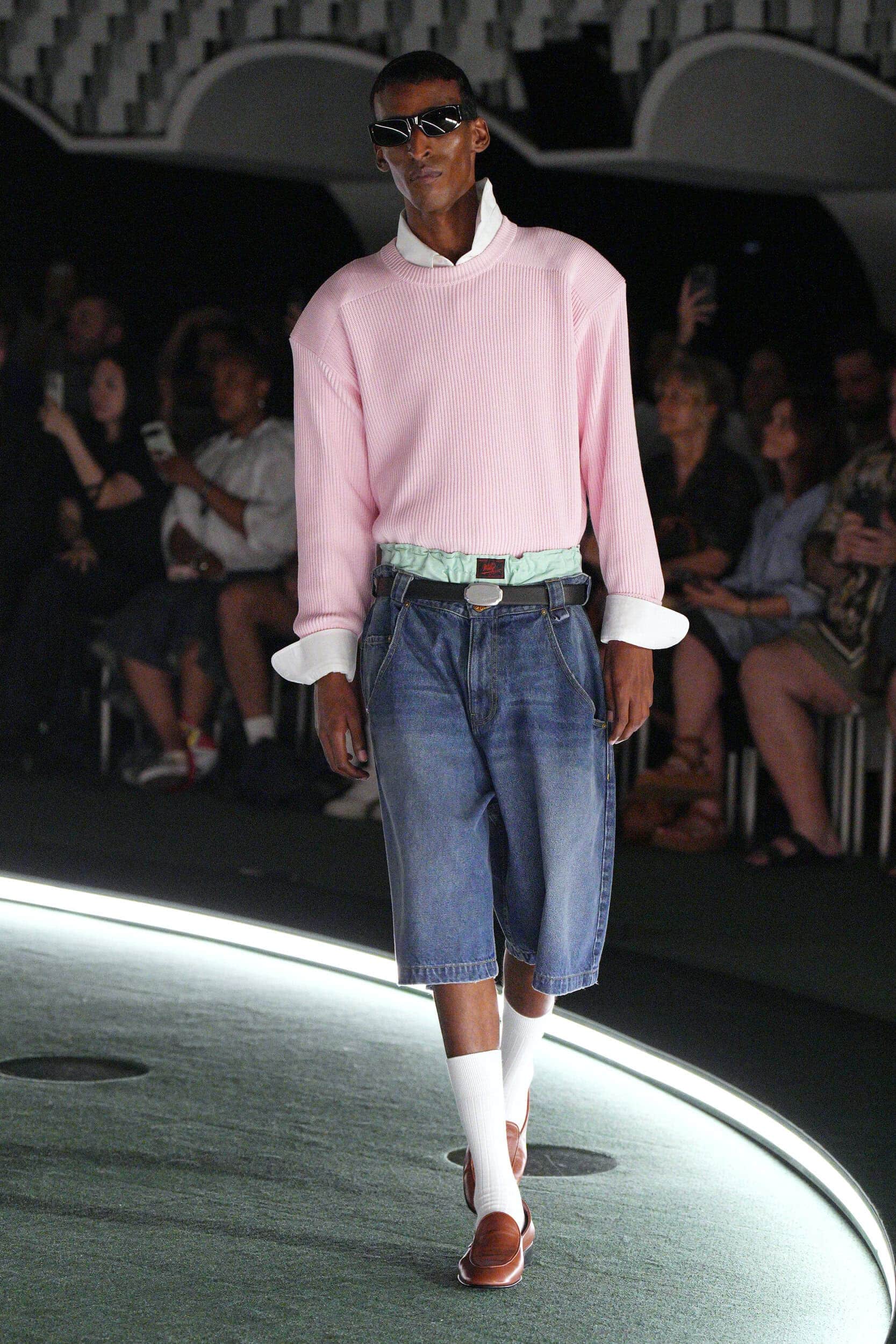
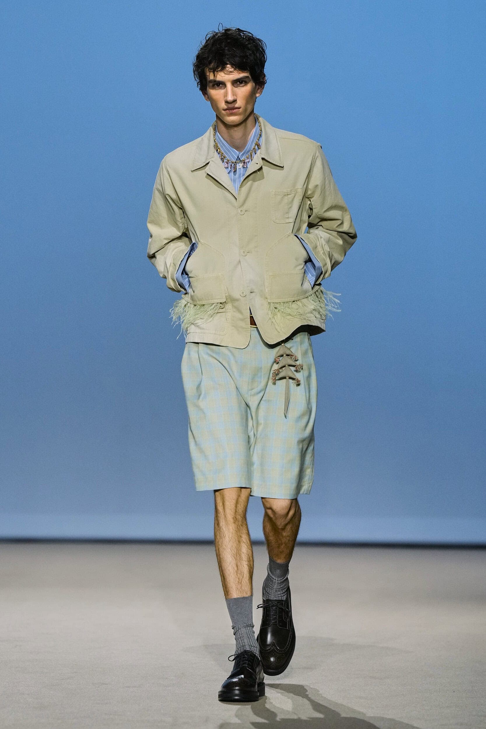
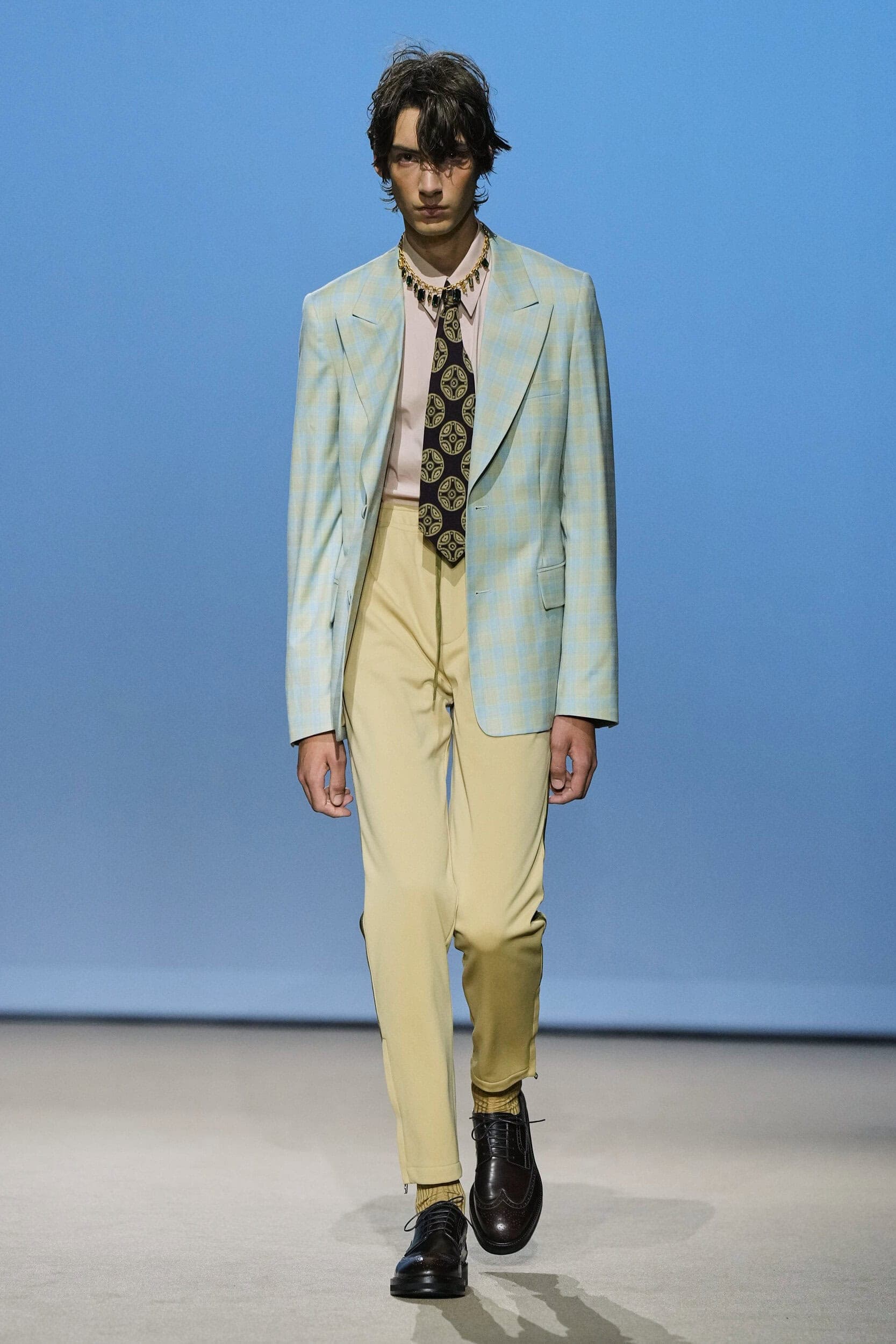
The strongest indication that menswear is once again evolving into a softer space is the adoption of ice-cream shades that also play into the rise of the ‘Whimsy Boy’ summer trend. Pastels are the ultimate visual tool to communicate the collective need to lean into the light in a world that feels increasingly heavy.
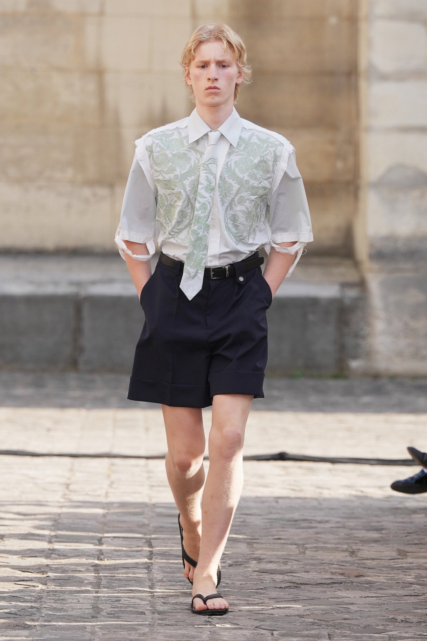
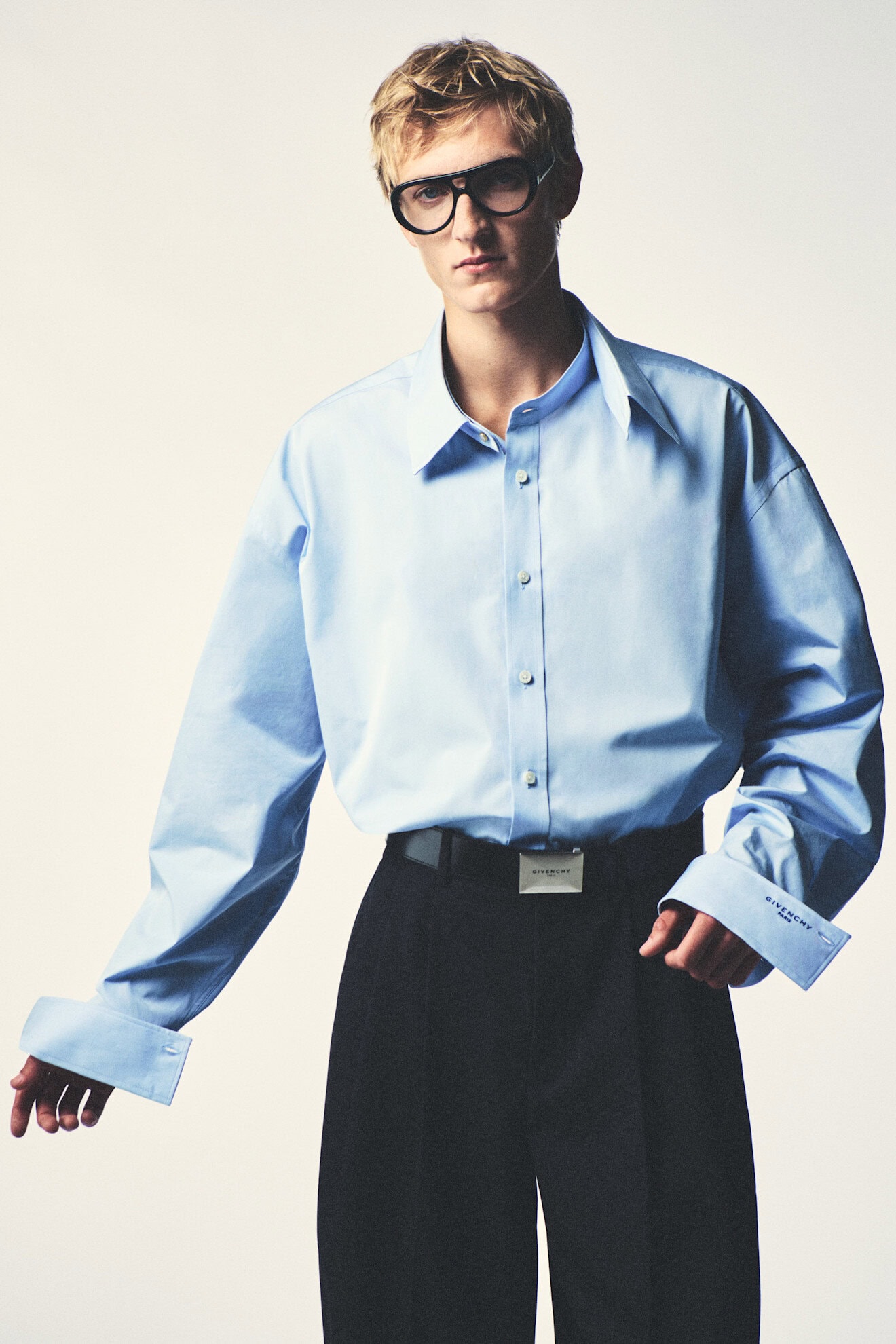
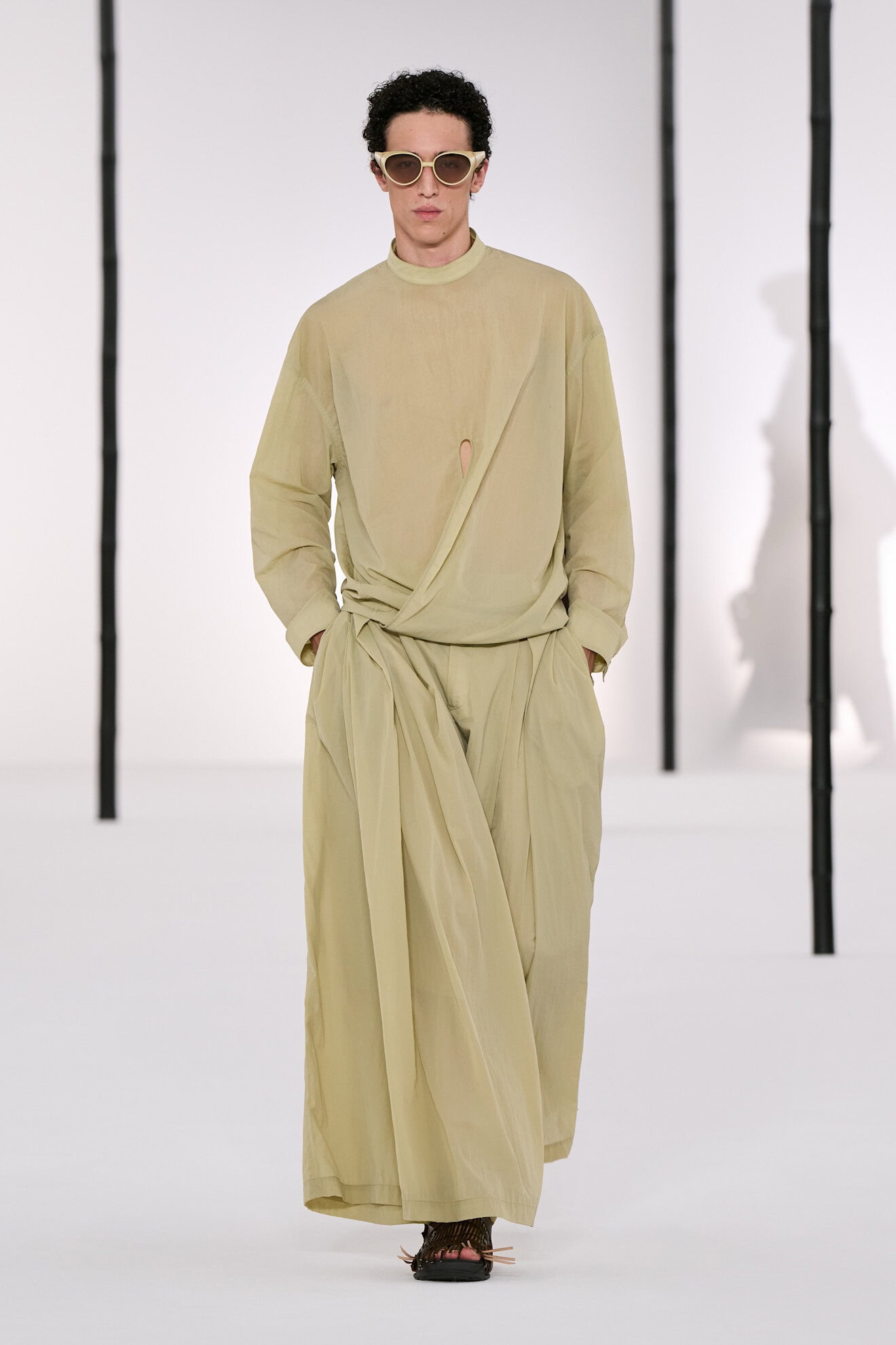
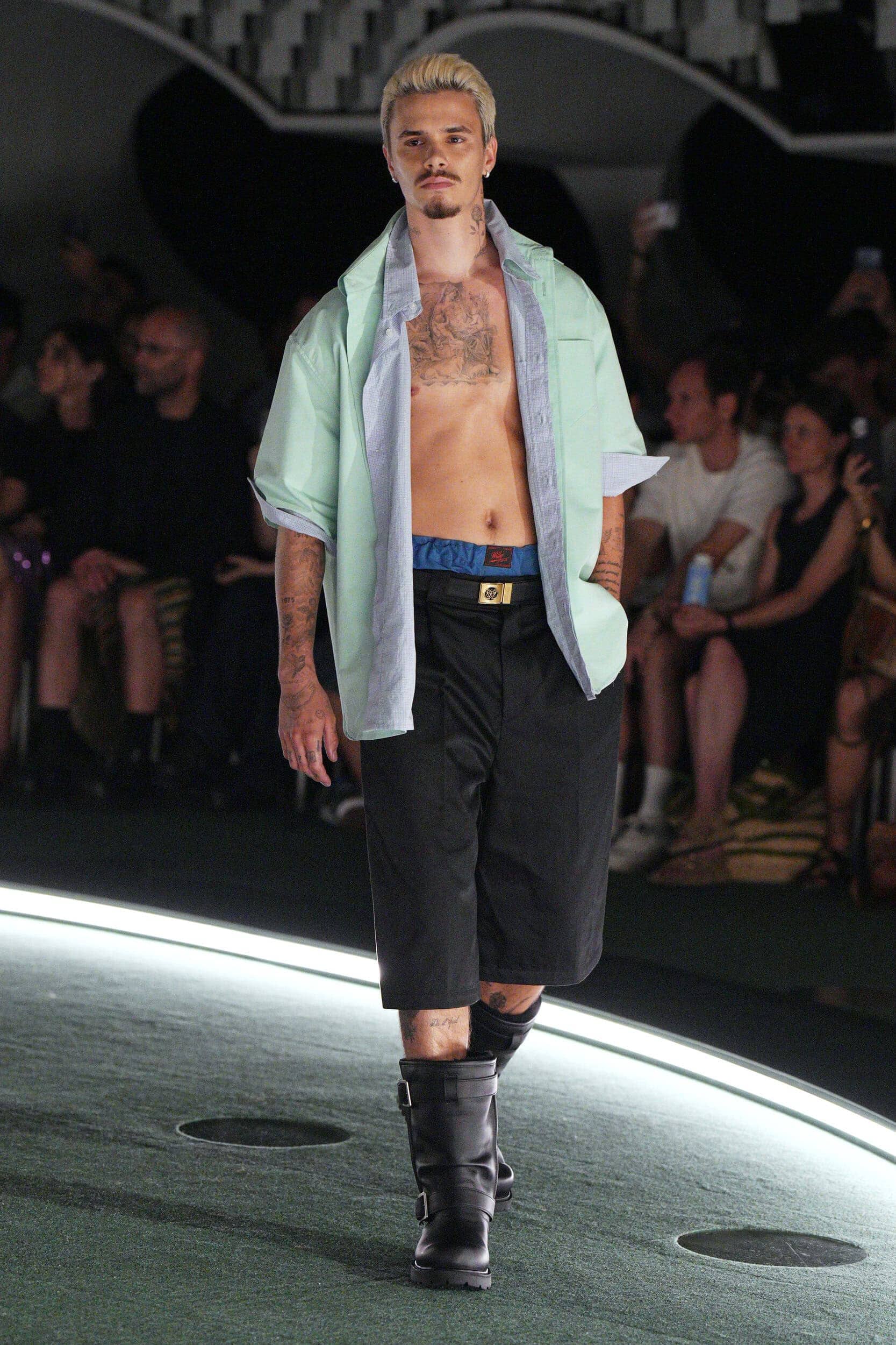
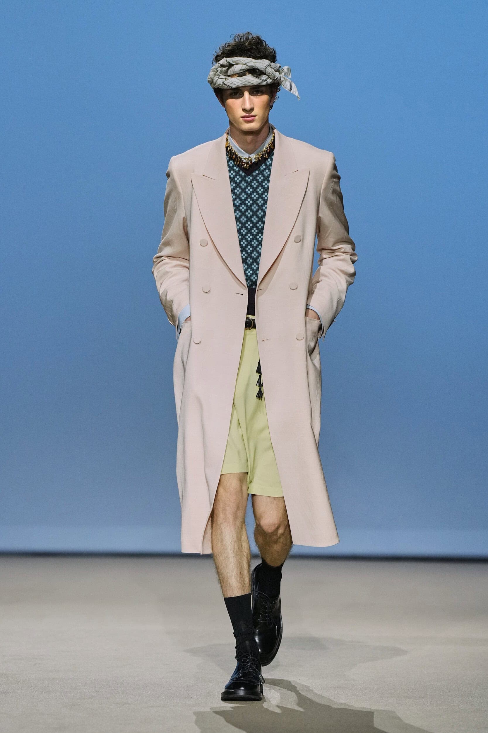
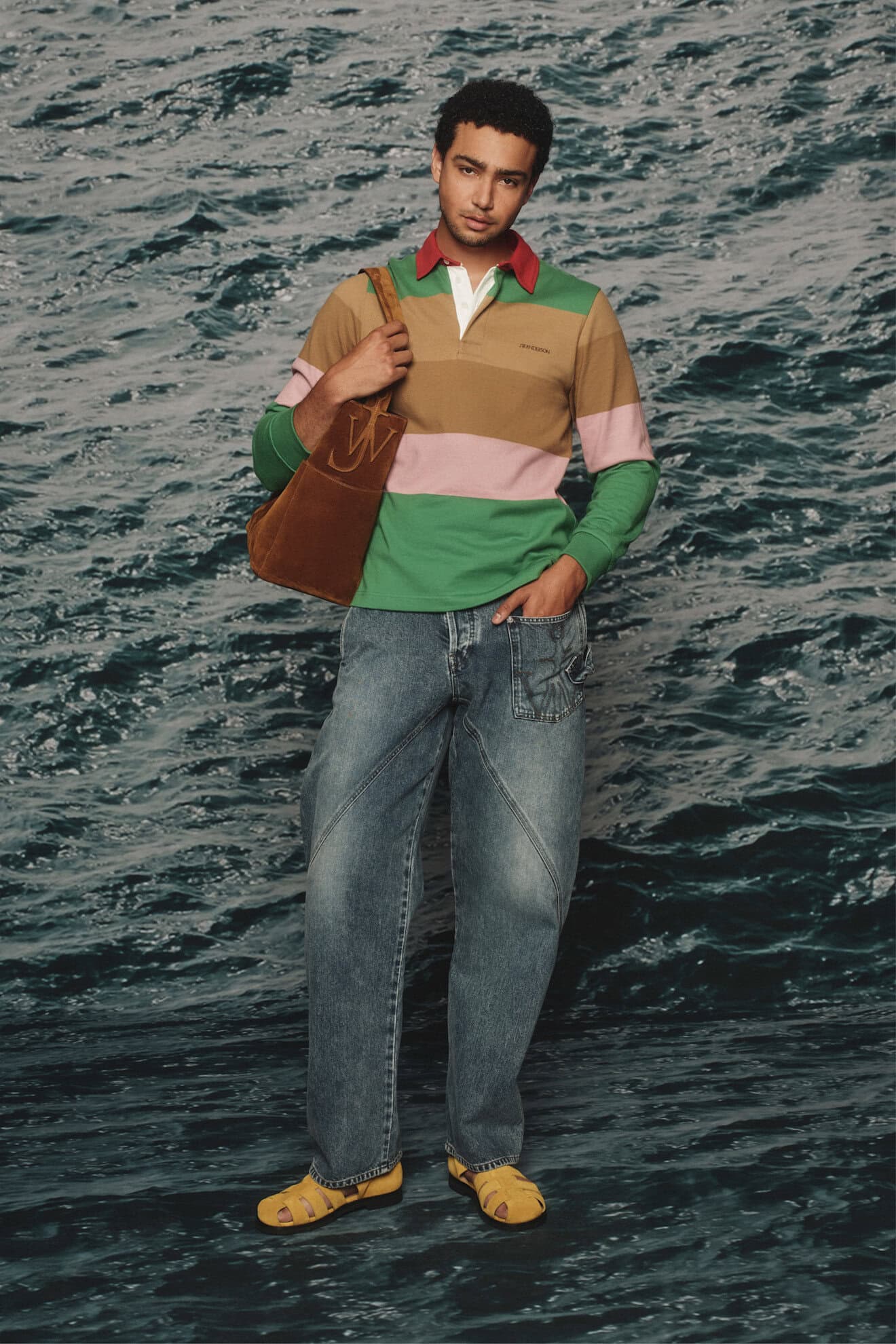
Tones of blue, pink, peach and lilac are derived from dream-like states and fairytale fantasies. Acting as the perfect accompaniment to the transparency trend, as these shades can be diffused through sheers. Dries Van Noten and Louis Vuitton were the purveyors of this palette with influences ranging from mythical fauns to sunset waves. Pistachio green offered a calming refresh and will be applied most liberally across all product categories as was seen at IM Men, Auralee, Willy Chavarria, JW Anderson and Giorgio Armani.
3. CLEAN SLATE
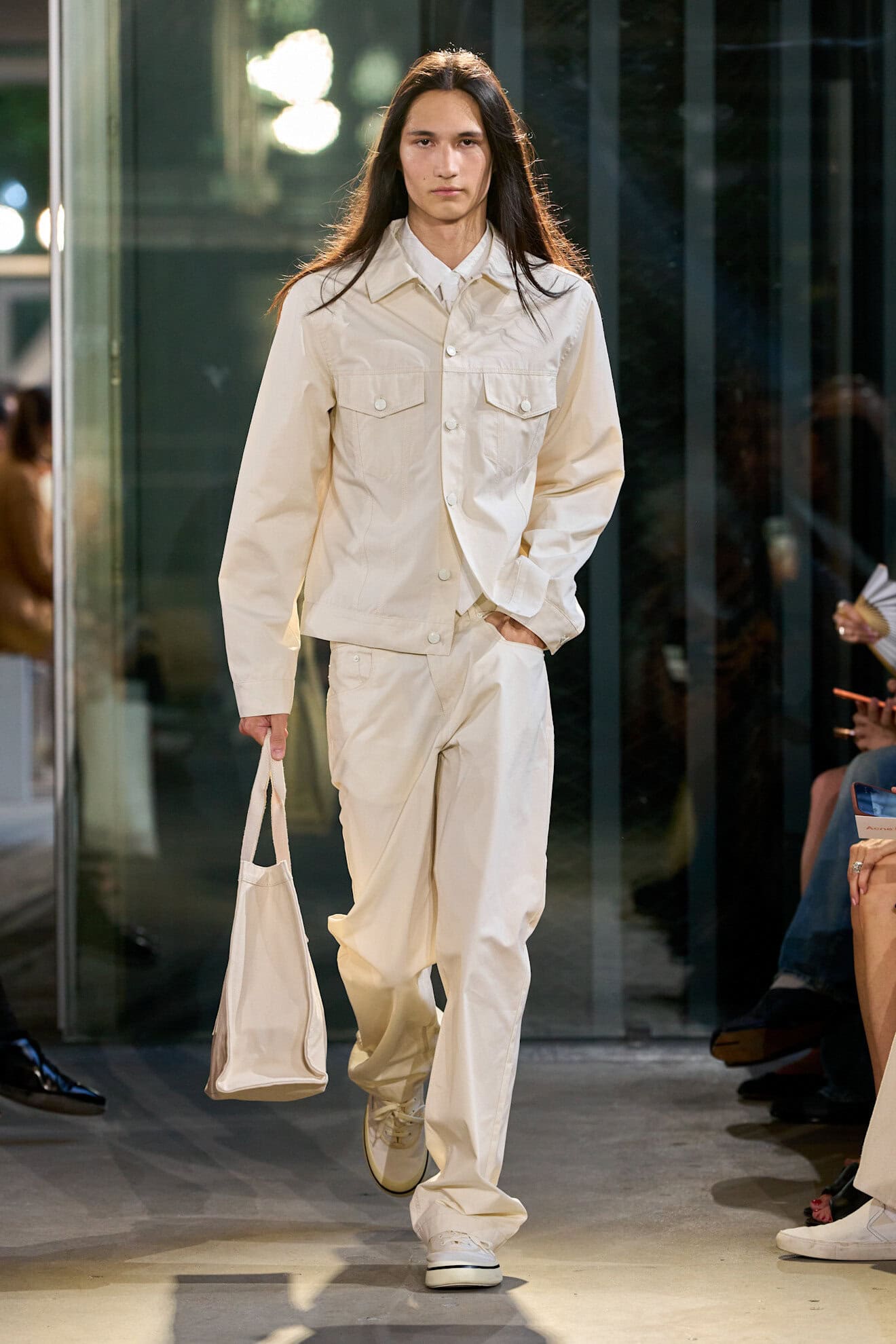
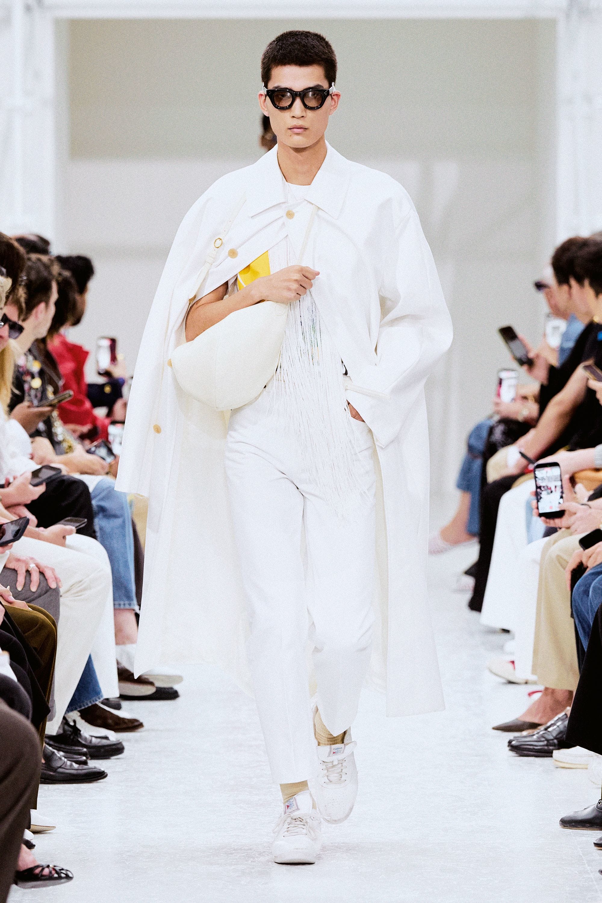
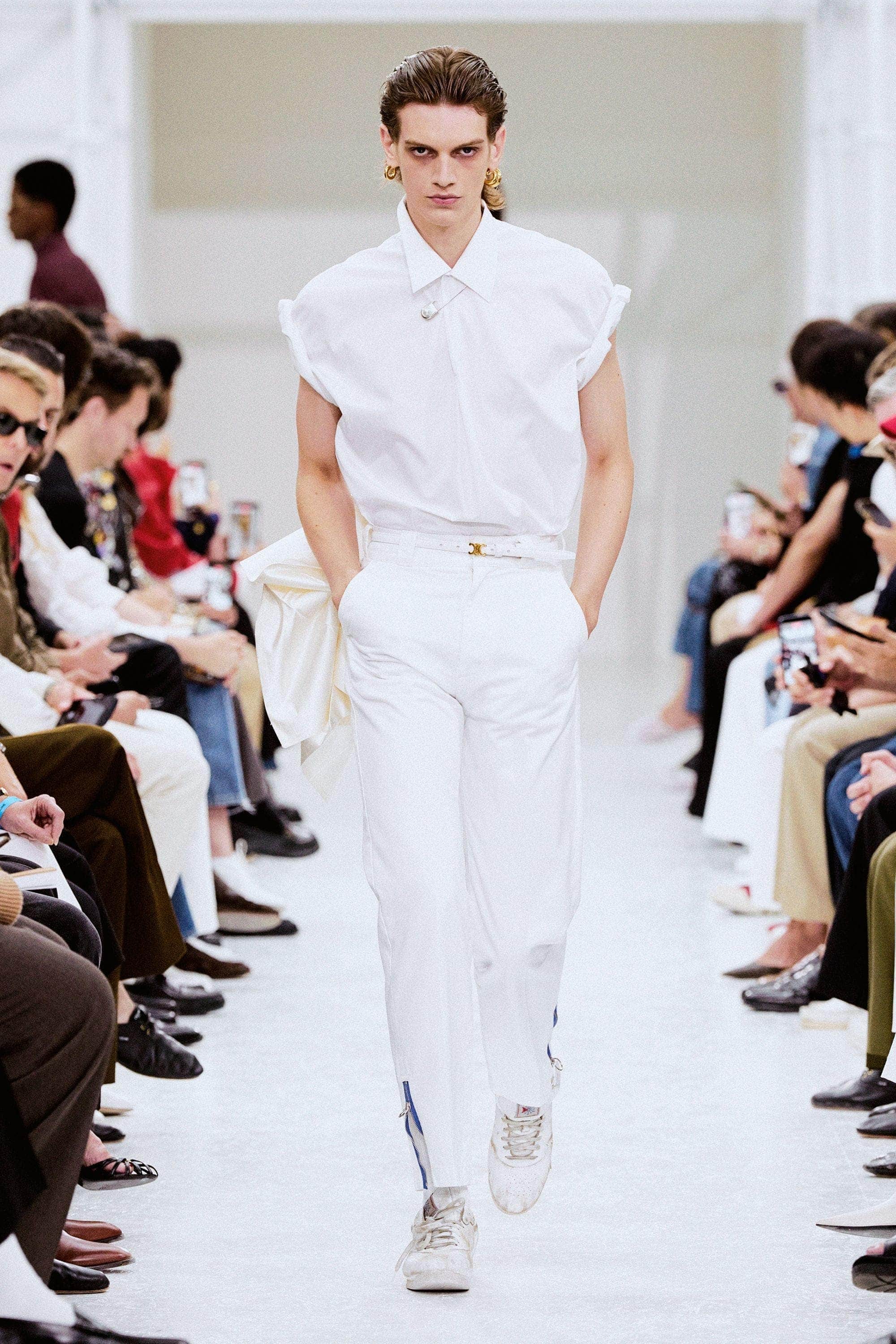
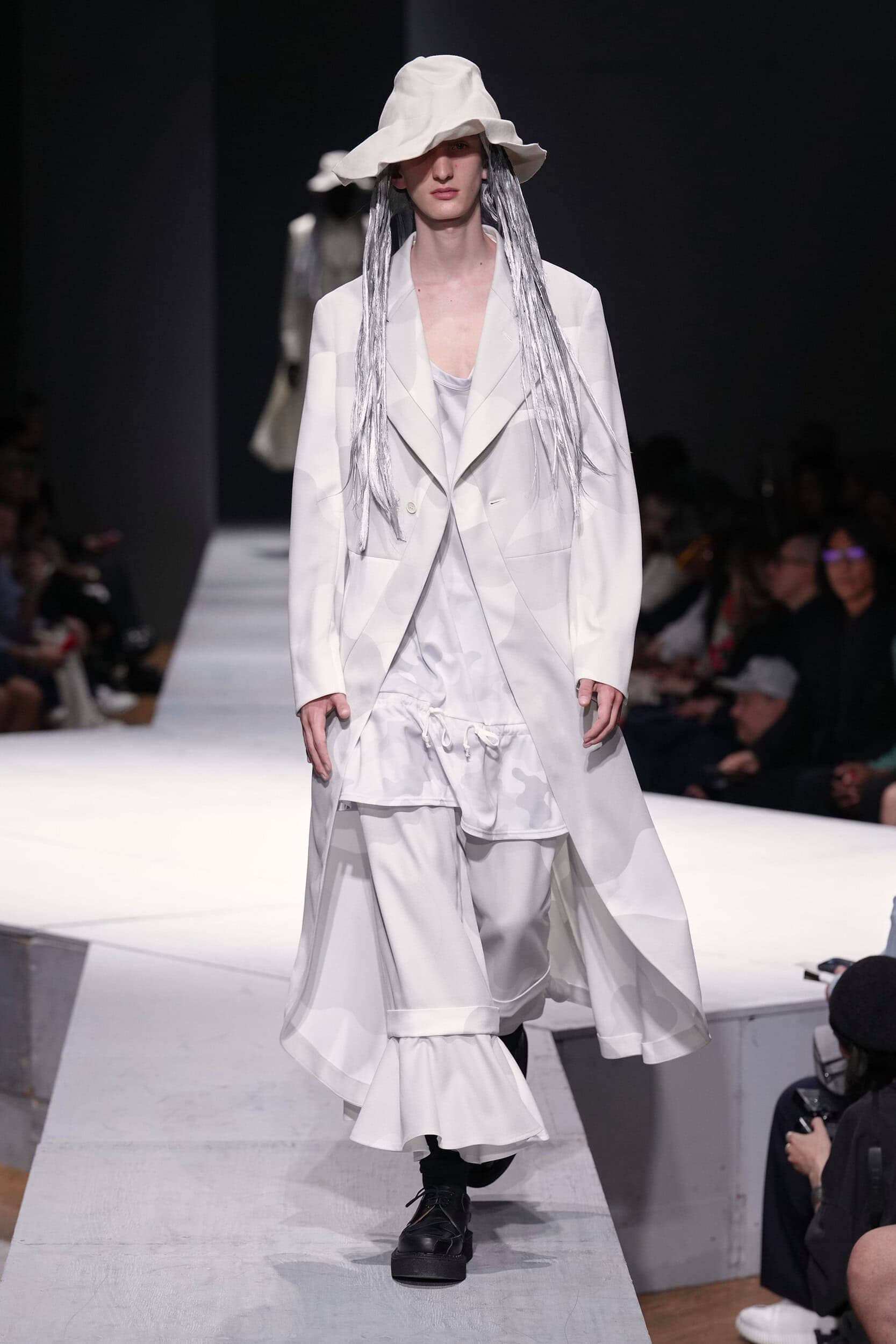
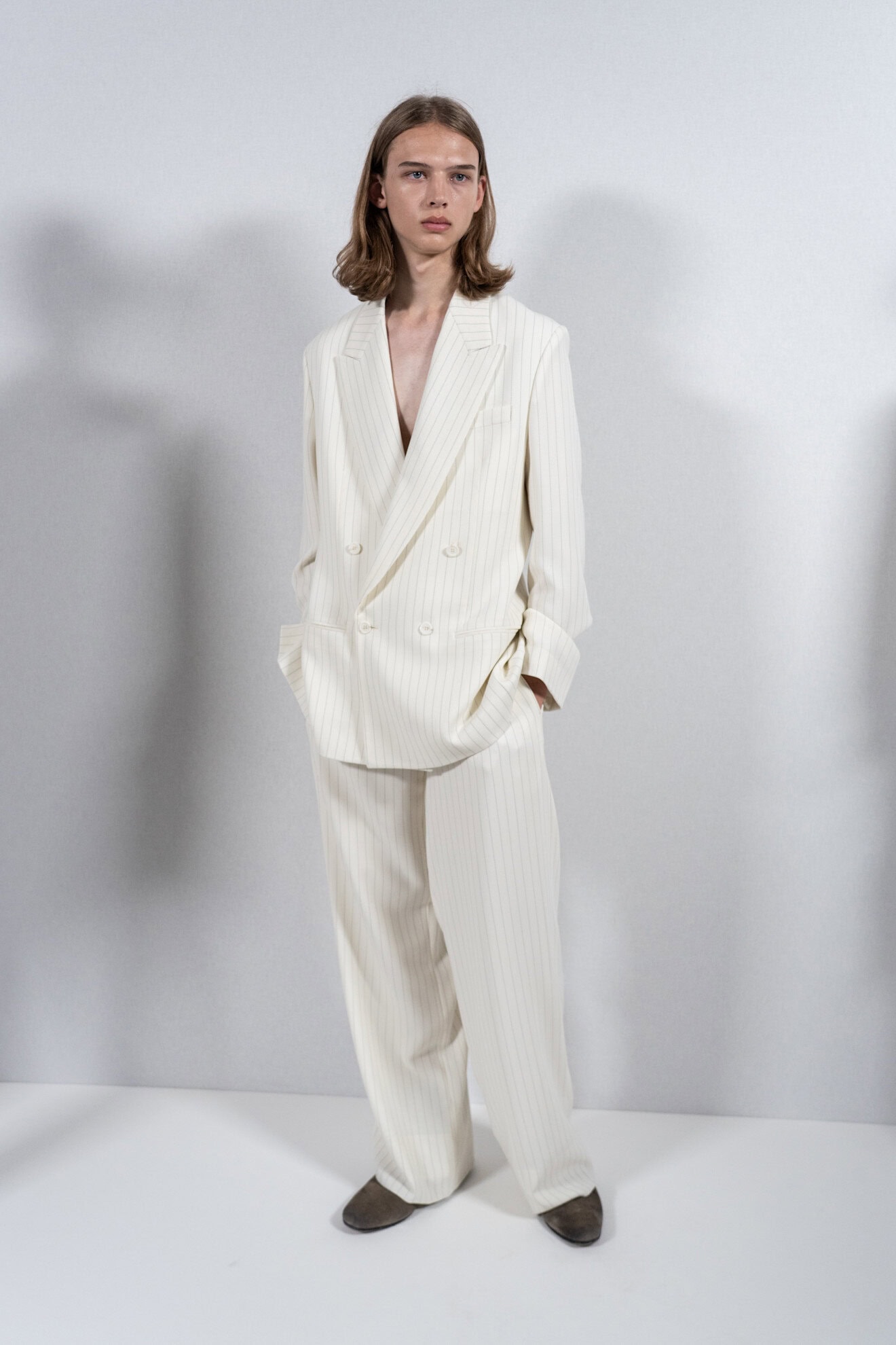
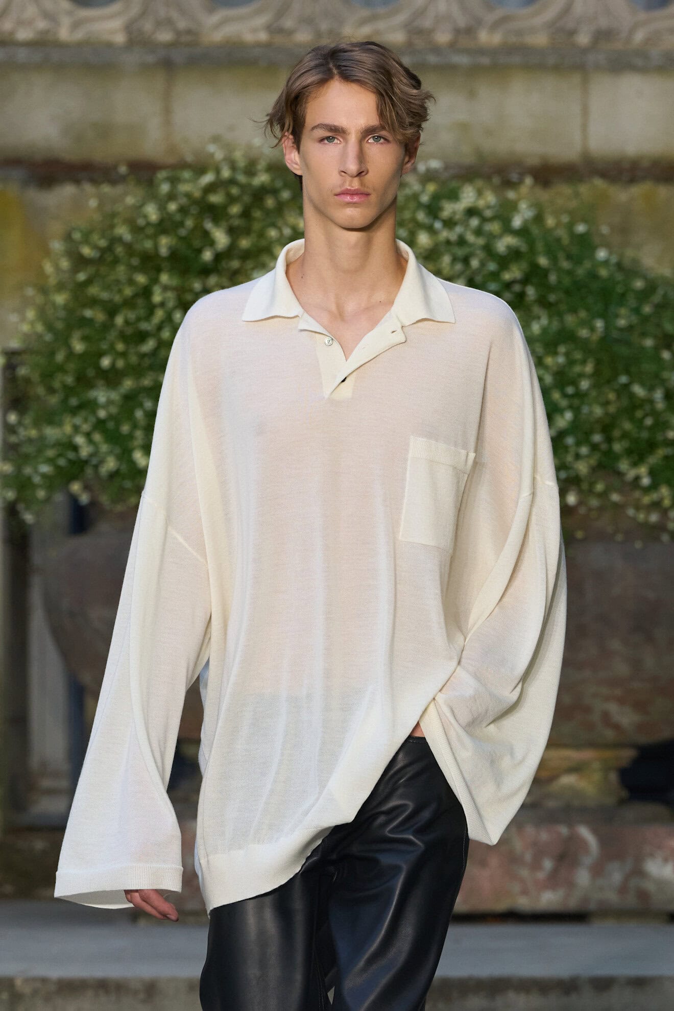
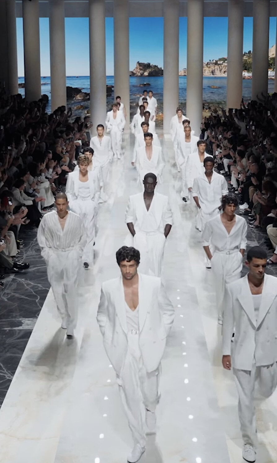
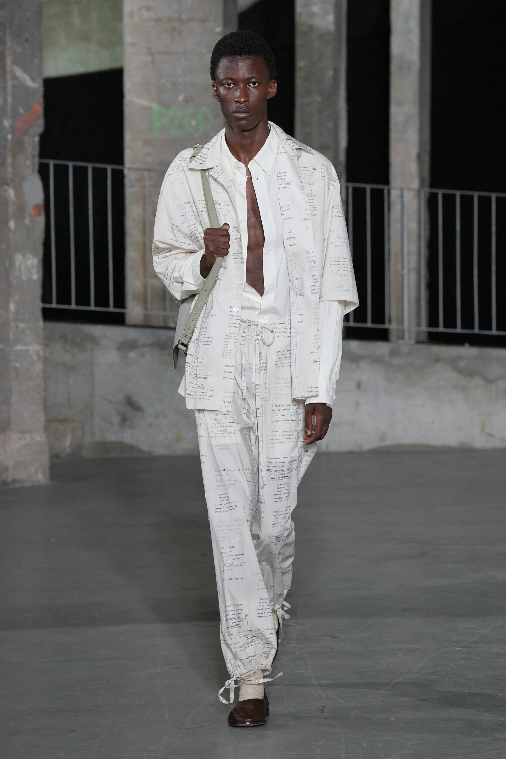
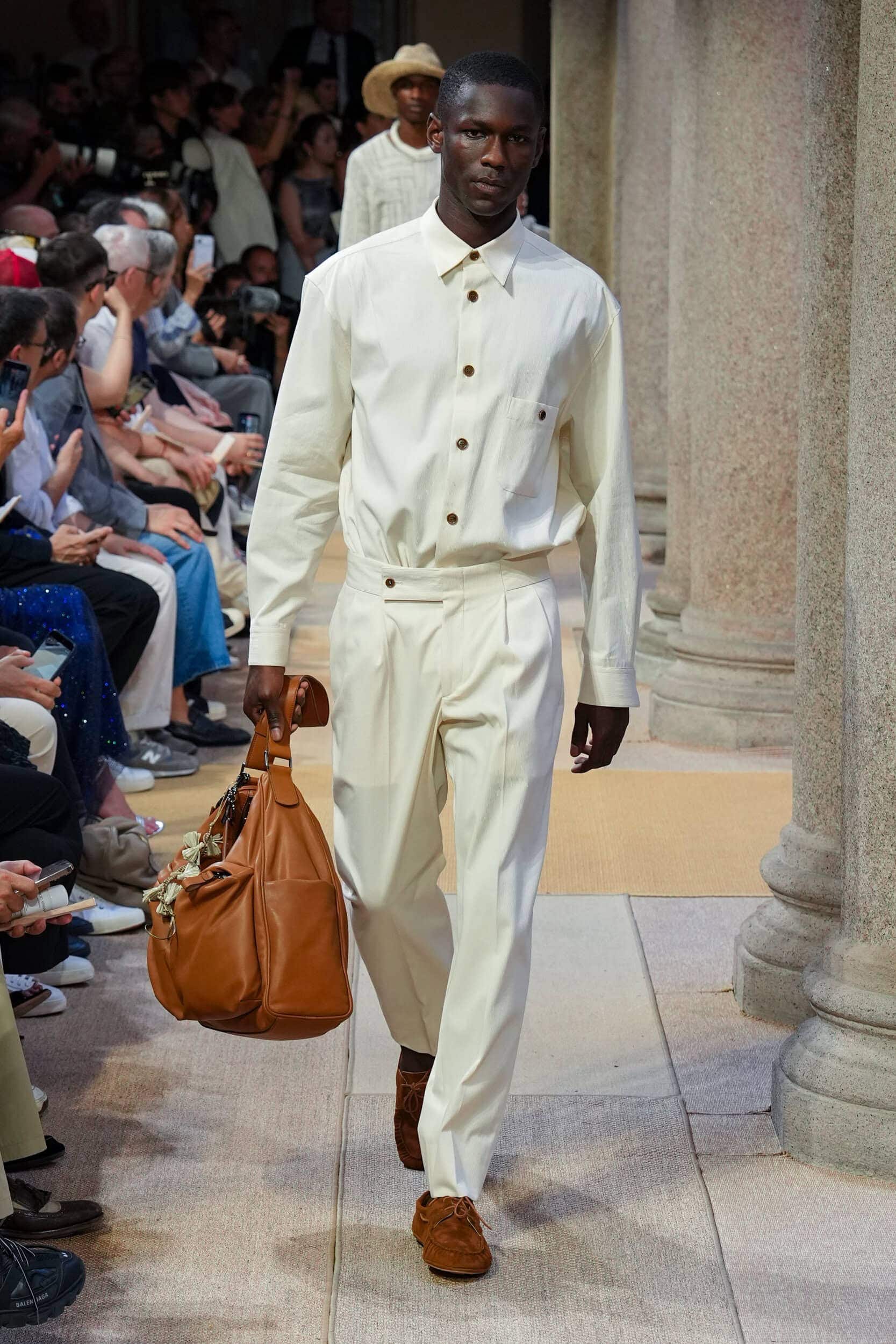
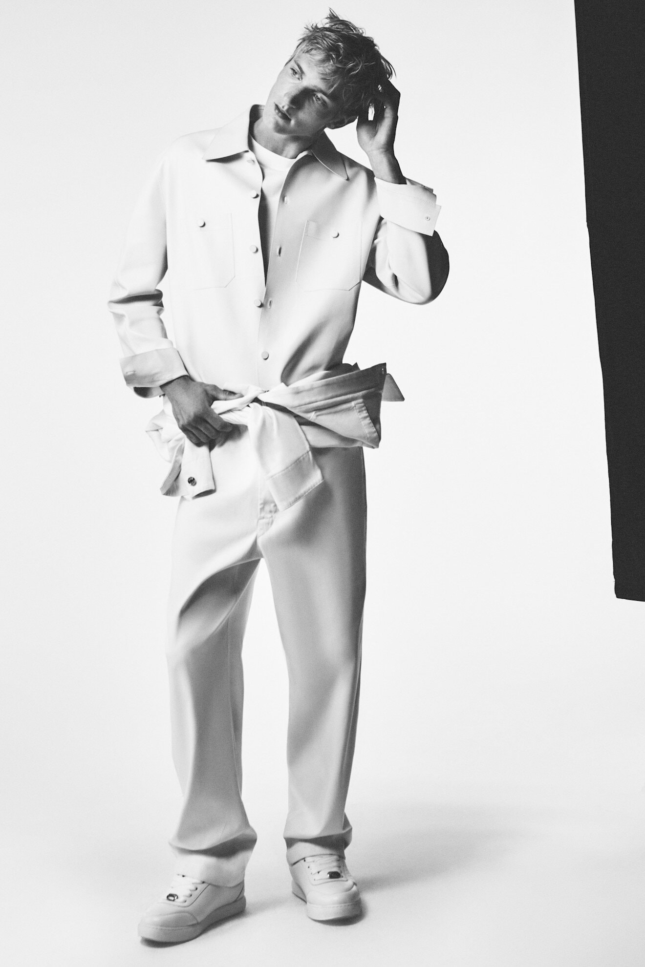
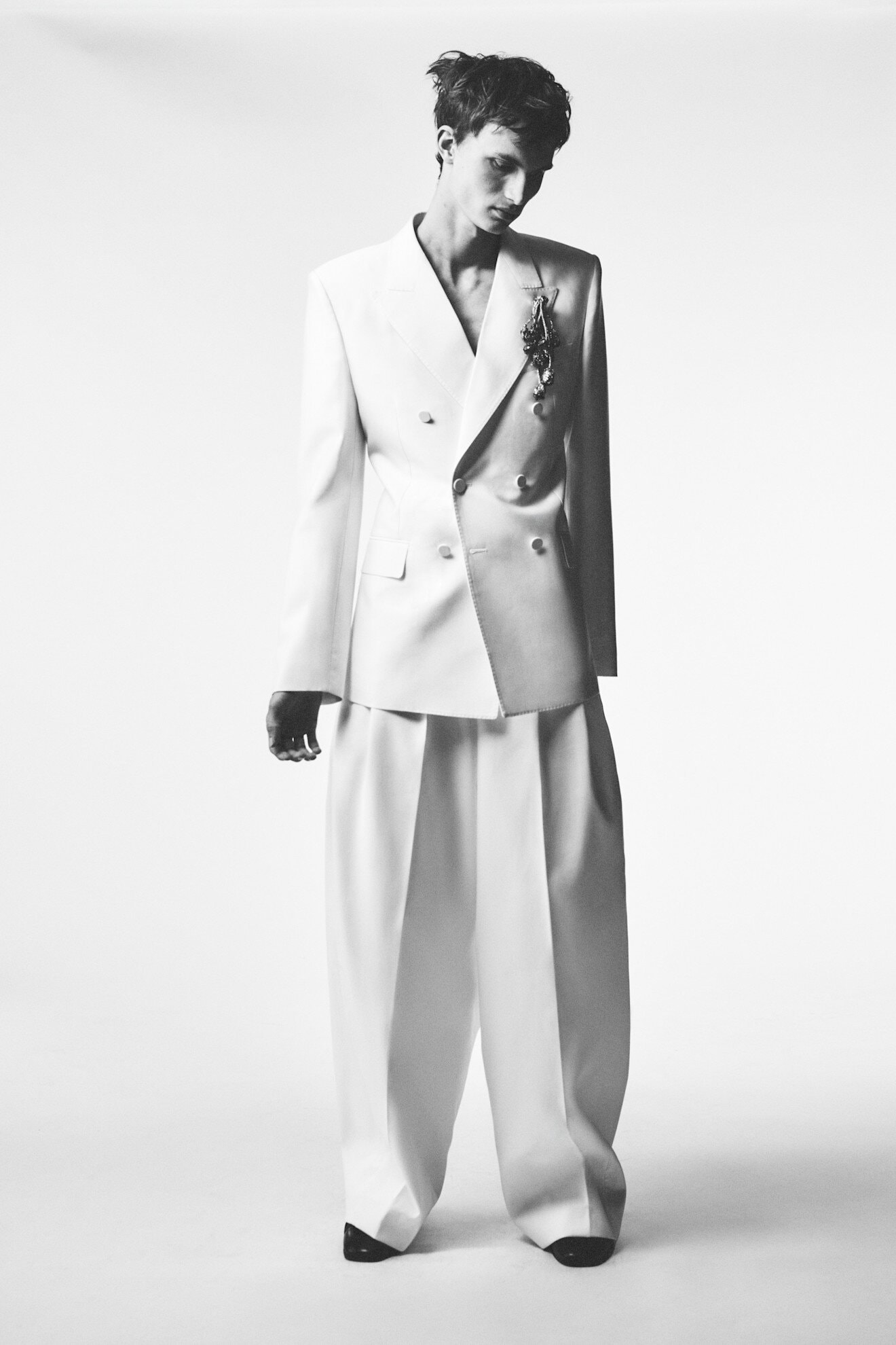
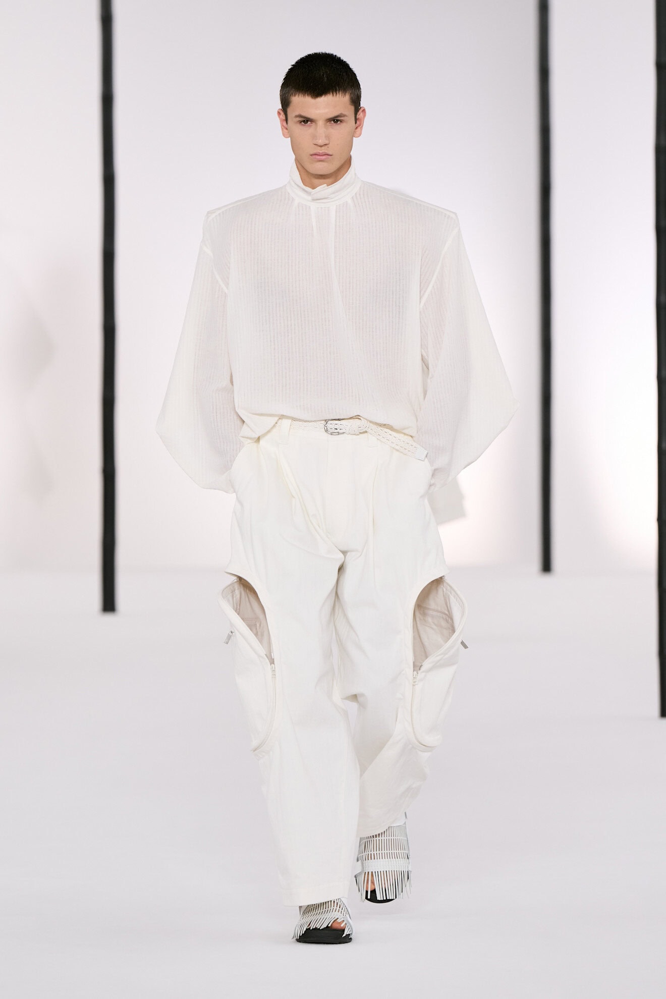
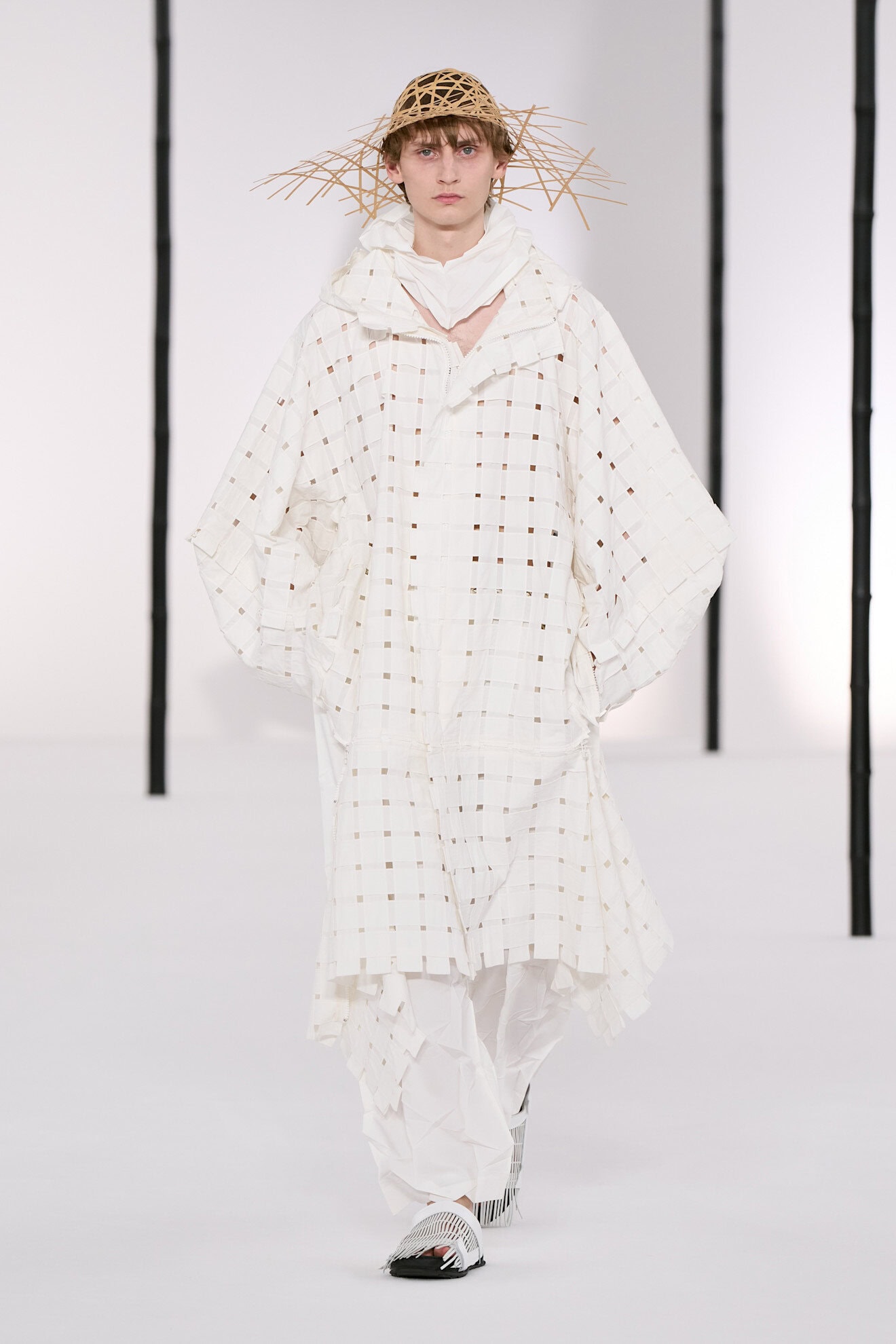
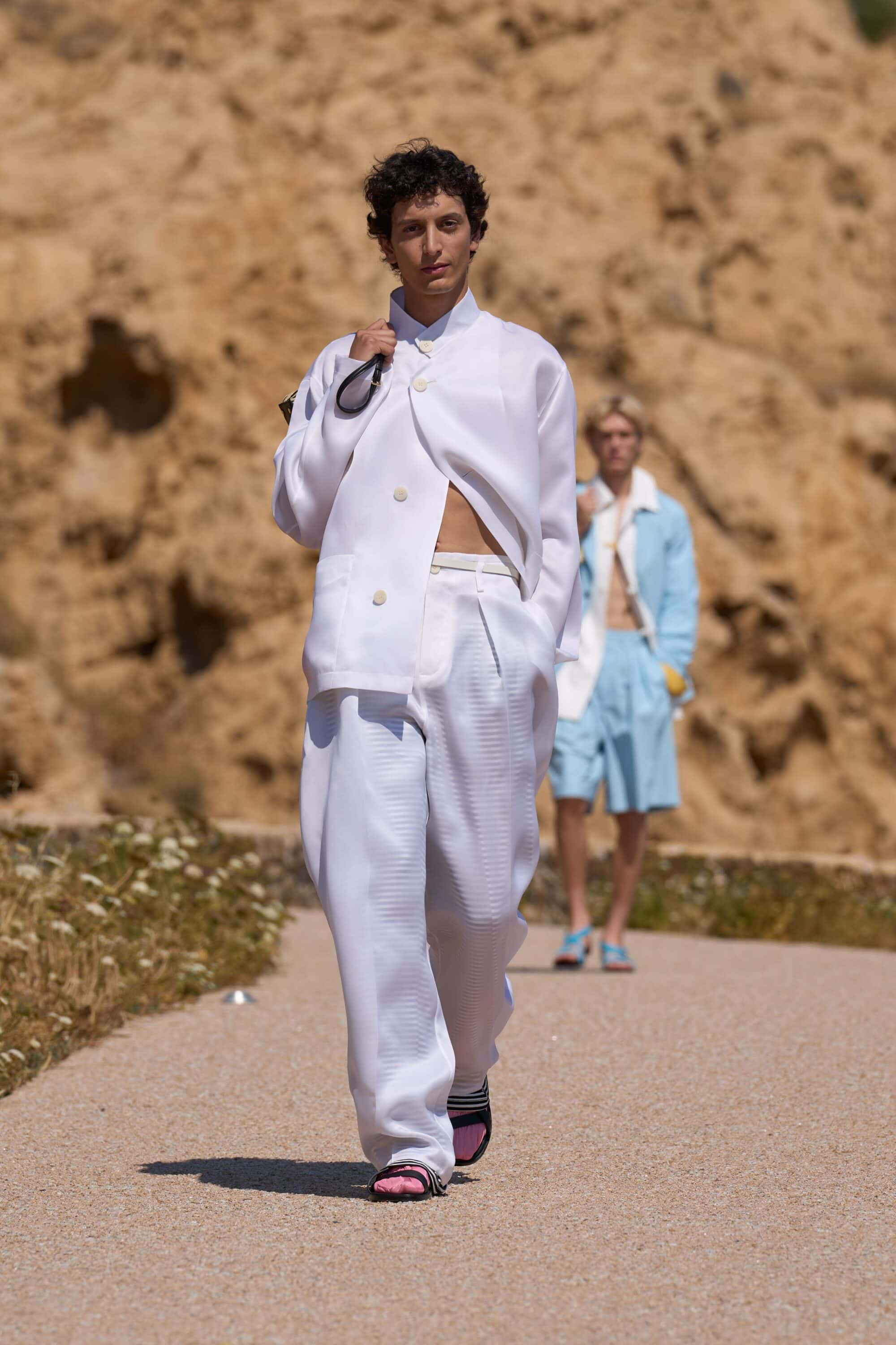
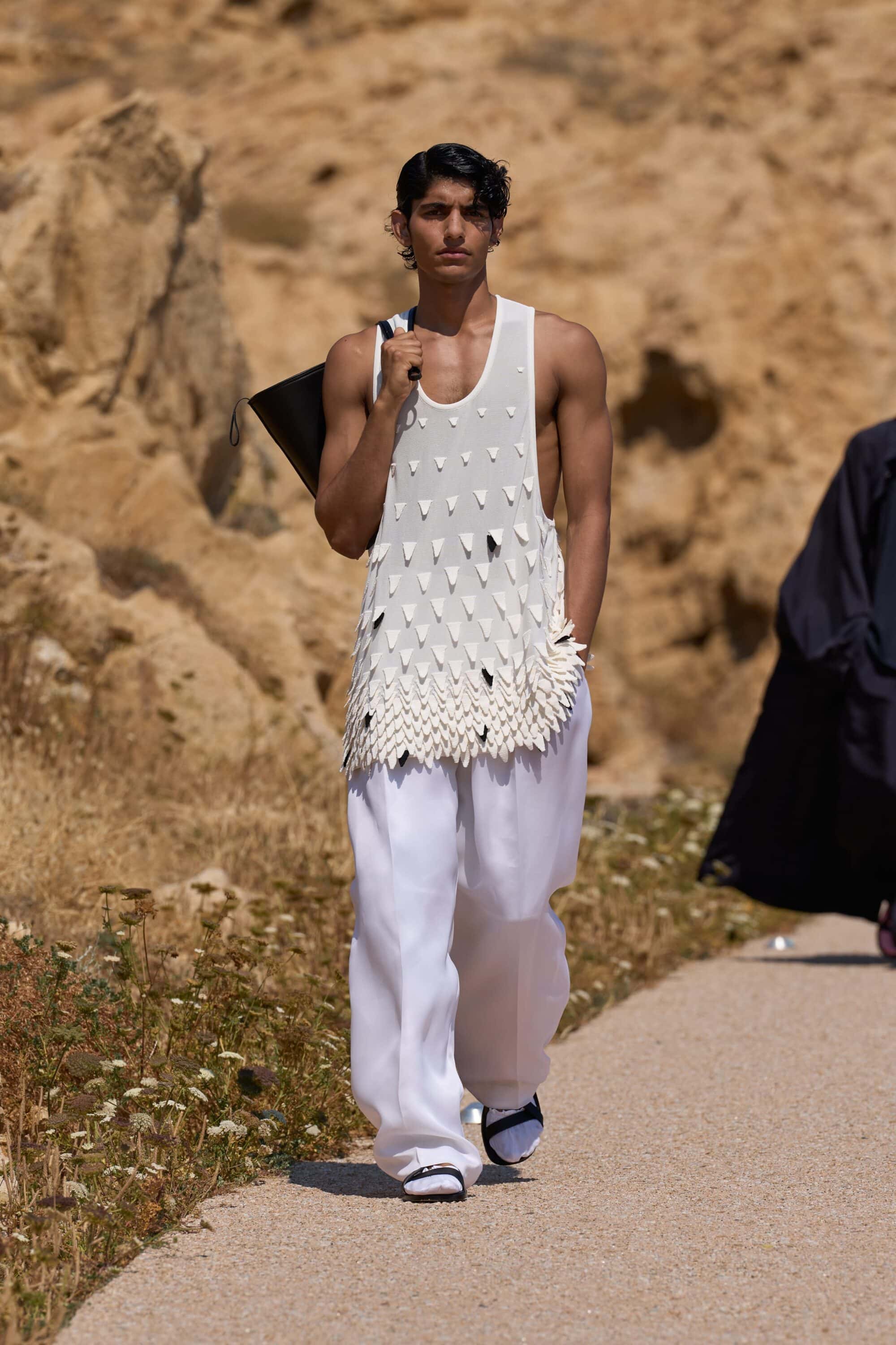
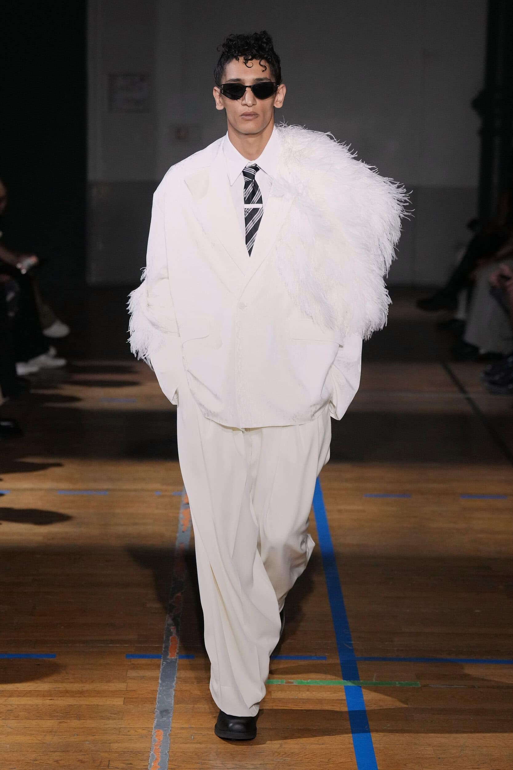
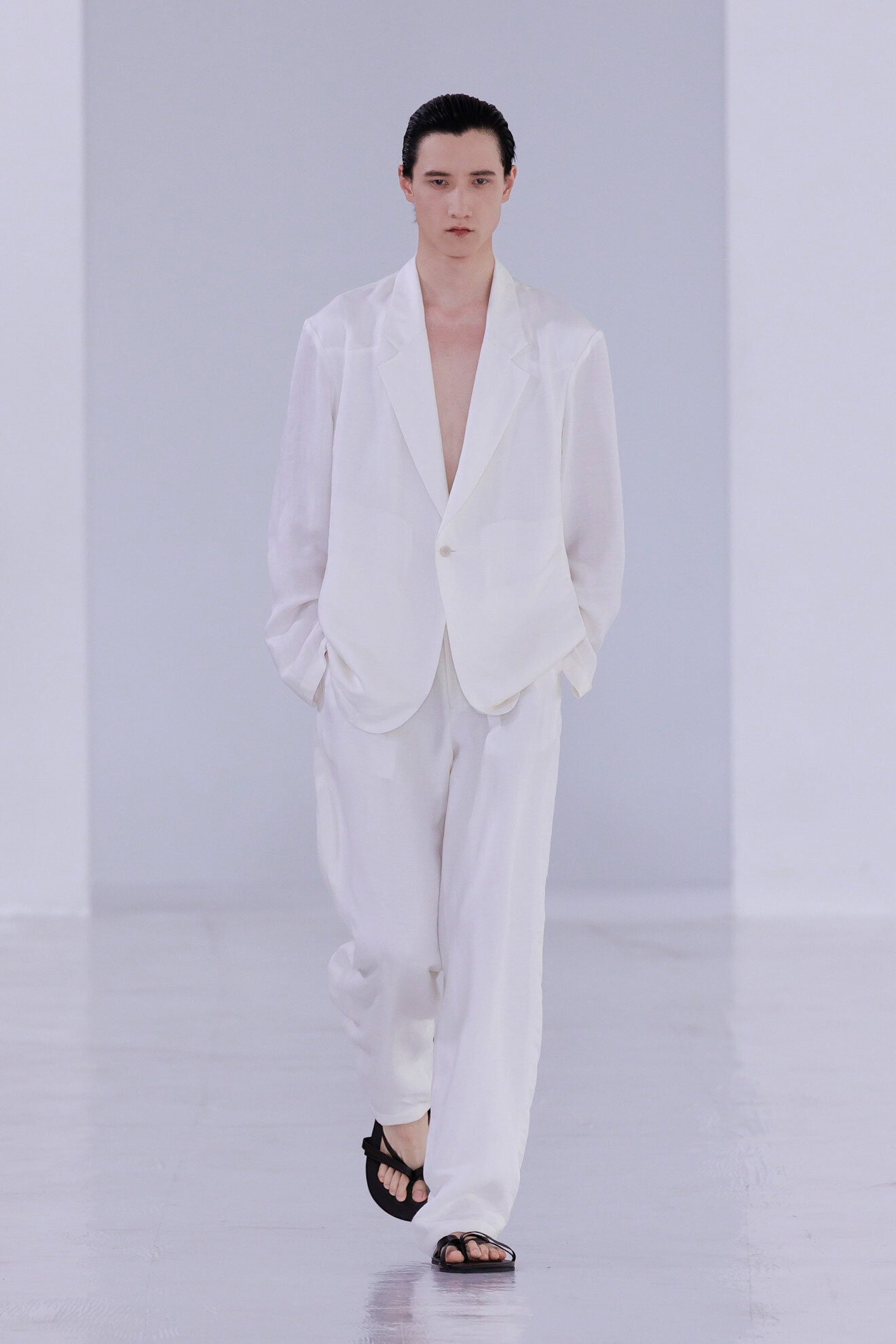
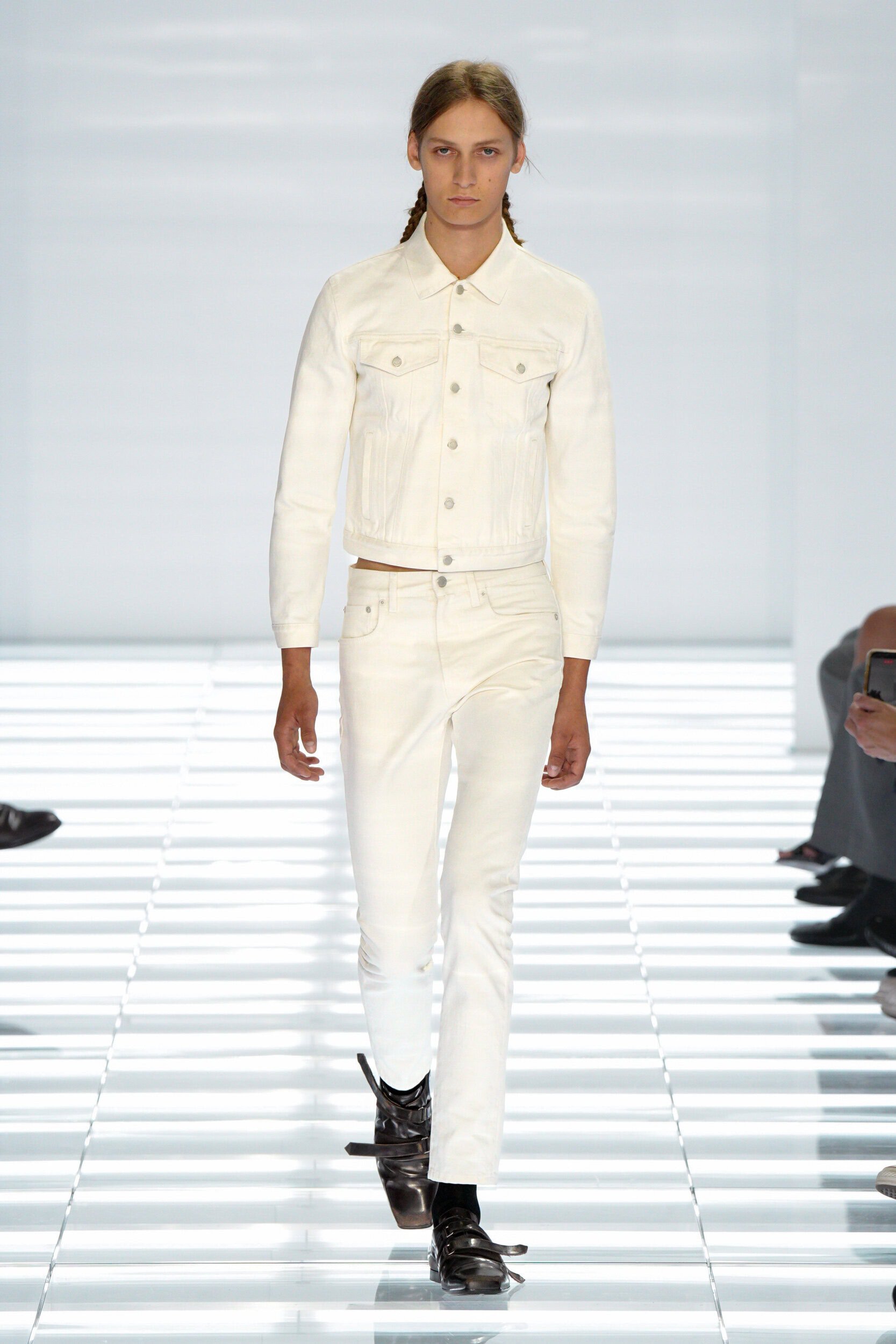
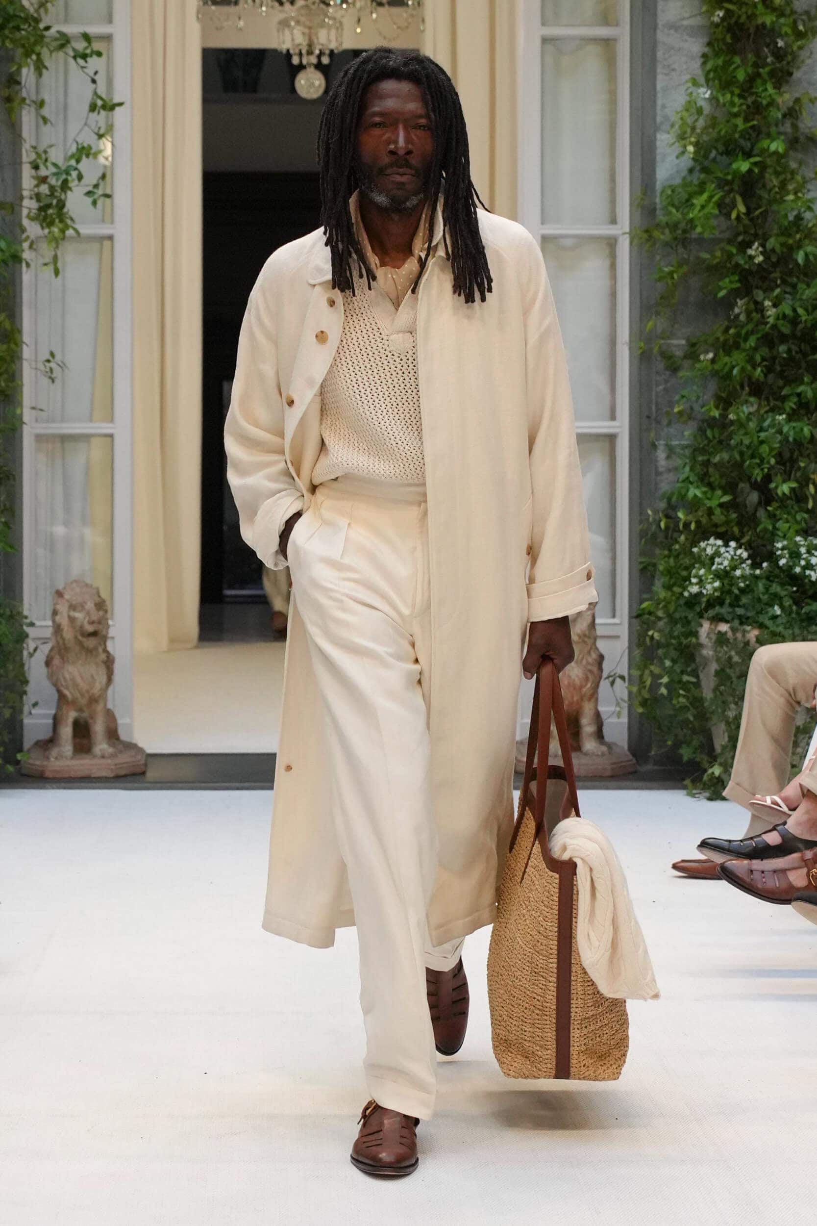
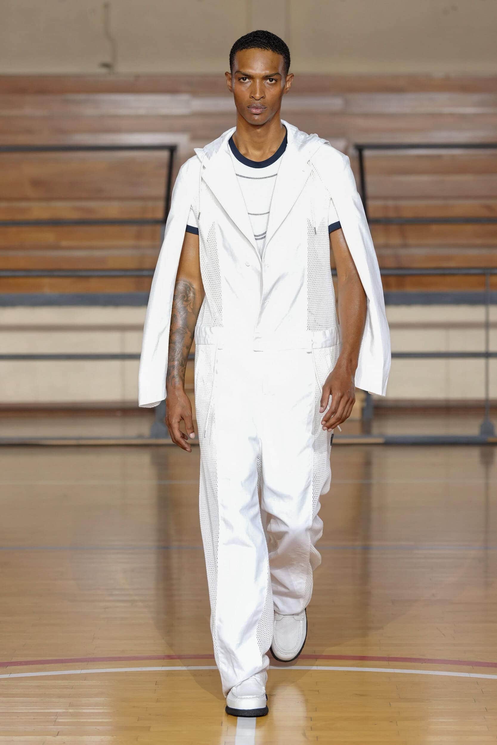
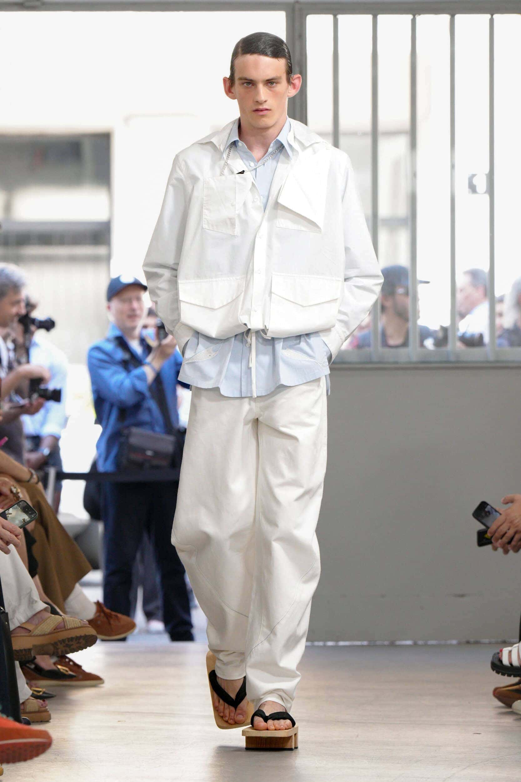
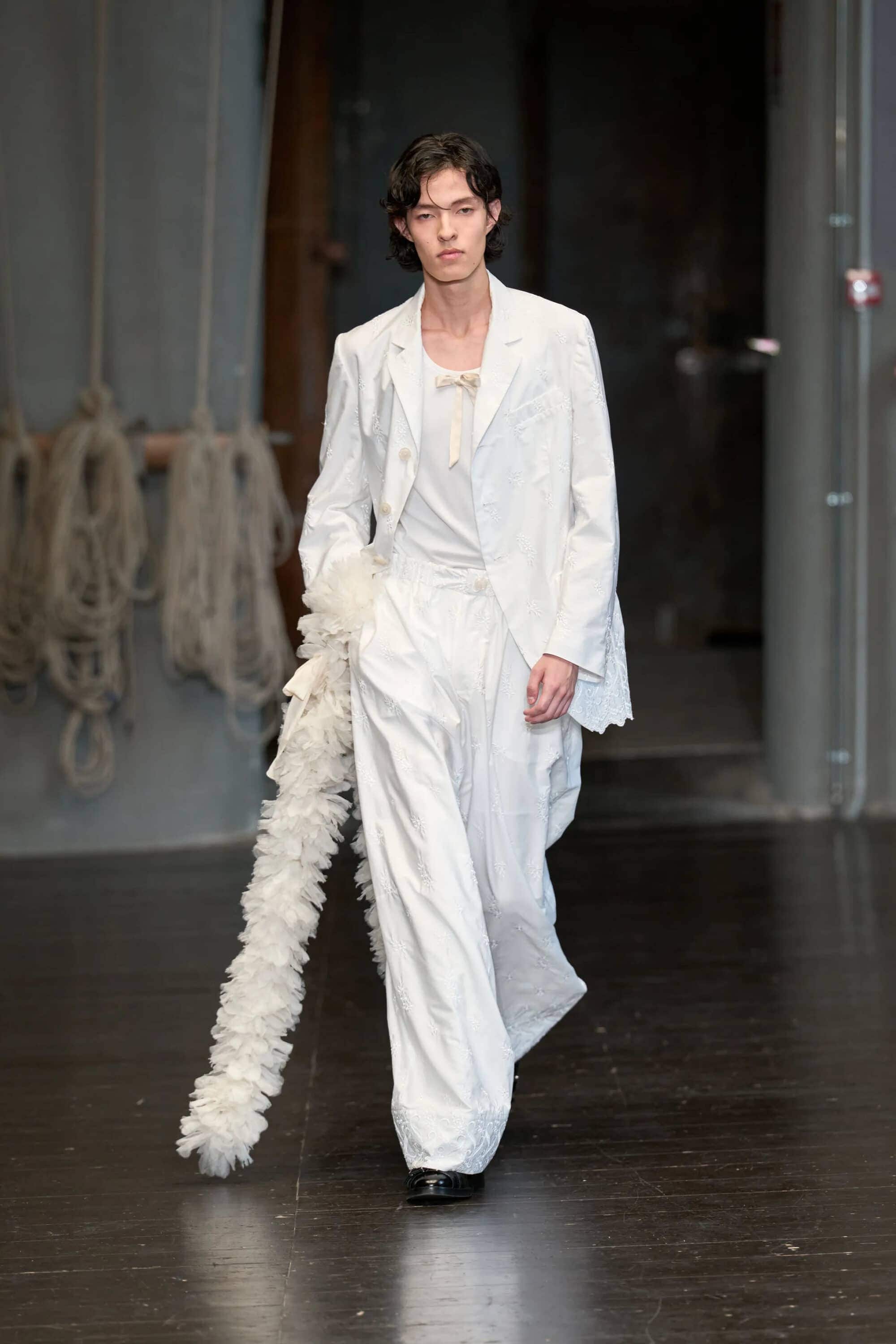
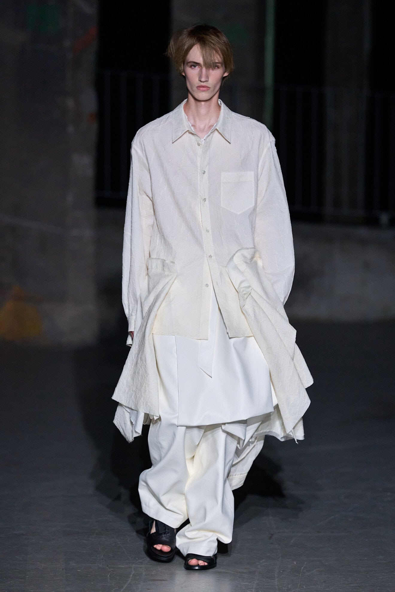
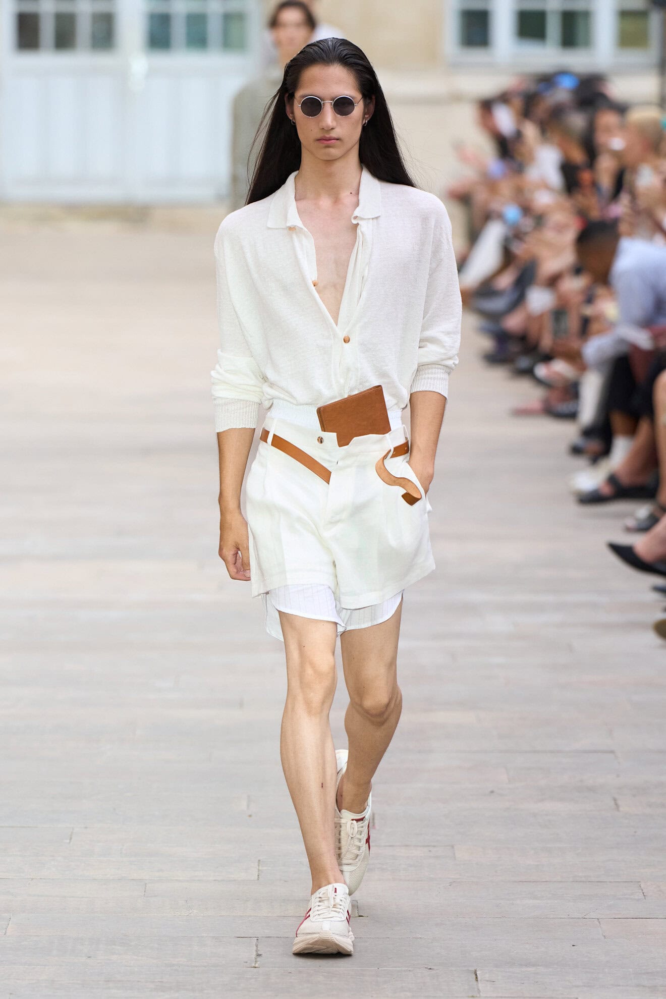
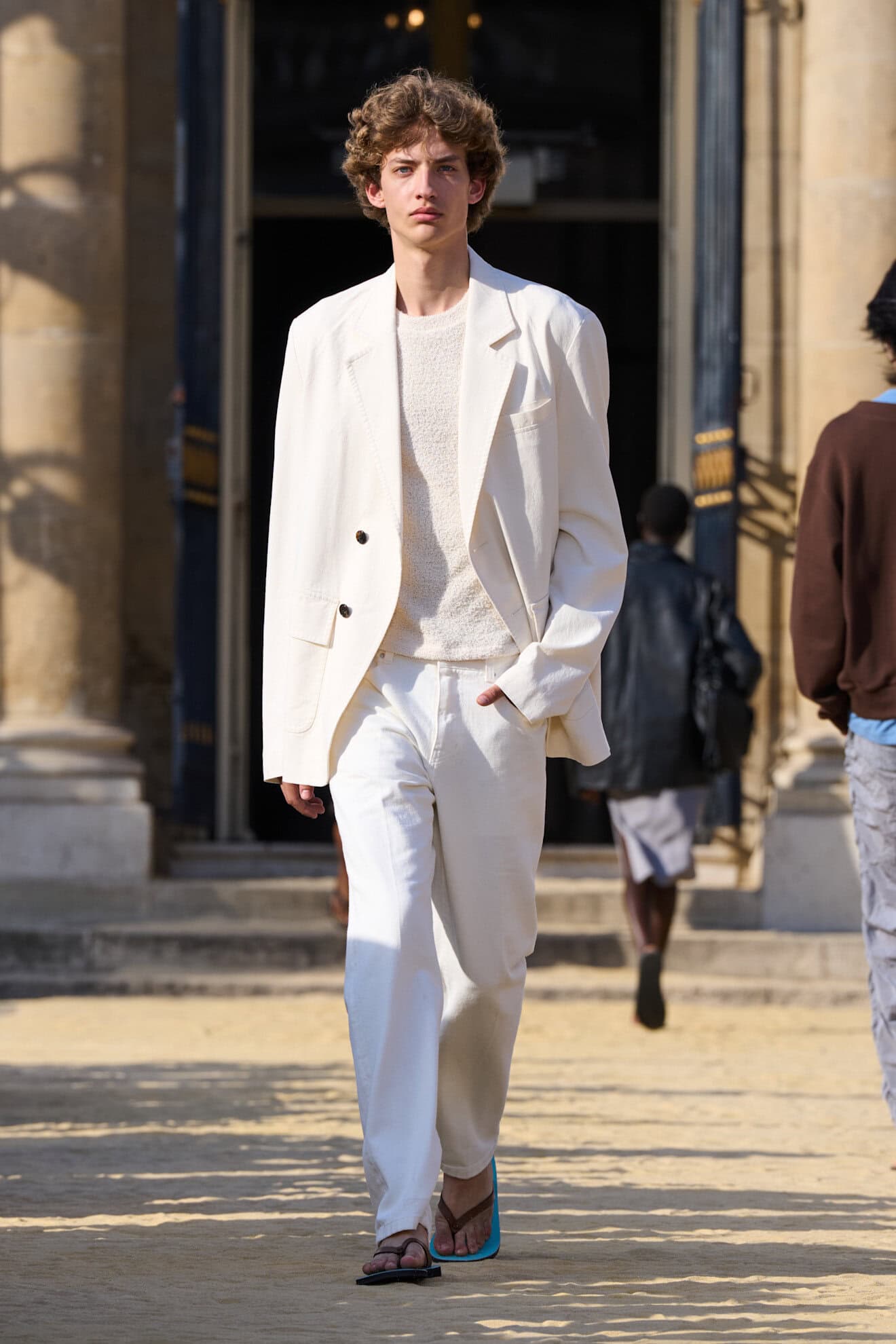
The eternal choice for a versatile summer hue always comes down to the palate cleanser of crisp white. Not constrained to classic shirting and linen suits, white was reframed and applied with a technical, almost clinical broad stroke. Continuing the theme of aerated clothing, designers used bright white for its heat and sun-reflecting properties across woven jackets at IM Men, fringed vests at Jacquemus, and crochet and gauzy knits at Ralph Lauren and Dior Men.
4. INTENSE REDS
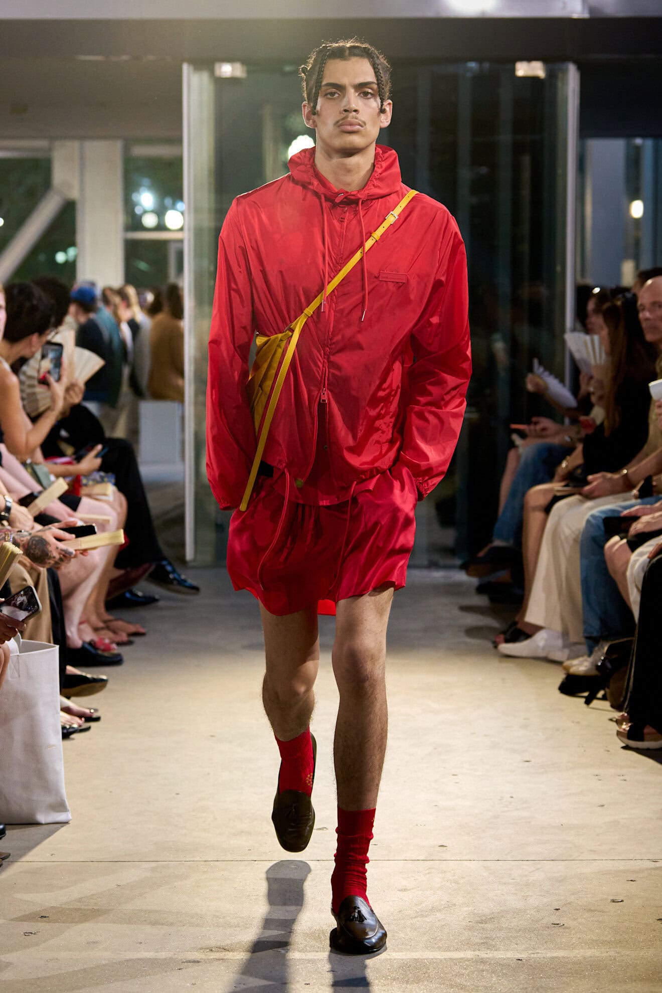
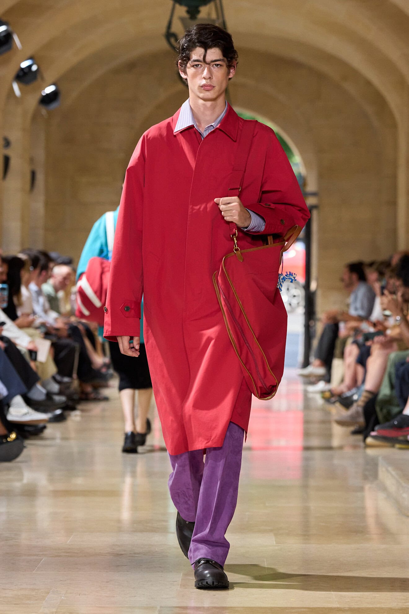
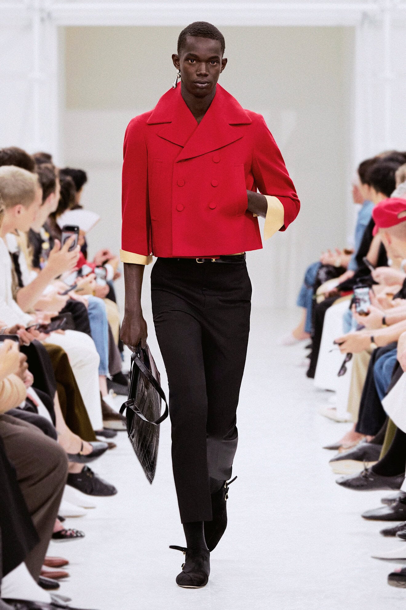
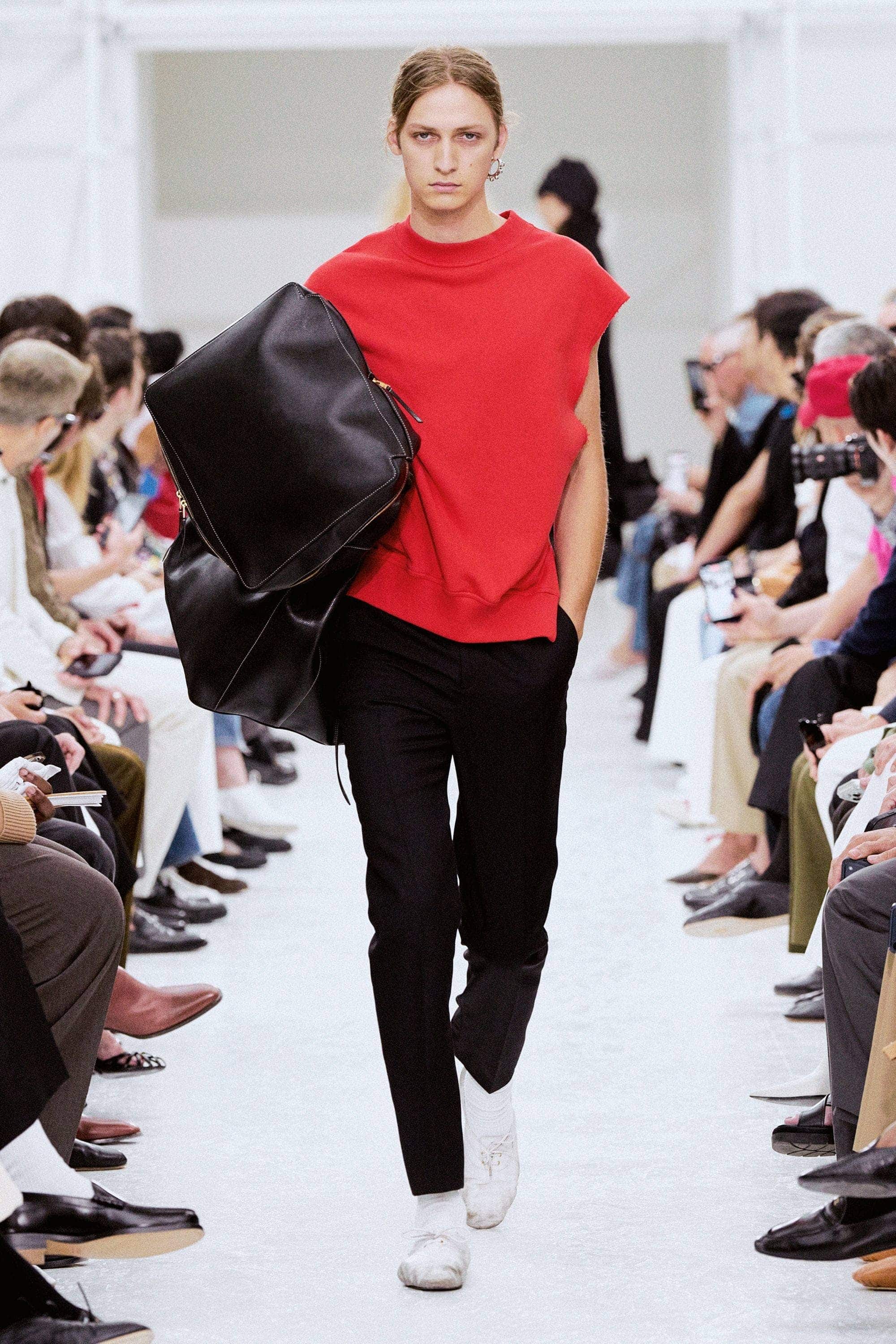
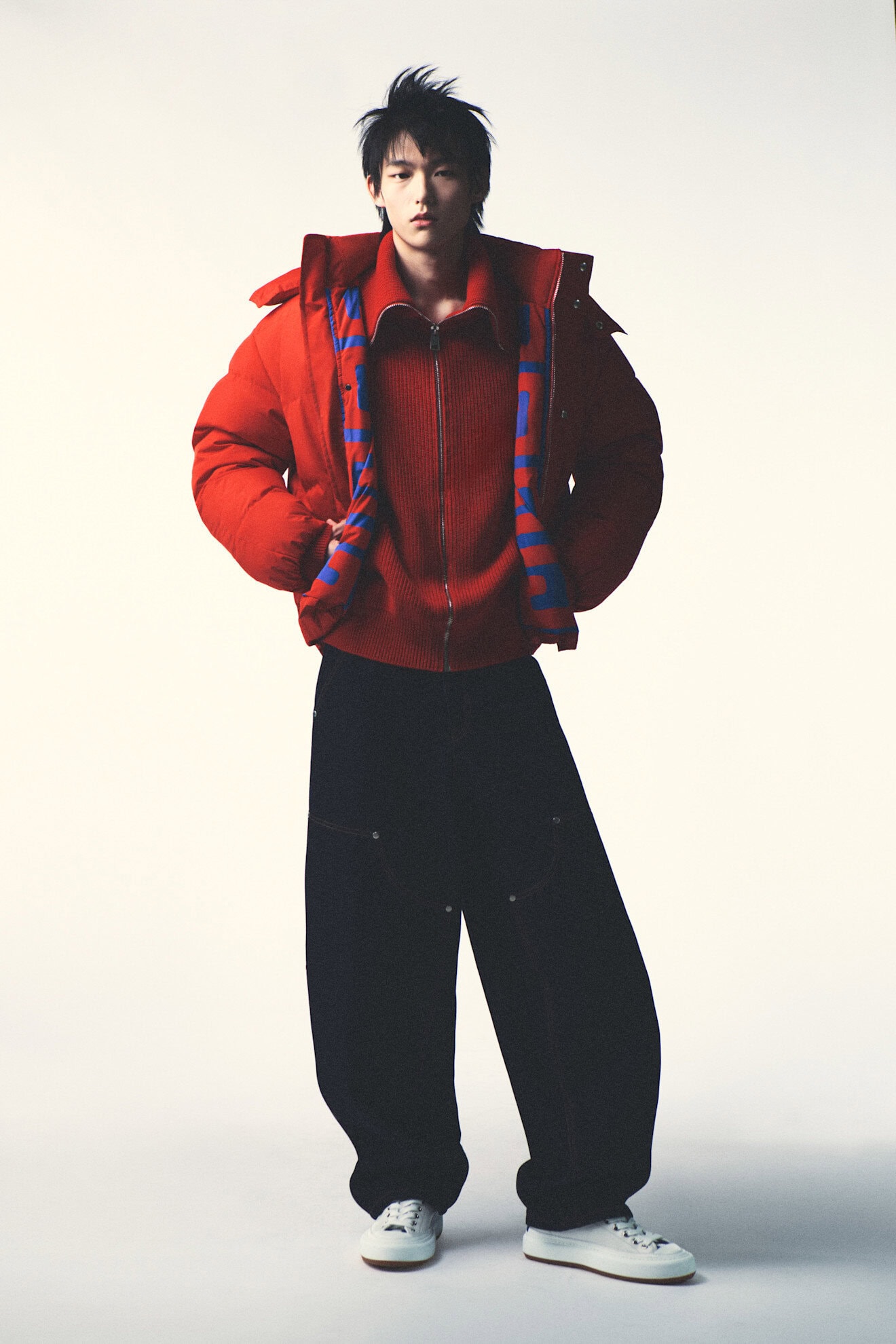
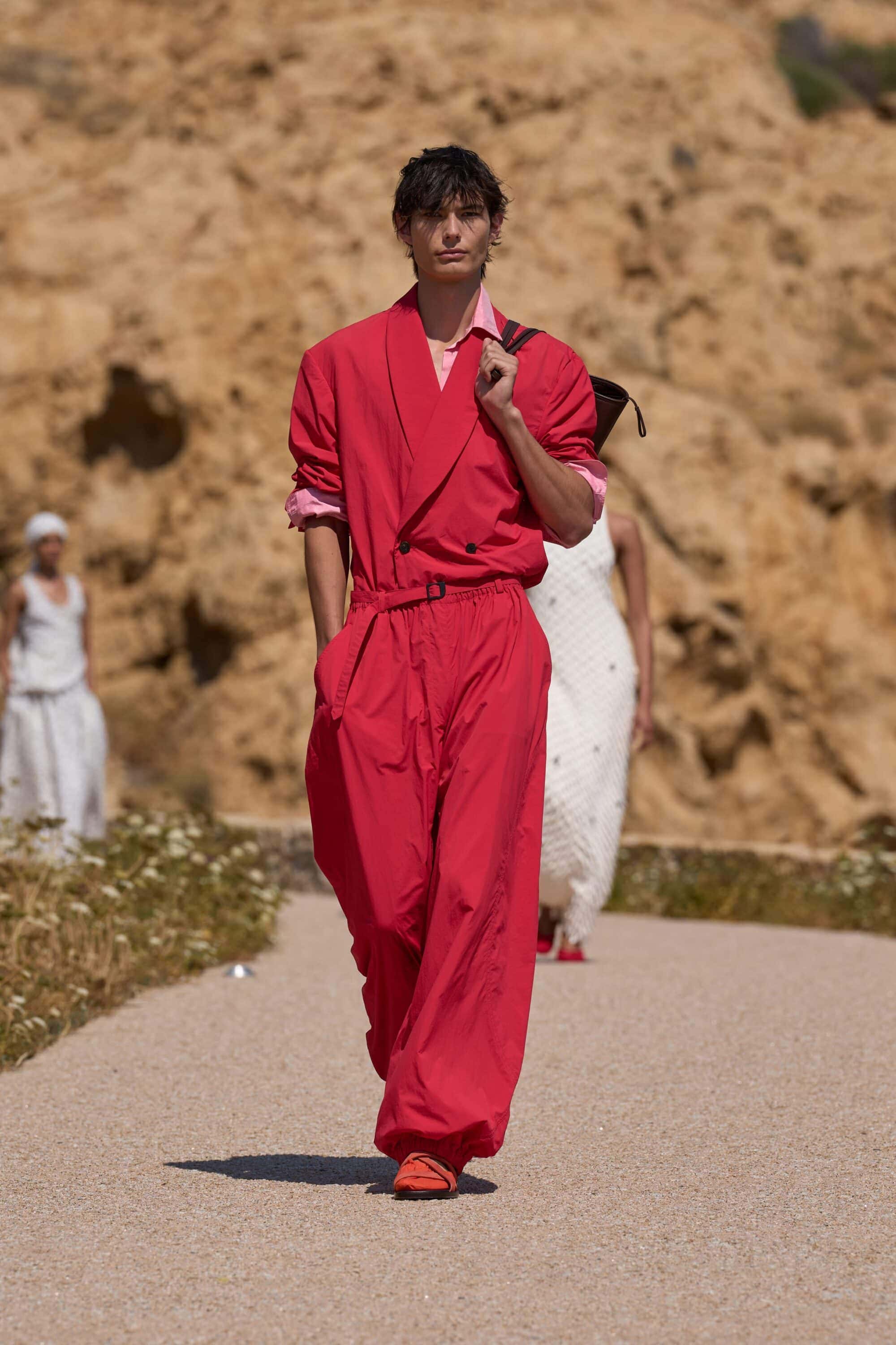
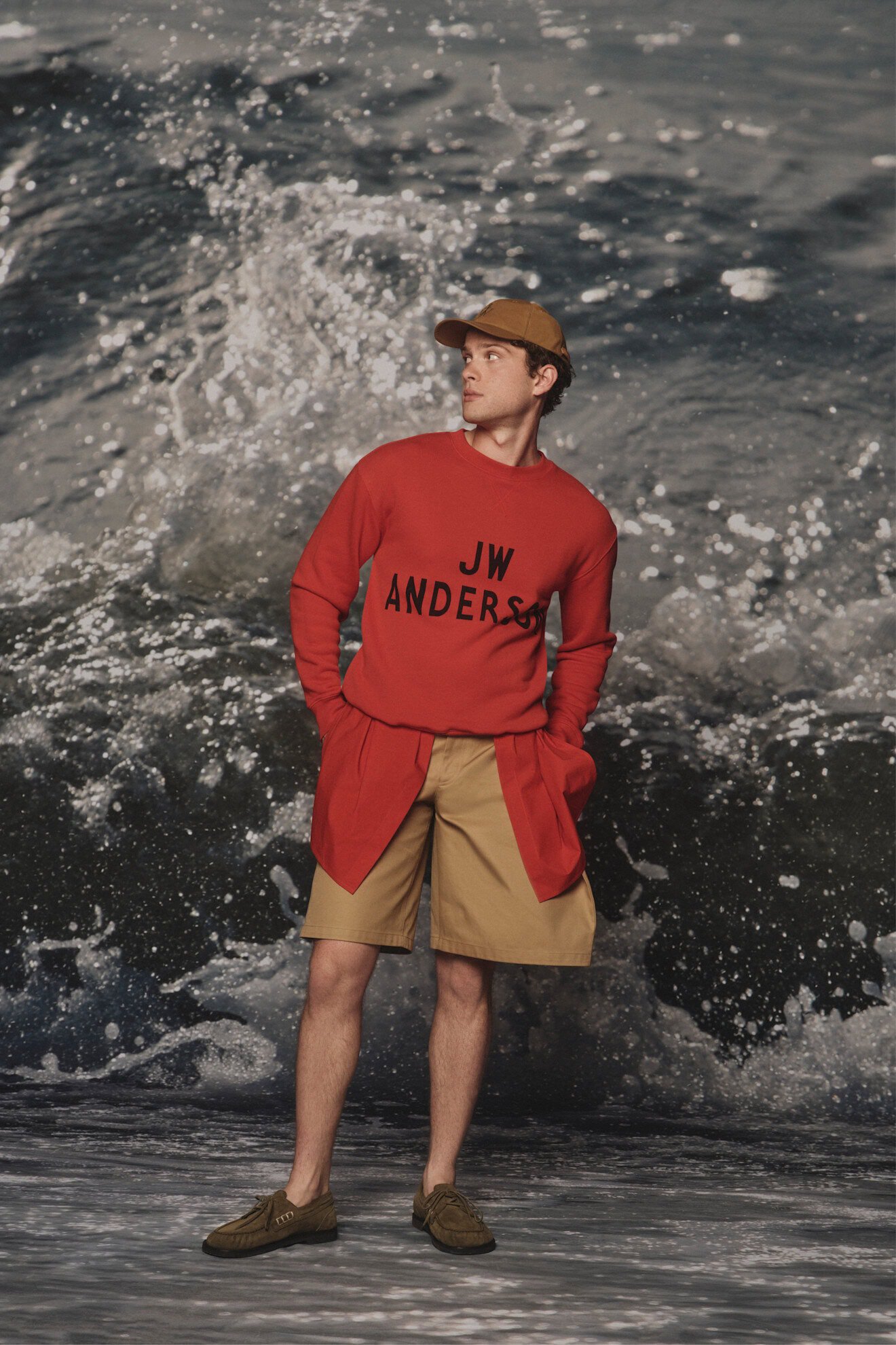
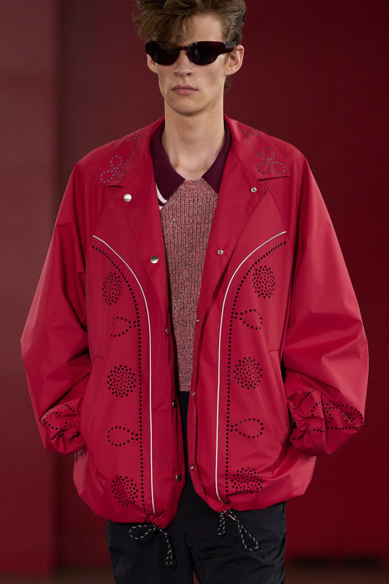
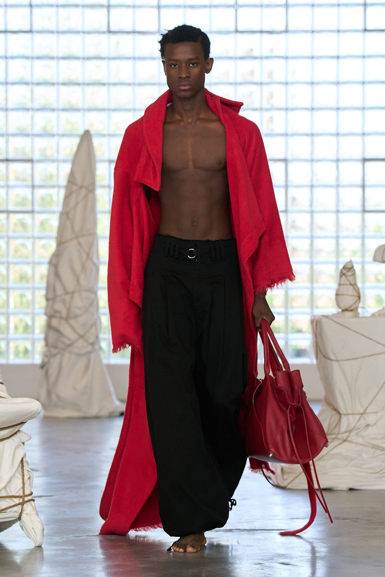
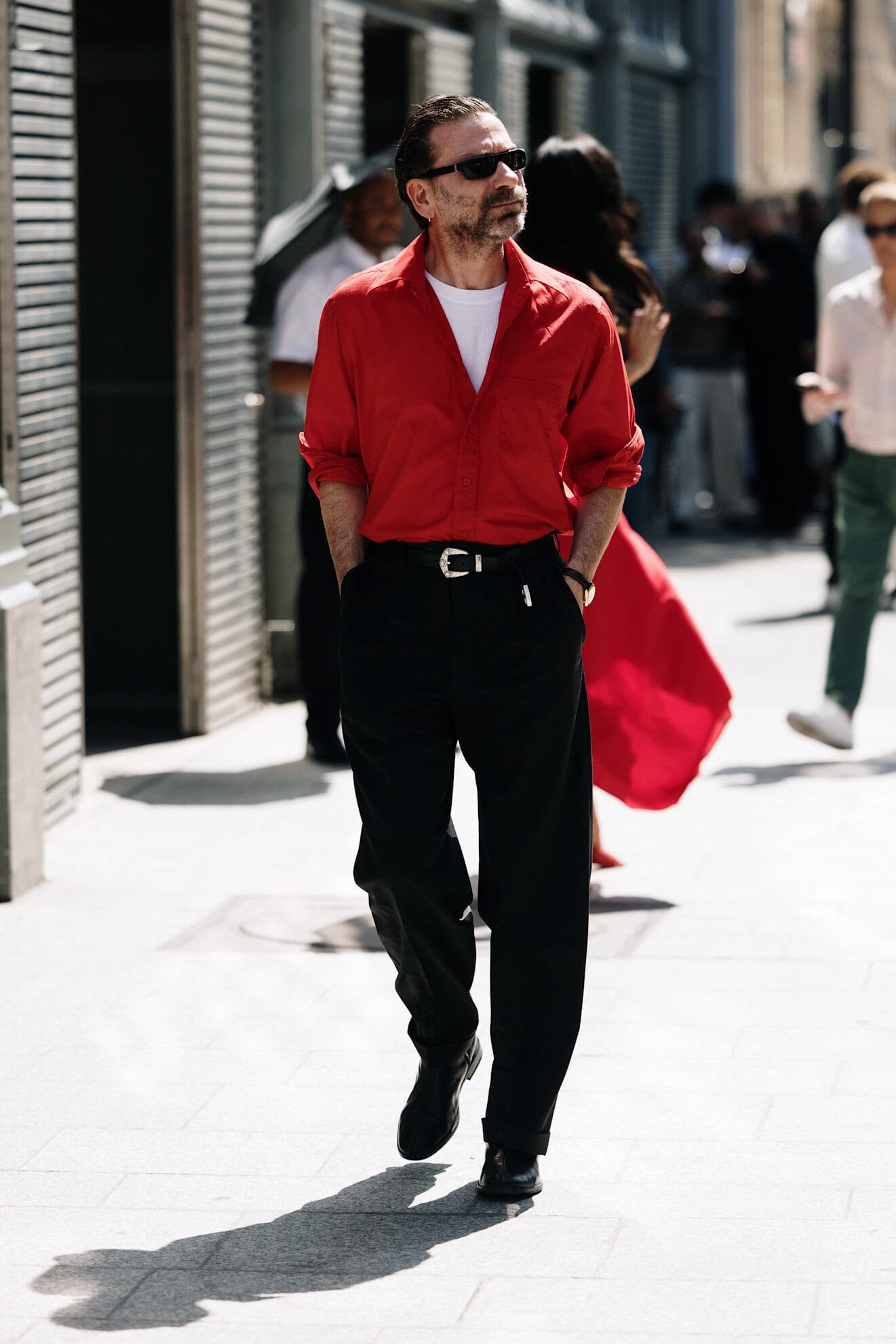
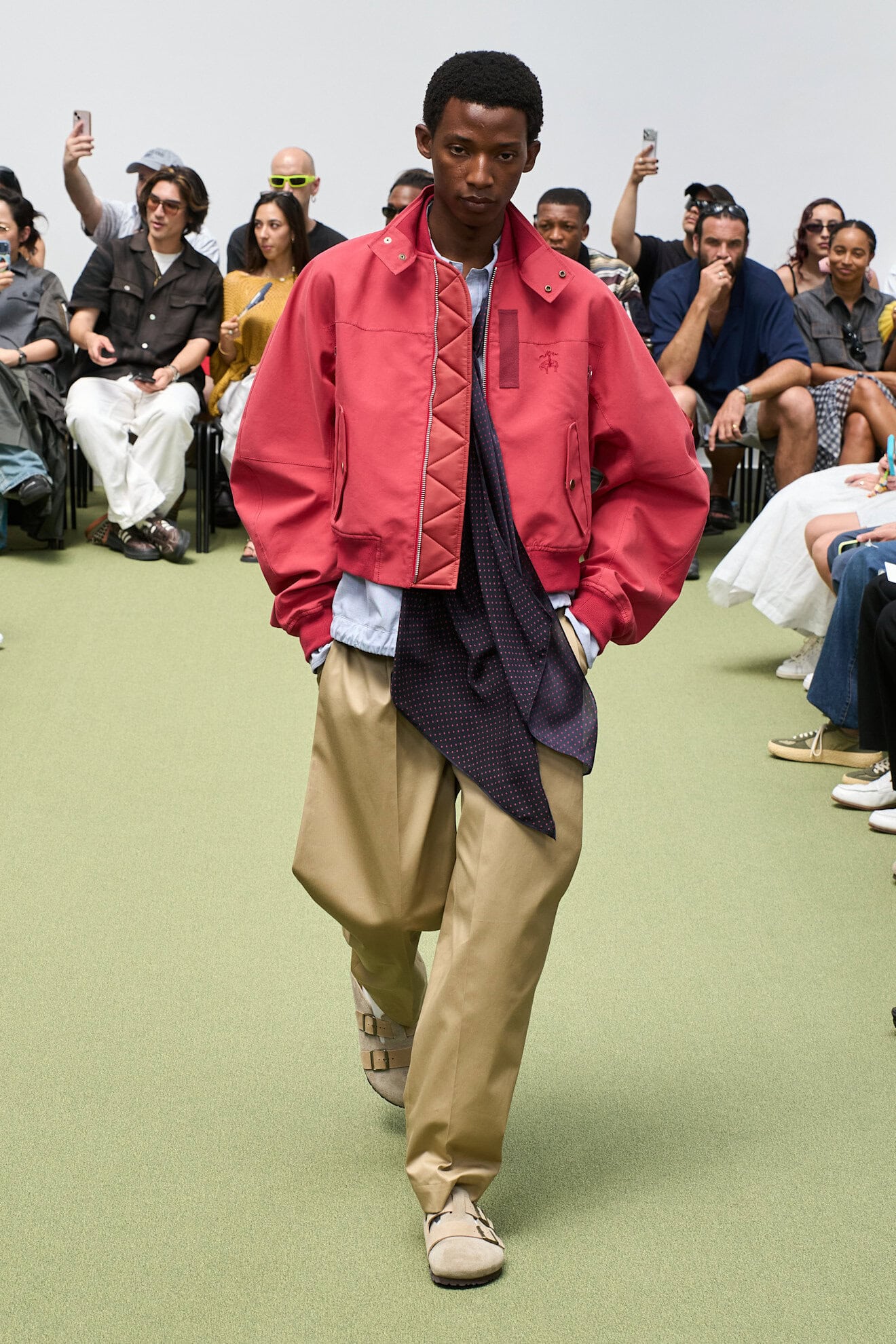
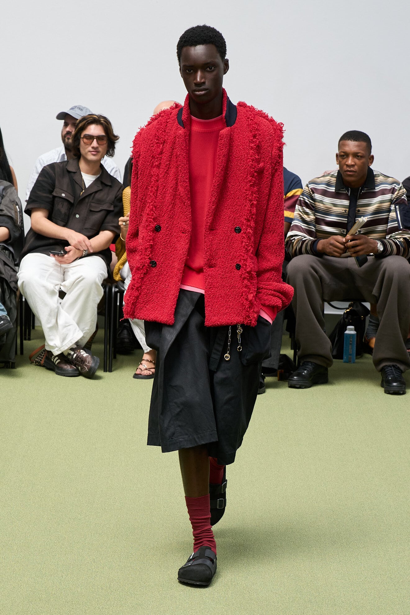
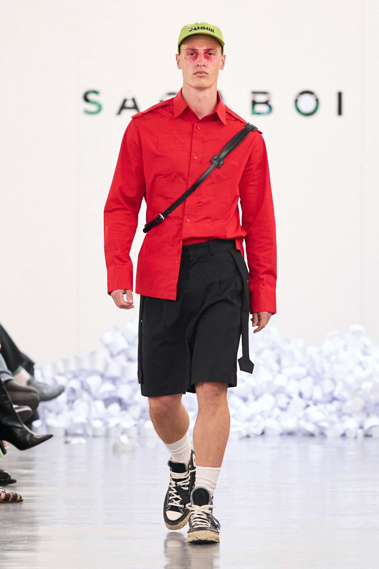
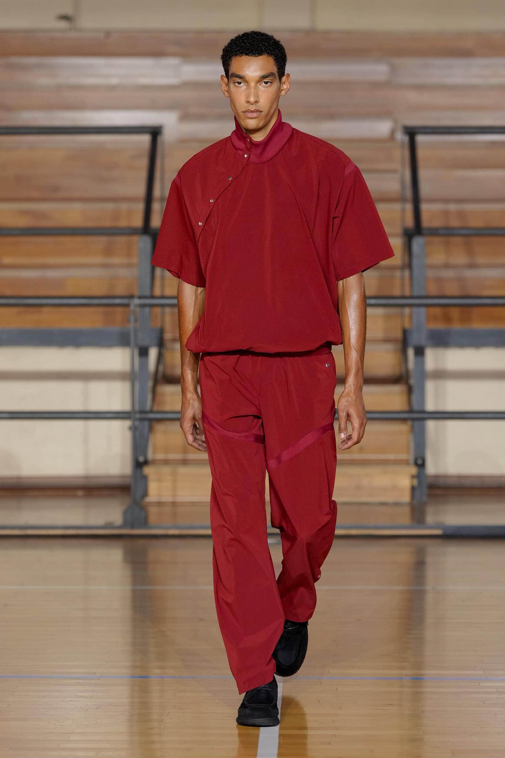
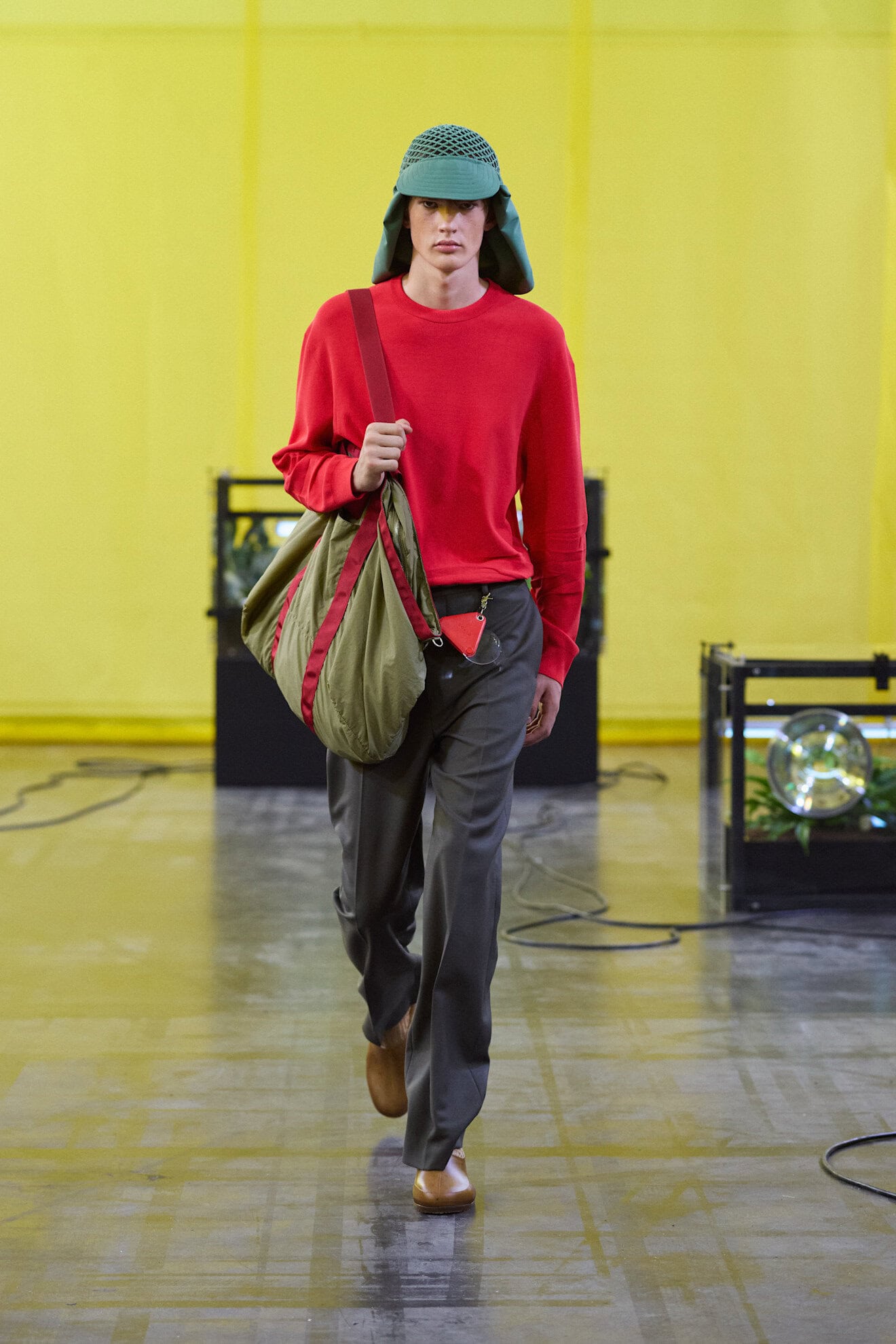
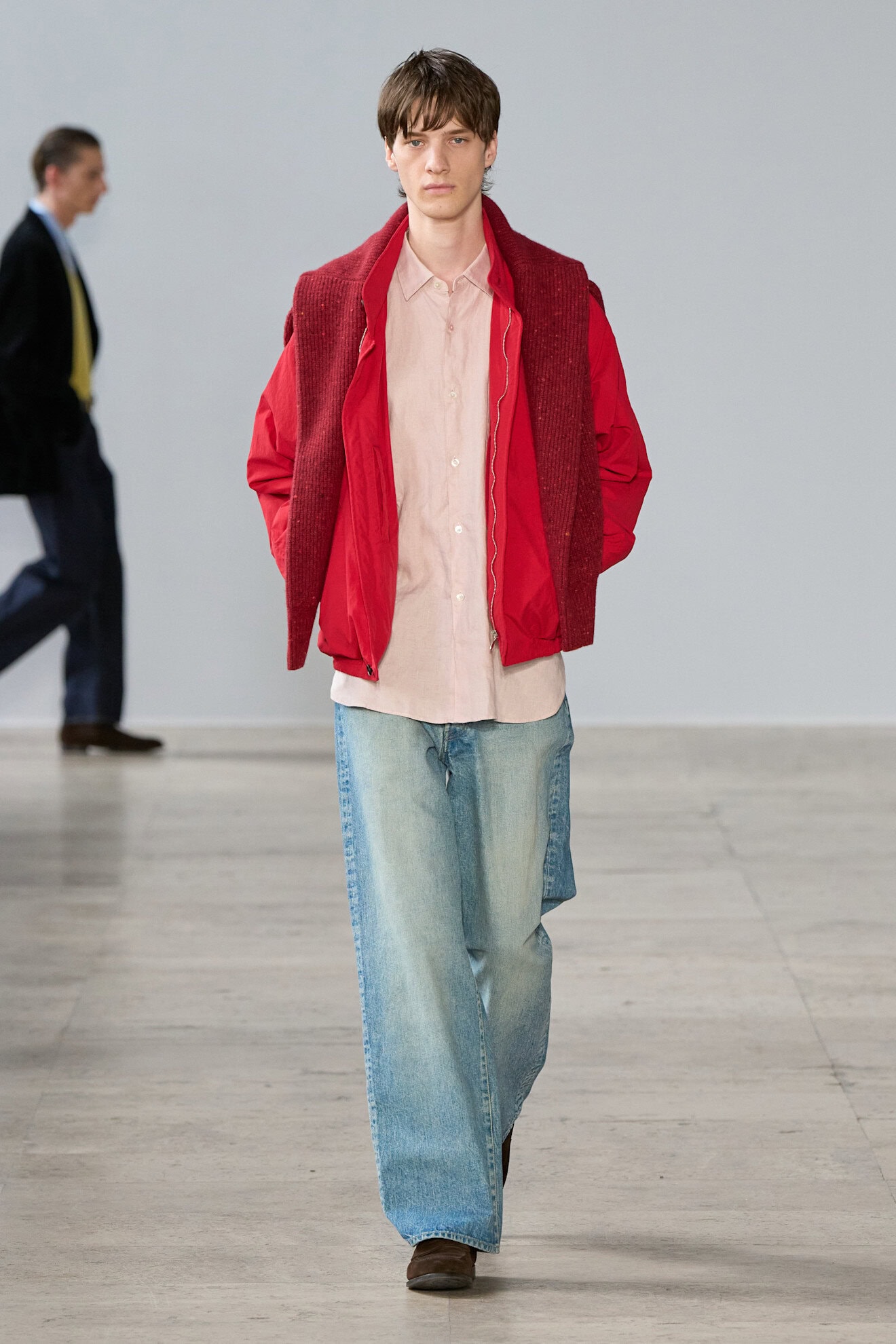
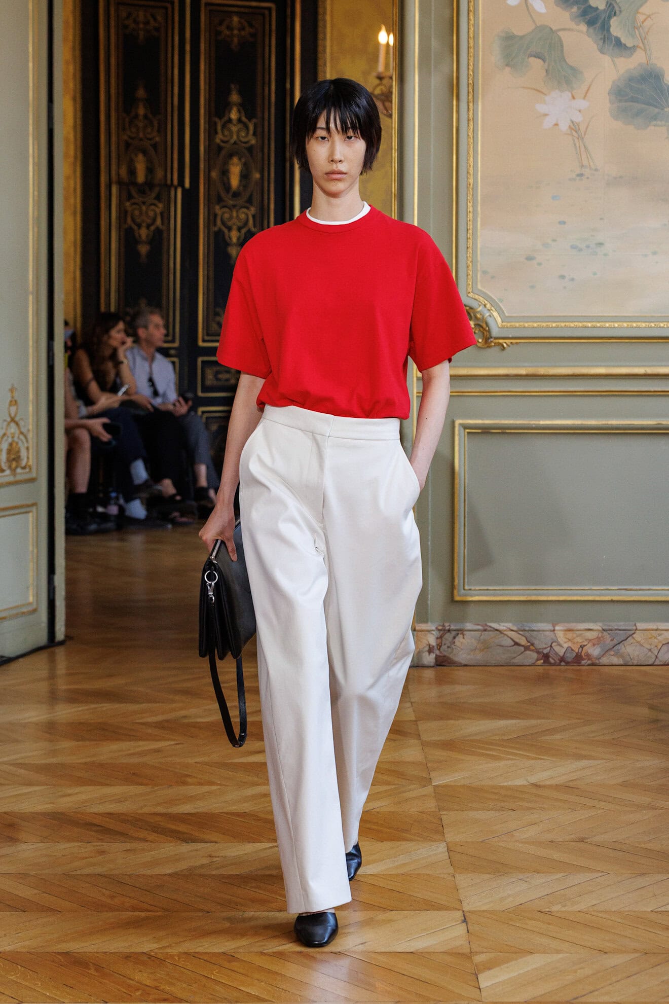
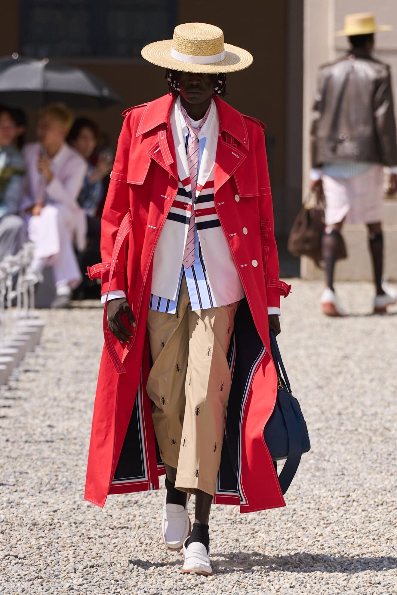
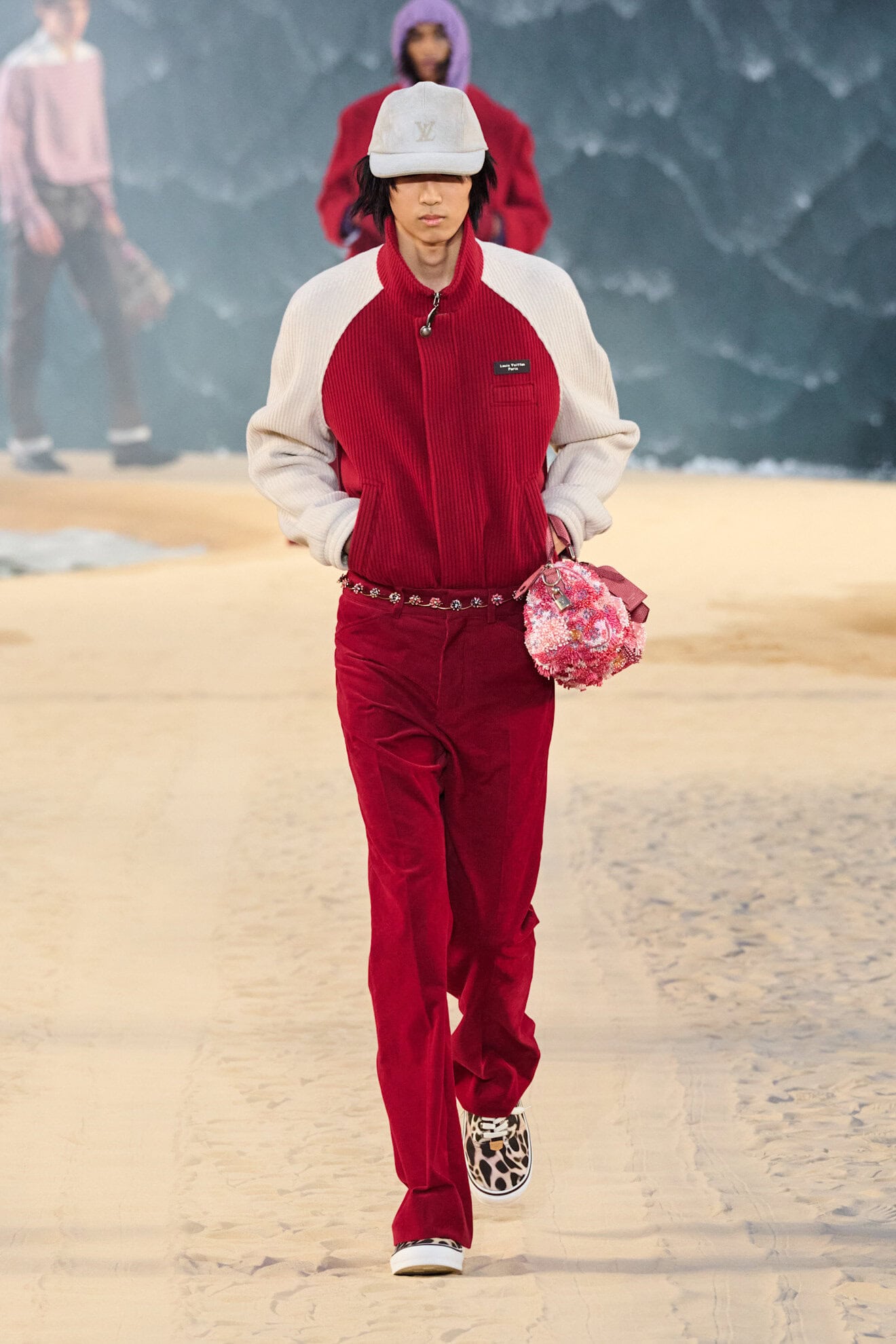
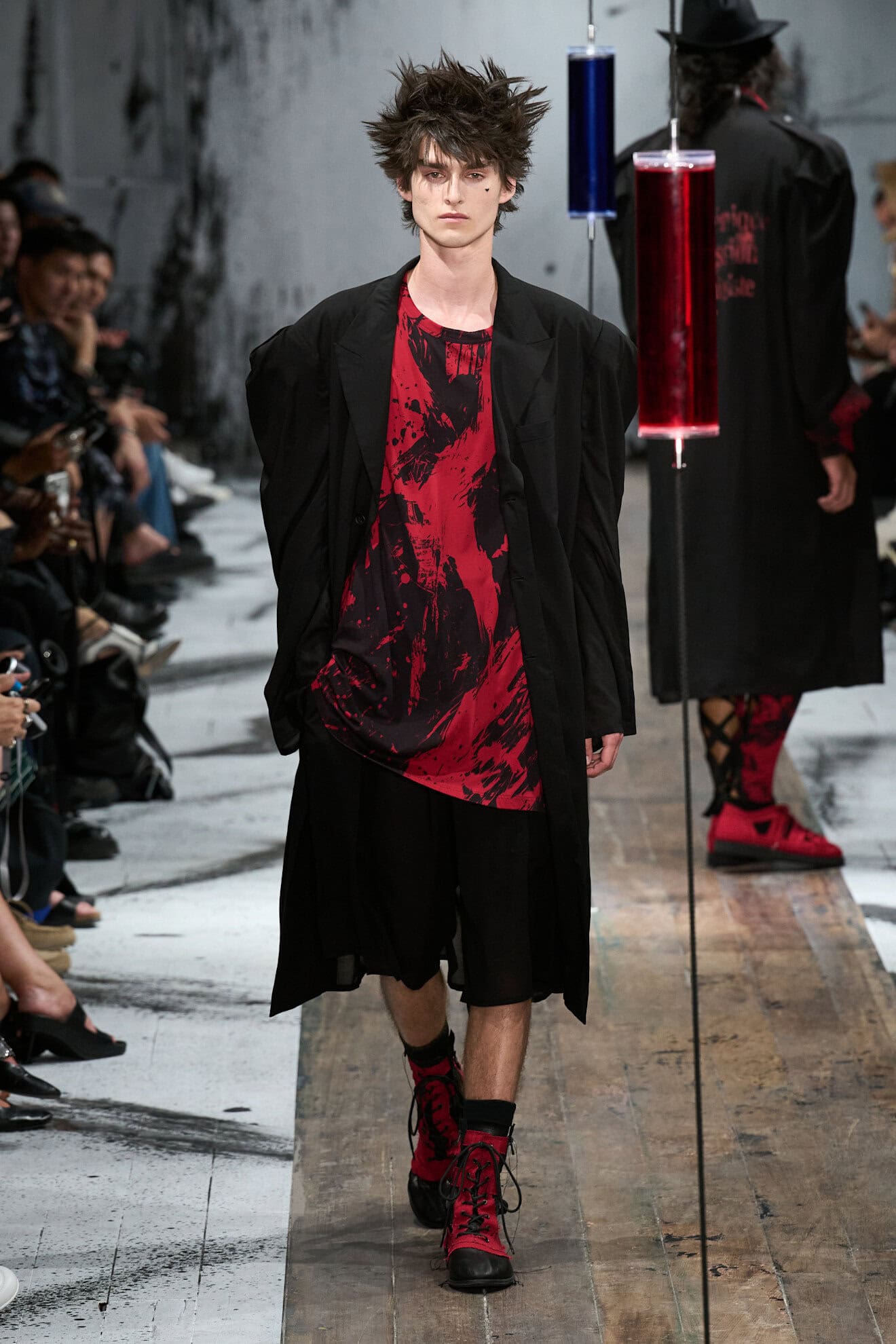
The intensity of red is consistently associated with passion and power and for next spring these connotations were no less evident in the way the strong hue was used for its punchy impact. Scarlet tones commanded the attention of the viewer but were also used as a traditional tailoring option, as was seen at Jacquemus and Celine. Tweedy textures, laser cutting, and technical nylons expressed a burst of confidence in the colours ability to communicate a need to live life with a modern attitude of flamboyancy over pure function.
5. SUMMER HARVEST
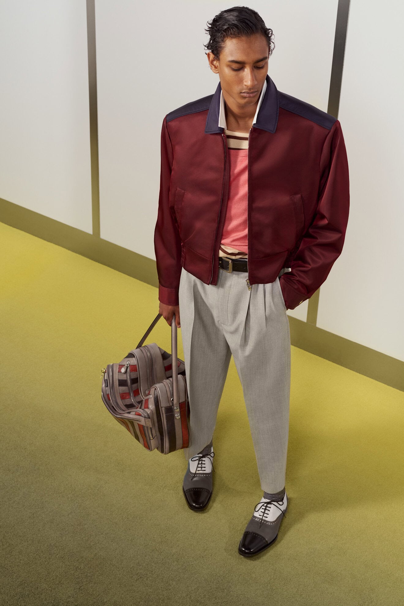
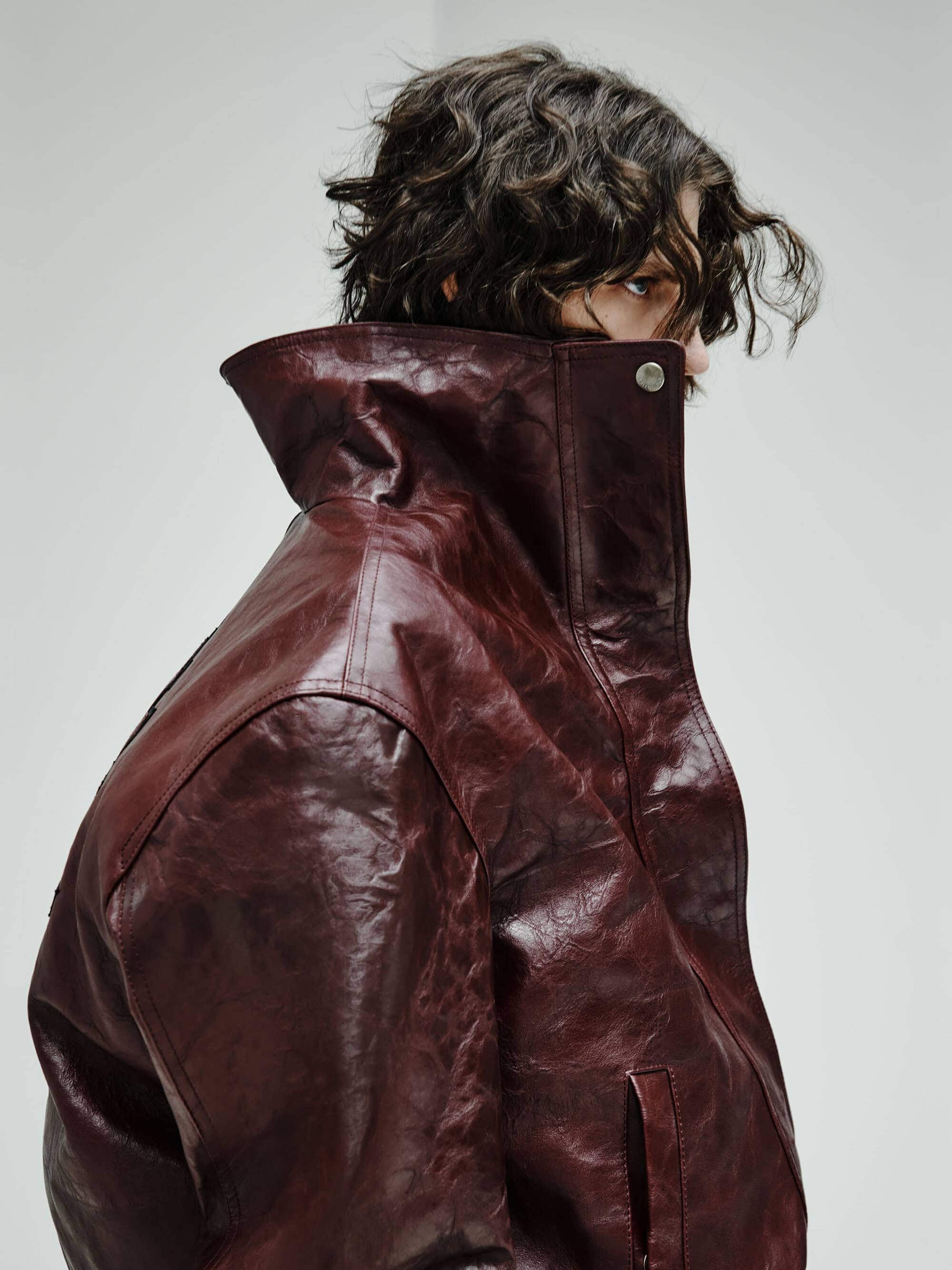
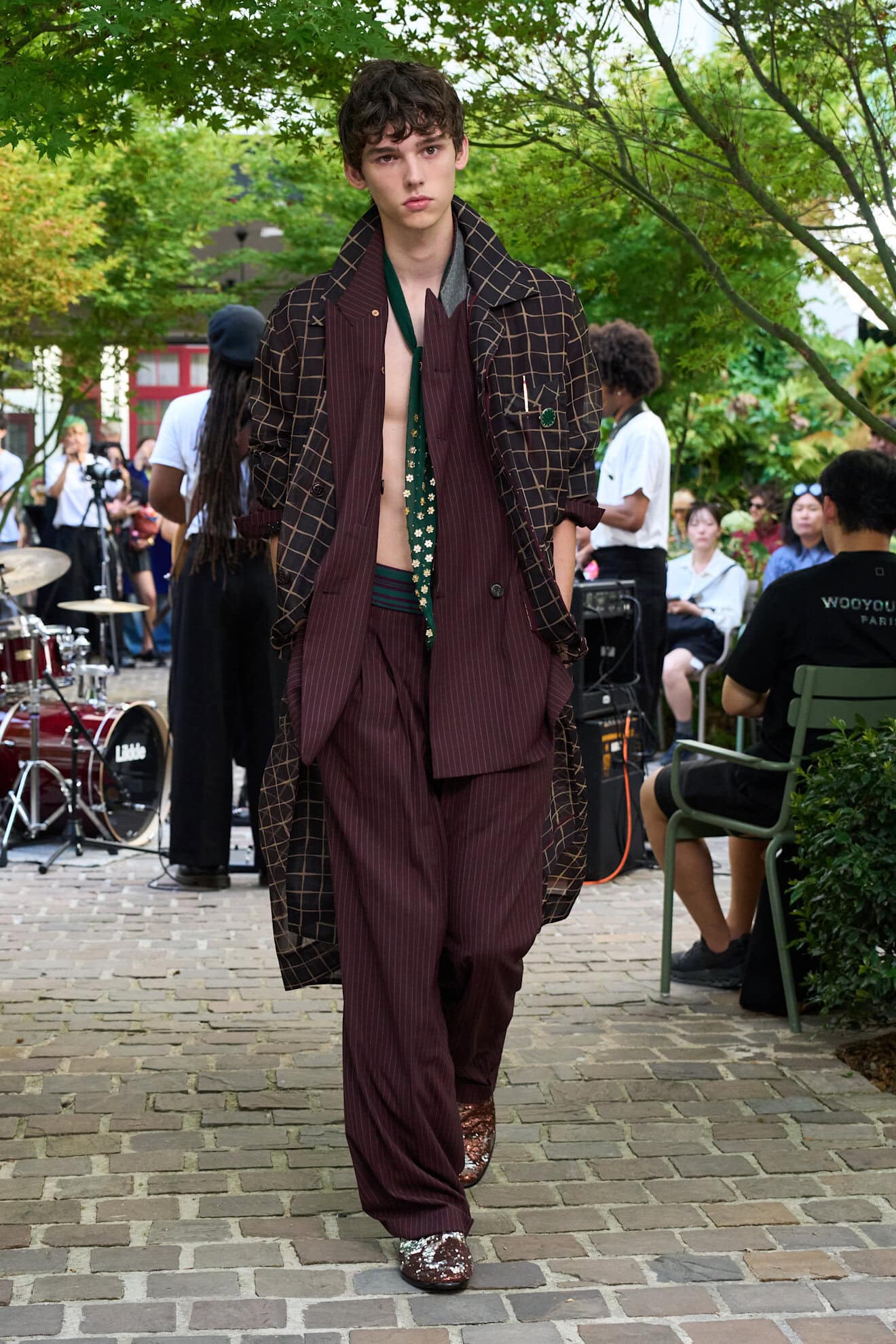
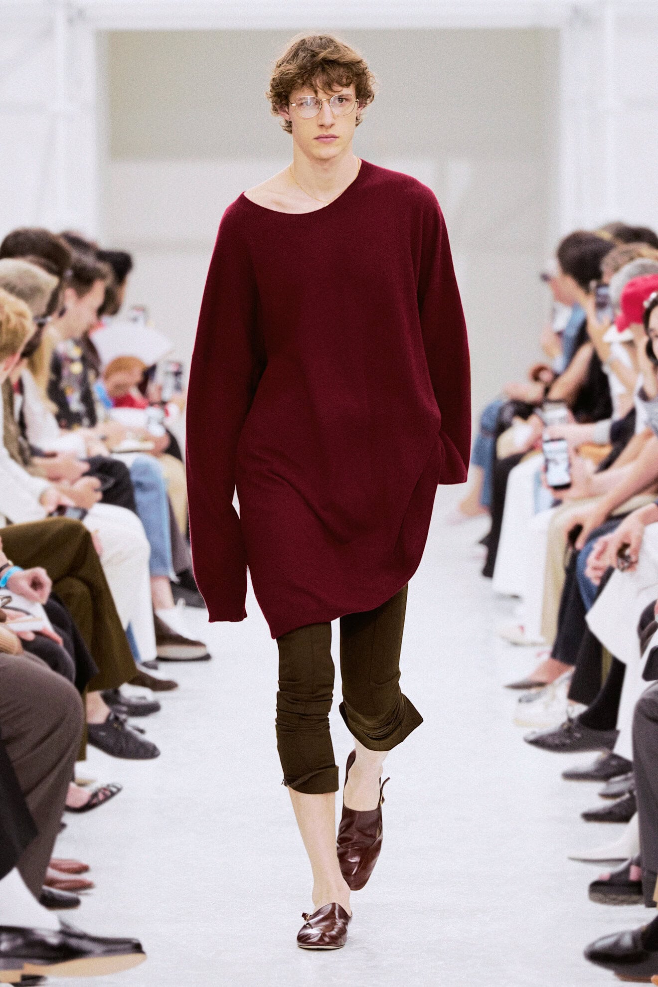
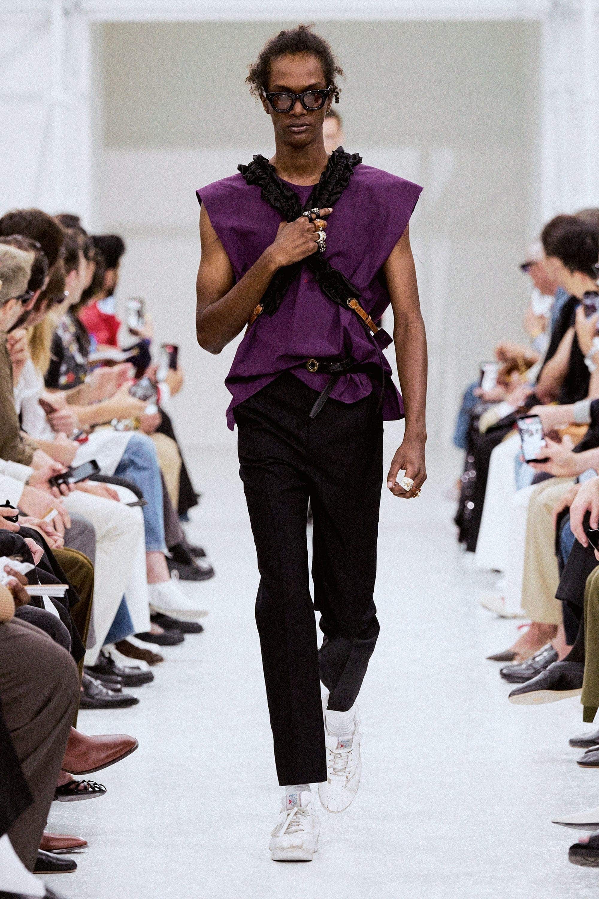
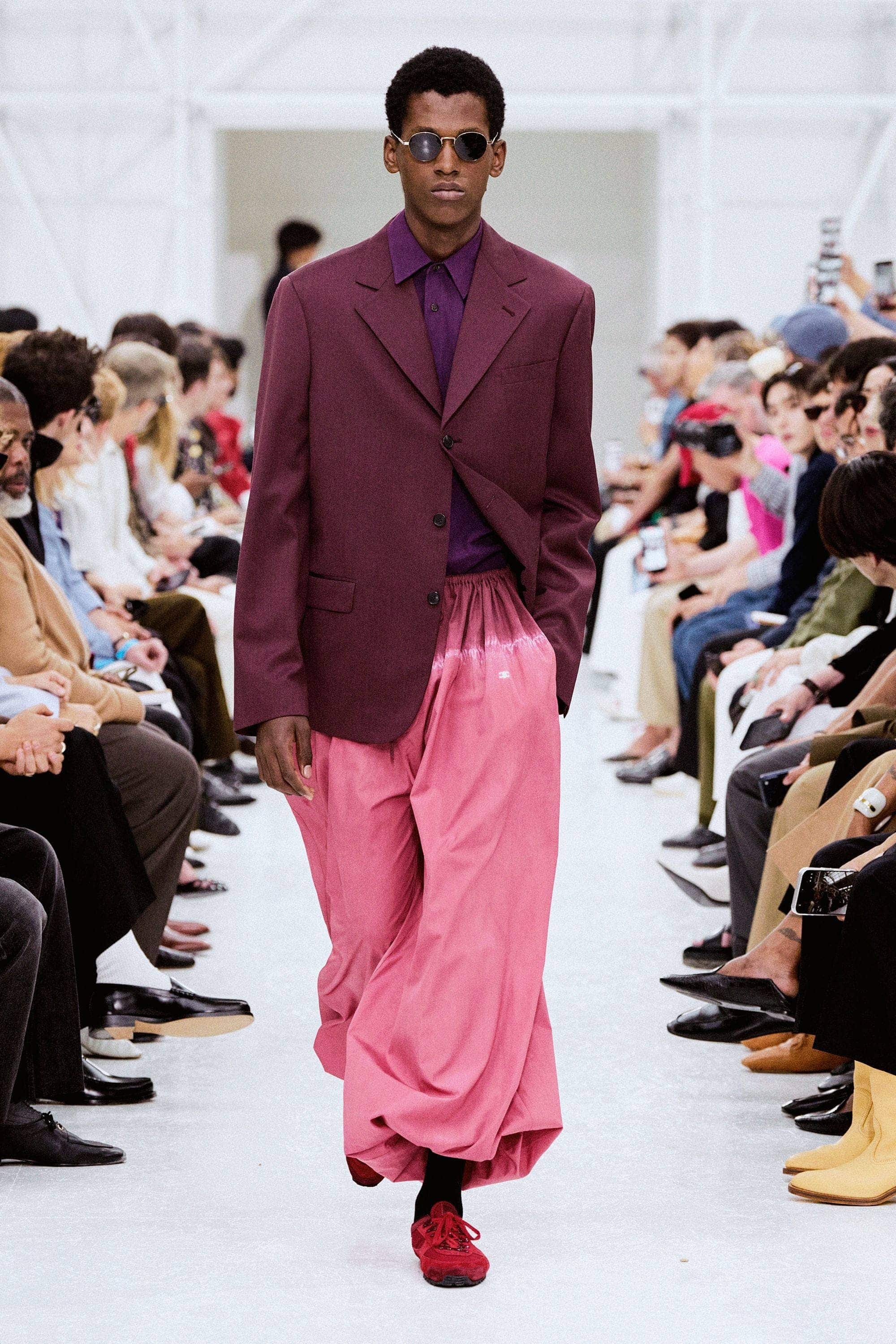
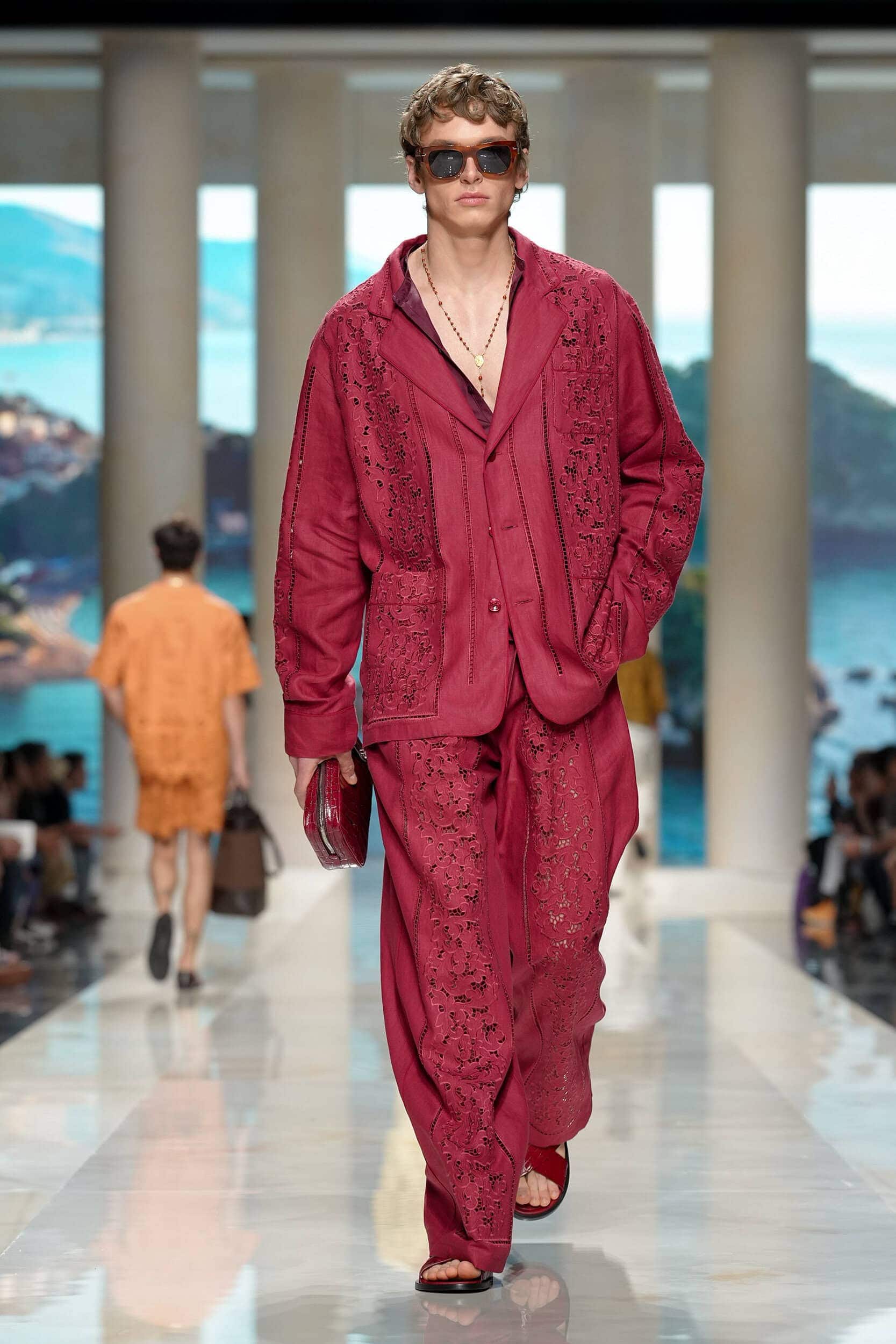
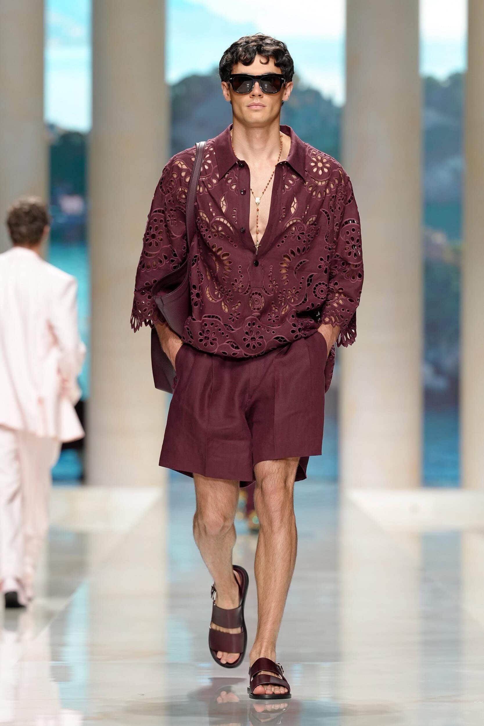
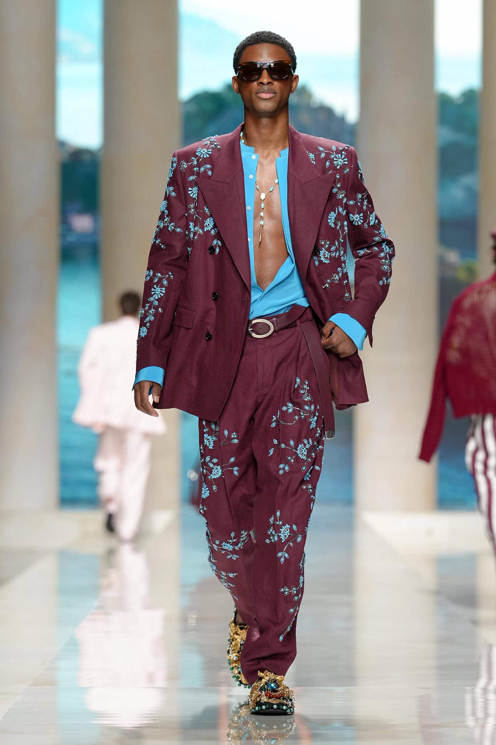
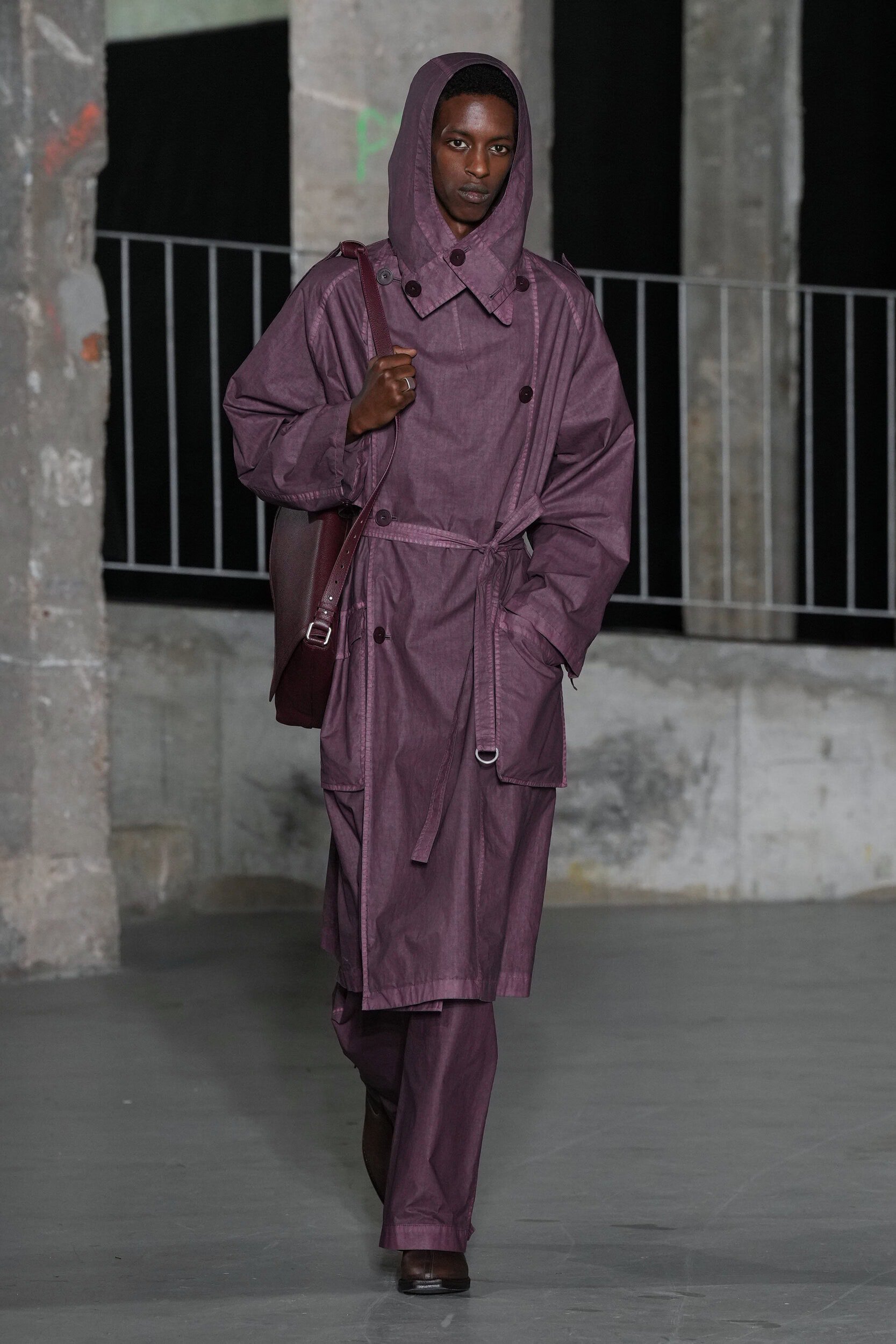
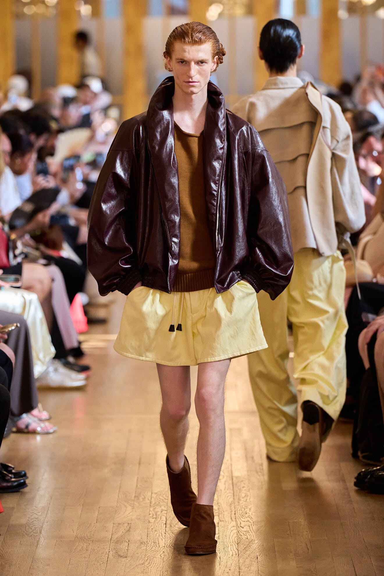
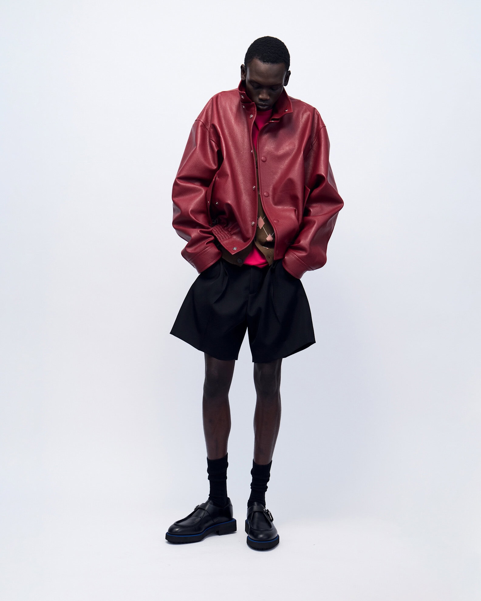
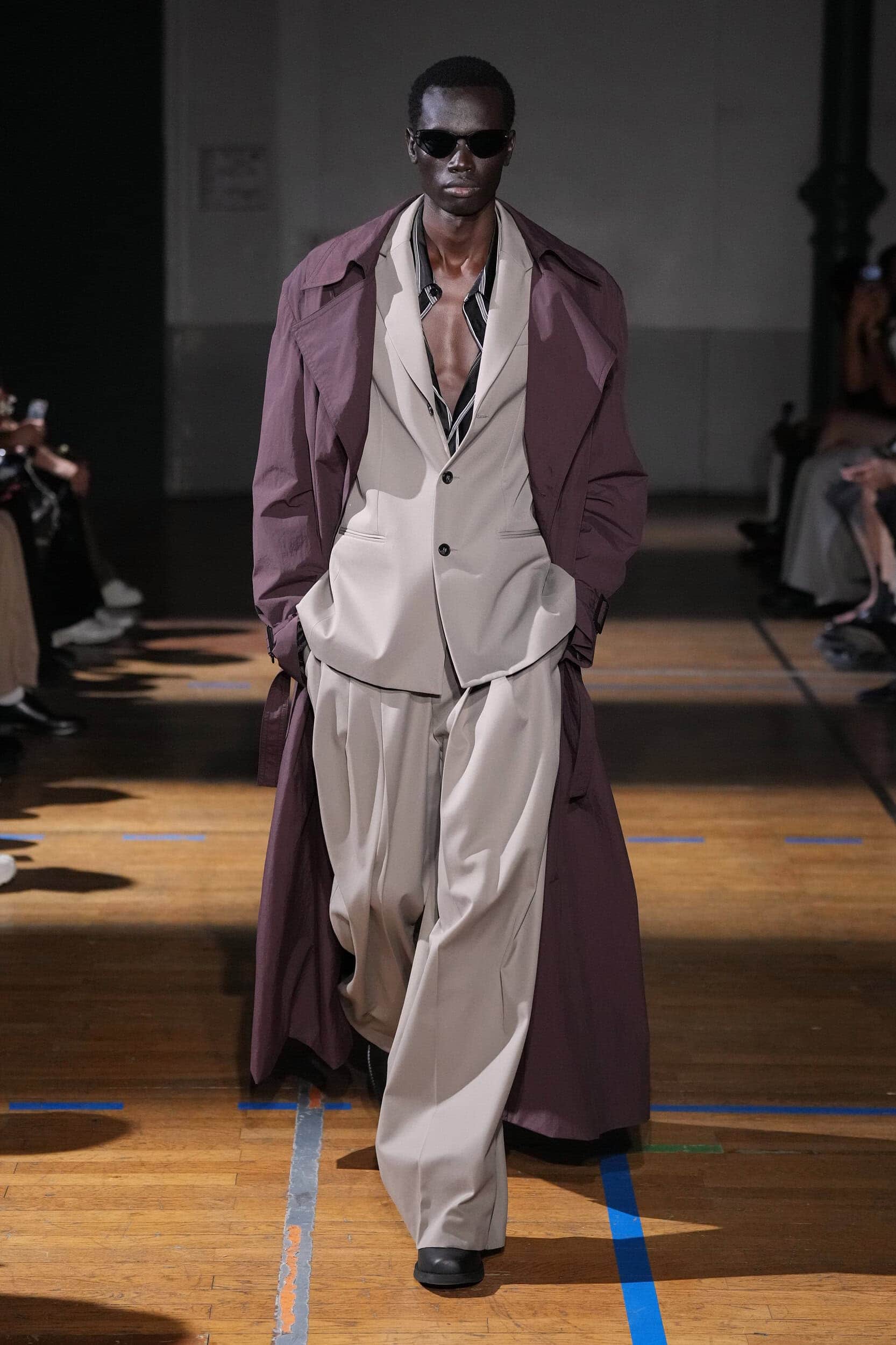
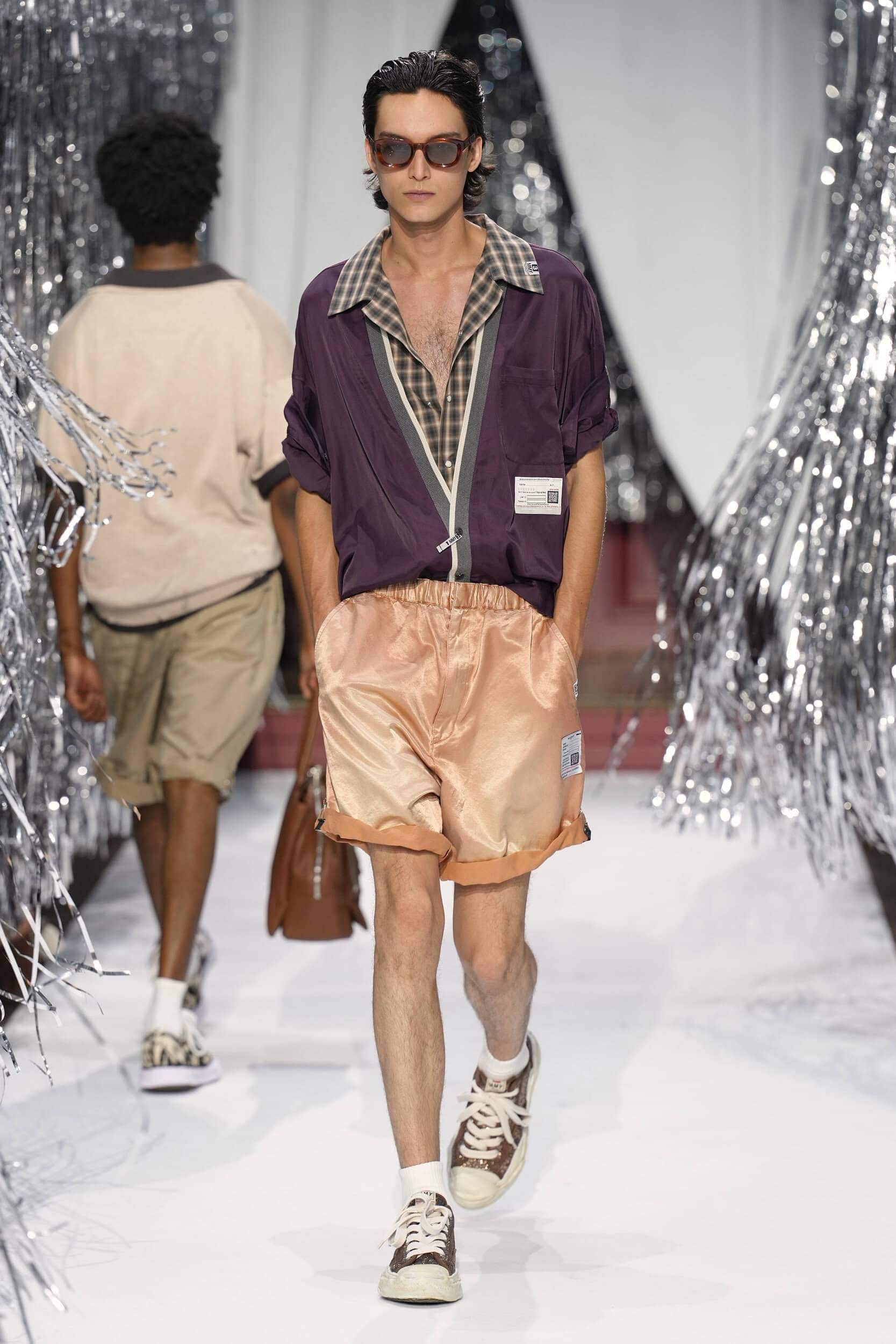
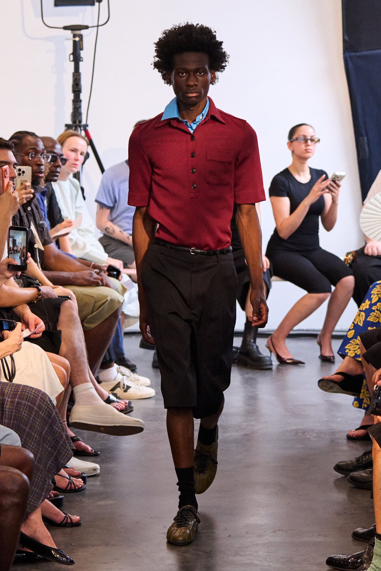
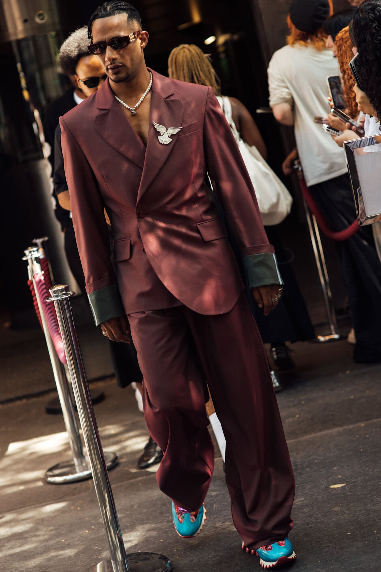
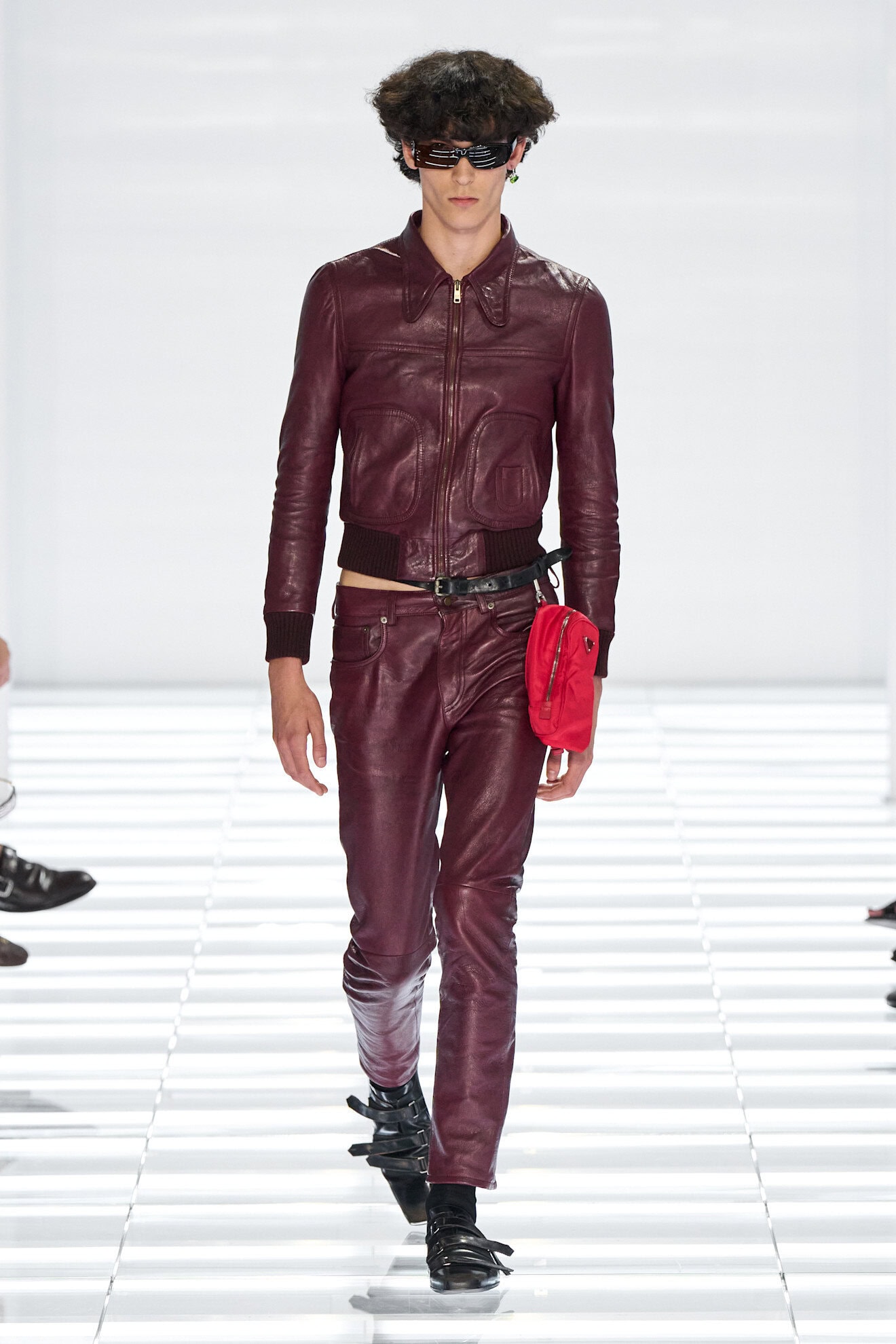
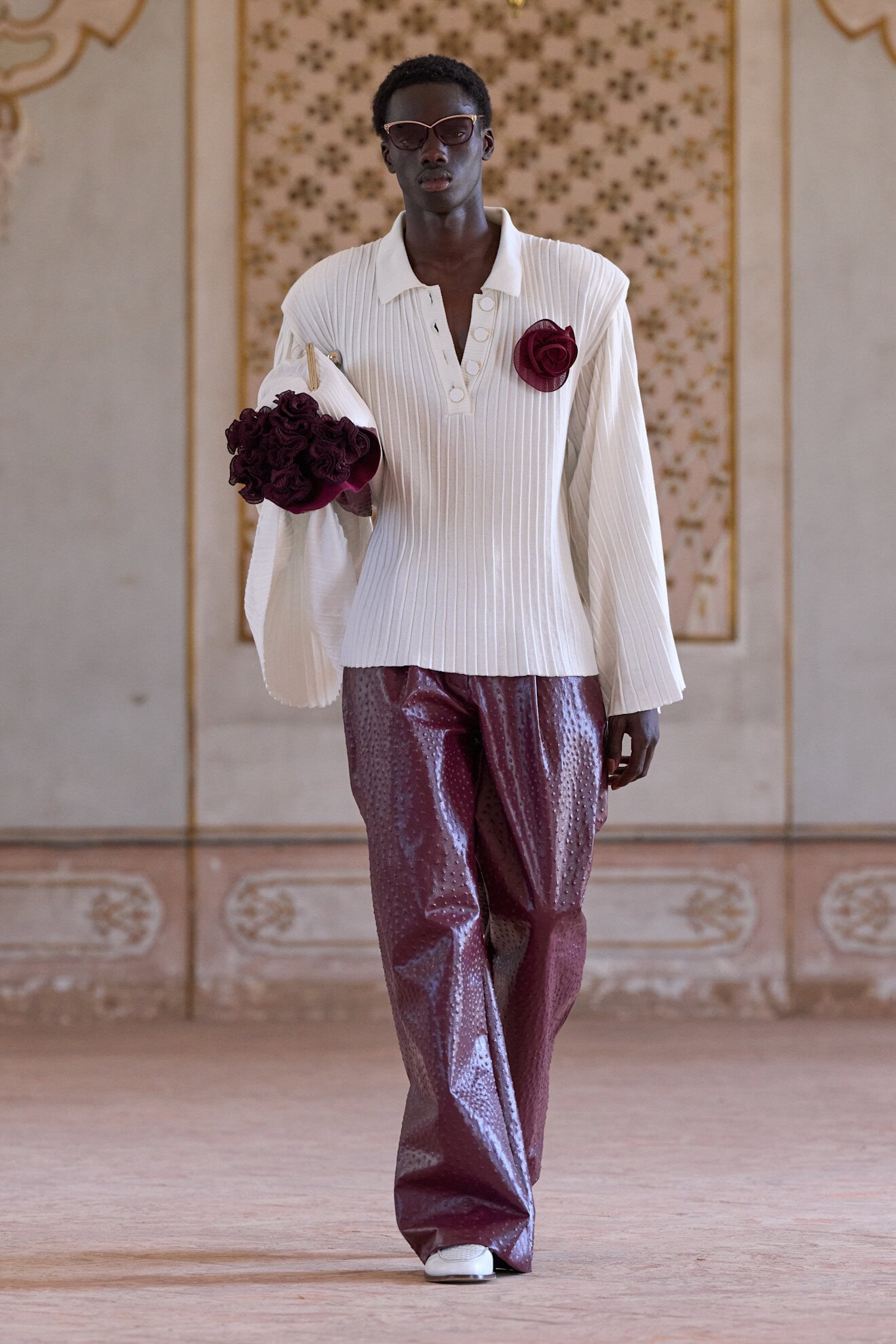
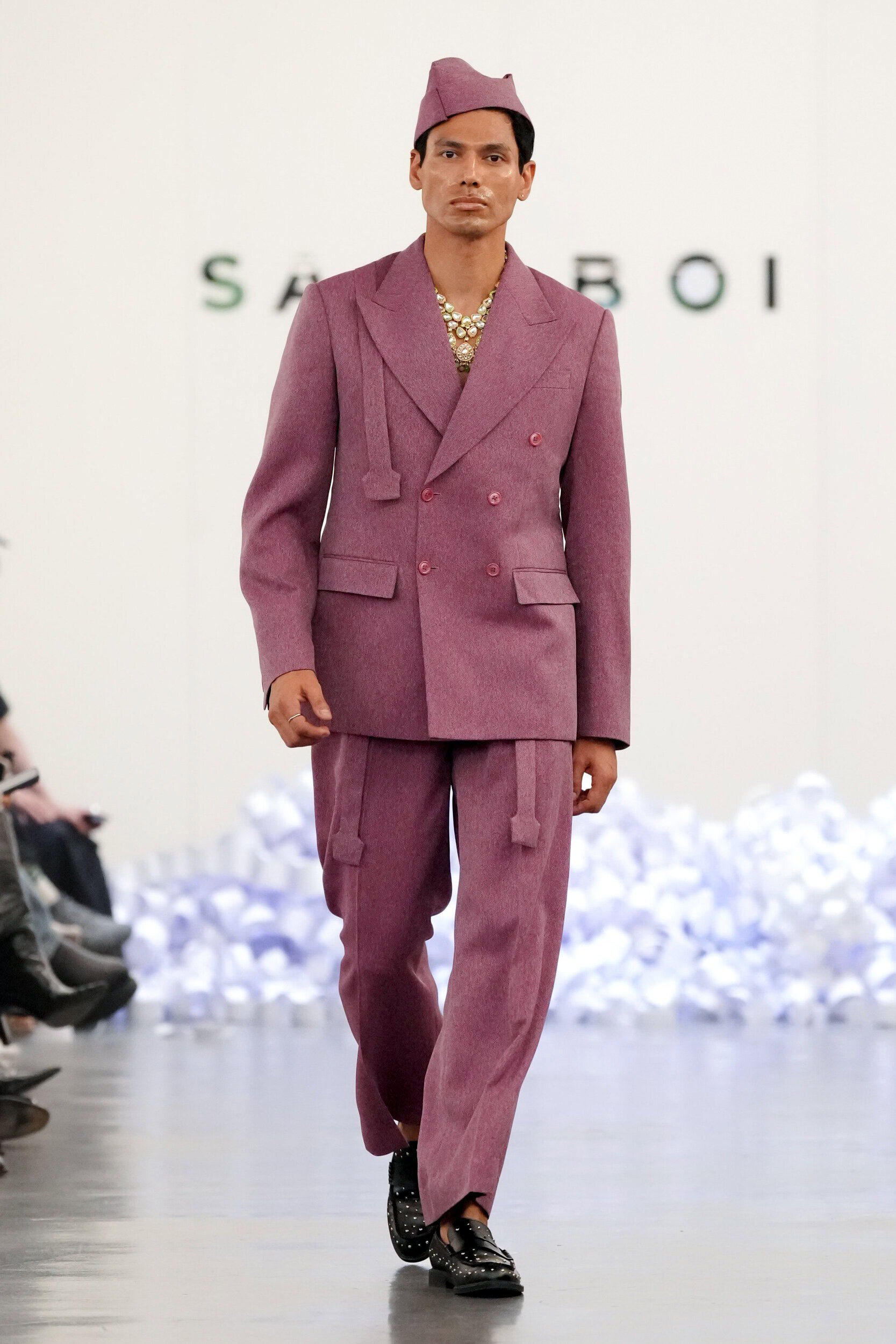
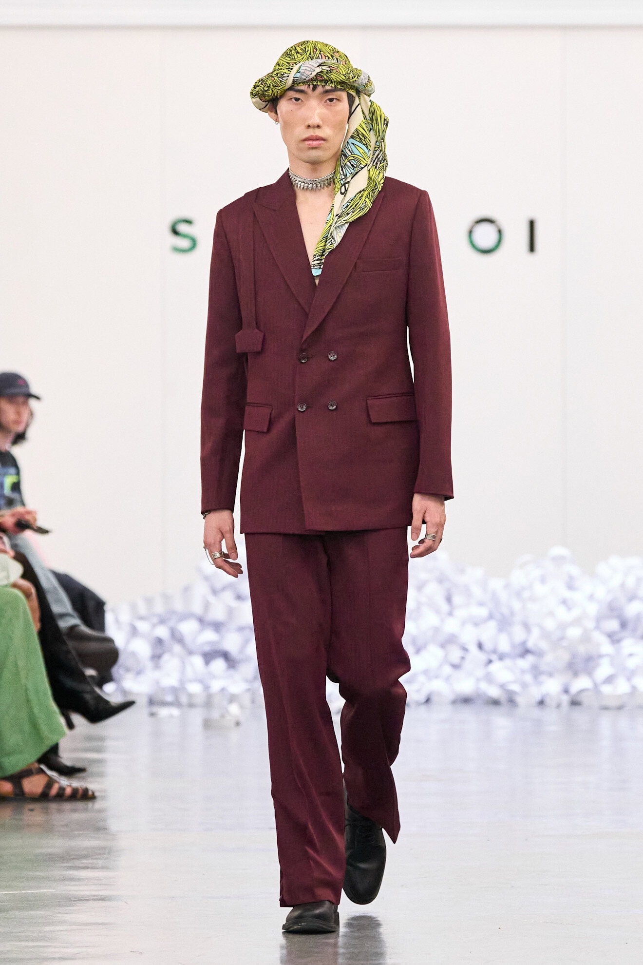
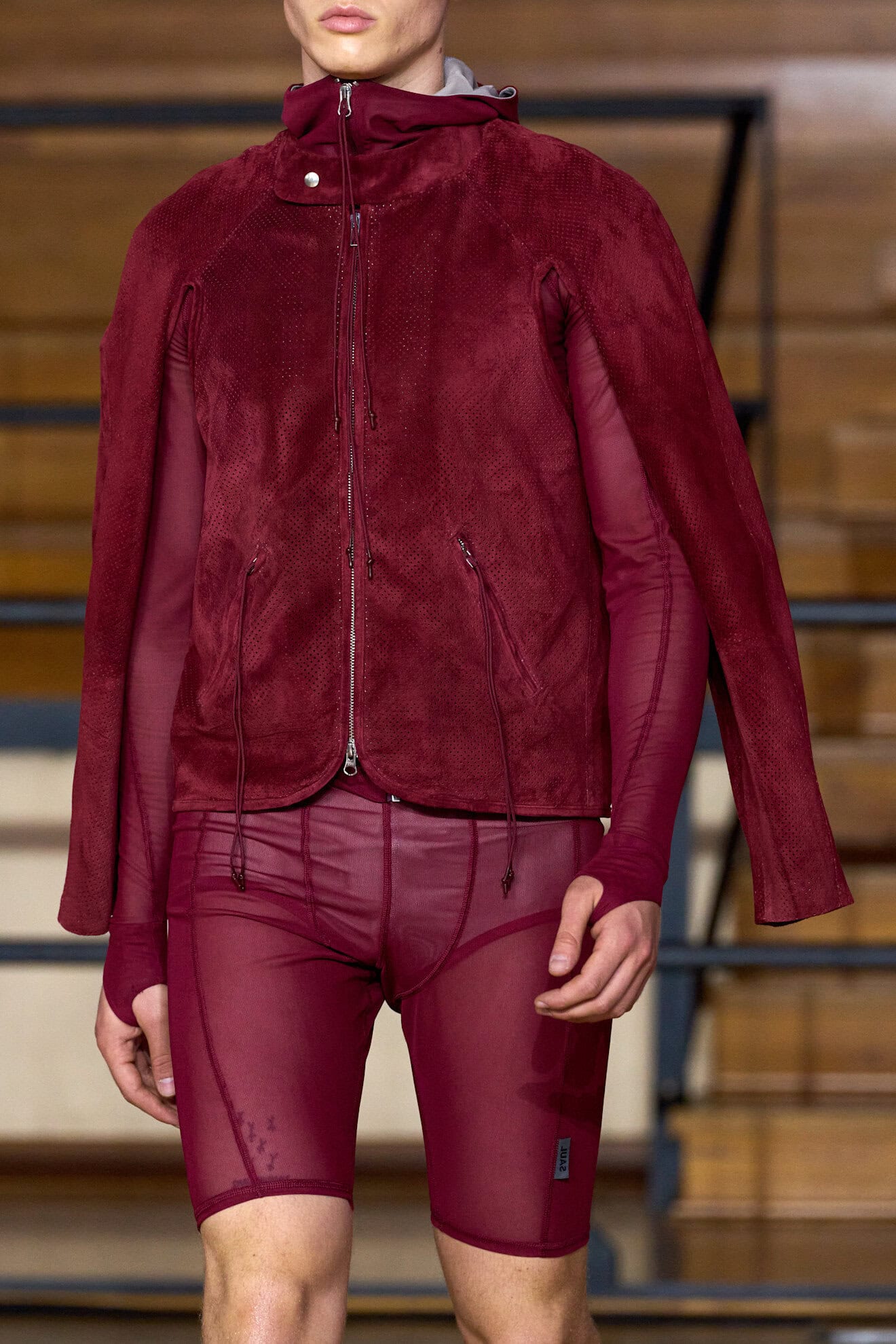
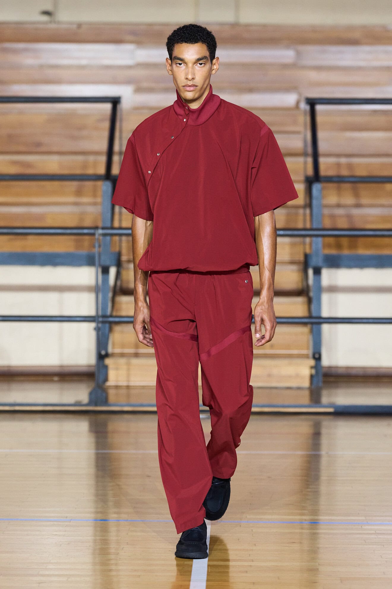
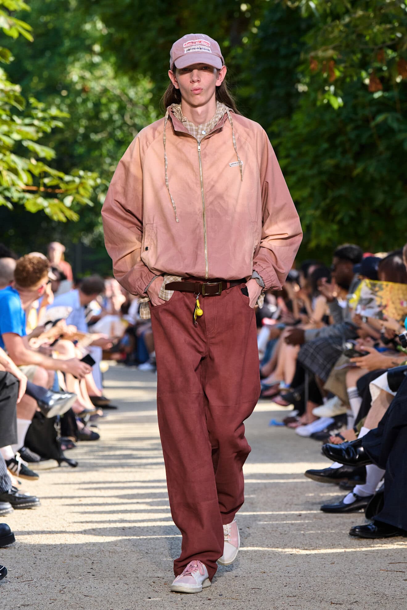
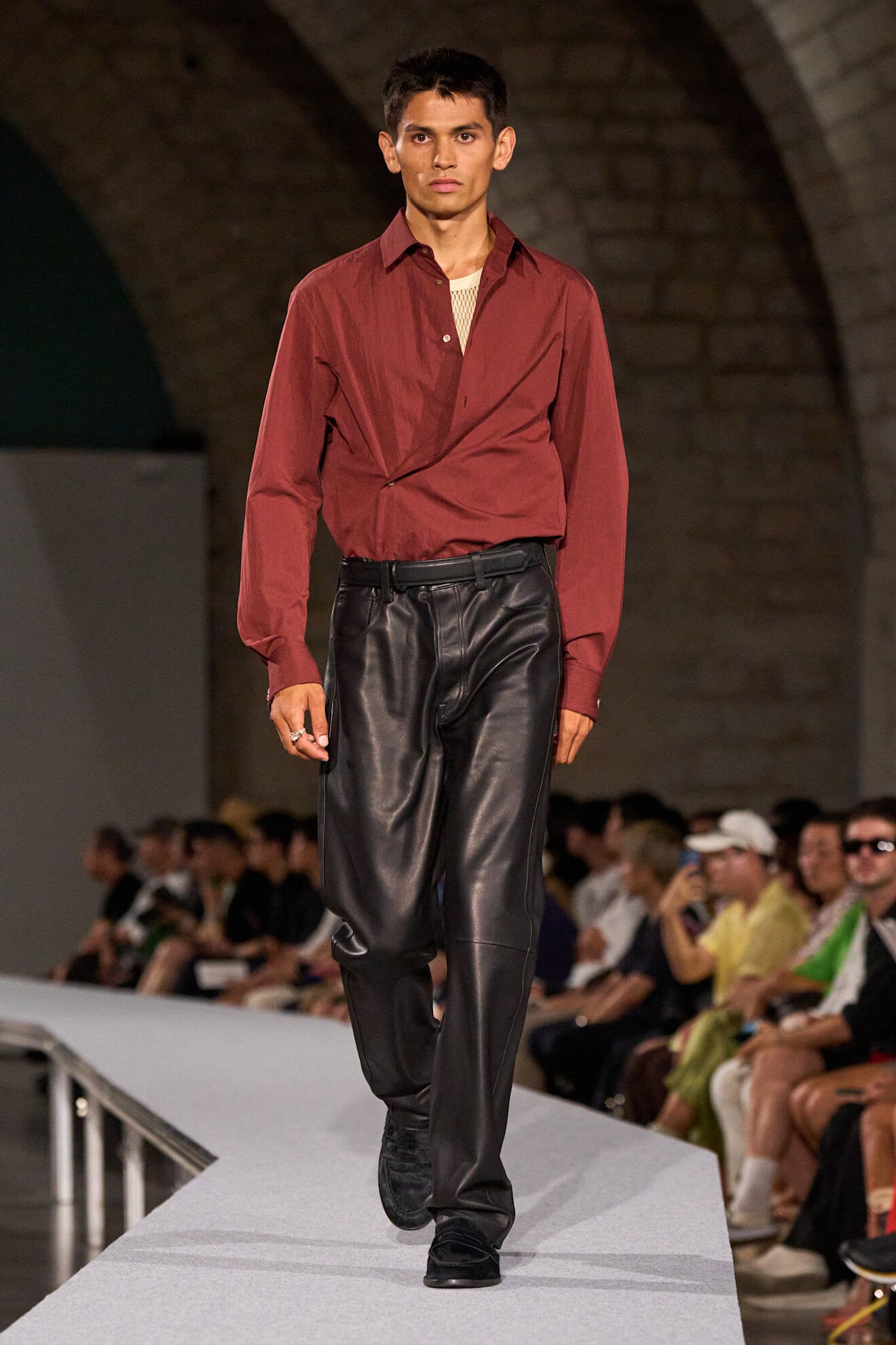
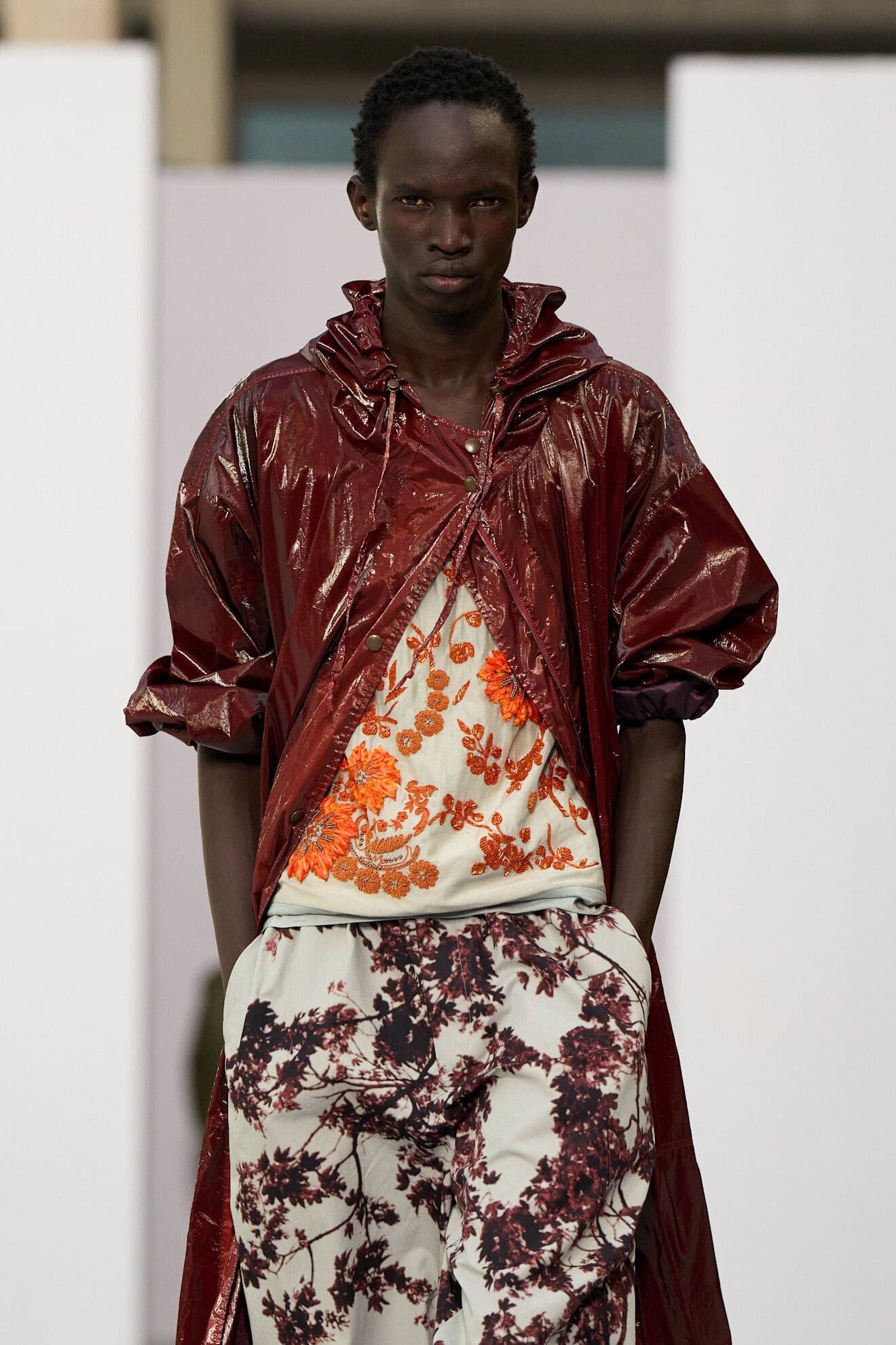
A complementary summer shade that evolves the deeper colours designers have been using to update their collections in recent seasons, dark greens, blues and berries work as an alternative to classic tones of black.
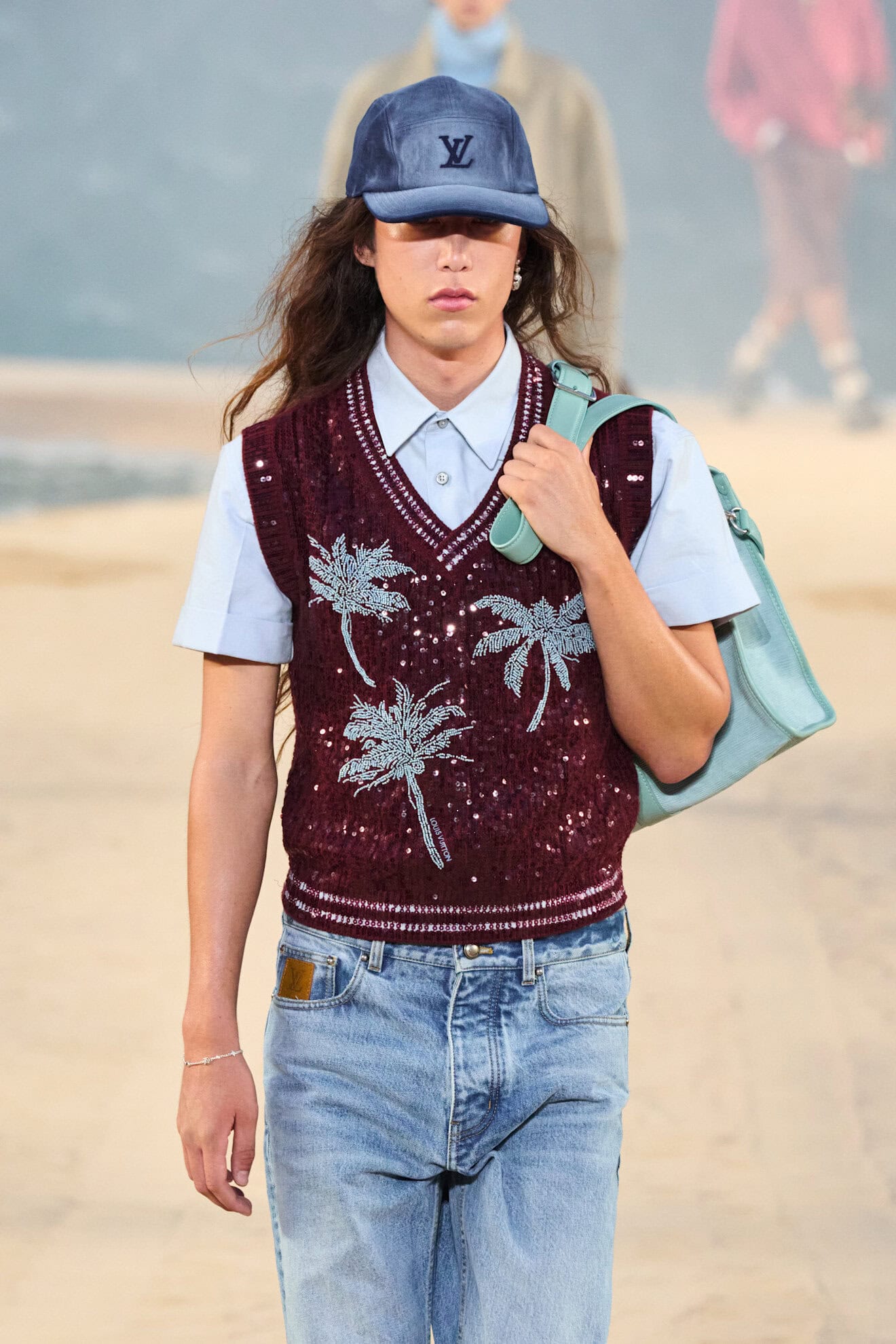
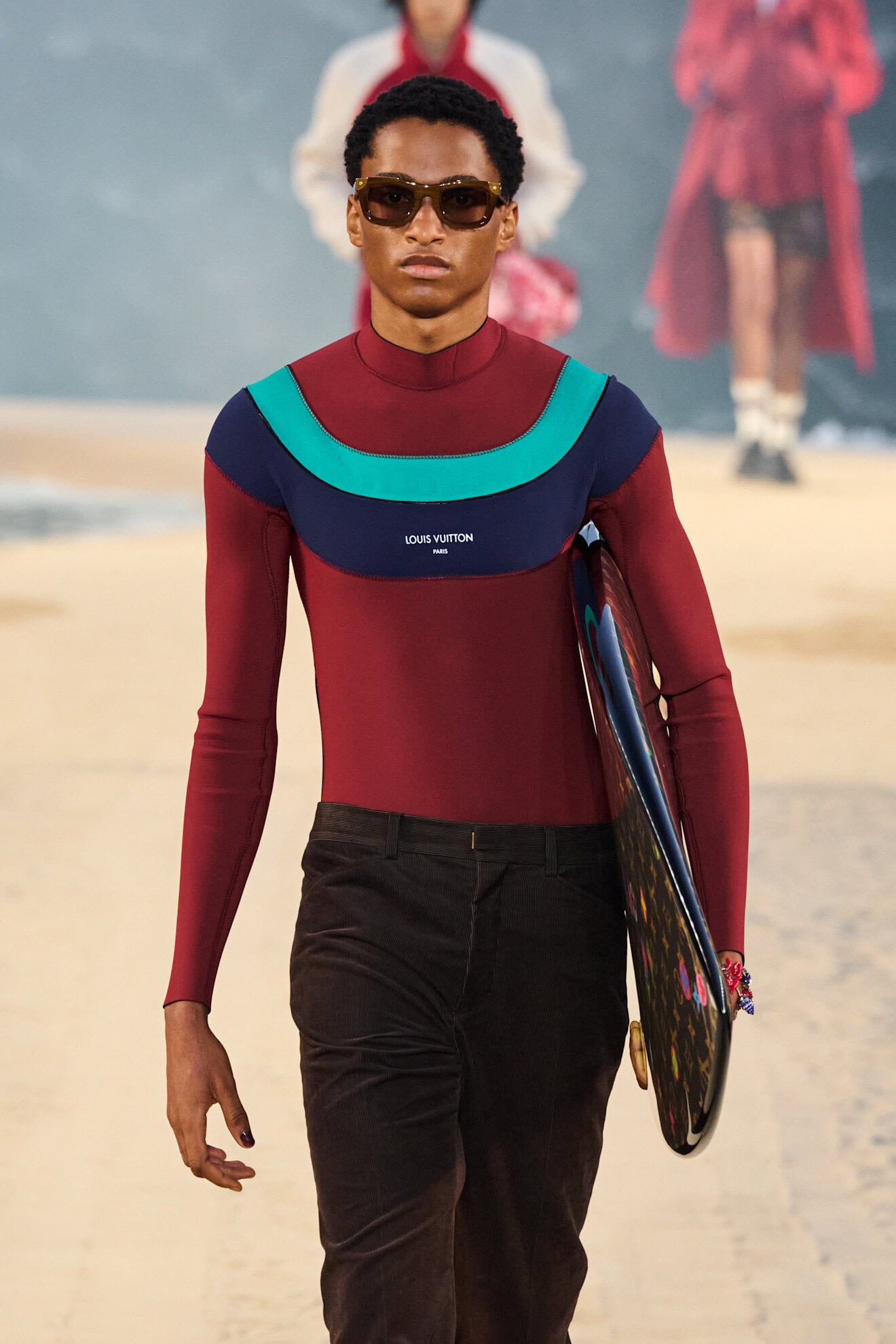
Taking its cue from nature, and the burgundy tones that were popular from Fall 2026, these summer berry shades are enlivened with a rich, almost tropical, vibrancy. A touch of glamour was added when these deep reds were paired with a shot of aqua, as was seen with Louis Vuitton’s colour-blocked wetsuits, and Dolce and Gabbana’s turquoise embellished tailoring. Hot pink at Celine also proved a fruitful combination, and rendered in tie-dye it referenced the seasons’ nomadic theme. Faded and washed effects also ensure that this tone transitions across the seasons and is infused with a subtle luminosity.
6. DRESS CODE BLACK
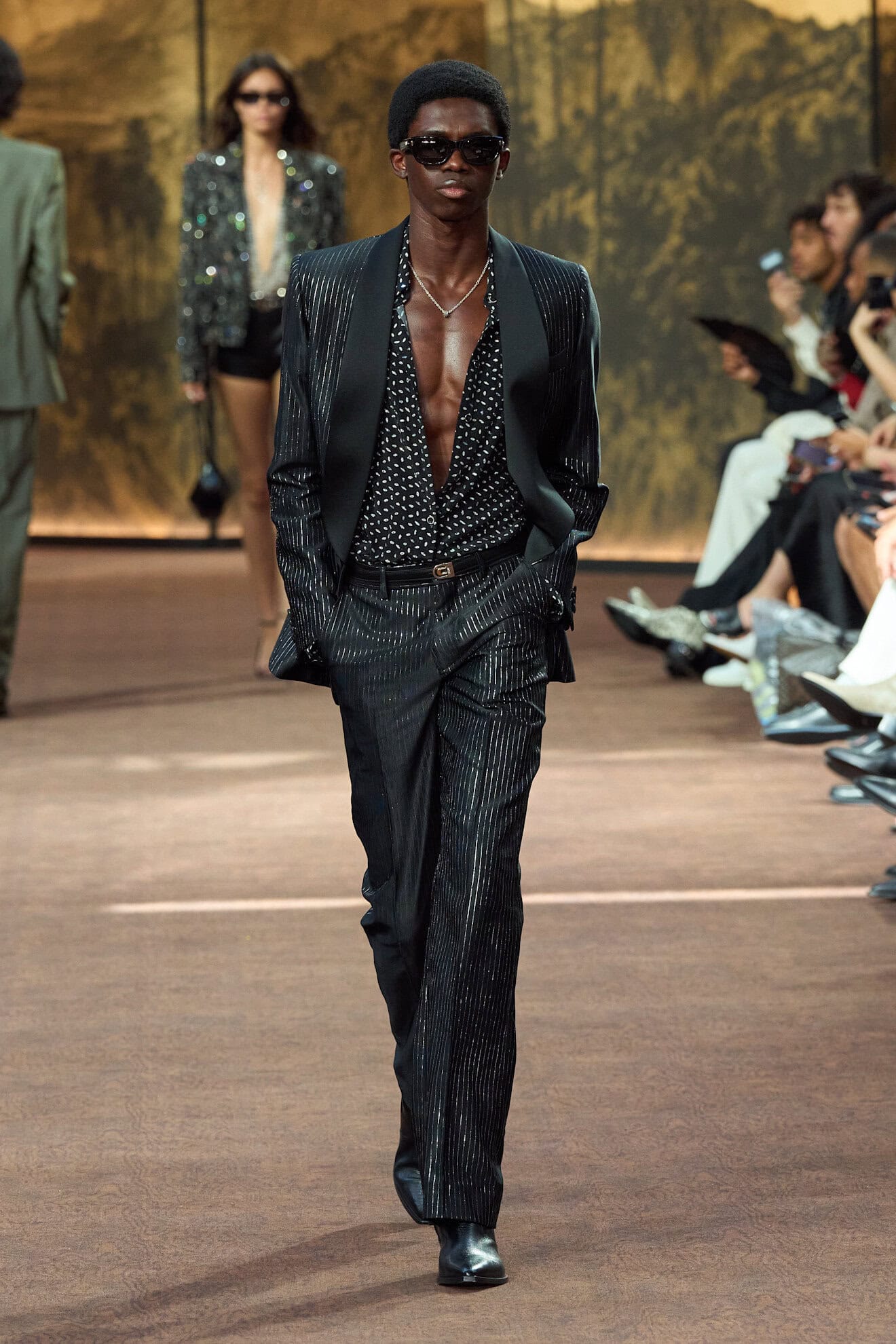
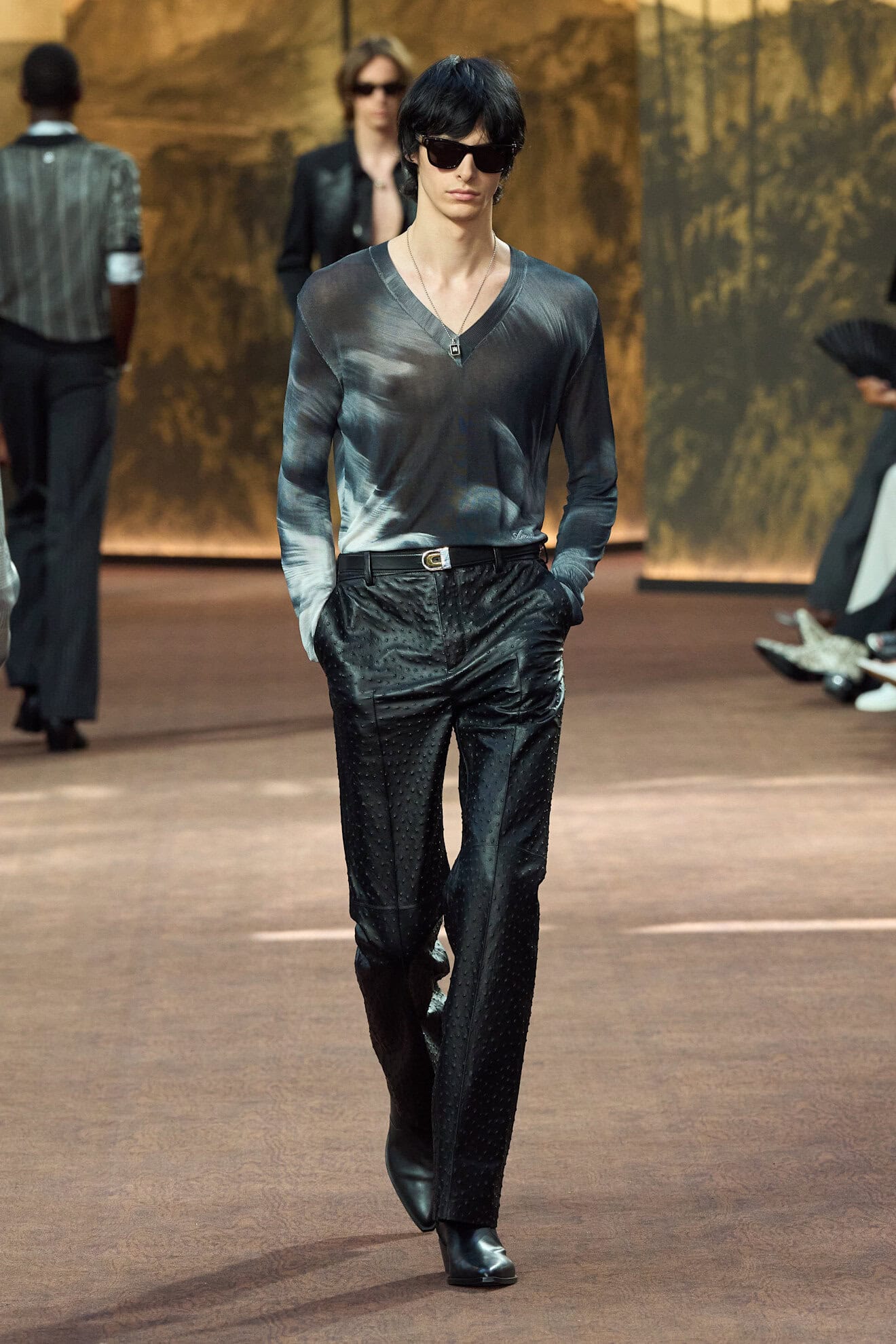
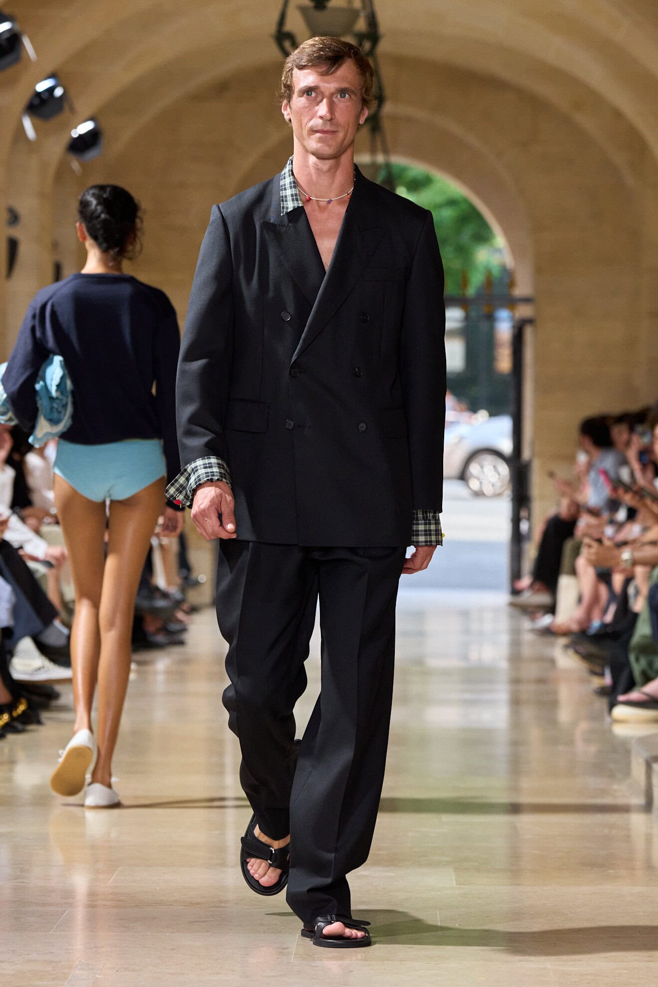
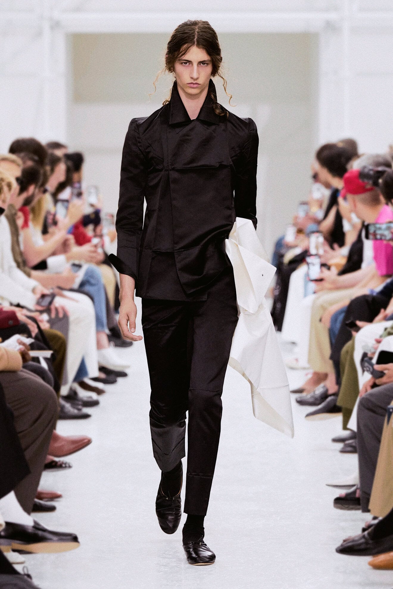
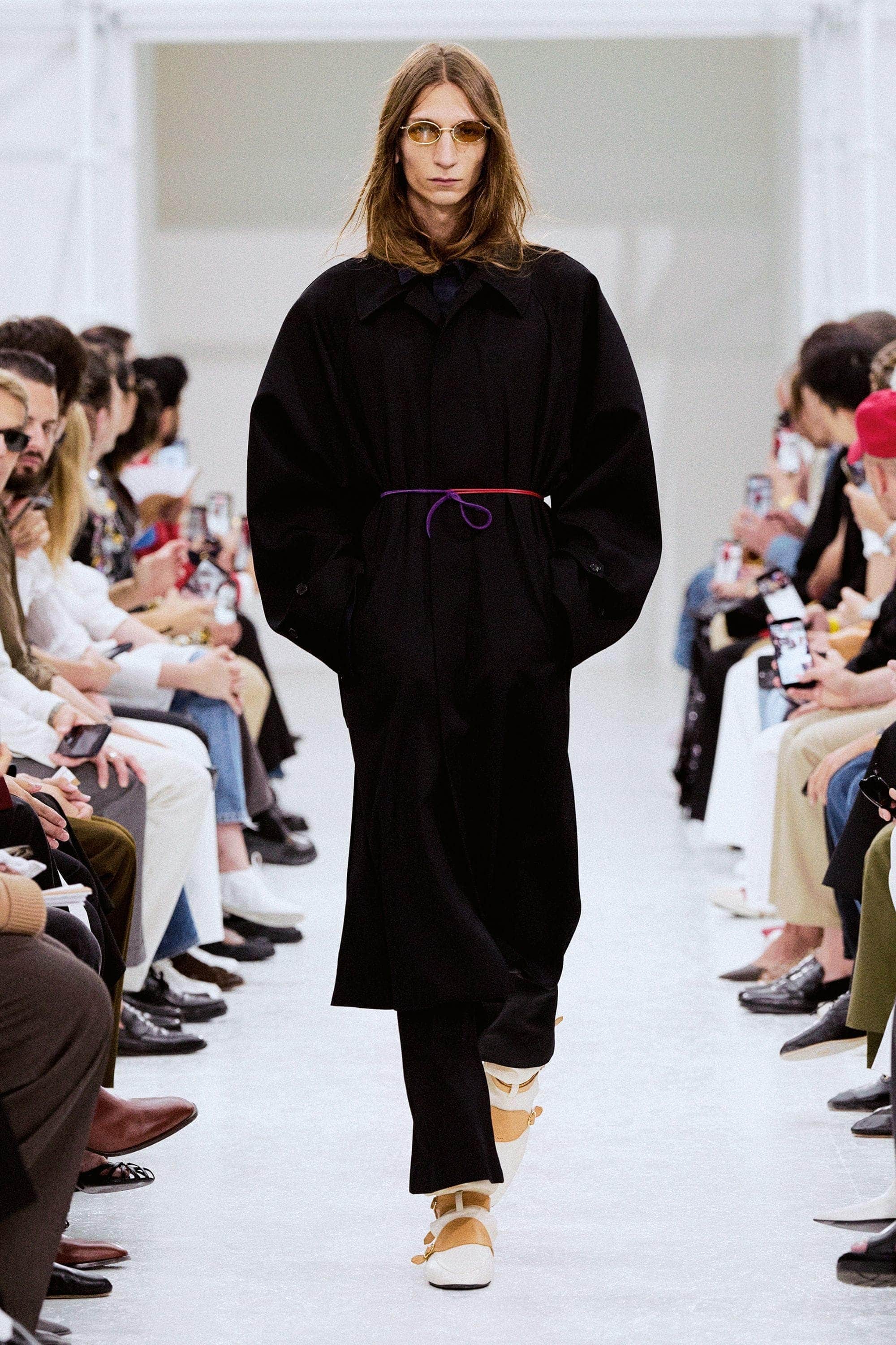
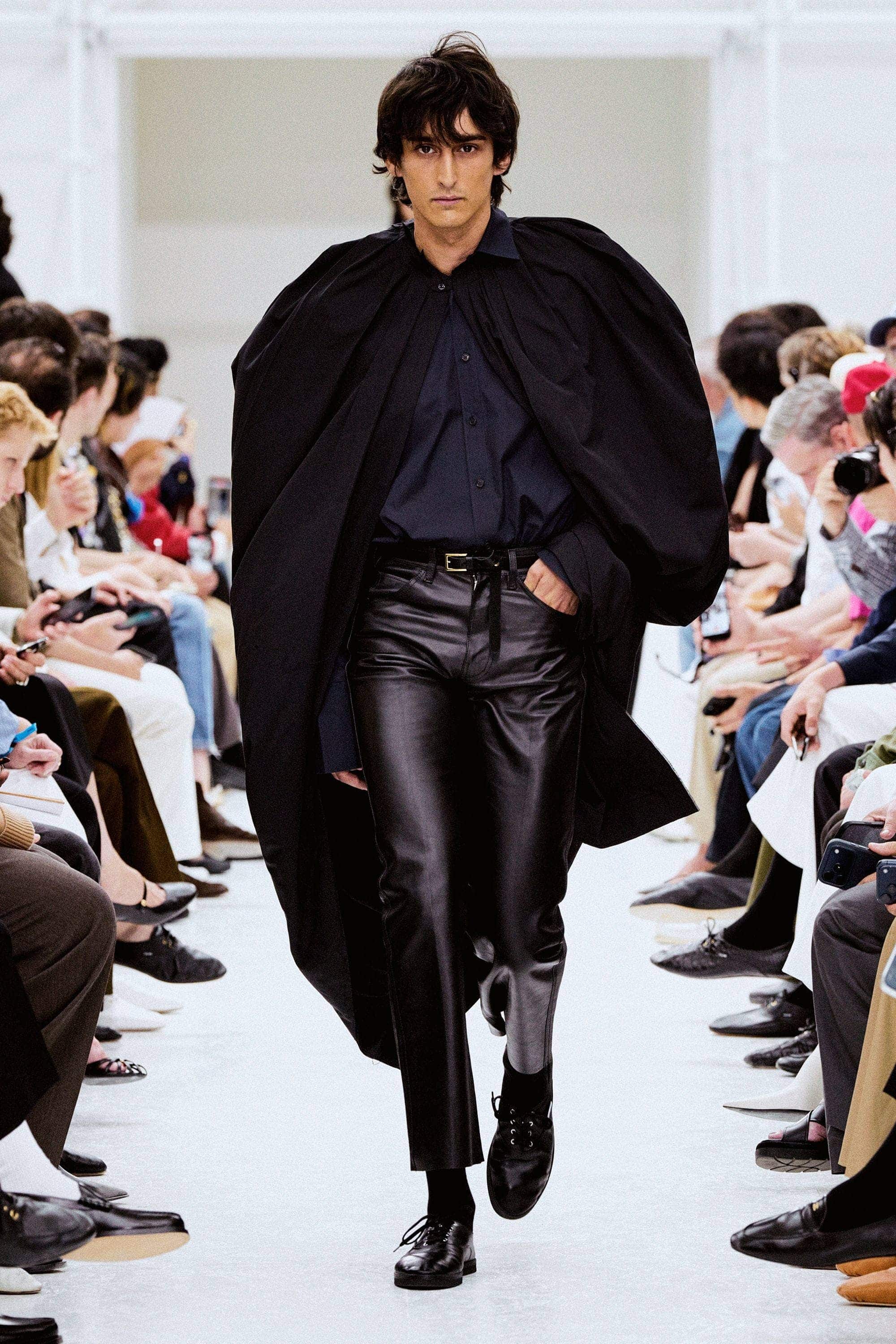
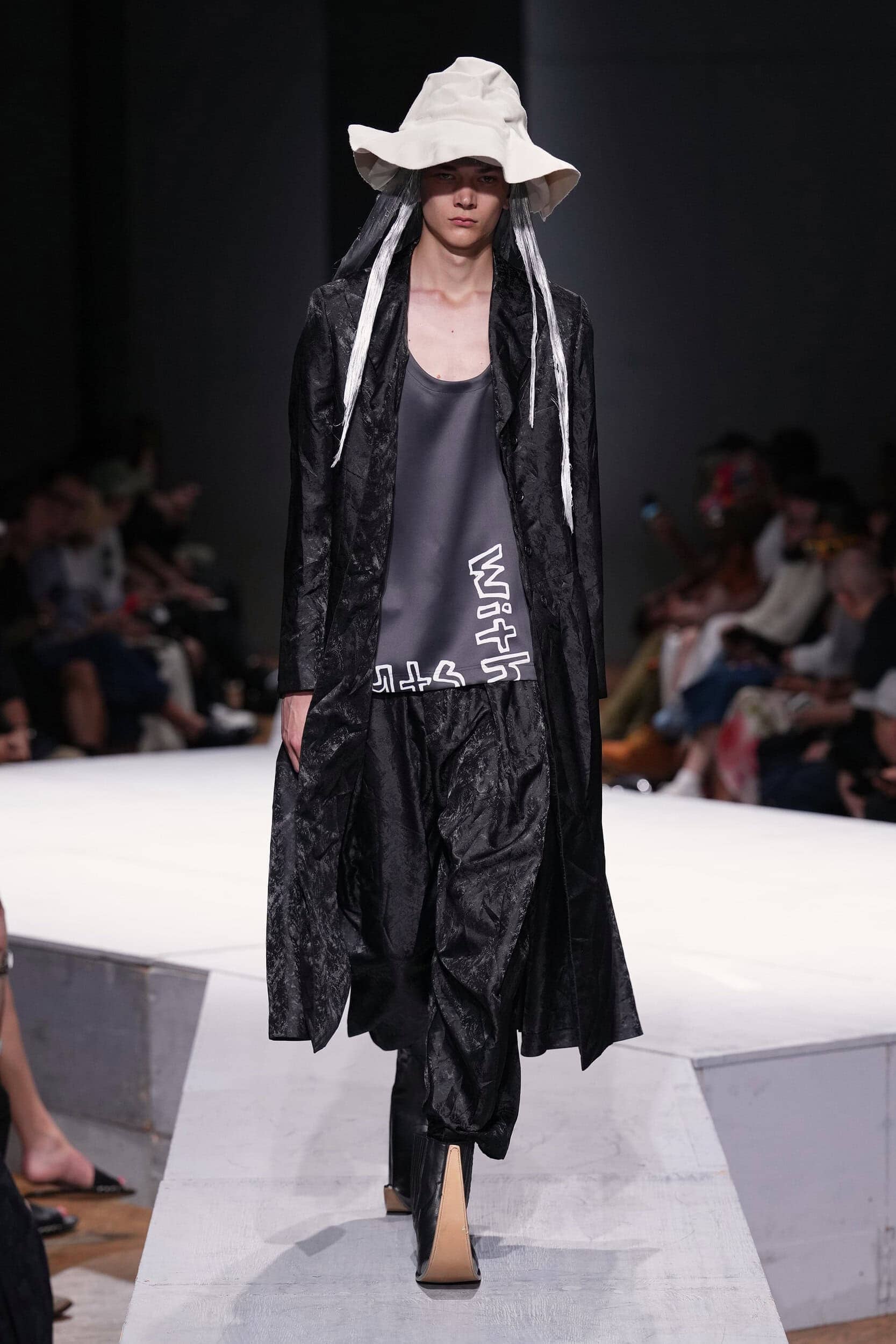
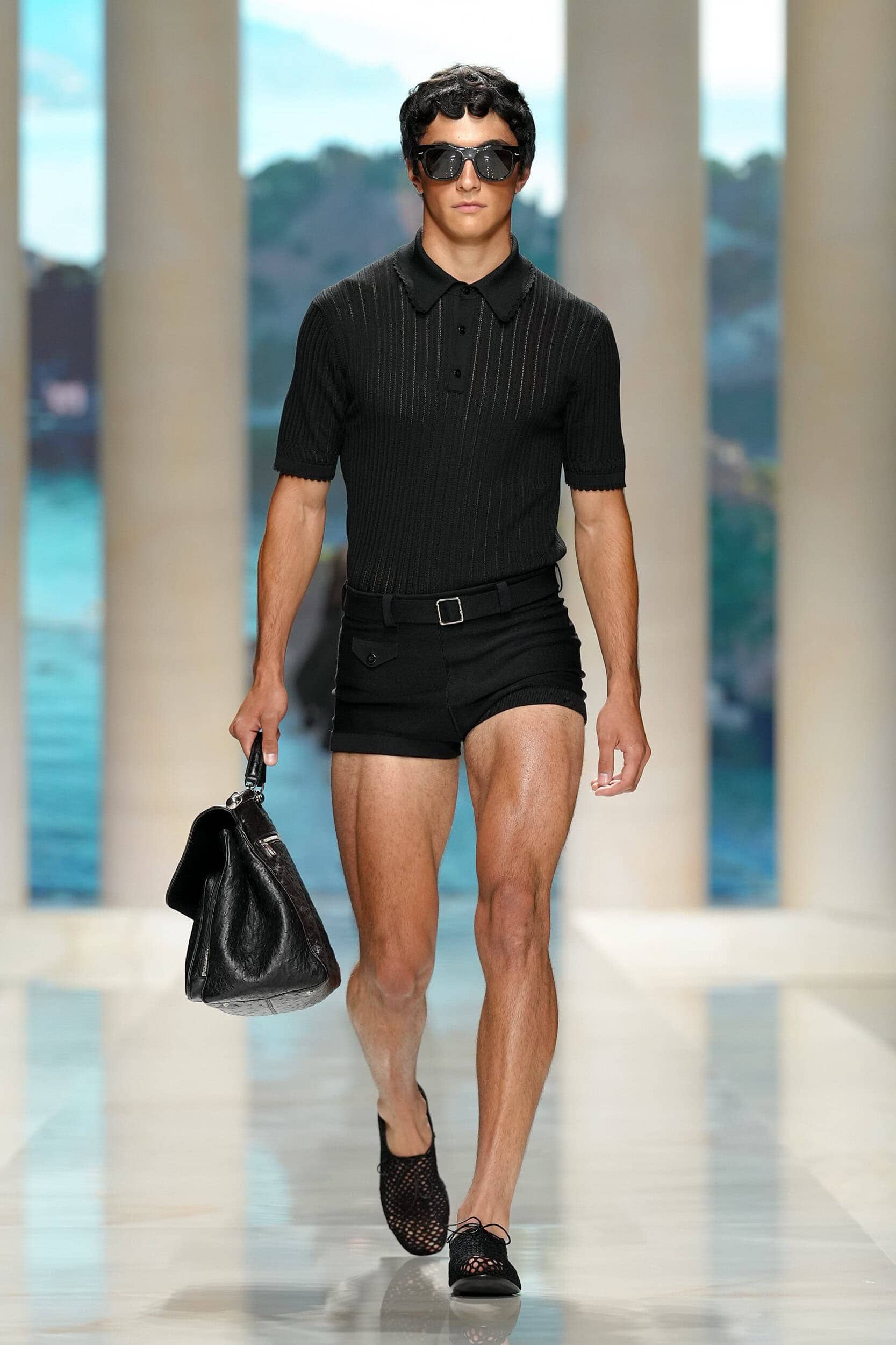
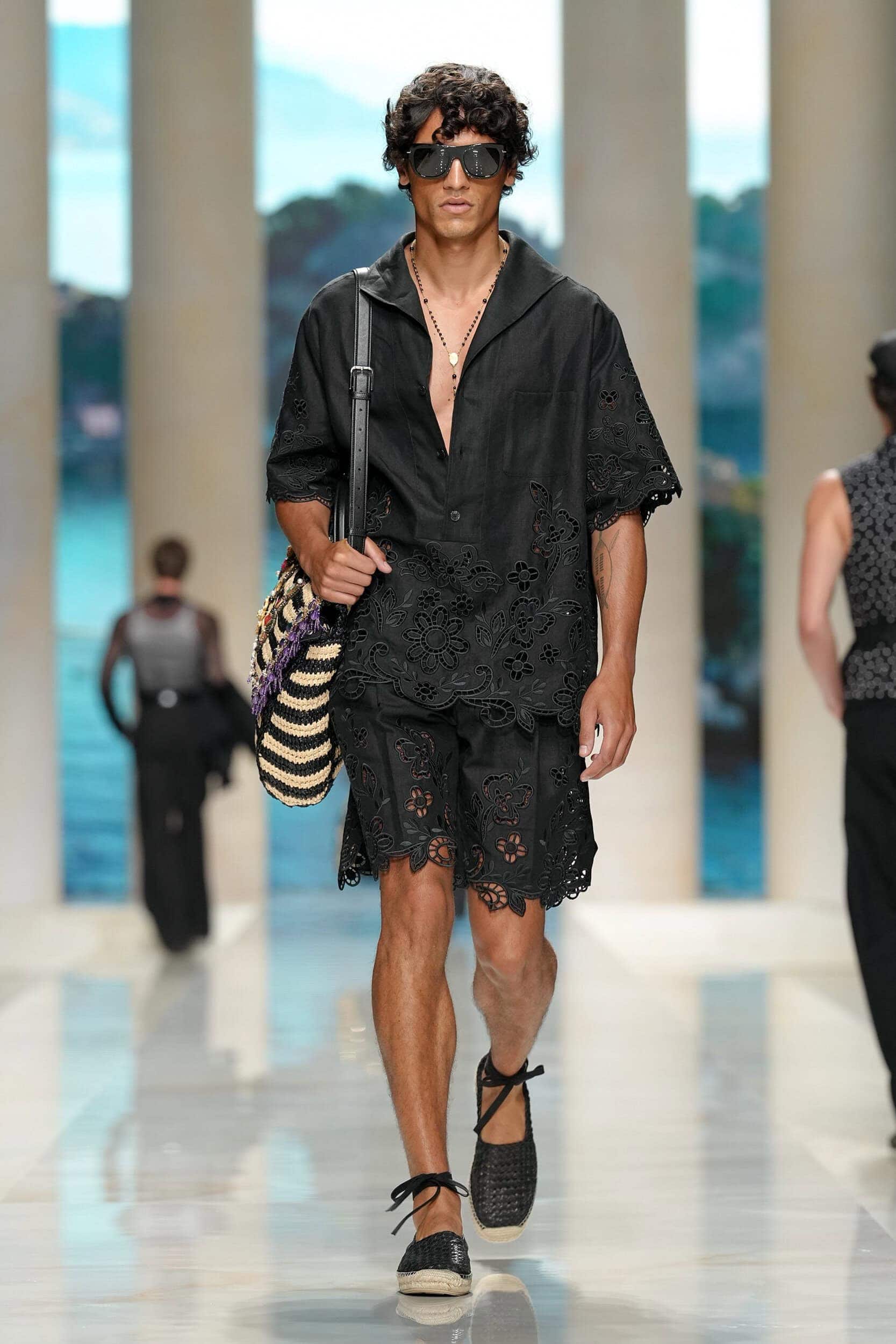
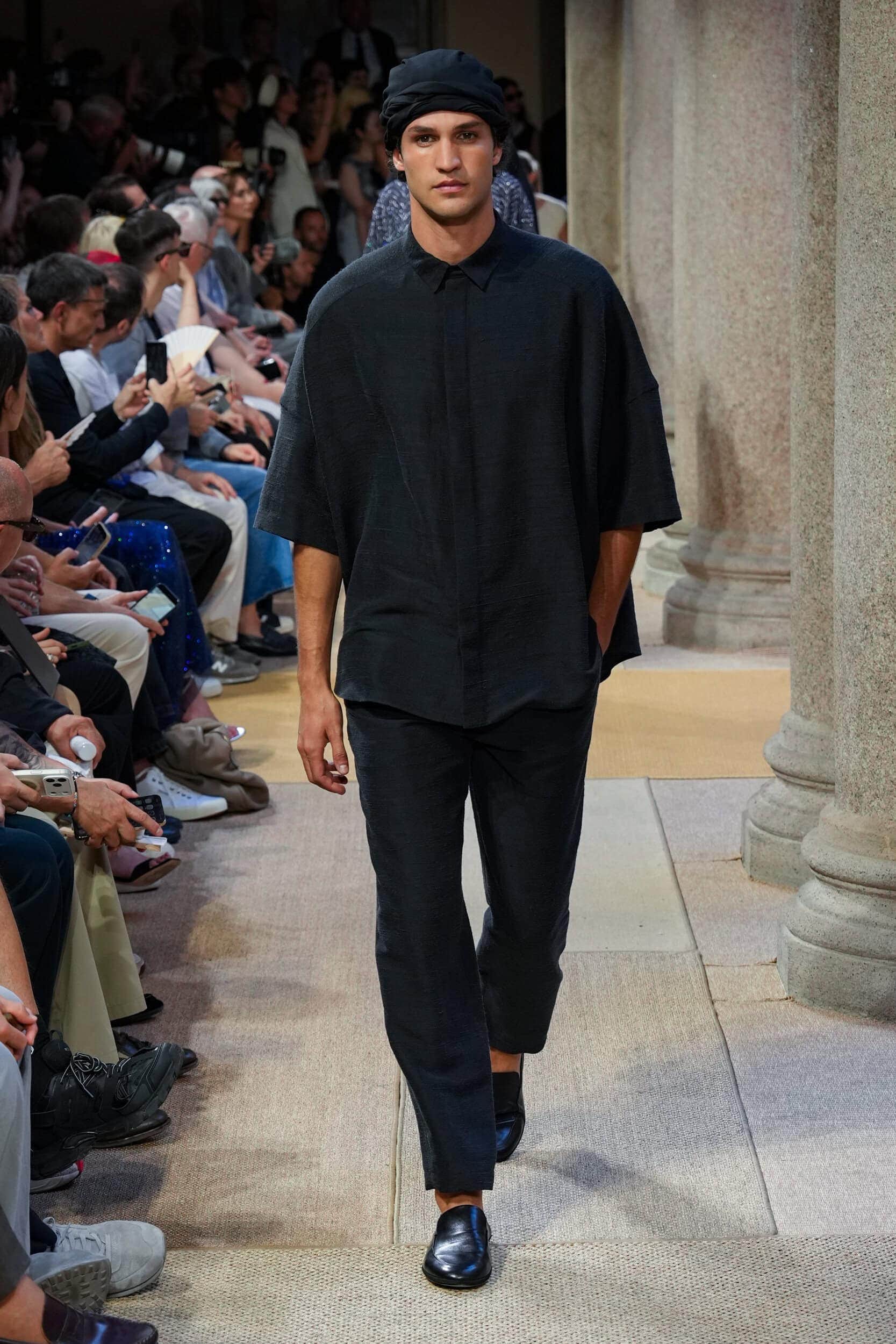
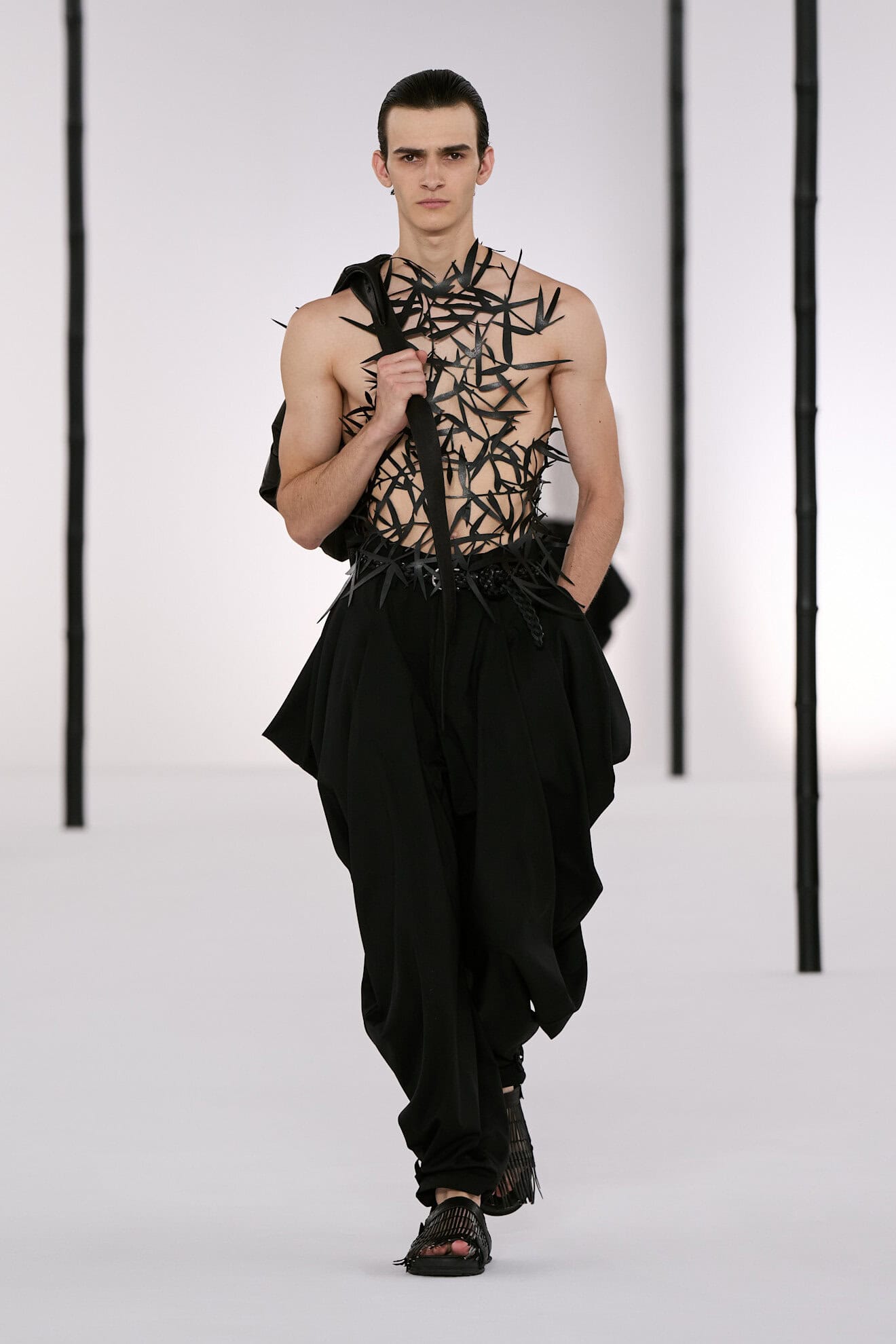
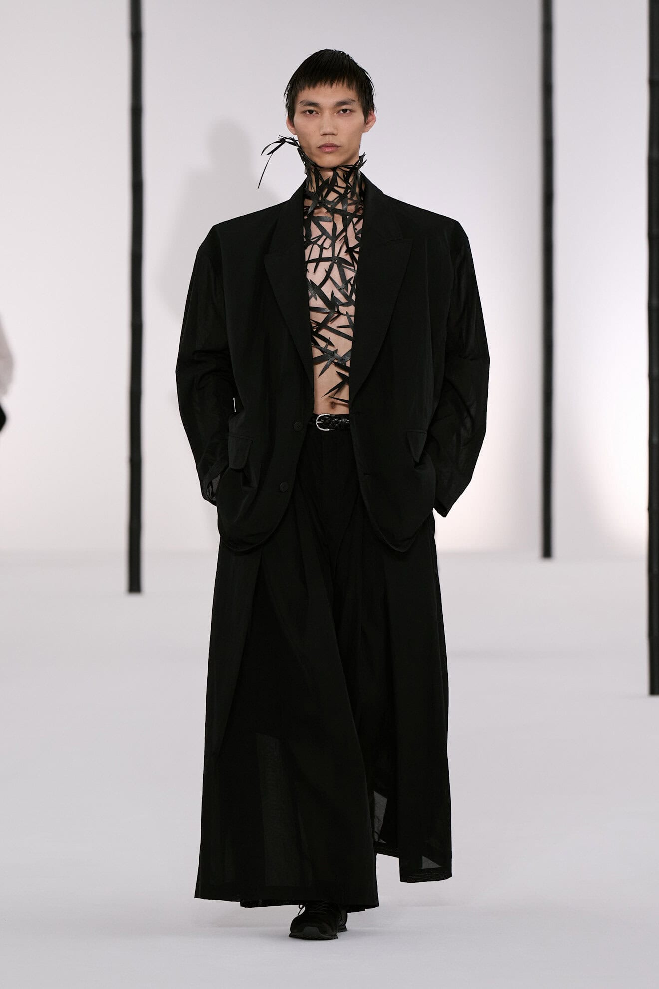
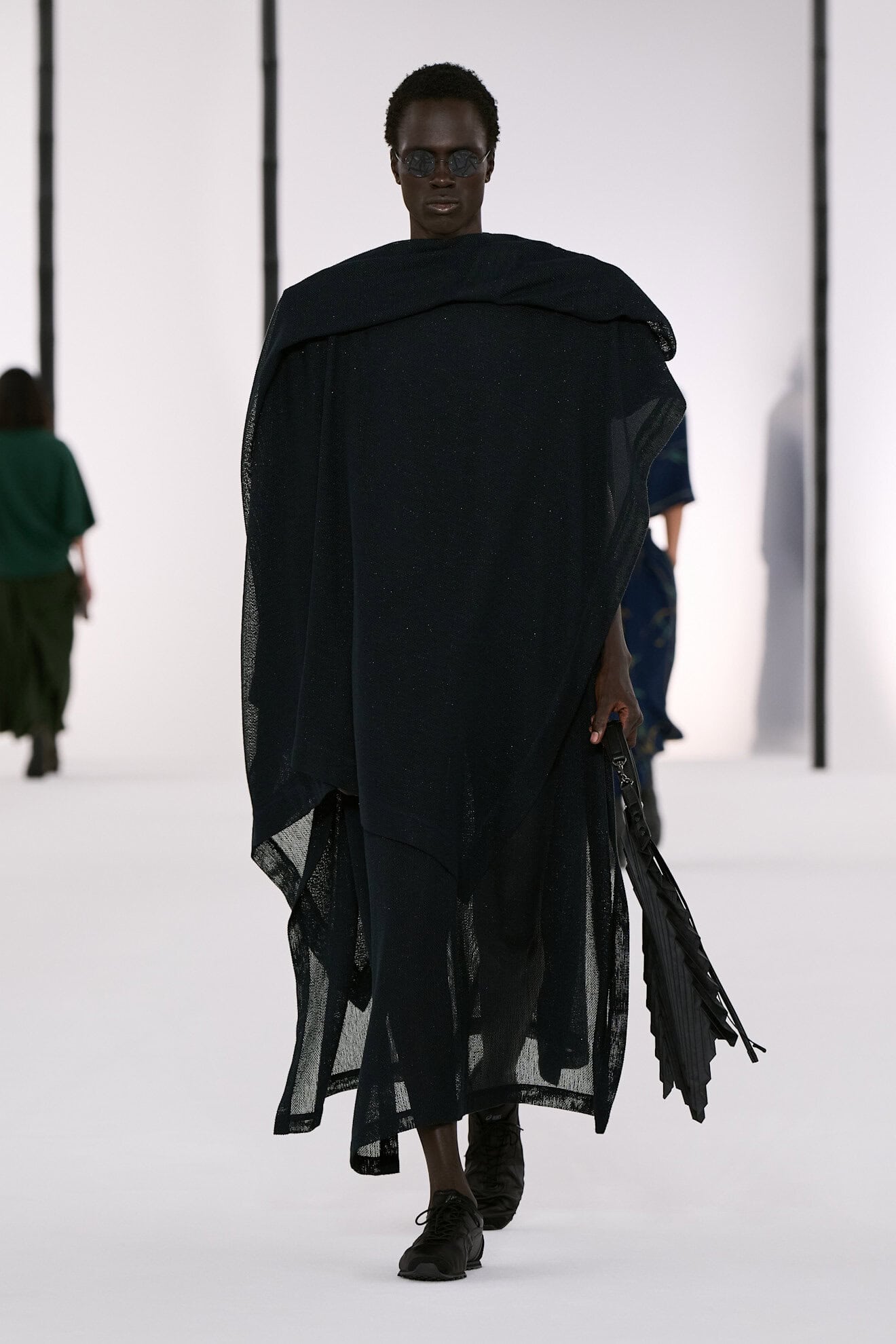
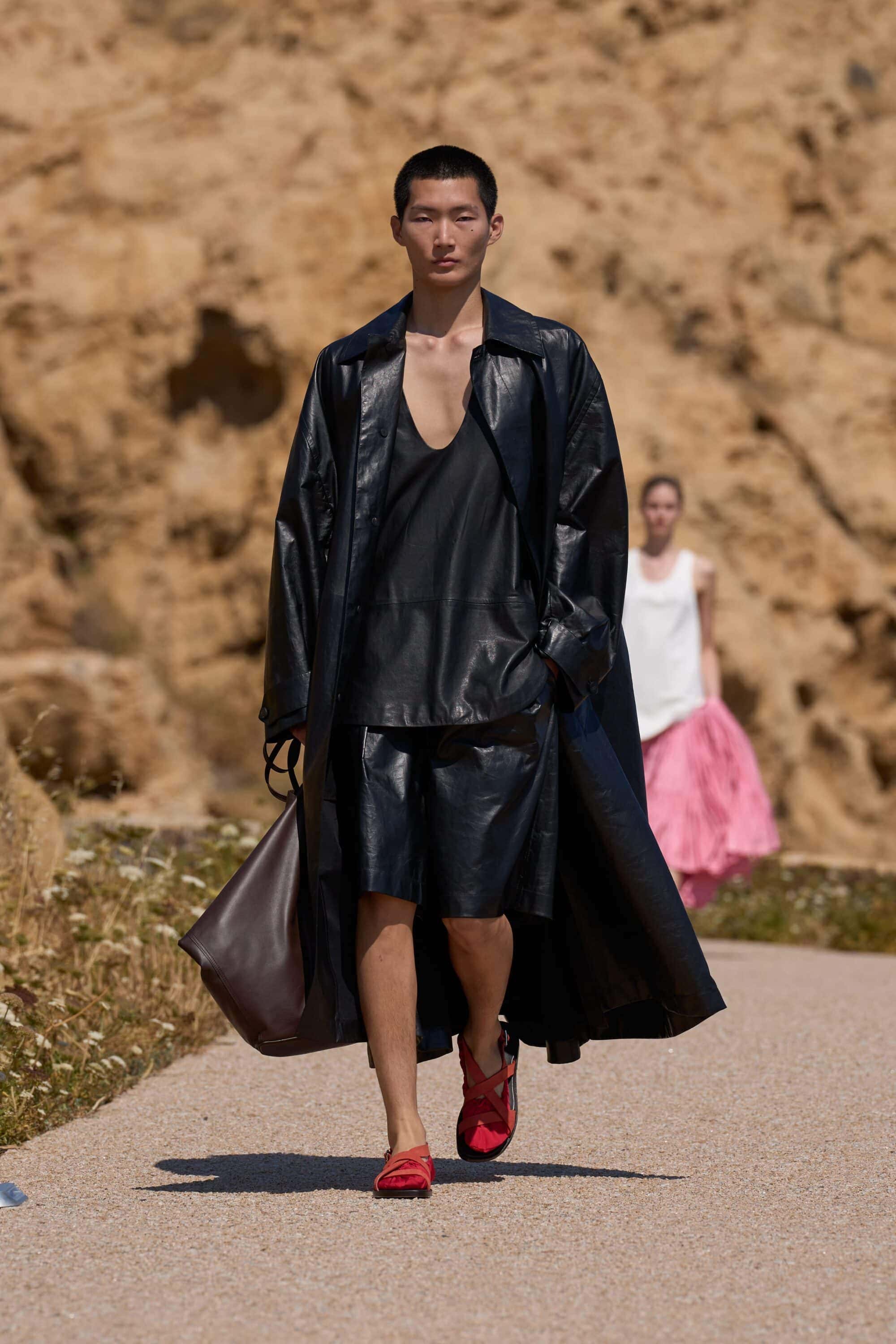
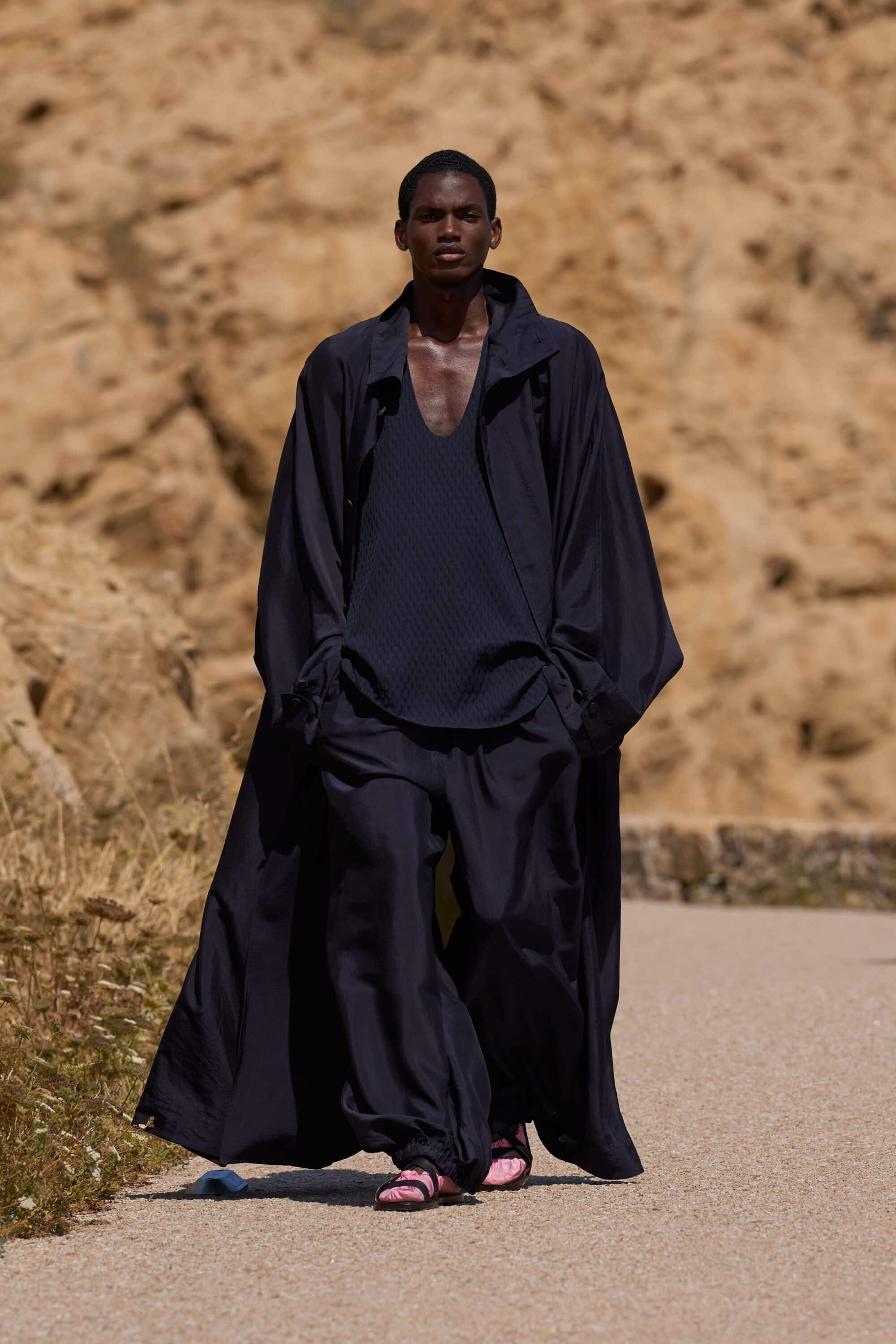
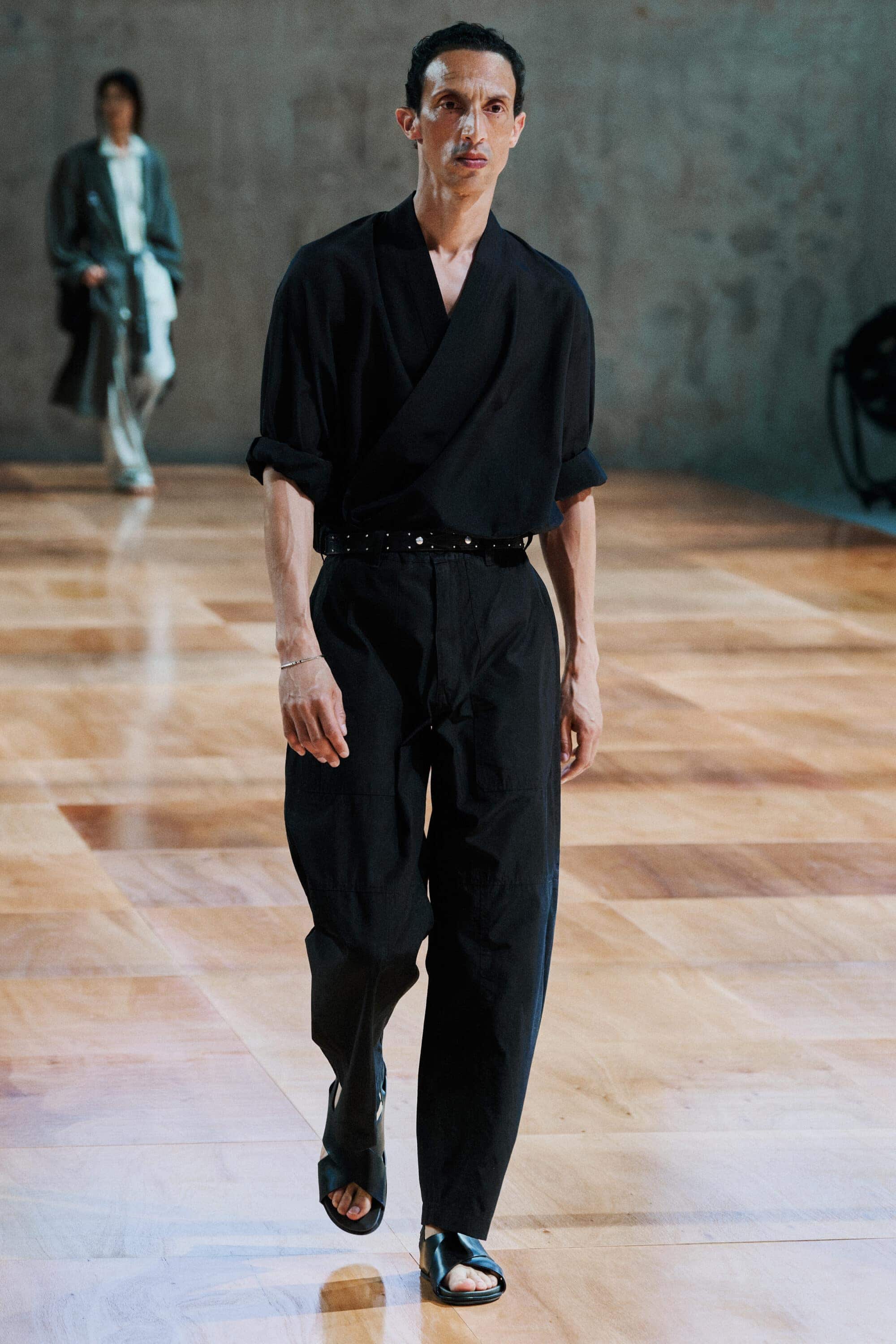
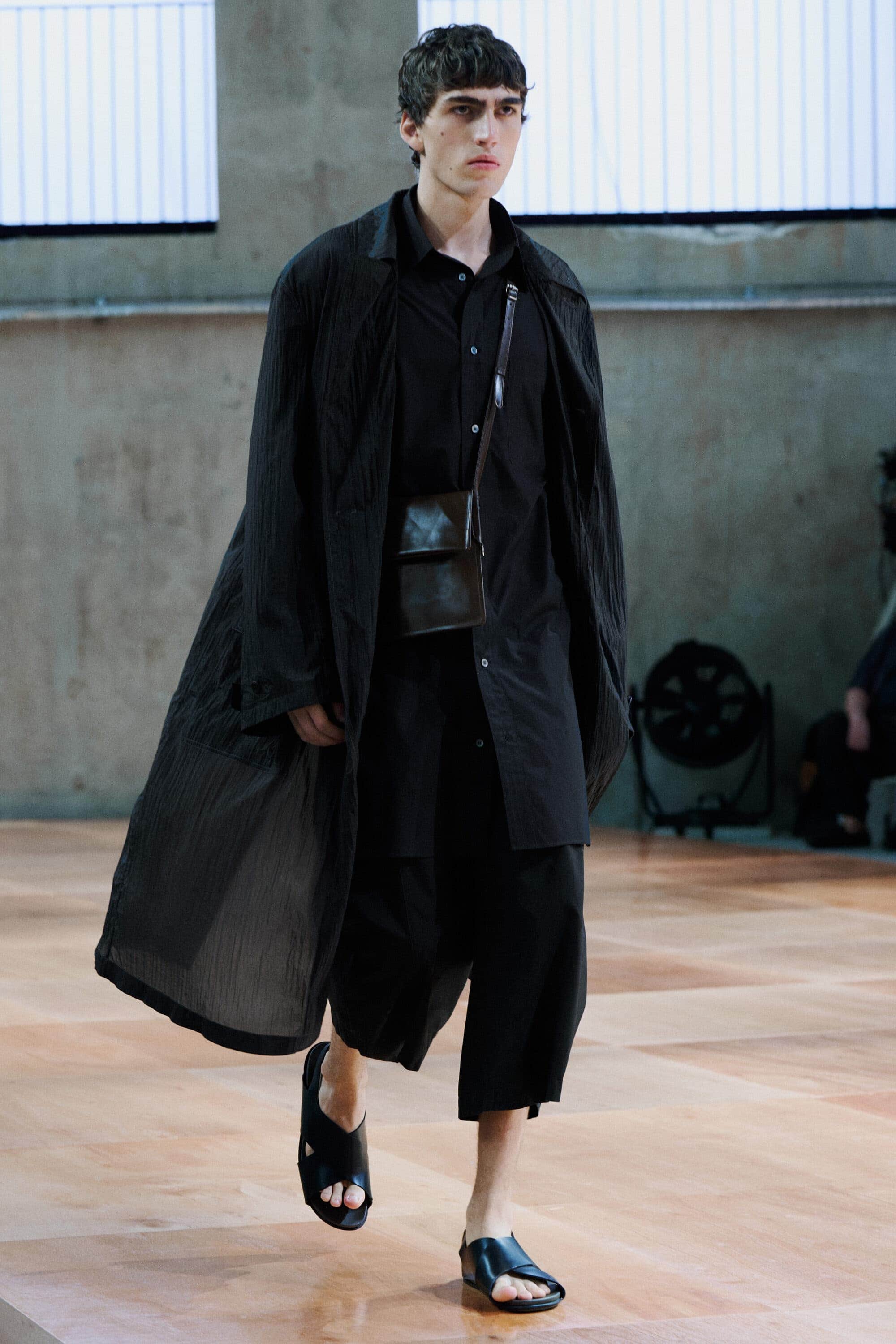
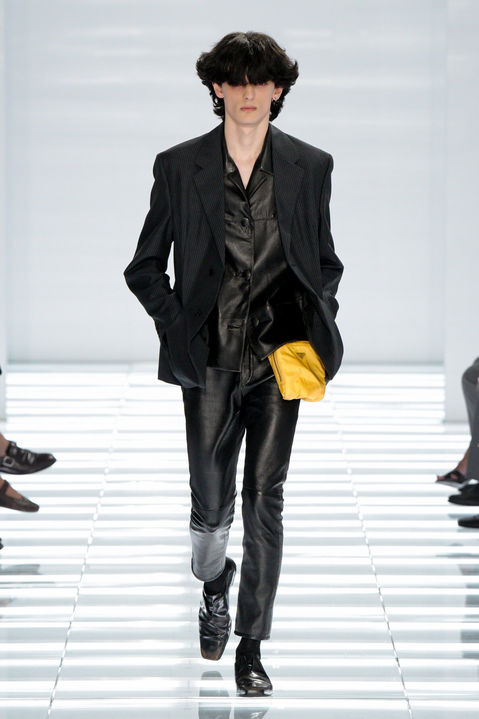
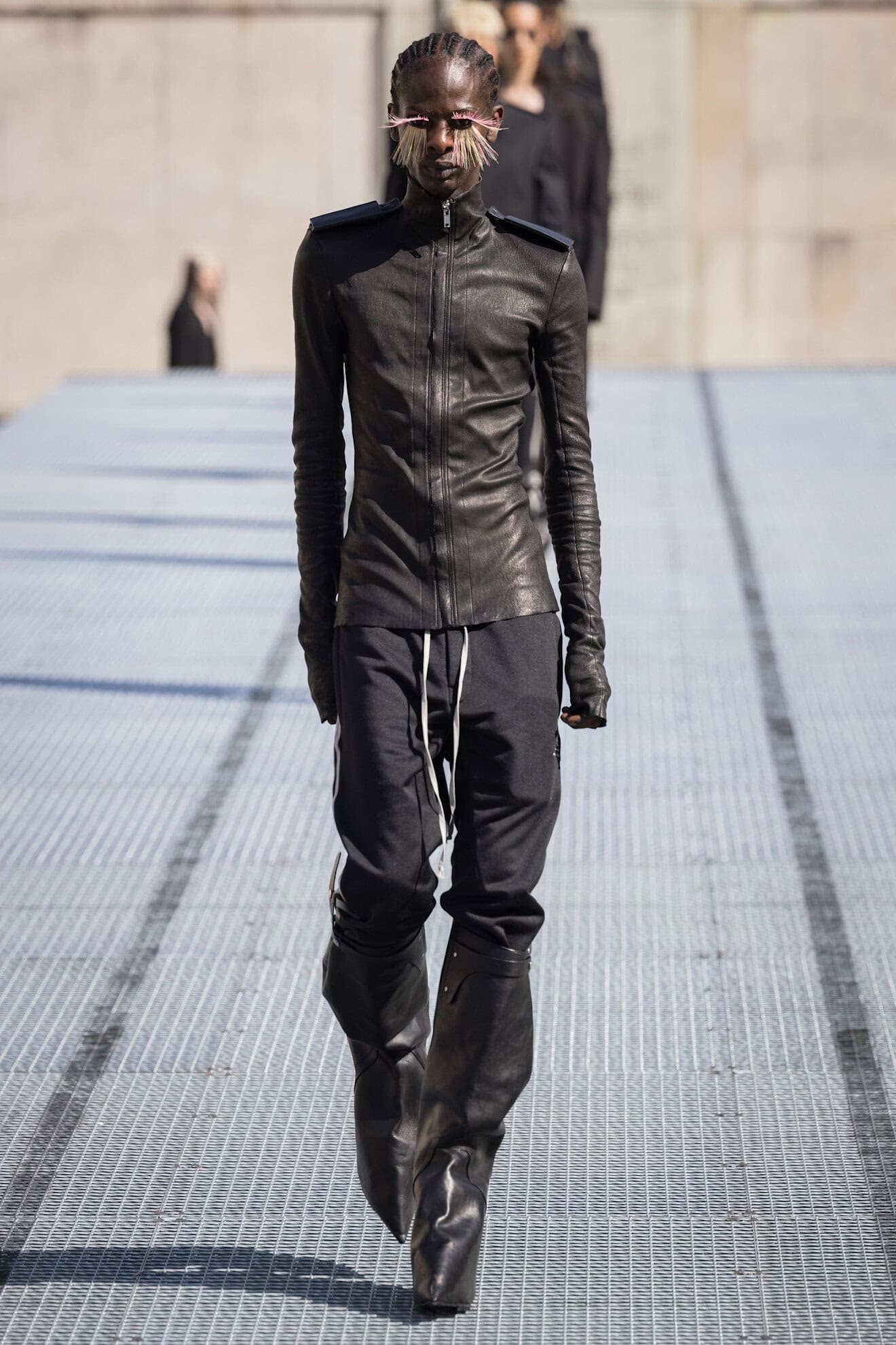
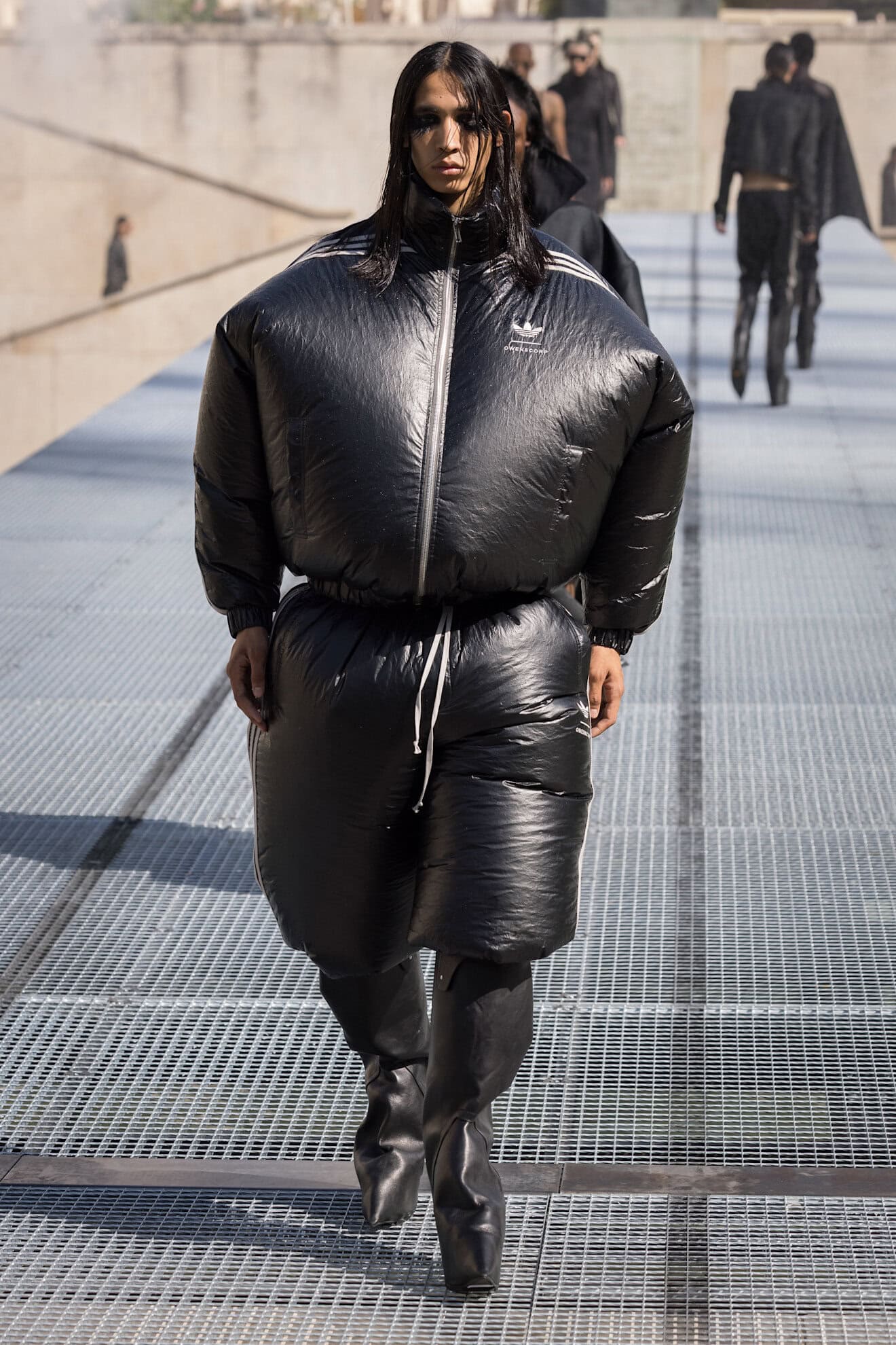
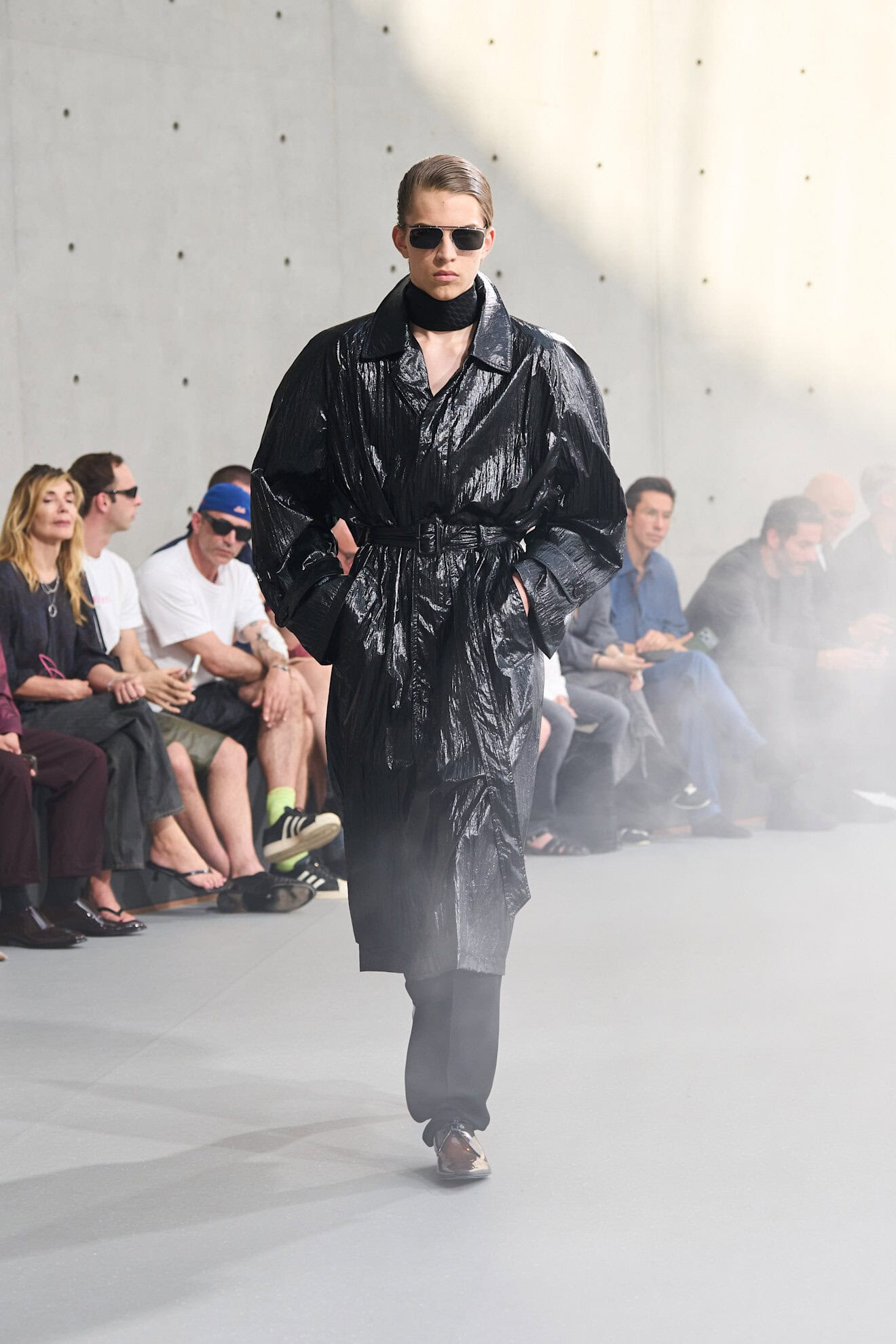
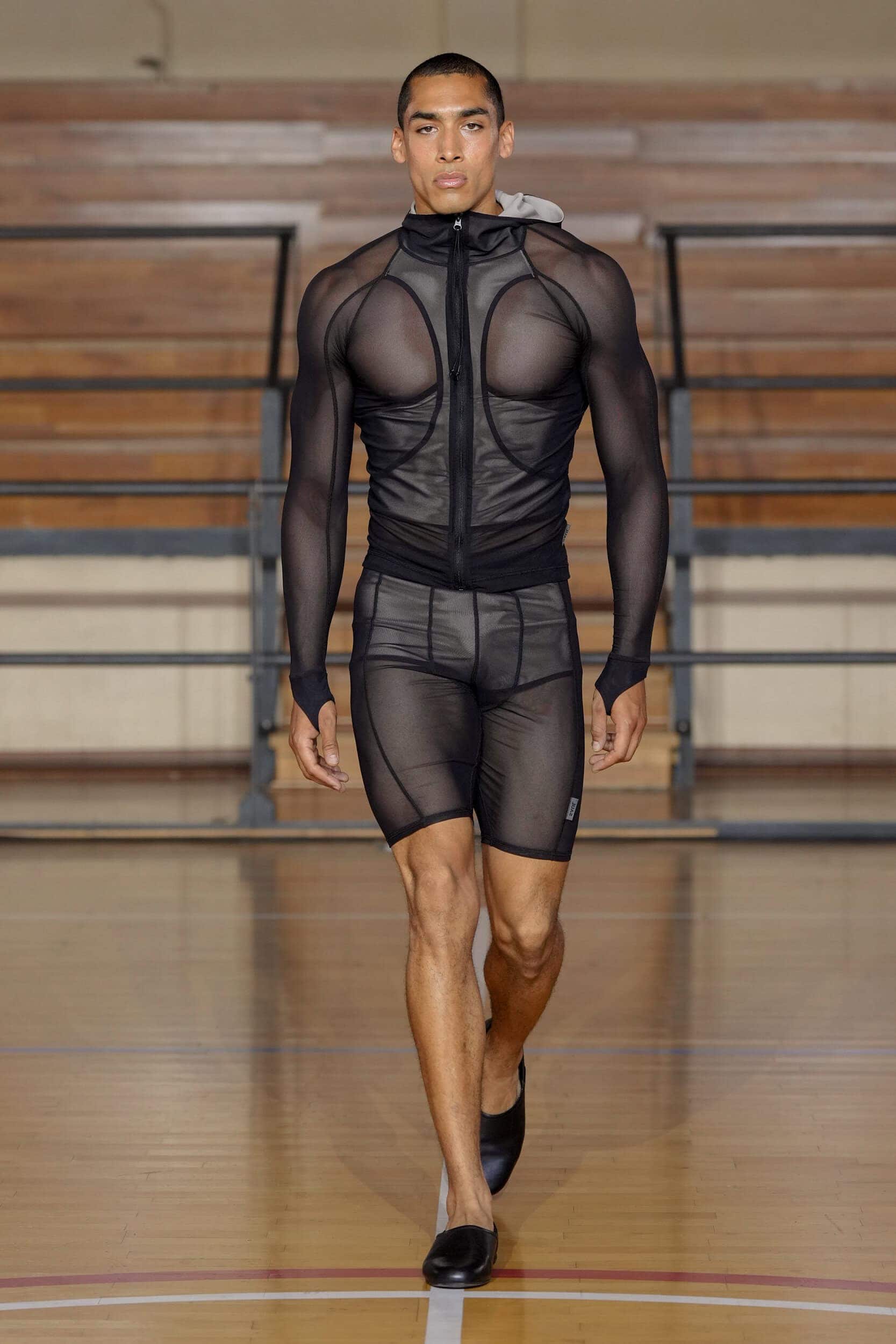
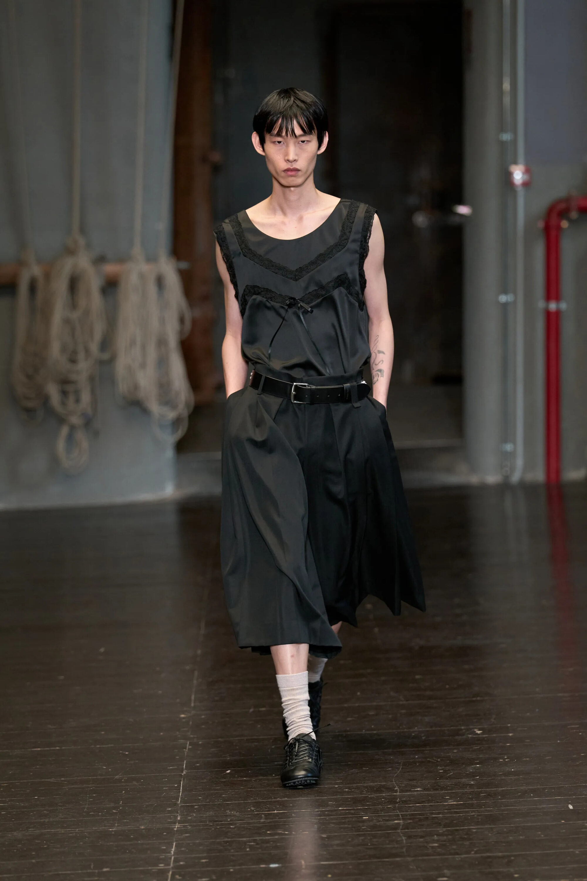
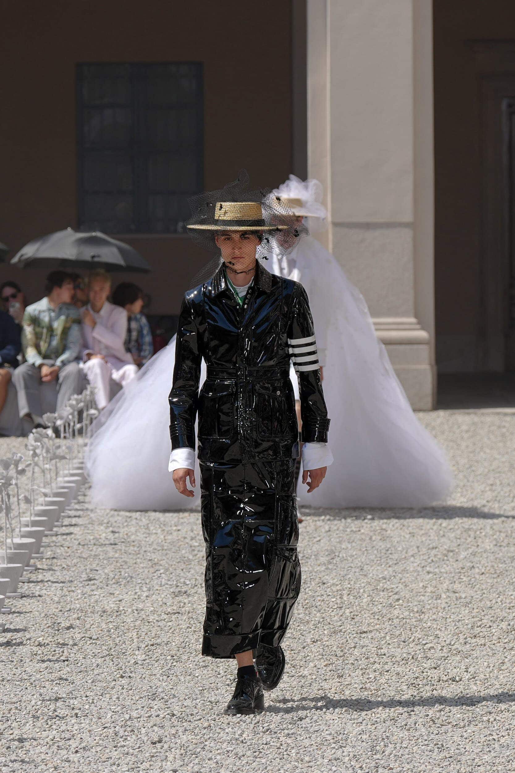
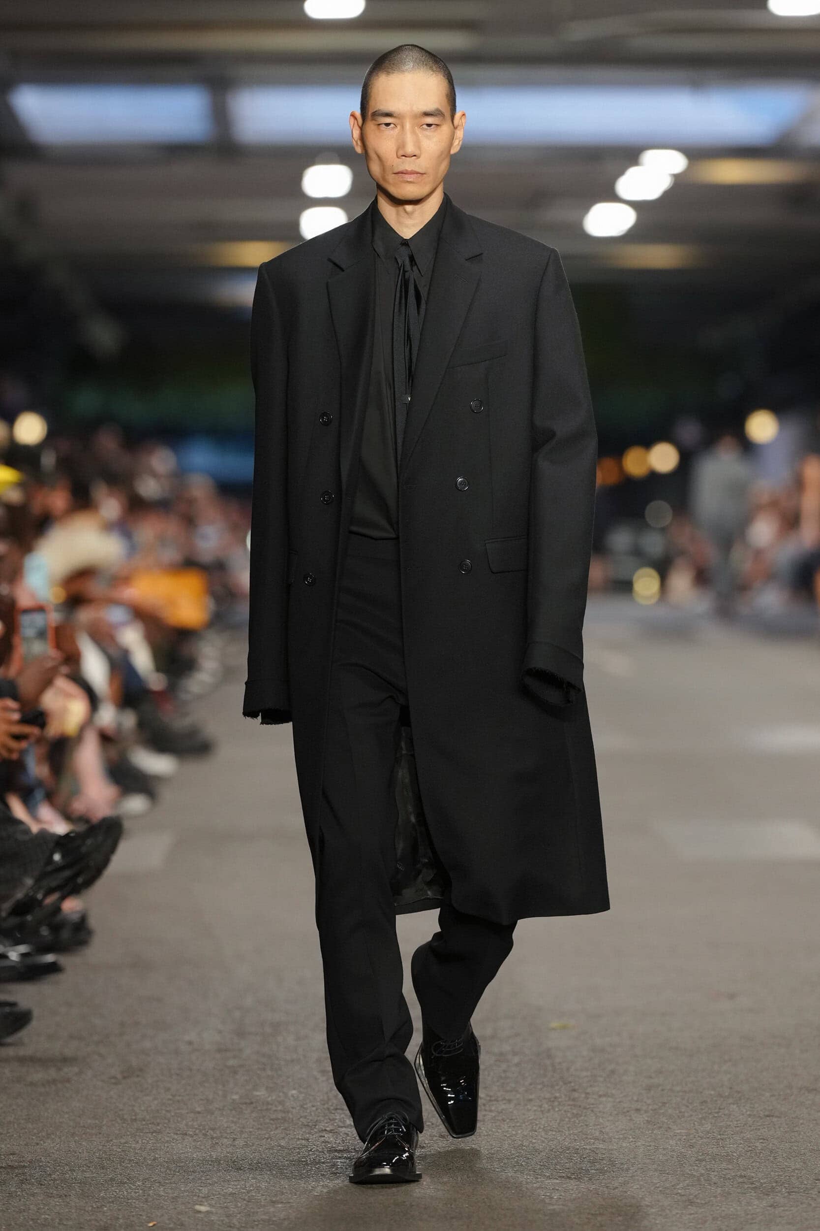
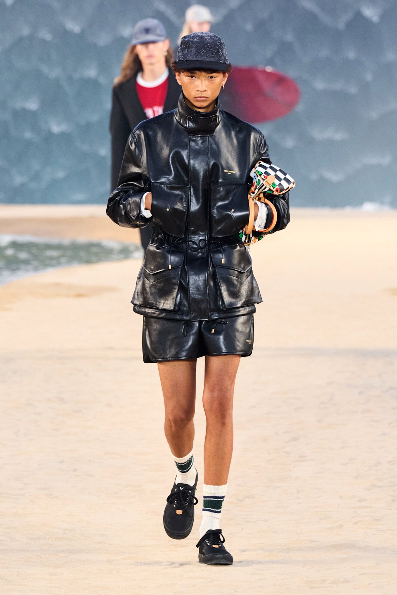
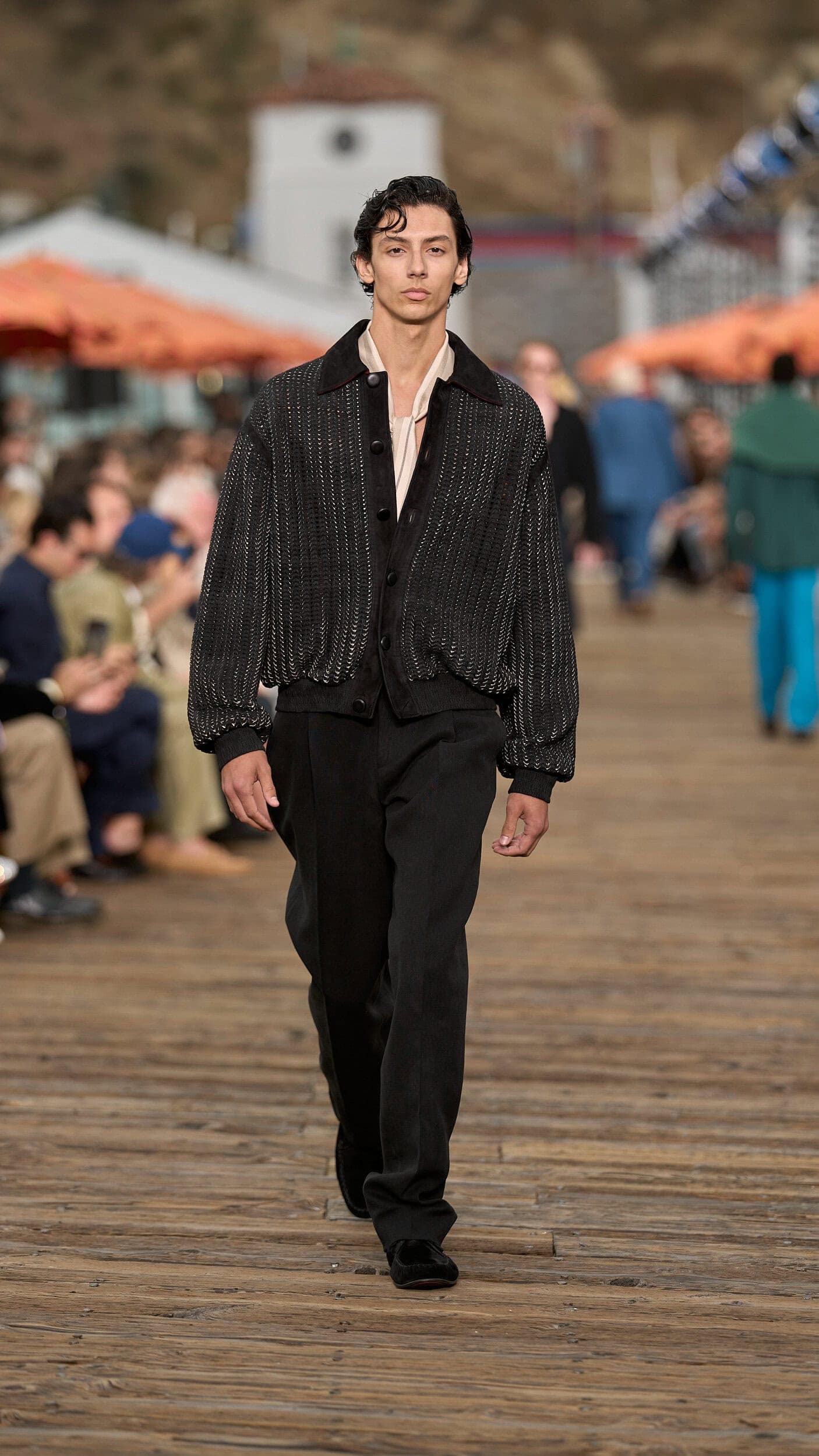
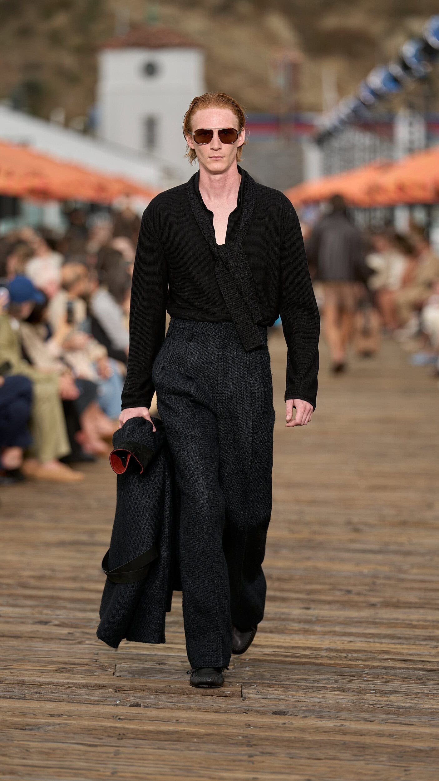
As a trans-seasonal go-to, black remains an essential component when it comes to summer colour palettes. Instantly bringing together a look, whether the occasion calls for a formal or casual dress code, black’s dark tone was used generously by designers for its versatility and purity. Think slick surfaces coating trench coats at Saint Laurent and Thom Browne, ballooning tracksuits at Rick Owens, and reworked into delicate sets of macramé lace at Dolce and Gabbana (who also encrusted tweed jackets with heirloom jewels and brooches). Leather, that lends itself to the all-encompassing dark shade, was brought back in the form of the leather pant, to coincide with the return of the ultra-slim rock-and-roll silhouette that was seen at Celine and Prada.
7. RARE EARTH
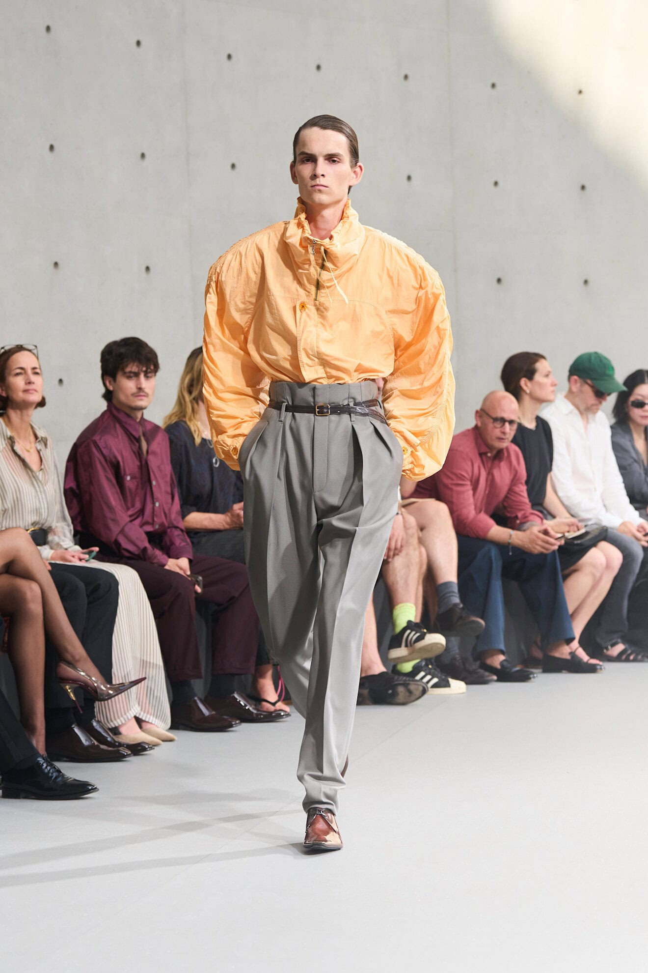
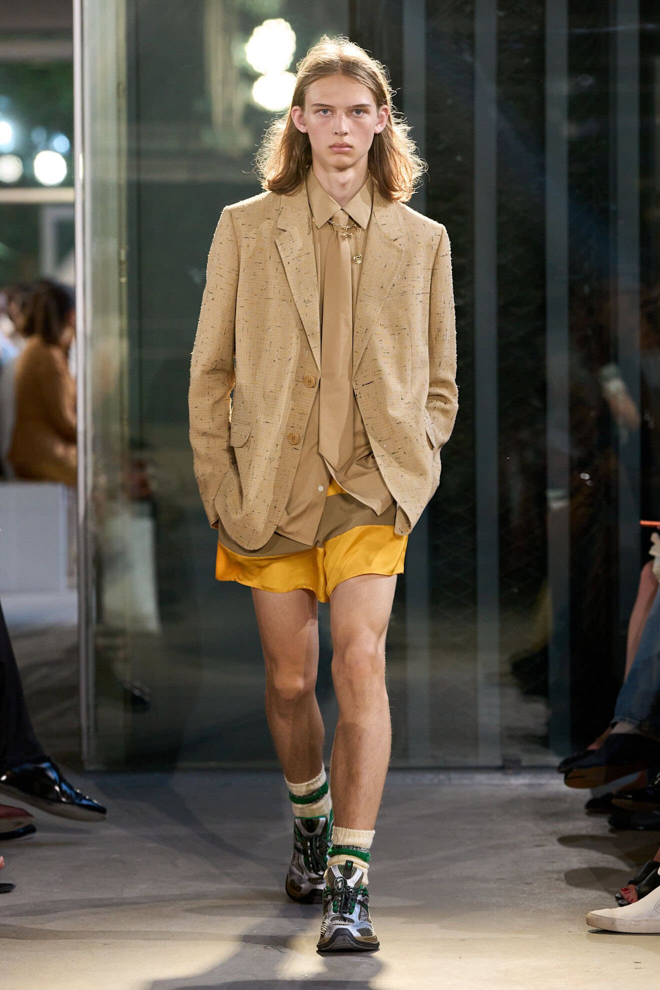
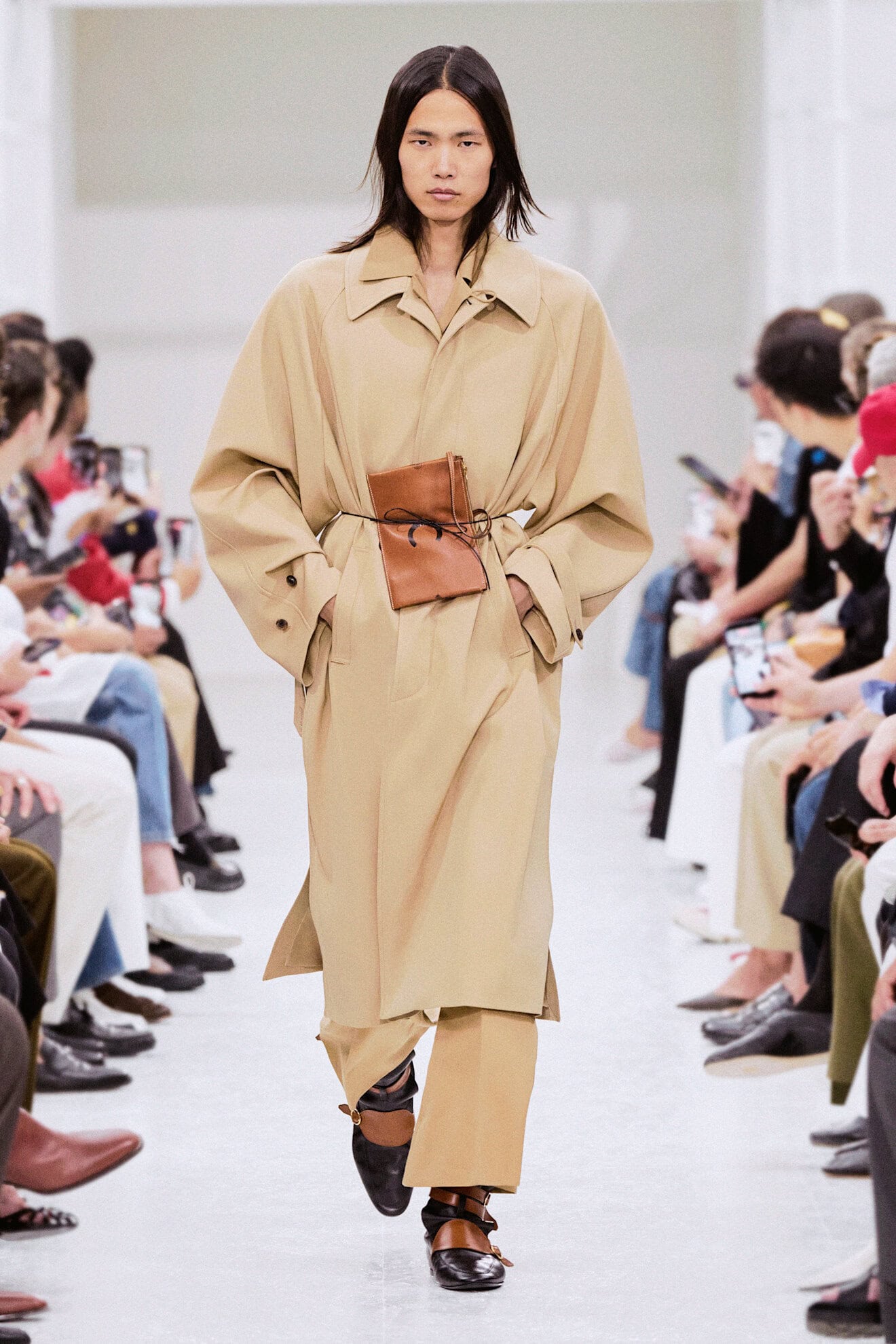
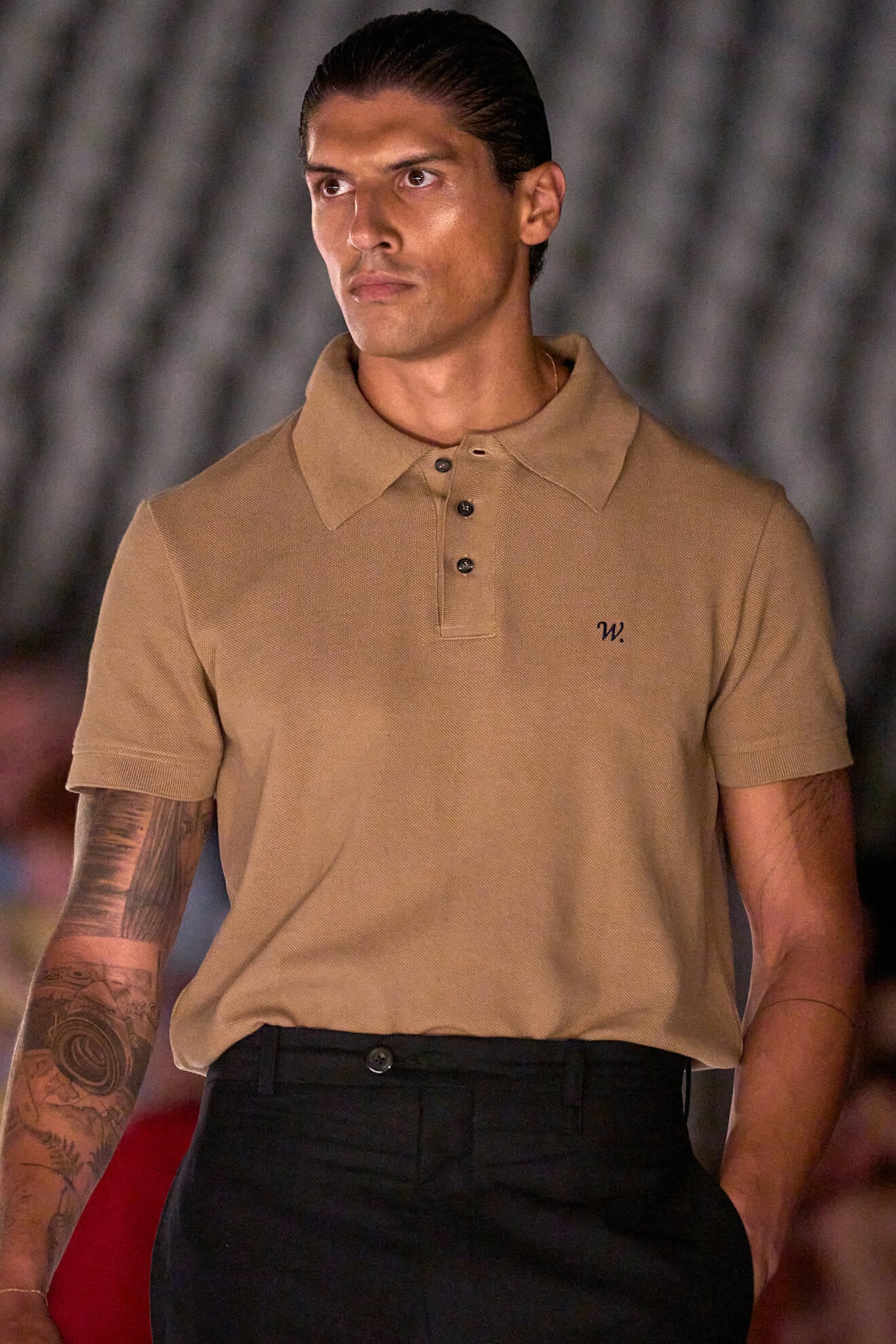
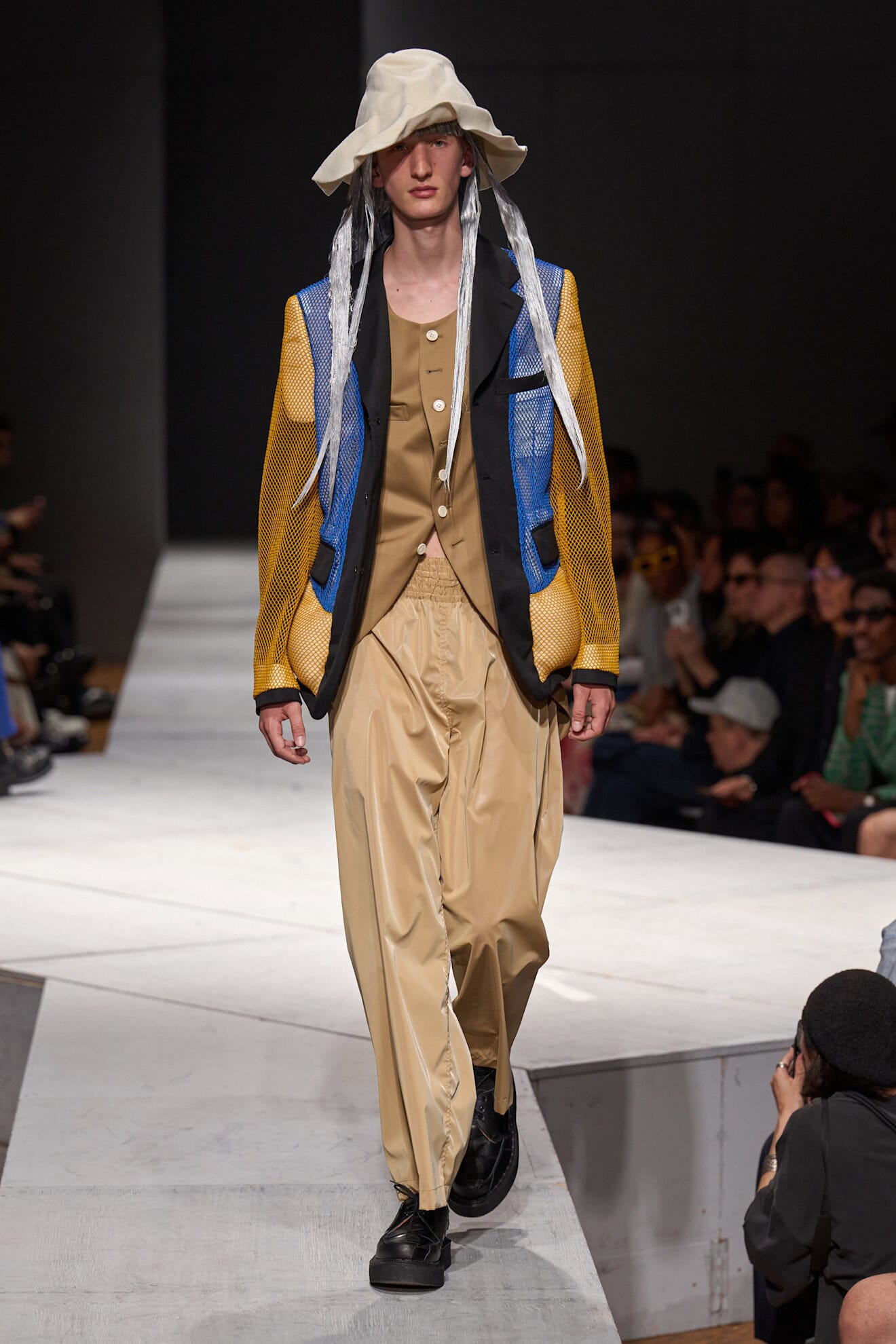
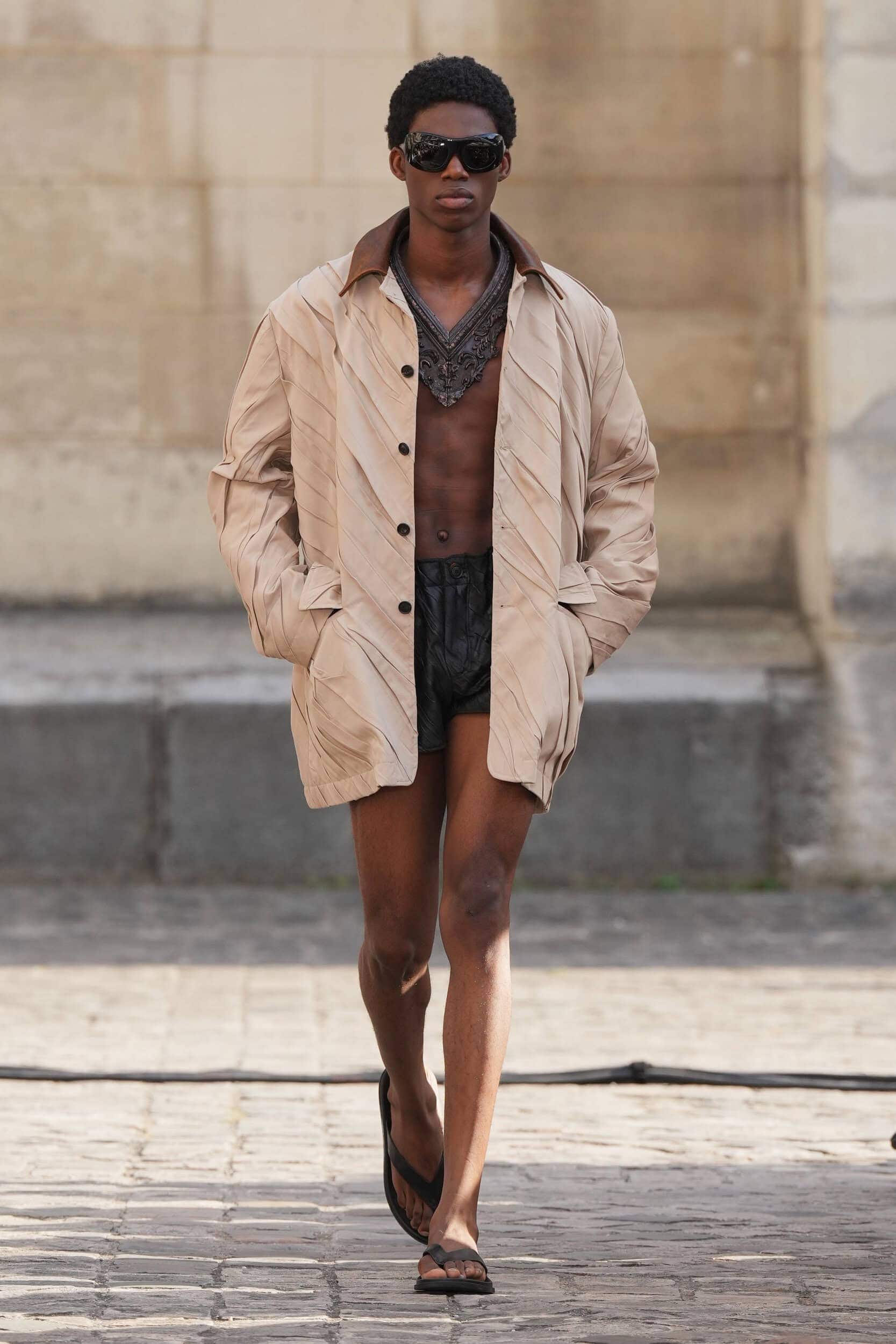
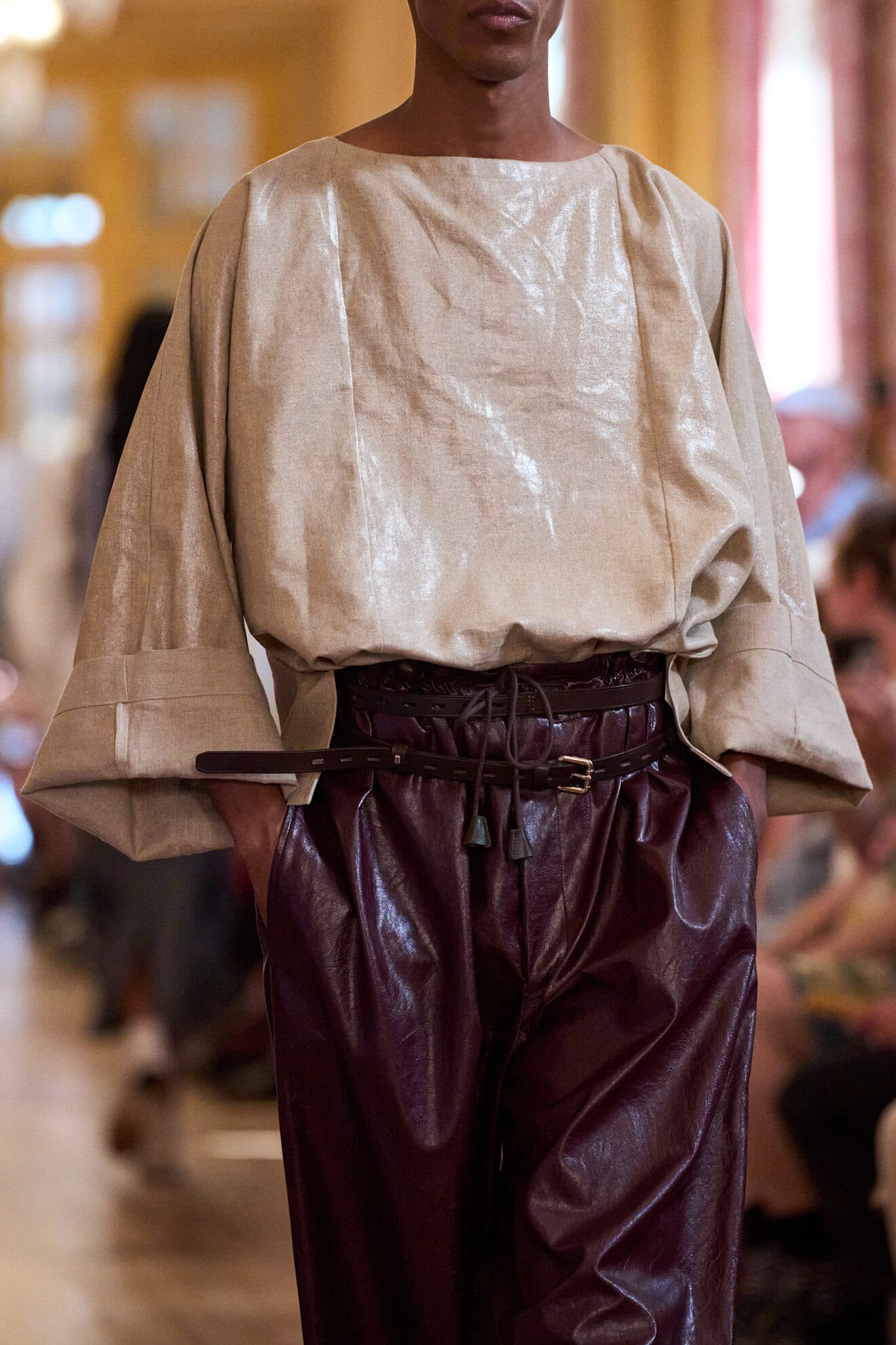
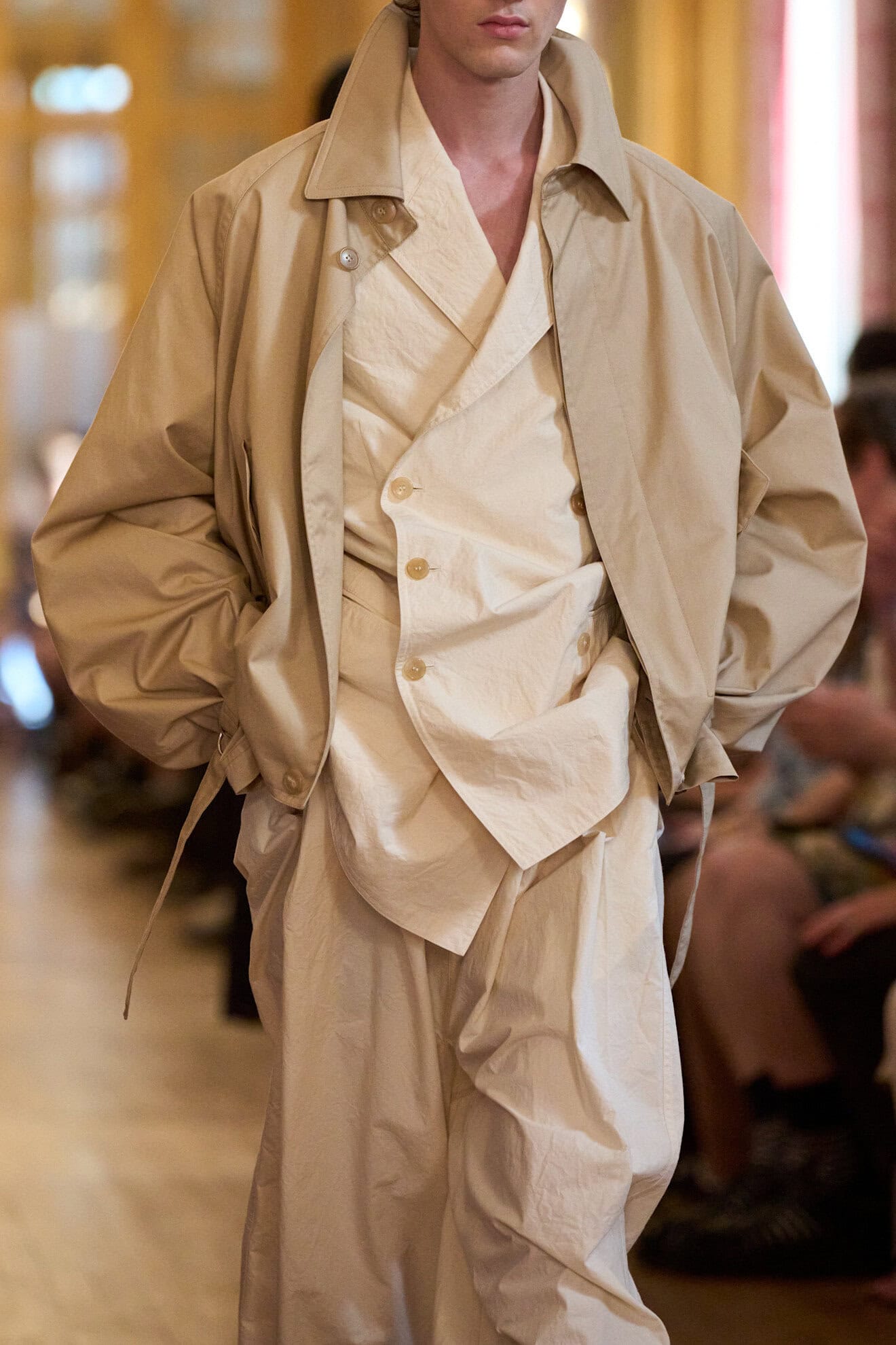
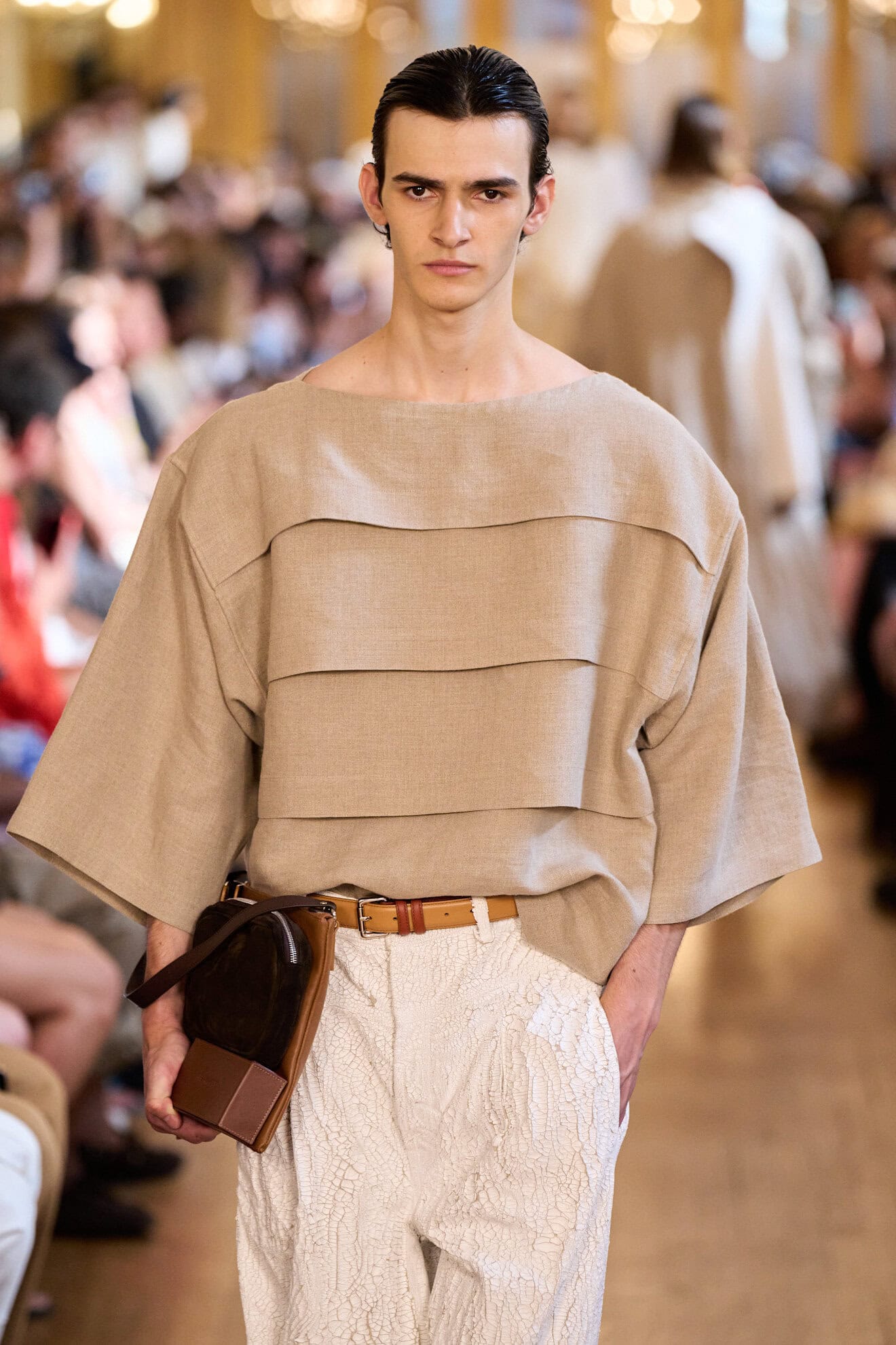
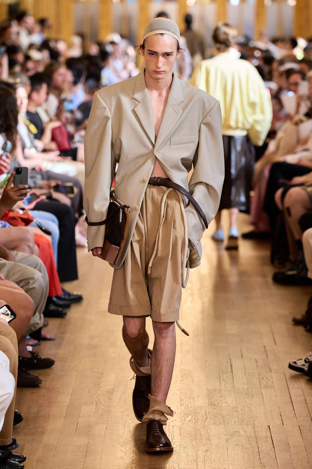
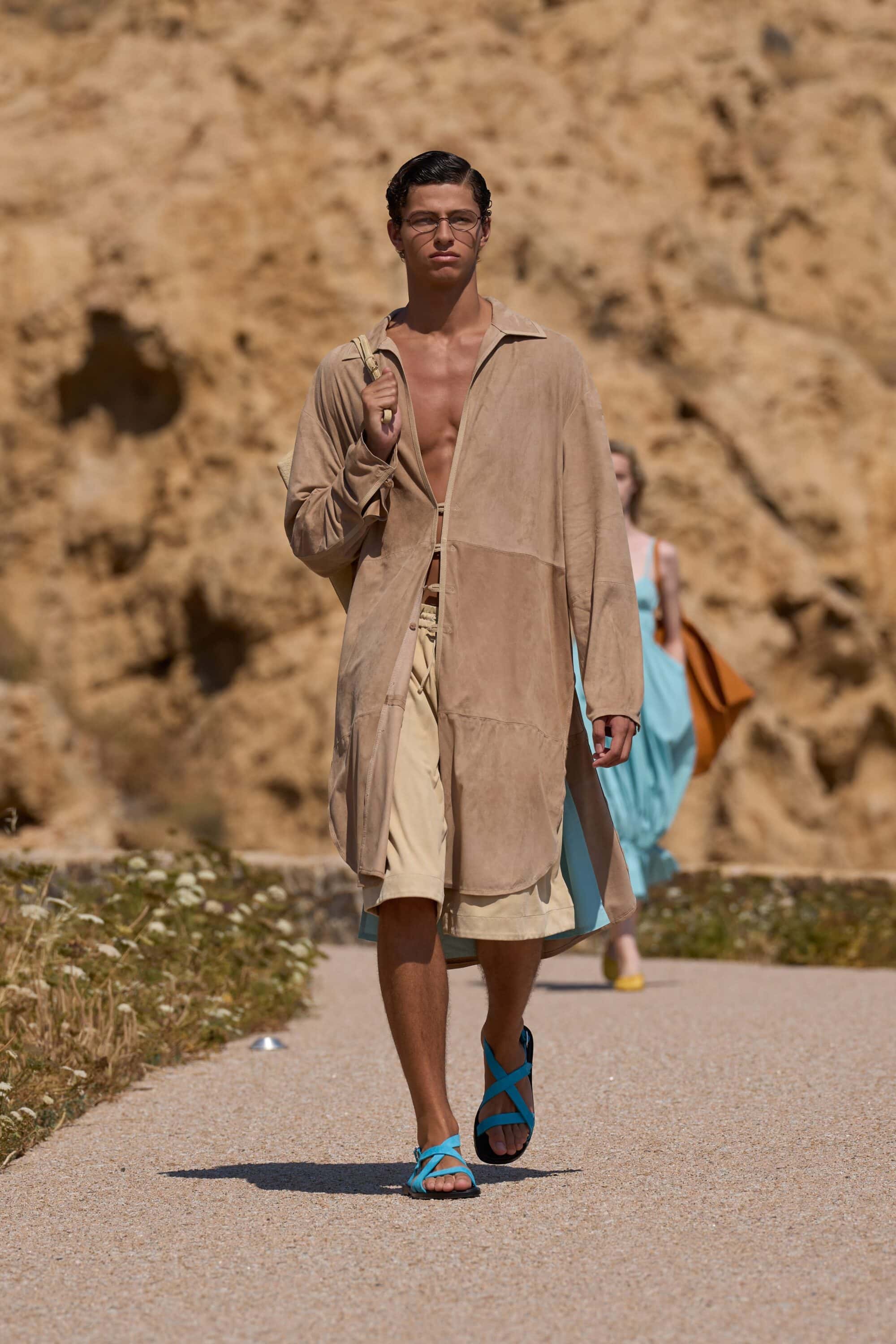
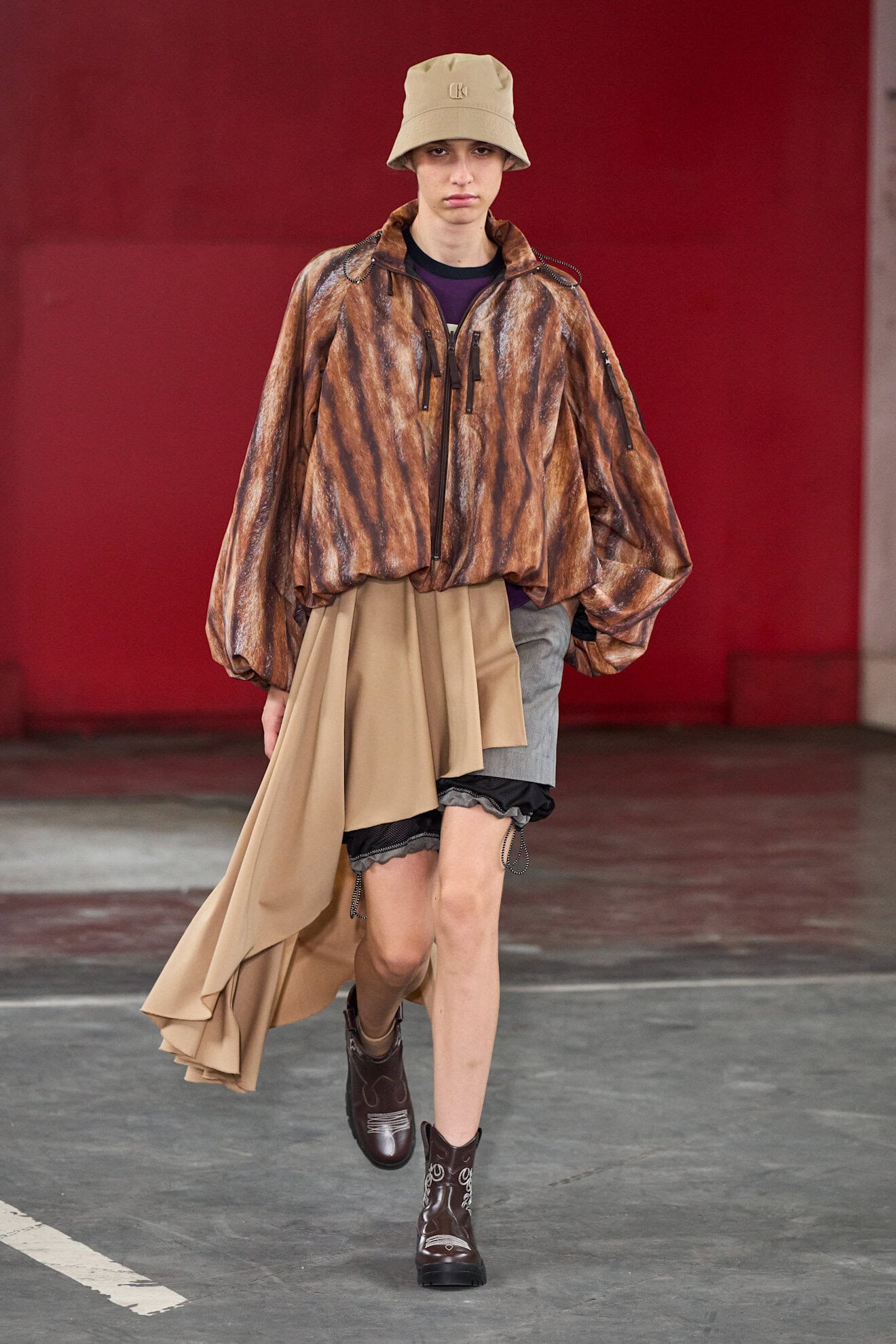
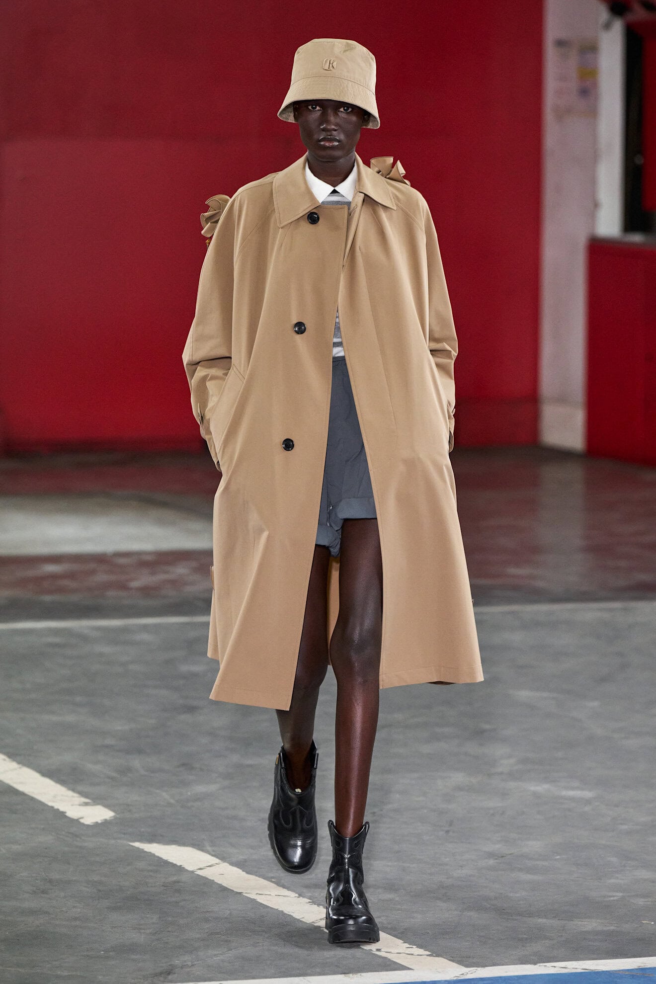
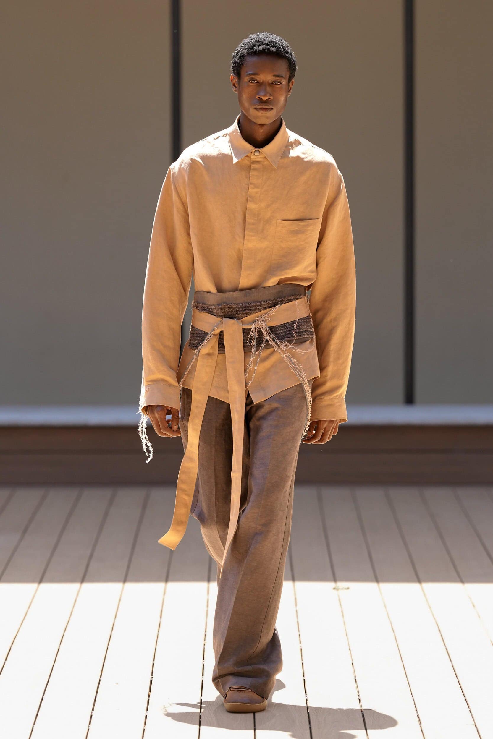
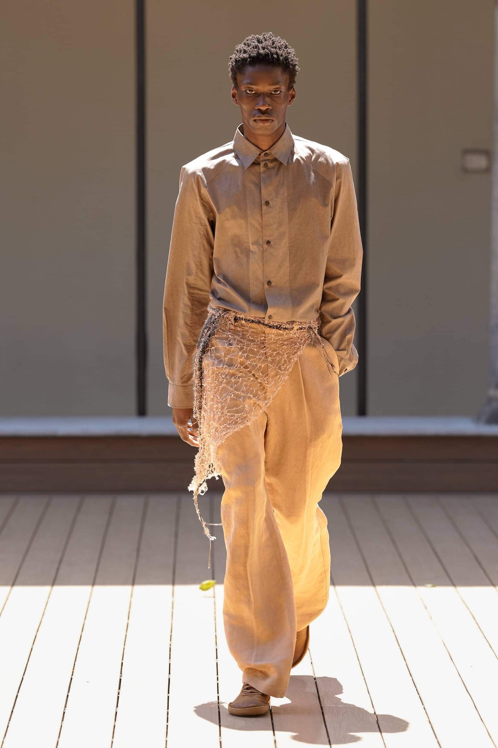
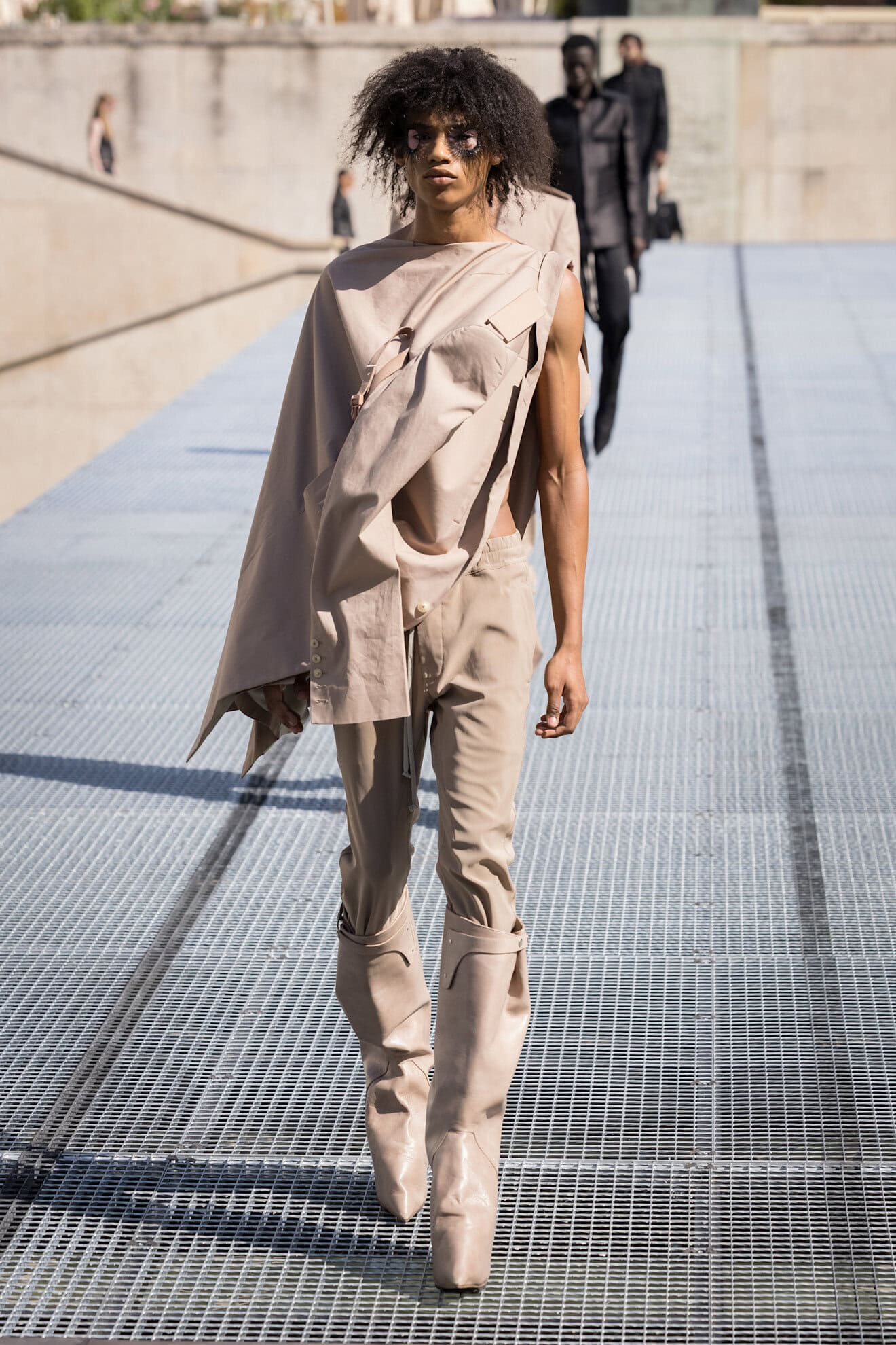
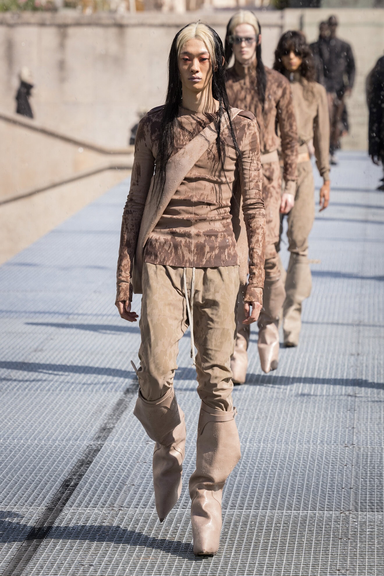
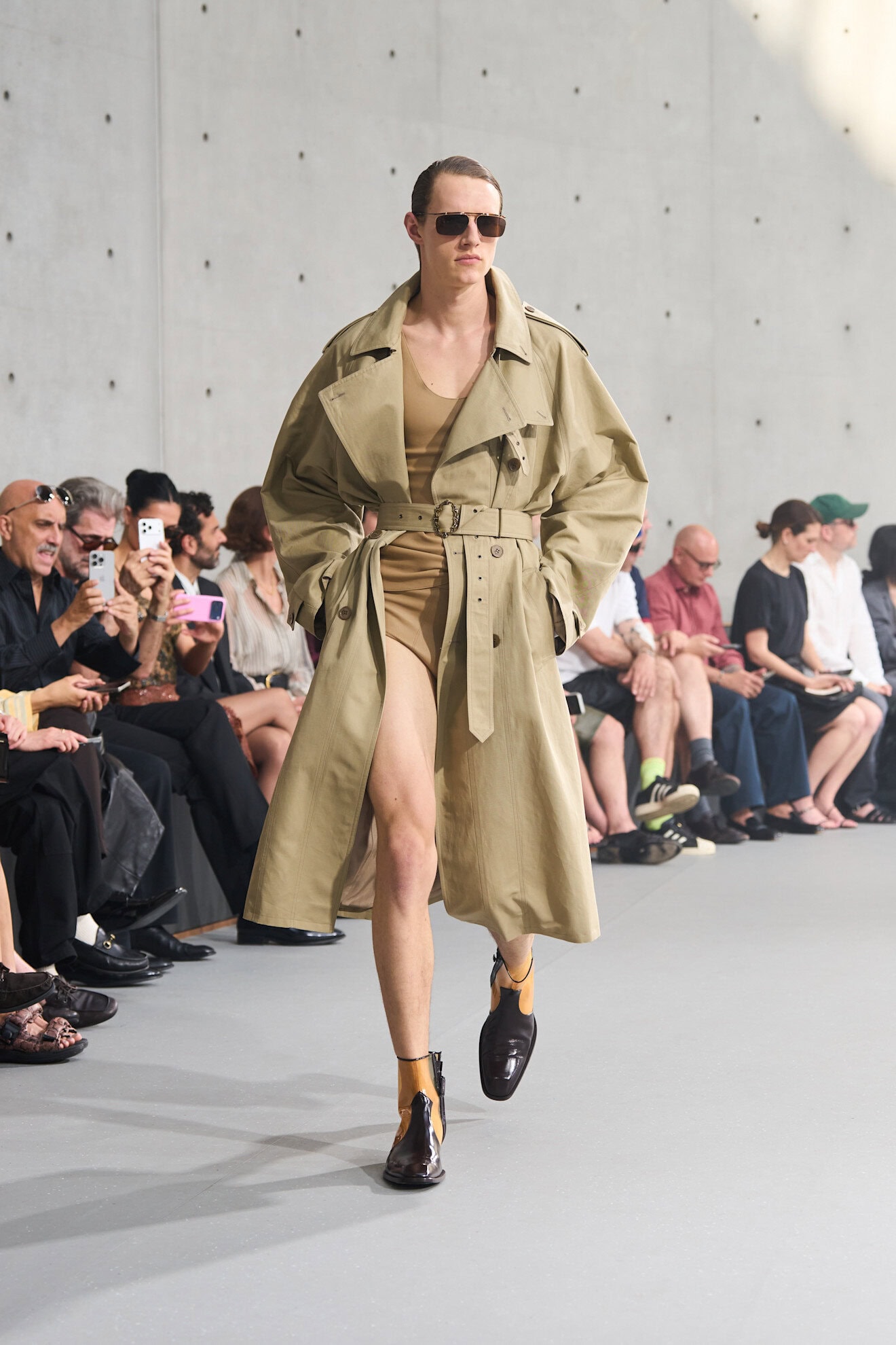
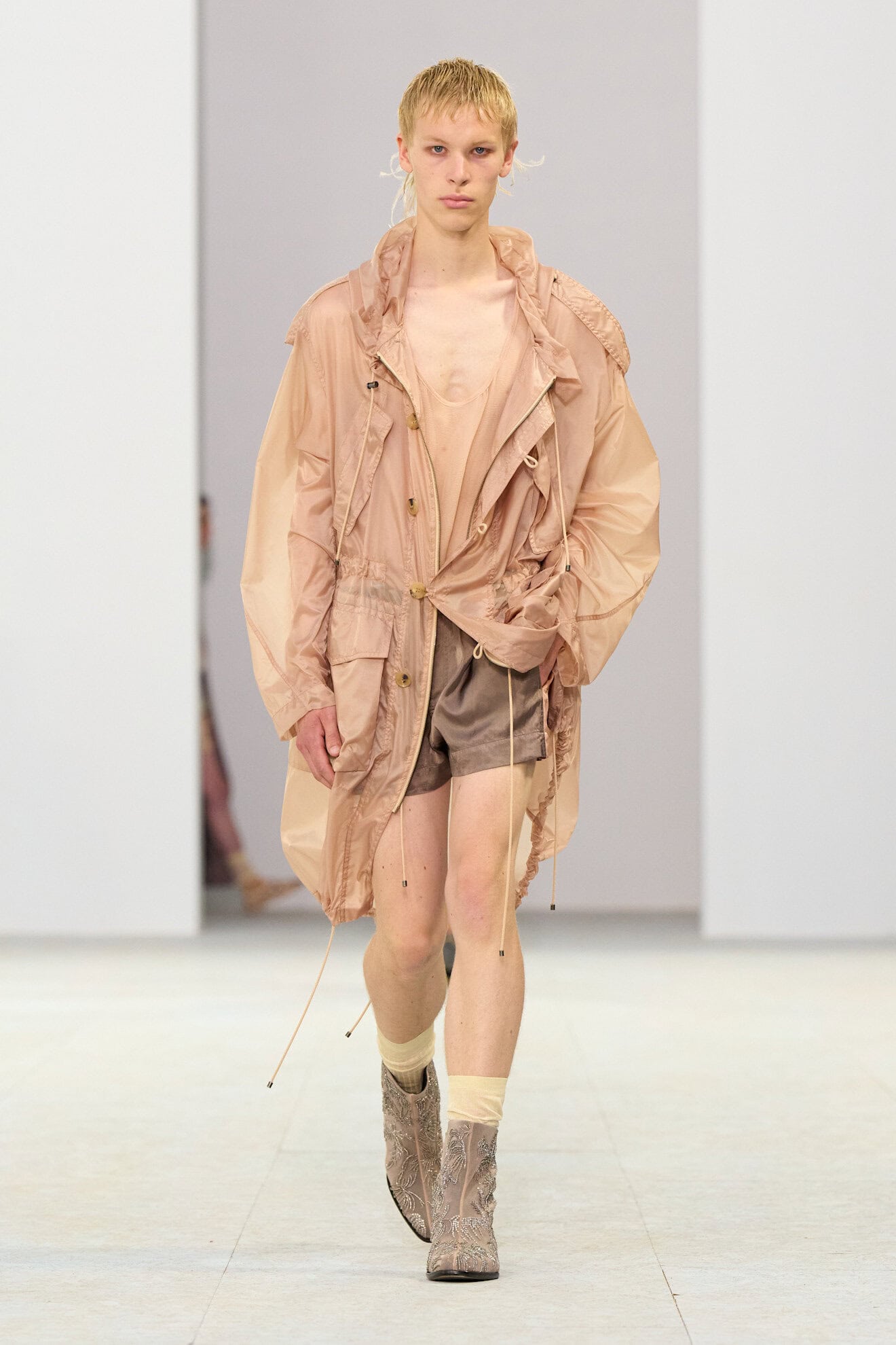
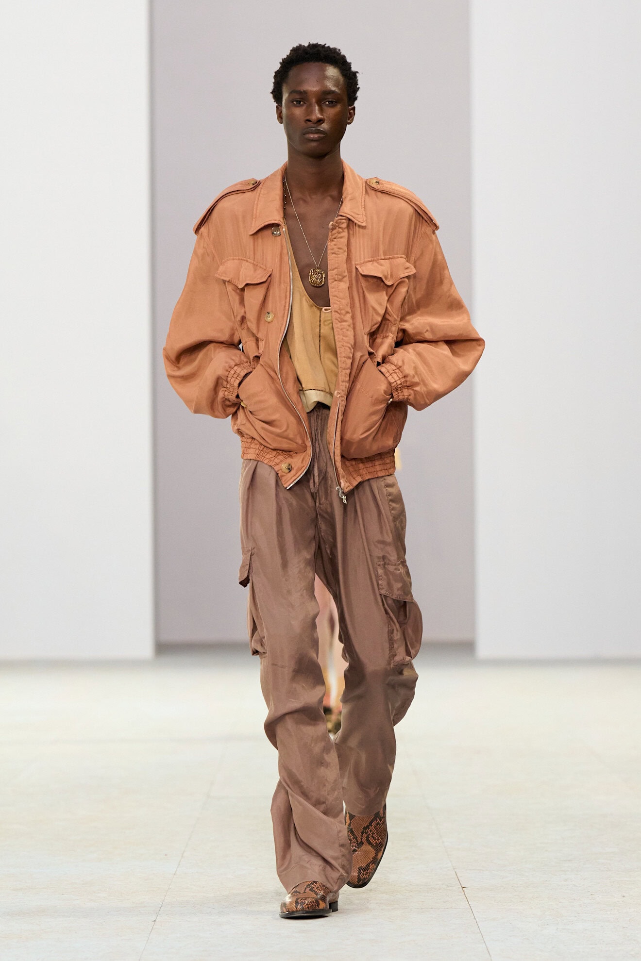
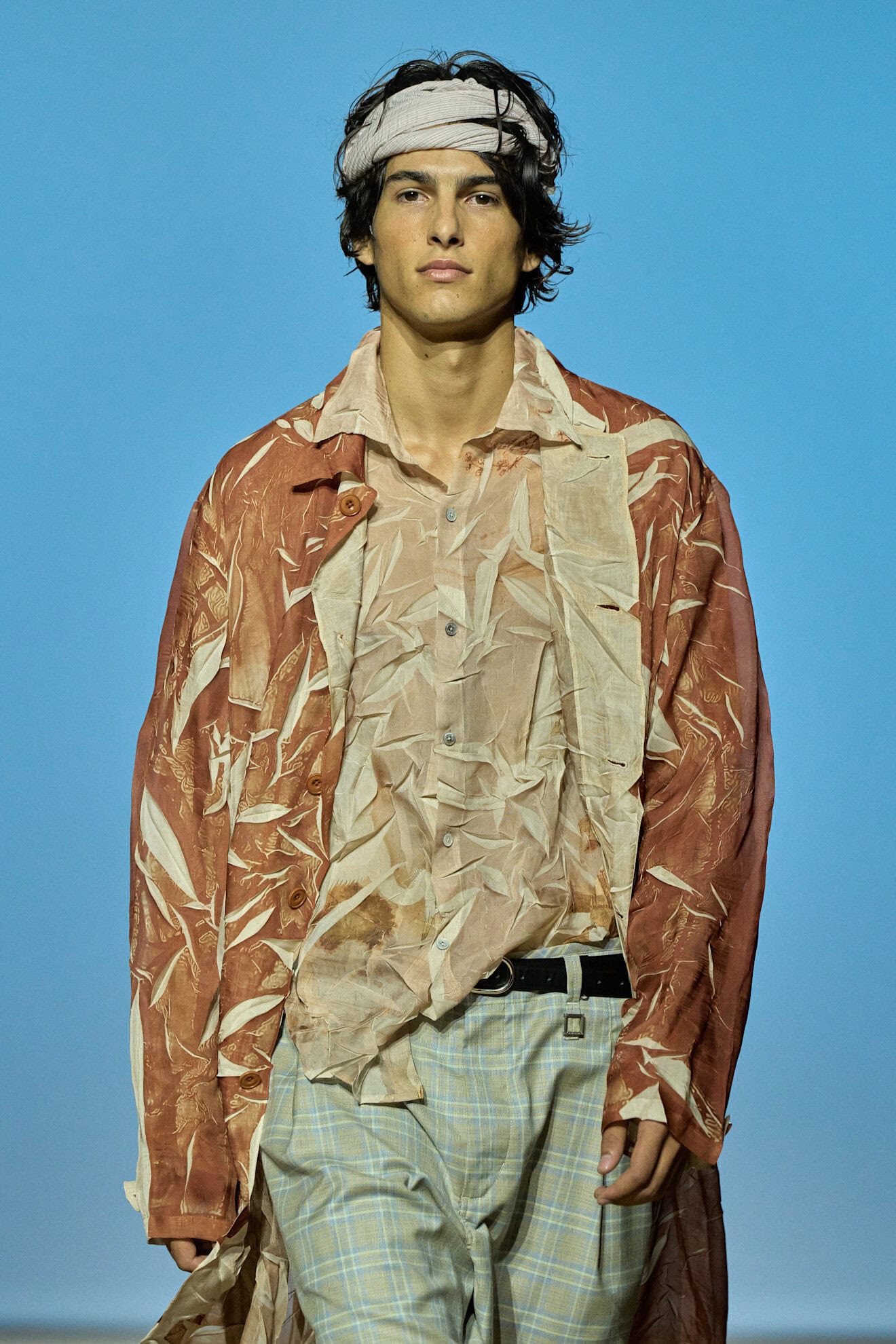
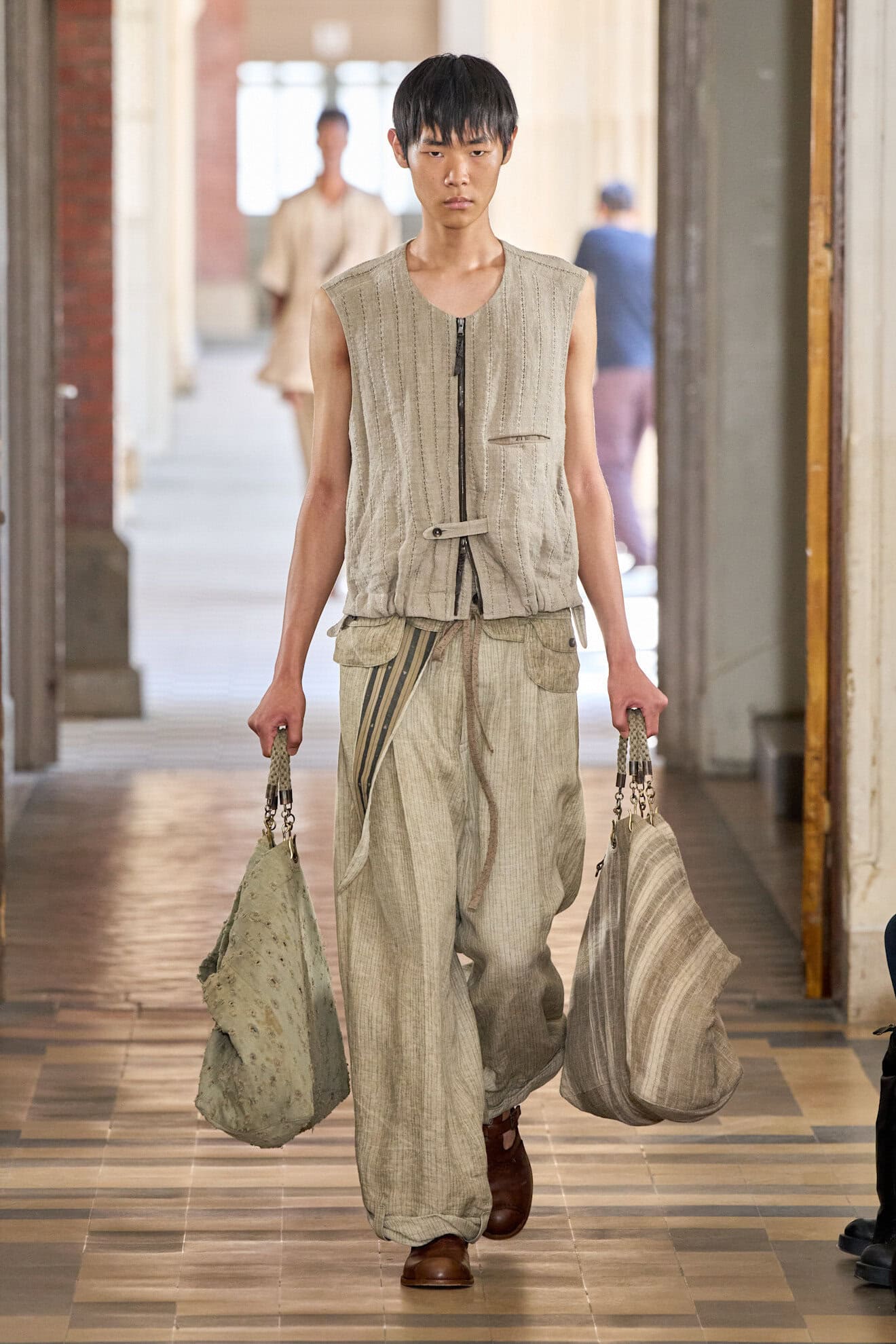
The luxury of escapism through the art of travel infused the neutral palette with warmer tints and comforting tones derived from the Global South. Sand, soft peach, umber, cinnamon, and caramel were used tone-on-tone across the runways – from Hed Mayner’s metallic-coated linens to Dries Van Noten’s parachute silks and Rick Owens moulded suedes.
These earthy pigments found in nature offered a worn-in effect that was contrasted by refined fabric choices. Deep browns and pinks were accentuated in technical nylons, suede and paper-touch cottons.
8. ORANGE ALERT
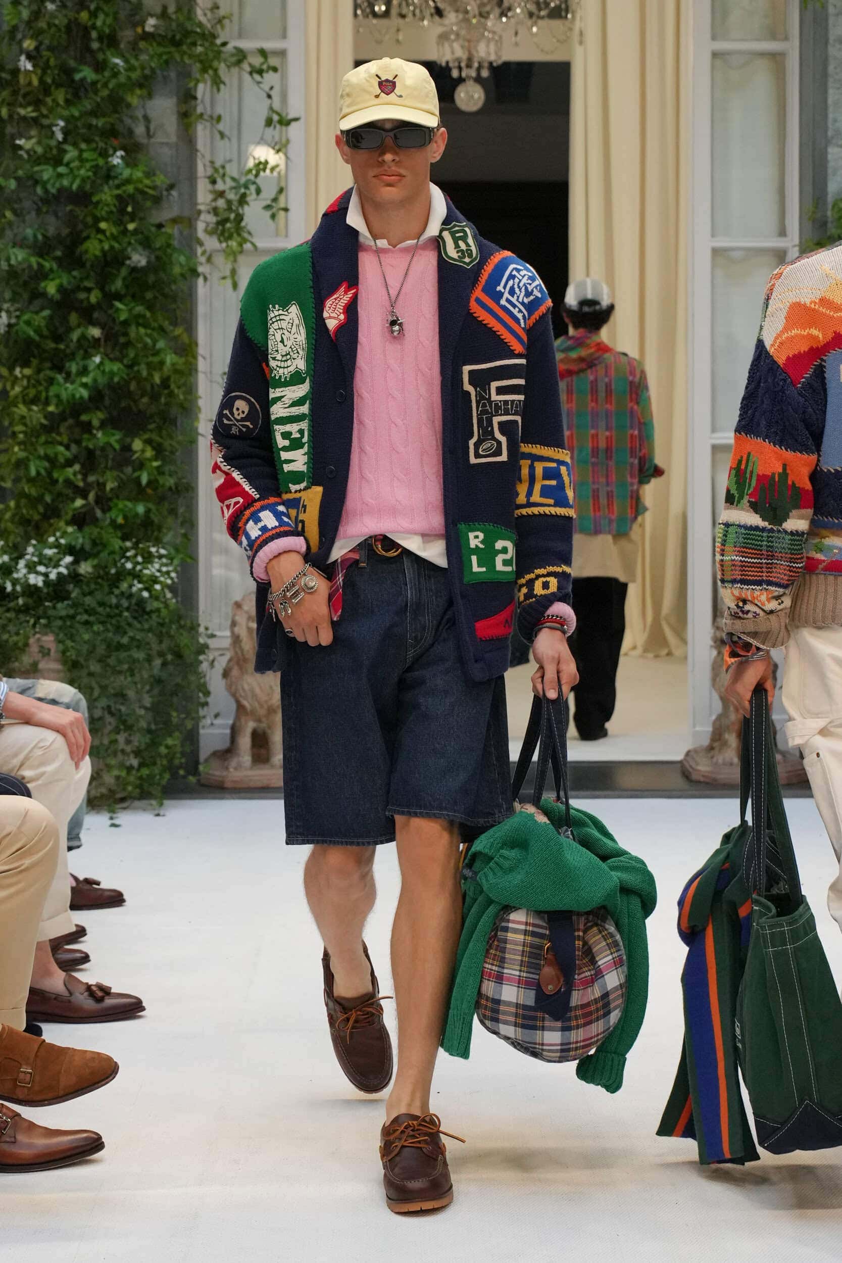
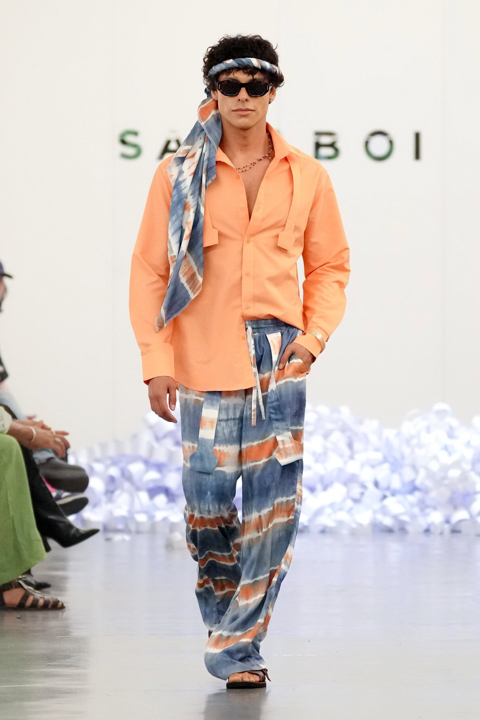
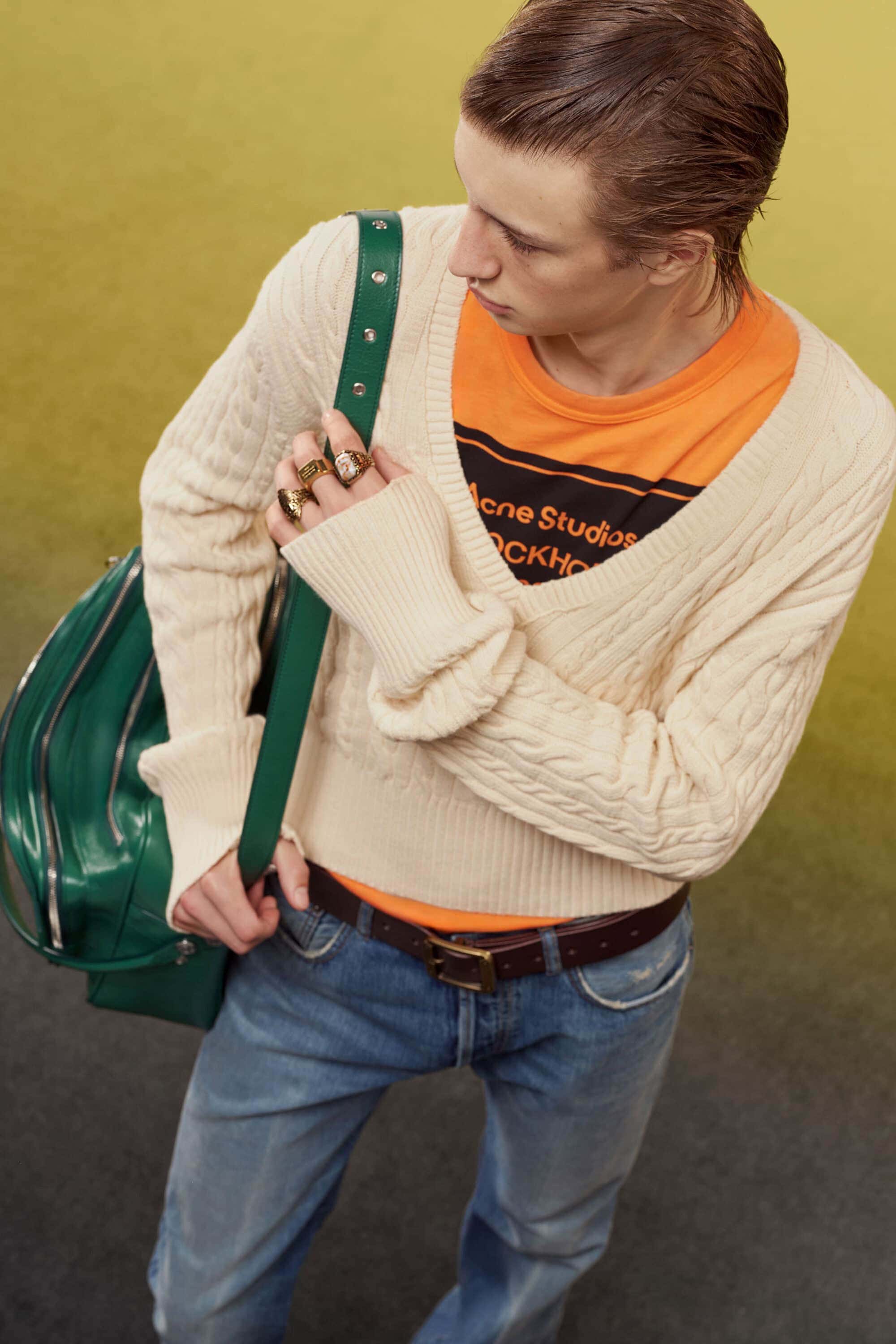
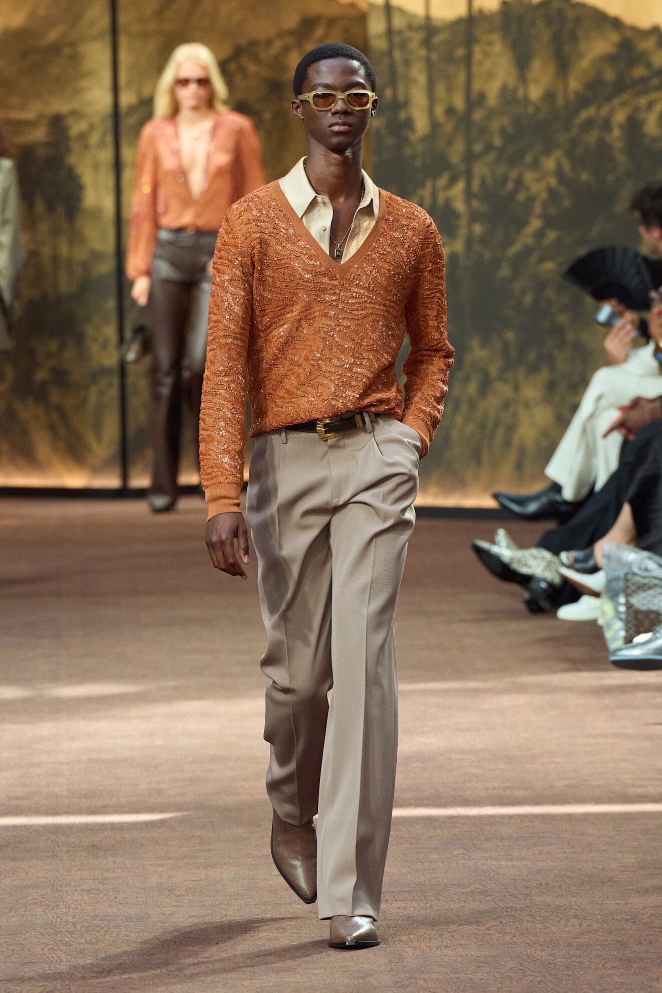
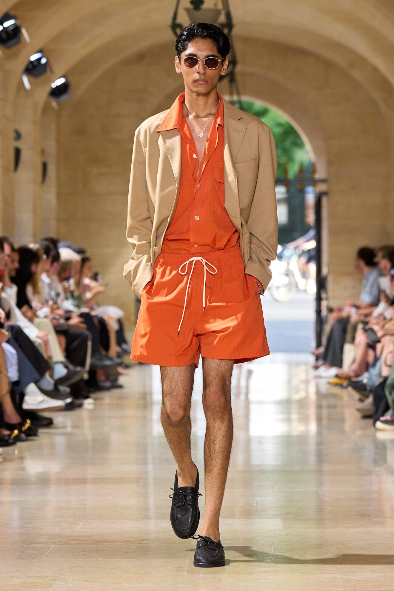
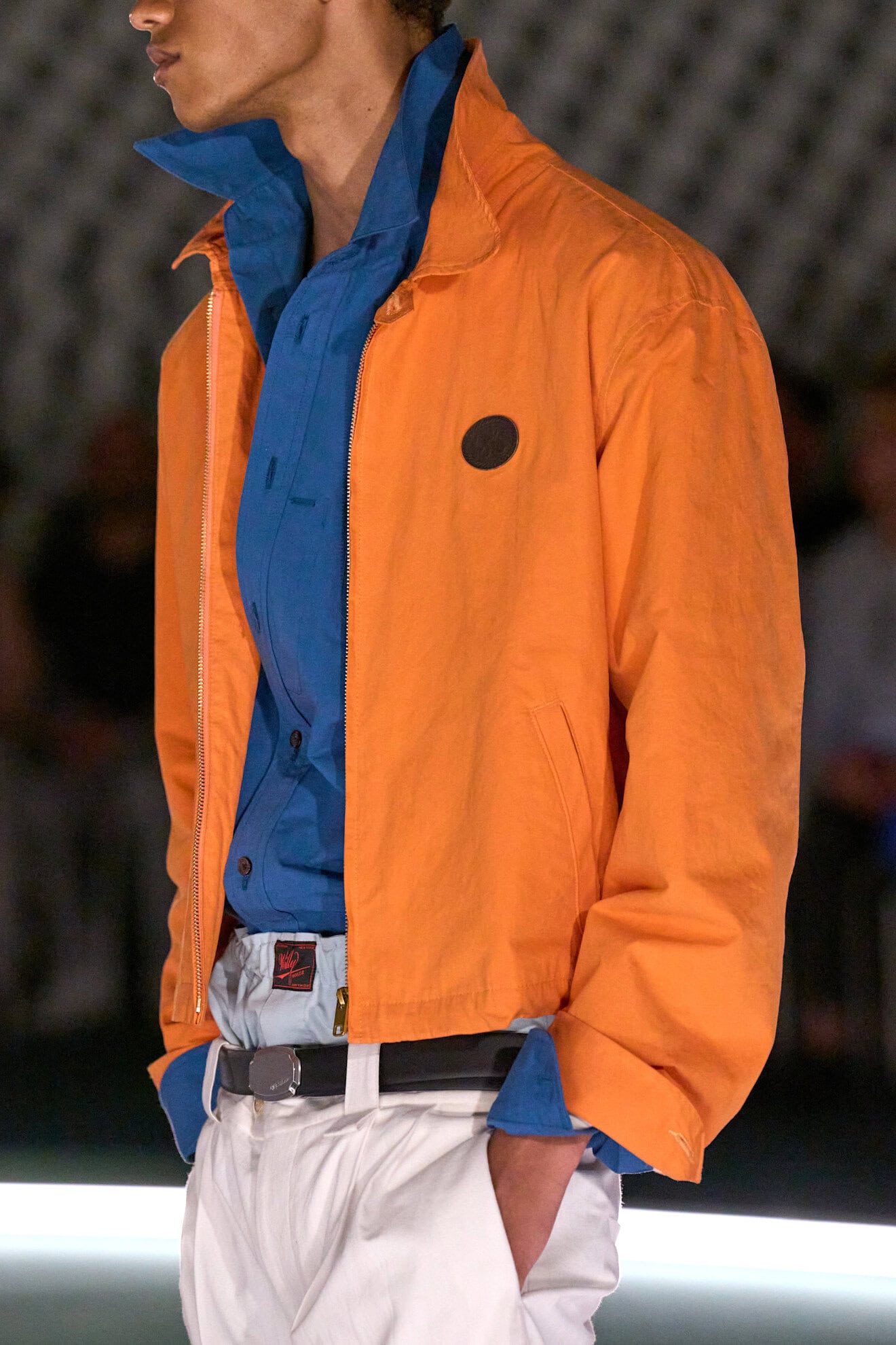
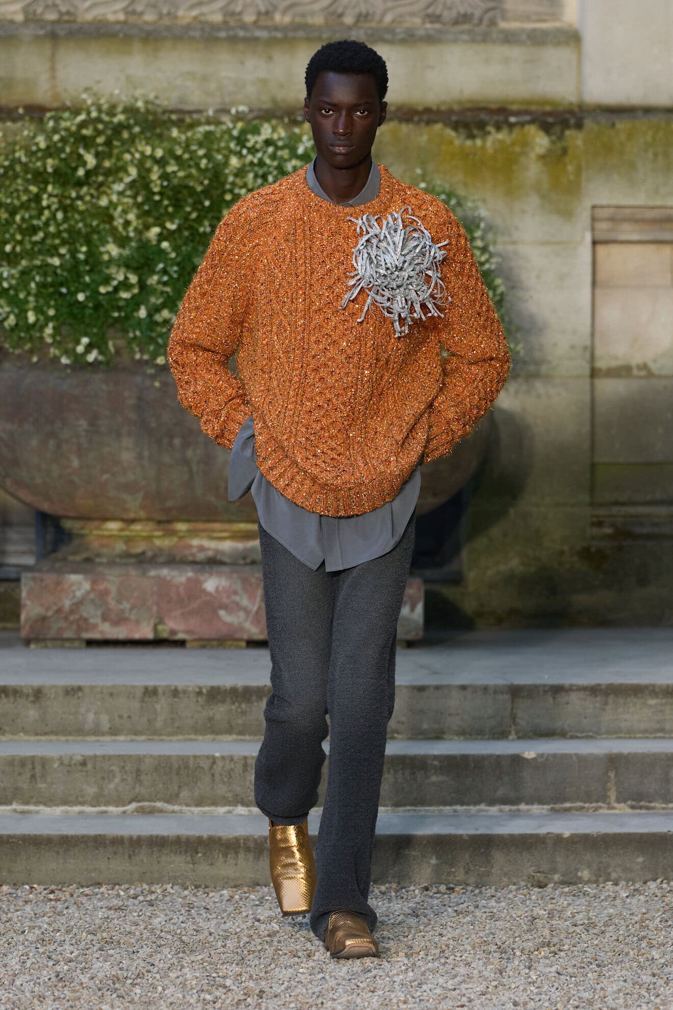
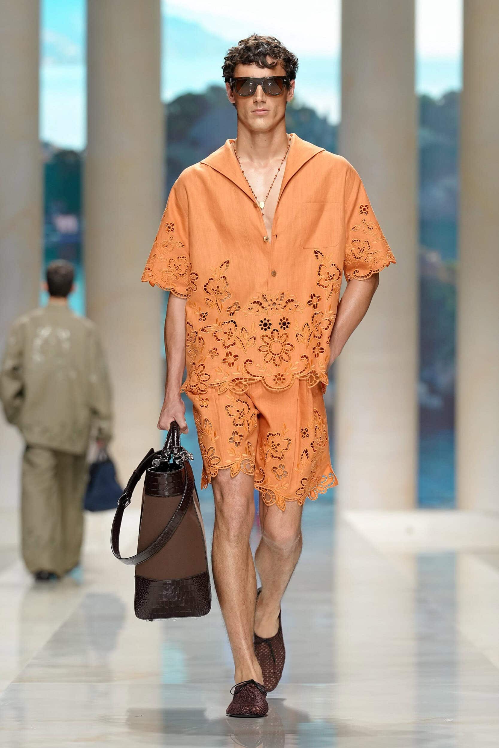
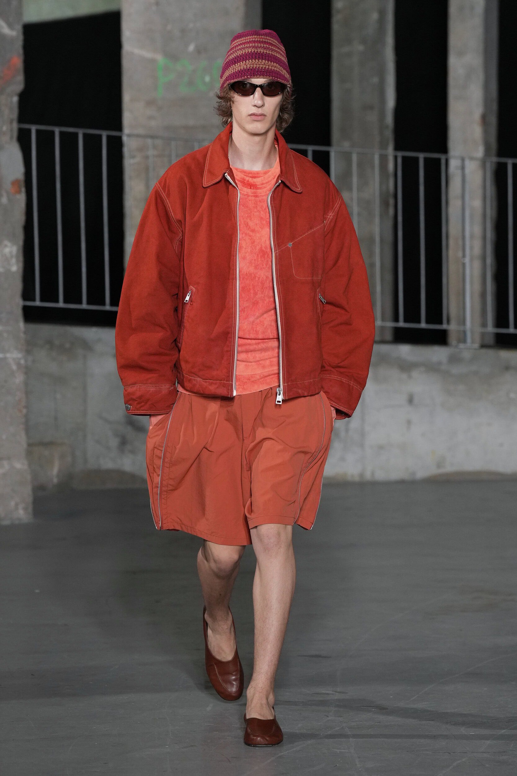
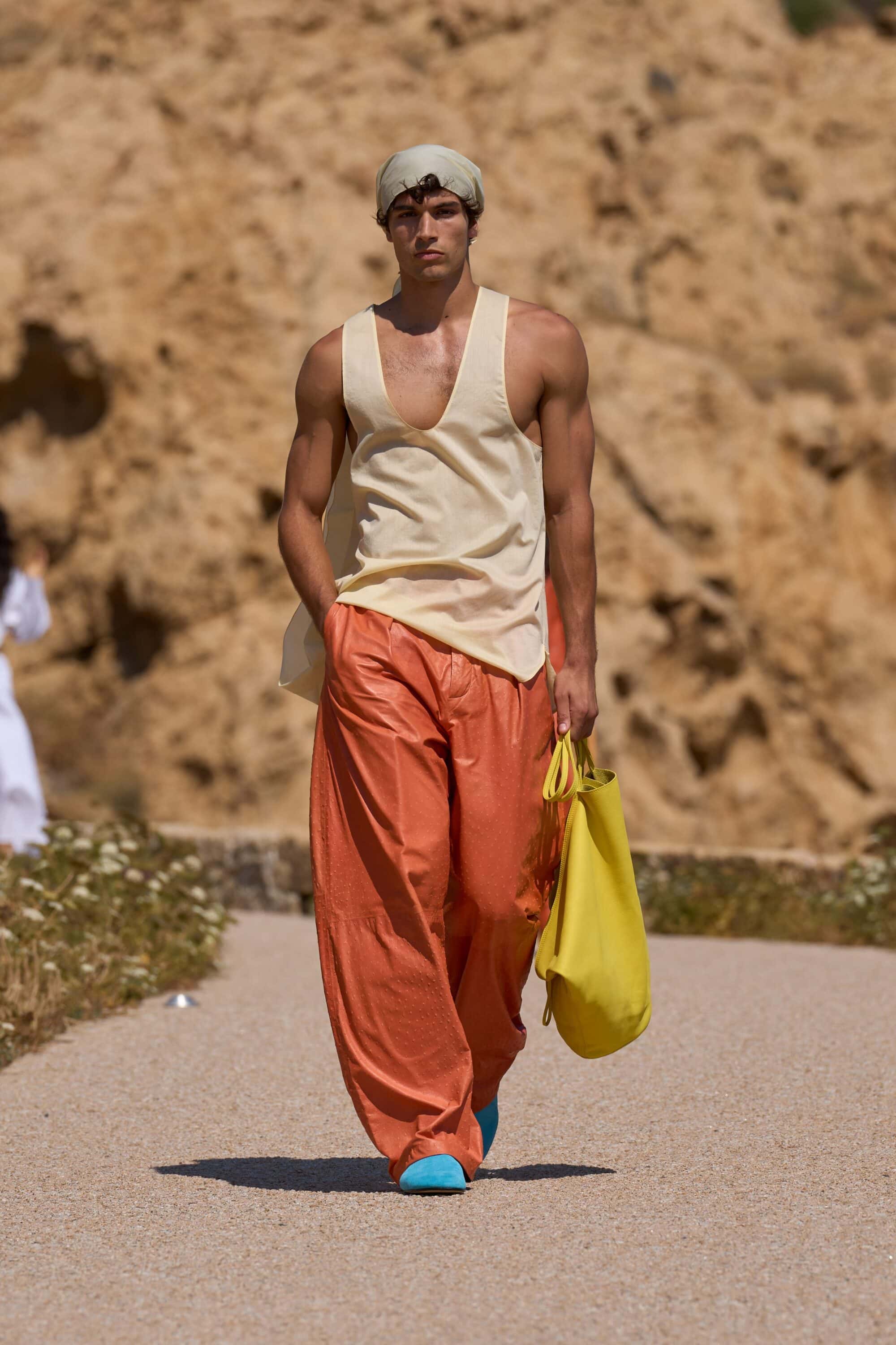
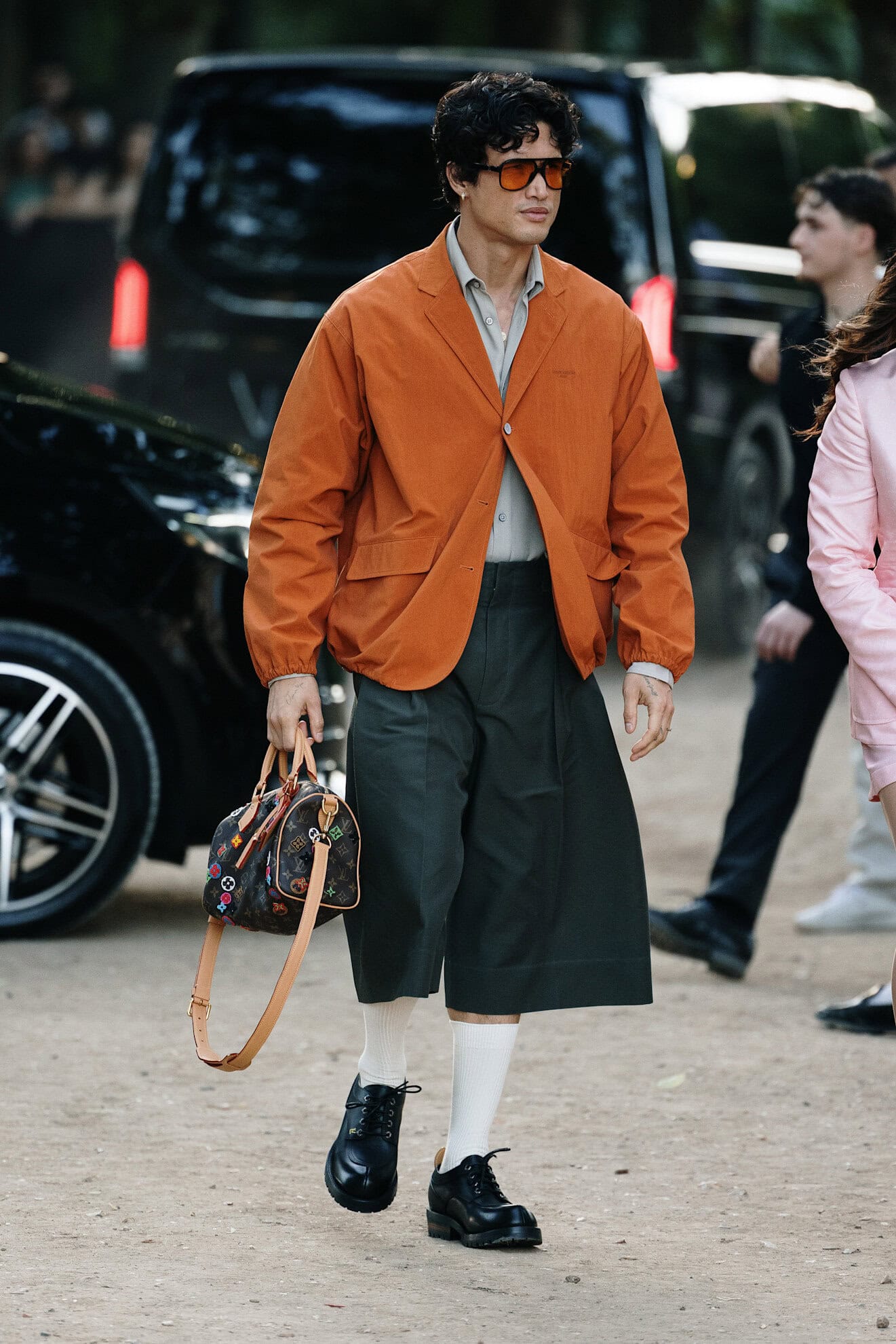
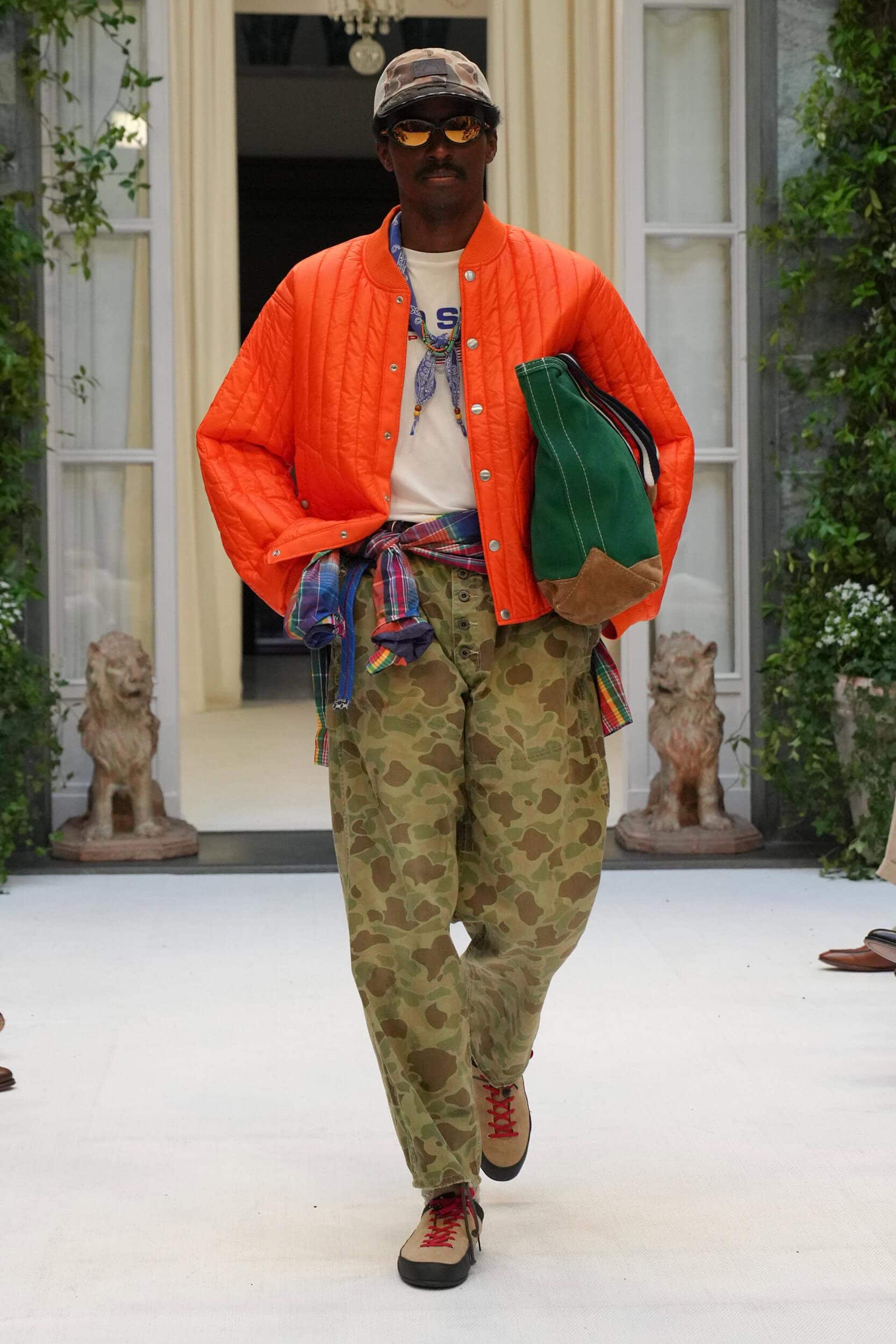
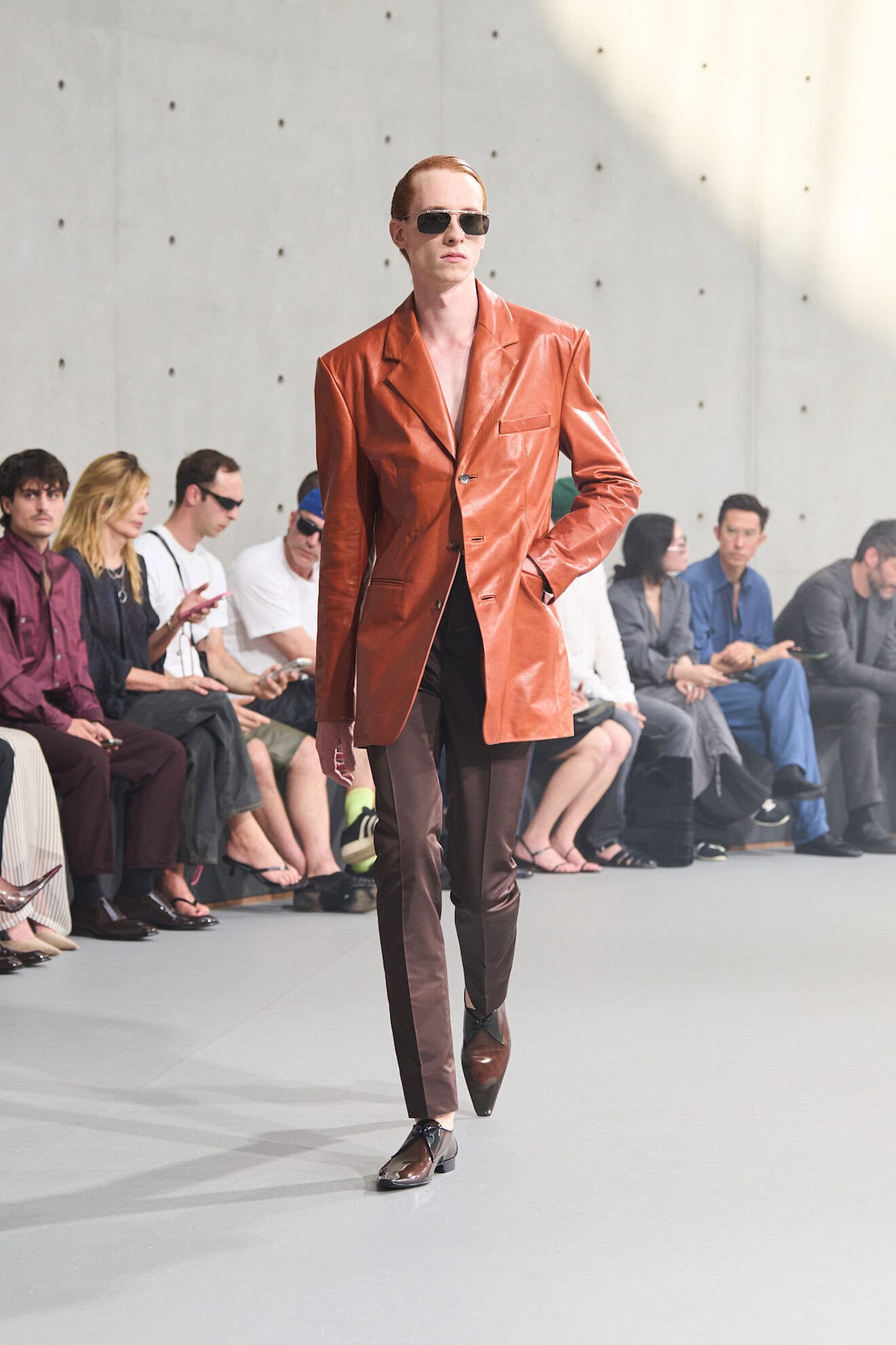
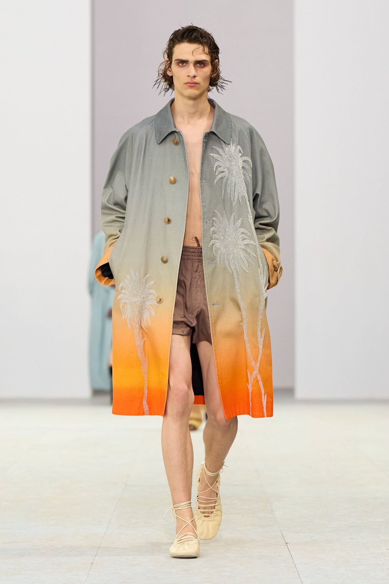
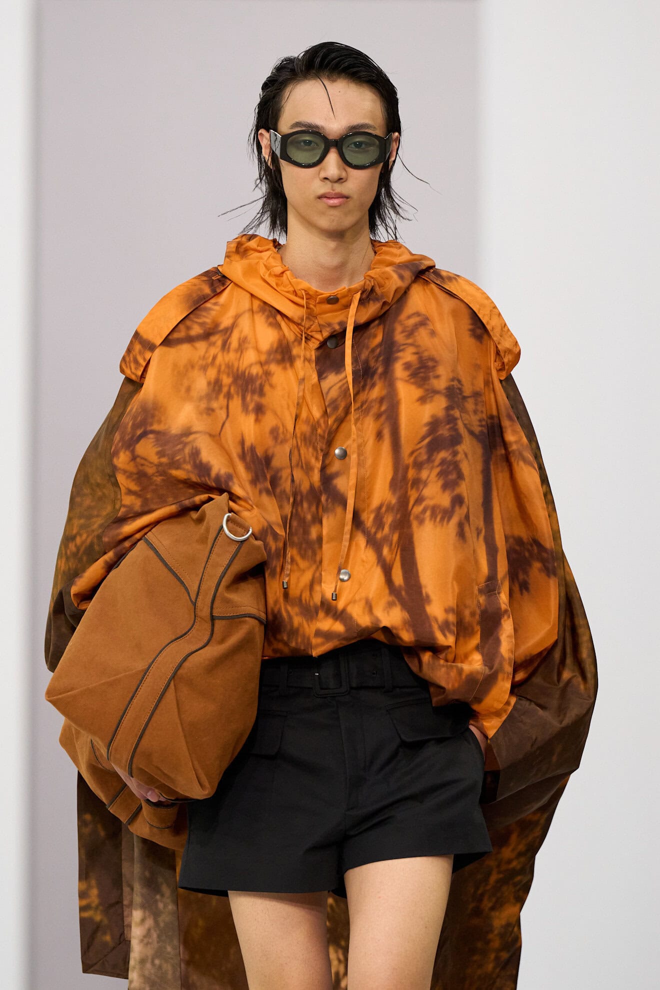
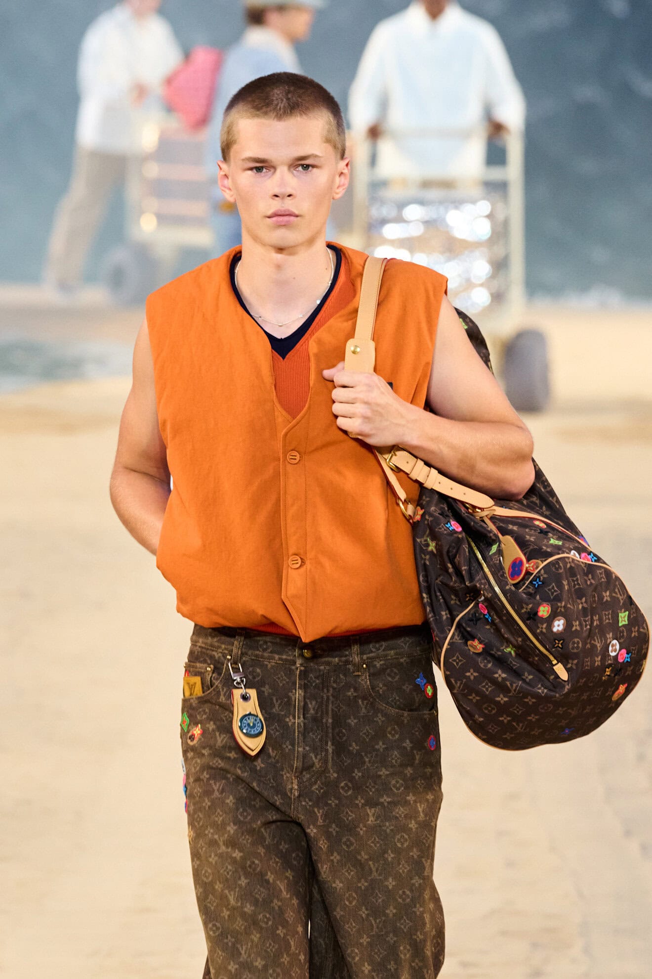
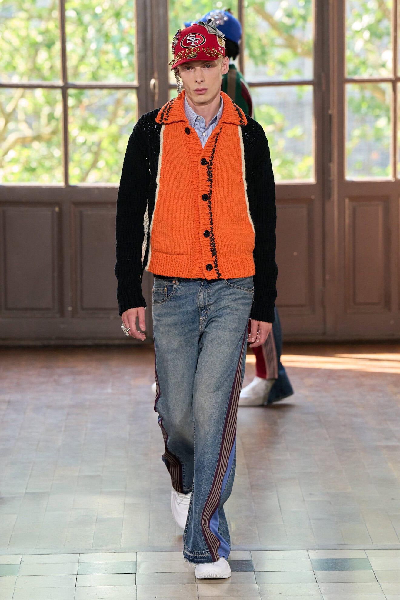
As dressing-up once again becomes a pleasurable activity colour is being used to reflect this shift. Alongside the continued popularity of red and the evolution of the neutral palette, orange sits comfortably between the two, working as both an energetic sporty shade, as well as a warming serene hue. Its use in the former guise taps into the growing relationship between fashion and sport that will pre-empt the 2028 Los Angeles Olympics when collections from Auralee and Saul Nash hit down at retail, while at brands such as Amiri, creative director Mike Amiri demonstrated how the colour could translate for evening attire by embellishing a V-neck knit in a rusty shade of orange. At Dior, Jonathan Anderson also gave the cable-knit sweater a decadent overhaul with a sprinkle of sequins and a silver floral brooch. No stranger to the preppy world a brighter tangerine shade was brought to life at Willy Chavarria and Polo Ralph Lauren, paired with deep blues and green accessories.
9. GREEN WASHING
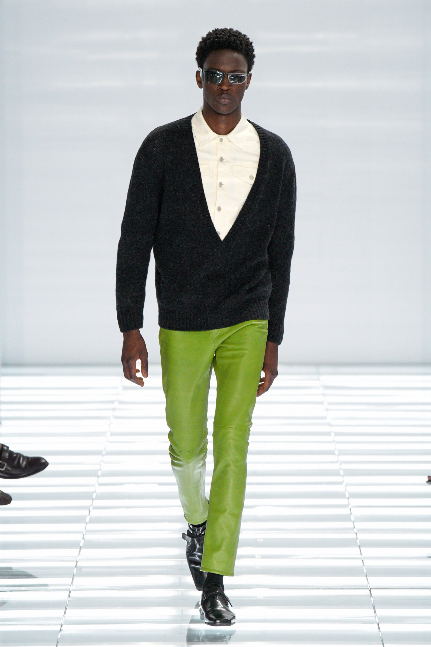
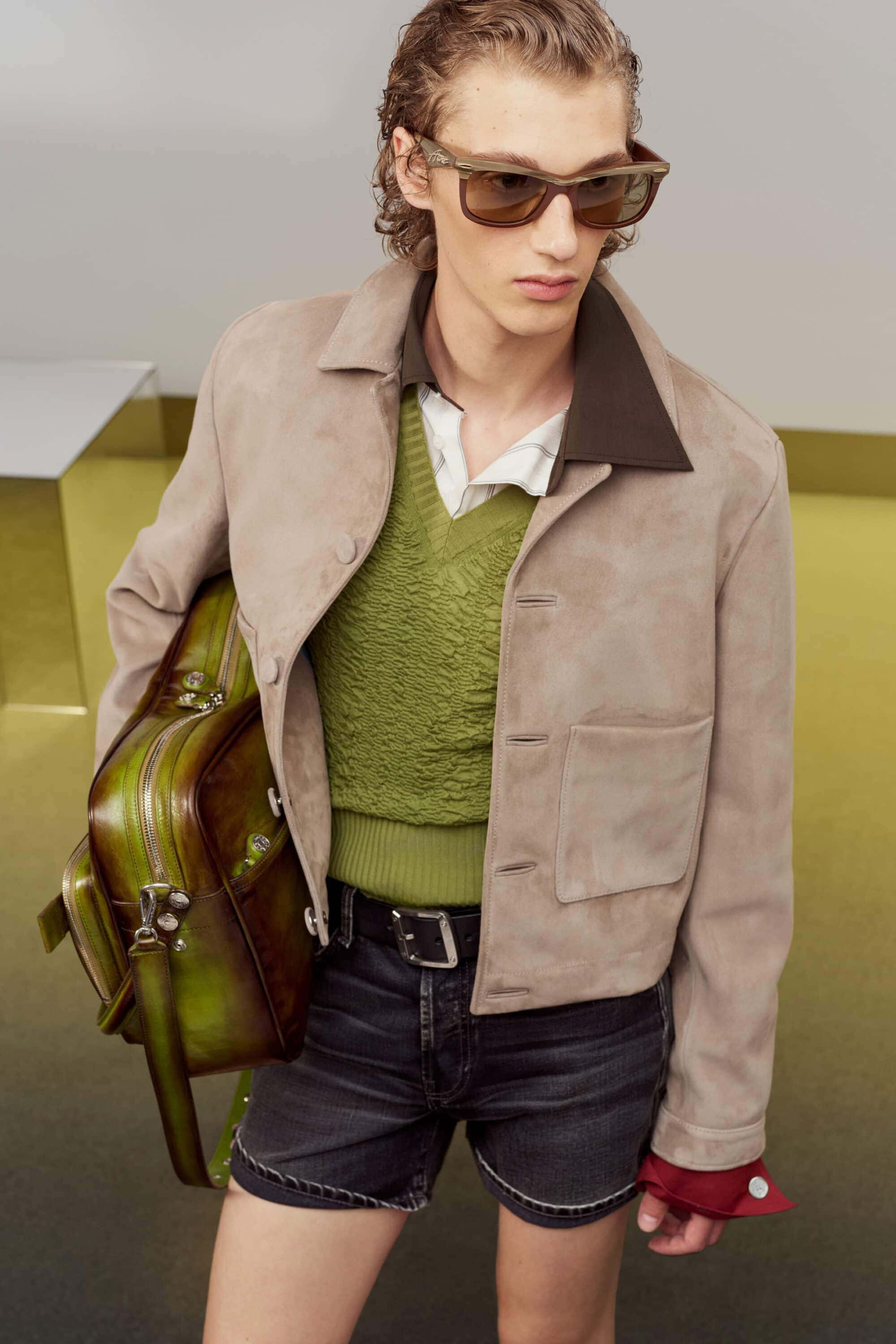
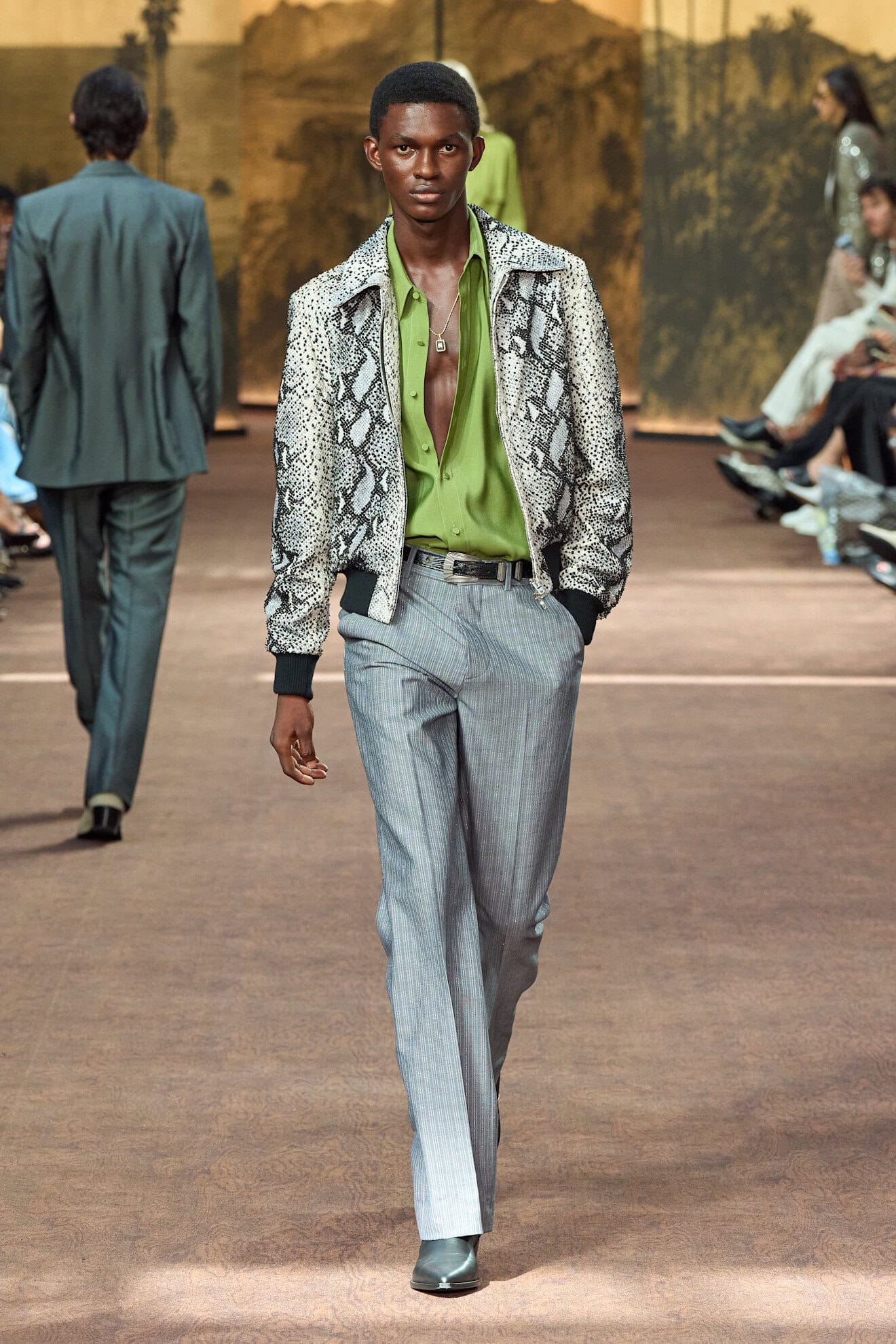
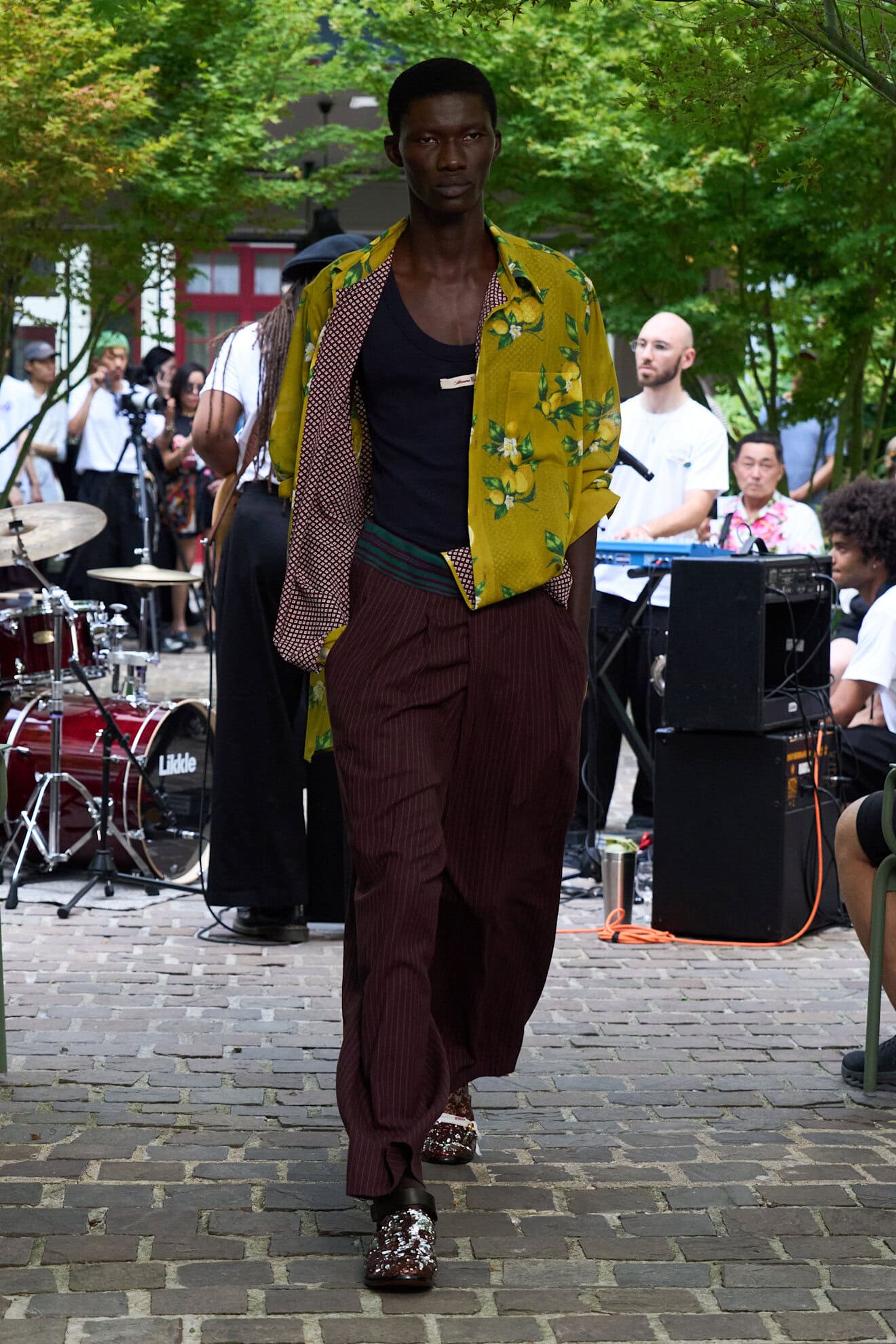
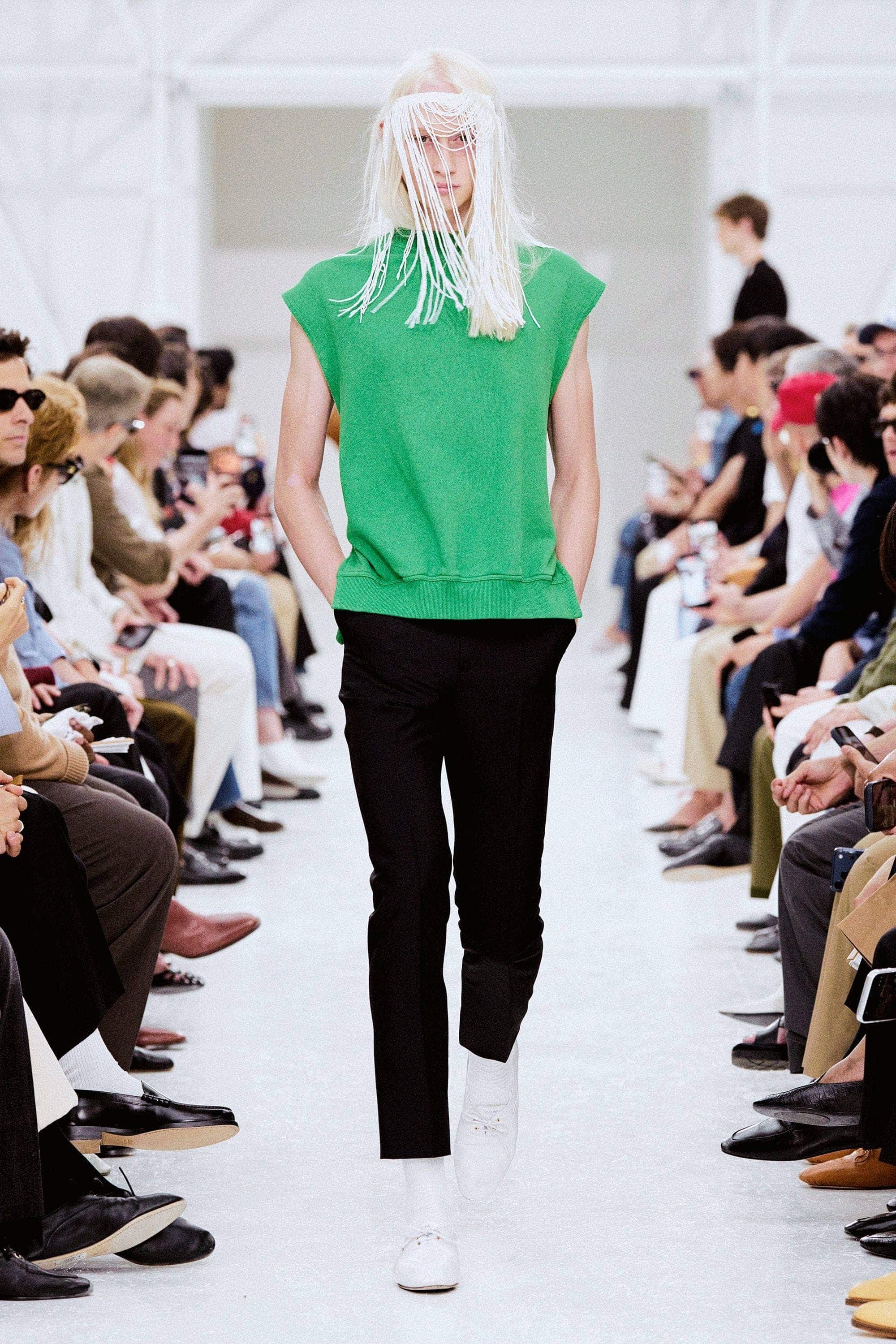
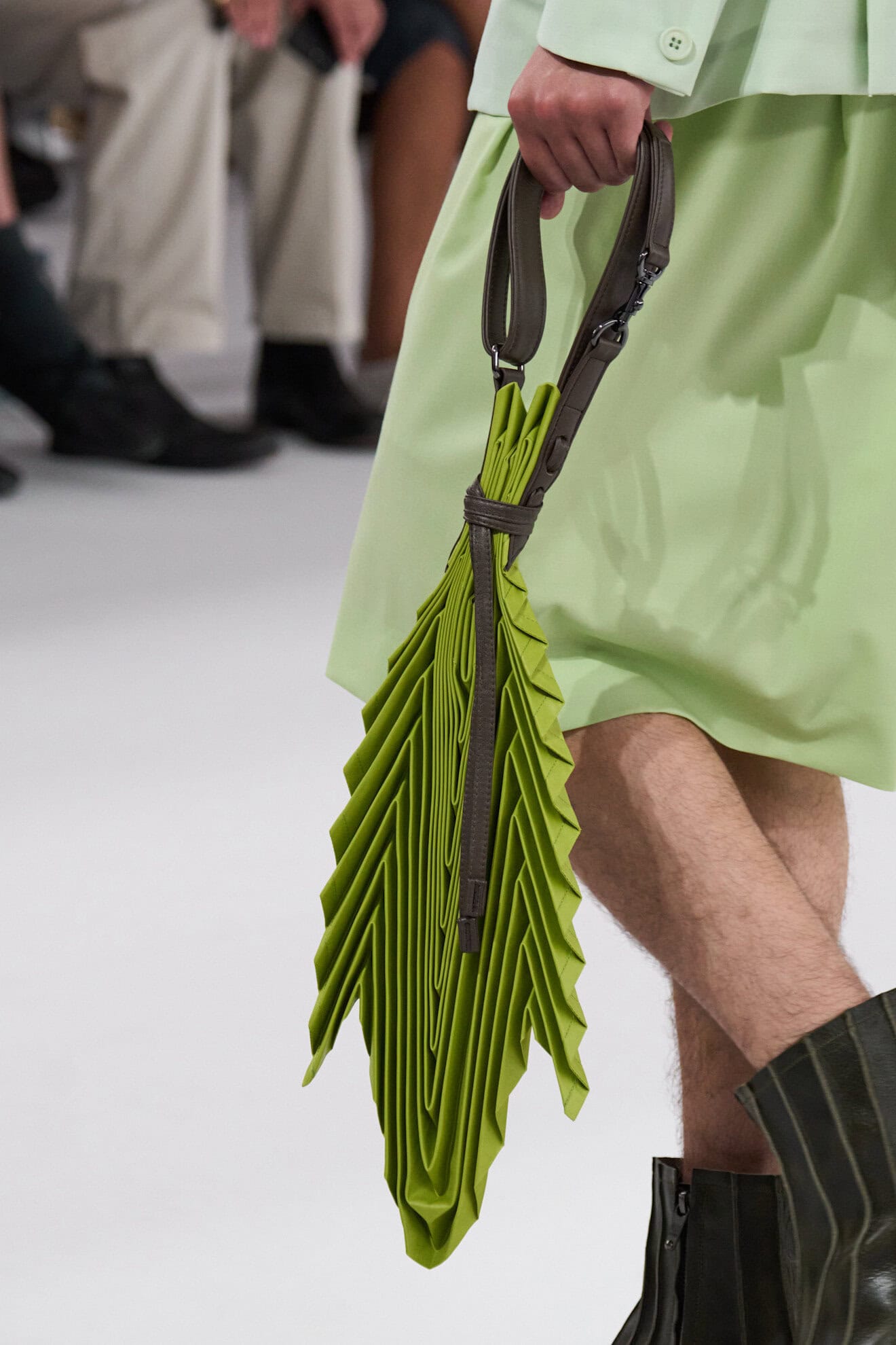
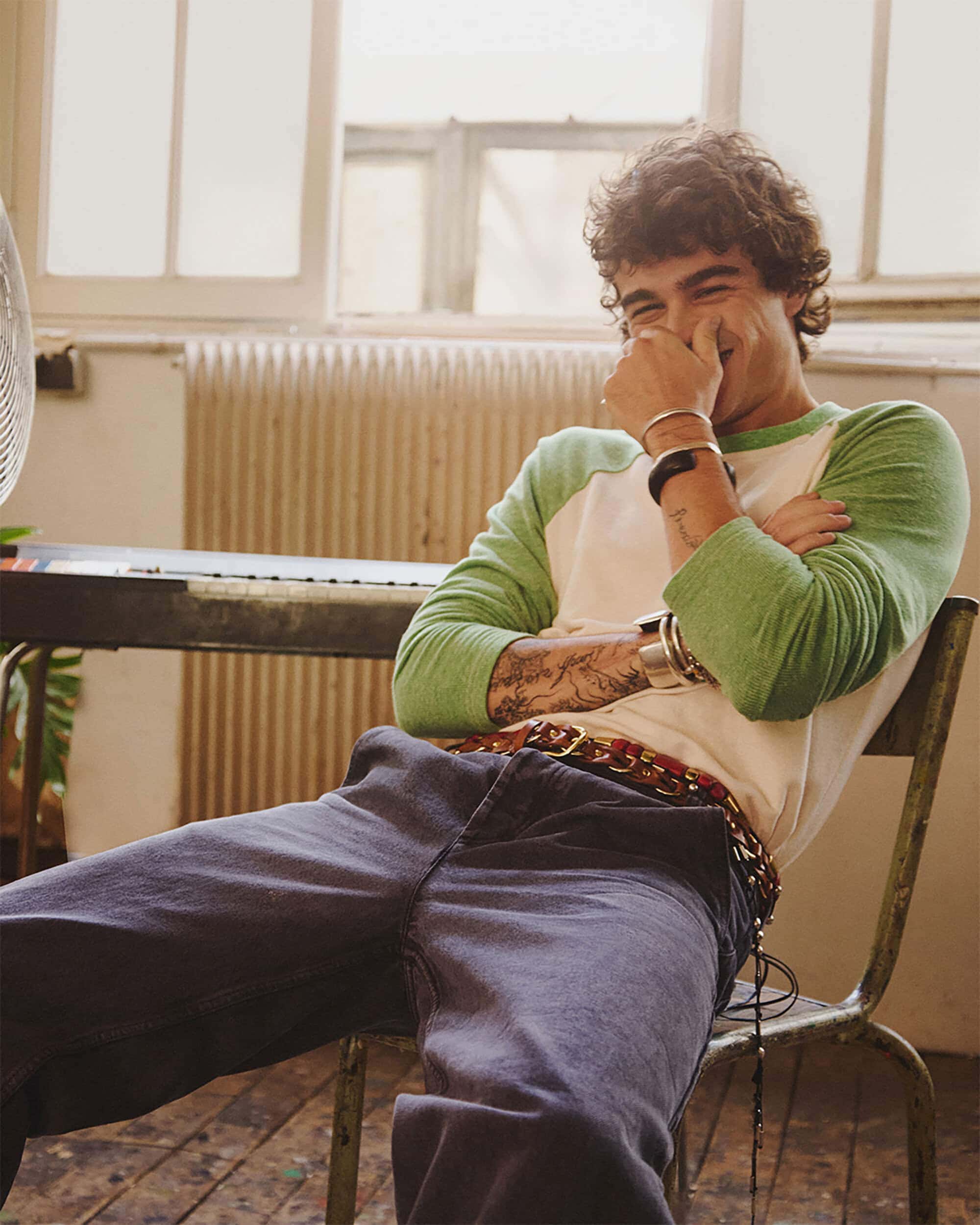
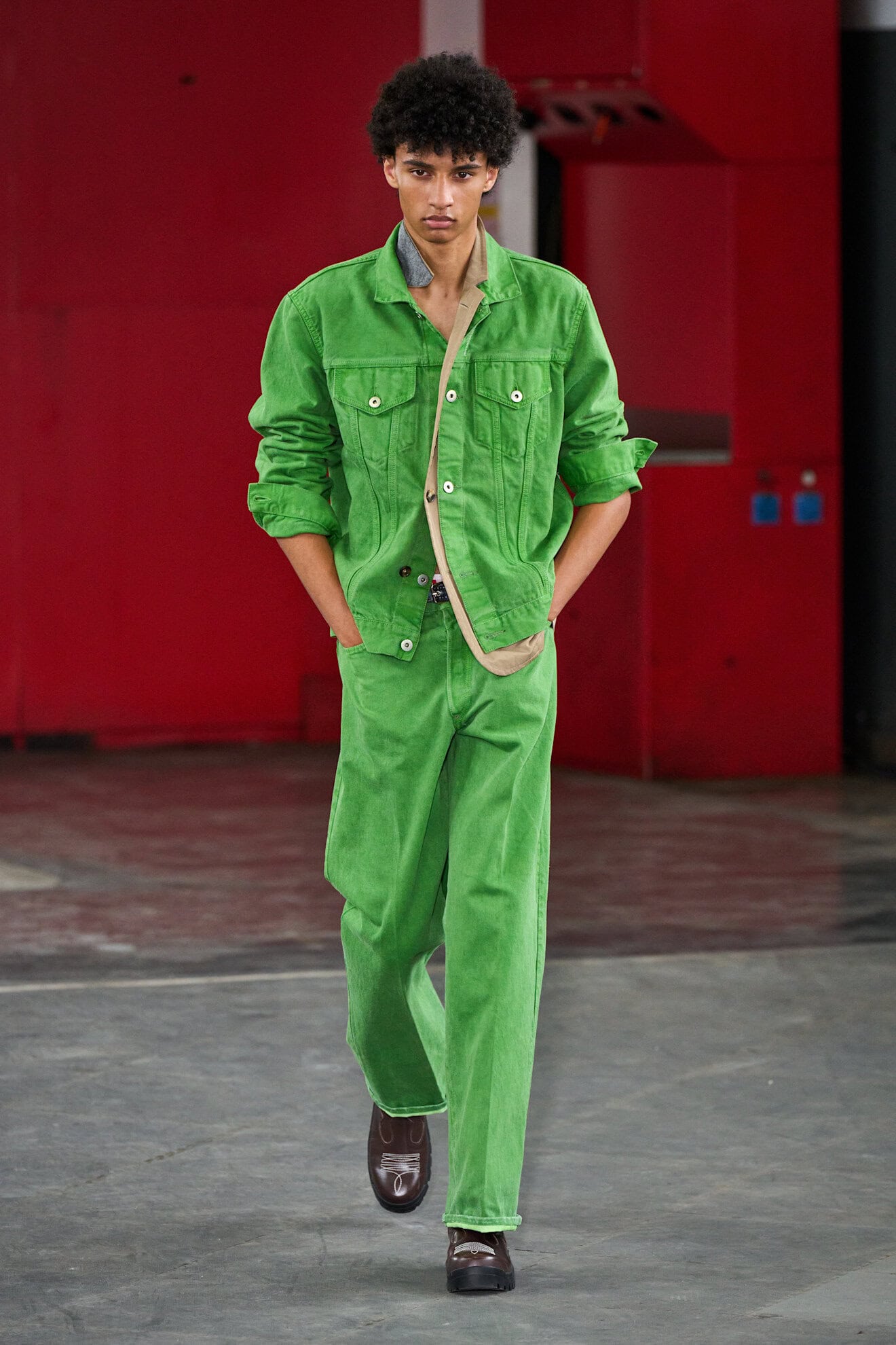
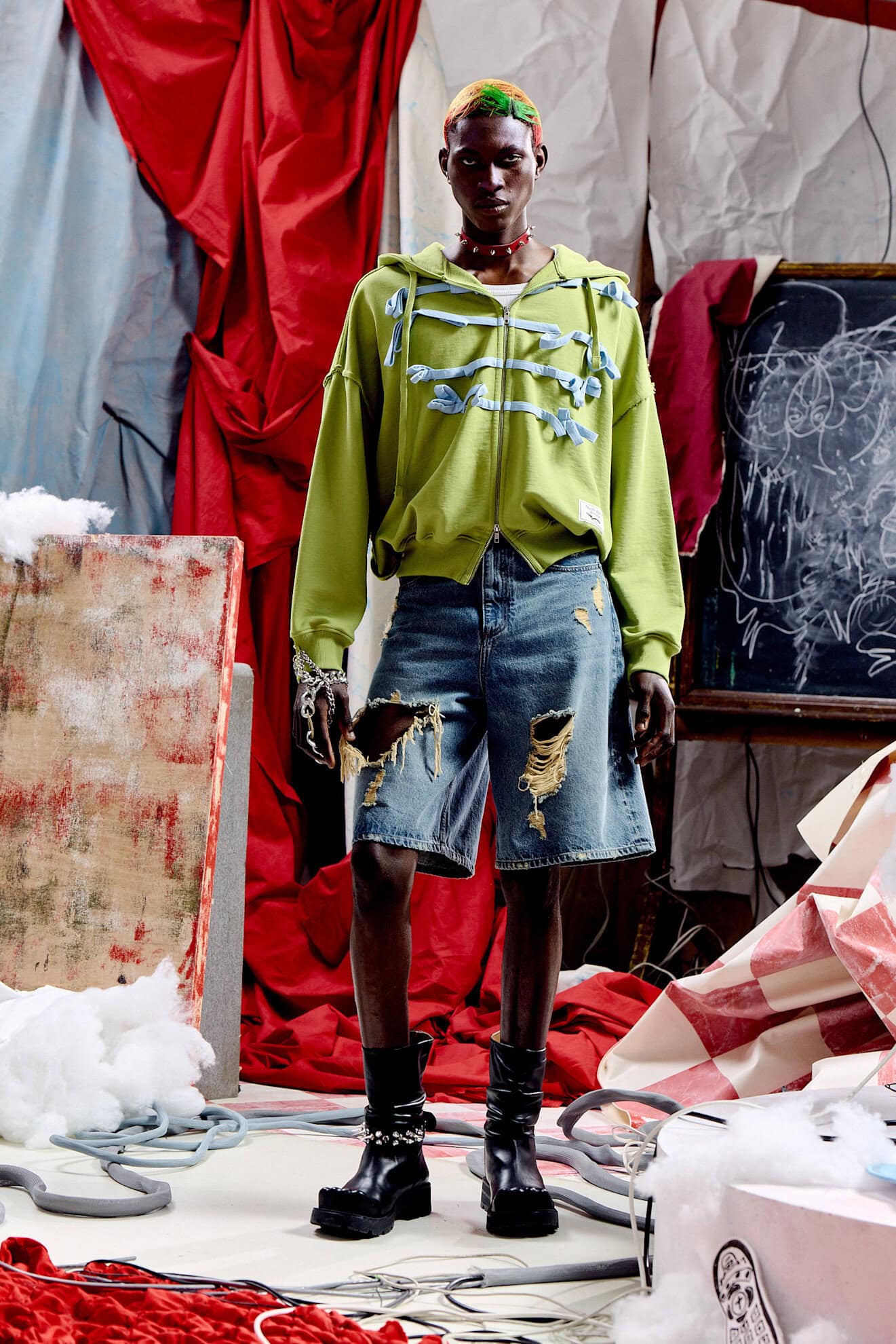
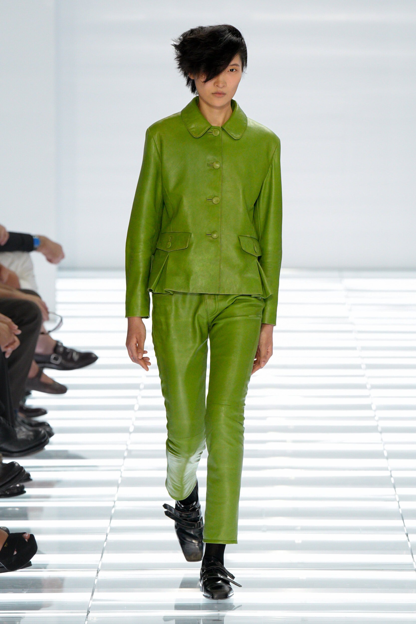
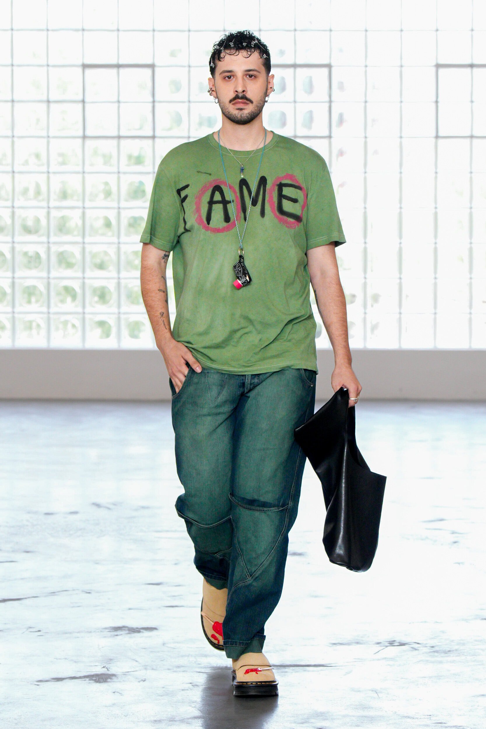
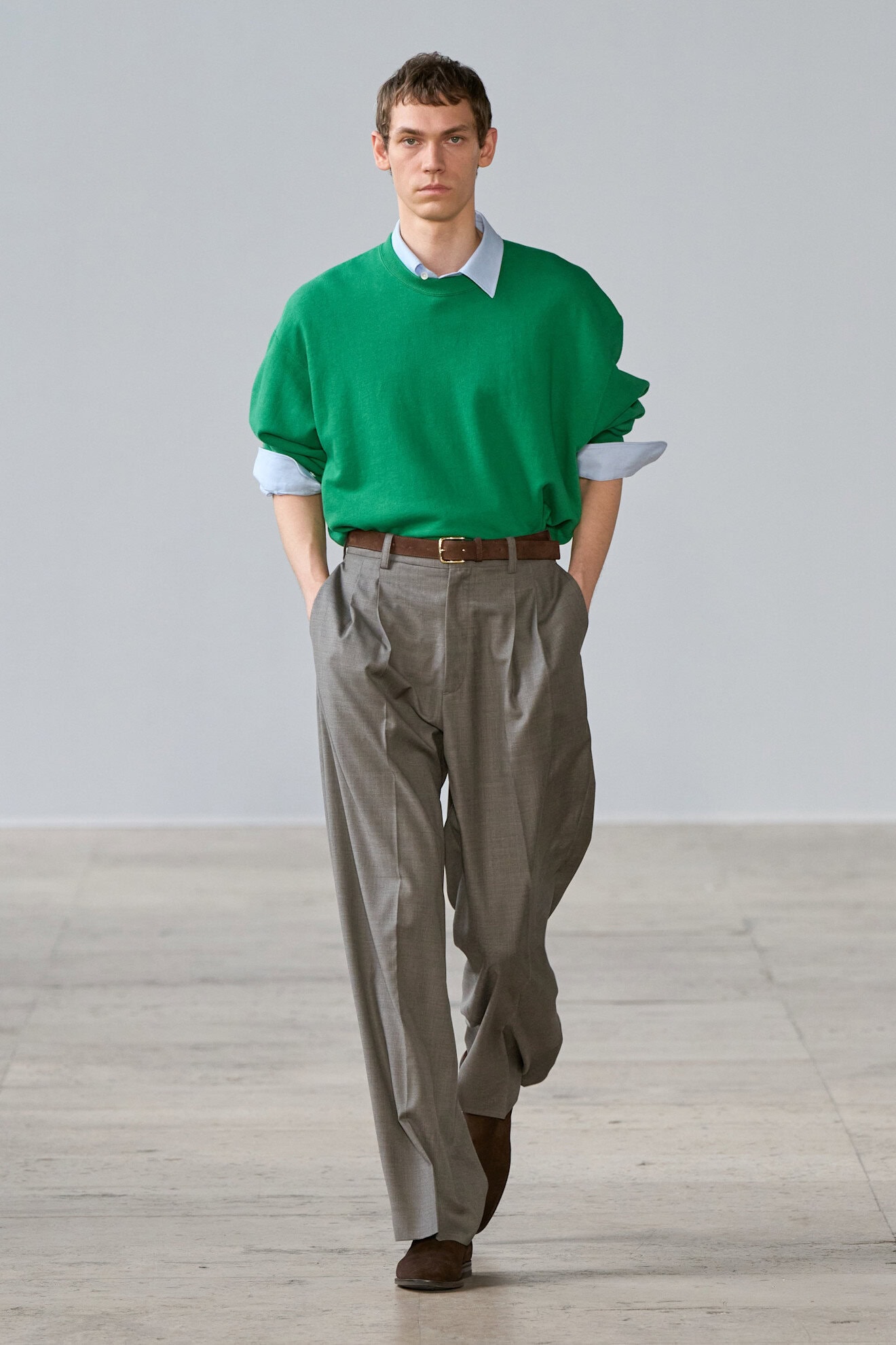
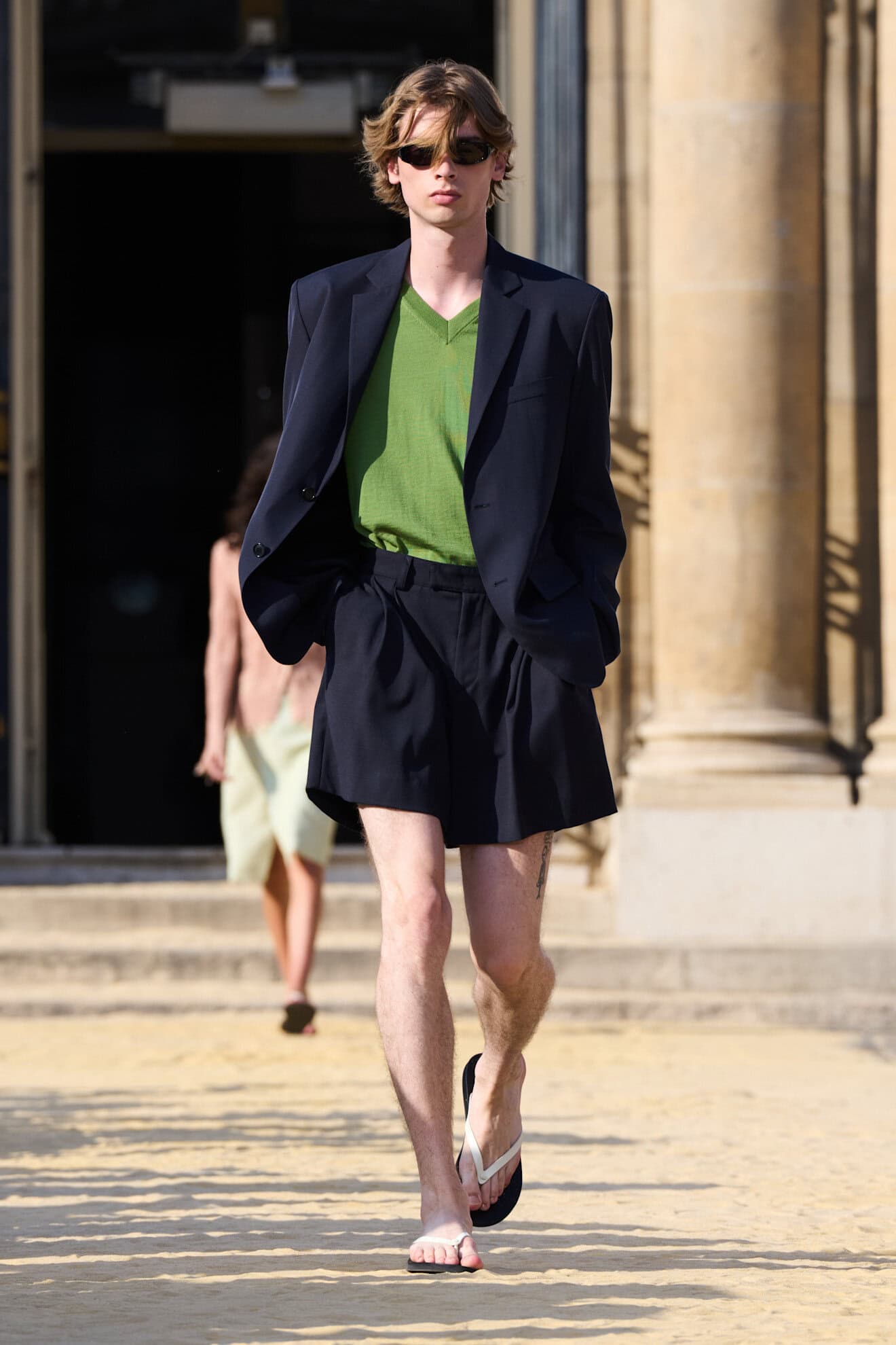
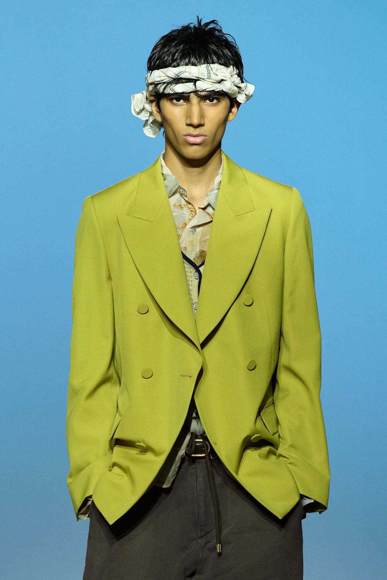
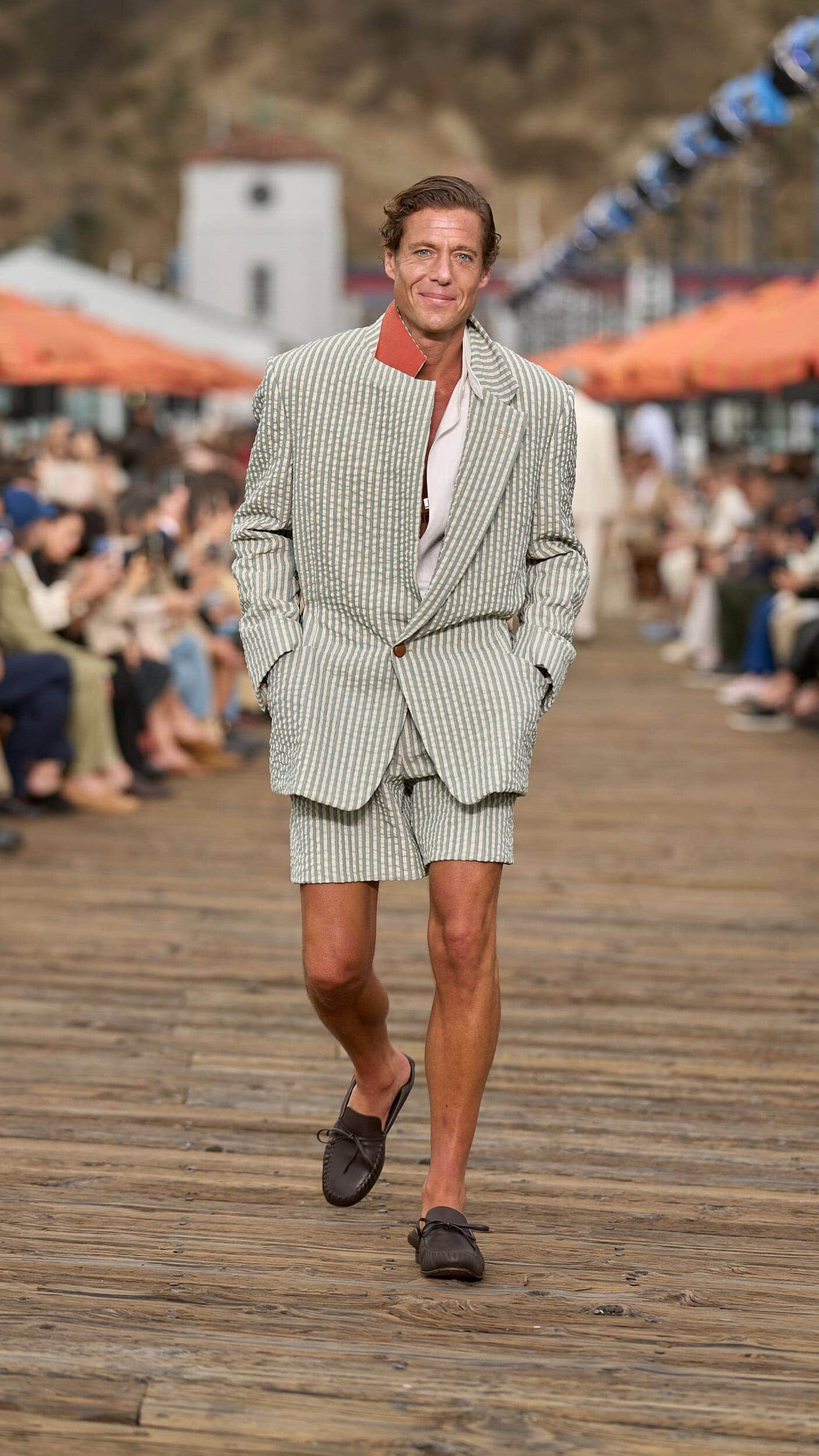
Typically rendered in utilitarian looks, green hues were pulled from nature and exuded (alongside white) the concept of a fresh start.
Grass greens were calming in their call back to wild vegetation and were abundantly applied in tonal looks at Junya Watanabe and Kolor. Vibrant green rose in the ranks as the hue for jersey basics at Isabel Marant, SSStein and Celine. Moss green was a striking, yet bold shade of green at Prada that was made plausible for everyday use when layered with black and white. Velvet embroidered ribbons at Loverboy added a whimsical touch, and worn as a textured stripe set, as seen at Zegna, the shade grounded the look in a vintage charm.

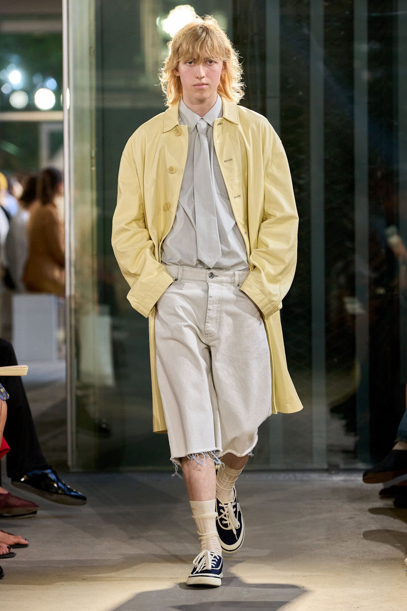
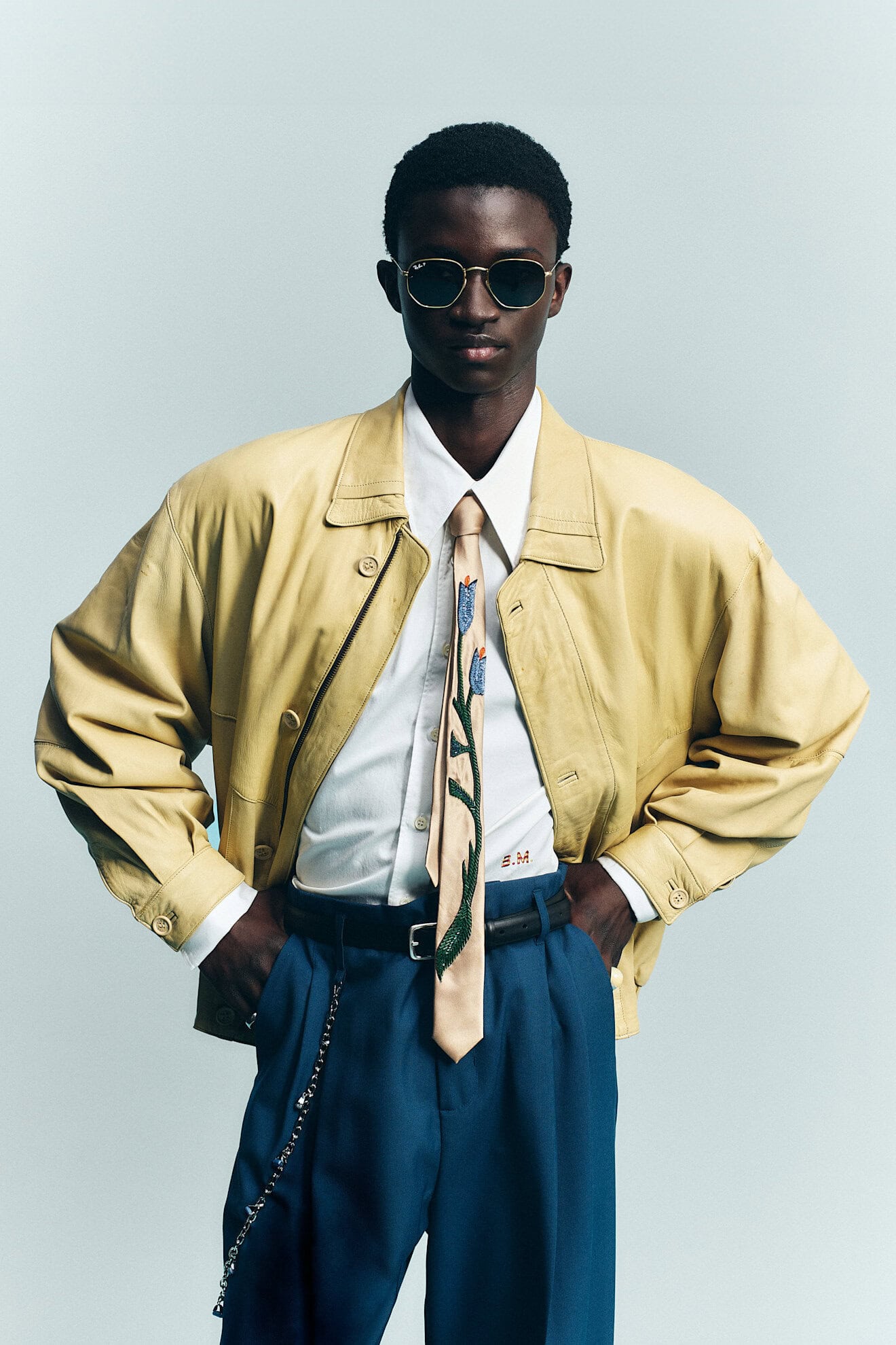
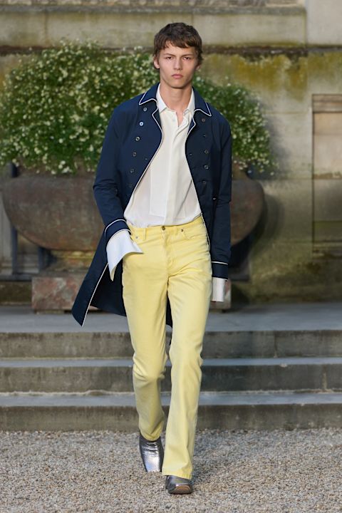
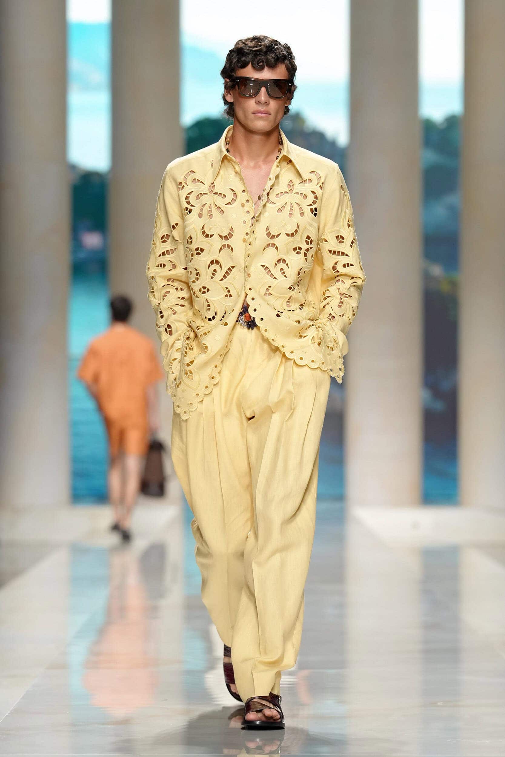
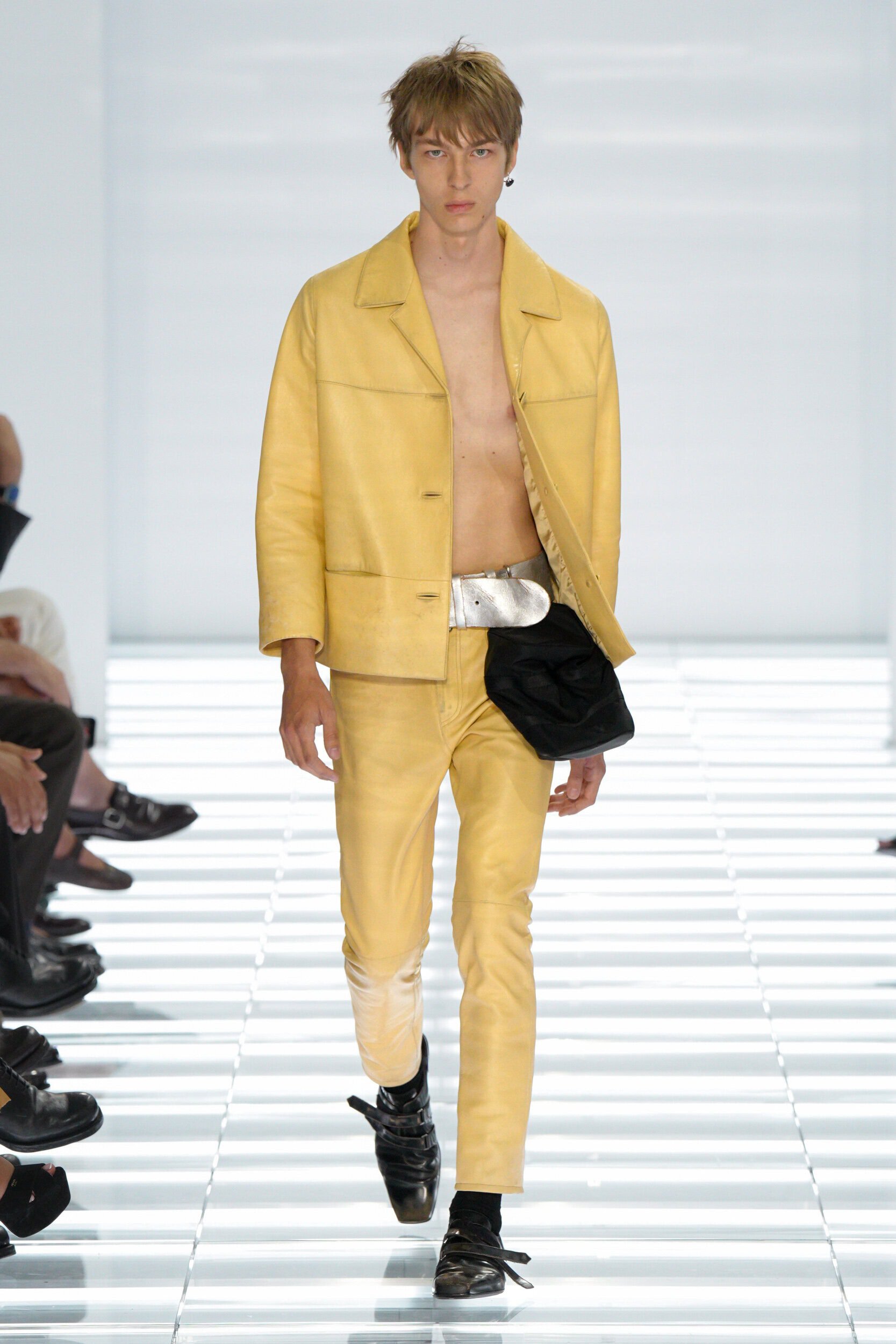
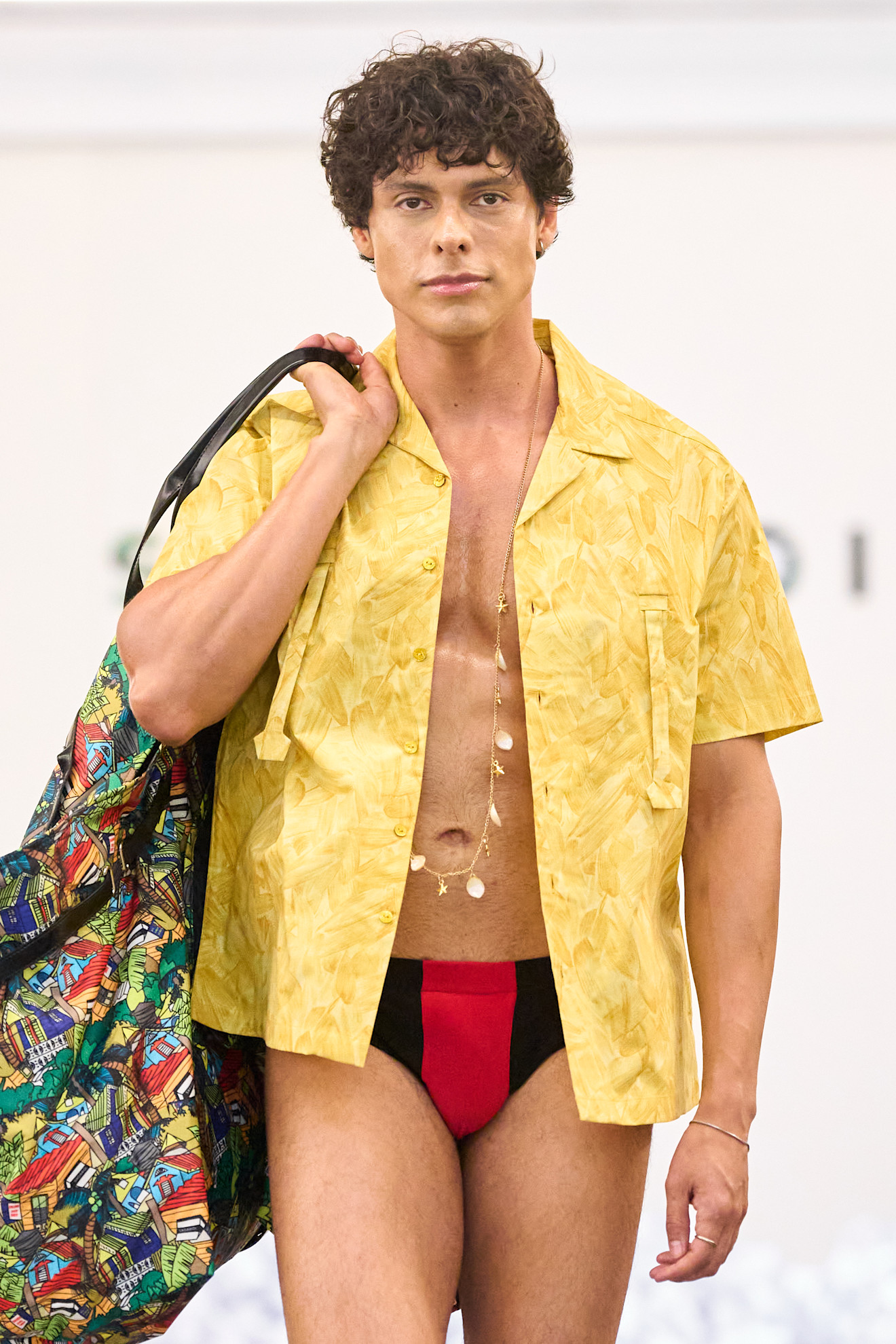
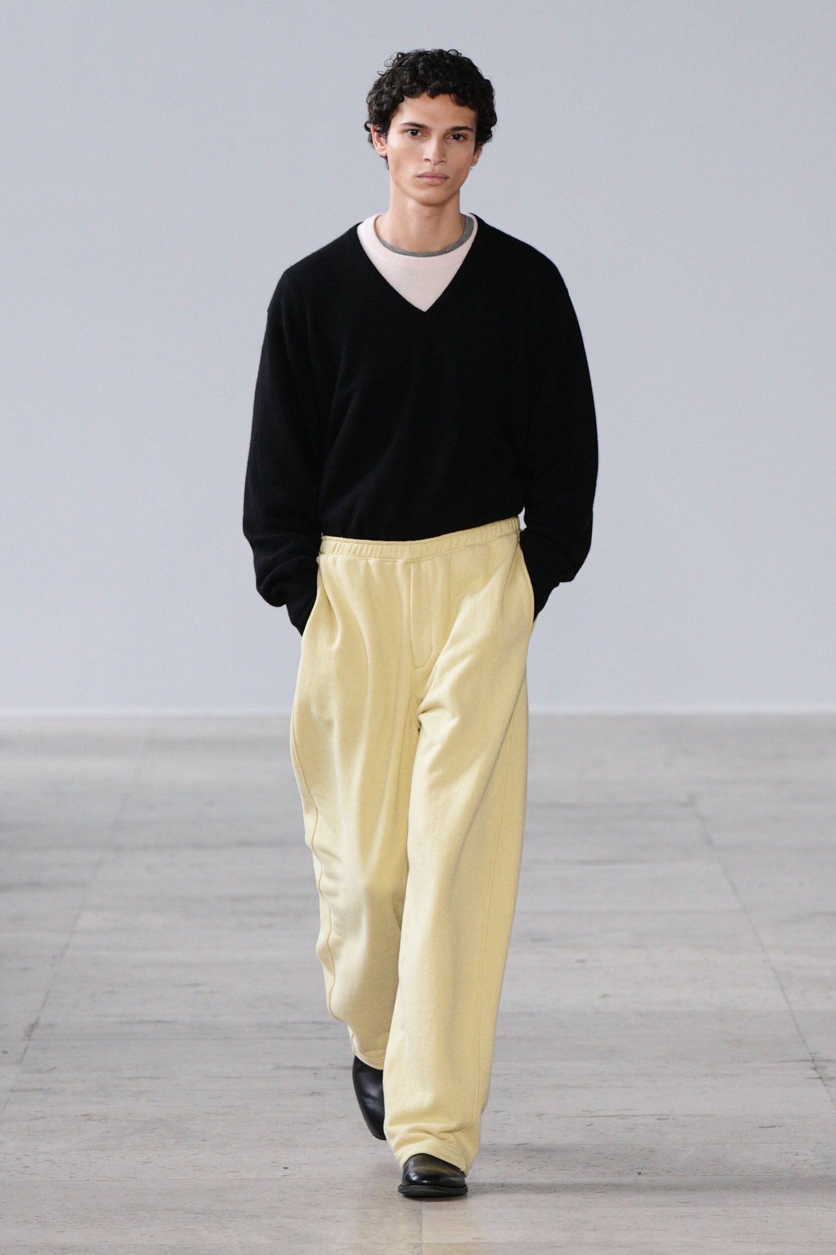
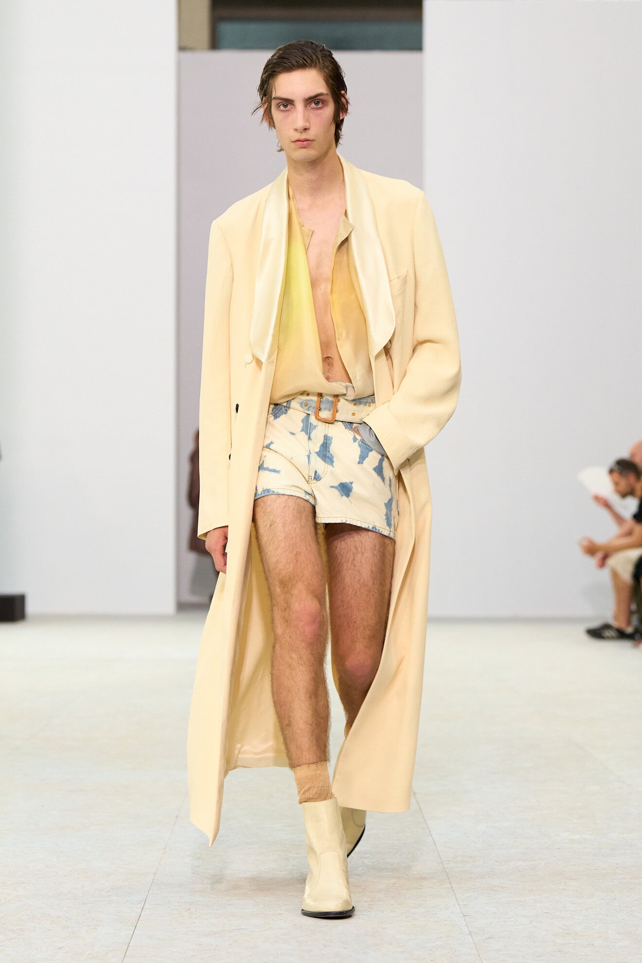
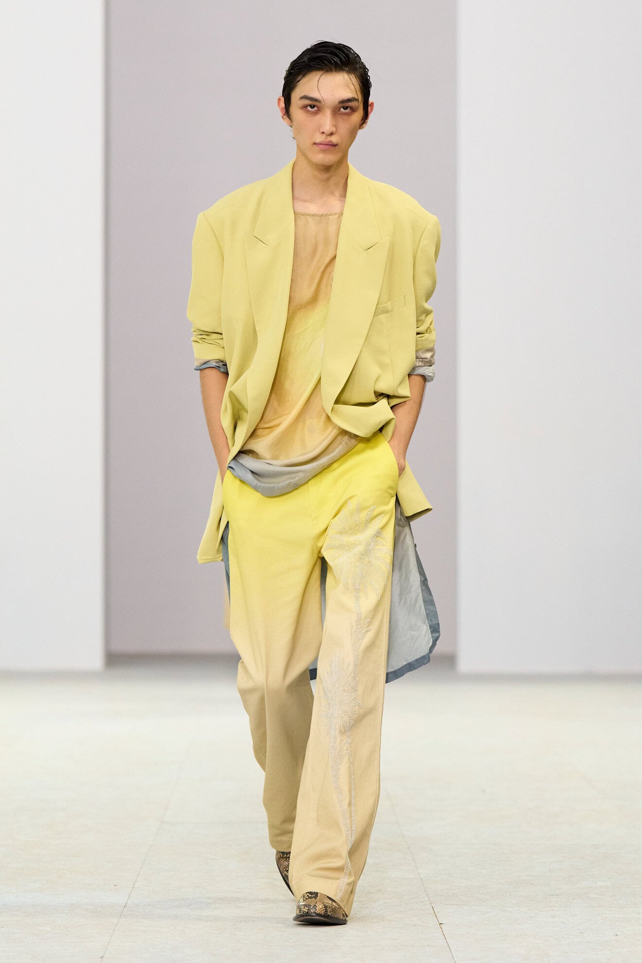
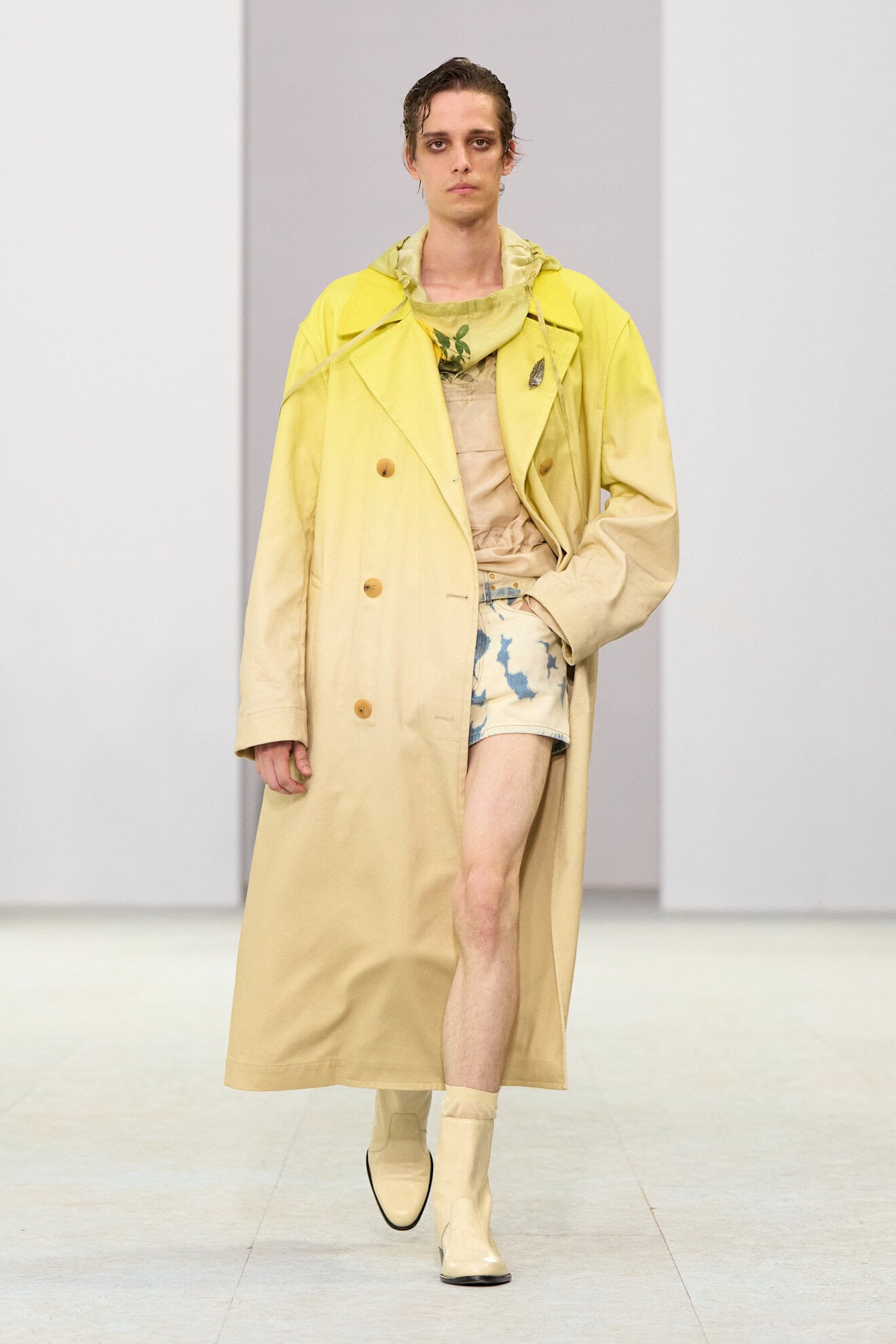
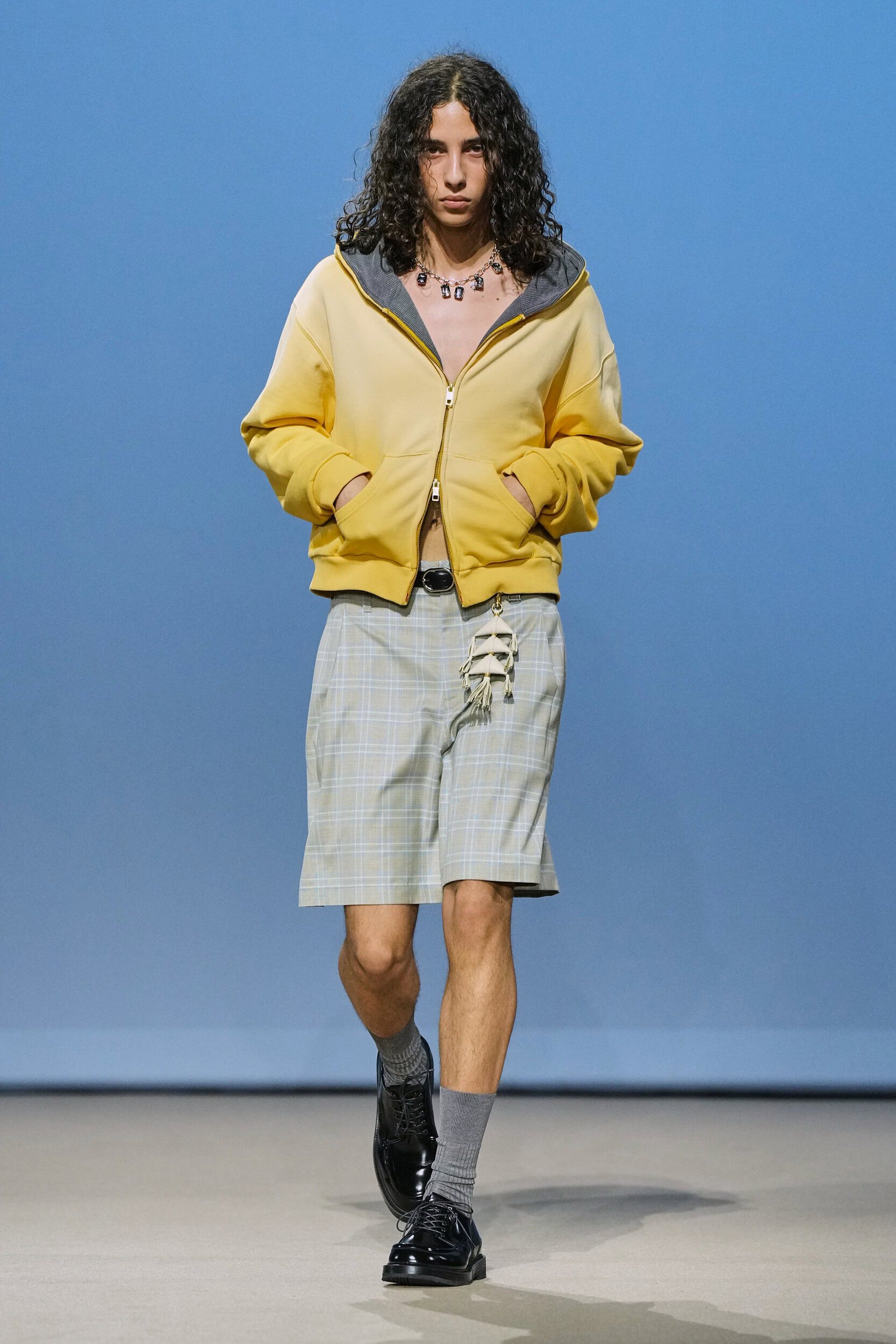
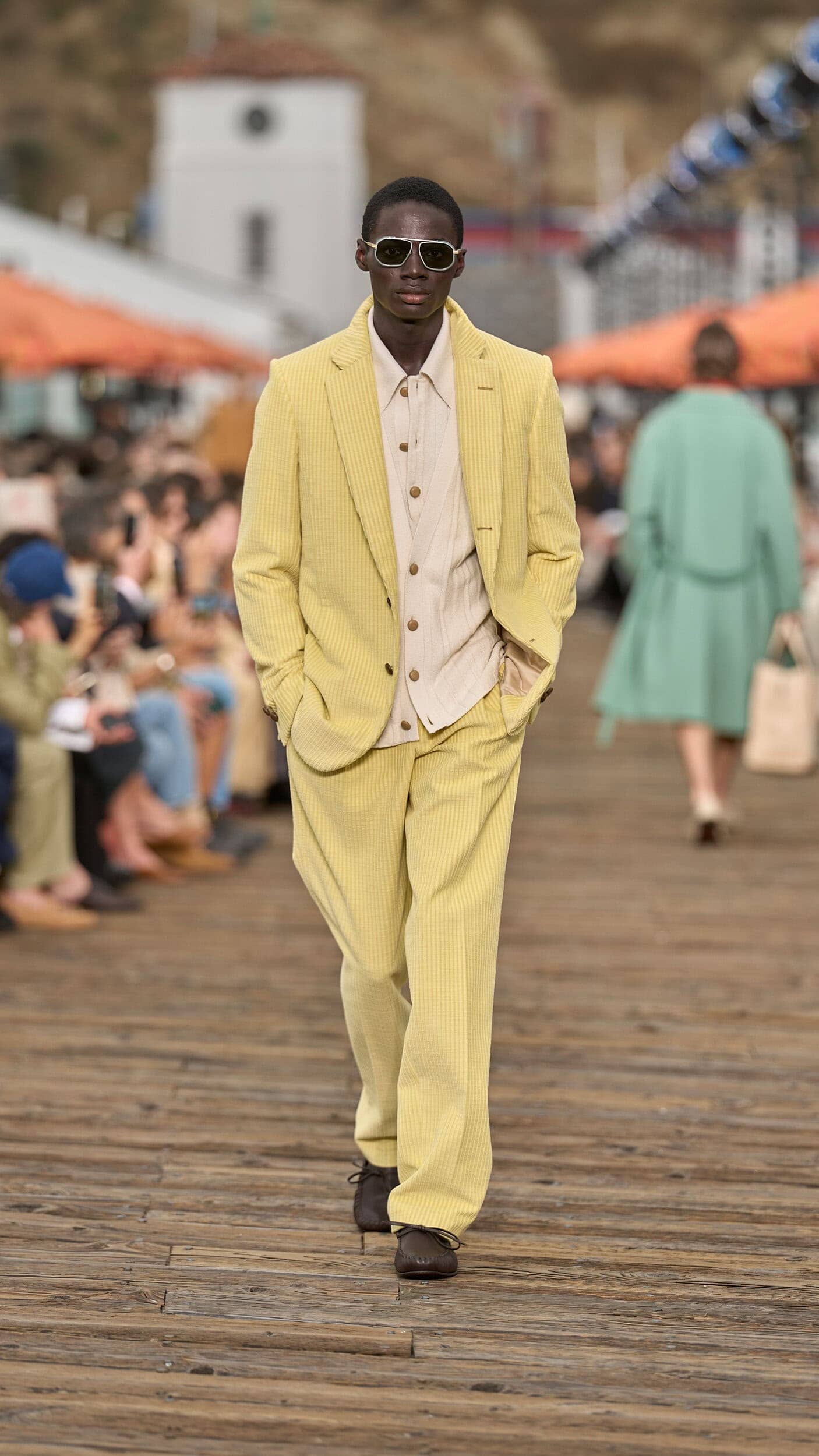
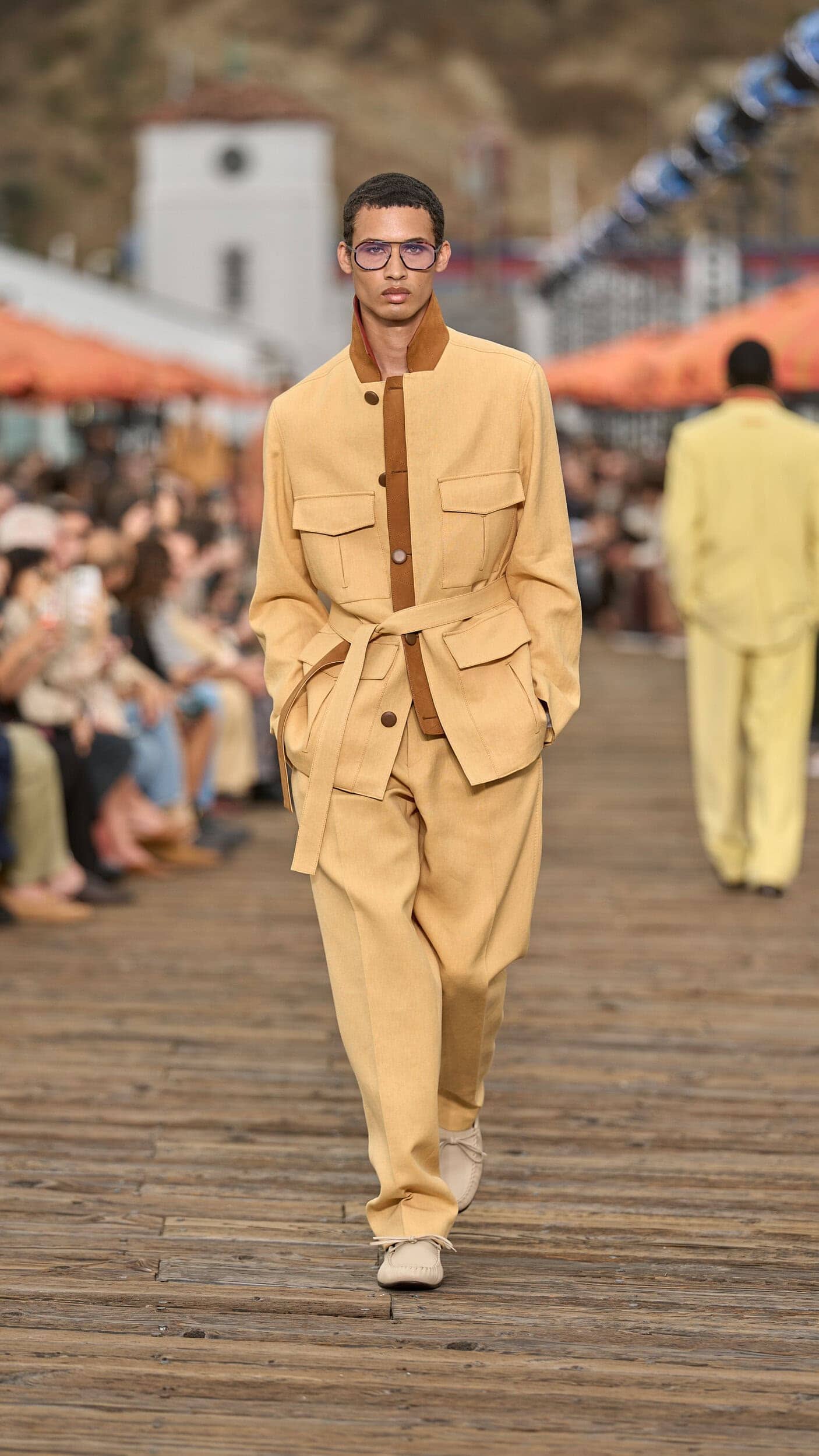
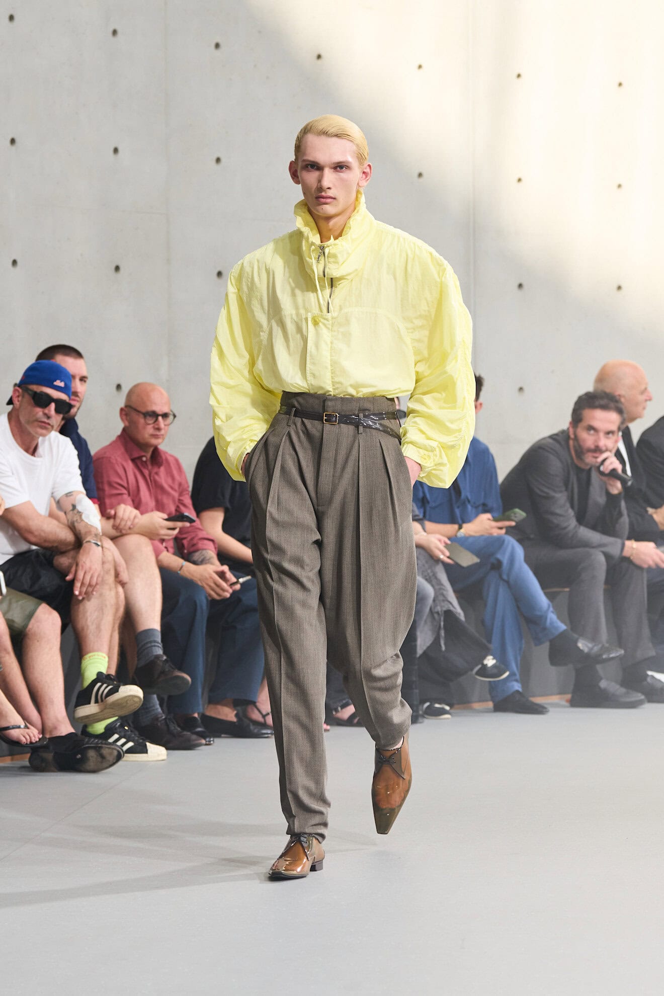
10. SUN-SOAKED YELLOWS
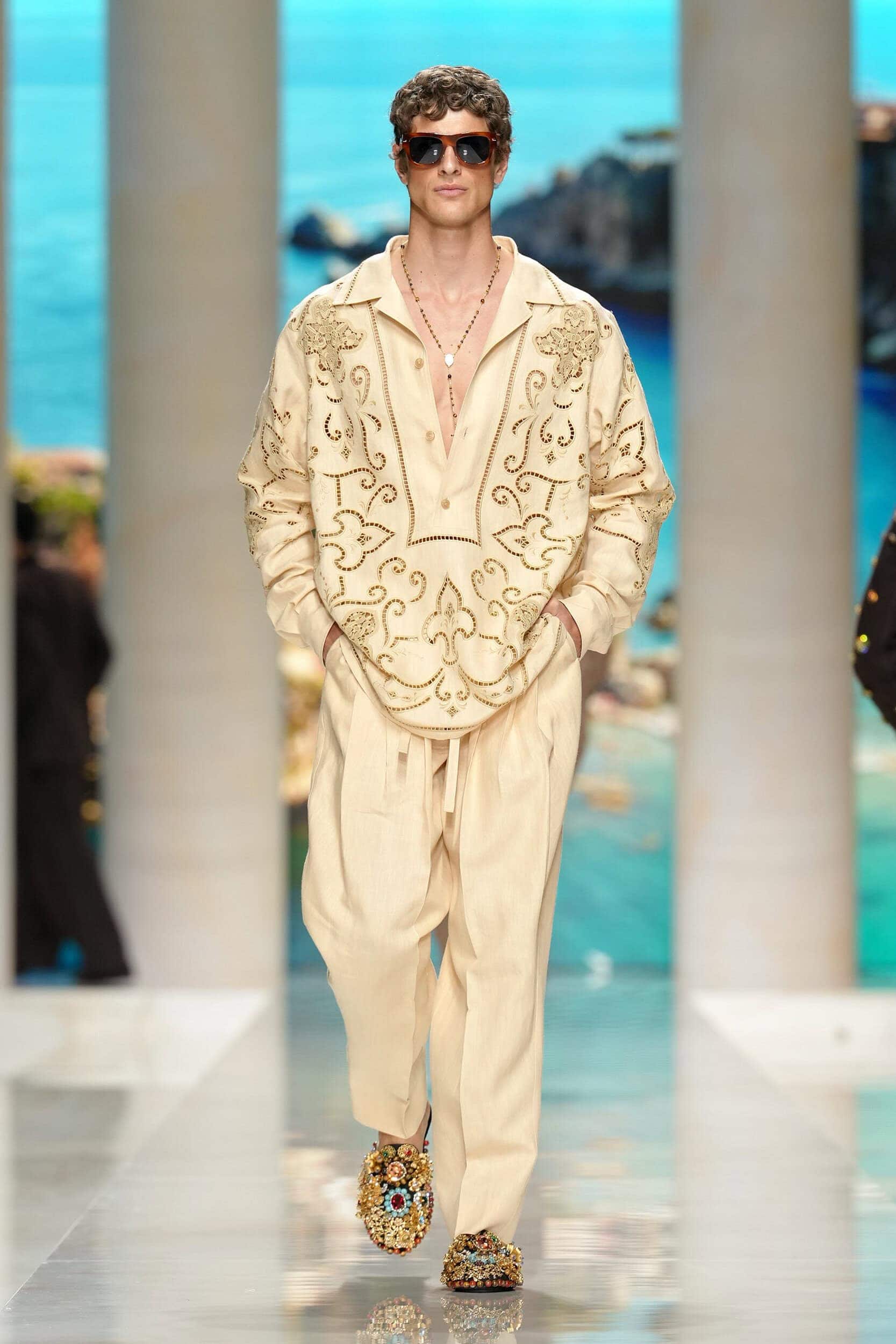
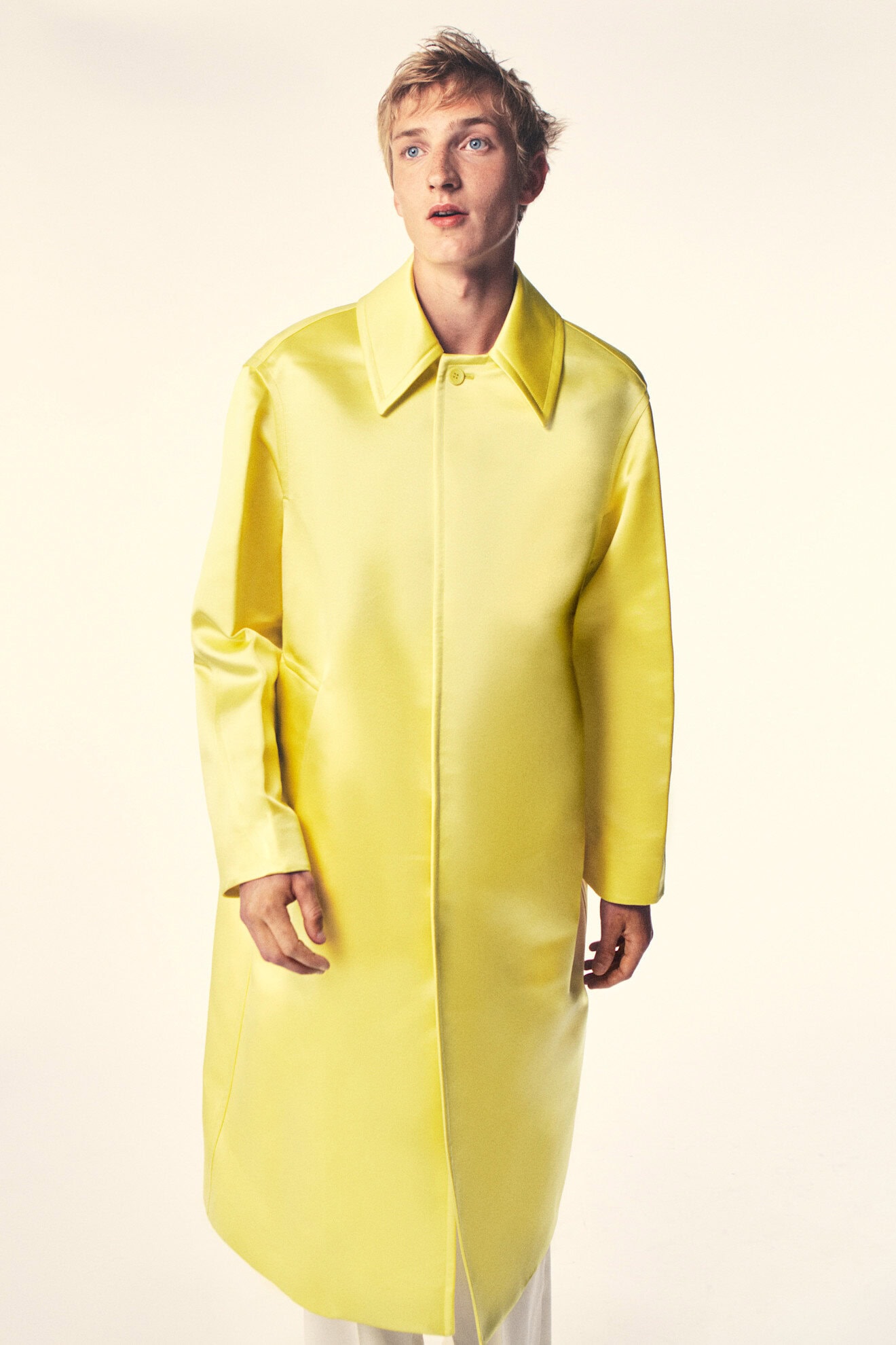
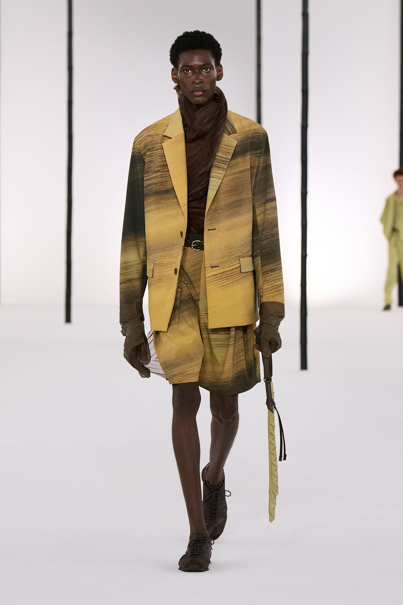
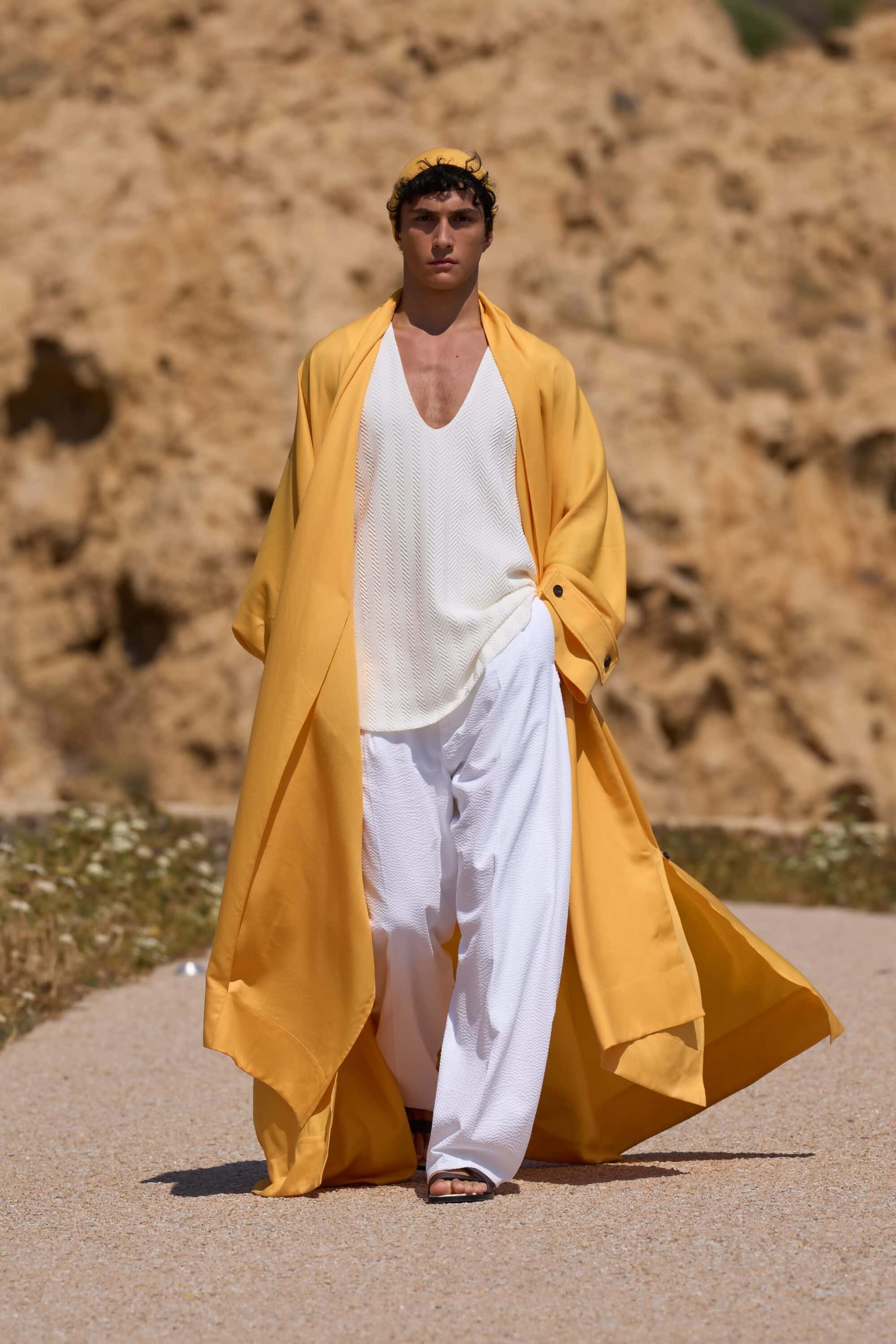
A holdover from womenswear, yellow’s associations with warmth and a subtle way to apply a light tint to a minimalist wardrobe makes it perfect for an entry into menswear. Sarah Burton’s debut collection for Givenchy applied the soft hue to a daring satin opera coat, while at IM Men it was shot through with deep brown brushstrokes. Dolce and Gabbana’s lace co-ords were reminiscent of coastal trips that involved Sicilian lemon gelato, but Julian Klausner’s dreamy journey from sunrise to sunset at Dries Van Noten displayed streaks of yellow at the height of the noonday sun, with ombre trench coats, silk blouses, and embroidered wide-leg pants. Offering balance and versatility, yellow has a cross-category appeal and looked newest when paired with white or rendered in sheer fabrications.