Last week the Riccardo Tisci era at Burberry kicked into high gear as the former Givenchy creative director revealed a new Burberry logo and archive-inspired print.
To create his first mark, Tisci tasked art director and graphic designer Peter Saville to quickly turn around new lettering and rework an old-turned-new monogram print. Saville, the British artist famously known for his album covers including that Joy Division cover, has recently found himself as fashion’s go-to for logo redesign; partnering with Raf Simons to update the Calvin Klein logo.
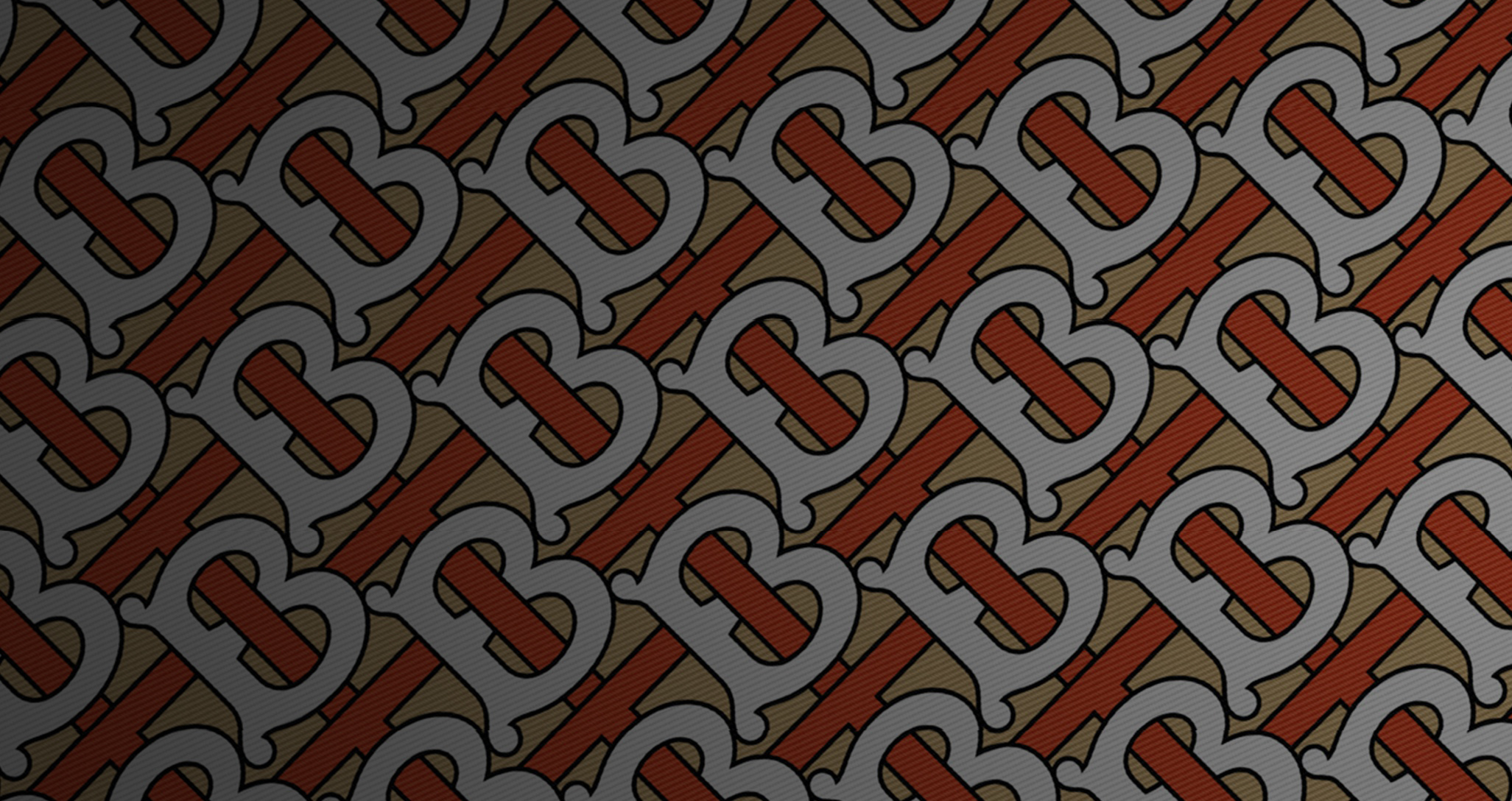
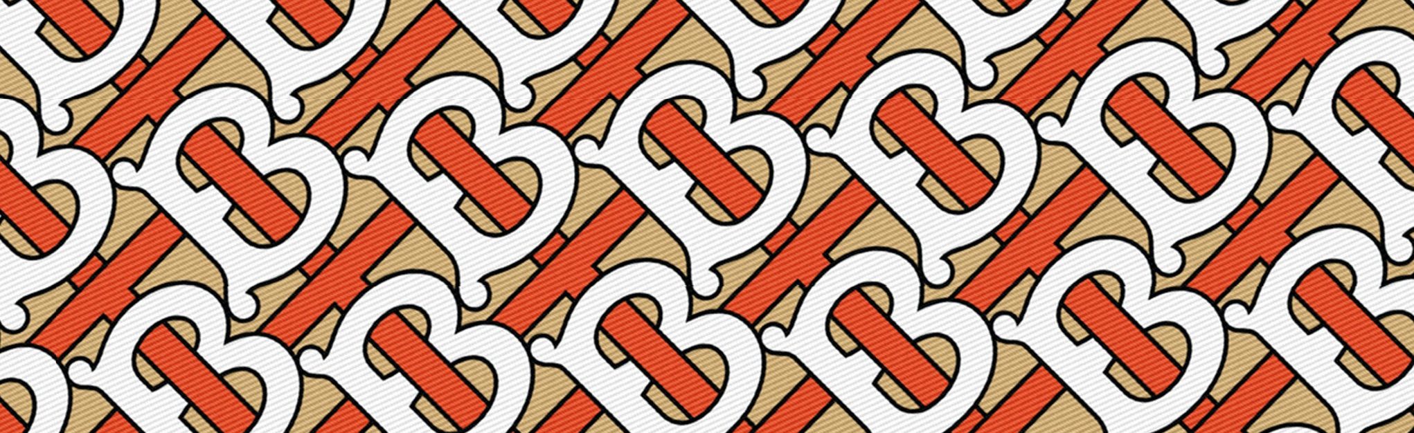
![]()
Burberry last revised their logo in 1999 when the house task Fabien Baron to give them an update, resulting in the label dropping the “S” from its name.
The new look features a straight forward logo for the digital age and the interlocking initials of the label’s founder, Thomas Burberry.
Change of any kind can be difficult, but even more so when the brand’s heritage dates back to 1856. However, as brands today need to evolve from product creators to storytellers, every new fashion creative director has the opportunity, and dare we say responsibility, to update their house.
The Impression is a fan of first impressions, so we reached to a few of today’s other leading fashion creative directors, to get their perspective on Tisci’s and Saville’s handiwork.
FABIEN BARON
“I think it’s a good thing that Riccardo/Saville changed the logo. New era, new logo!
When Burberry was relaunched in the 90s with Rose Marie Bravo at the helm, Baron&Baron was asked to work on all the communication programs. The first thing we did was to change the logo and the packaging. The brand was called Burberry’s back then. We killed the ’S, changed the graphics, and followed right after with a new advertising campaign with Kate Moss and Stella Tennant even though we did not have any of the new products. The results were an instant success and after almost a decade of hard work, the business had turned around in a huge way.
I believe brands need newness all the time, it’s fashion after all. Certainly Burberry is at a turning point again, and the brand needs a fresher look. This new logo is the first card in many Riccardo will pull out of his pocket. I am also pretty certain he will take Burberry to the next level, bringing his street savvy and his touch of high fashion to new heights.
Peter did an excellent job. He is an amazing creative talent. Opting for simplicity and impact was the right thing to do, especially now. Honestly, I can only appreciate these changes as I‘ve always been the first one to push brands to manipulate their look.” — FABIEN BARON, Baron & Baron
DAVID LIPMAN
“I love what Ricardo and Peter have just done. Being part of the last one some 20 years ago – this is quite an extraordinary move.
They threw out the history yet remained utterly British with a San Serif font and a great B Monogram.
“MAD BRILLIANT” is the best way to describe this.” — DAVID LIPMAN, Lipman Studios
DENNIS FREEDMAN
“This is a brilliant example of how two great talents can take a heritage brand image and evolve it in a completely relevant contemporary and iconic way It also shows that the best design is not by commitee nor long lead time. Congrats Riccardo and Peter.
And one more thought. It’s not about age it’s about talent pure and simple.” — DENNIS FREEDMAN, Dennis Freedman
RICCARDO RUINI
“I like the logo and the type a lot. It’s clearly a reference to some old fonts but look clean and contemporary.
I’m curious to see how it will work in the real world but it already looks great in the website page.
Regarding the pattern it’s a matter of how it is applied. A pattern always looks a bit dull when you see it just printed on paper, even worst on a screen. But I like the new “B” and the “T” becoming a net.
I like the job, but Riccardo (the other one) and Saville are a great combination so it doesn’t surprise me.” — RICCARDO RUINI, Ruini Studio
ANONYMOUS
“My mum always told me if you can’t say anything polite, don’t say anything at all!“ — ANONYMOUS
ALAN ABOUD
“There have been many grumbles in the Design Press this week about the Burberry redesign.
More about questioning whether Fashion Creative Directors have the qualified right to influence identity and marketing.
I feel Riccardo Tisci has every right to rule in this way. Fashion is all about having a great Dictator running one’s business, and their vision must be absolute in order to make a success of their tenure.
Others questioned the originality of Peter Saville’s new repeat monogram, saying it is merely from their archive. A great graphic designer’s role is often to point to the obvious within a brand’s heritage and urge it’s use, and Peter has done just that. The identity is fresh, bold and exciting for a brand that has visually been stagnant for many years.
Finally, it is SO refreshing to see that a creative of Peter’s generation has been entrusted with this task. Too often in the last few years have young upstarts been supposedly the creative messiahs for fashion brands. Experience DOES matter.“ — ALAN ABOUD, Aboud + Aboud
TONY KING
“It seems like it’s now par for the course that when a new big name creative director joins an established house they have this desire to make a big splash by changing the logo – I’m of the mindset that they should do that with their first collection. I think that all of the big house are transitioning over from classic, traditional fashion houses to become more modern thinking brands, brands that are inspired by more up to date culture such as streetwear, so the logo change to something quite simple and basic has become an almost standard move of late.
The new Burberry logo is ok, it doesn’t feel particularly unique. The TB pattern is nice, I believe that’s from the archives though.
There’s a school of thought that says a fashion designer should have no say in the brand positioning or marketing of the house they work for – we’ve seen examples of where this has gone wrong big time (Brioni) and we’ve seen examples of it working very well (Saint Laurent).
I’m looking at the Burberry and wondering if this change is going to be worth the many millions it will cost to switch all the stores, packaging, etc over to this.“ — TONY KING, King & Partners