Review of Diesel Fall 2022 Fashion Show
Jean-ius
By Mark Wittmer
With his second full collection as creative director of Diesel, Glenn Martens affirms a deep understanding of the brand’s bygone cool factor while incorporating it deftly into his own surreal and visionary design language.
Mega-sized and gleefully gender-fluid, the tone of the collection was both set by the campaign’s staging: a warehouse full of gigantic, minimally denim-clad inflatable bodies assuming take-me-now poses, with 3D scans of a few of the models printed uncannily onto the material: an extravagant gesture whose cheeky sexuality that belies some brilliant architectural and technological thinking.
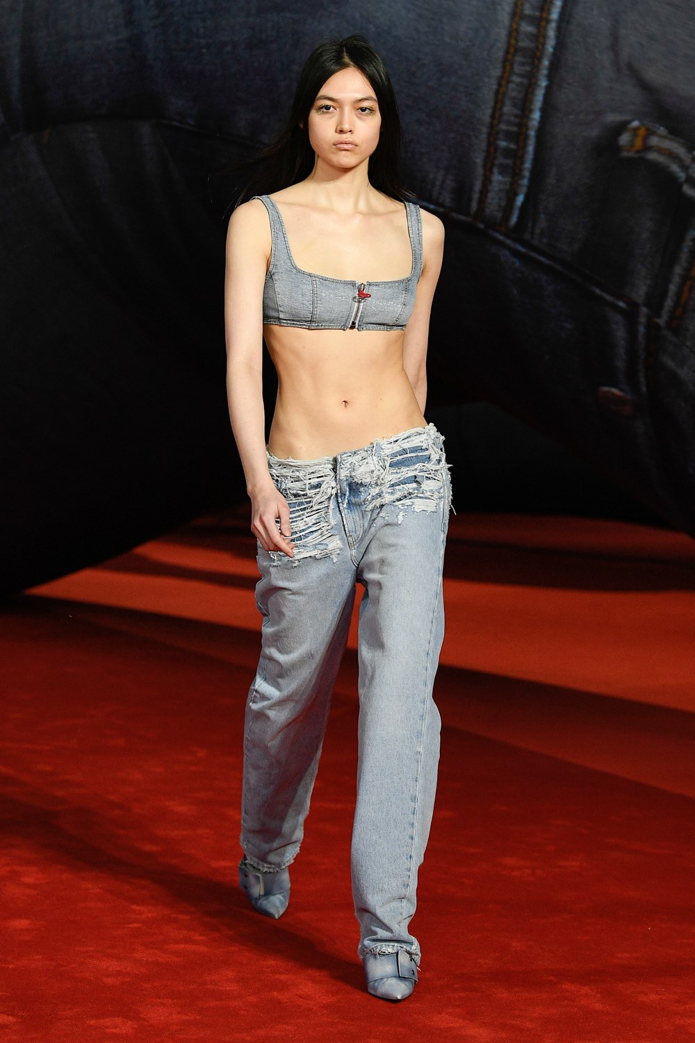
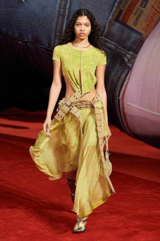
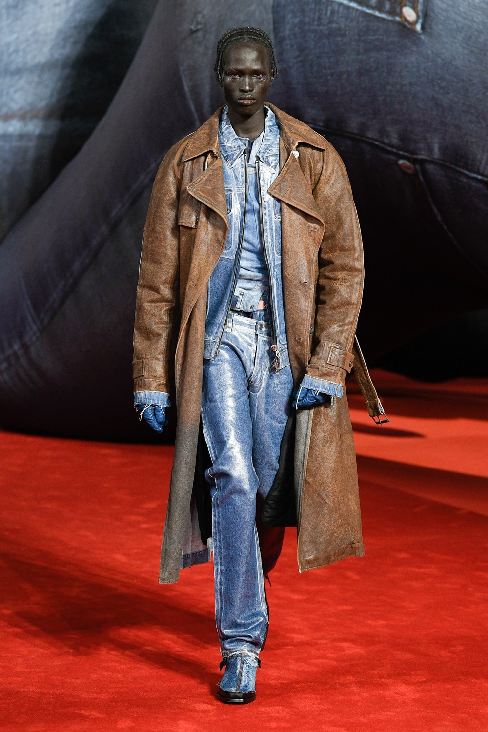
“In true Diesel fashion, denim anchored the collection throughout, established in the first look’s low-slung, straight-legged, stone-washed thrashers.”
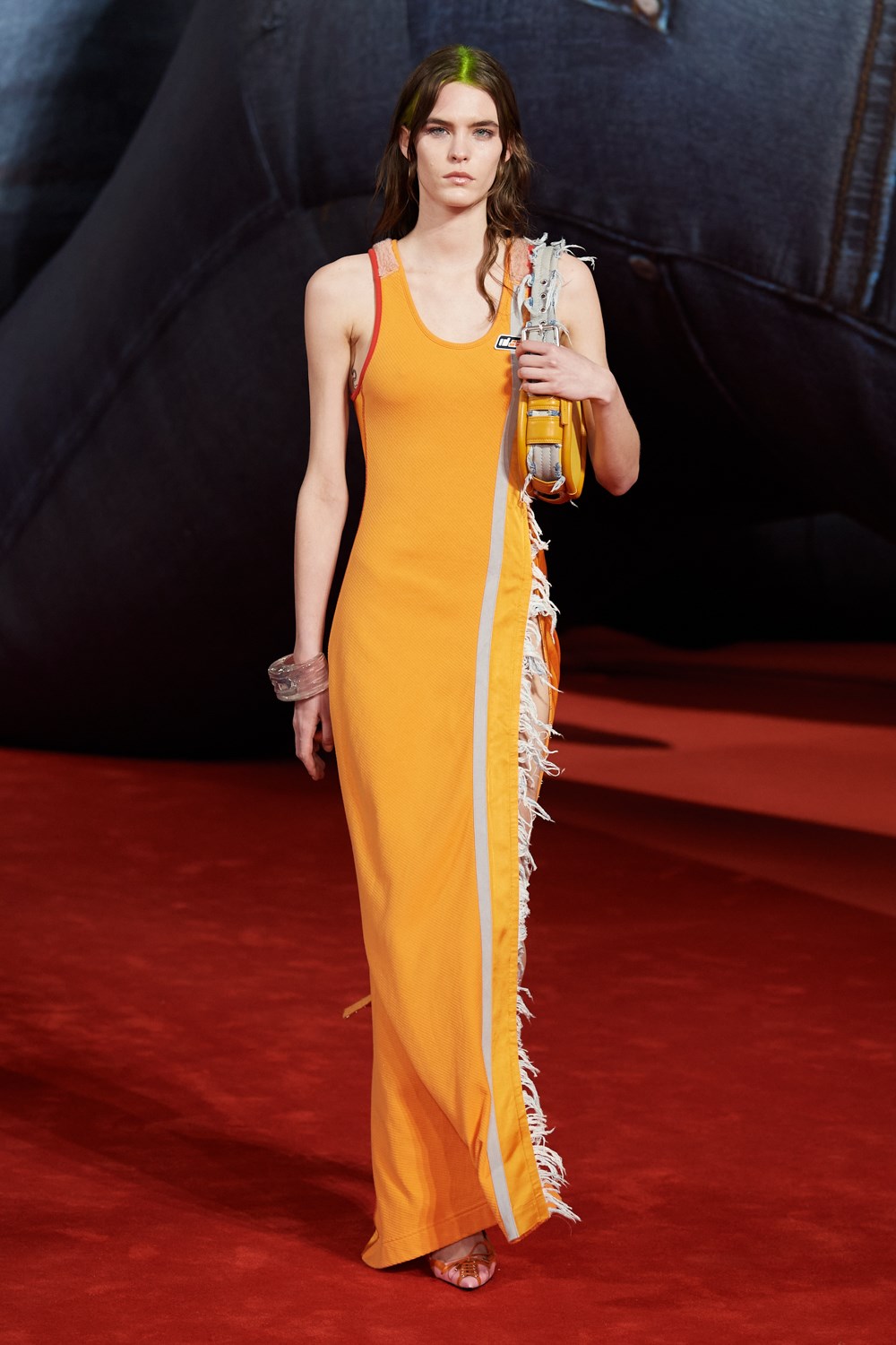
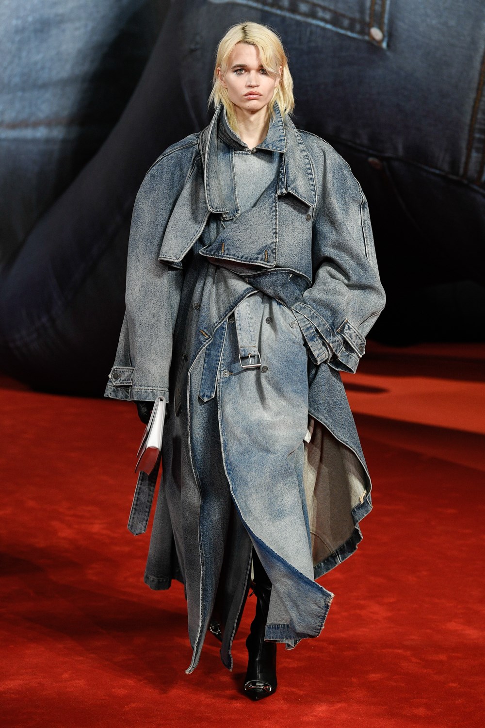
The ensuing looks then comprised a brilliant onslaught of everything jeans can be (and everything that can be jeans), but that only Martens is brave enough to make a reality: wrap skirts that were really just belts, denim trench coats, a dress trimmed with frayed denim edges, an overcoat that was composed of so much denim fraying it becomes a new sort of fur coat.
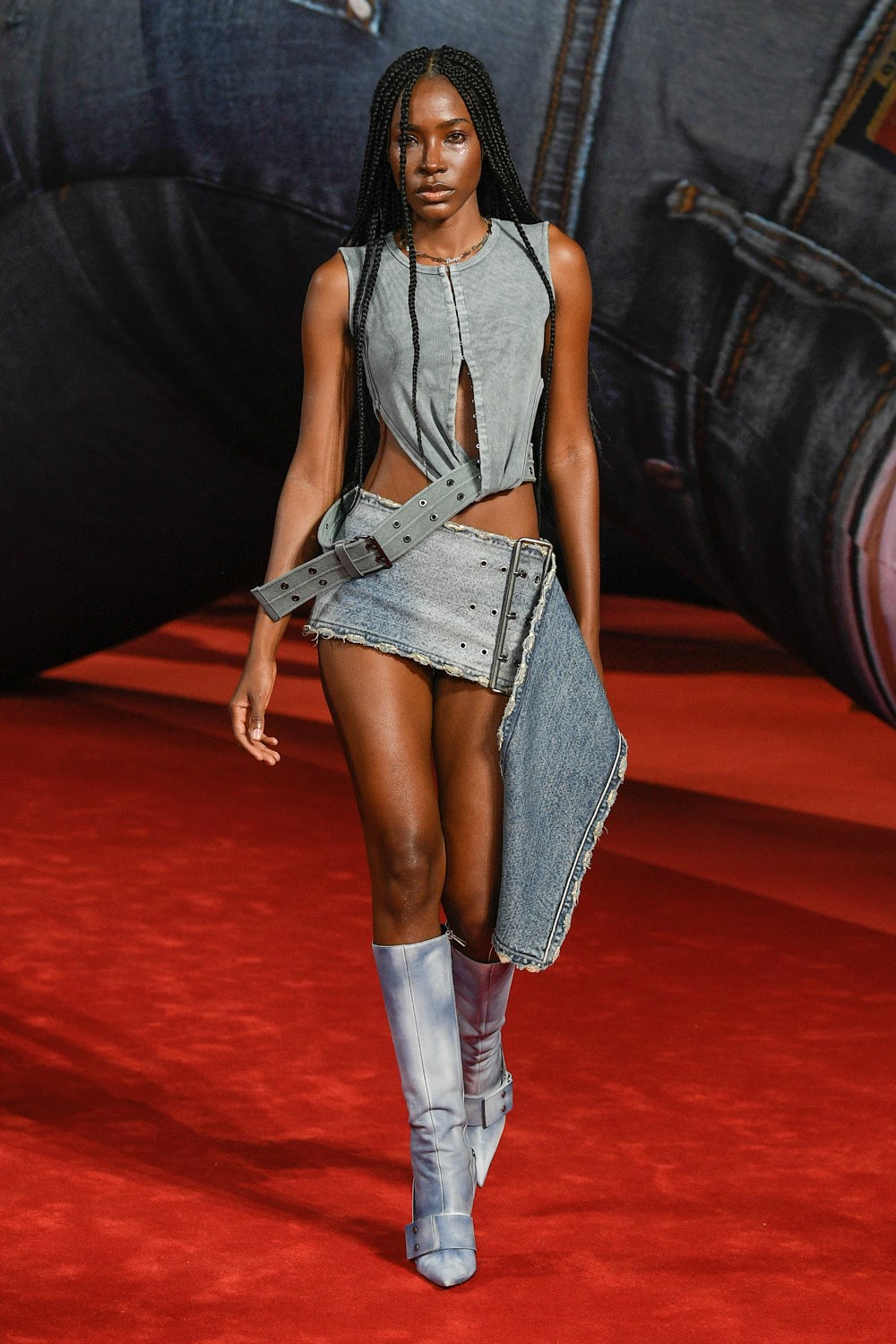
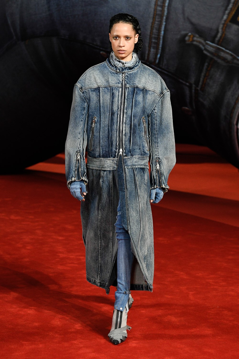
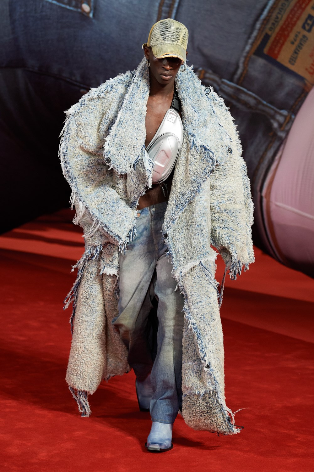
Leaning into motifs of asymmetry, industrialism, deconstruction, and mind-bending layering that are a mainstay for his work at Y/Project, he took took these denim roots to their limits, all but destroying them to push them into fresh, remixed territory.
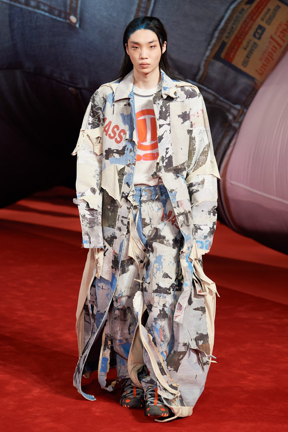
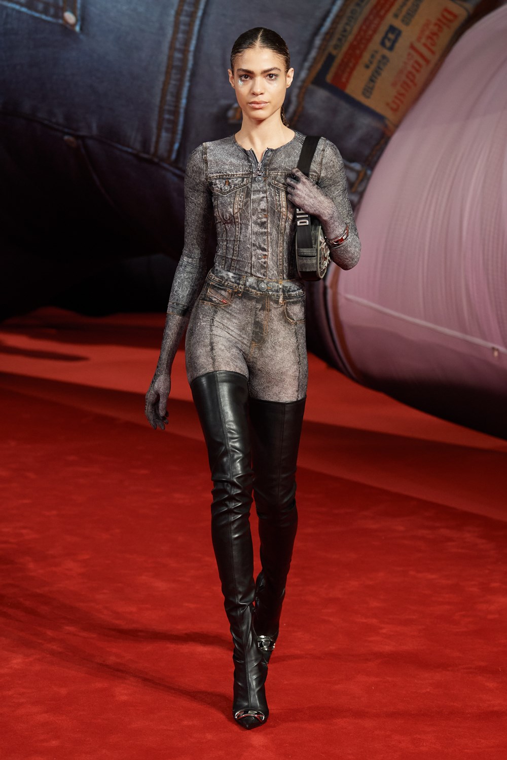
Even when denim itself wasn’t being used as a material, the aesthetic of a pair of jeans often remained, like on the jeather pants (leather pants printed to look like jeans), the joots (jean boots), or the jodysuit (you get the idea).
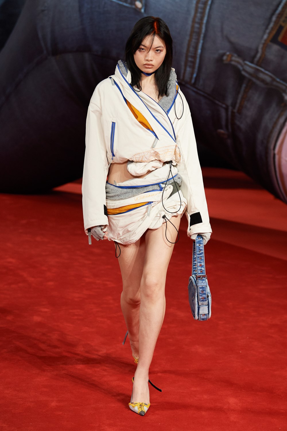
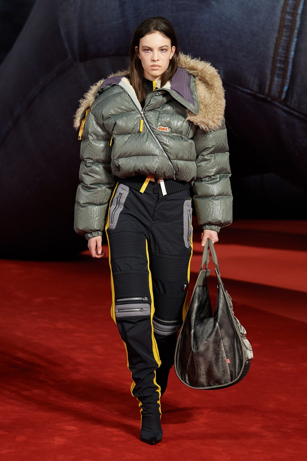
He also tapped into the sportswear aesthetic and archive of Diesel’s mid-2000’s heyday, serving up well-considered yet maxed-out odes to the era that felt both analogue and futuristic, and featured some delectable textures (as did much of the collection).
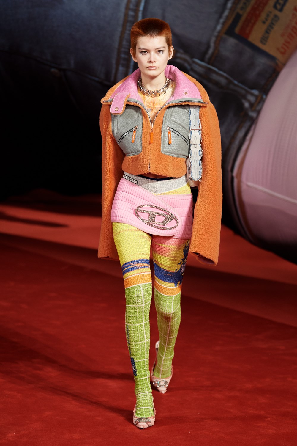
The designer deserves further commendation for his smart use of the brand’s logo, a more market-forward approach we haven’t gotten to see from him at Y/Project. From big stylized D’s to the familiar font freshly emblazoned or embossed across any number of items, and especially accessories, there was no shortage of branding. Though not exactly subtle, it never felt like the over-saturation of logo-mania, and instead smartly tied into the conceptual work of exploring and subverting consumerism and (post-)industrialism subtly suggested by his designs and graphics, as well as explored in his recent campaigns.
It’s incredibly exciting to see how Martens take a recognizable yet forgotten (and, for a while at least, almost anti-trend) design aesthetic and rewrite it as only he can in a way that feels incredibly fresh, yet of the utmost relevance to our age of over-saturation and simultaneous nostalgia and hesitant futurism. He’s off to an excellent start with Diesel, and we can only expect that as the brand makes a return to center stage under his brilliant guidance, he will continue to dazzle and disrupt.