The Garden Variety
Review of Thom Browne Spring 2027 Men’s Fashion Show
By Angela Baidoo
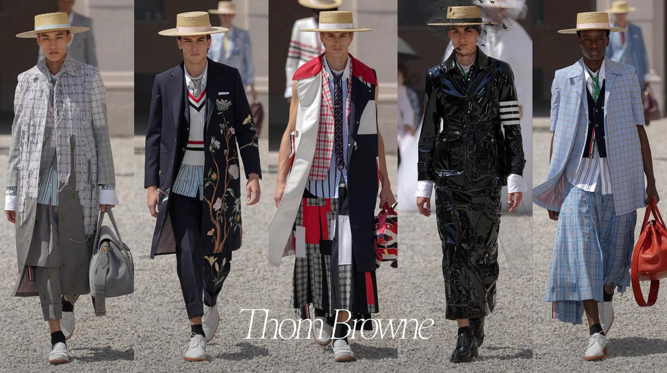
Acknowledging that the Thom Browne ‘look’ works best (as most uniforms are) when worn as an ensemble, presents a conundrum for the brand. Those who are dedicated fans – and there are many – are equally as committed to wearing the shirt+tie+blazer+overcoat+pleated skirt equation as set out in the – as yet – unwritten “How To Wear” guide. The reality of a changing climate may sooner, rather than later, call for an adaptation of brand codes.
Yet, Mr. Browne has always remained a staunch advocate for the benefits of uniformity. But how to wear a three-piece suit, with all the trimmings, in 100-degree heat? This question is set to become an ongoing concern for the designer, who will have to find a solution for every spring season, if the mid-year temperatures continue in their upward trajectory.
THE COLLECTION
THE VIBE
A Bug’s Life, Seersucker Summer, World of Whimsy
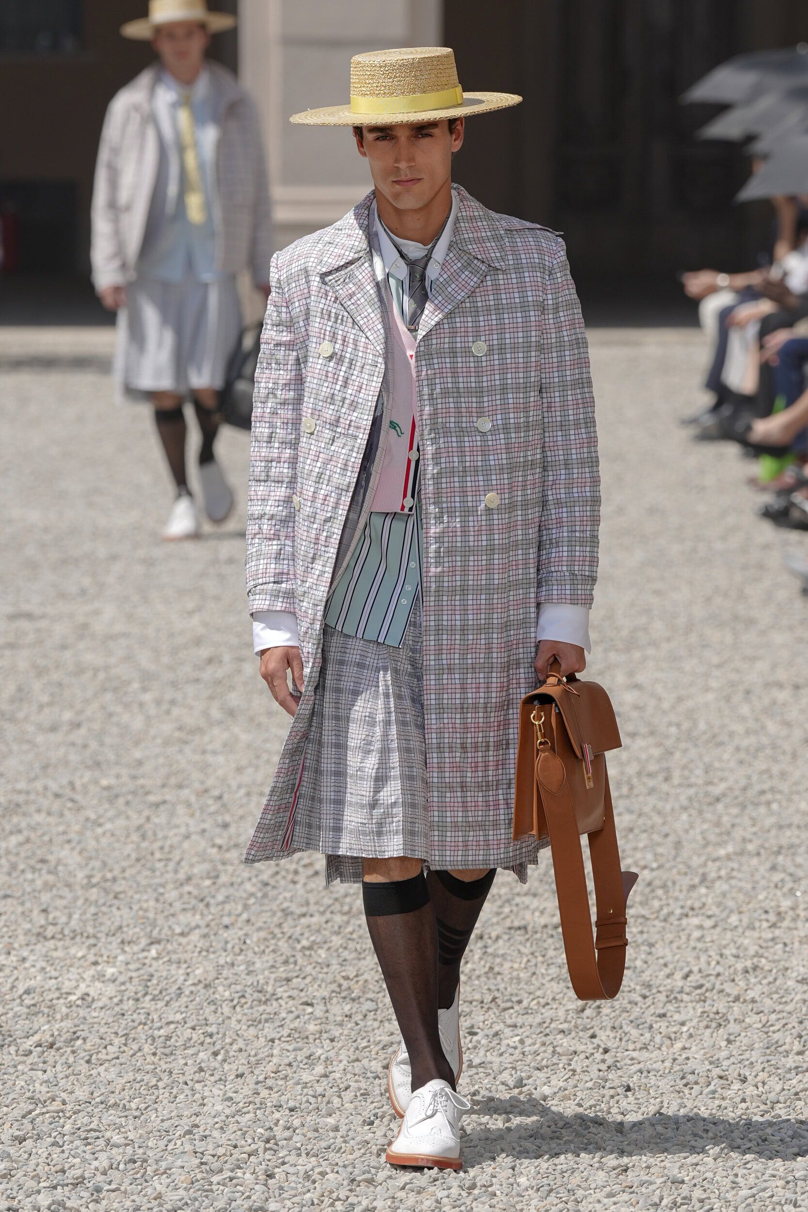
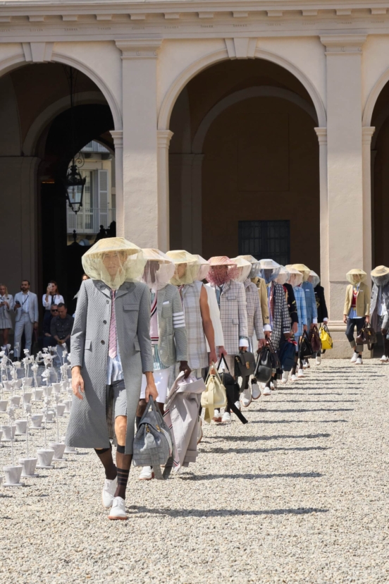
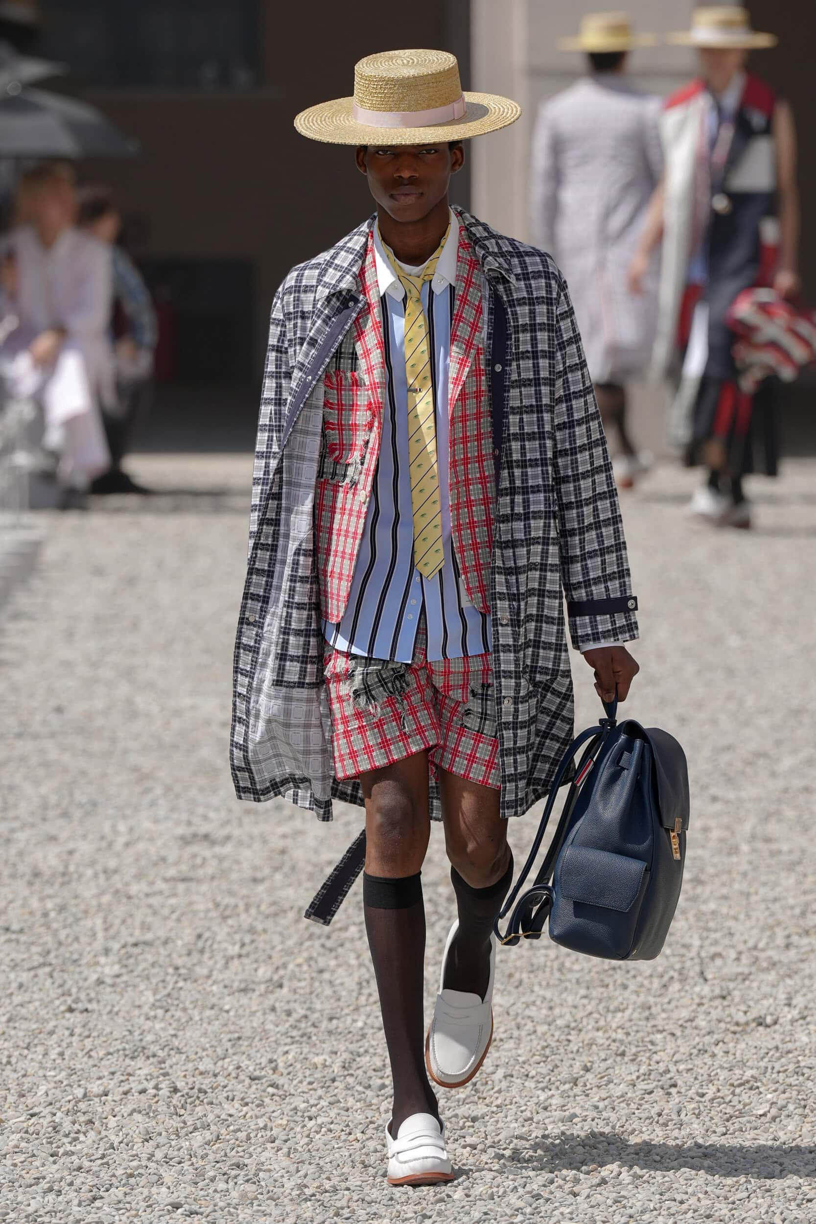
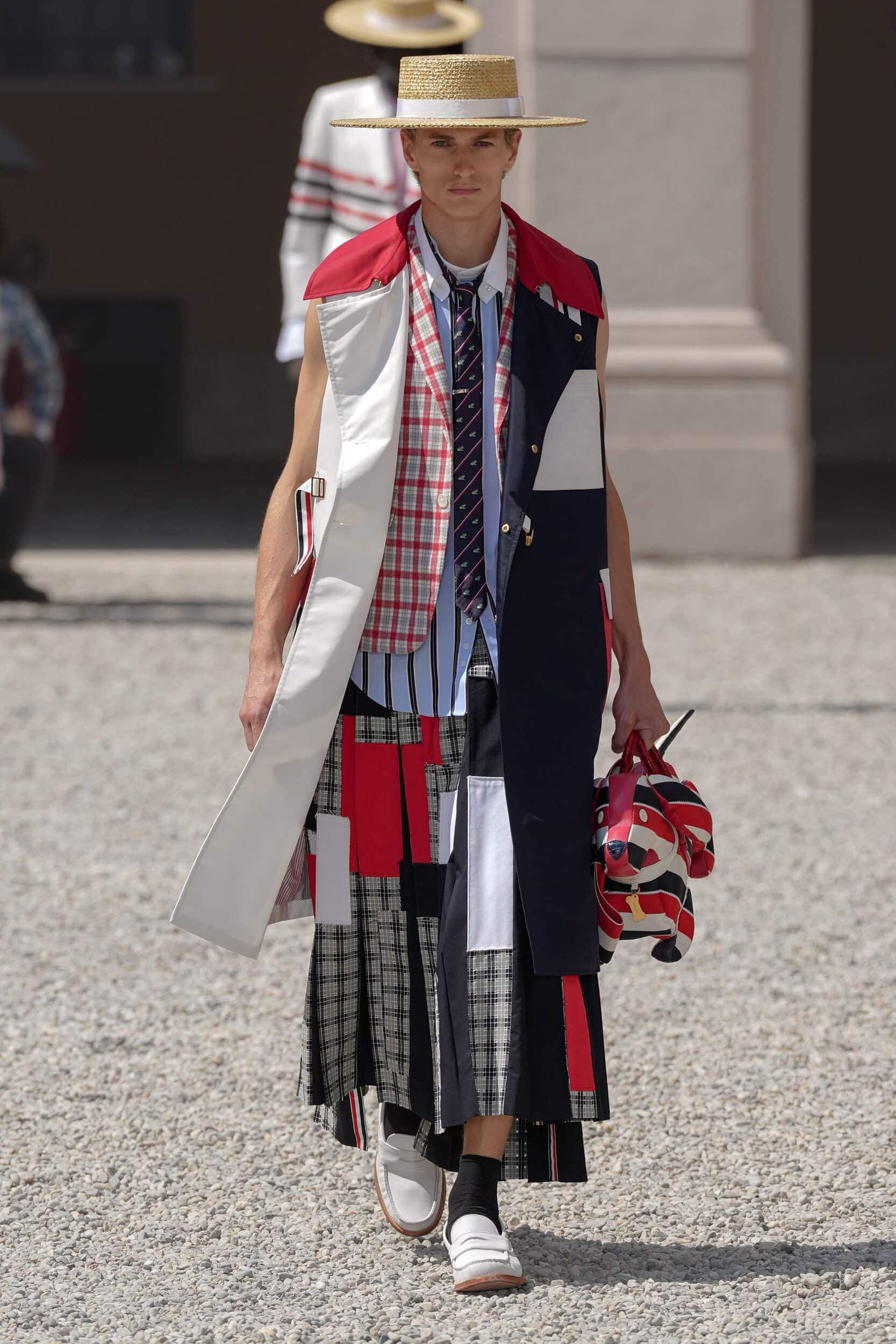
It was a brave choice to stage an outdoor show, as was seen by the many front row guests sheltering under umbrellas usually reserved for adverse weather. Yet, it was a necessary part of conveying todays theme that was all about finding inspiration in the outdoors – Thom’s garden to be exact. A uniform display of seersucker potted flowers outlined the runway foreshadowing the whimsical details waiting to be discovered throughout the collection.
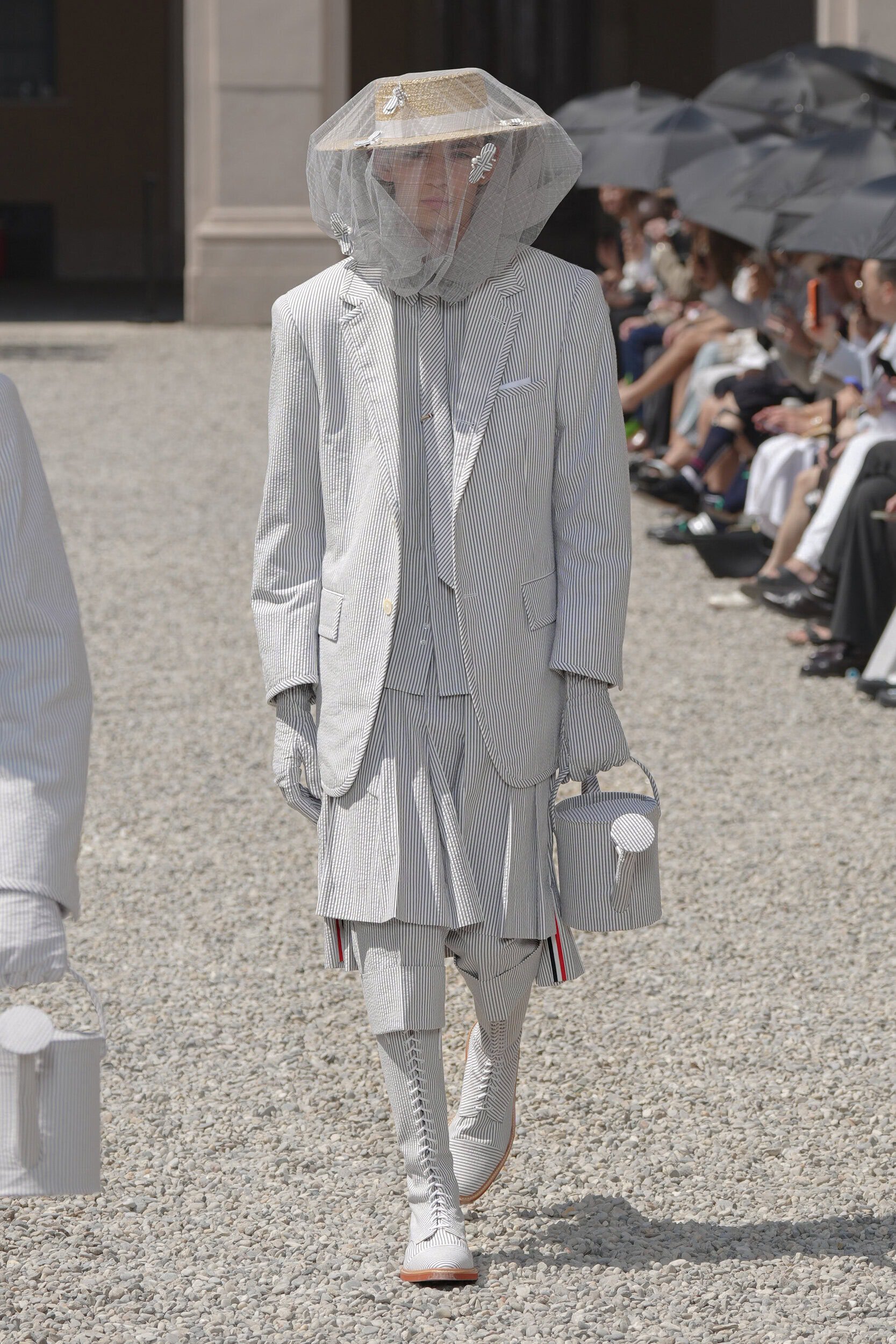
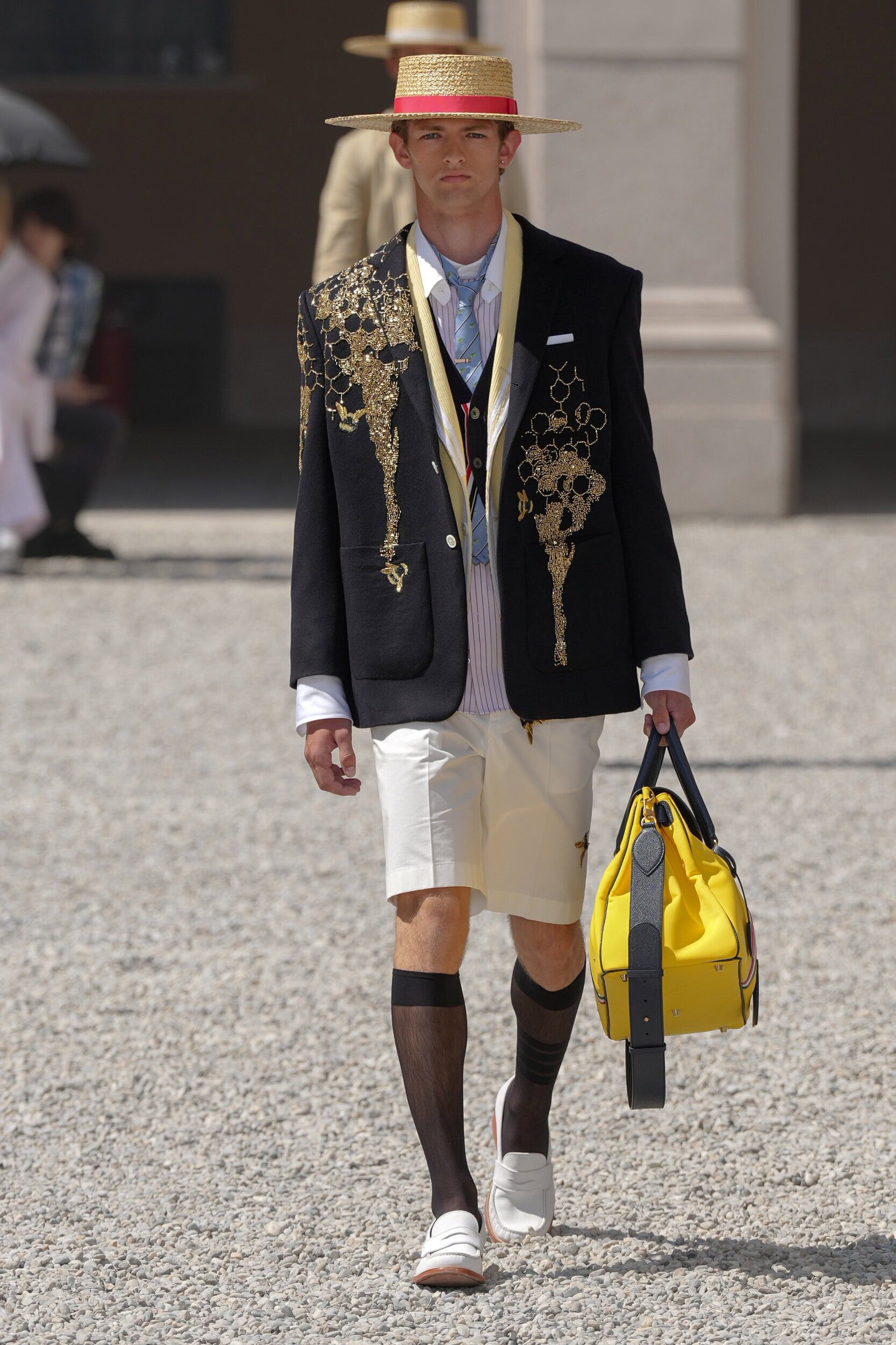
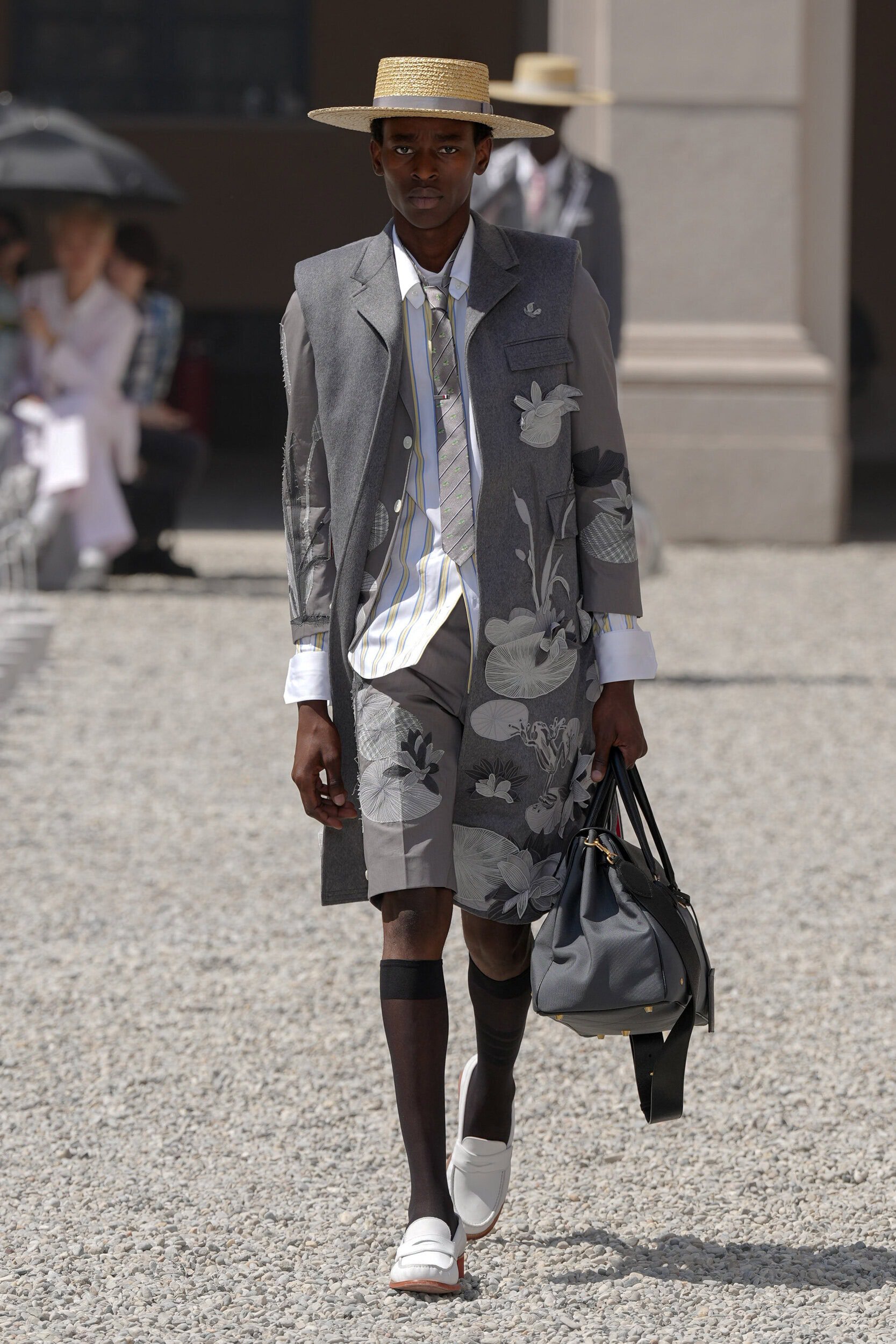
Two days before today’s show the brand put out a teaser on their Instagram account that gave a lesson from the archives – for extra credit of course! Schooling us on how to stay chic ‘during sweltering summers’ the answer came in the form of seersucker. A lightly puckered fabric, of Indian origin, whose name comes from the Persian phrase ‘Shir o Shakar’ meaning milk and honey, (a reference to the fabrics surface texture), that provides a natural form of aeration as it sits away from the skin. Travelling from the British colonies in the 19th to the American South, it has become a mainstay of preppy culture ever since and of Browne’s personal wardrobe. As he told The Impression backstage, “From Memorial Day to Labor Day, I never take it off. It’s something that’s so personal to me. It’s in every collection, and every collection it’s done differently.”
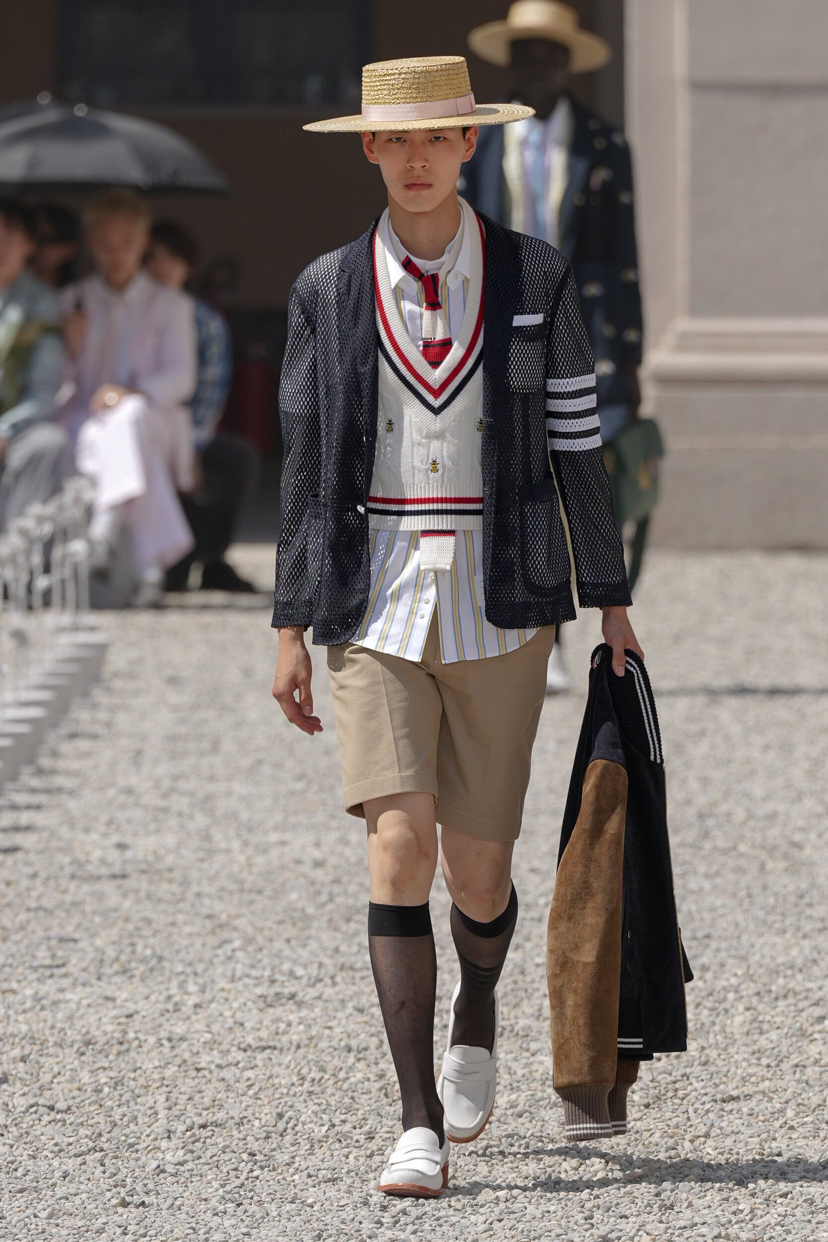
Adamant that “each element of a daily uniform serves its purpose,” as a recent social media post attested to, the use of seersucker has been a strategic part of the house for over two decades and is set to become the first line of defence for those wishing to maintain their composure in the heat. Smart layering hacks were used to demonstrate how the definitive look could still be achieved whatever the weather, from cropped sleeves and sleeveless trench coats to sporty mesh blazers and shrunken knitwear.
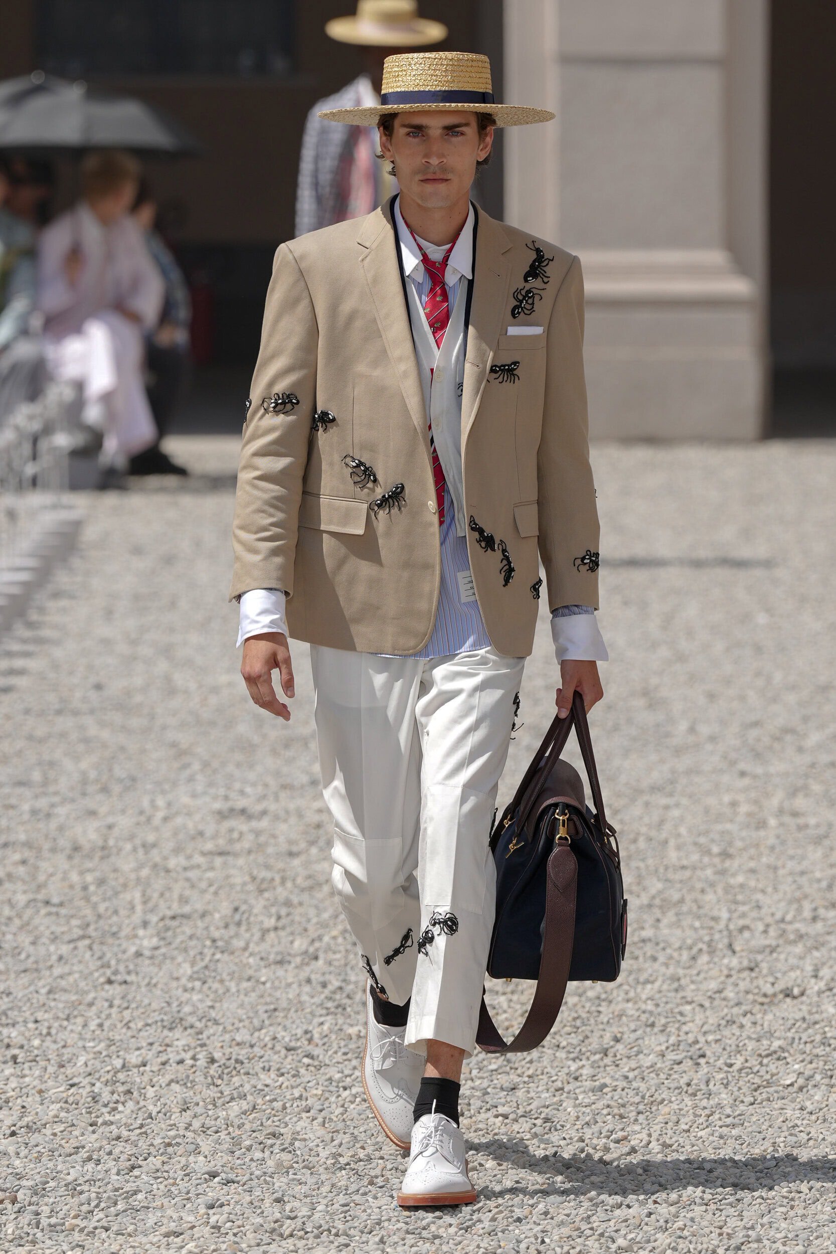
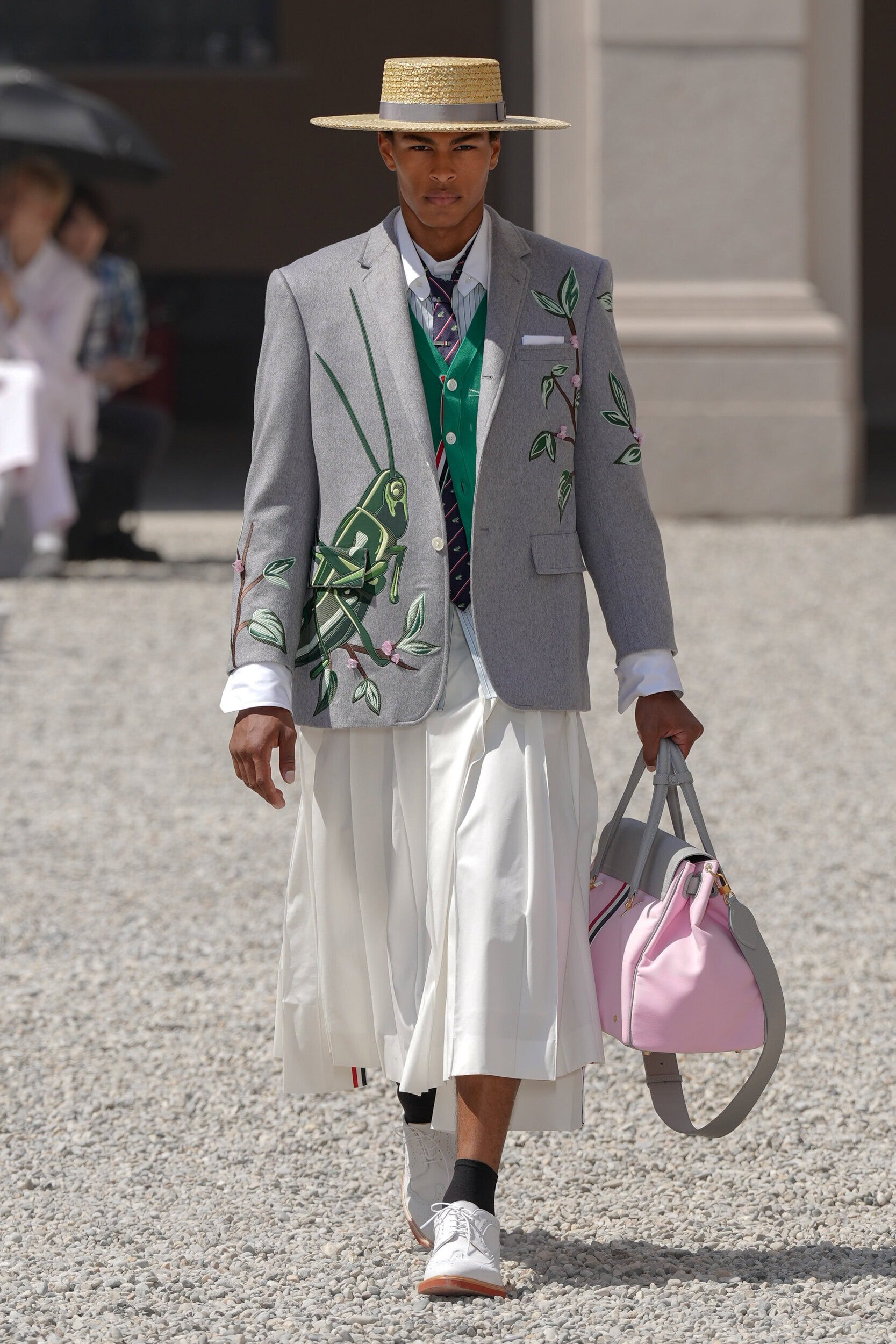
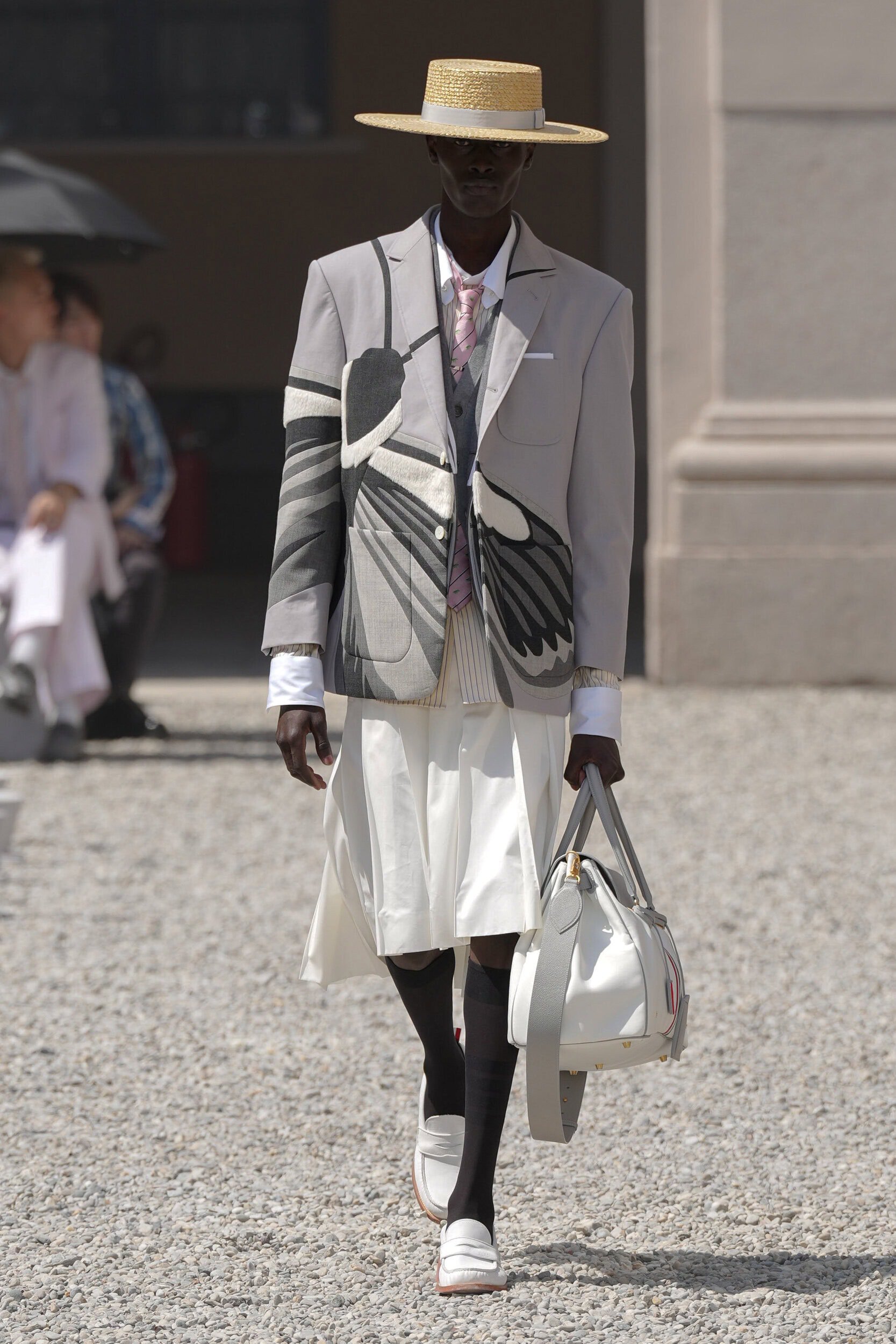
Spring 2027 also emanated a light-hearted sense of whimsy, another emerging trend since Simone Rocha’s menswear debut at Pitti Uomo. After watching the Pixar animation A Bug’s Life on a flight back to Milan, Browne was so taken by its charm that it made it onto the moodboard as a reference for the season, it was also his small way to combat “these times we’re living in.” Think dragonfly and lilypad applique, straw boater hats, watering can bags and golden honeycomb embroidery.
Throughout history, lighter colours have been used in clothing to deflect heat. But, what was missing from the collection, one borne of the vibrancy of nature, was a dialling up of the colour palette – the breadth of which can often be experienced on a visit to the brands Paris showroom. Either as a play on pastels or splicing together of preppy primaries, merged together with the scenic and Toile du Jouy prints from last season.
THE WRAP UP
As much as Thom Browne looks best when styled as a complete look, or at least when following the earlier mentioned formula, the designer is still open to his customers interpreting each piece in their own way. Acknowledging that each individual garment can become its own character, telling The Impression “Every piece is individual, you can wear a piece on its own, or wear things together. That’s the one thing people need to realise; you can take a piece yourself and personalise it and there’s a lot within the collection that you could make your own.”
This stamp of approval will no doubt come as a relief to those who want to delve into the buttoned-up world of Thom Browne, but rest assured – whether spring or autumn – the adaptability of the brands uniform codes will always be ripe for disruption, something the designer himself positively encourages.